01向购物中心学习
01 Learning from shopping malls
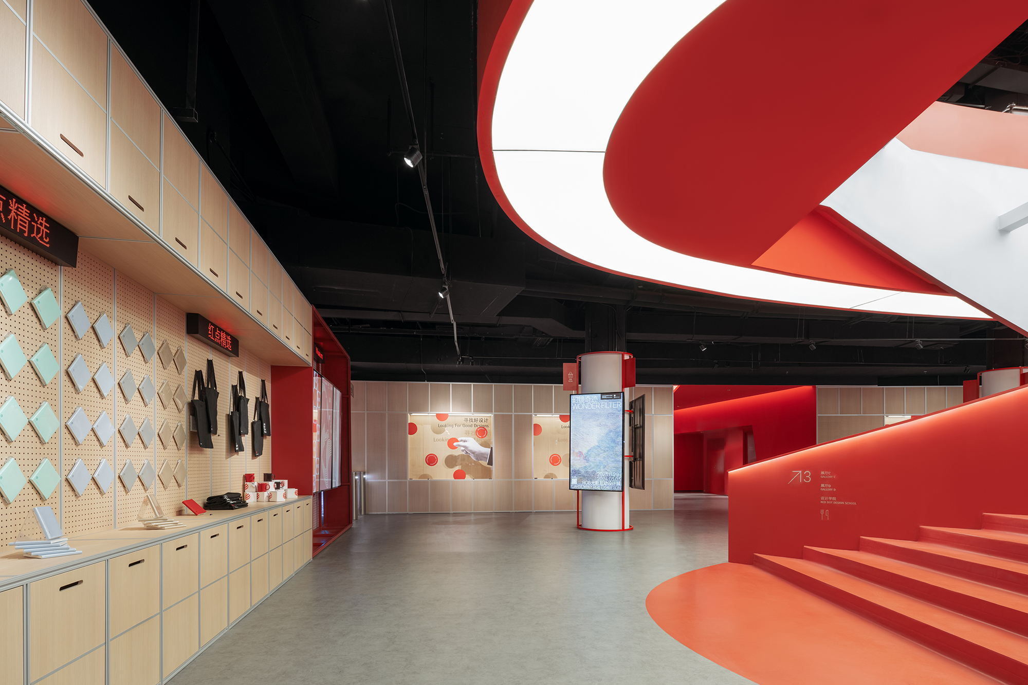
厦门红点设计博物馆是德国红点设计大奖在全球设立的第三家、亚洲第二家博物馆。区别于传统的博物馆,红点设计博物馆的展品大多为贴近日常生活的工业设计产品,与大众消费文化息息相关。
Red Dot Design Museum in Xiamen is the third Red Dot Design Museum globally and the second in Asia. Different with traditional museum, Red Dot Design Museum mainly exhibit industrial design products that are close to people’s daily life, which naturally inspires us with the relation of consumer culture.
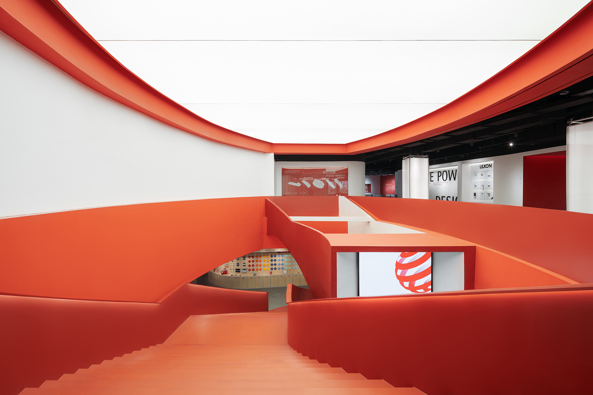
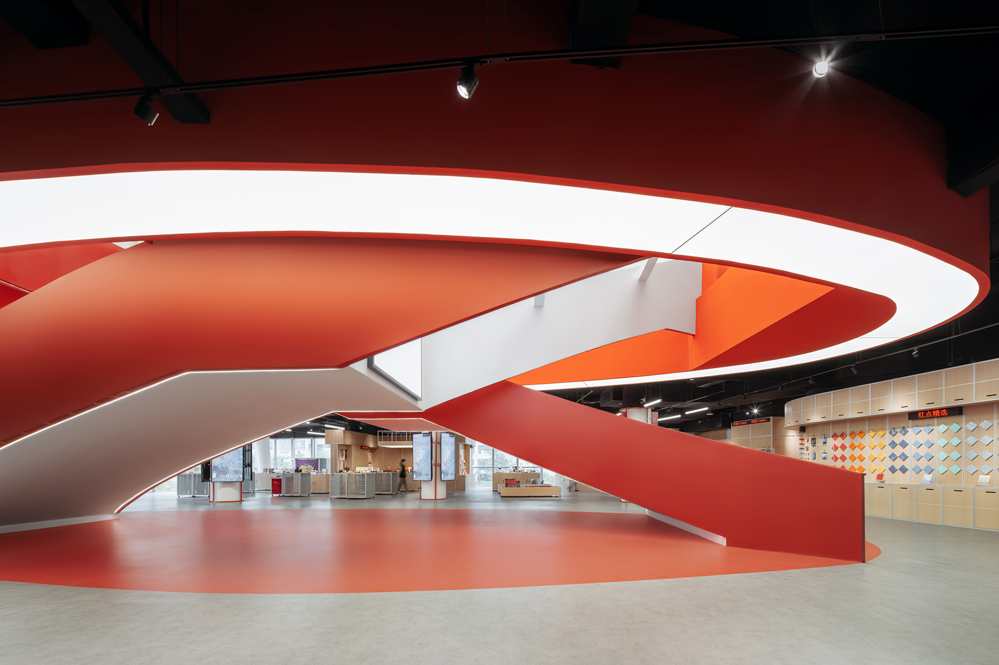
▲空间概览 © CreatAR Images (Ai Qing)
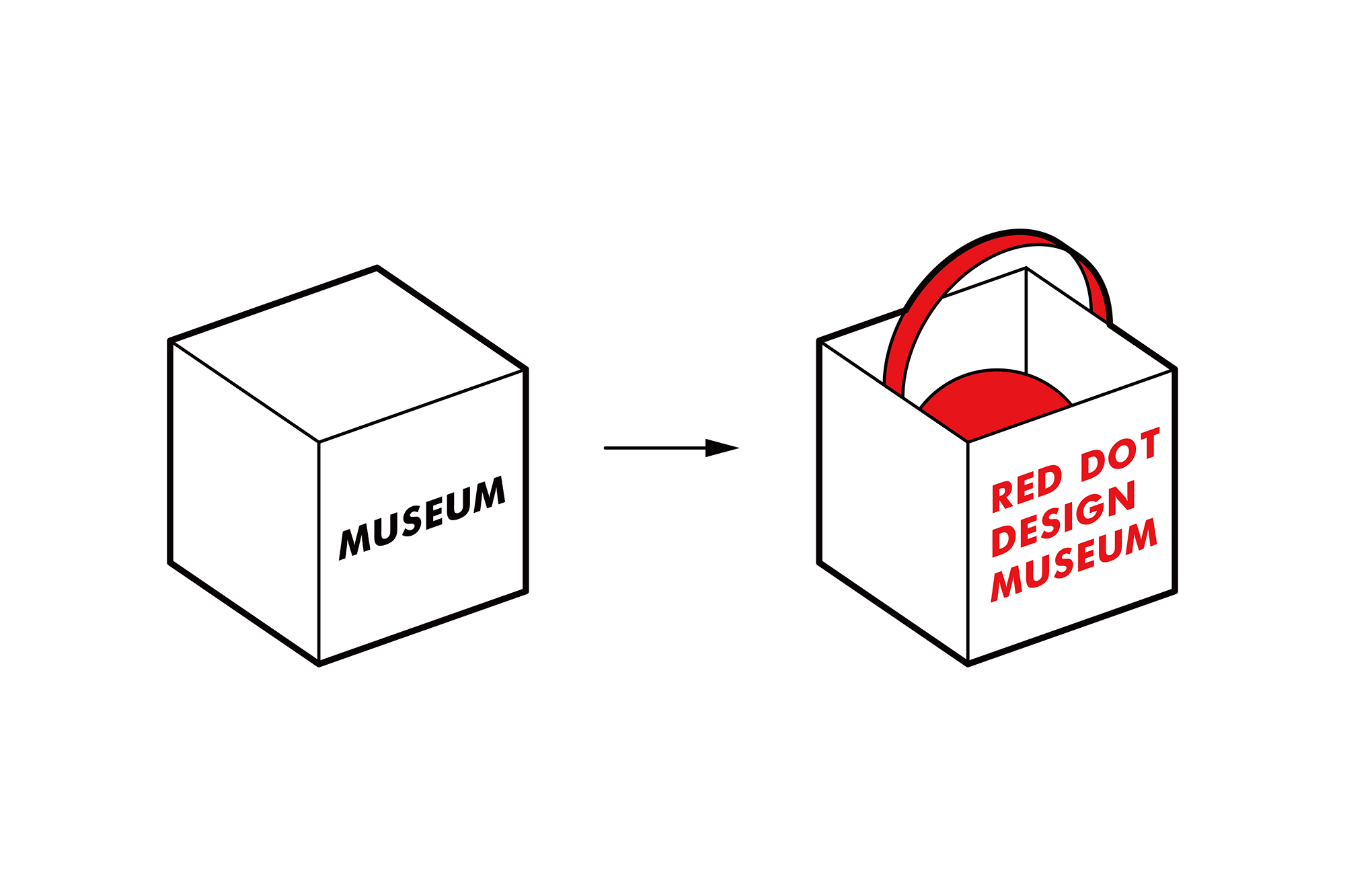
安迪·沃霍尔曾预言:“所有的购物中心将会成为博物馆,所有的博物馆将会成为购物中心。”受此启发,我们决定:与其设计一个保守而冰冷的白盒子式博物馆,不如大胆尝试打破博物馆和购物中心两种空间模式的界限。幸运的是,我们的想法与红点决策层希望打造一座接地气、有活力的新型设计博物馆的初衷不谋而合。
Andy Warhol once commented: “All shopping malls will become museums, and all museums will become shopping malls.” Also inspired by this comment, we decide that rather than designing another traditional white-box type of museum, we should break the boundaries between the two spatial systems of museum and shopping mall. Luckily, this coincides with museum leadership’s idea of building a new type of design museum.
▲概念示意图 © STEPS大台阶建筑
自19世纪初巴黎的拱廊街到今天的购物中心,本雅明曾在《拱廊计划》中提出的“漫游者”的生活方式早已成为建筑师们共同守护的价值观:在城市的消费环境中尽可能创造免费的公共空间,供人们度过休闲时光。在红点设计博物馆中,我们通过沿用购物中心这种大众熟悉的日常空间形式,充分平衡商业空间与免费公共空间的关系,打造出一个让人们可以像逛街一样自在漫游的博物馆,拉近博物馆与参观者的距离。
From arcades emerging in 19th Paris to shopping mall now-days, the concept of “idler” that Benjamin created has now become a common value that architects firmly guards: Creating as more free public spaces as possible in urban consumer environment for people to leisure. Learning from shopping malls, we try to create a museum that feels like wandering in shopping mall by balancing commercial and free public spaces.
▲自在漫游的空间 © CreatAR Images (Ai Qing)
02商业裙楼的新生
02 The rebirth of a commercial podium
新馆的选址位于厦门集美杏林湾商务区最高写字楼的商业裙楼。我们试图将裙楼自带的商业空间属性与博物馆空间结合,重新激活城市中这处已空置许久的商业裙楼。
The new museum is located in the commercial podium of the highest office building in Xinglin Bay, Jimei District, Xiamen. We try to adapt the original spatial properties of a shopping mall into new museum spaces, thus activating this long-vacant podium.
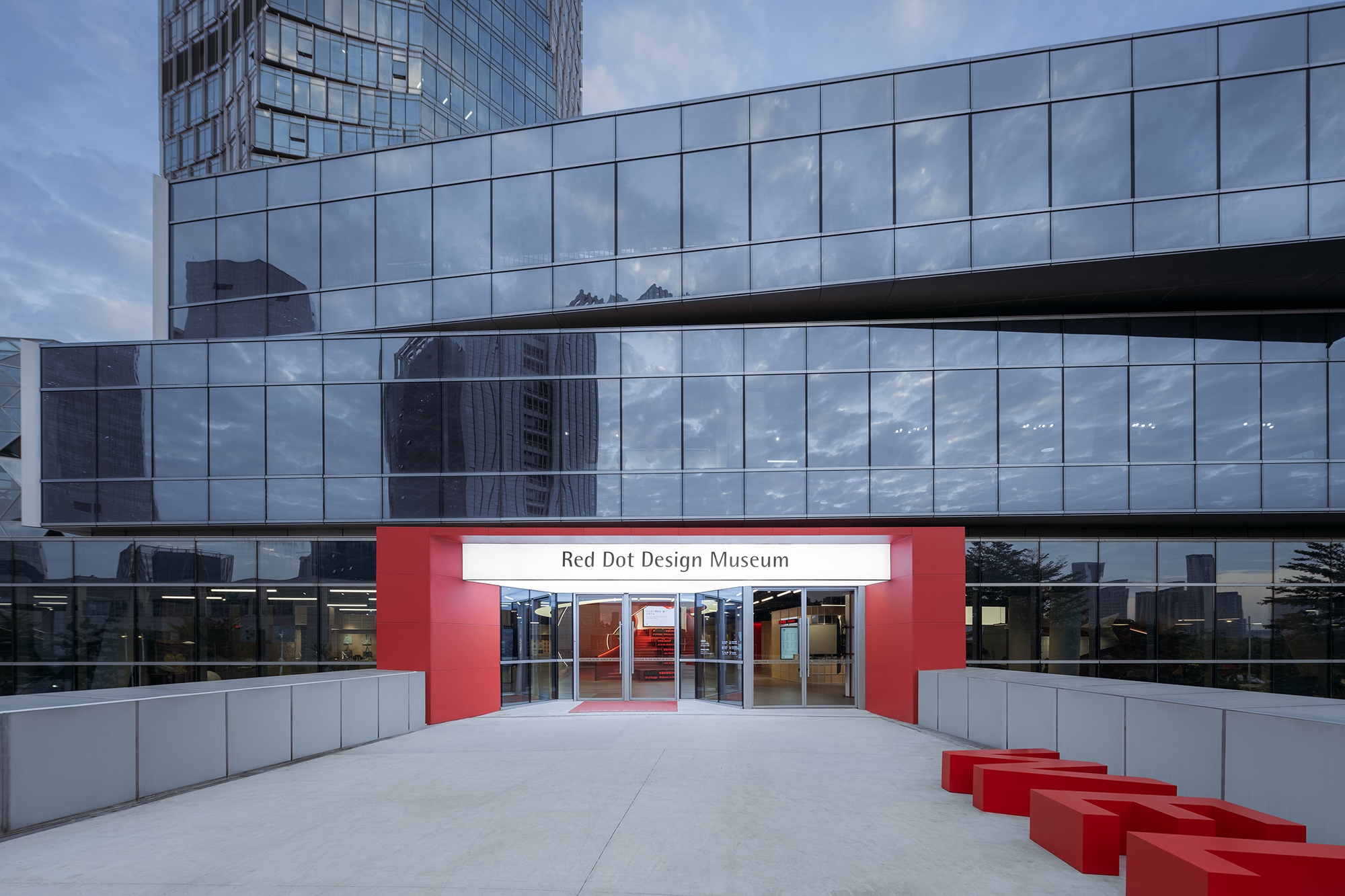
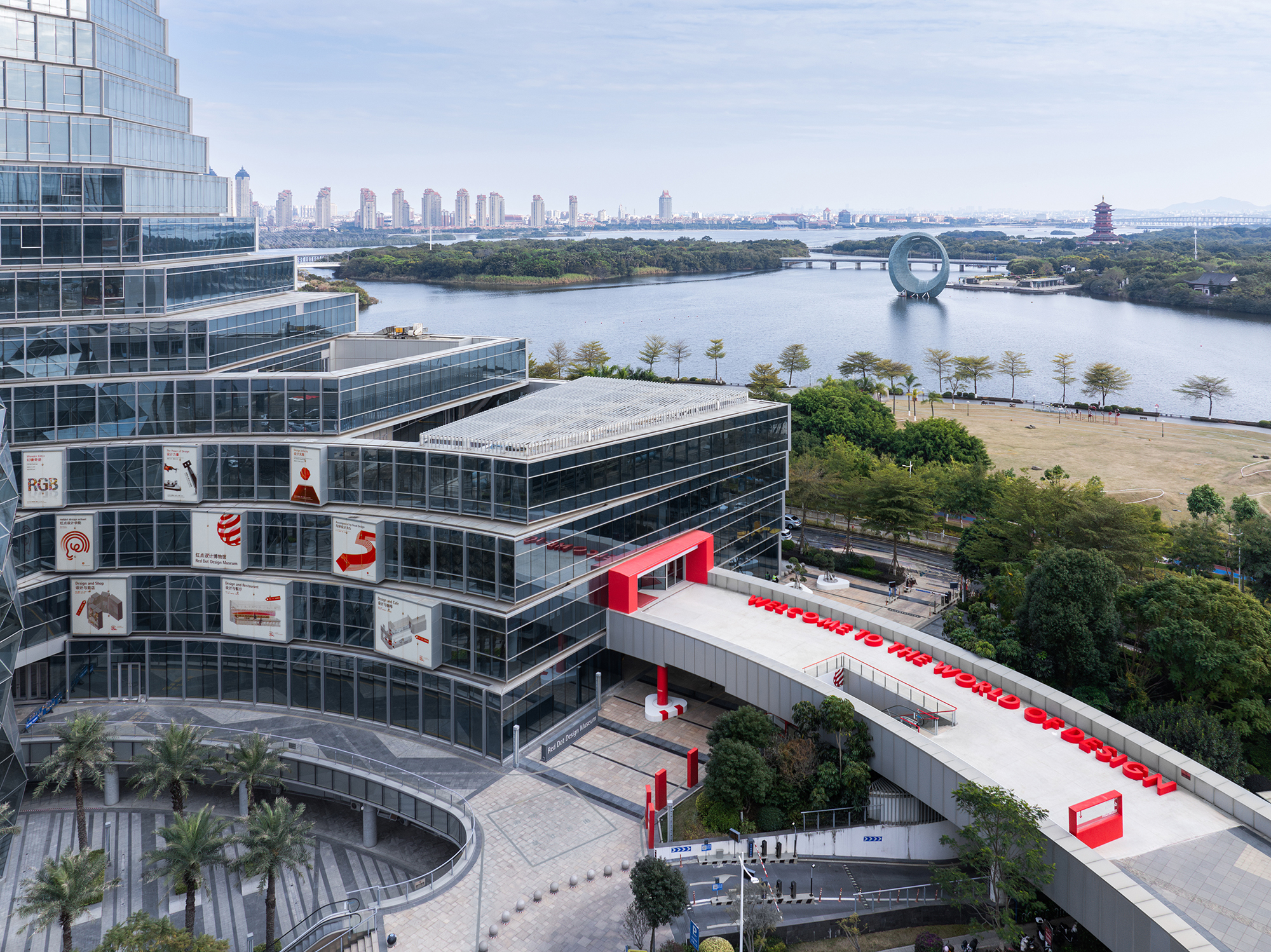
我们直接利用裙楼原有的立面橱窗作为博物馆的海报橱窗。在室外广场和人行桥上,通过设置一系列局部的红色元素:广告箱、柱子、扶手、雨棚、字母座位等,作为醒目的导视指引,将参观者引向博物馆入口。既形成了博物馆的户外公共空间,也为城市增添了一抹鲜明的红色。
We reuse the commercial façade showcases as showcases for museum posters. On the exterior plaza and bridge, by implanting a series of red elements as poster installation, column and railing paint, alphabetical seatings and canopy, we create a distinct pathway that leads people to the entrance of the museum, which also serves as the exterior public spaces of the museum, bringing a distinct shred of red to the city.
▲一系列红色元素作为户外导视指引 © CreatAR Images (Ai Qing)
▲博物馆入口 © CreatAR Images (Ai Qing)
▲博物馆的户外公共空间 © CreatAR Images (Ai Qing)
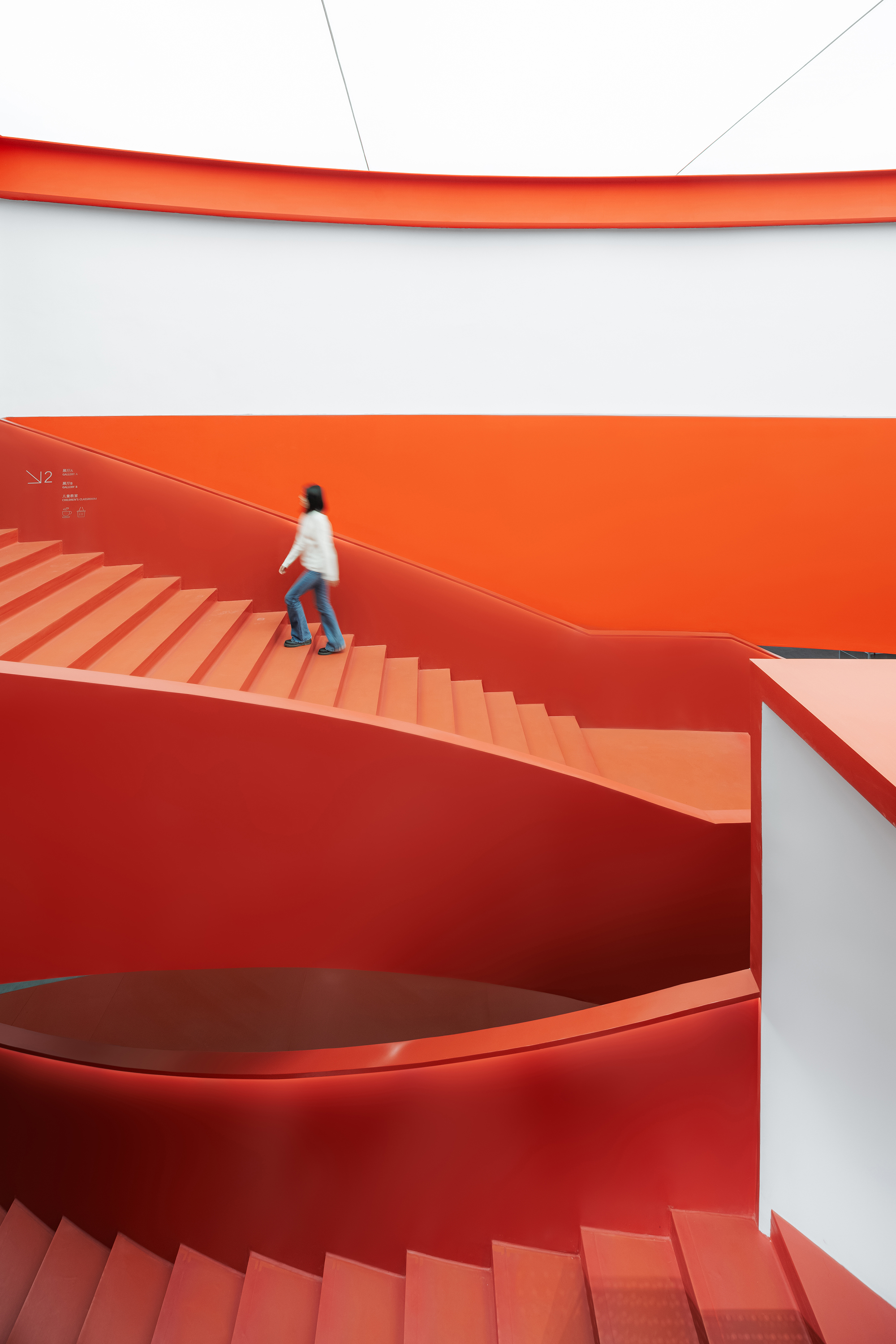
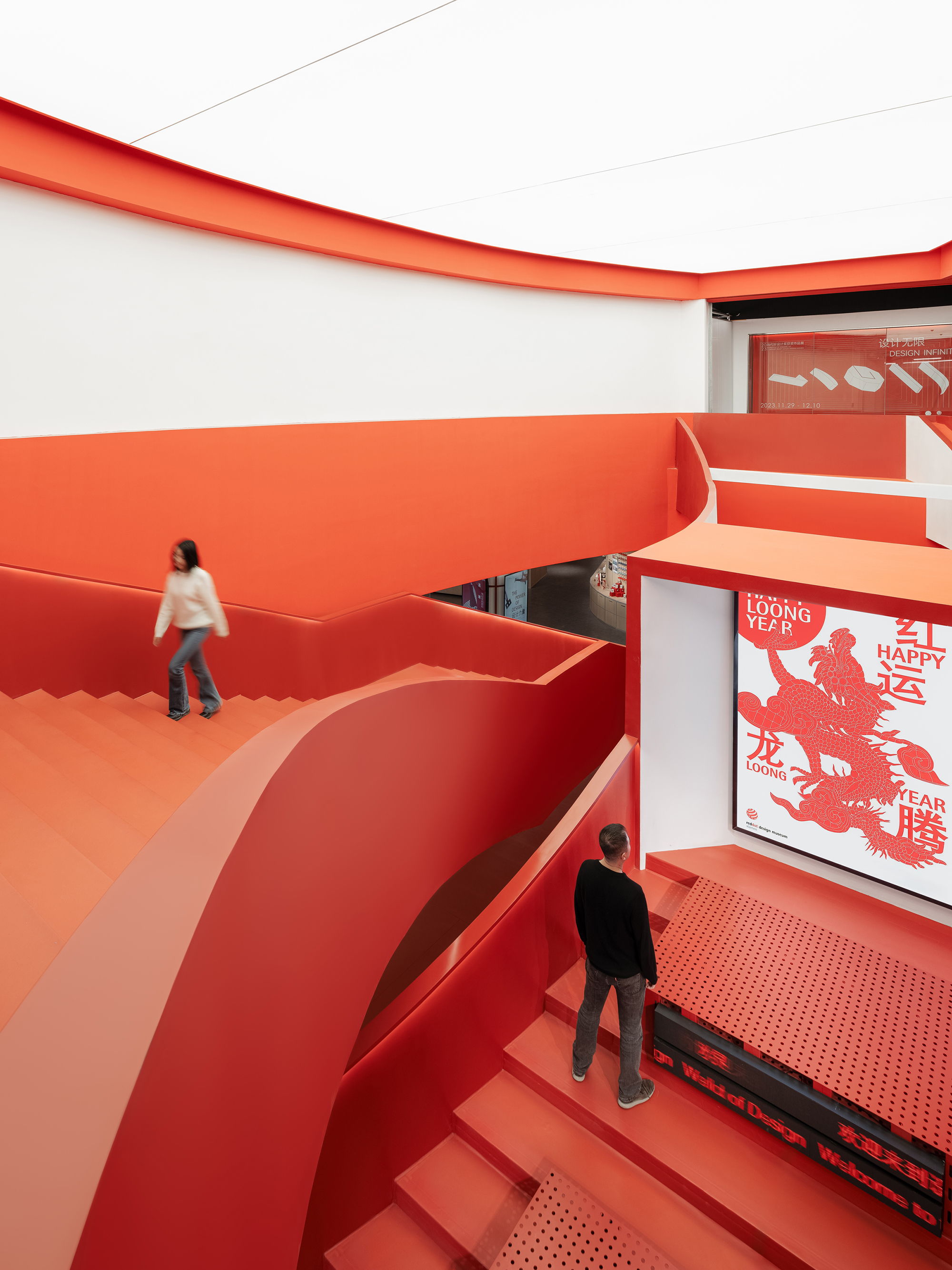
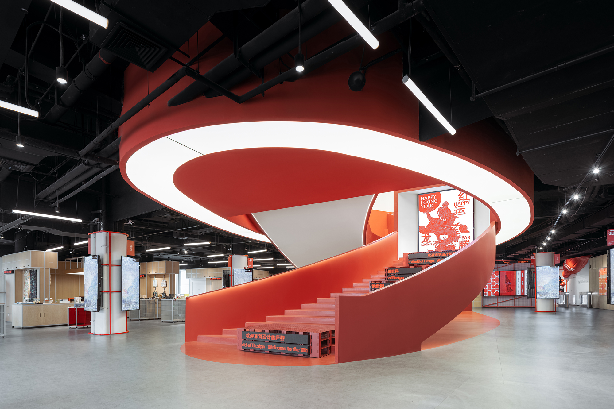
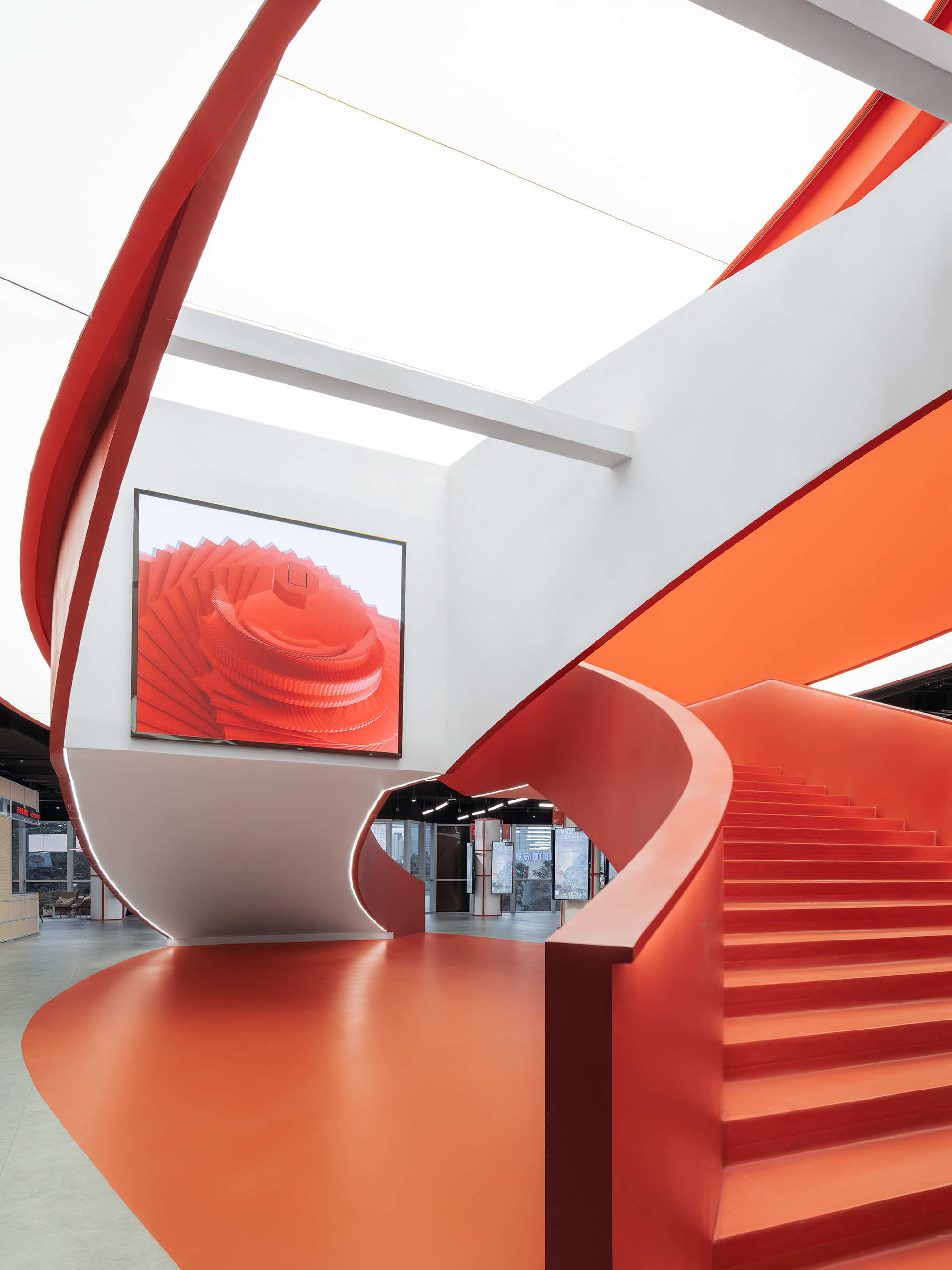
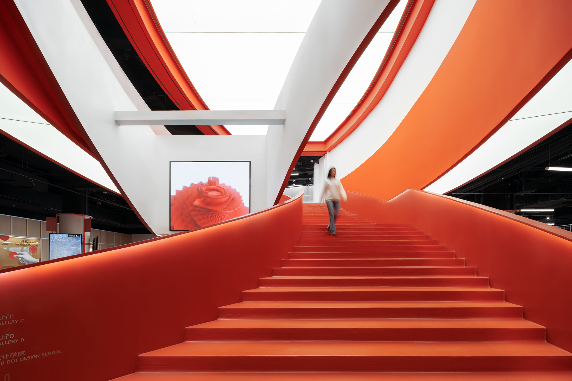
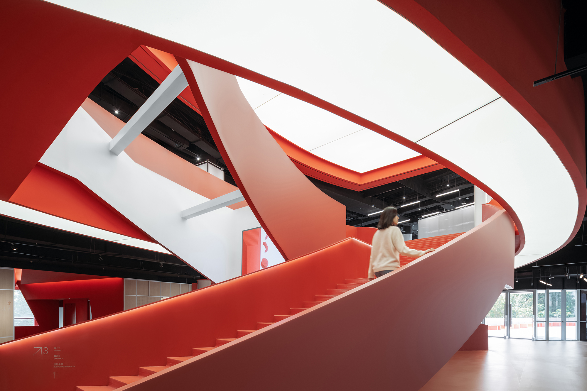
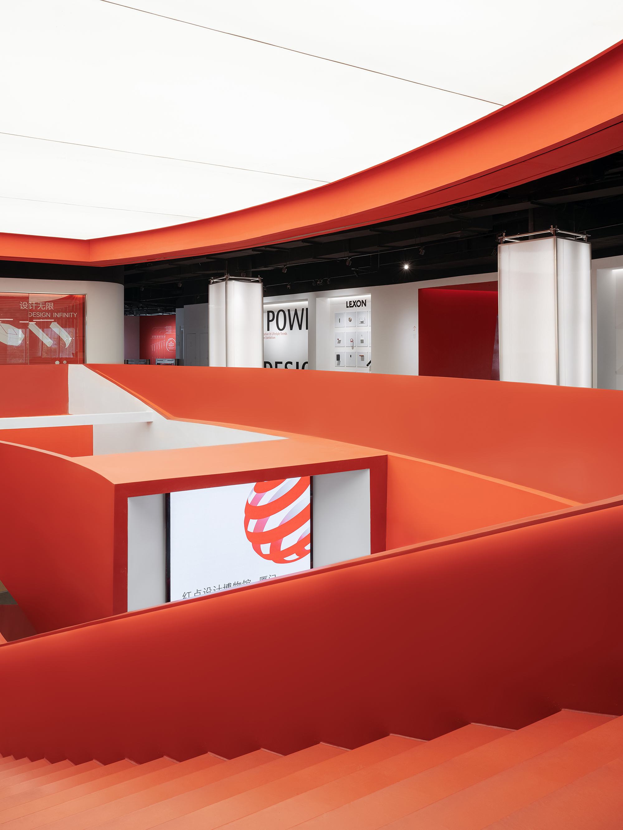
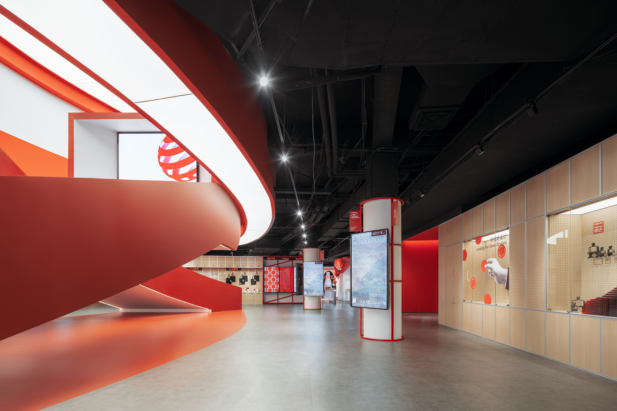
我们与跨媒介设计团队协作派对合作,充分挖掘利用现有商业裙楼的空间优势,打造博物馆的重点公共空间,即最具开放性的商业零售区及餐饮咖啡区。通高的中庭空间作为全馆核心正对着博物馆入口,我们拆除了原电动扶梯,设计了极具标识性的巨型双螺旋红色楼梯取而代之,成为视觉核心。面向入口的梯段为展示楼梯,设置LED屏幕,可不定期更换主题展品和视频内容;另一梯段为通向上层的功能性楼梯。两段楼梯交错缠绕,颇具游戏性和戏剧性,吸引参观者在此拍照打卡,通过社交媒体为博物馆宣传引流。
Collaborating with Network Party, we fully take advantage of the interior spatial properties of the commercial podium to form essential public spaces of the museum, which are the spaces of retail, coffee and restaurant. The atrium facing the entrance is the most distinct feature, we remove the escalators and turn it into the most iconic double-spiral red stair that serve as the visual core of the museum. The one half of the double-spiral stair facing the entrance serve as the “display stair” which seats the LED screens showing posters and videos that are updated periodically, and the other half leads people to upper floor. The double-spiral stair intertwines dramatically, bringing much attraction both off and on-line.
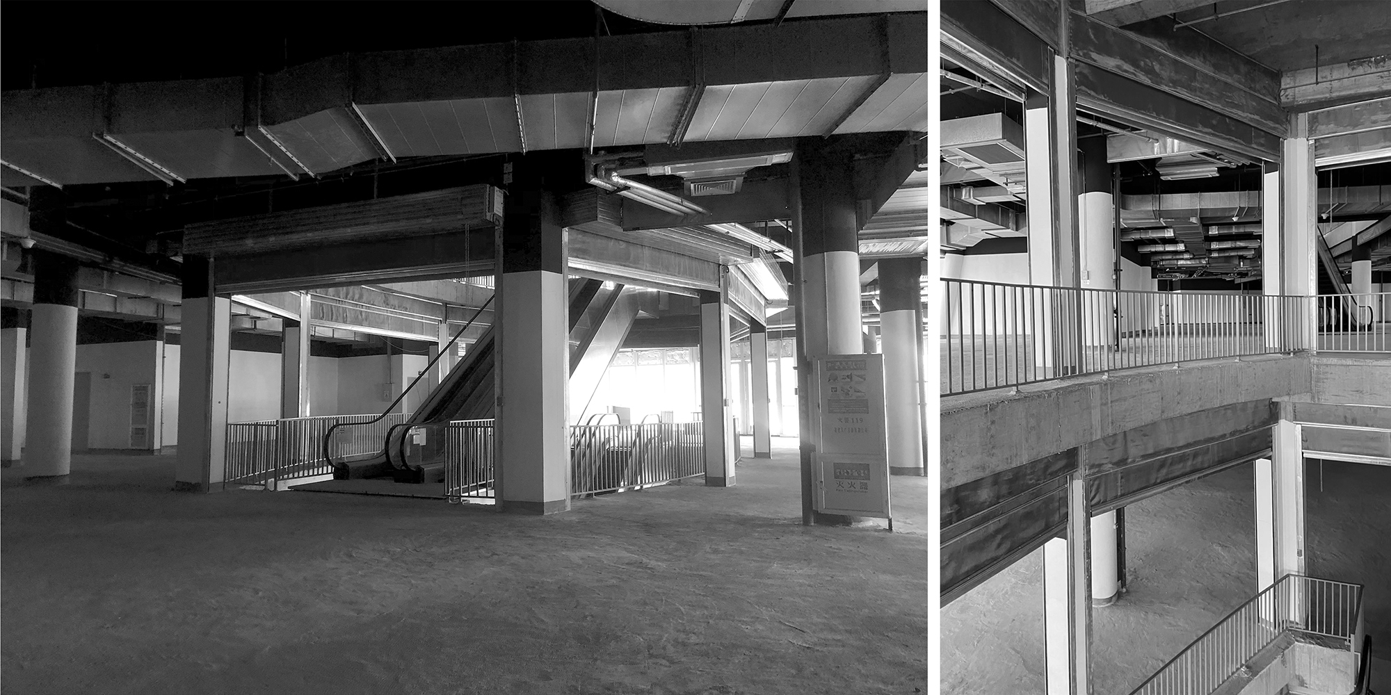
▲通高的中庭空间原状 © STEPS大台阶建筑
▲面向入口的展示楼梯 © CreatAR Images (Ai Qing)
▲作为视觉中心的中庭楼梯 © CreatAR Images (Ai Qing)
▲展示楼梯的镂空部分设置大屏幕 © CreatAR Images (Ai Qing)
▲通向三层的交通楼梯 © CreatAR Images (Ai Qing)
▲富有动感的中庭楼梯 © CreatAR Images (Ai Qing)
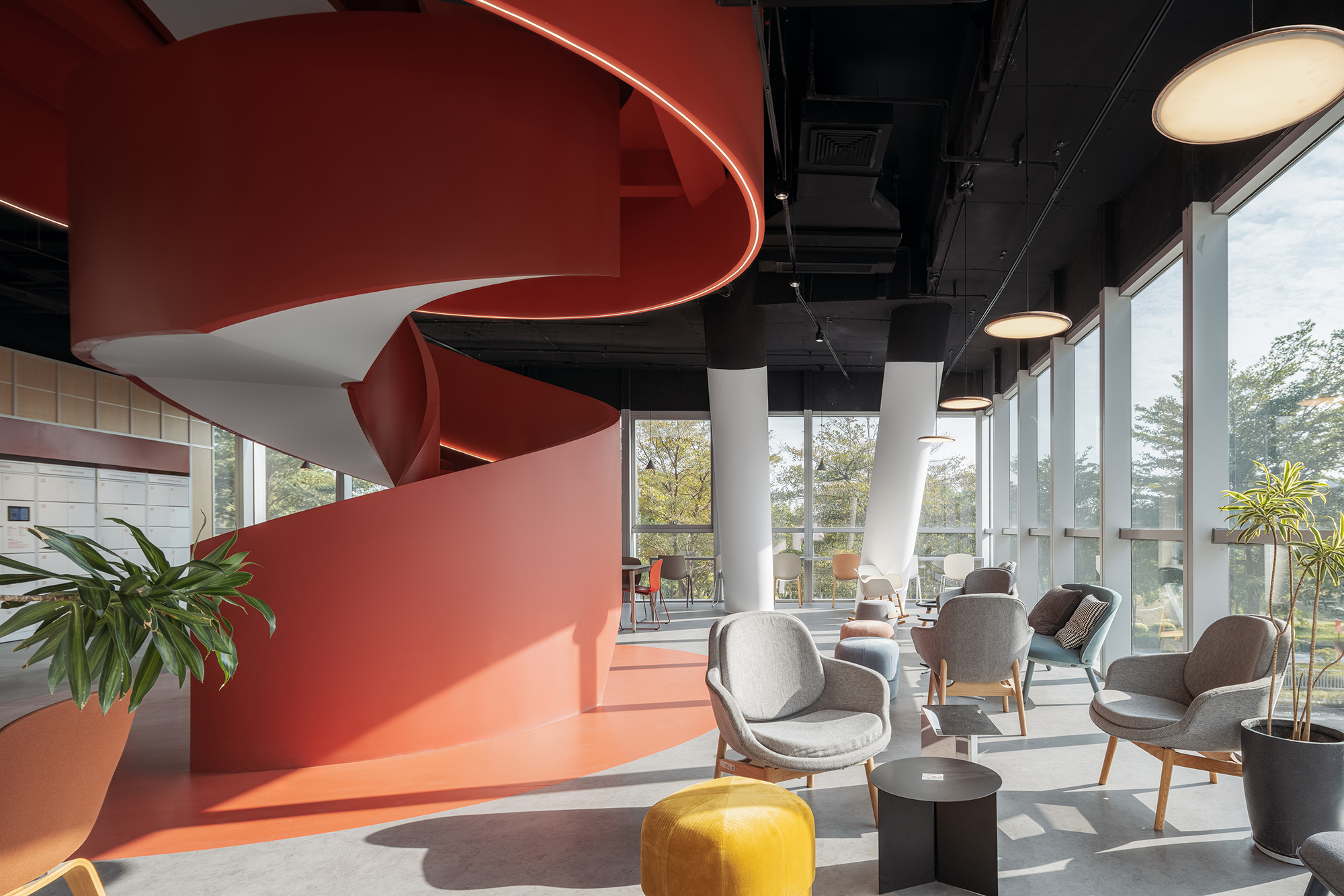
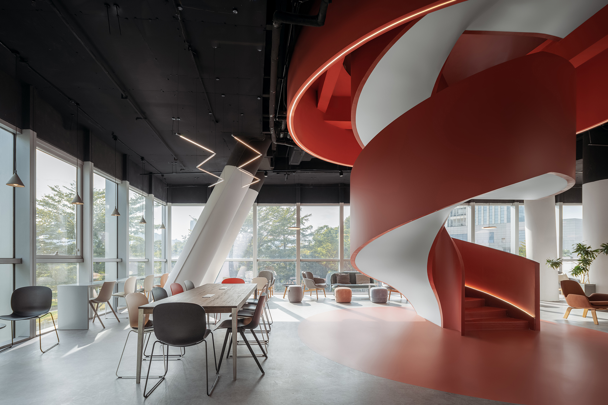
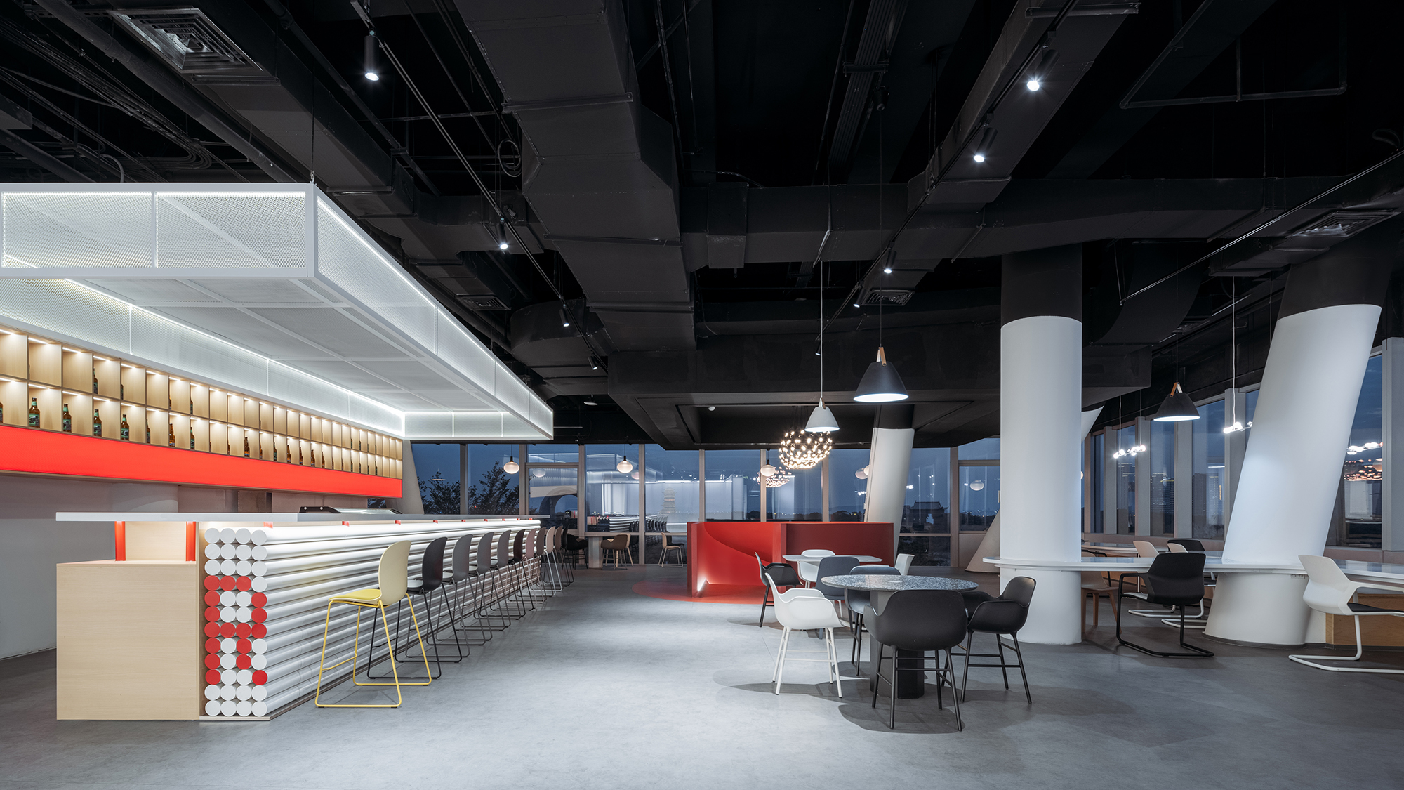
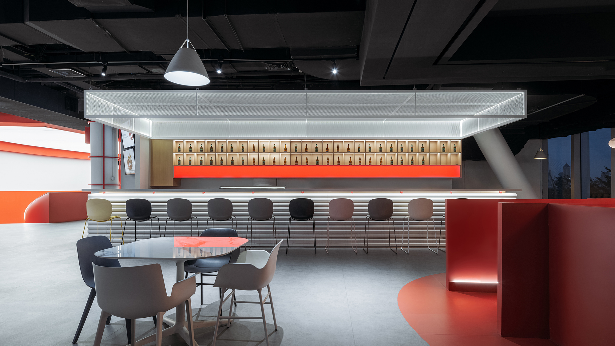
二、三层靠近玻璃幕墙的空间正对着厦门园林博览苑,充足的光线和美好的景色已然非常奢侈,我们仅增加了功能性吧台、利旧获奖灯具和家具,便轻松打造出舒适的观景咖啡厅及餐厅,并以鲜明的红色螺旋楼梯相连上下二层。
The edge spaces on 2nd and 3rd floor facing Xiamen Horticulture Expo Garden is sufficient with daylight and sceneries, we only add counters and reutilized award-winning furniture, creating comfortable coffee space and restaurant, and to connect these two spaces we implant another iconic red spiral stair.
▲从博物馆入口看向咖啡厅 © CreatAR Images (Ai Qing)
▲明亮舒适的观景咖啡厅 © CreatAR Images (Ai Qing)
▲明亮舒适的观景咖啡厅 © CreatAR Images (Ai Qing)
▲连接咖啡厅与餐厅的红色旋转楼梯 © CreatAR Images (Ai Qing)
▲餐厅夜景 © CreatAR Images (Ai Qing)
▲餐厅吧台 © CreatAR Images (Ai Qing)
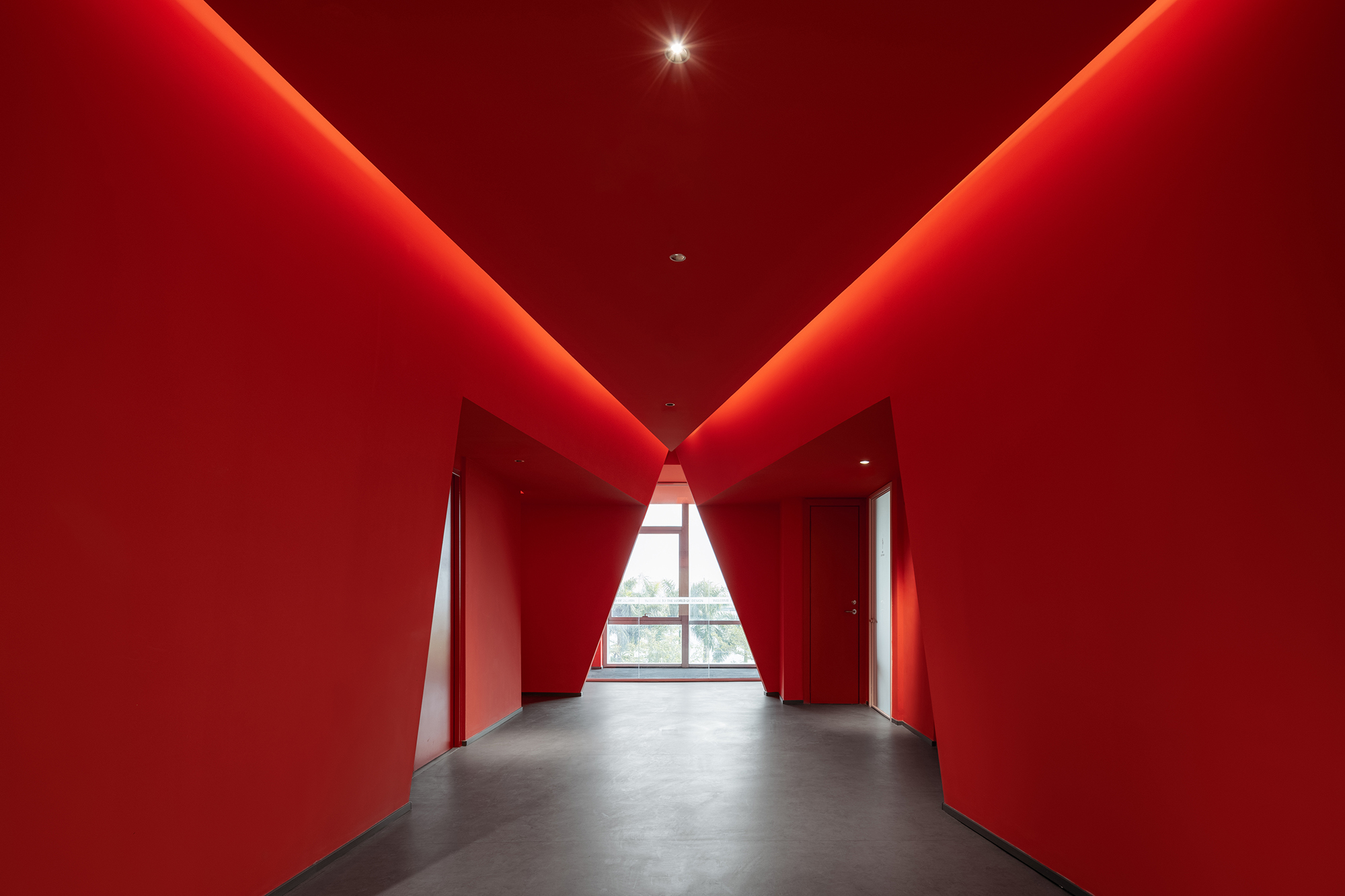
购物中心常见的通向卫生间的过道空间也没有浪费,我们将其改造为戏剧性的红色隧道,尽头自然形成三角形橱窗,既可观景,亦可用作展览空间。
We also take advantage of the space leading to restrooms that are common in shopping malls, transforming it into a dramatic red tunnel, which naturally forms triangle glass showcase in the end, serving not only as viewing window but also as exhibition space.
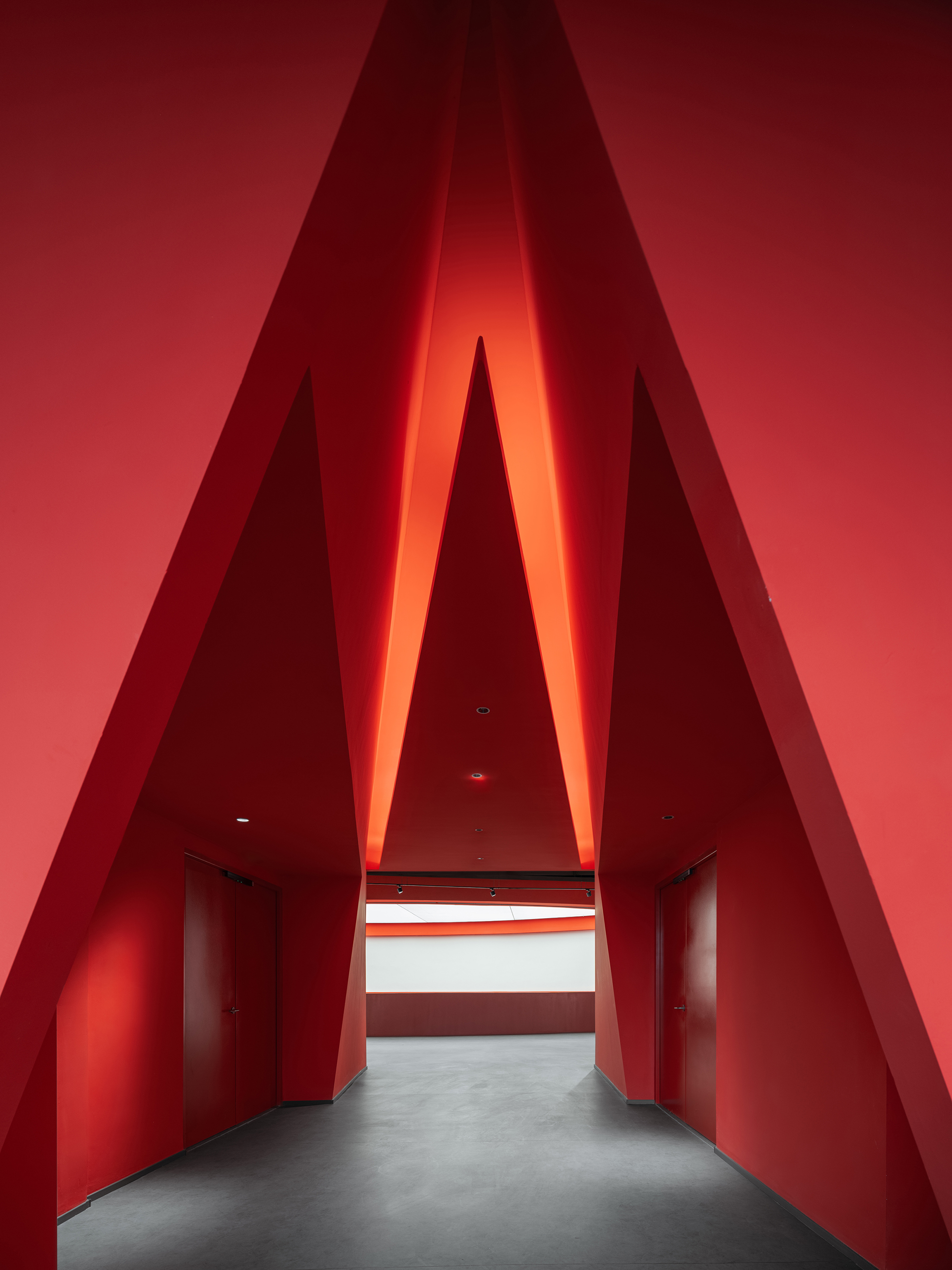 ▲戏剧性的红色隧道 © CreatAR Images (Ai Qing)
03没有墙的博物馆
03 Museum without walls
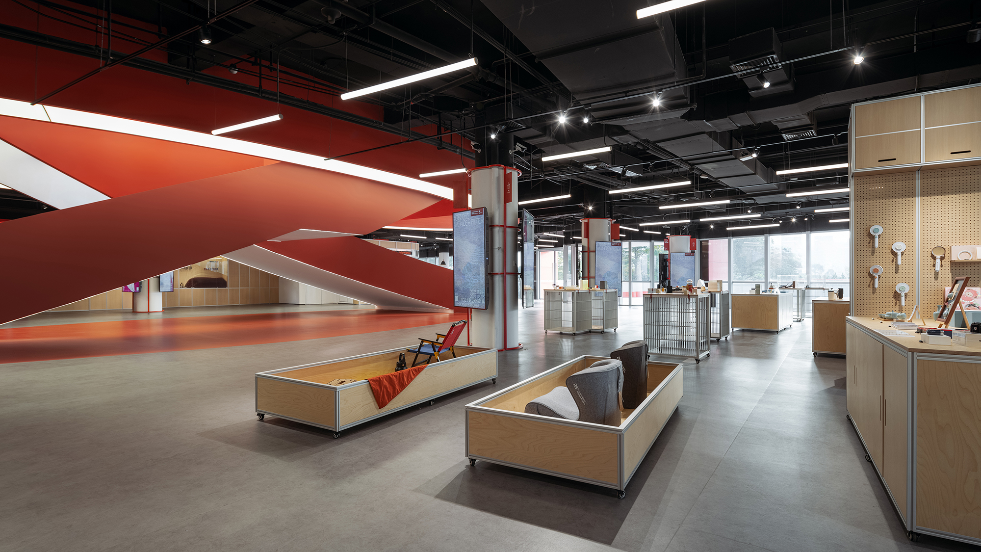
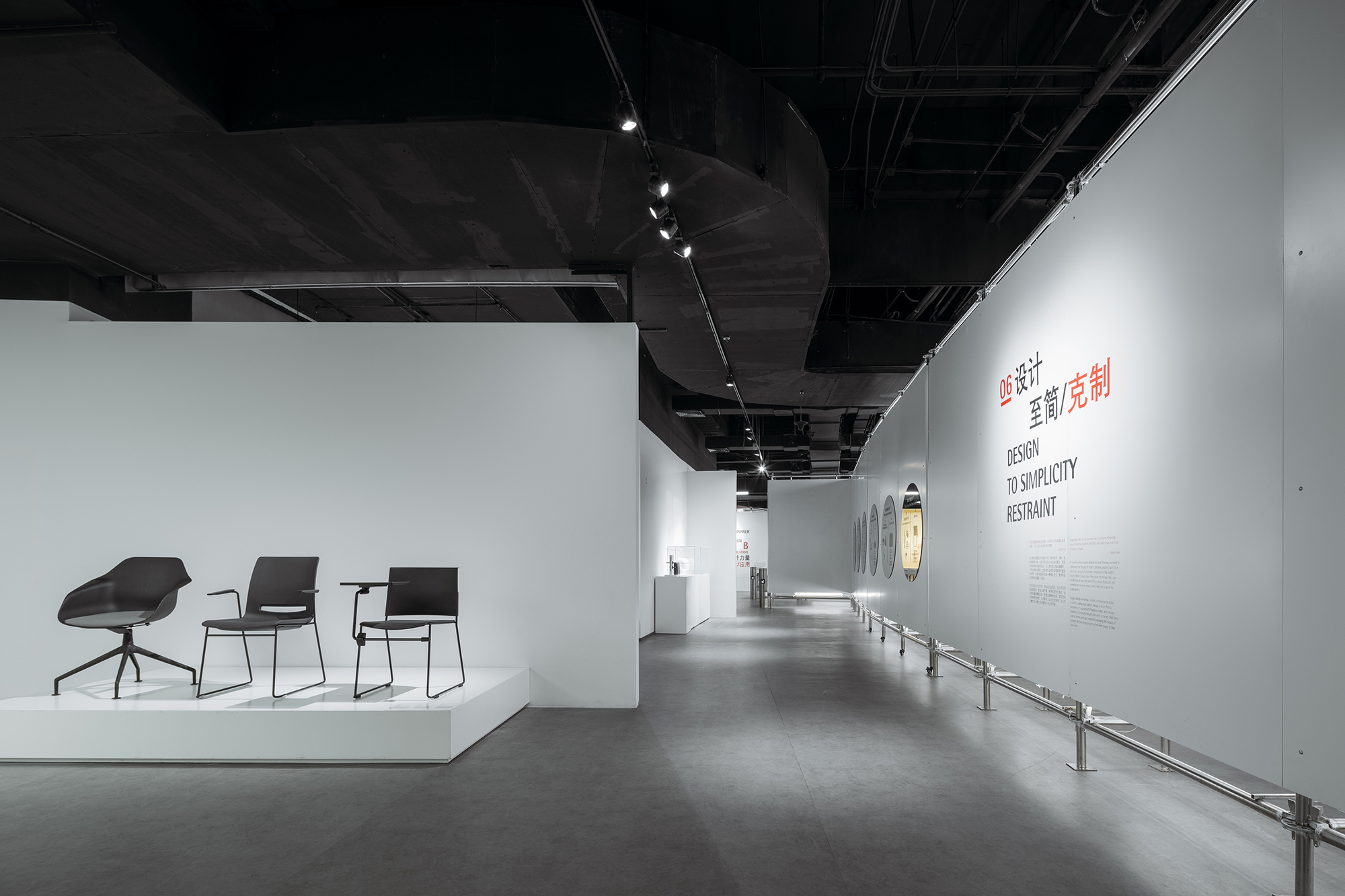
延续“向购物中心学习”:营造连续的漫游式参观体验,我们试图模糊展厅空间与非展厅空间的边界,令参观者仿佛置身于一个完整的、流动连续而富有变化的大展厅之中。而将空间分隔界面展览化、预制化是实现“没有墙的博物馆”两大设计策略。
To achieve the continuous wandering experience that we learn from shopping malls, we try to blur the boundaries between exhibition halls and other spaces, creating the sense of a big integral space without partitions. Exhibition-oriented and prefabricated boundaries are two strategies that we imply to achieve the goal of museum without walls.
▲博物馆作为完整连续的大展厅 © CreatAR Images (Ai Qing)
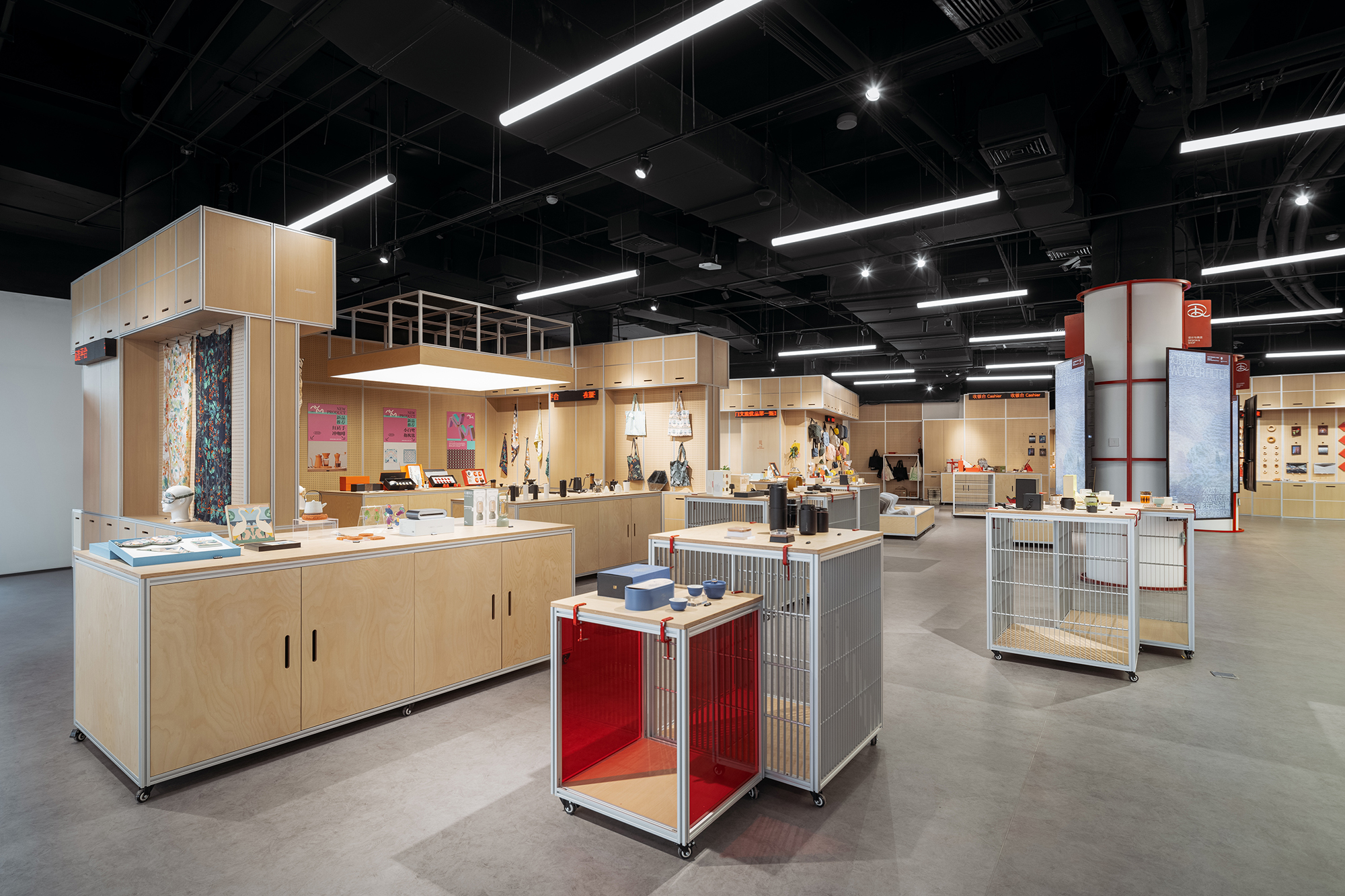
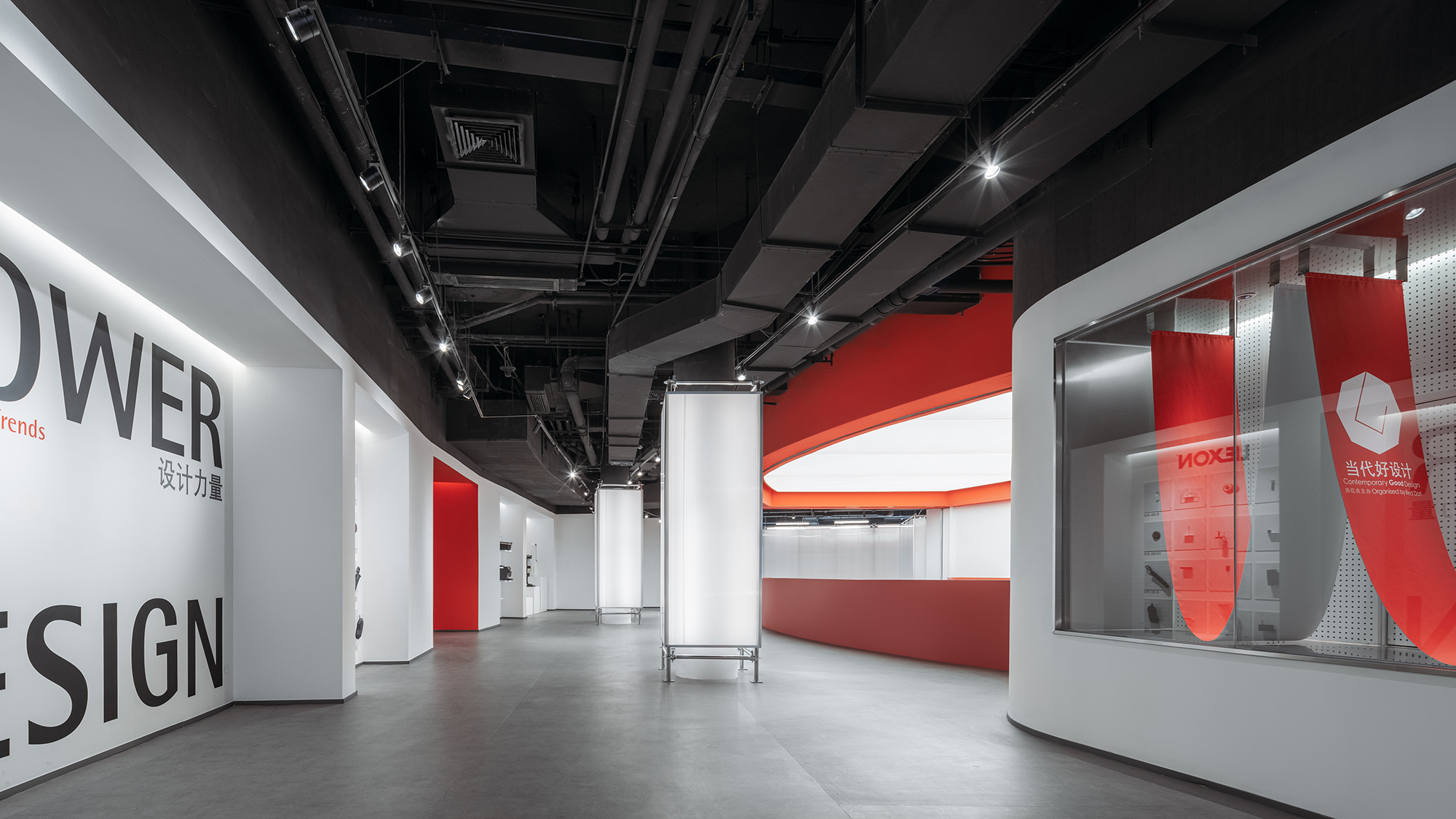
空间分隔界面展览化:我们在馆内各种过道空间的墙面上布置了大量形态各异的橱窗、洞口、洞洞挂板,赋予过道空间展览属性,使其成为免费展厅,对于参观者是一大福利,也为博物馆带来了商家品牌入驻橱窗的创收业务。
Exhibition-oriented boundaries: We place many showcases, openings and perforated panels in different forms on walls of corridors, giving these spaces the property of exhibition, making them free exhibition halls for viewers, and also bringing extra cash to the museum by leasing these showcases to companies.
▲零售空间的品牌入驻橱窗 © CreatAR Images (Ai Qing)
▲零售空间的商品展示橱窗 © CreatAR Images (Ai Qing)
▲零售空间作为免费展厅 © CreatAR Images (Ai Qing)
▲过道空间的橱窗、洞口 © CreatAR Images (Ai Qing)
▲过道空间的橱窗、洞口 © CreatAR Images (Ai Qing)
▲过道空间作为免费展厅 © CreatAR Images (Ai Qing)
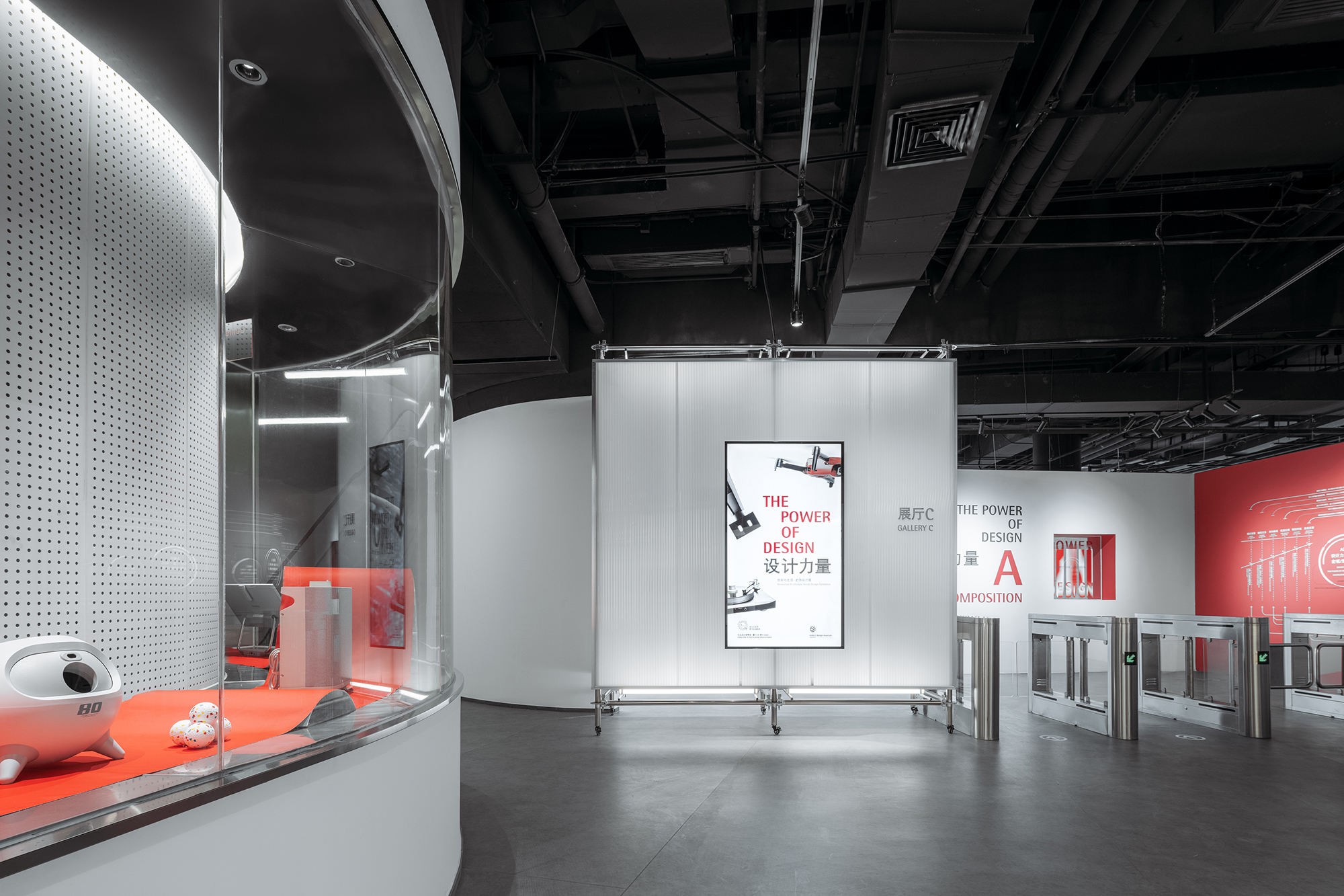
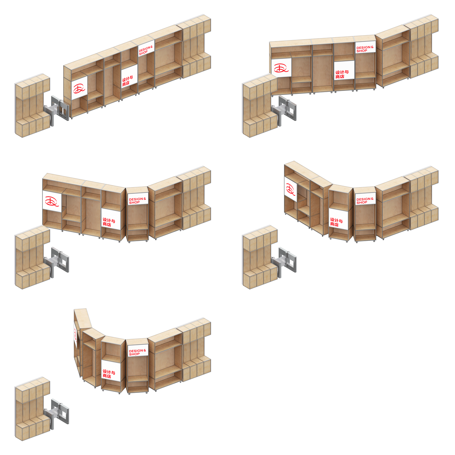
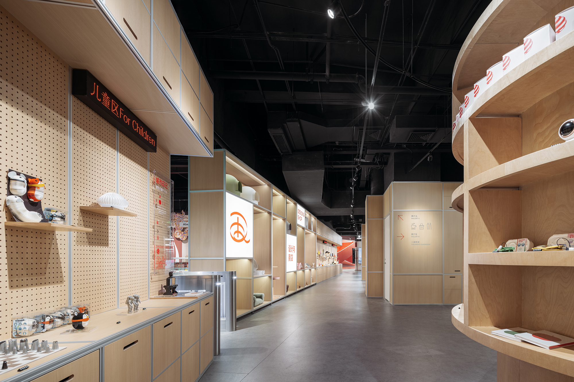
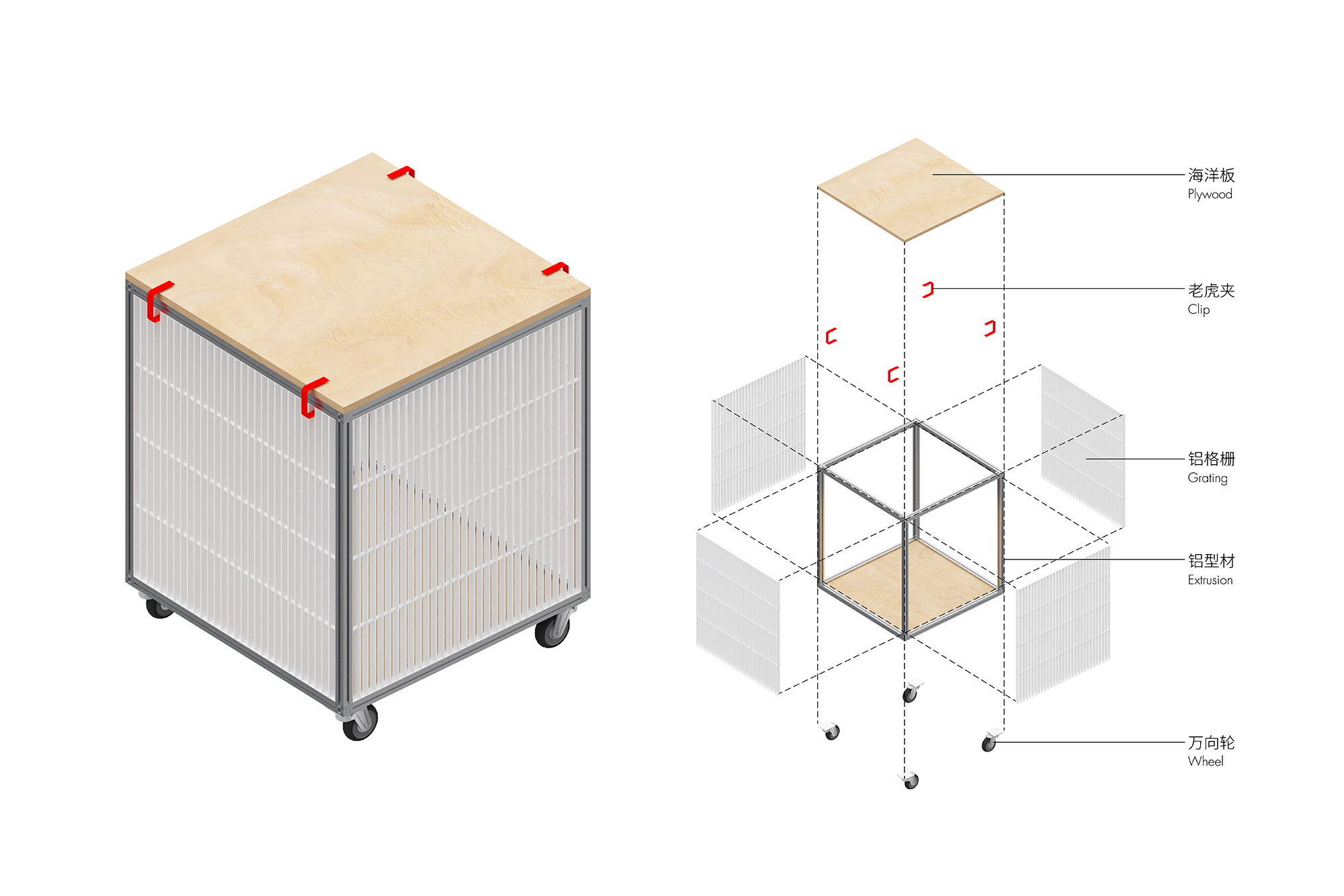
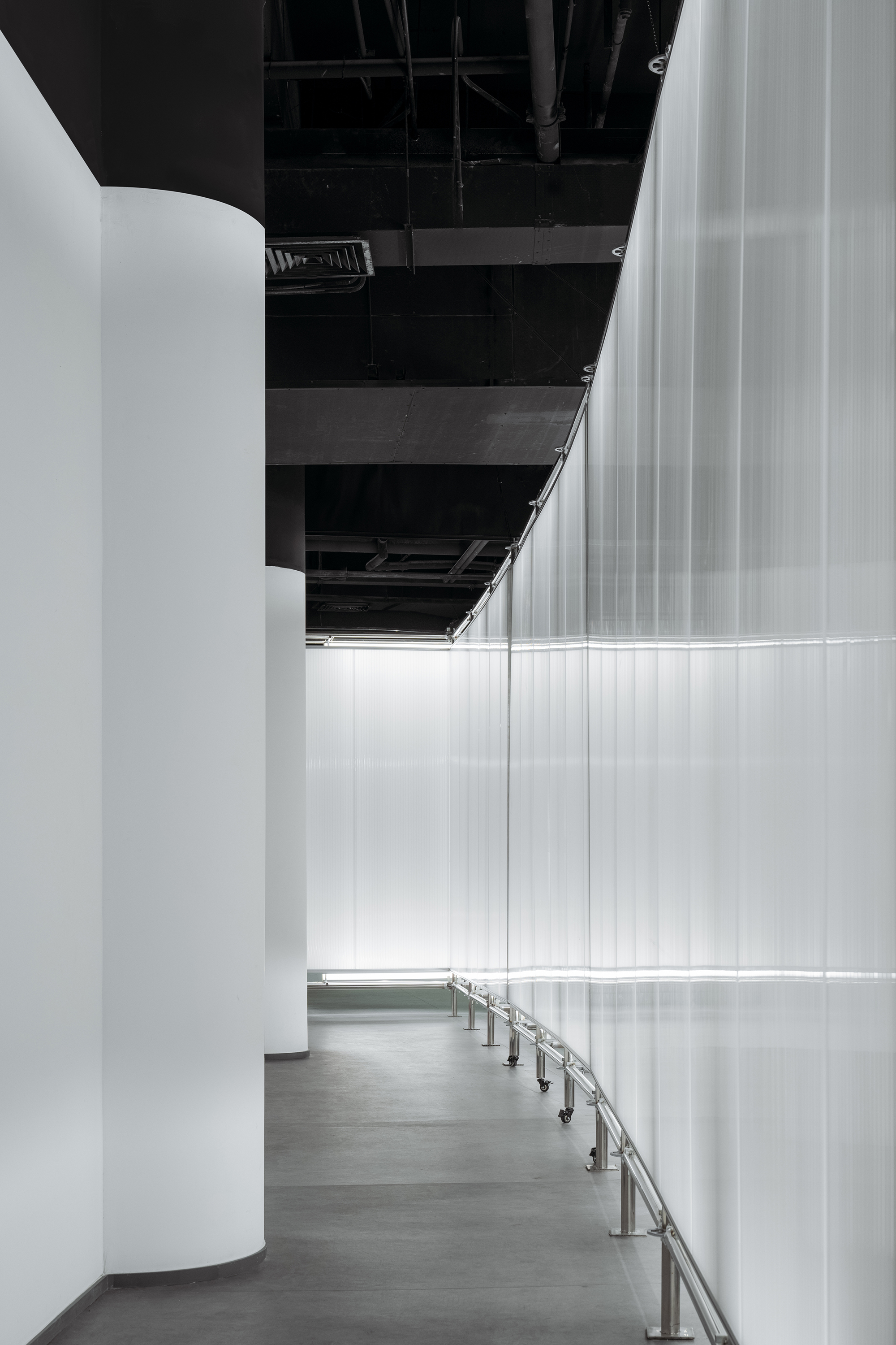
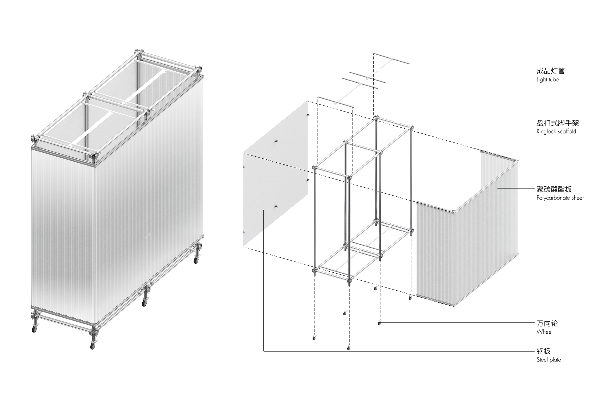
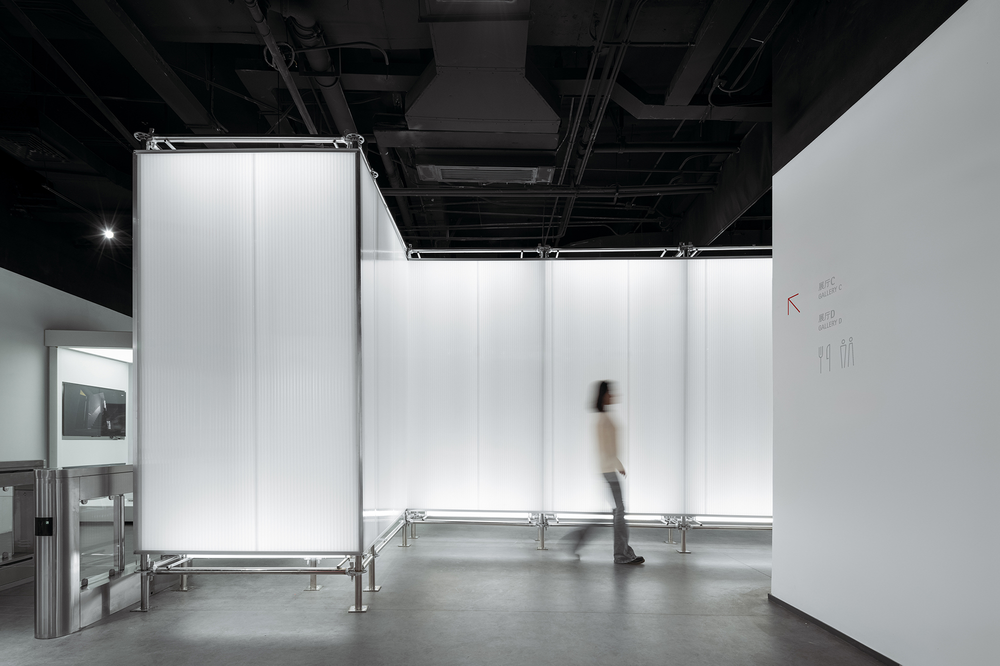
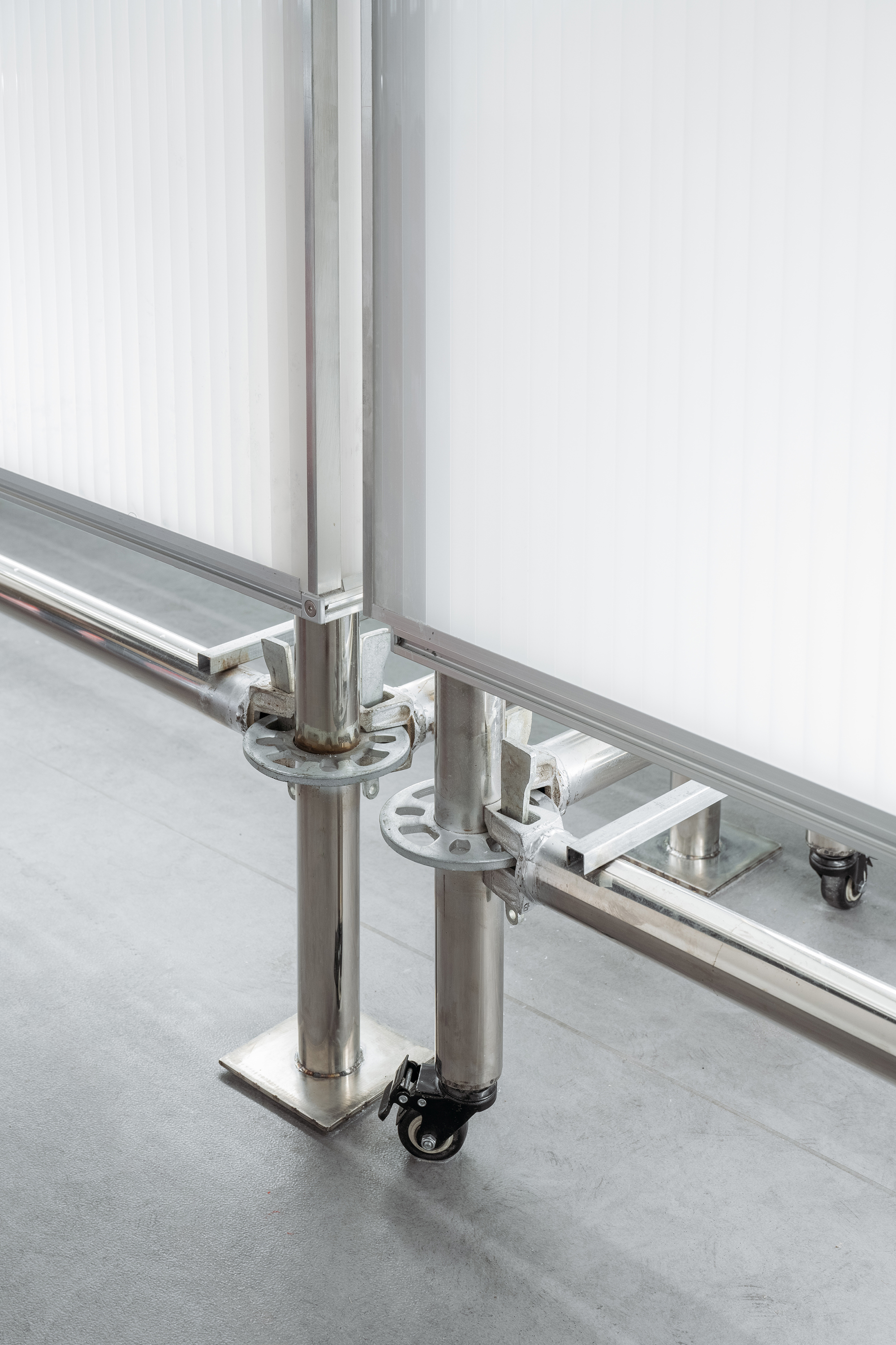
空间分隔界面预制化:我们运用工业设计的思维,采用脚手架等预制化元素替代了常规的实墙作为灵活多变的展厅边界,打破了传统盒子式的封闭展厅空间。一方面满足了灵活布展和展品运输的使用需求,一方面在紧张的预算和工期下,现场施工与工厂加工同步进行大大节省了时间,也因工业化零件可控度高,使空间品质更有保障,这也与红点设计奖作为工业设计产品奖的特点相契合。
Prefabricated boundaries: We imply the thinking mode of industrial design, using prefabricating elements such as scaffolding to replace walls of exhibition hall, thus breaking the sense of a closed box of exhibition space. On one hand this meets the need of flexible exhibition spaces and cargo shipping, on the other hand this saves tremendous time and cost due to the simultaneous work on site and in factory. Moreover, the overall quality of space is elevated due to high controllability of prefabrication, which also coincide with the spirit of Red Dot Design Award that recognizes the value in top-notch industrial design.
▲零售区柜体作为展厅边界,可旋转形成运货口 © STEPS大台阶建筑
▲零售区柜体作为展厅边界 © CreatAR Images (Ai Qing)
▲零售区柜体,采用铝型材框架,嵌入海洋板的形式,易于拆卸 © STEPS大台阶建筑
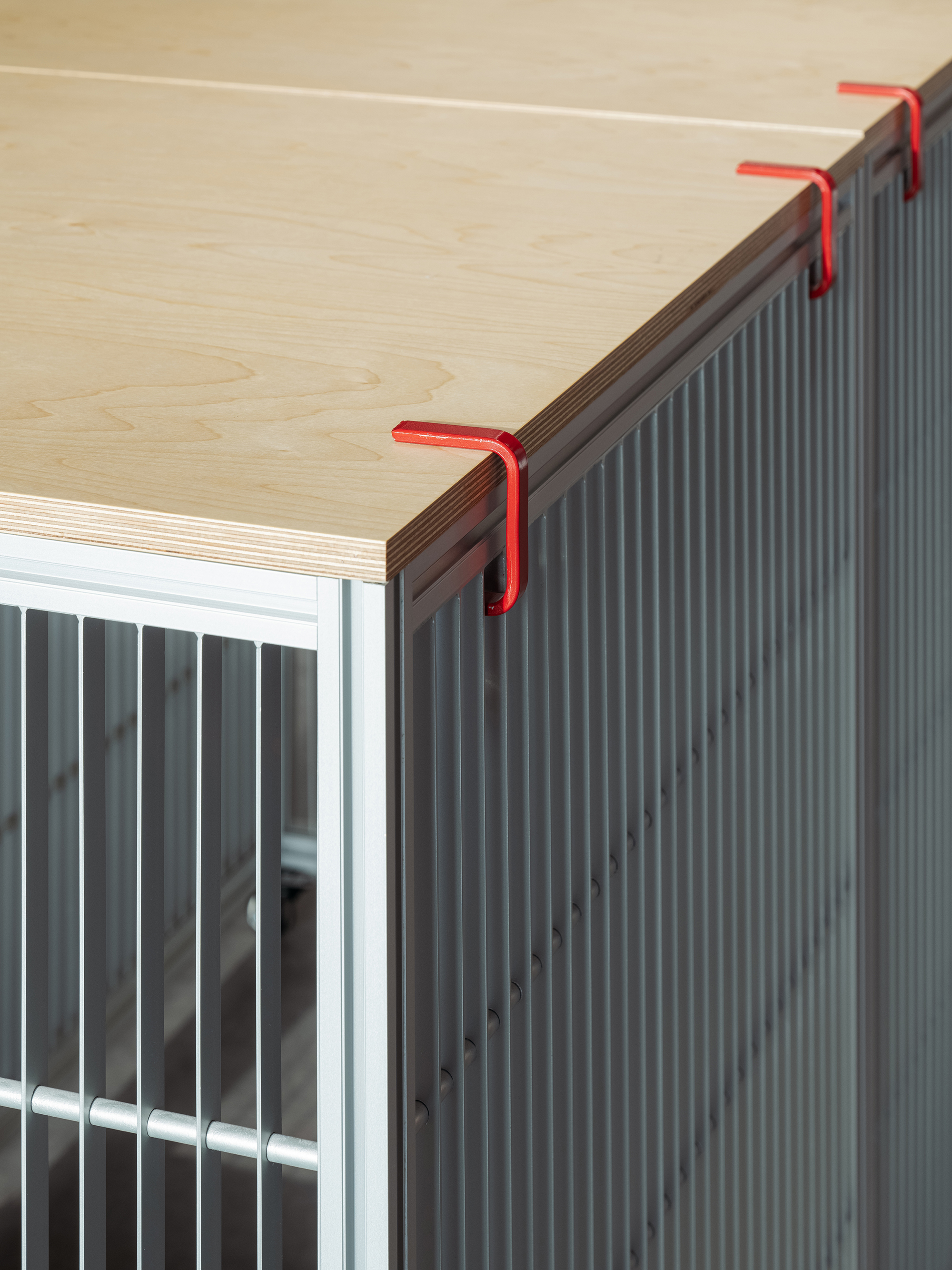
▲零售柜细节 © CreatAR Images (Ai Qing)
▲脚手架装置作为展厅边界,可挪动形成运货口 © STEPS大台阶建筑
▲脚手架装置作为展厅边界 © CreatAR Images (Ai Qing)
▲脚手架装置,靠展厅侧包裹白色钢板作为展板,靠走道侧包裹聚碳酸酯板作为灯箱 © STEPS大台阶建筑
▲脚手架外侧聚碳酸酯板作为走道灯箱 © CreatAR Images (Ai Qing)
▲脚手架内侧白色钢板作为展厅展板 © CreatAR Images (Ai Qing)
▲脚手架装置细节 © CreatAR Images (Ai Qing)
04面向未来的设计
04 Design for the future
除了全程参与新馆的策划、设计、施工,我们也协助了博物馆未来的运营规划,并提供了部分展览设计。红点设计奖作为设计行业标杆,肩负着培养下一代优秀设计师的使命。“教育”是新馆业务及运营规划中的重点板块。
Apart from planning, design and construction, we also participate in planning the future operation of the museum, and provide exhibition design. As the leader in the field of design, Red Dot Design Museum serve as the platform where next generation of designers grow. Education plays an essential role in museum’s operation.
红点设计学院为业内设计师提供培训及交流的场地,不定期举办课程、论坛等活动。为了适应丰富的使用场景需求,我们设计了灵活的多功能剧场式看台,座位与旋转桌板均可拆卸。
Red Dot Design School provides space for sessions, forums and conferences for designers to learn, communicate and social. To accommodate such various activities, we design flexible theater-like seatings on which the rotating table plate and seats could be disassembled and reassembled.
▲可举办多种活动的设计学院 © CreatAR Images (Ai Qing)
▲灵活的多功能剧场式看台 © CreatAR Images (Ai Qing)
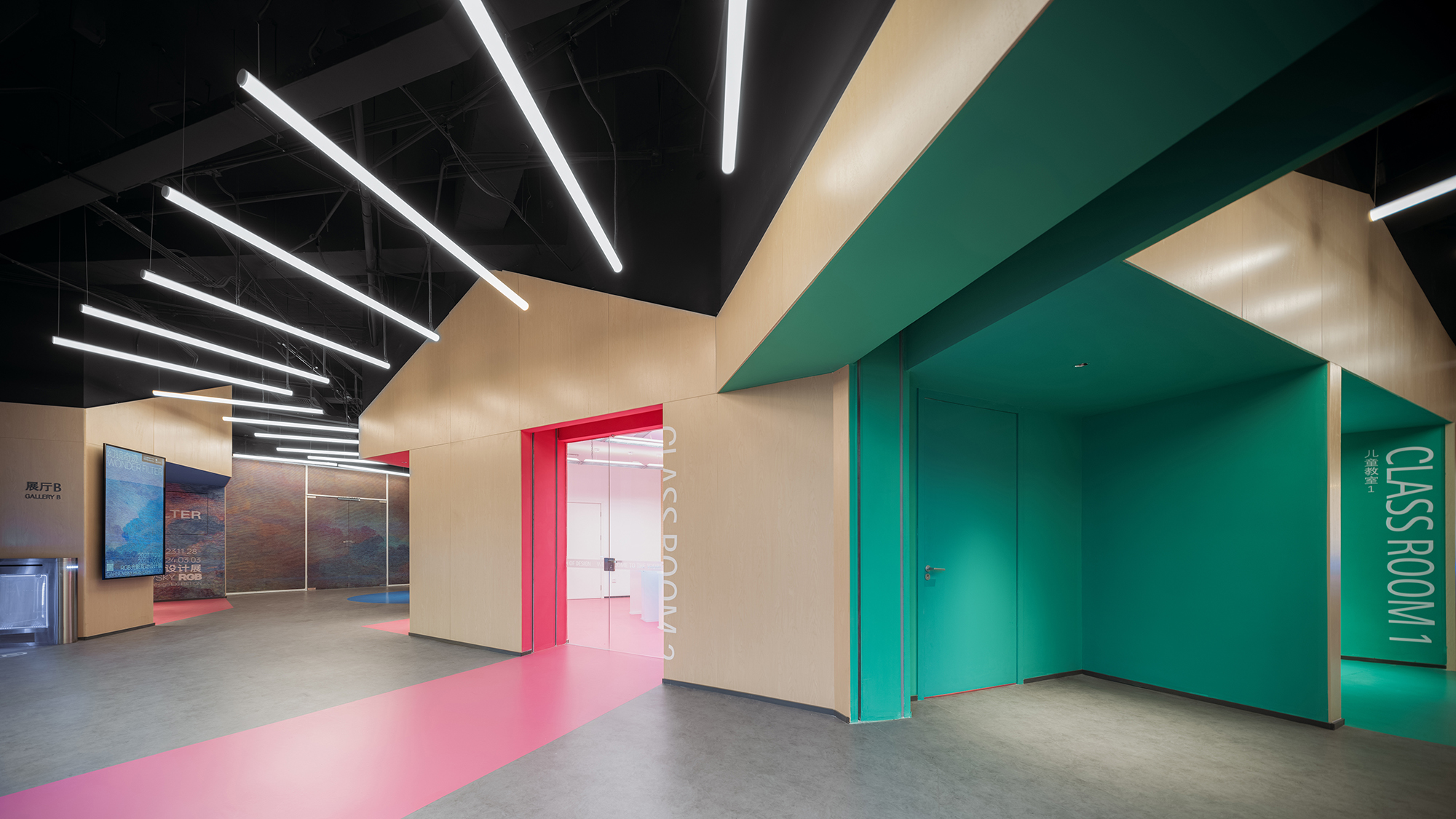
儿童区是相对独立的区域,包含教室及展厅。我们将儿童教室打造成三个不同主题色的小木屋,通过体块切割产生类似橱窗的界面展示空间,可用来展示小朋友的设计作品。通透的教室空间亦可根据展览需要作为免费迷你展厅。
The section of museum space for children is relatively independent, including children’s classrooms and exhibition hall. We design three distinct “wood cabins” that vary in color for the three classrooms, the mass of the cabins is cut to create openings that serve as showcases for children’s artwork. The transparent classrooms also serve as free exhibition spaces when needed.

 ▲小木屋般的儿童教室 © CreatAR Images (Ai Qing)
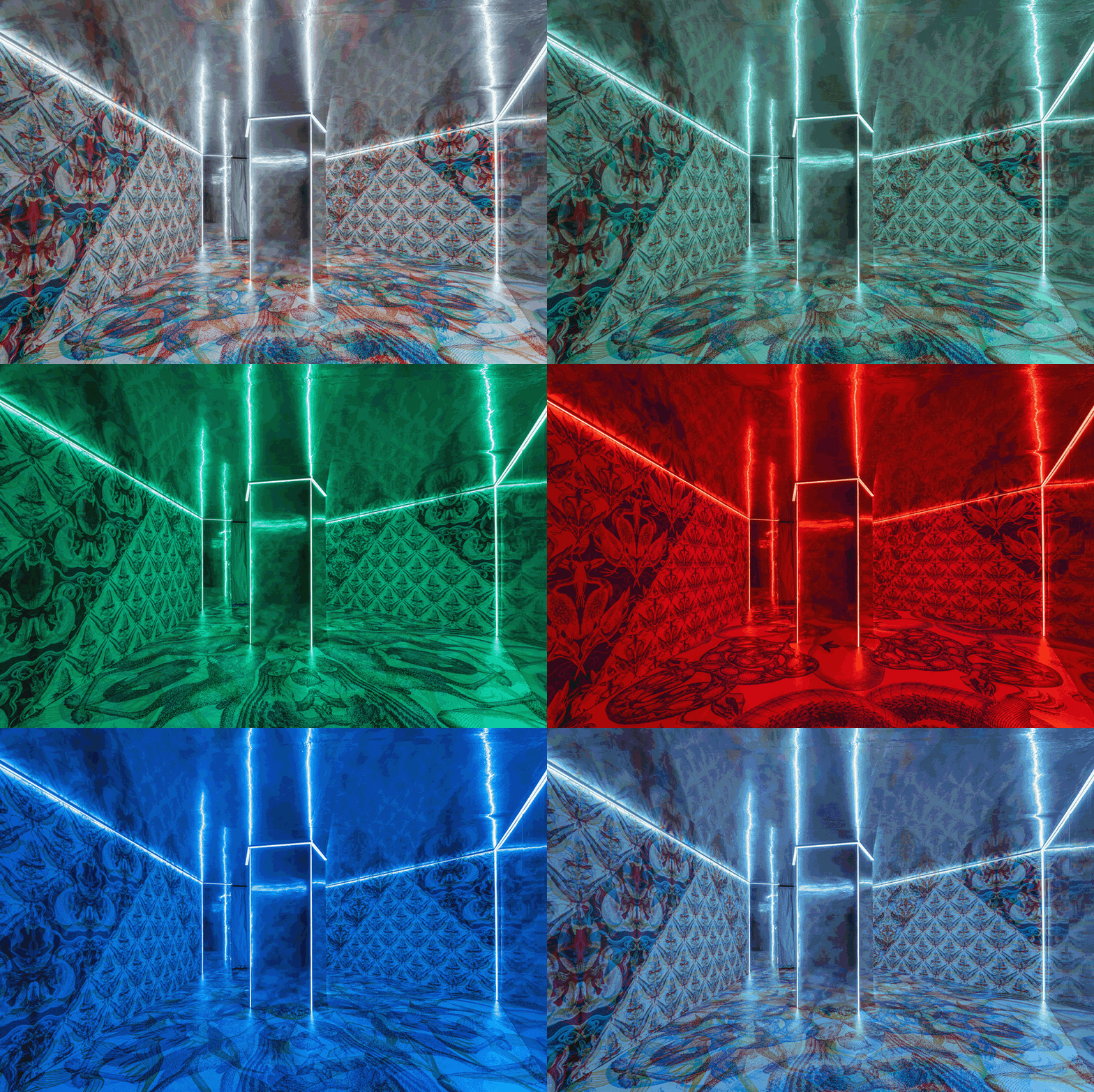
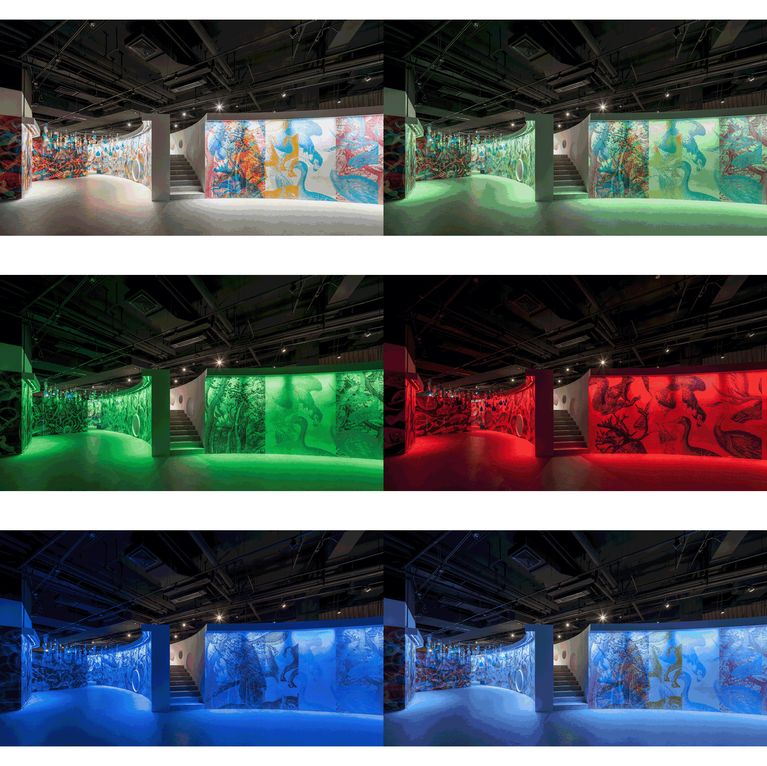
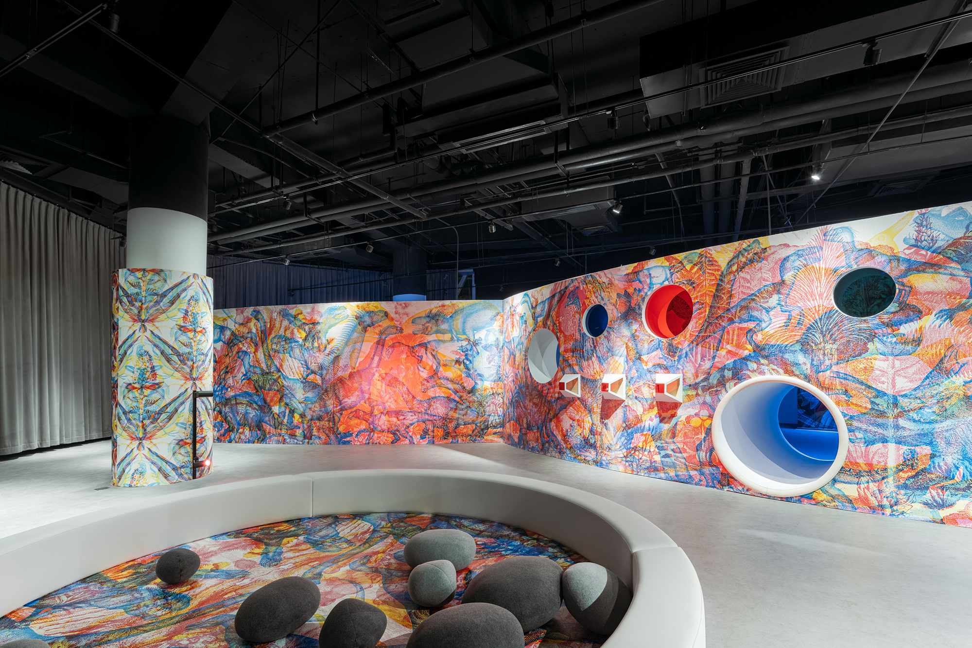
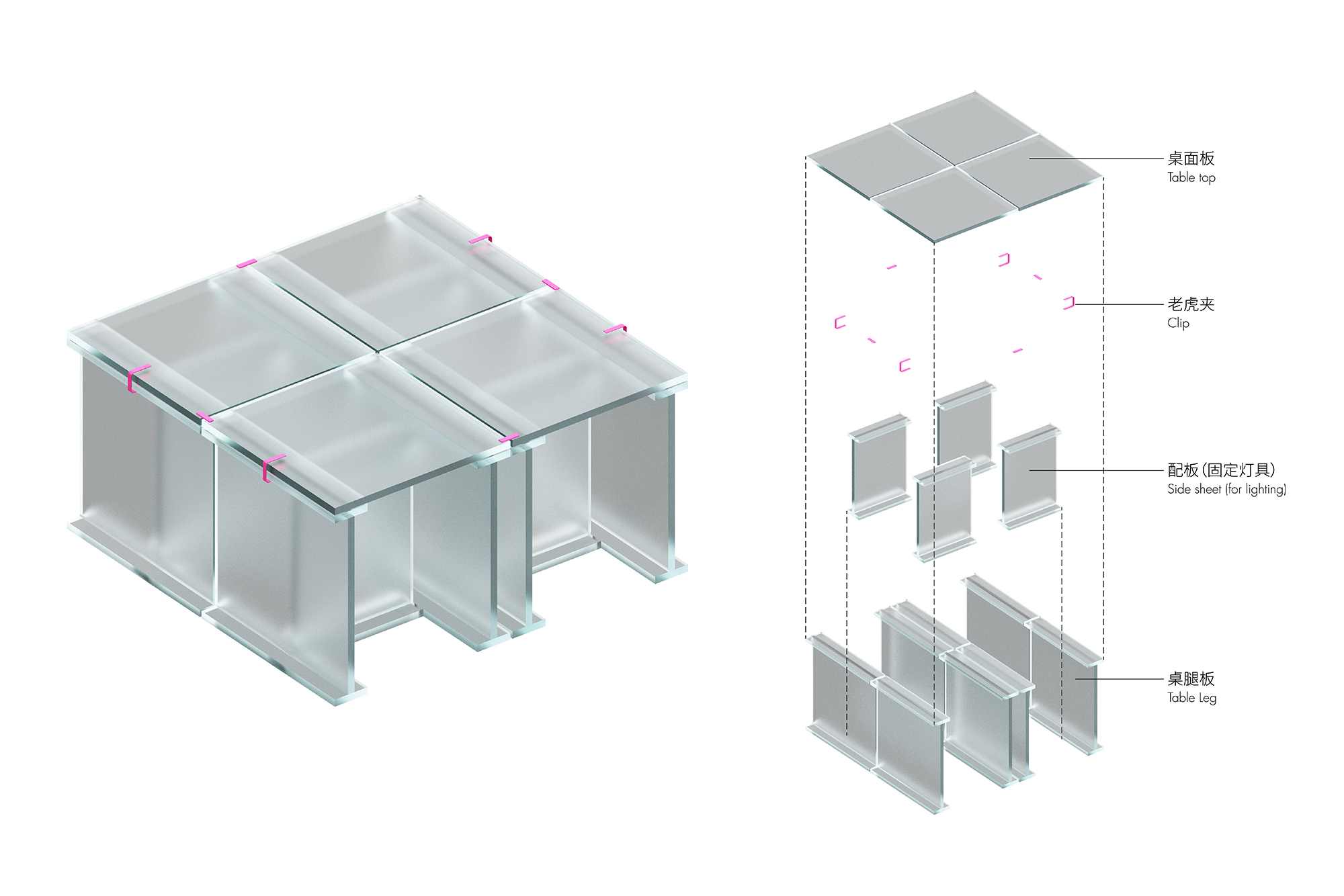
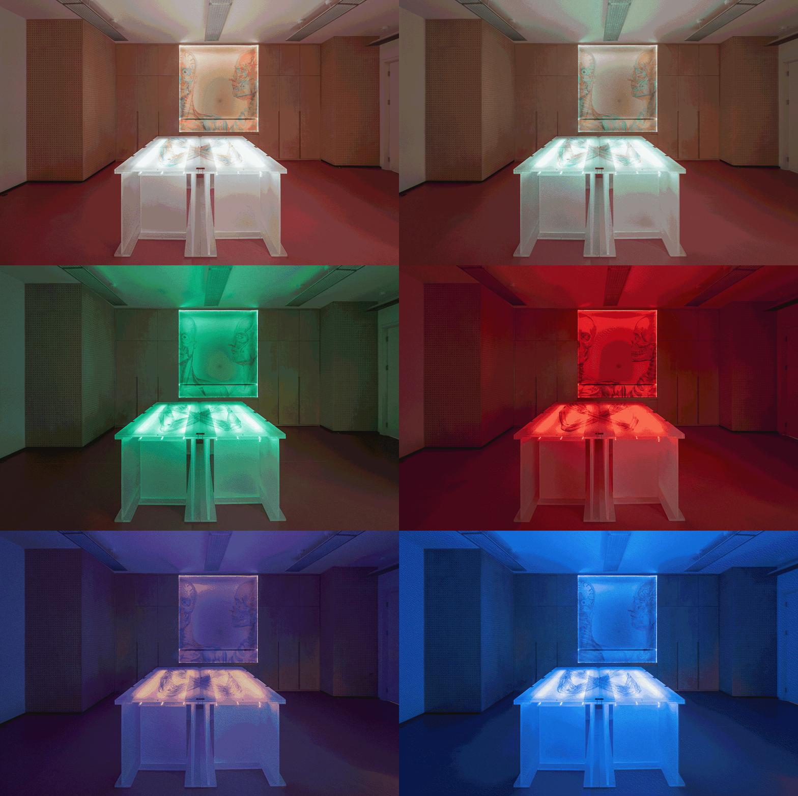
我们为儿童展厅设计了开馆展览——幻镜奇迹:RGB光影互动设计展。欧洲艺术家团队基于RGB原理,将红蓝绿三种颜色的插画交叠在一起,通过光色的变化产生绚丽多变的画面。我们设计了多种观看方式:通过LED灯光让空间在红蓝绿三色中切换,或通过墙面彩色洞口观看等,形成丰富的空间体验。考虑到小朋友贪玩的天性,我们通过设置夹层、洞口、台阶、滑梯,让游戏空间和展览空间融合,寓教于乐。此外,我们为儿童展厅设计了一套特殊展具,透光的磨砂亚克力板由彩色连接件可拼成各种形式,方便组合及存放。
We design the exhibition for children’s exhibition hall during museum opening——Wonder Filter, RGB Interactive & Design Exhibition. Based on RGB principles, Artists in Europe overlap patterns in three colors, creating psychedelic effects when color of light changes. We design multiple ways of viewing wall patterns: through ever-changing LED lighting that shift in RGB, and through wall openings that vary in color, creating dynamic spatial experiences. We also design a serious of mezzanine, openings, steps and sliding for children to explore, thus combining education with fun. Moreover, we design a unique set of exhibition furniture, frosting acrylic panels are easily assembled and disassembled with colorful connectors, creating various forms.
▲游戏空间和展览空间的结合 © CreatAR Images (Ai Qing)
▲儿童展厅展具构造 © STEPS大台阶建筑
▲透光的亚克力展具 © STEPS大台阶建筑
▲亚克力展具细节 © CreatAR Images (Ai Qing)
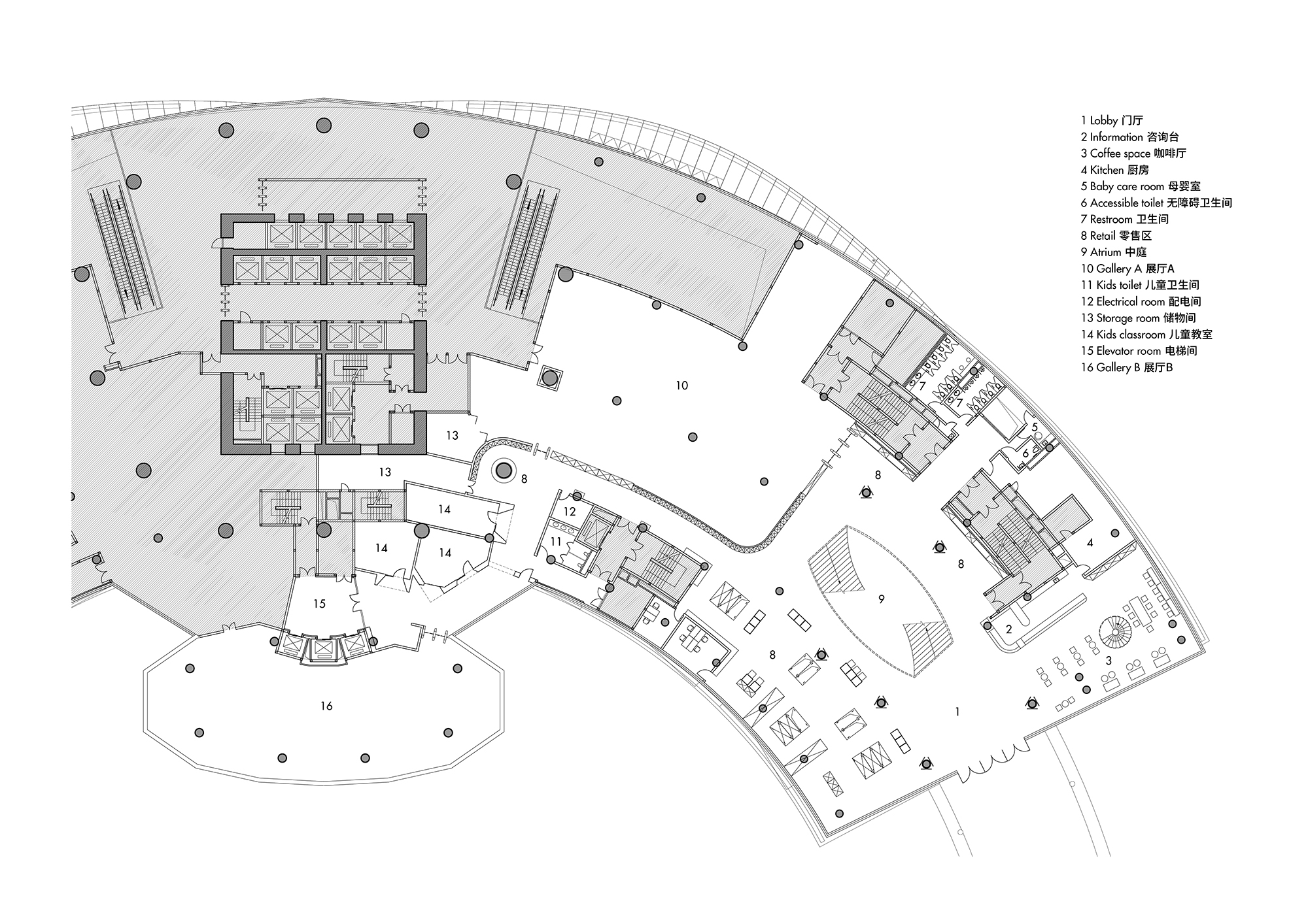
▲二层平面图 © STEPS大台阶建筑
▲三层平面图 © STEPS大台阶建筑
项目信息——
项目名称:红点设计博物馆·厦门
项目类型:建筑改造、室内设计
设计方:STEPS大台阶建筑、协作派对
公司网站:www.stepsarc.com
联系邮箱:info@stepsarc.com
完成年份:2023
主创设计:吴俣、季子潇
设计团队:蔡凯(协作派对)、李晨澍(协作派对)、陈岩平(协作派对)、曾天(协作派对)、赵月铭、李弢、赵蕙、王凯平、程广晓、闫瑞琪、刘羽、Sadiq、王博、时露航、李春蓉等。
设计咨询:北京炎黄联合国际工程设计有限公司
施工图:福建省博意建筑设计有限公司
施工方:福建兴港建工有限公司
代建方:厦门市政城市开发建设有限公司
项目地址:福建省厦门市集美区杏林湾路502号诚毅国际商务中心
建筑面积:8,000㎡
摄影版权:CreatAR Images (Ai Qing)
照明设计:Lumia Lab麓米照明设计
导视设计:out.o studio 再平面
多媒体设计:协作派对
订制家具设计:STEPS大台阶建筑、协作派对
展览设计:STEPS大台阶建筑、协作派对、韦田设计有限公司
客户:红点设计(厦门)品牌运营有限公司
材料:氟碳喷漆、海洋板、聚碳酸酯板、PVC地胶
Project Information——
Project name: Red Dot Design Museum · Xiamen
Project type: Renovation, interior design
Design: STEPS Architecture, Network Party
Website: www.stepsarc.com
Contact e-mail: info@stepsarc.com
Completion Year: 2023
Leader designer: Wu Yu, Ji Zixiao
Design team: Cai Kai (Network Party), Li Chenshu (Network Party), Chen Yanping (Network Party), Zeng Tian (Network Party), Zhao Yueming, Li Tao, Zhao Hui, Wang Kaiping, Cheng Guangxiao, Yan Ruiqi, Liu Yu, Sadiq, Wang Bo, Shi Luhang, Li Chunrong
Project location: Chengyi International Business Center, No. 502, Xinglinwan Road, Jimei District, Xiamen, Fujian
Gross built area: 8,000㎡
Photo credit: CreatAR Images (Ai Qing)
Lighting design: Lumia Lab
Wayfinding design: out.o studio
Multi-media design: Network Party
Millwork design: STEPS Architecture, Network Party
Exhibition design: STEPS Architecture, Network Party, Weitian Design
Clients: Design China ltd.
Materials: Fluorocarbon paint, plywood, PC sheet, PVC flooring


