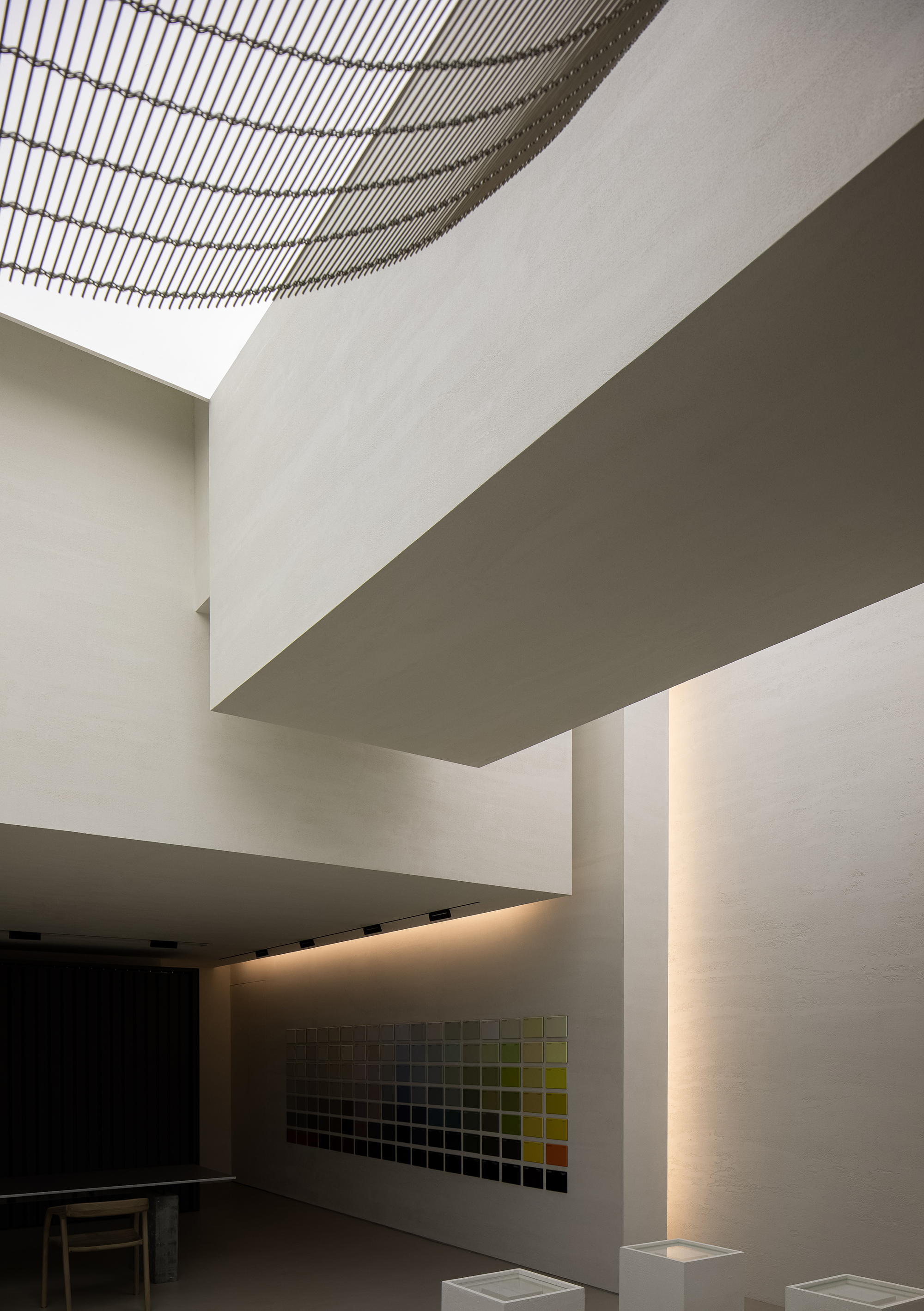
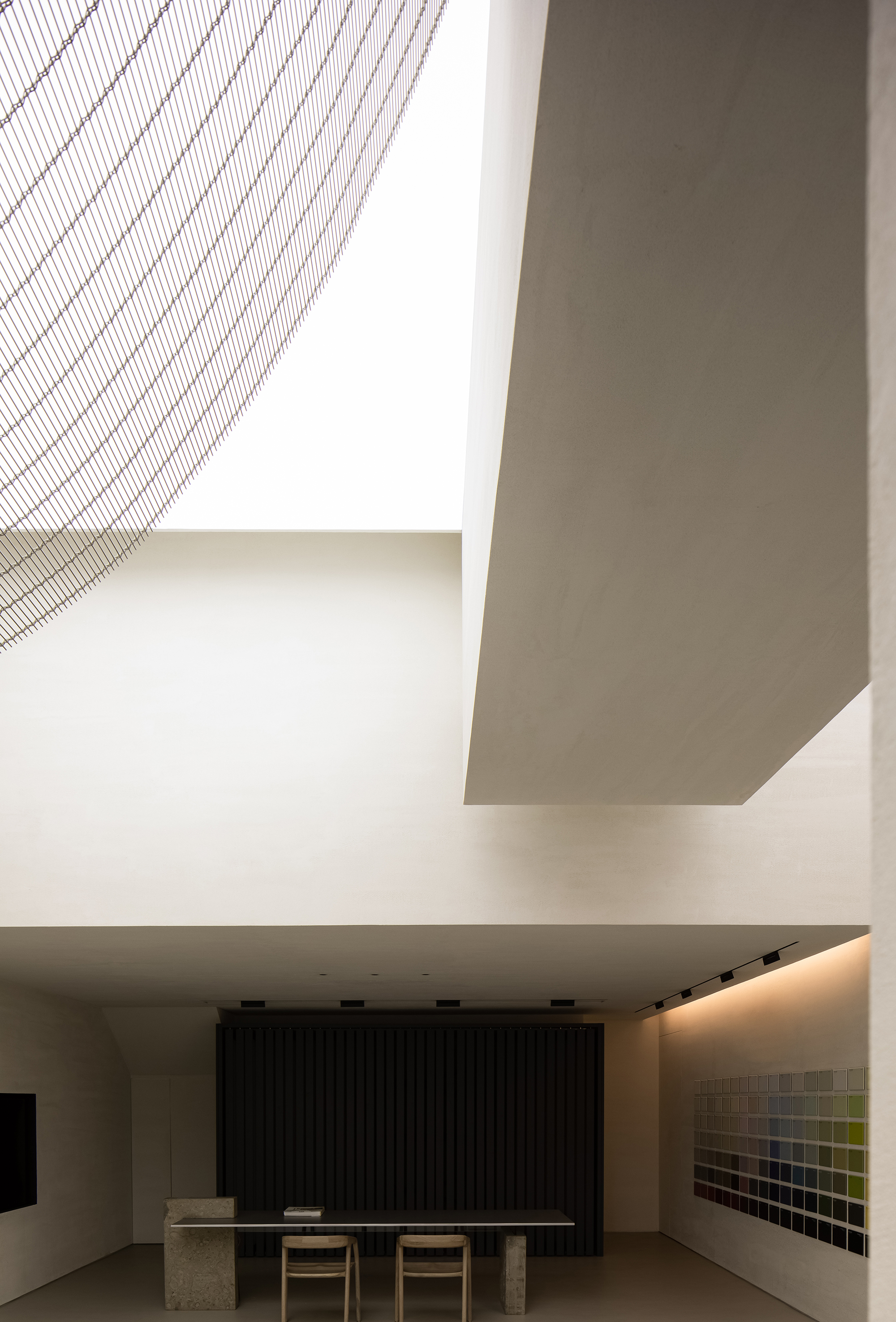
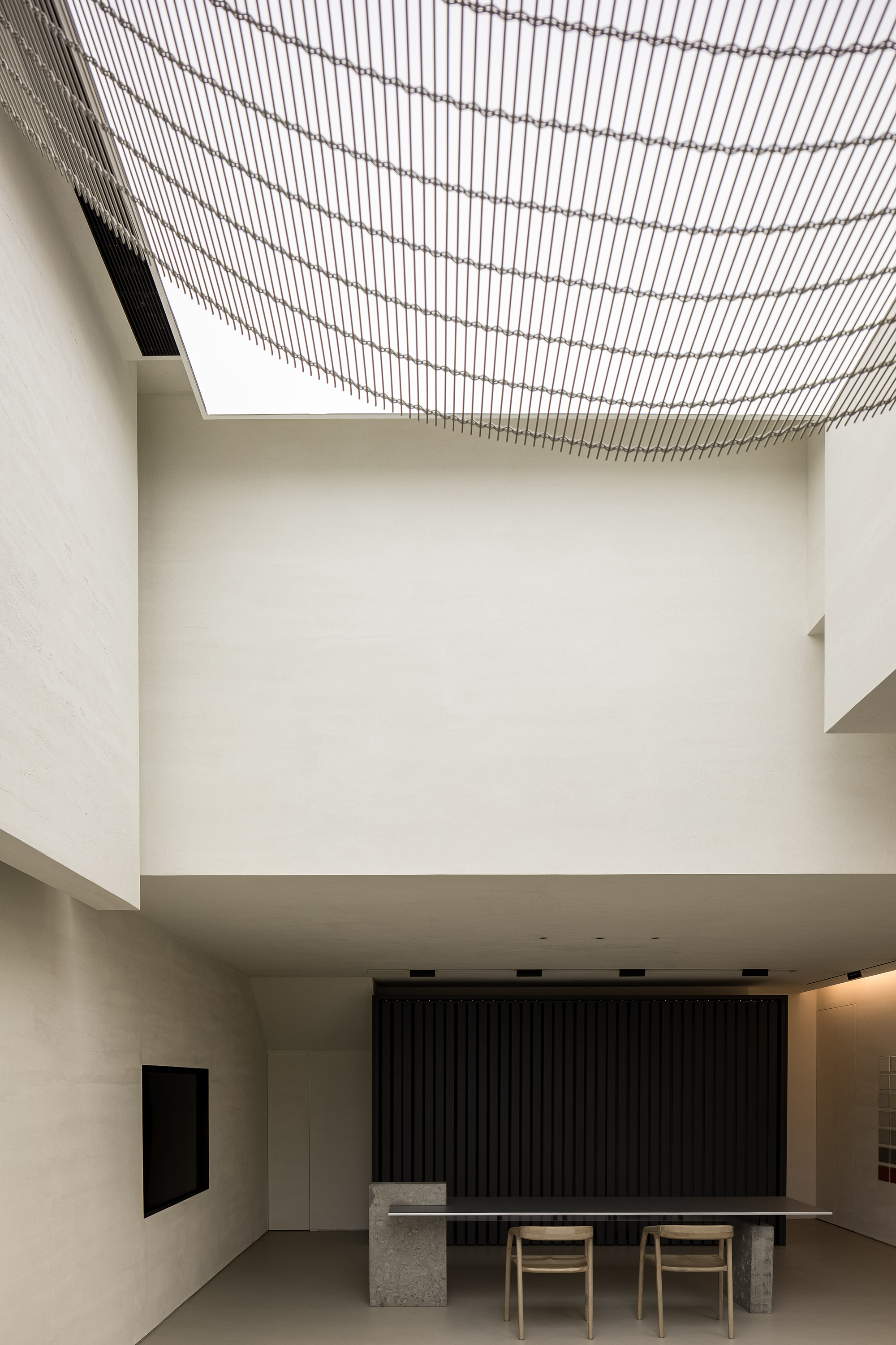
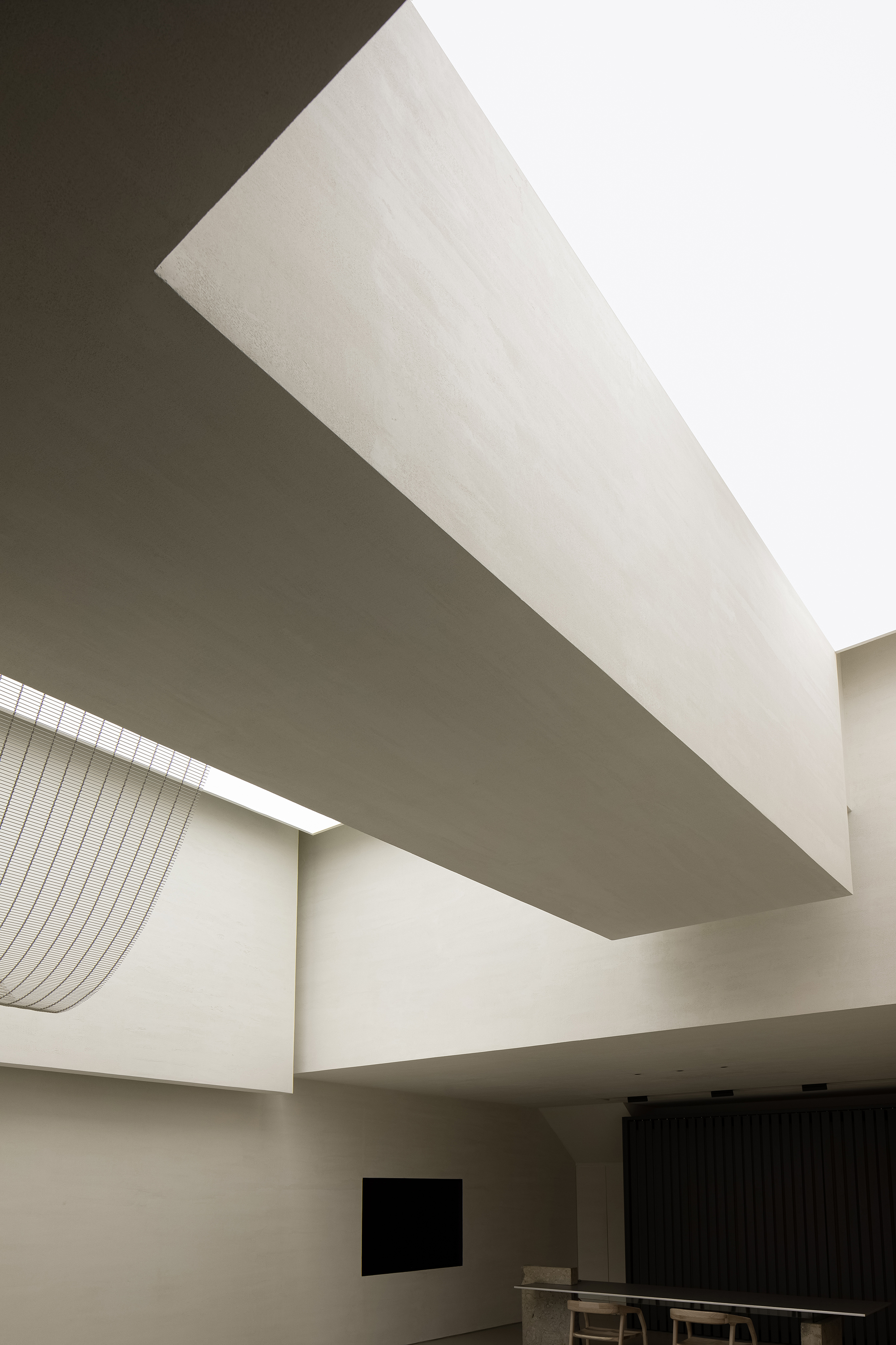
本案是一个以意大利TULLIO涂料产品展示的展厅。位于当地一个最集中的材料商场次入口附近,周围店面设计以广告位,金属不锈钢,大理石,玻璃等为构成要素,充斥着浓烈与过去式的商业气息。
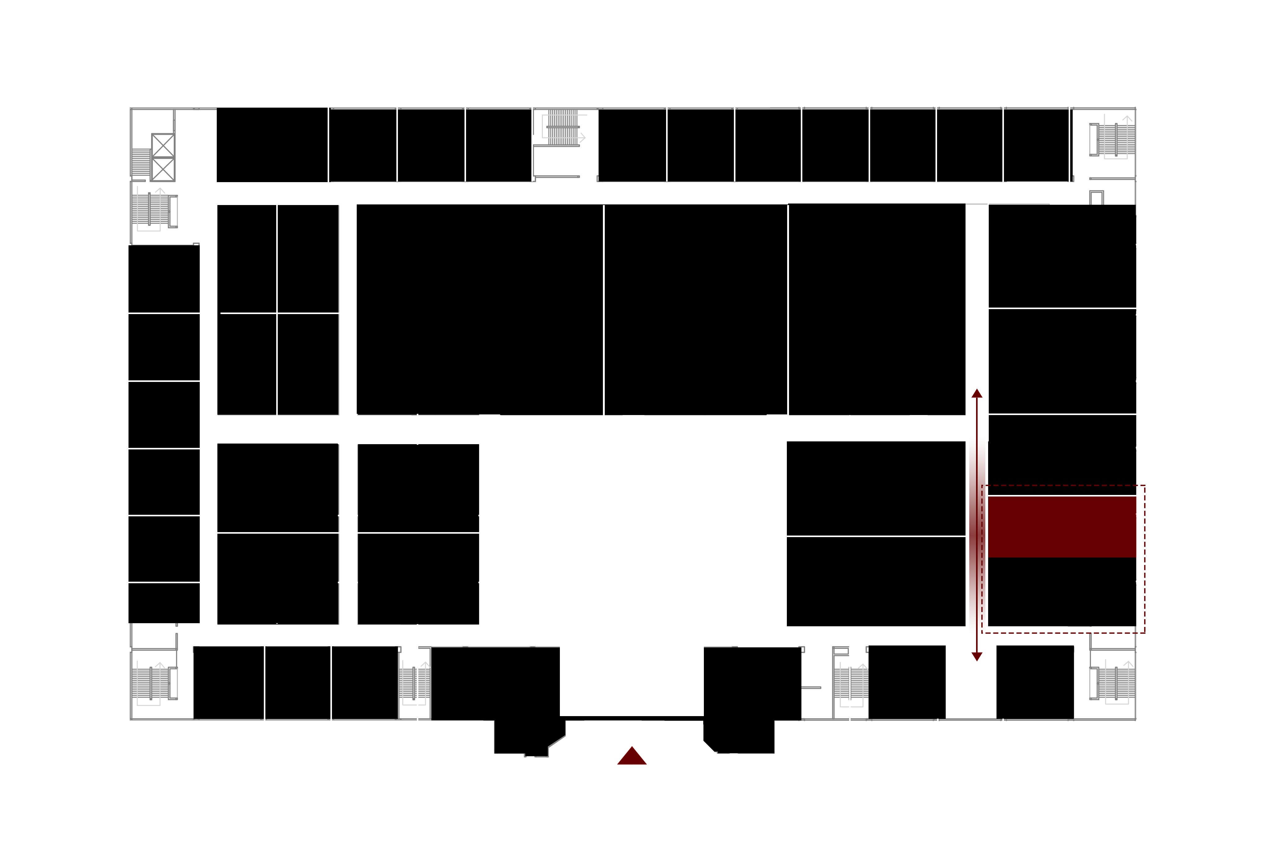
ANBONG HOME is a showroom for Italian paint brand TULLIO, situated within a building materials mall in Shantou, China. It‘s next to the secondary entrance of the mall. The design of its surrounding stores features many common elements such as signboard, stainless steel, marble and glass, and shows an old-fashioned style and strong commercial atmosphere.
项目还没开始就遇到了一个让业主很纠结的问题:两个不同品牌,不同的业主要将这个场地一分为二,合租一个店面,各自经营,而我们的甲方也是只能选处于内部视线比较差的位置,这严格来讲不是一个店面,而是半个店面,而且是剩余下来的部分。这个无疑是给设计丢来了一个大大的难题,也是业主一直犹豫要不要去租下店面的原因。如何引流与打破原空间的缺点是我们设计需要解决的问题与挑战。
Before the launch of the project, the client was hesitating about renting the site, which is a shop space shared by two tenants. The half space available for the client is at the more inner area, which offers poor visibility. This posed a great challenge to the design – that’s why the client wavered over whether to rent the space or not. For the design team, the challenge was to figure out how to break the restrictions of the original space and attract customers.
与周边环境的关系
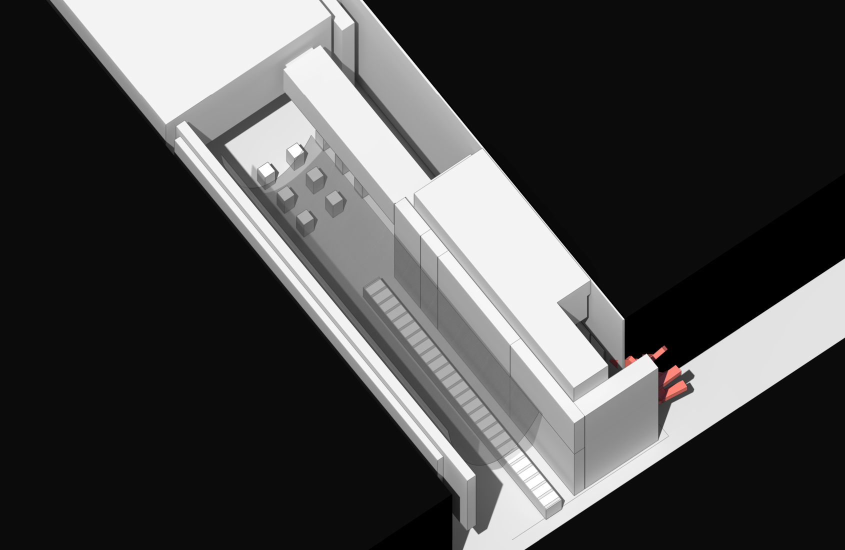
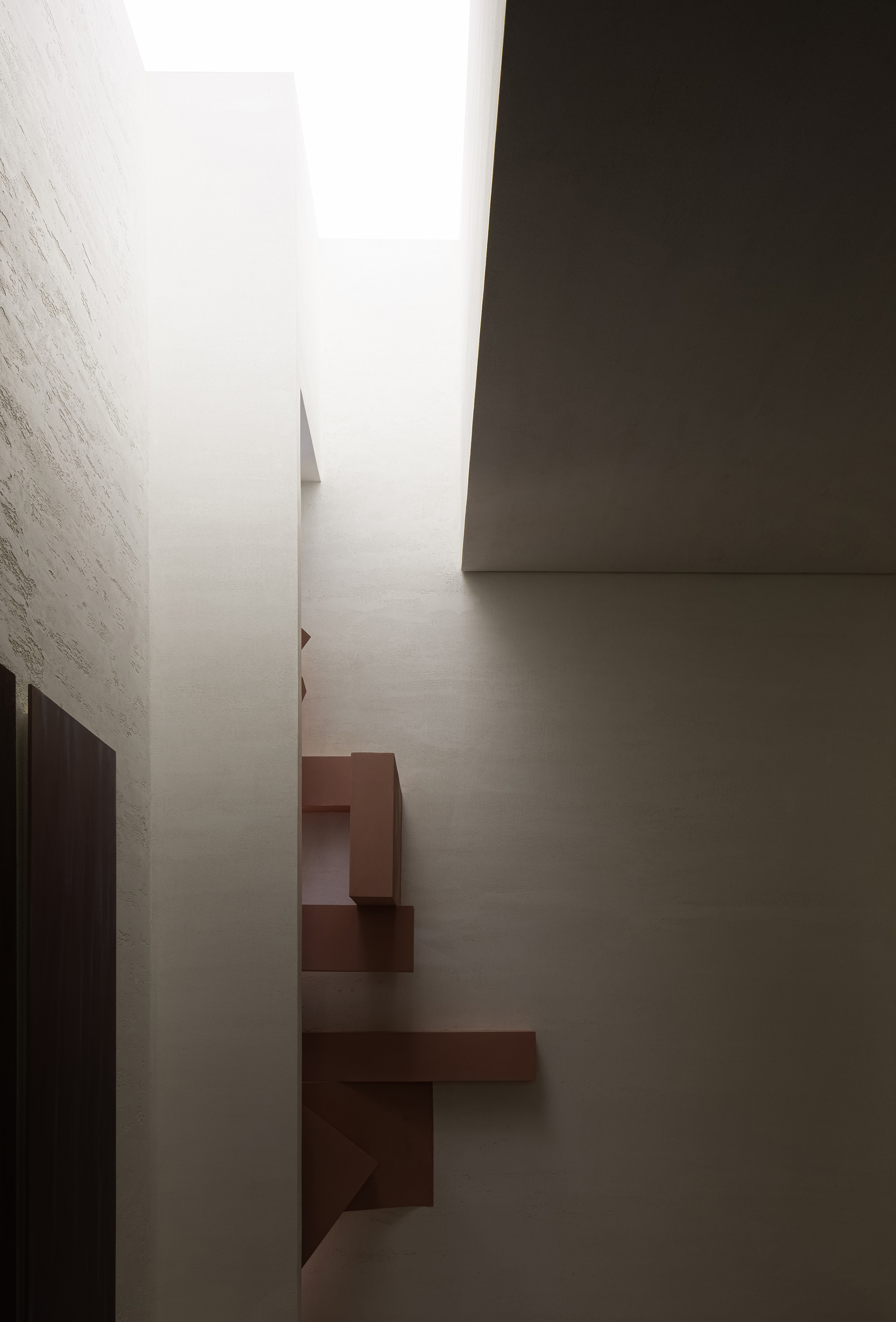
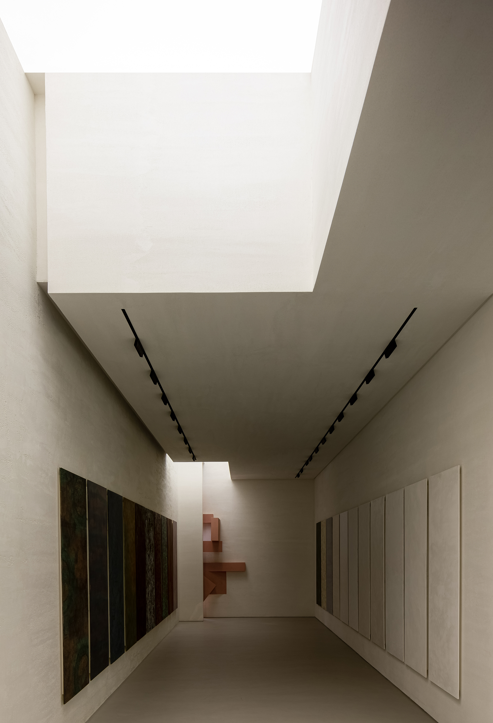
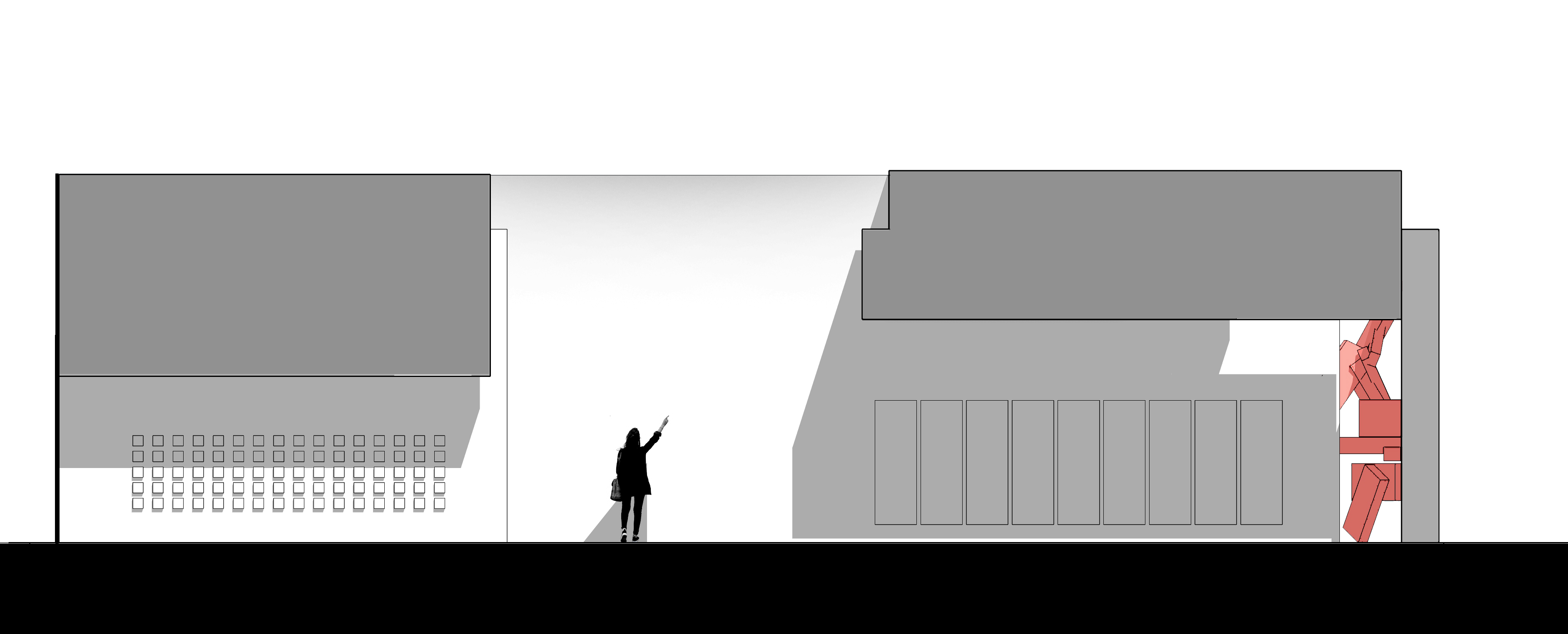
由于位置条件的缺失,我们的业主与共同承租店面的另外一个品牌的业主进行商讨,通过让其退让的方式让我们的店面给进入商场的人可以第一时间看到,给我们留出了立体的区域,在设计上我们采用了粉色的形体让人产生强烈的视觉磁场,以弥补位置的缺失。
To tackle with the unfavorable position, the client communicated with the other tenant, who finally gave in and leaved an area, which opens up the view to the inner showroom. AD ARCHITECTURE adopted pink structures in this area, to produce strong visual effects and attract sight lines of customers.
人总是能在跳出习惯的时刻获得惊喜,而这种惊喜的差异化是我们一手策划的···
As conceiving ANBONG HOME, the designers tried to break with conventions and create the unexpected.
人从大门进从次入口出,经过了这些前面的店后,我们需要给人透气的空间,让人经过前方旧商业气息的轰炸后有一个新的发现,这种感觉就像一个人穿梭在都市中,眼前突然出现一片没有尽头的草原,会产生兴奋的状态。
Customers enter the mall through the main entrance and walk out via the secondary entrance, which is close to the project site. After they passed through plenty of old-fashioned stores, they will encounter with ANBONG HOME, which is a big surprise. It feels like that someone suddenly meets an endless and exciting prairie after a long journey in the city.
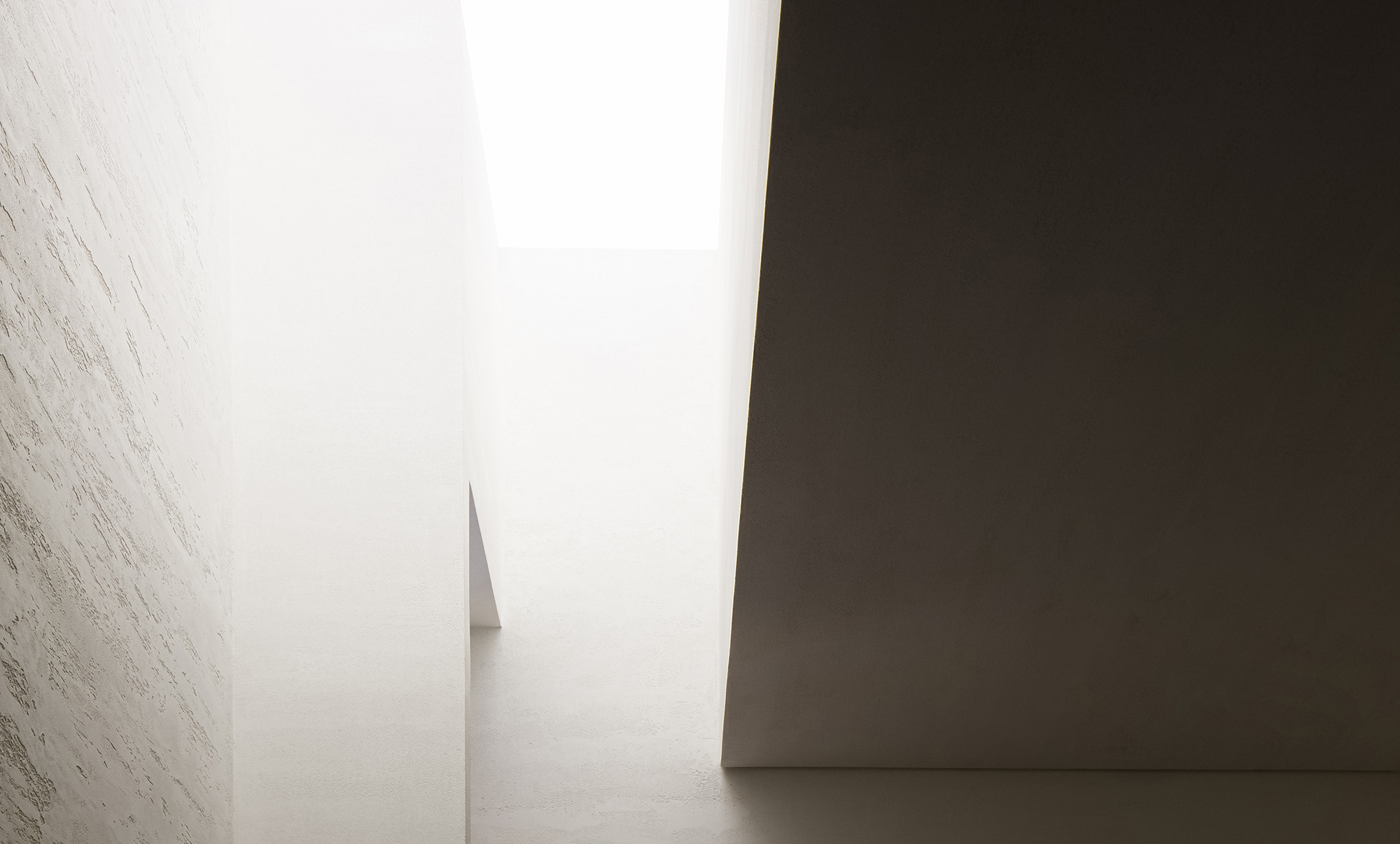
这是在审美上给人一种异轨,如美术馆般的展厅,更好的烘托产品的艺术性与品质的同时强调材料本身与空间的高度融合。
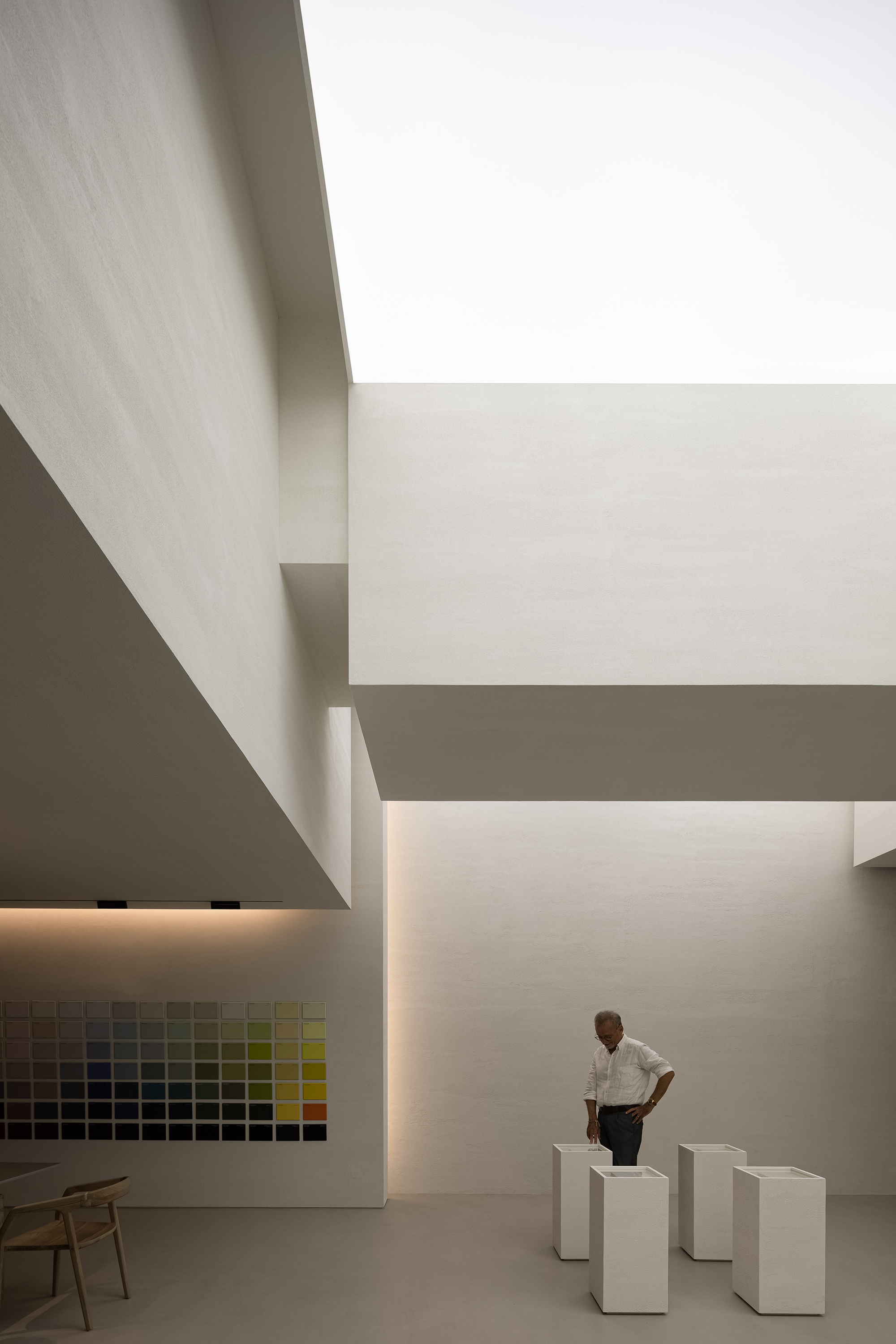
The showroom offers a unique aesthetic, looking like an art gallery. The spatial design highlights the artistry and quality of the space, while also accentuating the close fusion of materials and space.
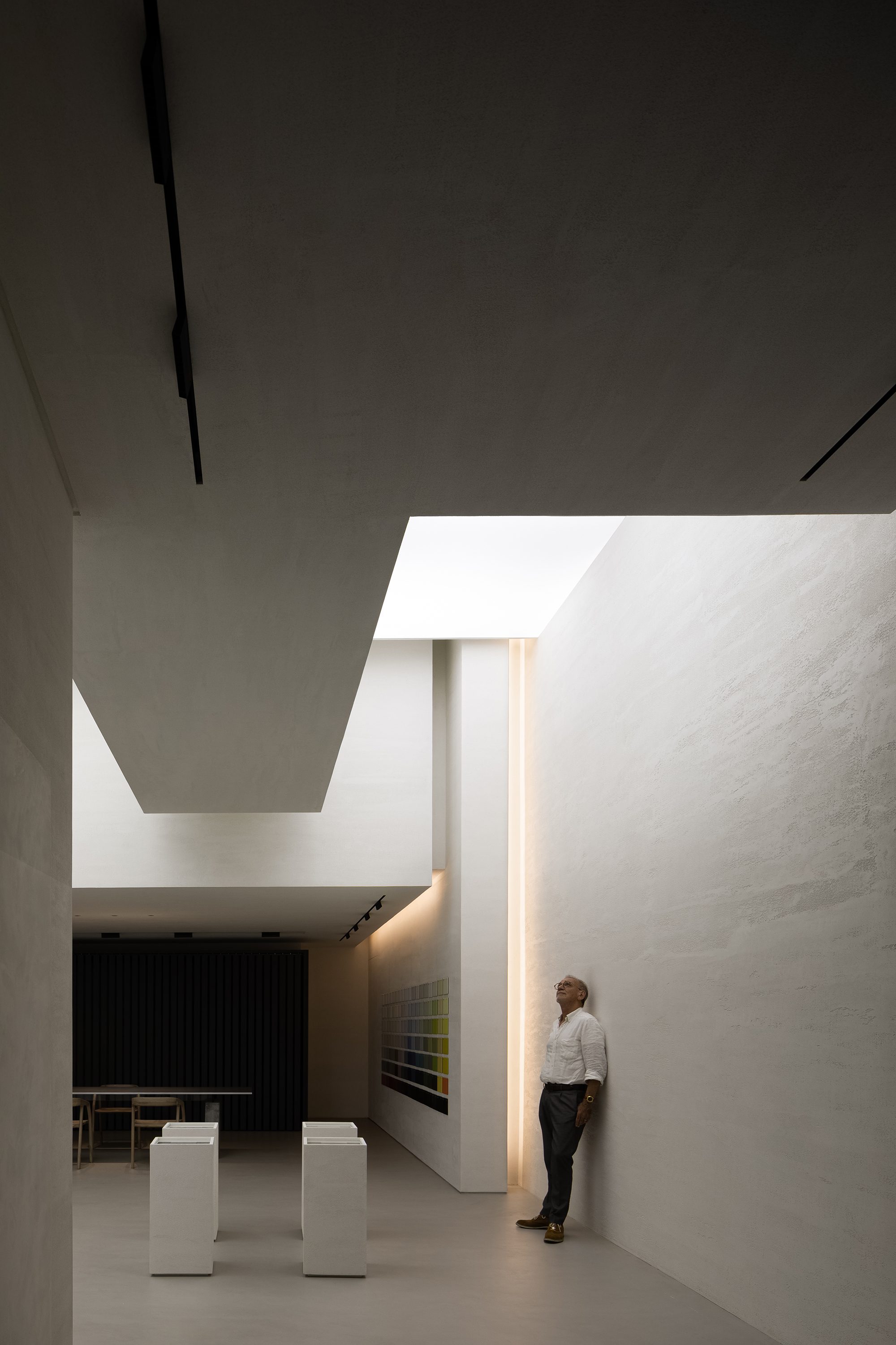
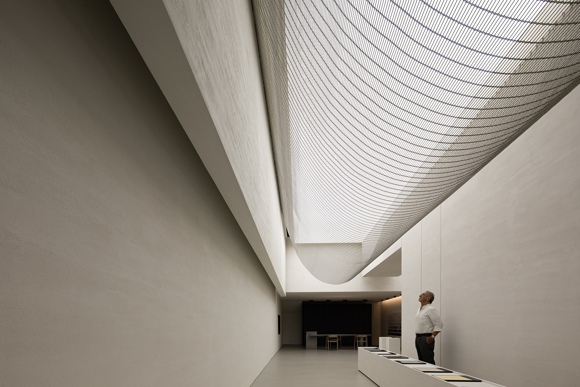
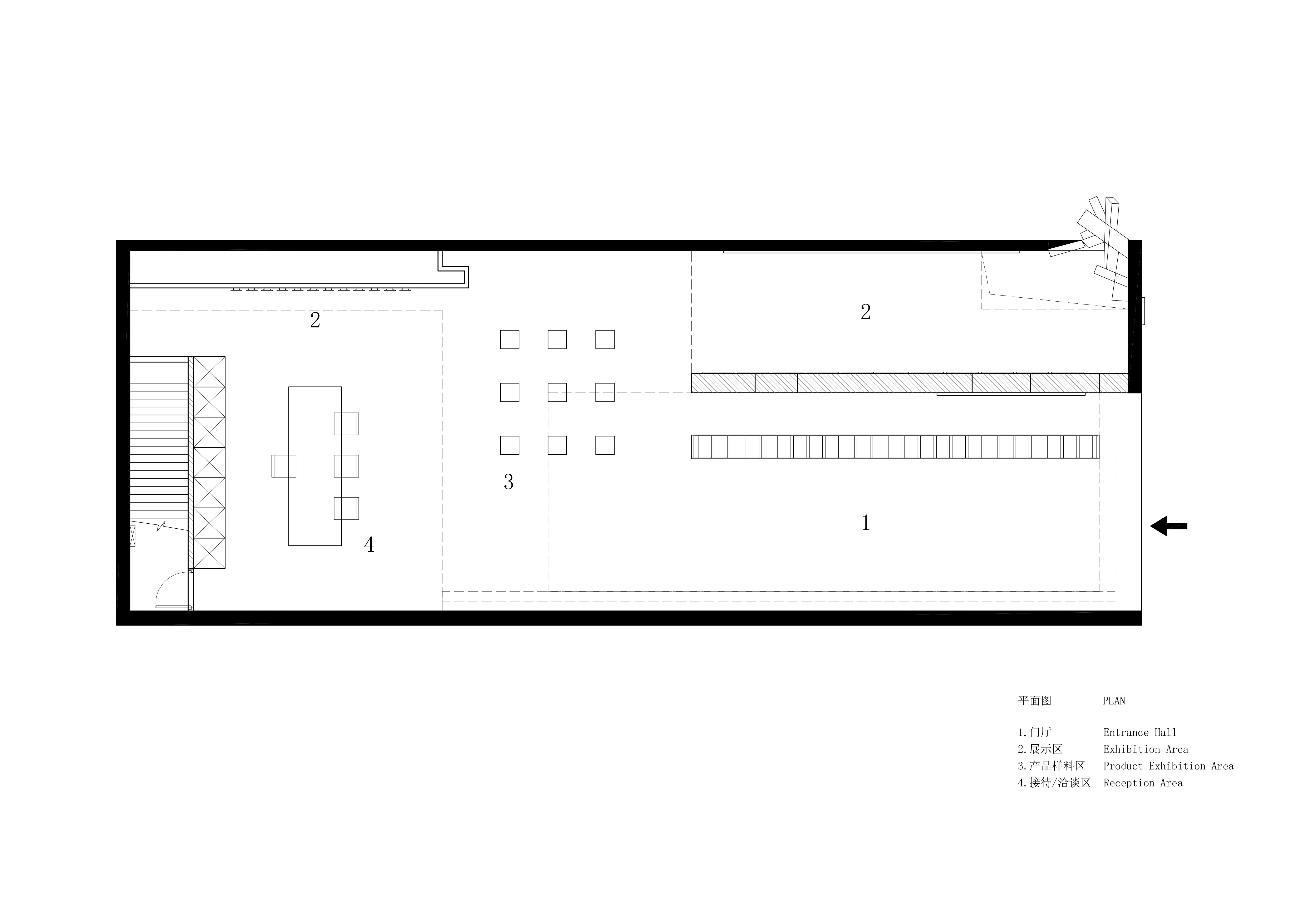
本次改造空间的主要挑战是:基于场地的条件如何进行破冰,让原来深邃场地的压抑感地变得透气舒展。基于原场地细长的特点,我们将前半部分切分成二,目的是为了制造以小见大的空间效果,先抑后扬。创造了内向型的空间和开放的扩展。
The main challenge of spatial transformation was how to break the limitations of the site, eliminate the oppressive feeling and create a breathing space. Based on the linear plane of the space, the design team divided the front part into two sections, in order to create an introverted space that gradually opens up the view and expands towards the inside.
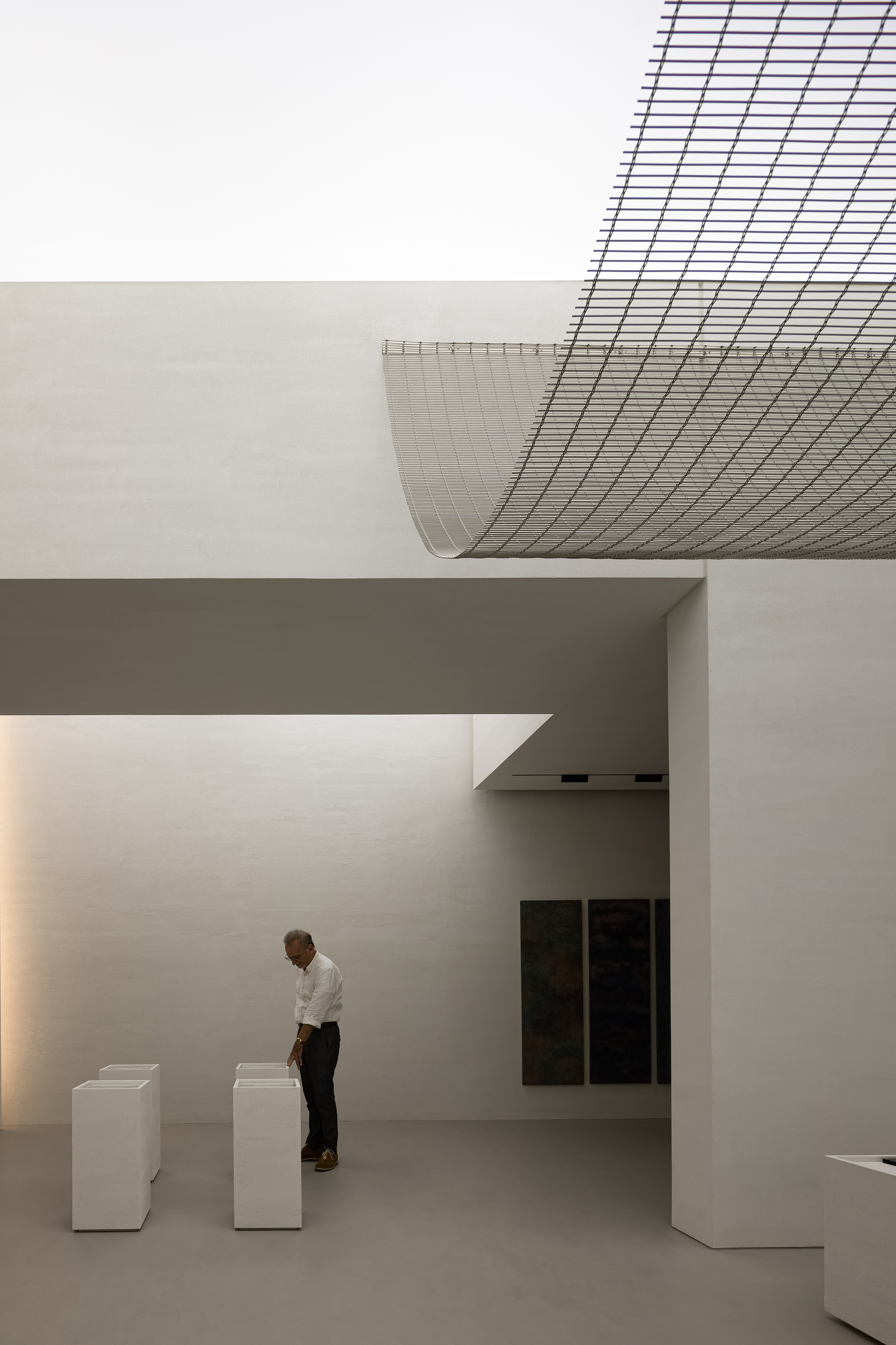
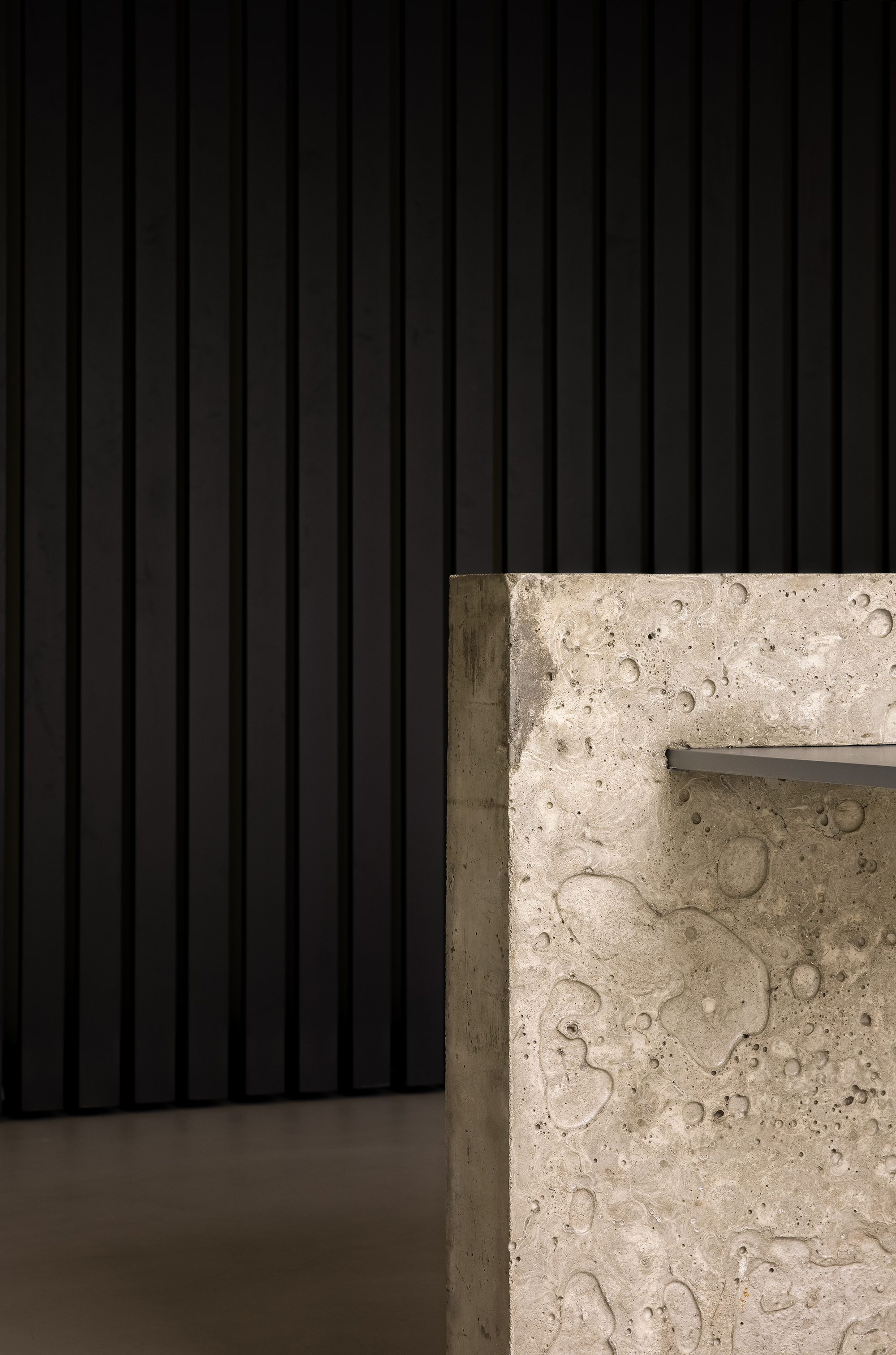
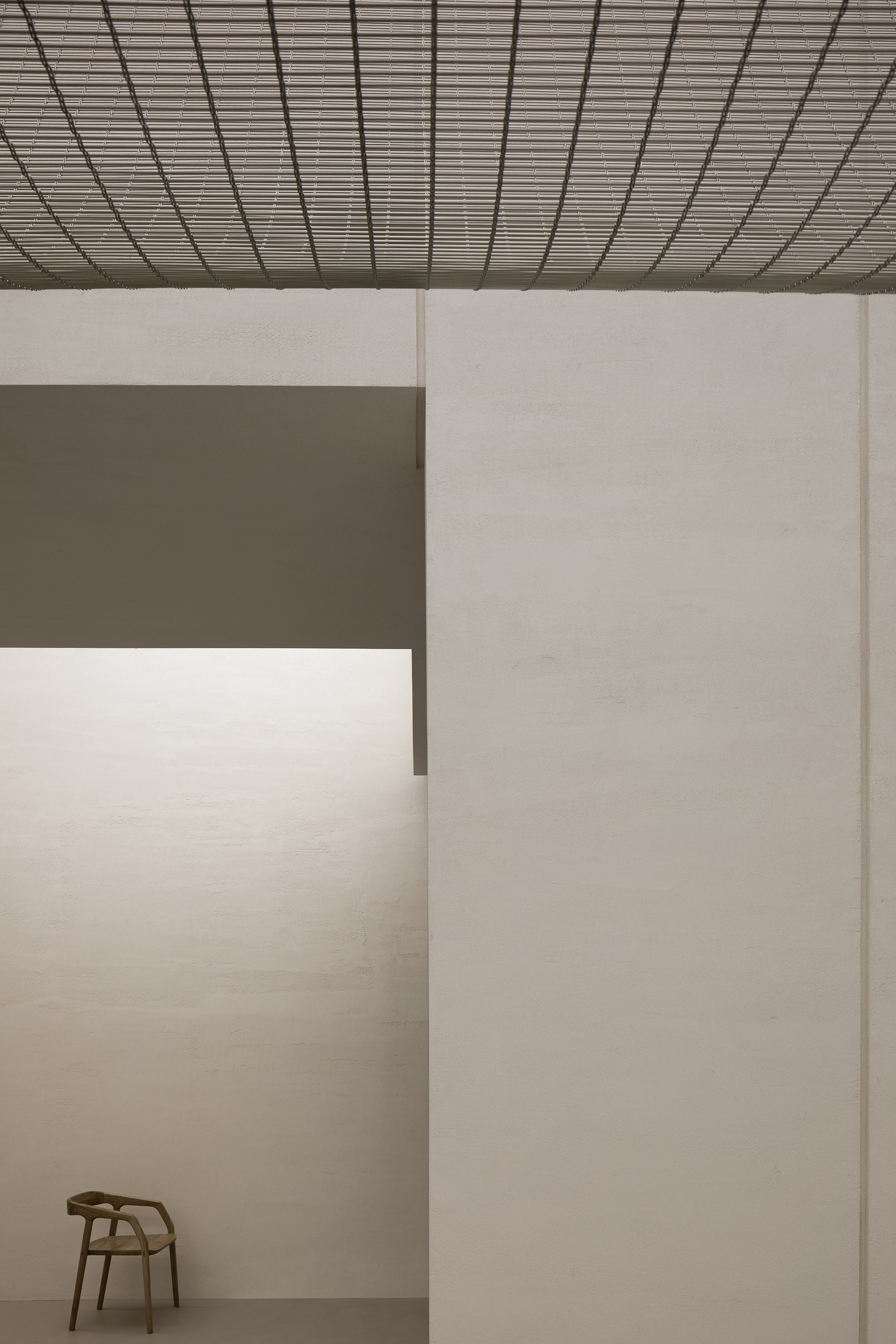
去接待台的设计也是我们在商业领域的一次大胆的尝试,而这样的尝试也是因为当代商业的收银方式在产生变化。空间中无装饰性软装的处理手法更是一个大胆的尝试,我们试图让人更多的去感受空间、材料与灯光带来的情绪,接待区唯一的家具采用混凝土与模拟铝材的漆进行碰撞,更好的让人感受材料本身的灵活性。
The reception and cashier desk is a bold attempt, which responds to the changing ways of payment in commercial field. The space was made simplistic and free of adornment, in order to encourage visitors to feel materiality, lighting and the space itself. The only furniture at the reception area showcases the contrast between concrete and aluminum-like paint finish, and highlights flexible, diverse material textures.
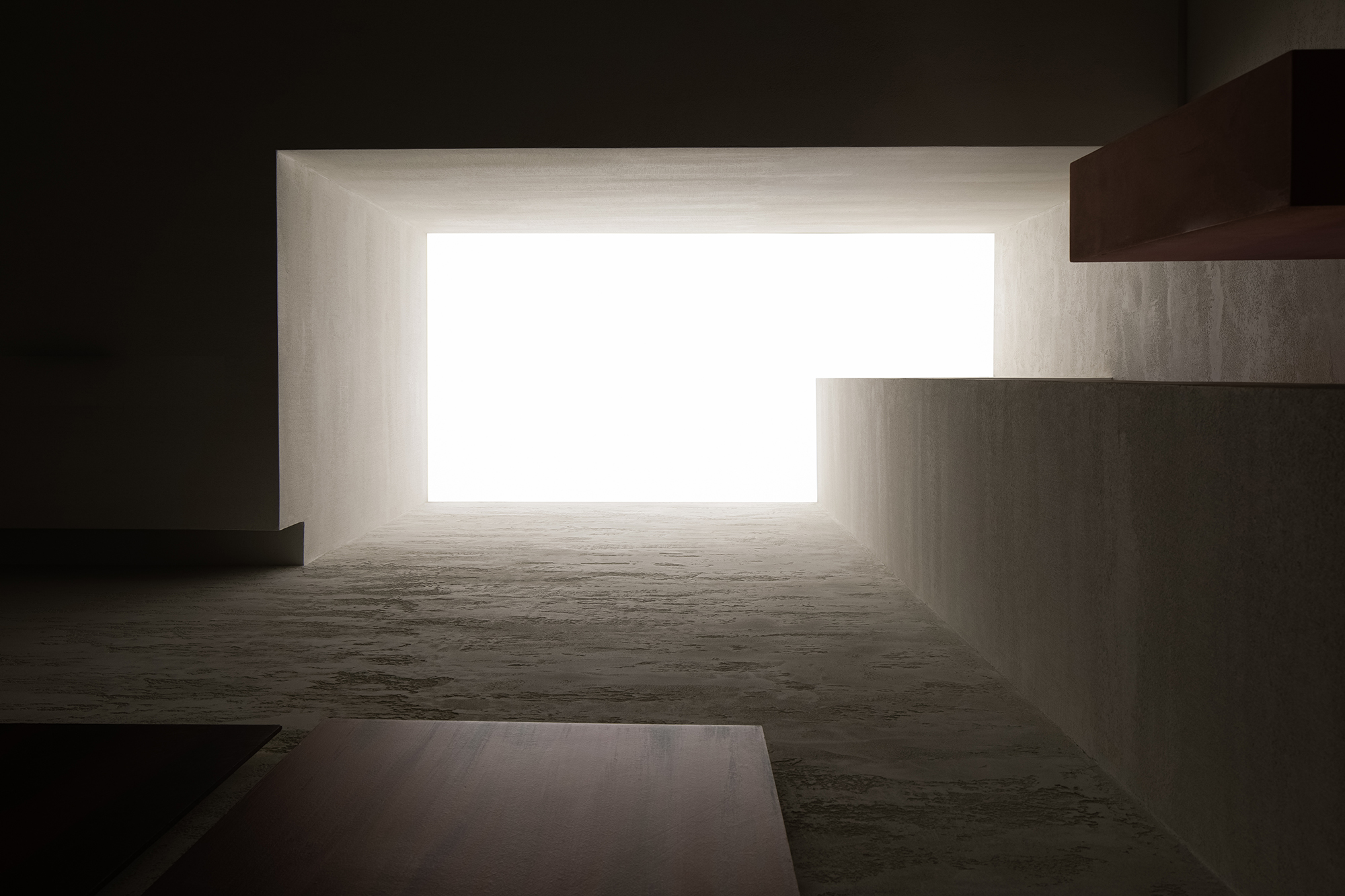
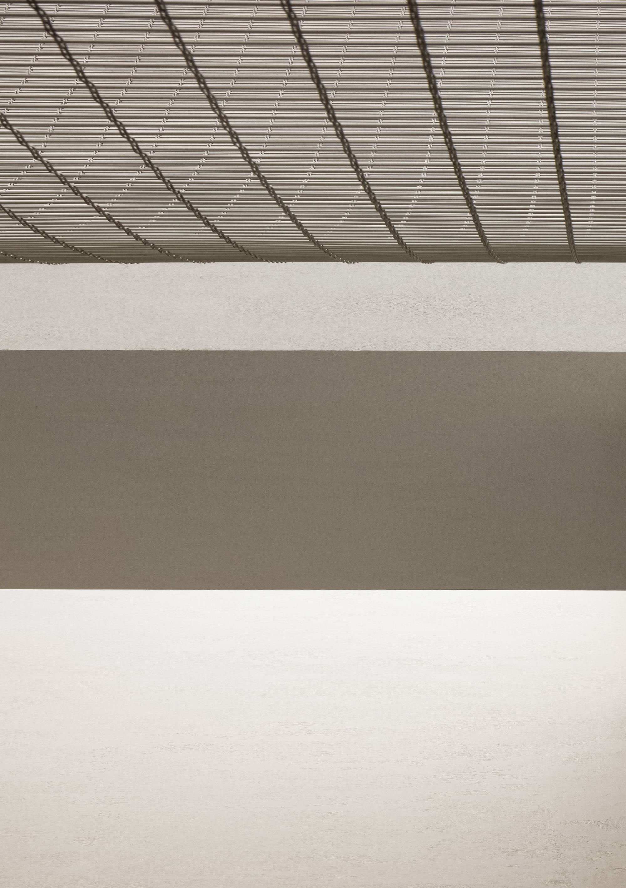
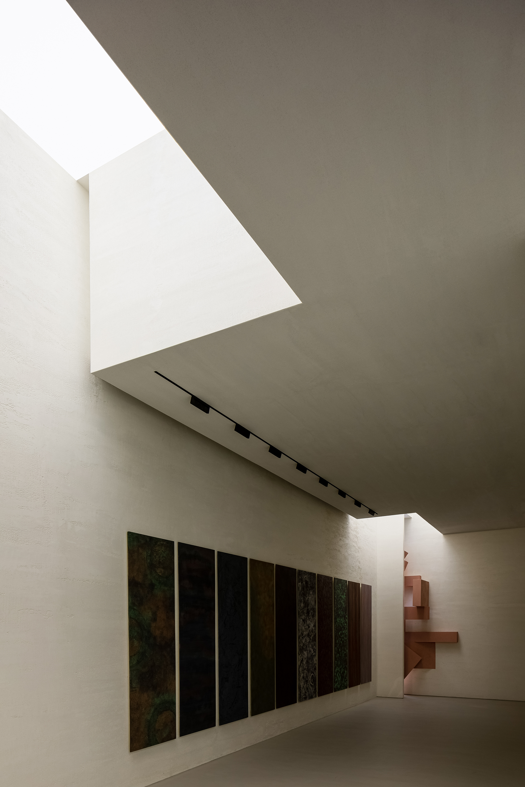
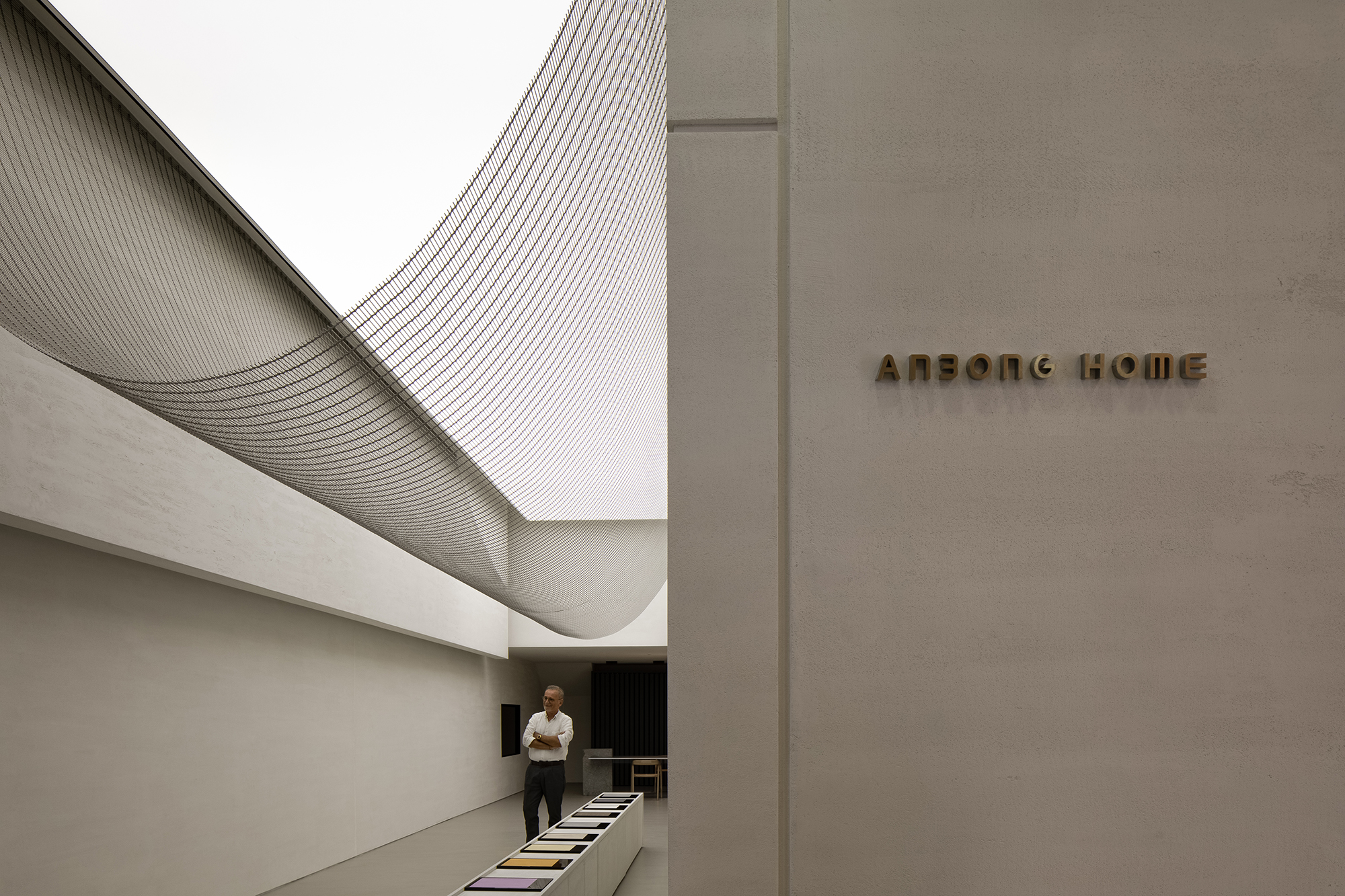
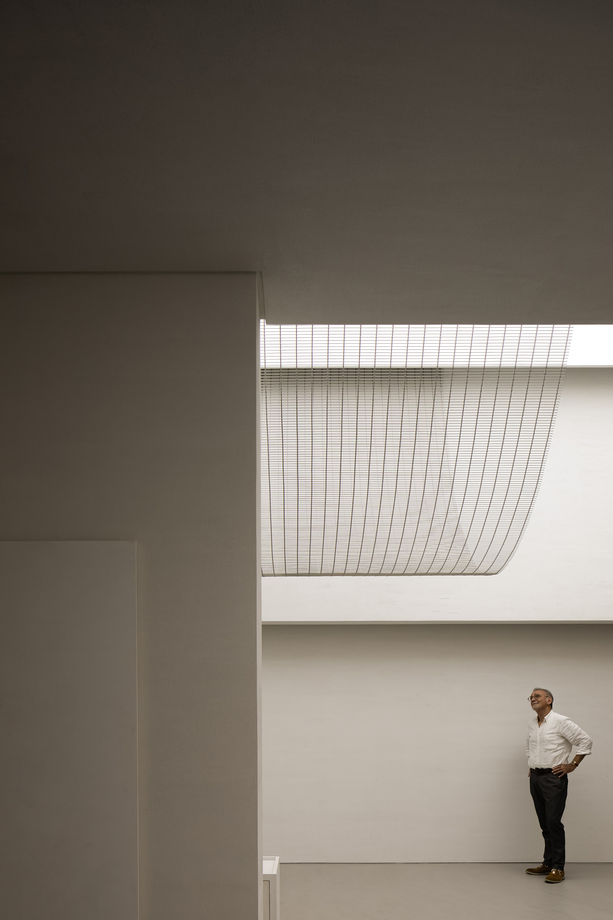
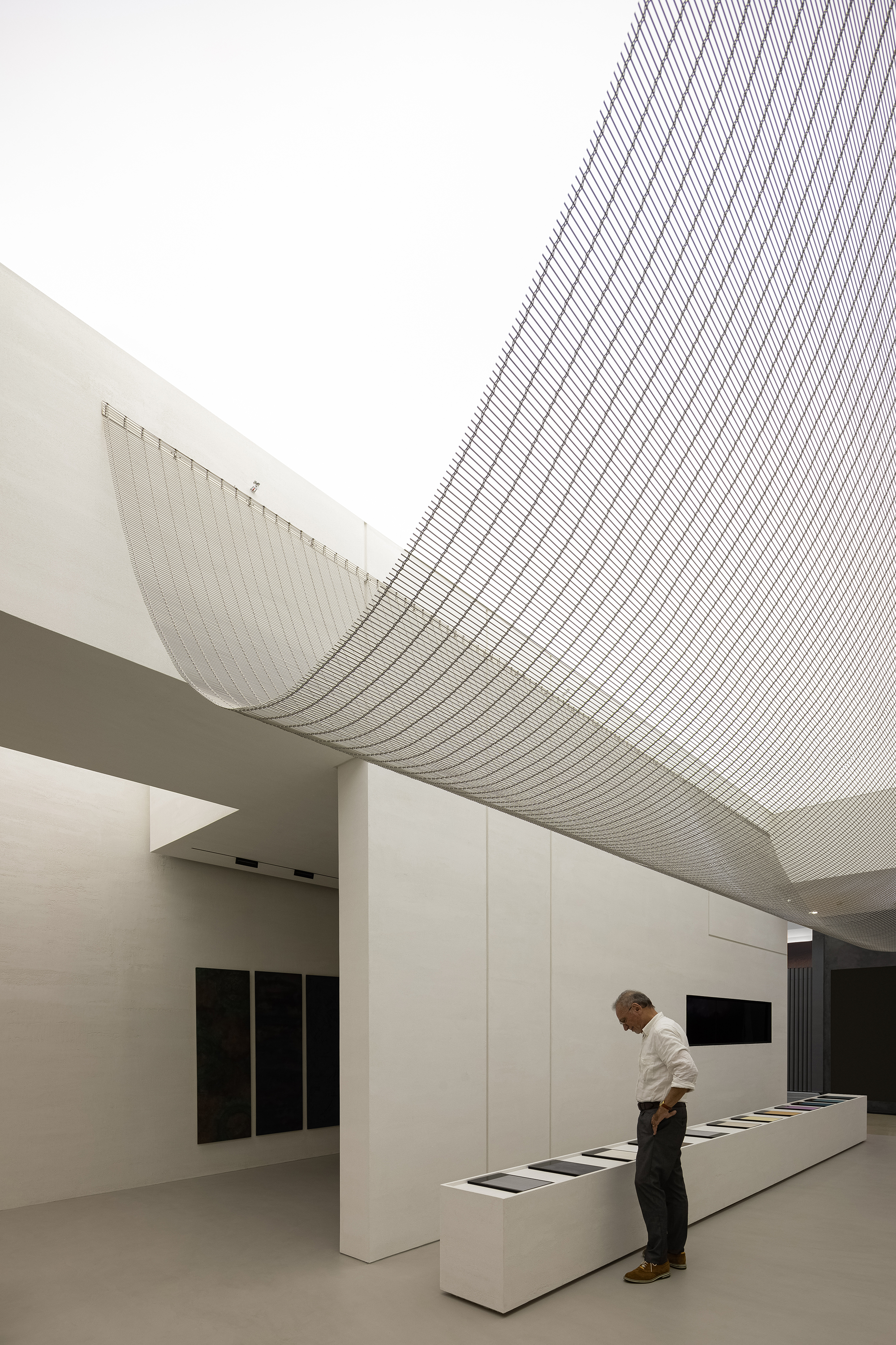
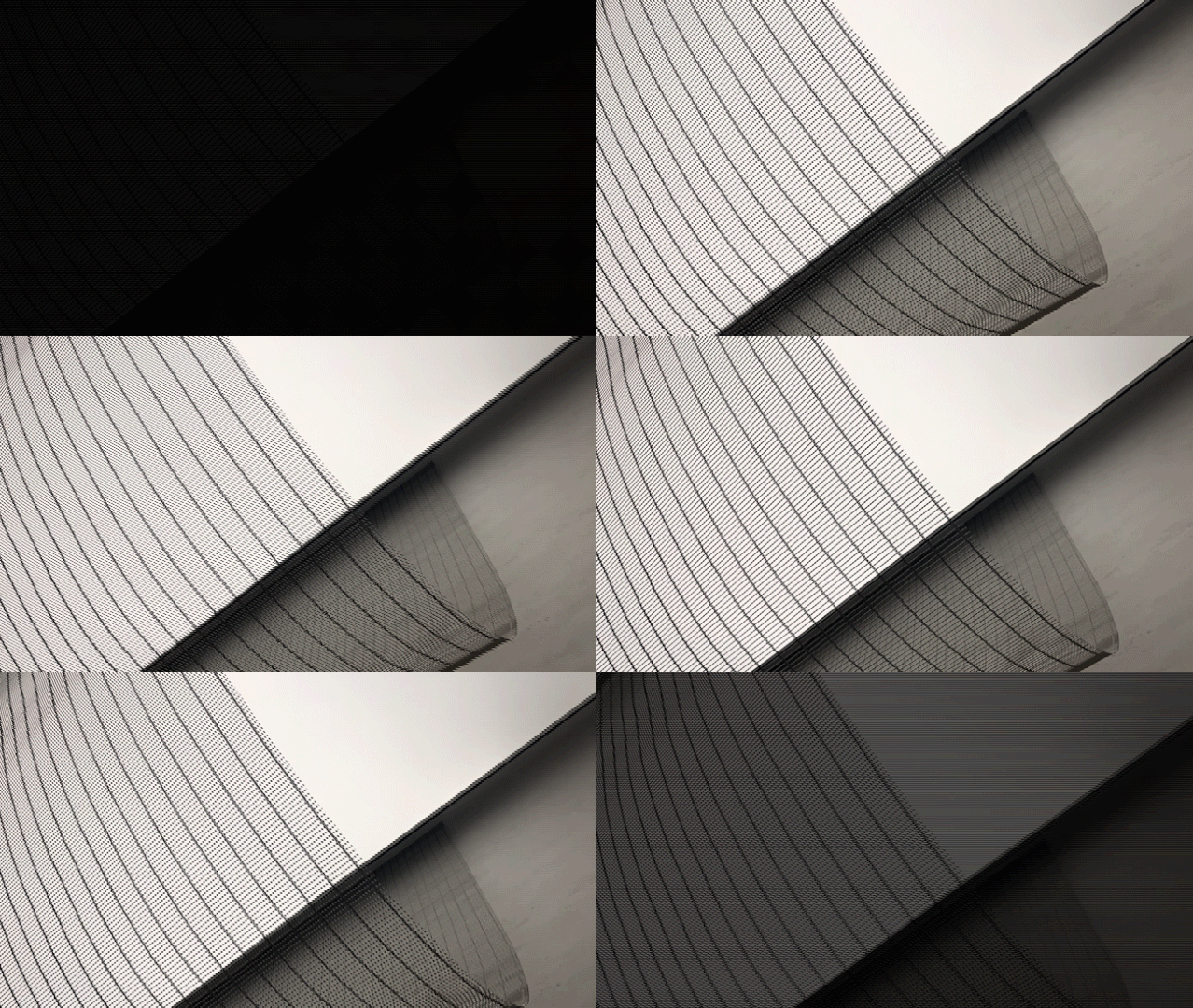
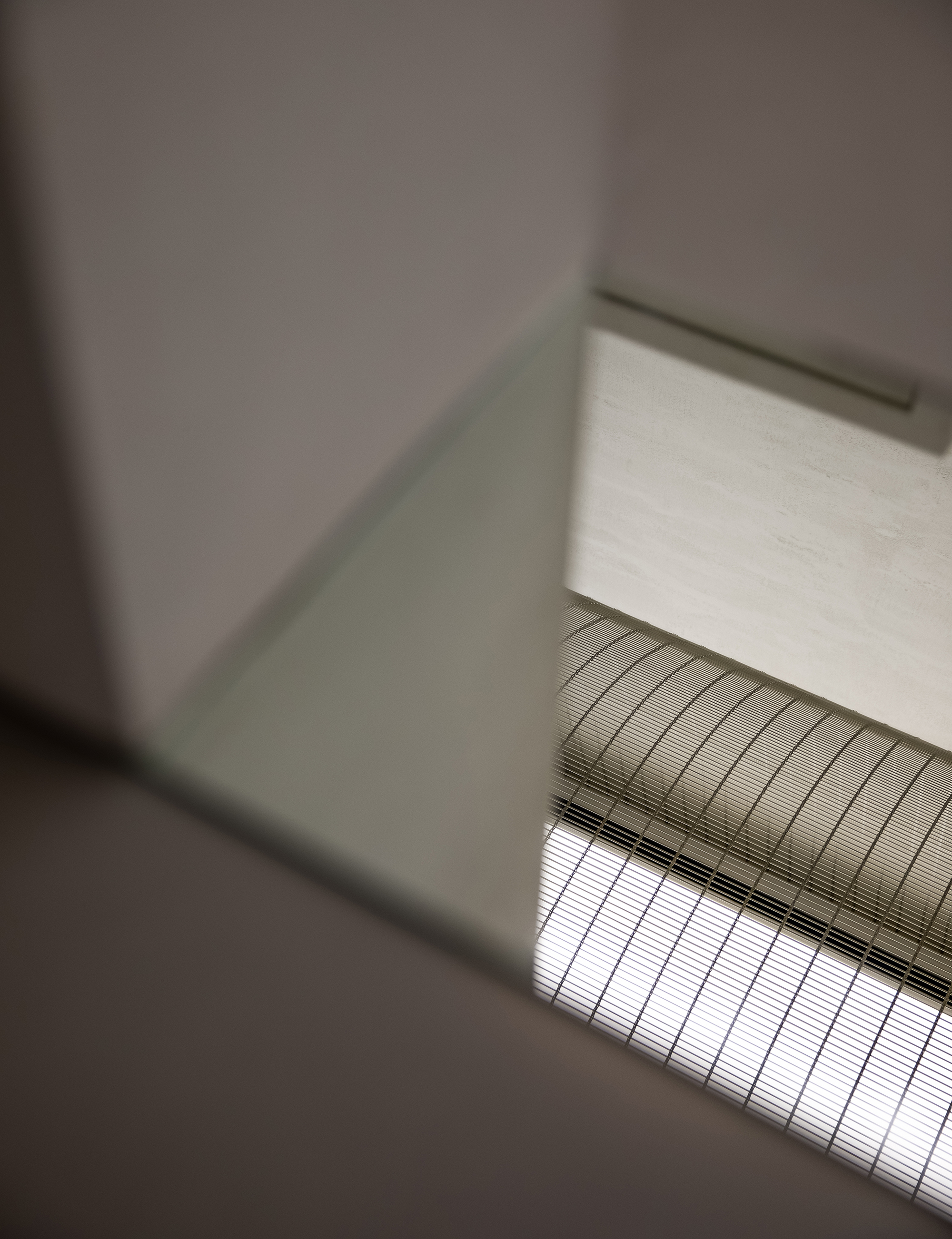
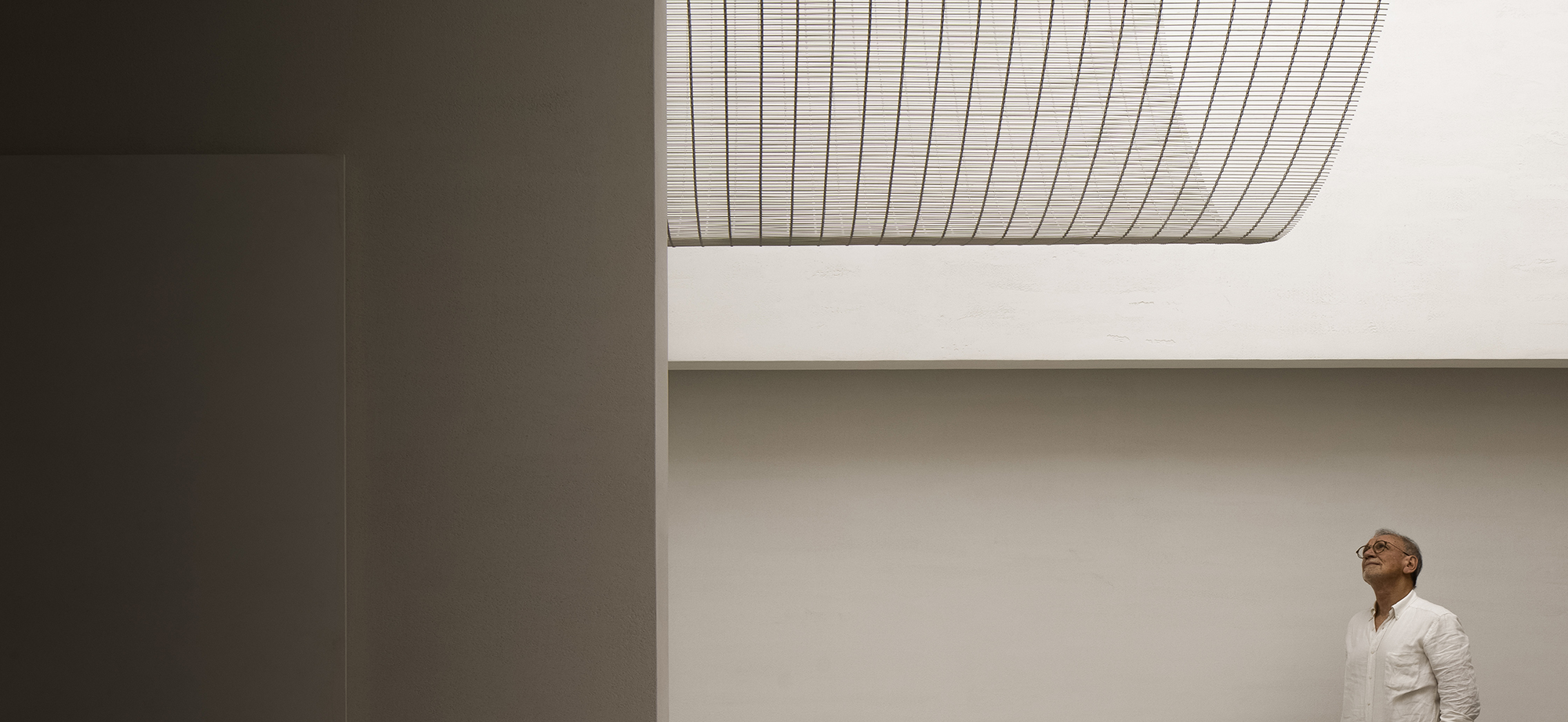
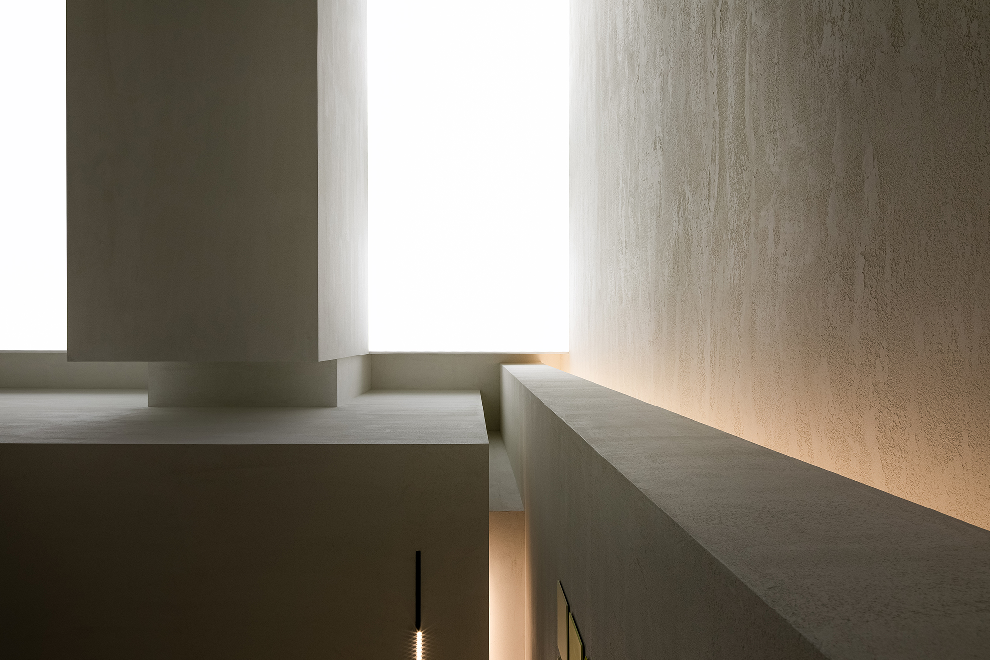
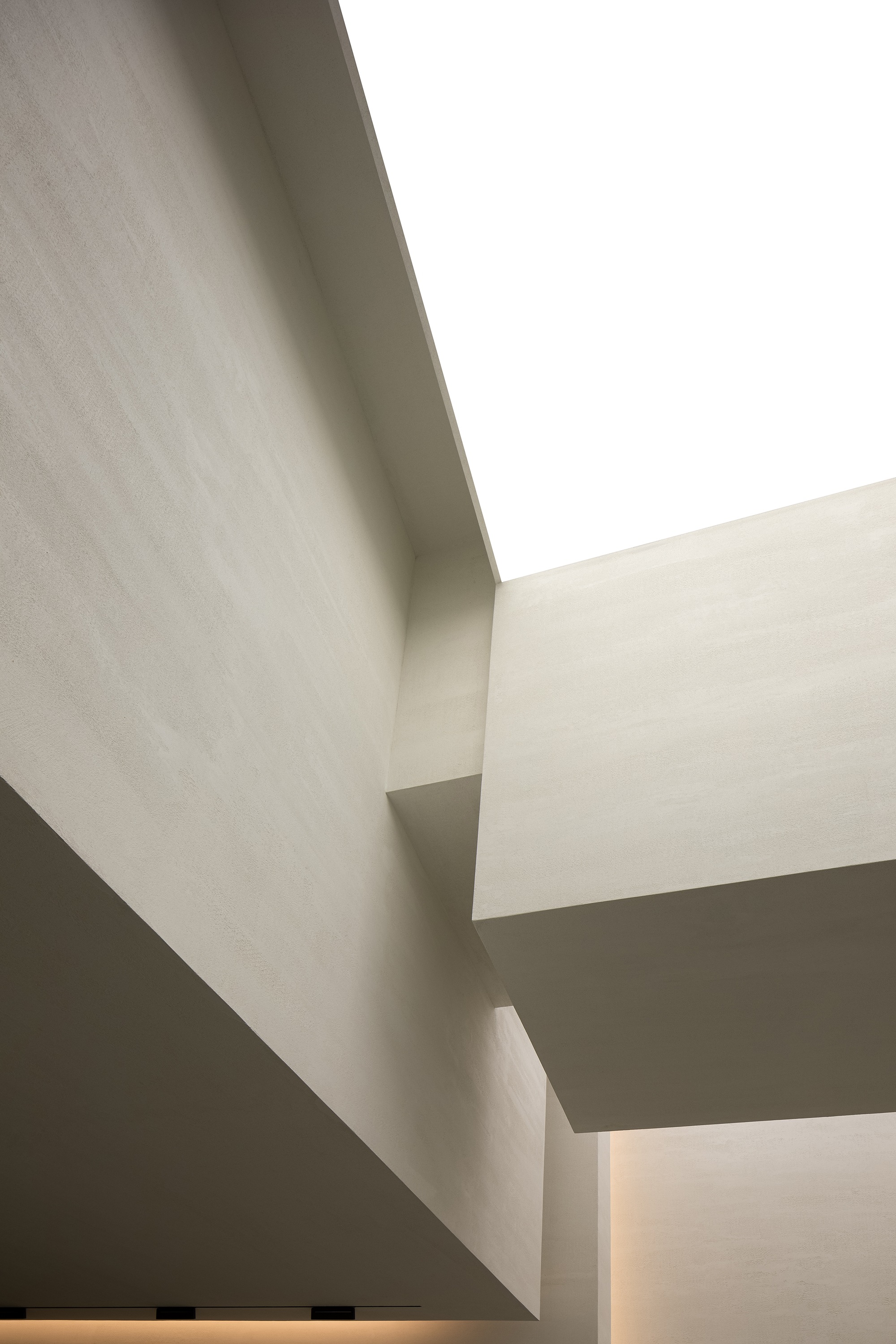
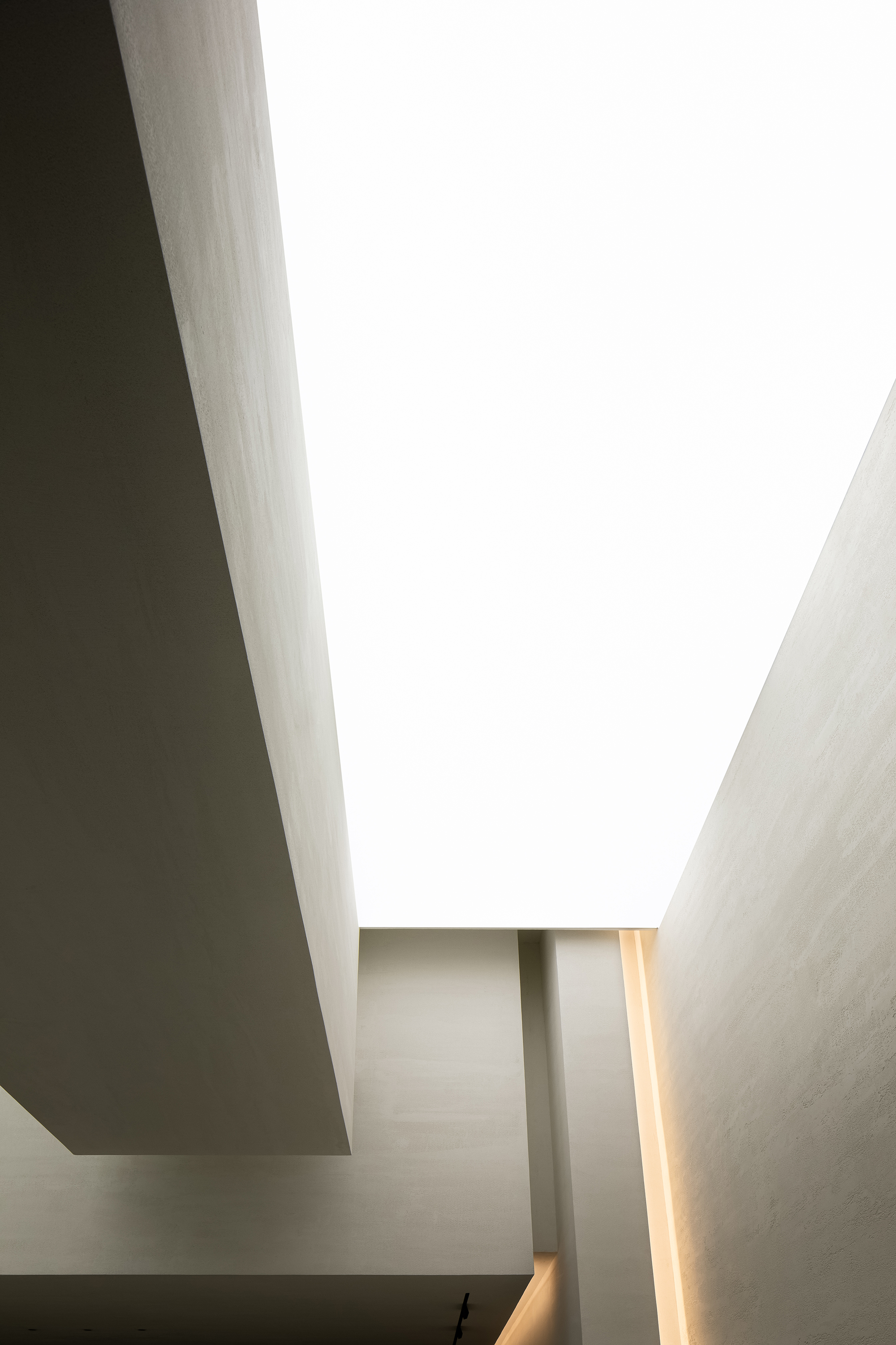
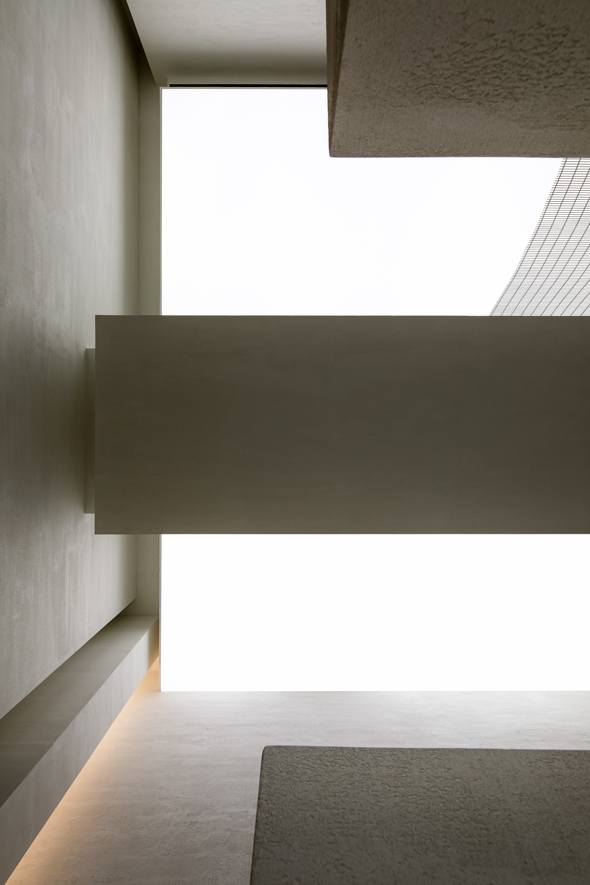
天花中的形体结构结合管线,以严谨的姿态,获得了该商场最高举架的店面,扭转了原本极度恶劣的空间感,这是一种极为巧妙的思考。空间以一种高挑向上的状态展示在我们面前,而入口垂钓的弧形金属网,在天花的拉膜与立面的形体之间形成了一片介质,丰富了光与空间的关系。让人产生强烈的好奇与探索的欲望。
The transformation of the ceiling was based on full consideration of structures and pipelines. In this way, the design team produced a high ceiling, which makes the space appears lofty. The curved metal net hanging in the air and the stretch ceiling above together enrich the relationship between light and space, and evoke visitors‘ curiosity and desire to explore it.
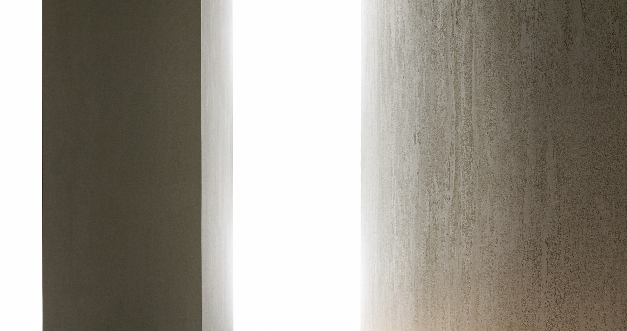
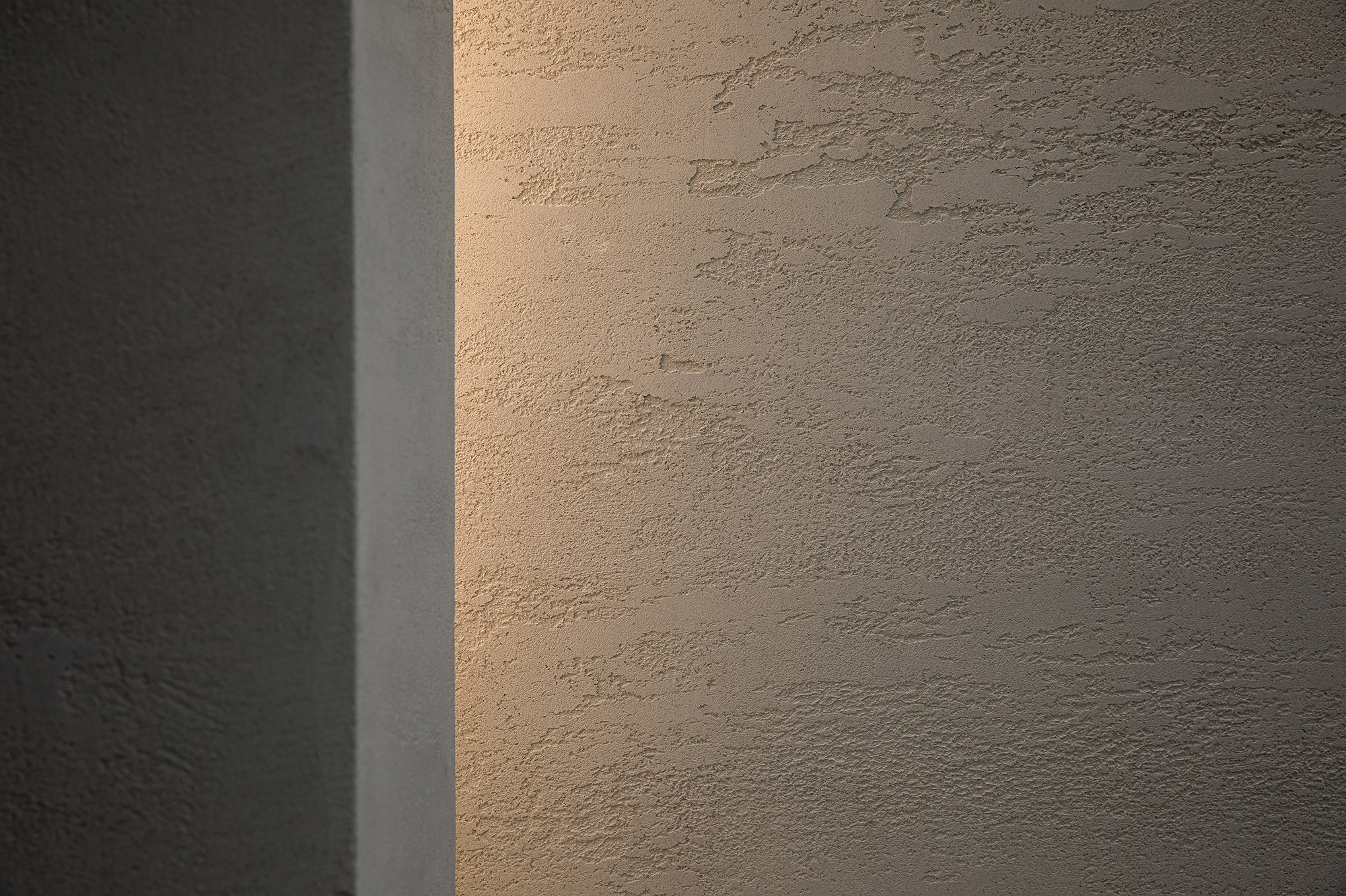
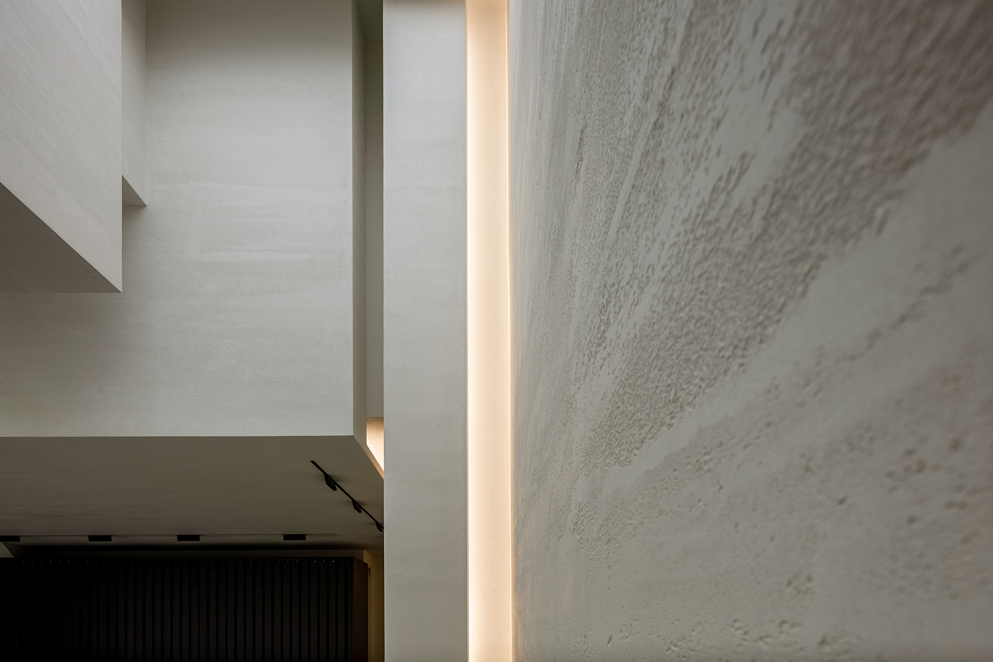
空间本身是一个容器,而我们试图探索手工涂料本身的表情。在平静的空间中感受时间的启发,先关注空间与产品在空间中质感的魅力再去解读产品本身。
The space is a container, and the design team tried to explore the expressions of handmade paint products. Customers are encouraged to feel the space and the charm that products exude in it, and then to read the products in detail.
宽敞明亮的空间感,以自然的质感,自然的光给空间最真实的反馈。空间与人的互交在我们的设计中特别的被重视。极大地改变了现有建筑的空间和组成关系,有利于空间结构、材料和色彩的选择与调和,并在建筑和场所之间建立了一种新的流动。
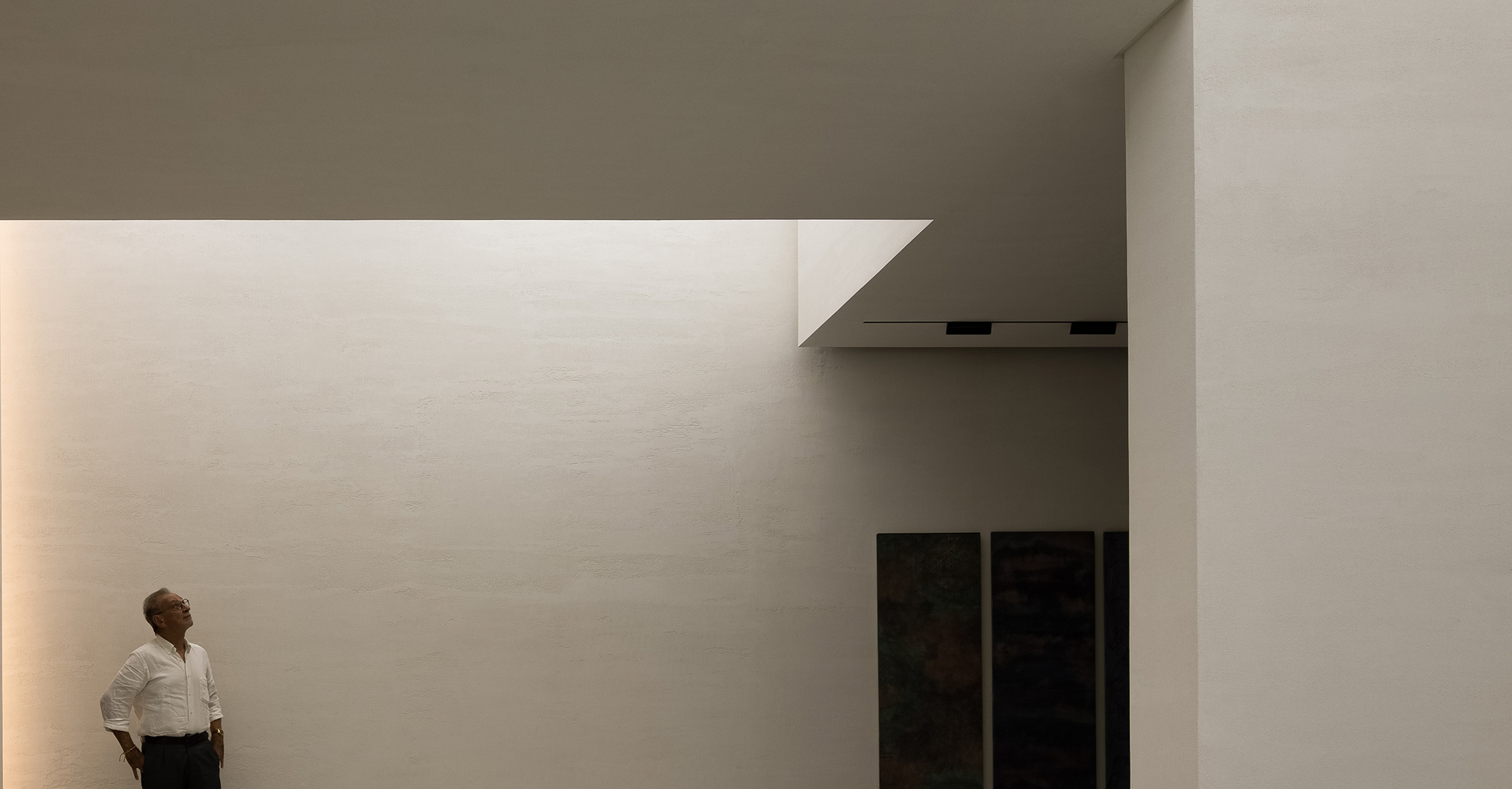
The space features an expansive and bright feeling, natural textures and light. The designers emphasized the interaction between space and people, greatly changed the original spatial structures, coordinated materials, structures and colors, and created new fluidity between architecture and space.
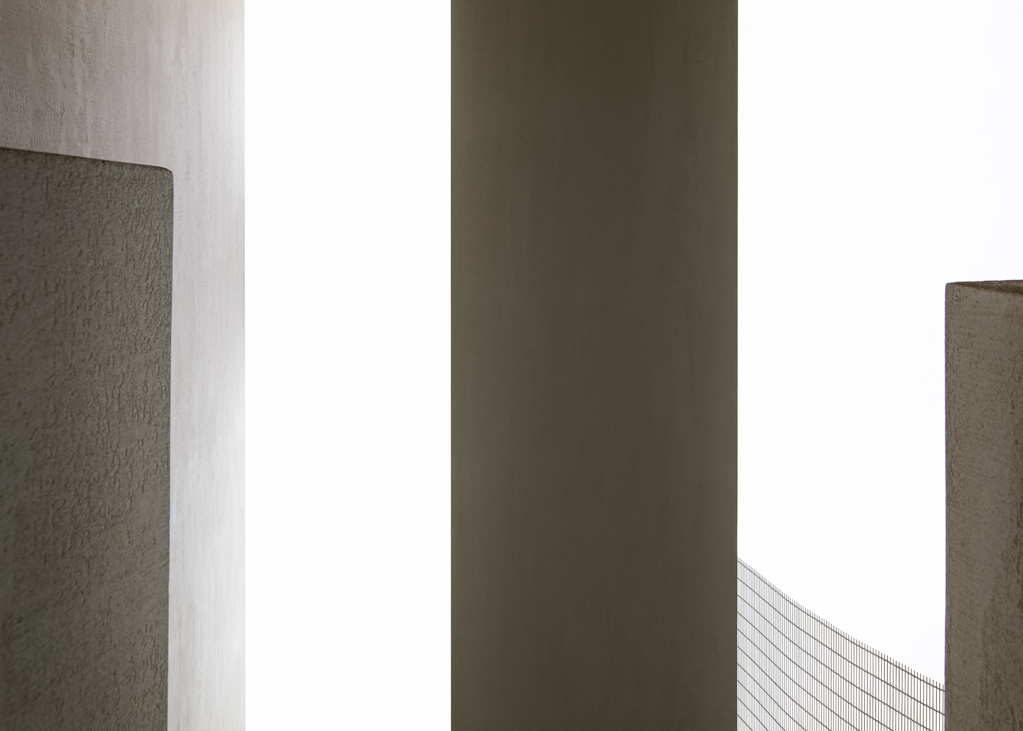
空间找到形状,并通过优雅朴素的几何形状变得可触摸,感受透气的质感。让空间在一个悬浮的感受中自由流动。
Geometric shapes in the space are elegant, simple and touchable, creating a floating and free ambience.
这是艾克建筑设计团队在用西方的设计秩序来建树东方的空间情绪与哲学再一次实践。
Through this project, AD ARCHITECTURE attempted to accentuate Oriental spatial emotions and philosophy via Western design logic.
项目信息——
项目名称:ANBONG HOME 涂料展厅
业主:Mauro Malfatti
设计机构:AD ARCHITECTURE∣艾克建筑设计
官方邮箱:office@arch-ad.com
总设计师:谢培河
设计团队:艾克建筑
建筑面积:200 m²
主要材料:手工涂料、微水泥、金属网、混凝土、透光膜
设计时间:2020年7月
竣工时间:2020年11月
摄影师:欧阳云
Project information——
Project name:ANBONG HOME
Client:Mauro Malfatti
Design firm:AD ARCHITECTURE
Email:office@arch-ad.com
Chief designer:Xie Peihe
Location:Shantou, Guangdong, China
Area:200 m²
Main materials:handmade paint, micro-cement, metal mesh, concrete, membrane
Start time:July 2020
Completion time:November 2020
Photography:Ouyang Yun


