本项目是一个全案设计,从品牌形象到空间拓展,都由同一设计团队完成,这样就能将VR设计和空间设计很好的结合起来。全案由“青丘”这一地名展开联想,以“洞穴”元素展开空间想象,力求打造自然而静谧,深邃又隐蔽的空间。
This project is a full-case design, from the brand image to space expansion, all completed by the same design team, so that VR design and space design can be well combined. The whole project is associated with the place name “Green Hill” and imagines the space with the element of “cave”, striving to create a natural and quiet, deep and hidden space.
空间,是人类探索世界的主要载体,自古以来都与“行为”,“心理”相关。而结合商业空间属性对原有空间进行划分,再生,从而产生情感交流是本案阐述的重点。青丘是医疗美容属性的商业空间,这类空间一般在注重功能性的同时更加注重私密性,并且要契合女性气质。
Space, the main carrier of human exploration of the world, has been associated with “behavior” and “psychology” since ancient times. The main point of this case is to divide and regenerate the original space based on the attributes of commercial space. Qingqiu is a commercial space with medical beauty properties. This kind of space generally pays more attention to privacy while paying more attention to functionality, and should fit in with feminine temperament.
温暖而柔和,简洁且干练,是女性气质的体现,同时也是我们想融入空间的情绪表达。运用色彩,材质的不同,为人营造出一种静谧的空间感受。
Warm and soft, concise and able, is the embodiment of femininity, but also we want to integrate into the emotional expression of the space. Apply colour, qualitative different, the person builds a kind of quiet space to feel.
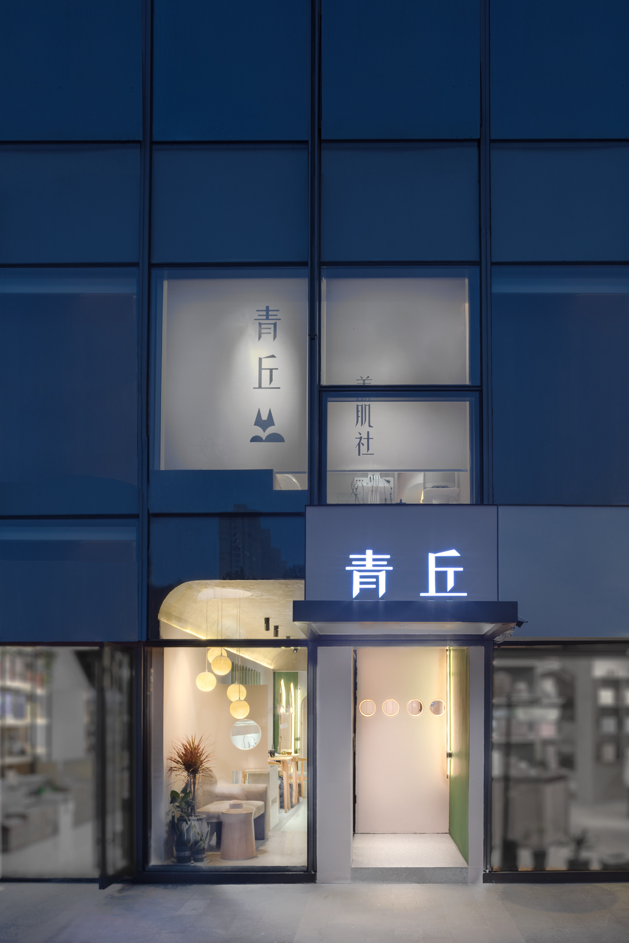
▲店铺外观
店铺入口是设计重点,我们将原结构的入口往店铺内部收缩一部分,使入口空间变大,视觉上也更开阔,同时增添了趣味性。还增加了网红打卡区,代替传统橱窗设计,增加了店铺记忆点,有利于店铺的品牌推广。
The entrance of the shop is the key point of the design. We shrink the entrance of the original structure to the interior of the shop, making the entrance space larger, more visually open and interesting. In addition, web celebrity punching area is added to replace the traditional window design and store memory points, which is conducive to the brand promotion of the store.
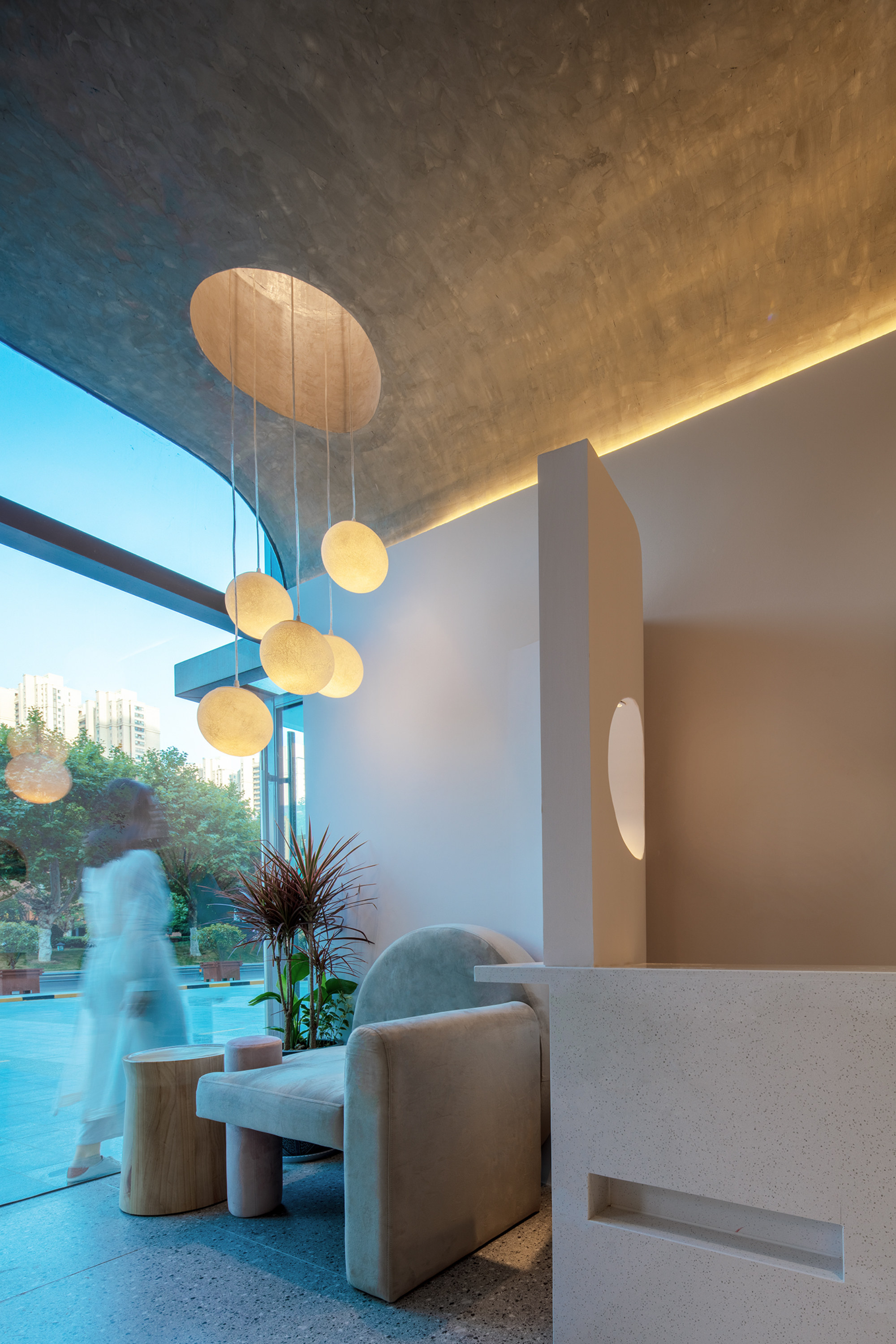
▲入口接待区
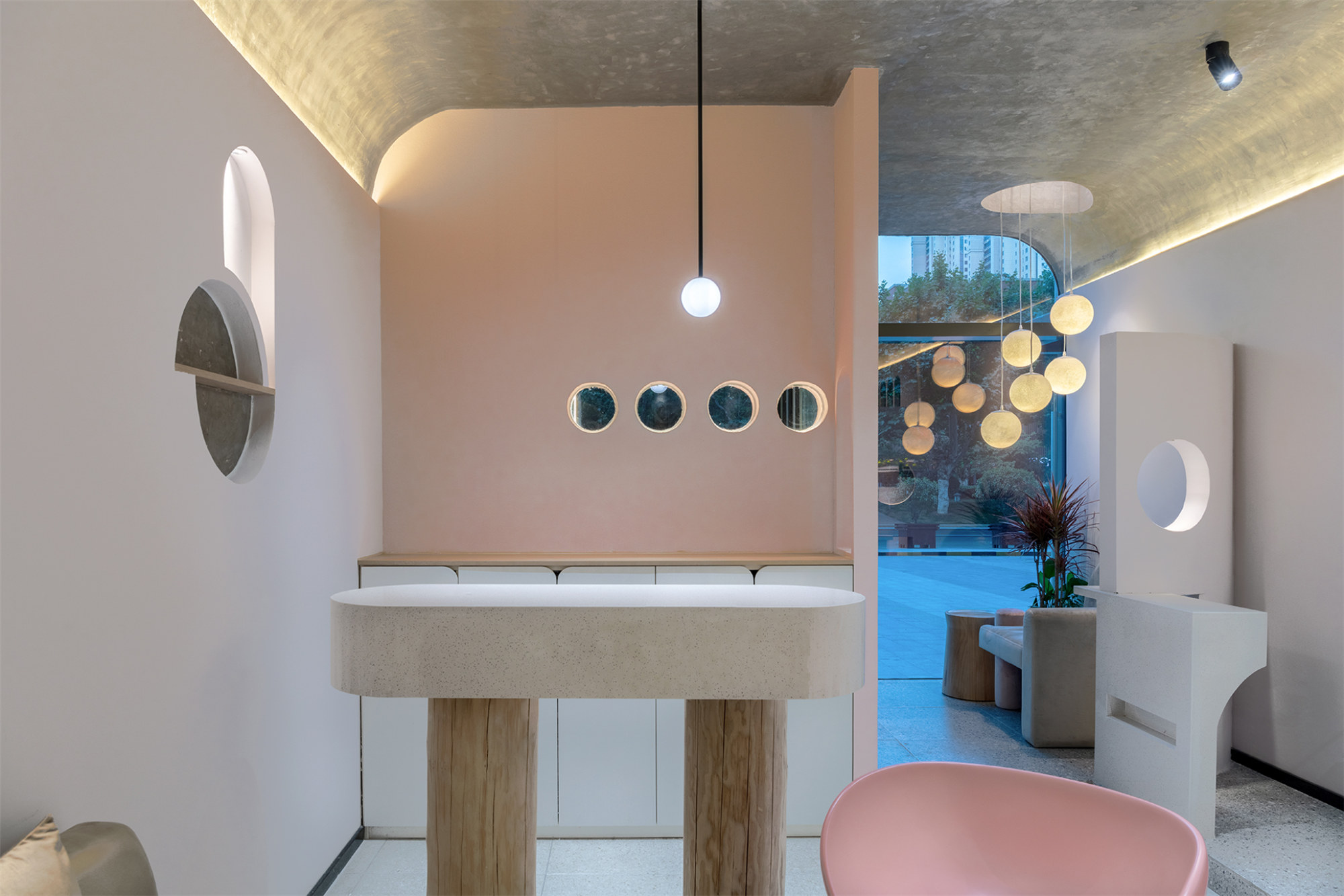
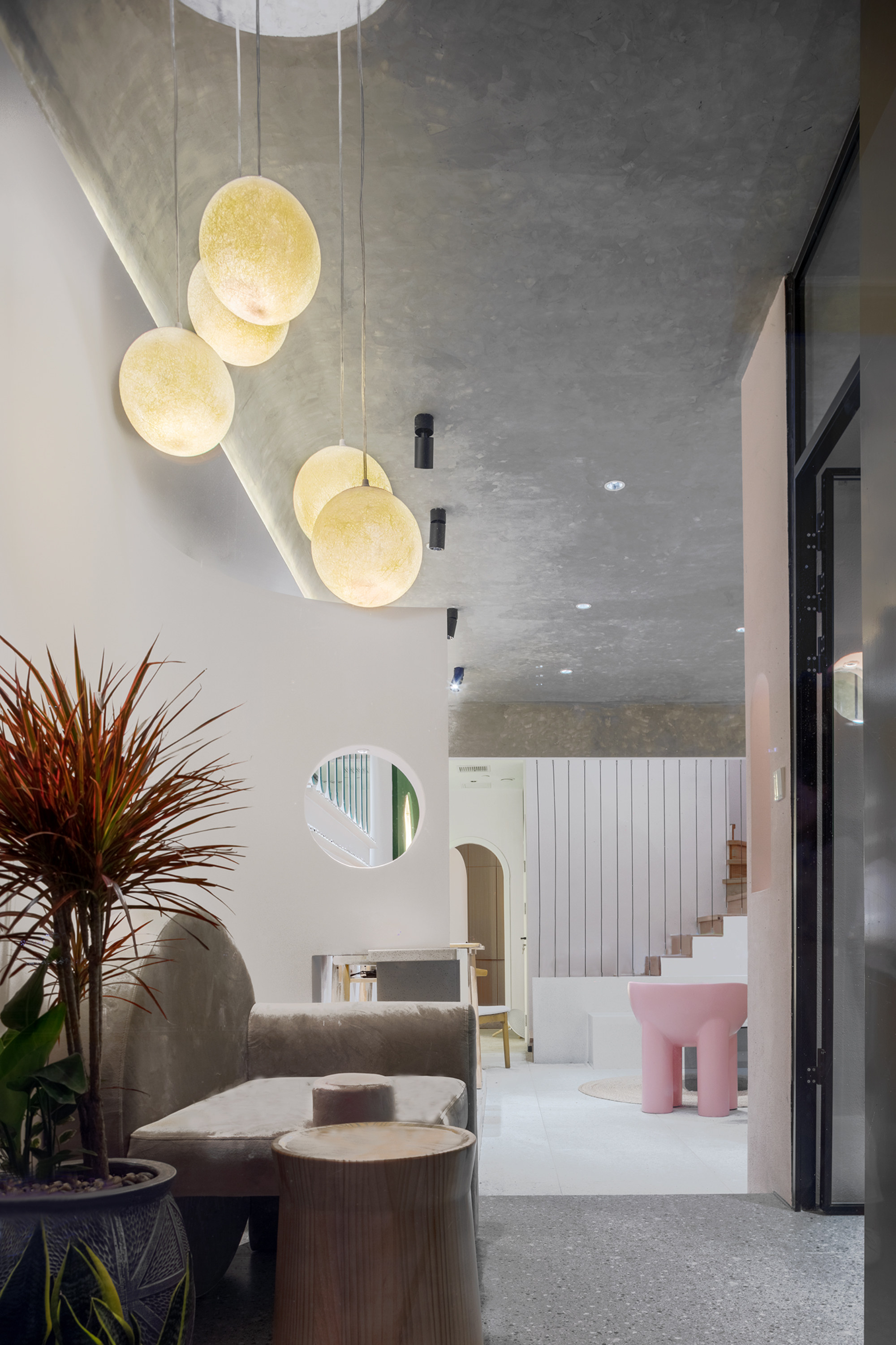
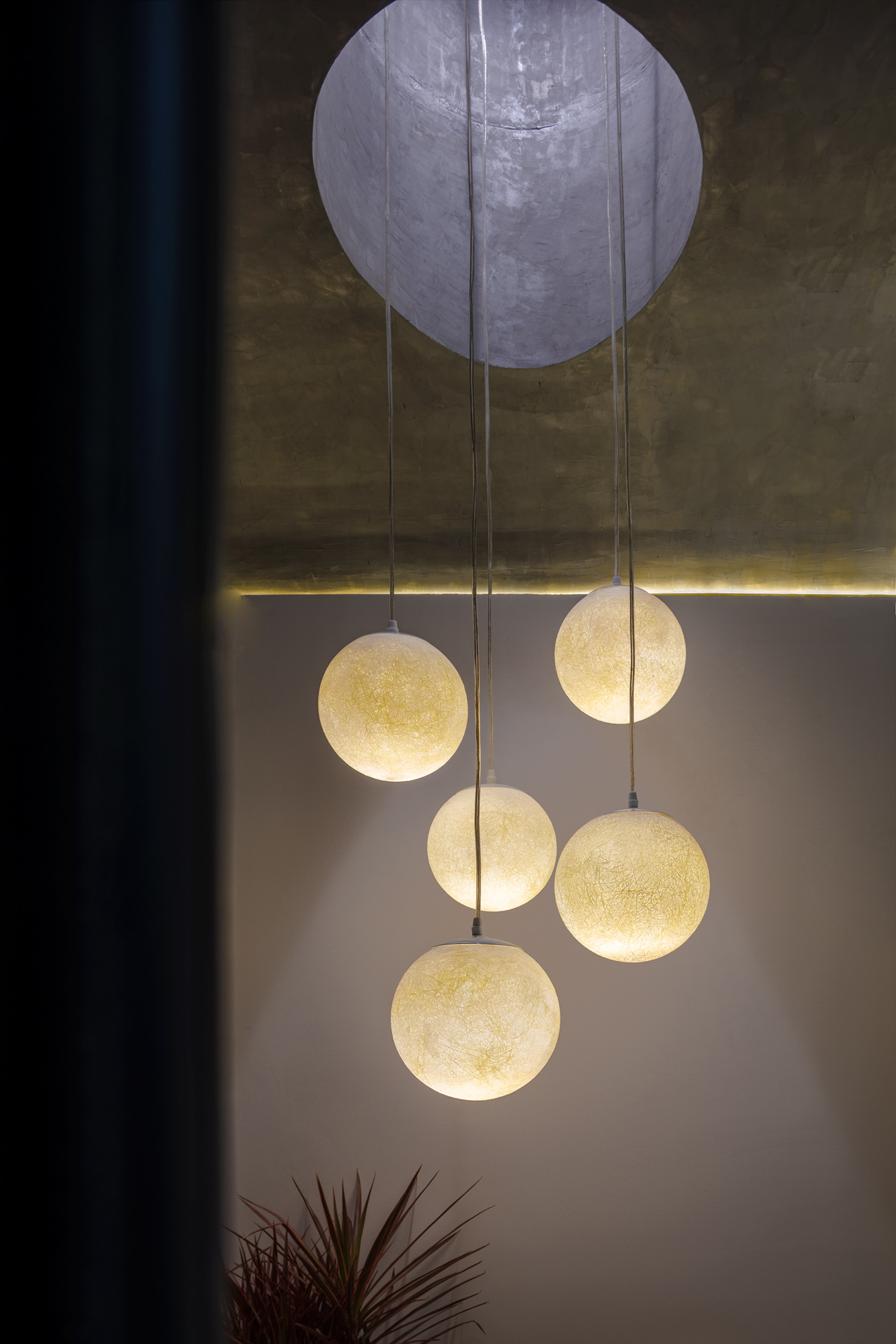
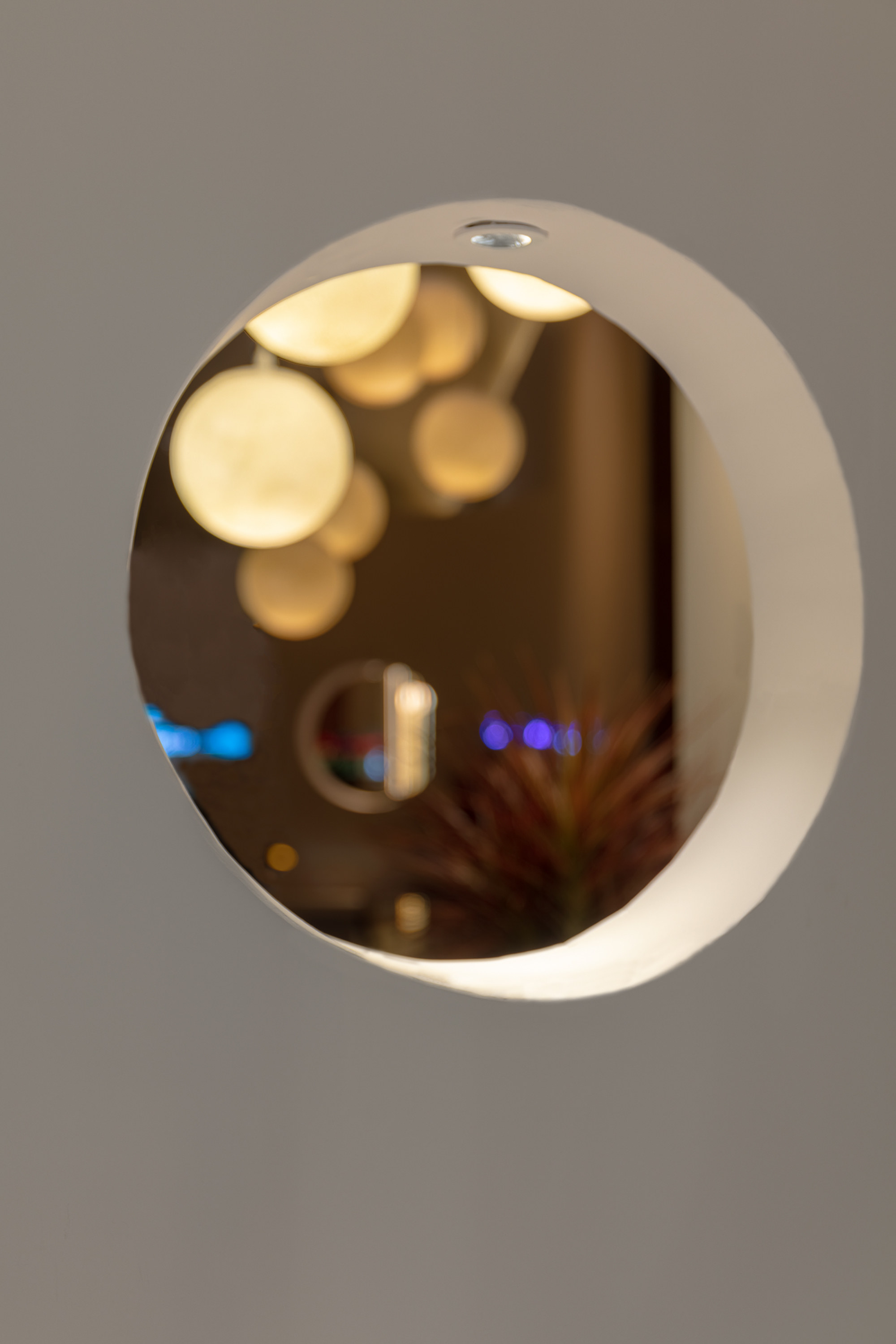
入口接待区作为网红打卡点在灯光上做了特殊设计,结合“月夜”主题将顶面做镂空处理仿佛一轮明月,并运用月亮吊灯烘托气氛。侧面小洞口正对着内部前台,内外人员通过洞口产生交流性。
The reception area at the entrance is specially designed as a web celebrity punching point on the light. Combined with the theme of “moonlight night”, the top surface is hollowed out like a bright moon, and the moon chandelier is used to heighten the atmosphere. The side small hole is facing the internal front desk, and the internal and external personnel communicate through the hole.
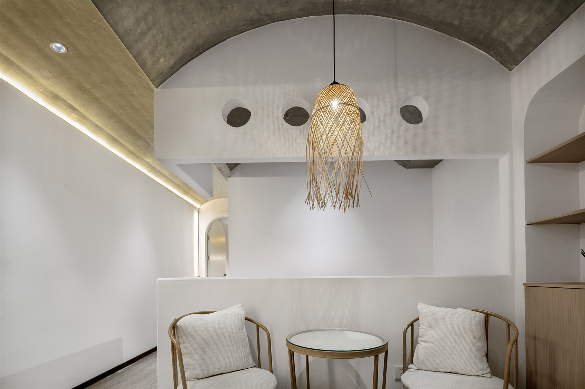
▲一楼等候区
店铺面积小,但是作为美容场所又必须满足一些基本需求,客户提出想要大一点的接待区,于是我们摒弃了大部分商业空间中将接待台设计的较为醒目的做法,将接待收银的区域融为一体,扩大交流空间。
The shop area is small, but as a beauty place, it must meet some basic needs. The customer wanted a larger reception area, so we abandoned the eye-catching design of the reception desk in most commercial space and integrated the cashier area to expand the communication space.
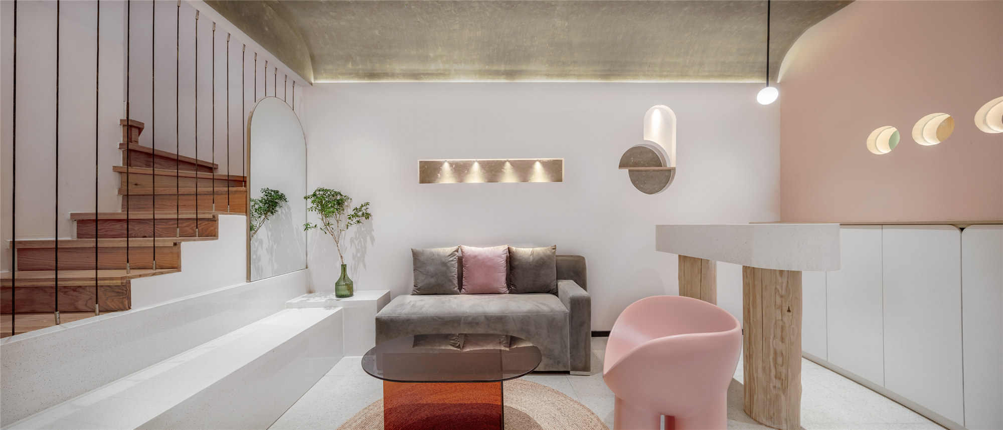
▲空间概览
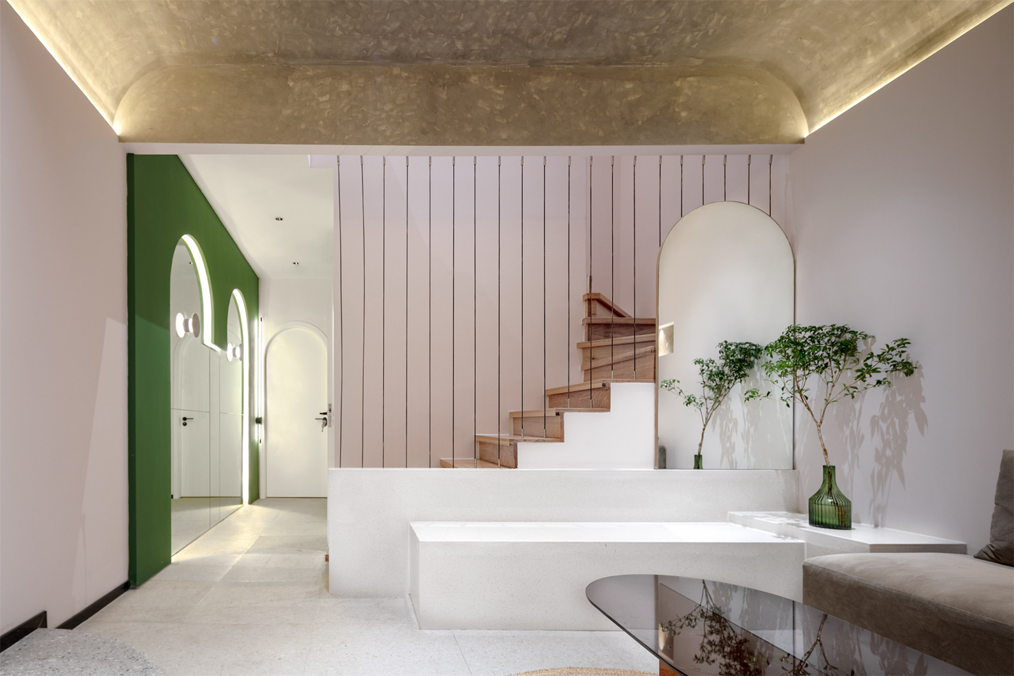
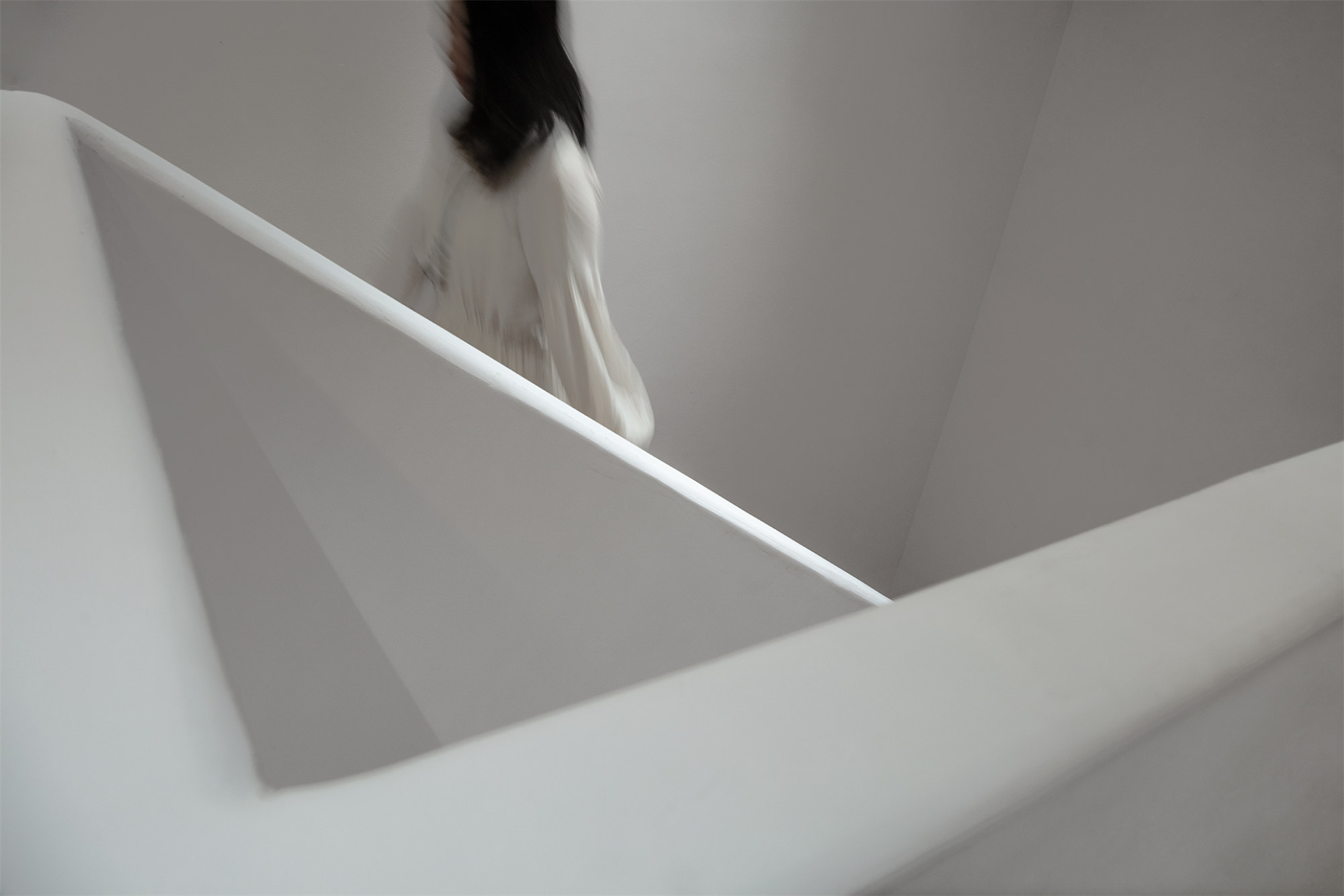
▲楼梯处的软隔断
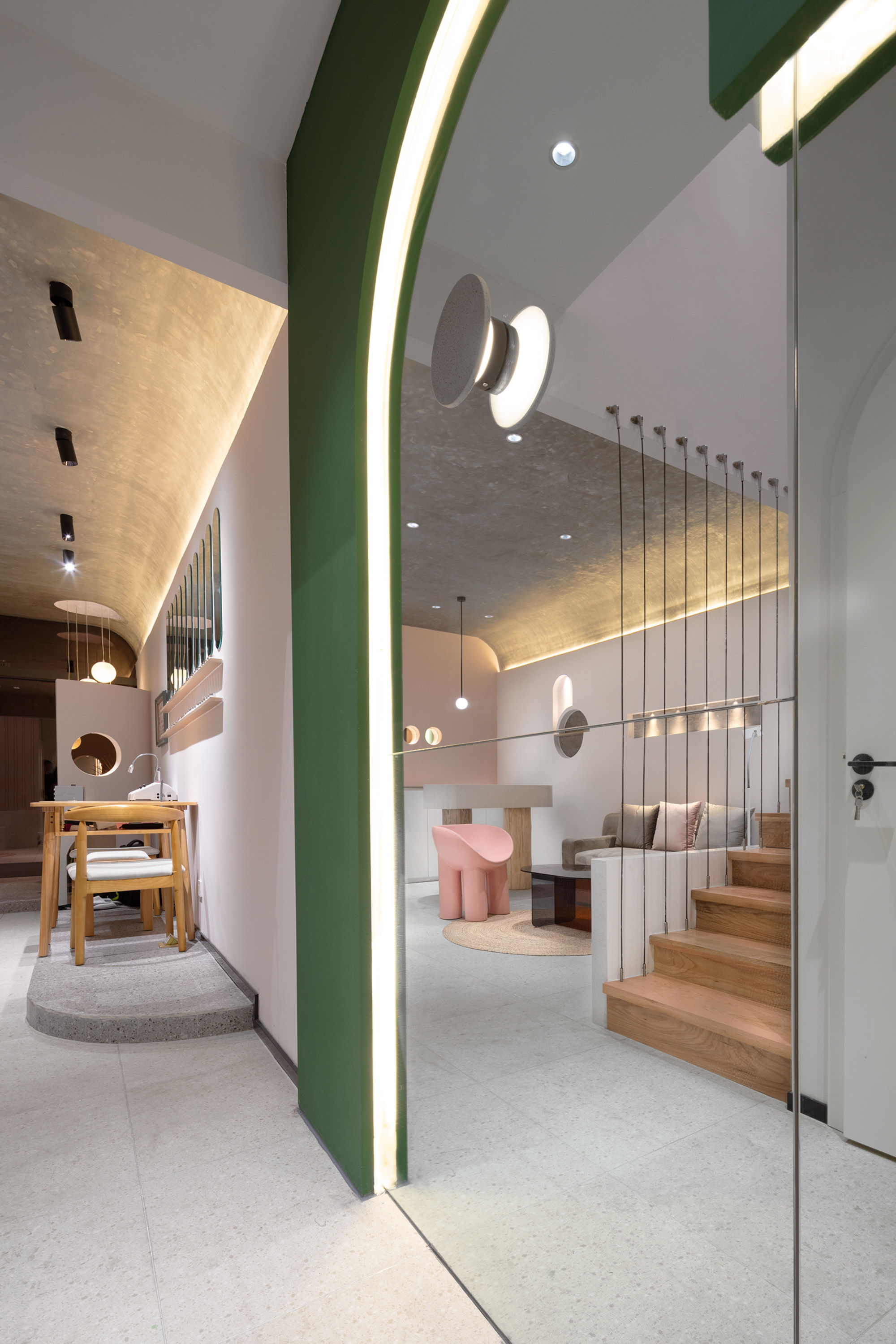
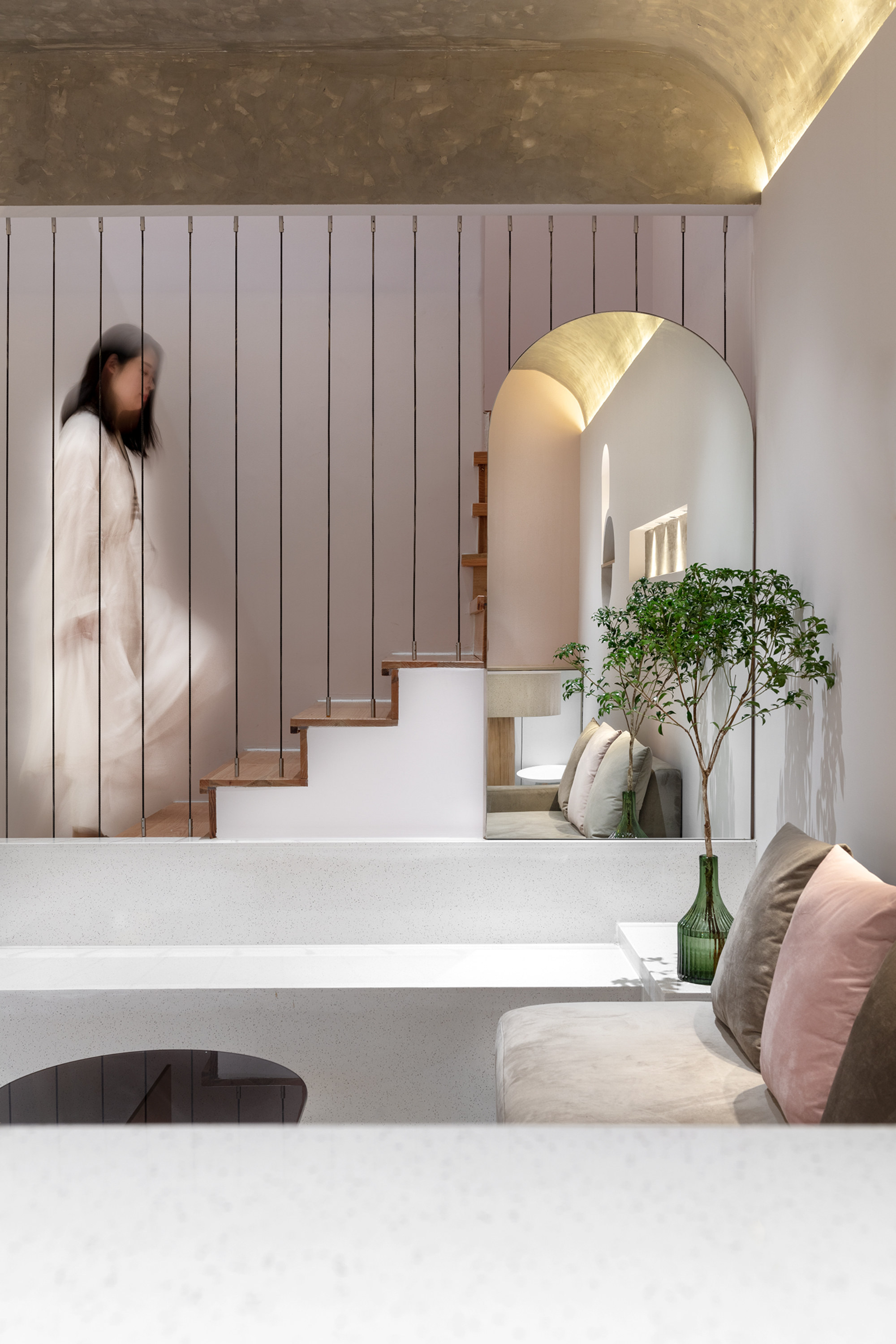
内部空间运用色彩进行区域划分,避免了空间狭小带来的局促感,水吧,洽谈区,卡座区相视而独立,楼梯处的软隔断处理既能满足包裹感又避免了视野的阻隔。一楼公共空间以弧拱形的顶面压低空间弱化墙顶连接性,运用水泥涂料进一步强化“洞穴”的概念。
The interior space uses color to divide the area, avoiding the cramped feeling brought by narrow space. The water bar, negotiation area and booth area look at each other and are independent. The soft partition treatment at the staircase can satisfy the sense of wrapping and avoid the cut off of the vision. The public space on the first floor depresses the space with the top surface of arc arch to weaken the connection of the wall top, and the cement coating is used to further strengthen the concept of “cave”.
▲楼梯
▲二楼休息区
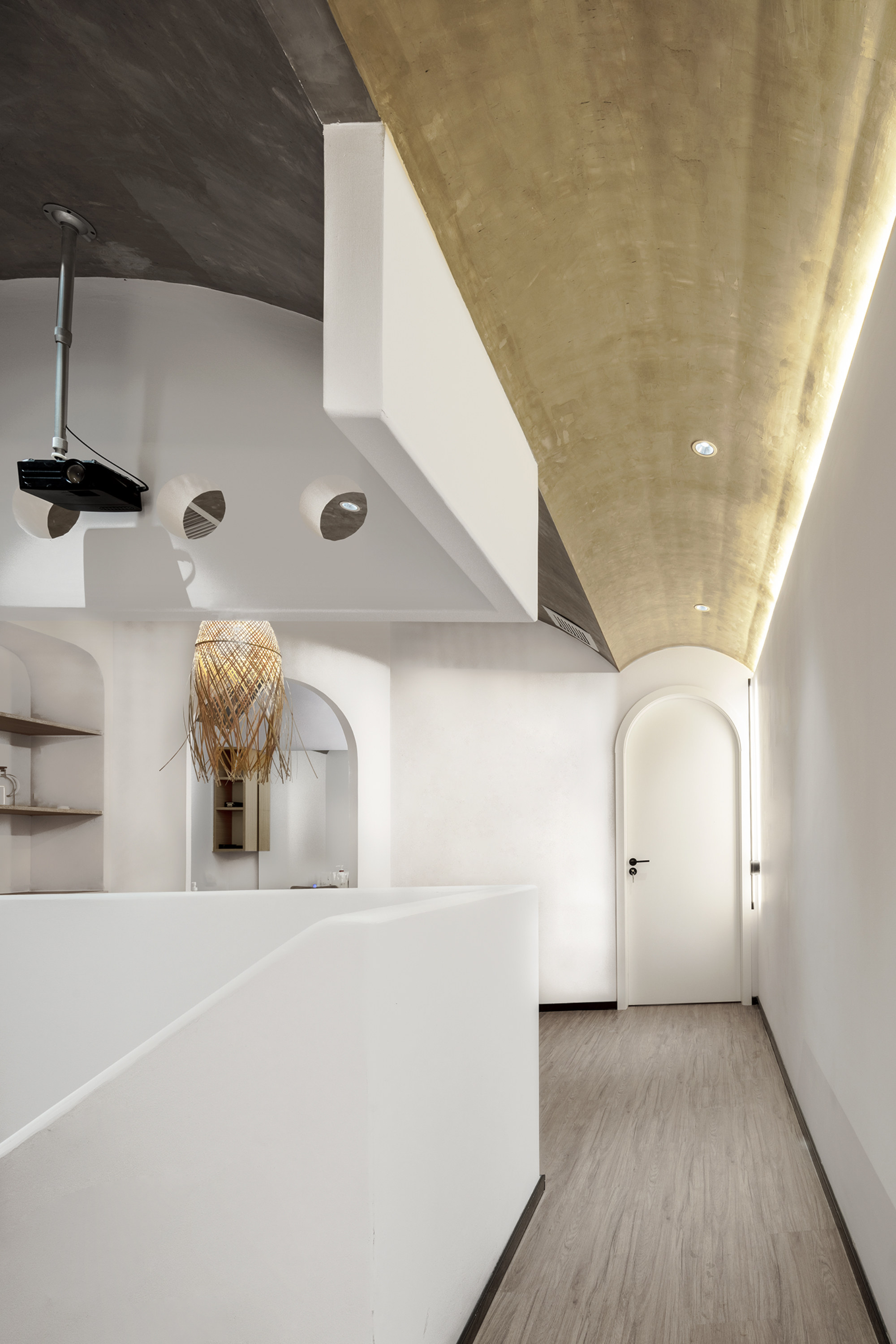
▲二楼走廊区
二楼整体风格更趋近于侘寂风,“侘寂”两字,本身出自中国禅学,逆时间之河而上,通过平静的空间窥见极简的生活。侘寂的美学意识就是黯然、枯寂,以粗糙,哀美之姿传达其意识。
The overall style of the second floor is more similar to wabi-sabi. The word “wabi-sabi” itself comes from Chinese Zen, and goes against the stream of time to see a minimalist life through peaceful space. The aesthetic consciousness of wabi-sabi is sombre and desolate, conveying its consciousness in a coarse and mournful image.
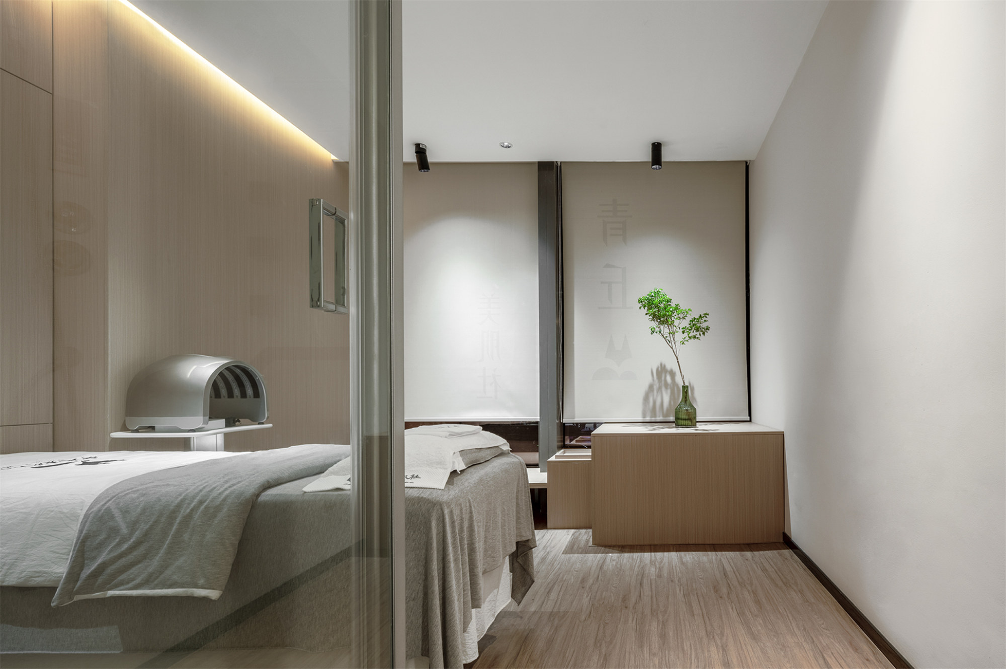
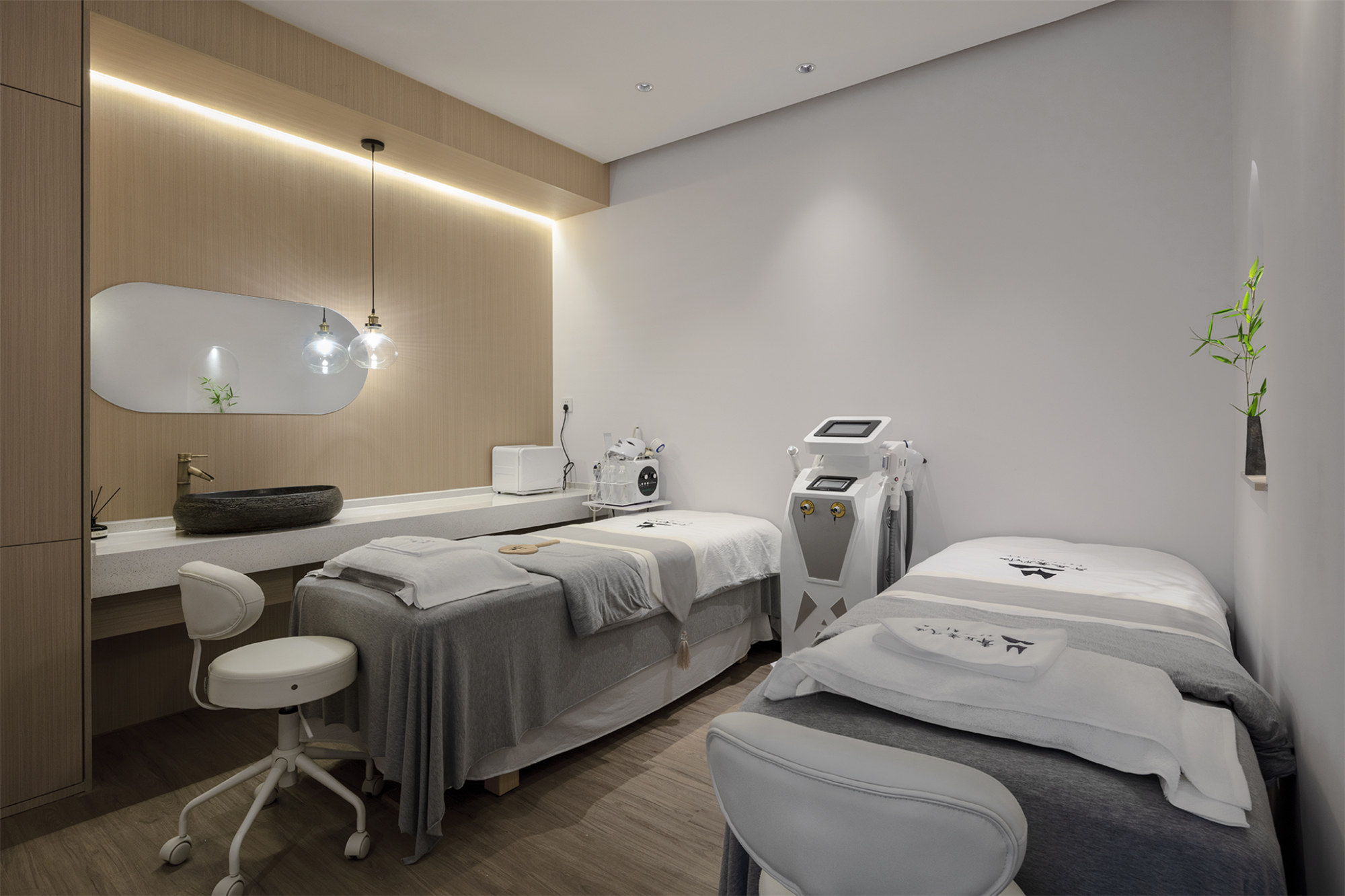
▲面部护理区
结语:对于这个项目,设计师在空间中以空间叙事和建筑漫步手法展开,将其当成时间的艺术,对空间展开序列性、引导性的重组,在行进中观察,体现空间的叙事,将对空间的感知放大。
Conclusion: For this project, the designer wants to use spatial narration and architectural stroll as the art of time to carry out a sequential and guiding reorganization of the space with the “Hand of God”, observe in the process, and the moving lines reflect the narrative of the space, so as to enlarge the perception of the space.
▲空间细节
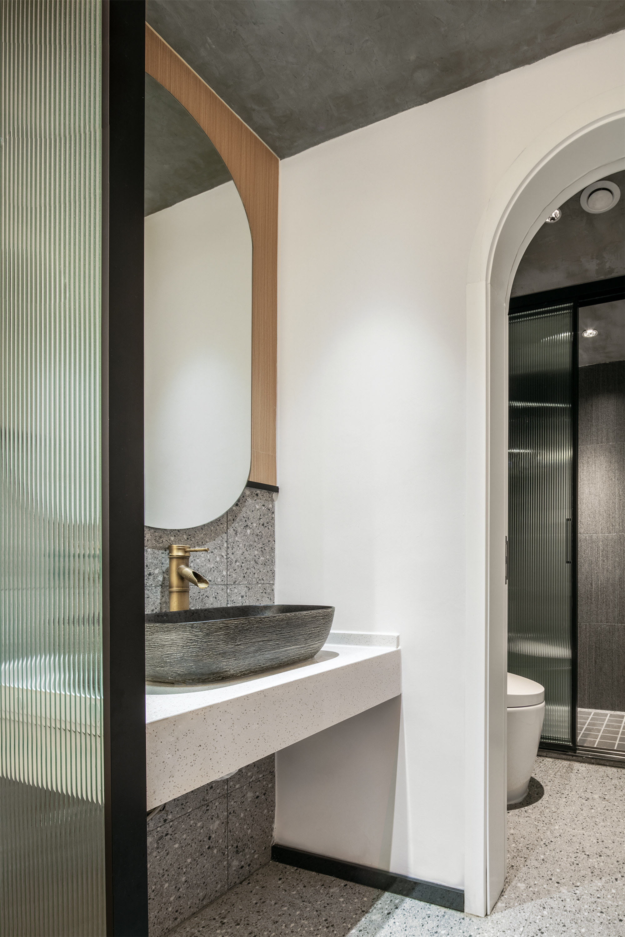
▲卫生间
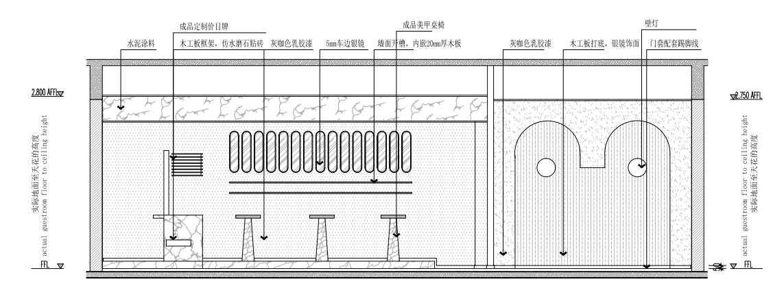
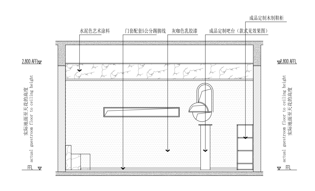
▲立面图
▲一层平面
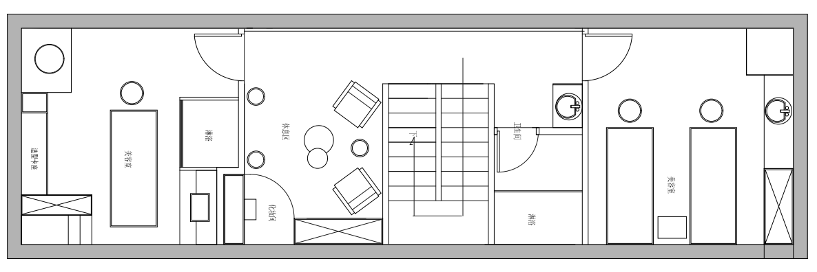
▲二层平面
项目信息——
设计公司:纪青空间设计
位置:中国合肥
类型:建筑
材料:水磨石、水泥、涂料、木地板、镜子、灯光


