itD首次对儿童理发品牌进行空间设计。设计之初,我们思考的一个要点是:如何将空间元素与斑马线儿童理发品牌自然地连接在一起,并通过整个空间故事让顾客对斑马线产生品牌记忆点?
For the first time, itD studio designs the space of a children‘s hairdressing brand. At the beginning of the design, one of the main points of our thinking is: How to connect the space element with the brand Zebra Line naturally, and let the customer have a strong impression on the brand through the whole space?
经过前期调研分析,我们发现大多儿童理发品牌的空间多使用动物和汽车元素,且无故事脉络串联,仅填塞各种儿童可能会喜欢的形象,而缺乏空间美感和自身空间辨识度的考量。
After the preliminary analysis, we find that most of children’s barber shop just use plenty of animals and car elements, and there is no connection between those incidents, but only filled in the image that children might like. Hence, most of children‘s barber shop lack of aesthetic sense and recognition.
现今,空间质感与美感已成为极重要的消费引导趋向,且更是品牌识别的发力点。斑马线想打造的高端形象,亟则须打通品牌与空间互通的关节。
Nowadays, the beauty and quality of commercial space have become an extremely important trend of consumer guidance, and also the point of brand recognition. Therefore, only to well-connect of the brand and the space, will Zebra Line achieve the goal of creating a high-end image.
空间概念 Space Concept
从业主方得知,斑马线在于“保护”的意味。红灯停,绿灯行的交通规则,使得每一条斑马线成为保护行人安全过马路的隐形骑士。儿童剪发,也在于安全贴心地在过程中保护好孩子们,让他们开心地享受自己的新发型。
It is known from the owner that the name of brand-Zebra Line-is meant to be “protected”. The traffic rules that red light stops and the green light goes, make every zebra crossing an invisible knight that protects pedestrians crossing the road safely. Children’s barber shops also protect children in a safe and intimate way, allowing them to enjoy their new hairstyles happily.
我们从“斑马线”这个词发散,辟除杂乱的元素干扰(比如首当直冲的“斑马”),思考将剪发和斑马线品牌可连接的元素,将“线”作为头脑风暴发散的原点,联想各种以“线”的形式存在的东西。
Starting from the word “Zebra Line”, we remove the messy interference (such as the upsetting “Zebra”), and think about the elements that can be connected to the brand. We use “line” as the origin of brainstorming, associating with a variety of things that exist in the form of lines.
最终回到了斑马线的产生地“城市”–人口密集,充斥着多种线条的地方。斑马线是城市的产物,但秩序严谨的城市高楼太过于无聊,于是我们把城市抽象成为儿童喜爱的元素–积木。
Eventually, it return to the “city” where the zebra crossing is produced-a densely populated area filled with lines. The zebra crossing is a product of city, but the orderly urban high-rises are too boring, so we abstract the city into a favorite element for children – building blocks.
▲开启新故事了New story starts.
空间布局 Spatial Layout
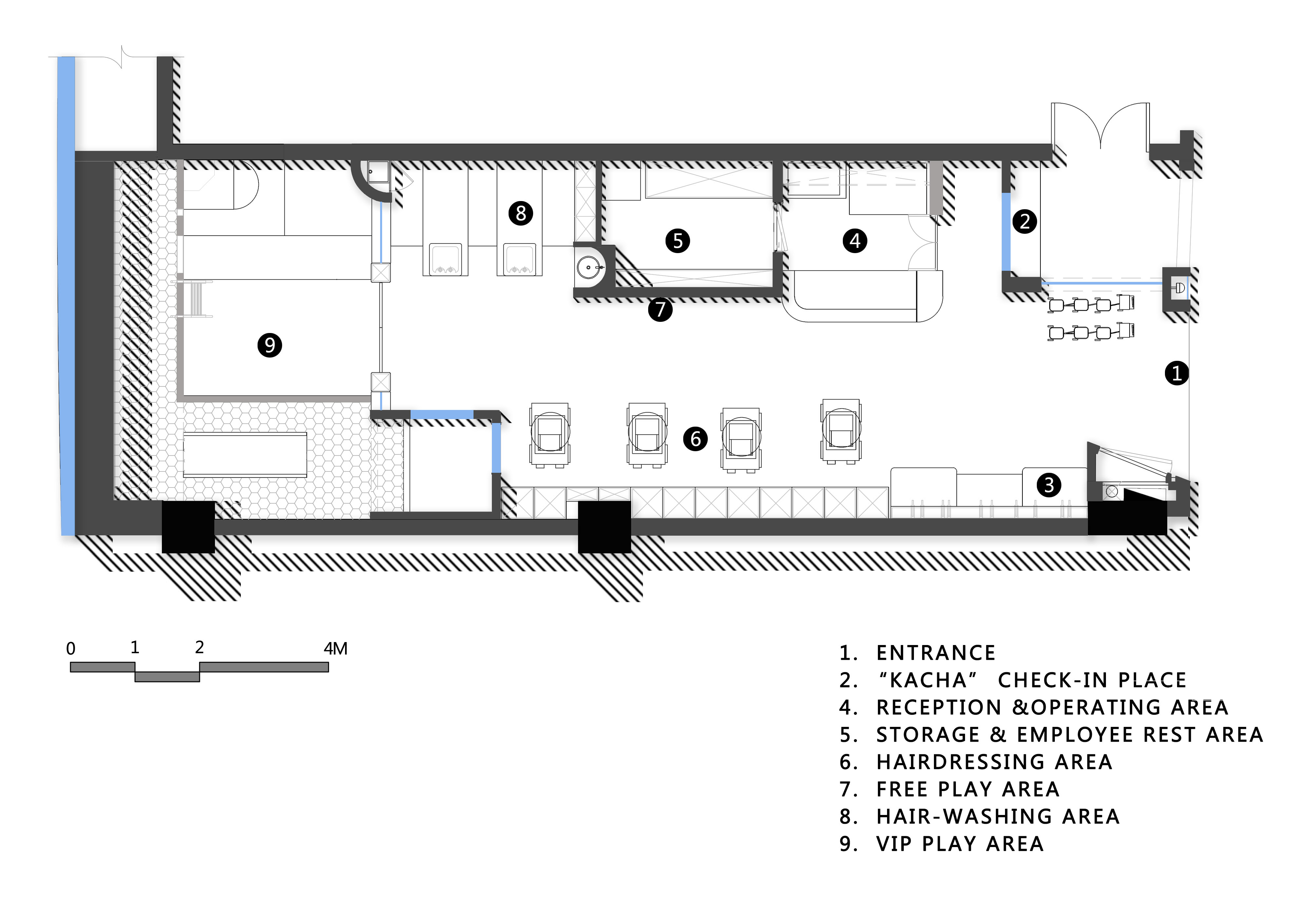
▲平面图Plan
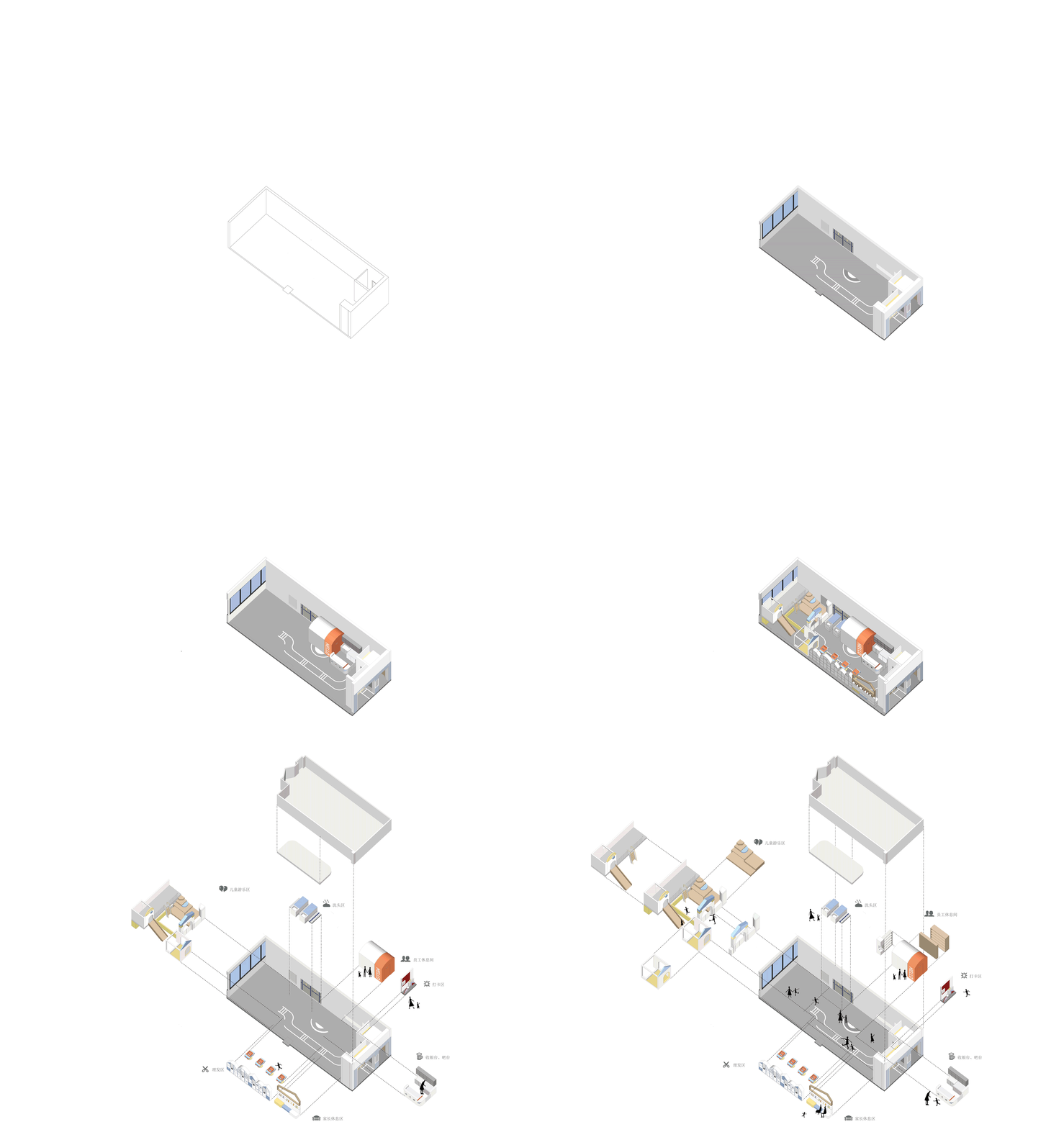
▲轴测图Axonometric
空间是一块块积木有序地堆叠,你能在这里发现刚刚提到过的城市意象,甚至可以看到房屋、火车、城堡等元素。更多属于空间的小亮点,往下看吧。
The space is blocks of blocks stacked in an orderly manner. You can find the city image just mentioned here, and you can even see the elements such as houses, trains, castles and so on. More small highlights in the space, let‘s keep looking.
打卡点 KaCha Check-in Place
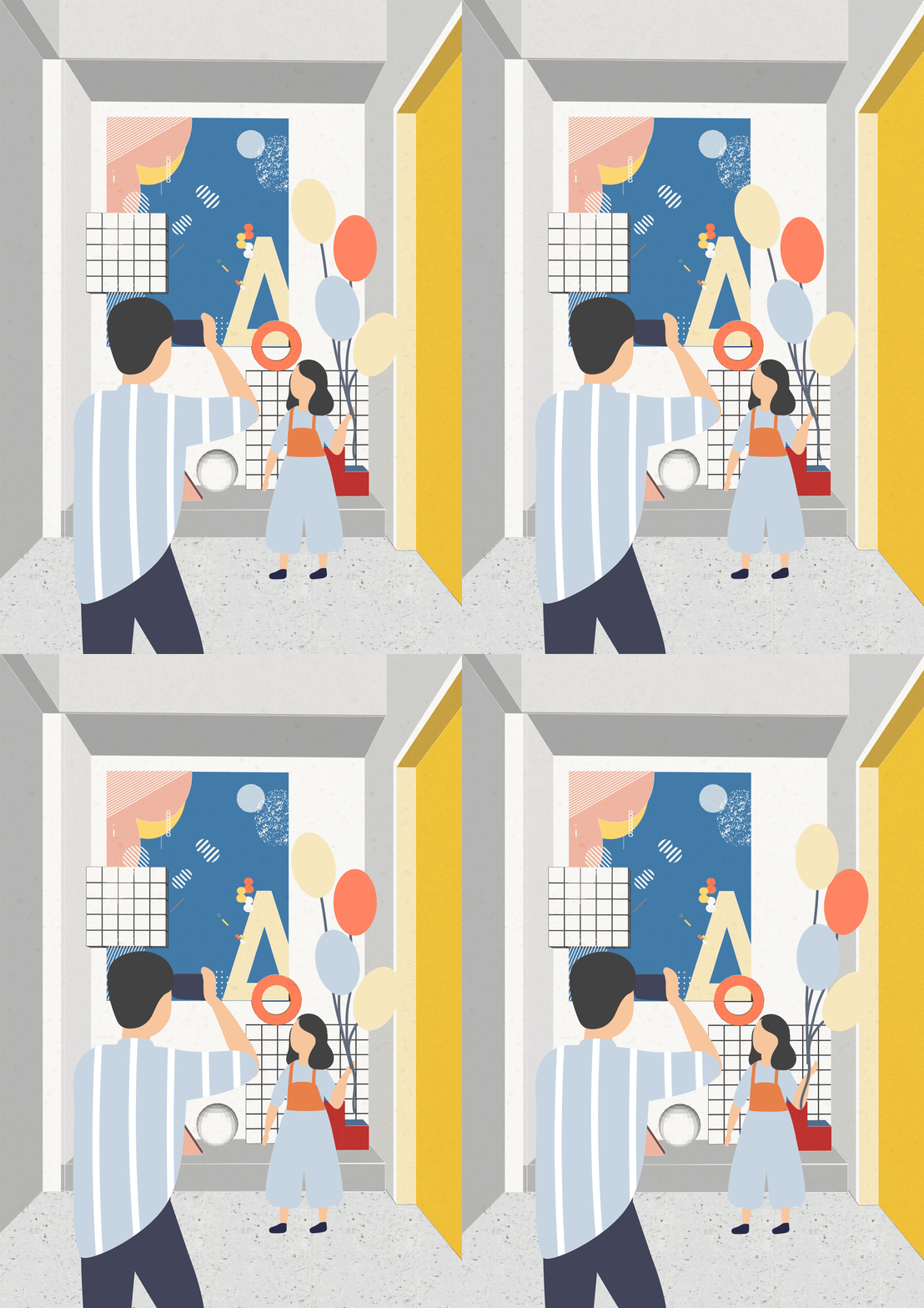
我们将外立面的一块墙面内推,形成打卡点。并在此设想个多个主题场景:恐龙时代、梦幻草原、积木城市、探索世界……可根据店内活动内容、节假日等更换主题场景。
最初方案中,我们还设想门头放置巨大的 “KaCha”,以醒目的字符引导人们拍照打卡。
We push inward a wall of the facade to create a check-in place. Then here comes numbers of theme scenes: Era of Dinosaurs, Great Grassland, Blocks City, and World Adventure… The theme can be changed according to the activities of the store, the holiday day, and so on.
In the original plan, we also want to put a huge “KaCha” on the door in order to use striking character attract people to take photos here.
▲现场图Real Scene
▲设想的插画风“Kacha一照”Illustration style of Ka Cha
收银台&储物间 Reception & Storage
▲现场图Real Scene
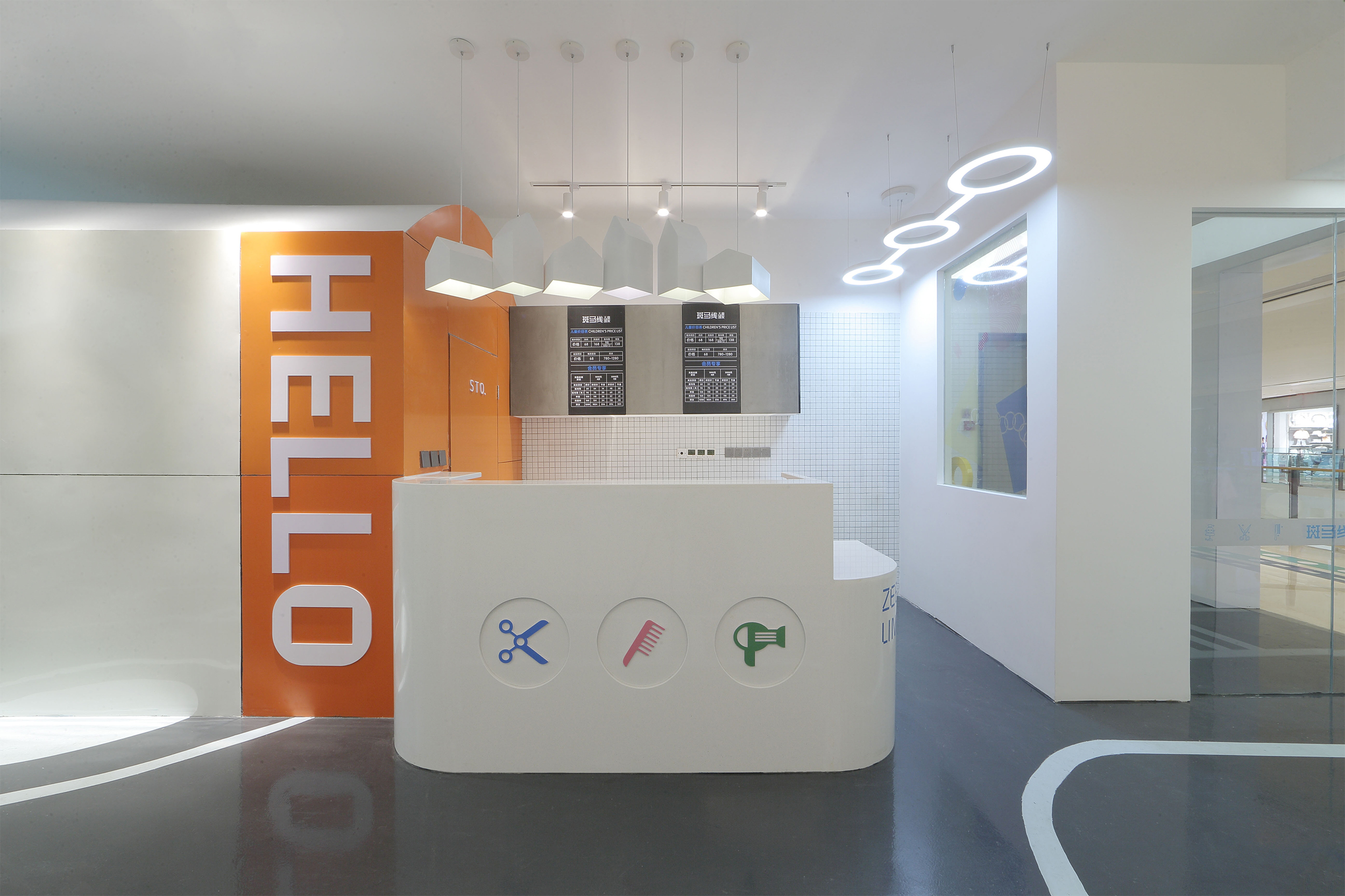
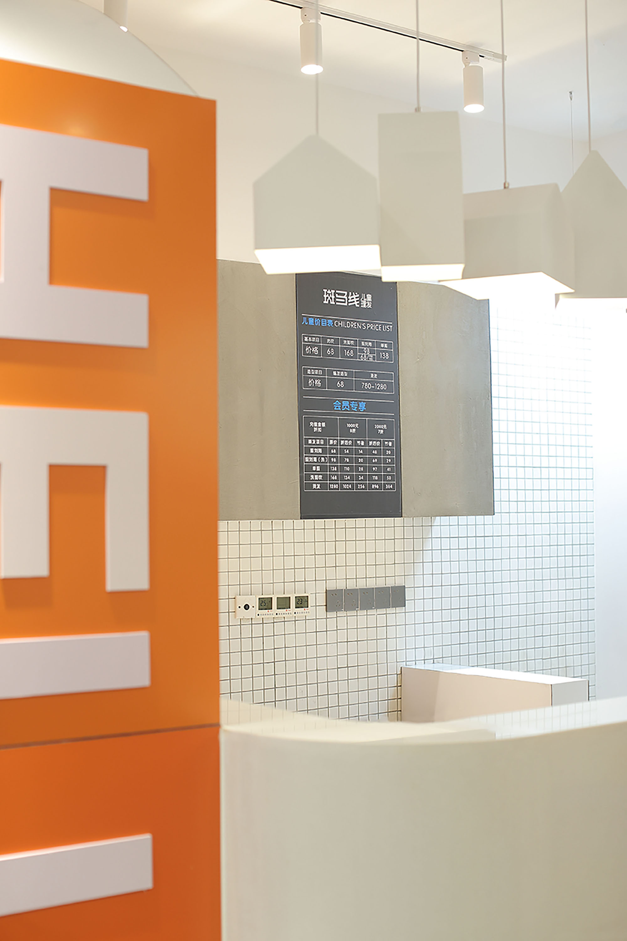
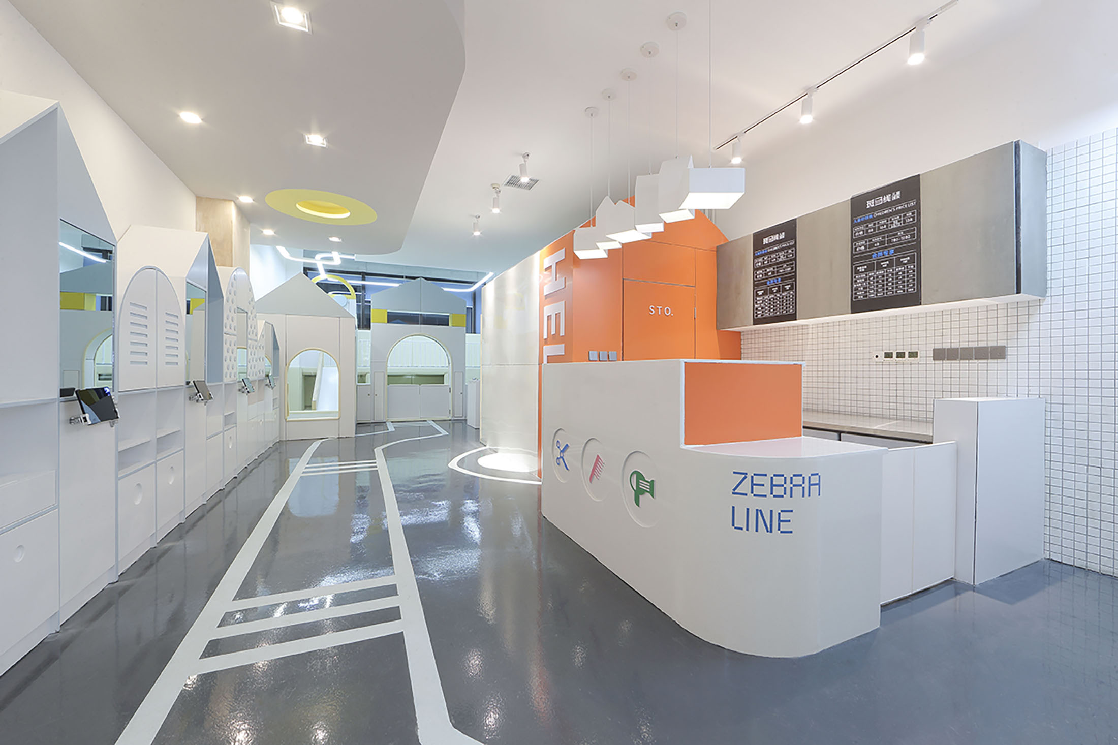
收银台与储物间(亦是员工休息室)连在一起,成为积木城市里YARD(院落)和HOUSE(房屋)的代表。“HELLO”呈现在储物间墙面,构成活泼开放的空间氛围。
The reception is connected to the storage room ( also the employee rest room) which represents YARD and HOUSE in Blocks City.“HELLO” is presented on the wall of the storage room to create a lively atmosphere.
▲设想的插画风空间动态Illustration style of “What will the space be like?”
理发&休息区Hairdressing & Rest Area
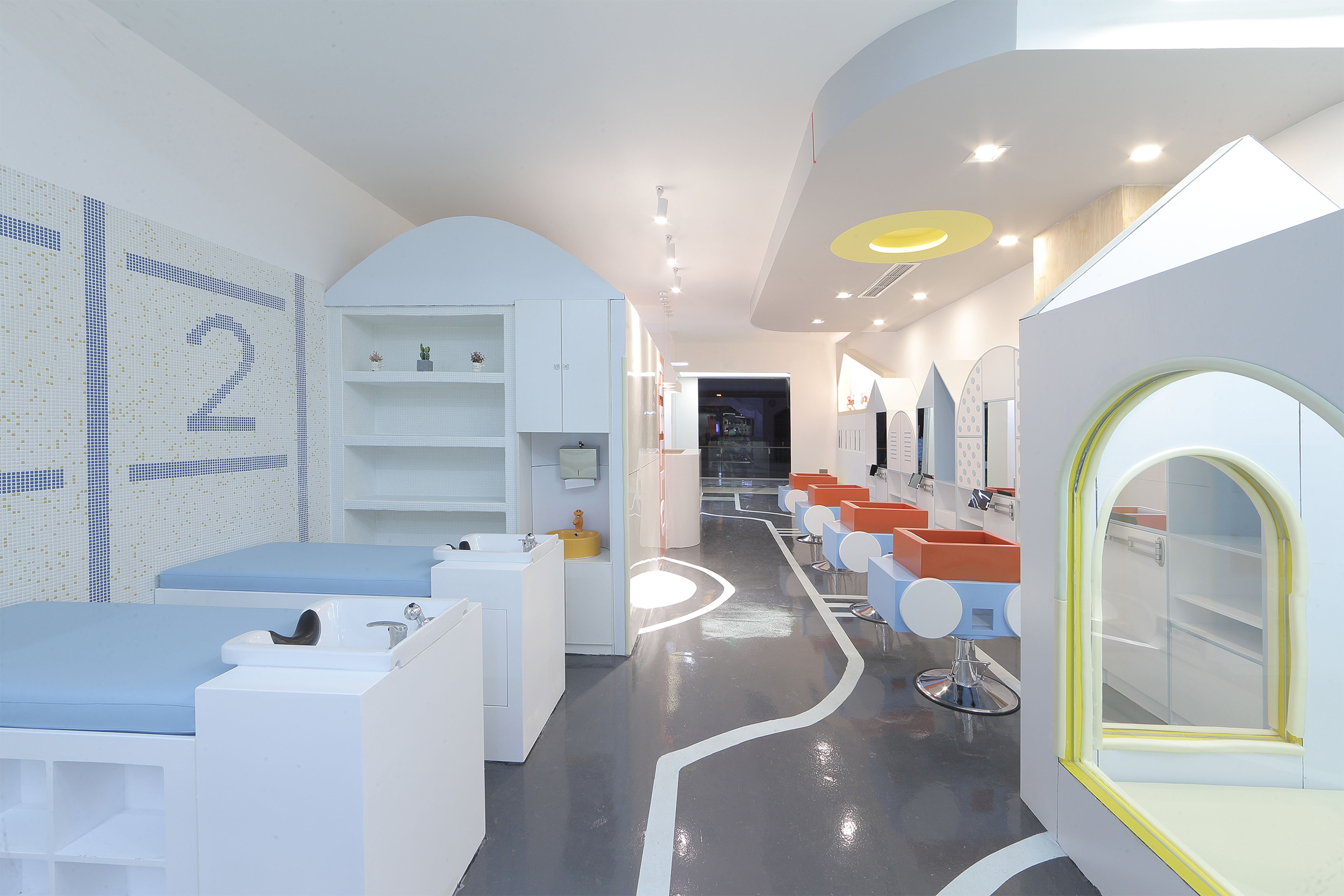
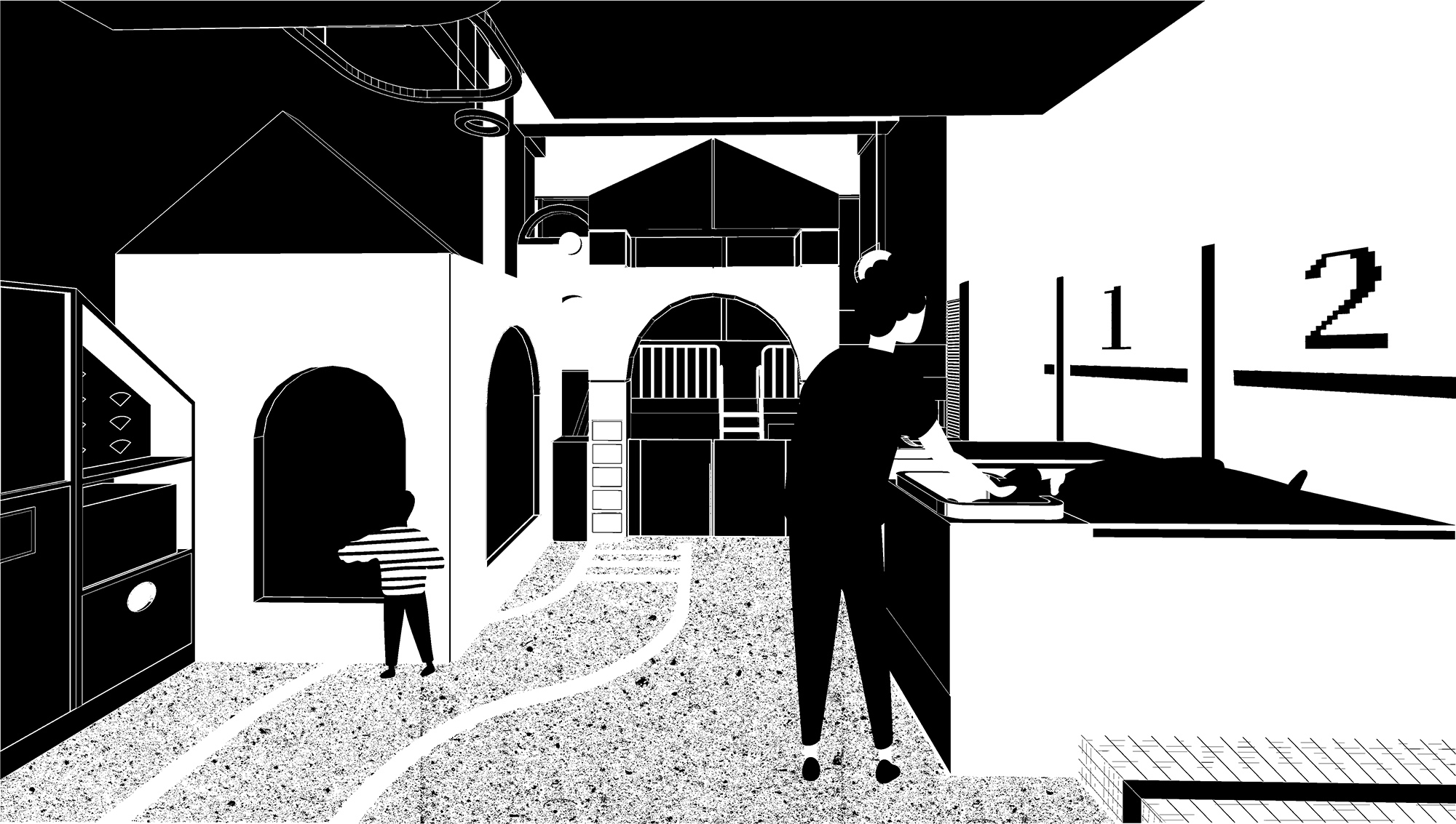
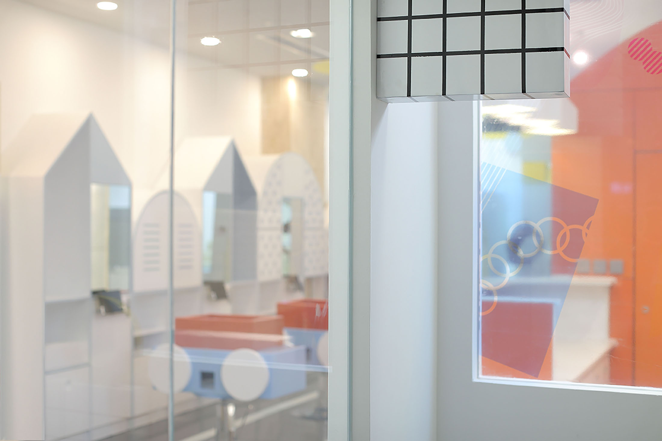
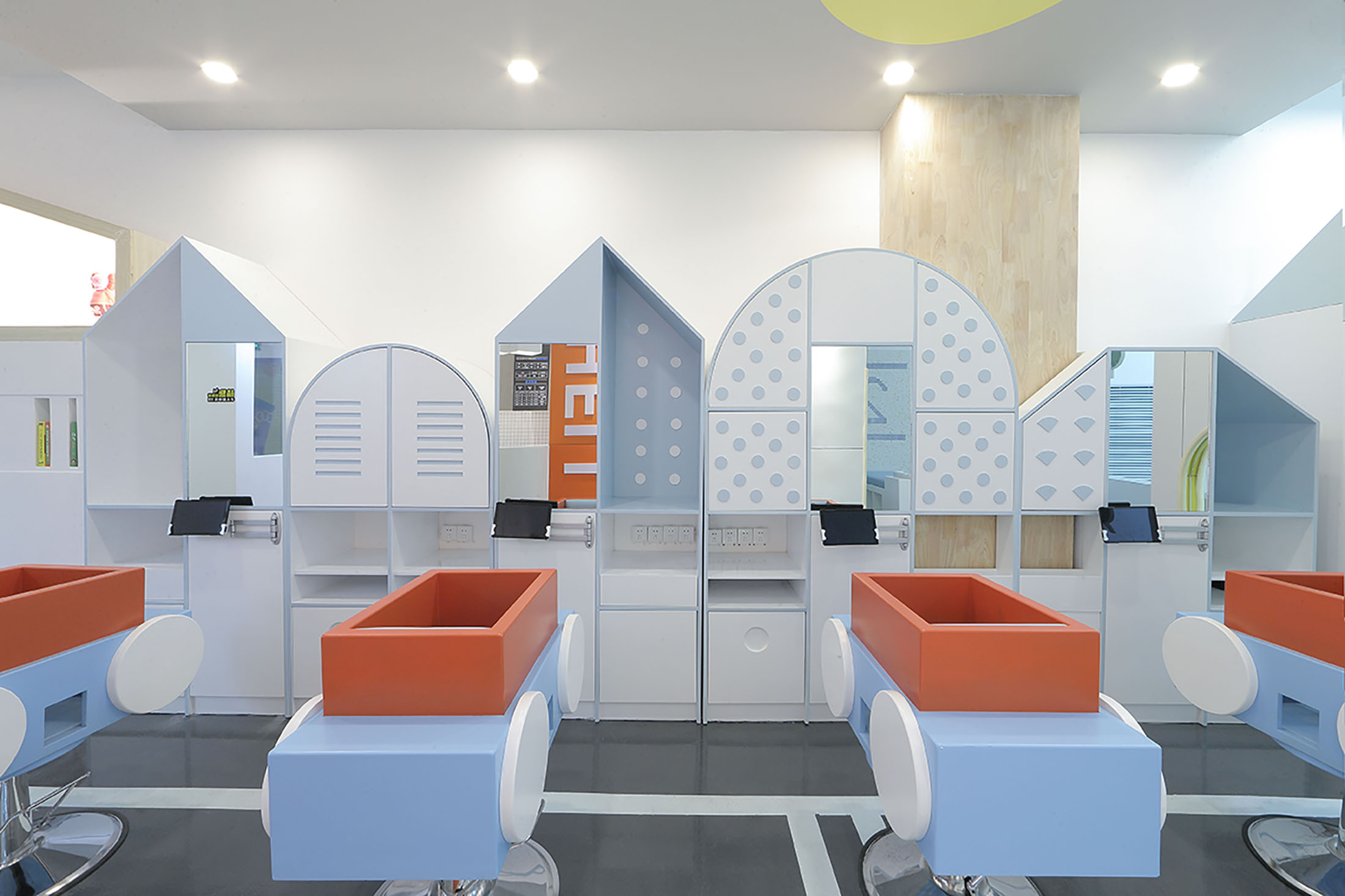
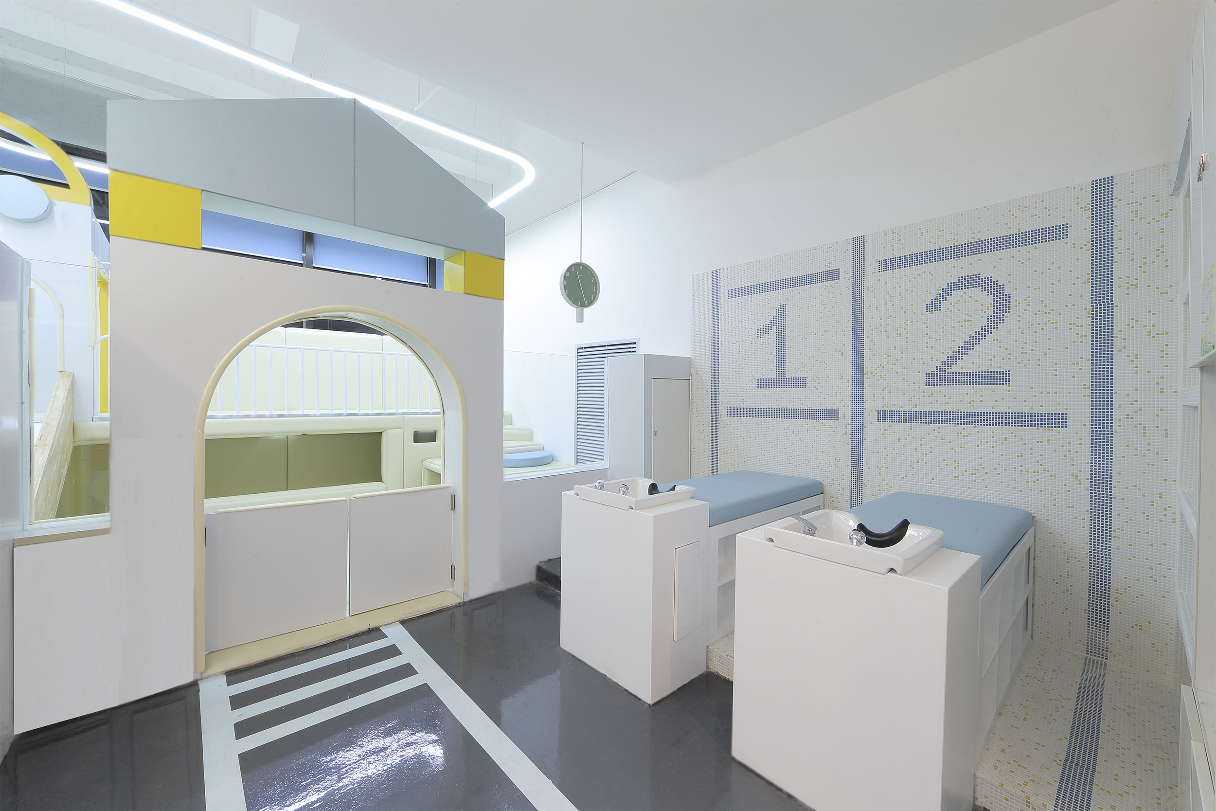
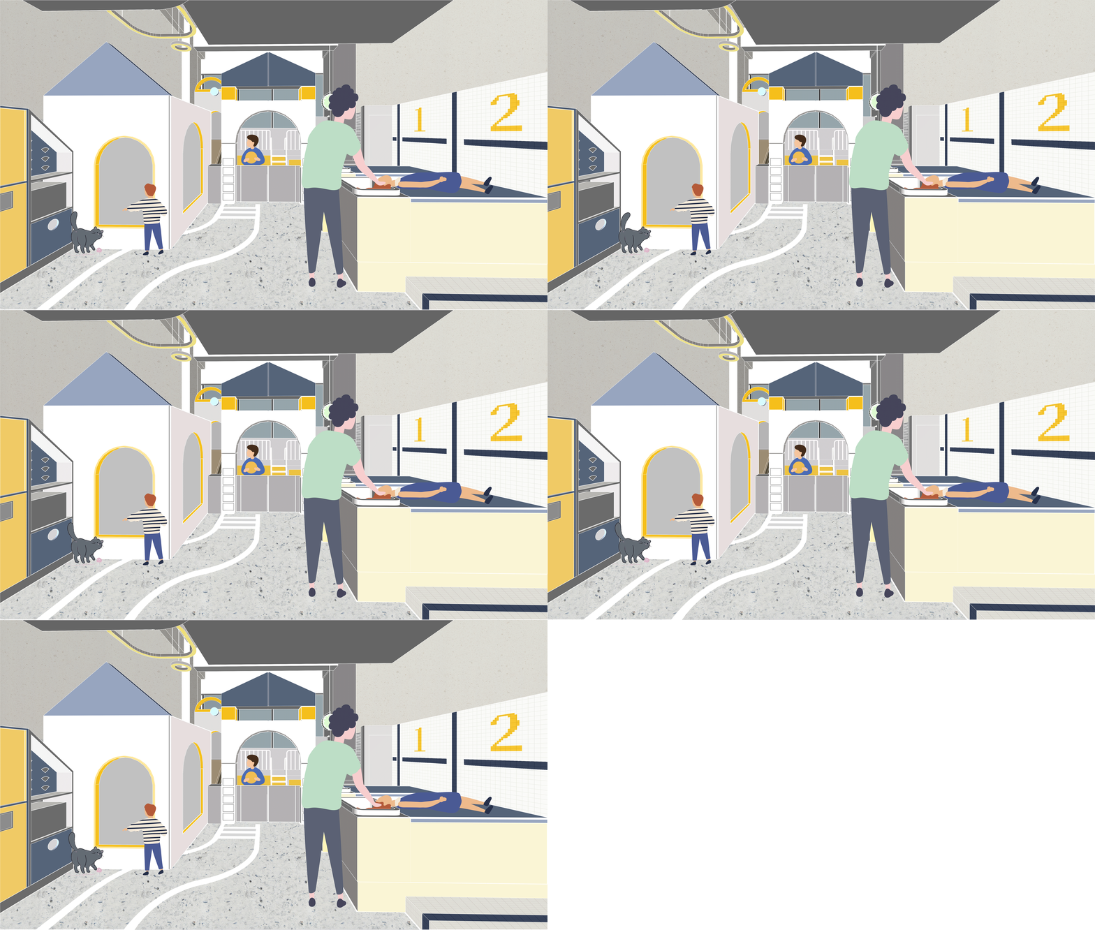
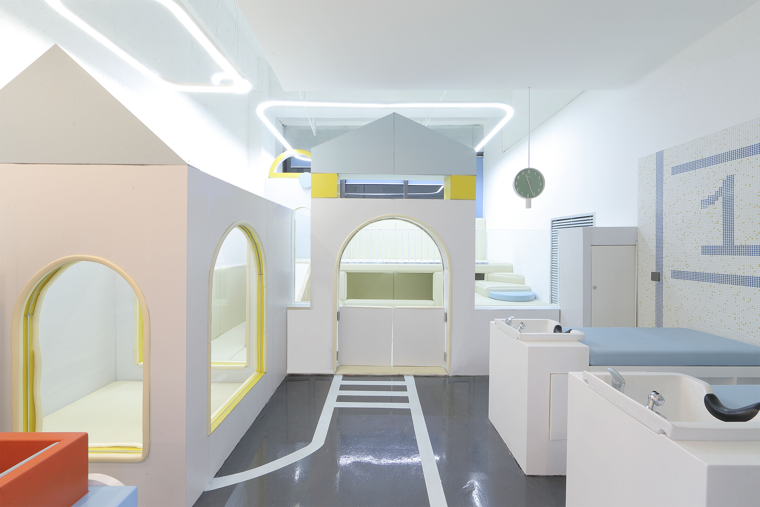
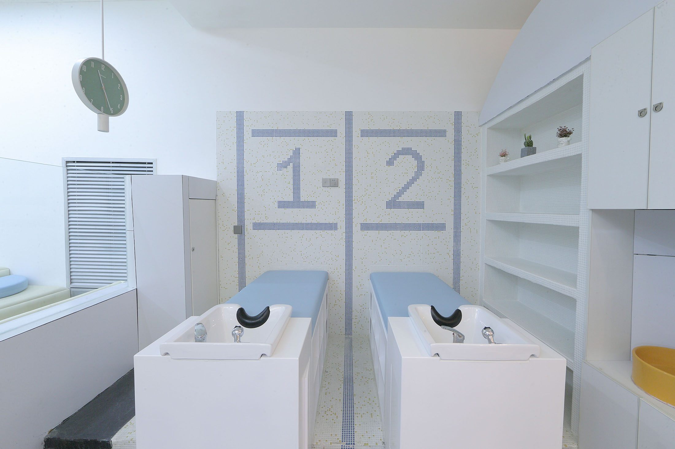
顺着地面的交通指引线,进入内部空间。积木城市里的一幢幢高楼是为孩子们的理发台,儿童理发座椅则是顺着交通路线停放在楼底停车场的一辆辆小汽车。
Enter the interior space along the traffic guidance line on the ground. The high rises in Blocks City are actually hairdressing cabinets, and children’s hairdressing chairs are cars parked in the parking lot at the bottom of the building along the traffic route.
▲现场图Real Scene
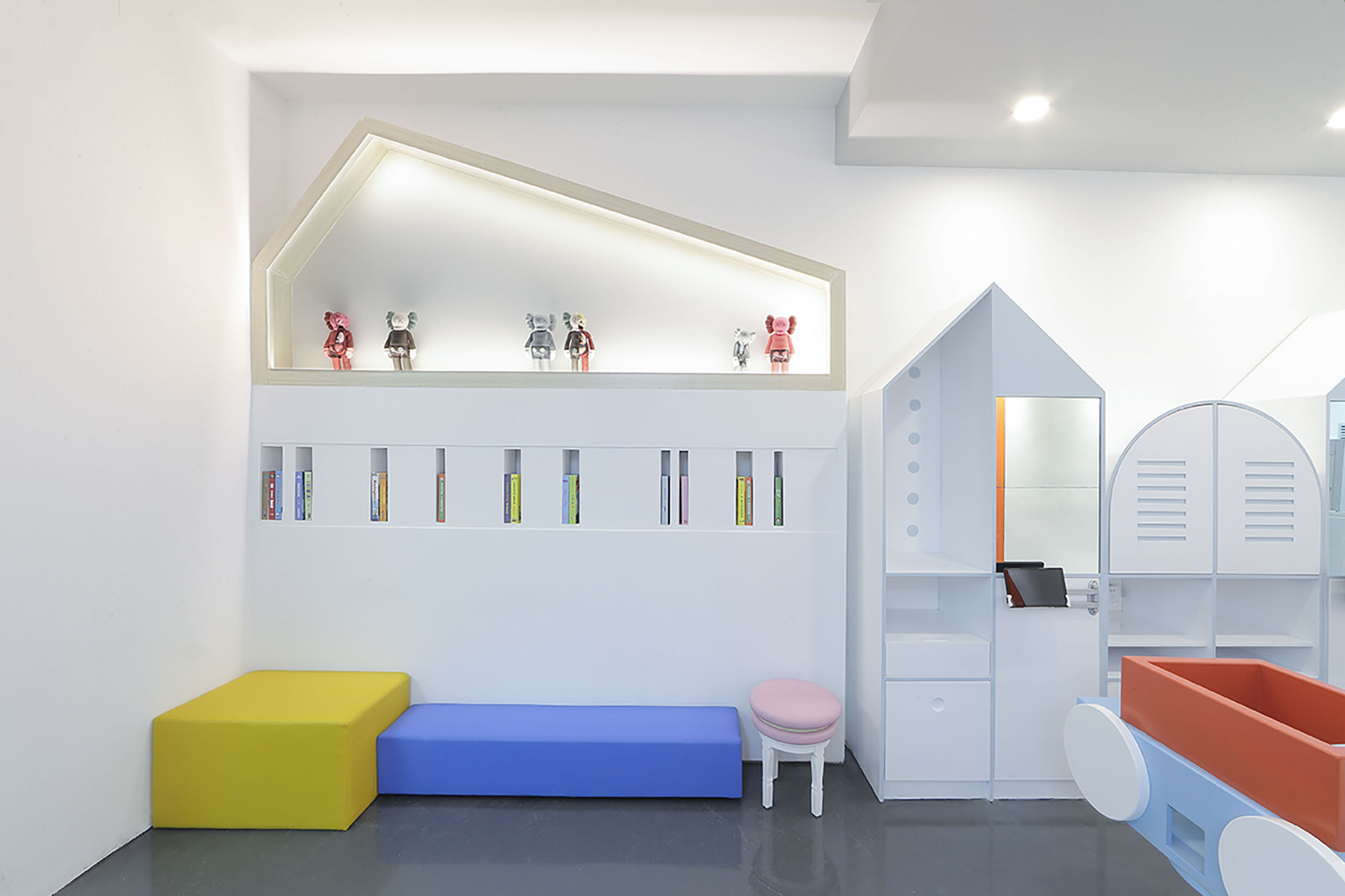
旁边的休息区是家长看顾孩子和等位的区域,座位设置为高低不一的积木块样式。上方的绘本、杂志等物件以抽卡的形式抽取出来,你永远不知道下一本有什么惊喜。
The rest area is the area where parents wait and look after their children. The seats are set in a block style of different heights. The picture books, magazines, etc. above are extracted in the way of drawing cards. You never know what surprises are in the next one.
▲现场图Real Scene
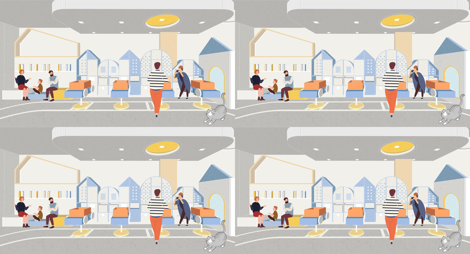
▲设想的插画风空间动态Illustration style of “What will the space be like?”
玩乐区
根据斑马线的经营管理模式,游乐区分为免费游乐区与VIP游乐区。
According to the management mode of Zebra Line, the amusement is divided into a free play area and a VIP play area.
免费玩乐区 Free Play Area
免费游乐区,除了免费绘本和小玩具,我们更设置了小型的磁性板,孩子们可以在上面组合创作图案。
In addition to free picture books and small toys, we have set up a small magnetic board in free play area, children can create patterns they like on it.
VIP玩乐区 VIP Play Area
理发店设置大型玩乐区听上去是很奇特的事情,而这其实是业主对儿童理发业态增值服务的思考,亦是对家长需求的考虑。游乐区虽免费面向VIP顾客,但非VIP顾客亦可消费后将小孩放到里面玩,自己则可以省心地到别处休闲1-2小时。
It sounds very peculiar to set up a large play area in a barber shop, actually it is the owner‘s reflection of value-added services for children’s hairdressing industry, and also a consideration of the needs of parents. Although the play area is free for VIP customers, non-VIP customers can also put children inside to play after they consume, and they can spend 1-2 hours elsewhere to relax themselves.
▲设想的插画风空间动态
▲现场图Real Scene
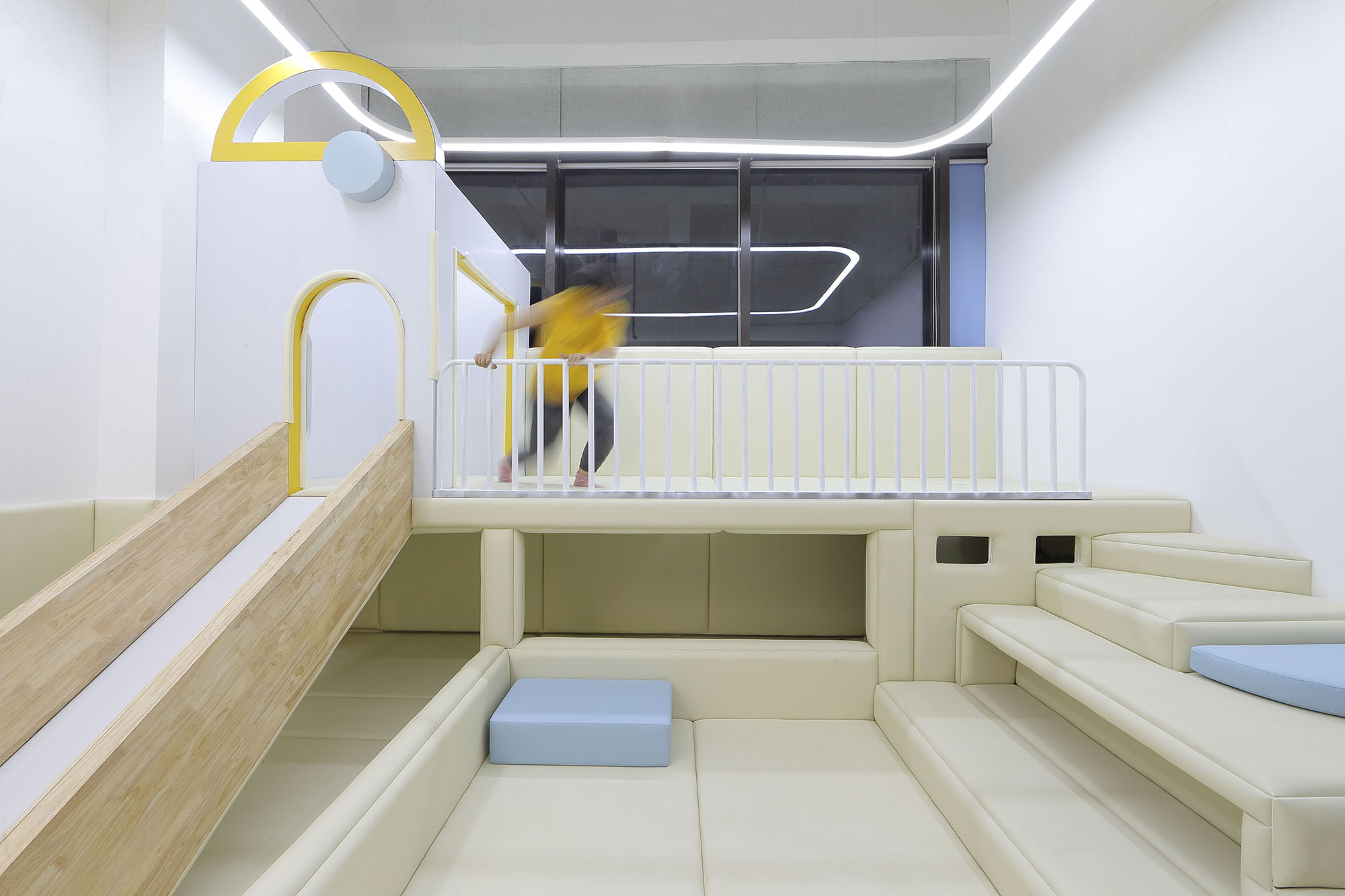
VIP游乐区承续积木主题搭建,是一个提供欢笑的积木之城。进入标志性的城堡牌楼,城中游乐设施有伫立在海洋球池中心的长条形小岛,小岛的通道墙上有大小不一的透明泡泡球,是孩子们观察岛外环境的望远镜。滑出小岛,陷进嘭嘭啦啦的海洋球池,正对的是两面开弧形窗的绘本区。
The VIP play area is built on the theme of blocks, which is a blocks city that provide happiness. Entering the iconic castle archway, a long strip-shaped island standing in the center of the ocean ball pool. There are transparent bubble balls of different sizes on the channel wall of the island, which are telescopes for children to observe the environment outside the island. Sliding out of the island, trapped into the smashing ocean ball pool, right in front of the picture book area with two curved windows.
▲现场图Real Scene
斑马线施工过程中,原本与业主的一次关于道具放样效果的沟通,由于期间更深入地了解到业主对斑马线的经营模式布局,于是我们提出修改原本的游乐区设计,以扩大游乐区作为活动承载区域的使用面积。
During the construction of Zebra Line, in the communication with the owner about the effect of the props stakeout, we proposed to modify the original play area design to expand the usable area of it as the event space, due to a deeper understanding of the owner‘s layout of Zebra Line’s business model.
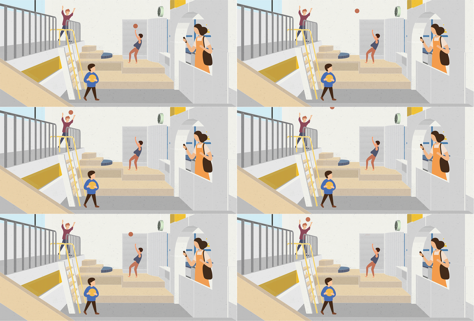
通往岛上的爬梯已正对着城堡牌楼,往左出岛依旧可以滑入海洋球池,从而见到绘本区的风景,而往右则可拾阶而下,找寻有趣的物件同玩伴玩笑嬉戏。
The ladder leading to the island is facing the castle archway. Go to the left, you can still slide into the ocean ball pool to see the scenery in the picture book area, and go to the right, you can find some interesting objects to play with your playmates.
▲设想的插画风空间动态Illustration style of “What will the space be like?”
我们相信每个空间有自身的性格,且空间性格与品牌打造和经营策略不容分割。我们希望儿童空间是动态的,有活力的,能感染人的。
走进这个“斑马线”,走入一个放大版的积木城市,不论年龄,我们都是其中的小儿童而已。
We believe that each space has its own personality, and the personality cannot be separated from branding and business strategy. We hope that children‘s spaces are dynamic, lively, and impressive.
Walking into this Zebra Line, walking into an enlarged version of blocks city. Regardless of age, we are all just little kids.
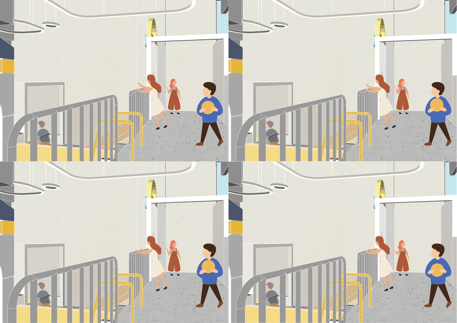
▲设想的插画风空间动态Illustration style of “What will the space be like?”
项目信息——
项目:斑马线儿童理发品牌终端空间设计
地点:重庆市渝中区龙湖时代天街C馆3F
面积:95㎡
主设计师:罗珮绮
设计团队:邓林 苏志展 舒晨 龚玮坭 刘宪平 陈佳恒 曾佑蝶
软装执行:苑丹
Project information——
Project Name: Interior design of chidren’s hairdressing brand, Zebra Line
Location: Longfor·Paradise Walk, Yuzhong District, Chongqing
Area: 95㎡
Design in charge: Luo Peiqi
Main Creation and Design Team: Deng Lin, Su Zhizhan, Gong Weini, Shu Chen, Liu Xianping,ChengJiaheng, ZhengYoudie
Funiture Supplier:Yuan Dan


