在着手店铺空间设计之前,通过透彻分析空间场所和项目背景,现场的空间要素、业主的诉求、陈列商品的调性等等这些细节元素,会在我们脑海里形成一个关联的网络,这个客观要素网一旦形成便会与设计师的我们相遇,迷一般地产生出概念的火花,当我们恰当地捕捉到他们时,就会形成较为清晰的视觉化形象。
Before starting the space design of the store, we analyzed the details, including the spatial place and background information, the space elements, the owners‘ demands, and the tonality of the displayed goods, all of which would form an associated network in our mind. Once this objective network was in place, it came to us, the designers, before we co-generated the spark of the concept in an amazing way. Having properly captured it, we obtained a clear visual image.
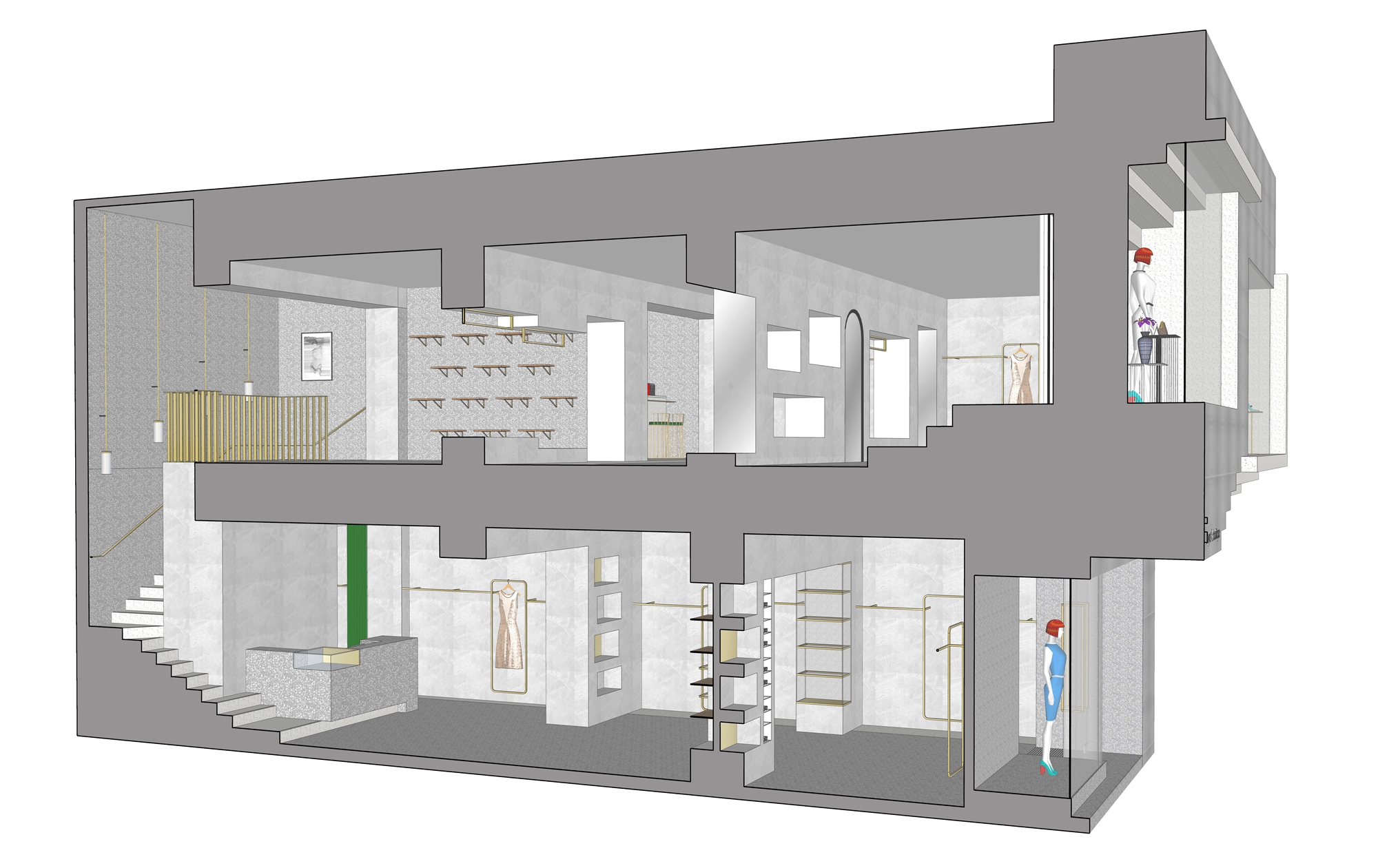
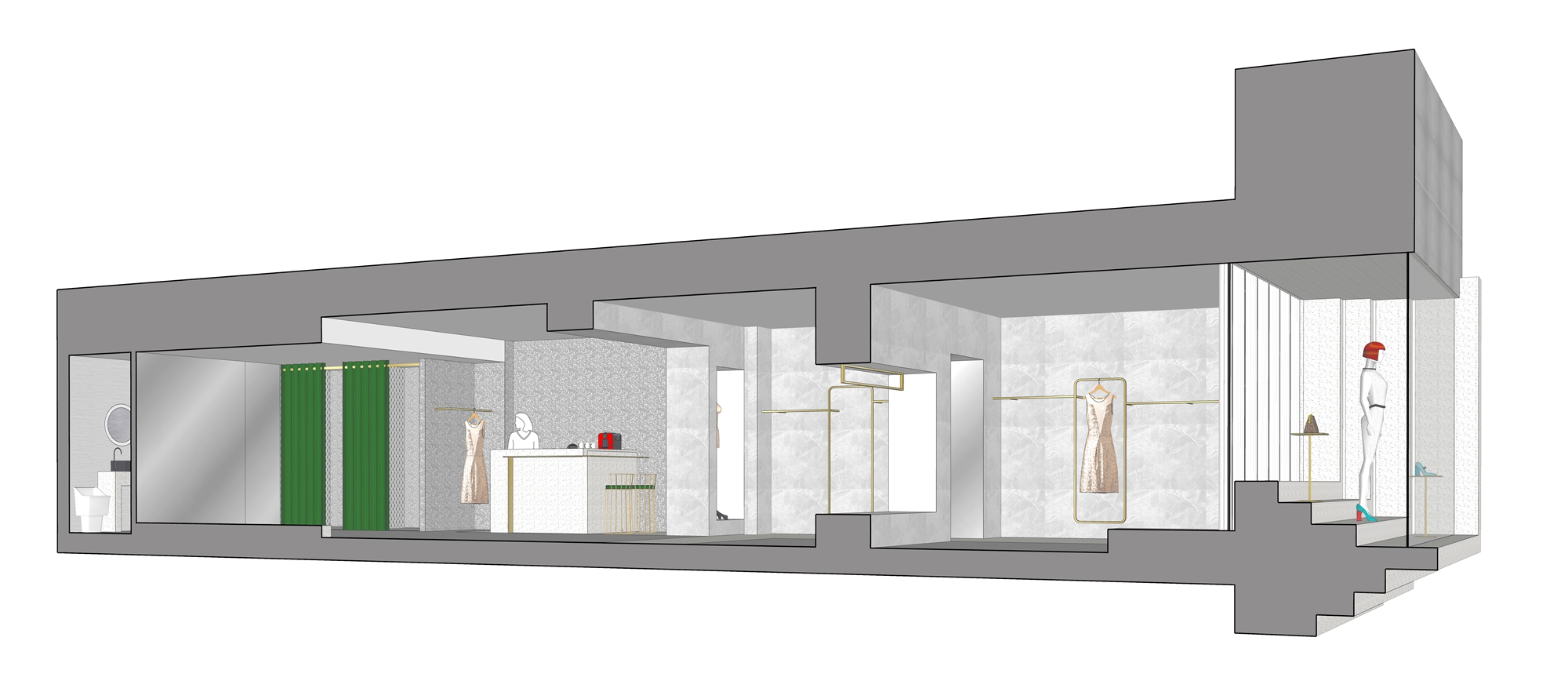
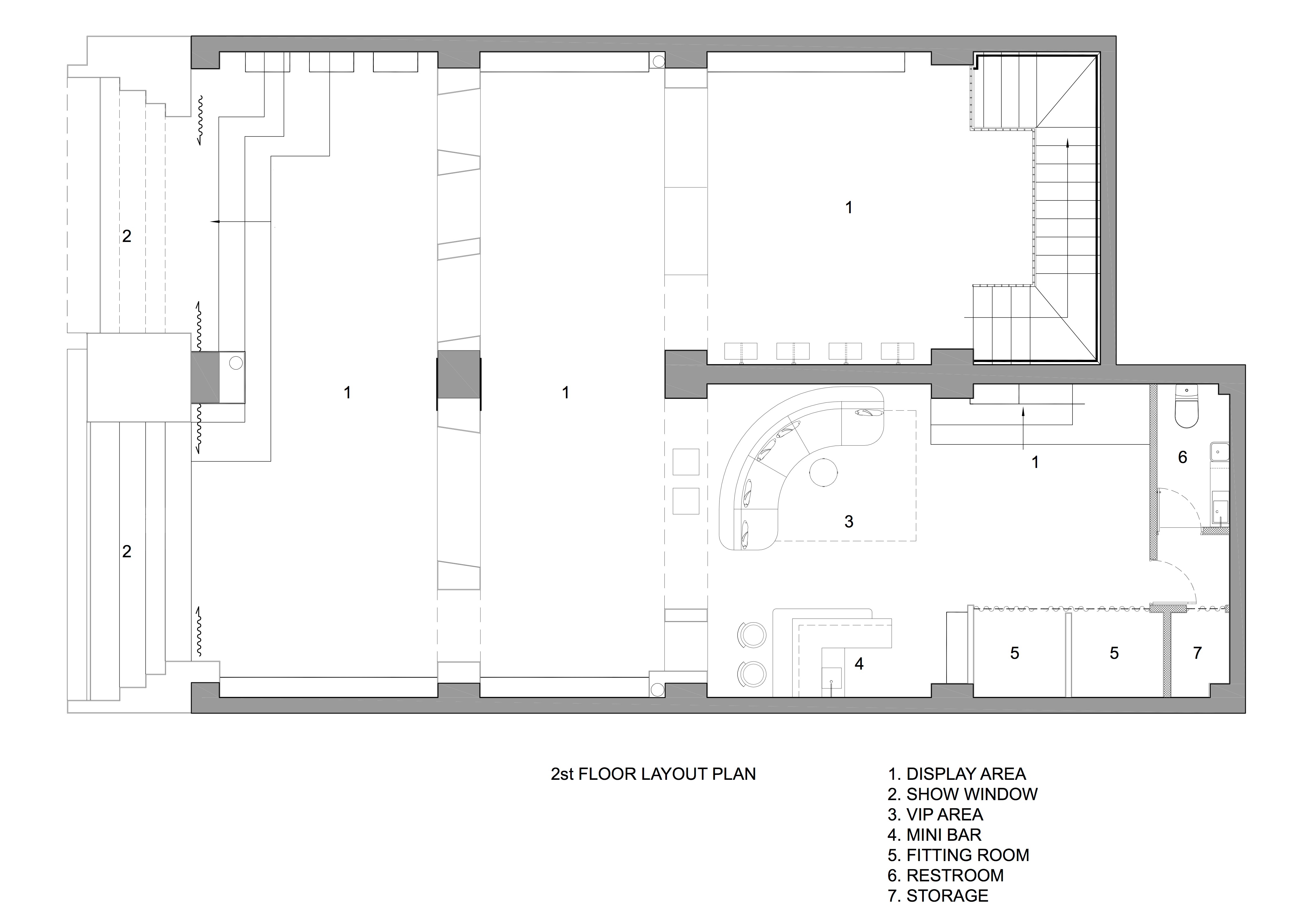
在踏勘现场,充分了解层高、梁柱、楼梯等要素后,我们发现过低的大梁是这个空间中无法回避的“难题”,它们将店铺分割成进深方向的几个琐碎空间。暴露或是平顶这样的常规做法,都无法解决他们对空间的不良影响。如何让空间看起来轻松自如,并体现出预想的优雅感,需要一个巧妙的解决方法。最终我们决定:将大梁从天而降拉至地板,形成一个有厚度的“墙体”,同时在这个墙体上开“洞”,“洞”中陈列商品。这种既满足功能又营造空间感的手法一经确立,便奠定整个空间的基调。在O.T.S店里,几乎看不到陈列道具,空间成为体验的主体,“墙”营造出层层递进的关系。购物者可以在这里获得一种漫游式的购物体验,特别是在二楼,三层递进的空间,购物者漫游其间,透过不同造型的“墙洞”,“你”和“我”两两相望成为彼此的风景。移步换景式的购物体验也使O.T.S拥有了独一无二的属性。
On the investigation site, we found that the low girders in this space were the “difficulty” that couldn’t be avoided after fully examining the elements such as floor height, beams and stairs. They divide the shop into several trivial spaces by depth. Conventional practices, like exposure or flat top, may fail to help eliminate their adverse effects on the space. Thus an ingenious solution is called for to make the space look relaxing and give off the elegance as expected. In the end, we decide to pull the girders from the top to the floor to form a “wall” with certain thickness. We also cut “holes” in the wall, and display goods in them. This practice- both meeting the function and enhancing spaciousness- would set the tone of the whole space. In the O.T.S store, there are almost no items specific for display; instead, space becomes the highlight of experience, and the “wall” creates progressive layers. Shoppers can roam around the store, especially through the three layers of the progressive space in the second floor. While wandering around, they may see each other through different shapes of “holes” in the wall, which could add some fun during their visit. To sum up, the experience that shoppers can change their views as they move endows O.T.S a unique feature.
此次设计的另一个重点是临街的大橱窗,原本呆板的两个长方形窗洞,借由凸出外墙的装饰架而获得新生。L型的退台在两个橱窗分别形成“台阶”和“门洞”两种不同的造型,其中一个橱窗的台阶形式延伸至室内,形成室内、外自然的关联。丰富且变化的退台橱窗,透露出ARTDECO的优雅气质,不仅为O.T.S带来了独有的标志性,也确立了品牌的空间调性。
Another feature of the design is the large window near the street. The two rectangular window openings that were originally wonderless can get reborn by the decorative frame that protrudes from the outer wall. The L-shaped backward terrace forms two different shapes of “steps” and “door opening” in the two windows, and the “steps” extend inwards to form a natural connection between the interior and the exterior. This dynamic windows underline the elegance of ARTDECO, bringing unique signature to O.T.S and establishing the spatial tonality of the brand.
本次项目的主材选择了有生命感的水磨石。浅灰色和白底粉颗粒的两款水磨石打底,搭配有光泽度和手工纹理感的浅灰色马来漆,加上挂衣杆的金色,共同营造出简约而高雅的购物氛围。水磨石自然的石子纹理为空间奠定了亲切宜人的主调,同时这样的颗粒感,也正体现了设计的另一层意向:“园景”,它最终完满了我们在这个设计中的“造园”梦。
The terrazzo with a sense of life is chose as the main material of this project. Two kinds of terrazzo, namely, the light grey one and the white one with pink particles in it, are used to set the basic tone, together with the light gray Malay paint of gloss and hand-made texture, plus the gold clothes rail, create a simple and elegant shopping atmosphere. The natural stone texture of the terrazzo would lay an amicable and pleasant tone for the space. This kind of graininess also reflects another intention of the design: “View of Garden”, a final step towards our dream of “creating a garden” in the store.
项目信息——
项目名称:芜湖O.T.S时尚店
设计方:上海有寻建筑设计事务所
项目设计 & 完成年份:2018年5月- 8月
主创及设计团队:汪琳、王丹、杜玉鹏
项目地址:安徽省芜湖市镜湖区中西友好花园29-30号
建筑面积:253平方米
摄影版权:林山
合作方:芜湖天城装饰工程有限公司
客户:O.T.S时尚店
品牌:CDN西顿照明、上海媛艺水磨石、立邦艺术漆
Project name:Wuhu O.T.S Fashion Store
Design:Circle Design Studio Shanghai
Design year & Completion Year:05-08.2018
Leader designer & Team:Lin Wang, Dan Wang, Yupeng Du
Project location:No.29-30,West Friendship Garden, Wuhu
Gross Built Area (square meters):253㎡
Photo credits:linshan
Partners:Wuhu Tiancheng Construction engineering co., LTD
Brands:CDN lighting, Yuanyi Terrazzo, Nippon Paint


