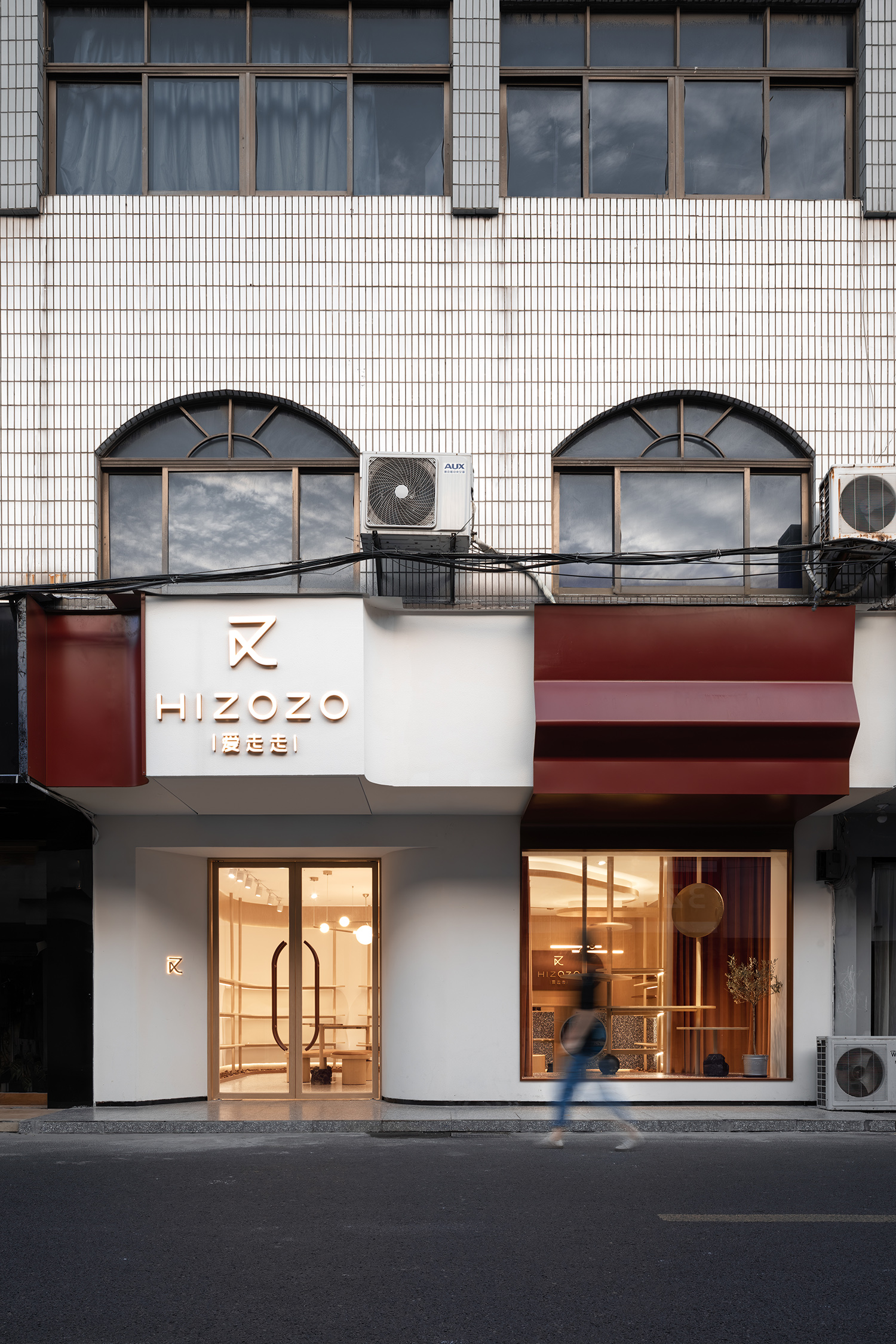
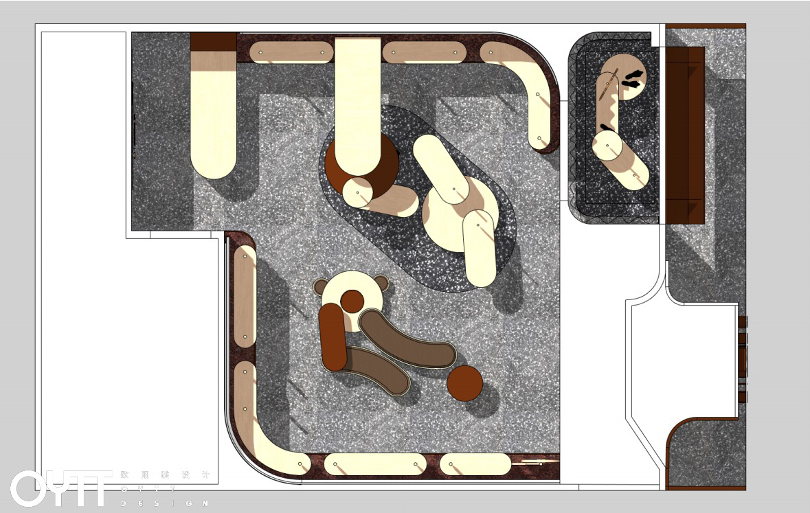
当传统连锁零售品牌面临时尚升级,如何塑造一个高级趣味的陈列空间,找到与品牌相契合的气质是本案思考的核心。设计师不拘泥于为空间做减法,更希望呈现其独到想象力,通过注入时尚的元素、摩登的色彩以及解构重组带来空间的冲突创造,拉近时代变化的距离,从而打造当下沉浸式消费场景。
When the traditional chain retail brands are facing fashion upgrading, how to create a high-level interesting display space and find the temperament that matches the brand is the core of this case. The designers do not stick to subtraction for space, but rather want to present their unique imagination. With the help of fashion elements, modern colors and the conflict creation of space brought by deconstruction and reorganization, we can shorten the distance of changes of the times, so as to create a sinking consumption scene.
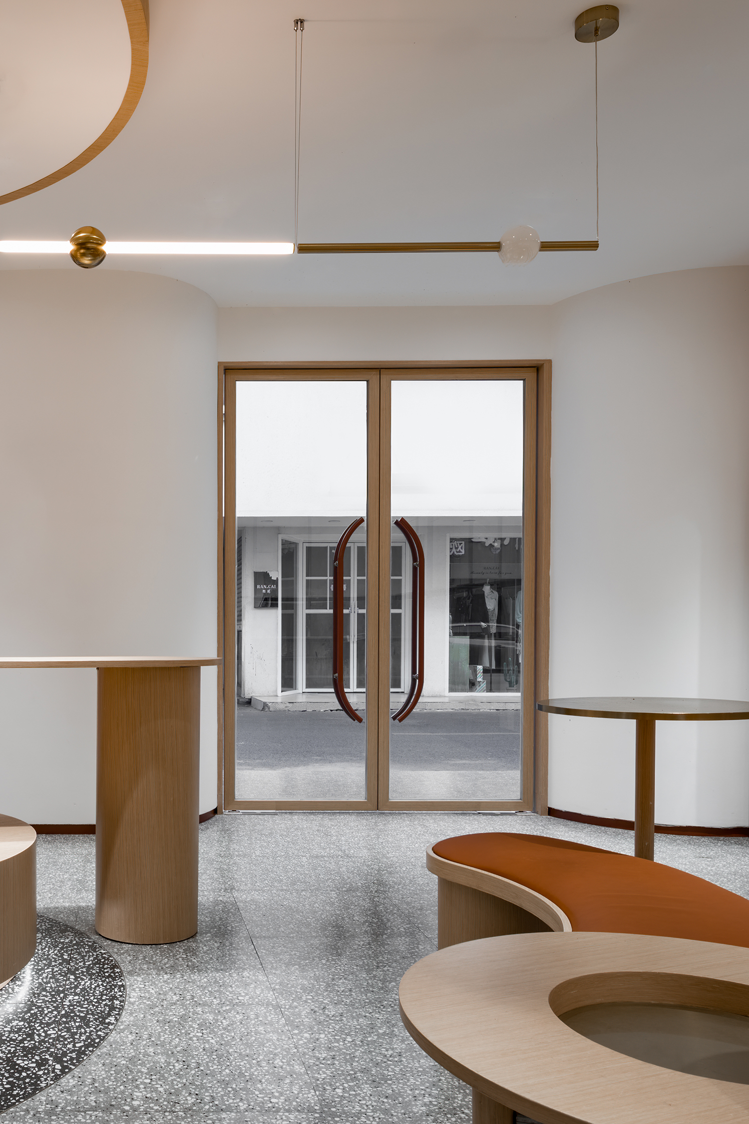
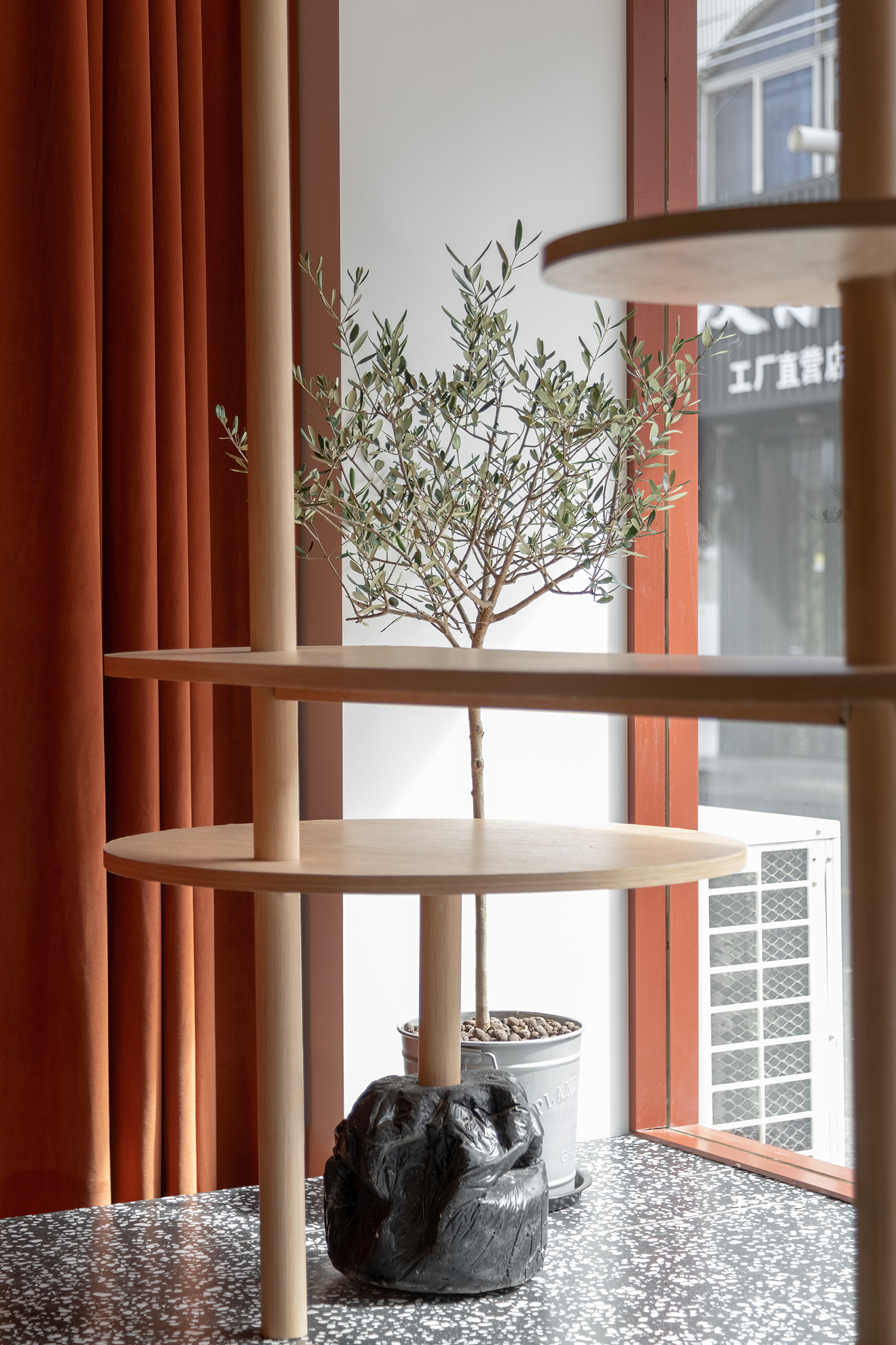
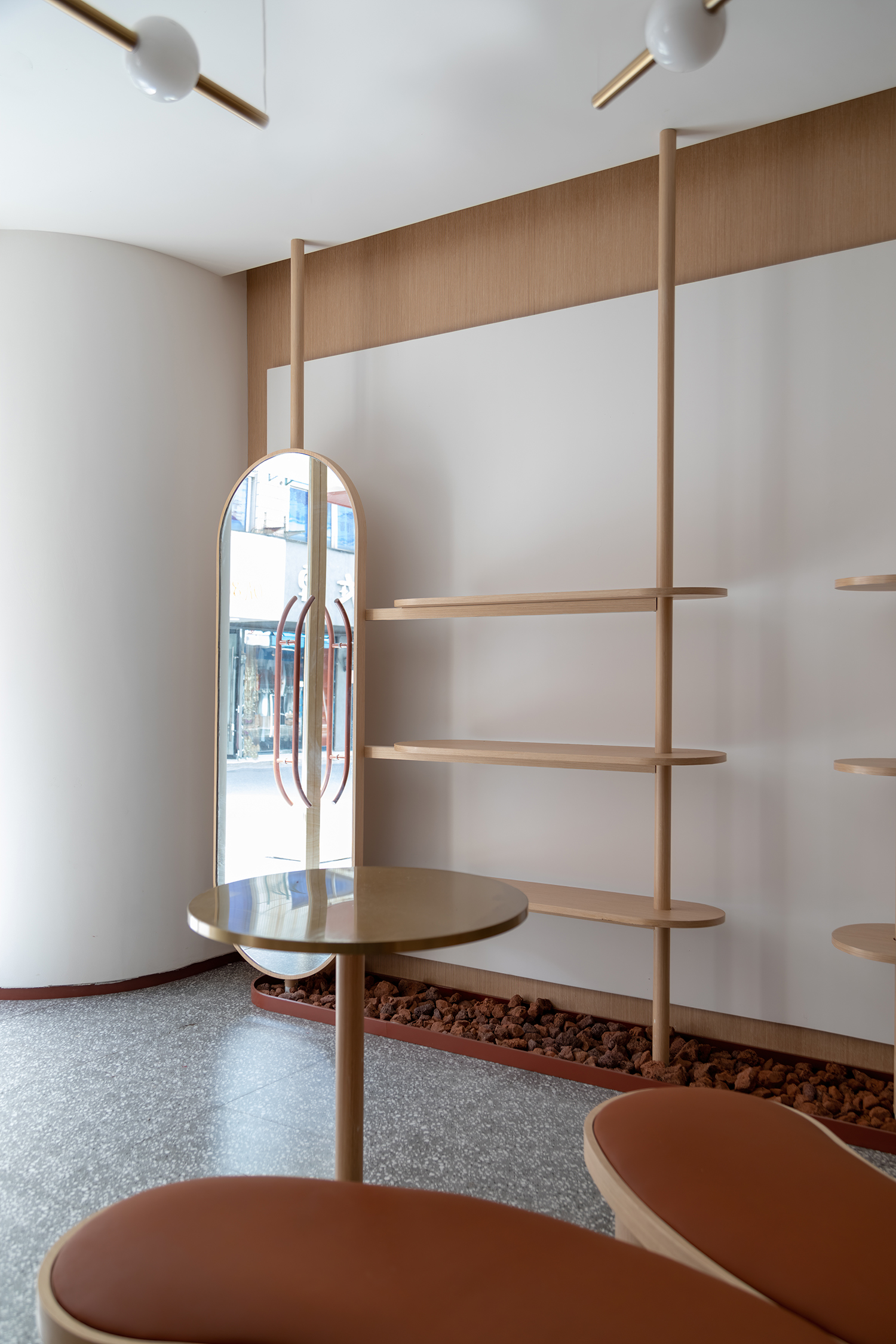
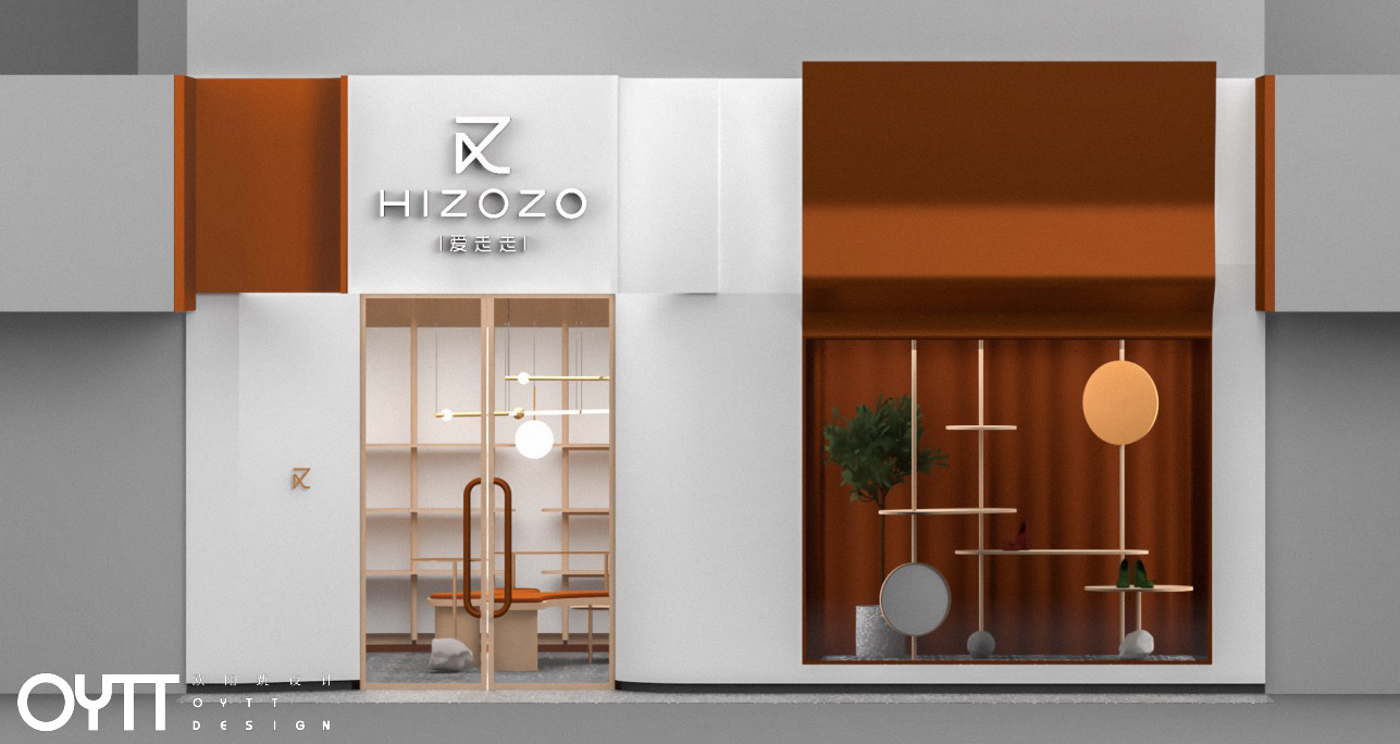
开敞的入口空间结合情景陈列装置,在线性灯条的结合下产生强烈的视觉撞击,形成空间张力,让人不禁想一探究竟。橱窗处用基本的几何图形表达碰撞,体块之间的叠加与组合营造出舞台效果,仿佛置身艺术馆。
The open entrance space combined with the scene display device generates a strong visual impact under the combination of linear lights, forming spatial tension, which makes people want to explore what is going on. The window uses basic geometric figures to express the collision, and the superposition and combination of body blocks create the stage effect, as if you are in an art gallery.
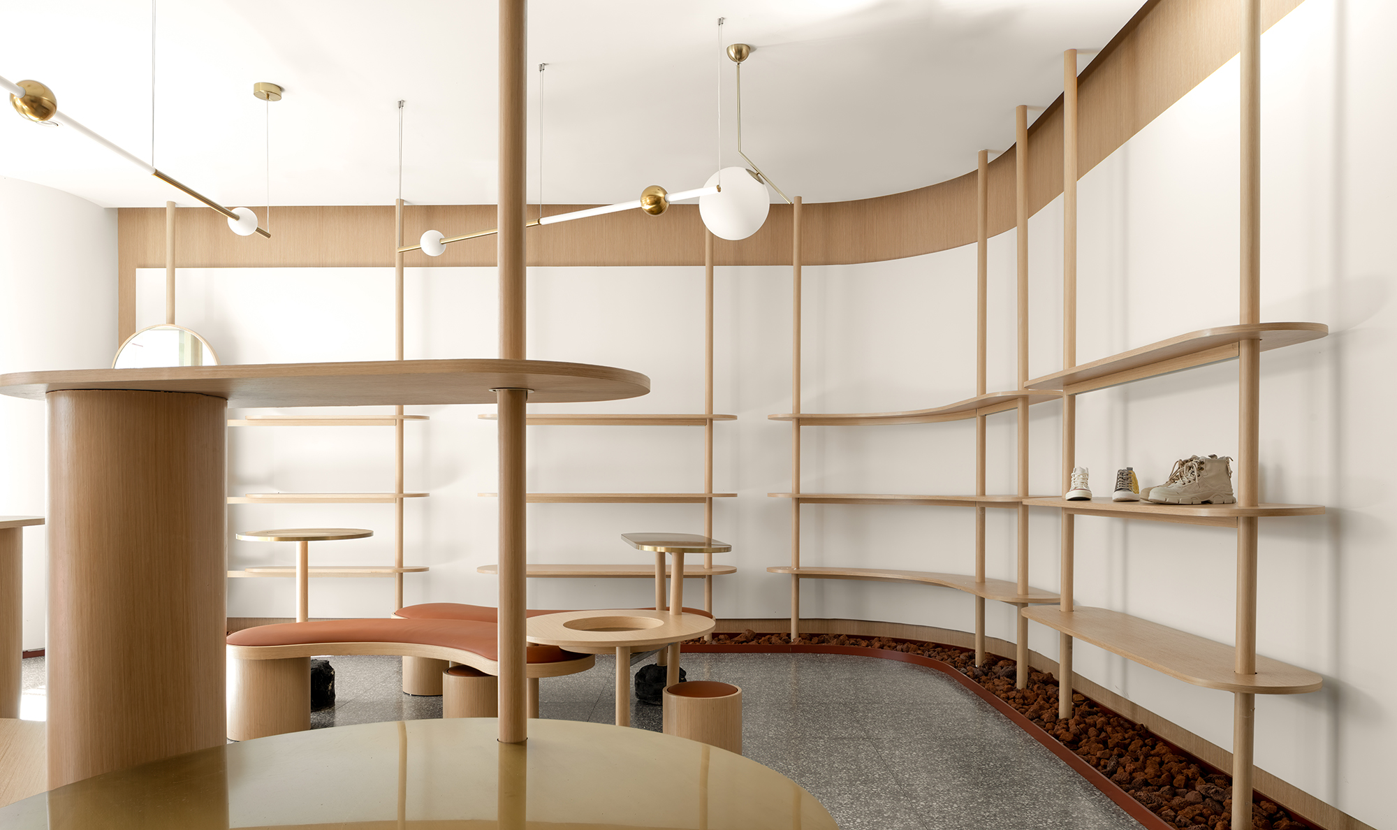
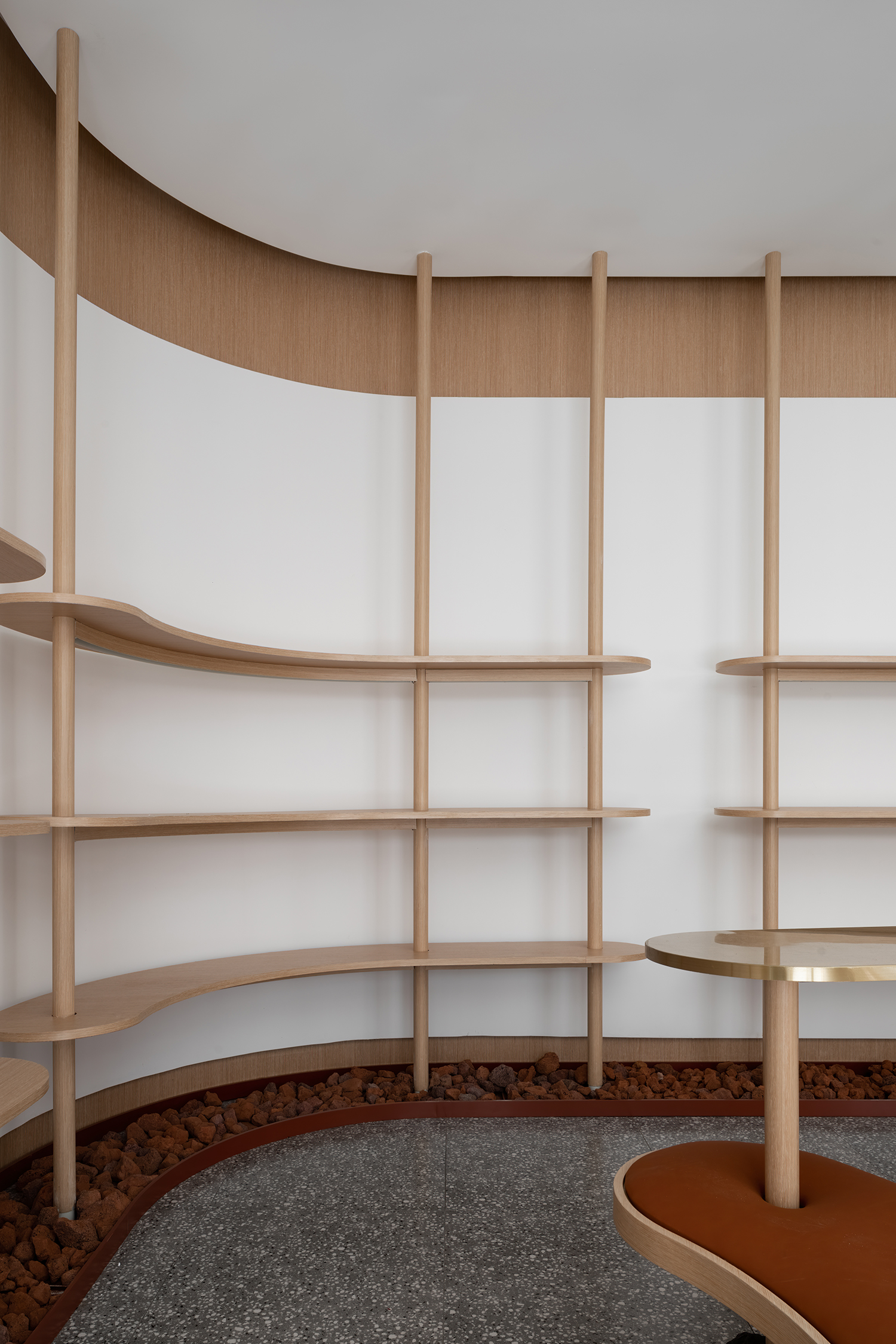
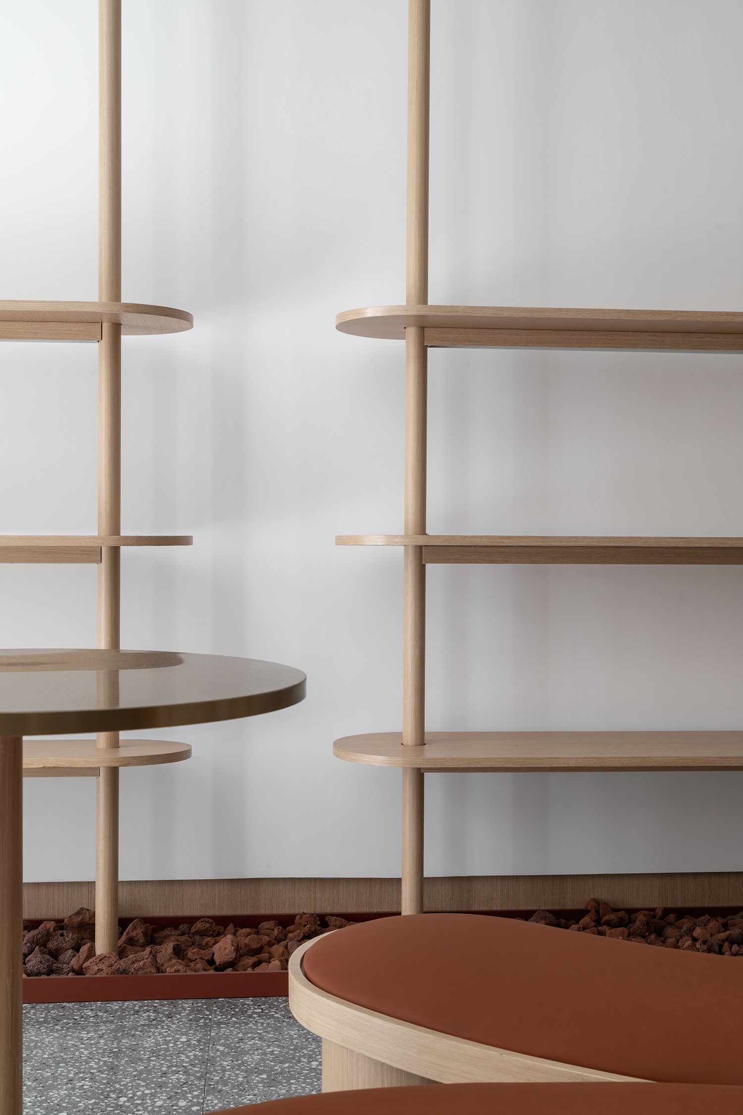
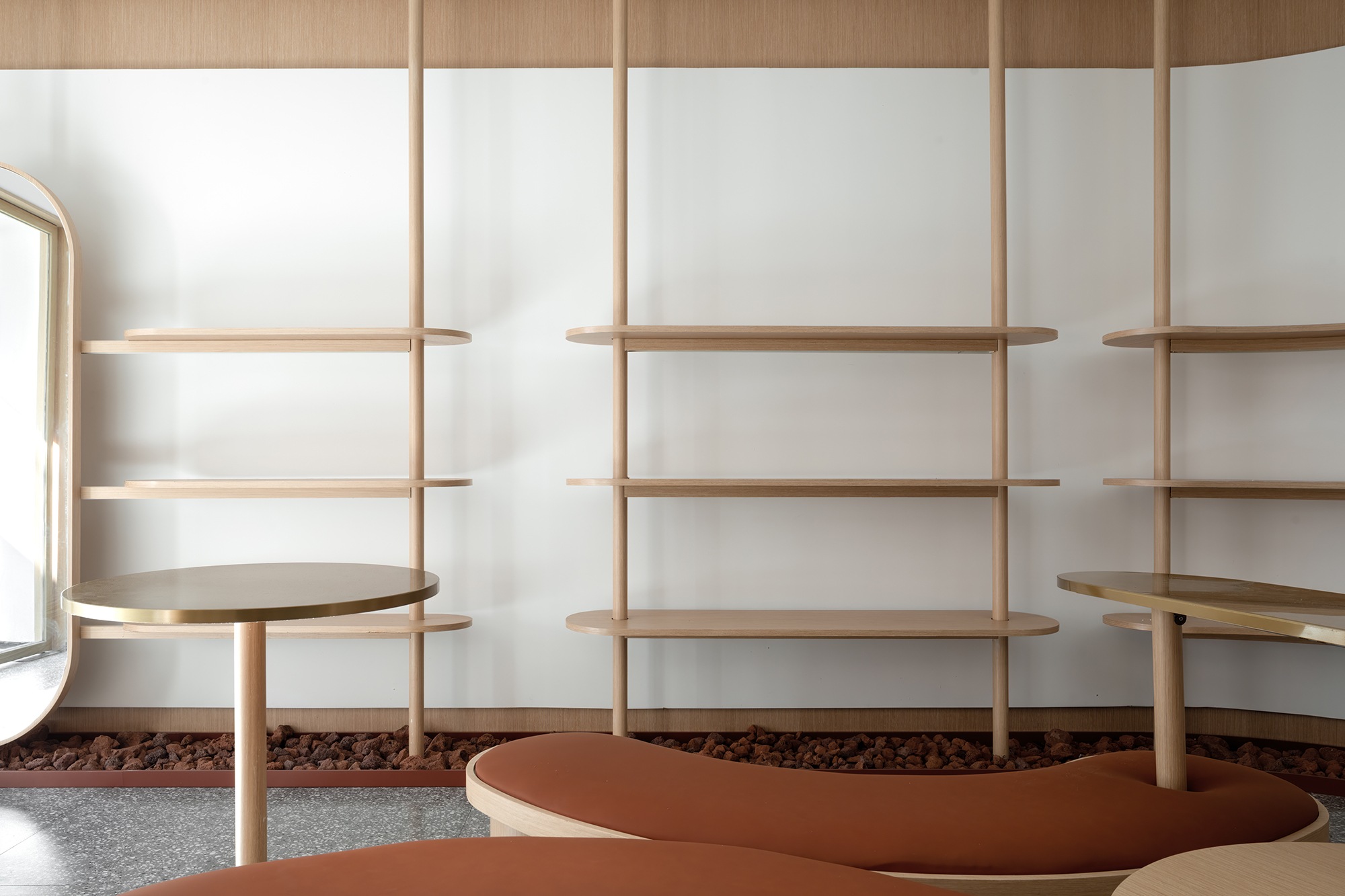
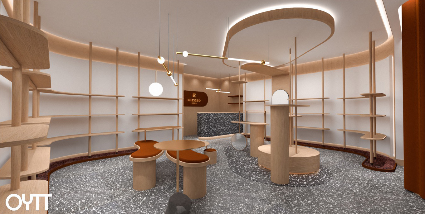
75平方米的空间以明朗的色彩与体块感构成空间的基调。大胆的跳色和金属线条的运用,可以在消解空间冰冷感的同时,增加几许优雅温和的内蕴。衔接天花与地面的木杆有秩排列,围绕室内创建了合理的动线,使得原本简约的线条成为一种恰到好处的点缀。高低错落的置物板在空中重叠、交错,让空间在时尚与艺术的交融中展现自己的个性。
The space of 75 square meters constitute the keynote with clear color and block sense. Bold color jumping and the use of metal lines can dispel the cold feeling of space and add a few elegant and gentle connotations. The wooden poles connecting the ceiling and the ground are arranged in order, and a reasonable moving line is created around the interior, which makes the original simple line become a proper ornament. The high and low placement boards overlap and interlace in the air, so that the space can show its own personality in the fusion of fashion and art.
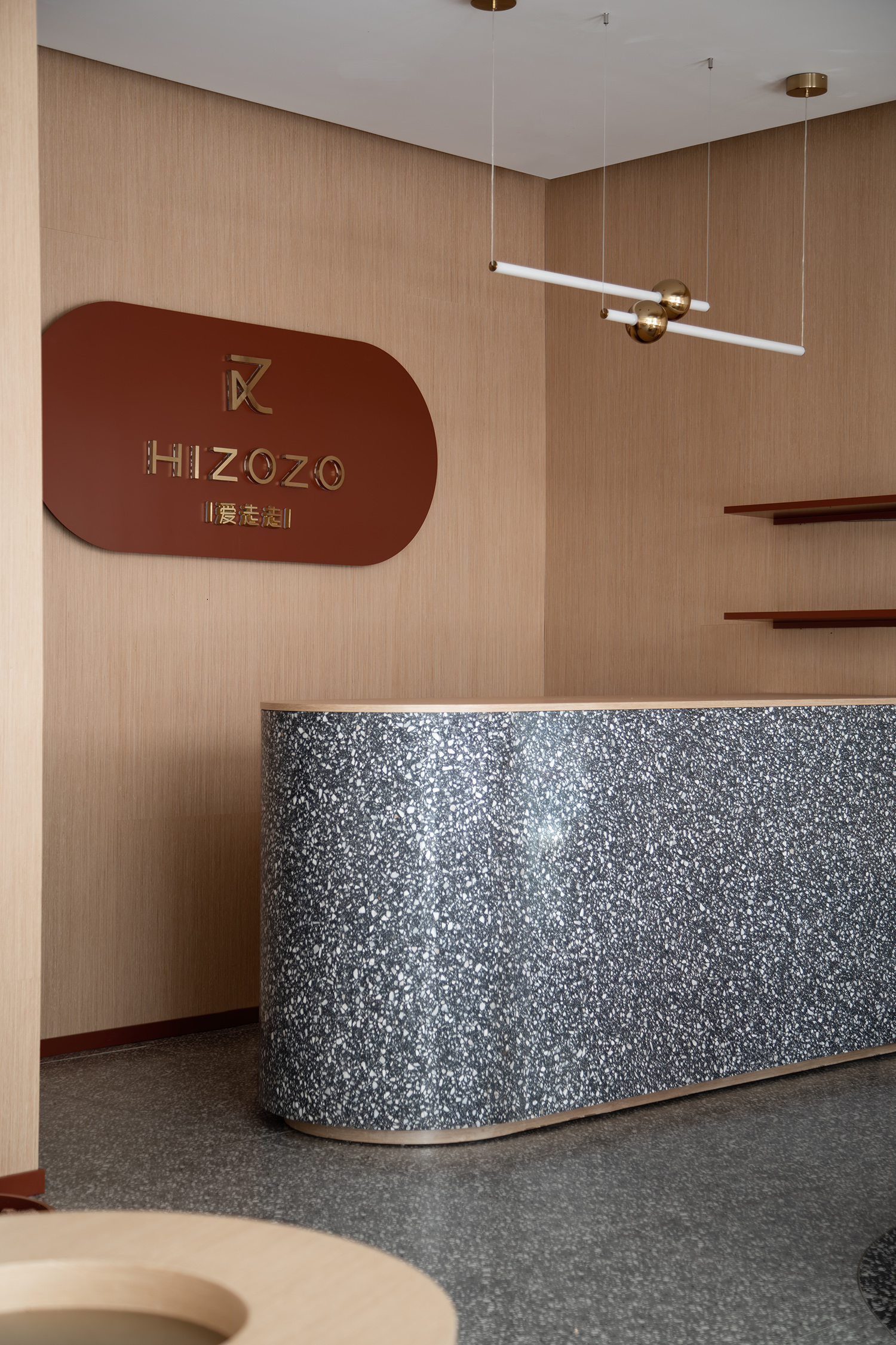
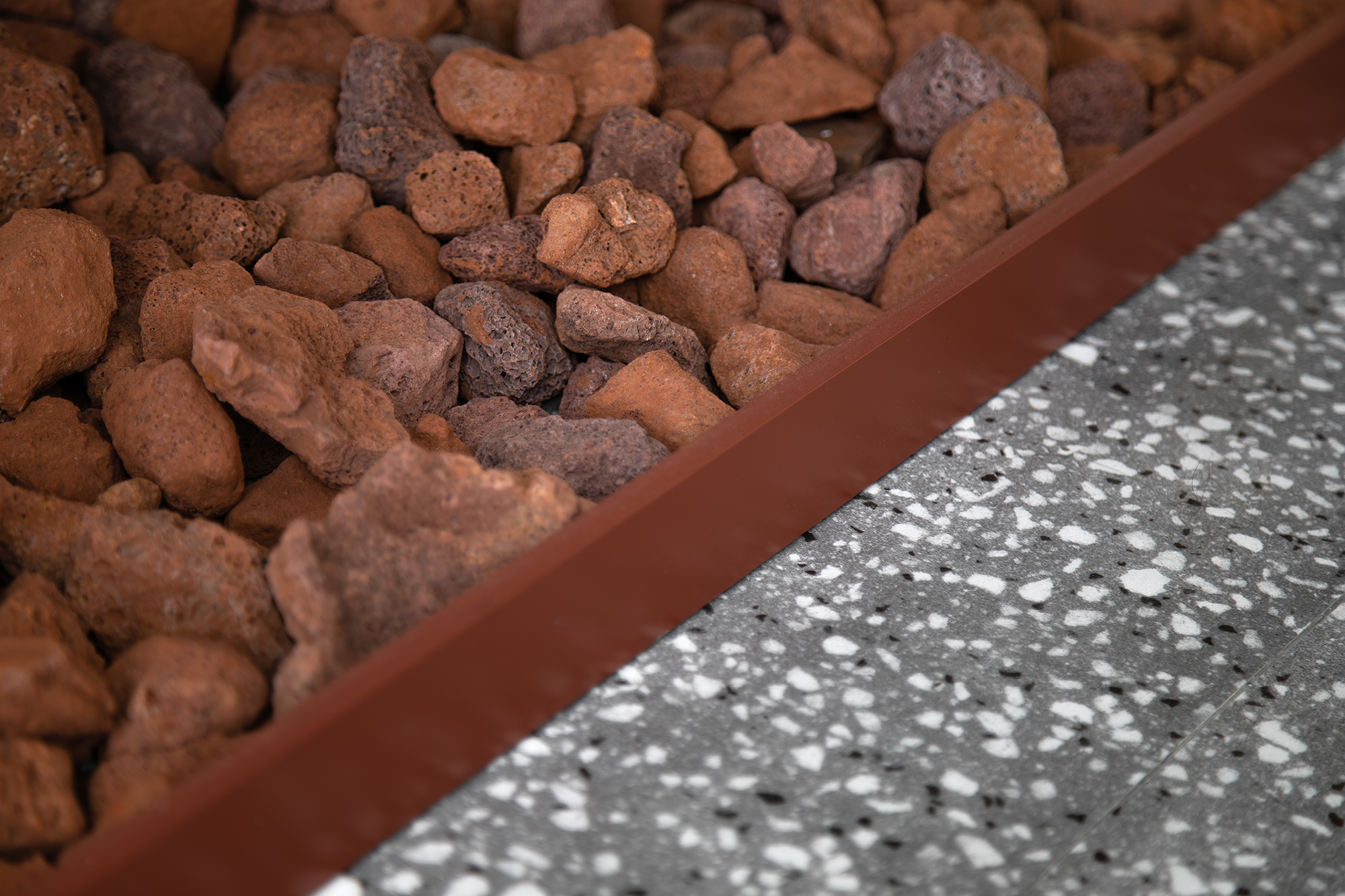
整个空间打破所有框架和定义,从形态到材料,线与线的交织,面与面的碰撞,光影于空间的游离,平静之中演绎细腻的情绪。粗犷的石材以及线条流畅的货架,加深了空间干净利落的时尚印象。同时,融入无处不在的圆润曲线与之抗衡,并利用光线作为空间的引导,传递出难以言说的丰富质感。
The whole space breaks all frames and definitions, from shape to material, the interweaving of lines, the collision of faces, the dissociation of light and shadow in the space, and the delicate emotion in the calm.The rough stone and smooth lines of the shelves, deepen the space clean fashion impression. At the same time, it integrates the ubiquitous mellow curve to compete with it, and uses light as the guide of space to deliver rich texture that is hard to say. 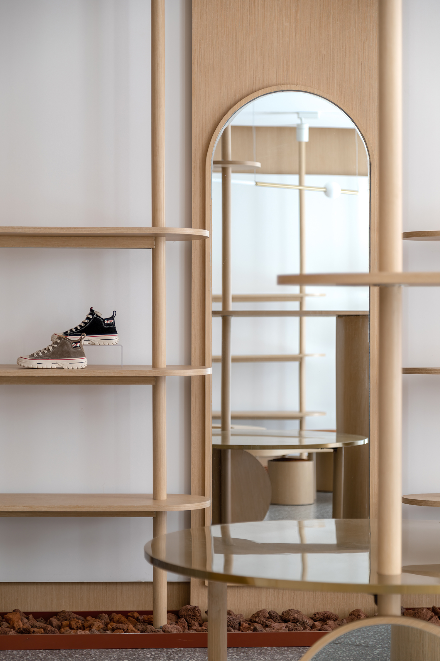

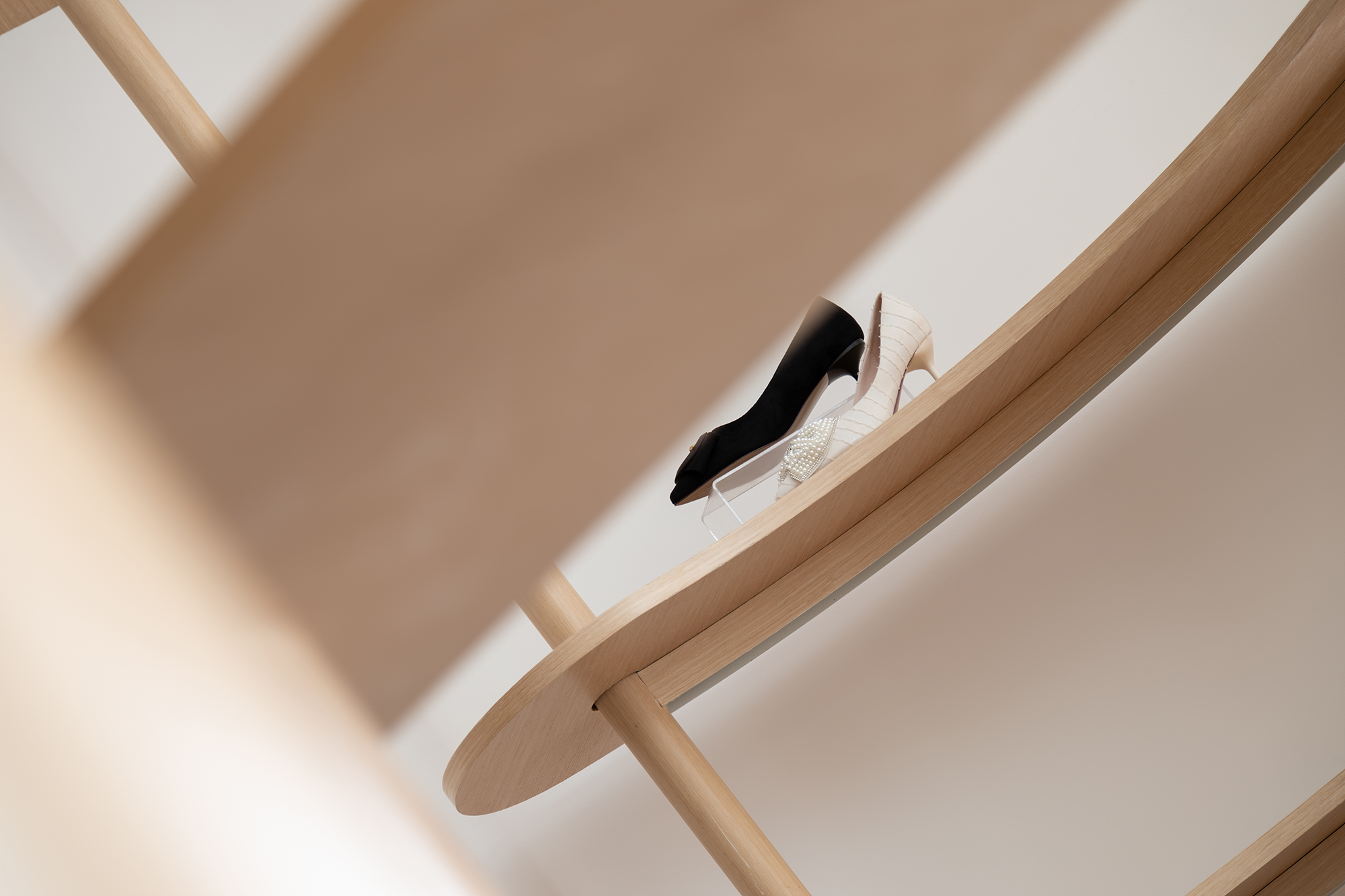
设计师基于时尚触角,探索人与空间的关联。用建筑的语言诠释线与面的对话,将几何单体混合杂糅,组合排列出新的可能。在钢筋水泥构建的城市中,创建一个柔和温馨的角落,把鞋品陈列变成融入生活的艺术品,给人想象和回味的余地。
Based on fashion tentacles, the designers explore the relationship between people and space. The dialogue between lines and surfaces is interpreted in architectural language, and the geometric monomers are mixed to form new possibilities. In the city constructed by reinforced concrete, a soft and warm corner is created, and the shoes are displayed as works of art integrated into life, giving people room for imagination and aftertaste.
项目信息——
Project Name: HIZOZO
项目地址:江苏张家港
Location: Zhangjiagang, Jiangsu
设计单位:无锡欧阳跳建筑设计有限公司
Design Company: OYTT DESIGN
主创设计师:欧阳跳、李志彪
Chief Designer: Tiao Ouyang, Zhibiao Li
辅助设计师:周丹凤、李阳
Assistant Designer: Danfeng Zhou, Yang Li
设计起止时间: 2019年06月18日~2019年07月02日
Design Cycle: June 18, 2019-July 2, 2019
开放时间:2019 年08月28日
Open Time: August 28, 2019
项目面积:75㎡
Area: 75 square meters
项目造价:3000元/平米(合计225000元)
Cost: 225 thousand RMB
主要材料:乳胶漆、防火板、水磨石、不锈钢
Main Materials: Latex Paint, Fireproof Board, Terrazzo, Stainless Steel
设计风格:时尚简约
Design Style: Modern and Simple
空间用途:零售
Space Use: Retail
摄影师:徐义稳
Photographer: Yiwen Xu


