项目地点位于上海南京西路嘉里中心,是whatever Eyewear第一个实体店形象。设计策略是希望在尊重品牌已有产品元素和品牌魅力的基础上,找到与之匹配的视觉空间表现方式。
The Interior and Spatial Design Studio, Roomoo, inspired by sound wave phenomenon for the creation of the first store for Whatever Eyewear, which is located in Kerry Center of Nanjing West Road, Shanghai. For this, the first shop of this new fashion sunglasses brand – the designers wanted to find a representation way to match its spatial visual image on the basis of respecting the existing product elements and brand charm.
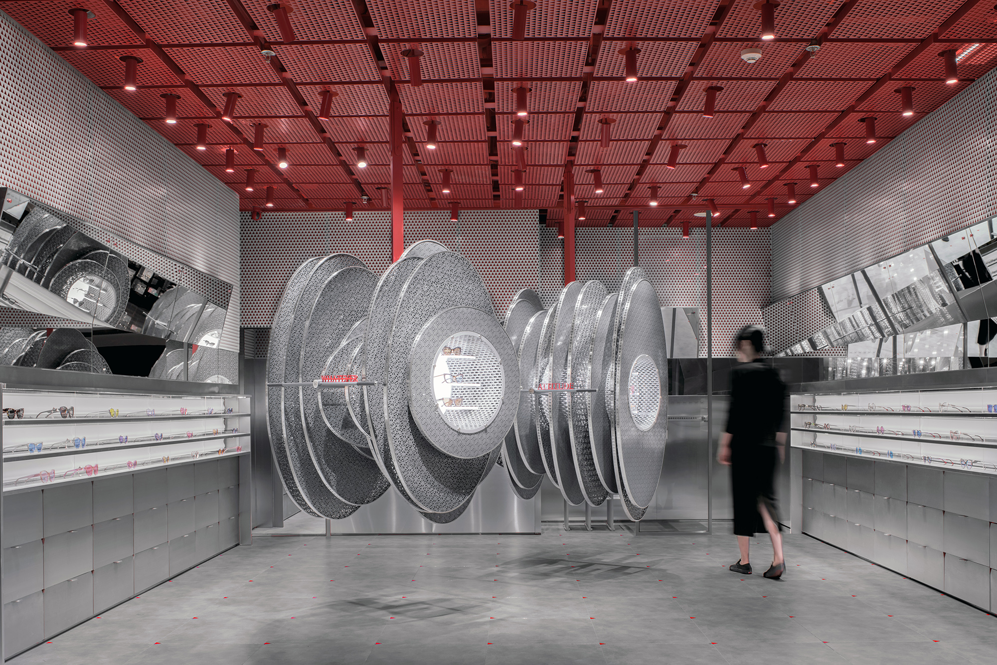
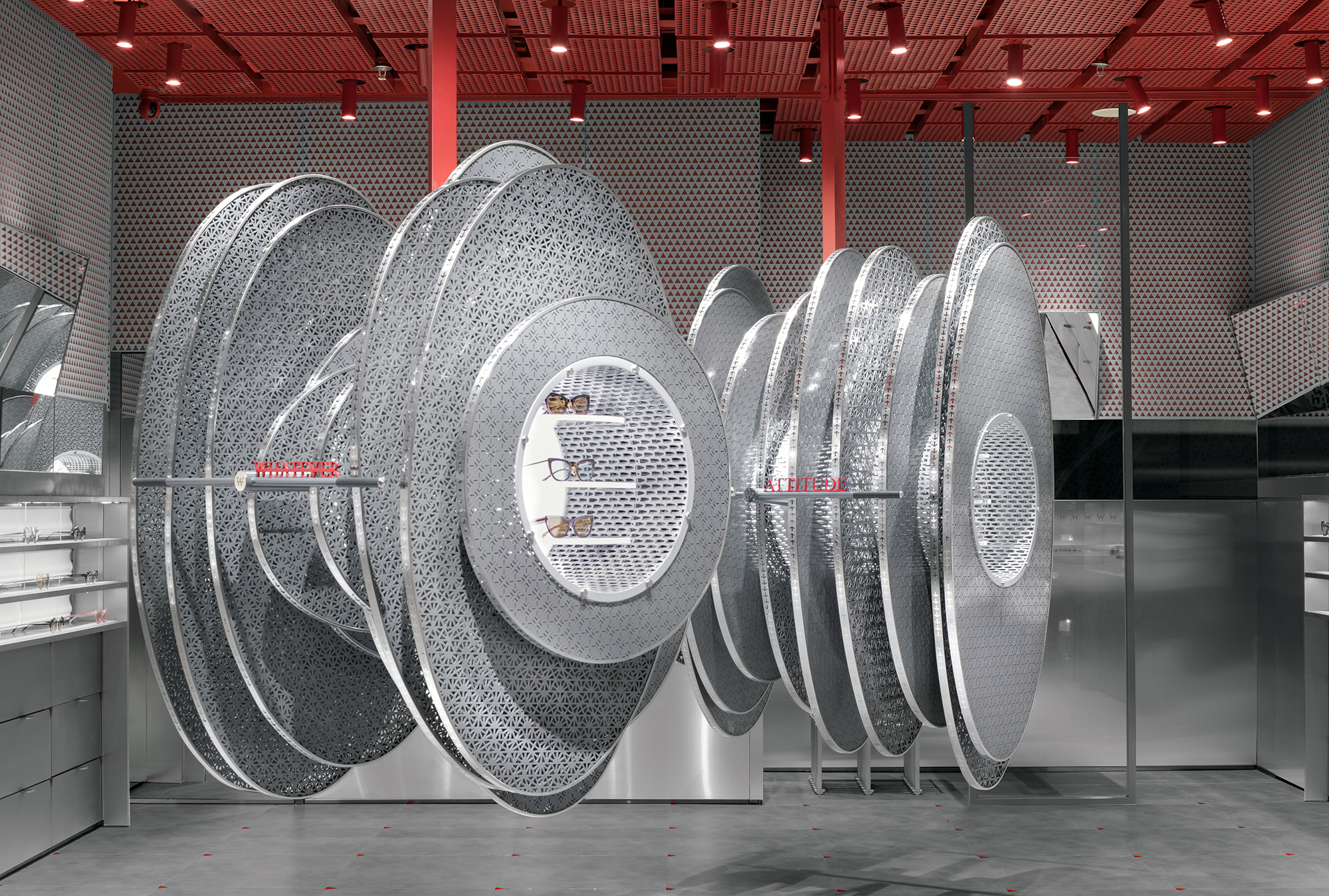
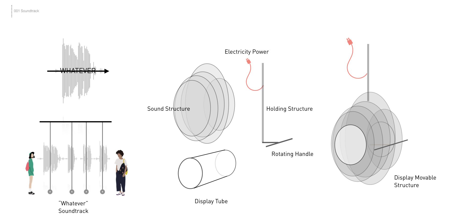
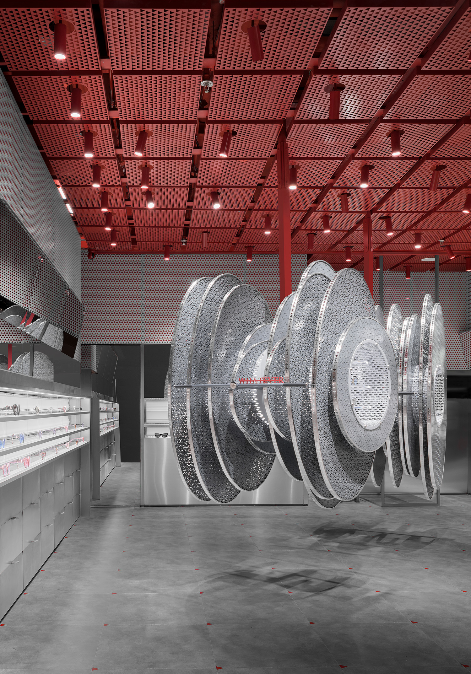
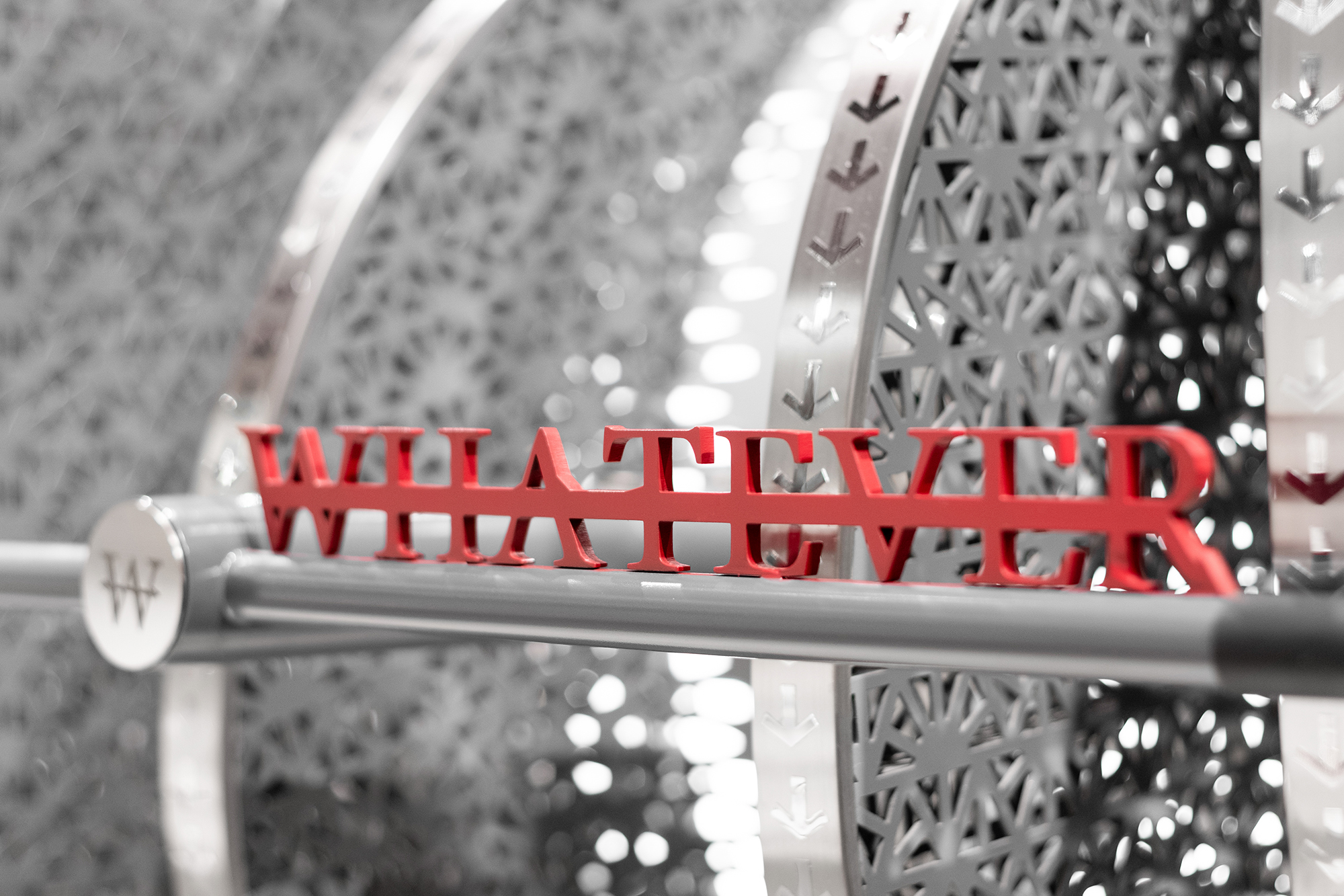
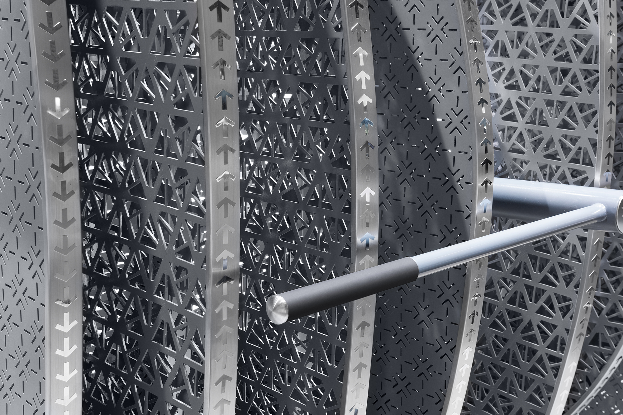
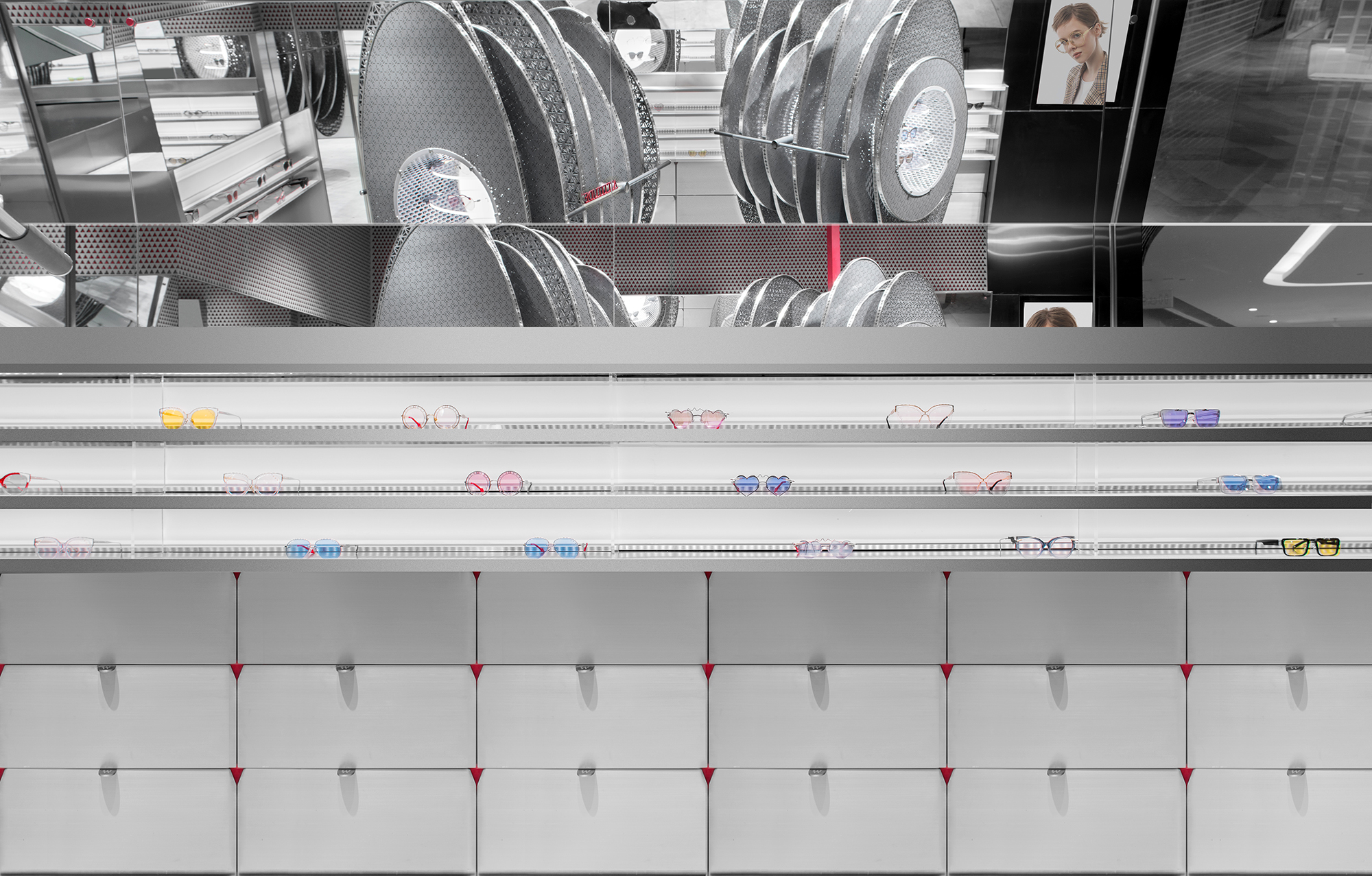
通过对Whatever Eyewear 本身产品的特有细节特点研究,在整体店面的视觉形象的思考上,是希望把Whatever Eyewear 转化成一种具象的力,通过把这种力进行有形化转换,形成店面中心的设计语言。中心的旋转装置是“Whatever”和“Attitude” 两个词发声后震动的视觉形象,也是最主要的展示区域。每片结构采用铝板冲孔做法,在减轻整体结构重量的同时满足对细节花纹图案的雕刻要求。箭头图案镂空的片状结构和子弹镂空图案形成的中心结构共同构成了半通透相对轻盈化的Soundtrack的有型体。
Inspired by the specific details of WHATEVER Eyewear LOGO and product themselves, rotating installation in the center is designed to present the visual image formed by the sound vibration of vocalized words “Whatever” and “Attitude”, which is the main display area as well. Each sheet structure using punching aluminum plate meets the detailed pattern carving requirements while reducing the overall structural weight.The sheet structure of the hollowed-out arrow pattern and the central tube structure of the hollowed-out bullet pattern are assembled together to shape a semi-transparent and relatively lightweight Soundtrack Installation.
同时,结构中心的发光设置和透明亚克力的展示层板可以最大化的展示产品不同角度的的细节。最终整体的形态通过中心旋转把手分成上下两部分,与Whatever 品牌LOGO图案相互呼应,在远处提供一种扰乱空间秩序的视觉感。另外,整体结构也可通过天花固定的旋转轴承来提供不同场景展示的需求。
The lighting setting of the central tube structure and the three-layers transparent acrylic display boards can maximize the details of the product different angles. The overall installation shape is divided into upper and lower parts by a central handle, which echoes the WHATEVER brand‘s logo pattern and provides a sense of vision at a distance that disturbs the spatial order. In the meanwhile, the rotating structure also can provide various needs of scene display by fixed rotating bearings in the ceiling.
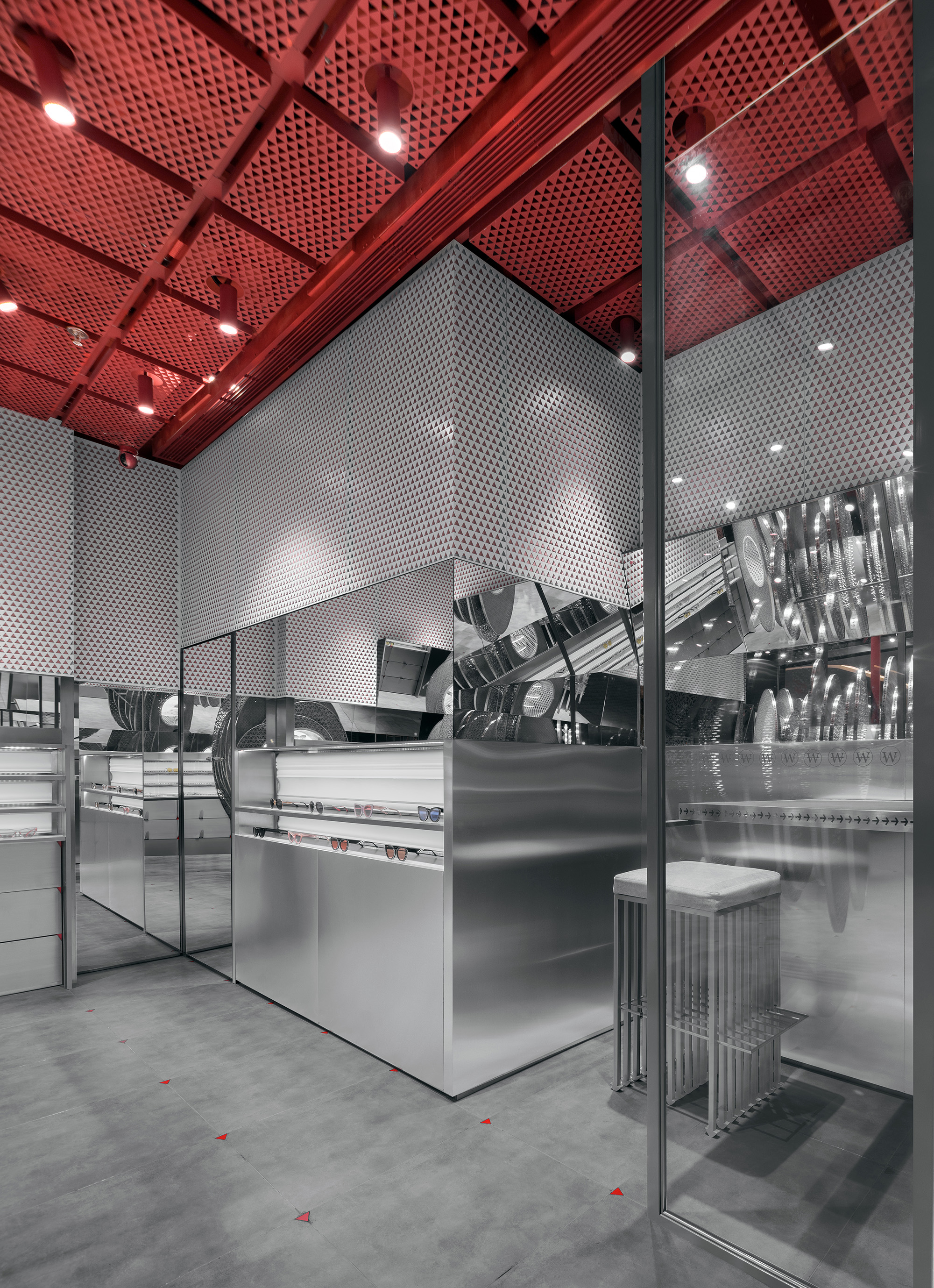
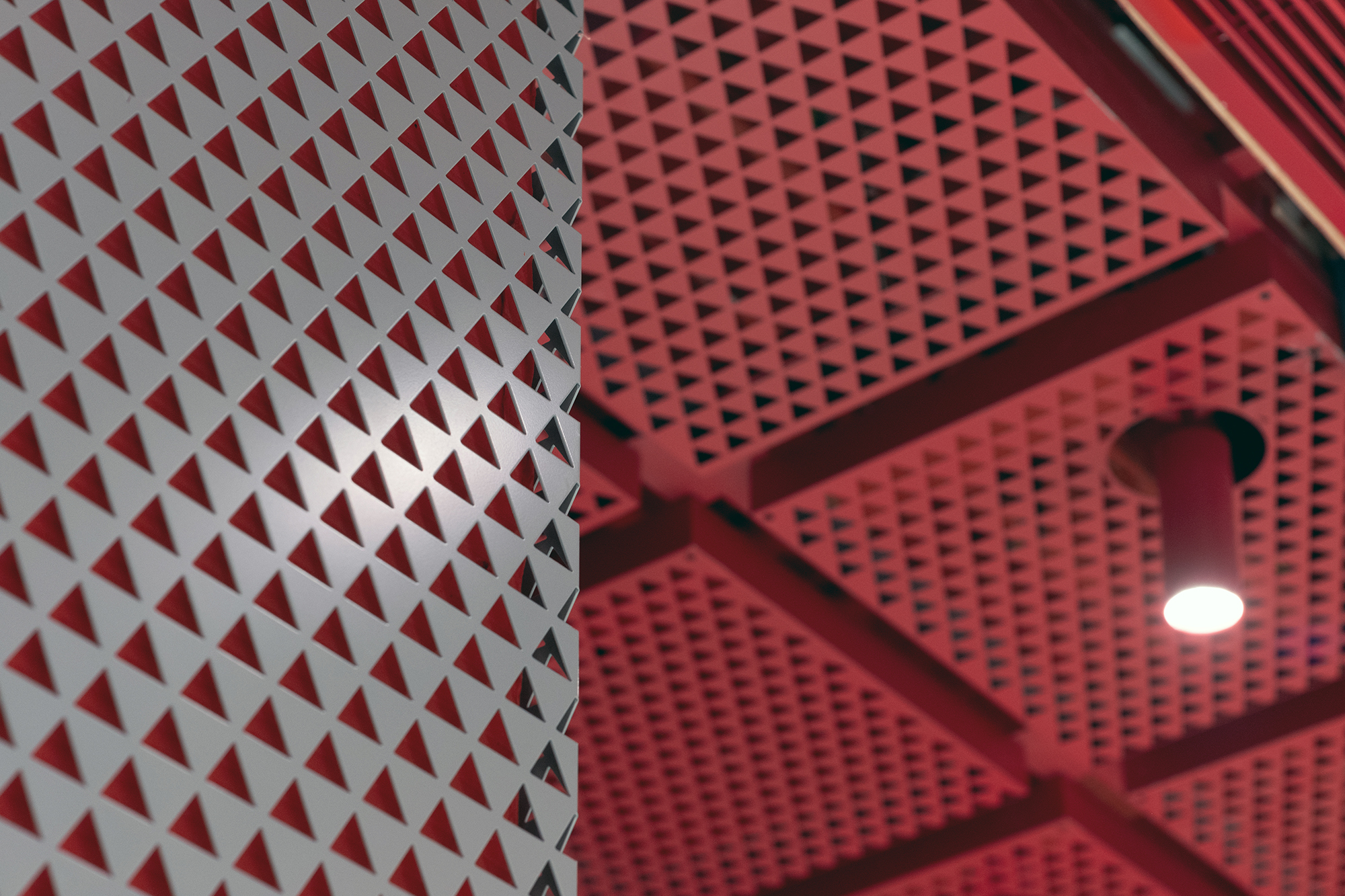
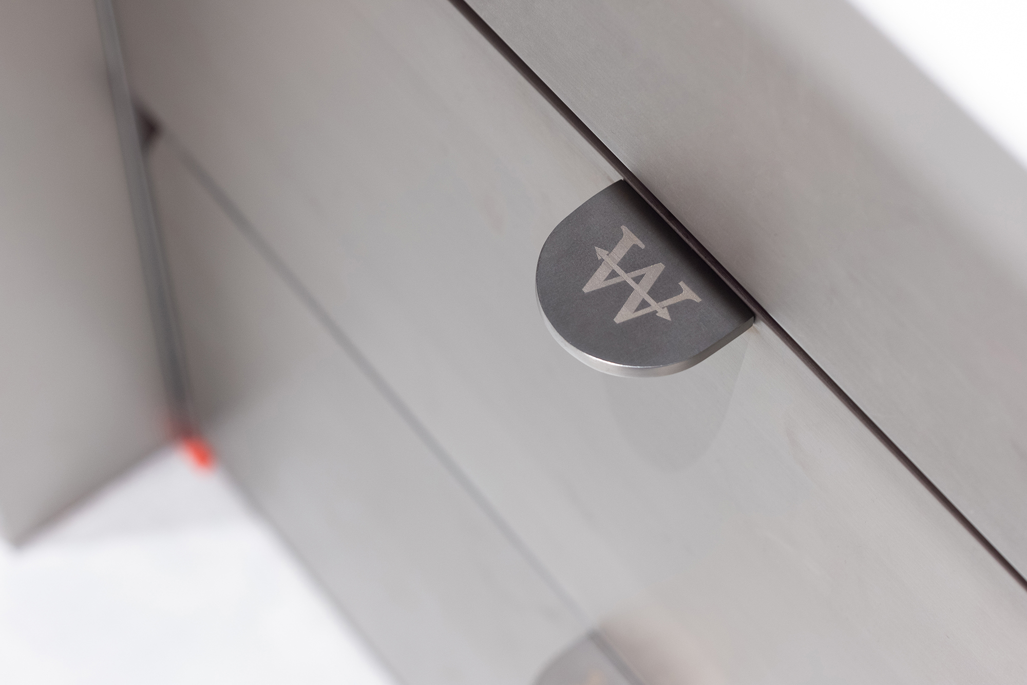
其他区域以干净简洁的视觉表现突出产品,使用带有方向性的箭头图案延续中心的结构的方向性的表达。不锈钢展示区域和红色灰色三角冲孔板构成了空间的主色调,强化品牌色彩,其竖向和横向分割通过向地面和天花的延伸统一整体环境模数。
Other areas highlight the product with clean and concise visual representation, using directional arrow patterns to continue the expression of central and structural direction. The stainless steel display area and the red gray triangular punching plate constitute the main color tone of the space, reinforcing the brand color. And its vertical and horizontal segmentation unifies the overall environmental modulus through the extension to the ground and ceiling.
镜子在空间中呈垂直、水平以及斜向15度角分布,满足多纬度客人试戴产品的需求,扩展展示区域。另外,在主镜体安装高度的考量上,保留了正常平视以下高度的产品展示区域,将视觉中心区域留白为镜子,也更强调了佩戴展示的体验感。
Mirrors are distributed vertically, horizontally and obliquely at a 15 degrees angle in space to meet the needs of multi-latitude guests to try products. In addition, considering the installation height of the main mirror area, the product display area with the height below the normal horizontal level is reserved. What is more, the visual center area is left blank as a mirror, which betters experience of wearing.
项目信息——
项目地址: 上海南京西路嘉里中心
项目面积: 45 平米
楼层: 1层
商业形态: 太阳眼镜店
客户:Whatever Eyewear
材料: 不锈钢金属板, 水泥地砖, 冲孔铝板
设计公司: ROOMOO
设计团队: Roomoo
照片所有权:ROOMOO & Xiao Yun(Photographer)
Project Information——
Location: Kerry Center, Shanghai, China
Project Area: 45 Square Meters
Number of Floors: 1
Business Attribute: Sunglass Retail
Client:Whatever Eyewear
Materials: Stainless Metal, Concrete Ceramic Tile, Red Color Metal Ceiling
Design Company: ROOMOO
Design Team: Roomoo
Photocopy Right:ROOMOO & Xiao Yun(Photographer)
