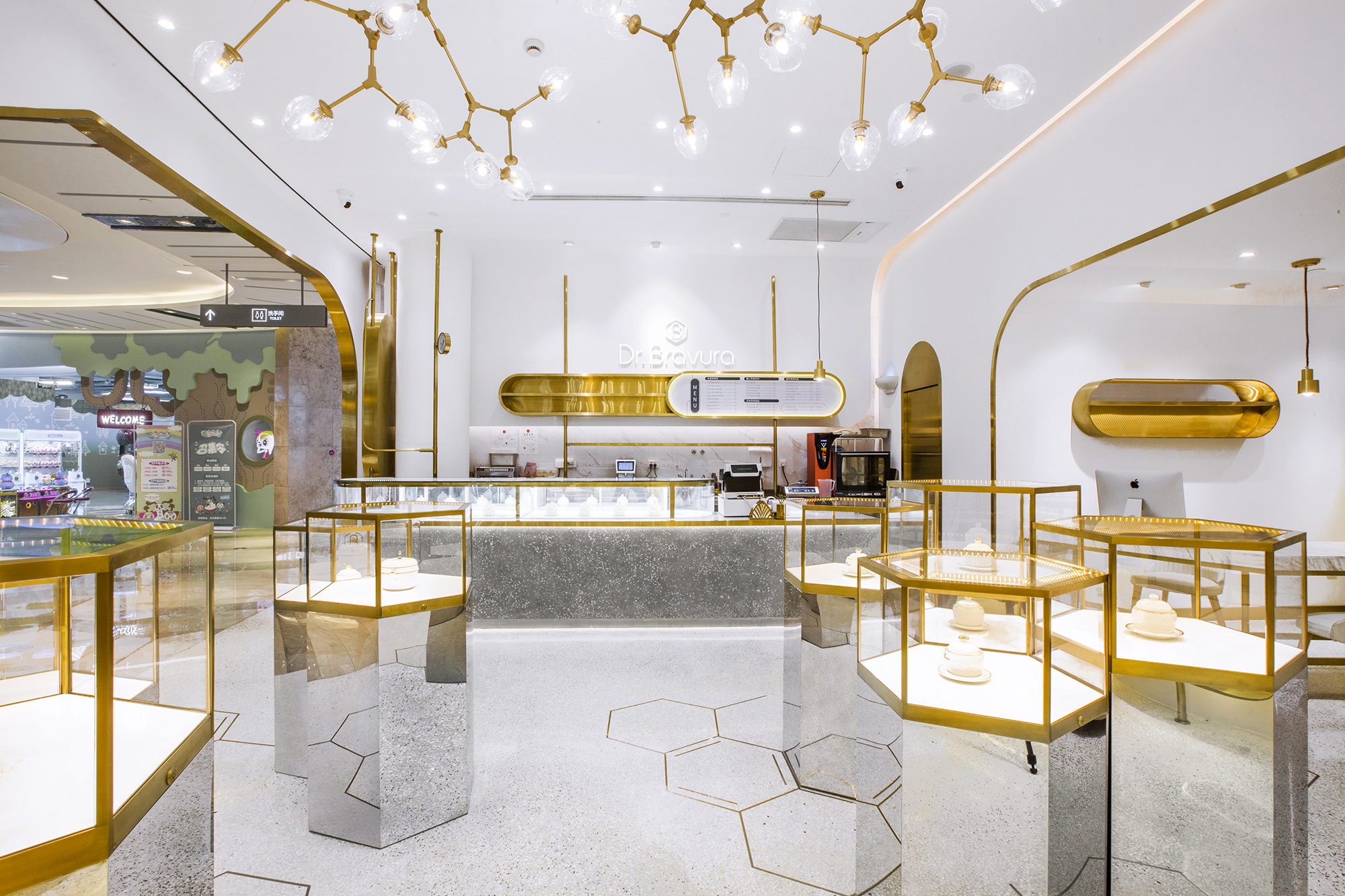
▲入口全景
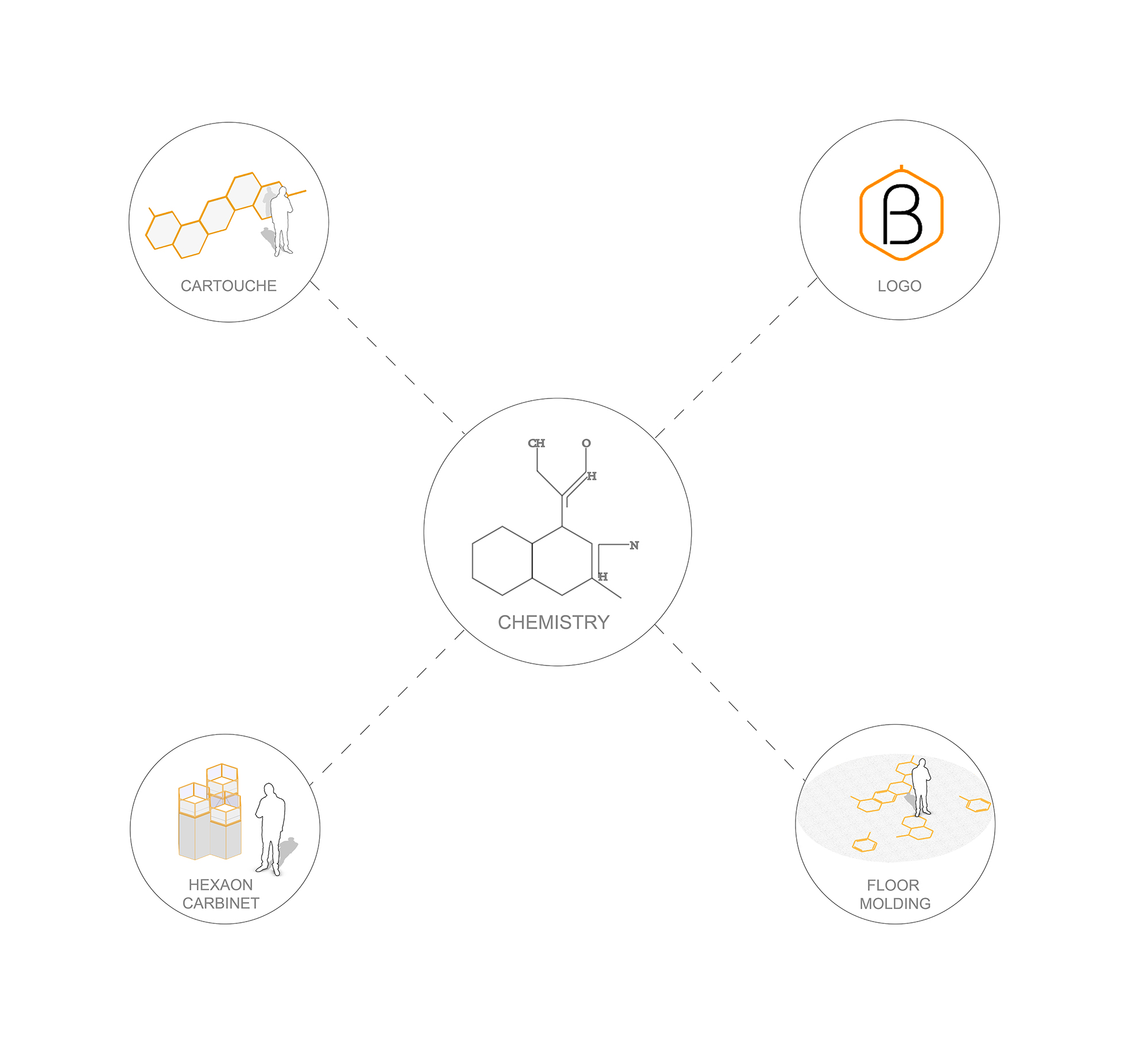
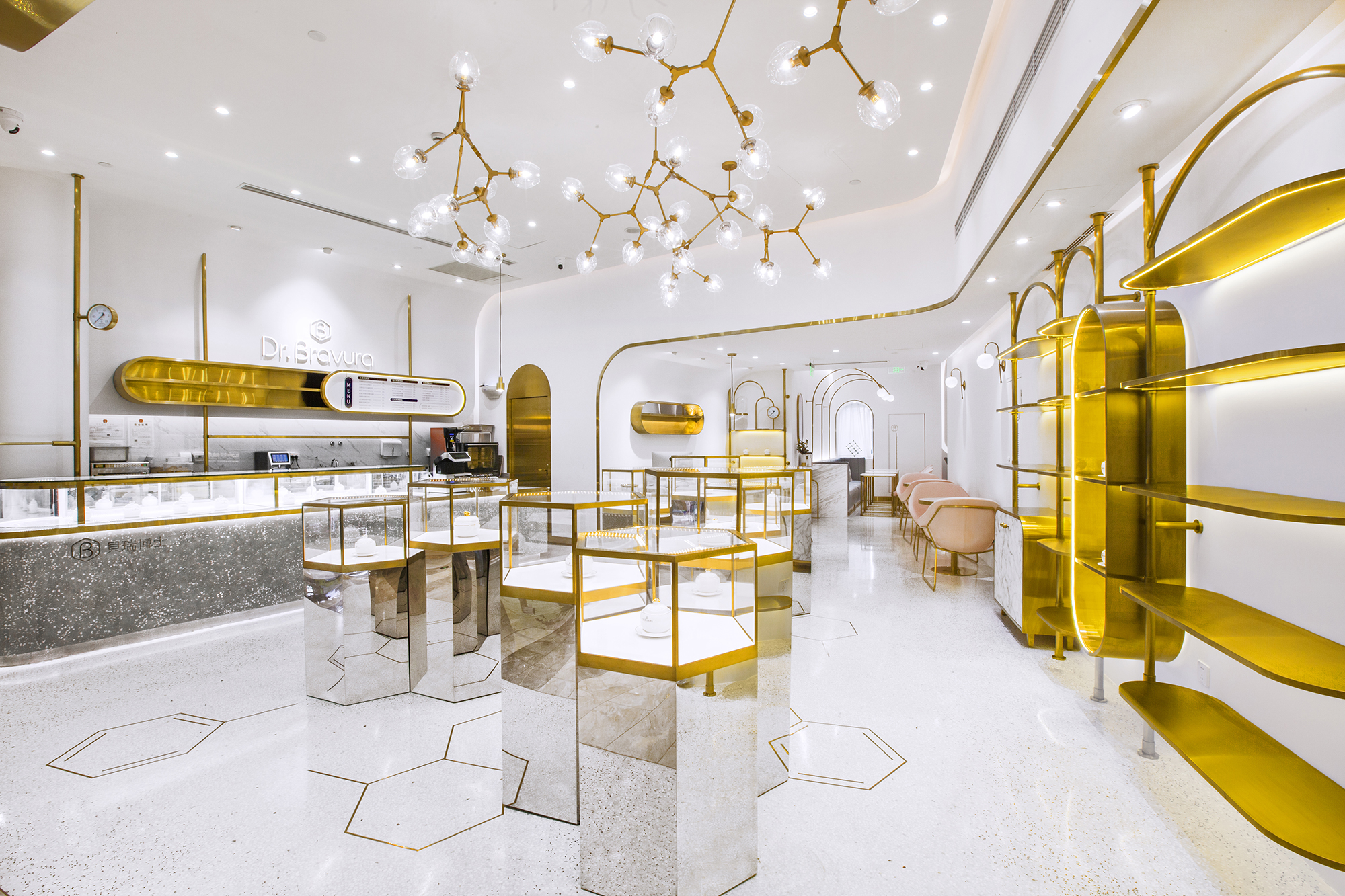
自然界中不乏以六边形与曲线呈现的天工之作,其背后隐藏着物质分子排布的巧妙与柔美形态。Towodesign堂晤设计从“为健康而研发”的品牌立意出发,择取了化学式中的基础图形——等边六角形结构。
A variety of works of nature feature hexagons and curves, behind which is the subtle arrangement of molecules.The studio Towodesign recently completed a bird’s nest drink and dessert shop for Dr. Bravura.
▲概念来源
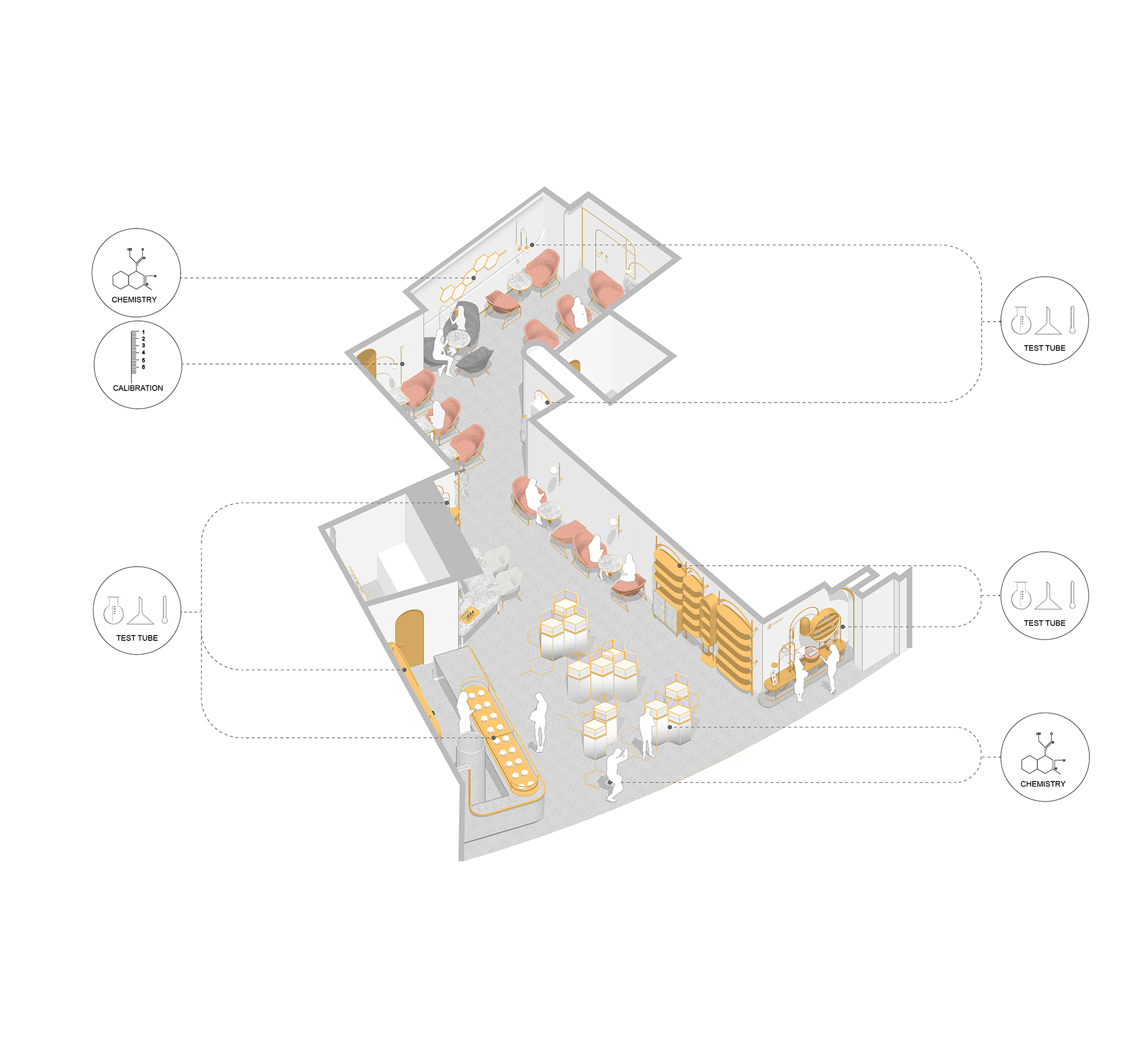
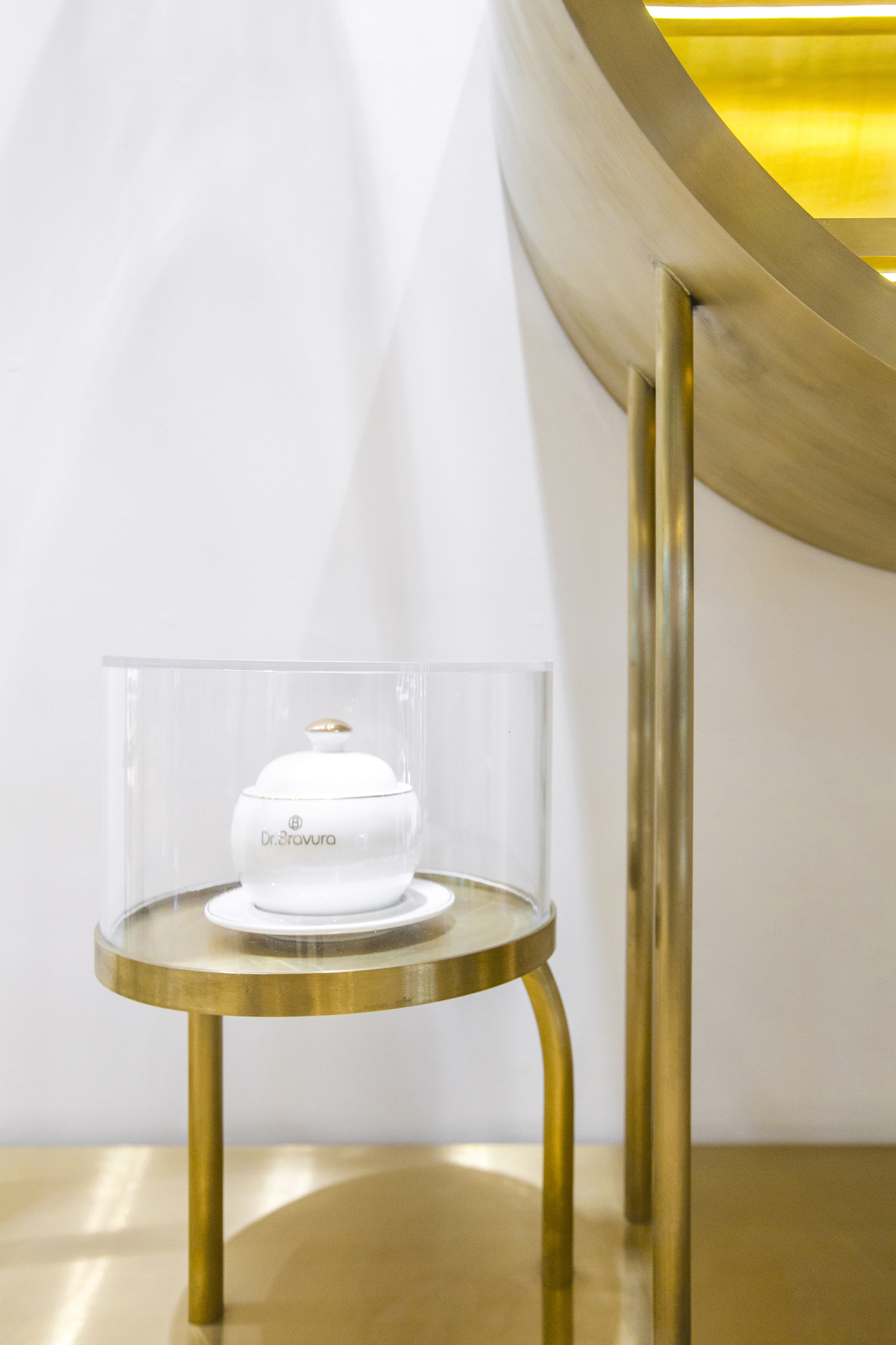
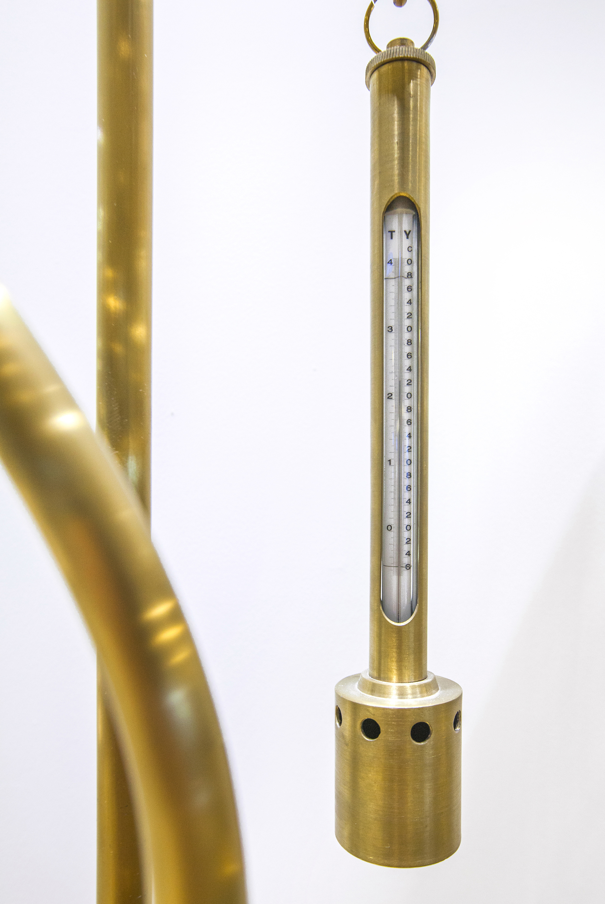
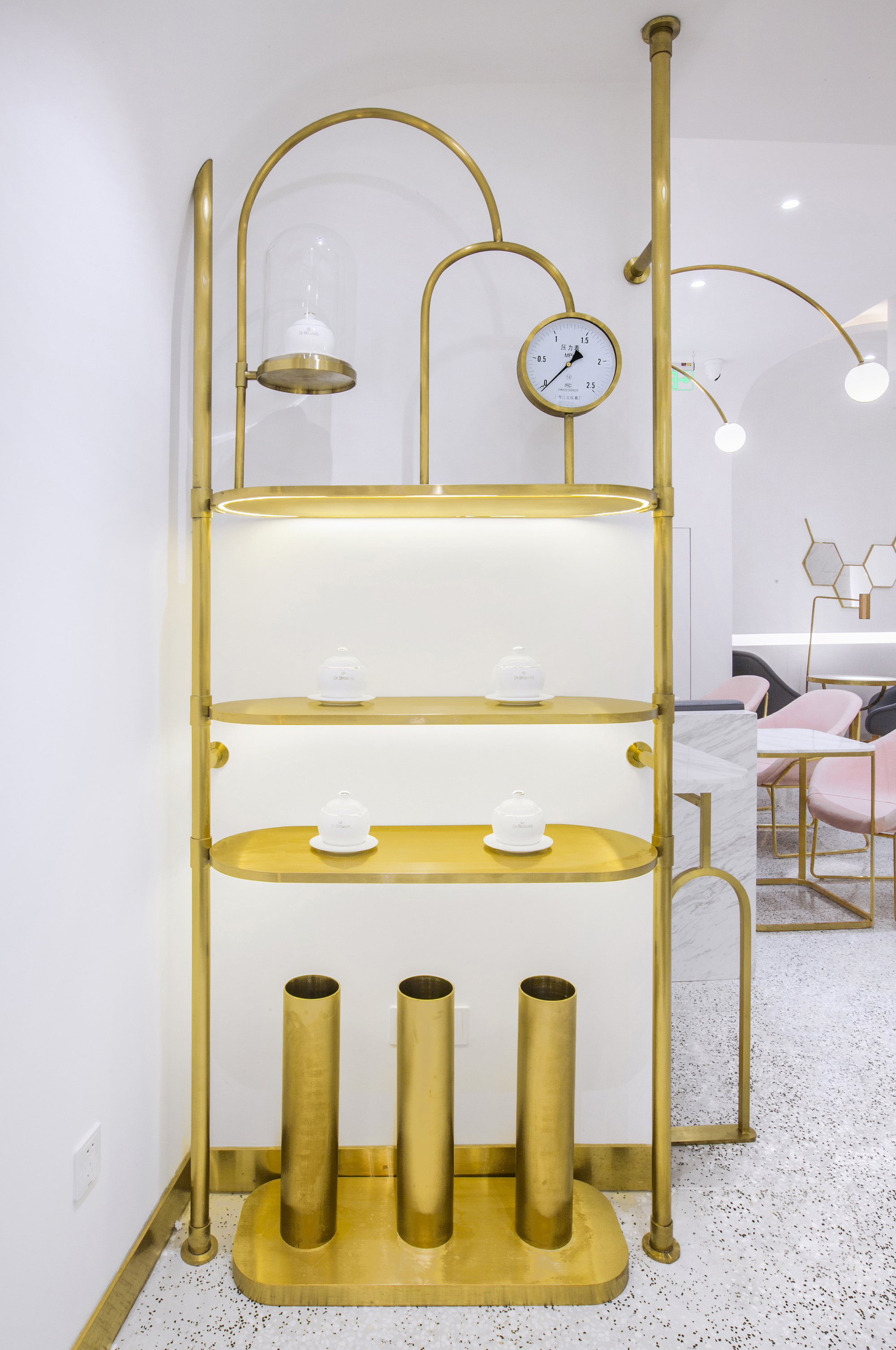
通过变化使其渗透到品牌Dr.Bravura贝瑞博士的店面logo、地面、墙面和展示架中,再结合实验室计量器皿的元素运用,建构了一个实用体验与美学意象共存的复合功能空间。
Based on the brand’s concept of “Research and Development for Health”, Towodesign applied regular hexagons, commonly seen in chemical formulas, to the storefront logo, the floor, walls and display stands. These hexagons, are combined with elements derived from measuring vessels used in laboratories, together creating a unique space that integrates functionality and aesthetics.
▲概念总览图
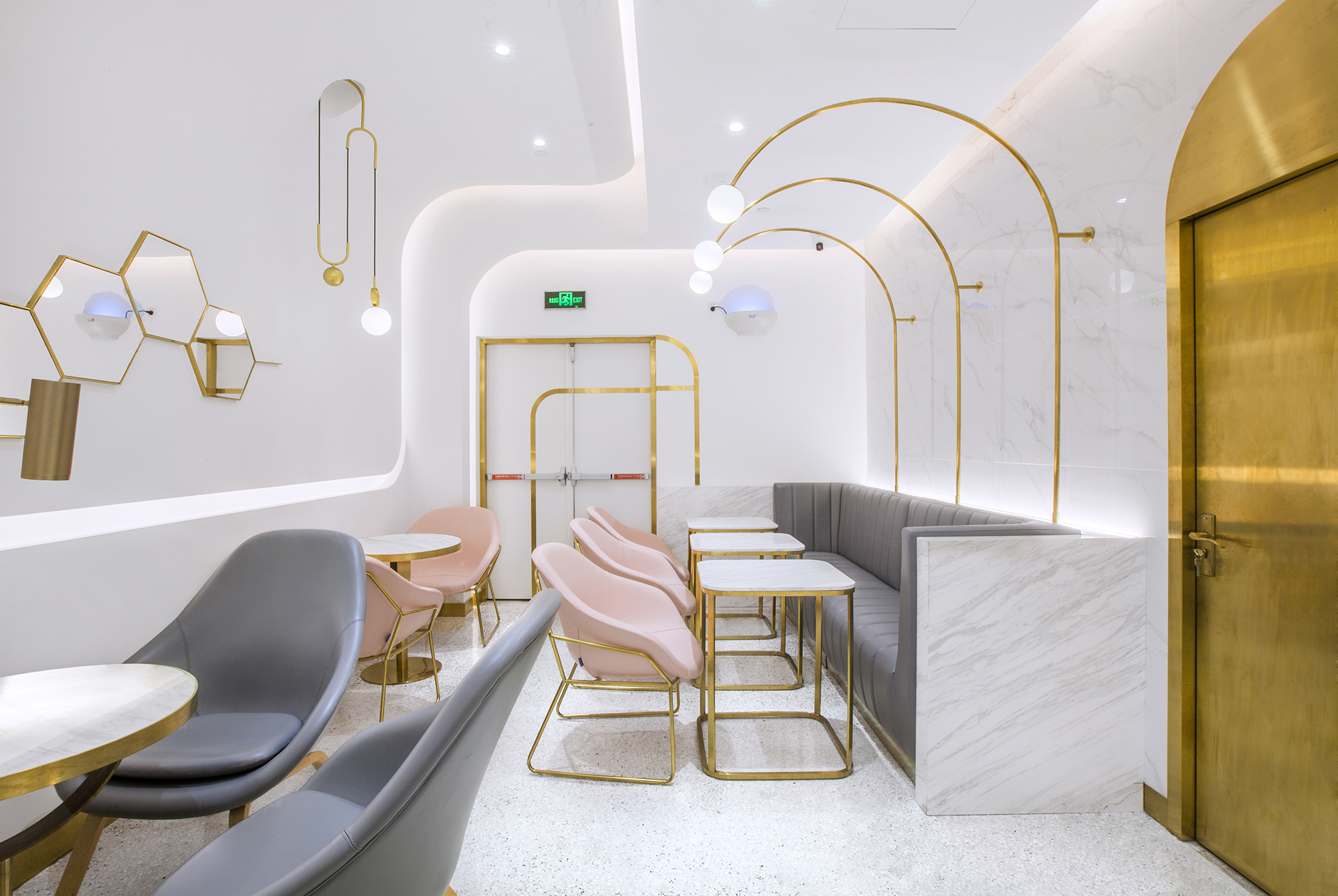
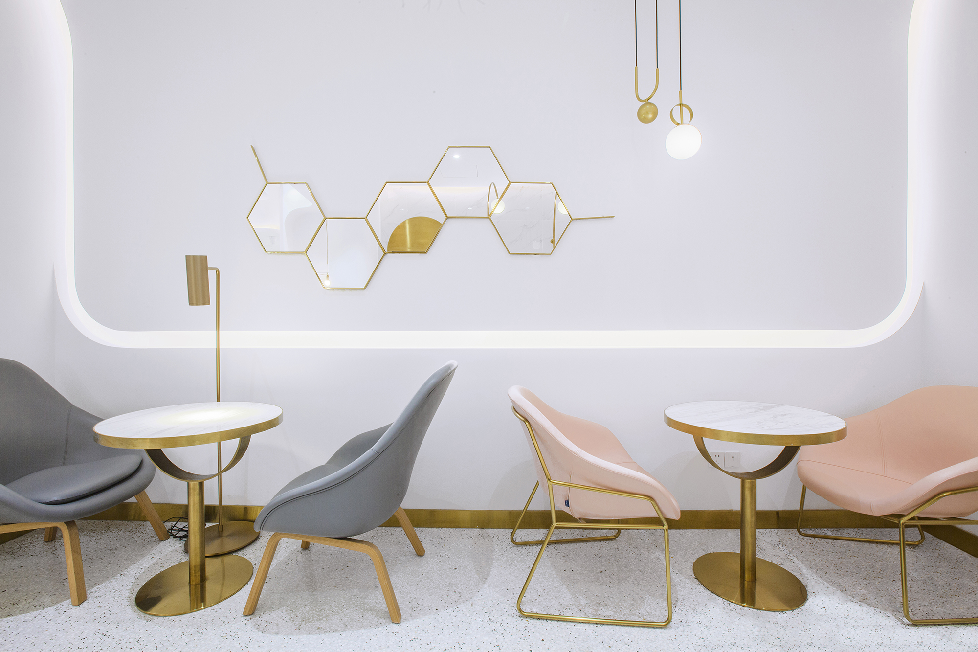
Dr.Bravura贝瑞博士本身是以营养科学为基础,衍生出燕窝相关的甜品与轻饮,为当下年轻人提供了健康、新颖、高端的结合传统食材的新型轻食体系。商铺沿袭了品牌的主题颜色,主体空间以白色打底,金色勾勒,部分穿插低度的粉与灰,彰显轻奢的气质。
Grounded on nutrition science, Dr. Bravura serves bird’s nest drinks and desserts, and provides healthy, novel and high-end light food system that incorporates traditional ingredients. The space inherits the brand’s typical color palette, with white setting the overall tone, gold sketching the contours and light gray and pink dotted in it.
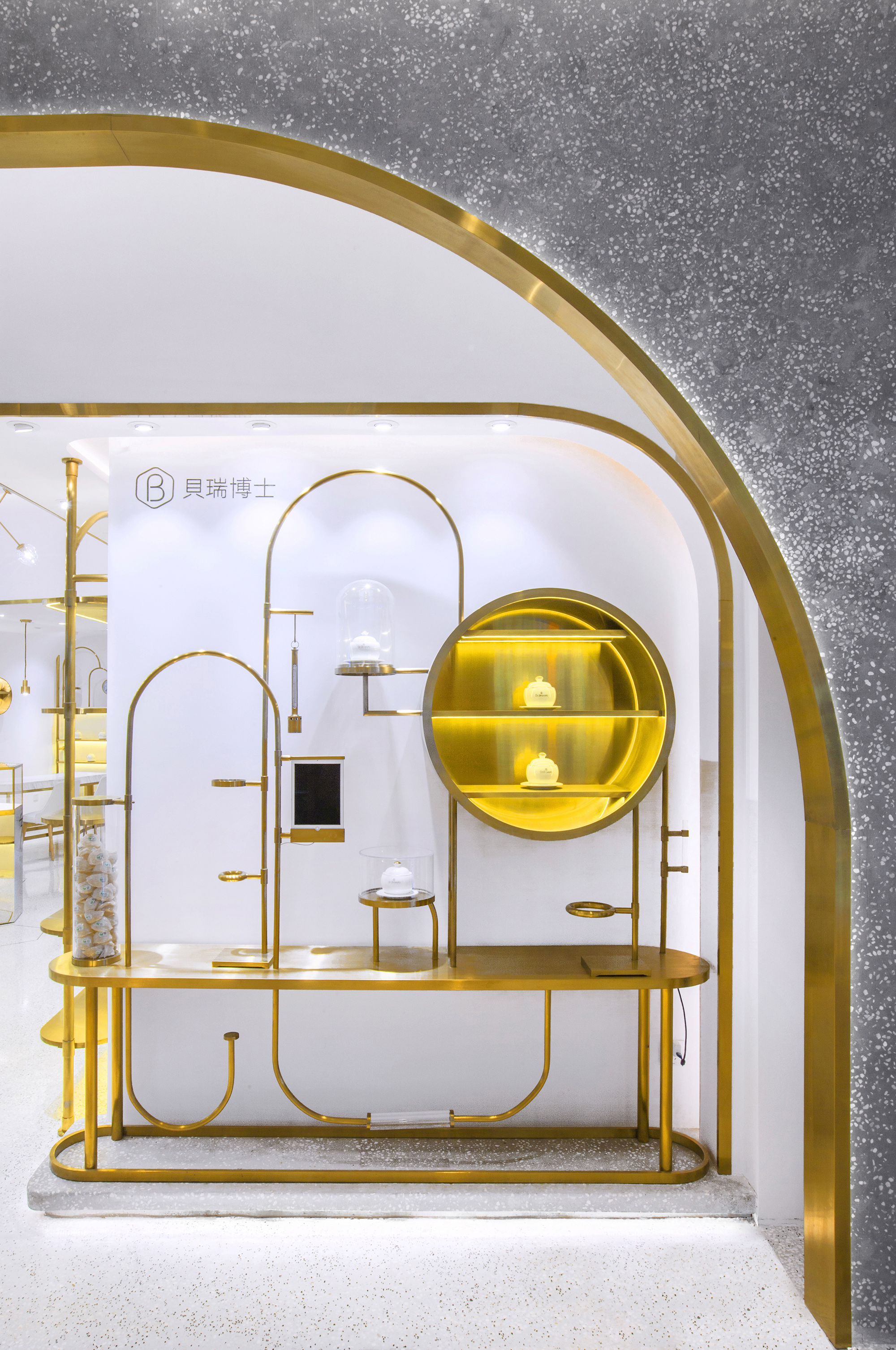
▲入口实验室风格展示道具
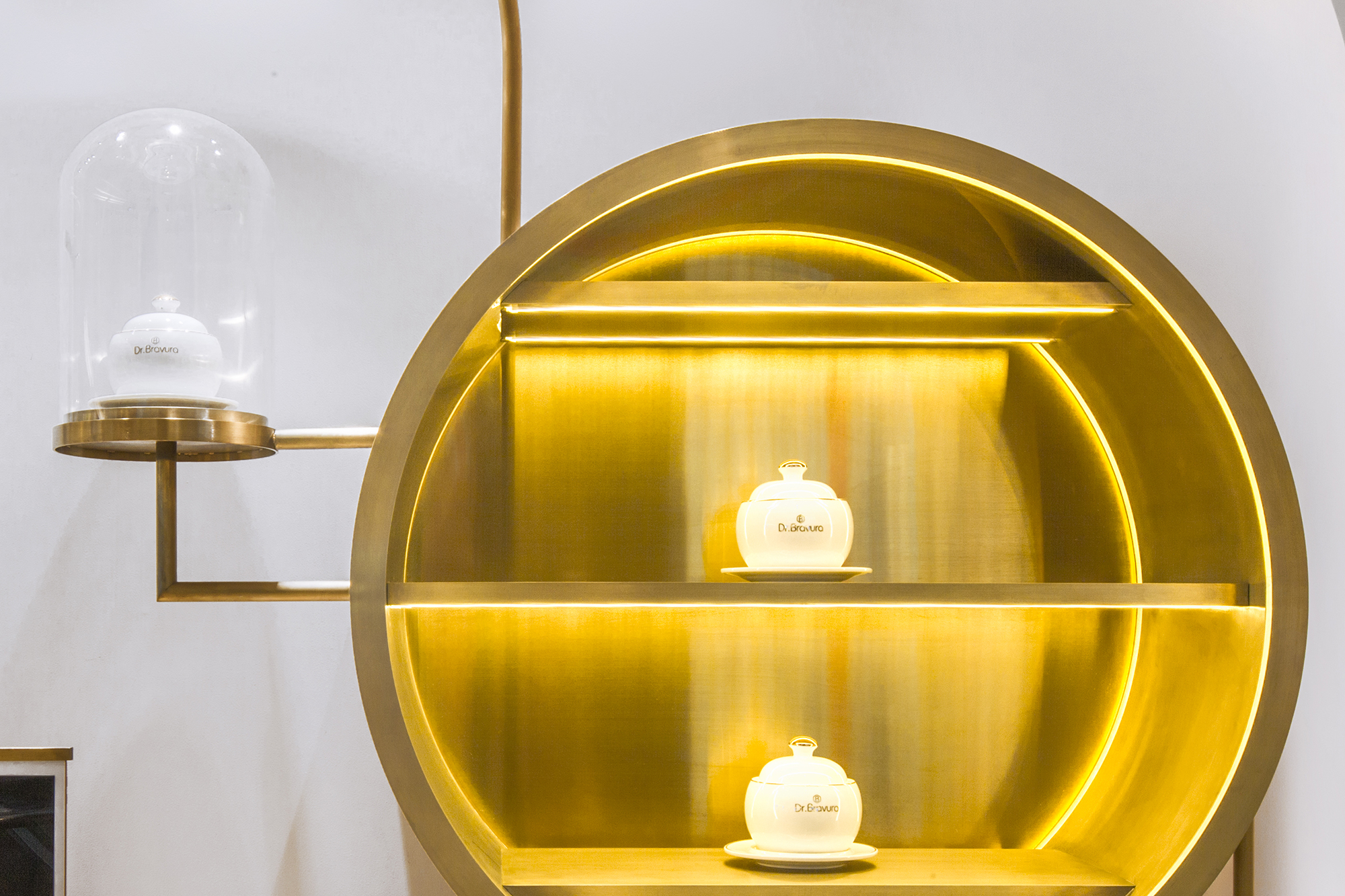
▲入口圆形展示道具
▲入口道具细部
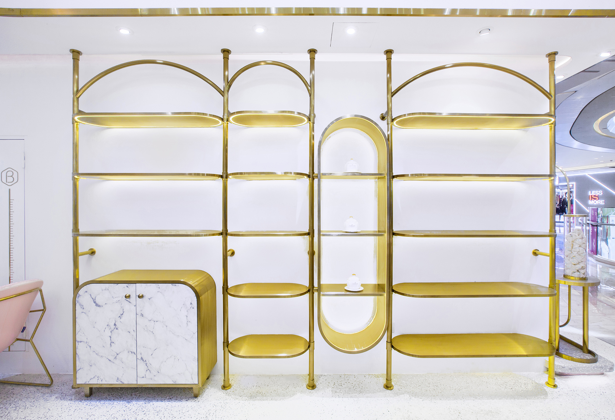
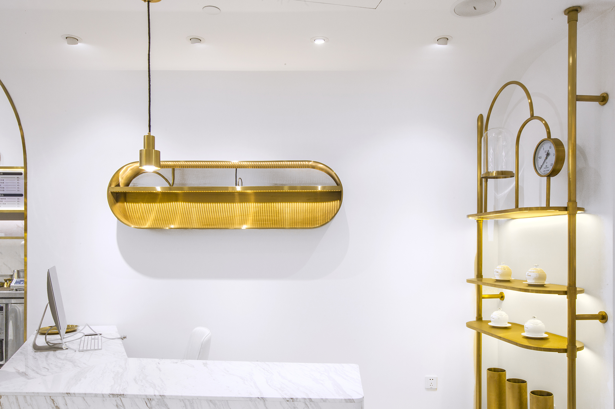
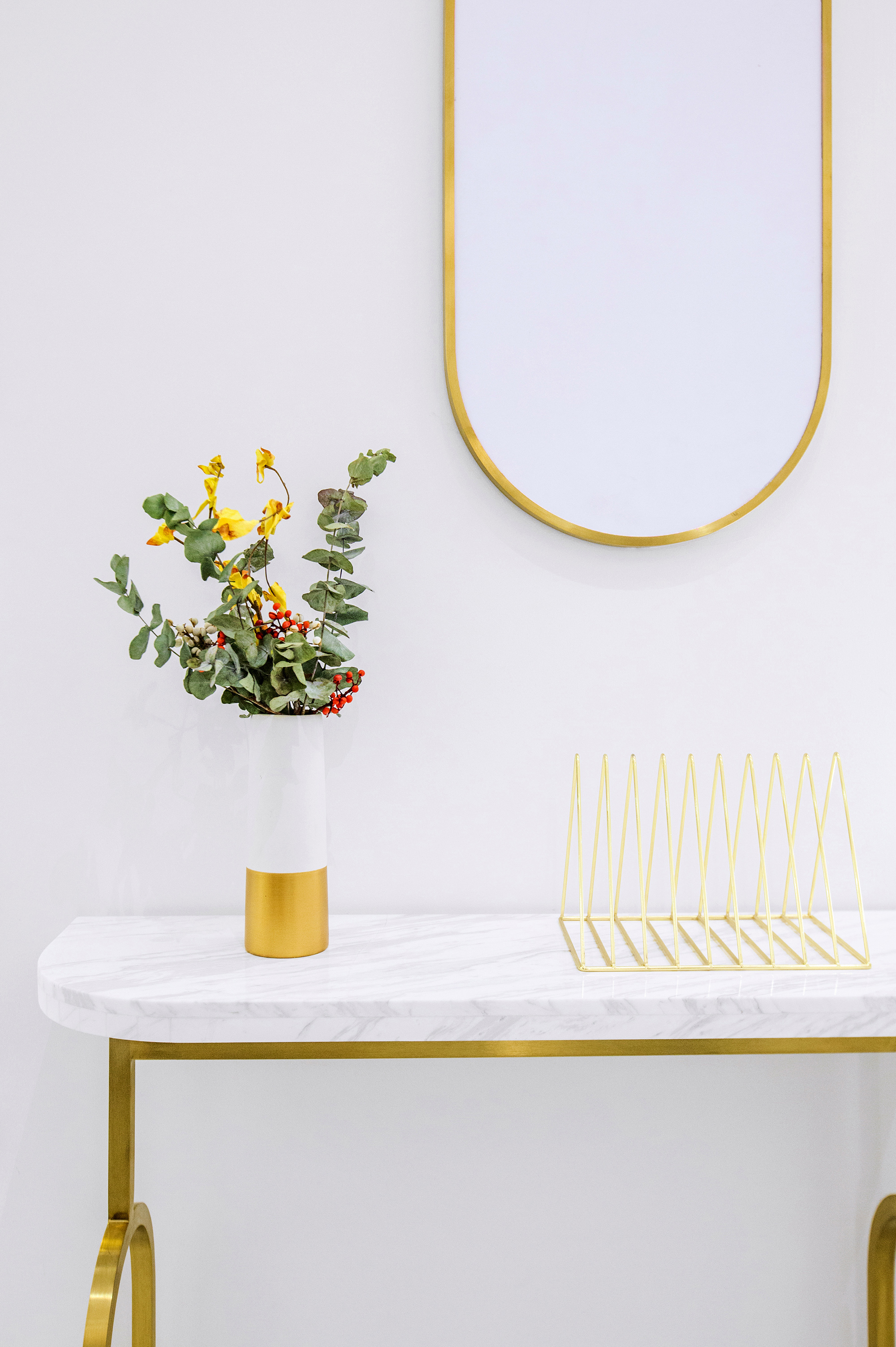
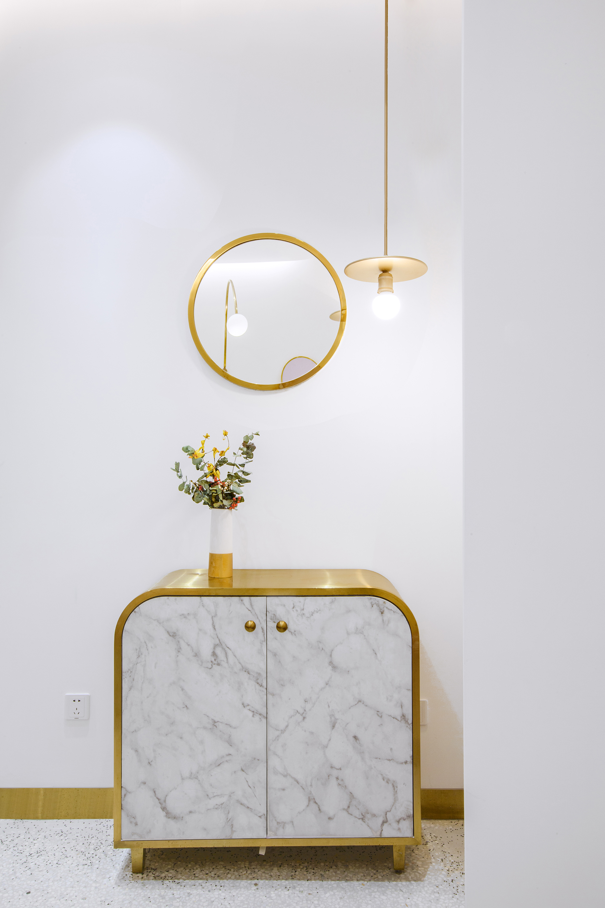
门头水平描摹的金色线条,延伸至入口展示区的几何造型货架,进而贯穿于内部堂食区的桌椅及装饰细节,以几何美学的思维,对空间的轮廓进行勾勒。
Gold lines highlight the storefront, frame the display stands with geometric shapes, and blend into the chairs and decorative details in the seating & eating area. The space is outlined with the aesthetics of geometry.
▲入口看销售展示区
▲展示区胶囊型展示架
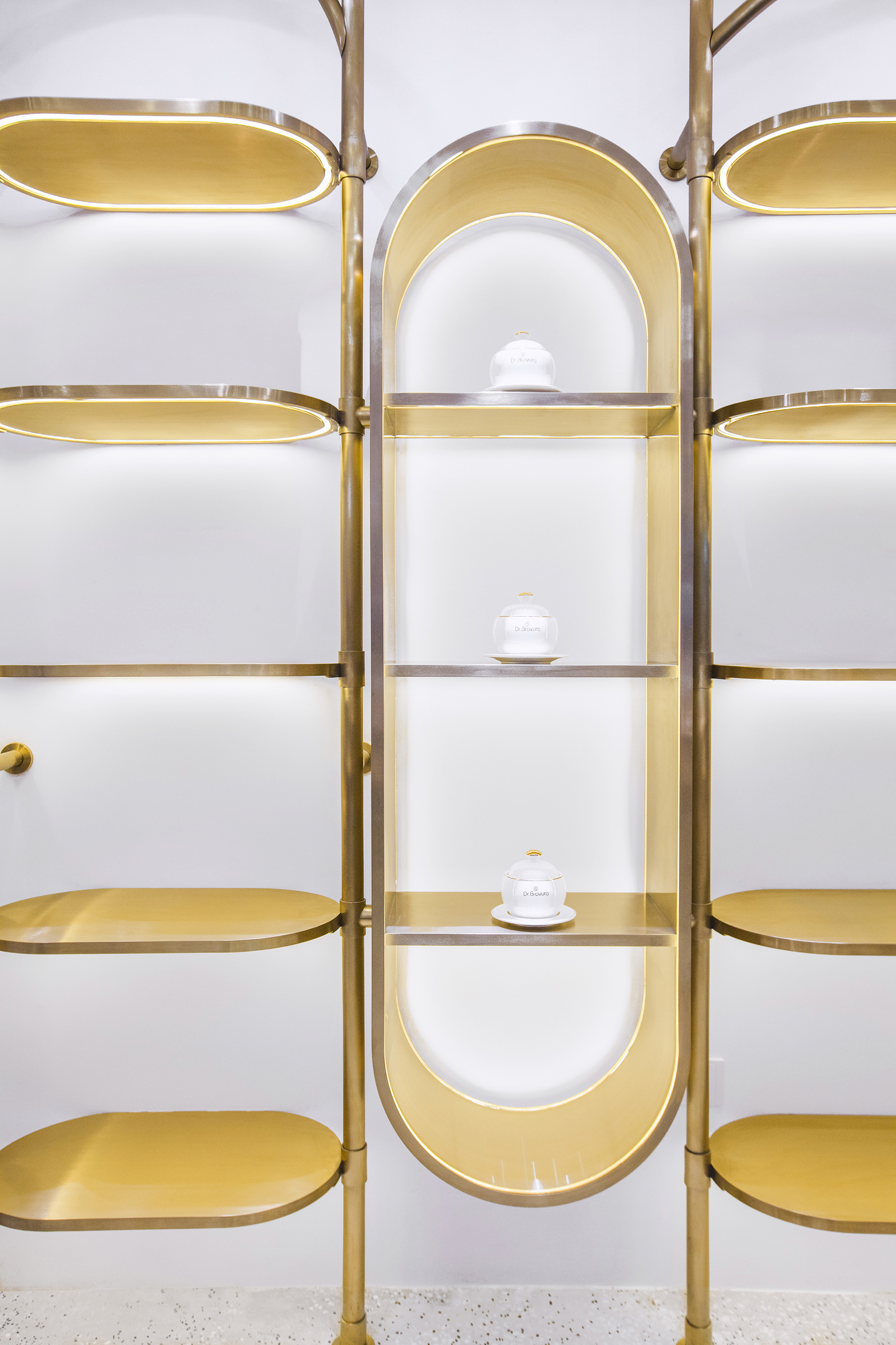
店内的灵魂当然要回归于它所提供的产品和服务。开放式货架上,燕窝产品像艺术品一样陈列着,使顾客专注了解食材的原生细节,同时也感受到品牌对高品质生活的用心倡导。
The soul of the shop lies in the products and services it provides. On the open shelf, edible bird’s nest products are displayed like artworks, enabling the customers to know about the details of the natural ingredients and the concept of pursuing a high quality life that the brand advocates.
▲从展示区看吧台
▲礼品服务区
▲胶囊型展示柜
▲礼品服务区展示道具
▲道具表盘的细部
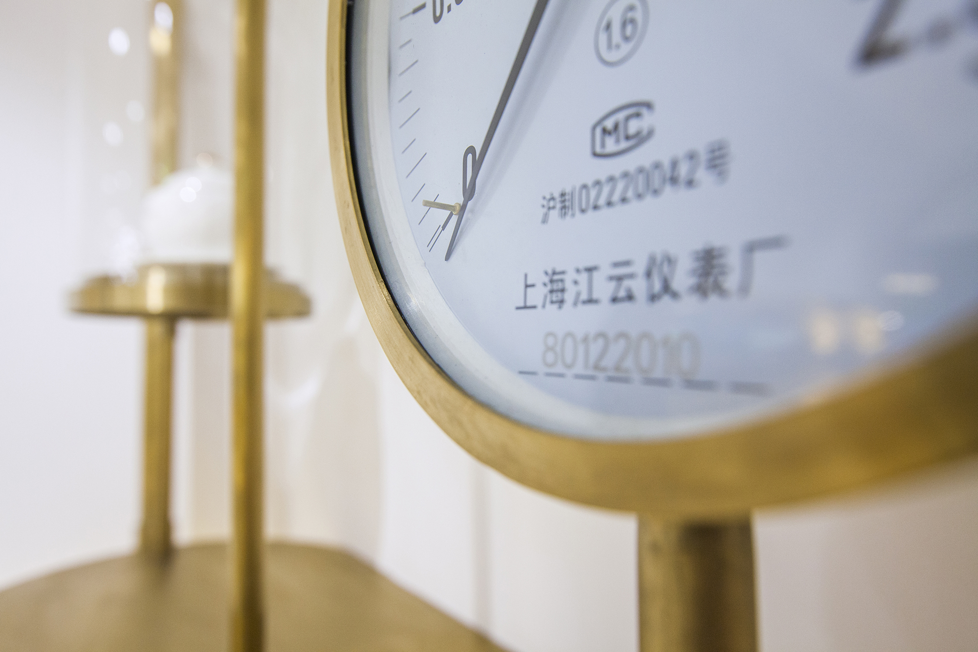
这种对于品质的关怀同样体现在其他细节中:玻璃、金属框架与大理石纹理完美搭配,传递出尊重材质天性的态度;独具个性的家具,每一件都是品牌专属气质的定制物件。
The details of the interiors show quality and exquisiteness. Glass, metal frames and marble grains complement each other, and each piece of furniture are customized, characteristic and unique. In the seating & eating area, seats are arranged in diverse densities.
▲从展示区看堂食卡座区
▲弧线形的壁灯
▲边桌小景
▲转角小景
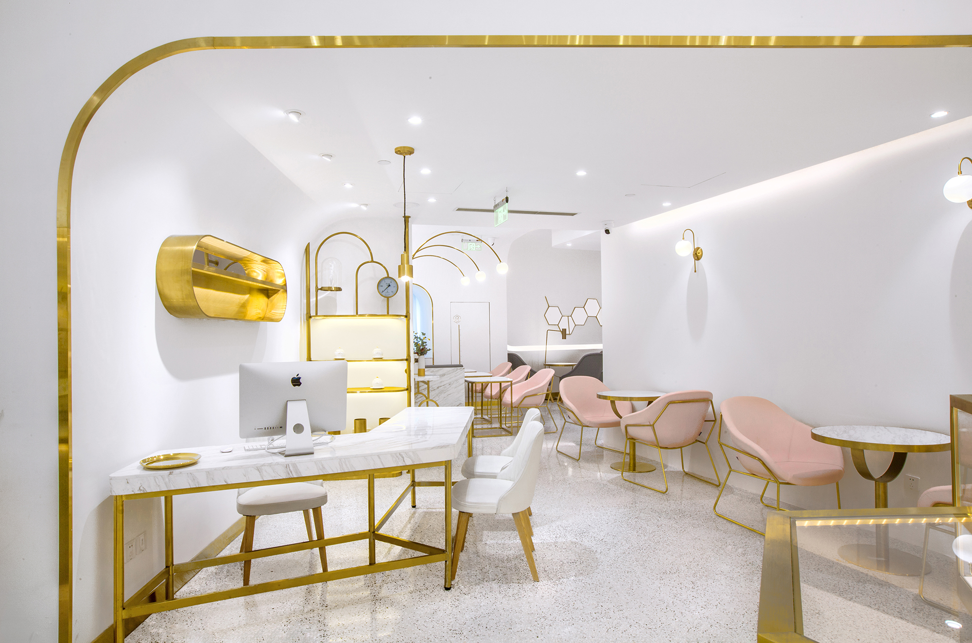
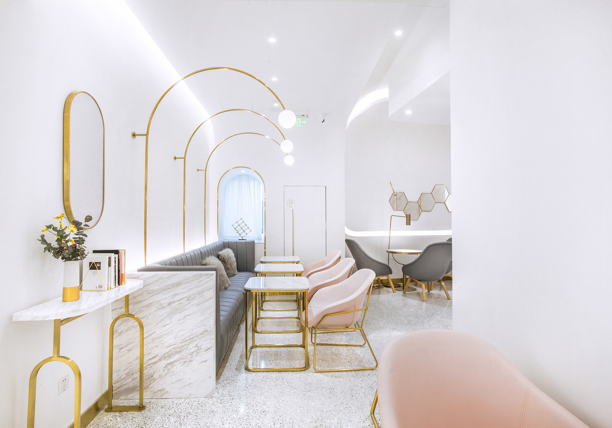
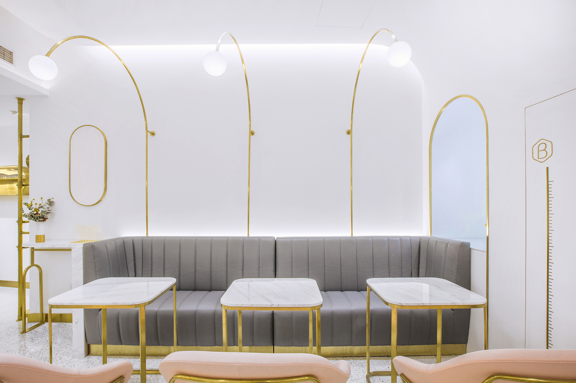
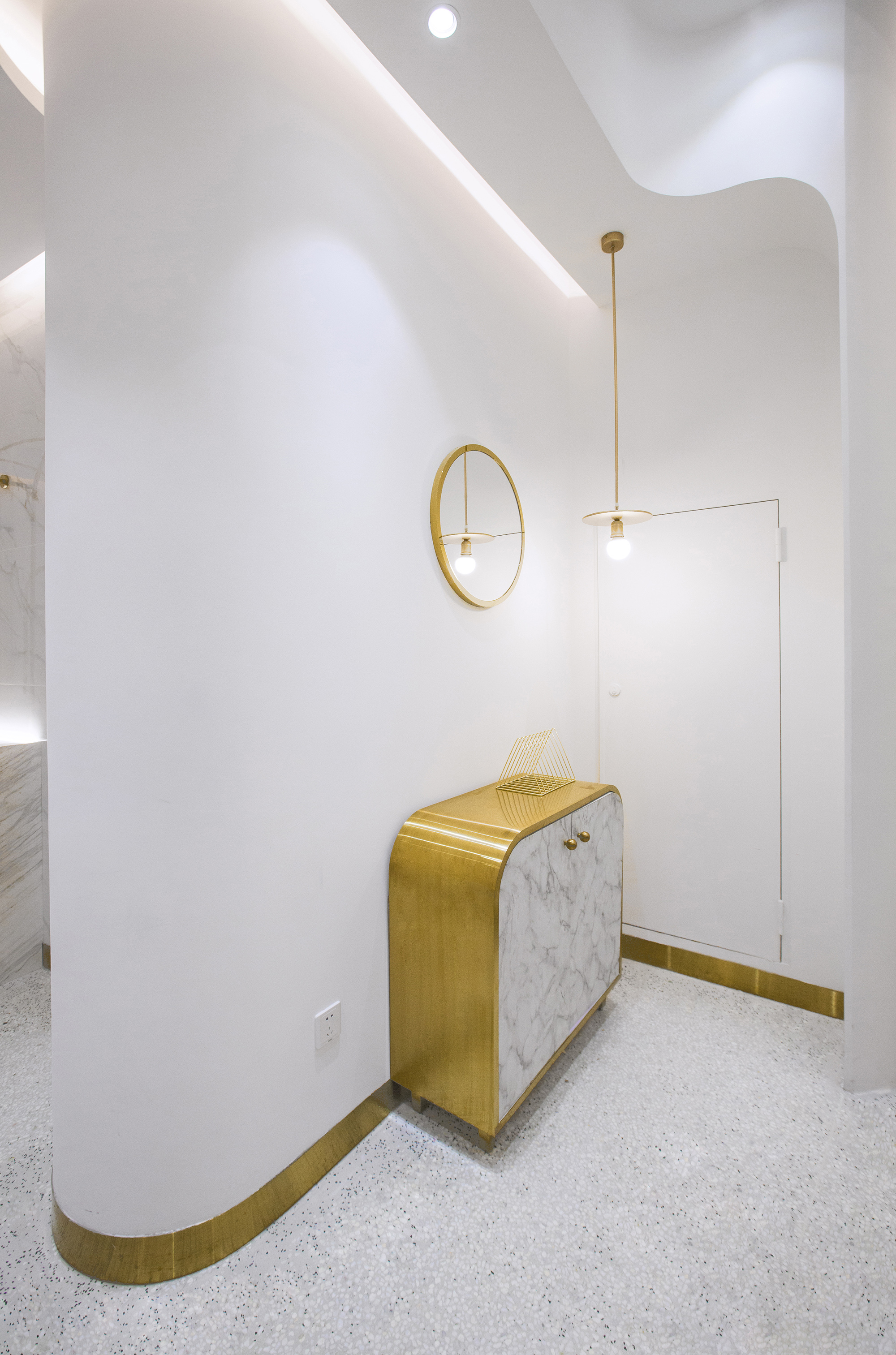
堂食区疏密有致的座位排布,墙体与家具互相呼应的韵律曲线,与售卖区的精密科学感产生对比,更能引起顾客坐下来小憩一番的兴趣。
And the walls and furniture echo each other and create a spatial rhythm, in contrast with the sales area featuring a sense of scientific precision, which is quite compelling to customers.
▲灯具的曲线与空间的曲线互相呼应
▲主题墙面装饰与曲线的搭配
▲曲线的光带勾勒空间的节奏
▲曲线光带与灯具的搭配
▲曲线的空间
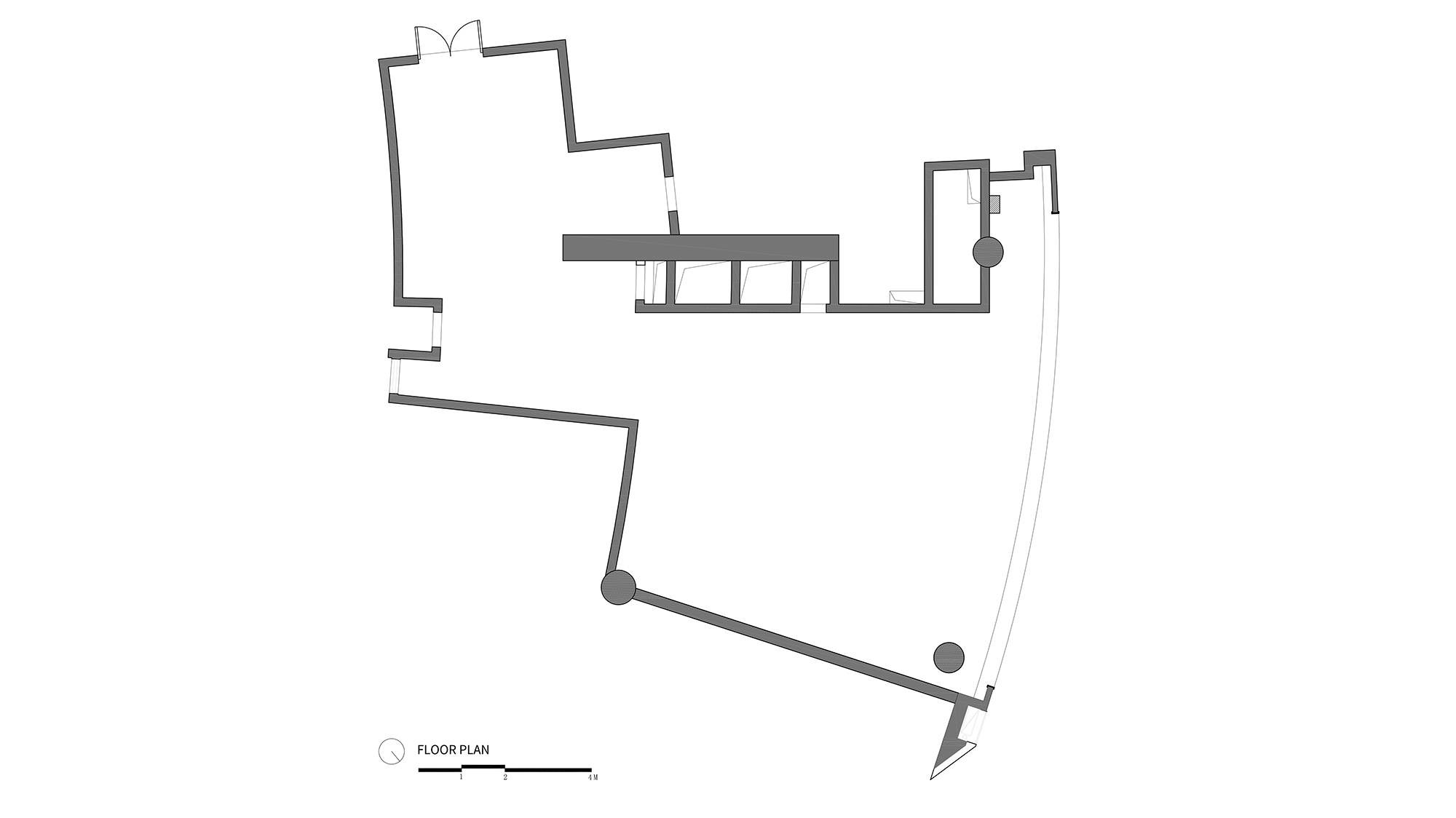
▲设计前平面图
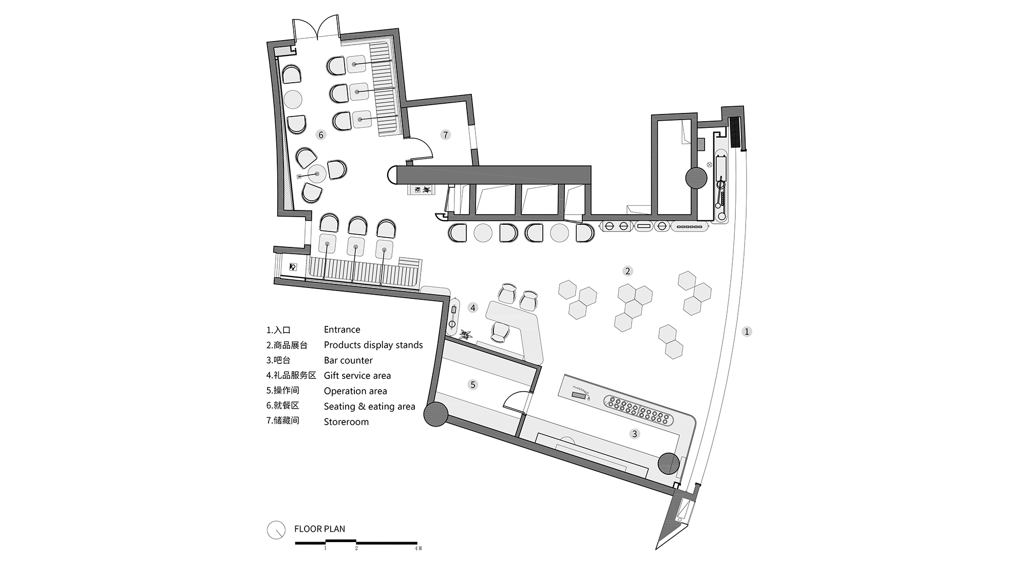
▲设计后平面图
项目信息——
项目名称:Dr.Bravura贝瑞博士燕窝饮品综合店
项目地点:上海
项目类型:休闲餐饮
项目面积:119m2
设计公司:Towodesign堂晤设计
主持设计师:何牧
设计团队:何牧、任伟、刘雄杰、郑力源
完工时间:2019.03
摄影:Towodesign堂晤设计
Project Information——
Project name: Dr. Bravura Bird’s Nest Drink & Dessert Store
Location: Shanghai, China
Type: casual catering space
Area:119 m2
Design firm: Towodesign
Chief designer: He Mu
Design team: He Mu, Ren Wei, Liu Xiongjie, Zheng Liyuan
Completion time: March 2019
Main materials: stainless steel, terrazzo, stone, paint
Photography: Towodesign


