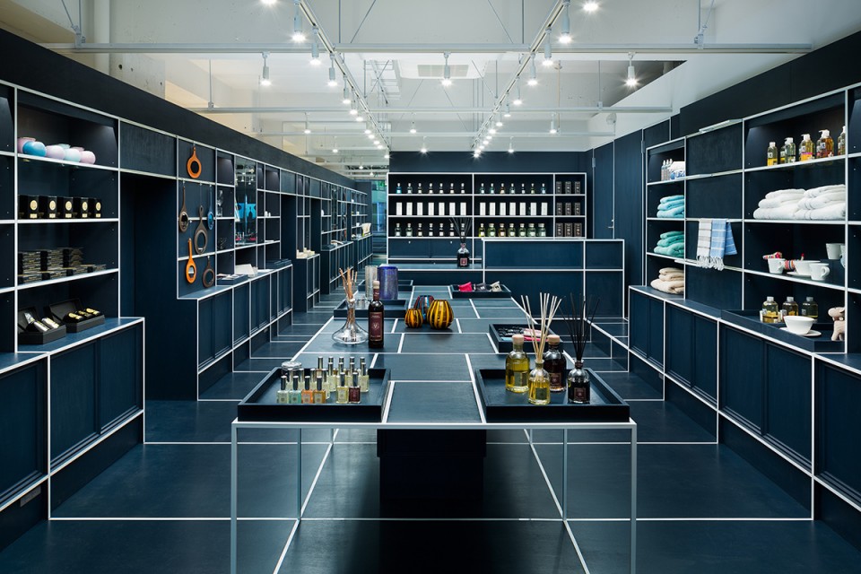
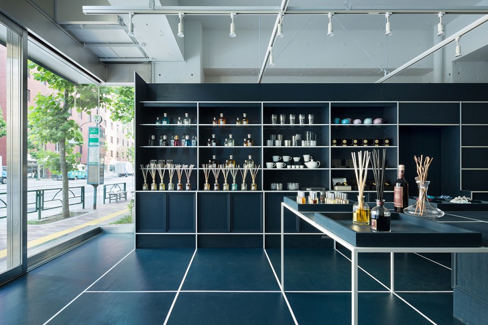
在琳琅满目,色彩缤纷的商店中,商品的展示方式在极大的程度上决定了空间的品质与留给客人的印象。建筑师将白色的网格条纹覆盖了整个商店空间,形成了极富特色的室内装饰。
In a retail space stacking many goods – having various colors and shapes, “ways of display” determine an impression of the space to a great degree. So, I spread a white-guide-grid for display over the space, and made as it is “ornament” of interior.
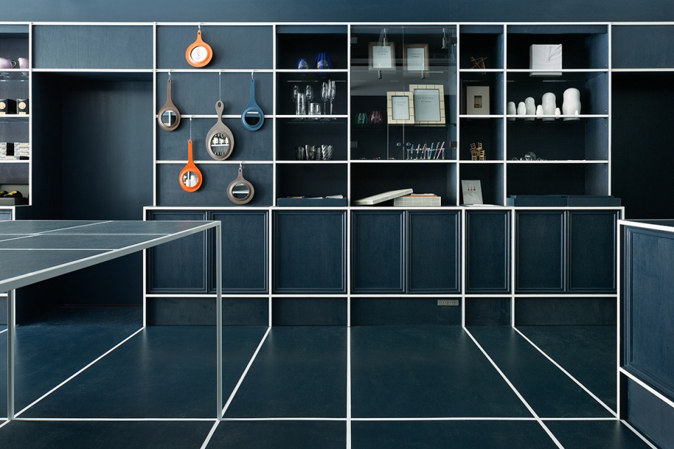
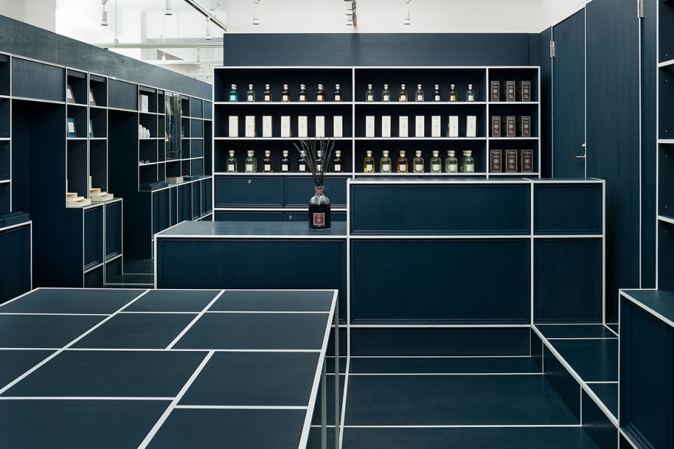
以建筑现有框架为基础,15毫米宽的白色线条勾勒出室内家具与装置、置物柜、桌脚和门框的边界,覆盖了空间内的每一个细节。而商店的标志性颜色-海军蓝则成为了底色,让空间看起来更为统一和整体。家具的木纹肌理透过粉刷层浅浅的显露出来,并不显眼却仍为空间带来了经典而温暖的氛围。
Using auxiliary lines drawn out by existing building frame, I laid it all out to pass the white line 15mm wide to every detail such as outlines of furnitures and fixtures, shelf boards, table legs, and door frames. Base color behind of guide-grid is navy – it is signature color of the shop. It has a role tightening the space as background of articles, but wood-grain remained by permeable paint and decoration of moulding makes classic and warm nuance.
▼15毫米宽的白色线条勾勒出每一个细节,the white line 15mm wide outlines every detail
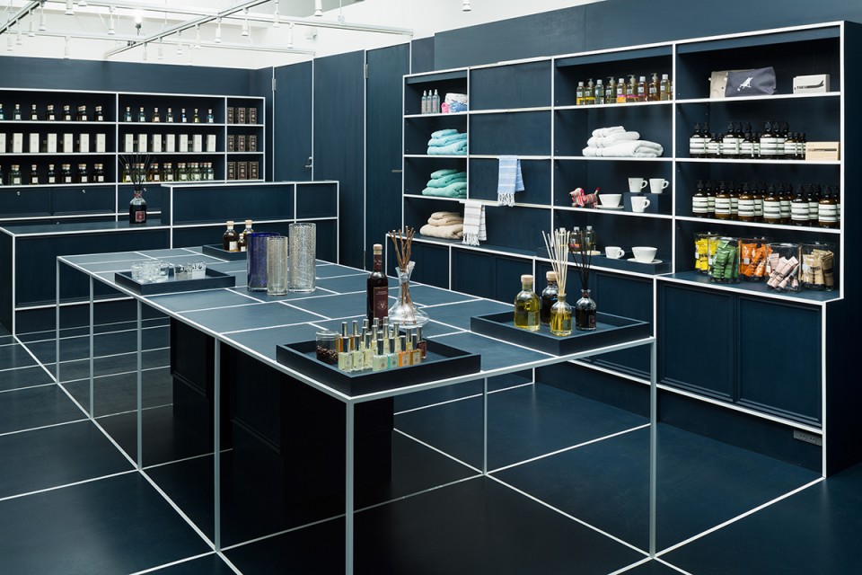
货架上不用尺寸的托盘可移至中部的岛台上摆放,形成高低错落、层次丰富的展示效果。与托盘尺寸相呼应的网格图案也为展台增加了不少趣味性。而随着托盘排放位置的改变,空间也呈现出多样化的面貌。
Trays of varied sizes on the shelves can place on the island-table having ladder pattern. Its pattern is drawn to fit to each trays. The space expression alters at random by changing places of trays.
▼岛台上的网格图案与托盘尺寸相呼应,pattern on the island-table is drawn to fit to each trays
建筑师为这个商店空间带来了极富秩序,却又可以不停变换、新鲜感十足的设计。
This design gives “order” and “freshness” for display changing from day to day.
▼商店外观,external view
项目信息——
Location : Tokyo, Japan
Principal use : Retail Store
Category : Renovation
Construction area : 61.42 sq.m
Design Period : 2014.03.
Construction Period : 2014.04. – 2014.05.
photography :Takumi Ota


