GREYBOX COFFEE嘉里中心店位于北京嘉里中心南楼一层入口西南侧。业主提出的极客设计主题和不规则的场地是我们首要面临的难题。幸运的是,颇具空间感和未来感的品牌标识为设计提供了原始创作灵感。我们决定尝试将品牌自信与商业表情融入到设计中去。
GREYBOX COFFEE is located at the southwest side the entrance of South Tower of Beijing Kerry Center. The challenges we first encountered were the geek style requested by the client and an irregular-shaped site. Fortunately, the logo of the brand itself, a design with feeling of space and future, offered us some original inspiration. We tried to integrate the self-confidence and business expression of the brand into the design.
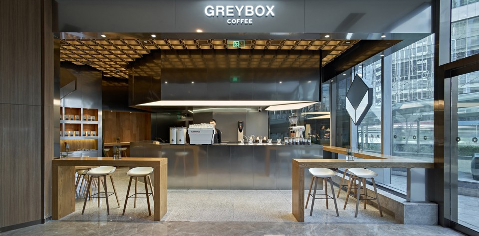
▼ 主入口,Main entrance
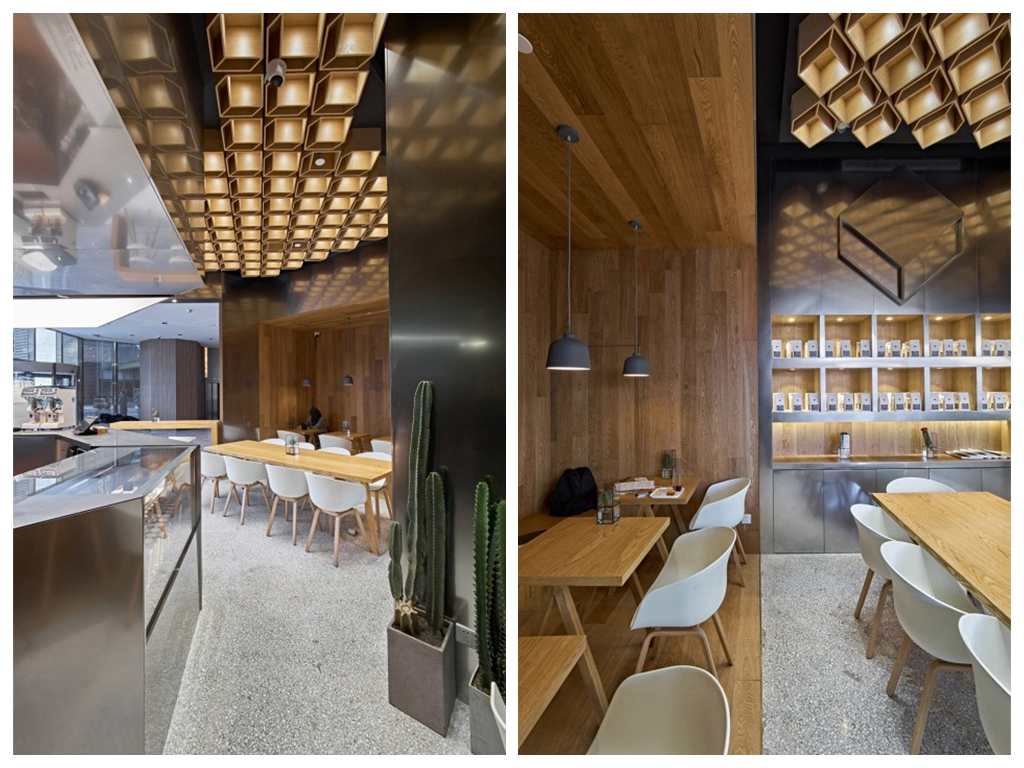
作为对品牌名称中“GREY”的回应,空间的主色调被确定为中性的灰色。通过在中心岛台和墙面大量使用喷砂不锈钢板,为整体空间定下了中性、冷静、光亮的灰色基调。椅子的白色与水磨石地面的浅灰色又为这种中性基调增添了更多层次。作为对大面积灰色的调和,家具、灯饰和局部墙面的木色,又为身处其中的顾客带来些许温暖和舒适的感觉。极客风格也就此产生。
As a response to the “GREY” in the brand name, a neutral grey was selected to be the main color for the space. With the use of sandblasted stainless steel panels as the key material for central counter and walls, the space is defined by a cool, calm, and sleek greyish tone. The white color of the chairs and light grey from the terrazzo floor also enrich this neutral color tonality with more layers. In order to add some warm touch to the space so the guests will feel more comfortable, the color and texture of wood from furnishing, lighting, and some walls are used as a mixture into the metallic space. The geek style is thus created.
▼ 极客风格的材质搭配,Geek-style material selection
品牌名称中另一个核心词BOX,也为空间设计带来自然而然的灵感。作为空间核心和视觉焦点的岛台是品牌标识的立体化呈现。如同一个灰色盒子的开口,操作台面与灯箱中间的部分,成为所有涉及咖啡制作和服务的操作空间。
The other key word from the brand name – box – also brings some spontaneous inspiration when it comes to space design. As the core and visual focus of the space, the central counter is a three-dimensional presentation of the brand identity. Like an opening of a grey box, the middle space created by the hanging light box and operating counter is reserved for all the activities involving coffee making and service.
▼ 作为空间核心和视觉焦点的岛台,The central counter as the core and visual focus of the space
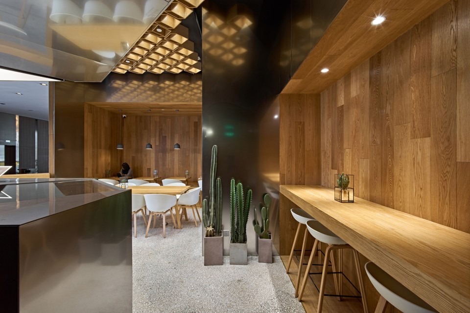
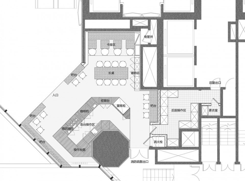
几次形体转折区分出不同功能的界面,也将场地中八角形的巨柱化为背景,隐匿其中。吧台桌环绕岛台设置于入口处和临窗区,给客人品鉴咖啡和闲坐交谈提供了很好的景观位。
Different functional areas are divided by the transition of the shape of the counter. The octagonal column is also successfully covered and becomes part of the background of the counter. Several bar tables are arranged around the central counter, close to the entrance and window, providing the guests with a good view when they enjoy coffee and chat.
▼ 形体转折区分出不同功能的界面,Different functional areas are divided by the transition of the shape of the counter
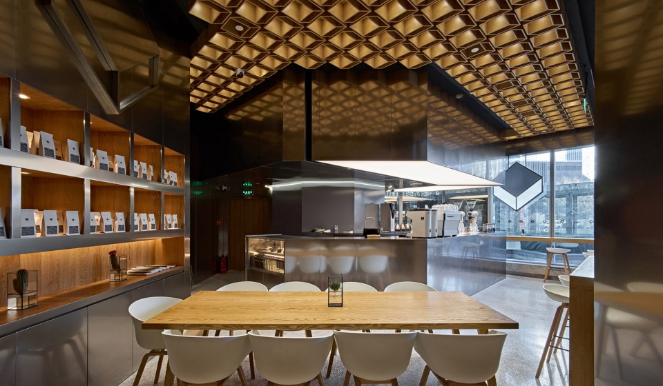
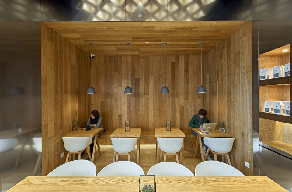
与中心岛台金属灰盒子相呼应的,是一个布置在场地内侧的以原木打造的“龛”形空间,放置长凳和小桌,形成较为安静的慢饮环境。盒子的概念也延续到展陈区的设计。一系列嵌于墙面的木盒用于展示咖啡豆和其他贩售商品。正对展陈区的是8人位长桌,用于较多客人使用。采用防火木制作的204个logo吊顶单元环绕岛台灯箱均匀排布,形成有趣的图案,内藏有射灯,音箱和其他设备。木色吊顶清晰地提示了消费区域范围,也为店铺提供了整体的品牌形象和主要照明。
Across the metallic grey box of the central counter, a timber niche is designed in the inner part of the space where bench and small tables are arranged, which forms a relatively quiet environment for coffee drinking. The concept of box is also extended into the display shelf. Inside a series of wooden boxes inserted in the wall, coffee beans and other products are displayed. A long table with 8 seats is put in front of the shelf, perfect for a group gathering. For the ceiling, a grid system is designed with the brand logo as the shape of the single unit. Made of fireproof board and with built-in lighting, 204 small boxes are evenly attached to the ceiling, creating an interesting pattern. Speakers and other equipment are also hidden in this grid system. It does not only define the consumer area of the space, but also reinforces the identity of the brand and provides the main lighting.
▼ “龛”形木空间/Timber niche
▼ 嵌于墙面的木盒用于展示咖啡豆和其他贩售商品,A series of wooden boxes are inserted in the wall for display / 204个logo吊顶单元形成有趣的图案,204 small boxes are evenly attached to the ceiling, creating an interesting pattern
▼ 平面图,Plan
项目信息——
项目名称:GREYBOX COFFEE北京嘉里中心店
项目位置:北京嘉里中心南楼一层西南角入口处
项目类型:商店
项目业主:GREYBOX COFFEE
设计团队:方式设计
建筑师:刘斌,李斌
建筑面积:75平方米
设计周期:11.2016 – 12.2016
施工周期:12.2016 – 01.2017
摄影师:王洪跃,鲁雯泋


