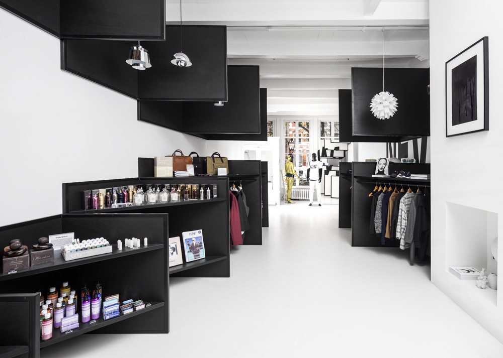
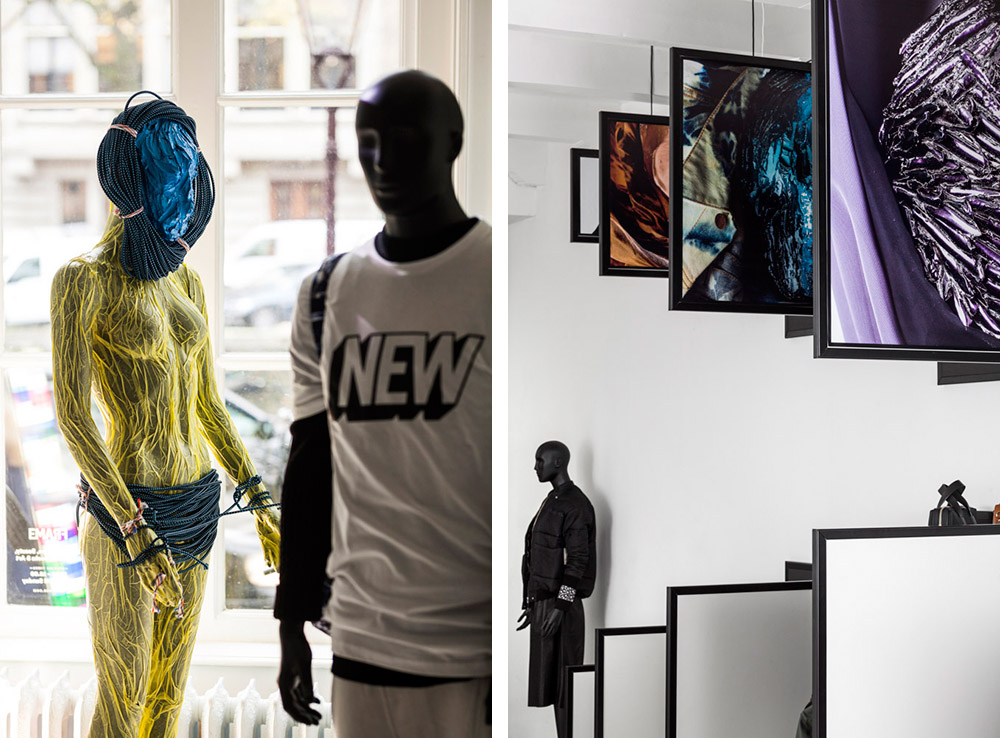
i29室内设计工作室为Frame Magazine设计的新店,一面是白色,一面是黑色,在行进的过程中,黑白交替混淆呈现,到达尽头再回溯,发现黑白已反转。一个跨界多样化商店的无限灵活性与可能性由此展开。
在2014年年初成功开设一个临时店铺后,Frame杂志决定继续在新的位置开店。i29室内建筑师再次被邀请设计他们的陈列环境。在菲里克斯·曼里提斯,不朽的“zuilenzaal”被变成了一个镜像世界,来衬托和强化其庄严。对比性最大的是位于Herengracht 178号的新店,这是一个纯白色高对比度的宁静空间。
设计师同样希望在商店继续提供三维体验—富有惊喜,启迪的无以伦比世界。在一个完全不同的环境中工作的i29室内建筑师们提提出了一个激进的概念:将两个商店融合在一起,在一个空间内提供两种相对立的体验,即一个设计成白色矩形,另一个黑色三角样式;一个是白色的展览体验,另一个是列满商品的黑色商店体验。Frame商店的商品涉猎艺术,设计,建筑和时尚。为此这样的室内设计完全可适应这样一个多元化商店。店面形象的灵活性和可变性是设计师的宗旨。
Having successfully opened a temporary store earlier this year, Frame Magazine decided to continue at a new location. i29 interior architects where asked again to design their retail environment. At Felix Meritis, the monumental ‘Zuilenzaal’ was transformed into a mirrored universe to reflect and intensify its grandeur. There could not have been more contrast with the new location at Herengracht 178, a serene completely white space.
Again, the Frame Store should offer a three-dimensional experience of the magazine – a creative and innovative universe that surprises and inspires. Working within a totally different context, i29 interior architects proposed a radical concept; two shops in one, two contradictory experiences in one space. One white and rectangular installation versus one black and diagonal; A white museological experience apposing a black shop experience full of products. Frame store works in the intersection between art, design, architecture and fashion. The interior design is based on the changeability of such a diverse shop. Flexibility and being able to change the store identity completely was our main focus.
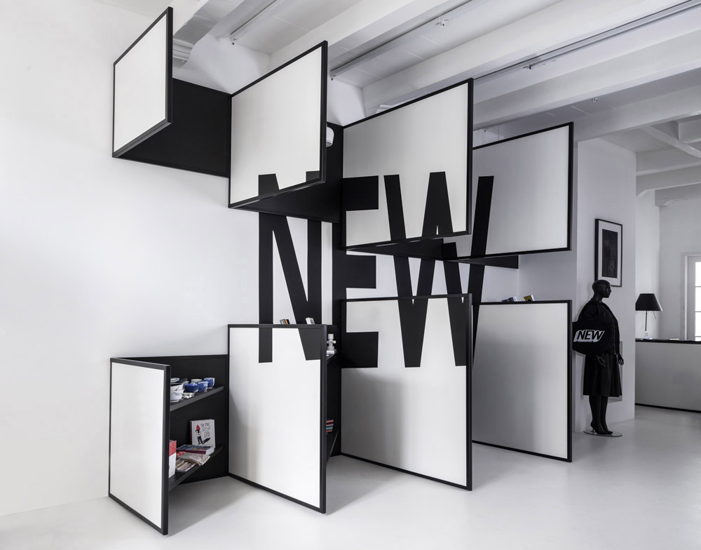
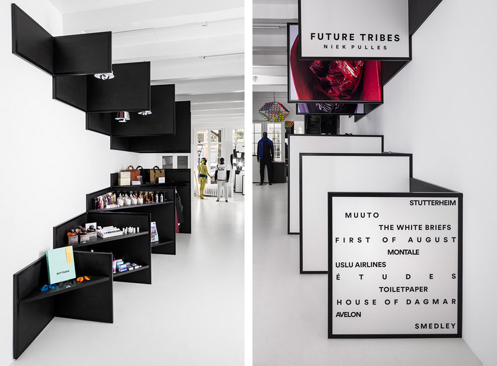
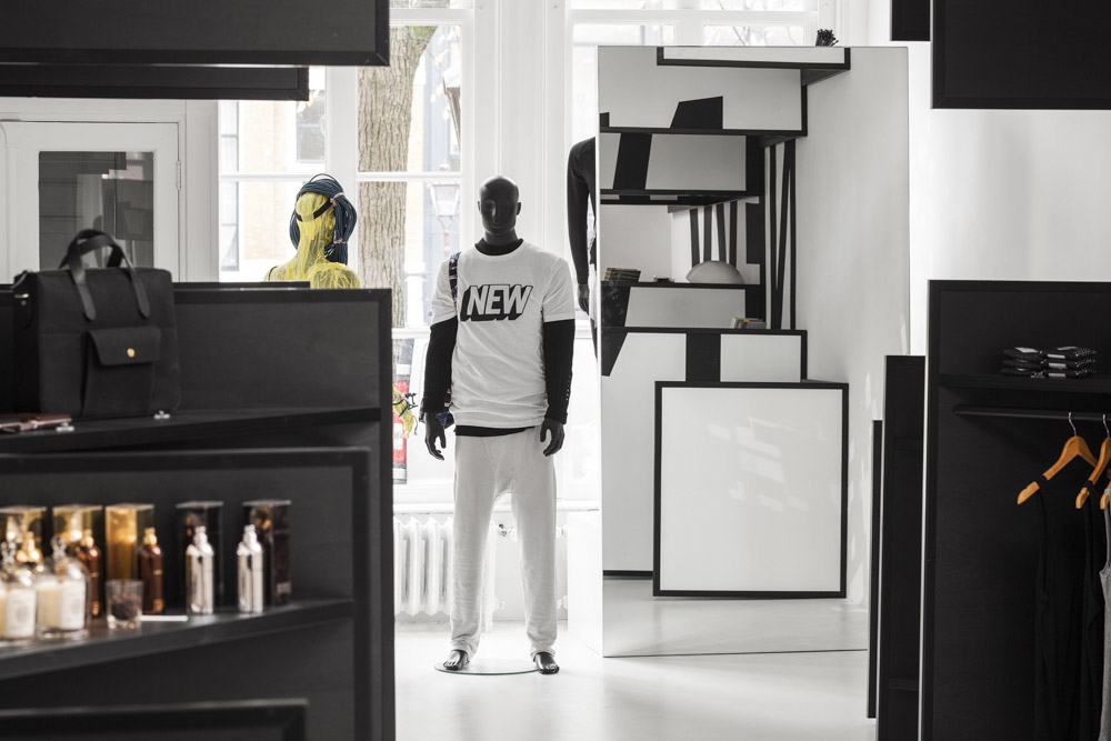
Seen from the front, an installation of white panels and black frames floats in the all white space. Hanging from walls, floors and ceiling these panels intend to function as a white canvas. The content of this ‘canvas’ can be changed as all front panels are easily replaceable. Personalized presentations on particular themes can be exposed. The use of text and graphic art linking back to the magazine’s origins. But also enabling artists to be invited by FRAME Magazine to completely make over the environment.
从前面看,白色面板和黑框的装置浮在全白的空间里。这些挂在墙壁,地板和天花板上的的面板是用作白色画布的。这种画布的内容可以随意改变,因为所有的面板都很容易更换。关于特定主题的个性化陈列可以被展现出来。文本和图形艺术的使用和该杂志的起源有关,也使得艺术家可以被邀请到Frame杂志对环境做全然的修改。
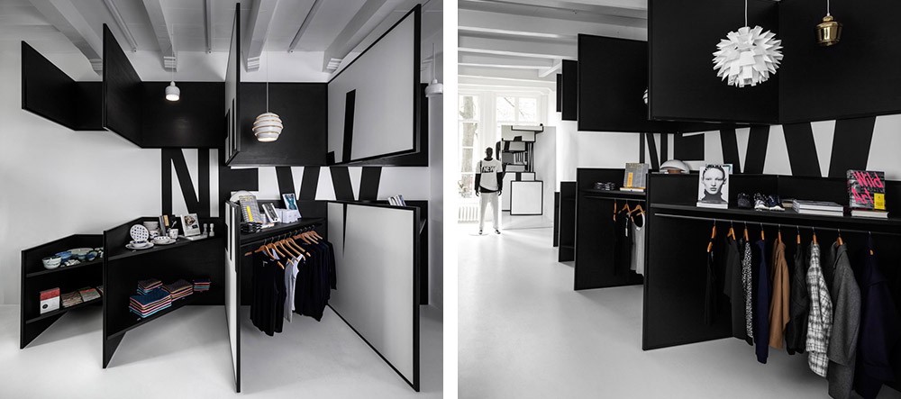
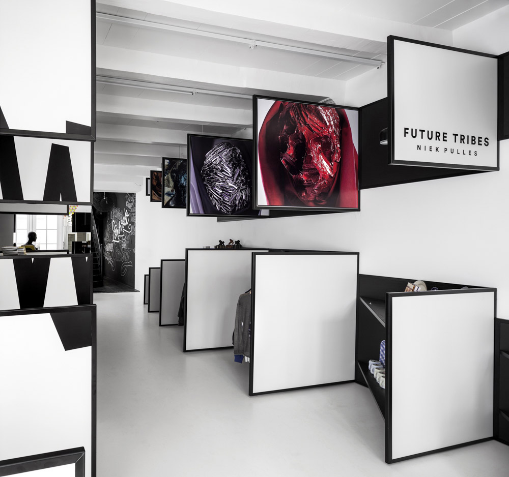
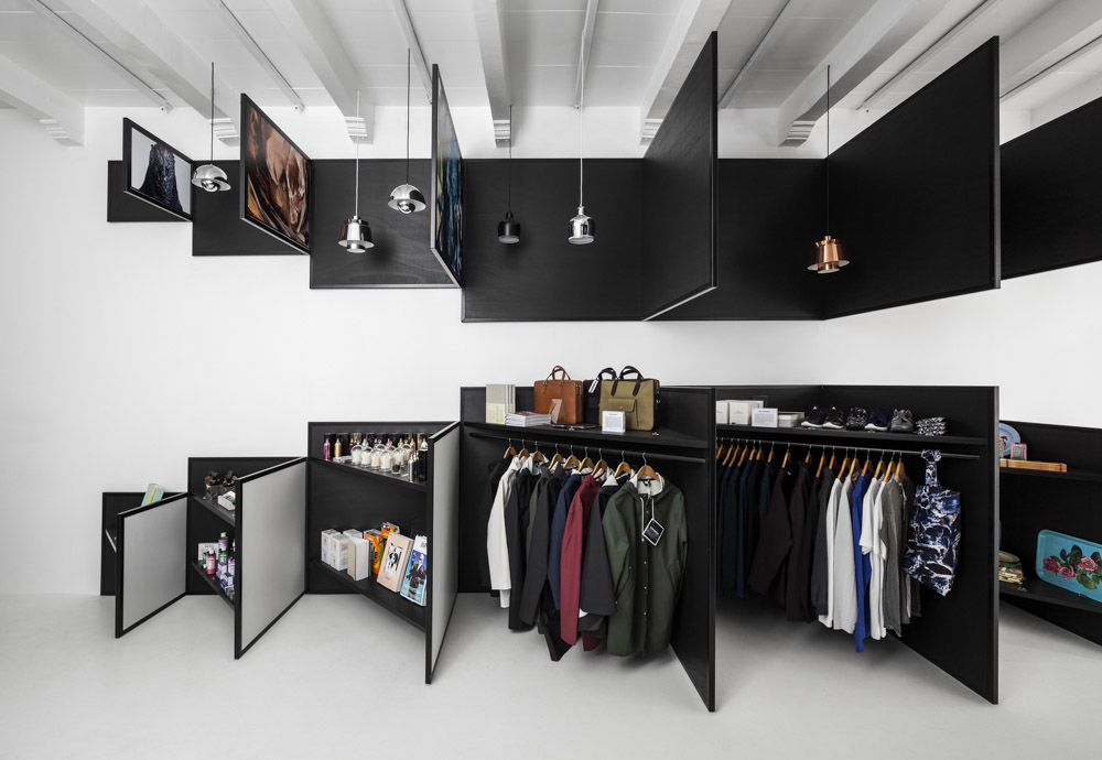
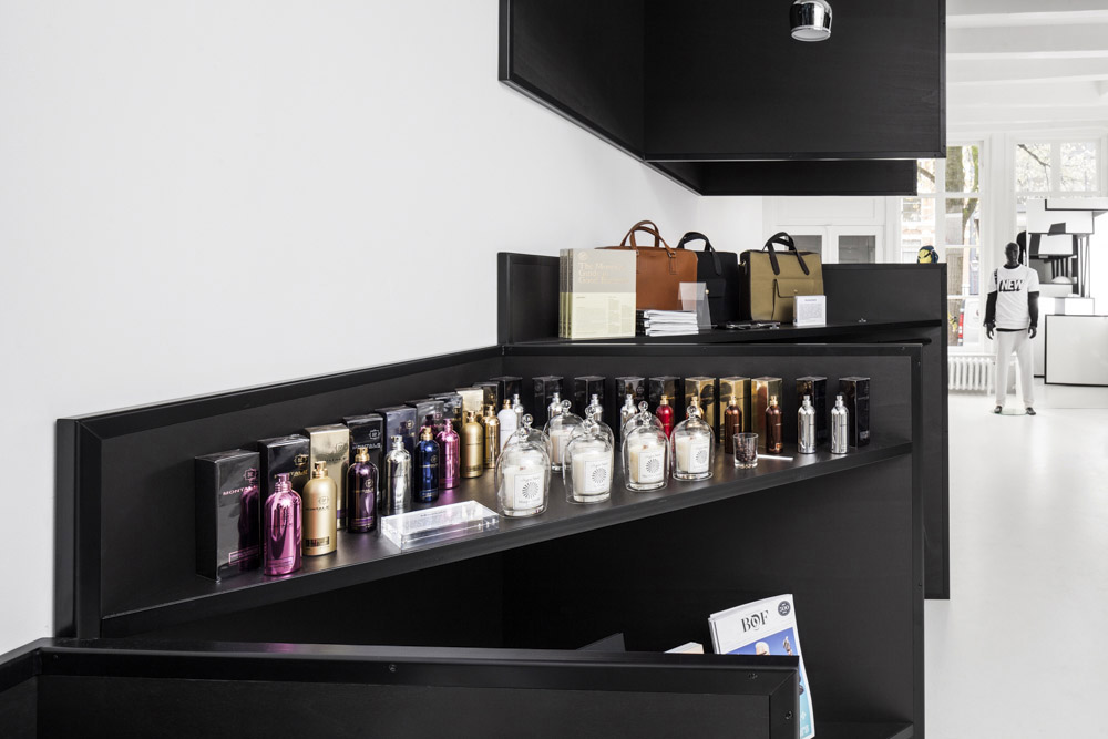
从后往前看,商店提供了完全不一样的体验;在前面板后面,染黑了的木质三角形展示板上陈列了真实的产品。在同一个商店内,这黑白两个世界的对比,非常震撼。为了增强这种对比效果,所有的选择是都是相对立的:黑与白,方形和三角形,空与满。在开幕酒会中,概念艺术家尼克布尔斯展示了一组名为“未来部落”的系列面具,这些作品也被展现在前面板上。新的露天装置也通过多维性的方式被显示在几个面板上。
这两个展示都清楚地表明了在一个商店内结合两种或三种表现方式的视觉冲击和可能性。新的Frame商店又一次提供了一个感官体验。在距离运河房屋地面入口几步之遥处,两种色调的图像覆盖在在整个内墙上,形成一个三维的装置。一个由三角形构成的光学错觉上隐藏着一堆杂志和时尚货架。悬挂在天花板上的照明吊灯被图形的上层所遮蔽。“该店的内部呈现的是完全不同的感觉(相较于第一家店),因为其内部空间是如此不同。但是,从概念上讲,我认为它一点也不弱于第一家店。”罗伯特蒂曼—Frame杂志的主管说到。
Looking from back to front, the shop offers a totally different experience; triangular shaped display boards in black stained wood show the actual products behind the front panels. The contrast of these two worlds within one shop surprises. In order to enlarge and amplify this contrast, all choices made are contradictory: black versus white, square vs triangular and empty vs full. During the opening party, conceptual artist Niek Pulles presented a series of masks called Future tribes. Detailed portraits of these artworks where also displayed at the front panels. Also the grafic opening installation new’ was displayed over several panels playing with the multi dimensionality. Both presentations clearly show the impact and possibilities of the approach combining 2d and 3d presentation in one store. The new Frame store again offers a sensory experience.
With only a few steps beyond the canal house’s ground level entrance, a two-tone graphic spanning the height and length of an interior wall is exposed as a three dimensional installation. An optical illusion comprised of triangular compartments conceals stacks of magazines and racks of fashion. Illuminated pendant lamps suspended from the ceiling are shielded by the upper tier of the graphic. ‘The interior speaks a totally different language (then the first store) because the interior space is so different. Conceptually, however, I think it’s at least as strong.’ Robert Thiemann, director Frame Magazine.


