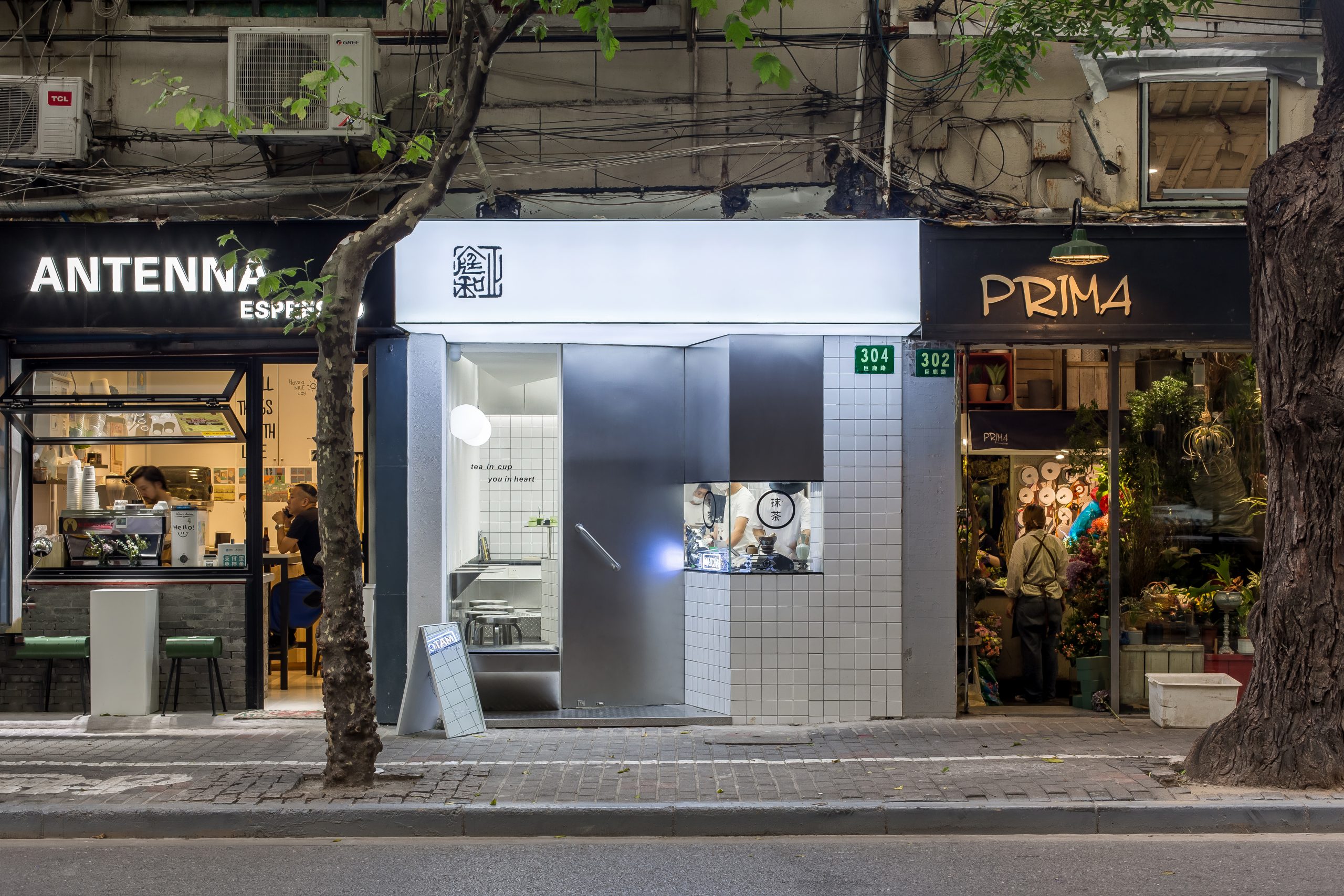
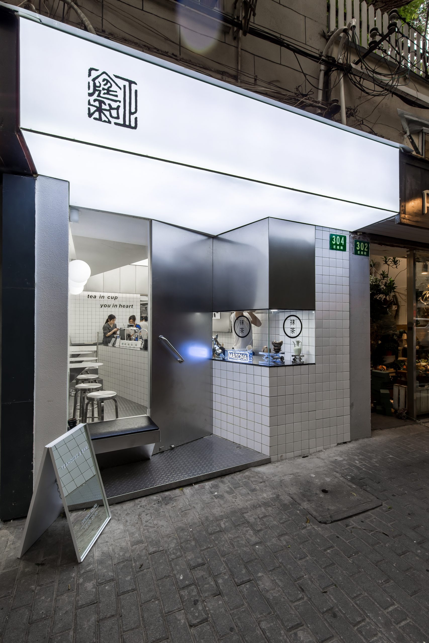
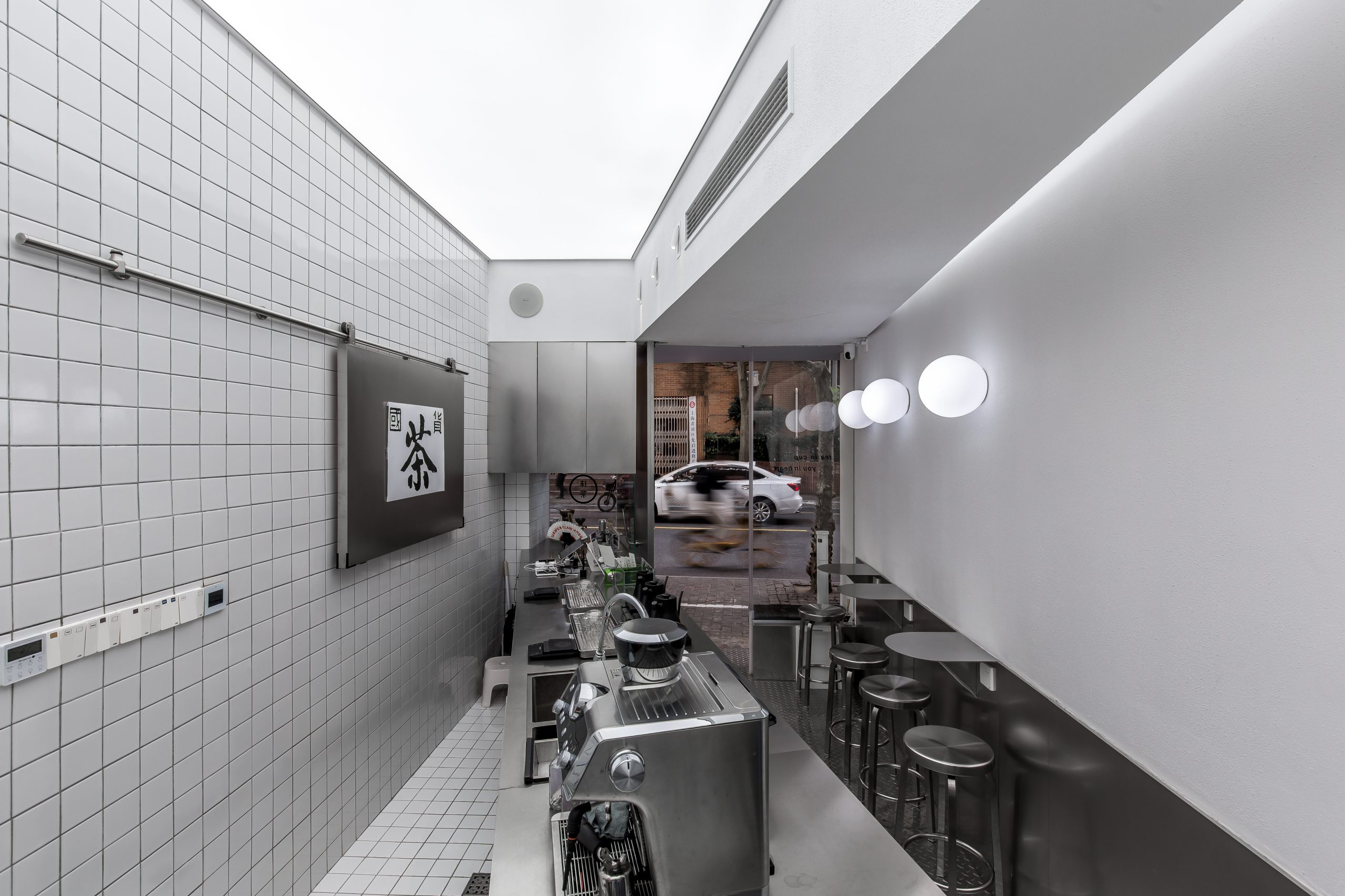
这是一个在上海巨鹿路上的小店。随着线上消费的普及和疫情的冲击,原先的服装店最终关张易手,新的店东打算发挥线下店的环境优势,打造具备独特就餐体验的饮品店。
Located on Julu Road in Shanghai, Ting He Zheng is a small beverage shop. With the popularity of shopping online and the impact of the coronavirus pandemic, the store that was a clothing shop had to closed and passed through a change of ownership. The new owner intended to make good use of environmental advantages of offline stores to create a beverage store with a unique experience.
店铺开间2.7米,进深5.4米,规模稍小。大家一开始便有螺蛳壳里做道场的觉悟。为了避免做出狭窄简陋的空间,本案的策略就是通过让人在其中不断运动和观看,打造出丰富的空间感受。
The store is quite small with 2.7 meters in width and 5.4 meters in depth, making it demanding to design. In order to avoid making a narrow and simple space, the strategy of this case is to create a richer space experience by leading people to move and watch continuously in this tiny space.
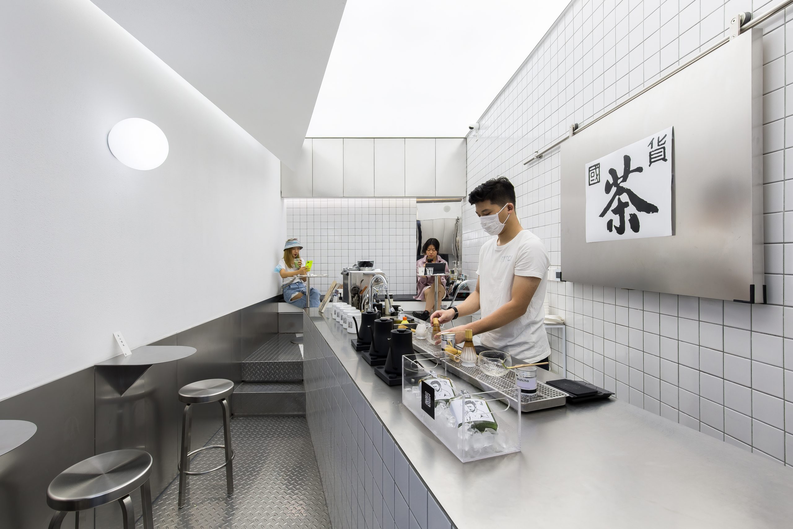
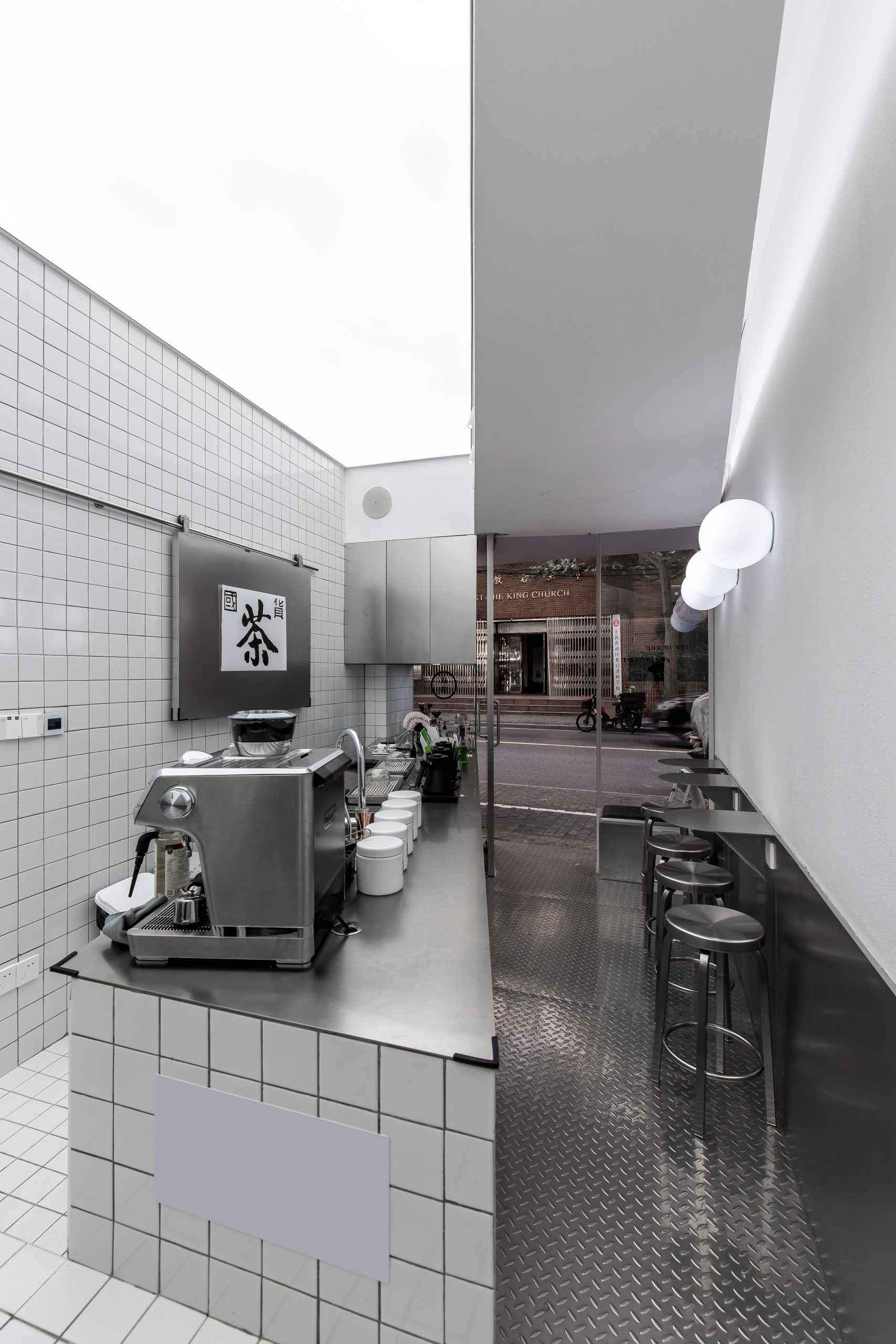
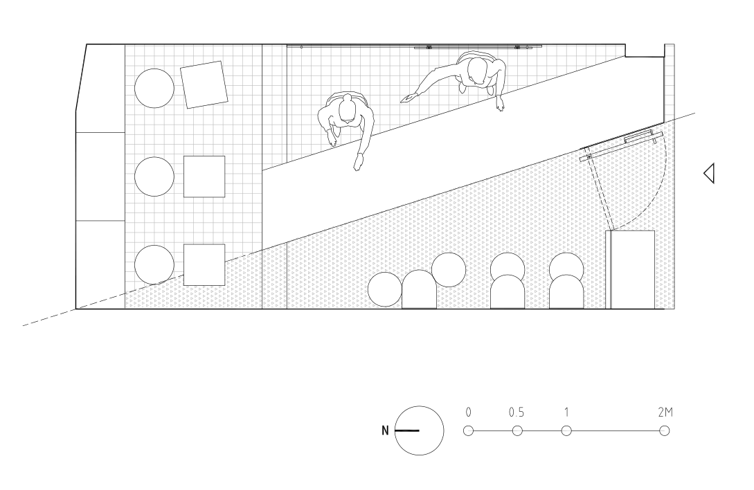
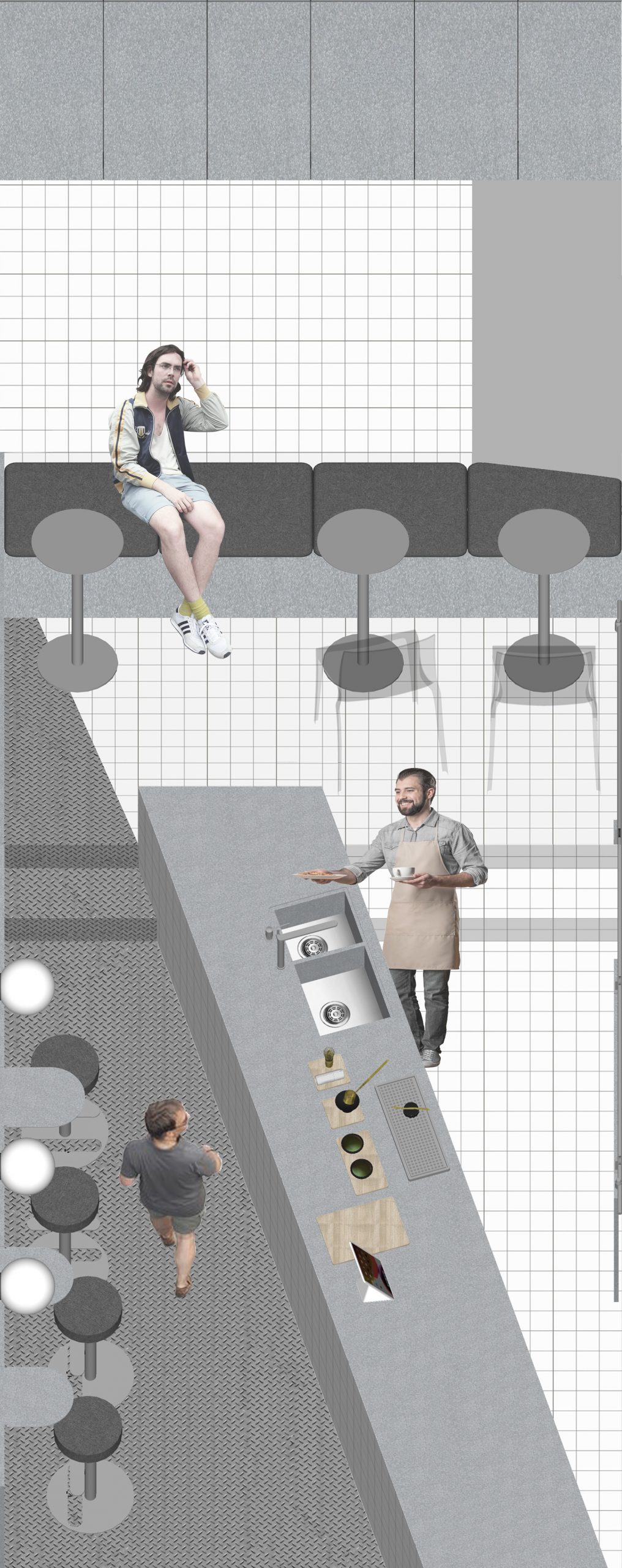
在传统的饮品店设计里,客人的流线和视域被很好地独立安排出来了。在本案中,我们反其道而行,一字排开的饮品制作设备被打包在一个吧台里,吧台横卧在空间之中,前场的客人在吧台前就餐,后场的客人在吧台背后就餐。这样一来,客人便具备了更多的观看视角和就餐形式。不仅如此,为了放大空间的透视效果,吧台被旋转了角度,强化了入口的进入感和后场的邻域感。
In the traditional beverage shop design, the flow and sight of the guests are well separated independently. However, in the case we went the opposite way. The lined up equipments are arranged on a bar, lying in the space. The guests in the front can drink in front of the bar, while other consumers in the back can drink behind the bar.In this way, guests will have more viewing angles and experiences. More than that, in order to magnify the perspective of the space, the bar table was rotated to enlarge a sense of entrance and enhance a sense of neighborhood in the back of the store.
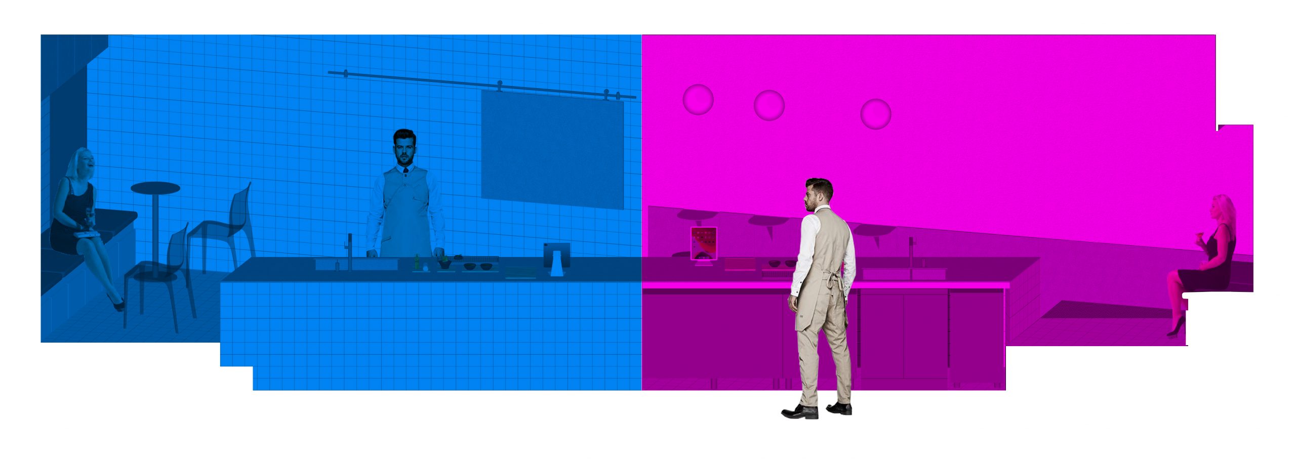
另一个维度的展开来源于纵向空间。3.3米的高度在服装店时期局部加建了夹层作为收纳。我们的想法是把后场作为平台抬高400mm,这样在前场的观看中空间就被强制展开,后场坐高和前场站高的视线齐平,能清楚地看到店员的制作过程,在开门的瞬间还可以远观街对面的天主教君王堂。
The design of another dimension comes from the vertical space. At the height of 3.3 meters, mezzanines were partially added in the old clothing store as storage area. we raised the area in the back of the store as a platform by 400mm, so the space in the front was expanded. The sight height of sitting in the back is the same as that of standing in the front, which making it possible to watching drinks made by servers and getting a glimpse of Catholic King’s Church across the street at the moment of opening the door.
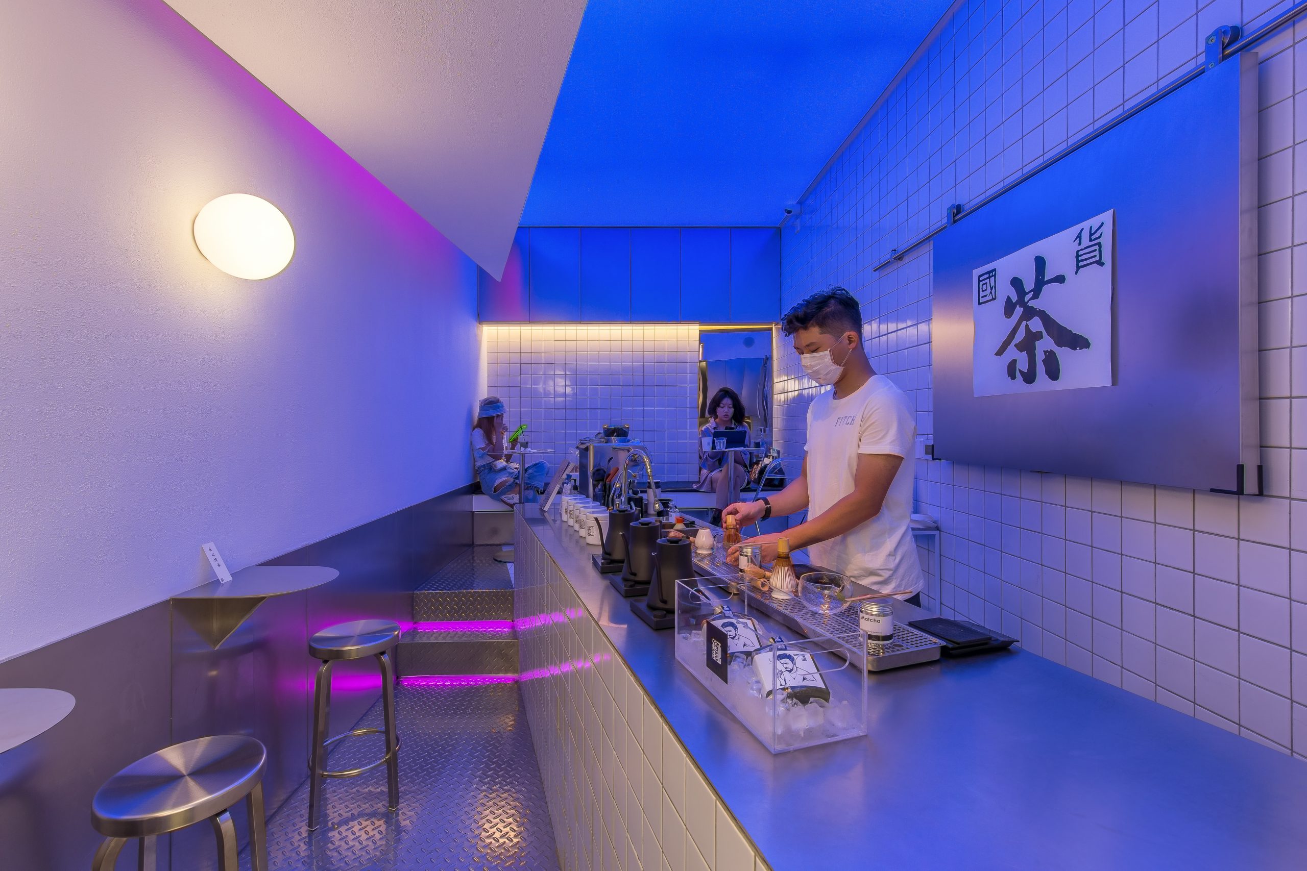
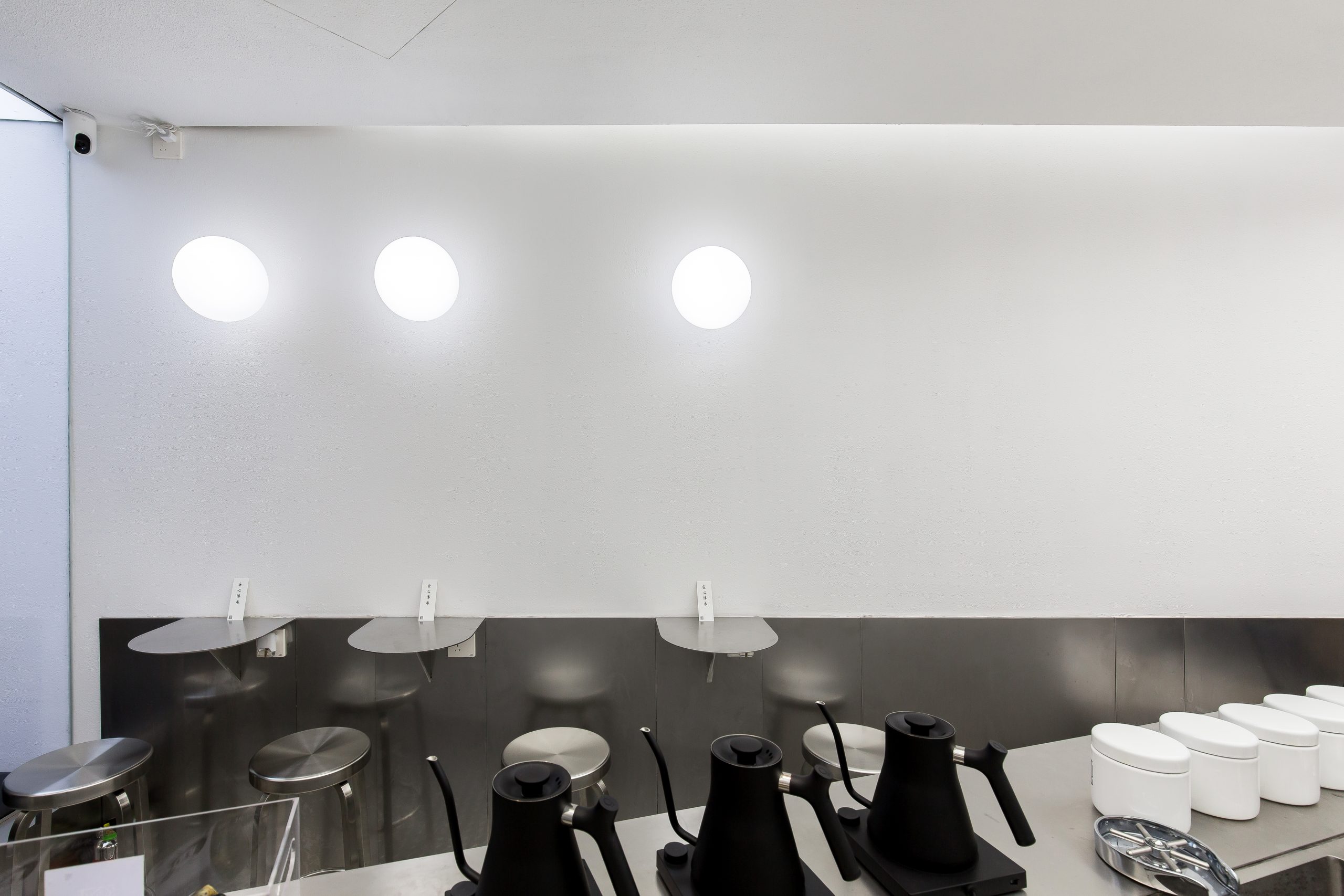
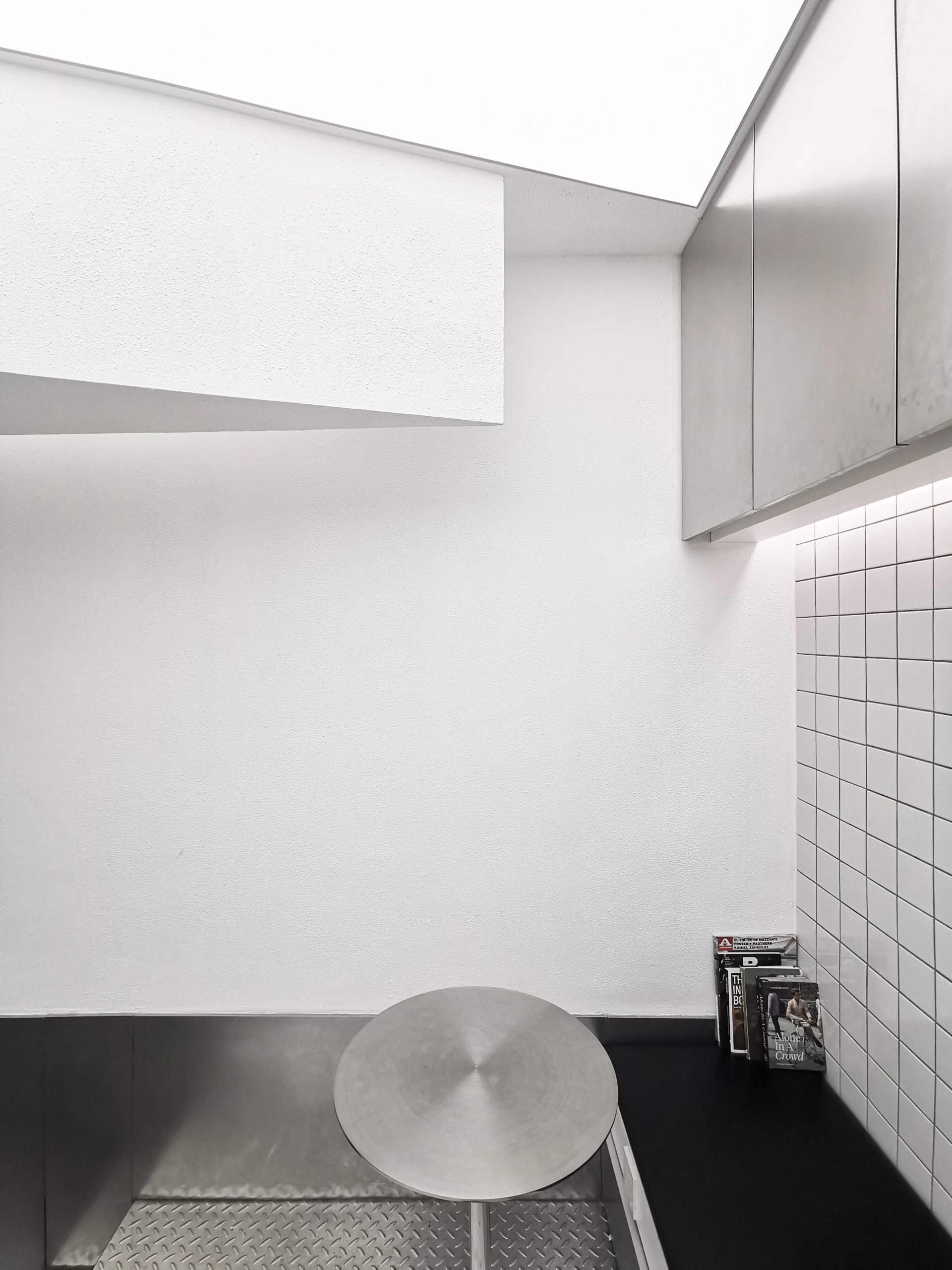
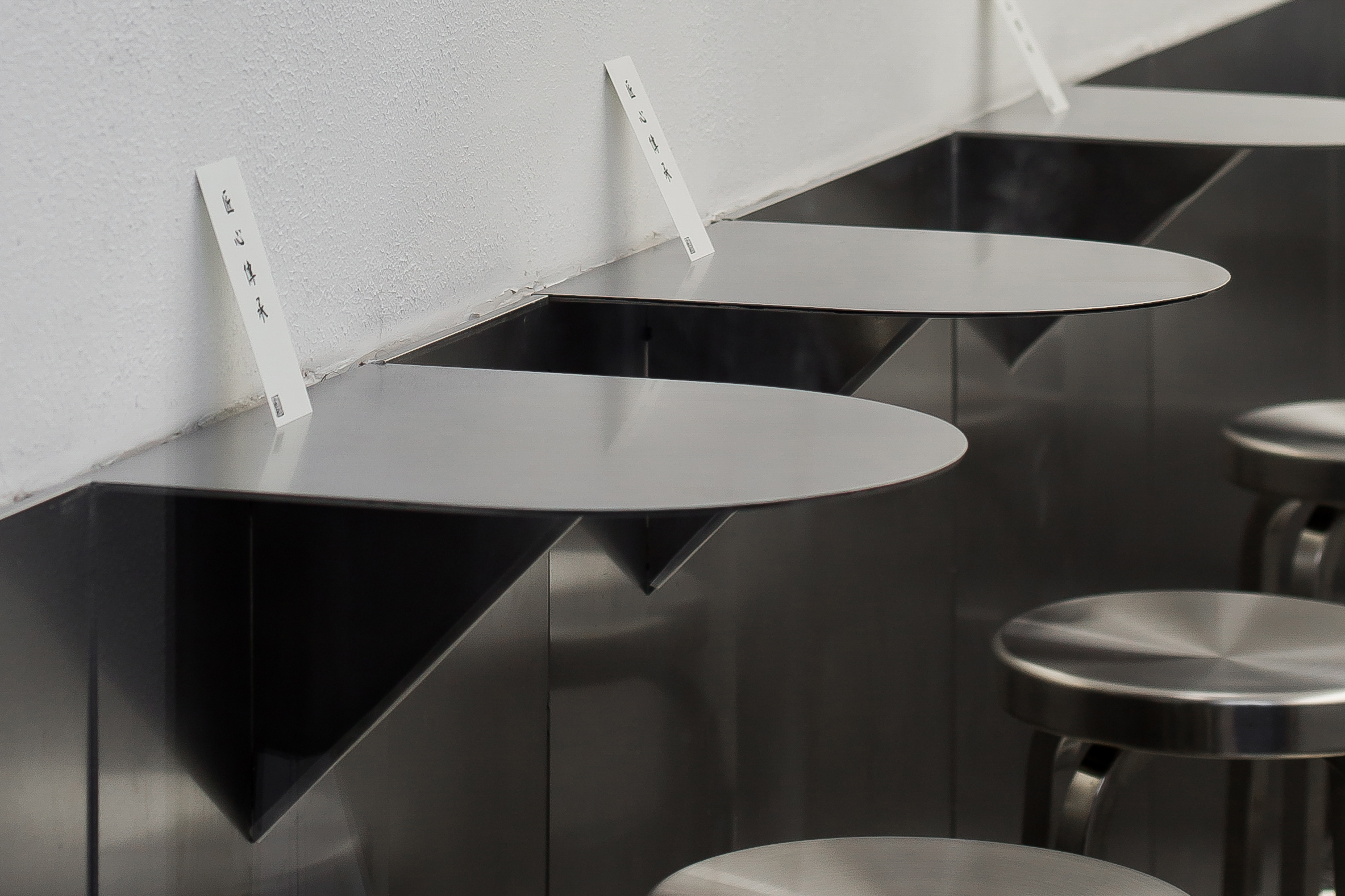
在店东决定白天主打抹茶饮料,夜晚主打酒精饮料的经营策略后,我们尝试引入两套不同气质的光源,同时采用釉面砖,不锈钢板,拉毛涂料等感光材料,扩充空间感受。白天正白光源的空间给人一种适应性和开放性。夜晚点线面三种不同色调的光源共同形成戏剧、迷人的气氛。
After the store owner decided to focus on matcha beverages during the day and alcoholic beverages at night, we tried to use two sets of light sources with different colors. Meanwhile, photosensitive architecture materials such as glazed tiles, stainless steel plates, and brushed paint are used to expand the space experiences. The space with a white light during the day creats a sense of adaptability and openness. At night, three diffrernt colors light from different forms, including dots, lines and planes enable to cultivate a dramatic and charming atmosphere.
▲平面图
▲概念图
项目信息——
项目名称:庭和正巨鹿路店
设计方:西水湾路工作室
项目地址:上海黄浦区巨鹿路304号甲
设计团队:孙闻良、周青
施工方:赵赛荣
建筑面积:15㎡
竣工时间:2020年7月
摄影:大树、孙闻良
Project Information——
Project Name: Ting He Zheng
Design Company: Lab_xswl
Project Location: No.304, Julu Road, Huangpu District, Shanghai, China
Chief Designer: Wenliang Sun, Qinq Zhou
Constructor:Sairong Zhao
Project Area:15 square meters
Completion Date:July 2020
Photographer:Dashu, Wenliang Sun


