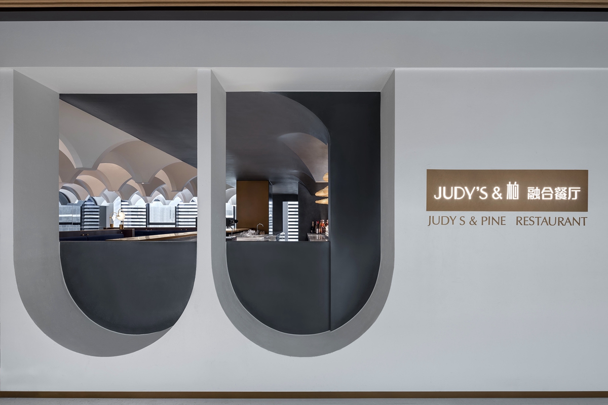
本案是一家名叫“Judy’s&柏”的融合餐厅,中西结合的名字,“融合”的属性,暗喻了此案诞生背后的奇妙故事。“Judy’s”与“PINE柏”,是郑州两家知名餐饮品牌,一家主打法式甜品,一家定位酒吧与咖啡,此次两大品牌强强联合推出融合餐厅,意欲为朋友们奉上一处包罗万象的欢聚圣地。如何走进年轻人的心里,同时又能在空间设计中体现两种不同基因的“融合”,是得德设计首要考虑的问题。
The project is a fusion cuisine restaurant called “Judy’s & PINE”. Its name has Chinese and western elements combines, indicating its attributive of “Fusion” and also providing an intriguing background for the interior design. They are two well-known catering brands in Zhengzhou, one makes French desserts, another positioned as bar and café. As a fusion restaurant co-hosted by the two wonderful brands, Judy’s & PINE is designated as a versatile destination for friends to gather around. To capture the youngster’s minds while showcase the “fusion” of two different genes becomes the primary goal that SALONE DEL SALON wants to achieve in this design.
“由于我们与两位业主都曾经合作过其它项目,彼此之间比较了解。这间餐厅的主题定义为‘朋友的餐厅’,我们一致的理念是希望打造一个更加开放的空间,来者即是朋友。”得德设计主理人沙龙表示。
“We have cooperated with both of the two owners in other projects before, so we are familiar with each other. This restaurant is themed as‘Friends’ Restaurant’in the spirit of creating a more opening space where everyone who comes feels like they’ve been treated as a friend.” the principal of SALONE DEL SALON, Salone said.
▲动画设计方案
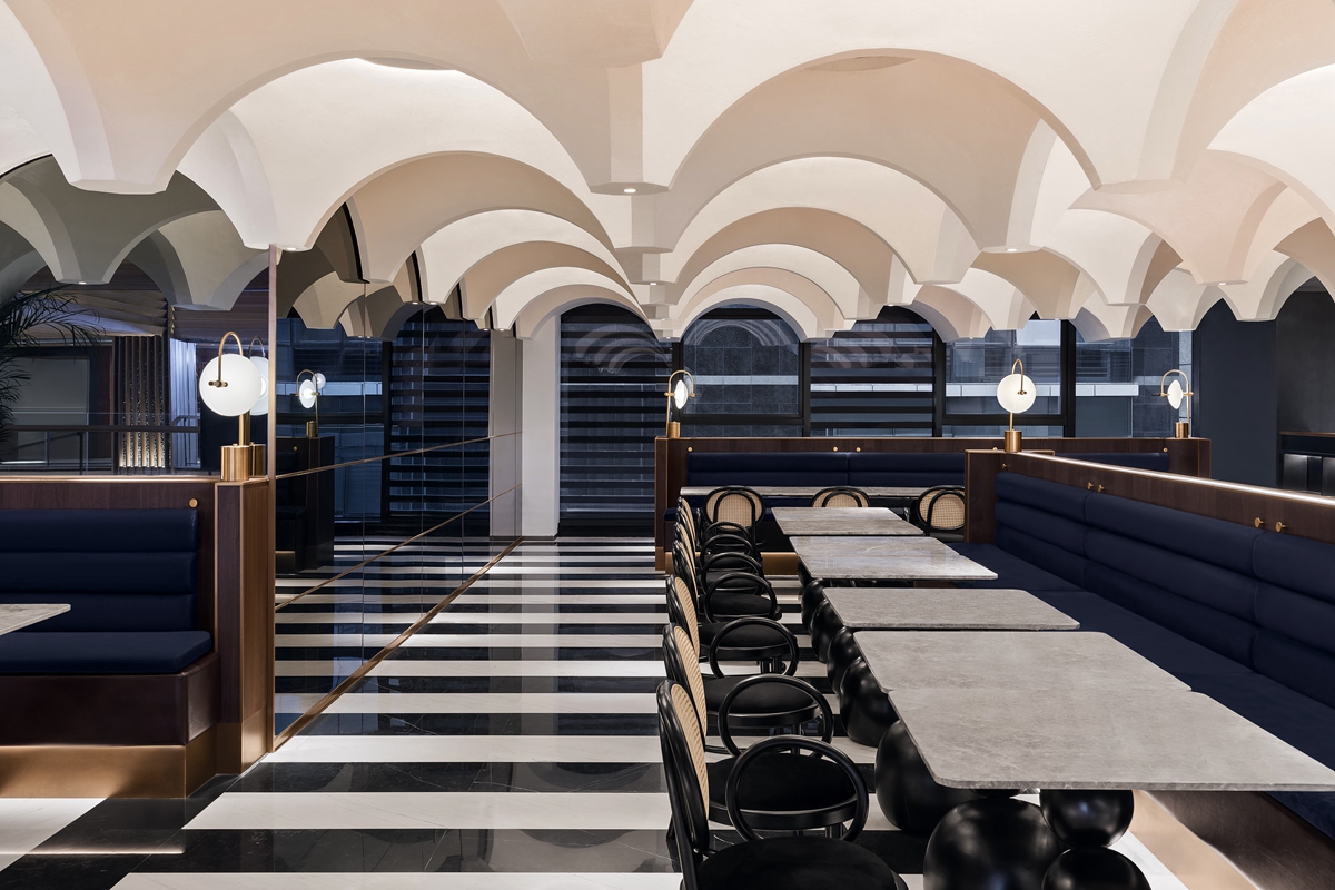
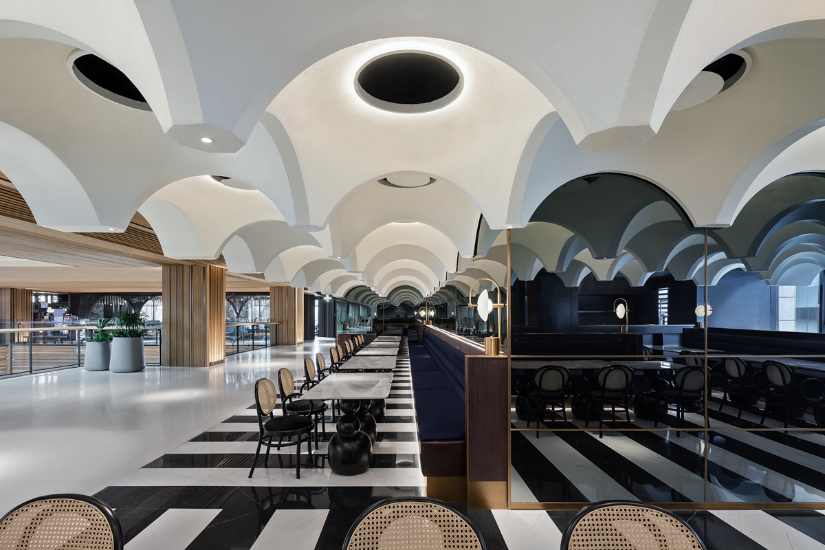
餐厅位于商场三楼,设计师对平面布局分析后决定,将临商场过道的用餐区完全对外开放。原因在于空间最大深度只有11米,但临近商场过道的长度有近28米,“开放”能尽可能多地对外展示餐厅空间环境,并让内部空间得到透气。
The restaurant is located on the third floor of the shopping mall. After analyzing the layout, designers decided to completely open the dining area next to the shopping mall aisle. With merely 11-meter maximum depth of the site, a 28-meter length of the aisle side open area can have more of the internal environment showcased, and at the same time, to provide better ventilation inside the restaurant.
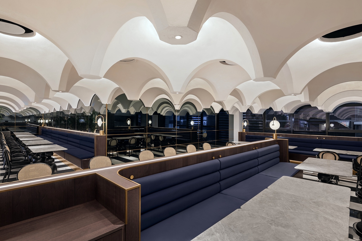
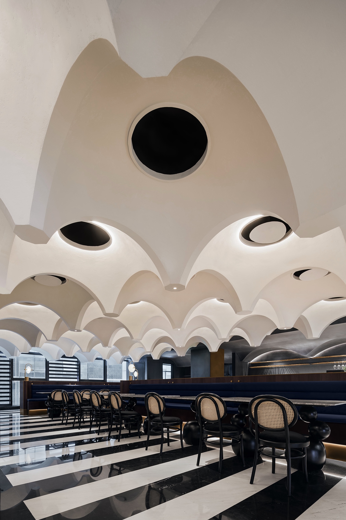
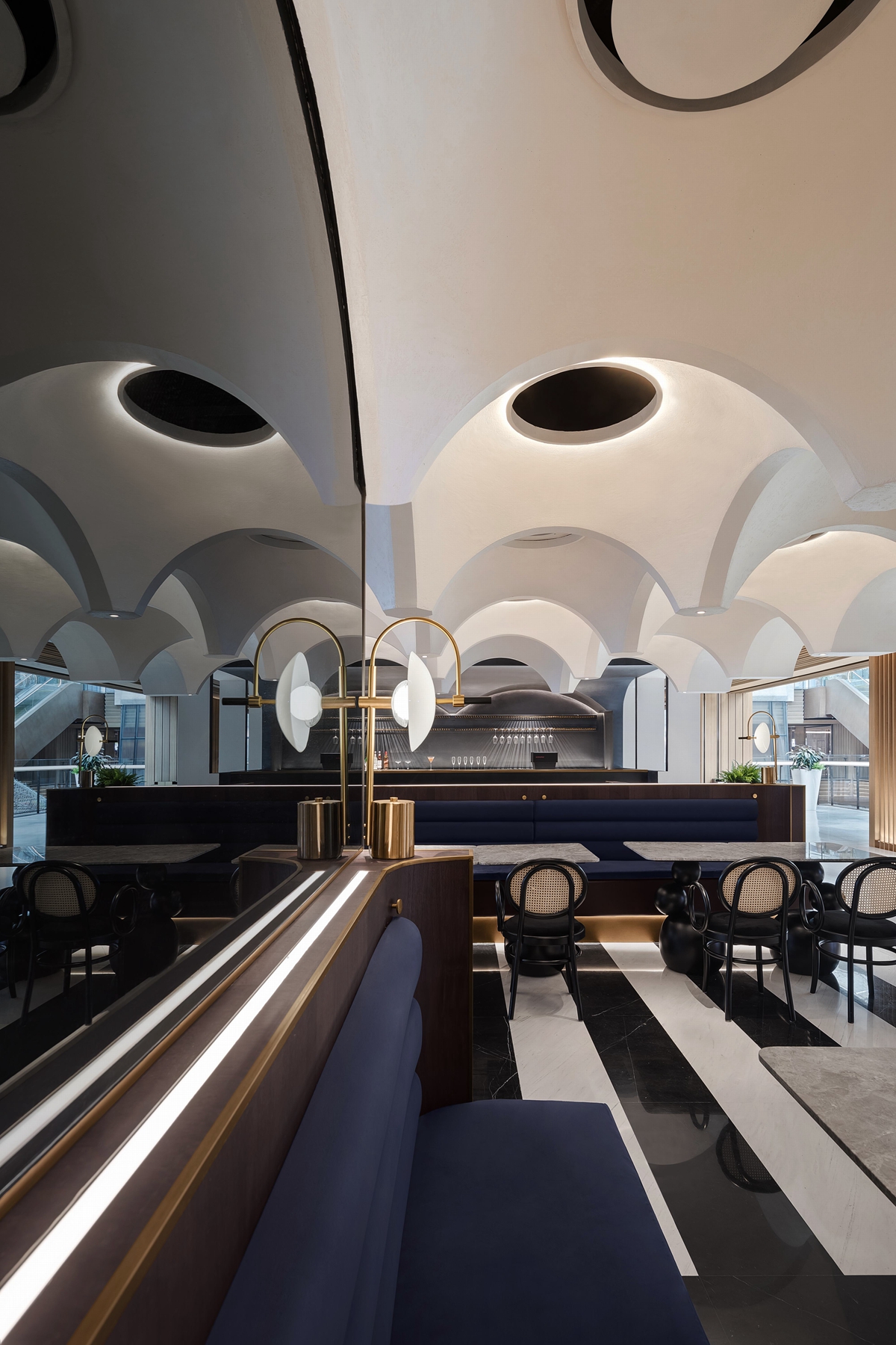
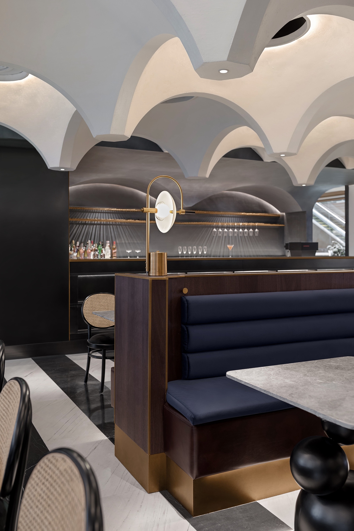
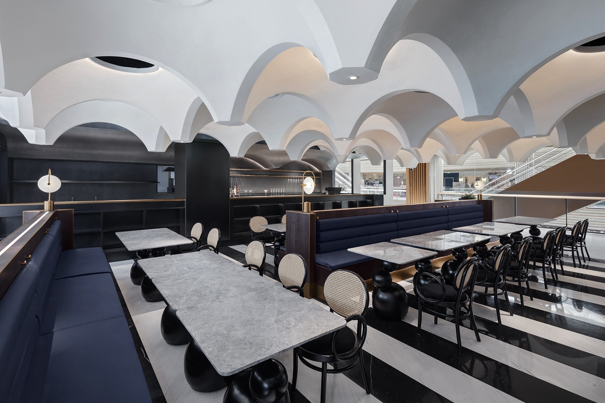
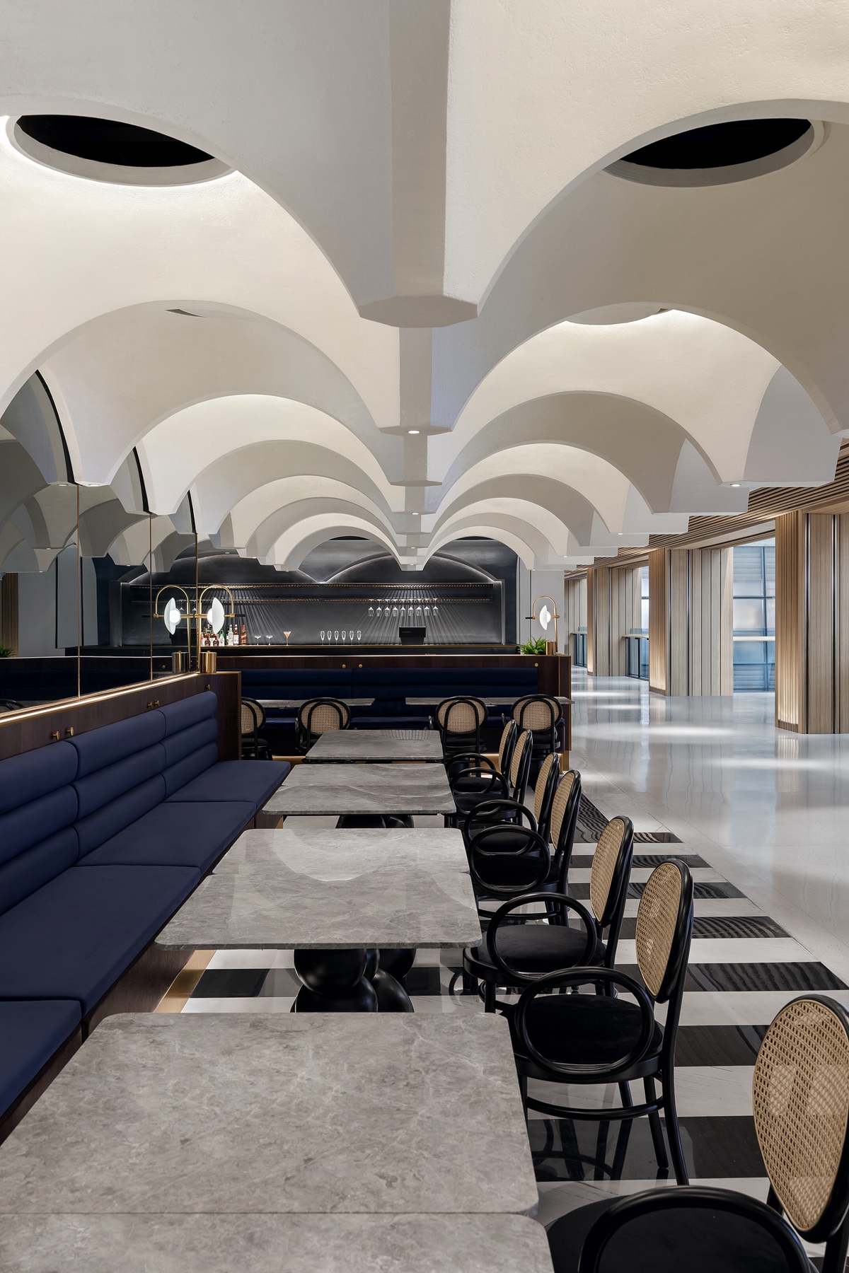
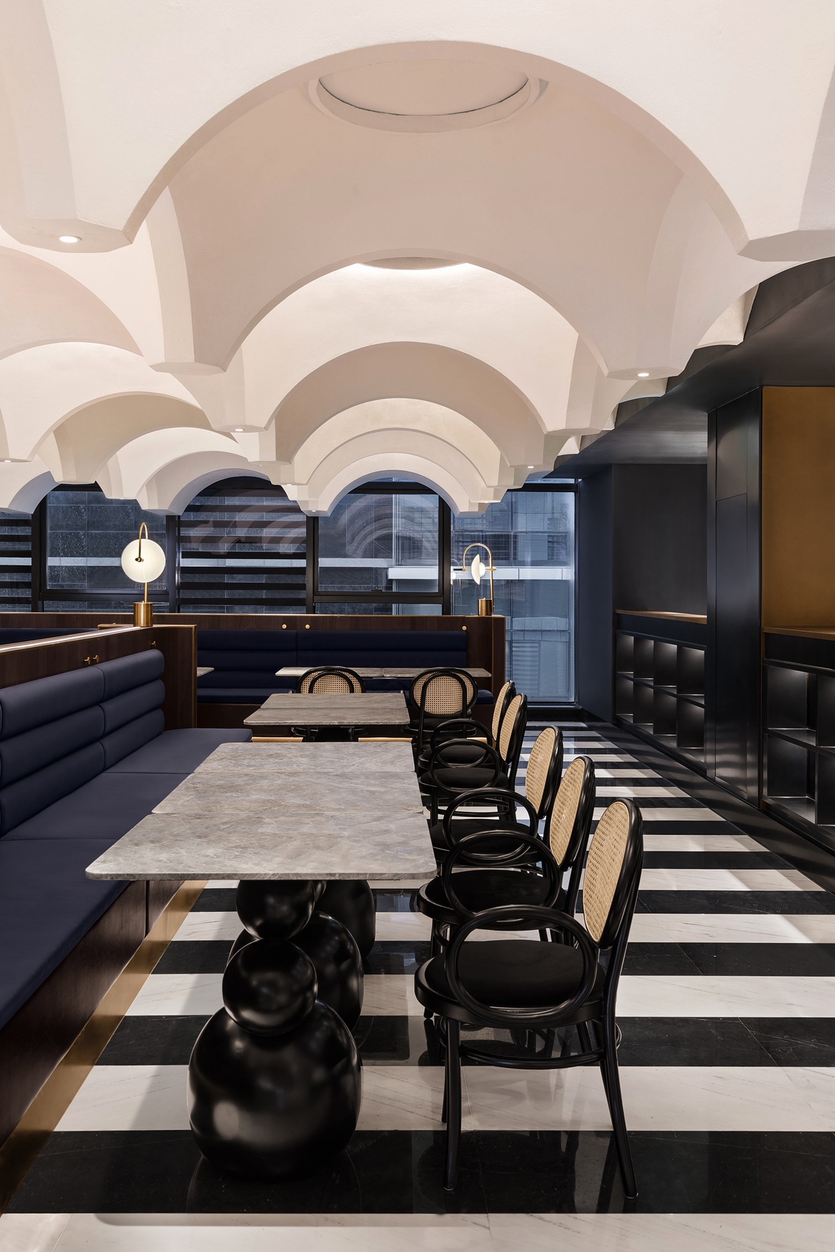
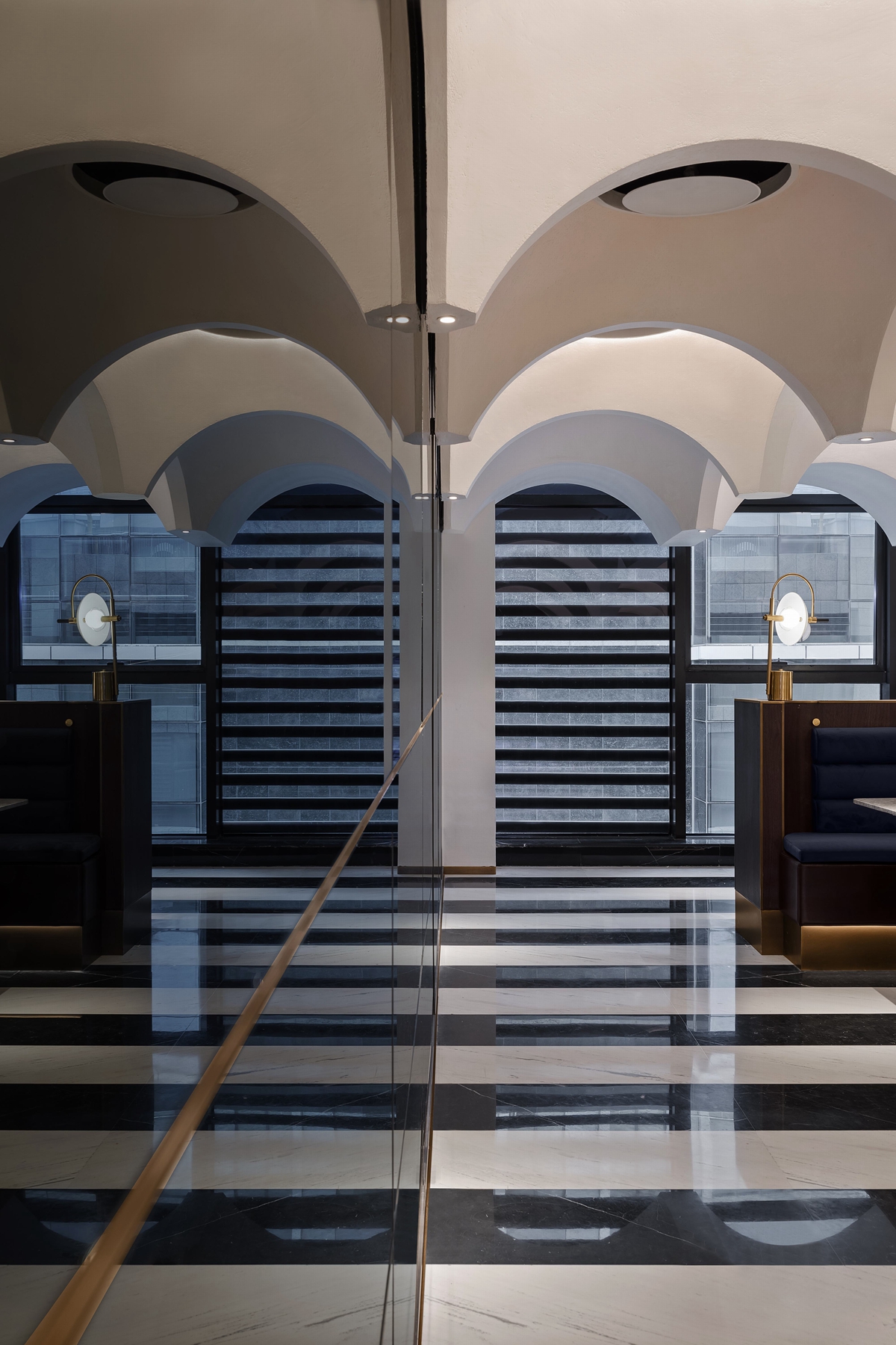
在确定开放空间的意图背景下,如何一眼锁定潜在顾客的视线?天花,是设计师巧妙构思的主战场,42个GRC穹顶组合,以小见大,以观苍穹,营造一种震撼的、异域的、极具想象力的好奇感,突显出商业空间的独特性。当一系列穹顶形成一个复杂的“紧凑的网格”时,空间的平面便具有很大的灵活性并友好进行分割。室内的空间开阔流畅,人们的视线也不会受到不必要的阻碍。空间的自由使欢聚于此的人们可以在不同场合下灵活布局利用。
After finalizing the open space layout, designers start to seeking for strategies that capture the attention of potential customers at one glance. Ceiling, therefore, becomes the major features where designers have their ingenious ideas delivered. There are 42 GRC dome designs on the ceiling. From details we foresee the greater picture so as to imagine the whole sky. The design presents an astonishing, exotic and creative curiosity to viewers, and also emphasizes the uniqueness of this commercial space. As a “tight network” created by consecutive domes comes into being, the overall layout becomes more flexible and can easily be divided into various parts. The internal space is both open and fluent, so as to prevent obstacles for eye sights, and to make this restaurant a perfect multifunction destination for customers of different needs.
建筑界对穹顶的崇拜,可追溯至1800多年前建成的罗马万神庙,其万神殿穹顶之完美登峰造极,令人仰望苍穹之神圣。设计师从游历世界的体悟中受到启发,由罗马万神庙到法国国家图书馆,再到多摩美术大学图书馆,复杂而简单的几何之美造就了经典。
The worship of dome in the architectural domain dates back to 1800-year-old the Roman Pantheon, which has a perfect dome that works as a window to the gods above high. World travelling experience provides designers sources of inspiration. From the Roman Pantheon to the National Library of France, and to the Tama Art University Library, it is the complexity and simplicity in geometric designs that created classics.
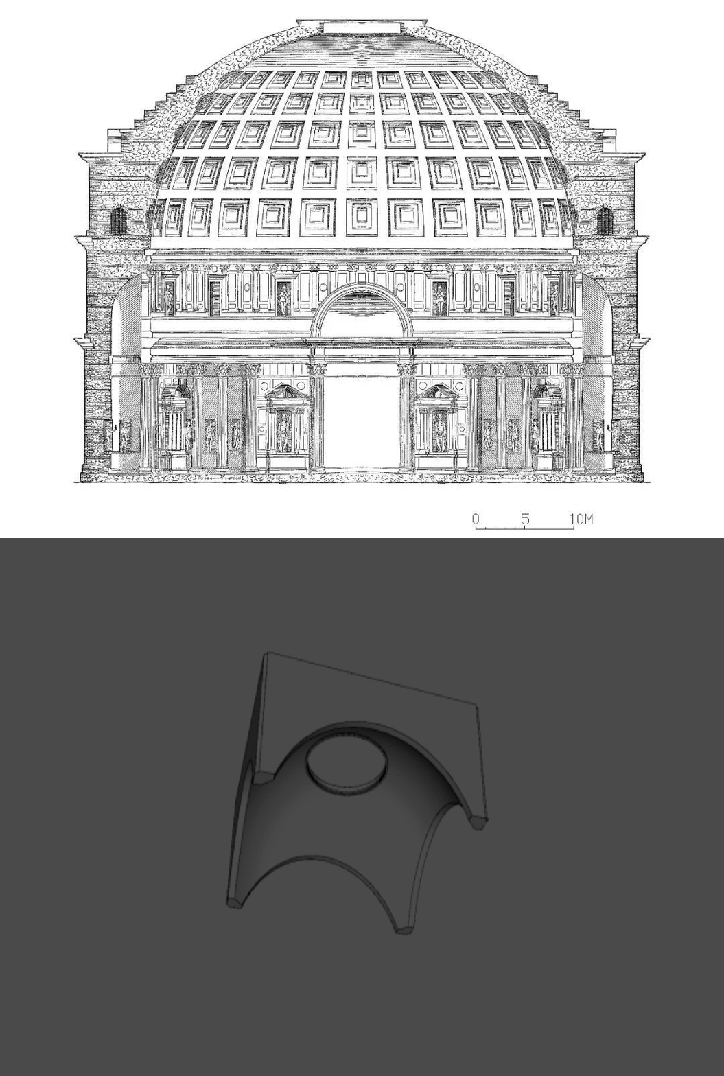
▲从罗马万神殿穹顶的启发到演化餐厅天花造型
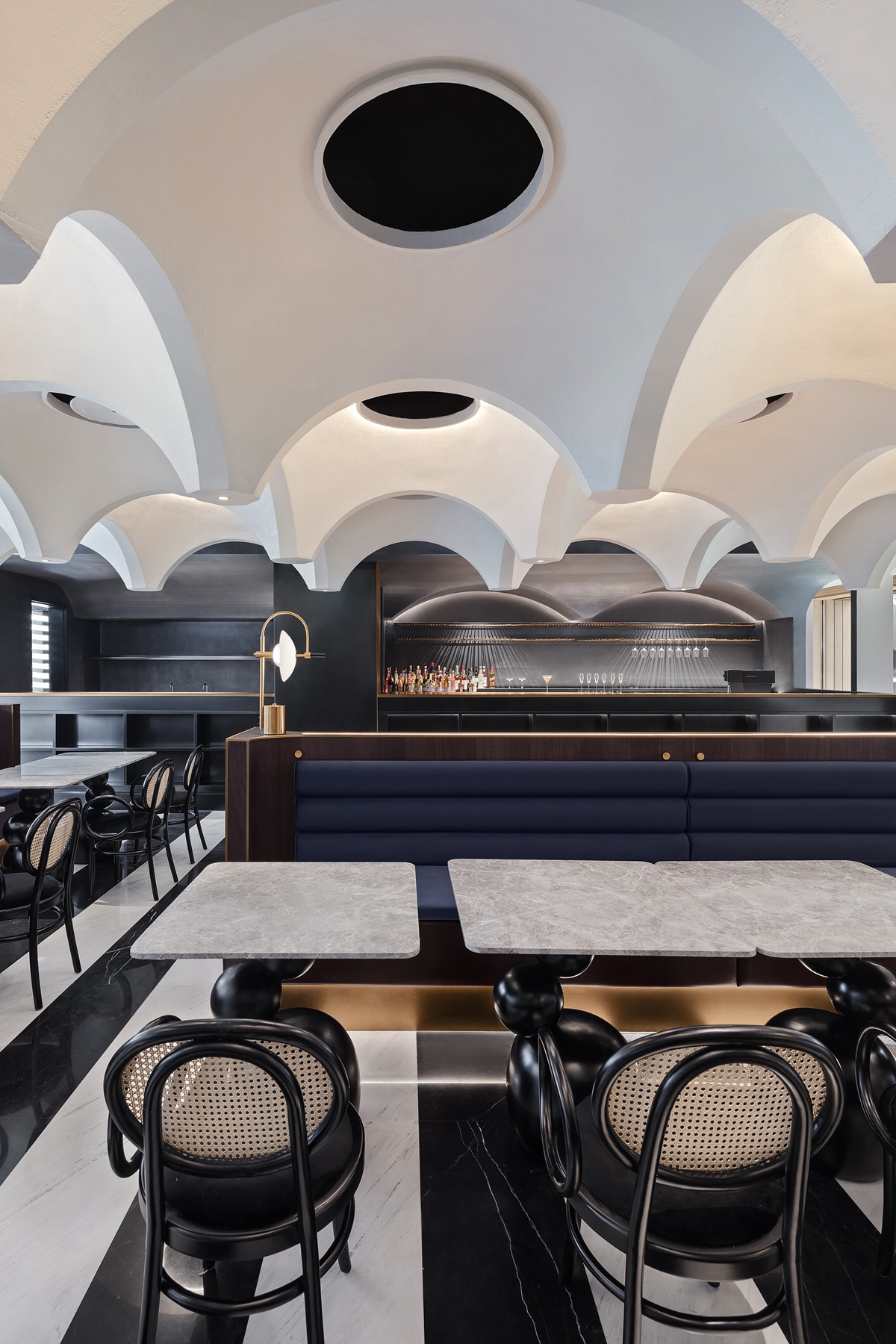
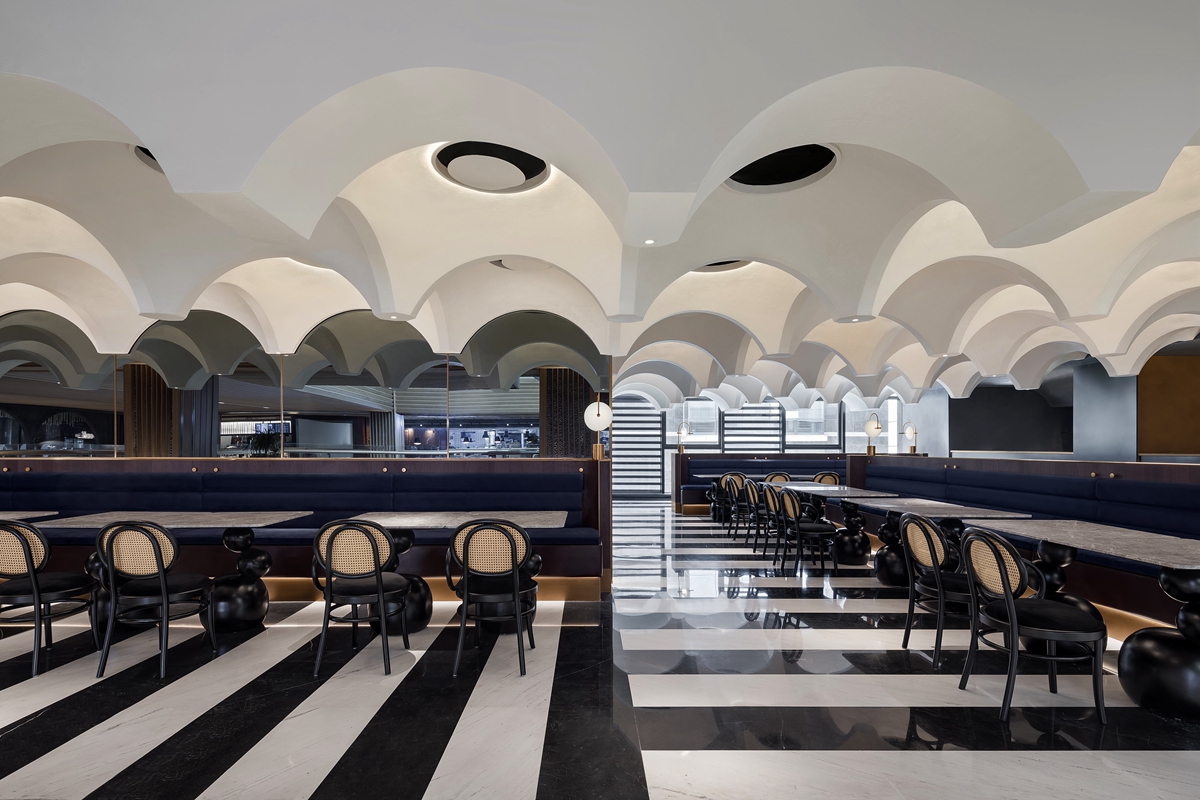
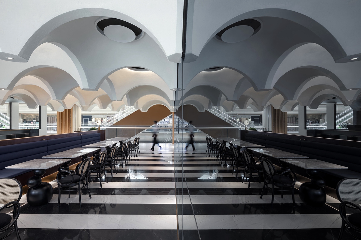
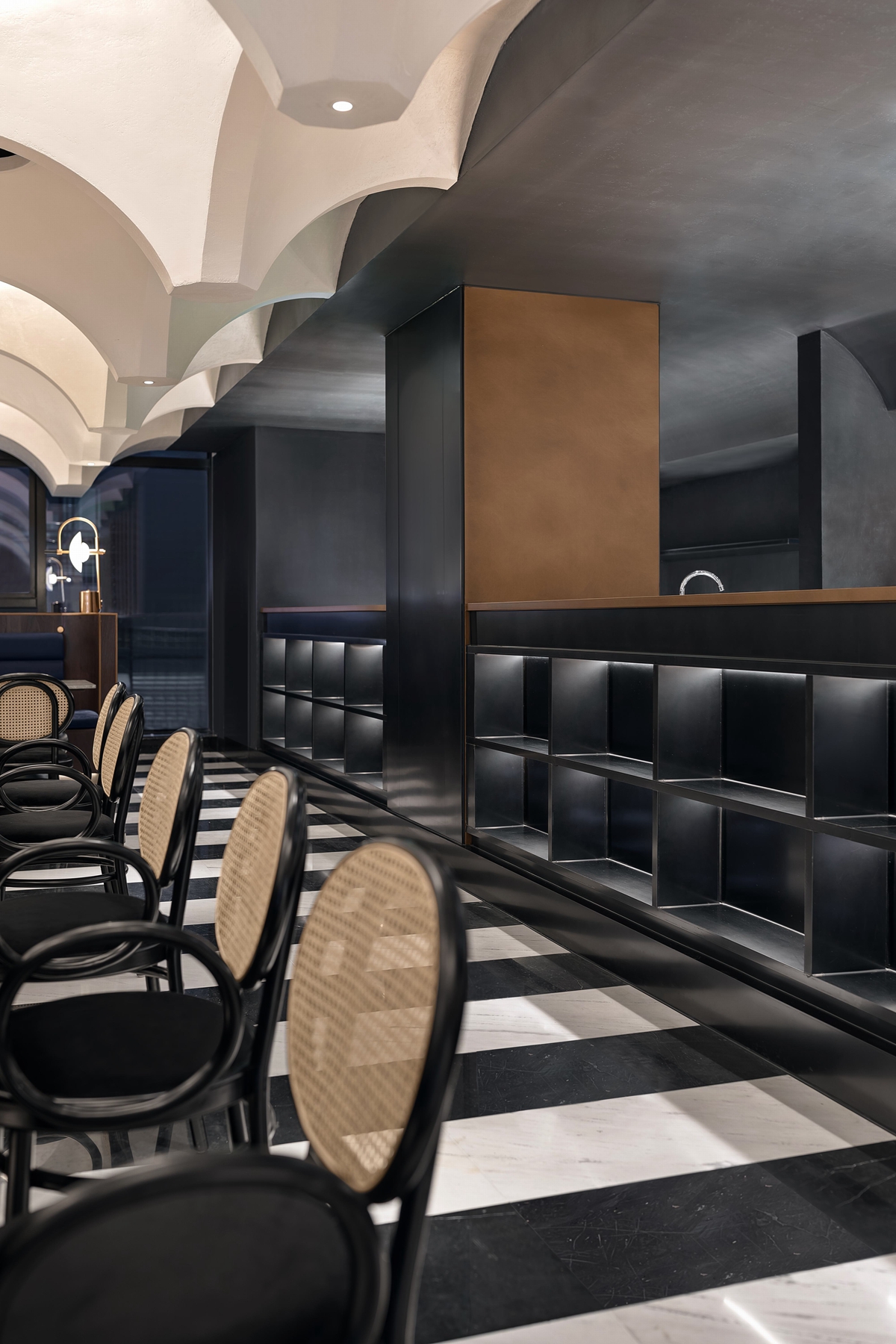
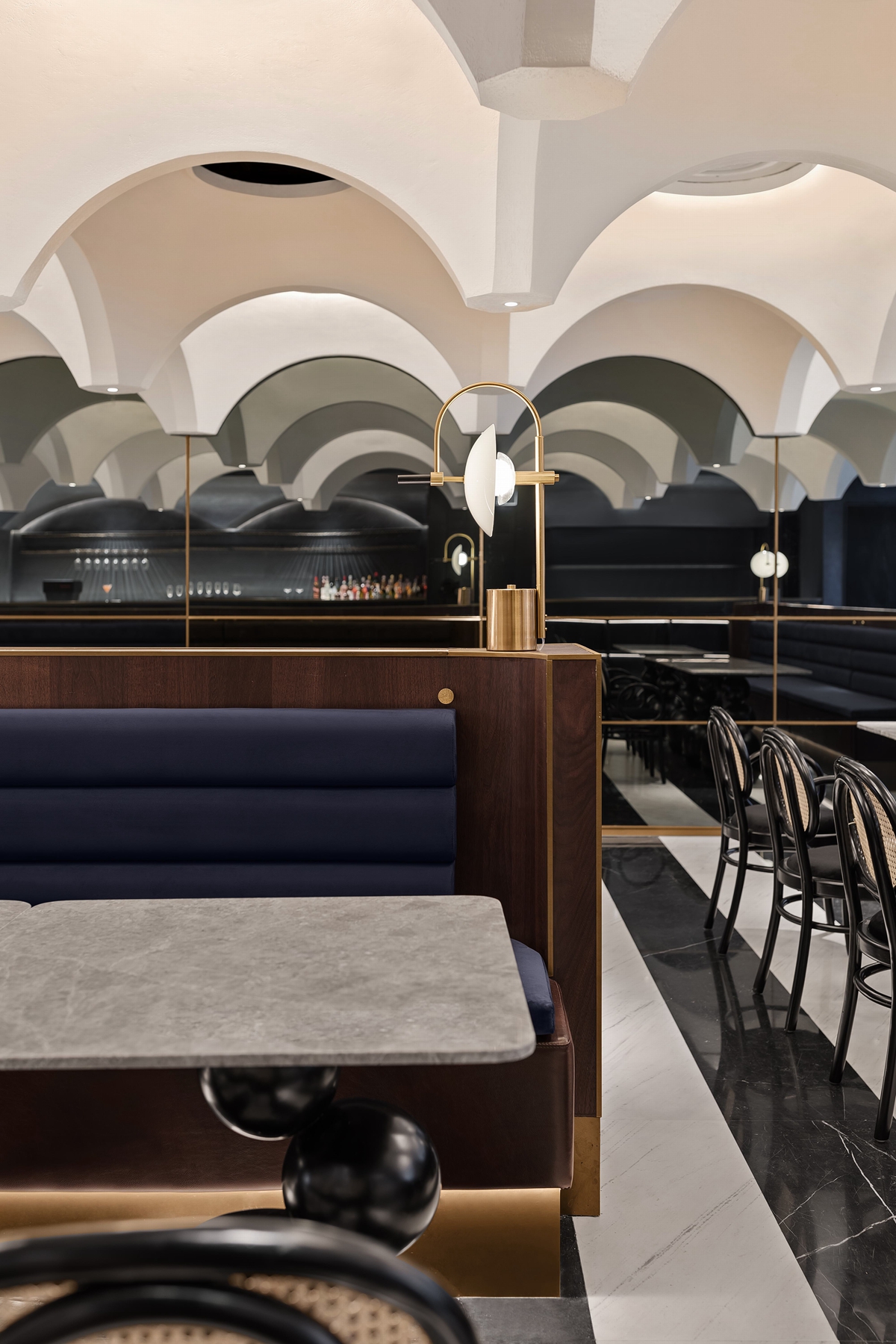
与得德设计以往擅于用色的表达不同,本案空间的色彩主打黑白,诠释法式优雅。白色为客人的用餐区,黑色为吧台操作区,地面采用黑白大理石“琴键”营造灵动氛围的同时,也增强了空间的延展性,墙面选用仿古镜,从视觉上放大空间感。餐桌造型灵感源于一位俄罗斯艺术家Grigory Orekhov的作品,于细节之处体现艺术张力。
Different from the colorful expressions that SALONE DEL SALON used to apply, this project interprets the French elegance with simple black and white. Dining area themed white, while operation area black. Black and white marble forms the “piano keys” on the floor, introducing a dynamic aura and an extended effect into the restaurant. Old-fashioned mirrors on the wall are enlarge the space visually. Design of the dining table comes from artworks of Russian artist Grigory Orekhov. It’s the details that tell the tension expressed in art.
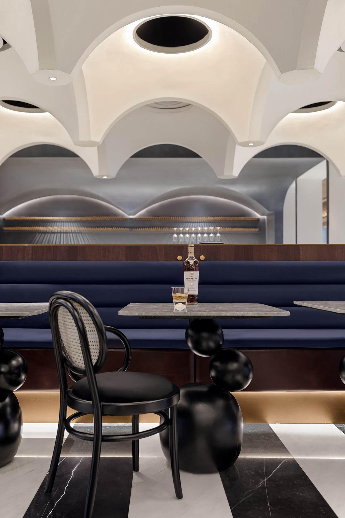
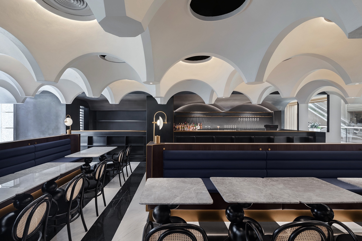
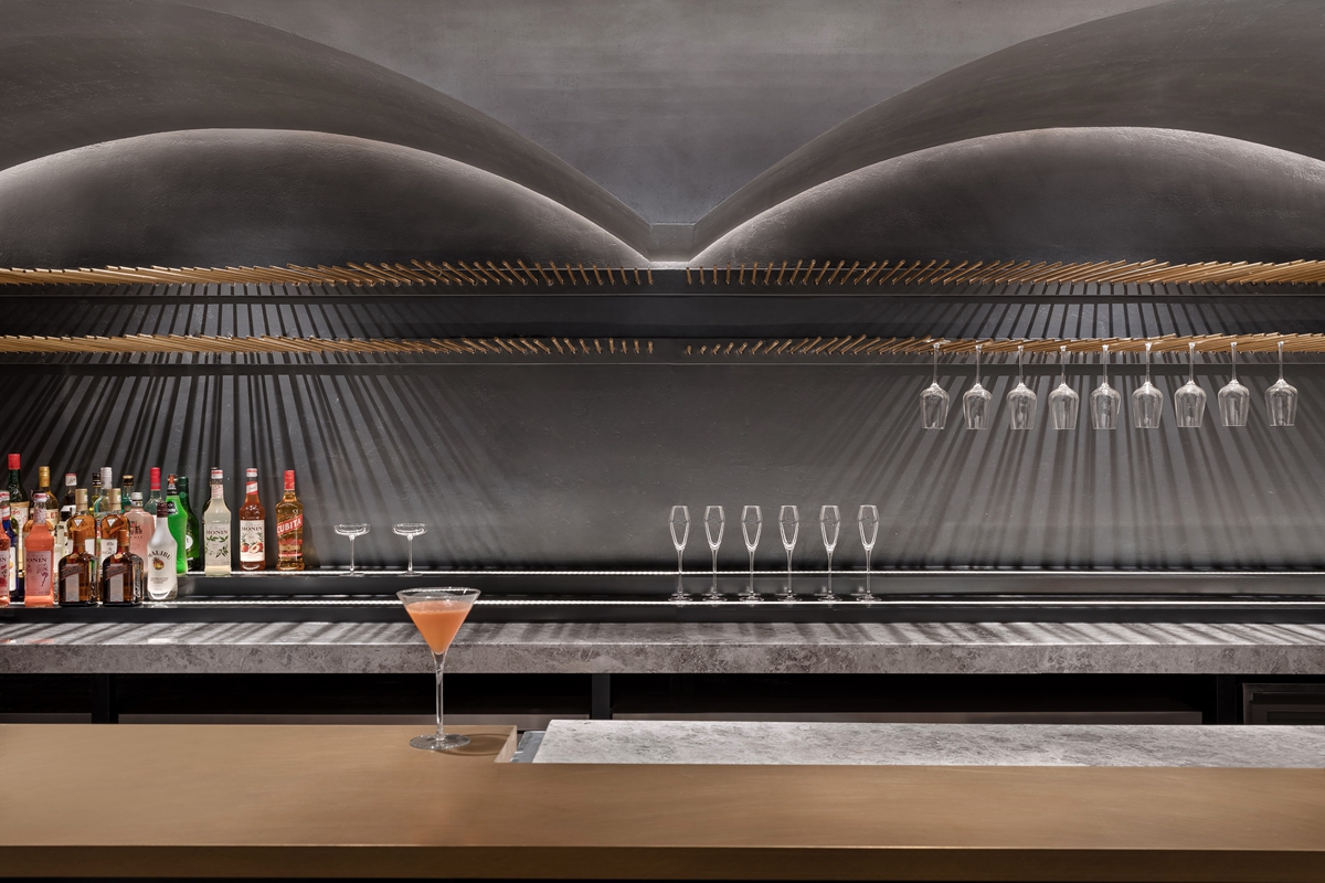
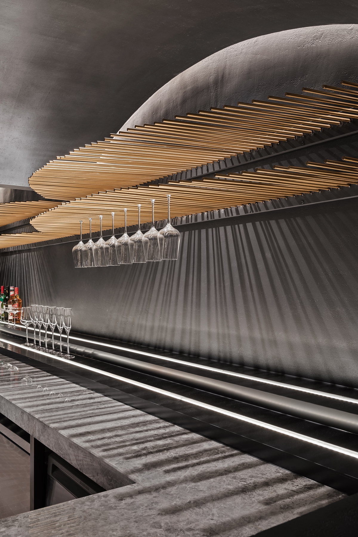
白色为欢聚的热情创造无限可能性,象征着沉默而神秘的黑色,则将吧台操作区暂隐于一旁。灯光从深色清水混凝土的墙壁里探照出来,透过一组精致序列的黄铜管,将人与物互动的场景营造出仪式感。
White color provides limitless possibilities for passionate gatherings, while the silent and mysterious black hides the console table to the side. The lights shade from the concrete wall travels through a raw of exquisitely ordered cooper bars, creating a ceremonial atmosphere for the interaction between people and scenes.
Judy’s的雅,PINE柏的酷,以及被他们吸引的朋友身上,每个独一无二的灵魂……不同的个性都得以容纳。不被过往所束缚,不给自己过早贴上标签,“融合”,是两个餐饮品牌的一次成功尝试,也是设计师对过去与现在的回顾和表达。
The elegance of the Judy’s, the chill spirit in PINE, and the peculiar characteristics in the friends that attracted by them… all finds their accommodations here. Not restraint by the past and never defines oneself with any tags. “Fusion” is a successful experiment of the combination of the two catering brands, and also the review and expression that designers have on the past and current.
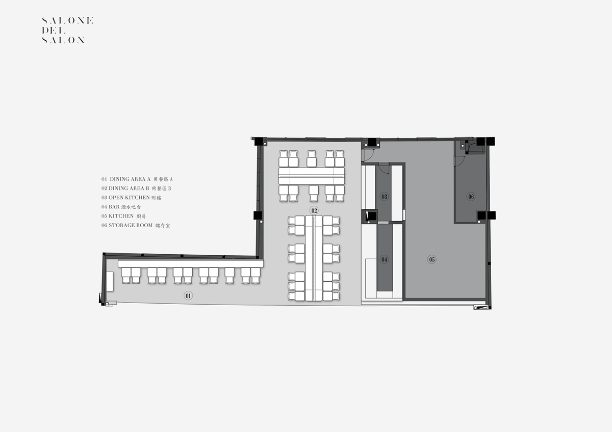
▲平面图
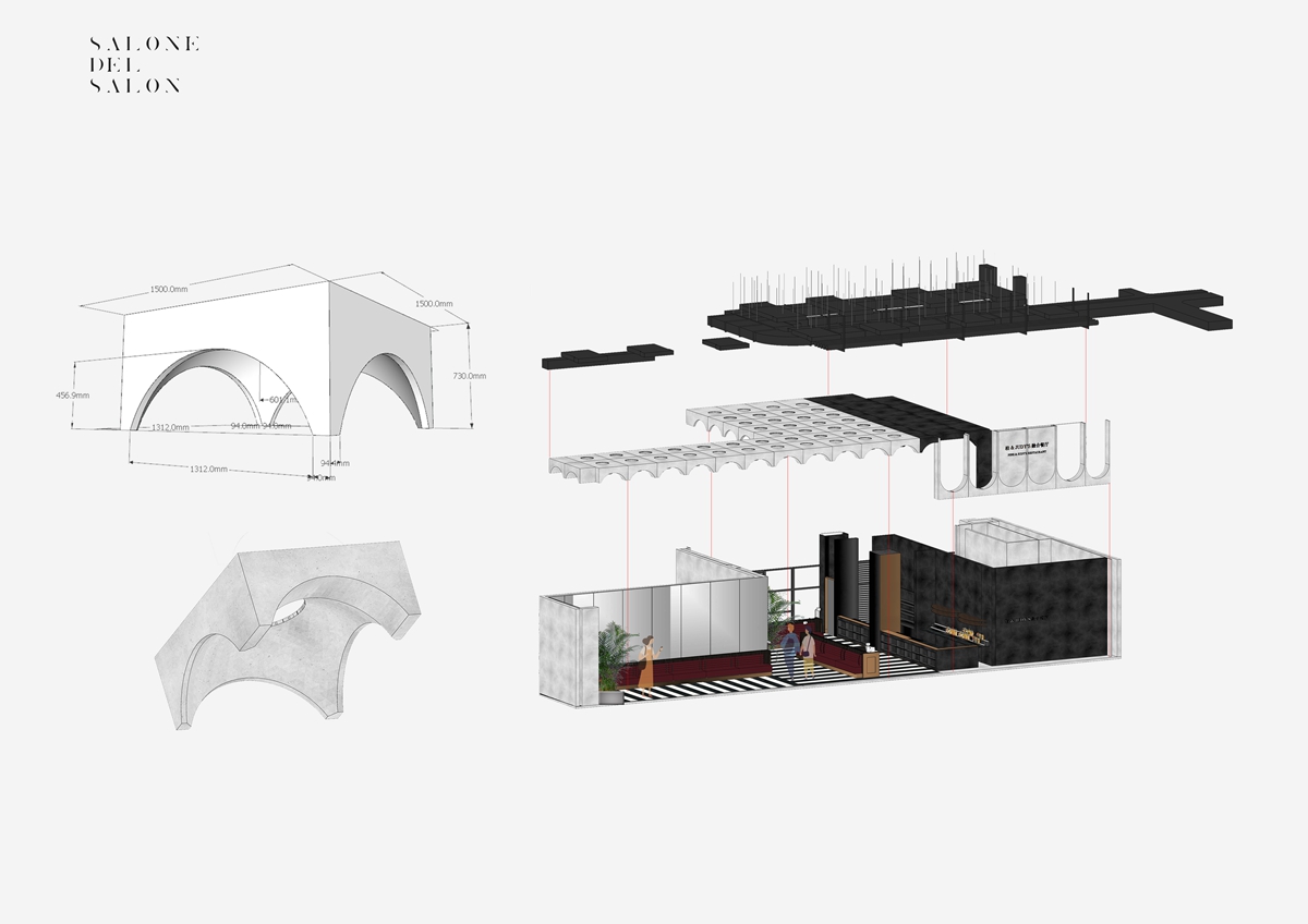
▲分析图
项目信息——
项目名称:Judy’s&柏融合餐厅
室内设计:SALONE DEL SALON得德设计
项目地址:中国 郑州
建筑面积:260m2
完成时间:2019年6月
主创设计:沙龙
设计团队:郑纬邦、岳群飏、李凌风、赵天一
摄影师:肖恩
Project information——
Project Name: Judy’s & Pine Fusion Restaurant
Interior Design: SALONE DEL SALON
Project Location: Zhengzhou, China
GFA: 260㎡
Completion Date: June, 2019
Chief Designer: Salone
Design Team: Zheng Weibang, Yue Qunyang, Li Lingfeng, Zhao Tianyi
Photographer: Xiao En


