说起烧烤店,从前,一个街边的摊子加上随意摆放的桌椅,就是一个酒肉江湖;而现在大多数的烧烤店,昏暗的灯光、或复古或工业风的元素、厚重的实木餐桌椅、烟火气十足的形象。那么未来呢?烧烤店,可以是一个什么样的形象?这是我们接到晓春烤吧设计委托最初思考的问题。
Mention a barbecue shop, look at the past, a street stall plus the tables and chairs placed at will, is a world of wine and meat; Look at now, dim light, retro or industrial elements, heavy solid wood dining tables and chairs, a image of smoke and fire. What about looking ahead? What kind of image can the barbecue restaurant of the future be? This is the question that we initially thought about when we received the design commission.
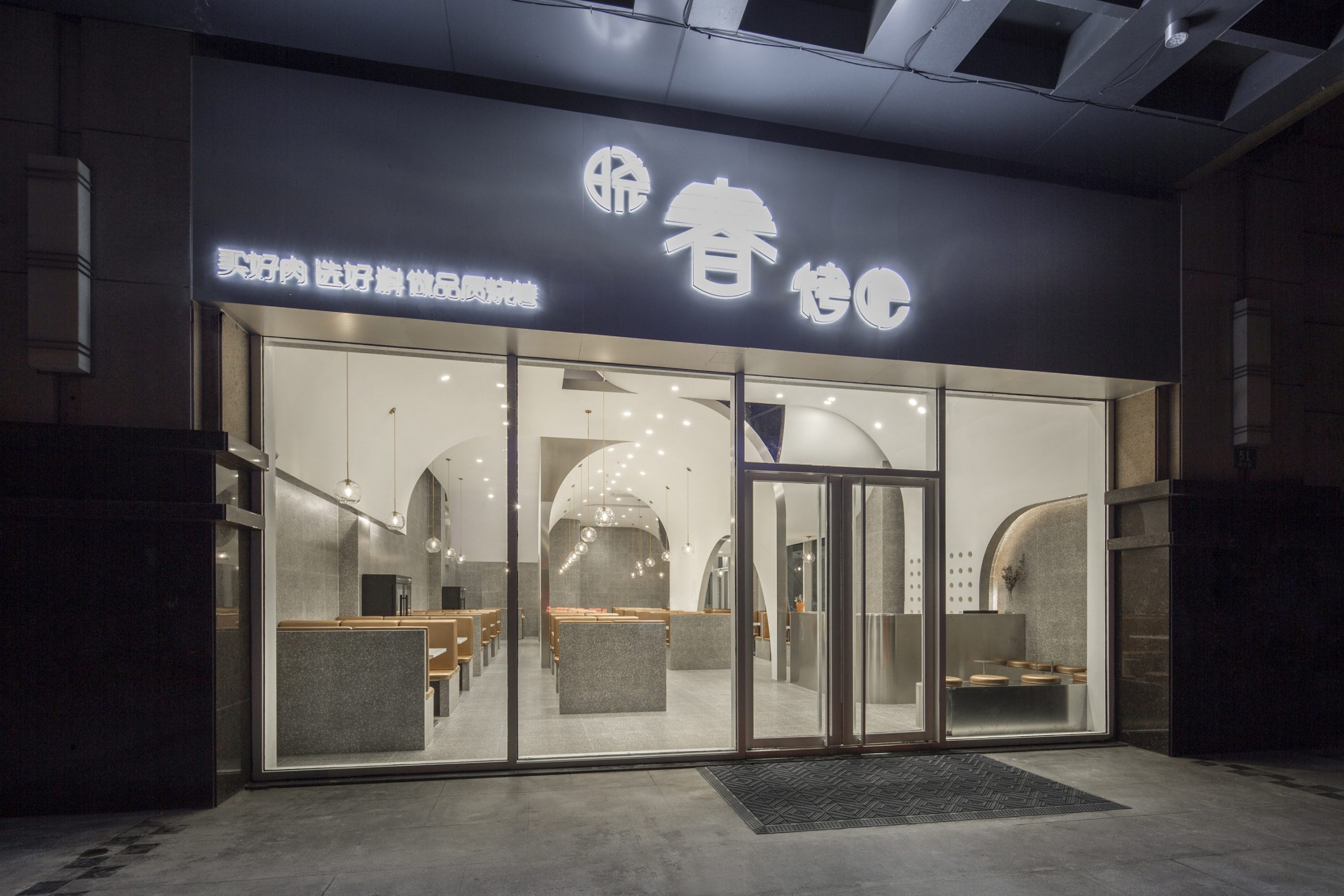
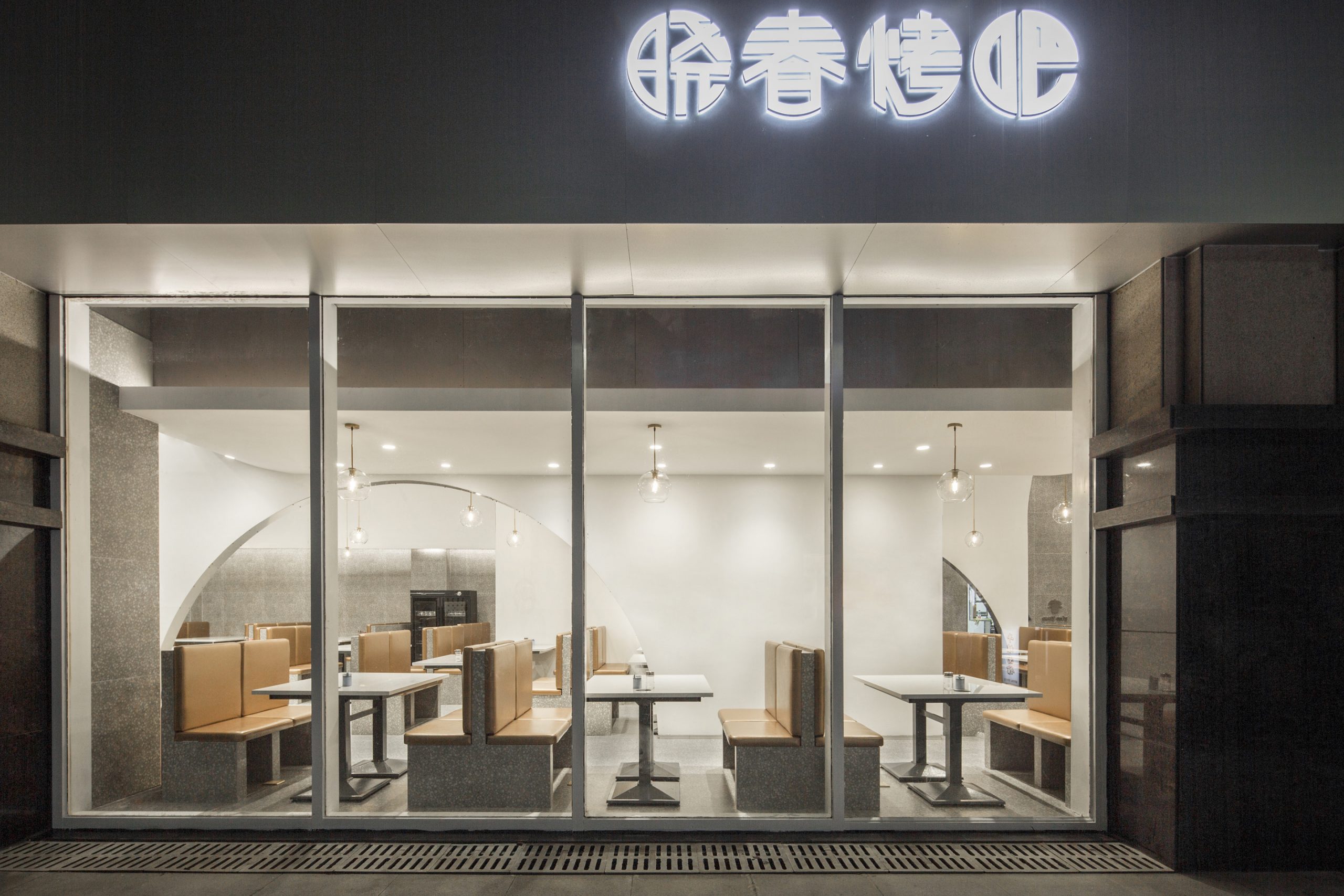
▲主入口立面
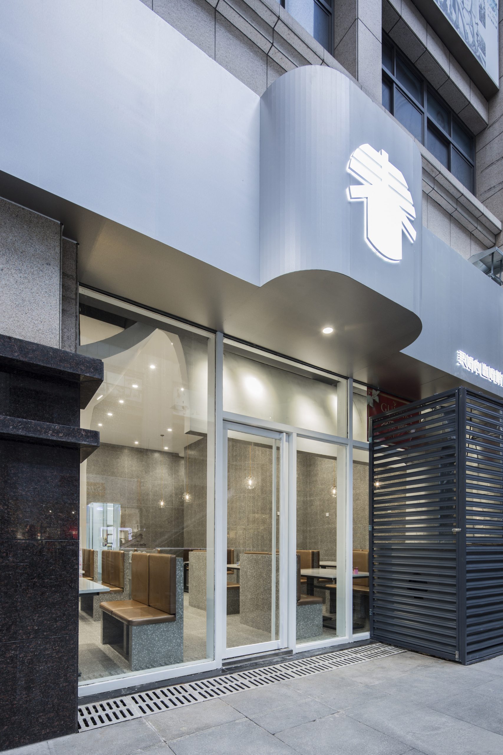
餐厅位于上海市杨浦区绿色米兰广场的商业入口处,通透的落地玻璃窗,以开放的姿态展现着室内洁白而纯净的环境,乍看之下丝毫不觉得这里会跟喝酒撸串有什么关系。
The restaurant is located in Green Milan square of Shanghai Yangpu district, a large area of glass Windows, showing the white and pure environment inside with an open attitude. At first glance, it doesn‘t seem to have anything to do with drinking and barbecue.
▲空间概况
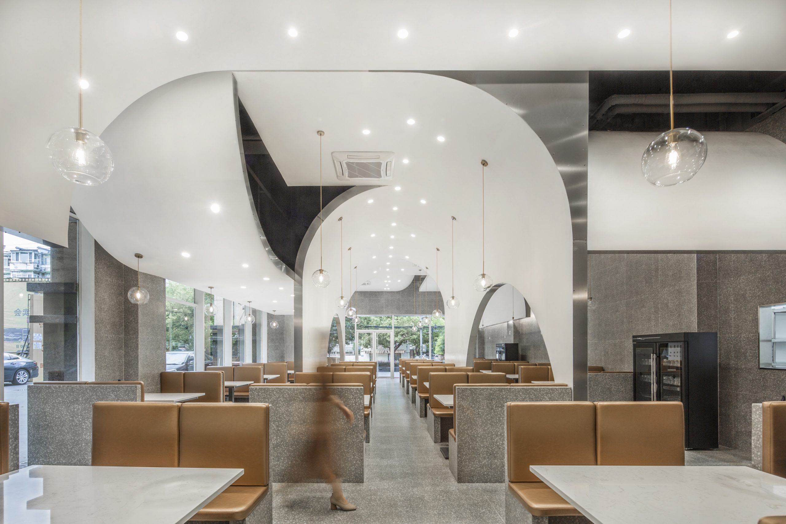
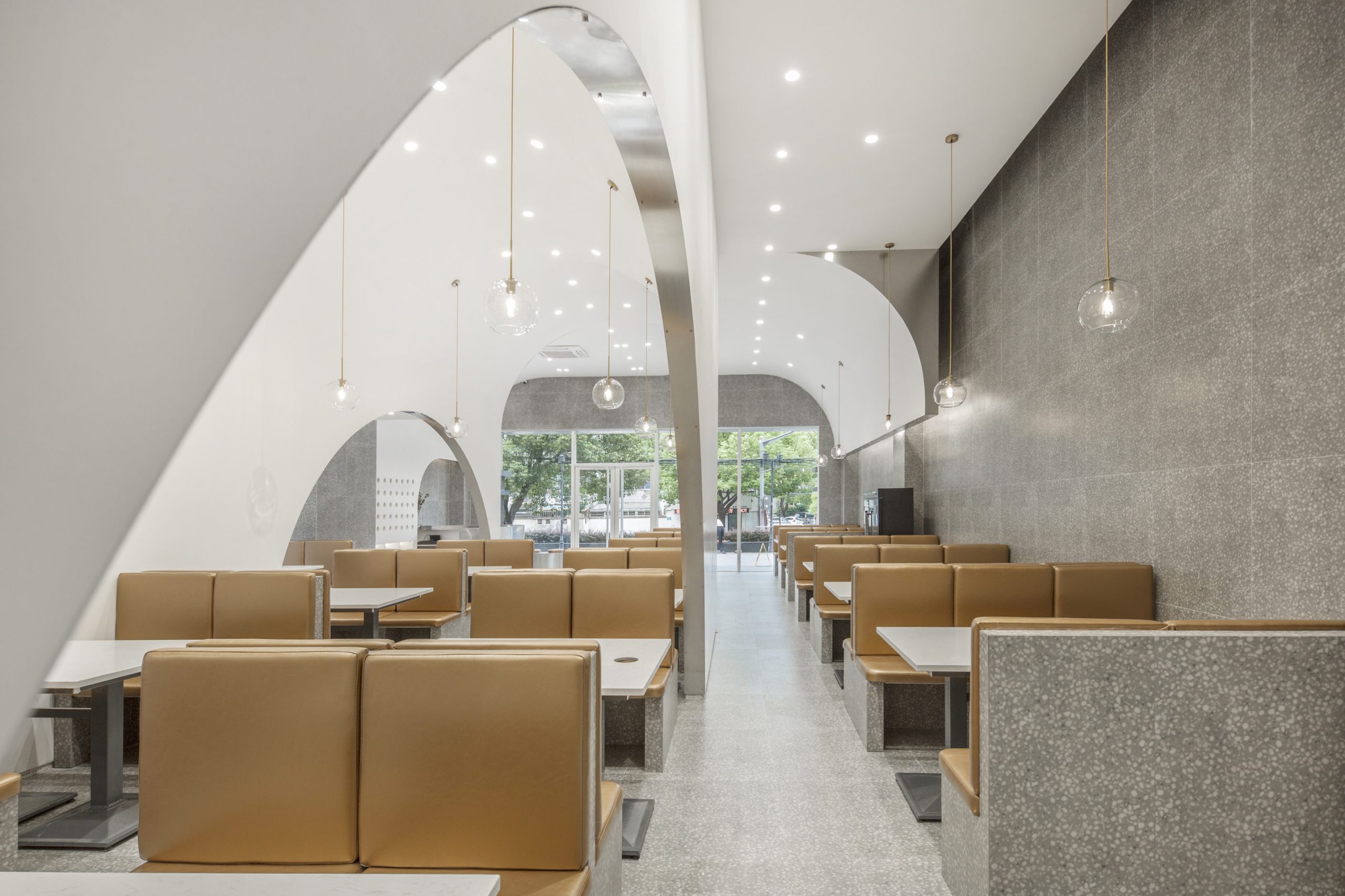
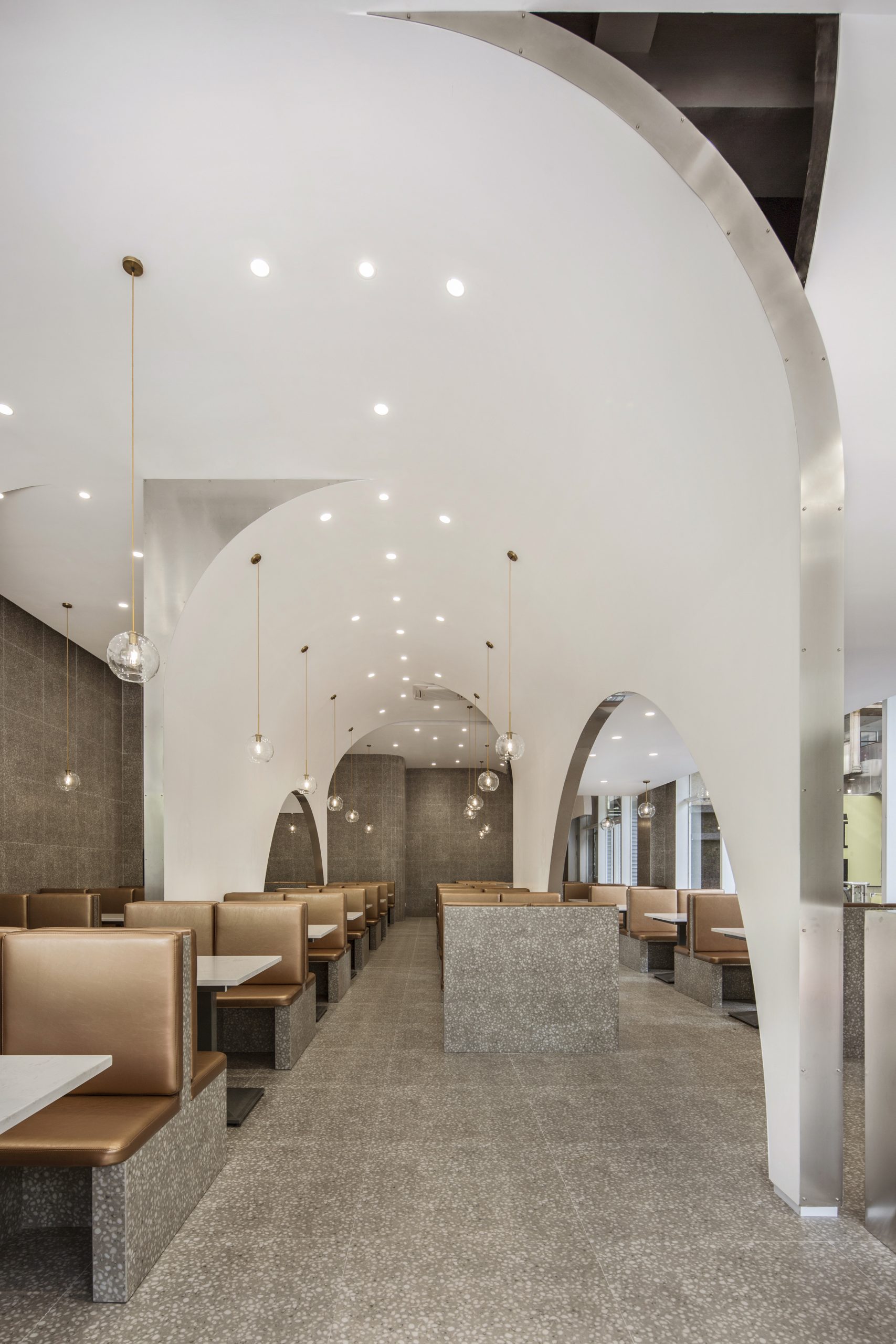
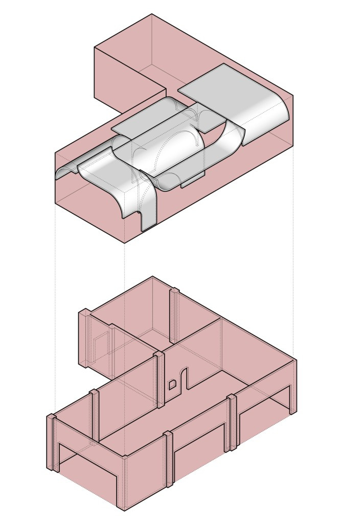
早在人类刚学会用火的远古时代,烧烤就已经成为了主要的烹调方式,在现代的烧烤店里能同时感受到远古时代和未来的气息吗?我们在空间上,用简明且富有张力的曲线勾勒出远古山洞的形态,将吊顶延伸向地面,模糊了吊顶与墙体的界限。在材质上选用增添未来气息的不锈钢材质、纯白色涂料和返璞归真的水磨石砖,让远古和未来在空间里来了一场相遇。
As early as in the ancient times when humans just learned to use fire, barbecue has become the main cooking method. Can we feel the flavor of ancient times and future in the modern barbecue shop at the same time? In space, we draw the outline of the shape of the ancient cave with a simple and tension curve, extending the ceiling to the ground, blurring the boundary between the ceiling and the wall. We chose the stainless steel material that adds future breath to be qualitative in material, pure white coating and the terrazzo brick that is simple and natural, let ancient times and future come to an encounter in the space.
▲空间布局
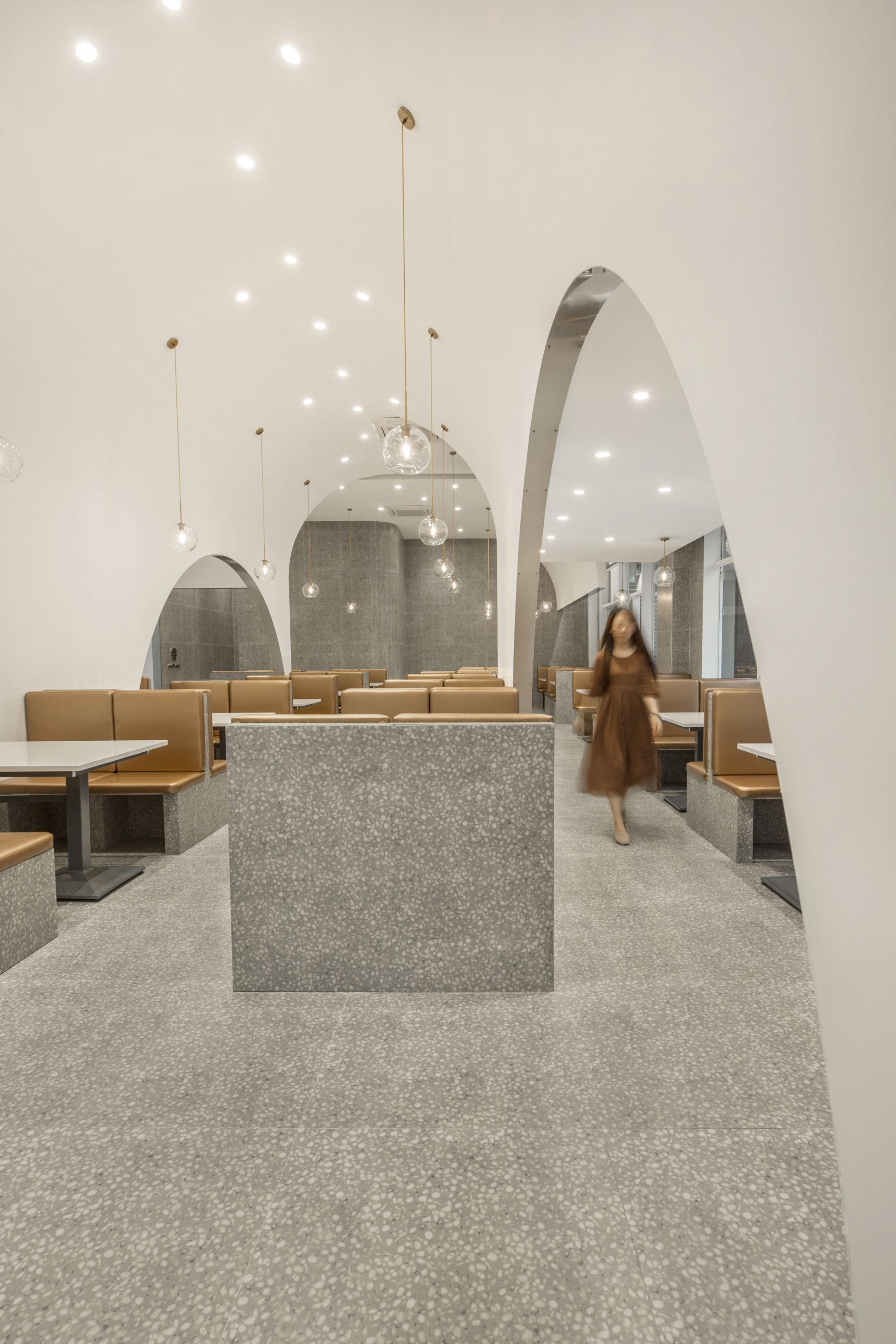
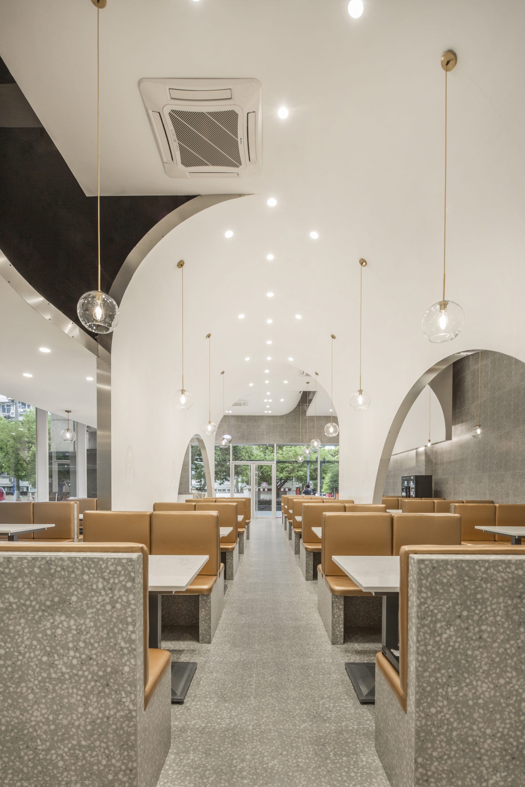
从顶部延伸到地面的隔断将各个空间分开,再通过隔断上的开口将空间连接起来,从而增加视觉和空间上的层次感。
The partition extending from the top to the ground separates the spaces, and the spaces are connect through the openings in the partition, which created sense of depth visually and spatially.
▲吧台和等位区
▲等位区细节
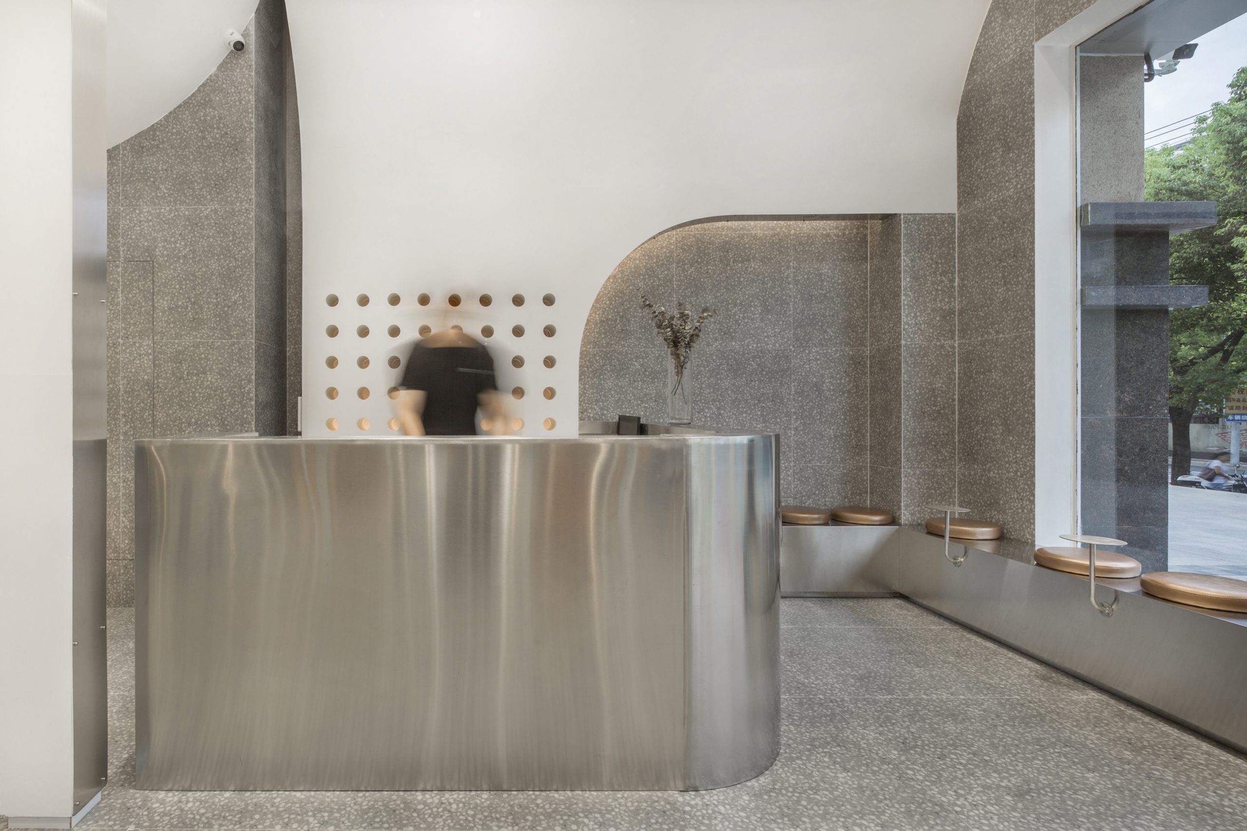
等位区设立在入口处,与吧台紧密相连,开放式的吧台为顾客与服务生的交流提供了便捷。背景墙上整齐的“洞穴”代替存放酒水的架子,等位的顾客可以随时点上一杯酒饮,放在座位旁特别定制的小边桌上,慢慢品尝等待,这样的等待似乎也没有那么漫长了。
The waiting area is located at the entrance, which is closely connected with the bar counter. The open bar counter provides convenience for the communication between customers and waiters. Instead of a wine rack, an orderly “cavern” on the background wall is designed to hold wines. It allows waiting customers to order a drink at any time, then place it on a custom-made side table next to their seat, and enjoy the wait, which may not seem so long.
▲中央拱形空间
▲中央就餐区
▲靠墙就餐区
▲靠窗就餐区
▲从餐厅前区看
▲从餐厅后区看
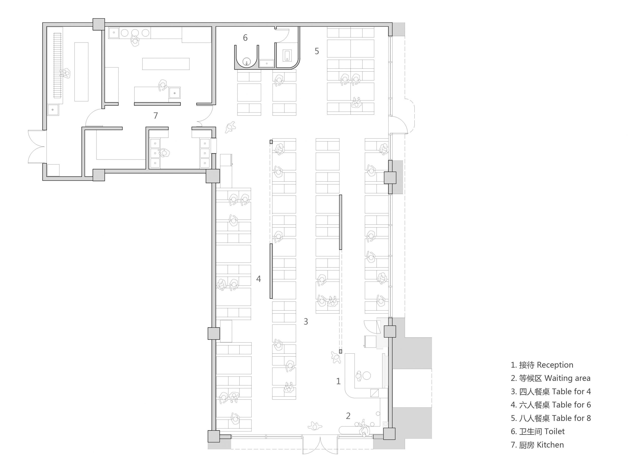
餐厅内分为4个区域,每个区域拥有不同的层高和尺度,提供了多种空间感的用餐体验。中央区域4.42米的挑高空间如同超现实的魔幻山洞,带给人视觉上的冲击;高挑且富有张力的拱形吊顶,又让人仿佛置身于神圣的白色教堂里,给原本随意自在的烧烤就餐增添了一份仪式感。左侧6人桌区域与中央区域一墙相隔,宽度收窄但保留了4.42米的层高,在增加了私密性的同时又提供了舒畅的空间感。靠窗的区域,有意将层高降低,营造一个温馨又私密的用餐环境,而一侧大片的落地玻璃窗扩展了视觉空间感从而消除了压抑感。餐厅的后区用高挑的层高和开阔的空间,将富有层次感且跳跃多变的吊顶造型尽收眼底,是欣赏餐厅全局的绝佳位置。
Restaurant is divided into four spaces, each space with different levels and scales, providing a variety of dining experiences. The 4.42-meter high space in the central area is like a surreal magical cave, which brings visual impact. The vaulted condole of tall and rich tension is carried, it also feels like being in a holy white church, which added a sense of ritual to an casual barbecue meal. The six-person table area at the left side is separated from the central area by a wall, which space is narrowed in width but retains a height of 4.42 meters, providing a sense of comfort while increasing privacy. The height is lowered at the area next to the windows, to create a warm and private dining environment. The large floor-to-ceiling window on one side expands the visual space and eliminates the sense of depression. The back area of the restaurant has a high and open space gives a panoramic view of the layered and jumping ceiling, which is a great place to enjoy the overall view of the restaurant.
▲次入口外立面
大面积白色的应用、通透的落地玻璃、明亮的灯光、高耸的空间……有人说它像咖啡店,有人说像教堂,有人说像服装店……我们最初思考的问题,在每个走进这里的人心里,都给出了不同的答案。
Large area of white, transparent floor-to-ceiling glass,the bright light, towering space…Some people say it’s like a cafe, some say it‘s like a church, some say it’s like a clothing store…In the minds of everyone who walks in, there is a different answer to the question we thought about in the beginning.
▲几何概念图
▲轴测分析图
▲平面图
项目信息——
项目名称:晓春烤吧,上海绿色米兰广场店
设计建筑事务所:多么工作室
设计团队:王维,盛乐,陆志毅
完成年份:2019年
建筑面积:250㎡
项目地址:中国上海
摄影:林山
Project information——
Project:Spring Grill Bar,Green Milan Plaza
Design:Atelier d’More
Project team:Wei Wang,Le Sheng,Zhiyi Lu
Completion date:2019
Area:250㎡
Location:Shanghai,China
Photography:Linshan Film


