知白设计研究室意在创造一个舒适的办公空间,利用空间的调性来体现“知白”的设计主张,白为无,白为有,白又为空。正如理查德迈耶对白色的理解一样,白色是纯洁、透明和完美的象征,白色是丰富的,包含所有的颜色,能最好的欣赏光影的表演,更加清晰的表现空间结构出来,设计师在原8.5M*8.5M的建筑标准柱跨单元模数空间里面,进行基础几何构成的体块穿插和切割的手法划分来形成不同功能区域布置,在小的空间体块里面容纳多重的功能,不同的空间体块里营造不同的空间感受,满足使用空间的同时也融合品牌寓意。
Zhibai Design Research Office intends to create a comfortable office space, and use the tonality of space to reflect the design idea of “Knowledge White”. White is nothing, white is white, white is empty. Just as Richard Meyer understands white, white is a symbol of purity, transparency and perfection. White is rich, contains all colors, can best enjoy the performance of light and shadow, and express the spatial structure more clearly. In the original 8.5M*8.5M building standard column spanning unit modulus space, the basic geometry of the block insertion and cutting method is divided to form different functional areas, and accommodate multiple functions in a small space block. Different spatial styles create different spatial feelings, satisfying the use of space and also integrating brand meaning.
入口 Entrance
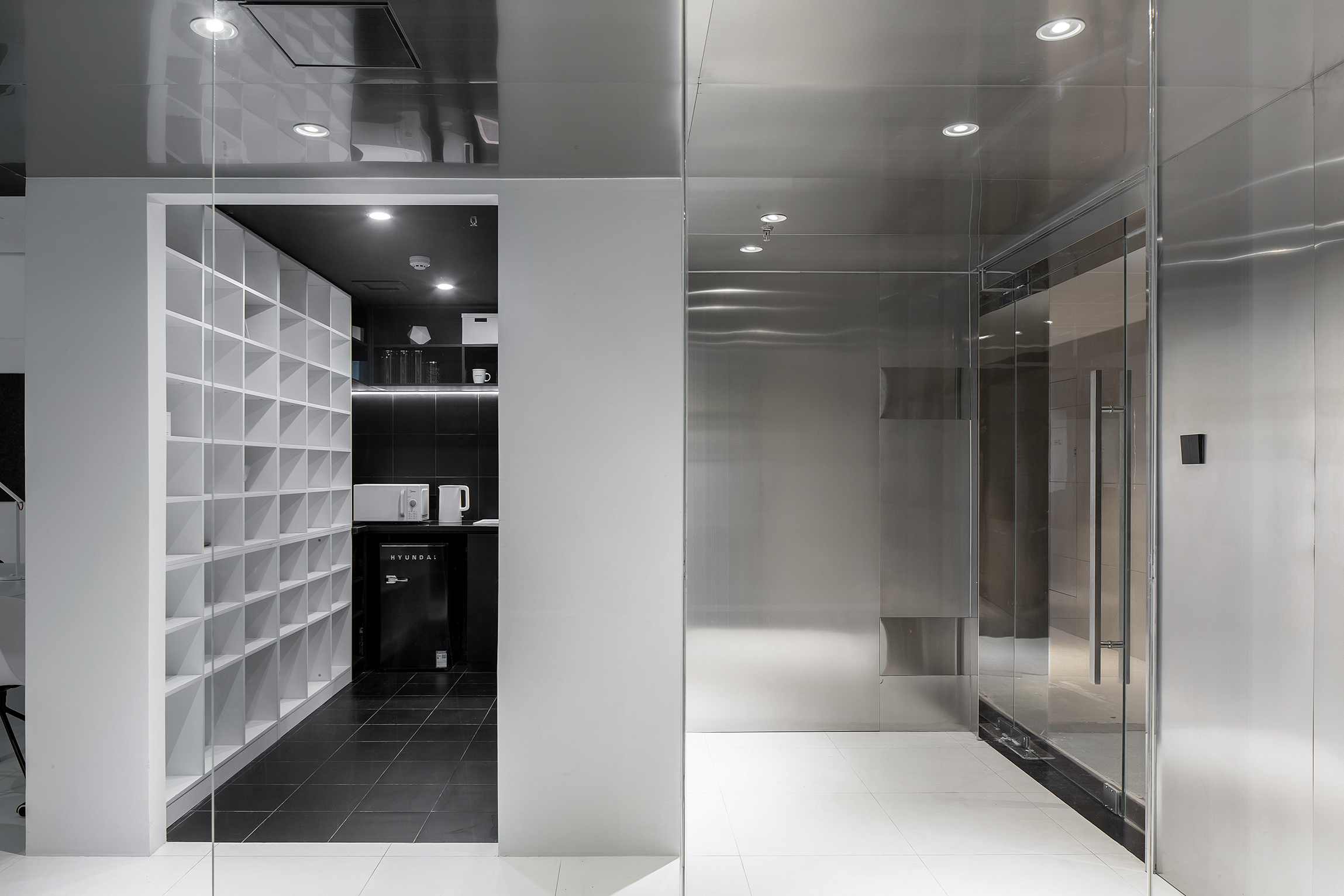
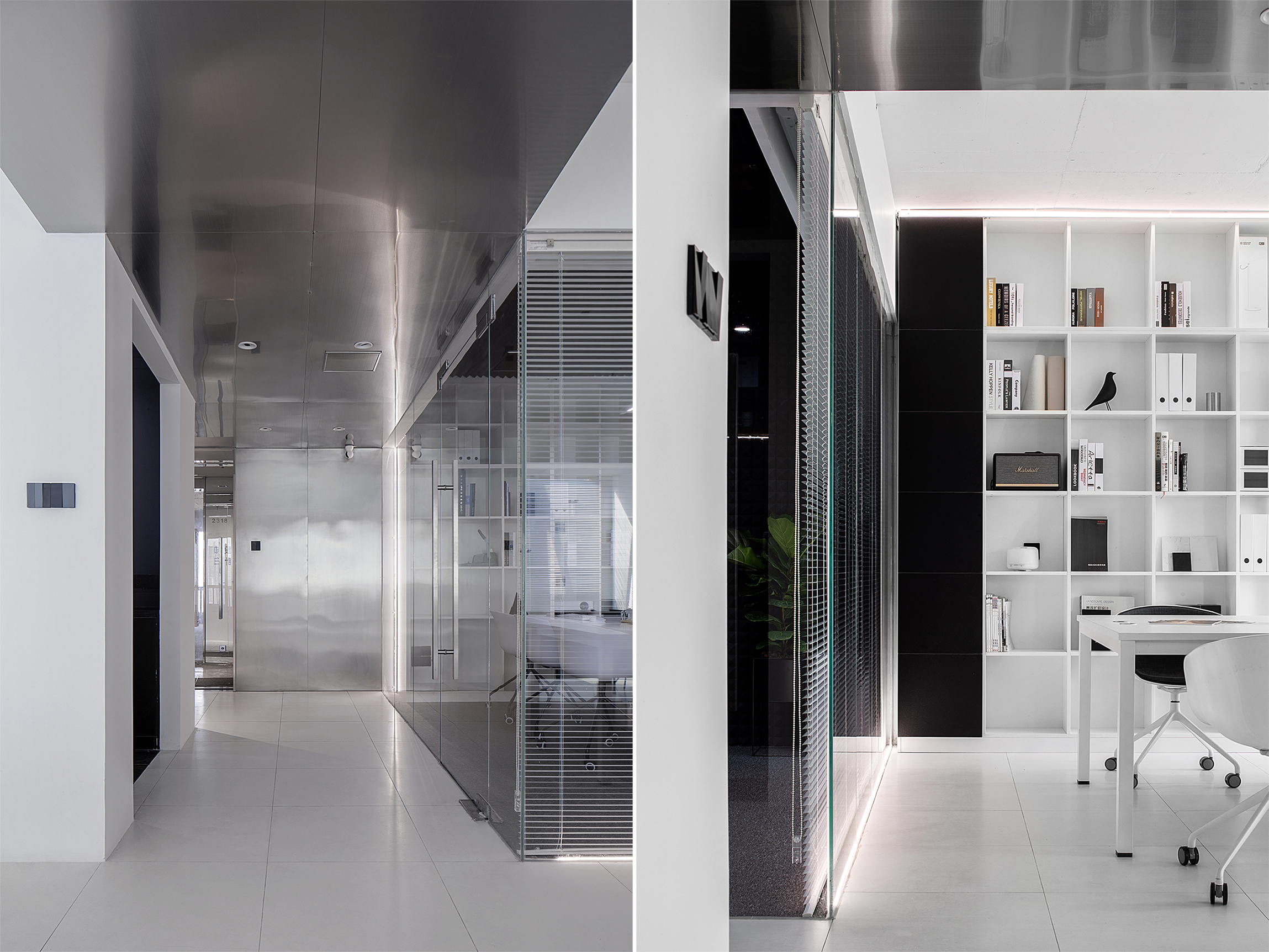
入口处的空间处理是3个盒子的穿插组合,LOGO位置将视线引向走廊。顶面的不锈钢一直延伸到天花通向办公区,界定了交通动线的流向,在空间上释放空间的高度,使空间在视觉上得到延伸。
The space treatment at the entrance is a patchwork combination of 3 boxes, and the LOGO position directs the line of sight to the corridor. The top stainless steel extends all the way to the ceiling to the office area, defining the flow of traffic lines and releasing the height of the space in space, allowing the space to be visually extended.
办公区 Workspace
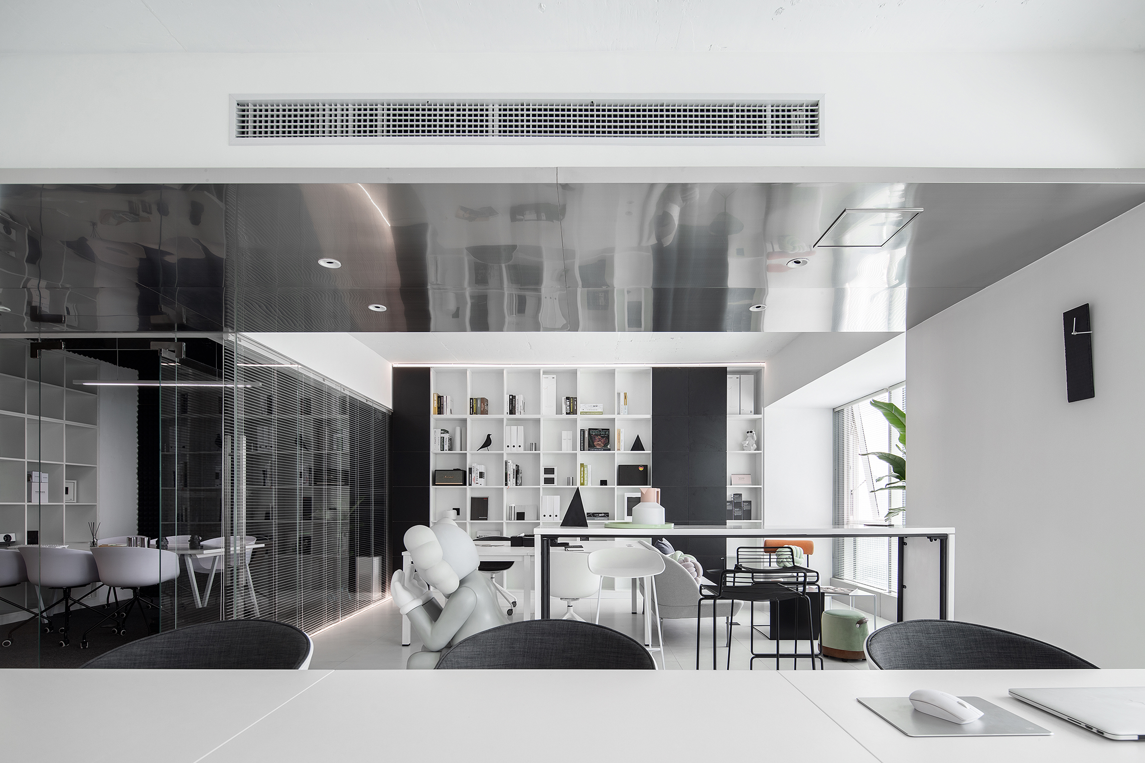
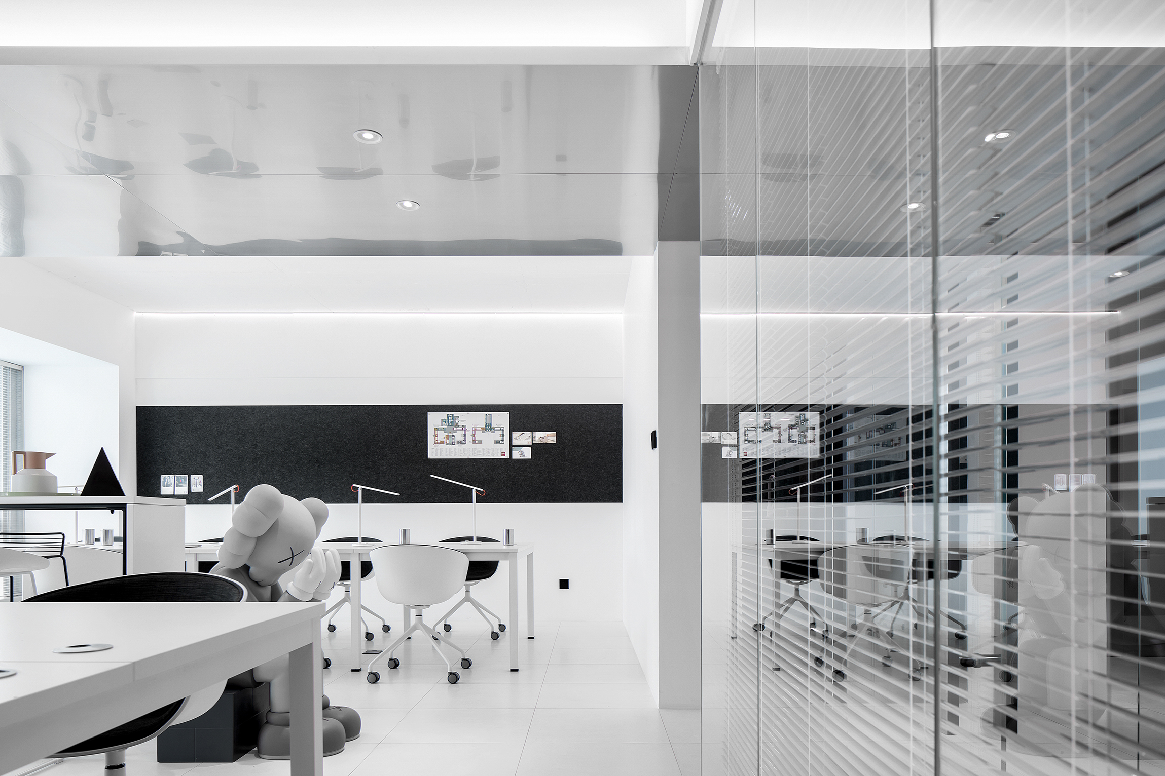
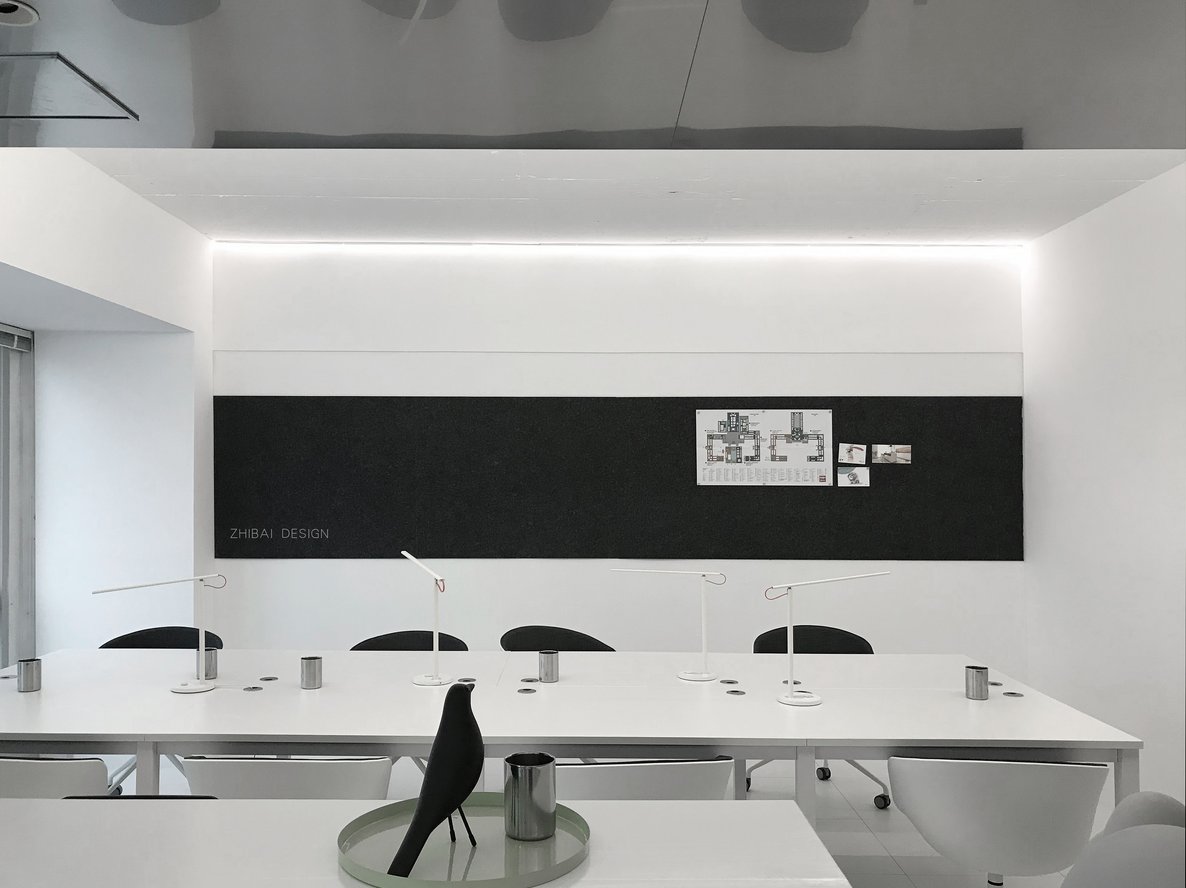
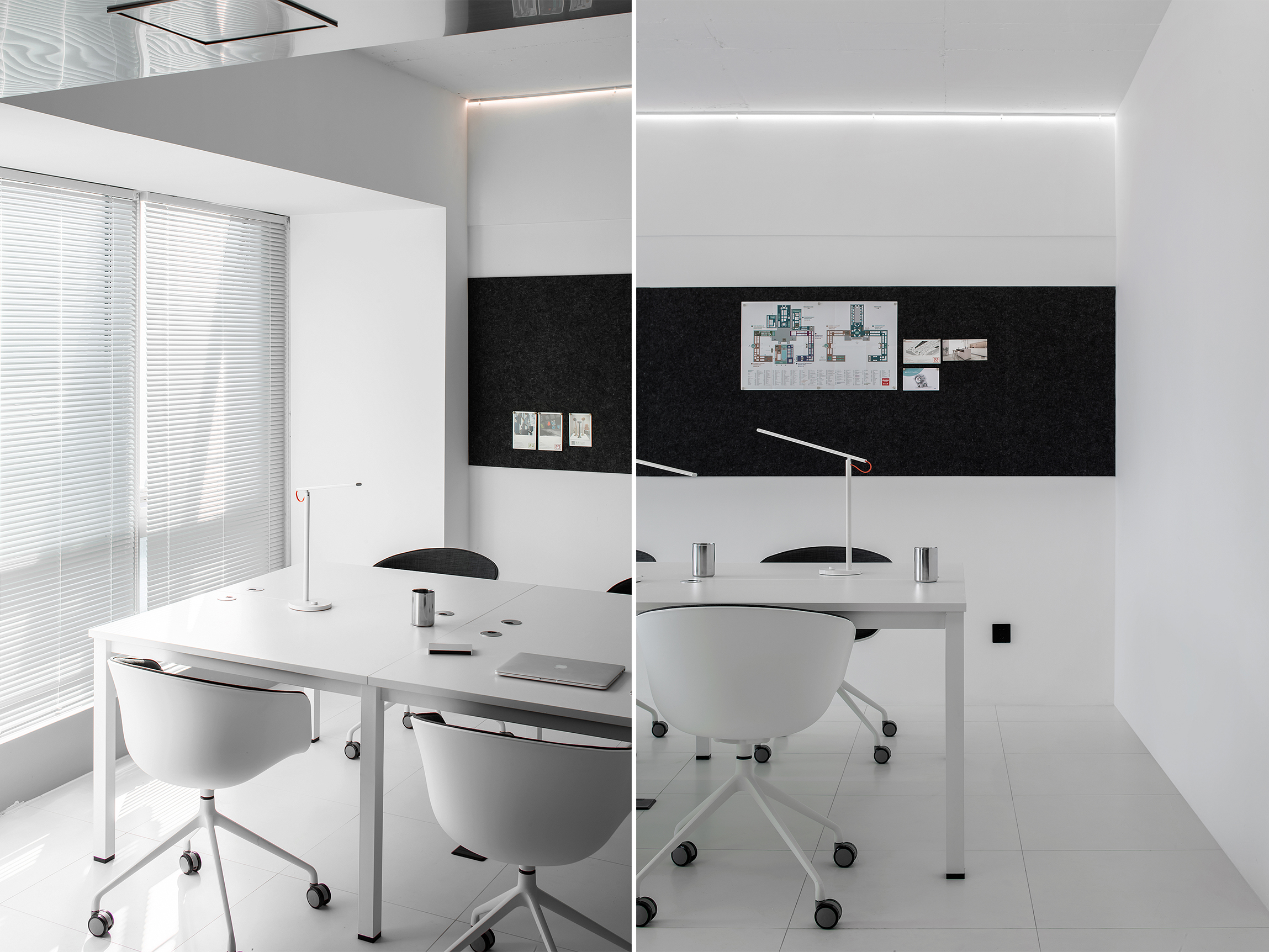
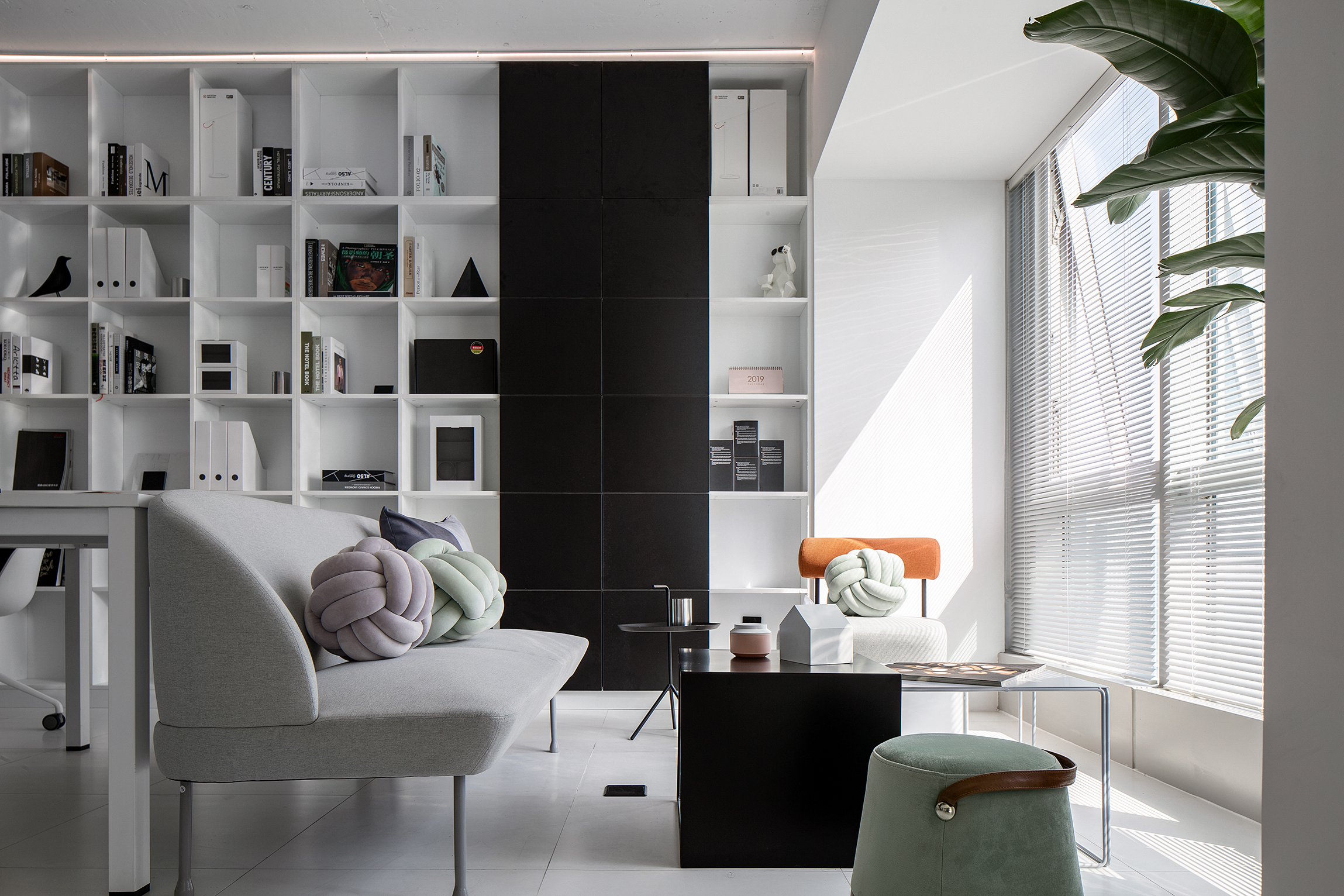
空间上大面积采用了高纯度的白色,动线空间里面运用的了灰度的不锈钢,功能空间里面用黑色作为辅助色,强调了空间的性质,空间里面自由开放,线性光的使用强调的了空间的结构。
A large area of space is made of high-purity white, grayscale stainless steel is used in the moving space, and black is used as the auxiliary color in the function space, which emphasizes the nature of space. The space is free and open, and the use of linear light emphasizes The structure of the space.
环境影响人的情绪,情绪带动人的心情,空间里大面积的白色搭配灰色系颜色让空间增加了情感的变化,白色既是无色,白色又是所有的颜色。自然光透过百叶在纯净的空间里面有了几分节奏。阳光下的绿色让空间多了一份对生命的诠释。
The environment affects people’s emotions, and emotions drive people’s moods. The large white color in the space is matched with the gray color to make the space change the emotion. White is colorless, white and all colors. Natural light through the louvers has a bit of rhythm in the pure space. The green under the sun gives the space an interpretation of life.
会议室 Meeting room
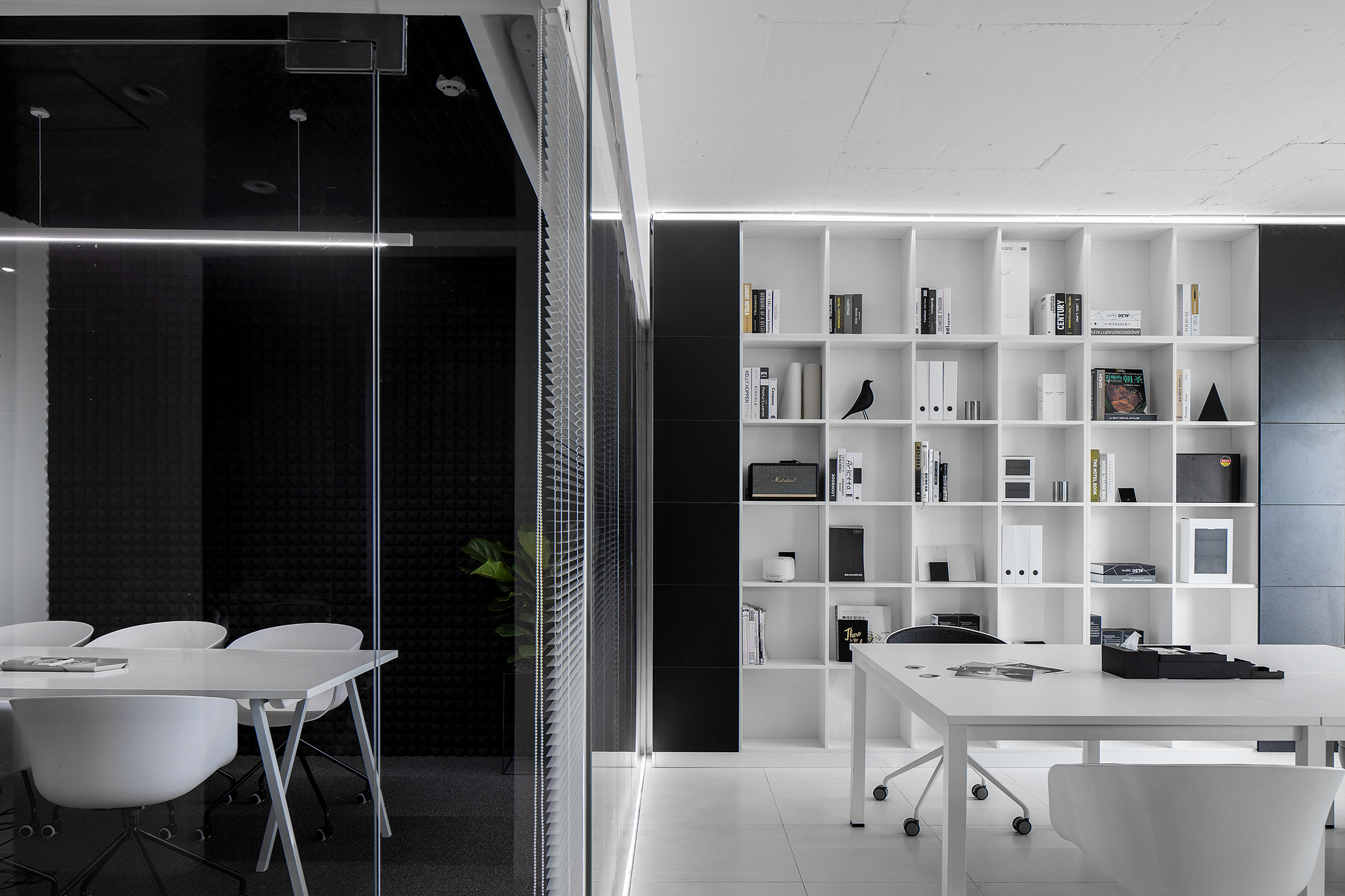
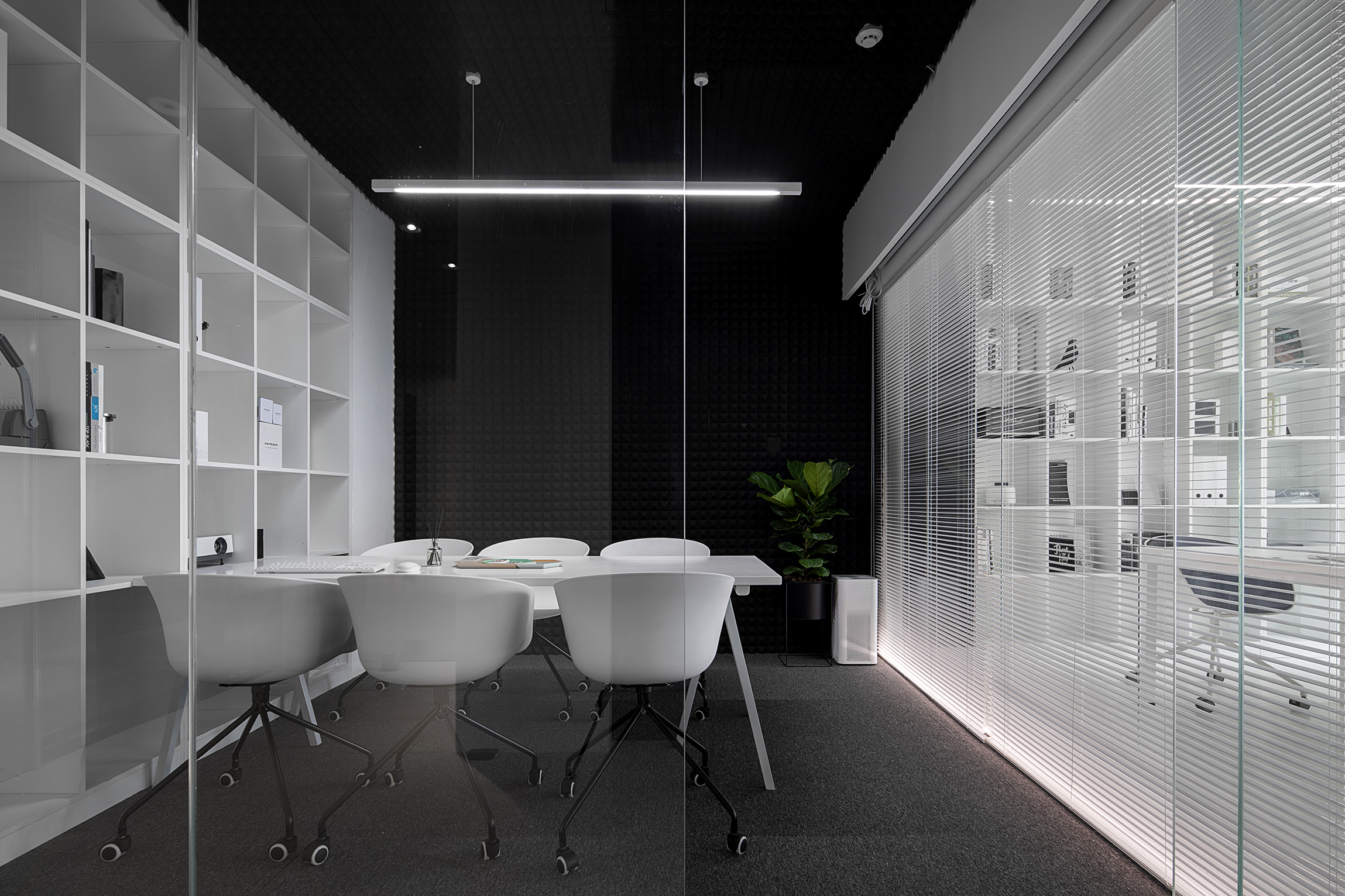
空间是凝固的符号。正如设计以多样探索赋予空间更大的想象力,空间的创造具有无限的可能性,在探索功能和美学相结合的同时,让置身当中的人犹如穿越一般体验两种不同的场景,吸音棉的空间包裹让整个空间有很好的吸音效果,从而保证了私密性。
Space is the symbol of solidification. Just as design creates a larger imagination with multiple explorations, the creation of space has unlimited possibilities. While exploring the combination of function and aesthetics, let the people in the middle feel like two different scenes through the general experience, sound-absorbing cotton. The space package gives the entire space a good sound absorption, thus ensuring privacy.
卫生间&材料间 Toilet & Material Room
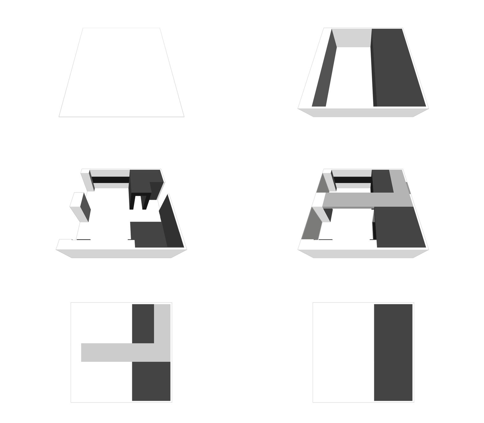
卫生间与材料间延续平面布置的理念意在营造空间的的体块穿插感,从材料间到洗手间形成两种对立的色块对比。
The concept of continuous layout between the bathroom and the material is intended to create a sense of interspersed space in the space, forming two opposite color block contrasts from the material to the bathroom.
▲平面图 Toilet & Mater
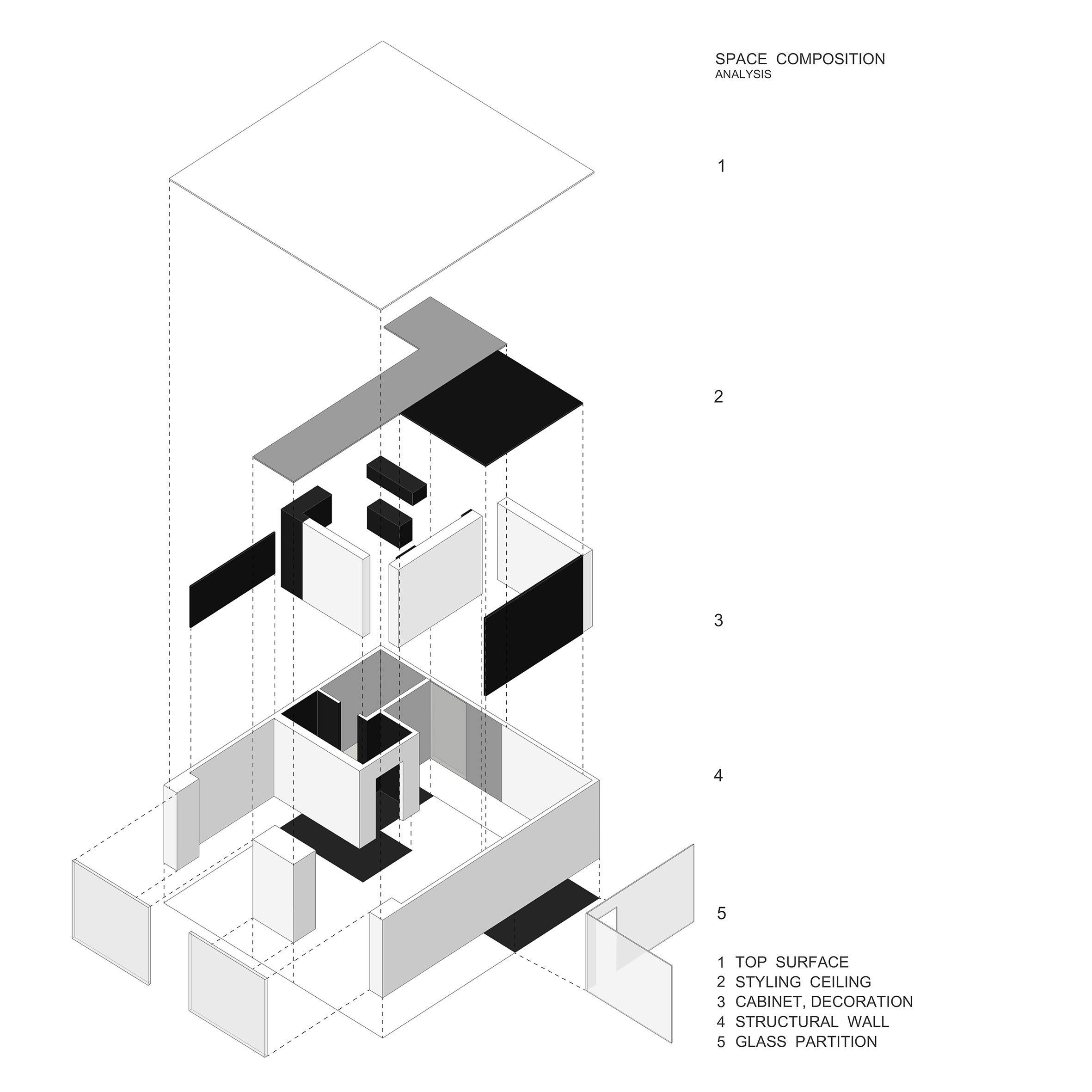
▲轴测图 Isometric View
▲结构剖析 Structure
项目信息——
项目名称:白色盒子
设计:知白设计
项目设计时间:2018年12月
项目完成时间: 2019年3月
设计团队:周海飞、王子林
建筑面积:101 m²
摄影版权:夏旭威
品牌:办公家具(GRIGHT)、灯(小米)、展柜(HIH)等


