自然衍生
从材质选择到肌理形态;塑造品牌价值的高度一致。
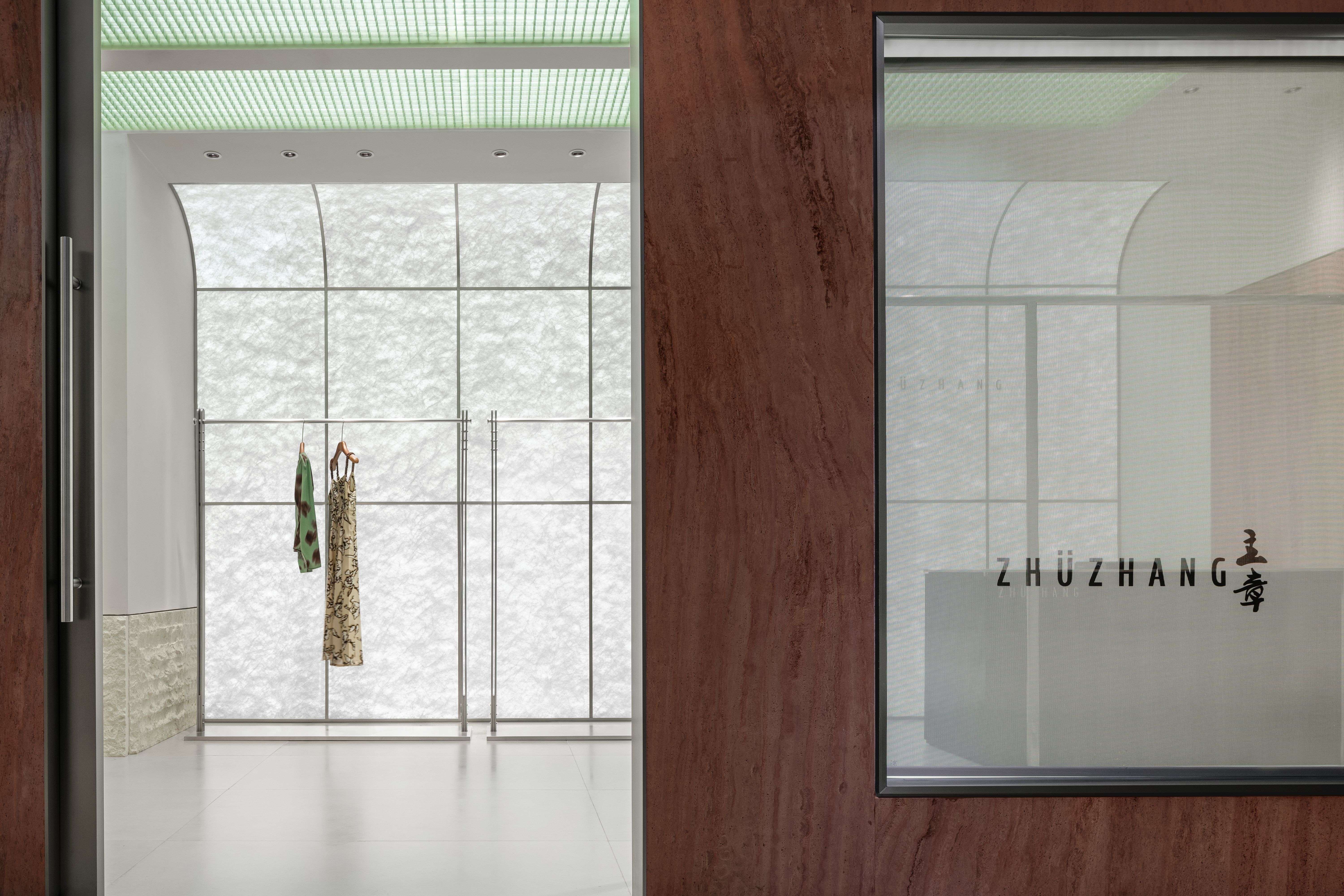
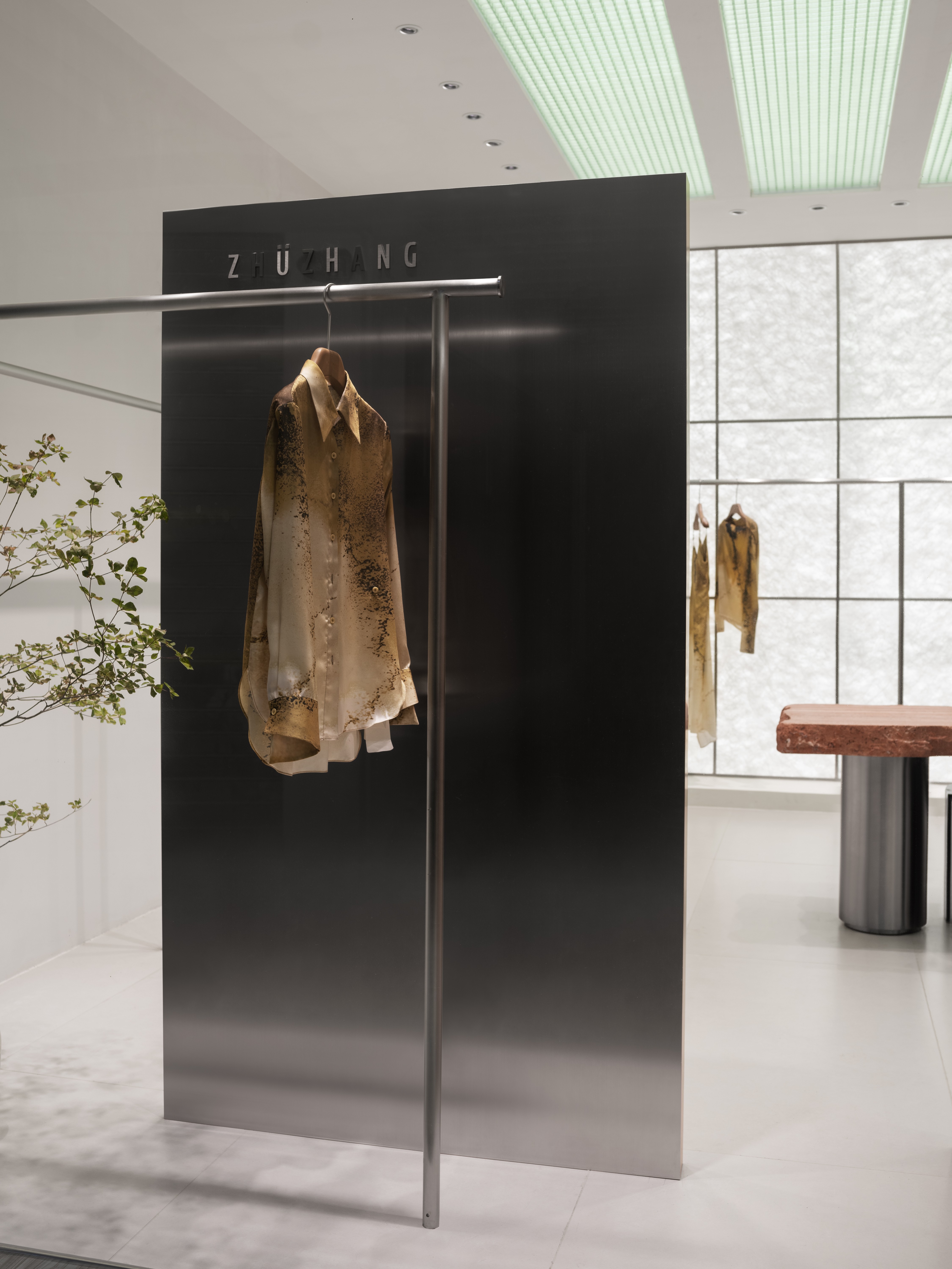
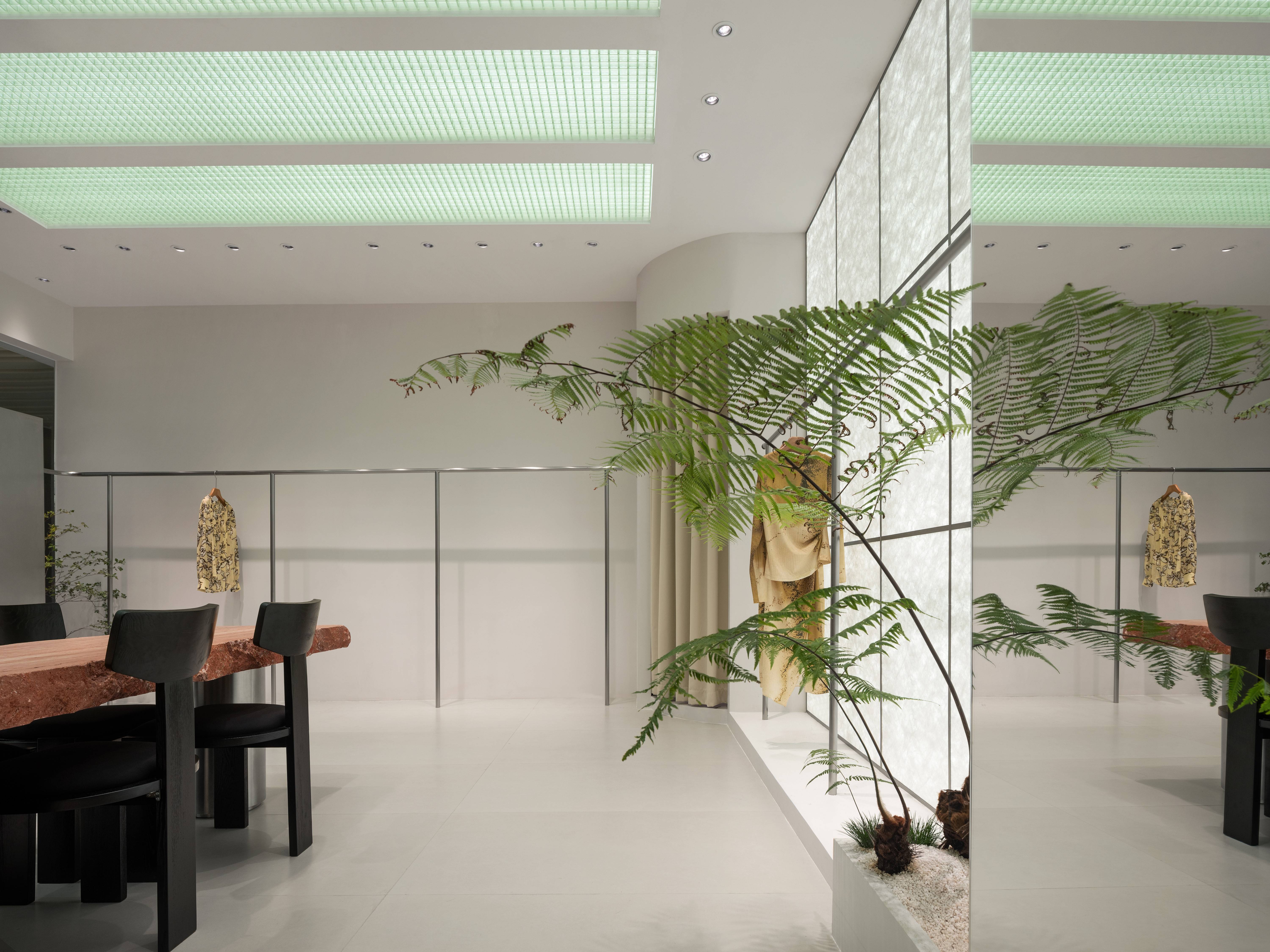
ZHU ZHANG位于深圳南油之地,是高端时装设计、生产、批发之代表性品牌,颠覆过往批发之旧思维,以品牌模式引领批发之道。结合当代艺术思维,深入探究空间与消费者之间的紧密联系,唤起消费者对品牌联想使其清晰辨识于消费者心中。LubanEra·Design创意总监Bobo用超越潮流之外的感性认知,汲取前沿文化精髓,将ZHU ZHANG的品牌精神内涵与自然衍生的元素进行了完美的融合,以自由的形态赋予空间全新的生命,为ZHU ZHANG构筑一处自然随心、悠然自得的商业空间。
ZHU ZHANG is located in Nanyou, Shenzhen, and is a representative brand of high-end fashion design, production, and wholesale. It subverts the old thinking of wholesale and leads the way of wholesale with a brand model. Combining contemporary art thinking, delving into the close connection between space and consumers, arousing consumer associations and making it clear in their minds. LubanEra · Design Creative Director Bobo uses emotional cognition beyond trends, draws on the essence of cutting-edge culture, and perfectly integrates the brand spirit of ZHU ZHANG with natural derived elements, giving the space a new life in a free form, and building a natural and carefree commercial space for ZHU ZHANG.
鲁班精神 · 匠心营造 · 专注极致
Lu Ban Spirit·It’s a work of art· Focused to the Max
长风破浪会有时,直挂云帆济沧海。
Long winds and waves sometimes break through, hanging straight on a cloud sail to the vast sea.
▲效果图
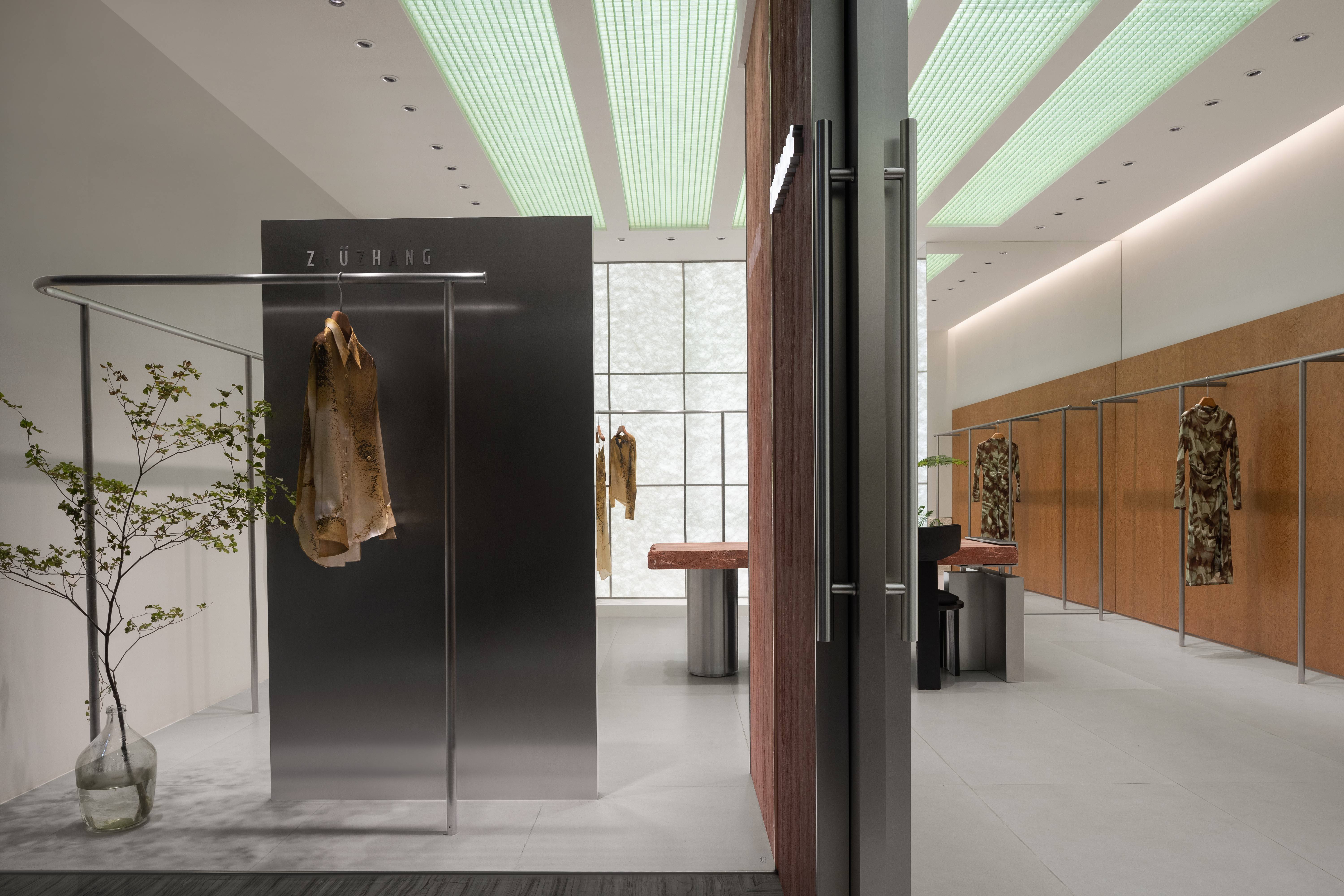
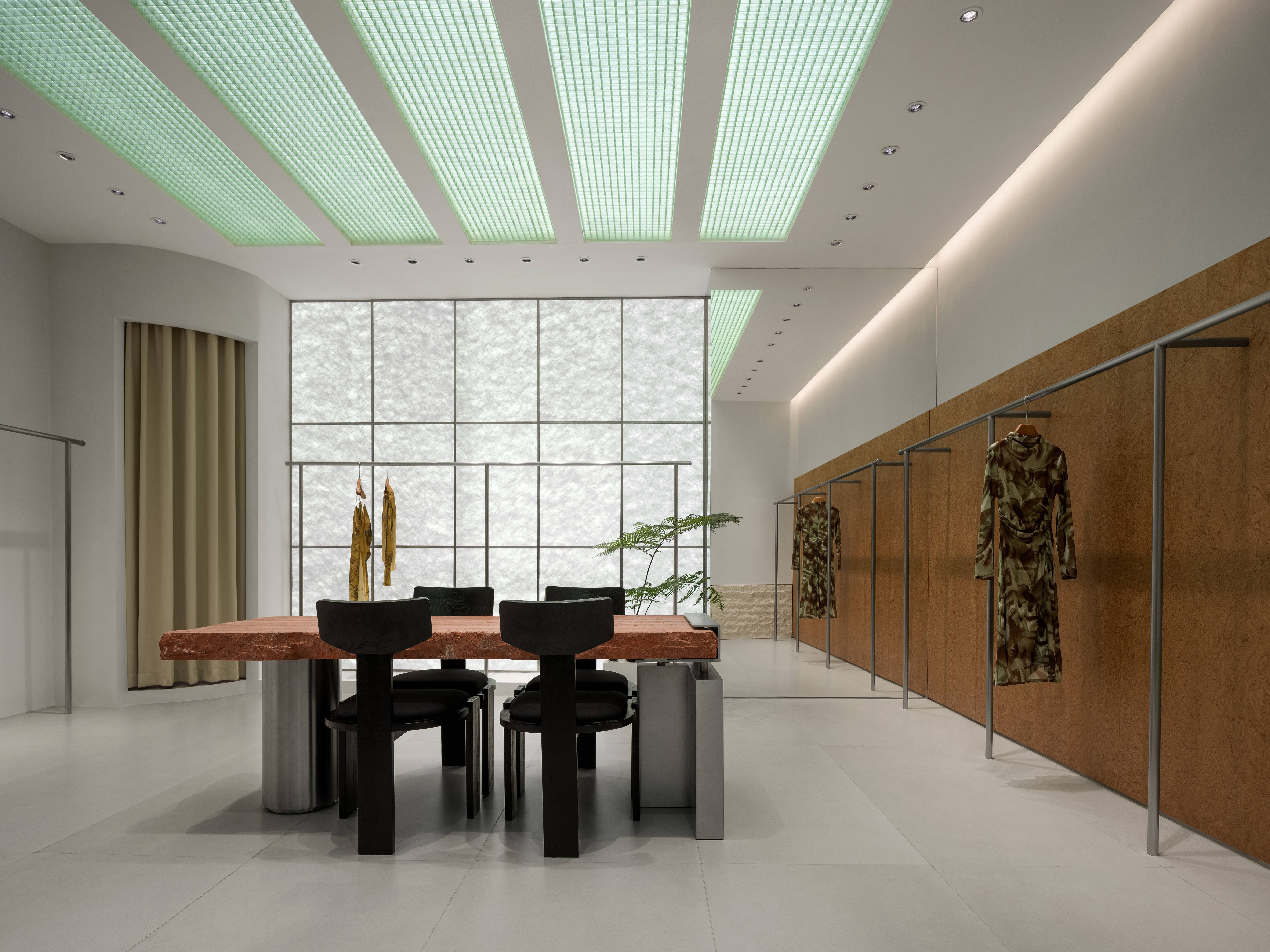
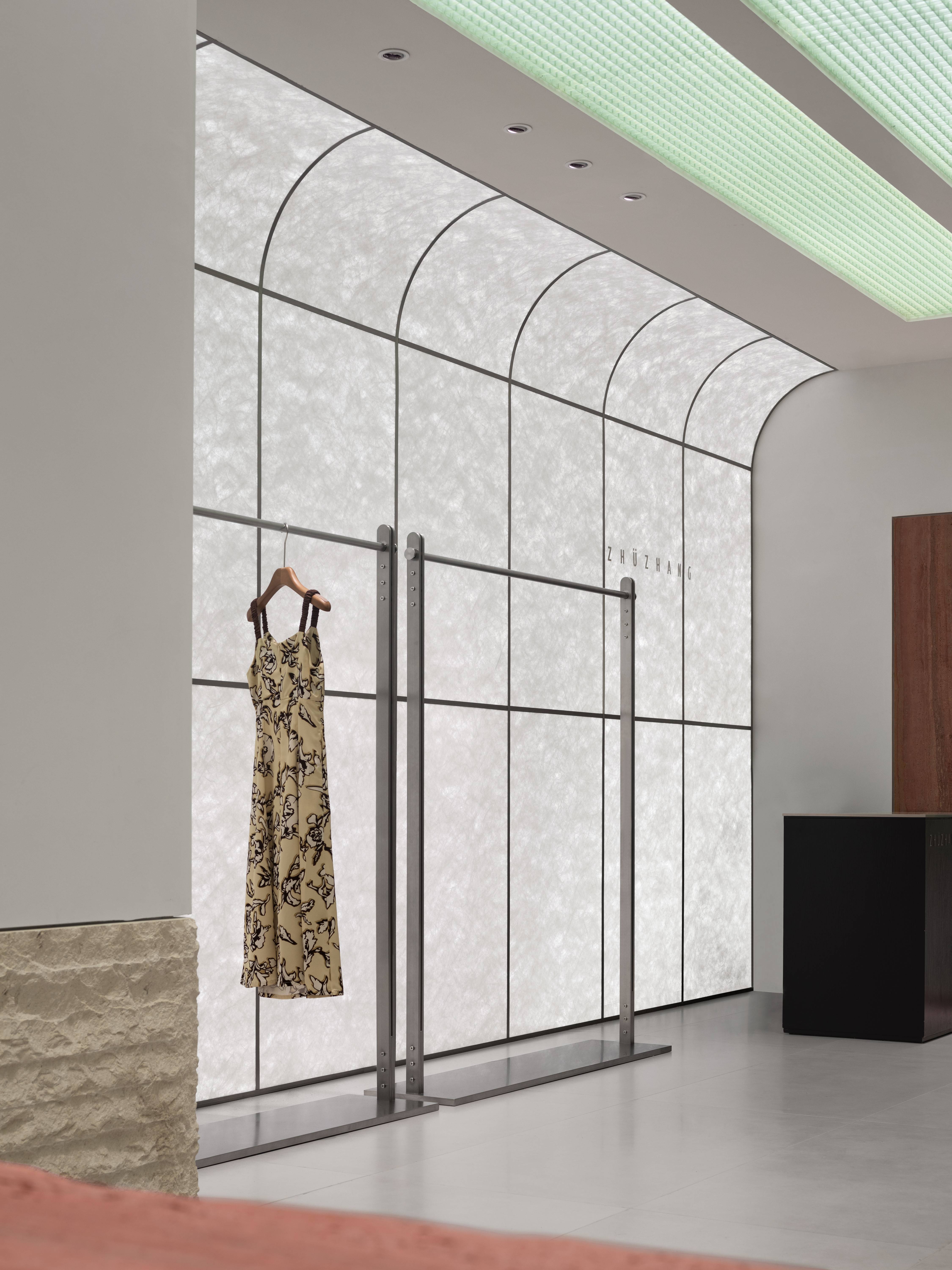
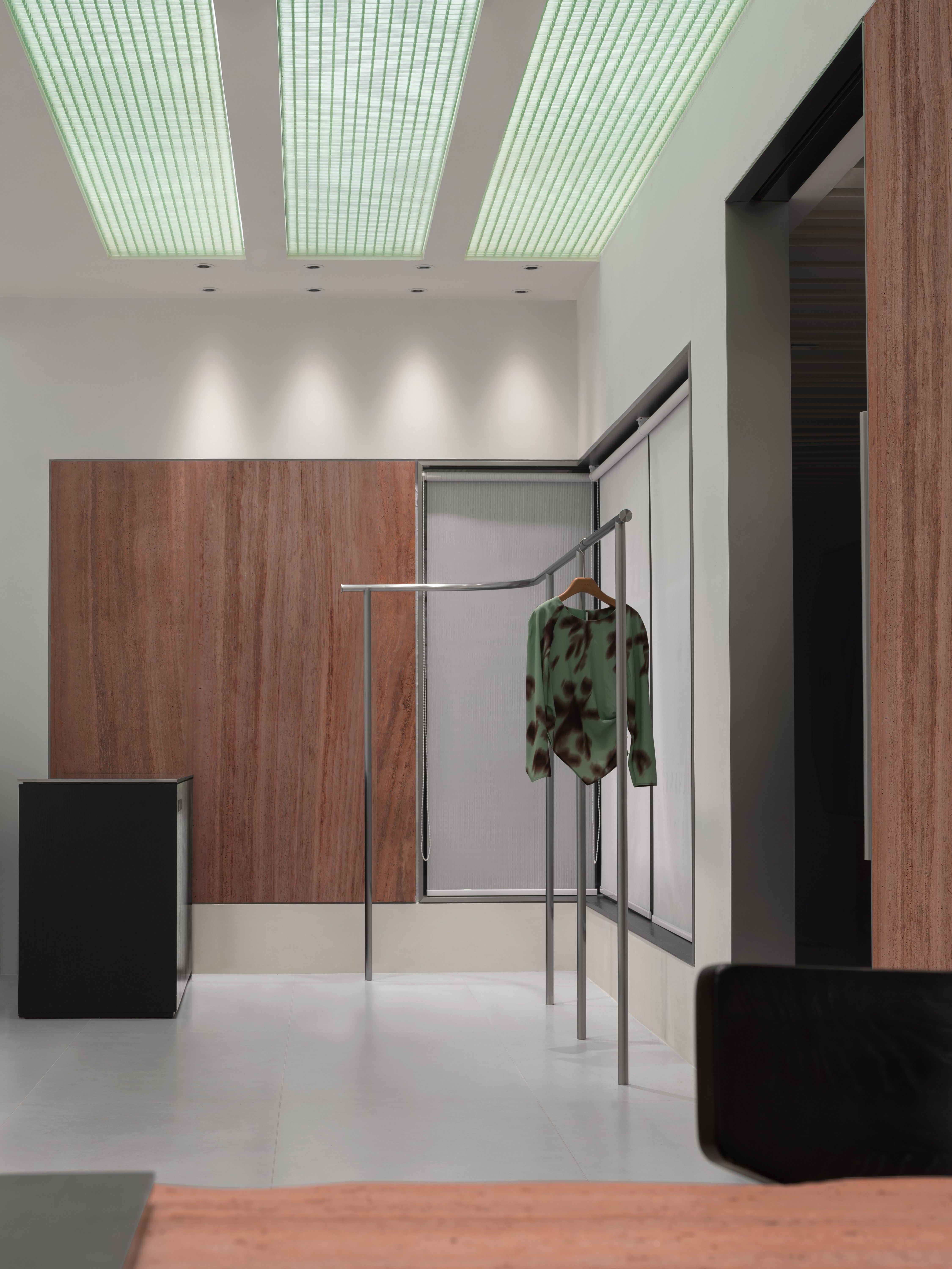
不追求所谓的设计风格,只探寻美学给空间创造的商业价值。这是LubanEra·Design创始人Bobo的设计创新之道,用“静谧”和“舒适”来赋予空间衍生自由的形态。在与自然的交会中,翡翠格栅散发出的温润光芒,既维持着一种有序的兼容感,又在这朴质的环境中绽放出它独特的魅力。
Not pursuing so-called design styles, only exploring the commercial value that aesthetics create for the space. This is the design innovation path of LubanEra · Design founder Bobo, using “tranquility” and “comfort” to give space a free form. In the intersection with nature, the warm light emitted by the jade grille not only maintains an orderly sense of compatibility, but also blooms its unique charm in this simple environment.
滋生万物
Nurturing all things
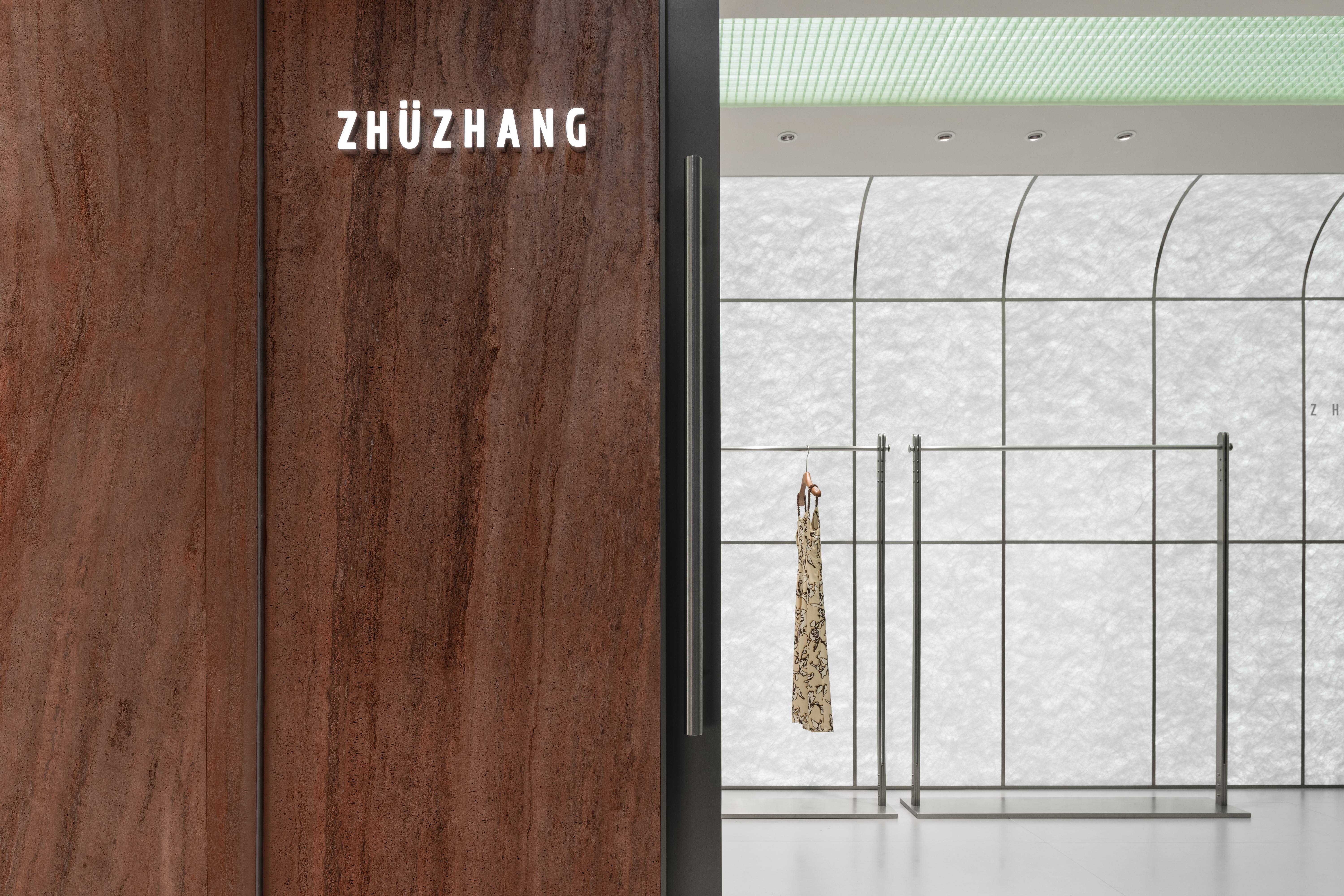
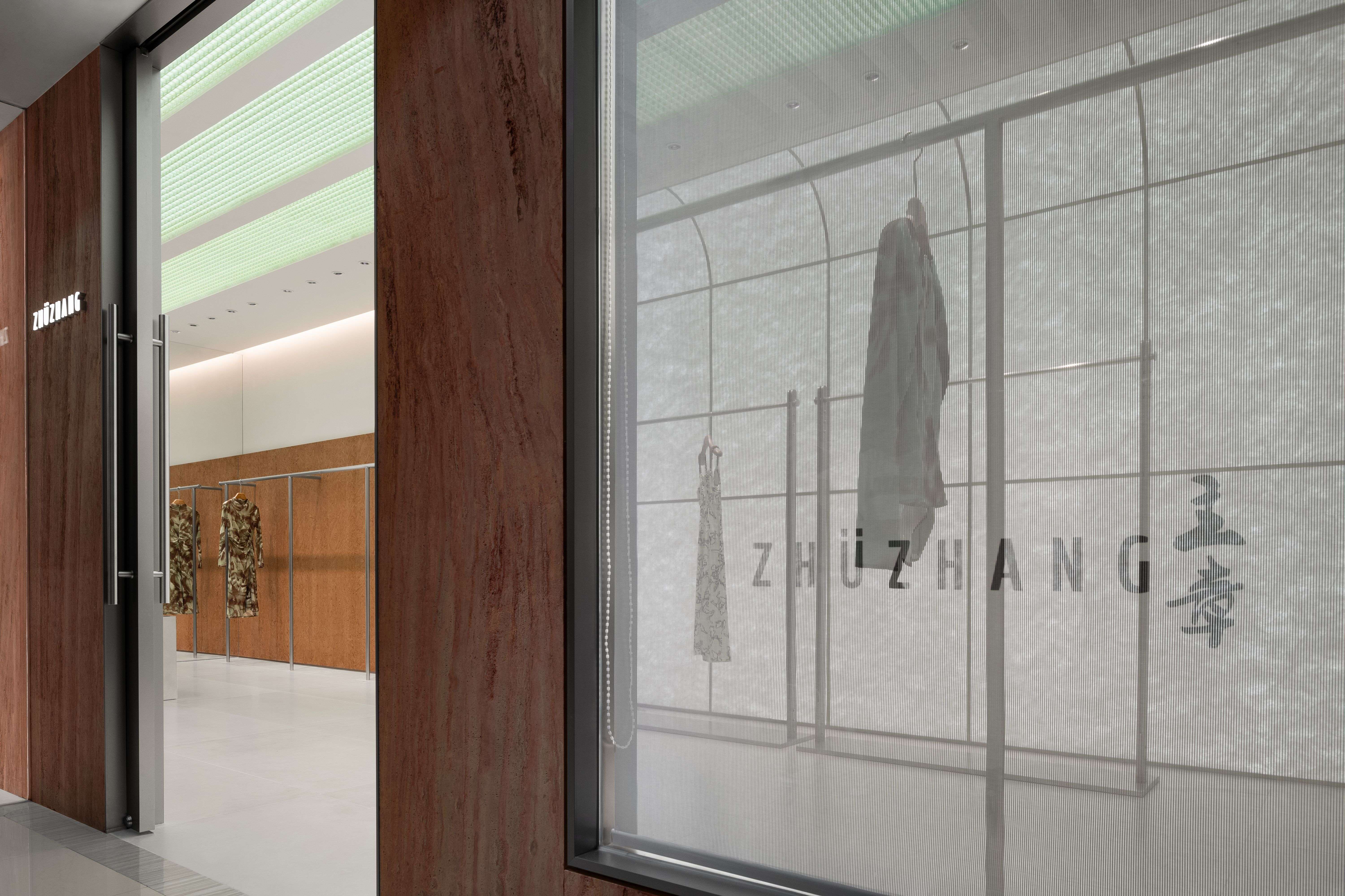
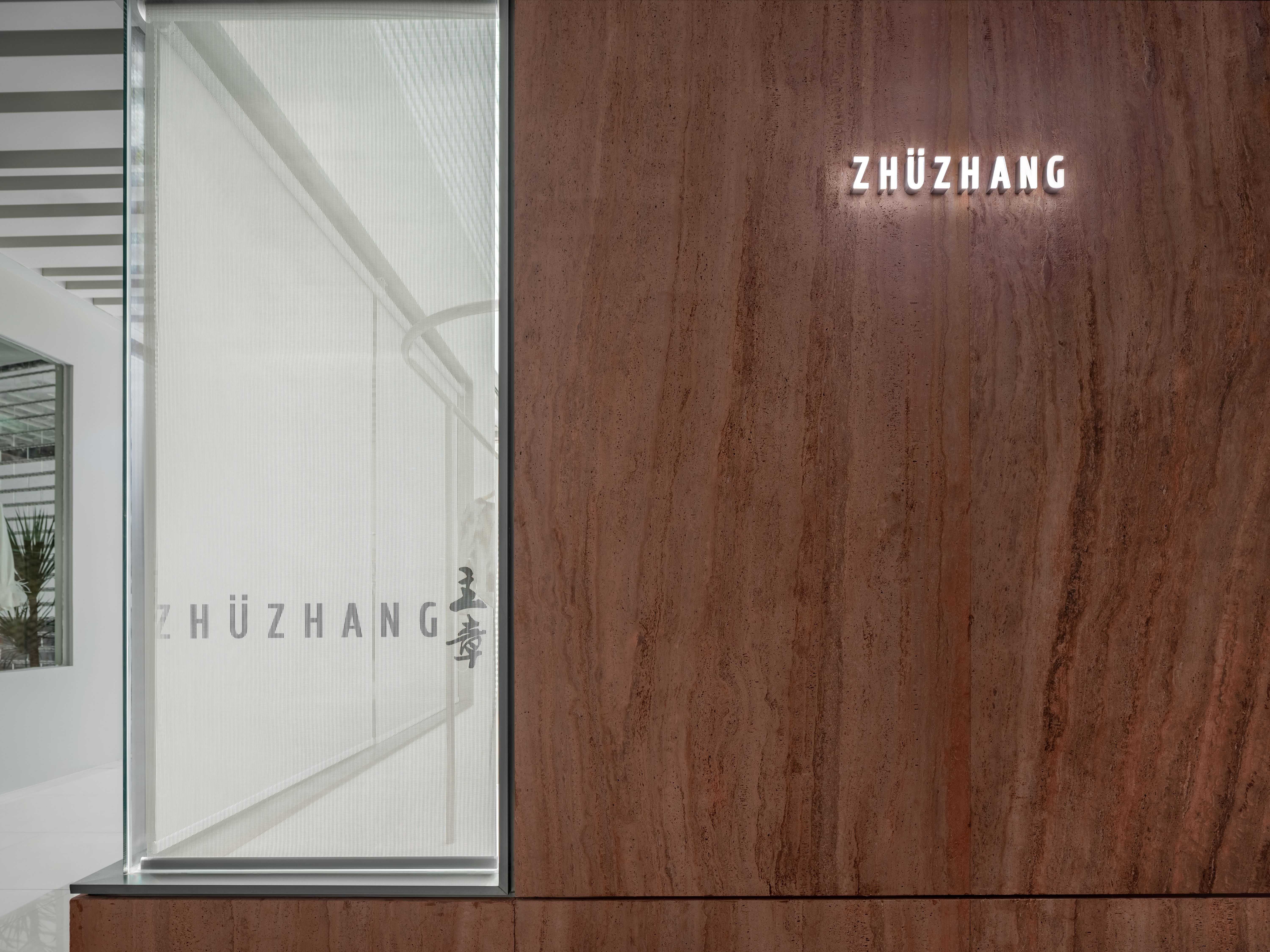
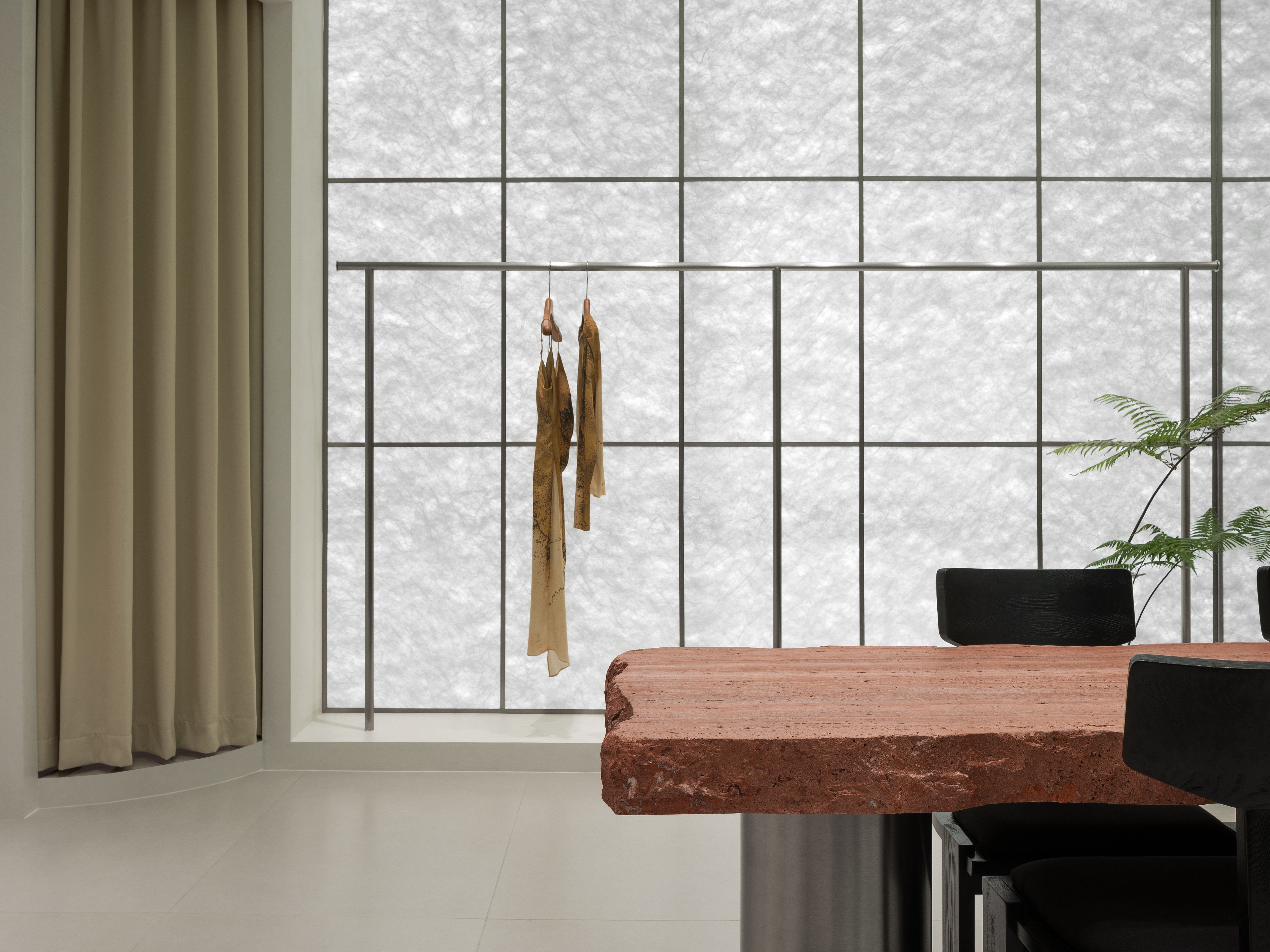
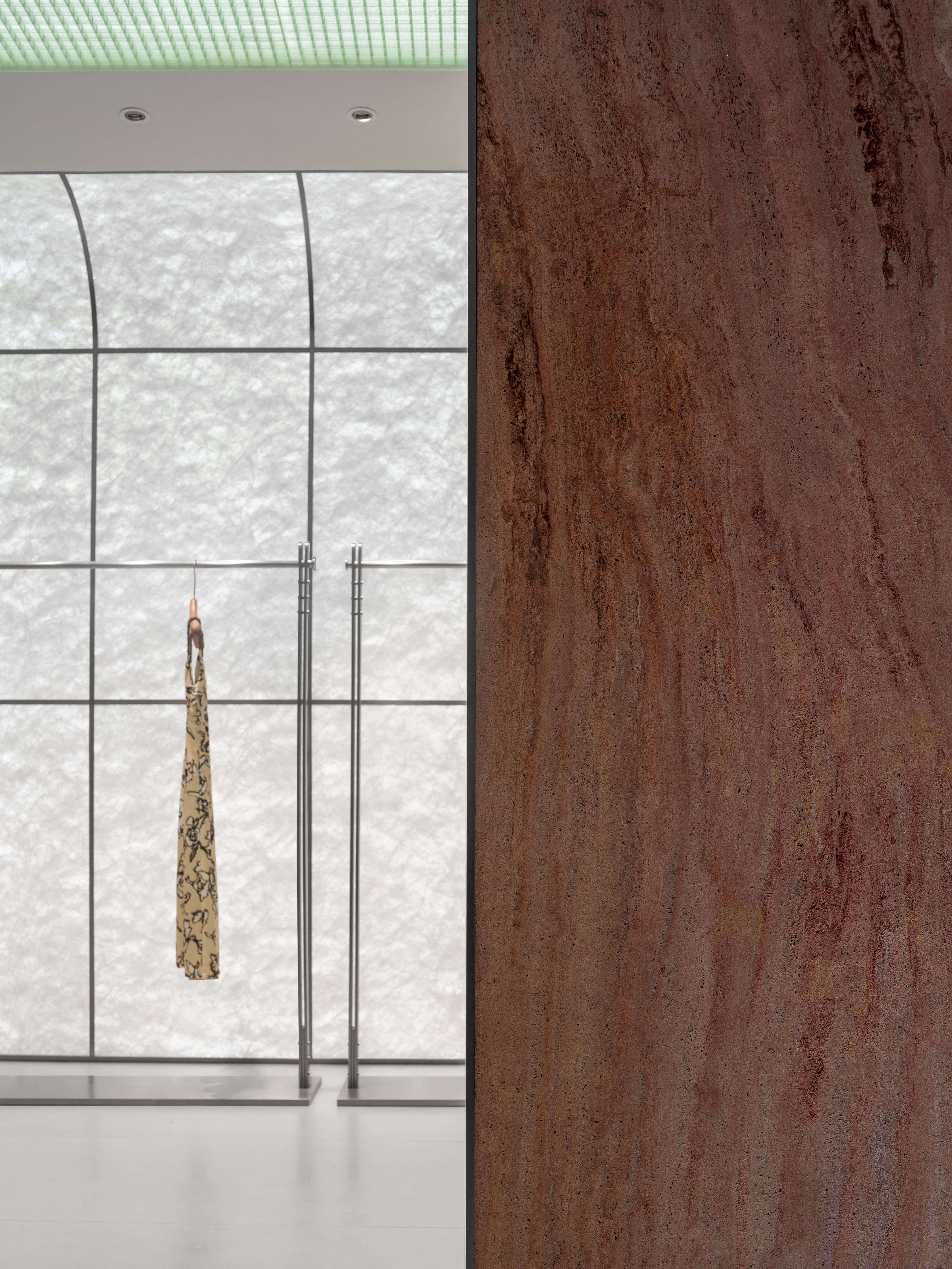
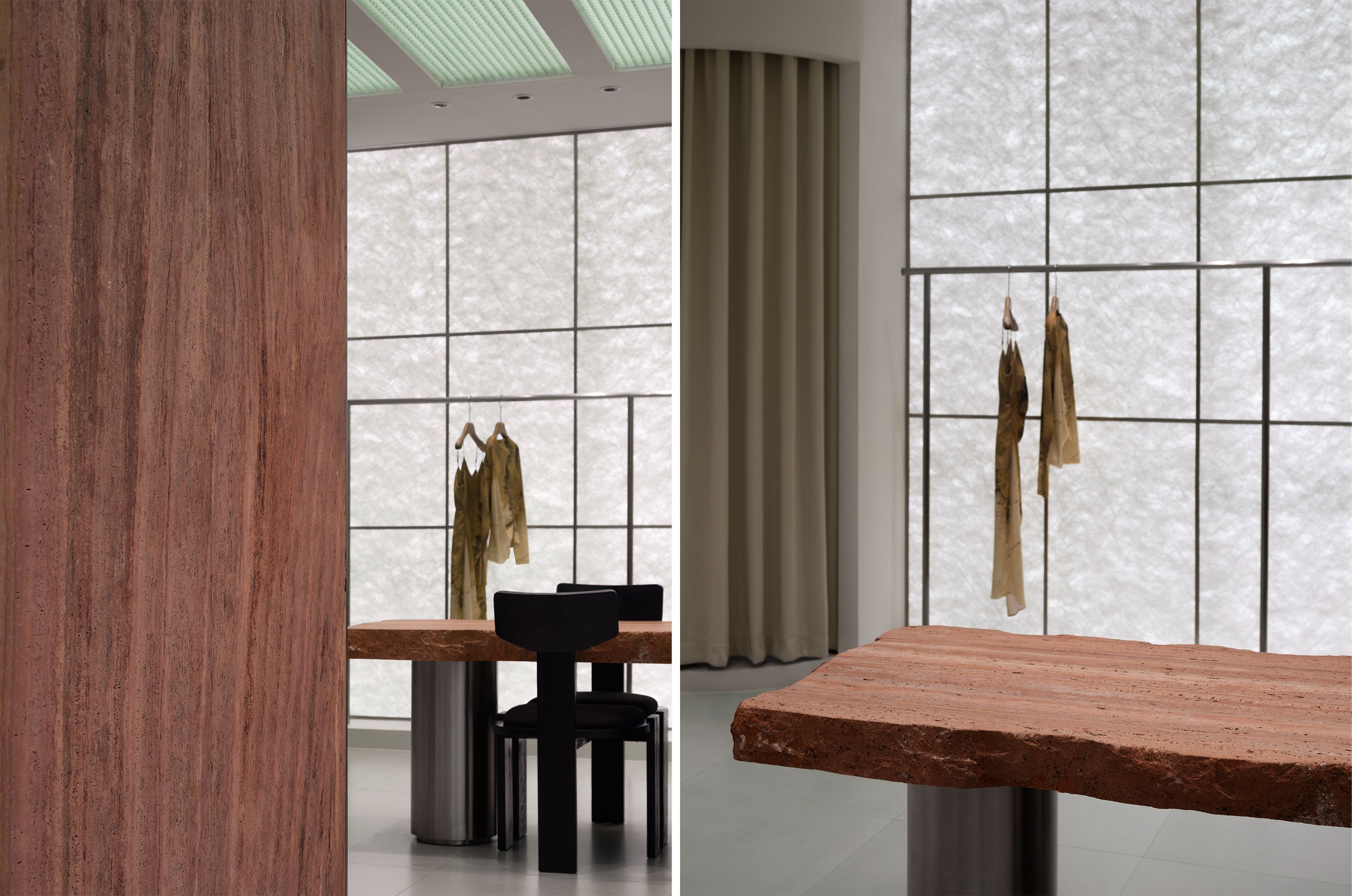
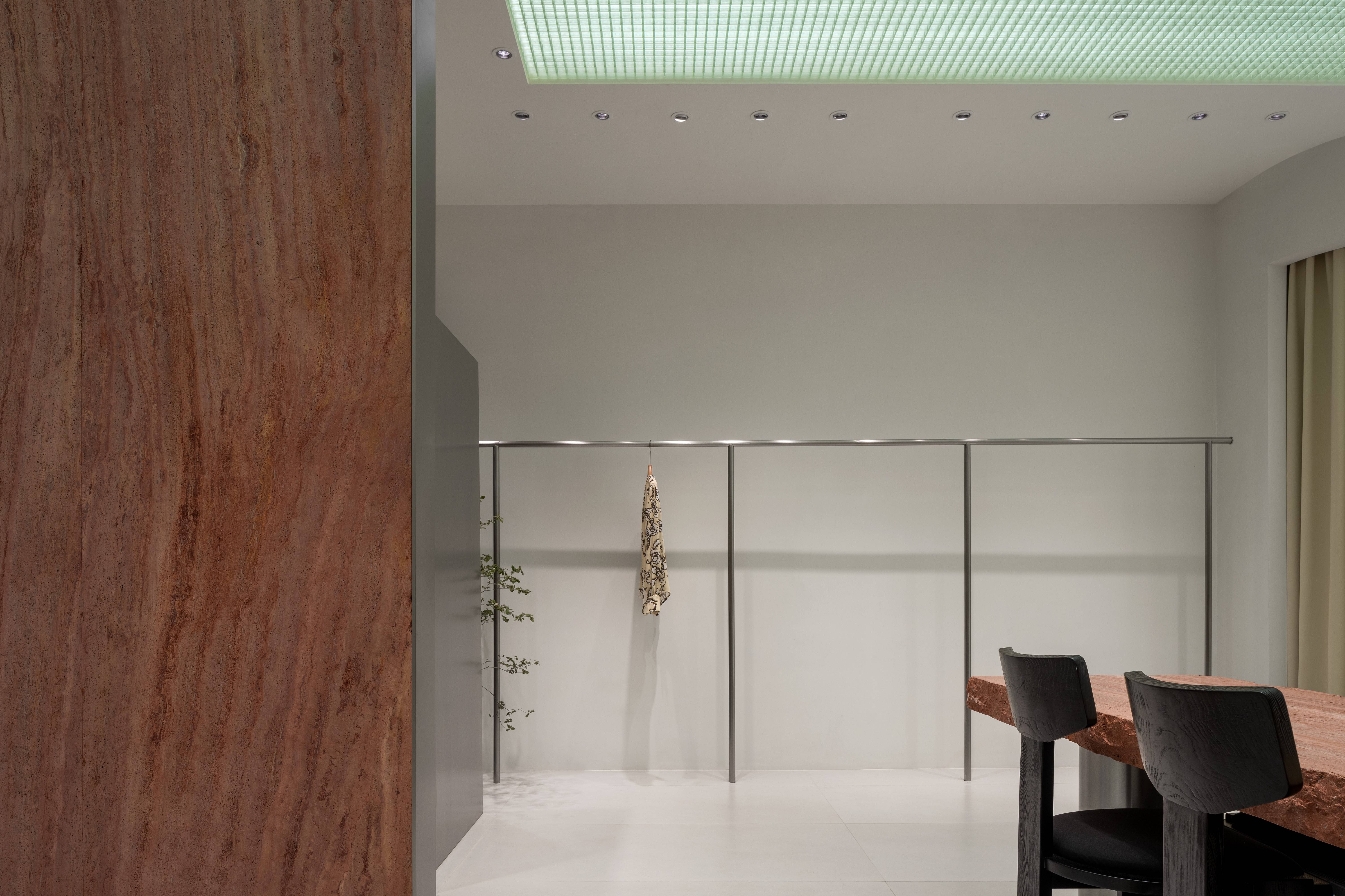
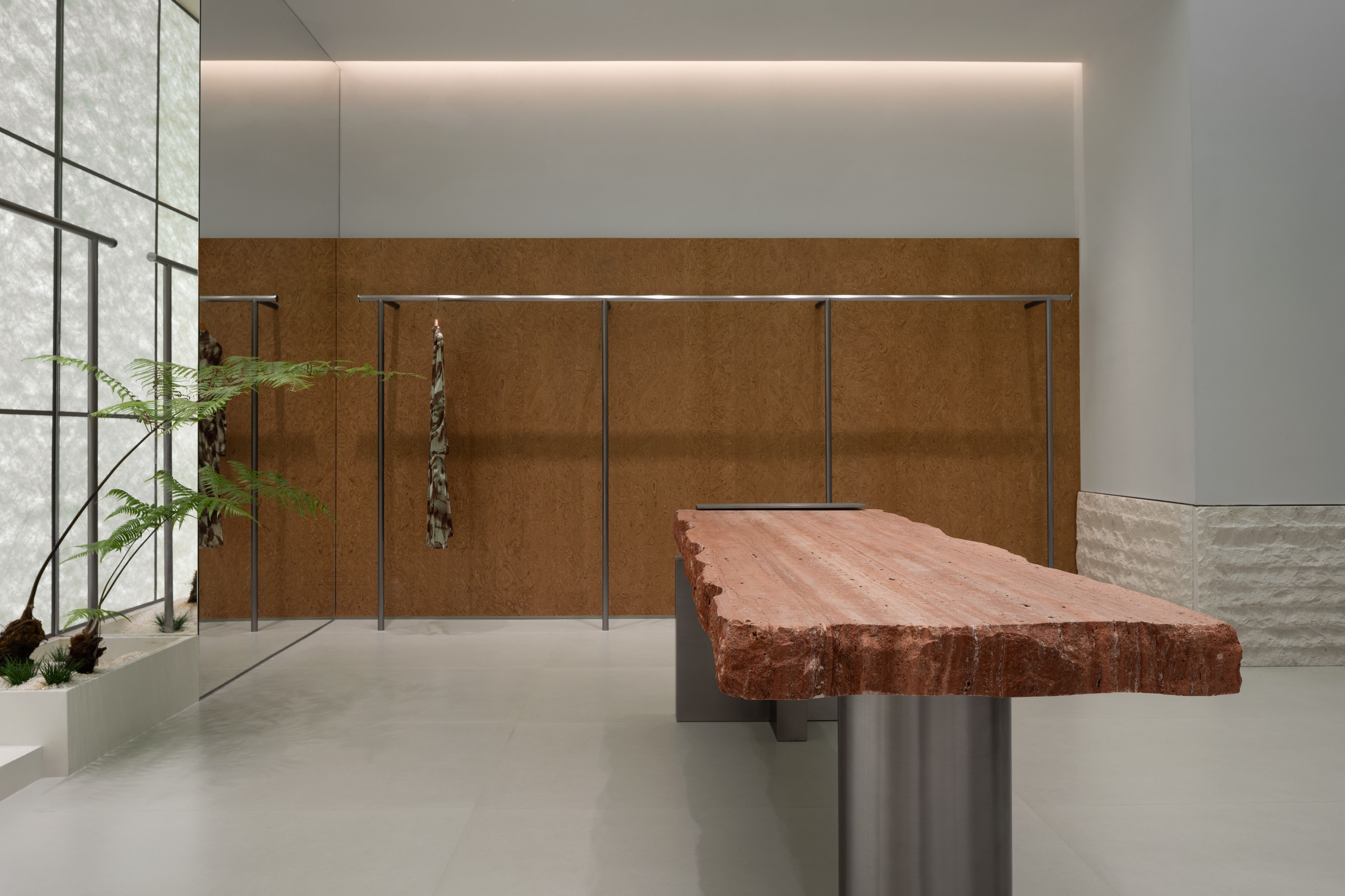
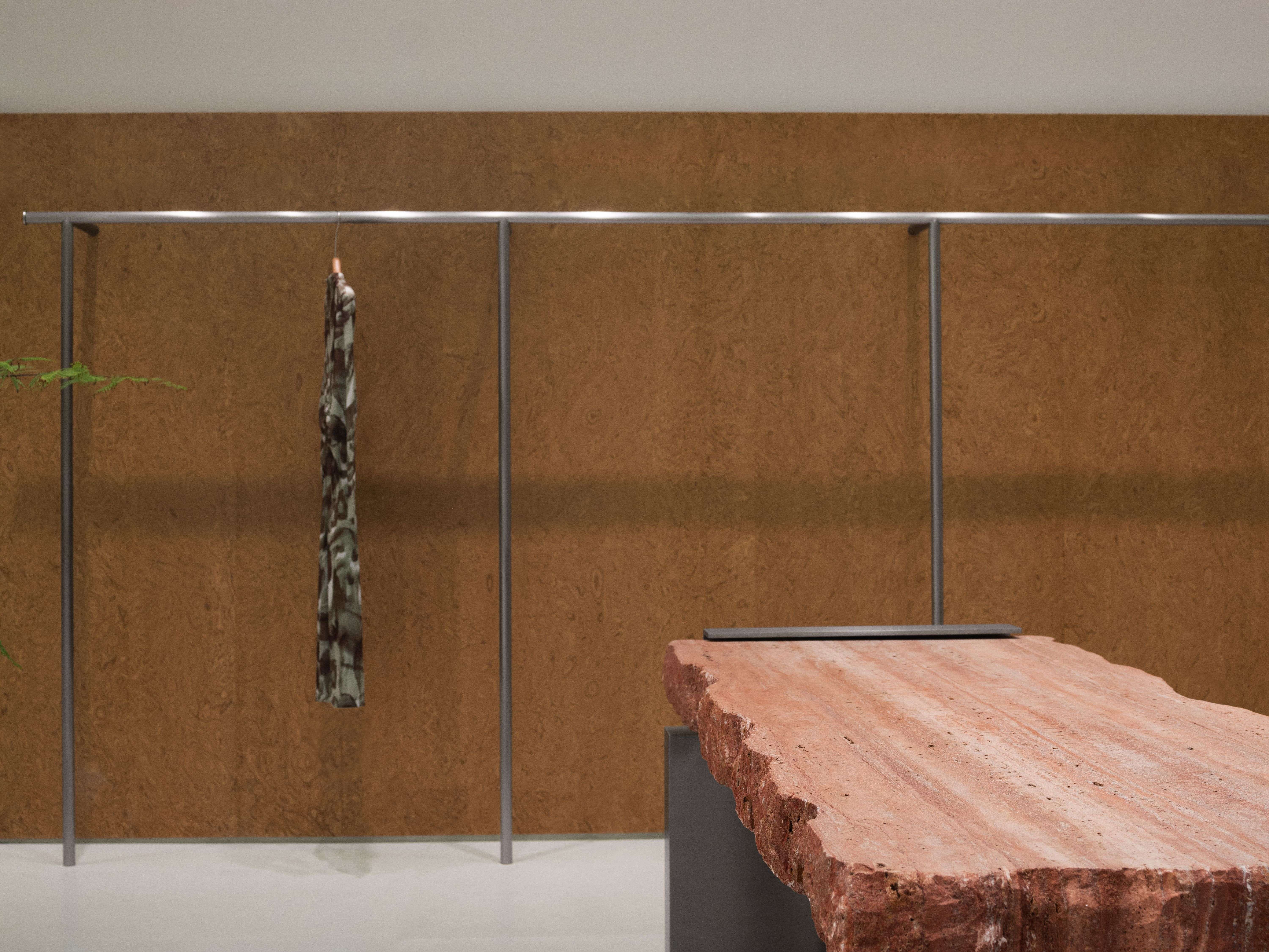
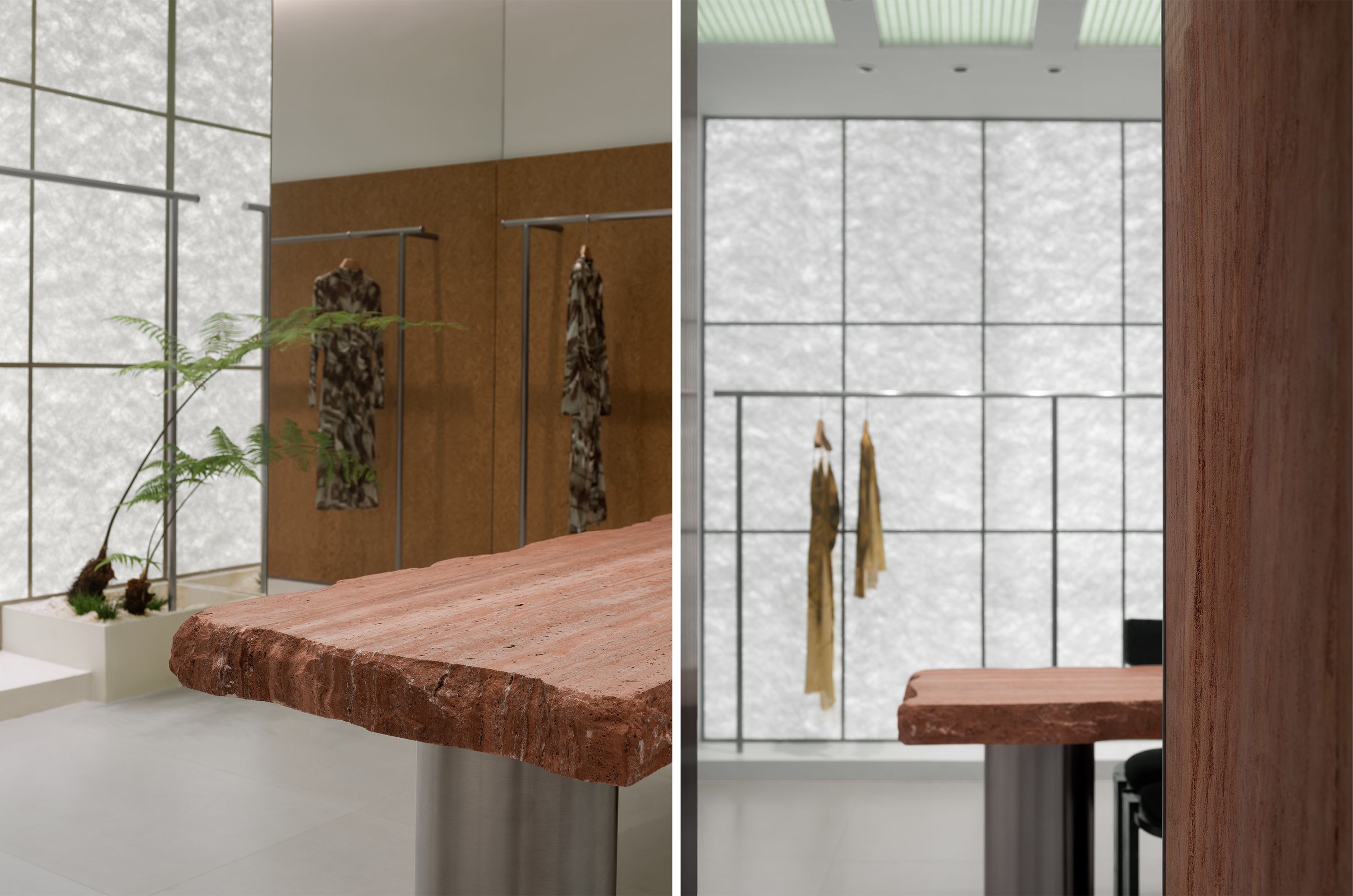
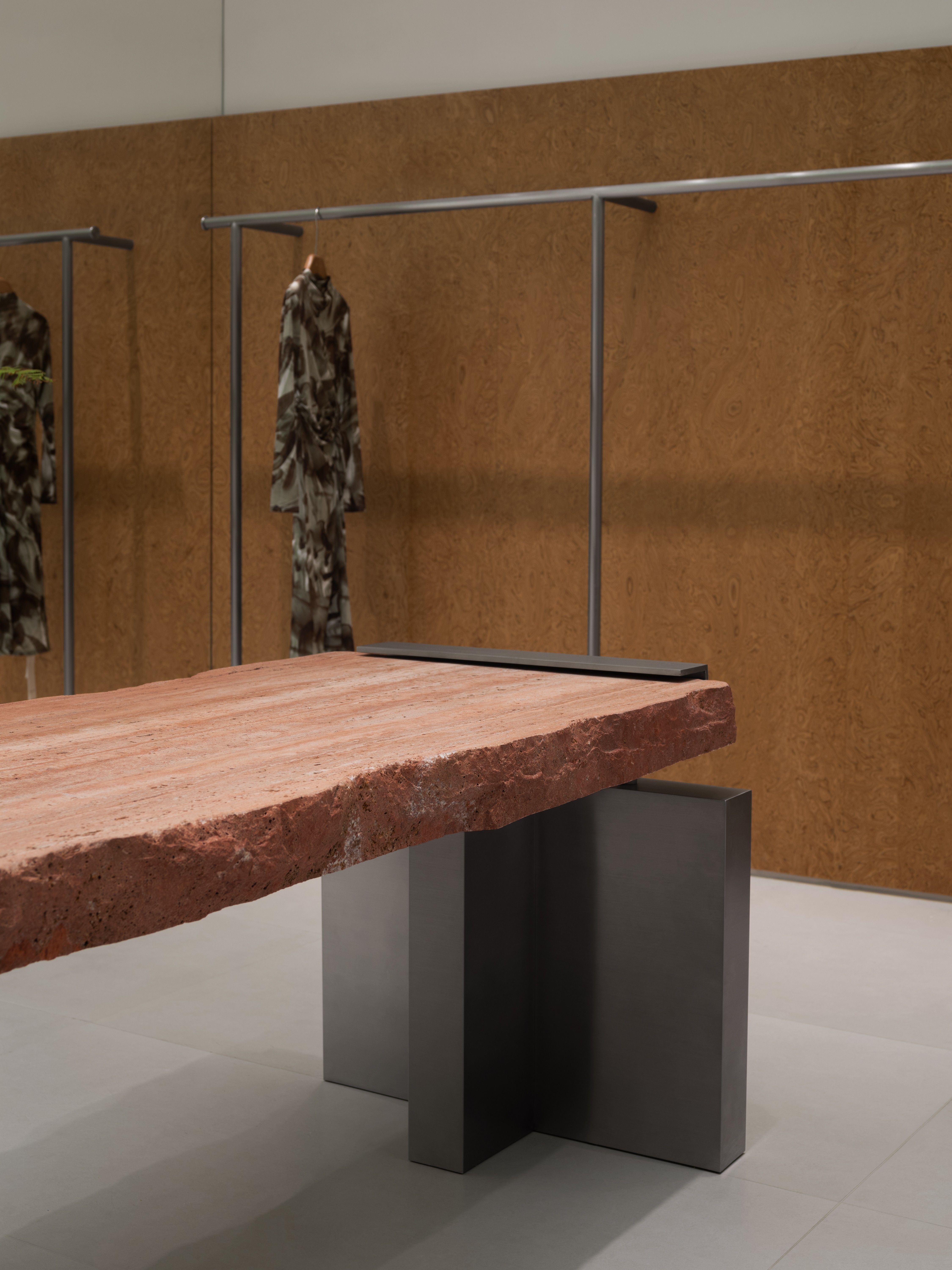
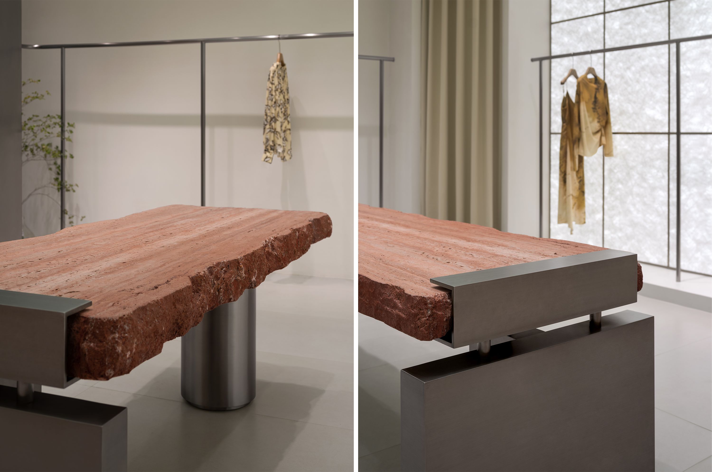
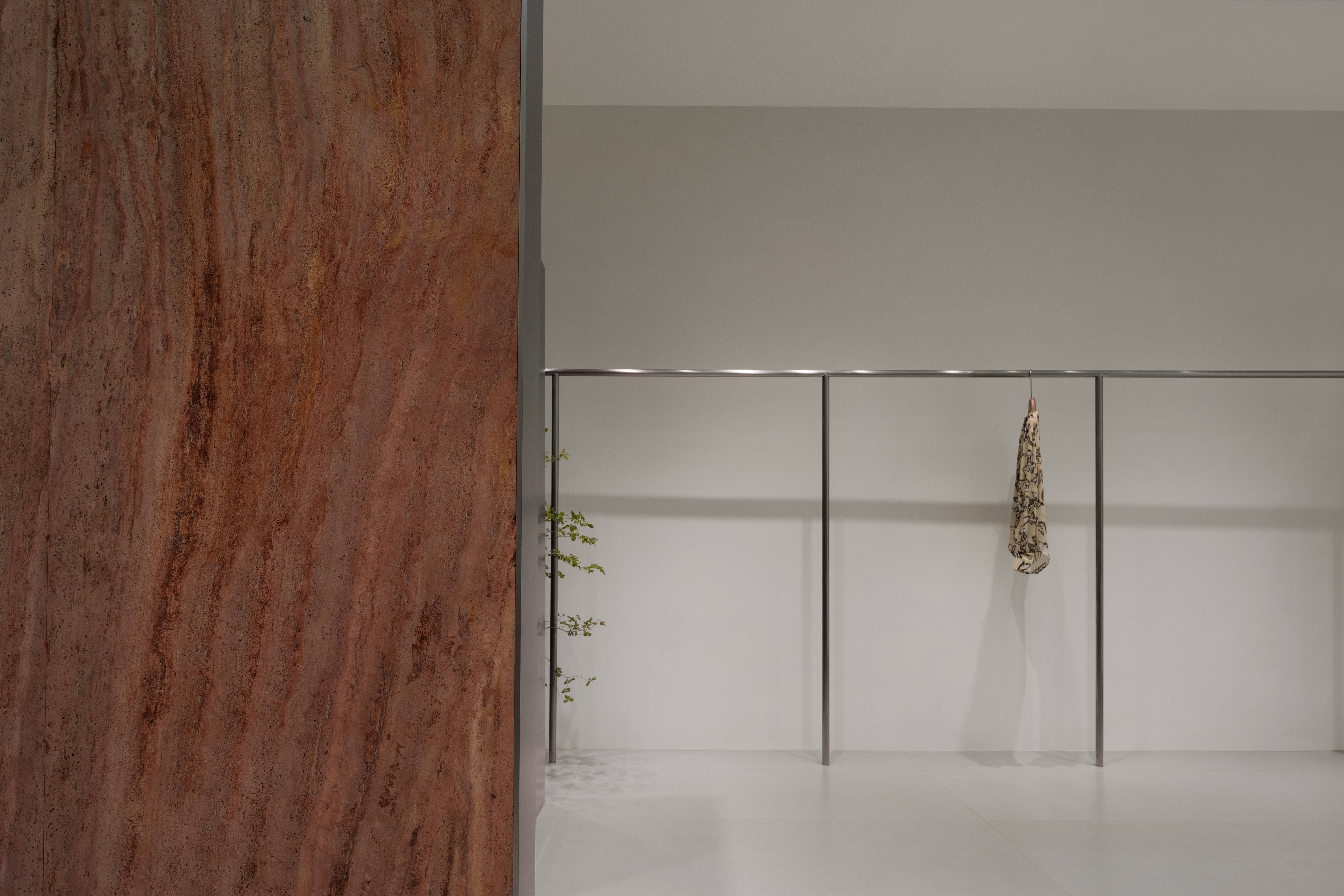
红色是具有感染力的,它带有明显的情绪性倾向,充满欲望与热情,以情感激发客户的感官体验来达到极致的消费体验。不锈钢的冷艳光泽自带种特有的未来感,轻盈空灵。而当热情的红遇上冰冷的金属,空间便多了一层精神层面的渲染与引领。各种材质相互碰撞融合,质朴与优雅被完美地凝固在那一刻。当我们沿着边界深入空间时,自然和谐的氛围扑面而来,与空间形成和谐共生的关系。这就是我们称之为“质体”的源泉。
Red is infectious, with a clear emotional tendency, full of desire and enthusiasm, using emotions to stimulate customers’ sensory experiences to achieve the ultimate consumption experience. The cool and bright luster of stainless steel carries a unique sense of future, lightweight and ethereal. And when the passionate red meets the cold metal, the space adds a layer of spiritual rendering and guidance. Various materials collide and blend with each other, and simplicity and elegance are perfectly solidified in that moment. As we delve deeper into space along the boundaries, a natural and harmonious atmosphere emerges, forming a harmonious symbiotic relationship with the space. This is the source of what we call the “mass”.
遵循本质
Following the essence
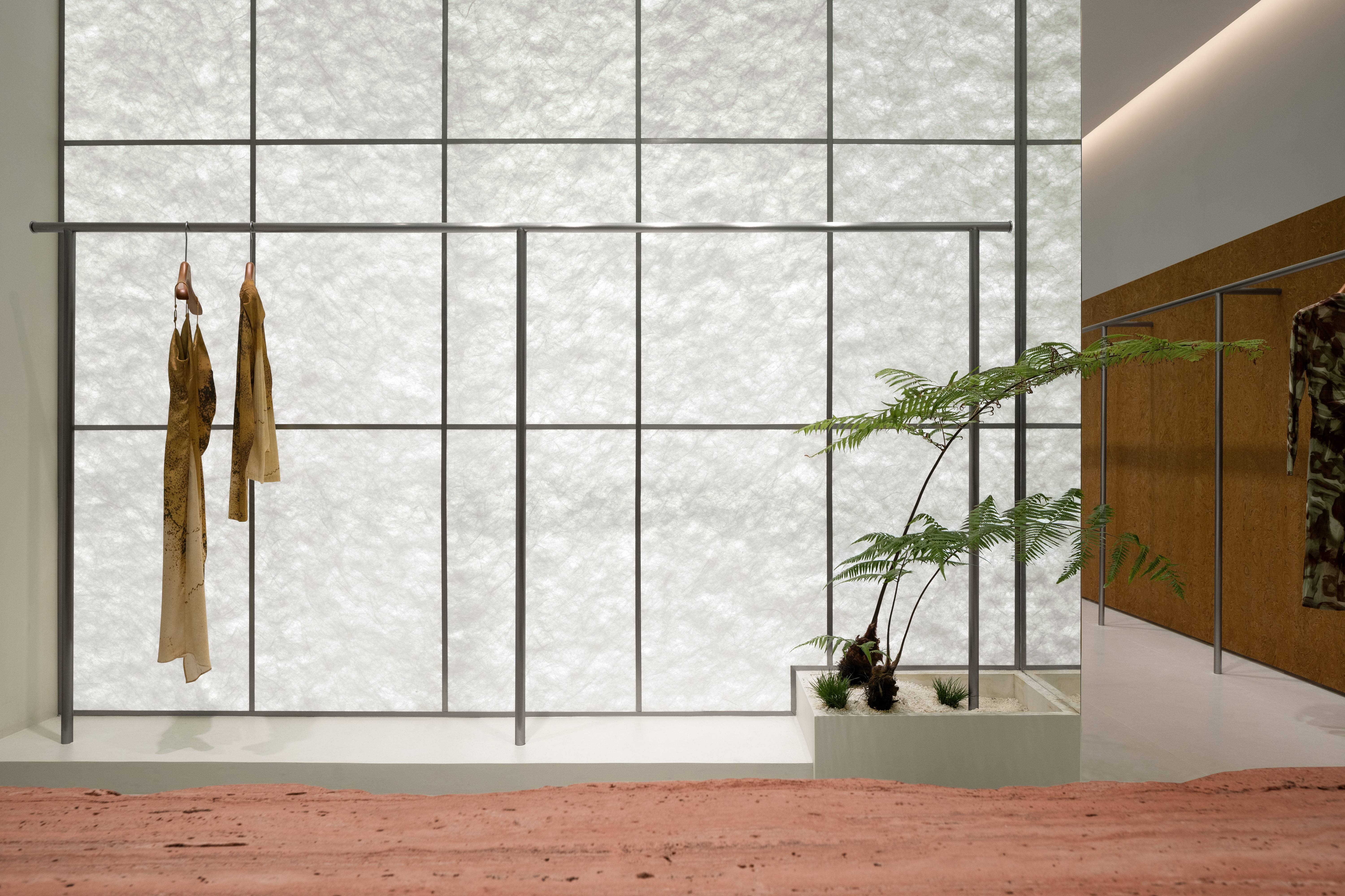
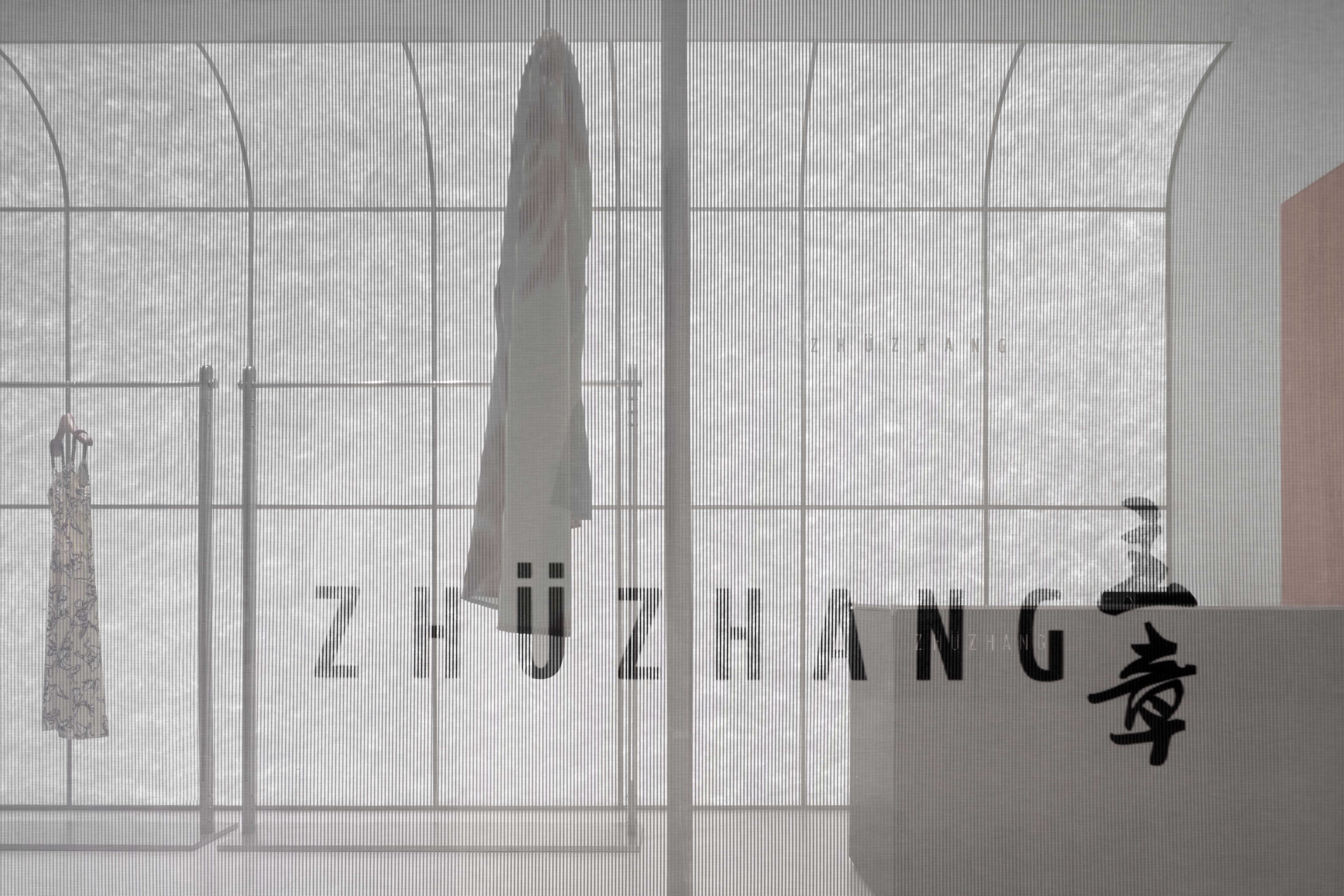
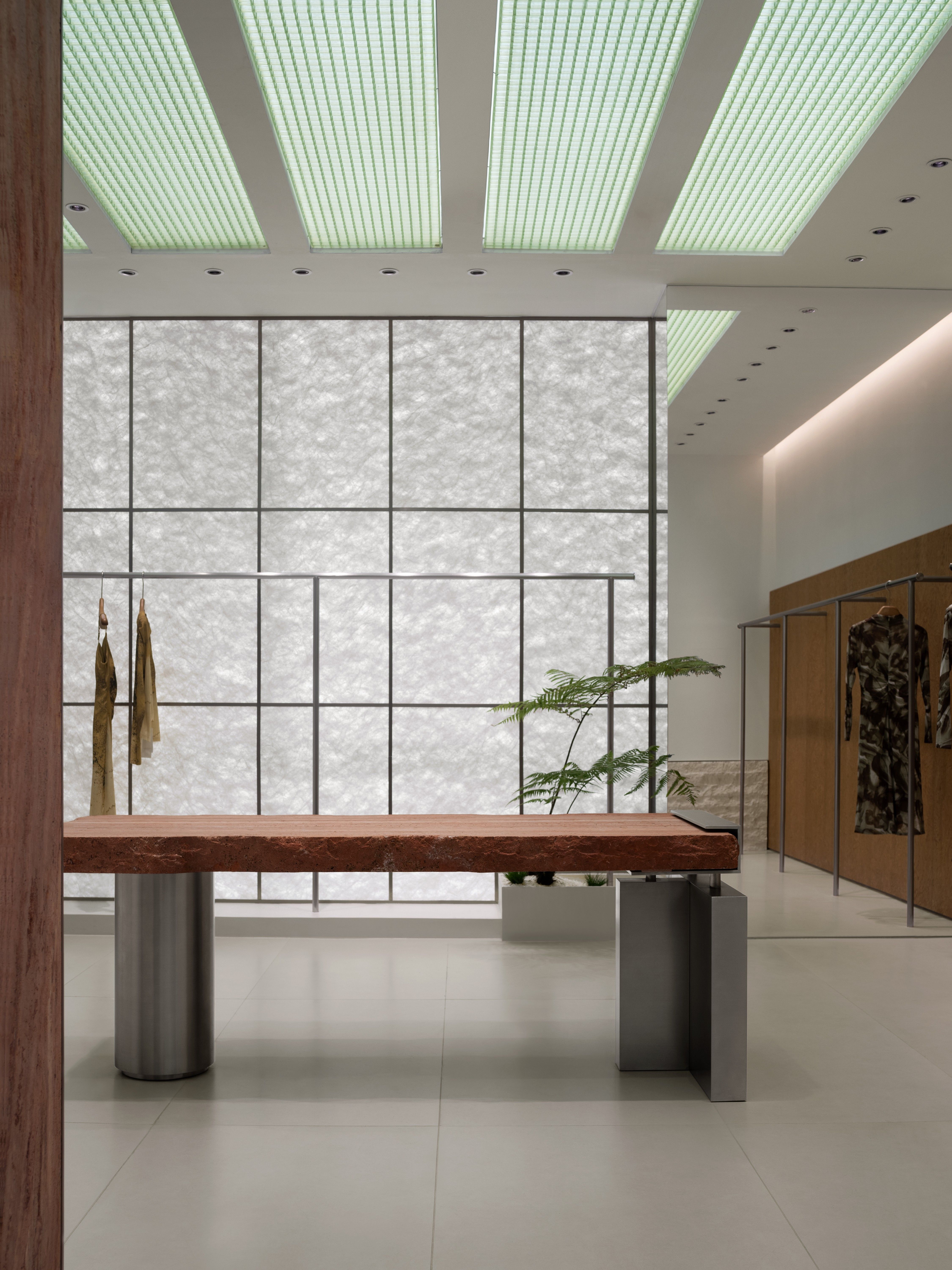
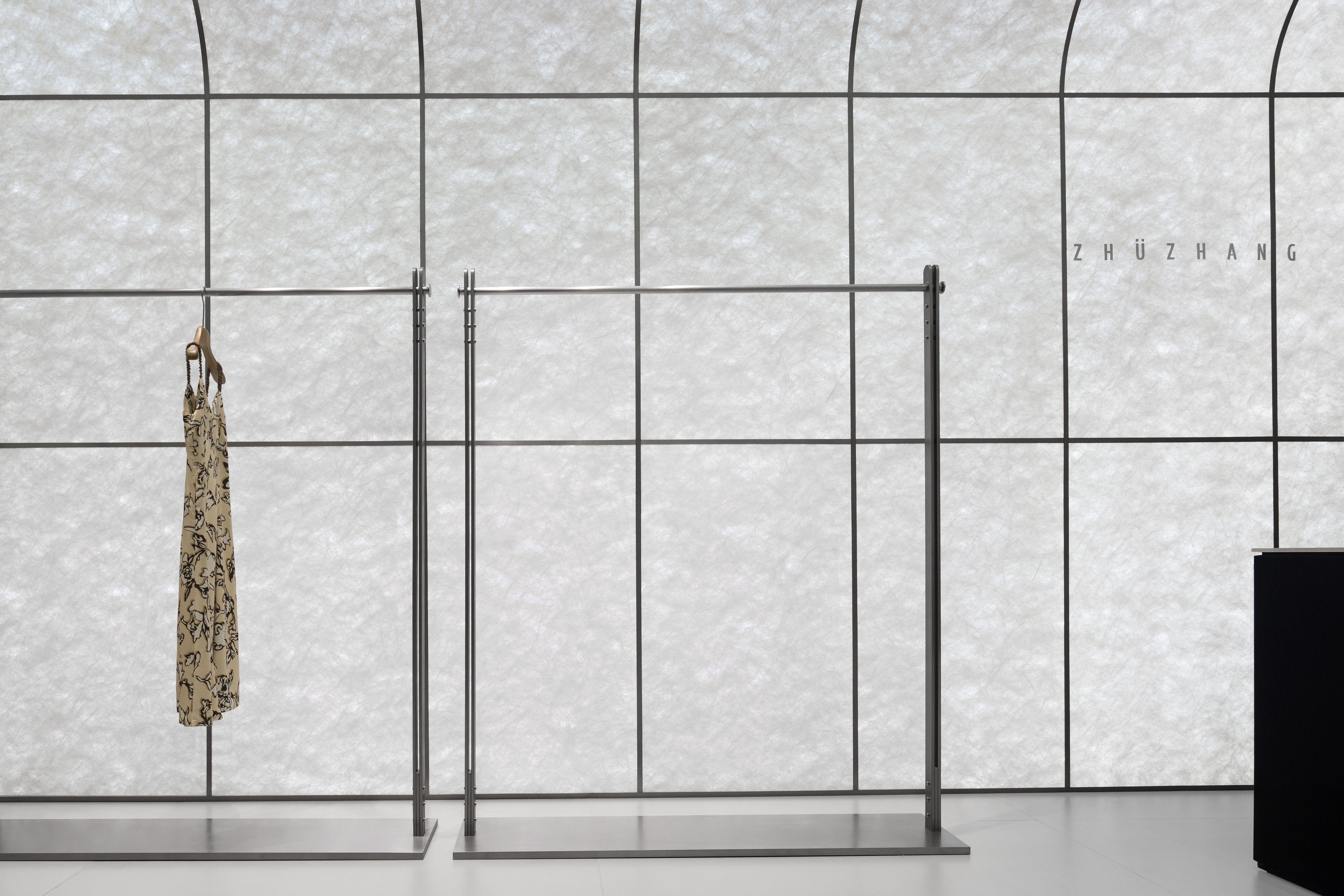
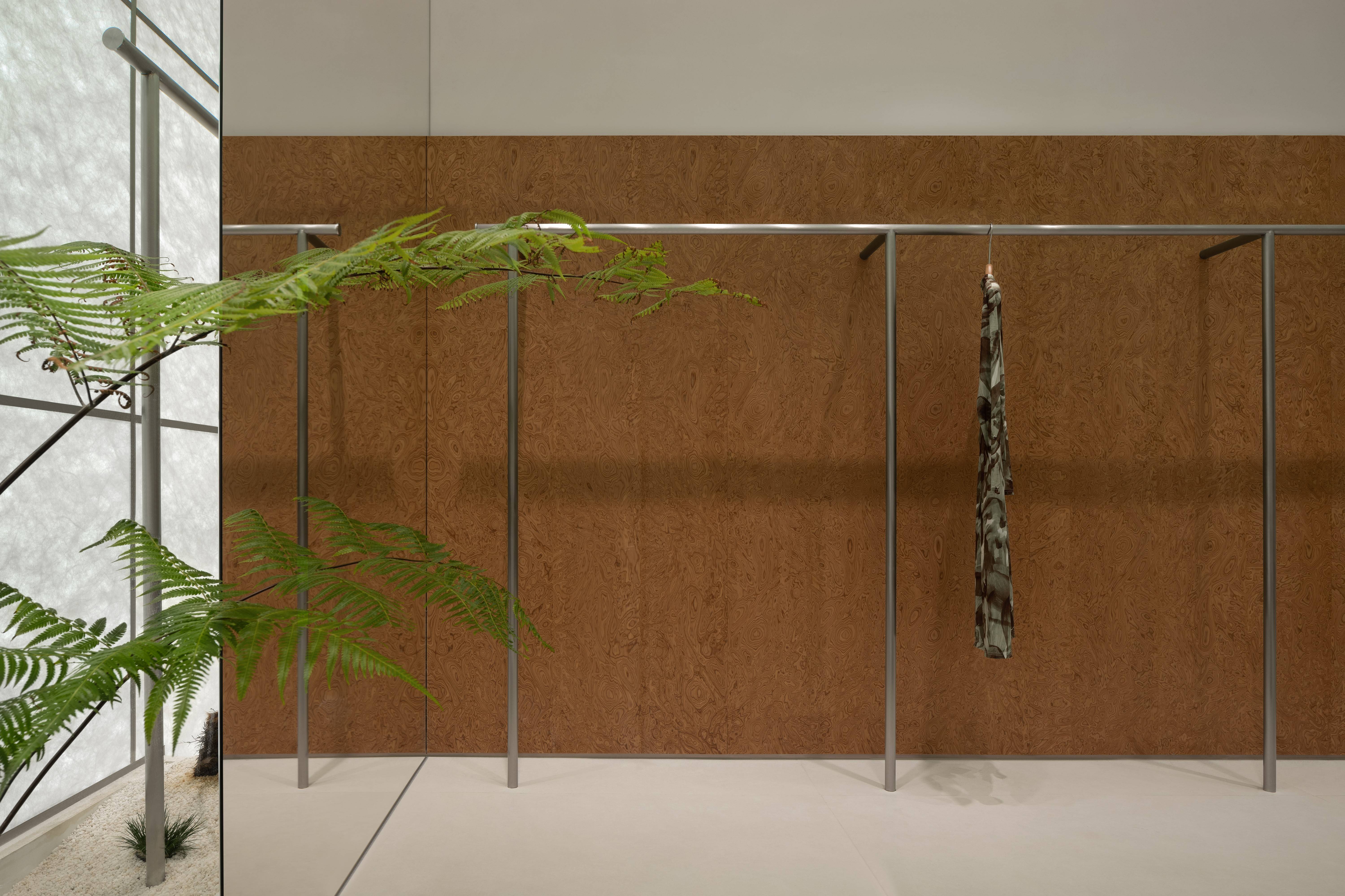
观测间距,利用其微妙的构造,融入场景之中。从外部看,它遵循着严谨的秩序;然而内部确灵动而多变, 红洞石的“自然野性”纹理,温润纯净的翡翠格栅,宣纸般质感的杜邦纸,营造出一种亲密无间的循环感,有限的空间也能创造无限的可能,赋予每个物体独特的灵魂,让光影在空间中自由流动。空间情感层次丰富,色彩、结构、质感等元素,为空间增添细腻的微妙变化,以艺术和纯净的感官体验作为叙事核心。
Observing spacing, utilizing its subtle construction, and integrating it into the scene. From an external perspective, it follows a rigorous order; However, the interior is dynamic and ever-changing. The “natural wildness” texture of the red cave stone, the warm and pure jade grille, and the texture of DuPont paper like rice paper create a sense of intimacy and endless circulation. Limited space can also create infinite possibilities, giving each object a unique soul, allowing light and shadow to flow freely in space. The spatial emotional hierarchy is rich, with elements such as color, structure, and texture, adding delicate and subtle changes to the space, with art and pure sensory experience as the narrative core.
淳朴质间
Innocent and Interstitial
淳朴的空间赋予了更多的可能性。自然元素的融入为空间注入了更多的色彩,结构的静谧深邃,白色与艳色的奏鸣,赋予了视觉垂直向度的层层透见,同时也作为构建元素和区域划分的参照,相互衬托,相得益彰。
The simple space endows more possibilities. The integration of natural elements injects more colors into the space, creating a serene and profound structure. The resonance of white and vibrant colors endows visual verticality with layers of transparency, while also serving as a reference for constructing elements and dividing regions, complementing each other and complementing each other.
宁下安逸
Ningxia Comfort
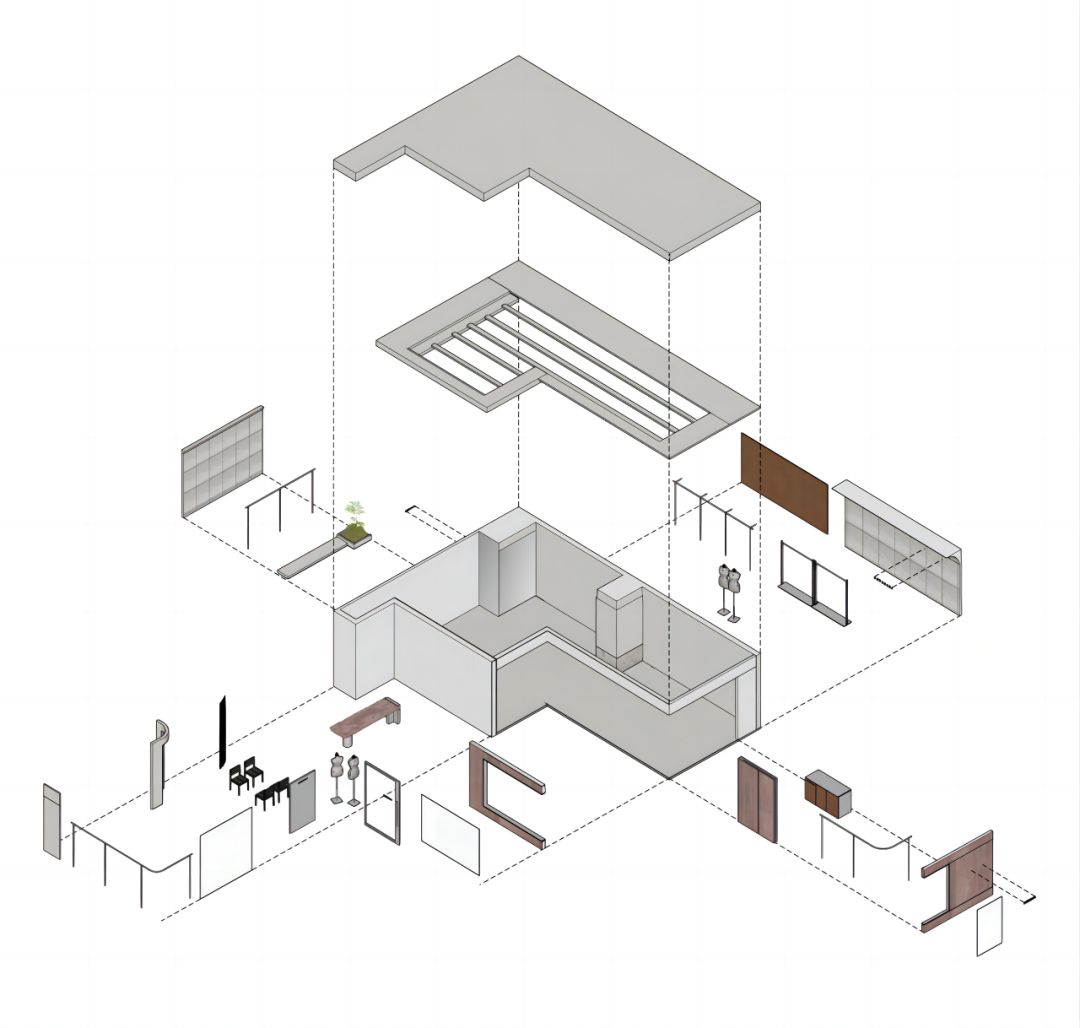
运用律动的美学来构建秩序,创造一个宜人的商业环境,通过段落式的节奏,巧妙地整合了各种功能区域,转化出的空间语言,丰富着每一寸空间的体验。
Using rhythmic aesthetics to construct order, creating a pleasant commercial environment, cleverly integrating various functional areas through paragraph like rhythms, and transforming spatial language to enrich the experience of every inch of space.
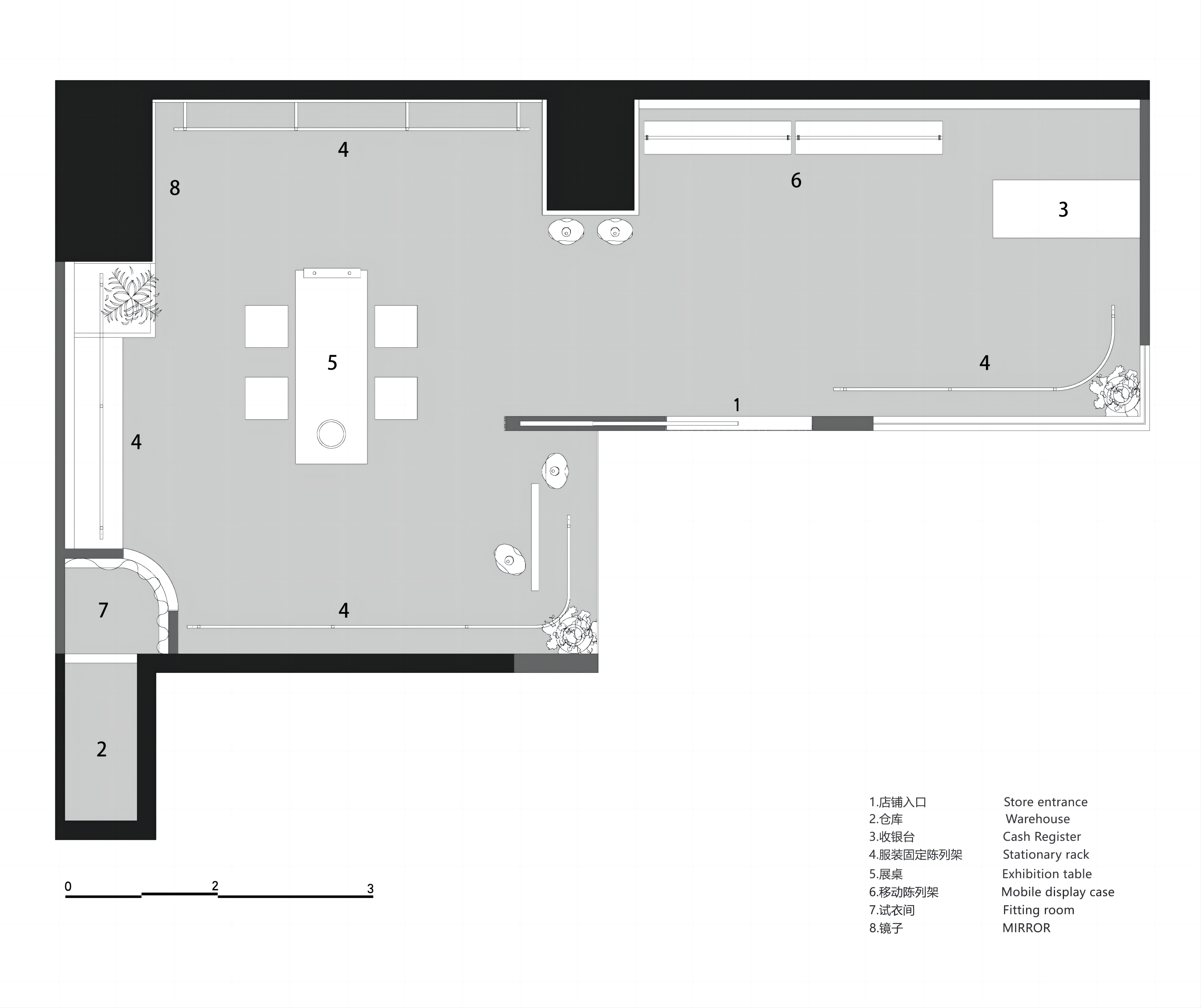
▲平面图
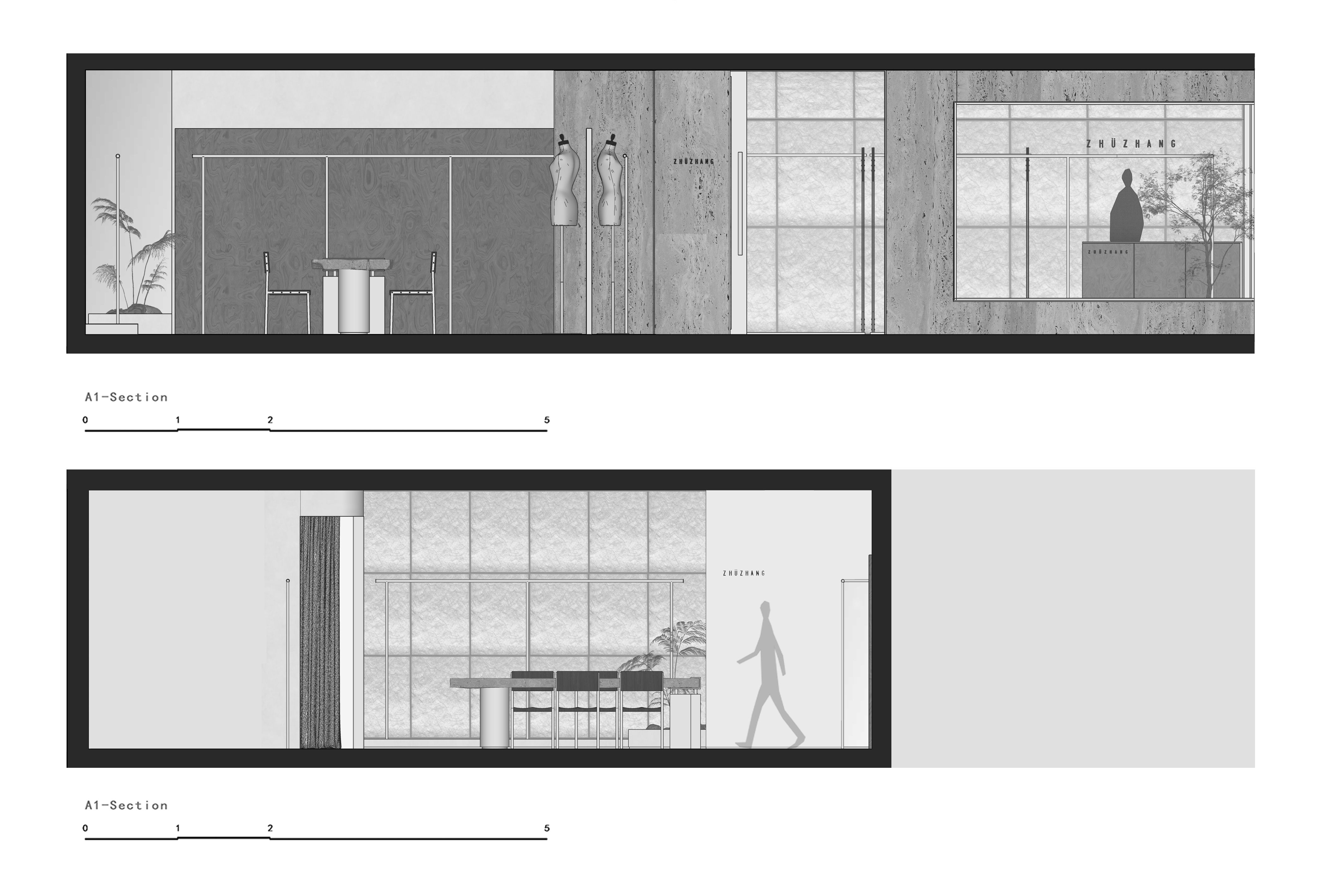
▲立面图
项目信息——
项目名称 | ZHU ZHANG
项目地址 | 中国·深圳·南油
项目类型 | 商业空间
项目面积 | 60㎡
完工时间 | 2023.07
设计公司 | LubanEra·Design (鲁班时代建筑装饰设计)
设计网站 | www.lubanera.com
创意总监 | 陈洪波
设计团队 | 甘澳,许奕帆,江毅锋
空间摄影 | 聂晓聪


