西单,靠近长安街,右侧是紫禁城,每一个在这里开店的品牌,都会感受到浓厚的文化氛围。YHD接到委托为JNBY设计新的旗舰店,商场方面希望未来的设计能和北京元素有所关联,而品牌方希望能延续品牌的一贯定位。
Xidan, close to Chang’an Street, with the Forbidden City on the right, is a place where every brand that opens a shop will feel a strong cultural atmosphere. YHD was commissioned to design a new flagship shop for JNBY, and the mall side wanted the future design to be associated with Beijing elements, while the brand side wanted to continue the brand’s usual positioning.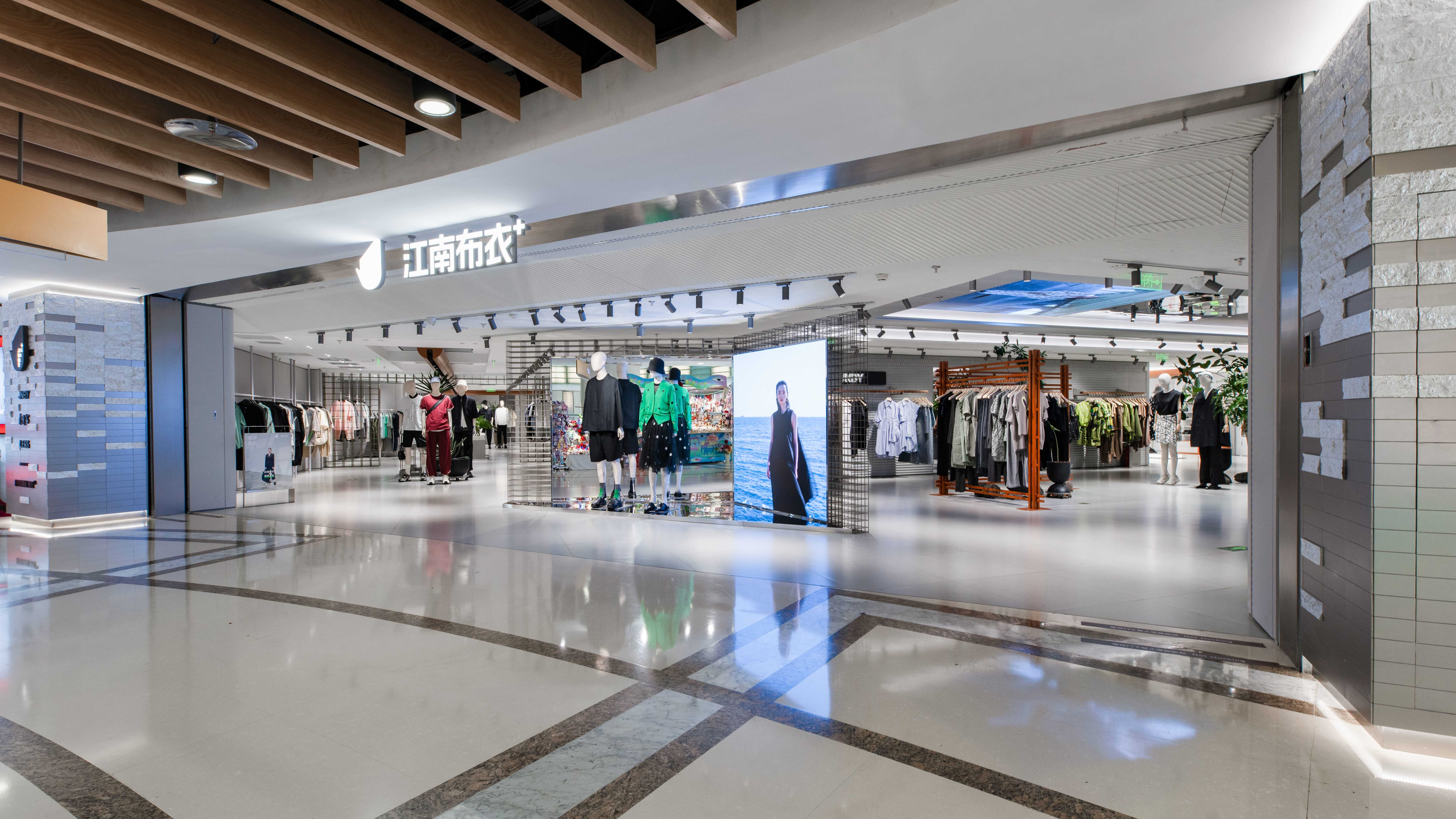

整个场地不同于以往的店铺开阔的形状,是一个回字形的场地,由此又布局了四个品牌,每个品牌一个空间,虽然同处一个集团,每个品牌还是有一些差异,如何把他们联结在一个空间里,彼此整体又略有分隔,这都是对设计的挑战。
Unlike in the past, this time it was an enclosed square-shaped venue.There are four brands laid out in the venue, one space for each brand,although they are in the same group, there are still some differences in each brand, how to link them in one space, each other as a whole and slightly separated, which are all challenges to the design.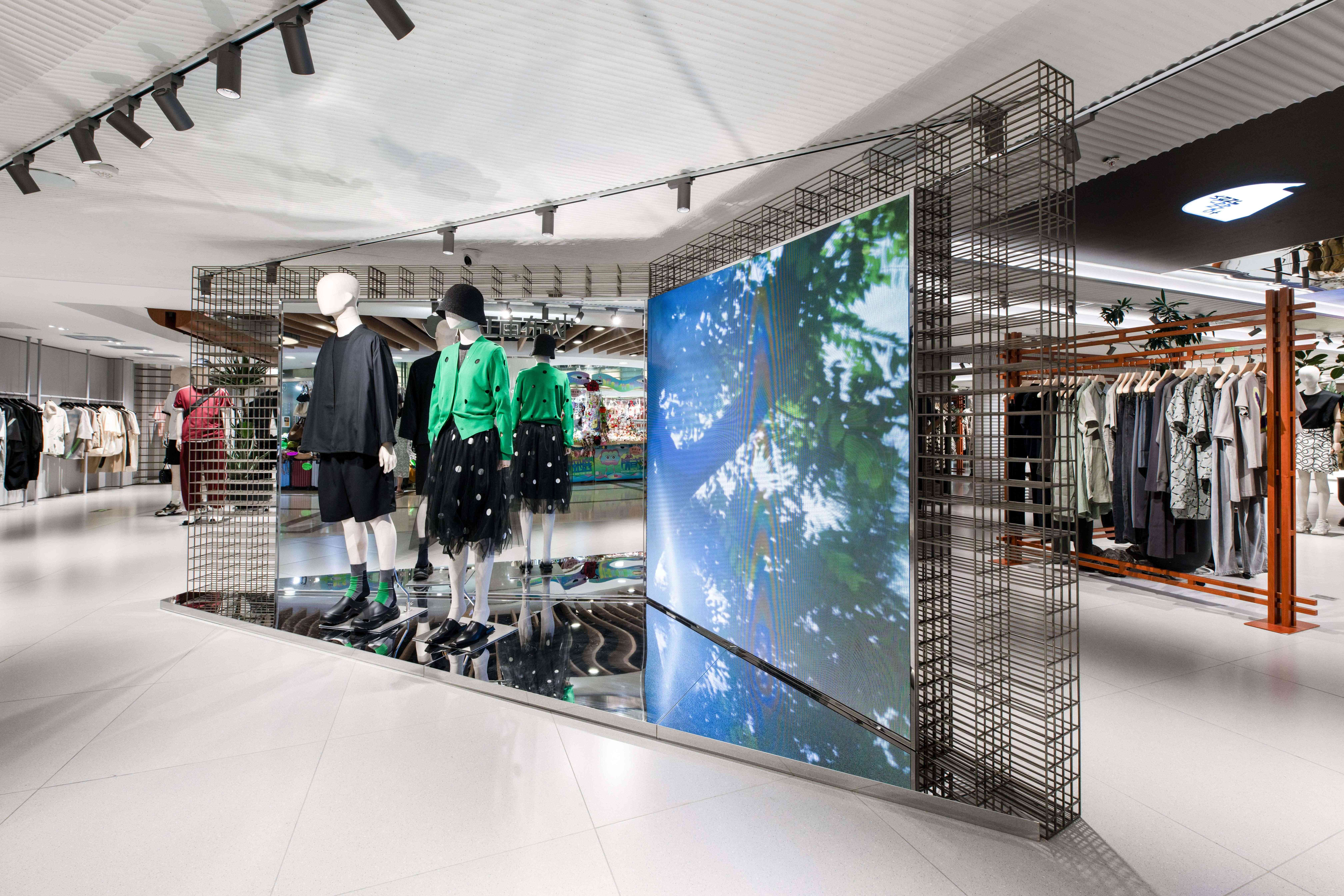

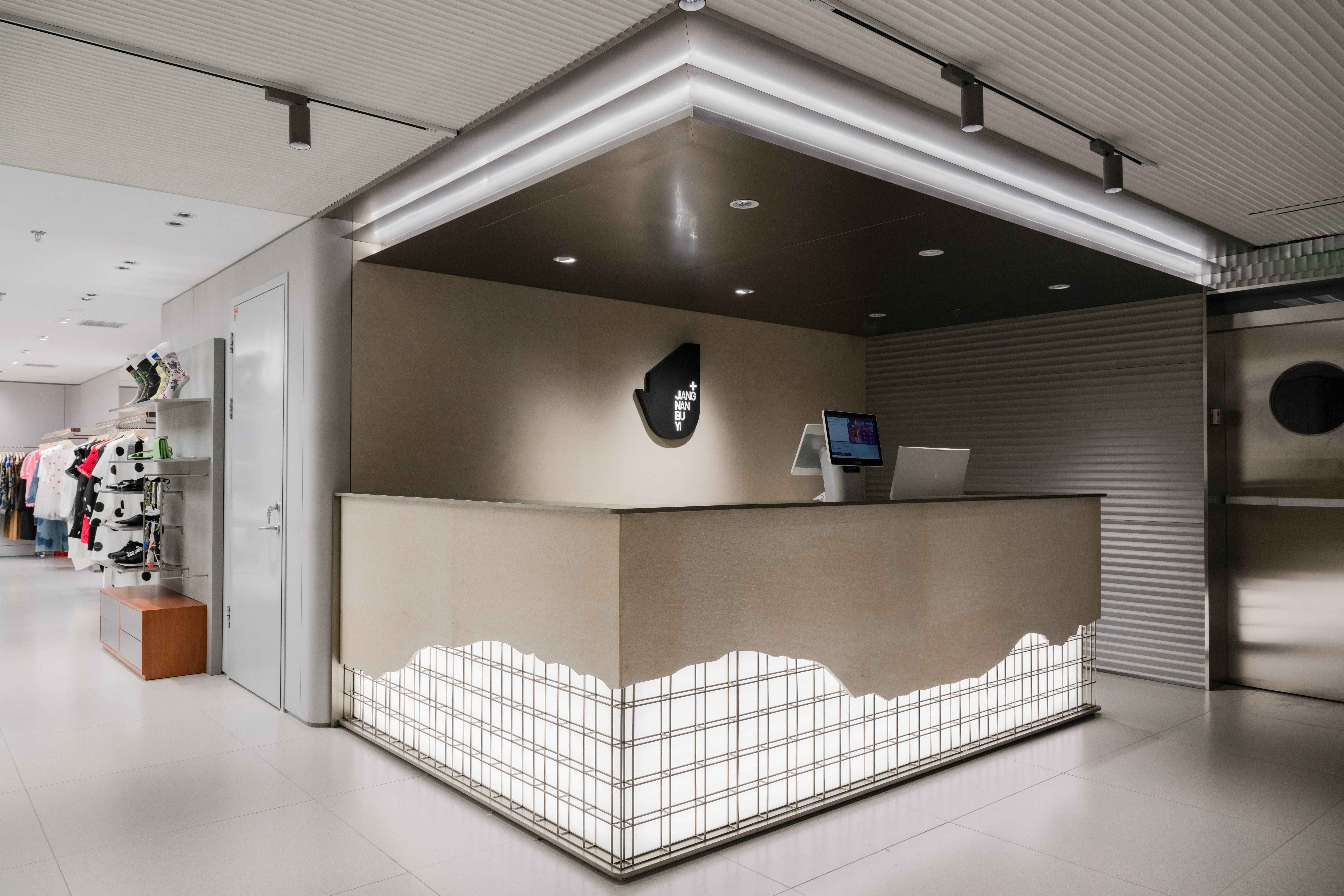
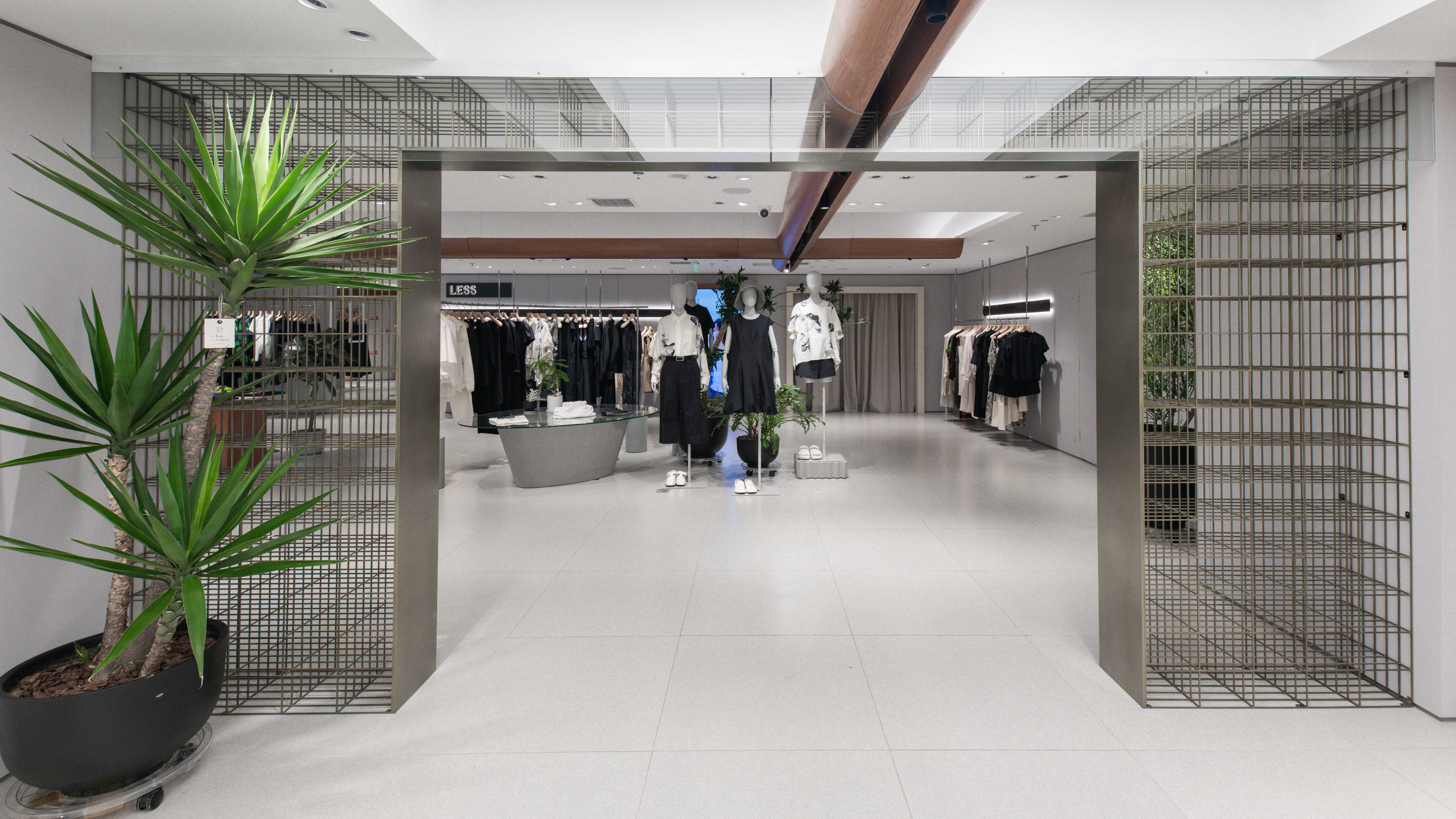 整个设计以中国文化的砖为基本元素,以四合院的天井为空间的起点,用一个连廊串起四个品牌的空间,每个空间用中国园林的月洞门相隔,视觉上有分隔却没有阻拦,有移步易景的概念穿插其中。
The whole design is based on the brick as the basic element in Chinese culture. The patio of the quadrangle dwellings is designed as the starting point of the space, and a corridor is used to link up the four branded spaces.Each space is separated by a Chinese garden moon gate, visually separated but not blocked, interspersing the concept of moving through the landscape.
青砖作为中国建筑的重要组成部份,在北京的古建筑中随处可见,在此次设计中,砖有实体的表现,也有虚的表现,更有意向的表现。
Blue brick, as an important part of Chinese architecture, can be found everywhere in Beijing’s ancient buildings. In this design, the brick has a solid representation, an imaginary representation, and a more intentional representation.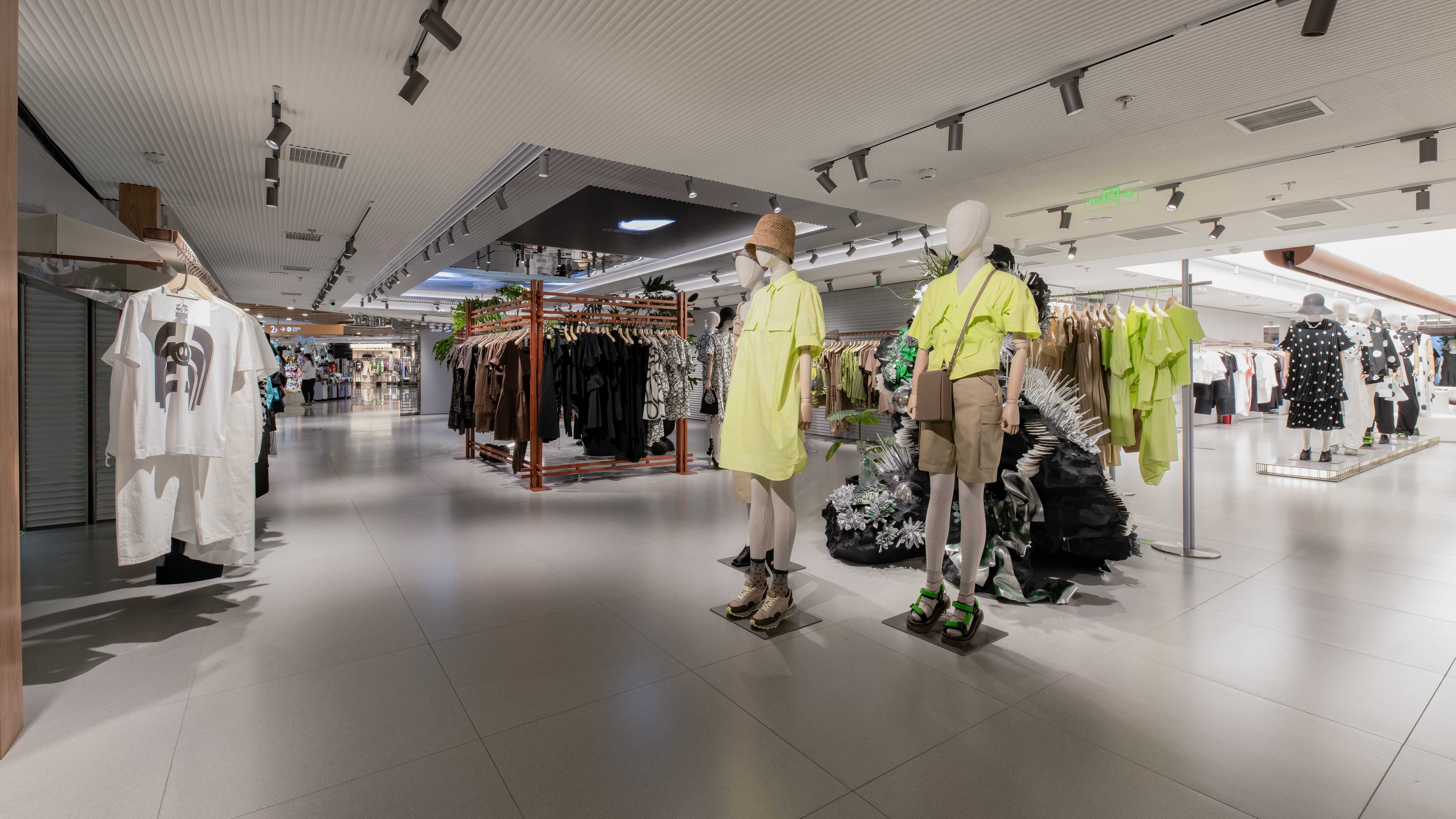


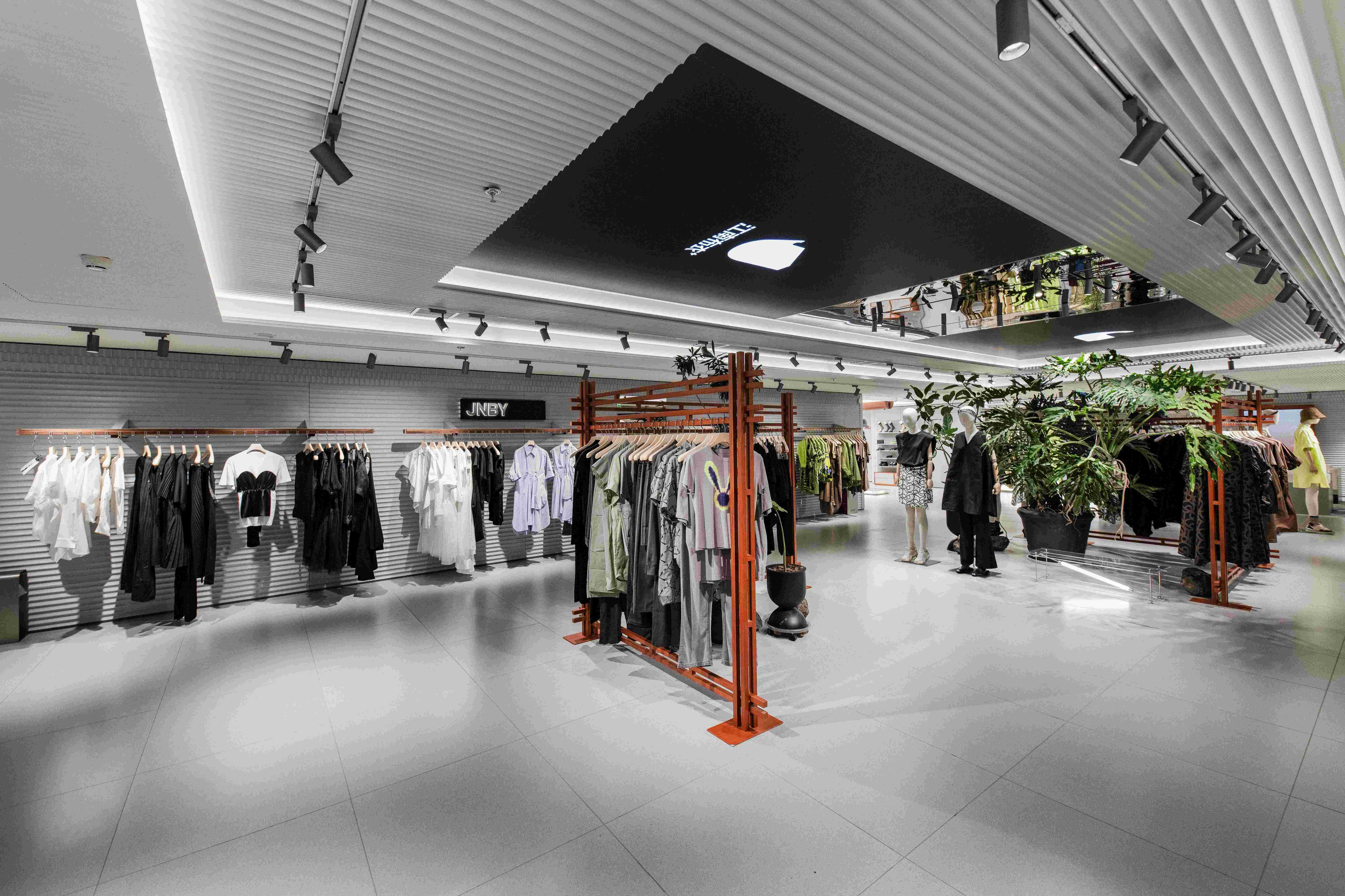
四合院最有特征的部份就是天井,这里是四合院和自然连通的窗口,所以我们用三层天花造型在室内再造了一个天井,天空就用一块LED屏幕来代替了,这里既是对四合院的思考,也是因为层高限制做出的设计策略。由于复杂的管道,原本的天花在大部分只能做到2米4,有局部可以做到2米8,而我们利用了这一点,在入口处可以营造一个高空间,让空间的压抑感降低。四合院的墙面并没有用青砖,而是用横向的条纹模拟出青砖墙面横向的线条感。
The most characteristic part of quadrangle dwellings is the patio, which is the window between quadrangle dwellings and nature. Therefore, we used three layers of ceiling moulding to recreate a patio in the interior, and the sky was replaced by an LED screen, which is not only a reflection of quadrangle dwellings, but also a design strategy due to the height limitation. Due to the complexity of the piping, the original ceiling could only go up to 2m4 in most parts, with some parts going up to 2m8, and we took advantage of this to be able to create a high space at the entrance to make the space less depressing.The walls of the Quadrangle dwellings are not made of blue bricks, but rather horizontal stripes to simulate the sense of horizontal lines of the blue brick walls.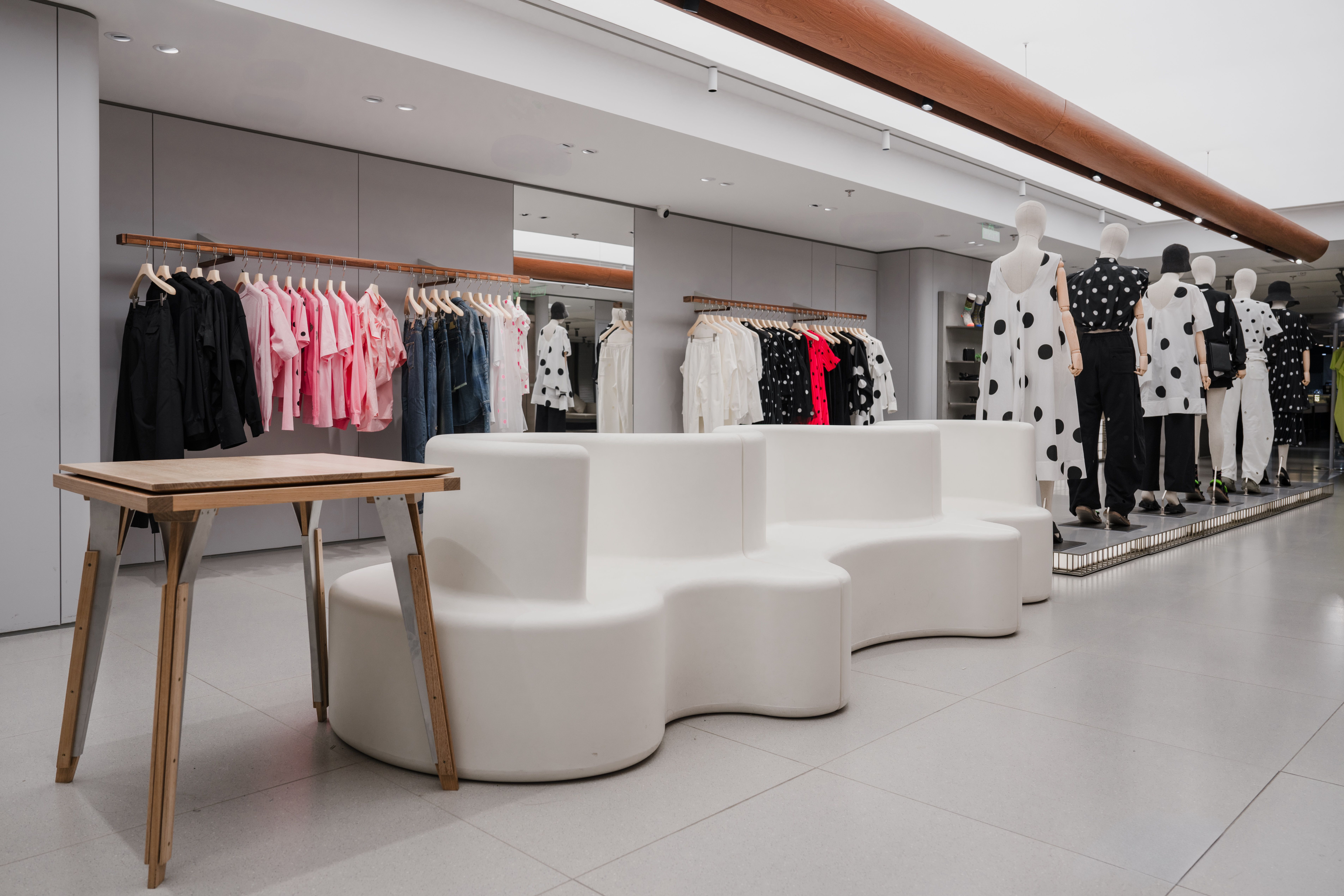
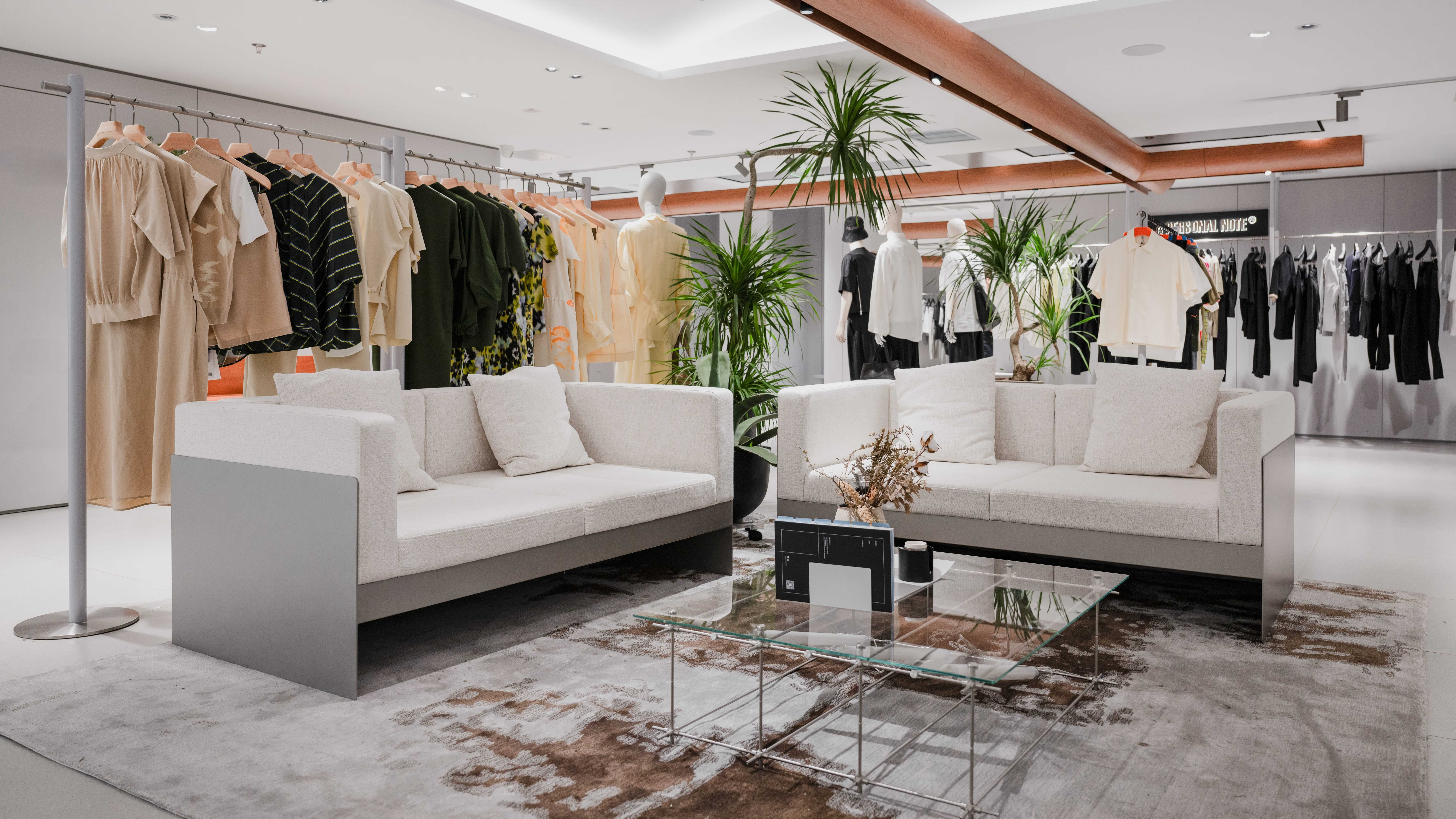
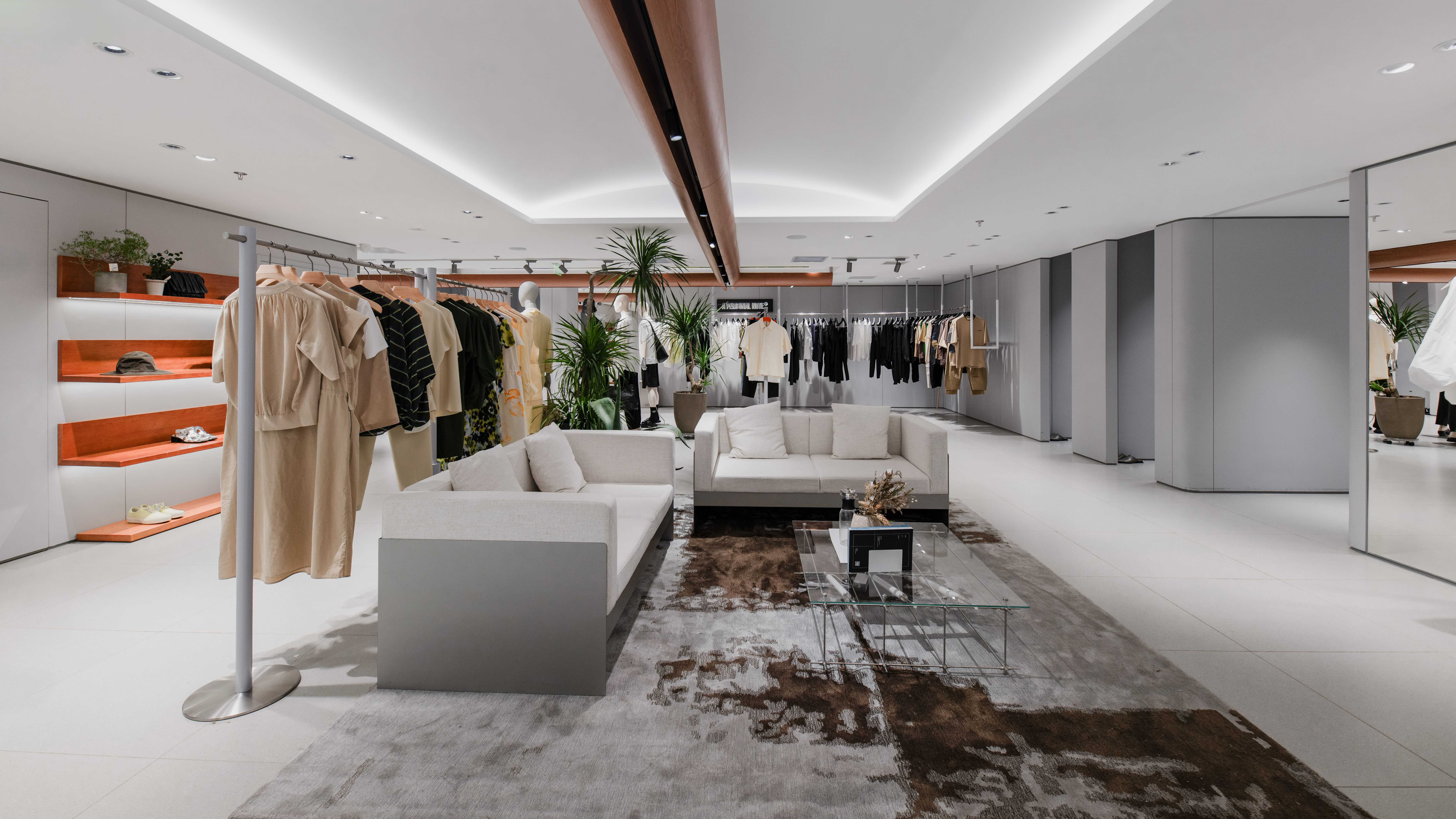

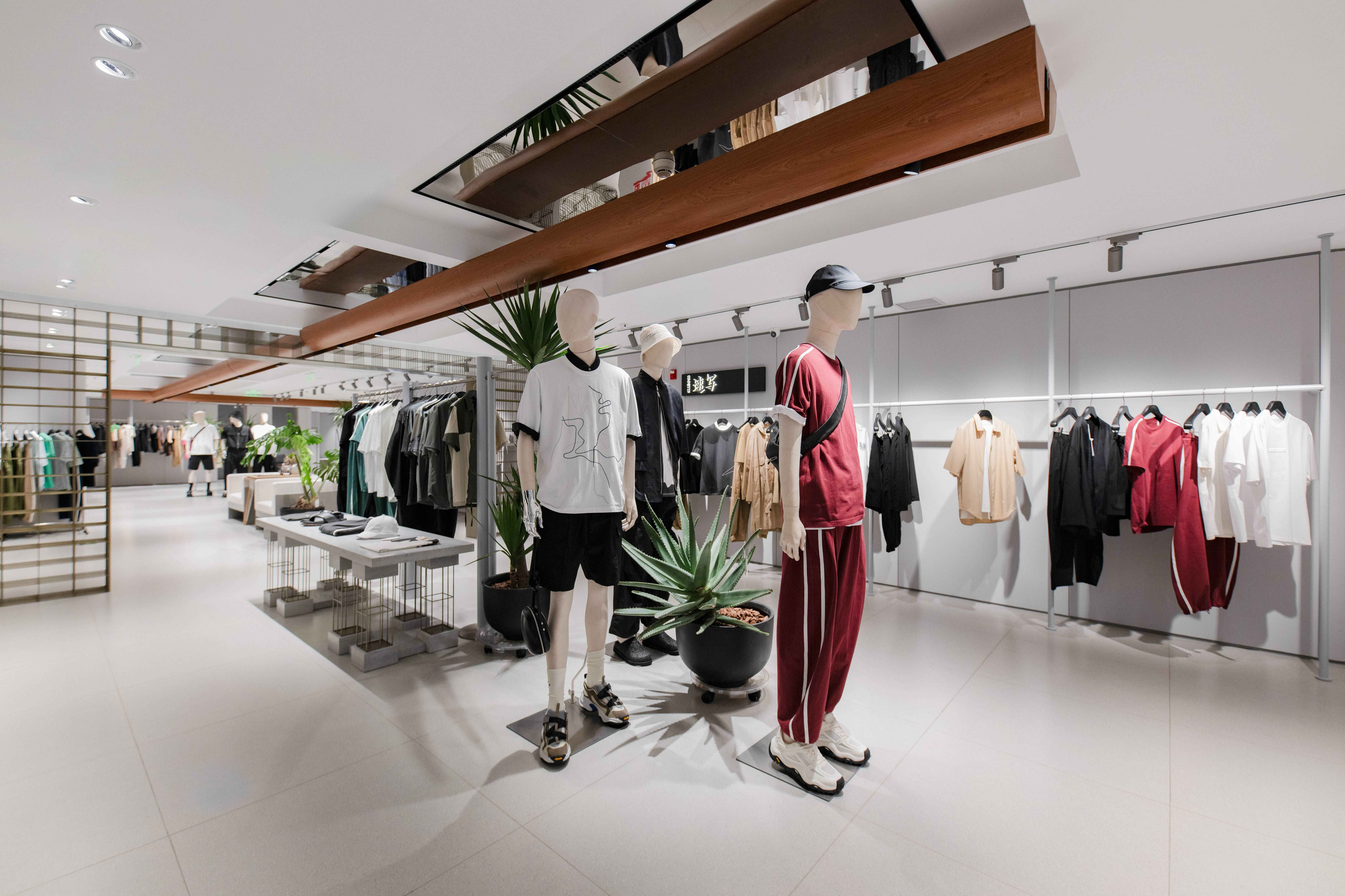

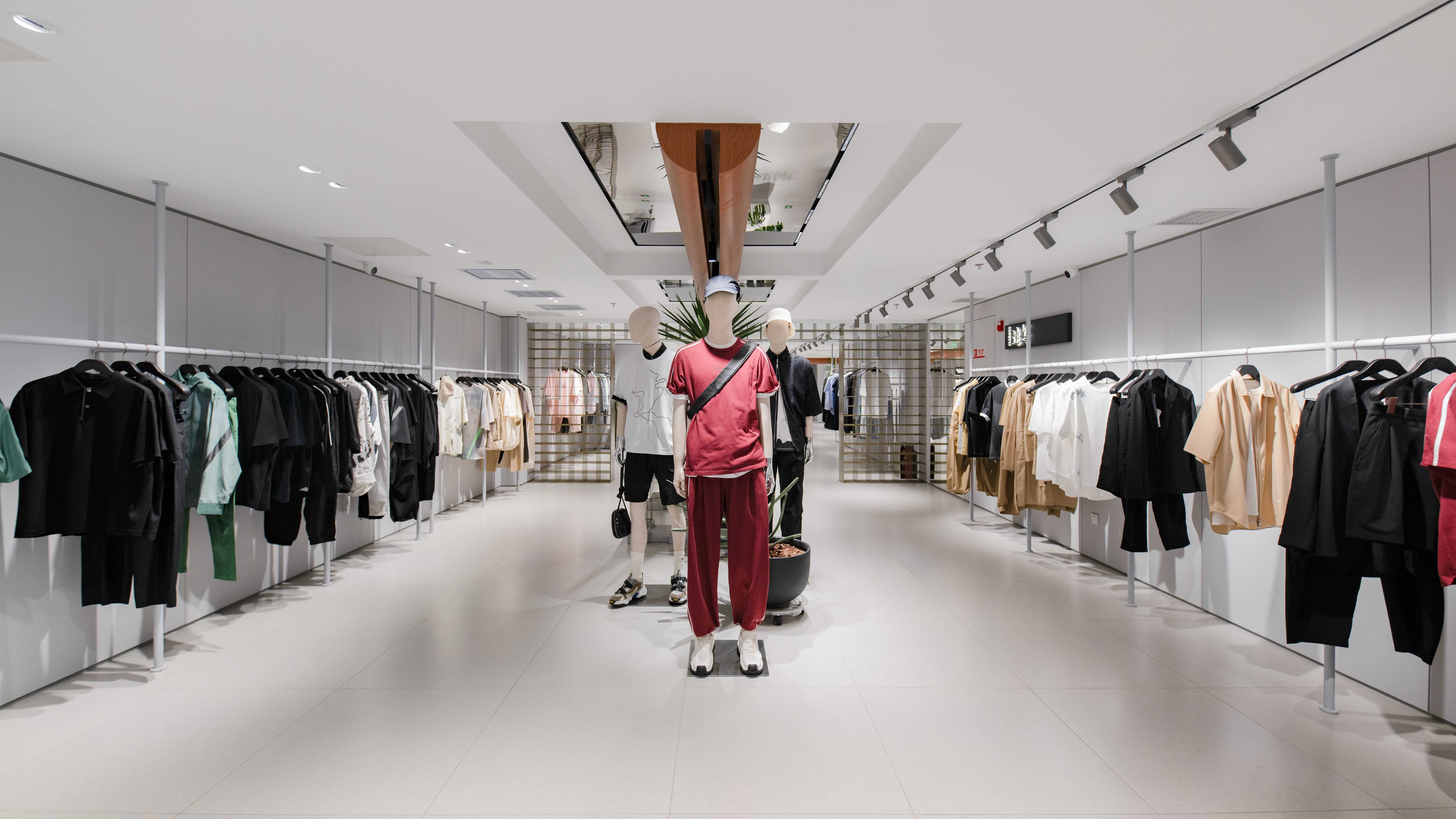
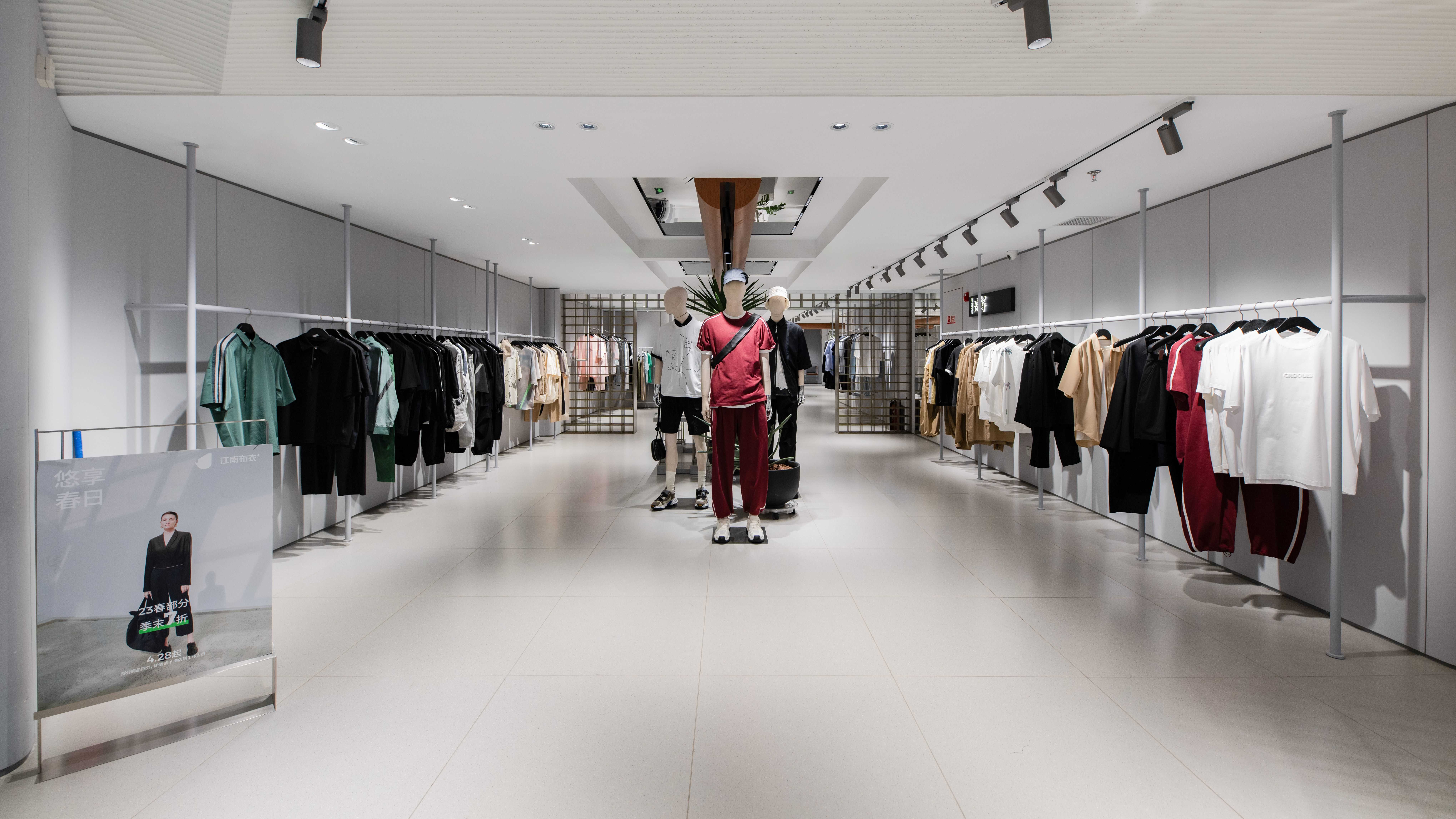
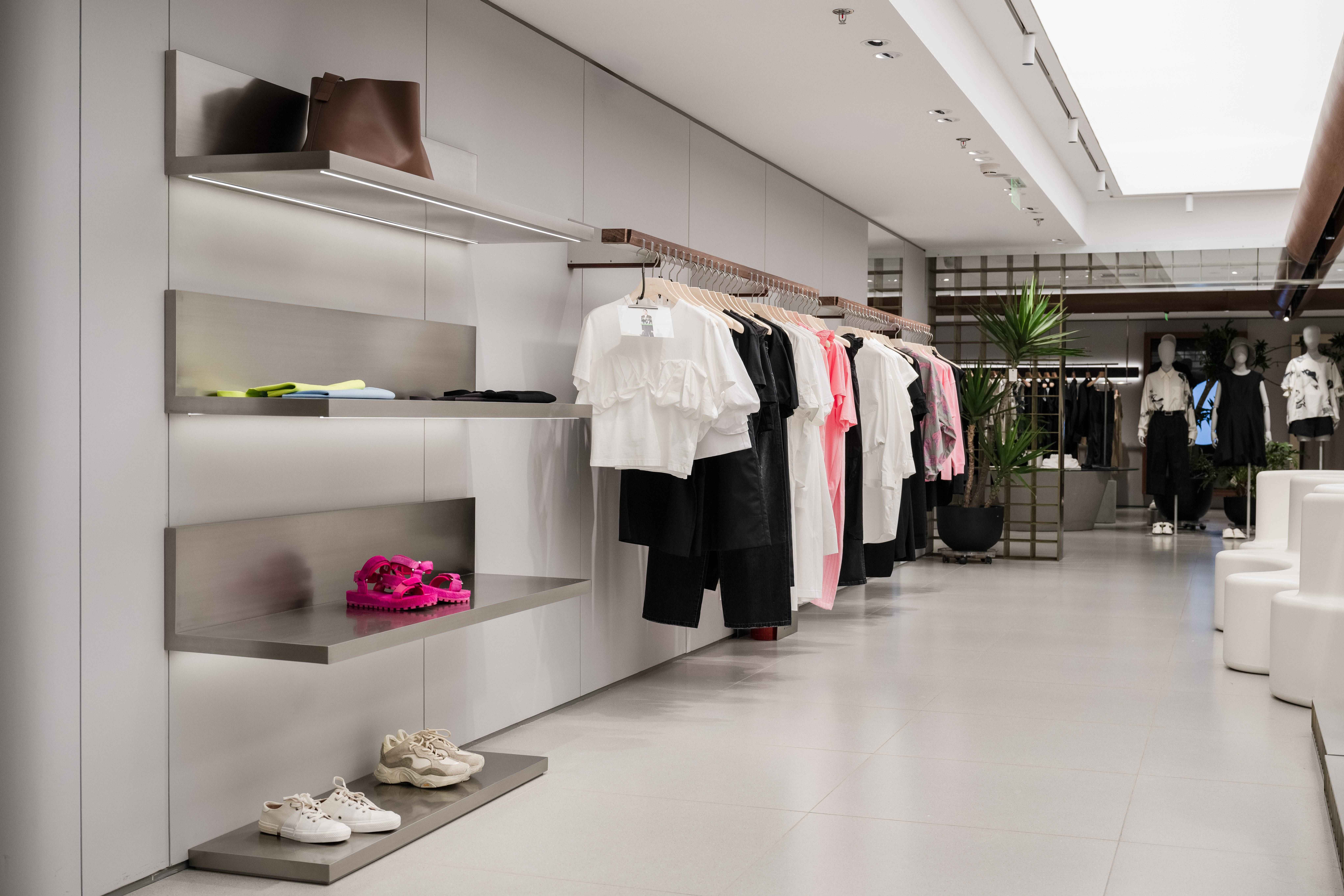
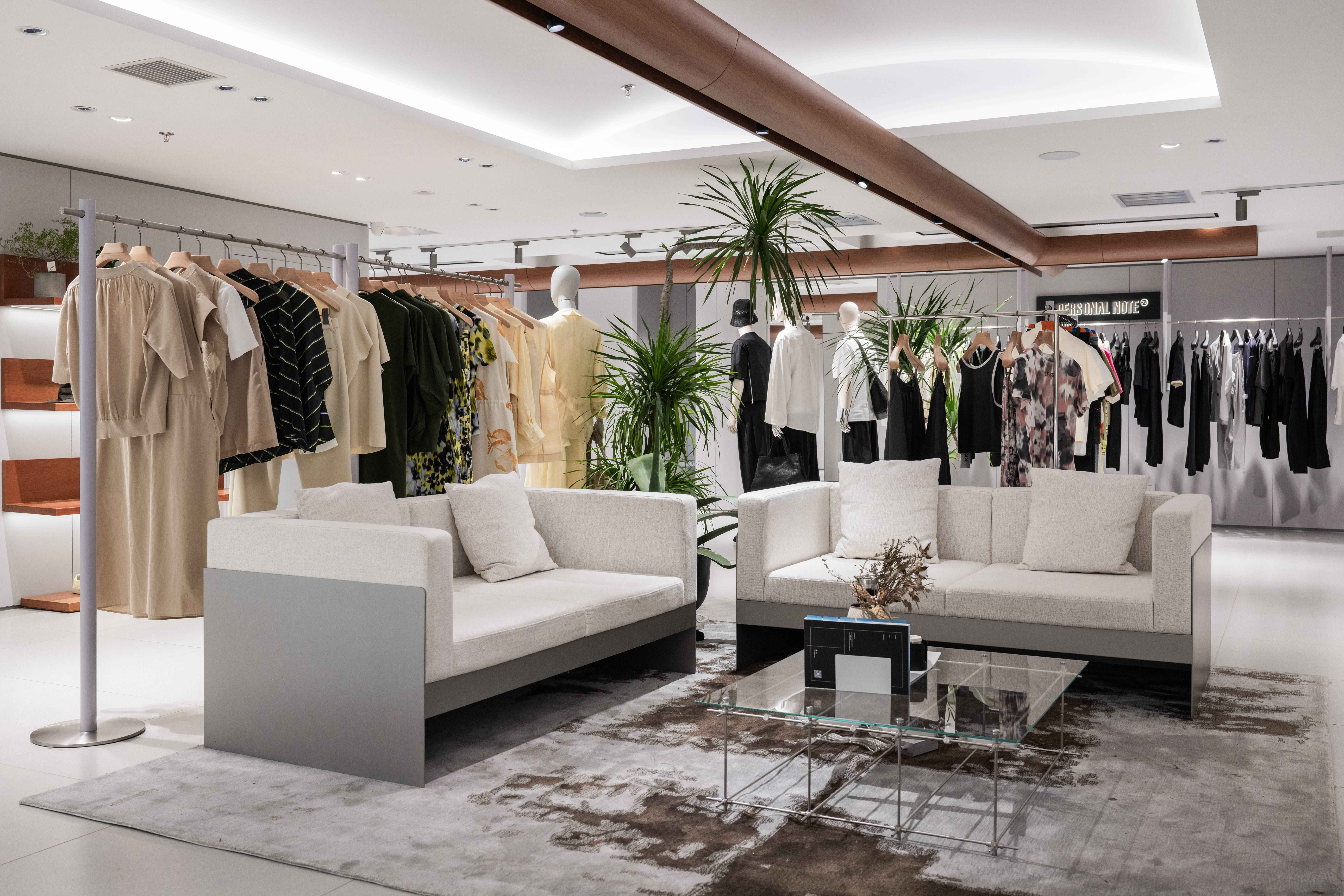
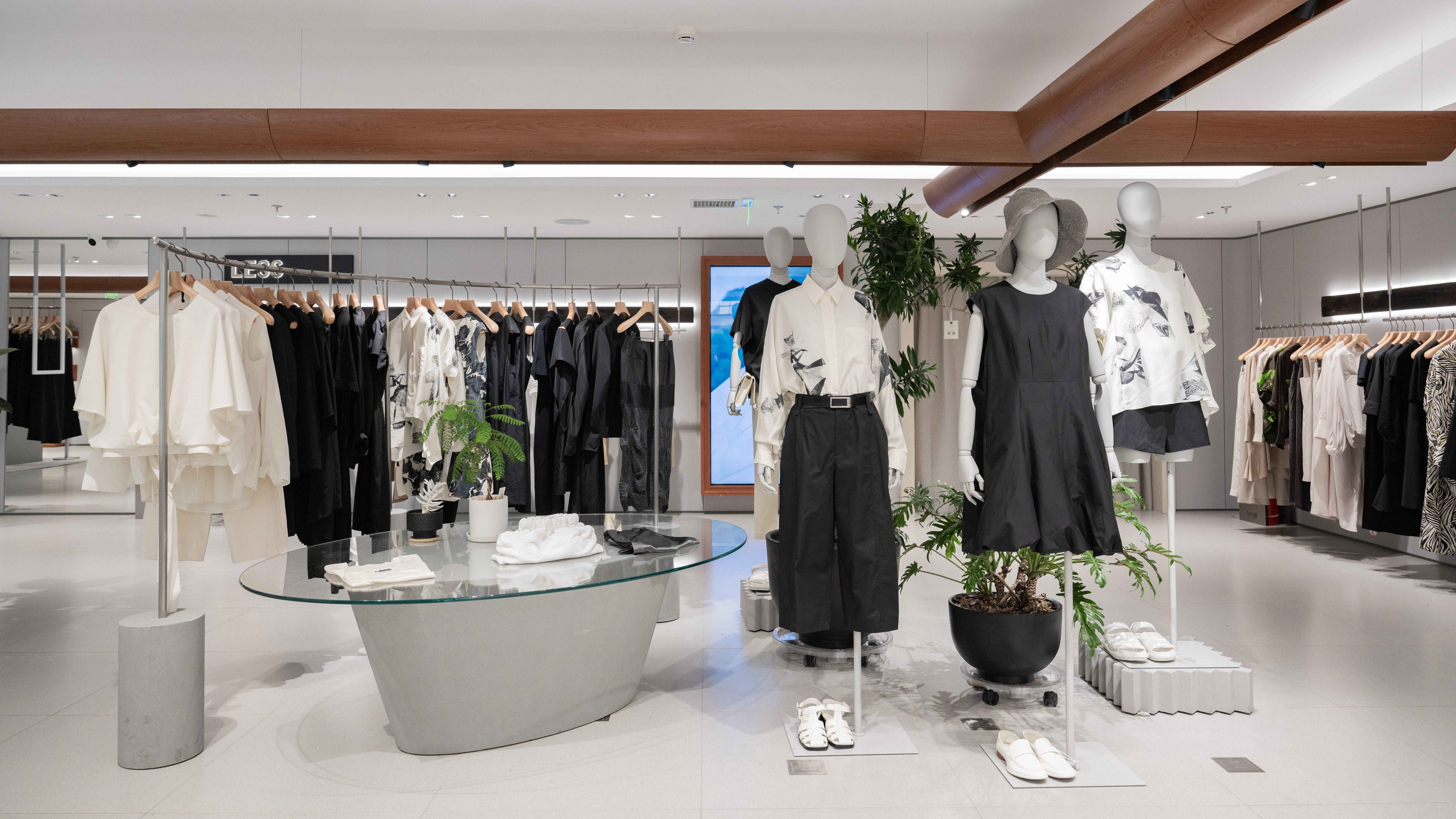
连廊通过门洞巧妙的分为三个品牌,三个品牌有着不一样的天花造型,通过中轴的中式横梁连接在一起,也提醒消费者往内走还有产品。
The doorway cleverly divides the corridor into three brands. The three brands have different ceiling shapes, which are connected together through the Chinese beams in the centre axis, which also reminds consumers that there are still products available in the inward direction.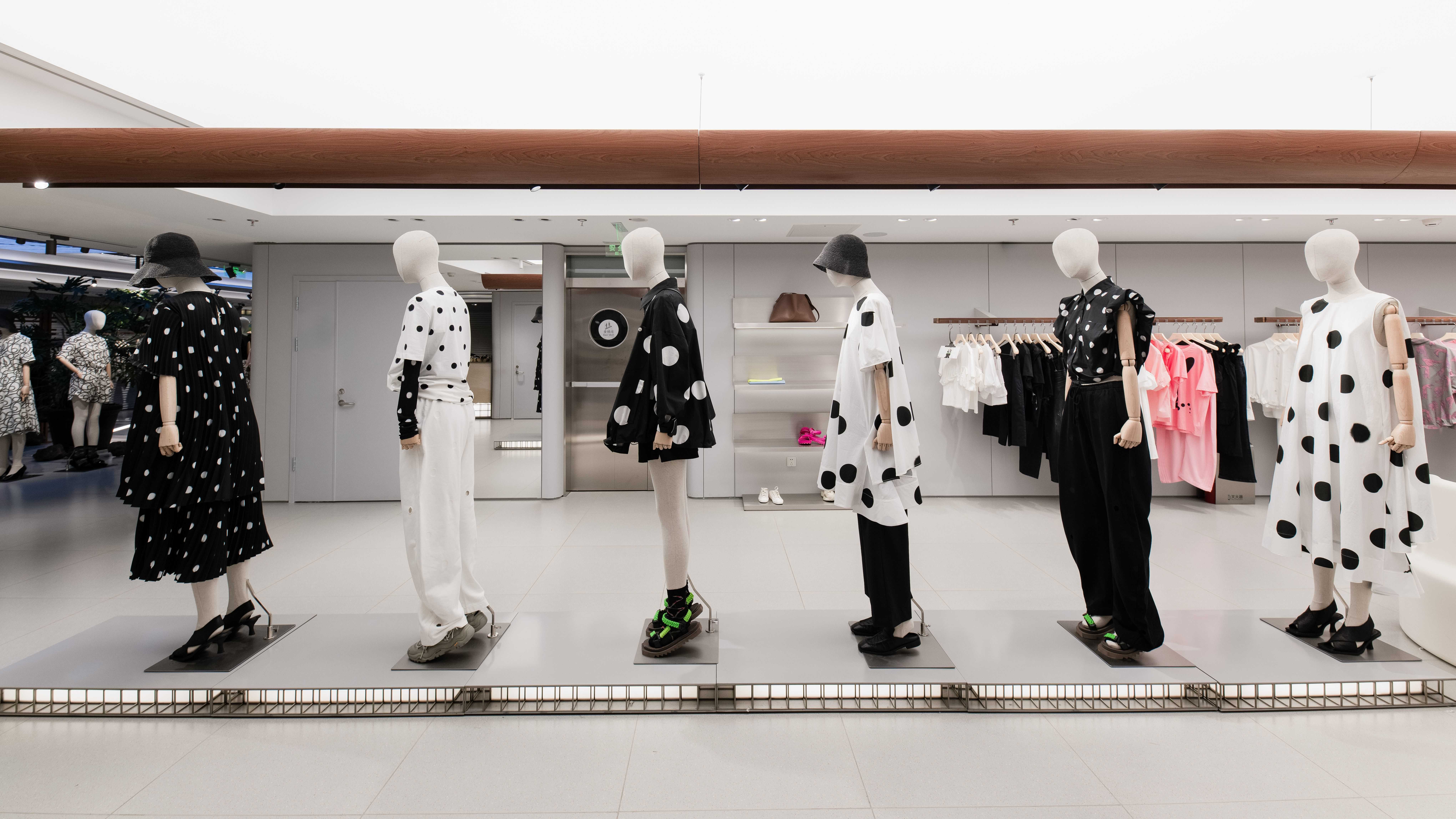
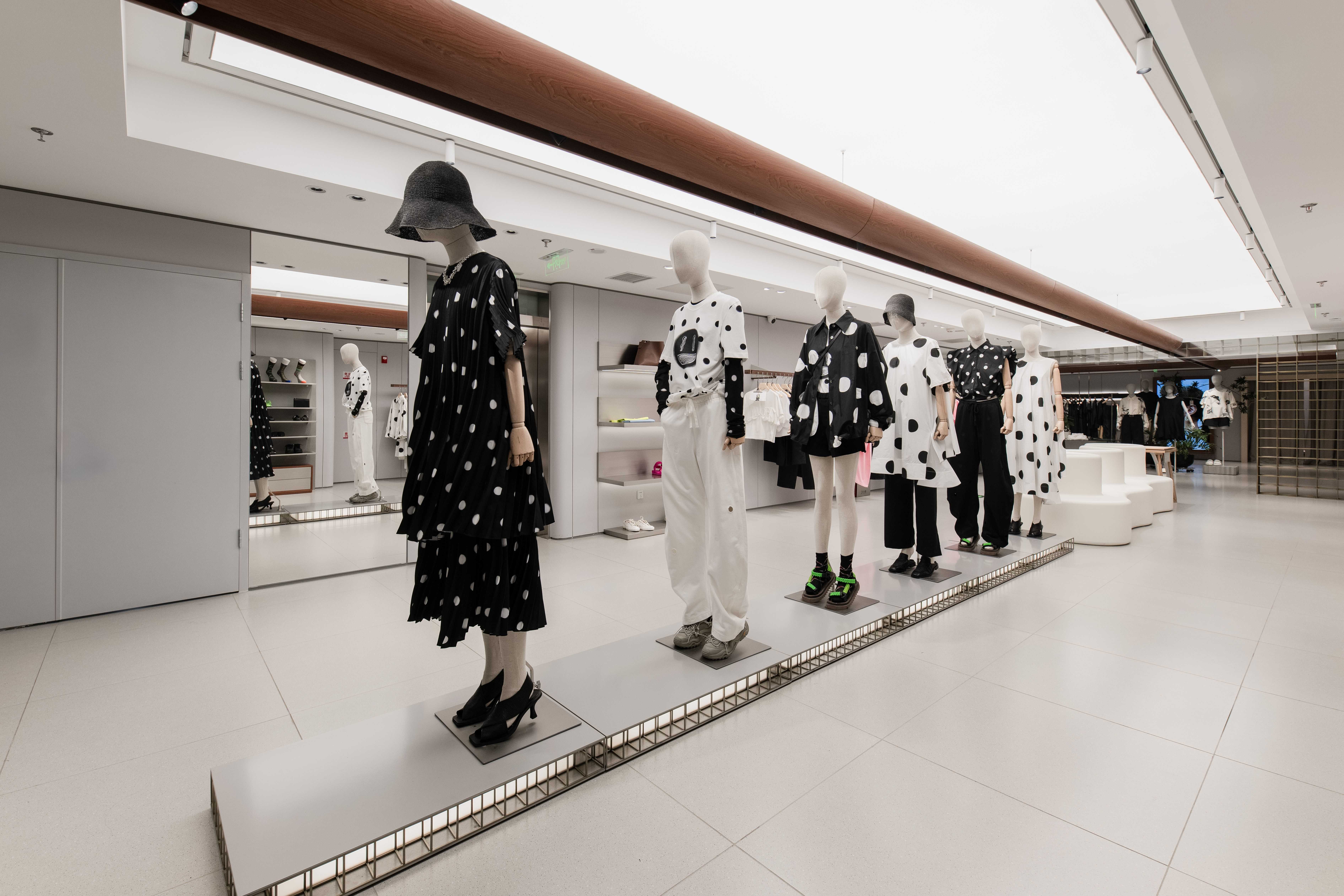
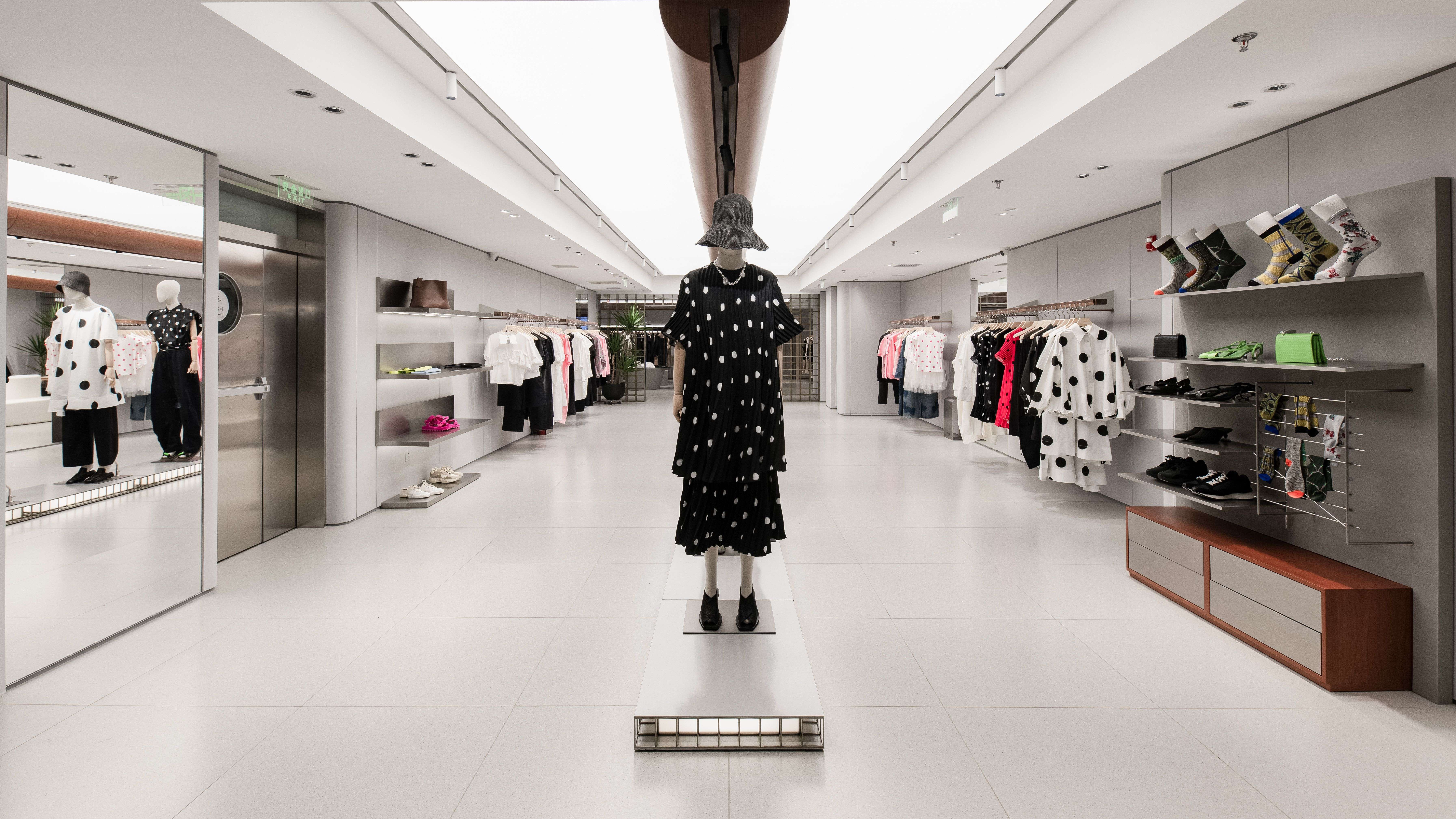
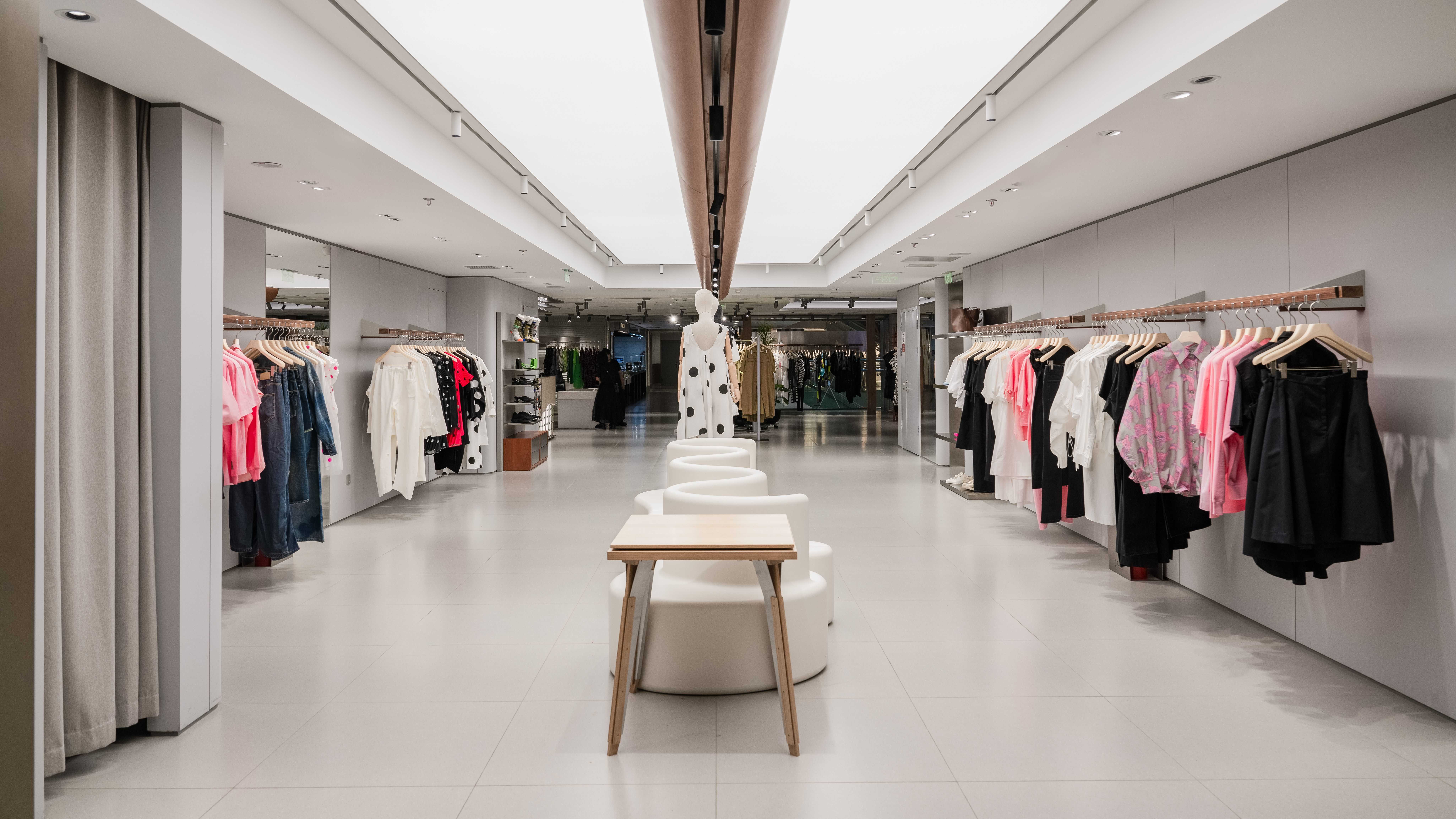

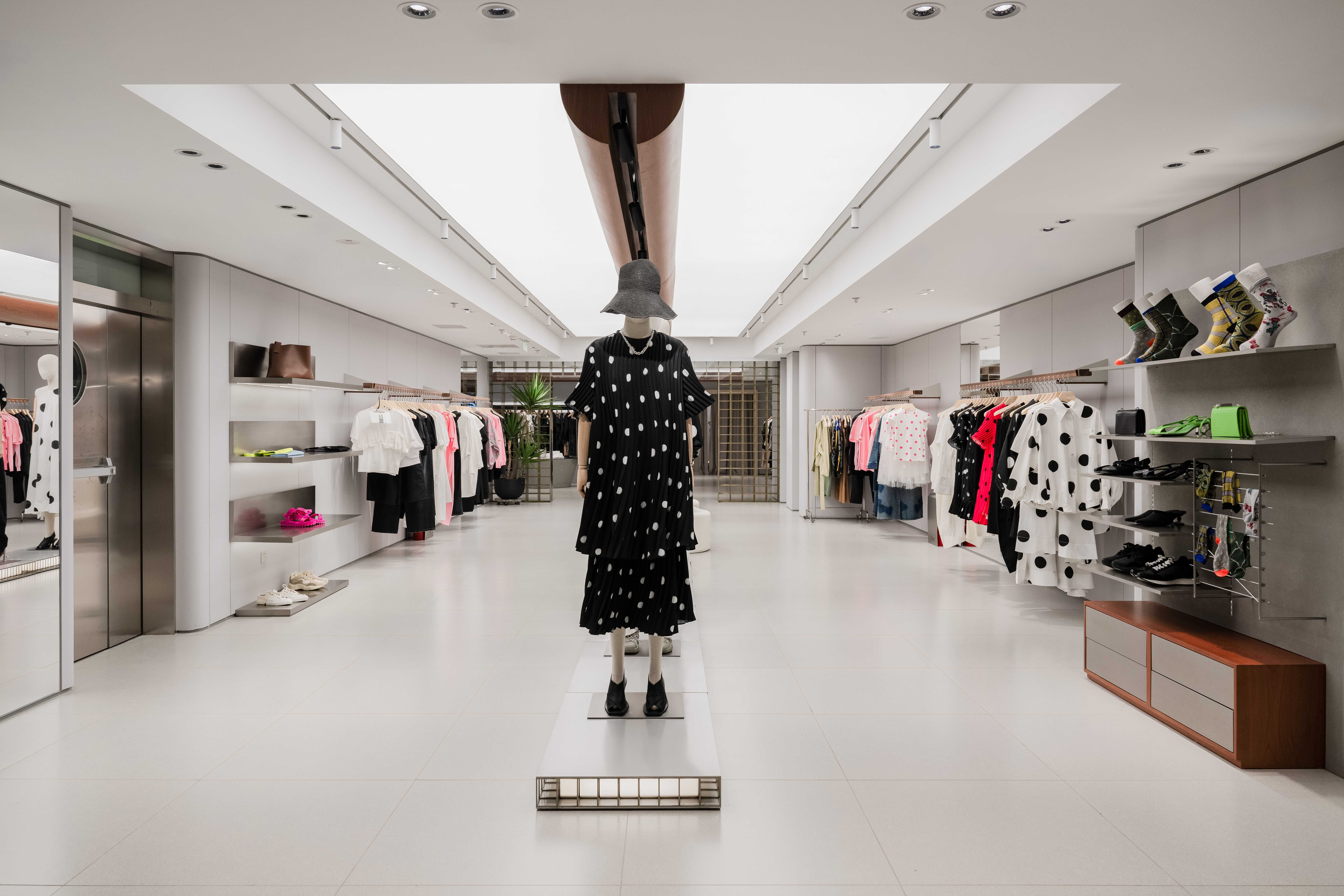
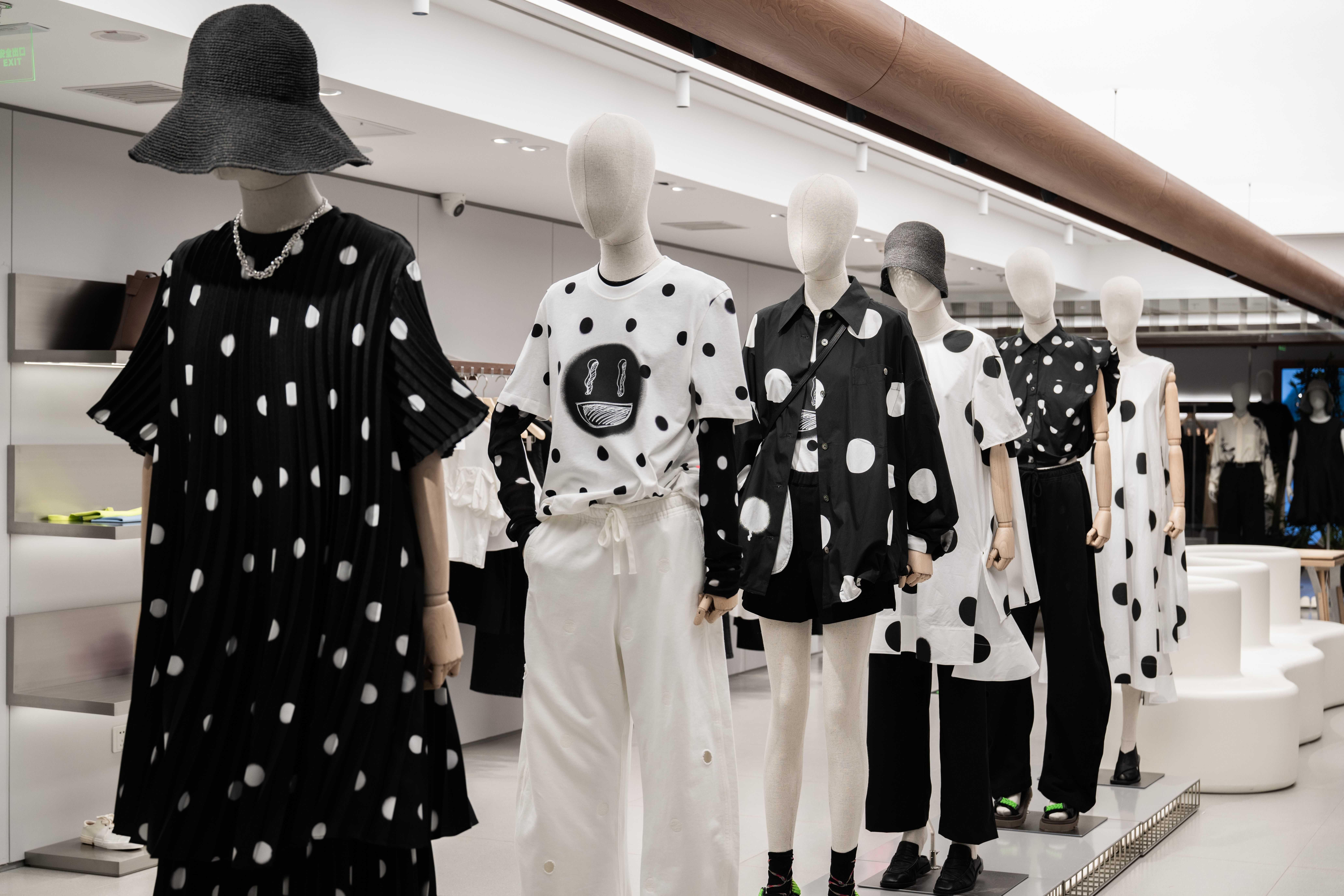

此案空间高度有限,本来是一个非常不利的因素,但是我们通过空间的高度穿插,灯光的运用,让本来低矮的层高显得不那么压抑,给消费者一个从容的挑选服装的空间。同时本案加入了VIP试衣间,让试衣的过程变得更加愉悦。
The height of the space in this case is limited, which is originally a very unfavorable factor. However, through the height of the space and the use of lighting, we made the originally low floor height less depressing and gave consumers a space to choose clothes comfortable. At the same time, a VIP fitting room has been added to this case to make the fitting process more pleasant.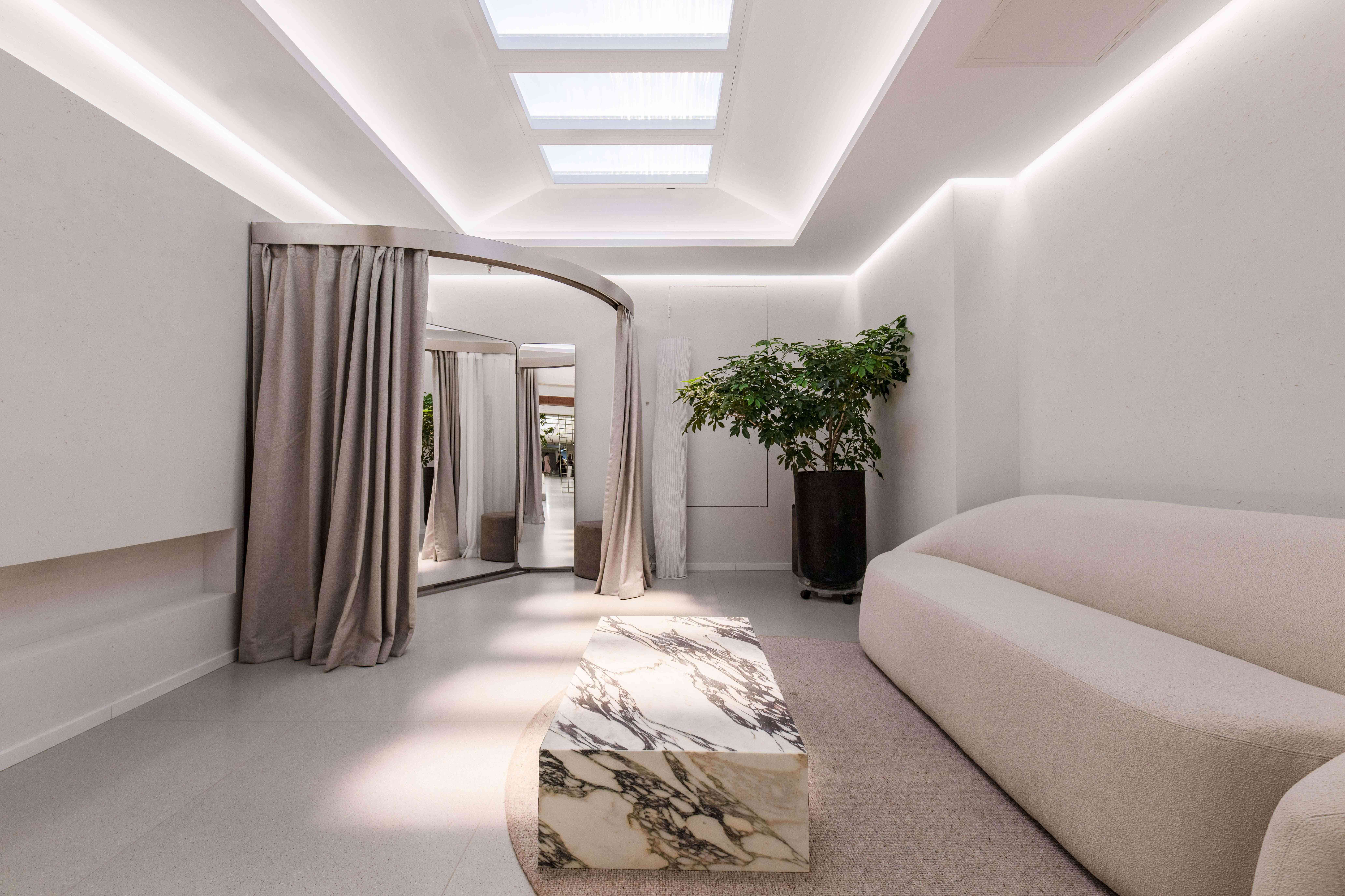
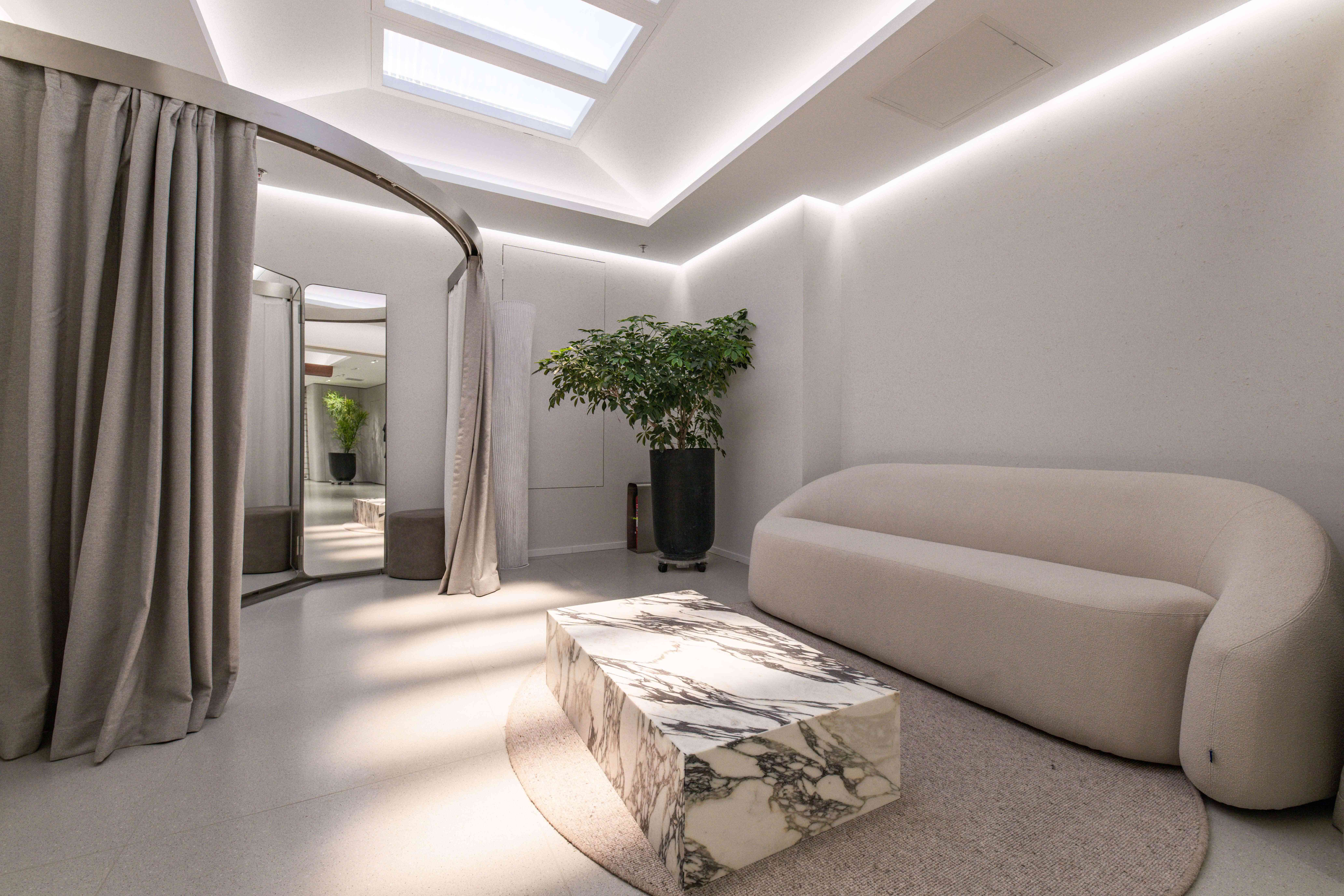
设计中大量使用了水泥预制板做装饰面,未来可以回收再利用,灯具都是用的低功耗的LED光源。
In the design, a large number of cement prefabricated boards are used as decorative surfaces, which can be recycled and reused in the future. The lamps are all made of low-power LED light sources.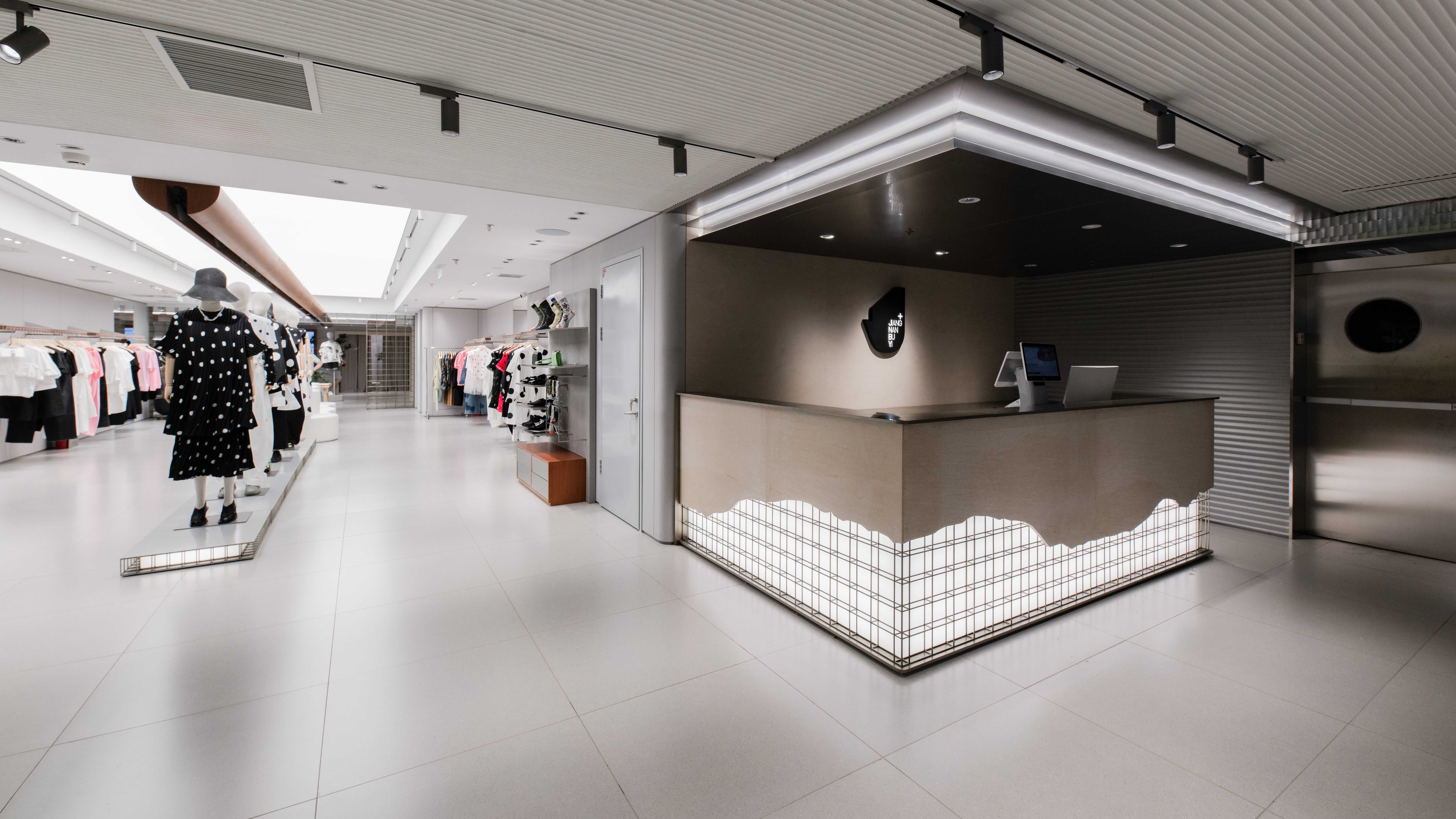





▲项目平面
项目信息——
项目名称:江南布衣北京西单d店
设计方:上海崴趣迪建筑设计有限公司
公司网站:www.younghoodesign.com
联系邮箱:rachel.zhang@younghoodesign.com
项目设计&完成年份:2022年&2023年
主创及设计团队:David Zhou及YHD团队
项目地址:北京西城区西单北大街131号西单大悦城4楼
建筑面积:810.92m2
摄影版权:蒋大伟
客户:JNBY
装修主材:地砖–品逸陶瓷,墙面–意抚建筑科技(上海)有限公司
事务所联系方式:186 2158 1325
事务所联系人:周方旻


