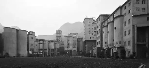
本案所在的双流水泥厂位于西湖区转塘镇。上世纪70年代,这里是杭州近郊最重要的建材工业区,机械轰鸣,红火一时,直至1999年关停后沉寂。工厂废弃,而厂房建筑在时代的洪流中安然伫立,空间作为时间的见证者和记录者得以幸存。而今又二十年过去,曾经的双流水泥厂已被改造成为文创艺术园区,生产活动以崭新的方式重新延续。
The Shuangliu cement plant where the case is located in Zhuantang Town, Xihu District in Hangzhou. In the 1970s, it was the most important building materials Industrial Zone in the suburbs of Hangzhou. Machinery roared and flourished for a time, until it was closed down in 1999. The factory is abandoned, while the factory buildings stand in the flood of the times, and space survives as the witness and recorder of time.Now another 20 years later, the Shuangliu cement plant has been transformed into a cultural and creative artistic Park, and the production activities are renewed in a new way.
▲厂区老照片 Old factory photo
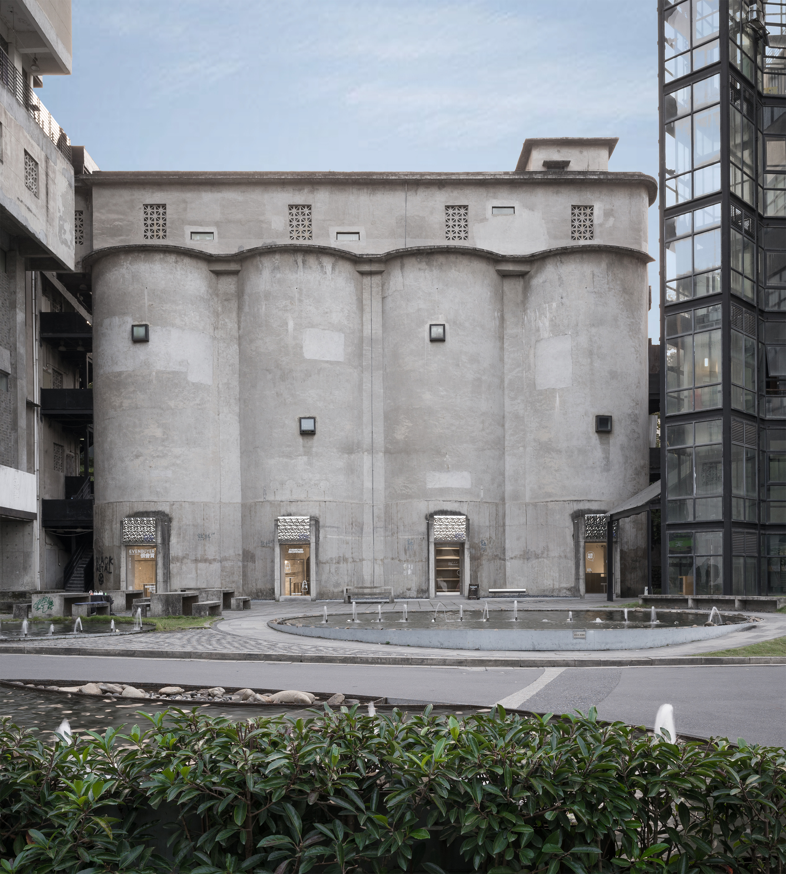
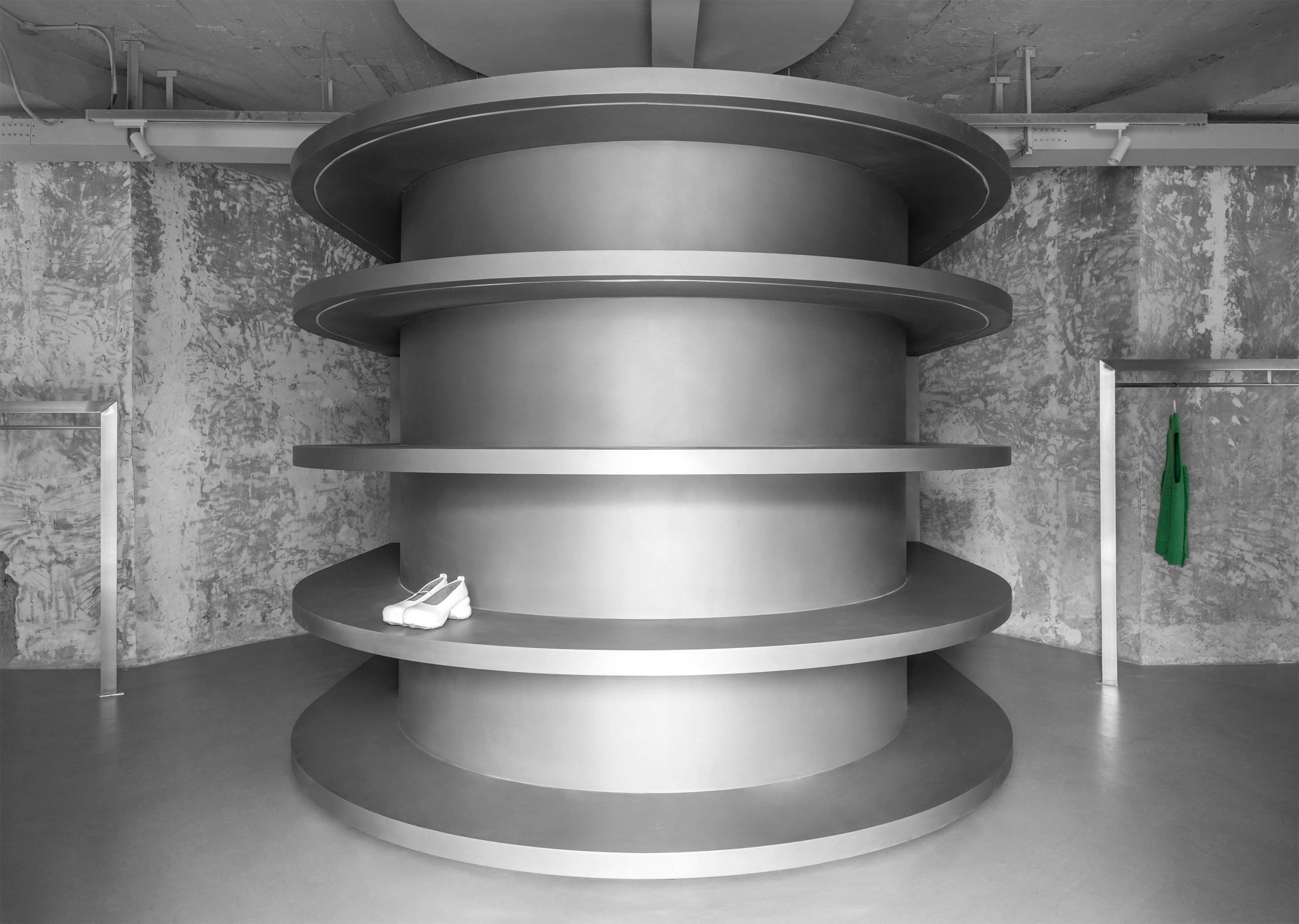
此次项目选址正是原双流水泥厂的熟料存放区域,四个巨大的圆筒结构一字排开构成建筑主体,内部互通相连。买手品牌EvenBuyer的全新店面在这里借建筑与设计的语言,讲述自身的风格标签与时尚态度。
The site of the project is the clinker storage area of the original Shuangliu cement plant. Four huge cylinder structures are arranged in one line to form the main body of the building, and the internal interconnection is connected. The brand new storefront of buyer brand Evan buyer is here to use the language of architecture and design to describe its own style label and fashion attitude.
建筑改造与室内设计由蒋杰室内设计工作室完成。旧建筑与新时尚的相遇为设计师带来灵感;最大程度地保留自然印记、融入当代极简的设计美学、引发跨时空的有趣对话,是设计的切入点。正如好食材往往只需采用最朴素的烹饪方式,置身沉淀着丰富内涵的建筑,恰到好处的室内设计,即可呈现美味佳肴。
The architectural renovation and interior design were completed by Jiang Jie‘s interior design studio. The meeting of old buildings and new fashion brings inspiration to the designer; the breakthrough point of design is to retain the natural imprint to the greatest extent, integrate into the contemporary minimalist design aesthetics, and trigger interesting dialogues across time and space.Just as good food materials only need to adopt the most simple cooking methods, place yourself in the rich connotation of the building, just the right interior design, can present delicious food.
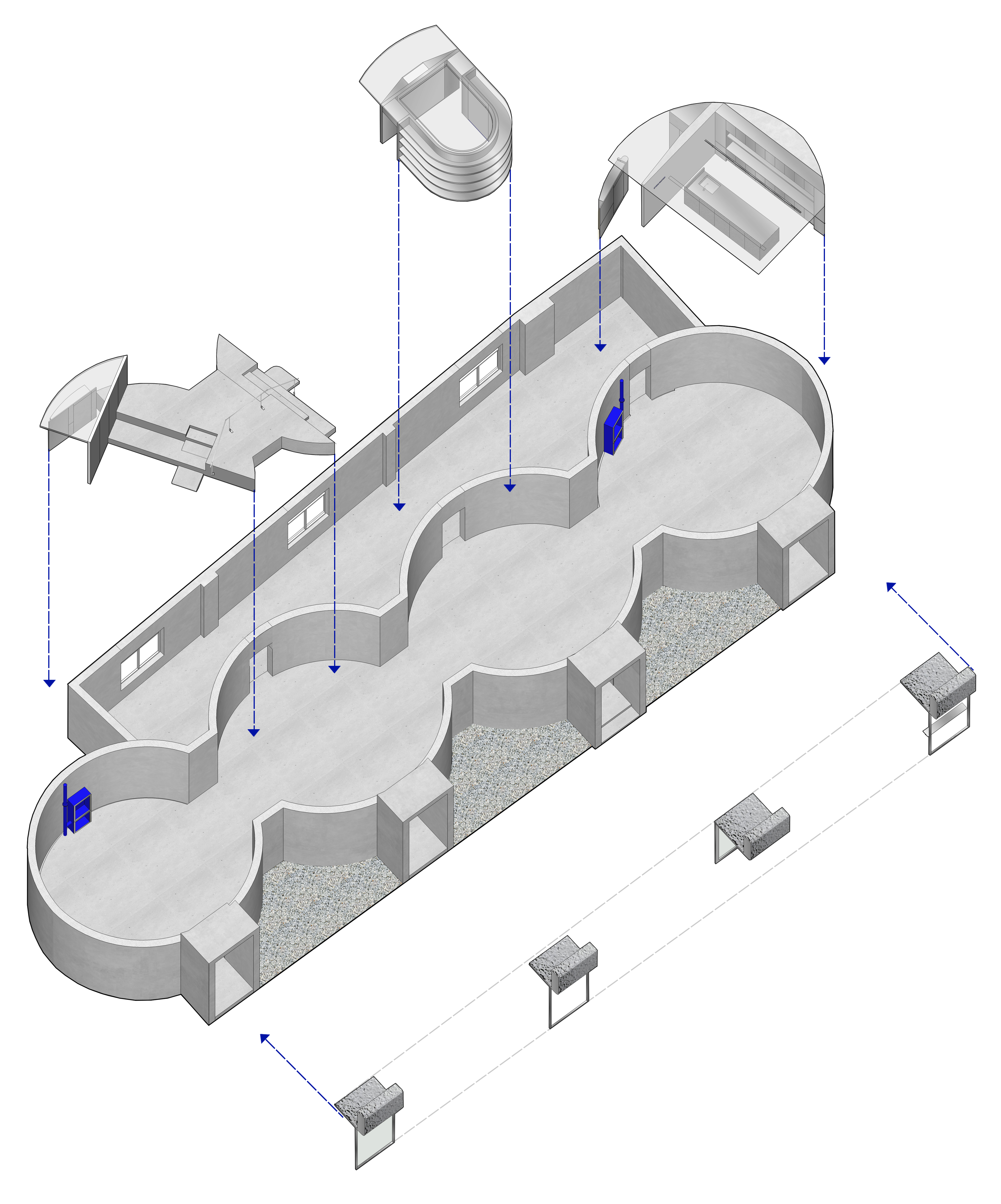
▲轴测示意图 axon diagram
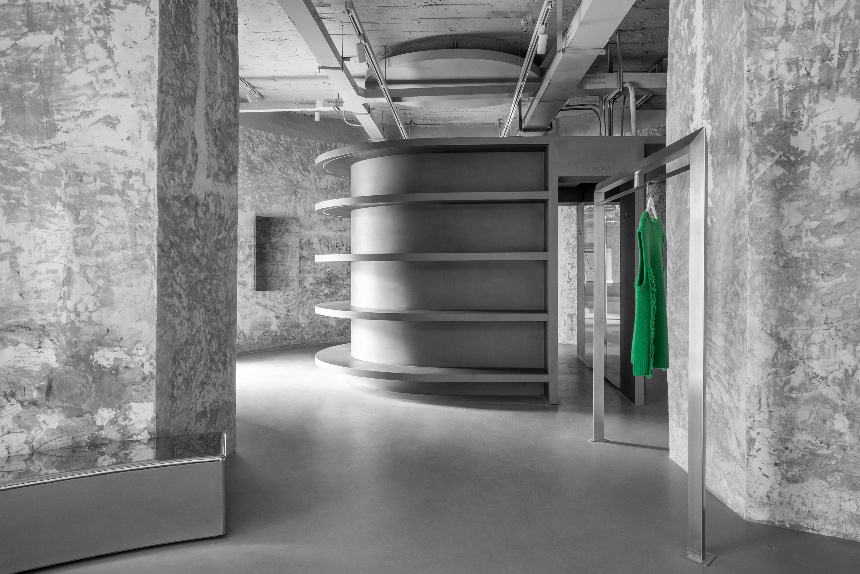
由于特殊的建筑属性,店面空间面积较大且呈长条形,而买手店的产品品类与数量繁多,设计师着力营造连贯而有韵律的空间氛围。通过在四个圆筒型空间中置入三个盒子,空间被分为三大部分。
Due to the special architectural properties, the storefront space area is large and long strip, while the product category and quantity of buyer’s shop are various. The designer strives to create a coherent and rhythmic space atmosphere. By placing three boxes in four cylindrical spaces, the space is divided into three parts.
▲入口 Entrance
设计师利用外立面原有门洞,将其一作为商店主入口,而另外三个成为落地橱窗。门洞与建筑高层的四个小窗口相呼应,共同形成有趣的节奏感。
The designer makes use of the original door opening of the facade, and uses one as the main entrance of the store, while the other three become the floor window. Four small windows of high-rise buildings should form a common rhythm.
▲橱窗display window
▲飘檐 Eveas
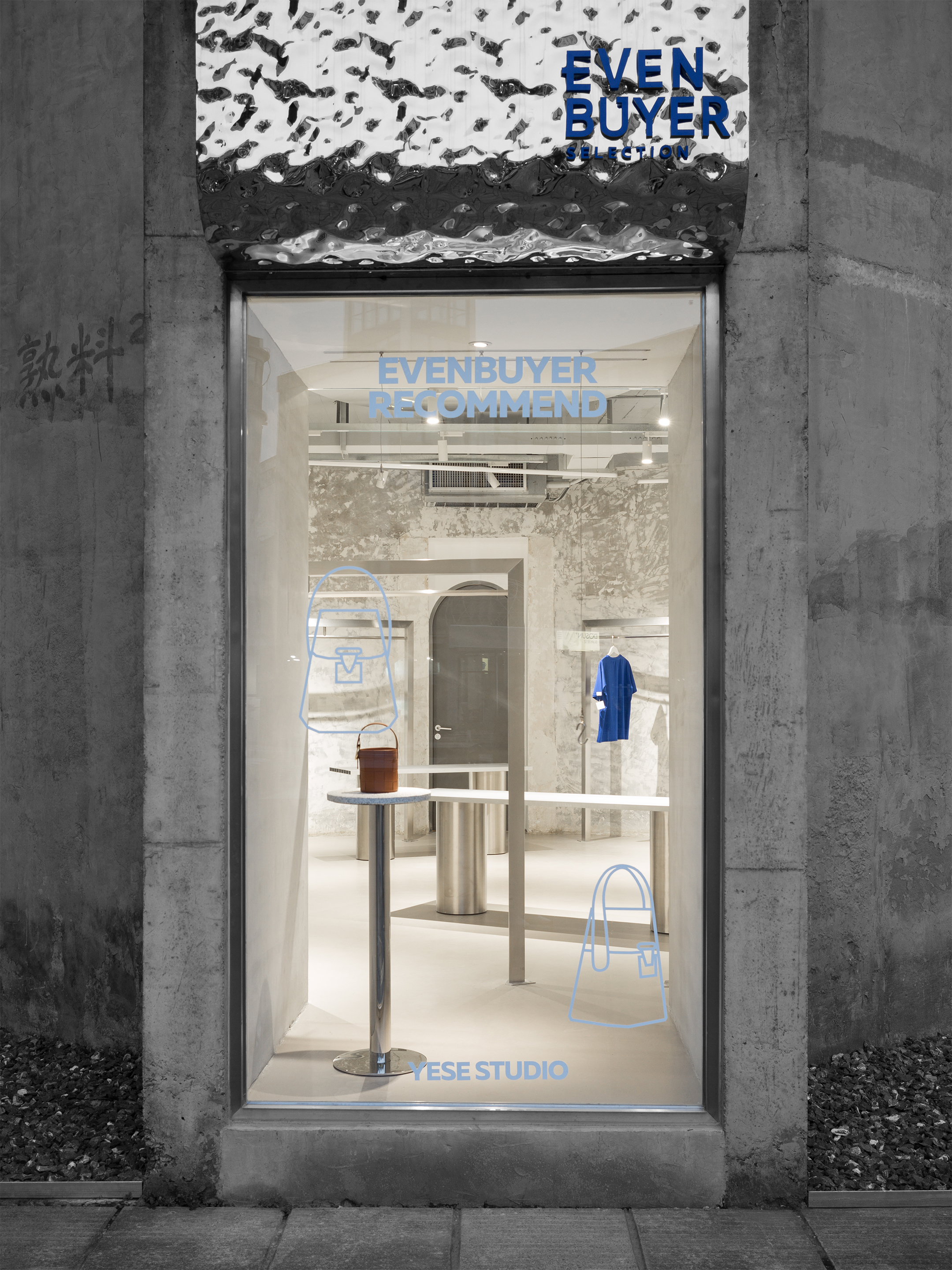
落地窗引入充分自然光,同时也用作橱窗,展示店家的当季推荐,窗贴的平面画面与产品相映成趣。统一的不锈钢波纹板飘檐与建筑原始水泥质感形成反差,首先为到达的访客带来视觉冲击,让好奇心引人进店。
Floor to ceiling windows provide plenty of natural light and are also used as windows to display the seasonal recommendations of the store. The flat screen of window stickers is in contrast with the products. The unified stainless steel corrugated board floating eaves is in contrast to the original cement texture of the building, which first brings visual impact to the arriving visitors and makes curiosity attract people into the store.
▲入口圆弧陈列桶 Circular Shelves to the Entrance
▲包展示区Package display area
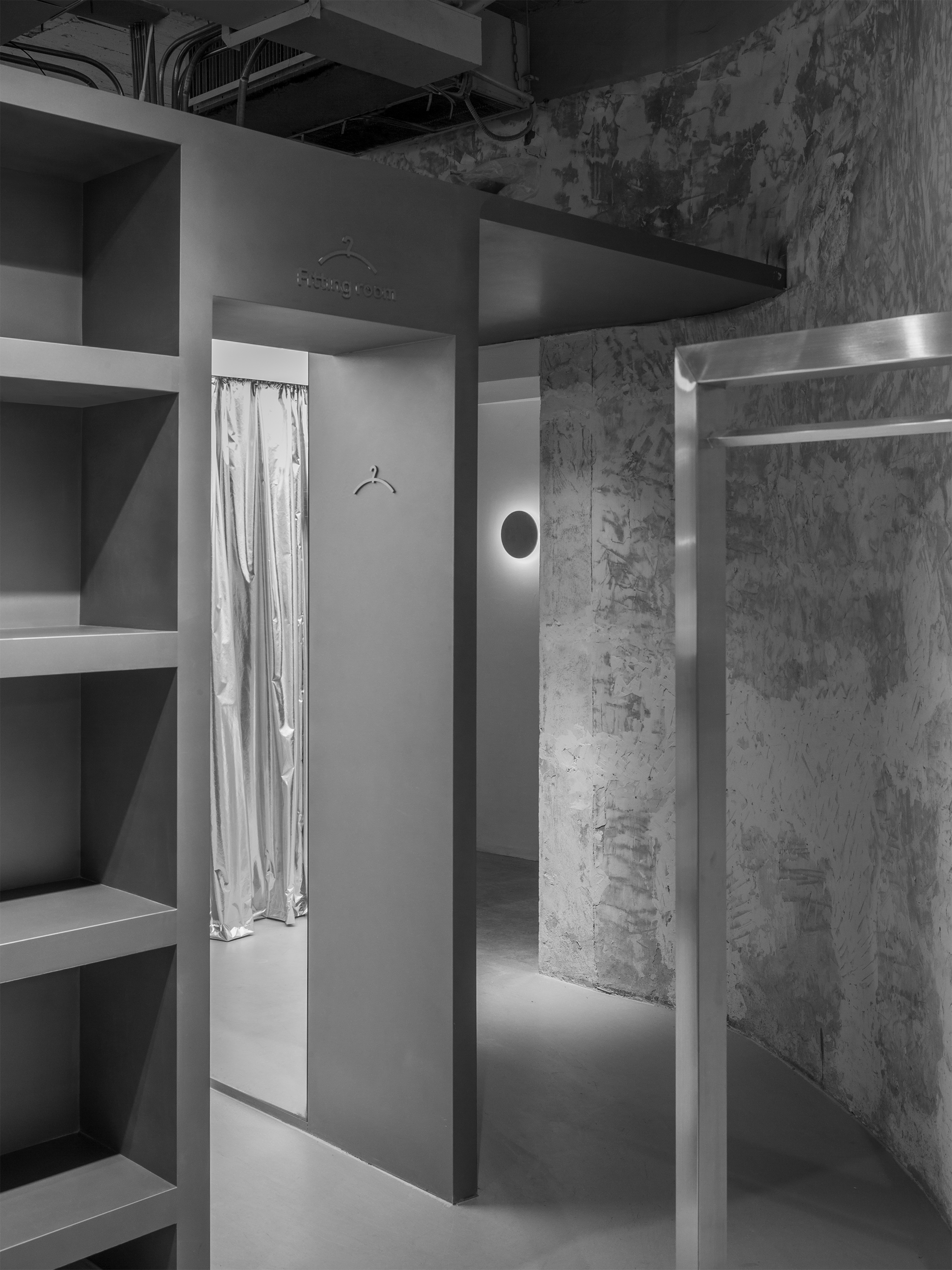
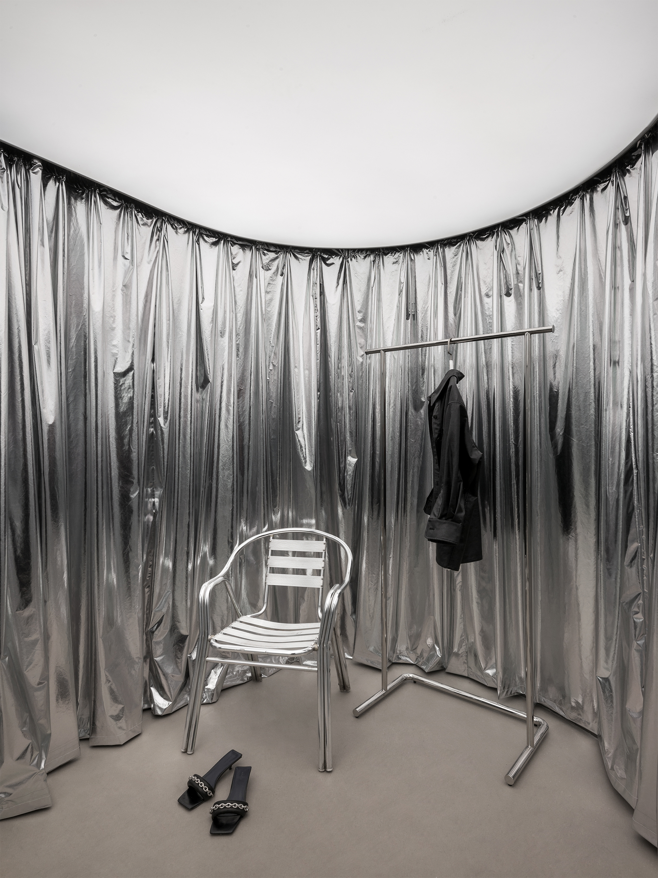
基于原建筑结构,空间布局中办公区域与店面入口平行相对。设计师在入口处置入漂浮的圆弧形层板,内部是兼顾试衣间、直播室的功能体块,材质上采用顶面发光膜及一块完整的镜面反射内部桶状空间增强纵深感,同时整个体块将办公区入口藏匿其后。
Based on the original building structure, the office area is parallel to the entrance of the store. The designer disposes floating circular arc-shaped laminates at the entrance. The interior is a functional block which takes into account the fitting room / live room. The material is made of light-emitting film on the top surface and a complete mirror reflection. The inner barrel space enhances the sense of depth. At the same time, the whole block hides the entrance of the office area behind it.
▲试衣间 Fitting Room
除了用作隔挡之外,以层板为对称中轴,将进店后的动线一分为二。弧形路径也为空间带来更多生趣,并为品牌方创造了多角度展示核心产品的场景。层板的圆弧形状应空间形态而生。在完美融入的同时留有缺口,保持空间连通性,营造张弛有度、有呼吸感的空间感受。
In addition to being used as a partition, the moving line after entering the store is divided into two parts by taking the laminate as the symmetry axis. The arc path also brings more interest to the space and creates a multi angle scene to show the core products for the brand.The circular arc shape of laminate should be generated by spatial form. In the perfect integration at the same time to leave a gap, to maintain spatial connectivity, create relaxation degree, a sense of breathing space.
▲吧台区 Bar area
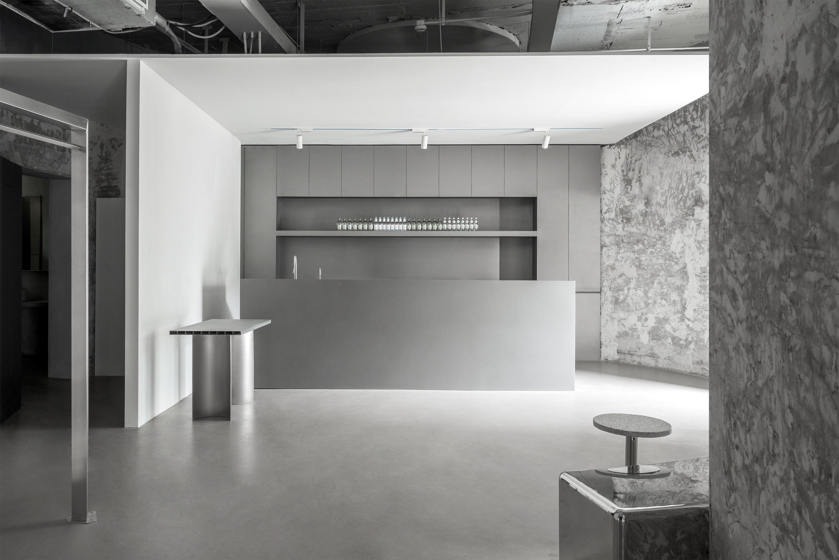
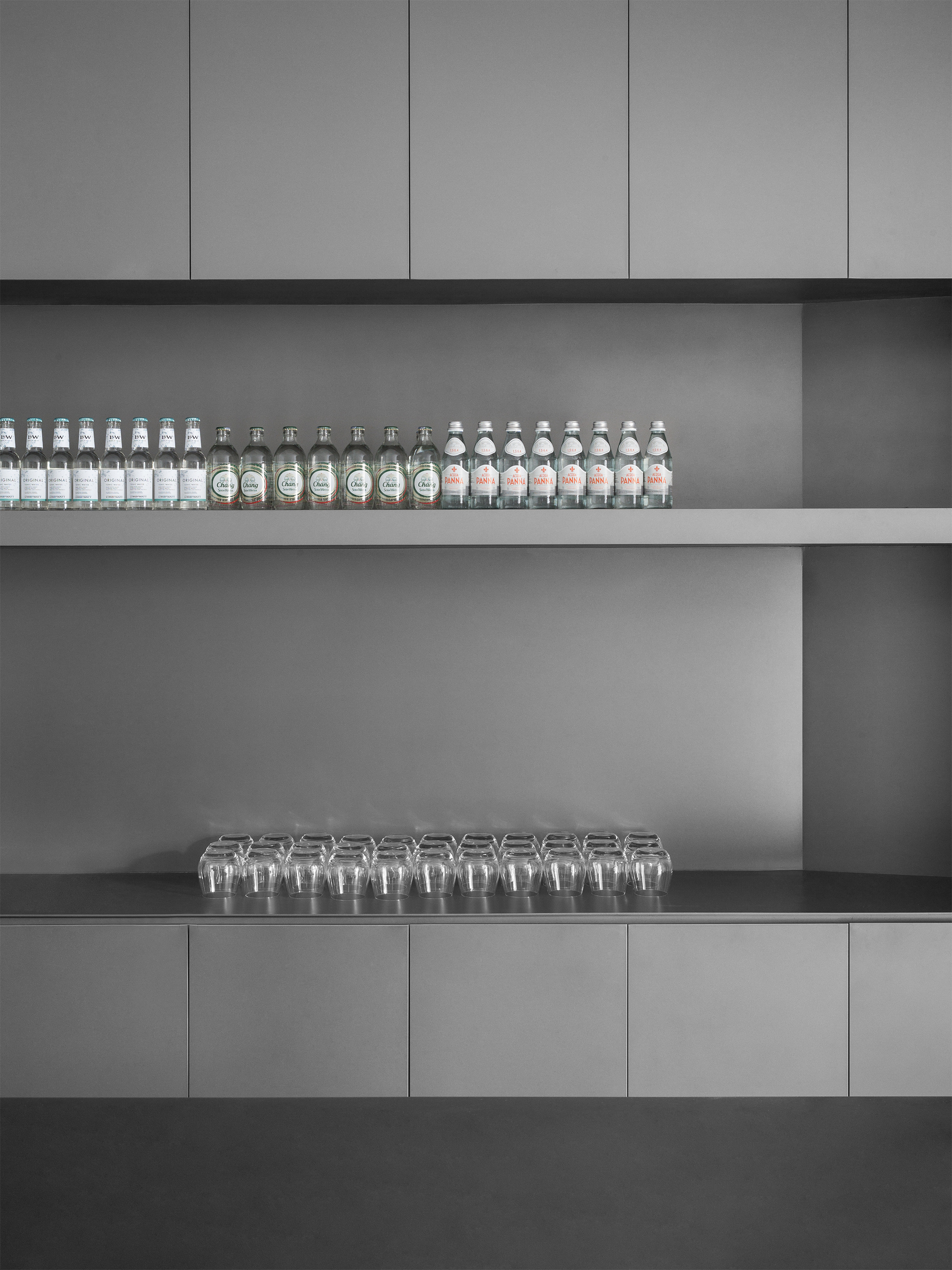
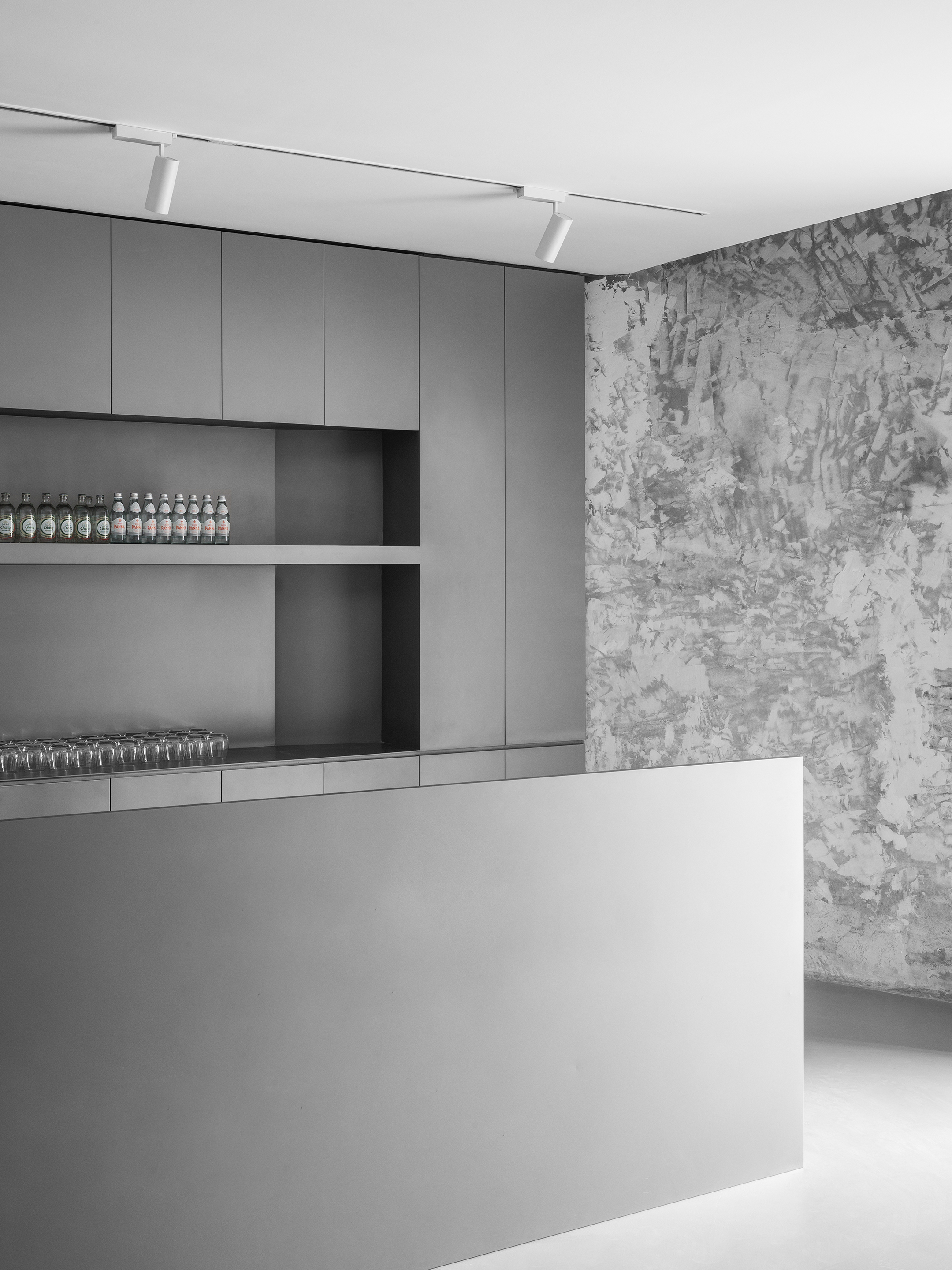
进店后向右是吧台区。设计师运用最简单的不锈钢方形体块将空间一分为二,隔出通往卫生间的通道。
After entering the store, the bar area is on the right. The designer uses the simplest stainless steel square block to divide the space into two and separate the passageway leading to the bathroom.
▲吧台 Bar
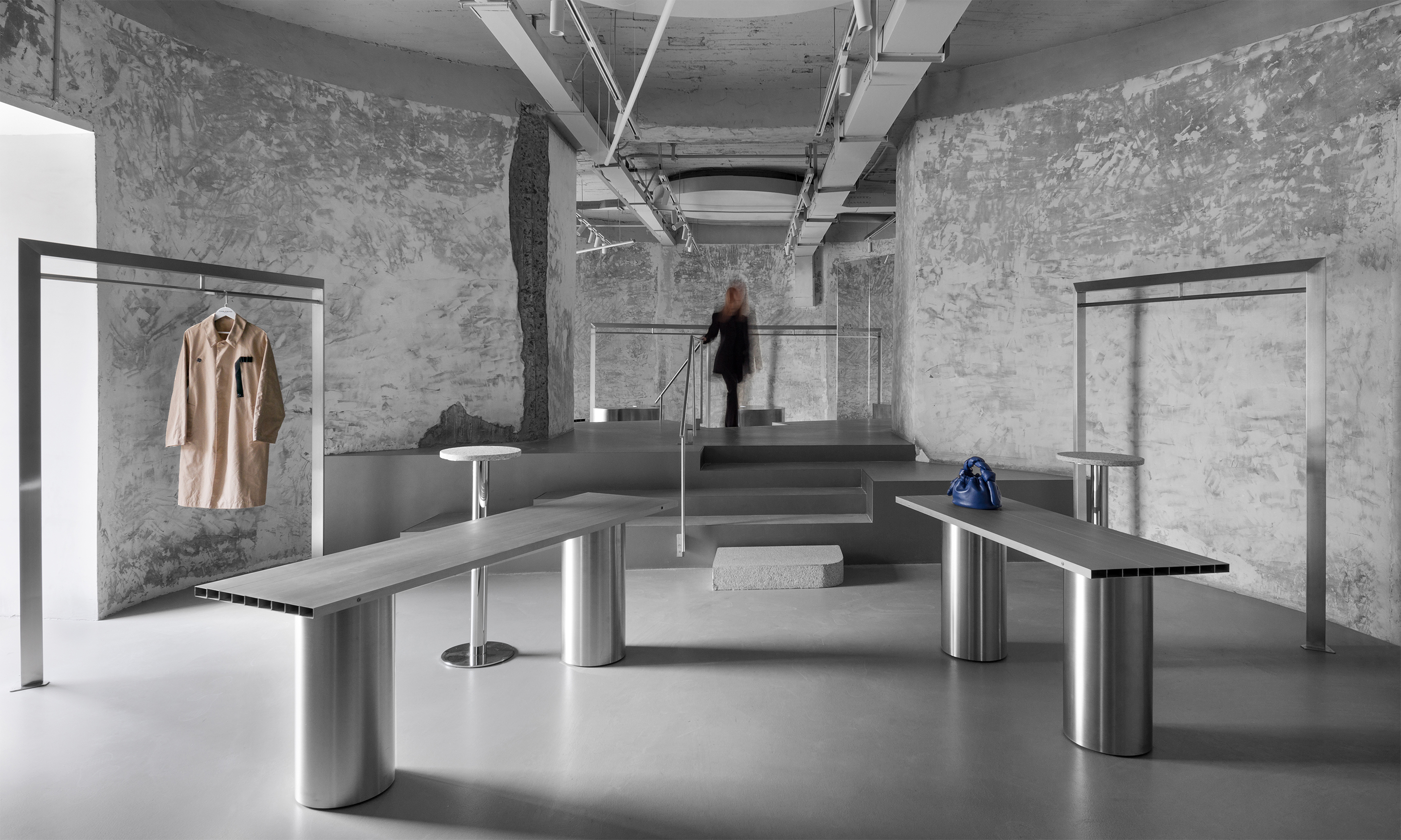
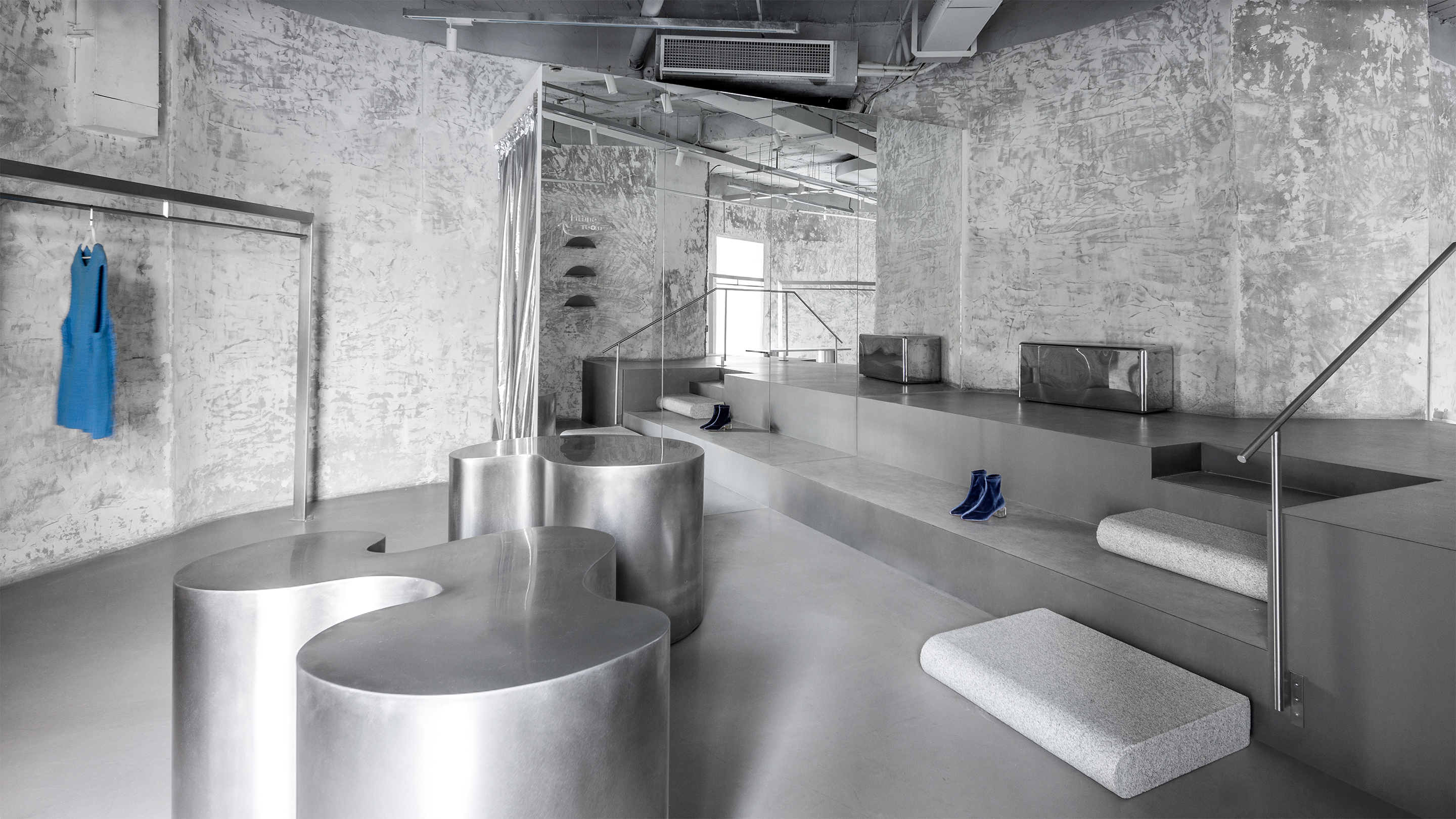
向左是服装、鞋类陈列区,设计师在两个圆筒中间运用阶梯作为一个展台连续空间的体验感。
To the left is the clothing / Footwear display area. The designer uses the staircase between the two cylinders as a continuous space experience.
▲服装、鞋类陈列区 clothing / Footwear display area
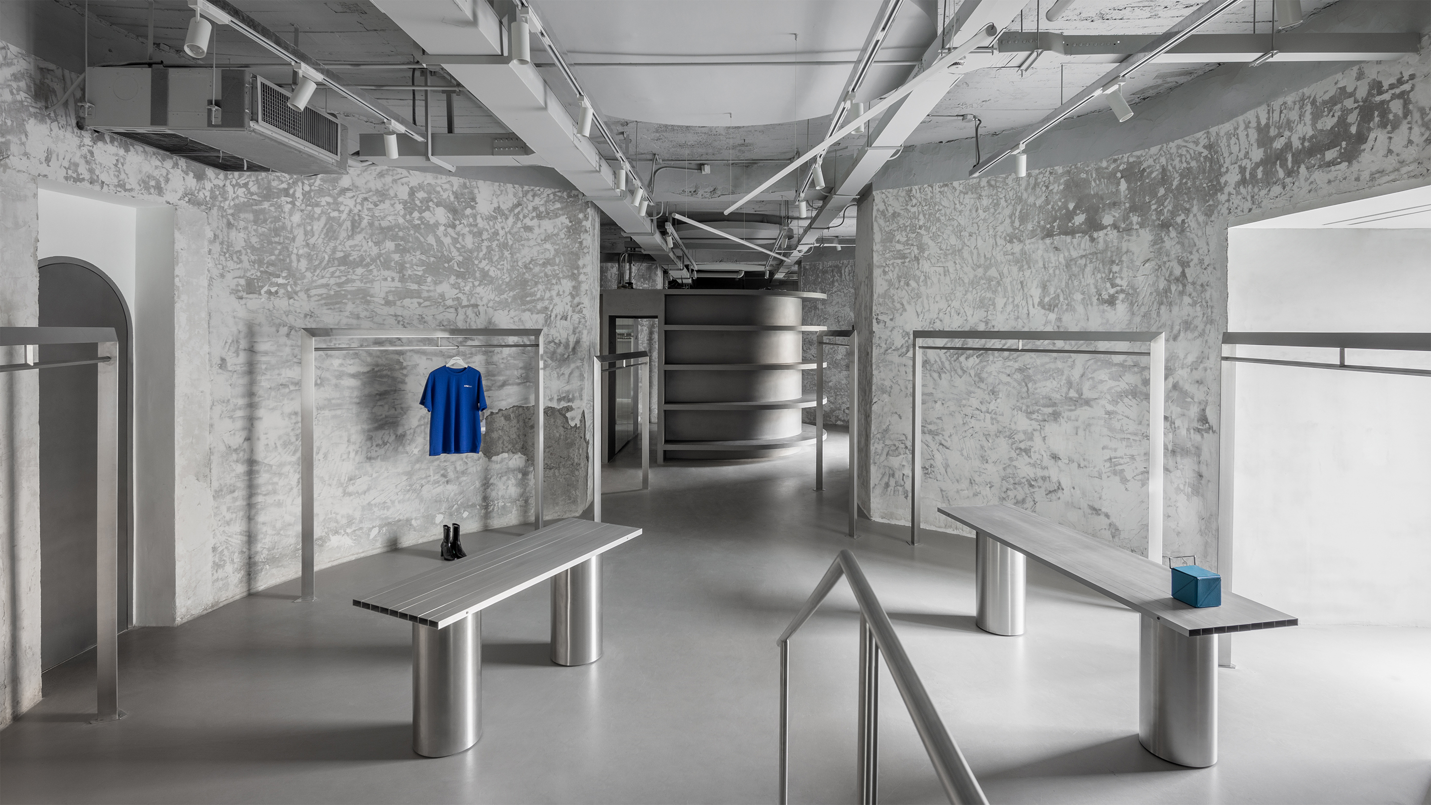
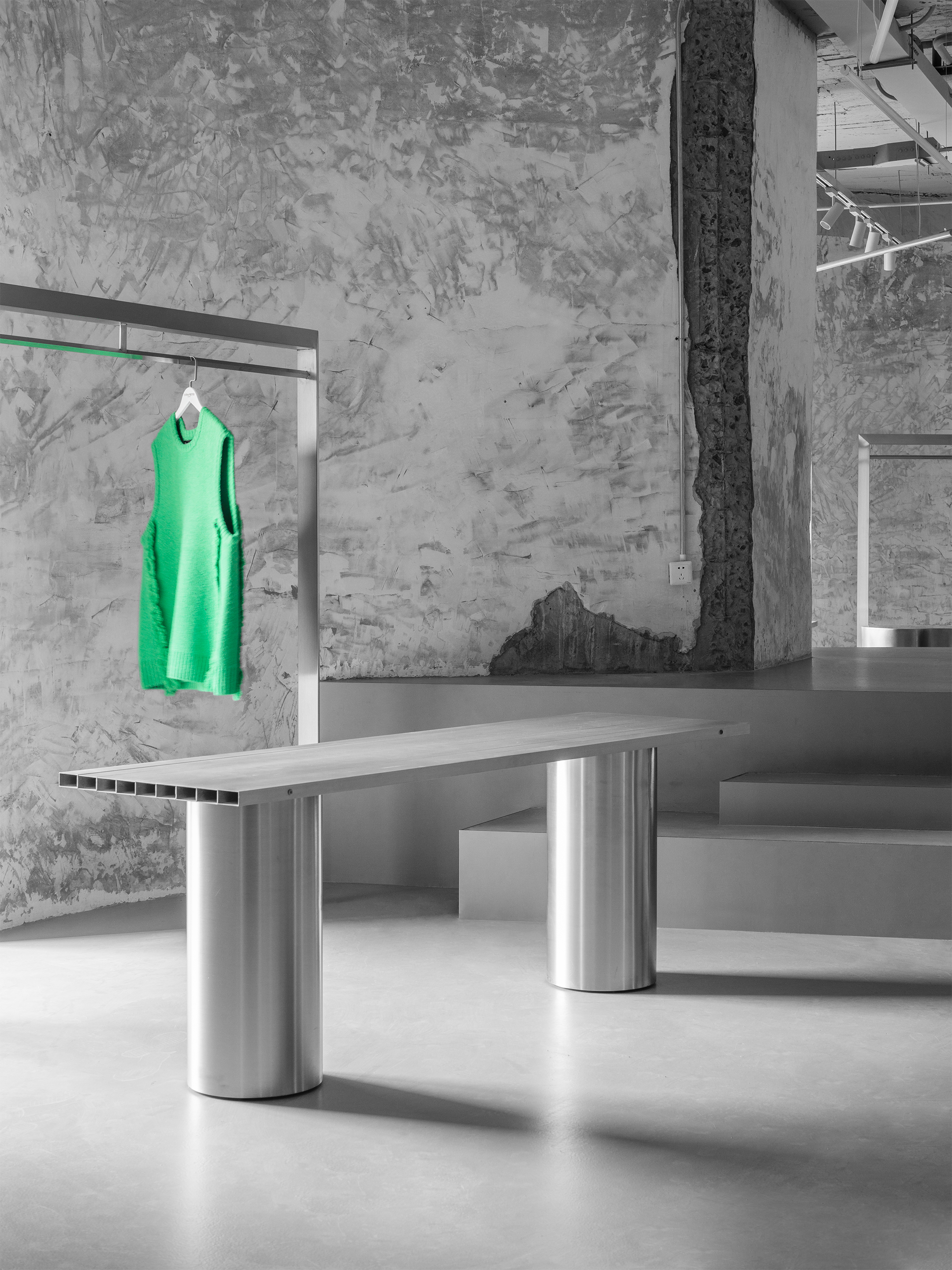
同样的对话方式在整个空间中延续。进入左侧服装、鞋类陈列区,空间让产品成为主角。落地式衣架配合展台用更为随意、松散的方式放置。
The same dialogue continues throughout the space.Enter the clothing / Footwear display area on the left, and the space makes the product the main character. The floor type clothes hanger is placed in a more casual and loose way with the exhibition stand.
▲楼梯展台Stairs Showcase
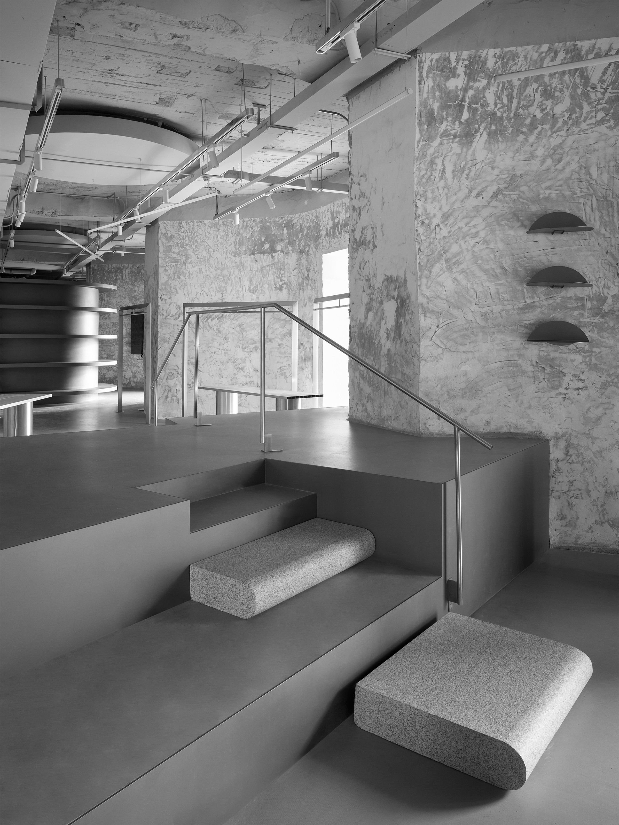
而在左侧两个圆筒之间,一个巨大的跨越式楼梯展台完成了对空间的分割,同时又为其建立了新的联系。
Between the two cylinders on the left, a huge stair crossing stand divides the space and establishes a new connection.
▲展台细节 Showcase Details
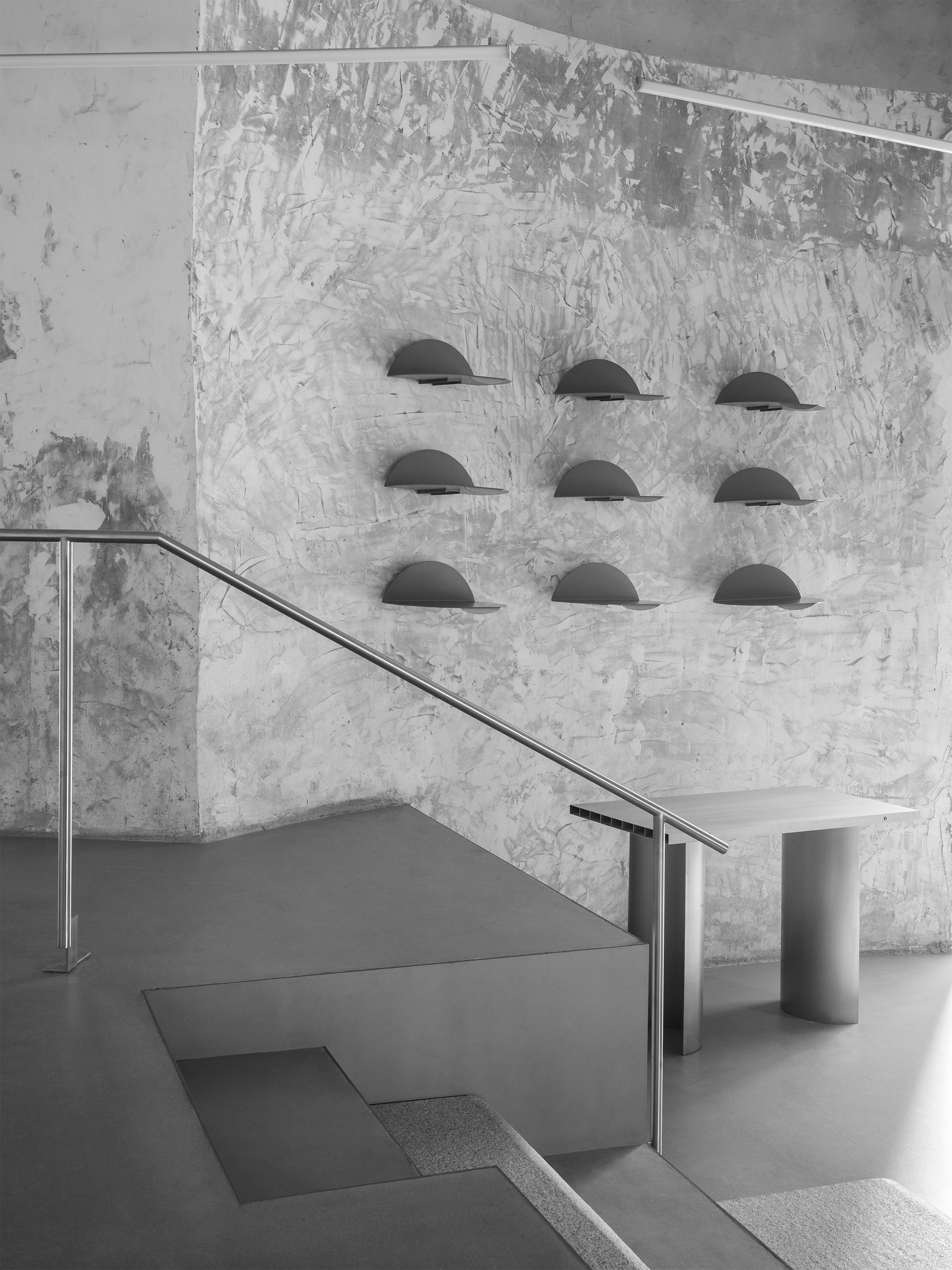
楼梯平台的高差阻隔了顾客的部分视线,激发更多的好奇心与探索欲,为距离入口最远的冷区引流。而高低错落形成的丰富视觉感受,也在长距离的动线上保证了空间的层次感与趣味性。展台加入大面积的镜子,在遮挡消防栓的同时,满足试衣需求并延续空间。
The height difference of the staircase platform blocks part of the customer‘s sight, stimulates more curiosity and exploration desire, and drains the cold area farthest from the entrance. The rich visual feeling formed by the high and low staggering also ensures the sense of hierarchy and interest of the space on the long-distance moving line. A large area of mirror is added to the booth to cover the fire hydrant and meet the fitting needs and extend the space.
▲冷区cold area
当人们走上展台时,又将解锁观察空间的全新视角。
When people walk on the exhibition stand, it will unlock a new perspective of the observation space.
▲细部 Details
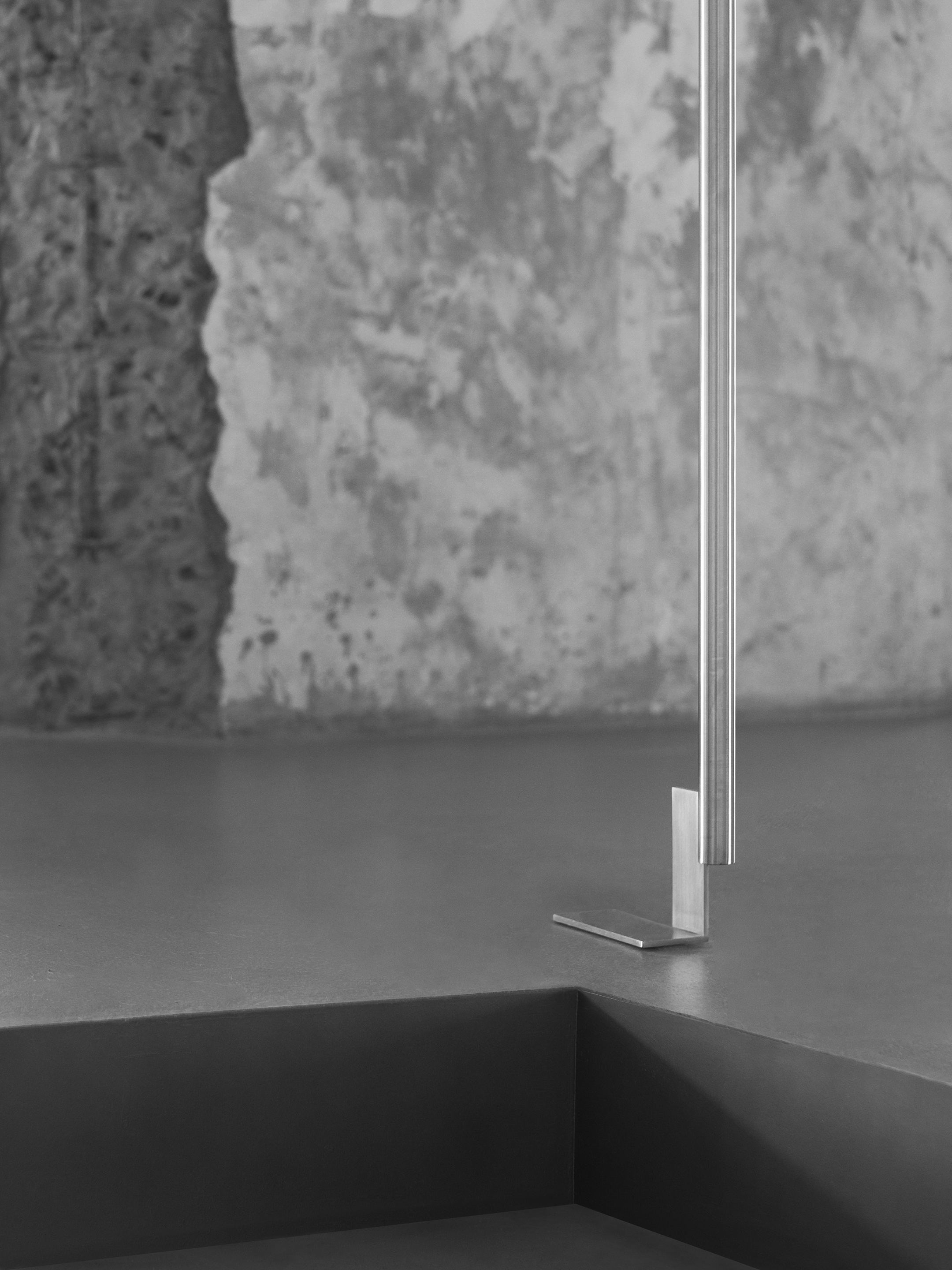
精致与粗粝、当代质感与原生肌理的对话。
The dialogue between delicacy and coarseness, contemporary texture and original texture.
▲材质Material
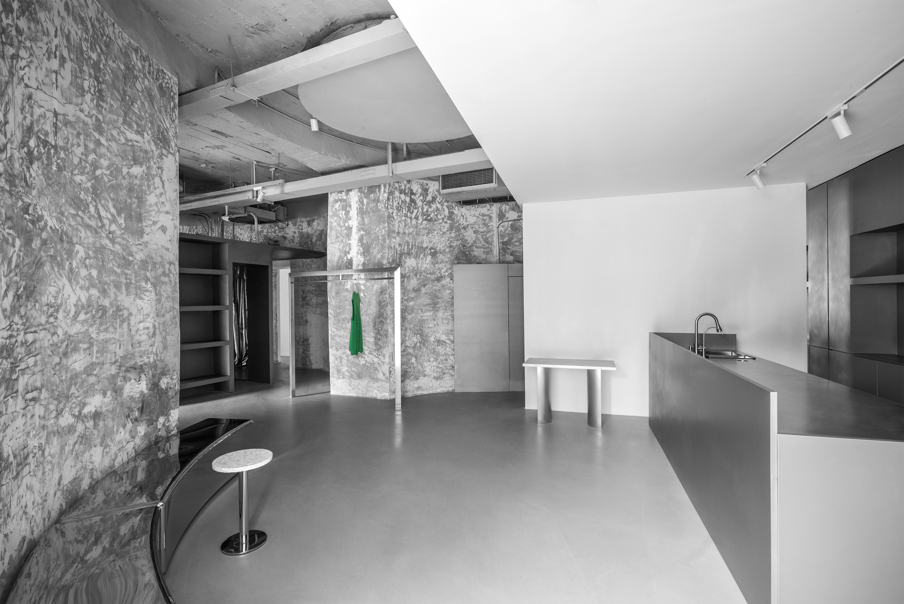
剔除粉刷面层后,建筑原有墙体呈现出原始毛坯状态,独特的肌理是时代的印迹。在此背景下,不锈钢及镜面材质注入强烈反差。
After removing the painting surface layer, the original wall of the building presents the original blank state, and the unique texture is the imprint of the times. In this context, stainless steel and mirror materials inject strong contrast.
▲社交媒体传播 EvenBuyer on Social Media
开业后的EvenBuyer,随即成为杭州新晋时尚打卡地标。
After its opening, Evenbuyer has become a new fashion clock out landmark in Hangzhou.
四十年前的水泥厂为城市建设提供原料,四十年后的「熟料空间」成为了都市先锋时尚的据点。从工业到文化的转变,在城市进阶的路径中,建筑获得了独特的意义。而在设计师手中,圆与方、粗粝与精致、原生肌理与现代材质、极简的设计语言与时下潮流单品,无不构成了有趣的互文及对「意义」的回应,并最终汇聚为这个张弛有度、富有韵律的空间。
Forty years ago, the cement plant provided raw materials for urban construction. Forty years later, the “clinker space” has become the vanguard and fashion stronghold of the city. With the transformation from industry to culture, architecture has gained its unique significance in the path of urban advancement. In the hands of designers, round and square, rough and delicate, original texture and modern materials, minimalist design language and current fashion items all constitute interesting intertextuality and response to “meaning”, and finally converge into this relaxed and rhythmic space.
▲分析图 Analysis chart
项目信息——
项目名称:EvenBuyer
设计公司:蒋杰设计工作室
主创设计:蒋杰
设计团队:潘楚楚
项目地址:杭州市西湖区凤凰创意国际
完工时间:2020.10
项目面积:320m²
摄影团队:汪敏杰
Project Information——
Project Name:Evenbuyer
Design Company:JIANGJIE·DESIGN
Designer:Jiangjie
Design Team:PAN ChuChu
project address :Fenghuang creative international in Xihu District, Hangzhou City
Time:2020.10
project area:320 M²
photography team:Wang Minjie


