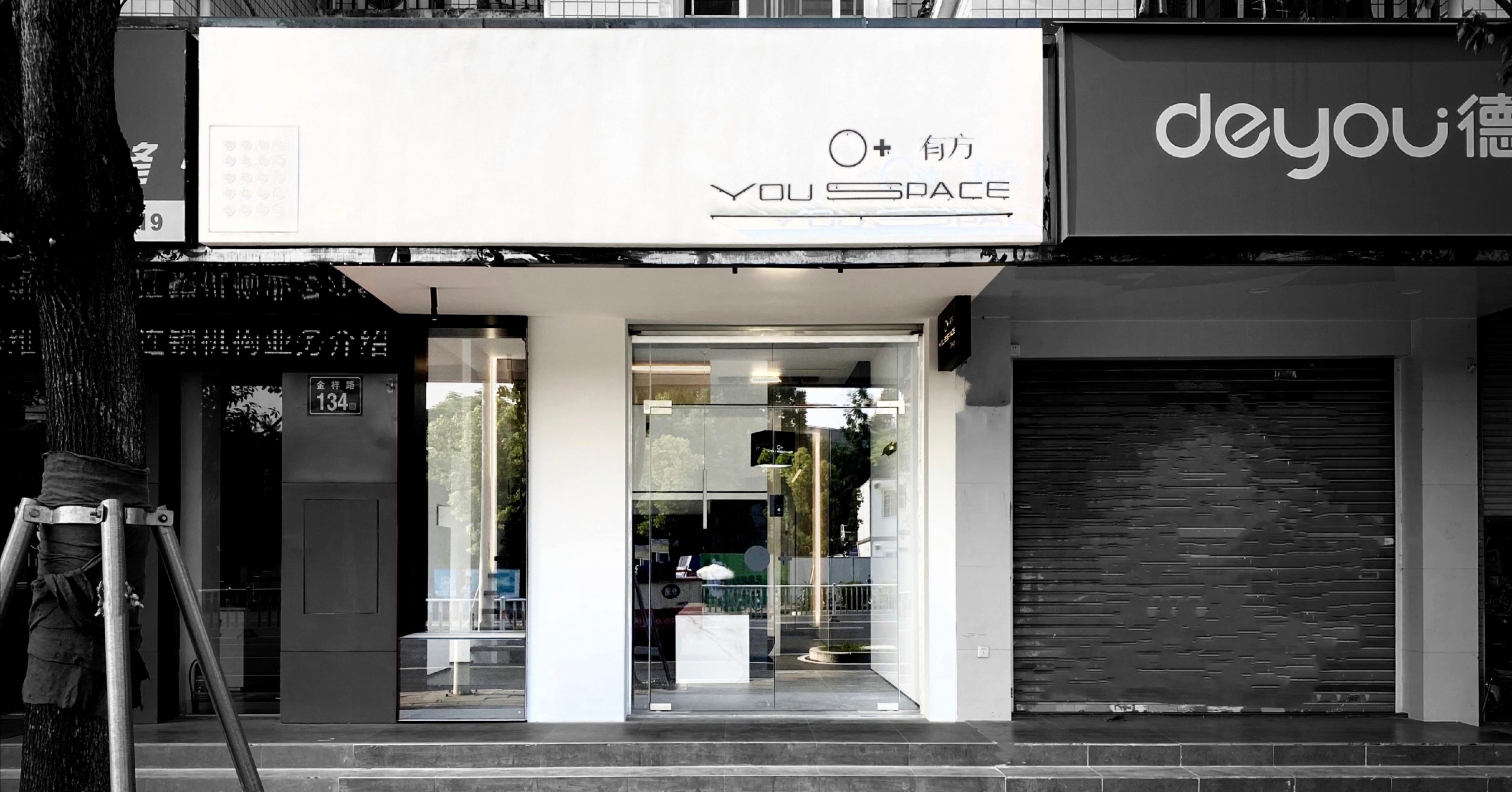
店铺径深12.6米,宽度4米,层高4.3米,规模稍小、狭长。为了避免做出狭窄简陋的空间,本案的策略就是通过让人在其中不断运动和观看,打造出丰富的空间感受。这是一个“实验室”,一个盛满可能性的地方。她可以是一个单身公寓、一个茶铺、一个独立的高级料理店、一个多元的展厅,设计初衷是为了“玩”。看看能“玩”出几个花样。当代的设计需要有更多元和创新的思考,在多种属性的空间里,玩出“一招致敌”的快感。
The store is 12 meters deep, 4 meters wide, smaller and longer. In order to avoid making a narrow and crude space, the strategy of this case was to create a rich spatial experience by letting people move and watch in it constantly. This is a “lab,” a place filled with possibilities. It could be a bachelor pad, a tea shop, an independent haute cuisine restaurant. It was designed to be “fun.” Let‘s see what we can do. Contemporary design needs to have more yuan and innovative thinking, in a variety of attributes of the space, play out the “one invites the enemy” pleasure.
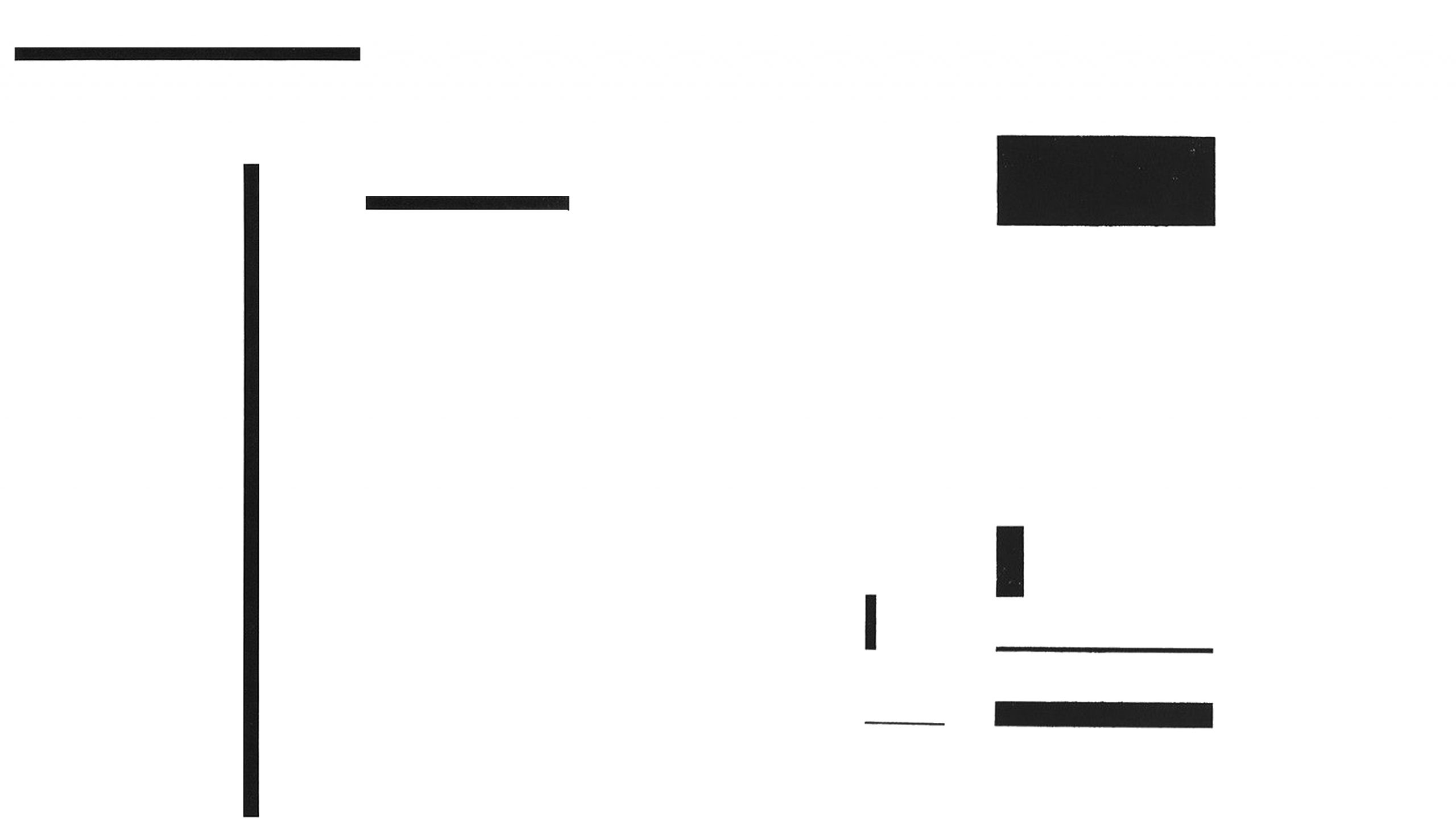
▲设计抽象概念图,Design an abstract concept diagram
设计构想之初是来源于画中不同长度,面积的体块,以打散重组在空间中的结构为概念的表现形式。在材质及造型上,为缓解小空间固有的压迫感,使用白色基调和方正的体块拓展空间界面。单纯的空间与单纯的时间都注定会消散于阴影之中,唯有二者的结合体可以继续保存一个独立的客观事实。从哲学层面思考这个空间问题,是相通的。白色就如同空间,黑色块面是时间。亚里士多德曾说:“时间是对变化的量度”。在这个空间里,时间刻画出自己丰富的痕迹,展现出一个相互融合的整体。
The original design concept is derived from the volume of different lengths and areas in the painting, which is represented by the concept of breaking and recombining the structure in space. In terms of material and shape, in order to alleviate the inherent sense of pressure in a small space, white tone and square block are used to expand the space interface. Both pure space and pure time are doomed to dissipate in the shadows, and only the combination of the two can continue to preserve an independent objective fact. From the philosophical level of thinking about this space problem, is the same. White is space, and black is time. Time depicts its own traces in space, showing an integrated whole.
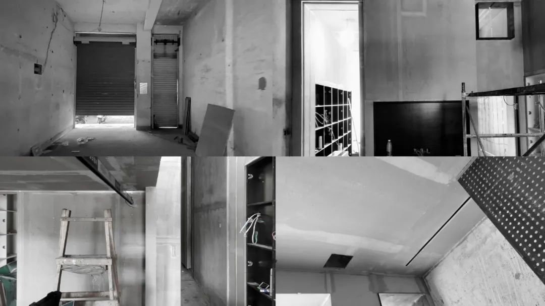
▲设计过程图,Design process diagram
设计难点:层高受限,挖地基的来增加层高,不料一次挖到了地梁,一次挖到了管道,都无法实现。利用钢架做了楼板,缩减占用高度的距离。“抠”成为这个项目施工的主线,能多一点高度的可能性都不能放过。整个空间狭长,采光差,在每个划分的区域都要通透是极为有挑战的。不仅如此,从商业角度来说,这个空间必须具备生命周期,多兼容性,适合多种行业的运营。适合当下时代对商业空间更深层次的思考。环保且创新。
Design difficulties: the height is limited, the foundation to increase the height, but only once dug to the beam, once dug to the pipe, can not be realized. The steel frame was used to make the floor slab to reduce the distance occupied by the height. “Dig” has become the main line of this project construction, the possibility of a little more height can not be let go. Whole space is long and narrow, daylighting is bad, the area that divides in each wants to connect fully it is to have a challenge extremely. Not only that, but from a business perspective, the space must be life-cycle, multi-compatible, and suitable for multiple industries. Suitable for the current era of deeper thinking of commercial space。Green and innovative。
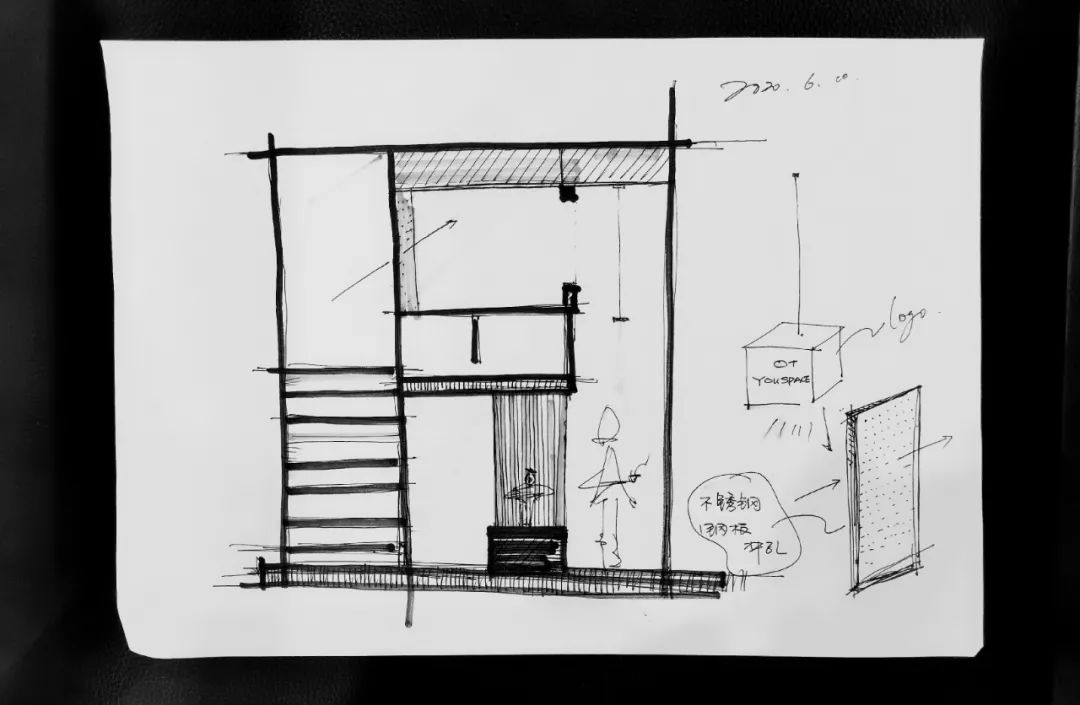
▲设计手稿,Design of the manuscript
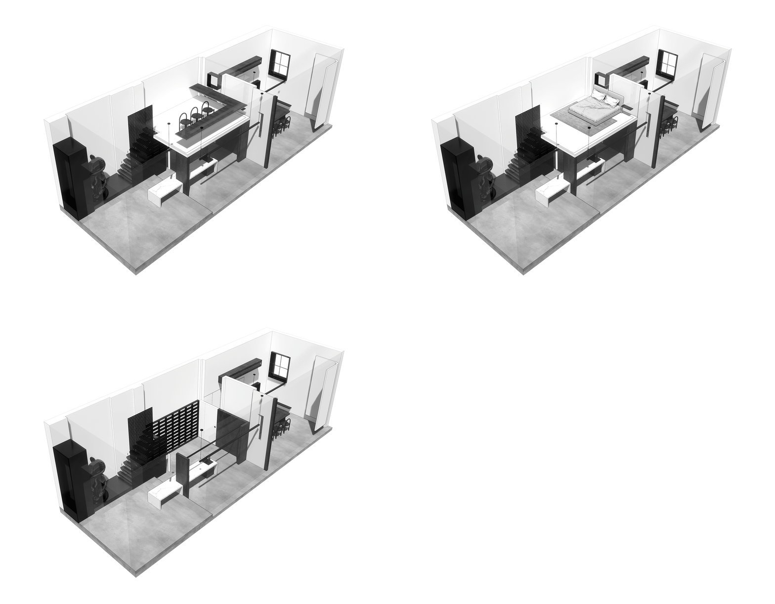
▲空间场景切换图,Space scene switching diagram
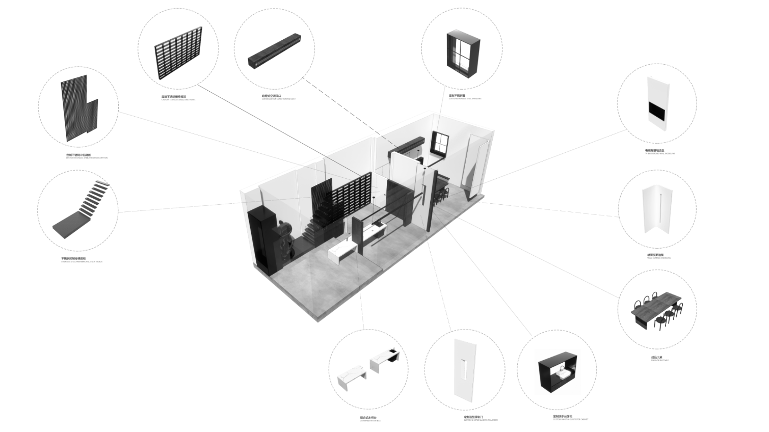
▲空间解构分析图,Spatial deconstruction diagram
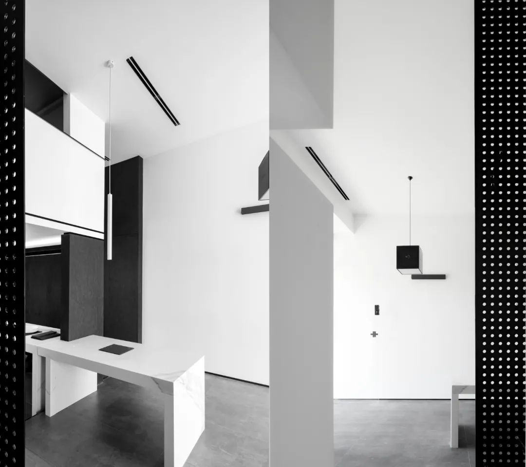
▲过道长廊视觉点纵横交错的黑白体块在空间穿梭,Corridor corridor visual point crisscross black and white block in the space shuttle
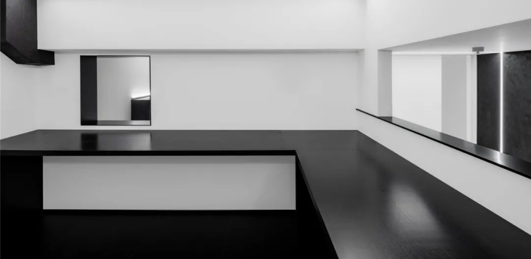
侧向视觉点 建构几何,正方体、长方形、圆形、线条,几何之间的关系微妙而和谐。
The lateral visual point constructs the geometry, the cube, the rectangle, the circle, the line, the relationship between geometry is subtle and harmonious
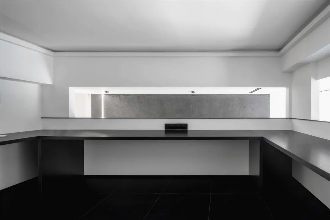
二层往窗外视觉点 建筑回廊的设计手法、窗口高度与整体层高的比例呈现出规整的视觉效果。
On the second floor, the design technique of the corridor and the proportion between the height of the window and the height of the whole floor present a neat visual effect
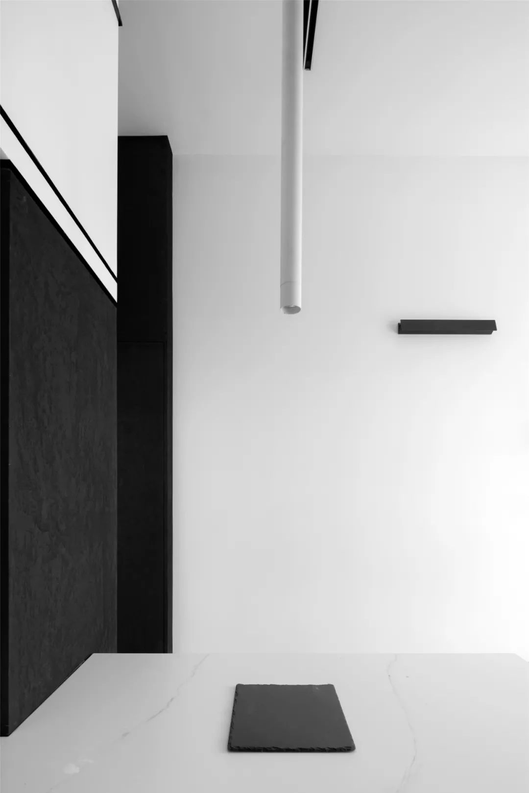
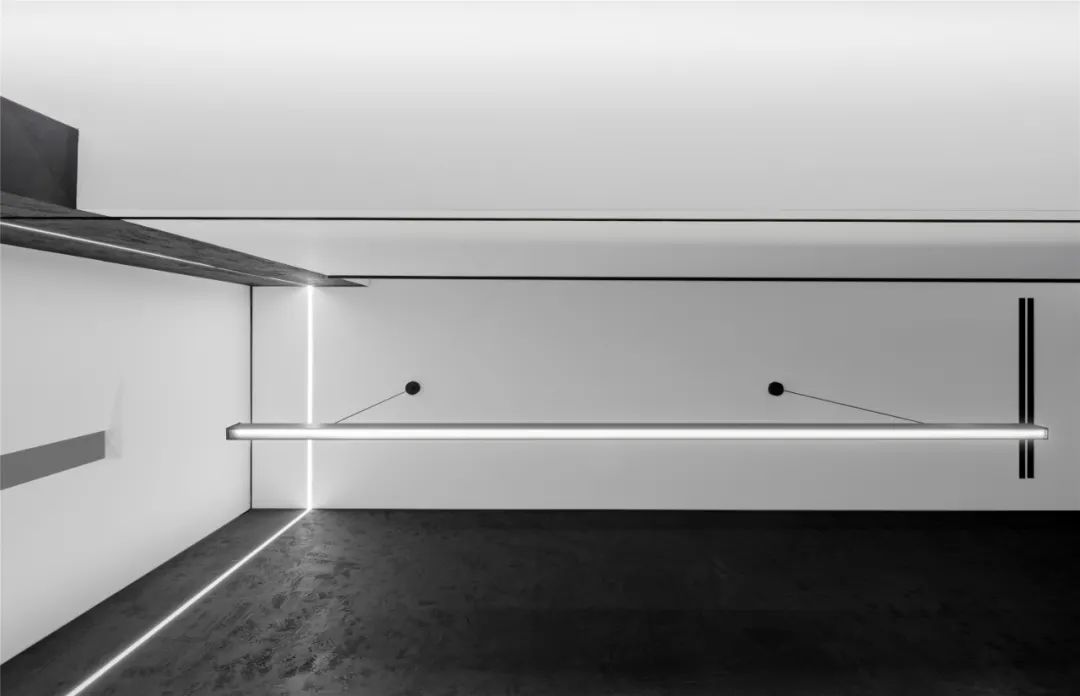
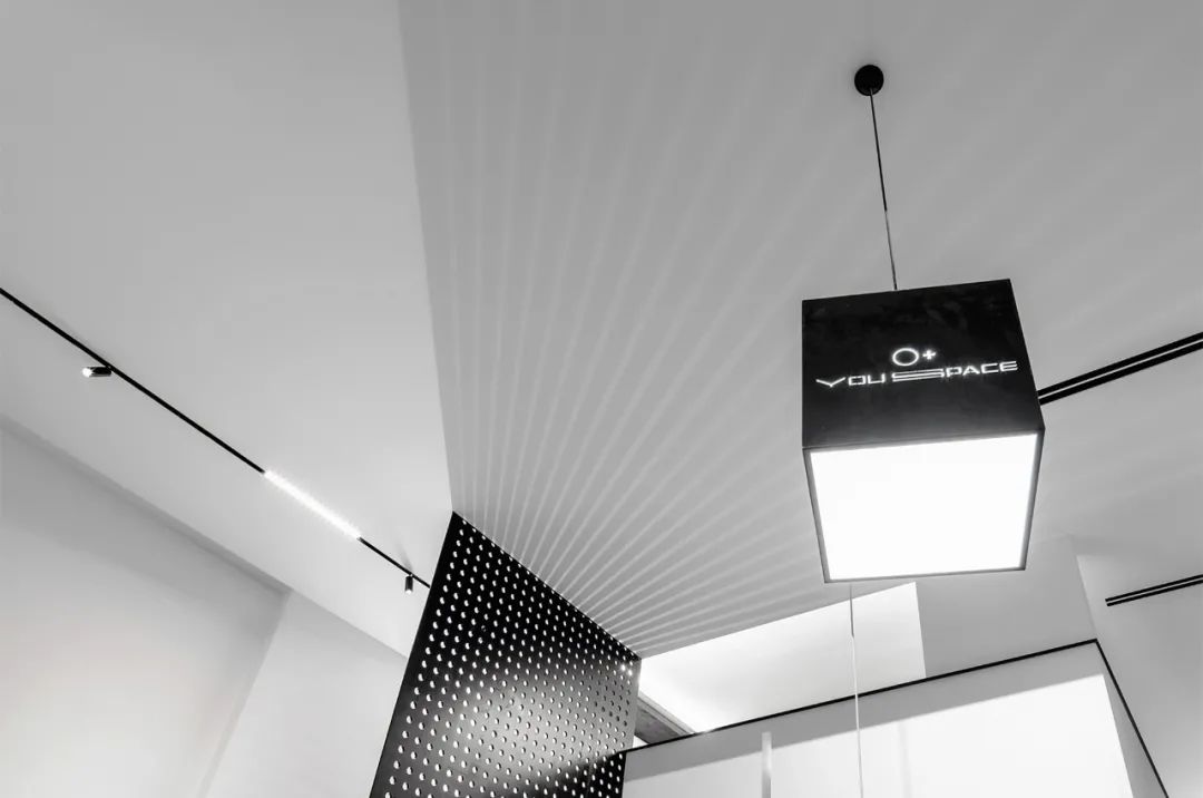
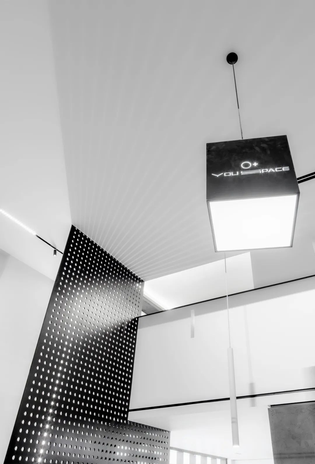
抬头挑空处视觉点 两种色块之间强烈的对比,有着各自的场域,线型灯在墙面和吊顶的切分,划破了空间的“你我” 。
The sharp contrast between two kinds of color blocks in the visual point of lifting the head and the empty space has its own field. The line light is segmented in the wall and the ceiling, which cuts through the “you and me” of the space.
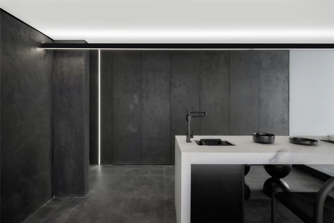
▲前区水吧台处视觉点,Front area water bar table at visual point
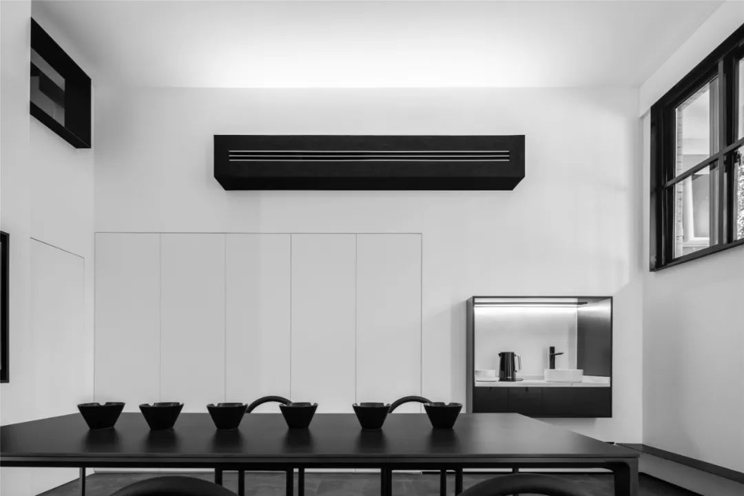
后区墙面处视觉点,二层0.6米高的窗户由钢板折合而成、0.3米高的空调盒子刷了金属肌理漆、0.9米高的小水吧台由黑钛做了一个整体的造型框,这三者之间是这个空间中立体感最强的几何构成体,以不同形式的语言在表达自己的存在。
Metope place visual areas after point by the steel plate is equivalent to 0.6 meters tall on the second floor window air conditioning box, 0.3 meters high and brushed metal texture paint, 0.9 meters high num bar by black titanium made the modelling of a whole frame, this is the space between and among geometric structure of stereo sense is strongest, in various forms of language to express their own existence.
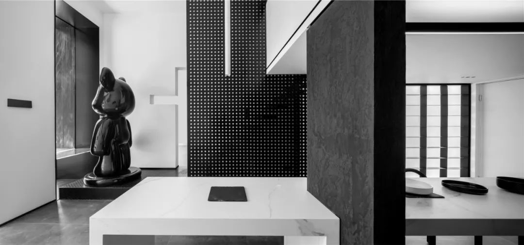
前区墙面视觉点 靠街道的框景放了艺术装置,制造了视觉的焦点。楼梯旁的钢板,做了规则的穿孔造型,待华灯初上时,折射出几何的光影。
The visual point of the front wall is framed by the street, where art installations are placed, creating the focal point of the vision. The steel plate next to the staircase is perforated regularly to reflect geometric light and shadow when the light comes on.
▲穿孔钢板透出的光斑,Light from perforated steel plates
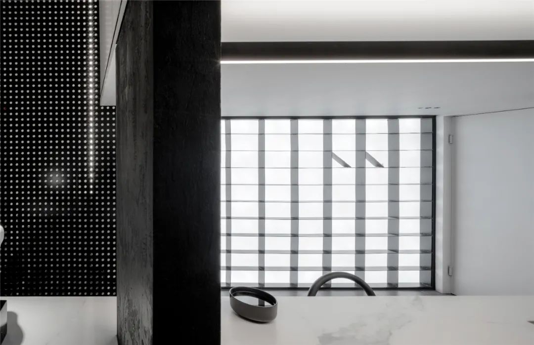
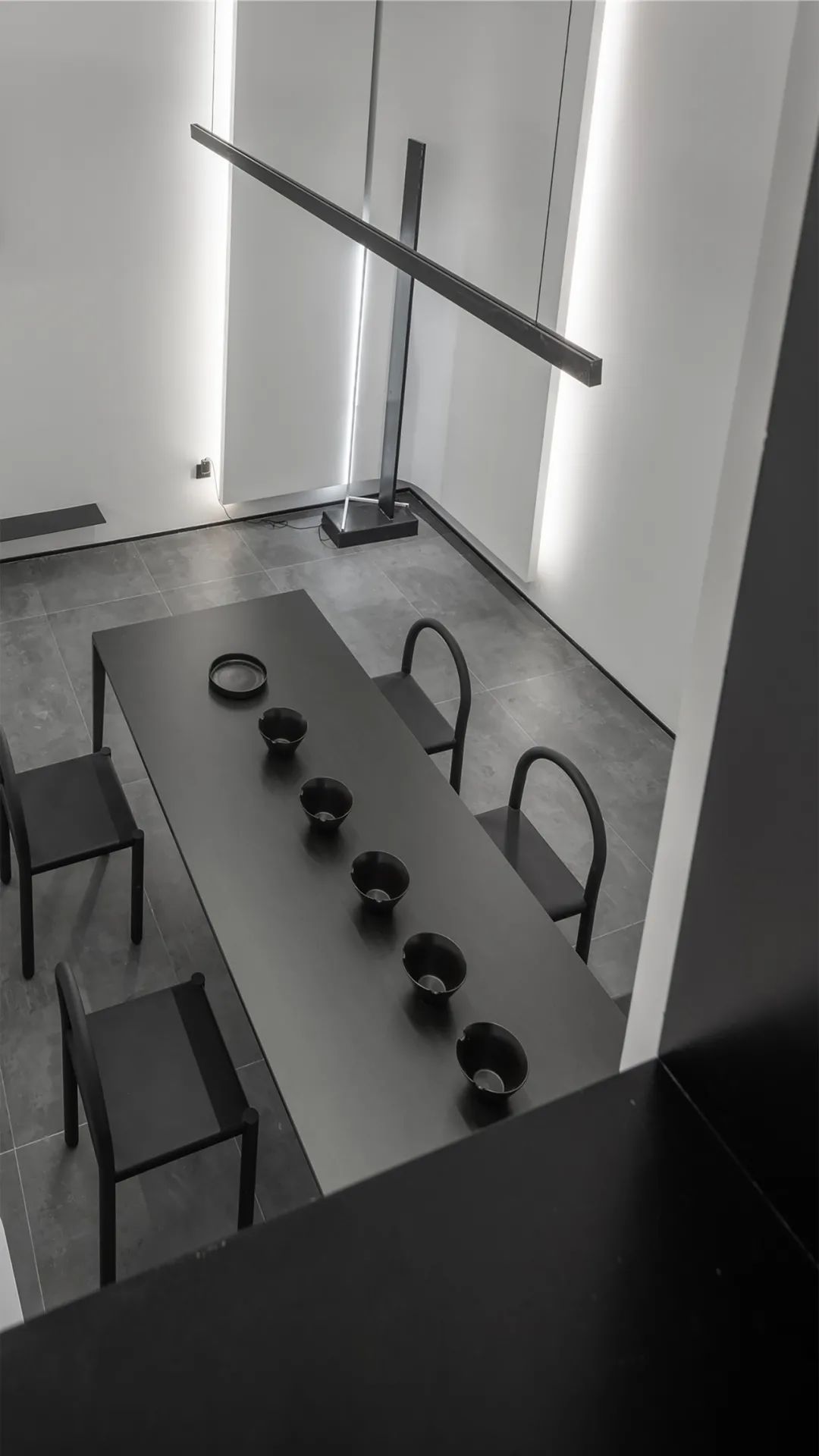
二层窗户看后区视觉点,吊灯与落地灯形成一个“十”字的有序构成
The 2nd floor window looks after area vision point droplight and floor lamp form a “10” the orderly composition of the word
前区左边门视觉点,有序的几何延伸出视觉纵深感,恰到好处的留白,让“椅子”和游走的光线、空气、不同质感的表现形成更有深度的“对话”。
The orderly geometry of the left visual point of the front area extends the visual depth, leaving just enough white space for the “chair” to form a more profound “dialogue” with the wandering light, air and the performance of different textures.
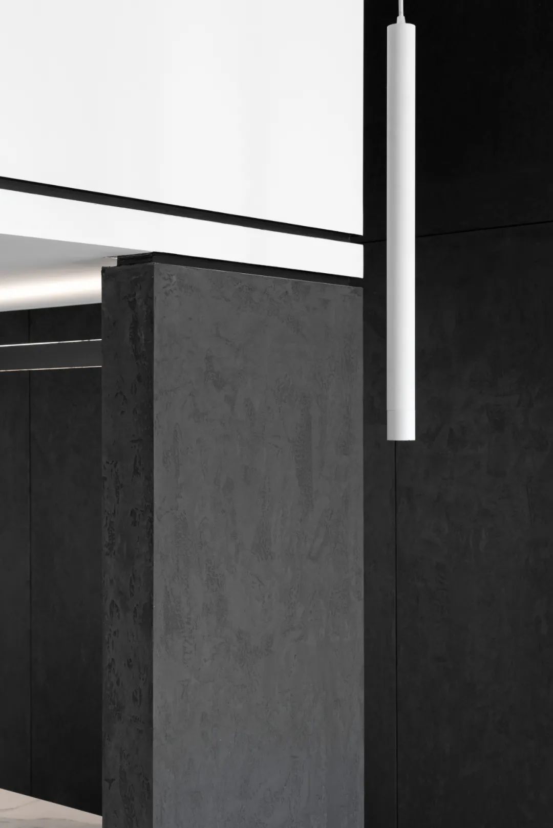
一层与二层连接处视觉点,内凹1cm的细节对接收口形成丰富的层次和线条
The visual point at the junction between the first floor and the second floor is concave in the detail of 1cm to form rich layers and lines
项目信息——
项目名称:有方
项目面积:41㎡
主创设计:游小华
参与设计:欧阳、李京、许骆英、林娜、卢艳萍
视觉表现:YOU SPACE
艺术陈列:ULI ART
设计材料:岩板、钢板、金属漆、不锈钢、大理石等
时 间:2020.09
Project Information——
The project name:has a square
The project area is:41 ㎡
The main designer designs:Xiao hua you
Participated in the design of:ouyang, li jing, xu luo ying, linna, lu yanping
Visual representation of:YOU SPACEART
showcase:ULI ART
Design materials:SLATE, steel plate, metallic paint, stainless steel, marble, etc
Time:2020.09











-50x50.jpg)

