作为“快生活”的衍生品,超市自上世纪30年代在美国诞生便迅速风靡全球。中国零售业70年代开始引入超市概念,却没有对本土市集文化进行很好的融合、延续与创新。芝作室受长沙本土新零售品牌“福来食集”委托为其设计了超市首店,借由传统市集文化的有机融入,打造可供市民深度体验的复合型公共空间。
The concept of supermarket was born as a by-product of the fast-paced lifestyle in the United States back in the 1930s. Most supermarkets in China adopt the conventional spatial model based on efficiency but often lack a memorable character. Commissioned by Fresh Mart, a new brand established in Changsha, to design its store identity, Lukstudio has reinterpreted elements from common Chinese markets and street booths, giving the familiar typology an unfamiliar facelift.
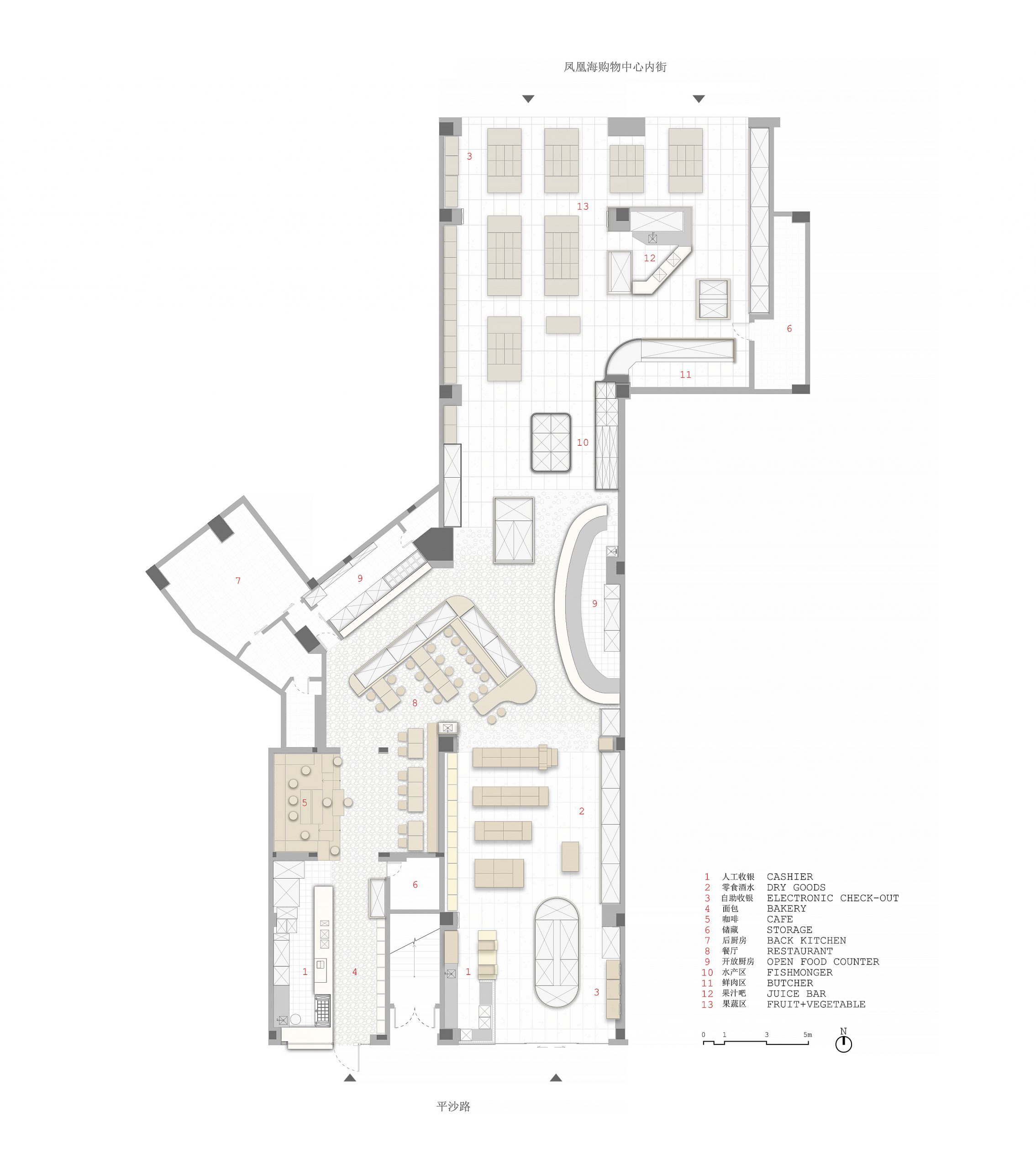
▲平面图 floor plan
▲空间轴测图 exploded axonometric diagram
项目位于长沙市新区北辰三角洲,周边住宅林立,超市南入口正对平沙路,北入口连通凤凰海购物公园内街。从传统市集货架提取的木框元素,既作为基础结构串连起超市各功能分区,也通过不同的变化组合来营造差异化视觉效果,烘托各区主题。
Located next to several residential compounds in the new CBD of Changsha, the given irregular site comes with two entrances, one facing the Pingsha street and the other connecting to the Hi Park Mall. Throughout the supermarket, a wooden frame is used as an infrastructure that ties all the different sections: fresh vegetables, fishmonger, butchery, dry goods, restaurant, cafe and bakery. Each section is then characterized by an assembly of relevant features or textures.
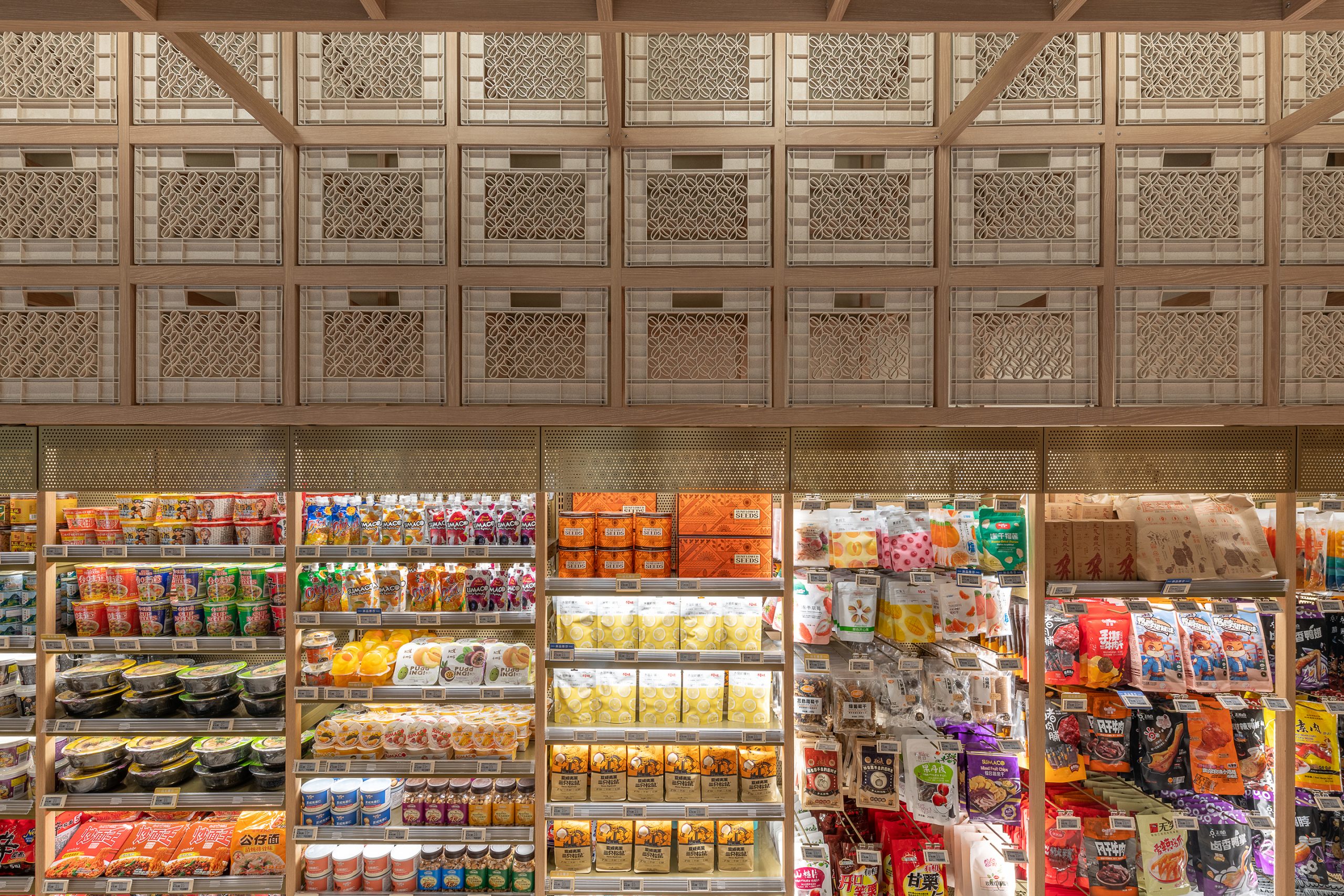
▲零食酒水区 dry goods section
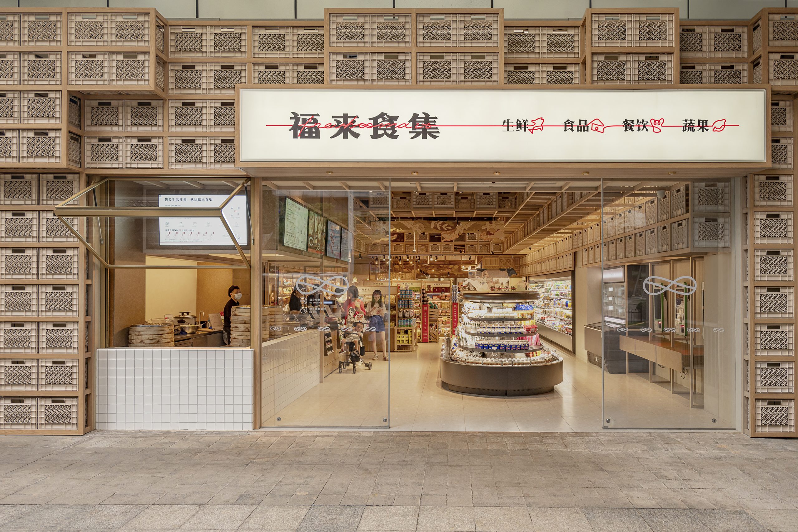
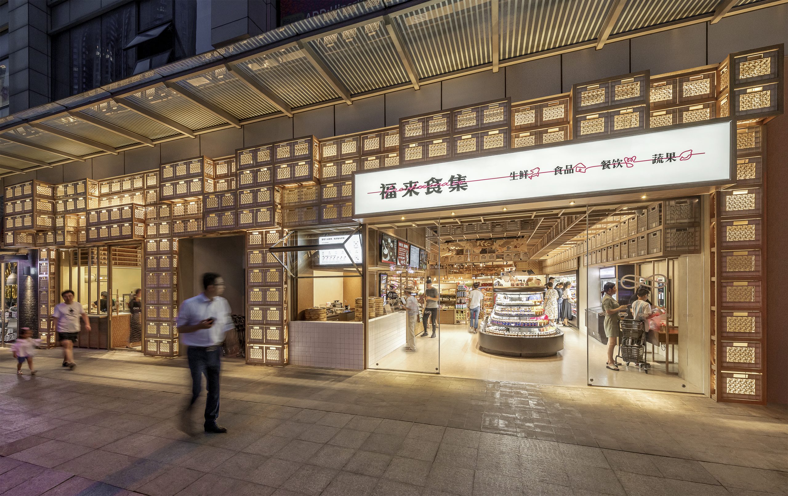
堆叠的牛奶箱自沿街外立面延伸到室内零食酒水区,传达空间属性与秩序感,还兼具店招及照明功能。
The street facade and the nearby dry goods section are marked by stacking milk crates which convey a sense of order among the busy racks and double as spectacular lanterns at night.
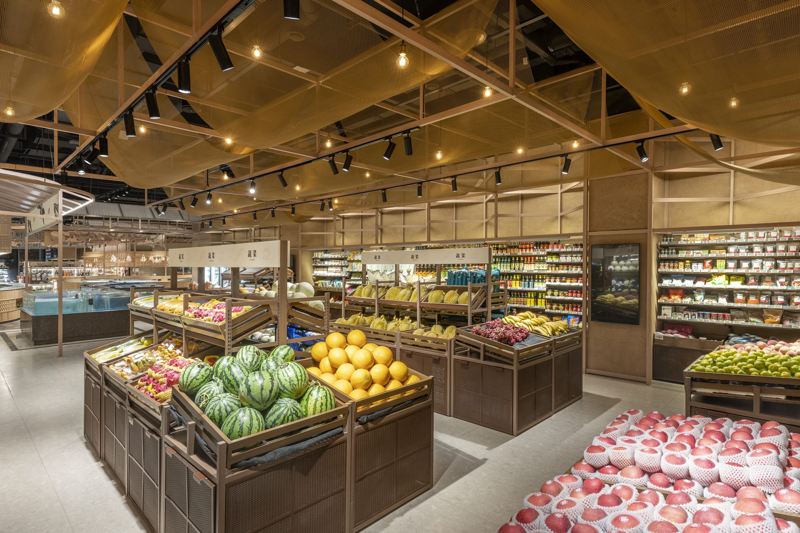
▲果蔬区 fruit & vegetable area
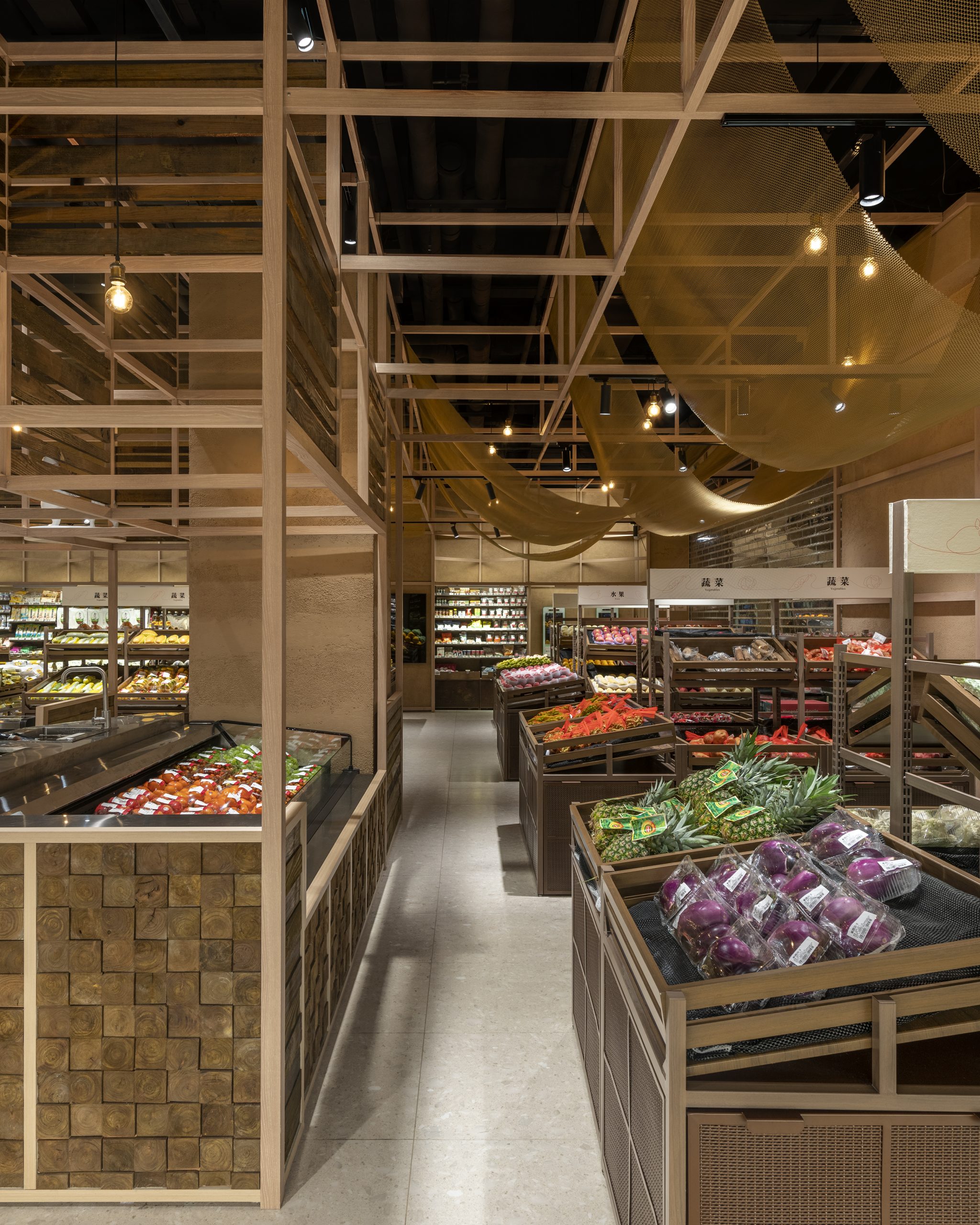
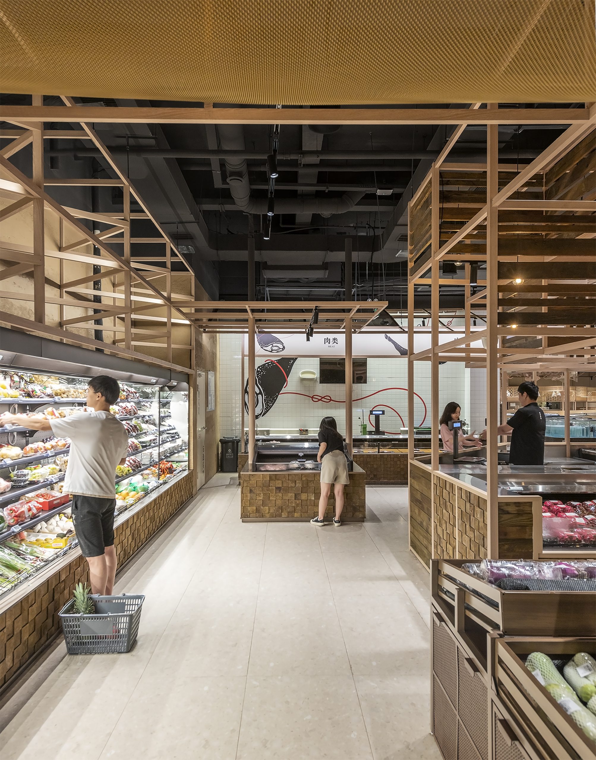
果蔬区以起伏的金属网檐和木框货架来营造氛围,带顾客重拾在露天市场挑果择菜的趣味体验。
At the fruit and vegetable section, the idea is to create the experience of walking down the aisles in a local Chinese outdoor market, a series of metal mesh canopies mimicking tarpaulin is the key feature.
▲鲜肉水产区 fish and meat area
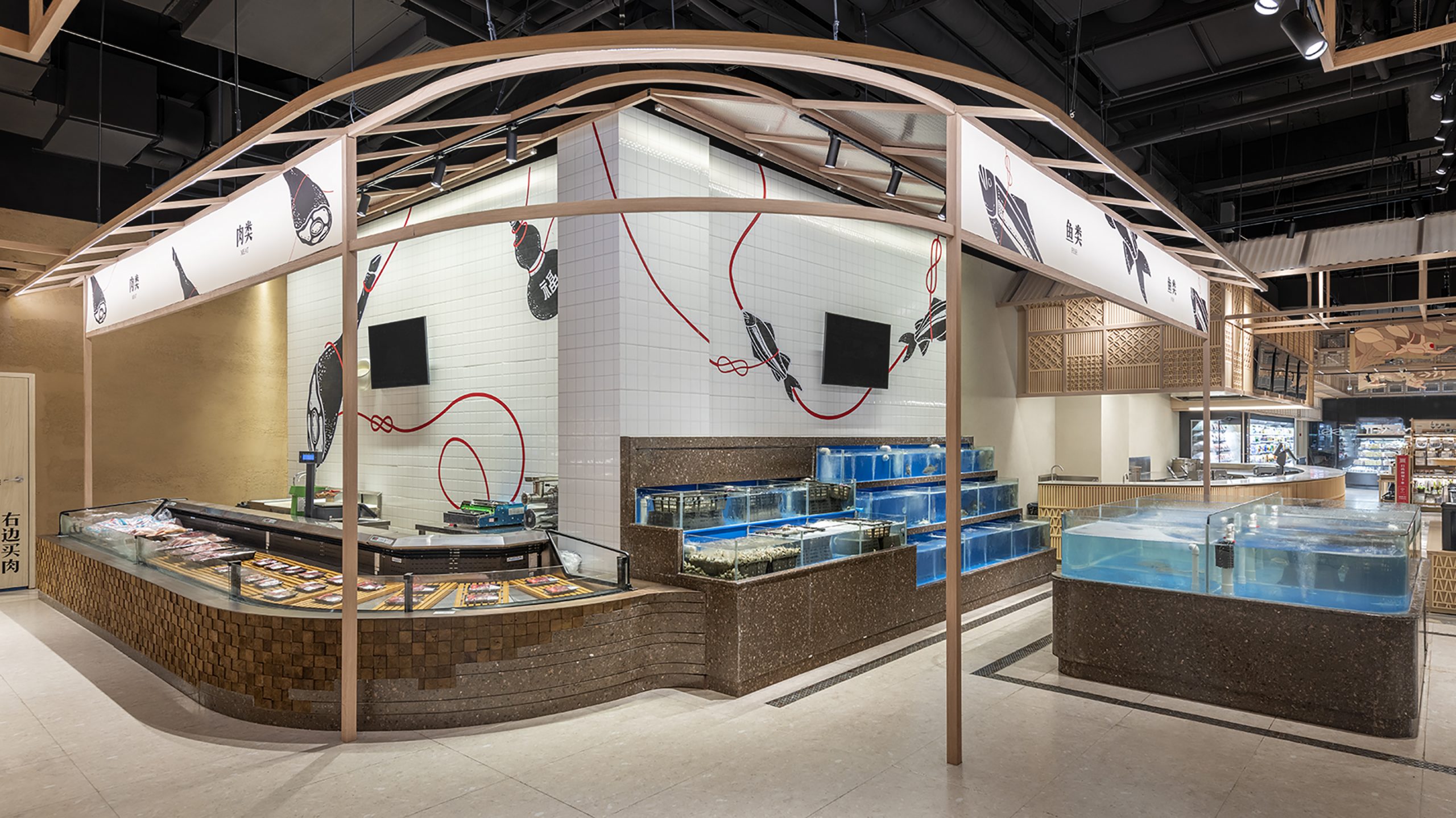
转角处鲜肉水产区的设计则受传统砧板的启发,案台用深浅木块拼接的像素图案向自选鱼缸基座的防水石材渐变过渡,加上背景墙一缕红绳串起的”鱼””肉”图像,两片区域自然衔接,生动有趣。
At the corner where the butchery turns into the fishmonger, apart from a lively wall graphic linking the sections, a material gradation along the counter intends to smooth the transition. Inspired by the sturdy chopping board often used by butchers, wooden blocks of different depths line the meat section and gradually change into waterproof stone finish surrounding the self-serviced fish tanks.
▲餐厅 restaurant
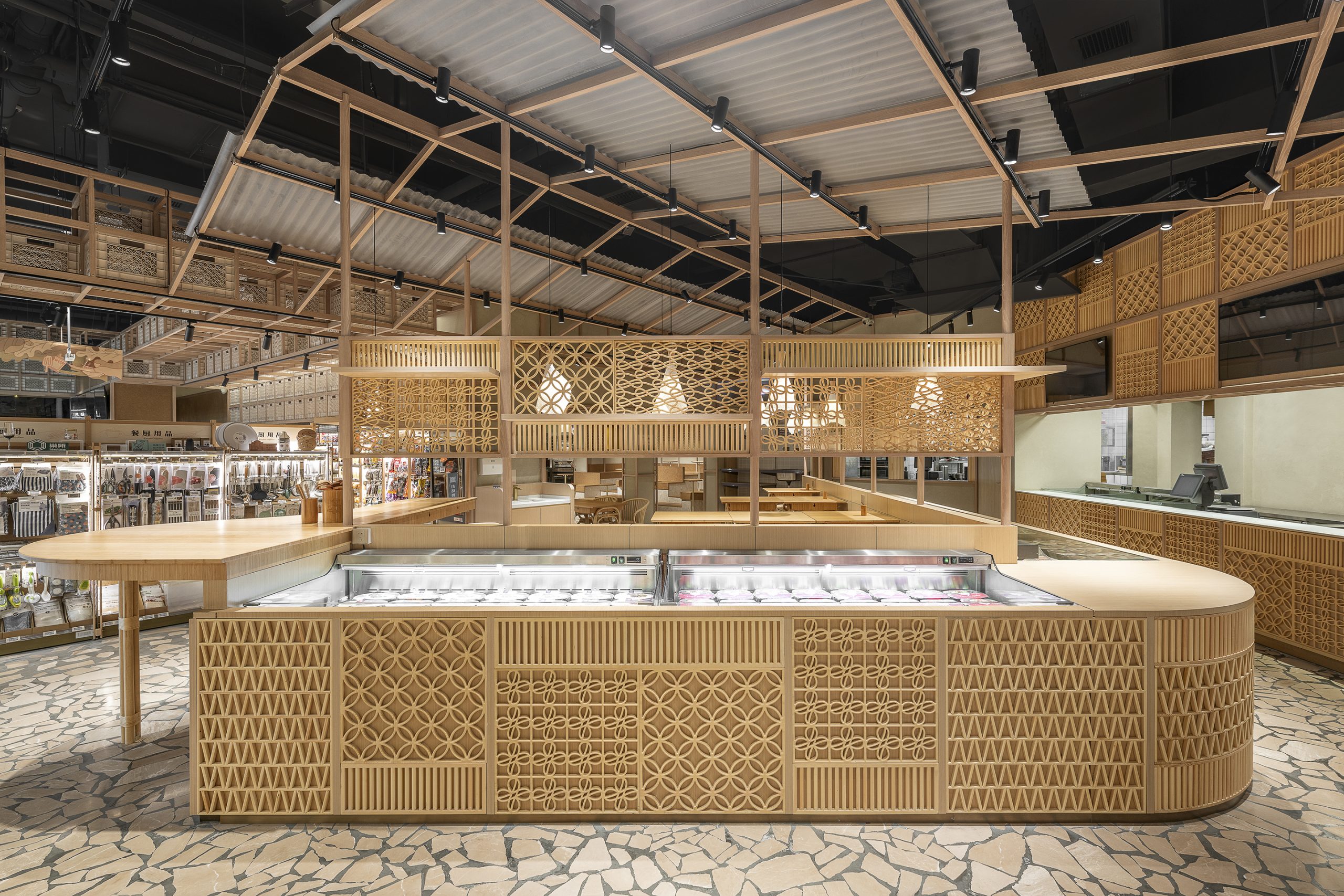
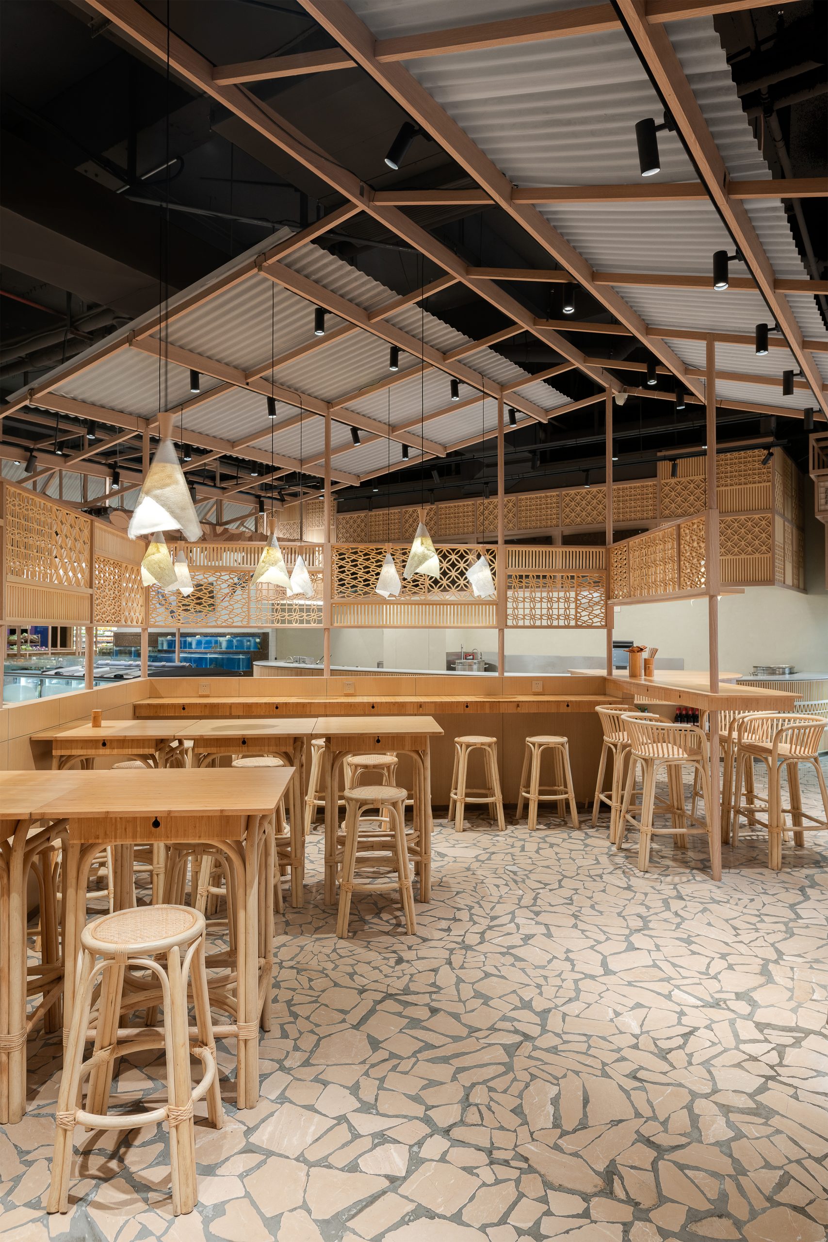
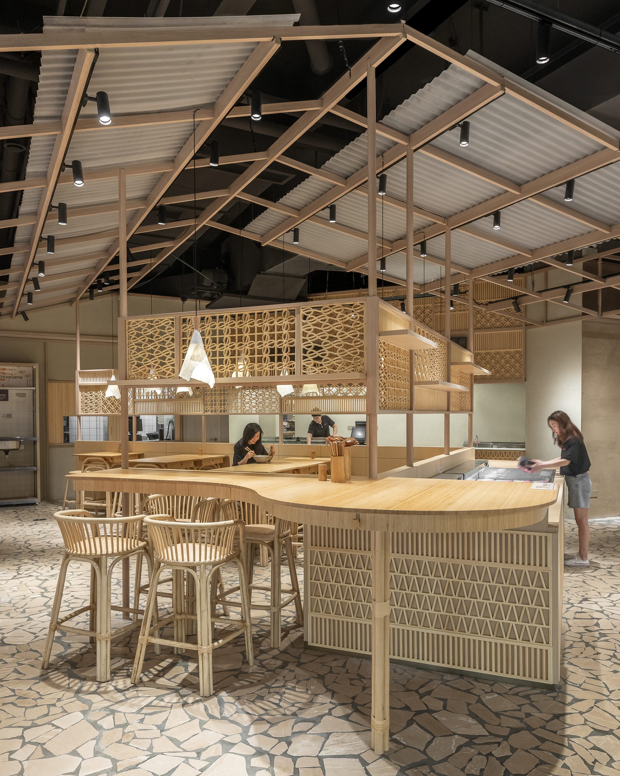
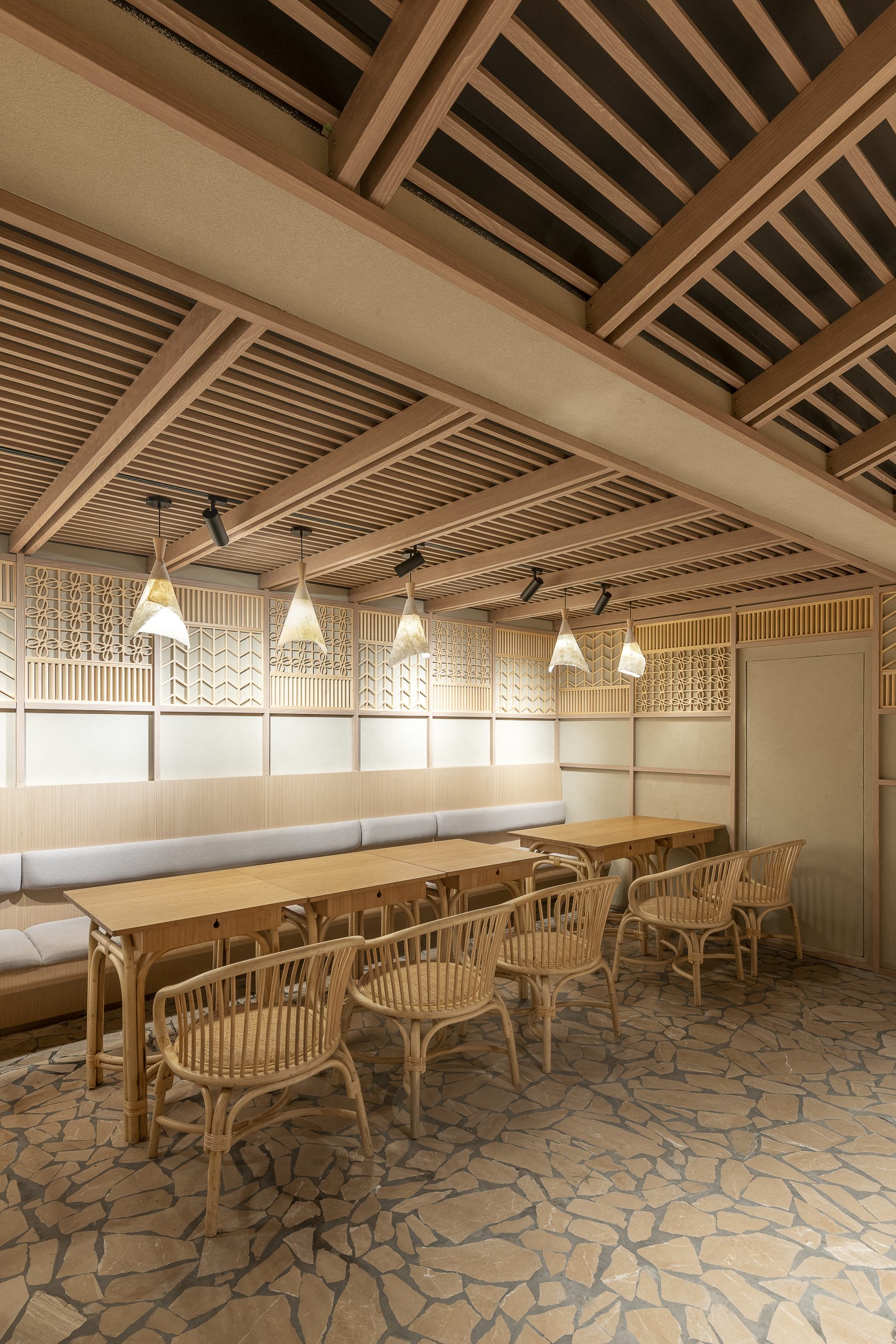
用餐区依照露天小吃摊的意象进行设计,木框结构与波纹板撑起一片高挑的斜顶。半透格子屏风被用以分隔餐厅与售卖区,屏上的花格元素还应用于周边柜台和设备的围档装饰,空间的视觉连续性与统一性得以保障。手作藤椅、竹桌与石板路再现了一种中式语境,犹如在当地老店享用地道美食的熟悉体验。
The restaurant is conceived as an open-air street food stall. Hovering over an array of refrigerated goods and seating, the wooden frame structure here transforms into an ad-hoc pitched roof with the addition of corrugated panels. Lattice screens are used as a visually permeable barrier between dining and shopping, but also a unifying texture wrapping around counters and equipment. Bamboo tables, rattan chairs and flagstone pavers together compose a Chinese vernacular, recalling the memory of having humble yet authentic dishes at an outdoor local joint.
▲面包区 bakery area
▲咖啡区 café area
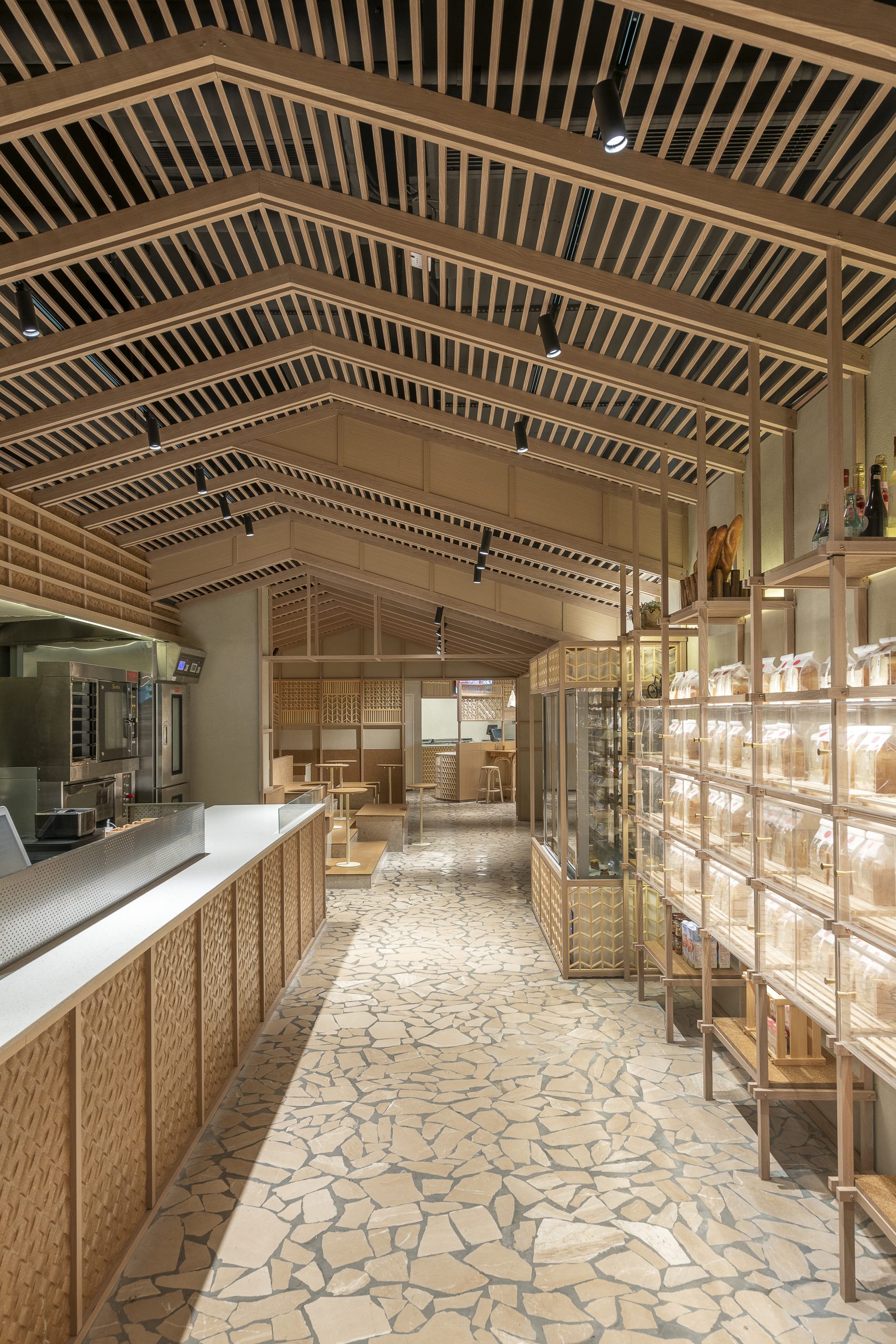
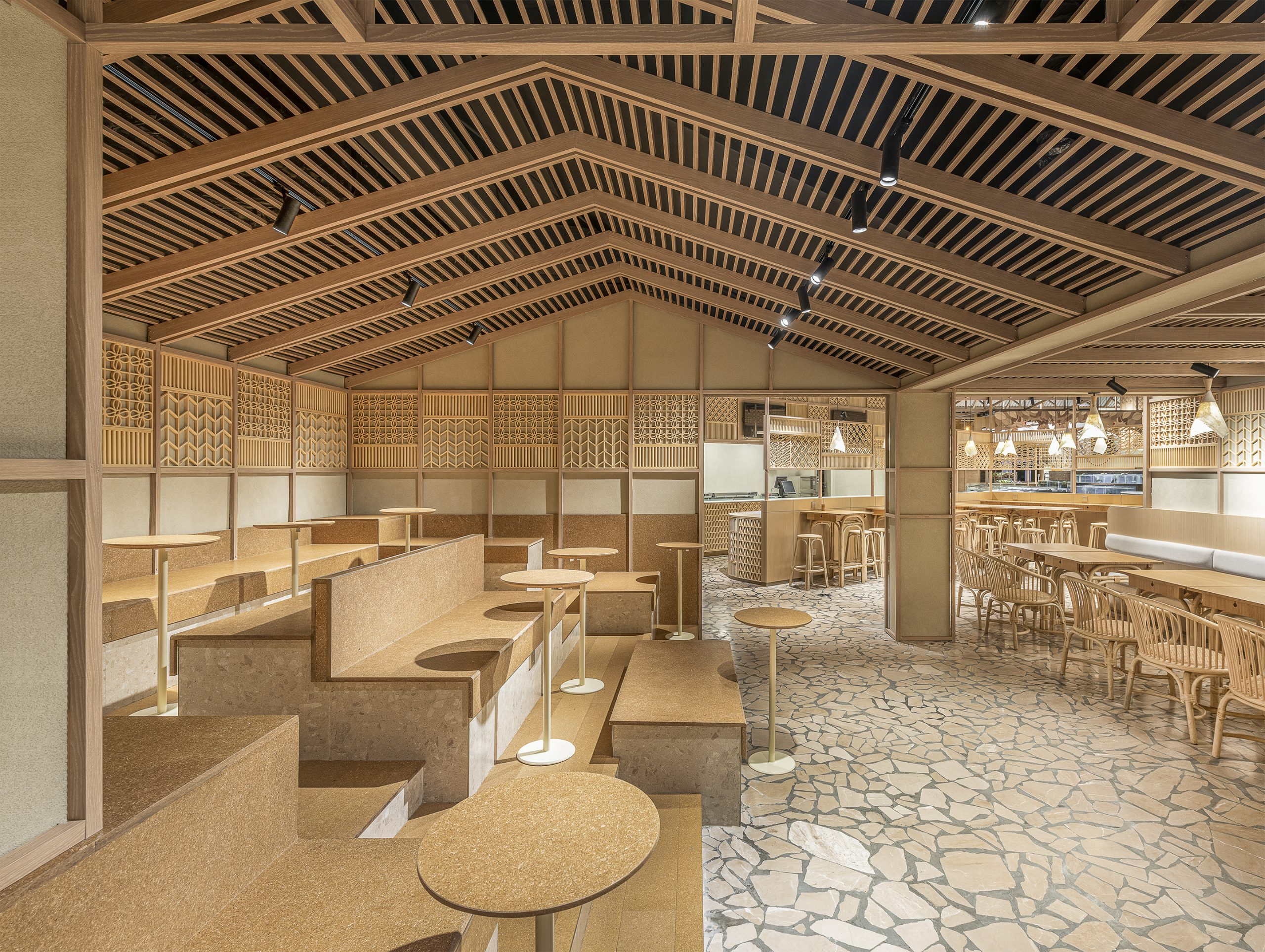
沿着石板路穿过”露天”食品摊,顾客将到达相对私密的面包区与咖啡区。芝作室用檩条结构搭出山形屋顶,使咖啡区原场地落差较大的顶面更具序列美感,卡座与阶梯座位的搭配让市民在此聚会或小憩都更加自由与舒适。立柱从屋面檩条延伸而下,化身有序的面包展架。与面包区相连的结账区,用带有草编纹理的模压板铺饰柜台外沿与菜单墙,借助温暖色调与自然质感营造温馨的氛围。
Following the flagstone pavement, the “open-air” food stall leads to a more intimate bakery and café area. By replacing corrugated panels into purlin structure, the wooden frame gives form to a gable-roof cabin, optimizing the original low-ceiling space into a cozy hangout with terraced seating. At the bakery cabin, a grid extends from the gable-roof structure and becomes the framework of an orderly bread display. At the check-out area, molded strawboard with a weaving profile is used to line the counter front and the menu above. Its natural warm tone and rich texture help compose the overall welcoming ambience.
随着电商行业的蓬勃发展,国人网购零食生鲜已逐步常态化。实体超市的便利性不再突出,体验过程才是其探索转型的方向。希望以此为理念进行设计的福来食集,可以成为一个供顾客学习食材常识与配餐技巧的平台,一个便于长辈向晚辈传授生活经验的社区,一个帮助人们进行日常社交的场所,将更具体验感和烟火味的生活方式带给市民们。
With the proliferation of e-commerce, ordering online grocery has become a norm in China. The purpose of a physical supermarket therefore is no longer about providing convenience but experience. It should be a platform where customers learn about new knowledge on food and preparation; it could grow a community where the elders pass on lifestyle tips to the youths; it is simply a place to be social and meet others. By creating vernacular ambience in a modern supermarket, Lukstudio wishes to reinforce the collective memory of a vivid Chinese marketplace.
项目信息——
地点:长沙市开福区北辰三角洲凤凰海购物公园沿街一层
室内面积:670平方米
设计总监:陆颖芝
项目团队:丁怡人、杜雪、高永、李墨、王海鑫、余炜锋
设计内容:外立面、室内设计、家具和灯光设计
主要材料:覆膜铝合金 (PIVOT 标榜)、不锈钢金属、金属网、自开模聚丙烯混合30%稻壳塑料框、亚克力波纹板、秸秆板、实木雕花、老木头、木饰面、石板地铺(D&A SPACE璞石)
设计期: 2019.12 -2020.04
施工期:2020.03- 2020.06
施工团队:湖南森度装饰设计工程有限公司
货架制作:佛山市兴达货架有限公司
活动家具:上海颐腾家具有限公司
灯具:中山市力音灯饰照明有限公司
品牌形象顾问:上海一融设计咨询有限公司
摄影:Dirk Weiblen Photography
Project information——
Location: LG, Hi Park, Kaifu District, ChangshaNet Area: 670㎡
Architecture and Interior Design: LUKSTUDIO
Director: Christina Luk
Design Team: Yiren Ding, Vivi Du, Coca Gao, Edoardo Nieri, Haixin Wang, Weifeng Yu
Scope: Facade, Interior, Furniture & Lighting Design
Key Materials:coated aluminum, stainless steel, metal mesh, molded PP plastic with 30% rice husk, acrylic corrugated panel, molded strawboard, woodenlattice, recycled wood block, wood veneer, flagstone pavement
Design Period: 2019.12 -2020.04
Construction Period: 2020.03- 2020.06
General Contractor: Sendu Construction and Decoration Co., Ltd.
Display Furniture:Foshan Xingda Shelf Co., Ltd.
Loose Furniture: Woteng Furniture
Lighting:LiyinLED
VI:Shanghai RONG Design and Consulting Company
Photography: Dirk Weiblen Photography


