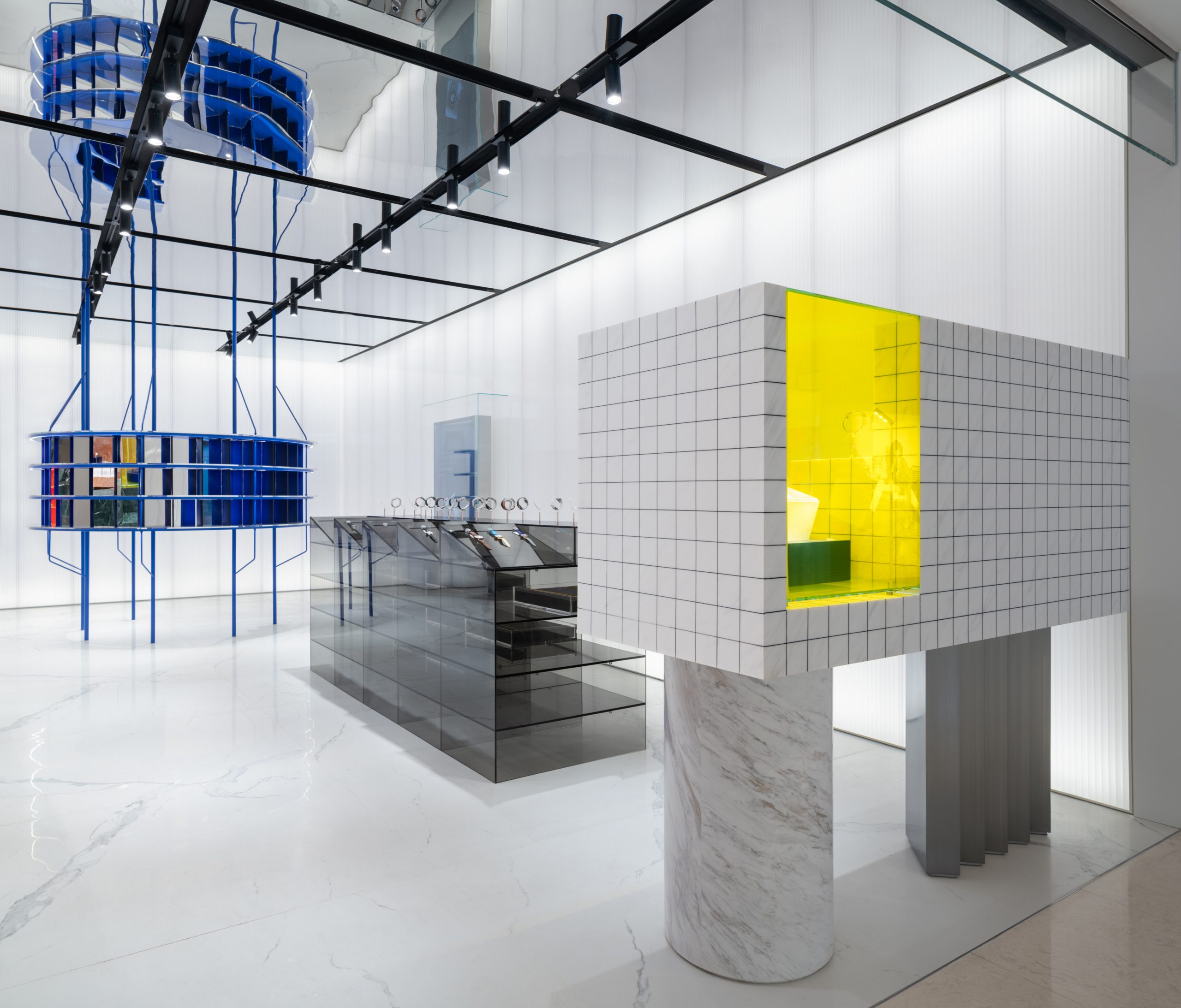
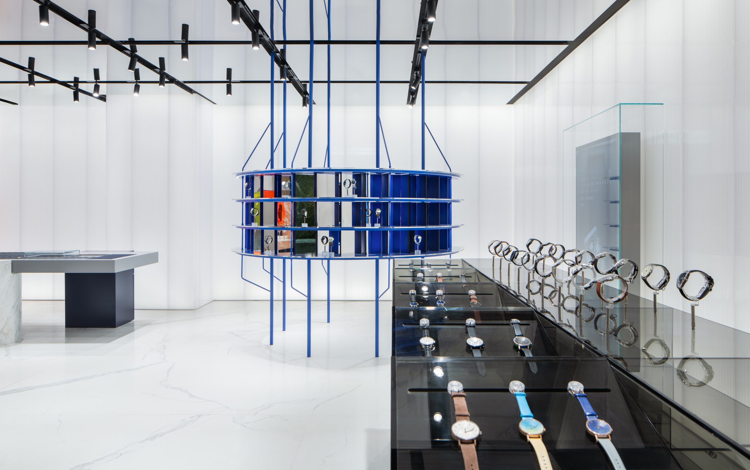
深绿色、蜜糖色和白色的大理石体块,穿插着橙色亚克力和蓝色金属的重音, 西涛设计工作室(atelier tao+c)为新生时尚手表集合品牌 MOMIC(Moments of Magic) 设计打造的首家新零售概念店仿佛是一首轻快的空间协奏曲。简单而独特的几何体块,赋予了店铺空间激进直白的表现力,从入口处开始就吸引顾客的注目。
Dark green, honeydew and white marble blocks, interspersed with accents of orange acrylic and blue metal, the first concept store designed by atelier tao+c for an emerging watch assembly brand MOMIC (Moments of Magic), featured simple and unique geometric volumes, superimposed on the precise combination of colors, enduing the space with a radical and straightforward and expressive force, capturing customers’ attention from the beginning of their journeys into the store.
▲门店外观,appearance of the project ©Wen Studio
手表,作为一种古老的计时工具,所具备的实用功能在近二十年里被逐渐抽离,其报告客观时间的用途如今更多地被手机所取代,多数情况下作为一种时尚配饰或是收藏品出现在当代人们的日常生活之中。当接受 MOMIC 概念店的设计任务时,atelier tao+c 希望通过运用空间与材质的对比与碰撞,去表达蕴含在手表中的现代矛盾性 — 从最初就被设计成为人类最具有亲密感的物体之一,但其本质却是一种冰冷的微型机械组,标记时间却又不主动提示时间。
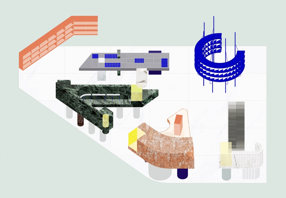
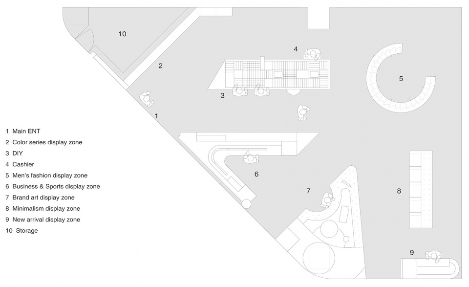
Planning the spatial movement line becomes the starting point of the design: six scattered and restrained compositions of display stand are placed randomly in the space, but in fact, the shape of each stand is divided according to the elaborated planned paths. Upon entering the customers are immediately guided by the paths generated by different “props”, inviting them to meander around, and establishing their own shopping order.
▲店内空间概览,overall of the project ©Wen Studio
如何在有限空间内吸引客户与商品进行最大程度的互动,是设计师首先思考的问题之一。规划空间动线成为设计的出发点,6 组不同材质、色彩的展示台,看似自由地散落在楔形的场地内,其形体实际上是依据动线的规划切分而成的。进入店铺内,顾客即刻被不同道具围合所形成的路径引导着, 邀请着他们自由地出入,建立自己的参观和购物顺序。道具们在功能上作为手表的展示平台,在动线上形成了空间的路径组织。
The designer has also limited the display interface between 1.05 to 1.65 meters based on people’s actions and gestures when buying watches, and the most comfortable sight angle when browsing watches, in order to liberate the upper and lower spaces and form a sense of transparency. Therefore, although each display stand has been arranged separately, the bottom height and the top height of the plinths are consistent, in responding to each other to form a continuous visual scene.
▲轴测图 – 6 组不同材质、色彩的展示台,axonometric drawing – 6 groups of different materials, color display stand © 西涛设计工作室
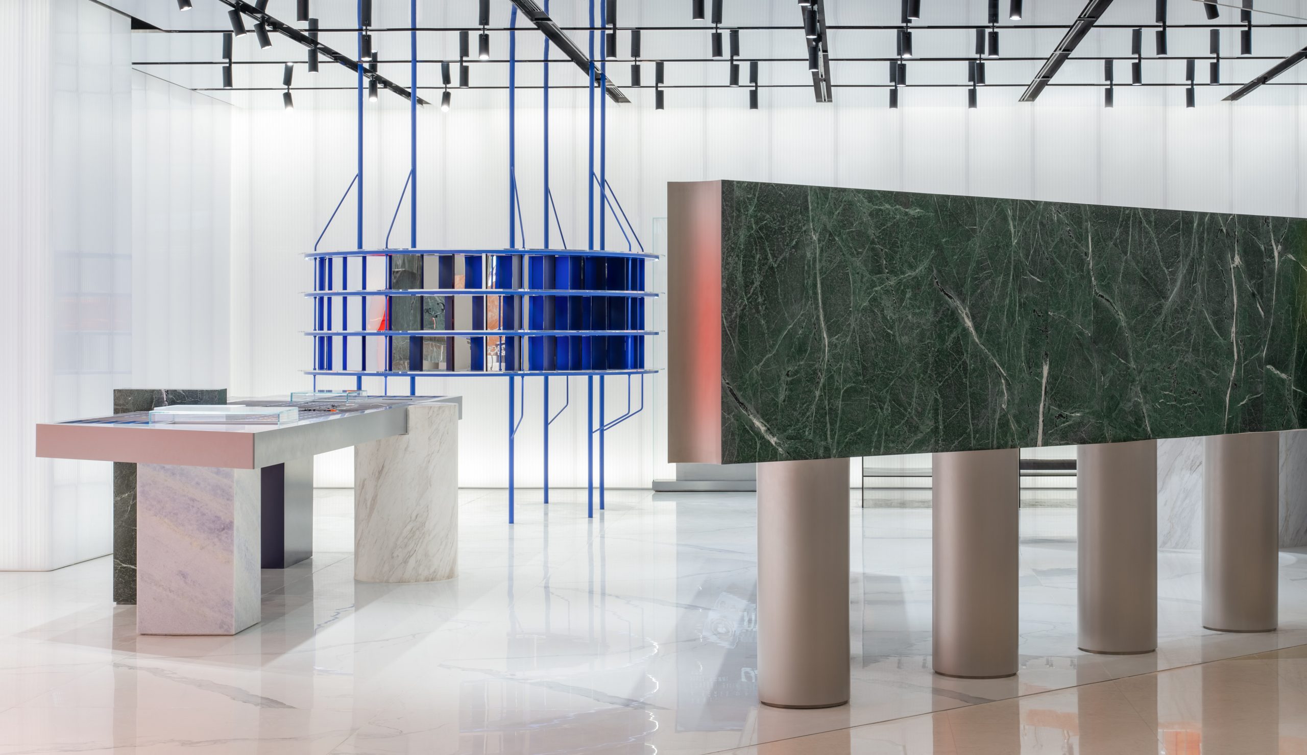
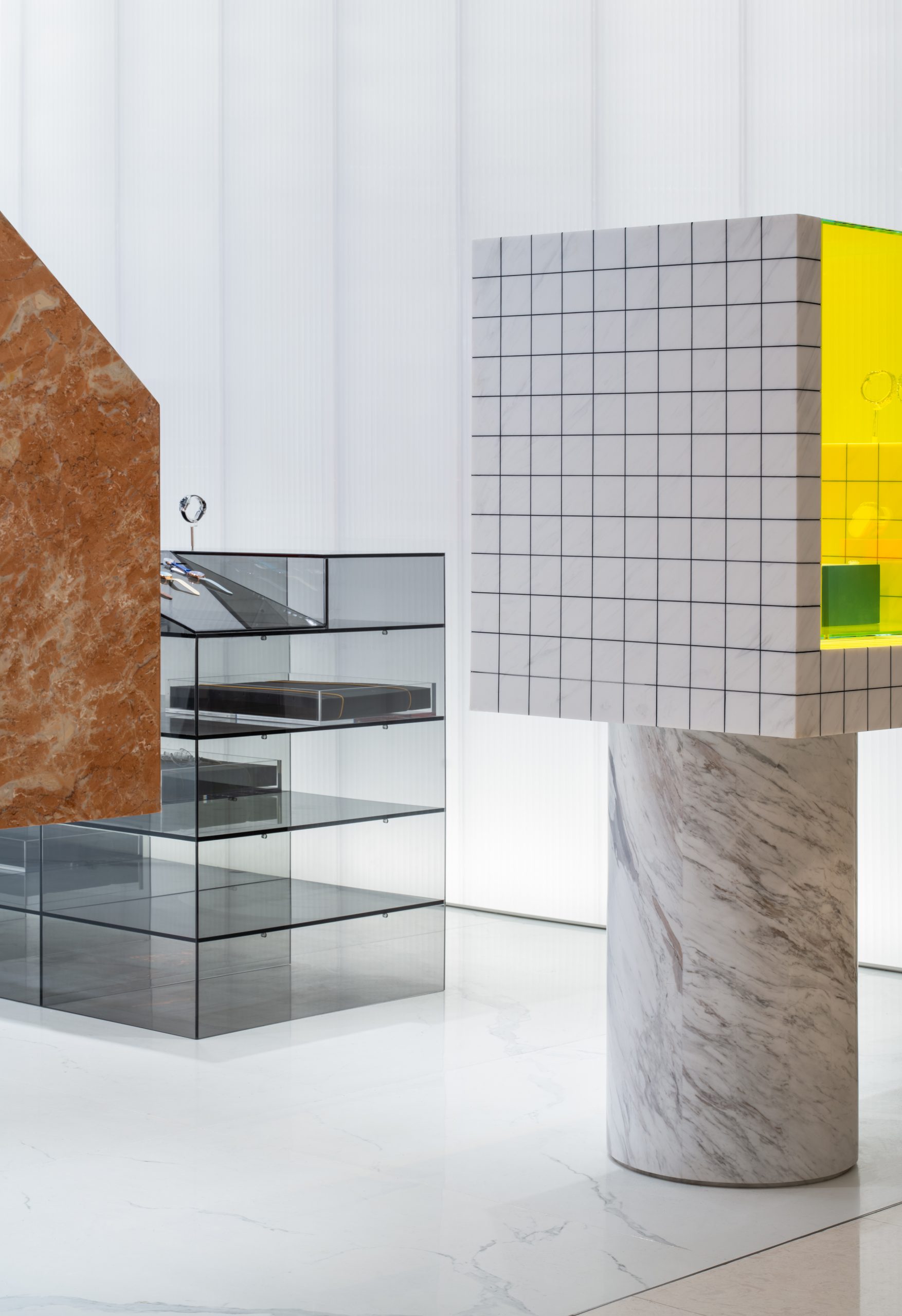
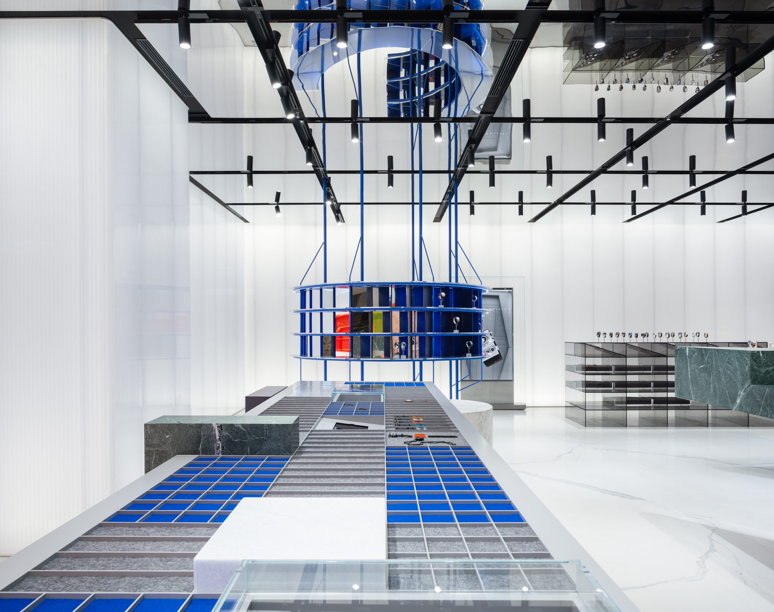
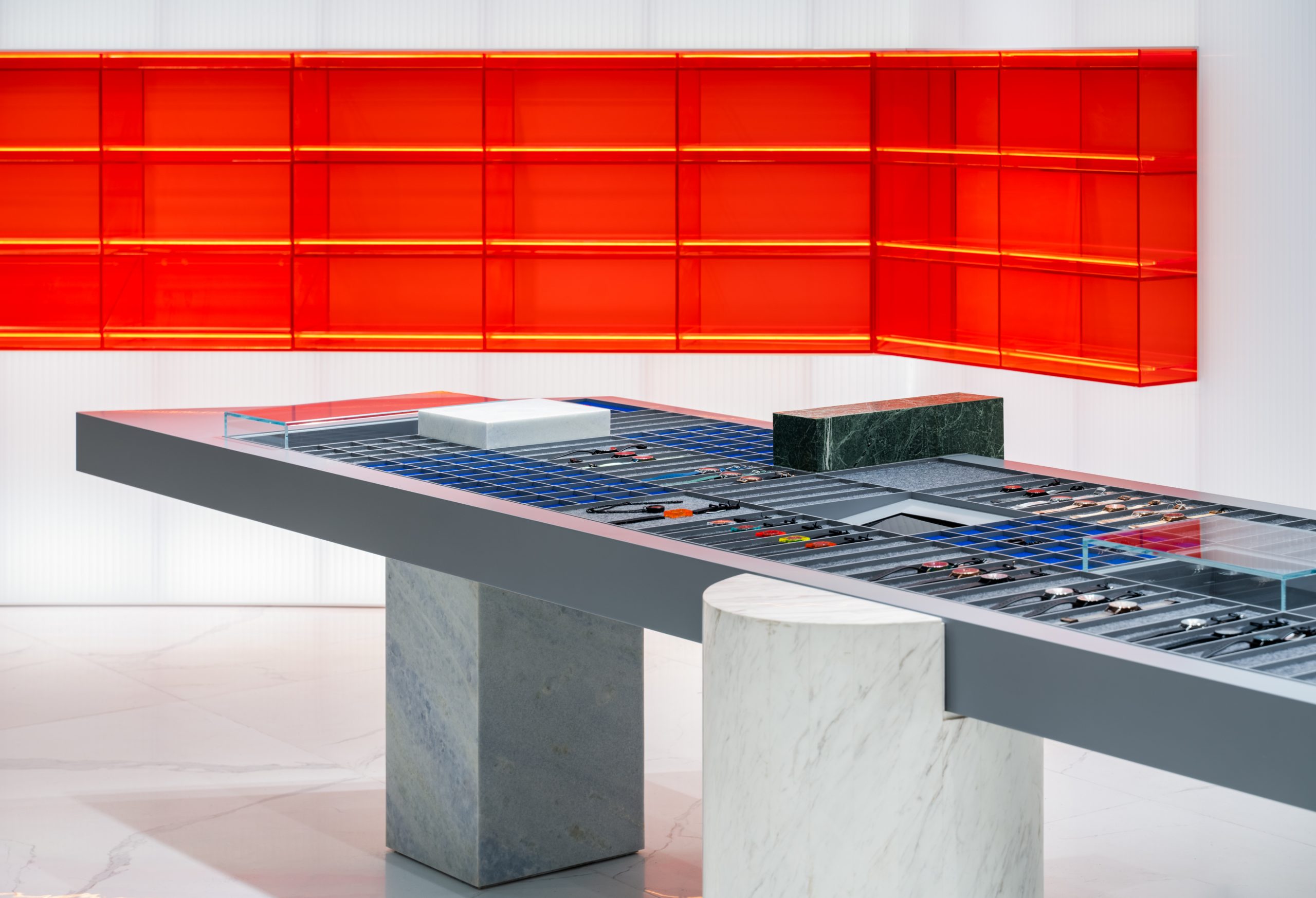
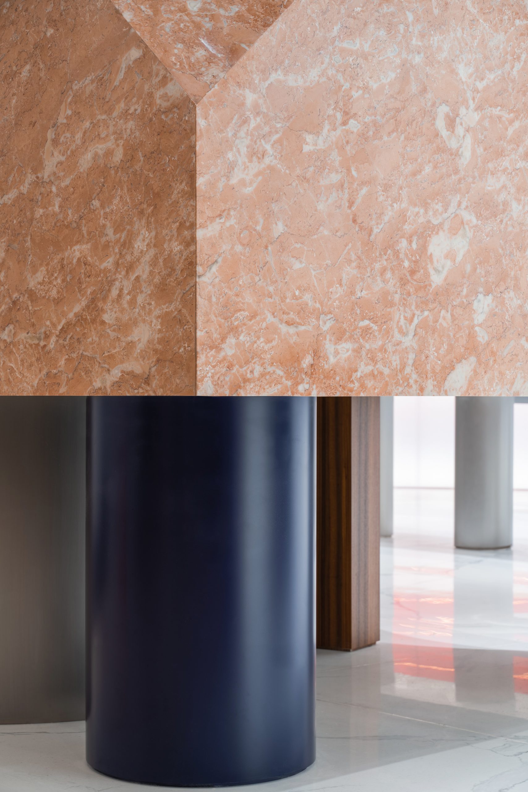
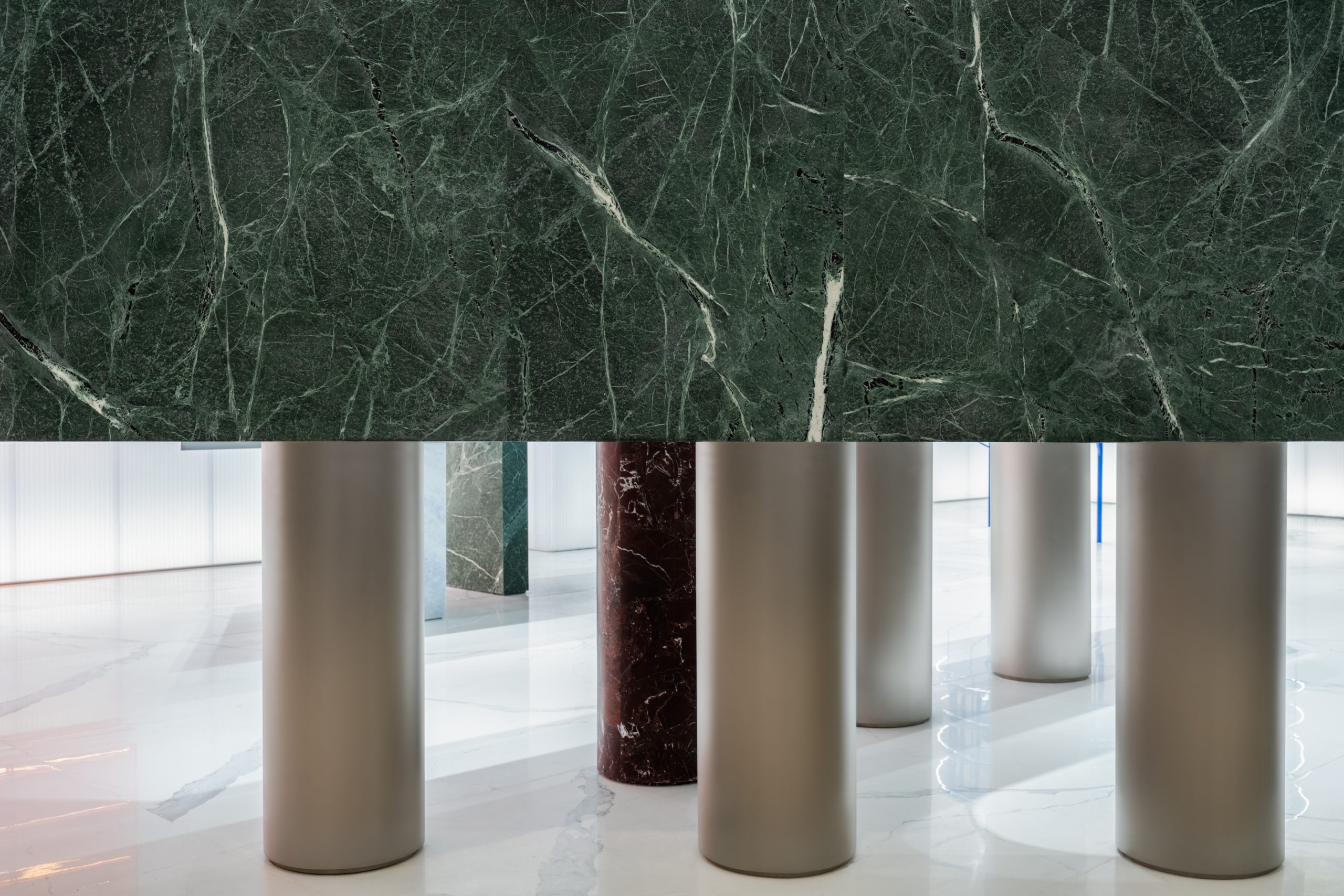
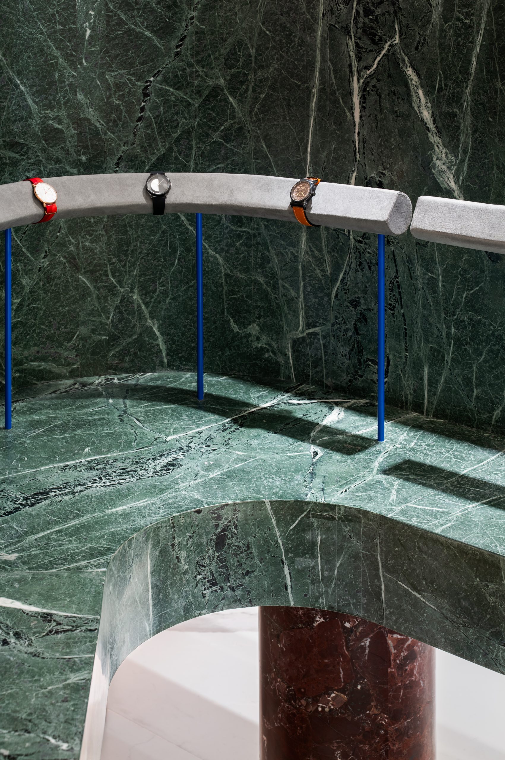
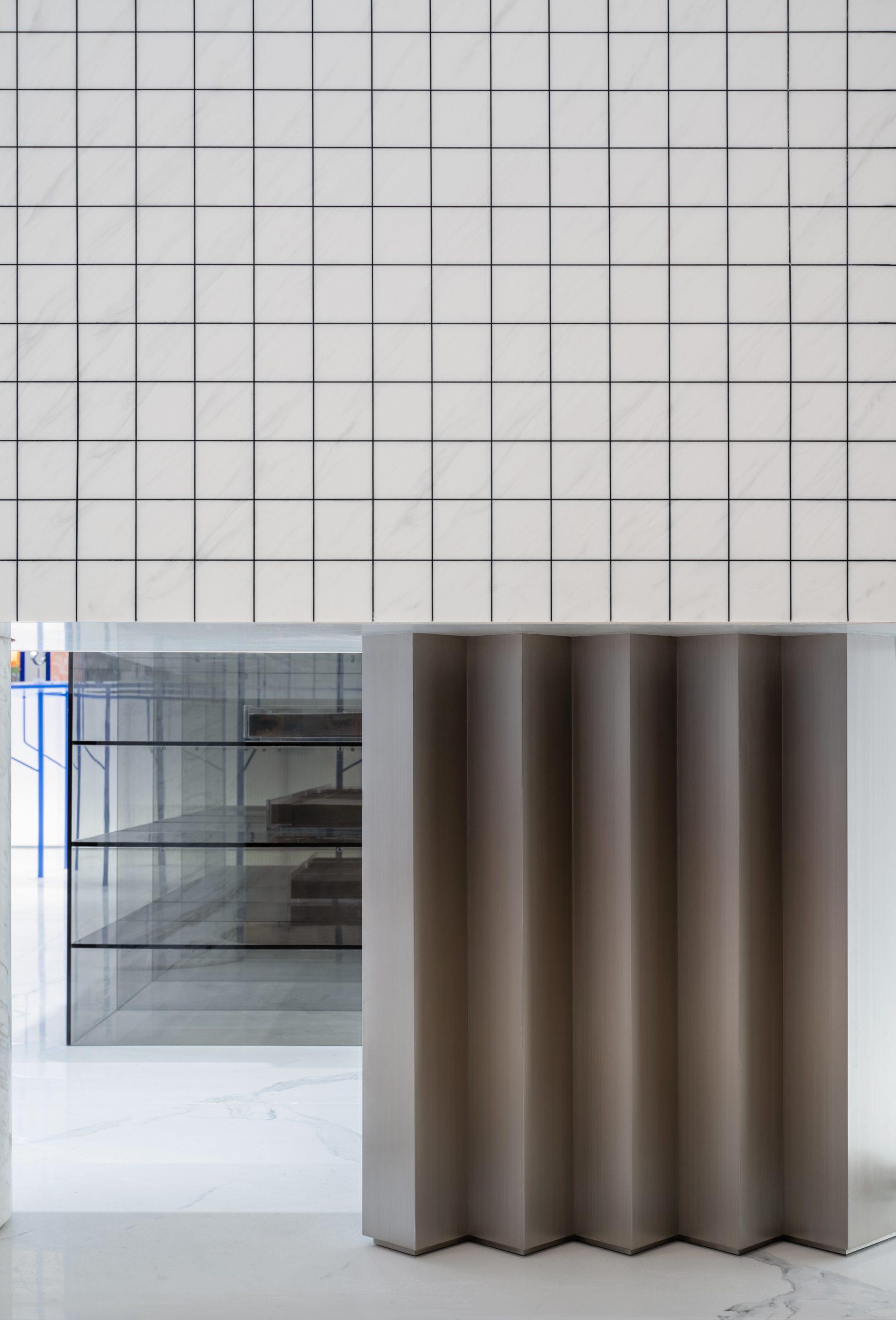
同时,设计师根据人们选购手表的动作和手势,以及观看手表时最舒适的视线角度,将展示界面限定在 1.05-1.65 米之间,从而让上下的空间都解放出来,形成通透之感。因此, 每组展示台虽然形态各异,各自分离独立,但平台底部高度和顶部高度都保持一致,各组之间相互回应形成连续的视觉带。每个展示基座(plinth)都被大小和材质不一的圆柱型腿托起,重复出现的圆柱底座,让人回想起古典的柱式和建筑原型。不锈钢或是亚克力材质的拼接,又为整体设计注入当代风格的偏转笔触。蓝色金属材质的的环形柱被竖向分割成一个个独立的展示架,垂直线条的设计与顶面的反射影像巧妙衔接,形成视觉上的延伸。厚重的台子与轻巧的支撑构件,形成轻盈和重力的冲突感,仿佛有趣的雕塑群,挑战着参观者对空间和体积的感受。
Each plinth is held up by a few cylindrical legs with different sizes and materials. The repeated general enquiry:info cylindrical bases remind people of the architectural column prototypes. With the combination of stainless steel and acrylic materials, the overall image is endowed with a twisting touch of contemporary ambiance. The heavy platform contrasts with the lightweight supporting components, expressing the conflicts between lightness and gravity, seem as the playful sculptures, stimulating people’s feelings towards space and volumes. The circular column made of blue metal is vertically divided into independent display stands. The vertical line is ingeniously connected with the reflected image on the top surface, generating a visual extension.
▲由主入口看展区,viewing the display stand at the main entrance ©Wen Studio
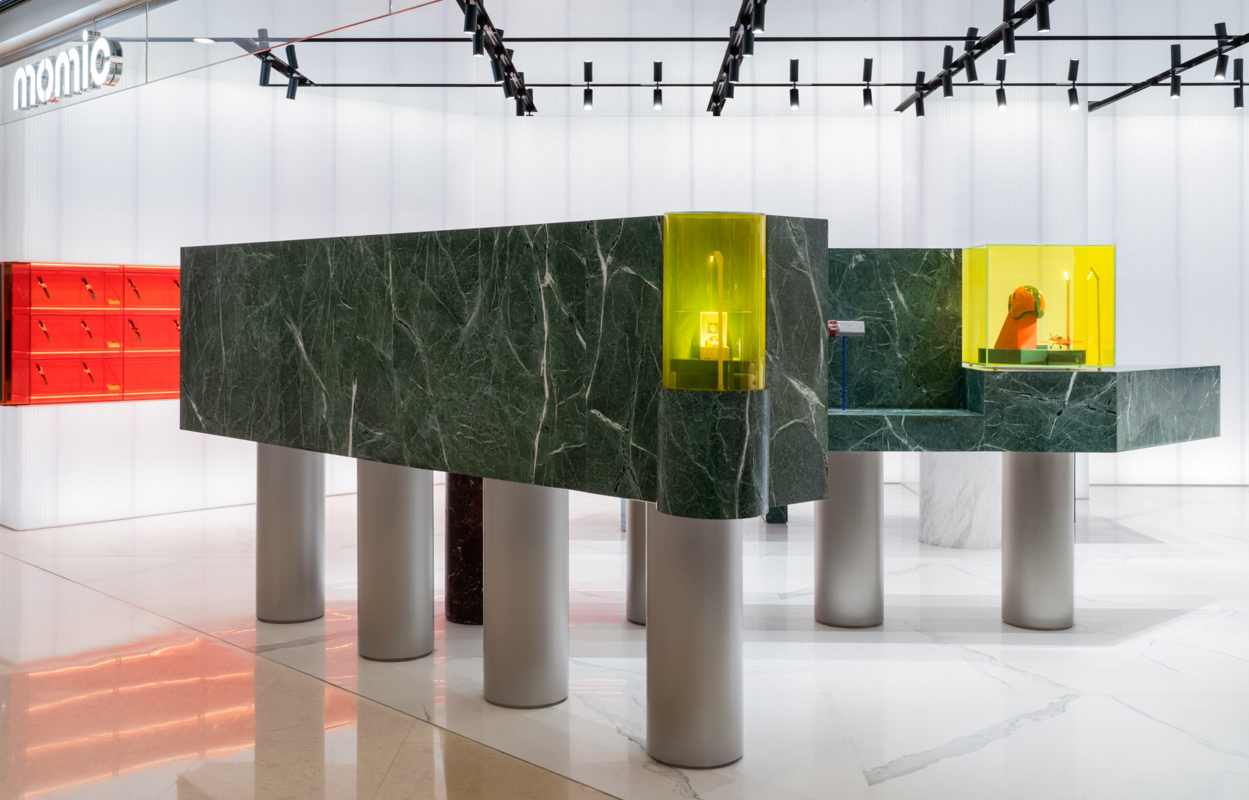
▲商务运动展区 – 展示基座(plinth)被圆柱型腿托起,viewing the display stand at the main entrance – each plinth is held up by a few cylindrical legs with different sizes and materials ©Wen Studio
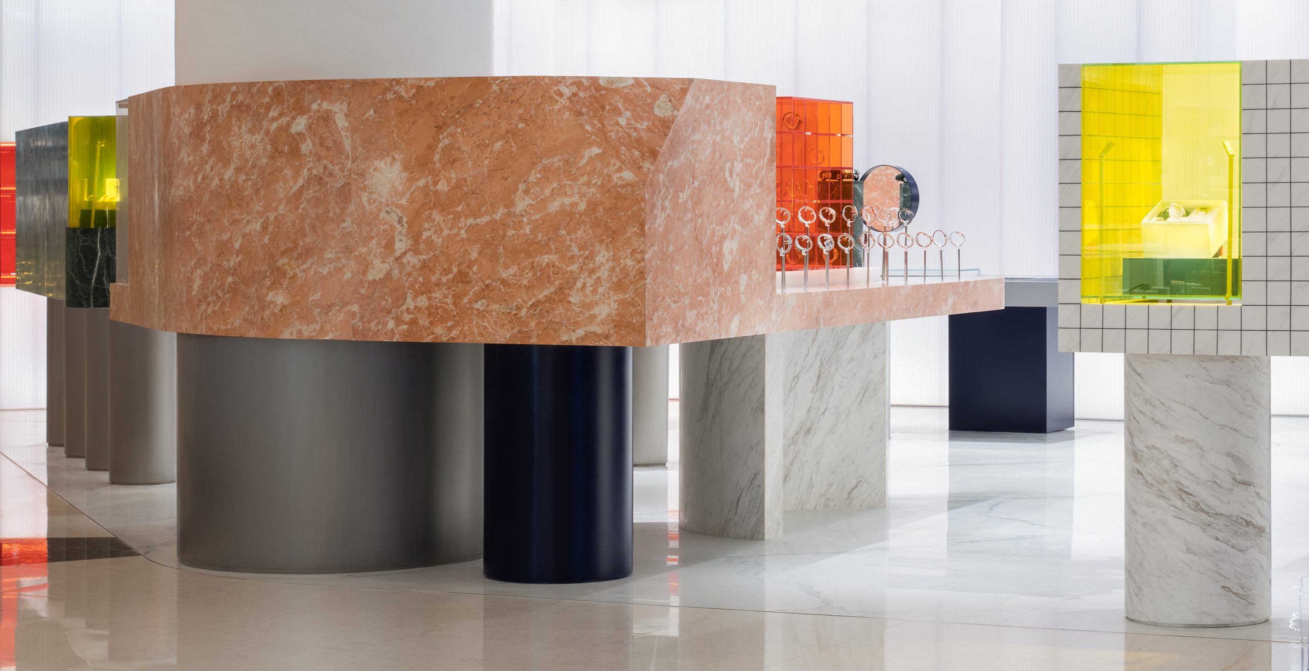
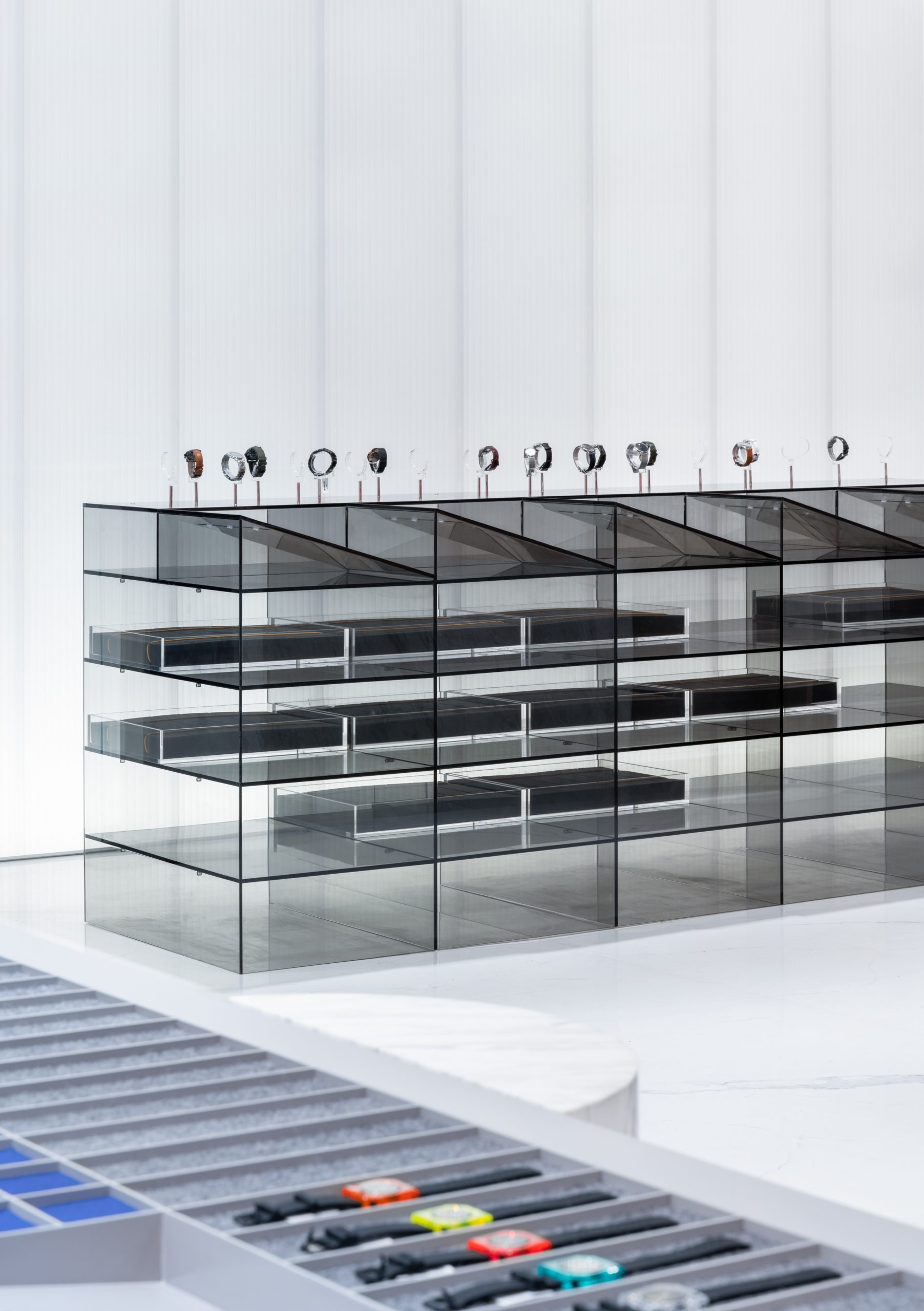
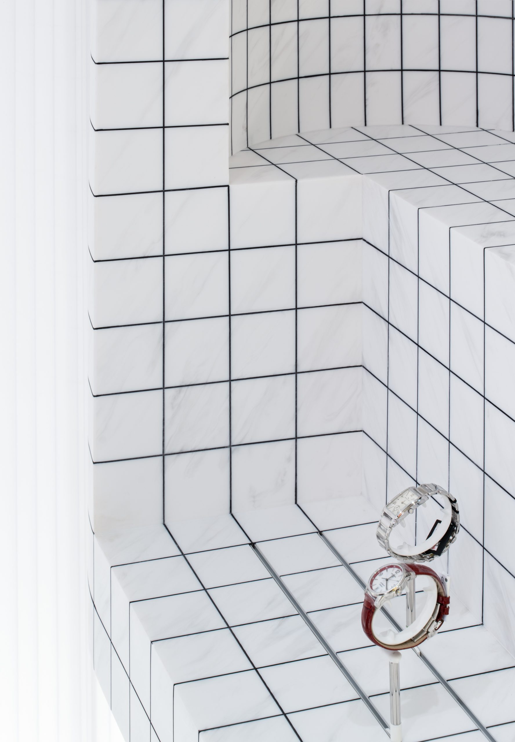
材料使用的背后也代表着设计师对于时空性的思考: 如果说灰色和橙色的亚克力材质有未来感,古老的贯穿人类建造历史的大理石则代表着传统,蓝色的金属架子则是现代工业材料的表达。不同的材质运用在空间中表达出时间的碰撞感,适合陈列不同套系的类型手表。绿色和蜜糖色的大理石展台分别作为运动型和纤巧型手表的展示,灰色亚克力展台和蓝色架子适合概念型和未来感的手表,灰色的格子台面则是 DIY 的操作台。
The use of materials also represents the designer’s thinking towards time and space: the acrylic brings in a sense of futurism, while the marble spanning the history of human construction represents the tradition, and the blue metal shelf is the illustration of modern industrial evolution. Different material textures have been incorporated to express the sense of time collision, which is also suitable for displaying different sets of watches. Green and
honeydew marble stands are respectively used to present sports and slim watches while the gray acrylic stands and blue shelves are for showcasing the conceptual and futuristic watches. Meanwhile, the gray lattice table designed as the DIY operation platform is employed to enhance the vibrancy within the store.
▲由品牌艺术展示区看男士腕表展区 ,viewing the men fashion zone from the brand art zone ©Wen Studio
▲新品展示区 ,new arrival display zone ©Wen Studio
▲极简单品展示区 ,minimalism display zone ©Wen Studio
▲新品展示区与极简单品展示区细部,details of new arrival and minimalism display zone ©Wen Studio
最后引入轻盈的发光墙体设计和顶面的反射镜面金属,墙壁的界限被刻意弱化,并加强了空间的延伸感,从而营造出干净柔和的模糊氛围,形成一种库布里克式的复古未来感。各种道具安隅空间内,各种材质达到精确的色调构成,与弱化的界面形成一种空间上的平衡。
In the end, the luminous wall and the glossy mirror hovering over the ceiling blurred the boundary of the space in between, created a soft and fuzzy atmosphere which reminds us of Kubrick’s retro-futurism aesthetics.
▲DIY 操作台 ,DIY operation platform ©Wen Studio
▲由DIY 操作台看色彩系列展区 ,viewing the color series display zone from the DIY operation platform ©Wen Studio
atelier tao+c 设计的 MOMIC 概念店脱离了传统手表店广泛采用的标志性严肃奢华设计,在手表展陈和顾客操作体验上创造新的可能性,强调自主选购的轻松方式也减少了消费者与品牌之间的隔阂。
The MOMIC concept store, designed by Atelier Tao + C, breaks away from the iconic, serious and luxurious design widely used in traditional watch shops to create new possibilities for the watch presentation and customer experience. The relaxing way of self-selection also reduces the estrangement between consumers and brands.
▲DIY 操作台细部 ,details of the DIY operation platform ©Wen Studio
▲其他展台细部 ,details of the other display stands ©Wen Studio
▲平面图,plan © 西涛设计工作室
项目信息——
项目名称:MOMIC 手表品牌集合店
设计师:atelier tao+c 西涛设计工作室
联系信息:info@ateliertaoc.com
媒体联络:press@ateliertaoc.com
项目类型:新零售商店
场地地址:浙江杭州,中国
完工日期:2020 年 06 月
面积:96 平米
设计团队:刘涛、蔡春燕、宋浩嘉、郭琳
材料:天然大理石(大花绿、柏斯高金、紫罗红、雅士白)/ 有色亚克力 / 聚碳酸酯透光板 / 人造石 / 瓷砖 / 烤漆金属 / 不锈钢
摄影师:Wen Studio
施工方:上海亨冠装饰工程管理有限公司
业主:黑玥时尚科技(上海)有限公司
Project Information——
Project Name:MOMIC Watch Assembly Store
Architect:atelier tao+c
General:Enquiry: info@ateliertaoc.com
Press:Enquiry: press@ateliertaoc.com
Project:Type: retail store
Location:Hangzhou, Zhejiang Province, China
Completion:Date: June, 2020
GFA:96 sqm
Design:Team: Tao Liu, Chunyan Cai, Haojia Song, Lin Guo
Materials:marble (dark green marble, persian gold marble, rosso lepanto marble, ariston white marble) colorful acrylic, polycarbonate transparent board, artificial stone, tile, highlight lacquer, stainless steel
Photographer:Wen Studio


