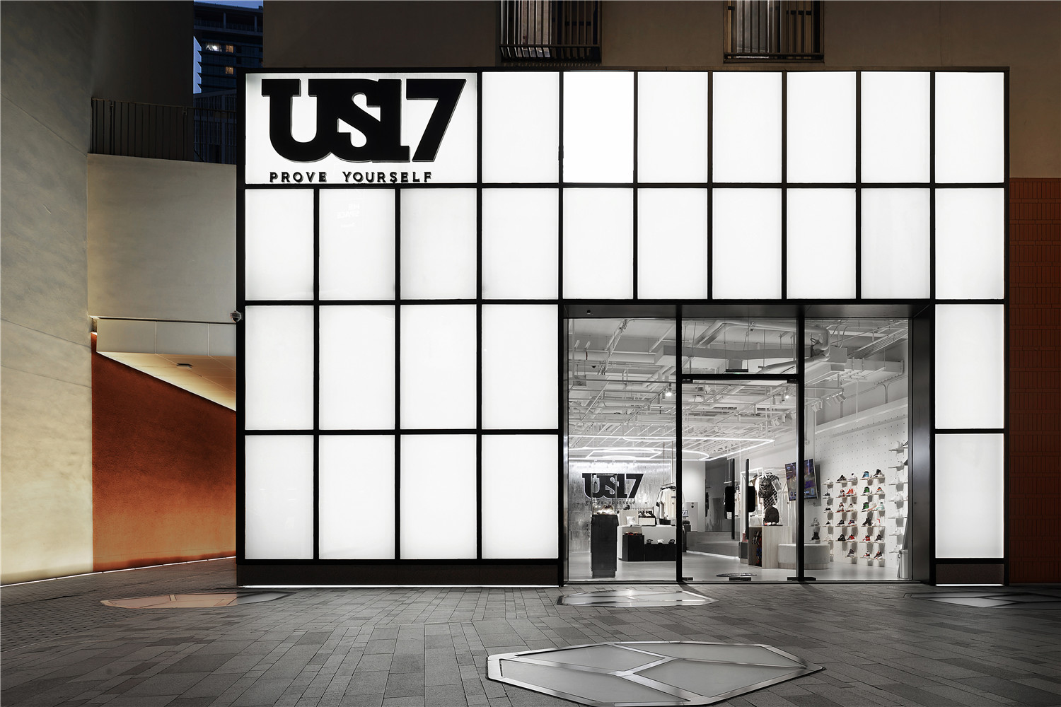
US17,是中国篮球巨星易建联于2014年用自己的鞋码US17创立的个人服饰潮牌。US17品牌以“PROVE YOURSELF”作为品牌的核心思想,旨在传达不仅只有篮球,在不同的领域内都要不断的努力,不断的证明自己。门头整体设计以黑白为主色调,使用极简线条,营造出纵横交错之感,简约但不单调。店内设计运用更多严谨的横线和垂直线,使其不会显得杂乱无章,在未来感的基础上,给空间增添了一份现代理性主义的色彩。店内无过多修饰,中心突出品牌名US17和SLOGAN,凸显品牌简约、克制的调性与个性。店内棚顶球场造型设计贯穿整个展示区,并配合品牌传达本土街头文化精神的品牌理念。
US17 is a personal streetwear brand created by Chinese basketball superstar Yi Jianlian in 2014 with his shoe size. US17 takes “PROVE YOURSELF” as the core idea of the brand, and aims to convey the spirit of the constant efforts in different fields to constantly prove themselves. The color of its door design is mainly black and white, with minimalist lines to create a sense of criss-cross, which is simple but not monotonous. The in-store design uses more rigorous horizontal and vertical lines so that it will not appear cluttered, adding a modern rationalistic color to the space based on the sense of the future. There is not much decoration in the store, the center highlights the brand name US17 and slogan, emphasizing the simplicity and restraint. The design of the roof basketball court in the store runs through the entire display area, and cooperates with the brand to convey the concept of the local street culture spirit.
▲空间内部概览
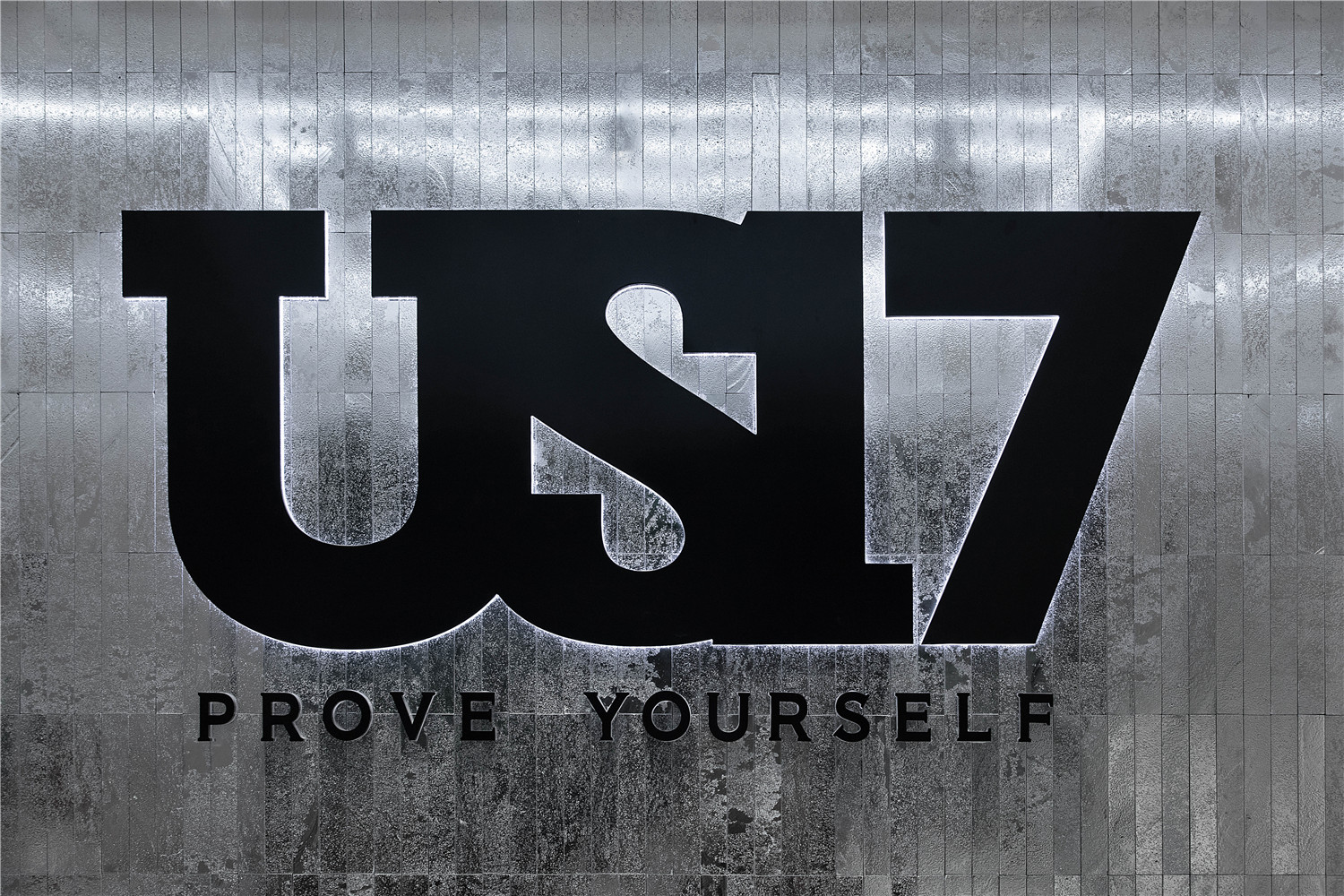
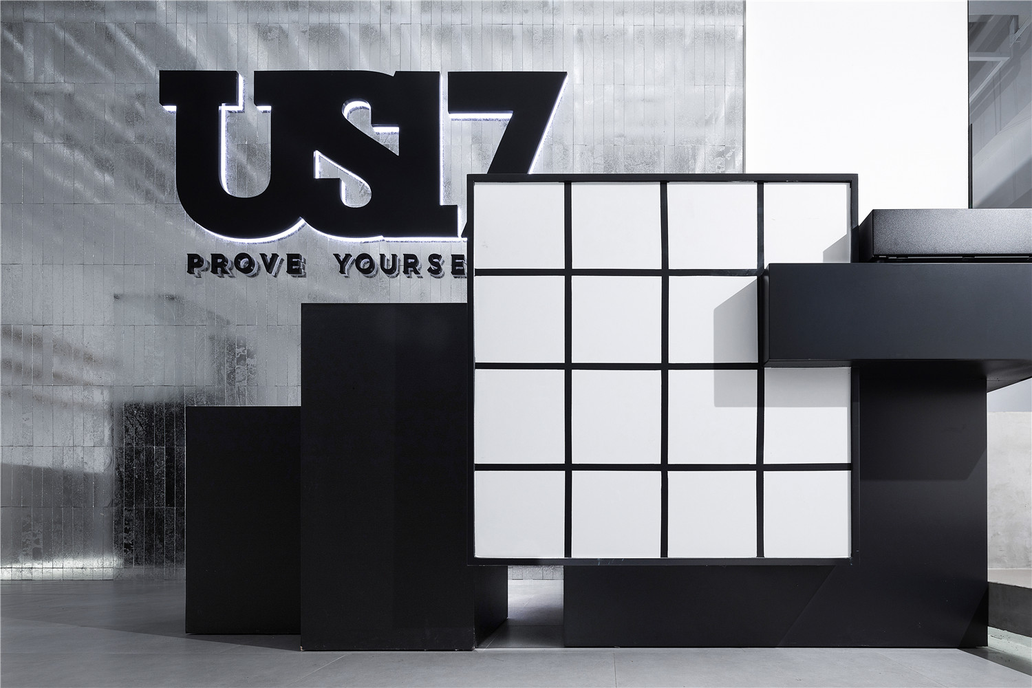
▲品牌名和SLOGAN
▲球场造型的天花灯
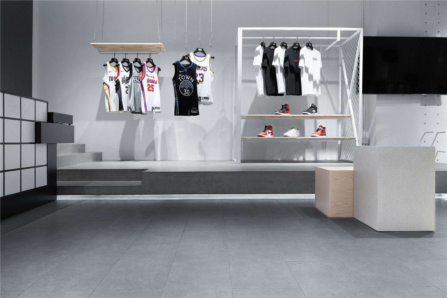
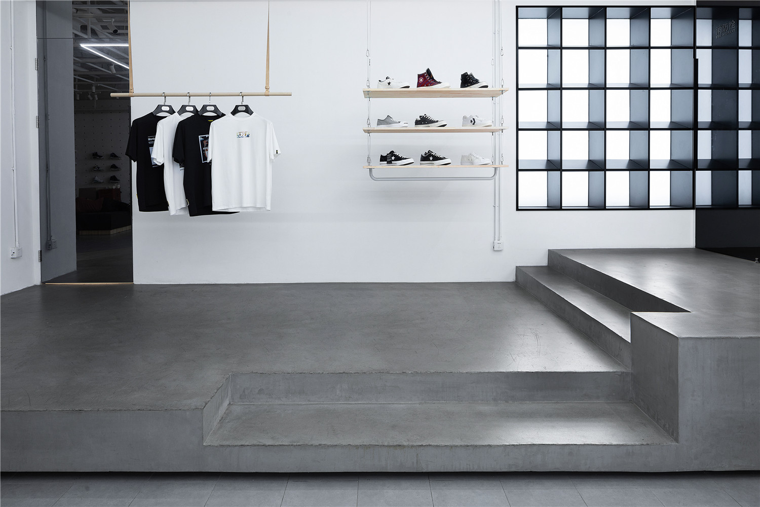
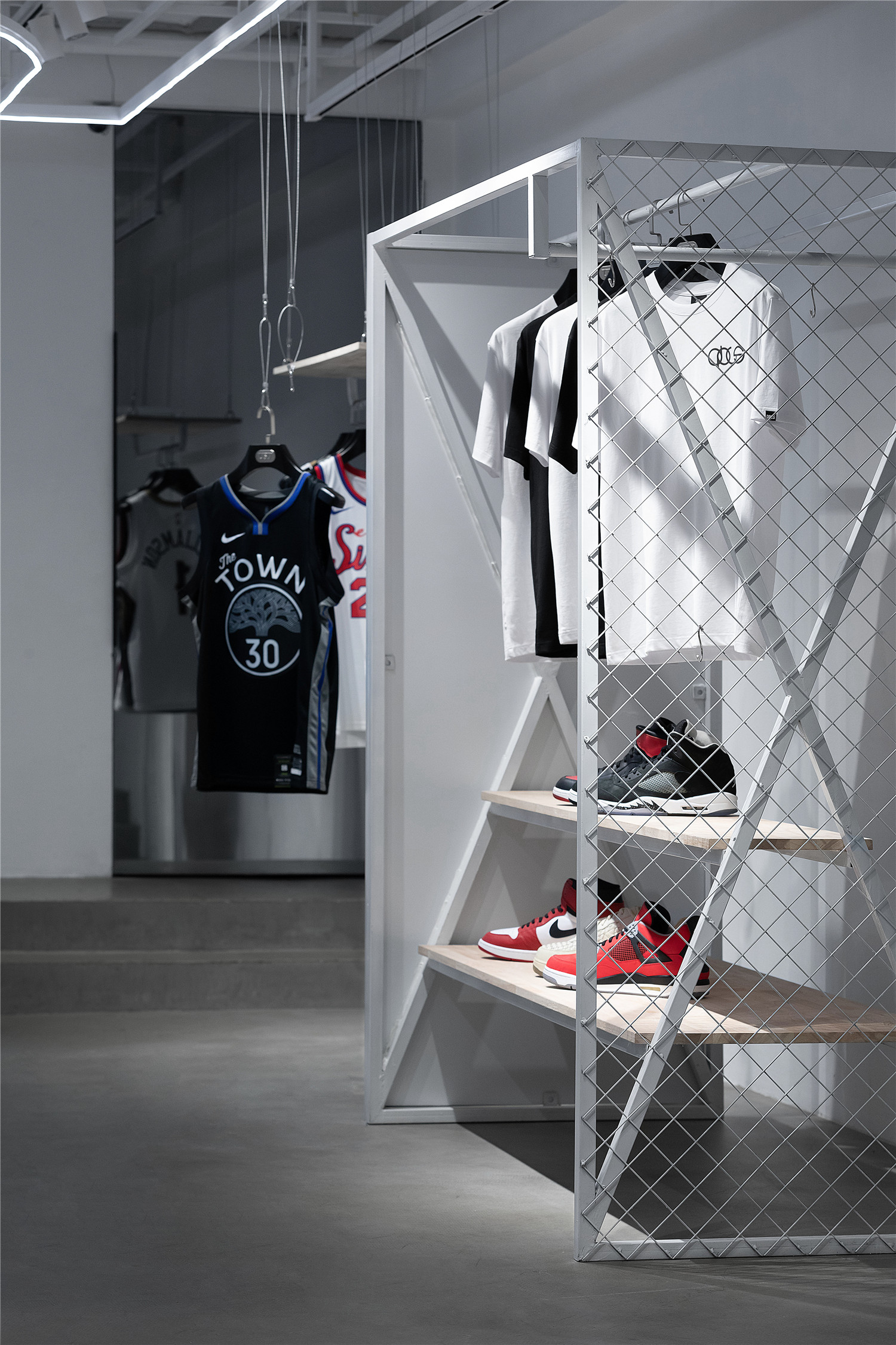
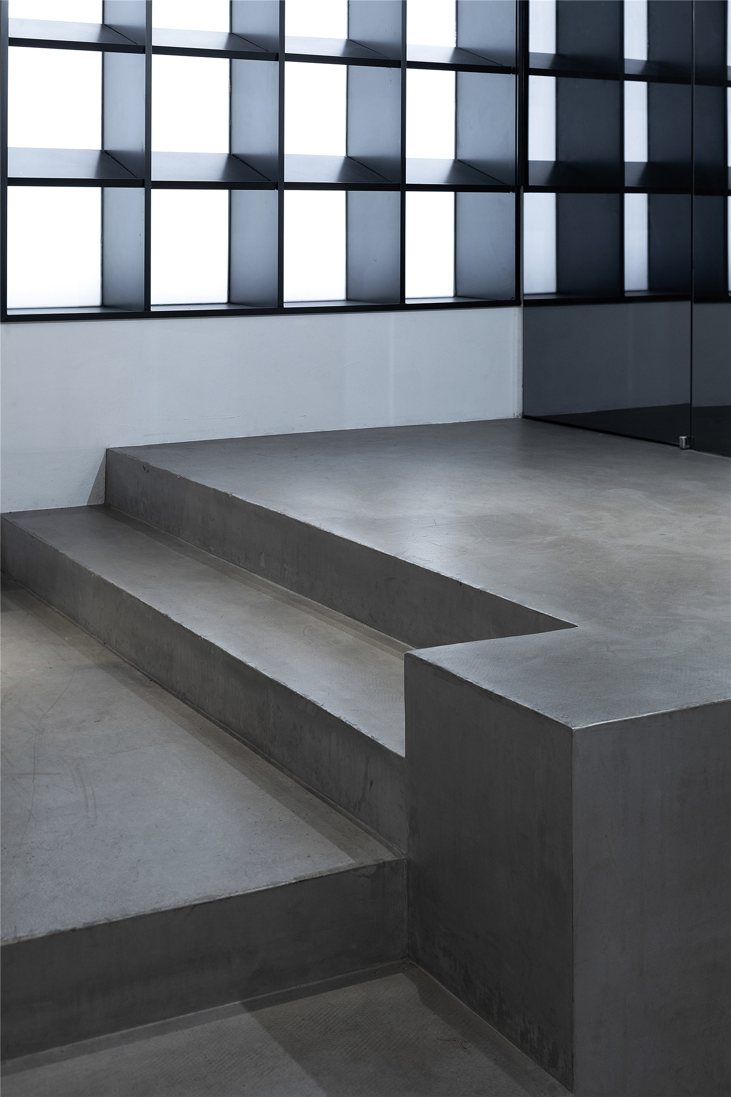
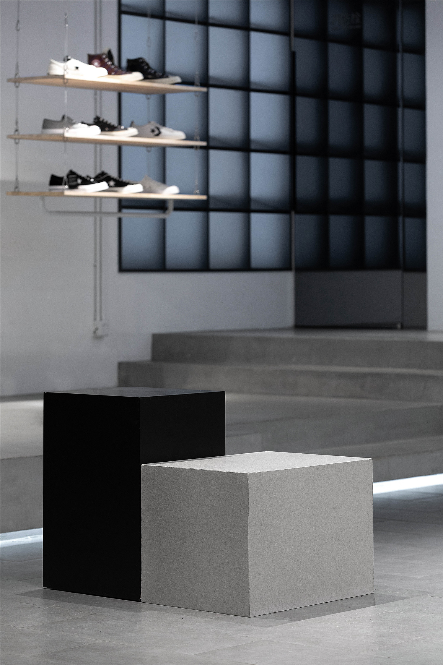
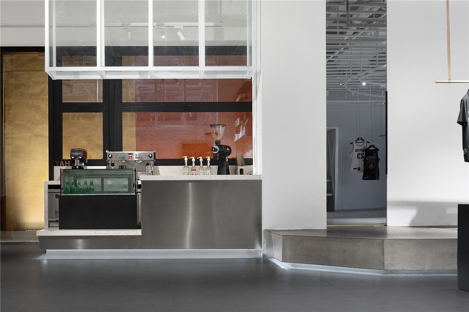
店内品牌名和SLOGAN由镜面和灯箱结合的全玻璃幕墙做背景,充分展示出潮与酷的流行理念,简约不落俗套。水银面的电镀砖也突出展现该品牌极强的潮酷感。球场造型的天花灯带让人有错位时空之感,头顶上的篮球场,让人瞬间进入设计场景,突出该店发扬篮球精神的宗旨。厚实质感的水泥地台工业风十足,让空间更有结构感,铁艺、金属元素拥有硬朗的外形、拼接的结构,呈现出结构分明的秩序感。木质展示架又中和了工业风设计的冰冷感,与铁艺展示架互为补充,充满温度和层次感,展现其设计初衷与调性。
The brand name and slogan in the store are backed by a full glass wall combined with mirrors and light boxes, which fully demonstrates the popular concept of being trendy and cool, simple and unconventional. The electroplated bricks on the mercury side also highlight the brand’s strong sense of streetwear. The ceiling lights in the shape of the court give people a sense of time and space dislocation. The basketball court above the head leads people to enter its design scene instantly, highlighting the store’s purpose of promoting the basketball spirit. The thick and solid concrete floor is full of industrial style, which makes the space more structural. The iron and metal elements have a tough shape and spliced structure, showing a clear sense of order. The wooden display stand neutralizes the cold feeling of industrial design, and fills the overall design with temperature and layering, showing its original intention and brand identity.
▲店内整体硬装以更纯粹的白灰色调为主
▲服装展示区的墙面用水泥漆强调出陈列的衣物
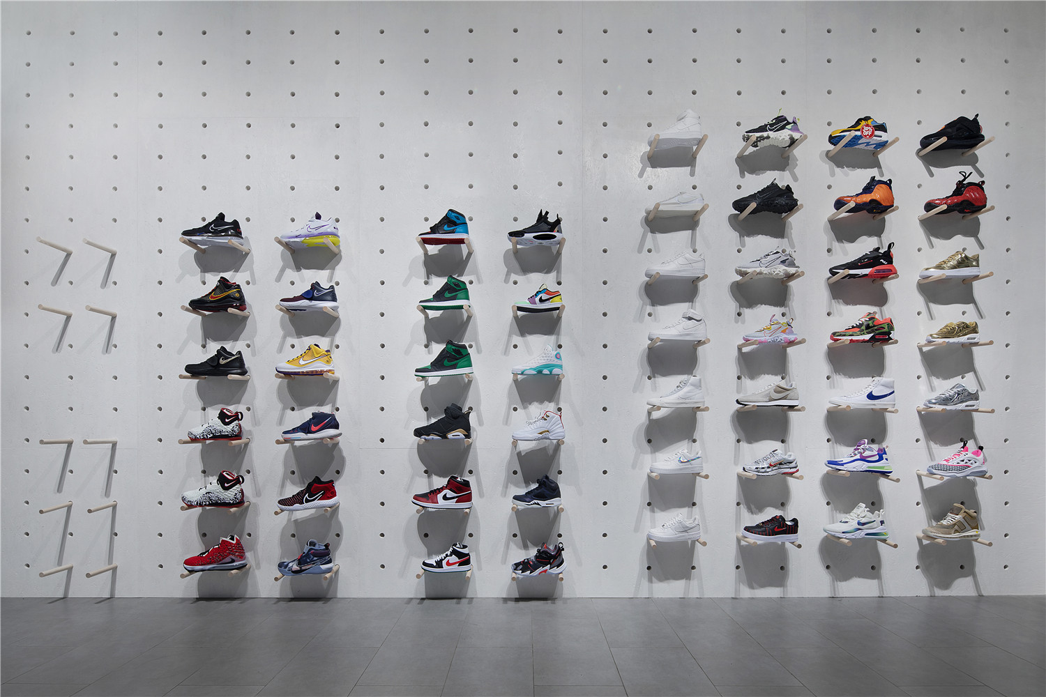
▲球鞋展示区
为消费者打造沉浸式购物体验。店内整体硬装以更纯粹的白灰色调为主,使商品成为视觉的中心。店内无过多装饰,让品牌名称与品牌宣言更为凸显,让品牌在消费者头脑中留下深刻印象。空间上故意留白部分区域,给予消费者更多自由去想象。衣服展示区与球鞋展示区得到很好地分割,消费者可根据自身需求到不同区域进行商品选购,让消费者得到心理上的满足感和愉悦感。服装展示的墙面则使用水泥漆强调出陈列的衣物,避免喧宾夺主。大部分的展示设置为活动装置,可根据不同产品风格以及销售主体做调整。消费者在体验过程中探索出更高层次的精神需求,服装展架也给出了合适的消费行为反馈。店内中部留出大量开阔空间,为消费者营造出在“舞台”中央穿行的感觉。
The design aims to create an immersive shopping experience for customers. The overall interior finishing of this store is dominated by white and gray, making the product the center of vision. There is not much decoration in the store, which makes the brand name and brand declaration more prominent, and makes the brand impress customers. Intentional blankness in the space of the store gives customers more freedom to imagine. The clothing display area and the sneaker display area are well divided. Customers can purchase goods in different areas according to their own needs, so that they can get psychological satisfaction and pleasure. The wall of the clothing display uses cement paint to emphasize the displayed clothing to avoid distracting customers. Most of the displays are set up as mobile devices, which can be moved according to different product styles and sales subjects. Customers explore a higher level of spiritual needs in the experience process, and clothing display racks also give feedback on appropriate customer behavior. A large amount of space is left in the middle of the store to create a feeling for customers to walk through the center of the “stage”.
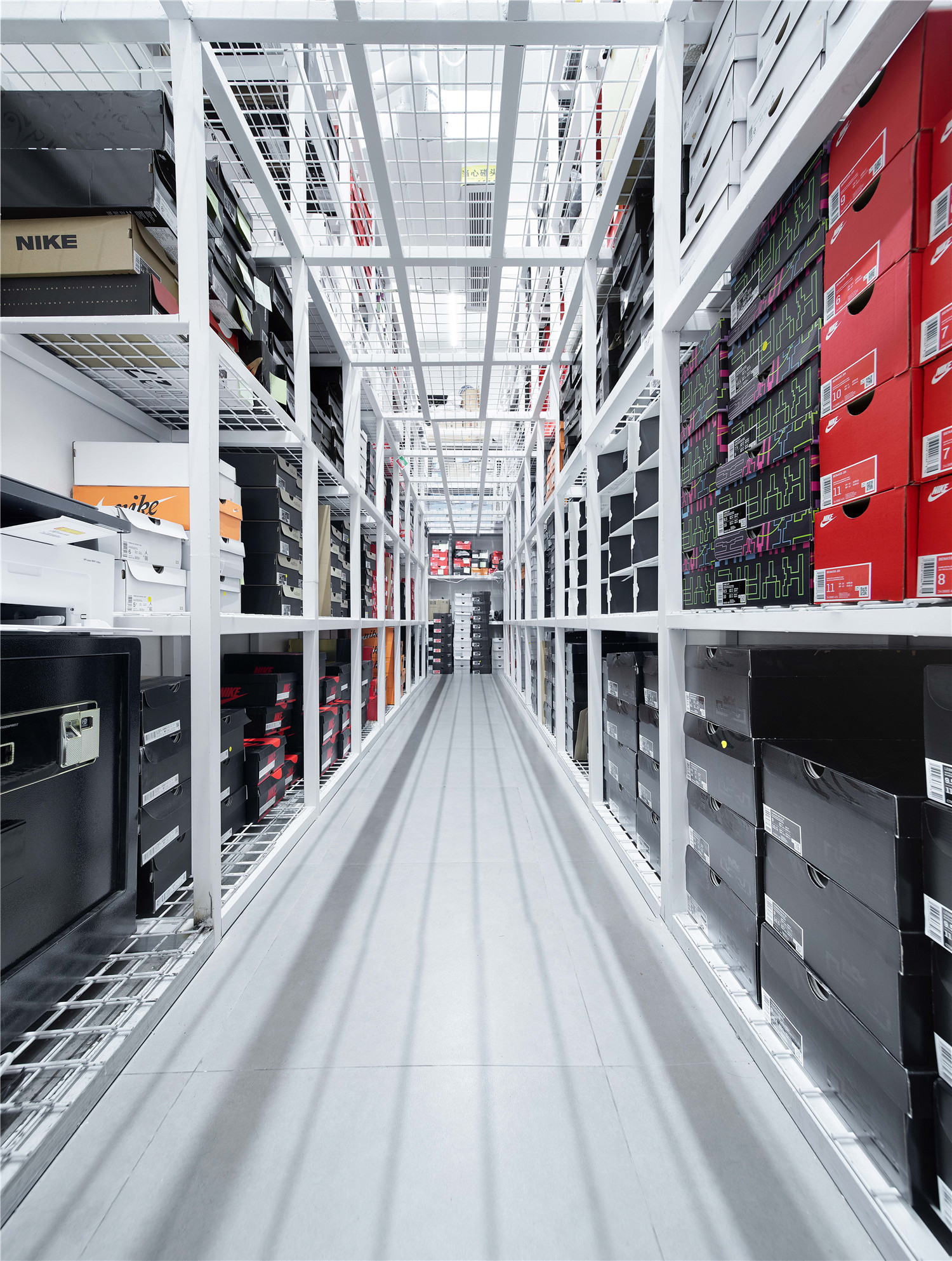
▲空间局部细节
本着环保的设计理念。该设计使用污染小的材料和设备,并且注重在使用中能源和资源的消耗,减轻环境负担。使用可重复回收利用的资源,优先选取环保型的建材,保证设计材料既能够符合建筑主体的功能及要求。选择对人体、环境无害的装修材料。自然通风提升室内空气质量以及室内舒适度,且没有能源消耗和污染。在室内融入自然要素,在设计中加入自然的元素,使得室内充满生机,并让消费者的身心得到放松,为消费者提供一个高质量的购物环境。
The design is based on the concept of environmental protection. Using materials and equipment with little pollution, paying attention to the consumption of energy and resources in use, and reducing the environmental burden. Using recyclable resources and preferentially choosing environmentally friendly building materials to ensure that the design materials can meet the functions and requirements of the main body of the building. Choosing decoration materials that are harmless to the human body and the environment. Natural ventilation improves indoor air quality and comfort level without energy consumption and pollution. Incorporating natural elements into the interior, adding natural elements to the design to make the interior full of vitality and relax the mind and body of customers to provide them with a high-quality shopping environment.
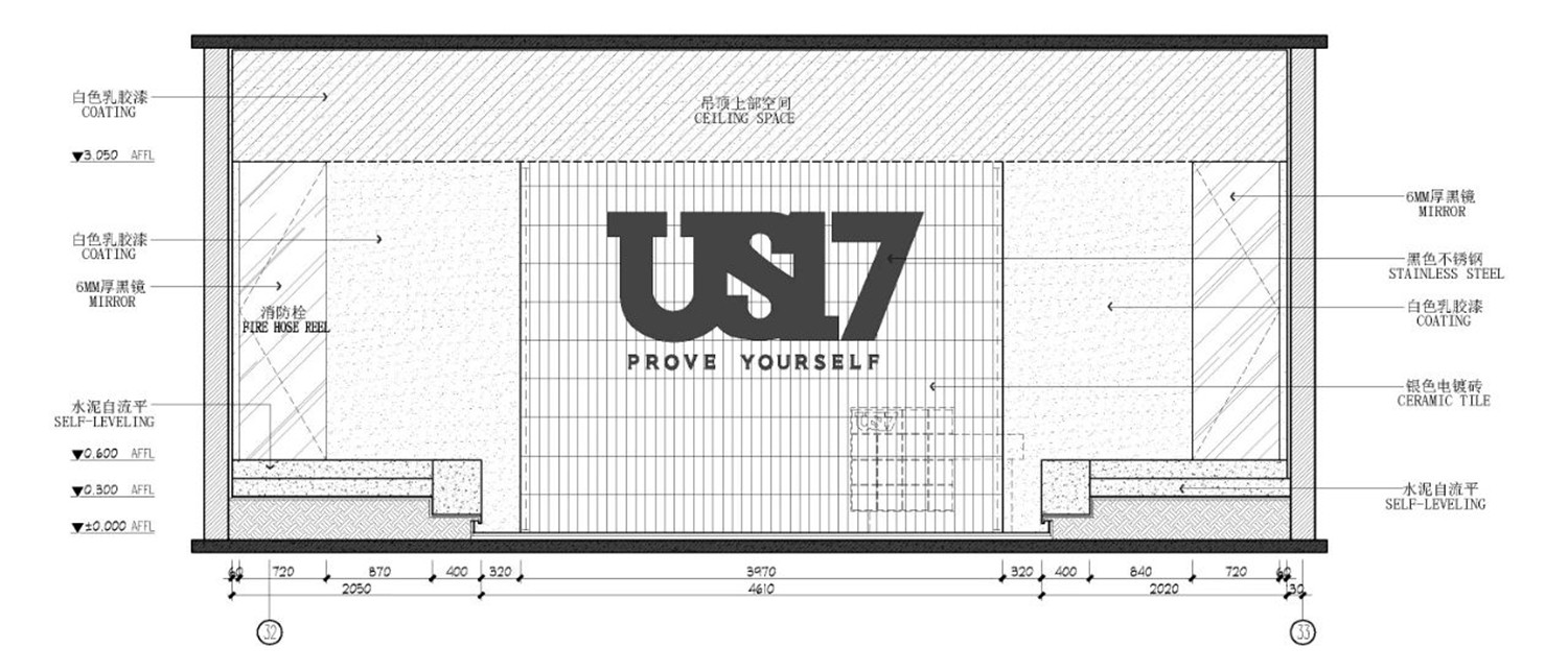
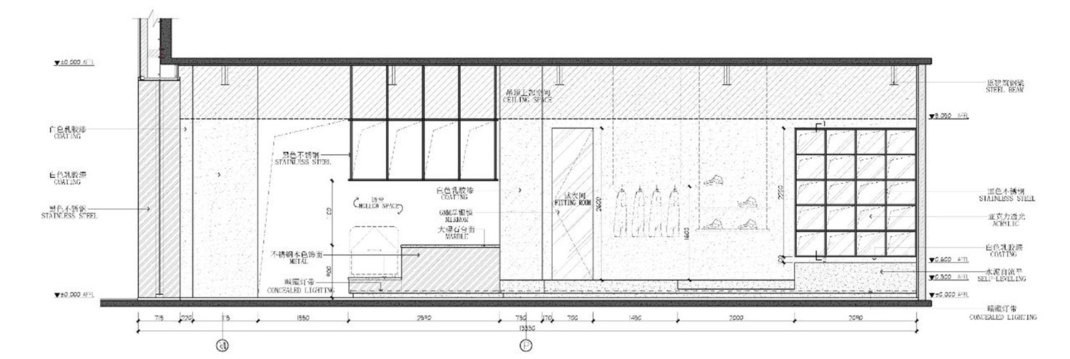
▲剖面图
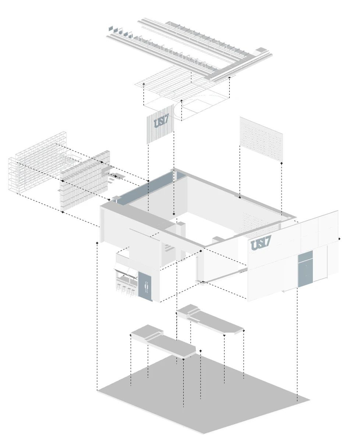
▲轴测图
▲平面图
项目信息——
项目名称:US17深业上城店
项目地址:深圳市福田区深业上城(南区)壹期商业L3层T3043号
业主单位:US17
设计单位:TRID添睿设计
摄影公司:狮子挂满树影像
项目类型:潮品店
项目面积:150㎡
主要材料:自流平、木饰面、水磨石、电镀砖、不锈钢、玻璃
设计时间:2019年08月
竣工时间:2019年12月


