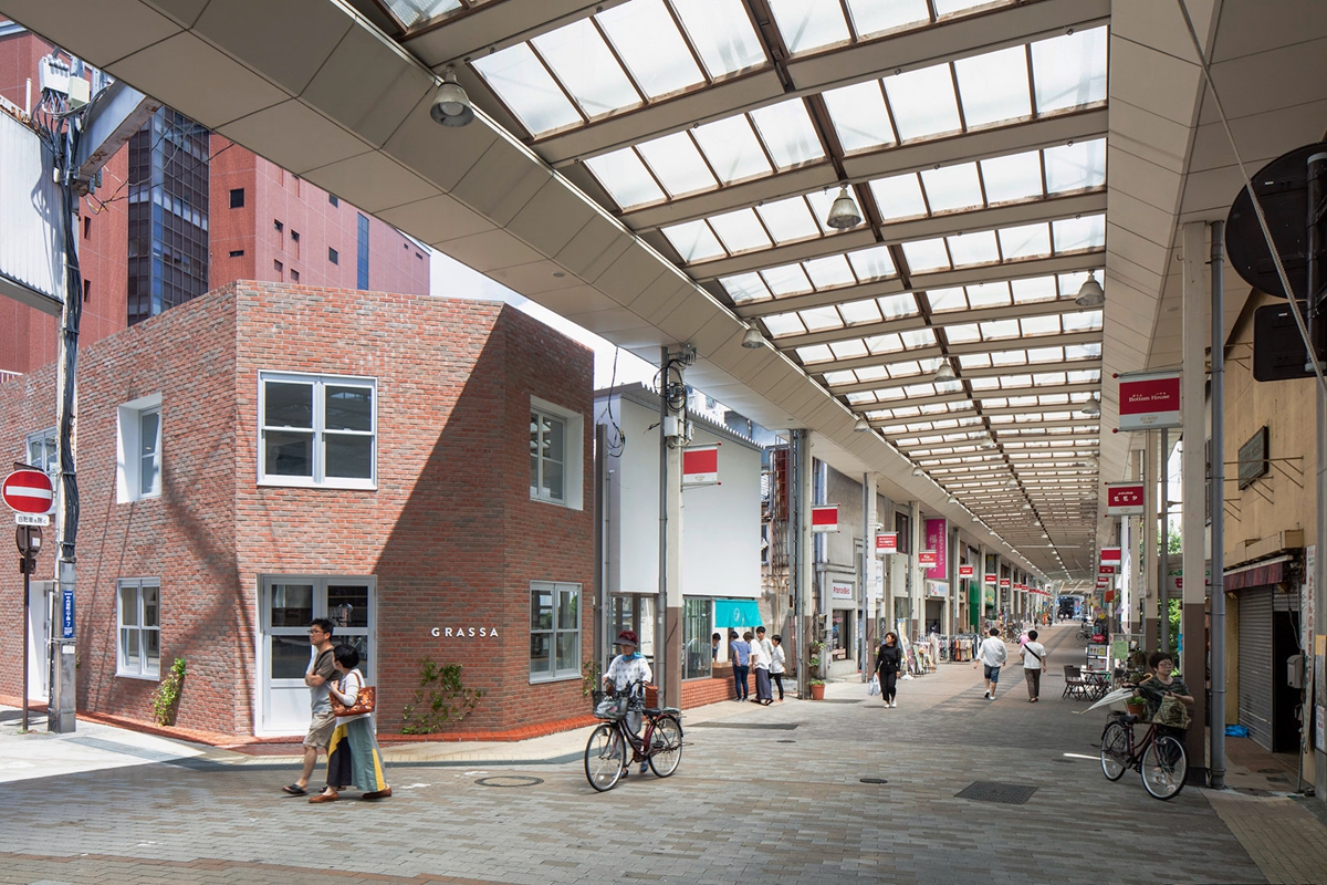
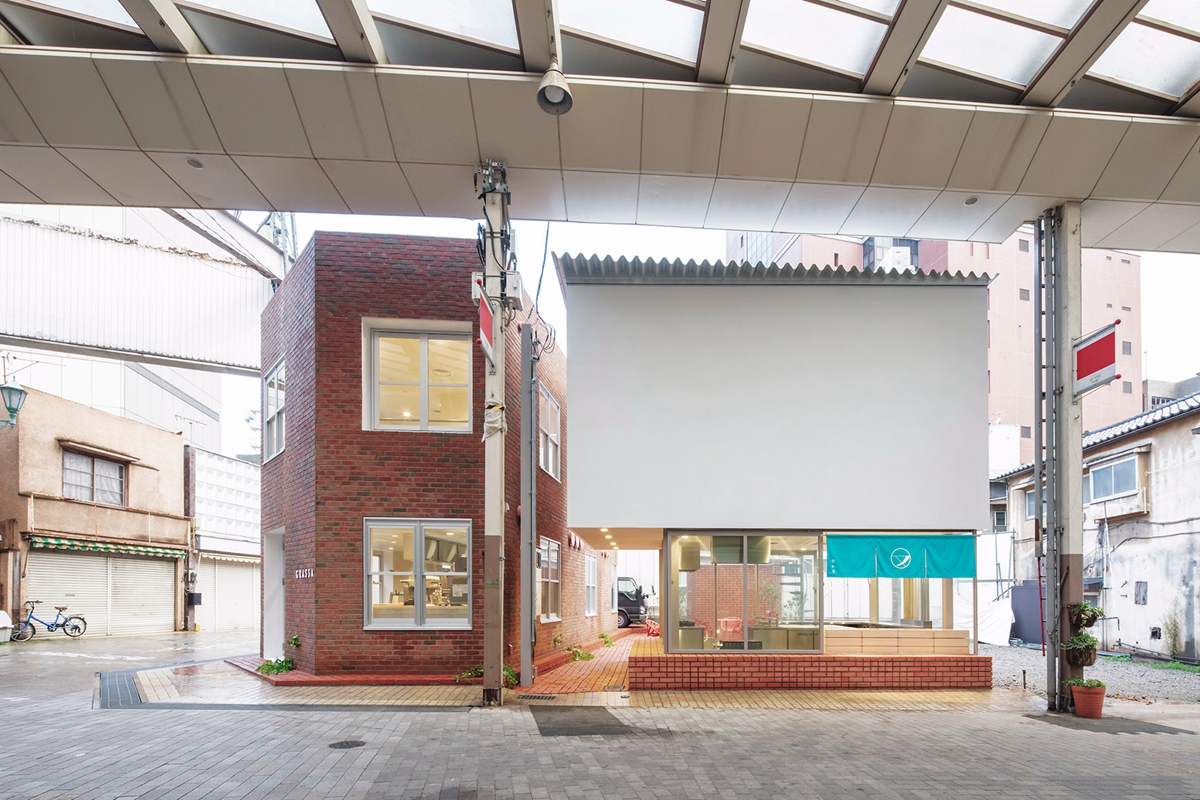
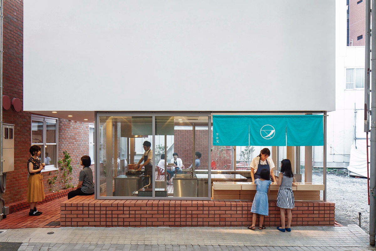
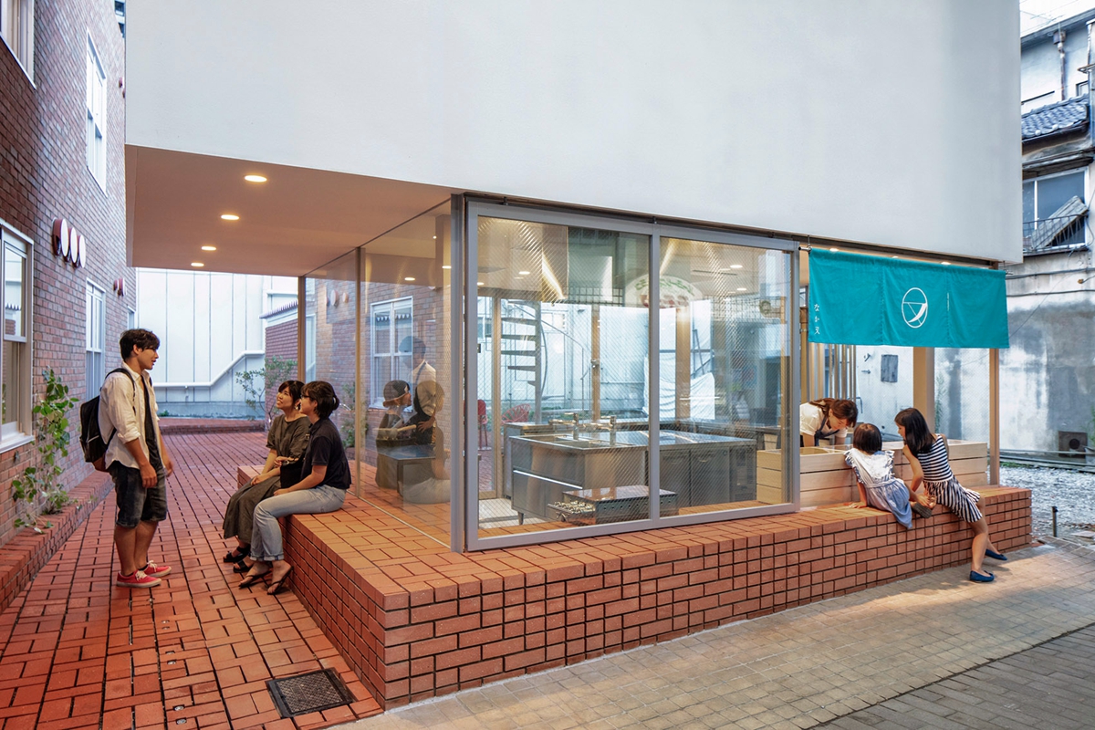
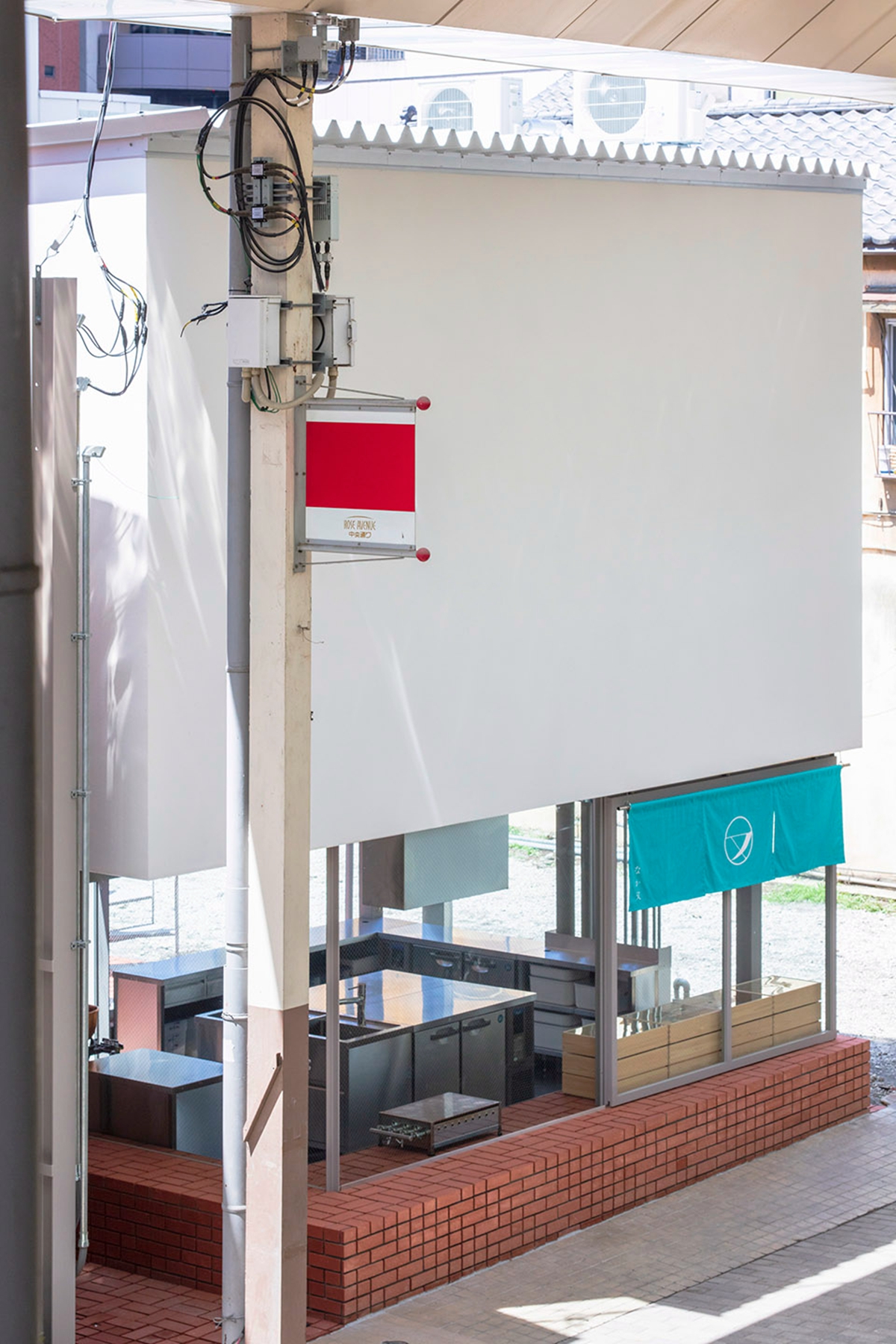
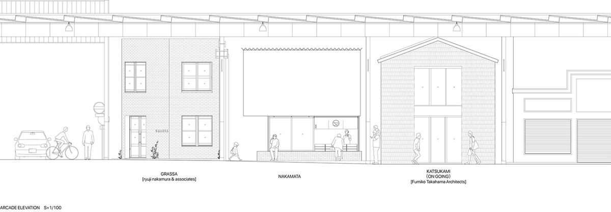
schemata事务所设计了一家日本糖果店“Nakamata”,商店在群马县前桥的ChuoDori购物街新开业。商店两边毗邻建筑,夹在其它店铺和人行道之间,仅有一面临街,人们只能从内部感受到商店的进深。
We designed a newly opened Japanese confectionary store “Nakamata” along the Chuo-dori shopping street in Maebashi, Gunma Prefecture. The building, flanked by buildings on both sides and sandwiched between the arcade and pavement, had only one facade visible to the street and one could perceive the depth of the building only in the interior.
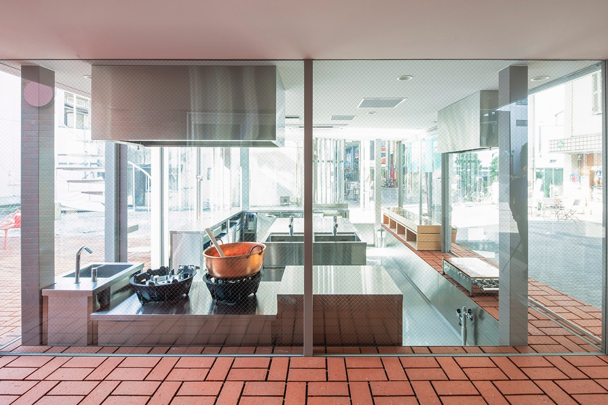
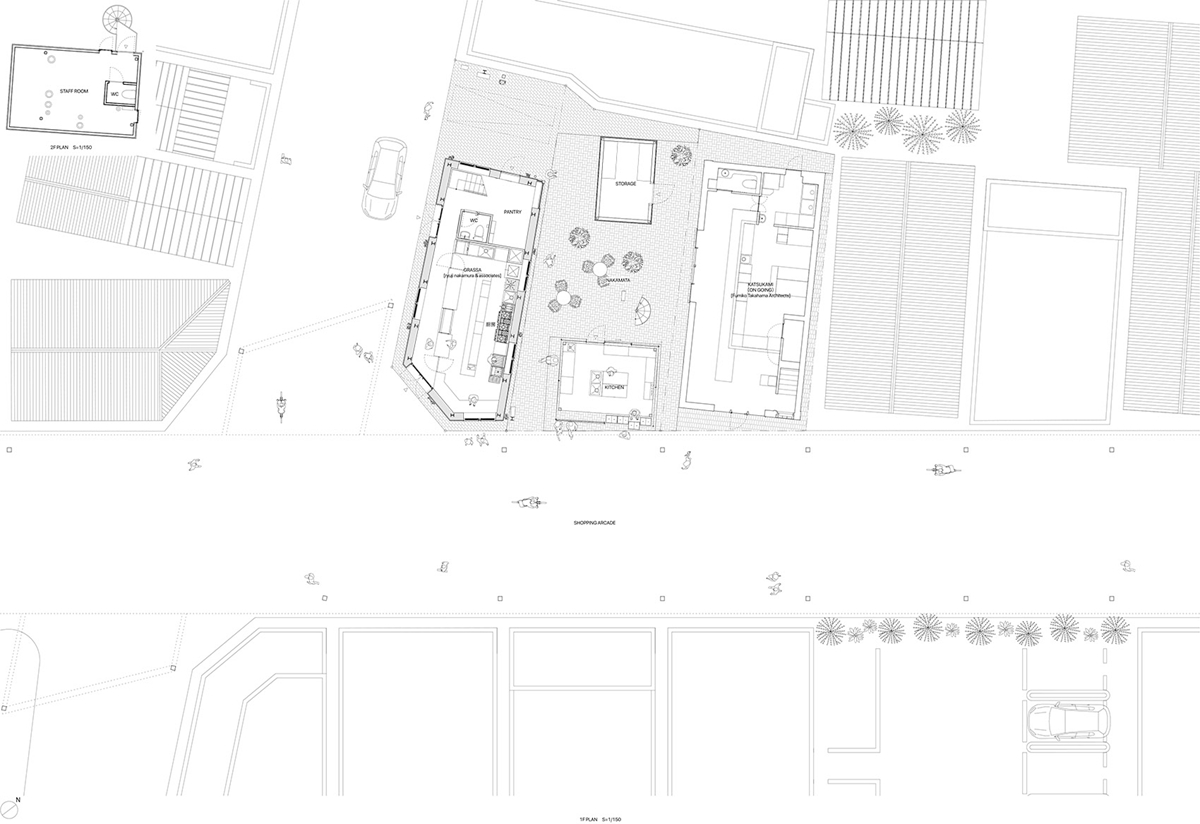
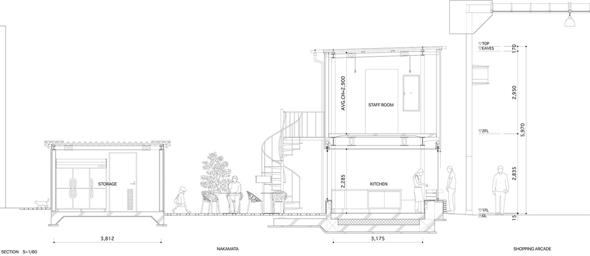
因为日本的糖果店不需要为顾客提供堂食区域,所以店铺所需的建筑面积与场地面积的比例非常小,这意味着场地会有很多剩余空间。设计这个项目的关键是如何利用“多余的空间”来回馈城市。
Because a Japanese confectionary store does not need an eating area for customers, the required floor area of the store was very small in proportion to the site area, which means we have a large excess volume on the site. The key to designing this project would be how to use the “excess volume” in order to give back to the city.
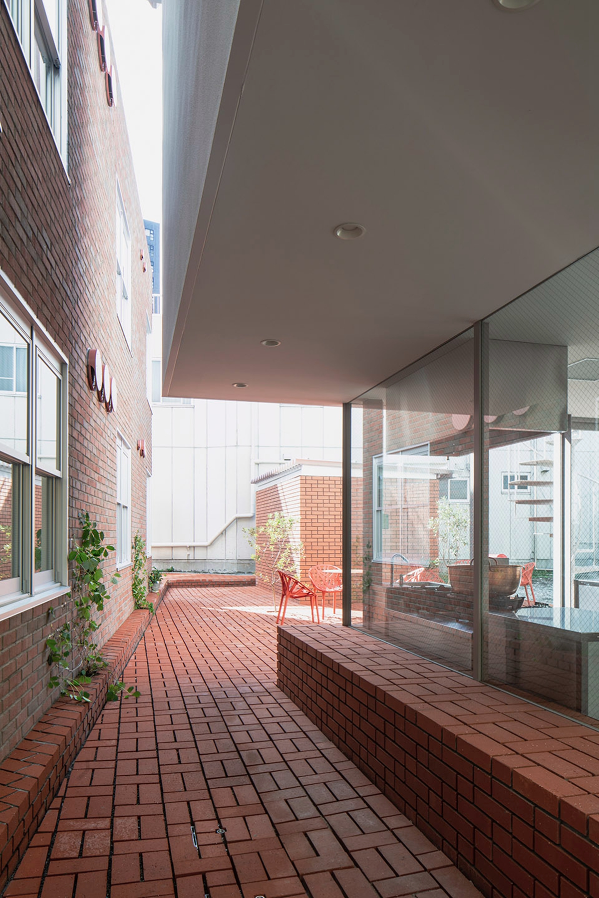
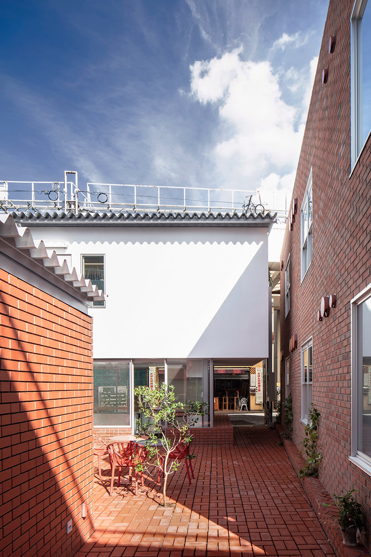
设计师创建了一条垂直于街道的道路,来增加城市的深度感和顾客的期待值。换句话说,他们决定使用“减少”的建筑体量来构建更深的空间。
we created a path extending perpendicular to these layers to add a sense of depth in the city and enhance customers’ expectations. In other words, we decided to use the “reduced” building volume to create the spatial depth.
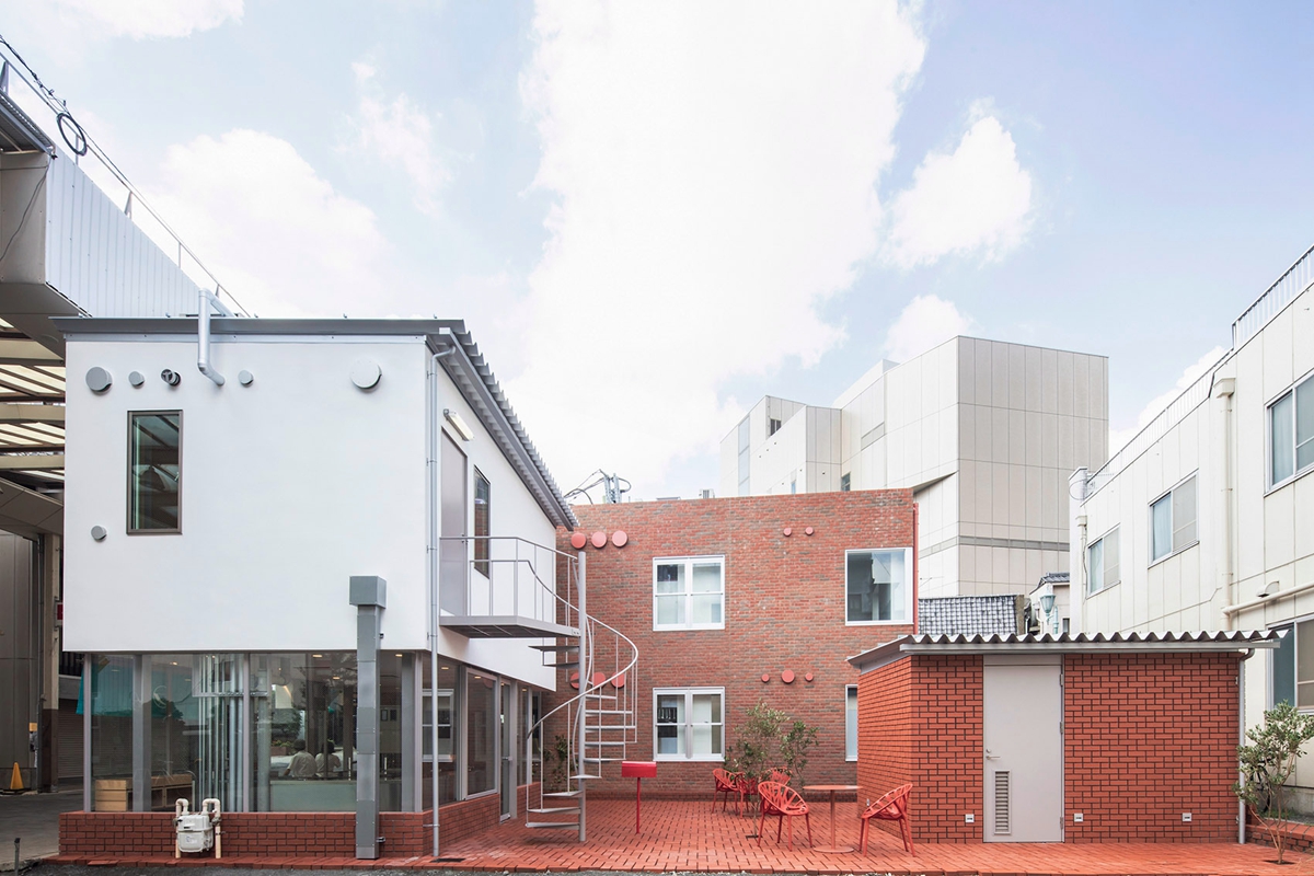
由Maebashi Machinaka机构制定的设计规范要求在建筑外部使用砖块。这个项目的有趣之处在于设计师能够在检查项目双方进度的同时进行设计。设计师想象他们如何在两边堆砖,并研究如何以不同的方式堆砌砖块.
The design code established by Maebashi Machinaka Agency required the use of bricks on the building exterior. The interesting part of this project was that we were able to design while checking the progress of the projects on both sides. We imagined how they would stack bricks on both sides and studied how to stack our bricks in various patterns.
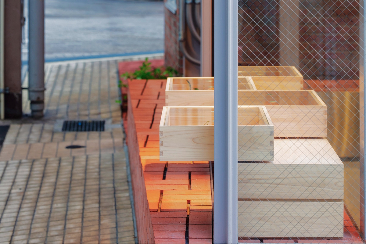
另一个设计规范要求是在场地上种植树木。设计师在空地上种植了三棵小树,设计的方式是随着每棵树的生长,树周围的砖块会被移除,土壤面积会逐渐增加。考虑到这些独特的细节,设计师没有使用灰浆填充砖缝,而是用深凹槽来加强砖的坚固性,突出光与影的对比。他们不仅在水平地面上使用了这种接缝细节,在垂直方向上也使用了这种接缝细节,以创建一种独特的砖外观。
Another design code requirement is to plant trees on the site. We planted three small trees in the “void” space and designed in such a way that bricks around the trees will be removed along with the growth of each tree and the soil area will gradually increase. Considering such unique details, we did not fill in brick joints with mortar and left them as deep grooves to emphasize the solidity of bricks and highlight the contrast between light and shadow. We used this joint detail not only on the floor but also on vertical stacks to create a distinct brick appearance.
▲平面图
▲立面图
项目信息——
项目名称:Nakamata糖果店
设计团队:schemata 建筑设计事务所
年份:2018
项目面积:52.0 m²
地区:日本东京千代田区
摄影:Shinya Kigure


