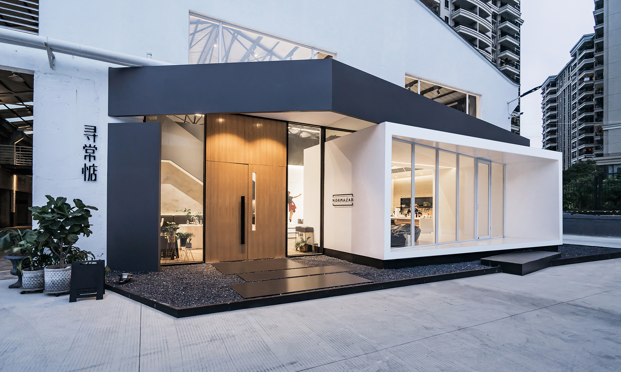
寻常惦坐落于由旧厂房改造的创意园内,集摄影、设计、花艺与轻餐饮于一体。
Normal²AB is located in the creative park transformed from an old factory,which integrates photography,design,floral art and light catering.
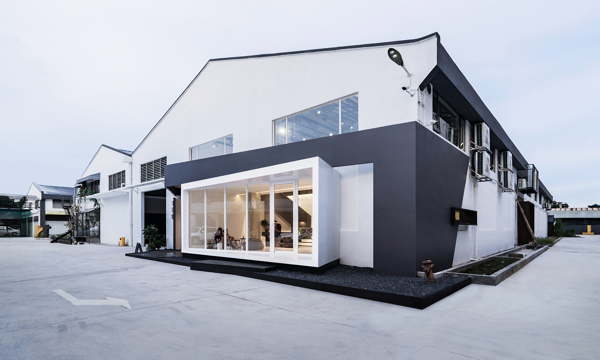
▼ 外观Appearance
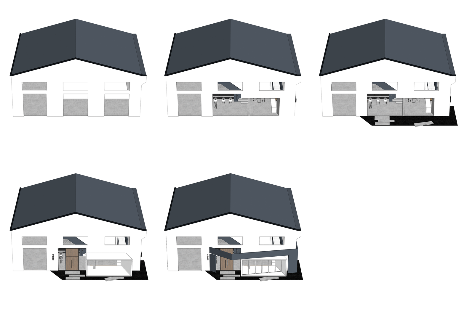
外观设计以虚、实两个不同形态的盒子构筑而成,喻意空间的形态复合。盒子双扣的空间形成内嵌式入口,庭院般的格局让大门仪式感十足,两侧玻璃结合虚实相映的门把手更引人想推门探秘。
The design is constructed in two different forms of virtual and real boxes,which means the combination of the forms of space. The space of the double buckle of the box forms an in-line entrance,and the courtyard-like pattern makes the door full of ceremonies. The door handles of two side glass contrast reality with illusion are more inviting want to push a door to explore a secret.
▼室内空间interior space
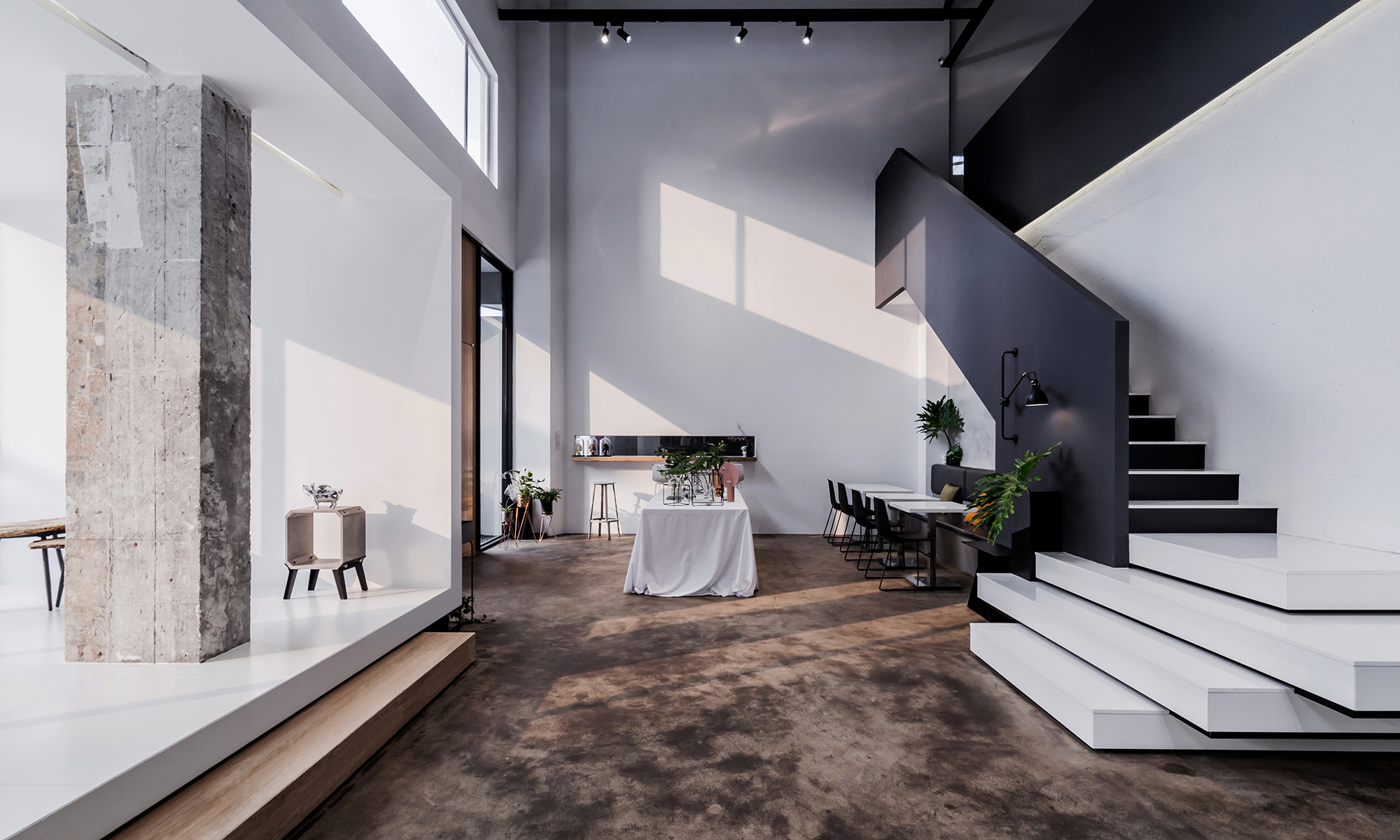
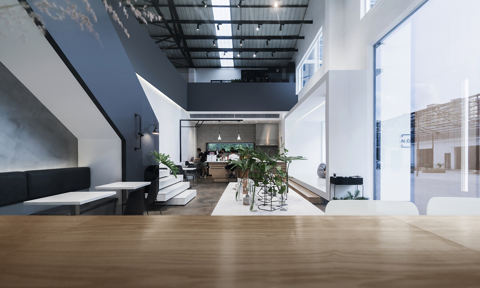
一楼是餐饮与举办各类活动的自由空间,二楼是摄影棚与设计工作区,以一道明快的楼梯扶手作无声划分。设计以营造空间“空”的部分为主旨,墙面以白色为主,并保留了厂房建筑的原始肌理,阳光透过门窗的刻画让影子像时针般在空间中划动,随时间和天气变化展露出不一样的表情,给客人不一样的感受。
The first floor is a free space for dining and organizing various events,and the second floor is a studio and design work area,with a bright stair handrail for division. The design is designed to create a space that is “empty”. The wall is mainly white,and the original texture of the building is preserved. The sunlight is portrayed through the doors and windows,making the shadows move like an hour hand in space,reveals different expression with the changing of time and weather,giving the guests a different feeling.
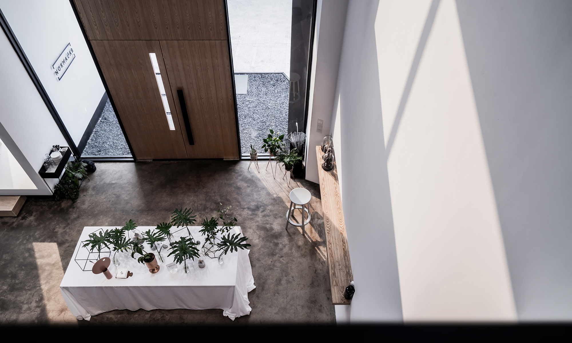
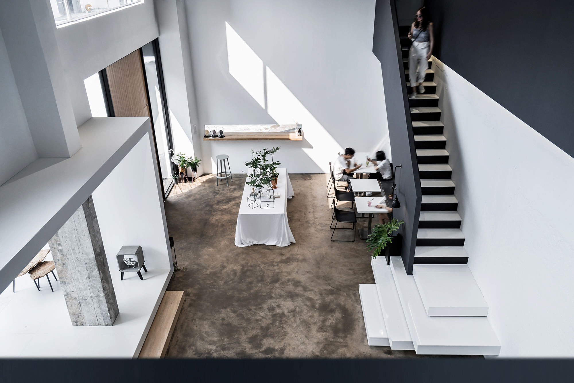
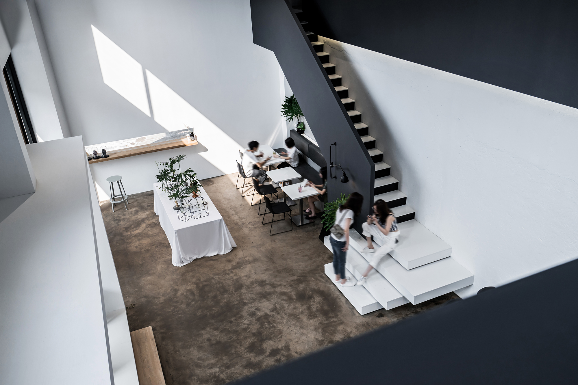
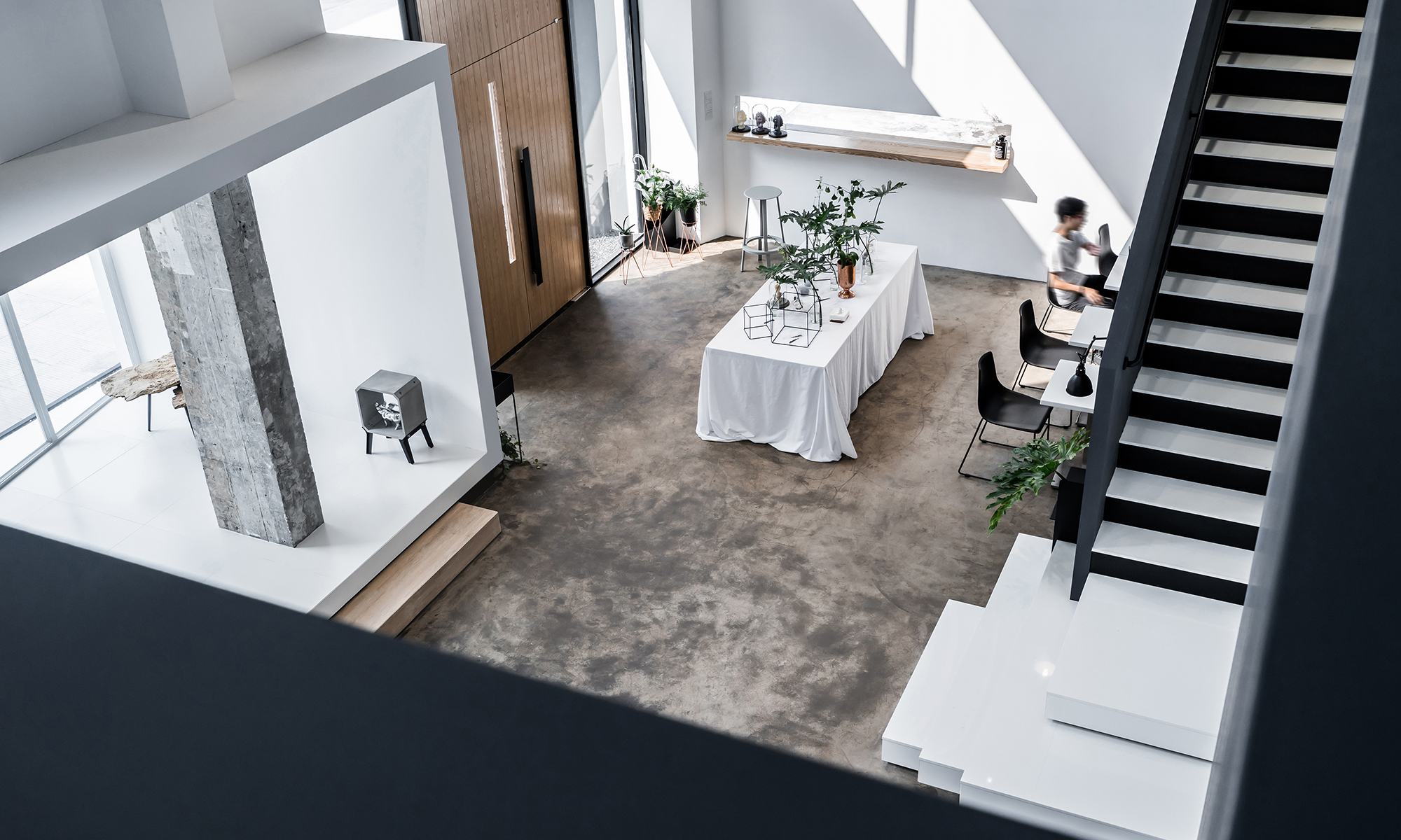
▼从二楼俯视Bird’s-eye view from the second floor
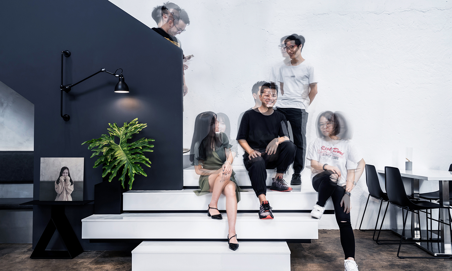
设计师尝试把单体元素的界限模糊,楼梯平台如积木堆砌,卡座区与楼梯扶手、外窗与餐桌的形态结合……为空间创造出更丰富的体验方式。
Designers try to blur the boundaries of each elements,stair platforms look like building blocks,deck area and stair railings,windows and table are combined … created a richer experience for space.
▼店内情景Instore scenario
▼白色盒子内In the white box
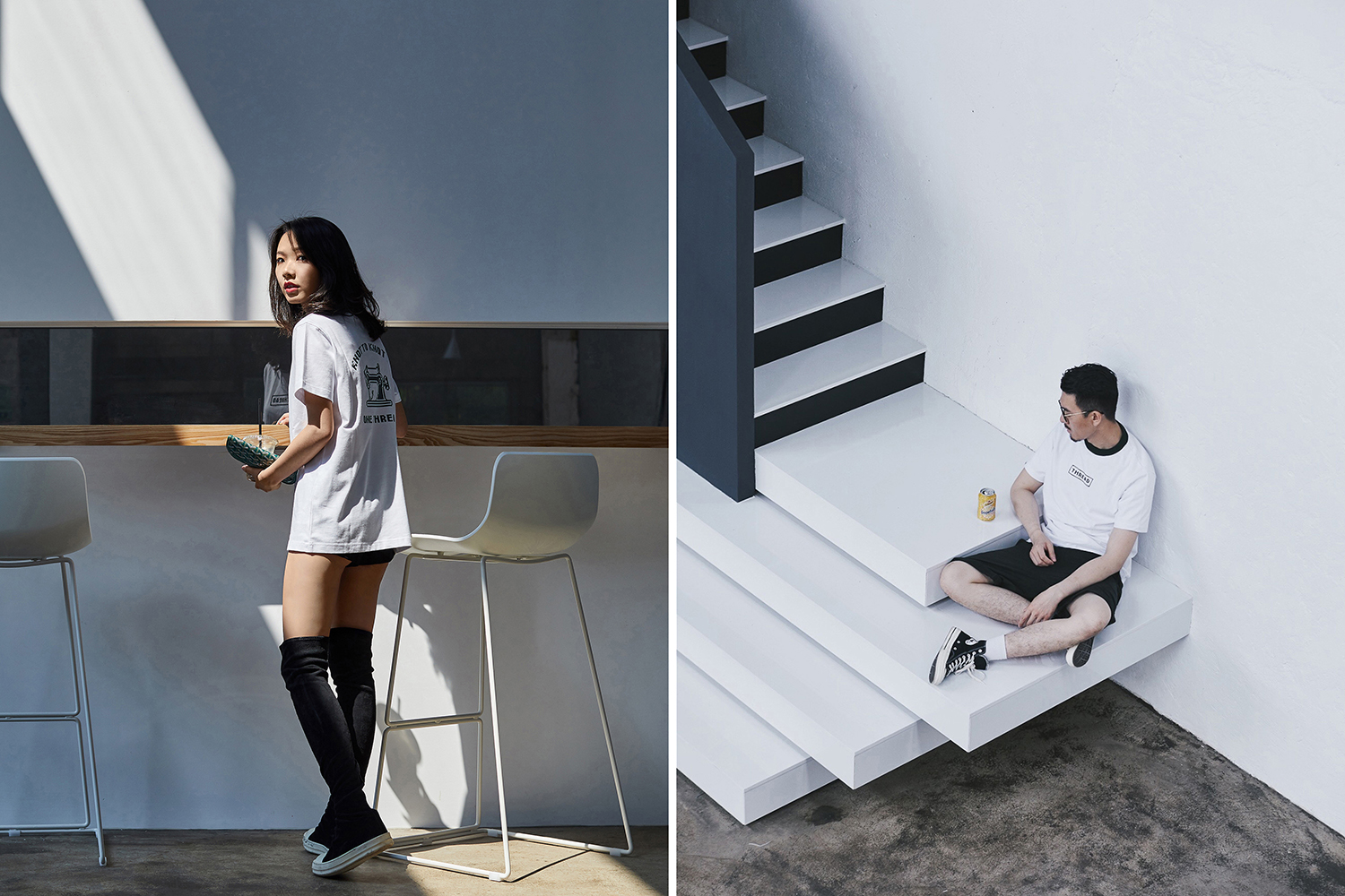
白色盒子穿插于外观与室内之间,如开放式橱窗,连接内外空间的互动,成为客人的小领地和摄影师创作的布景。
The white box is interspersed between the exterior and the interior,like an open window,which connects the interior and exterior spaces,becoming the guest’s small territory and the scenery for photographer to work.
▼从视窗看店内View the store from the window
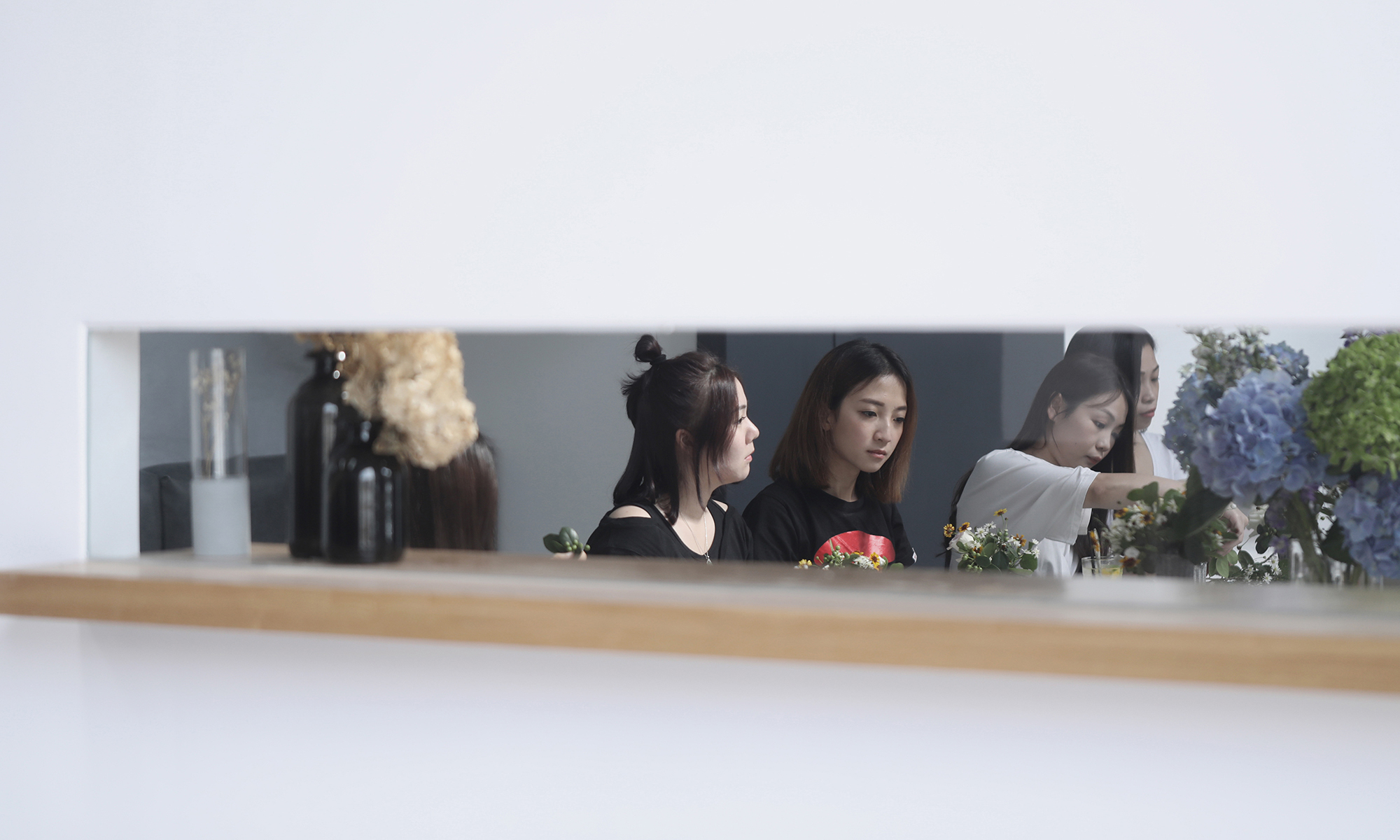
条形视窗在园区走廊一侧,木板如从视窗翻下变成客人的餐台,透出店内的情景十分有趣。
The strip window is on the side of the corridor of the park. The wooden board turns from the window to the guest‘s dining table,revealing the interesting scene of the store.
▼摄影情景Photography circumstances
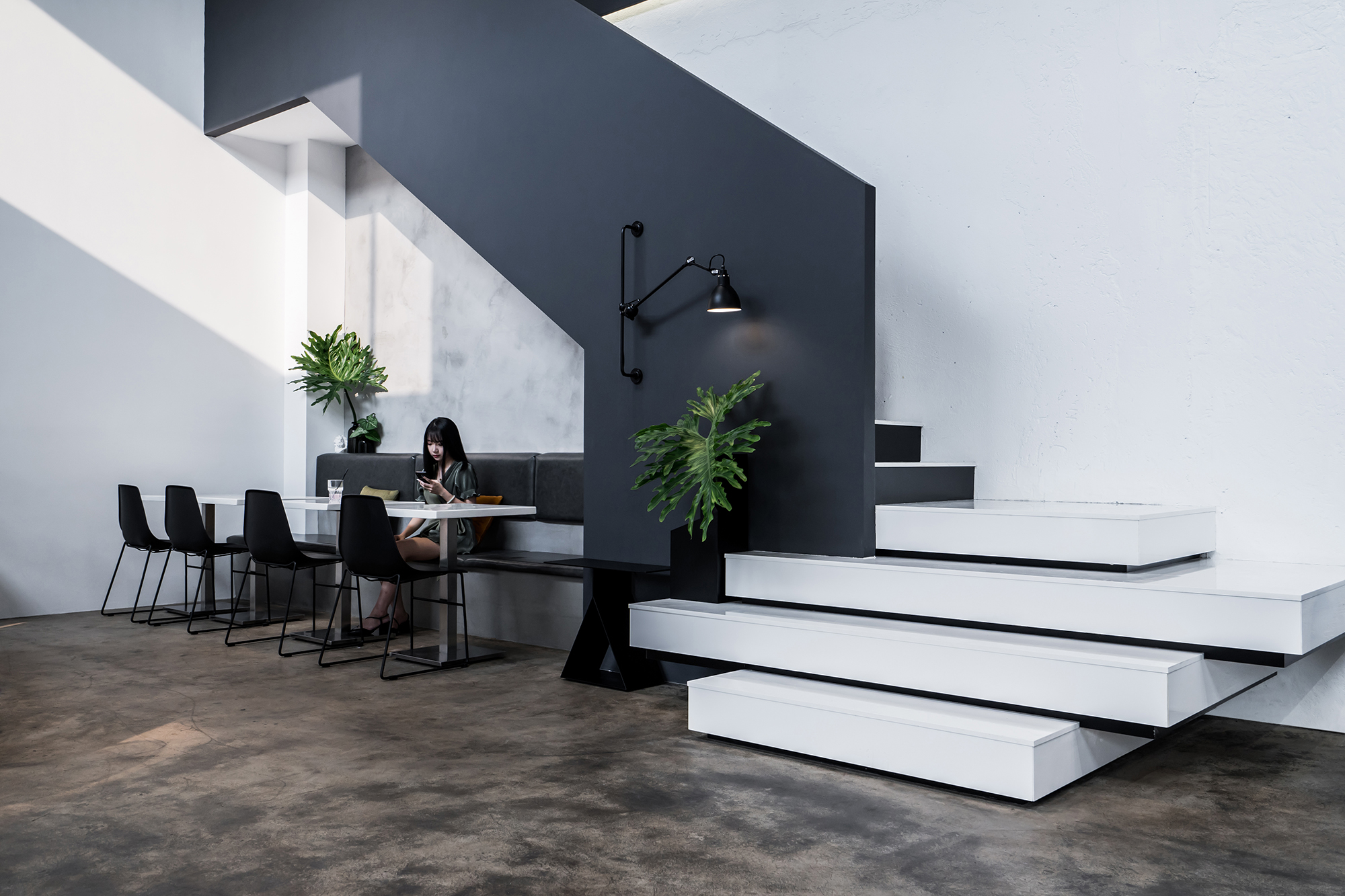
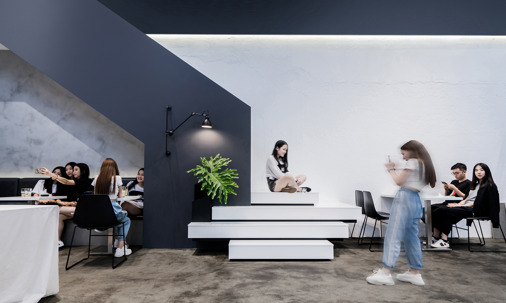
楼梯与卡座造型建筑感强烈,让客人的摆拍更显个性。
The stairway and the deck are with strong architectonic feeling which makes the guest’s posing more unique.
▼厨房与水吧区域Kitchen and water bar area
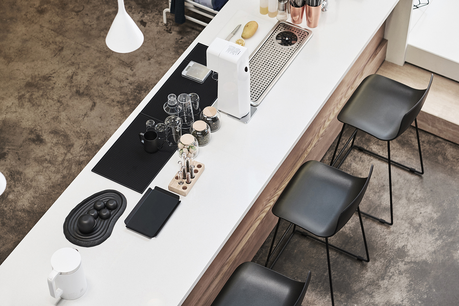
开放式厨房营造出居家般轻松的氛围。
The open kitchen creates a homely atmosphere.
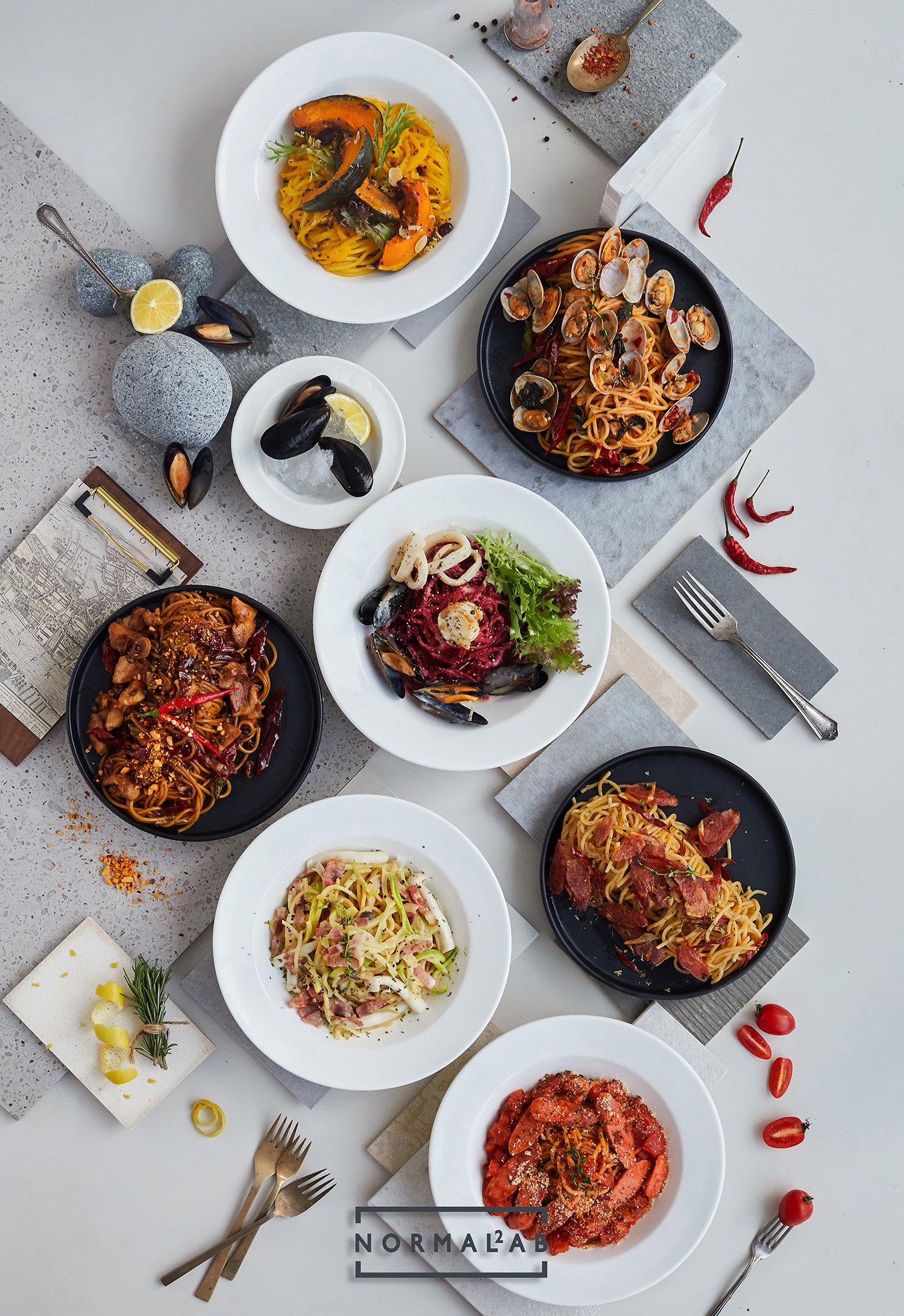
▼菜品Dishes
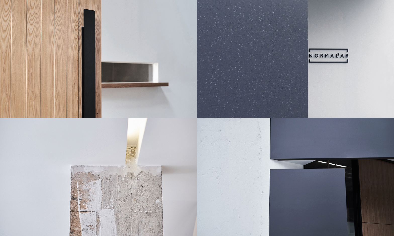
▼空间局部Part of the space
▼夜景Night scene
▼厂房原貌The original appearance of the factory
“希望我们生活的城市,有越来越多美好的地方是由旧楼改造而成,而不是拆后重建……”这是设计师与店主共同的愿景。
“We hope the city we live in has more and more beautiful places are built from old buildings,rather than being rebuilt after demolition…”This is the vision shared by designers and shopkeepers.
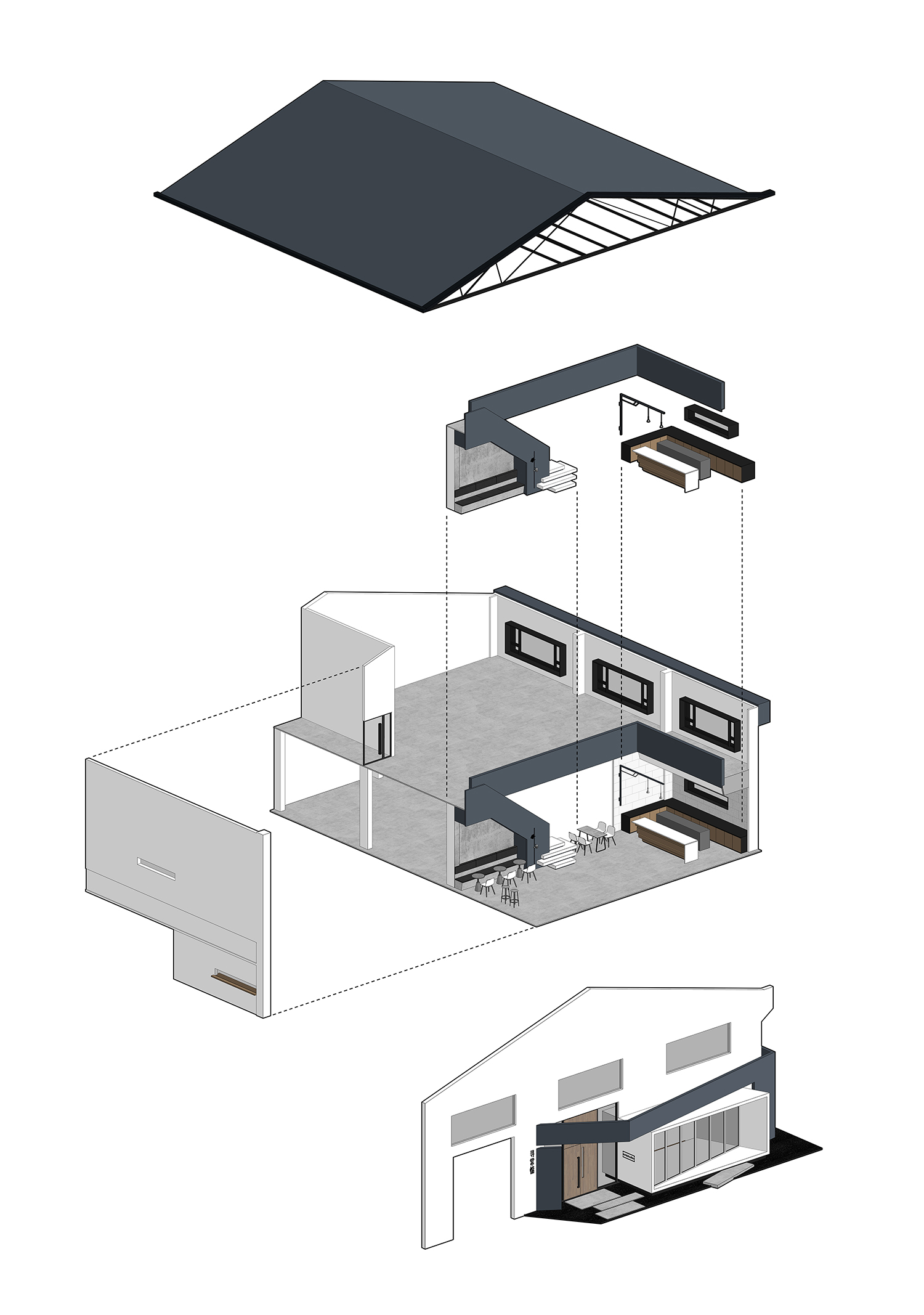
▼空间解构图Space deconstruction diagram
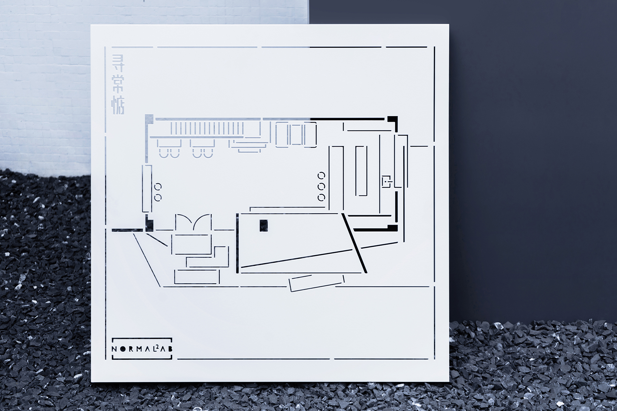
▼空间平面图Space Plan
项目信息——
项目名称:寻常惦
设计方: 三品空间设计事务所
项目设计 & 完成年份:2018-03;2018-08
主创及设计团队:刘嘉培
项目地址:中国广东省中山市滨江一号创艺市集B1-17
建筑面积:365平方米
摄影版权:表扬一下
客户:寻常惦业主
主要材料:冷轧钢板、饰面板、涂料


