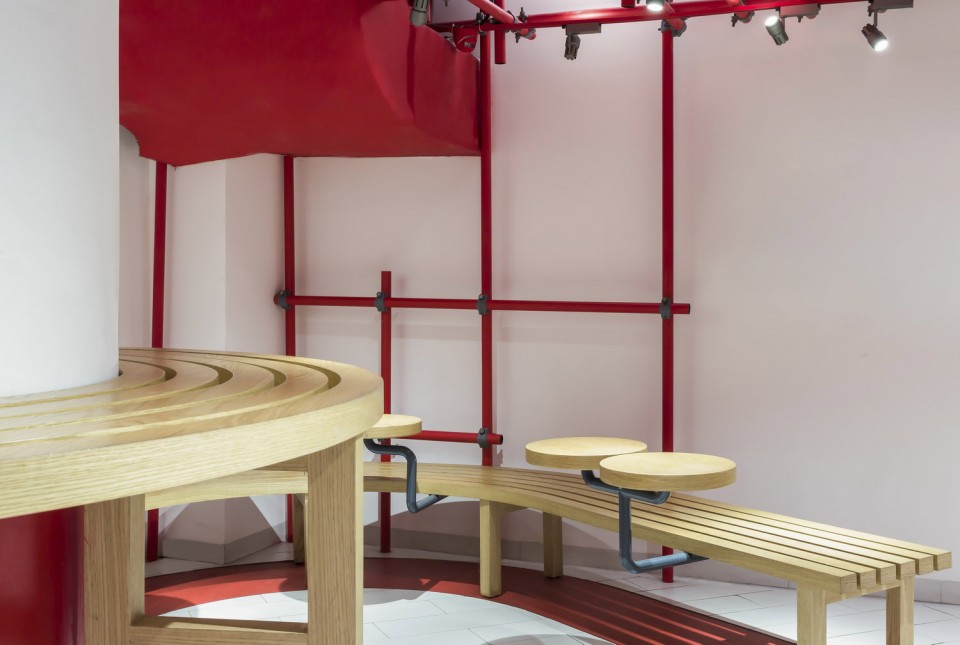
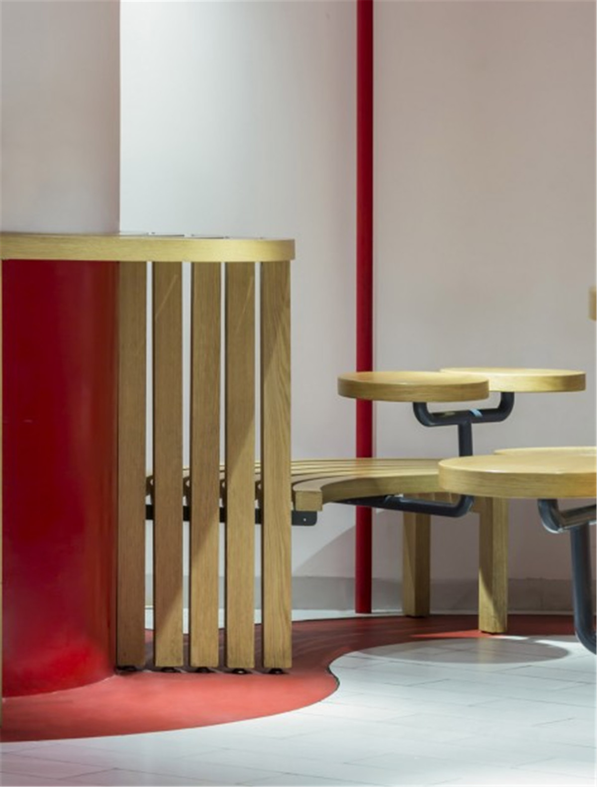
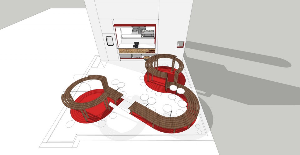
项目场地本身的条件前所未有,37平米的用餐区域中矗立了两支占地4平米的大圆柱,使得空间更显紧张与狭小。经过思考,原本“碍事”的柱子摇身一变成为座椅区。构思来源于公园中的景观,柱子象征参天大树,长长的公共座椅依树缠绕,成为用餐的桌子,人们围绕着“大树”乘凉就餐,而脱离柱子的部分又降低长椅高度使其重新成为椅子。这样一来,蜿蜒环绕的长椅一气呵成,成为空间内的主要造型。
The project site conditions unprecedented, in the 37 square meters of dining area there stands two poles that covers an area of 4 square meters, making the space more tense and narrow. After thinking, the original “obstruction” of the pillars transformed into a seat area. The idea comes from the bench in the park. The pillars symbolize the towering trees, the long public seats are wrapped around the tree, and becoming the dining table, people around the “tree” can enjoy cool meal, and from the pillar part it reduces the height of the bench. It becomes a chair again. As a result, it meanders around the bench at one go, becoming the main form of space.
▼ 店面外观,大众但也带着几分精致,external view of the restaurant, close to the public while having something delicate

▼ 围绕中部柱子设置的连续木制桌椅,continuous wooden table and chairs rounding the column in the center
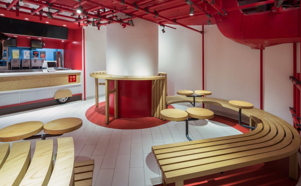
空间内原本的天花高低落差很大,管道最低处只有两米,于是设计师采用了脚手架的形式,使得空旷的顶部空间丰富起来,同时也与原本的管道相结合,使其成为一体,表现出施工现场的层次感。不仅在天花造型上,立面上也使脚手架代替了墙体的存在,增加了空间的通透性。
There’s dramatic height differences in the original ceiling and the lowest part of the duct is only 2 meters high. Thus the designer introduced scaffold element to the project, combining with the ducts and making the empty ceiling interesting. It shows the layered form of a construction field. In addition, the scaffold replaced the walls in some place, enhancing the transparency of the space.
▼ 脚手架式的吊顶与管道结合,scaffold like ceiling combines with the original ducts
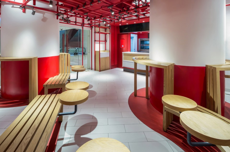
▼ 墙面上也采用脚手架装饰,scaffold also used on the wall
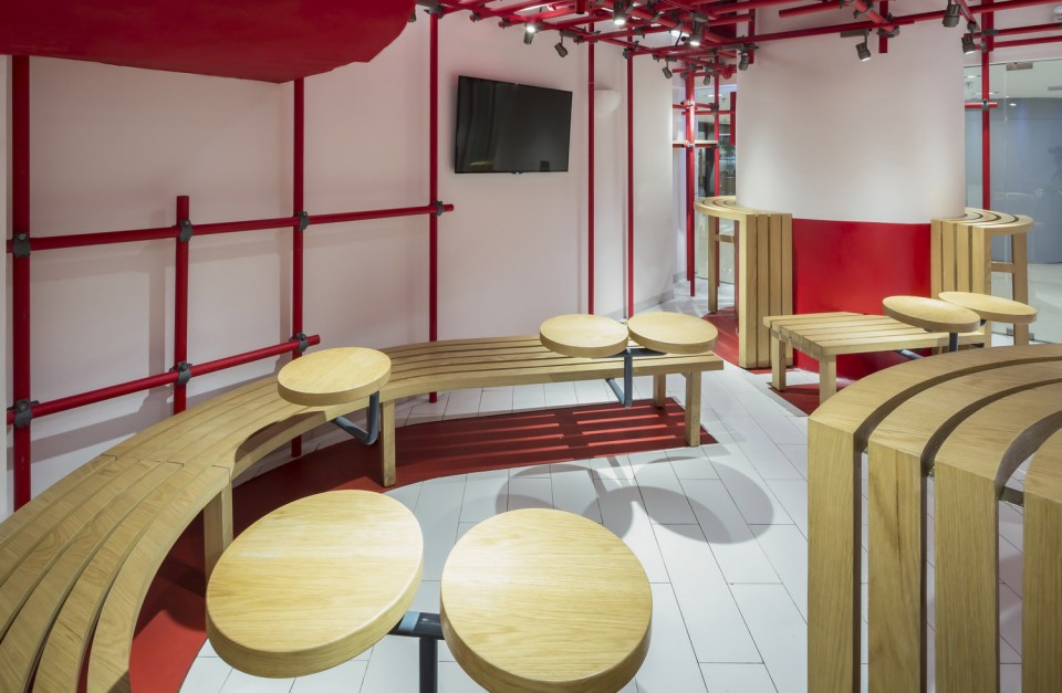
原木色的桌椅,大红色的脚手架以及纯白色的墙面和地面,整个店面给人一种简单利落的感觉。一边是公园的休闲与放松感,另一边是施工工地的繁忙与紧迫感。两种节奏一快一慢,一动一静,正好烘托出点餐区与用餐区的不同氛围。
Wooden furniture, red scaffold and white flooring and walls together provide a sense of simple and clean. On one side, people could enjoy and relax in a park-like atmosphere. On the other side, the scaffold gives a busy feeling on the construction site. The two spaces contrast with each other, creating different ambience in the ordering space and dining space.
▼ 利落的配色,融合不同的氛围,clear palette of the restaurant, combining different kinds of atmosphere

脚手架的应用也显示了肉夹馍本身作为街边小吃的形象与地位,大众与低价。但讽刺的是,西少爷如今已经将肉夹馍卖到了北京第二高楼里,颇有一种屌丝大逆袭的味道!
The use of scaffold reveals the popular and affordable image of rou jia mo. What interesting is that Xizhaoye is selling rou jia mo in the second highest building in Beijing, bringing this popular snack to a new height.
▼ 设计概念,围绕柱子的连续家具,design concept, continuous furniture around the columns
项目信息——
设计公司 : 古鲁奇公司
设计团队 : 利旭恒 , 赵爽,高颂洋
项目位置 : 中国北京
建筑面积:50平方米
建成时间:2017.1
摄影师:Lu Haha
Project Name: Xishaoye
Designer (Design company): Golucci International Design
Design team: Lee Hsuheng, Zhao Shuang, Gao Songyang
Location: Beijing China
Built area: 50m2
Completion (date): 2017.1
Photographer: Lu Haha


