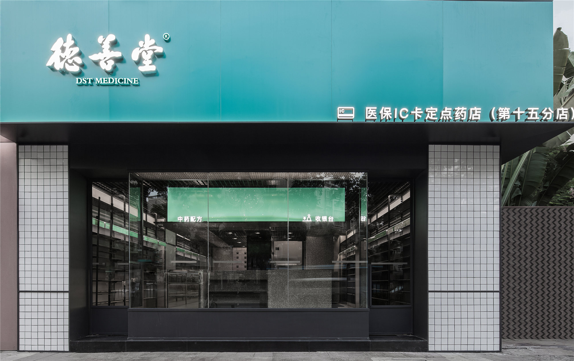
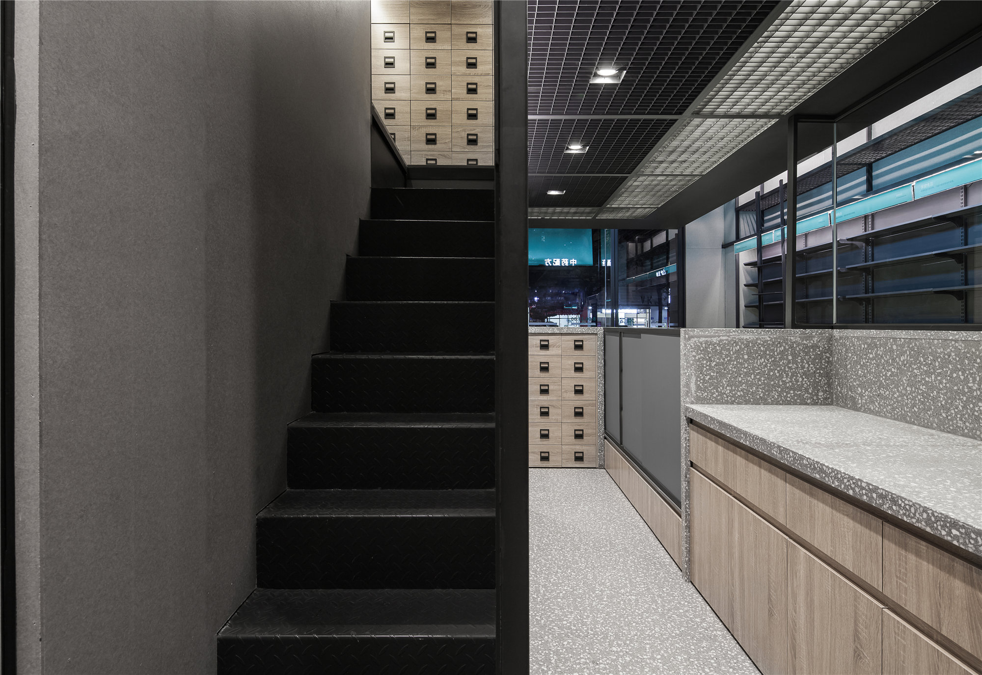
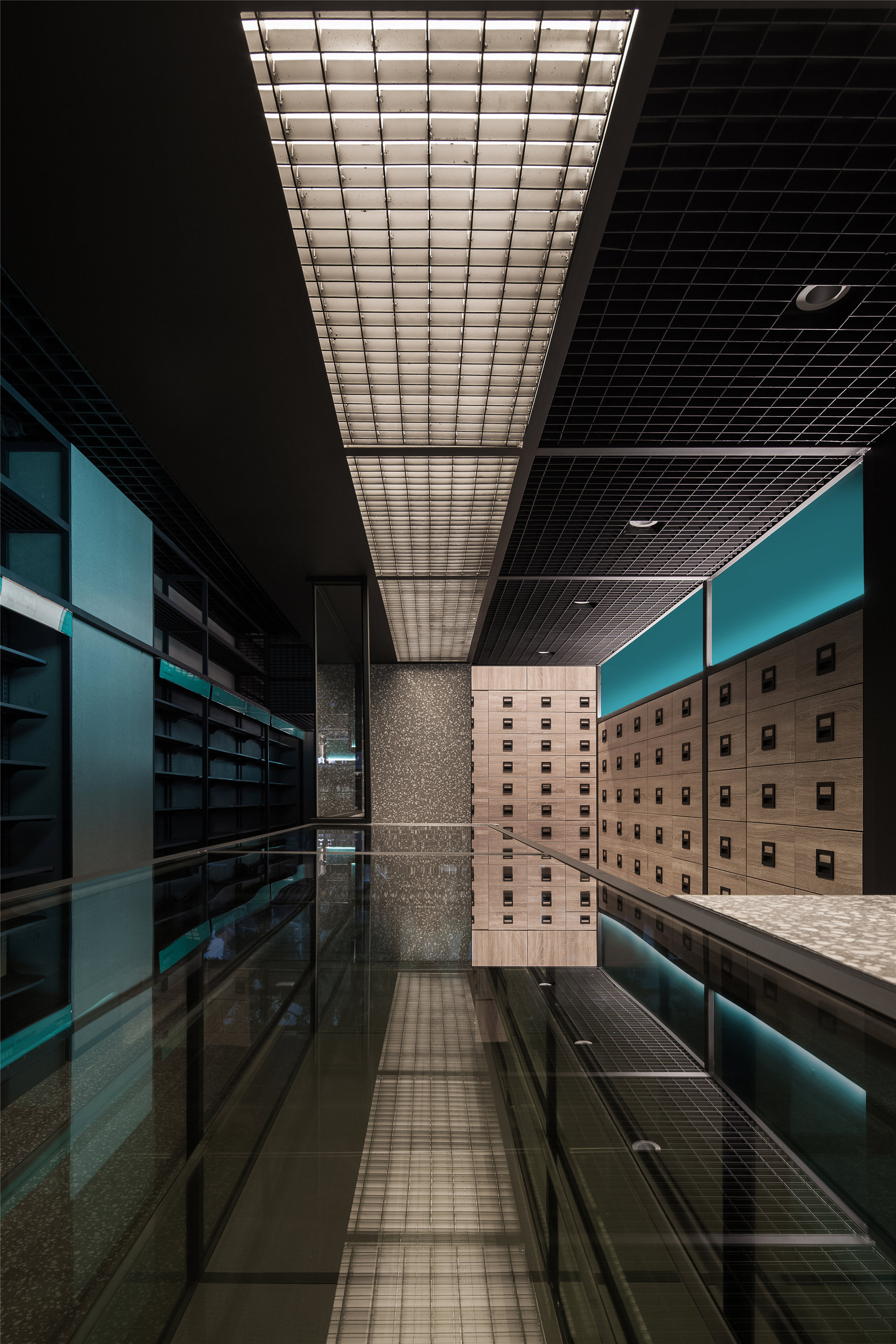
设计的出发点基于如何最大限度的利用3.9米的层高,将售卖、展示、仓储的边界模糊,进一步将各功能构件合并重构,最大限度地去除多余的功能和装饰化构件,从而达至功能与视觉统一、简洁而真实朴素的机器美学。
DST Medicine Shop, based on maximizing the 3.9-meter height, the design blur the boundaries among sale, display, warehouse and furthermore, combine and reconstruct every kinds of function. It not only gets rid of meaningless decoration the most, but presents precise, authentic and simple mechanical aesthetics, which unify function and visual.
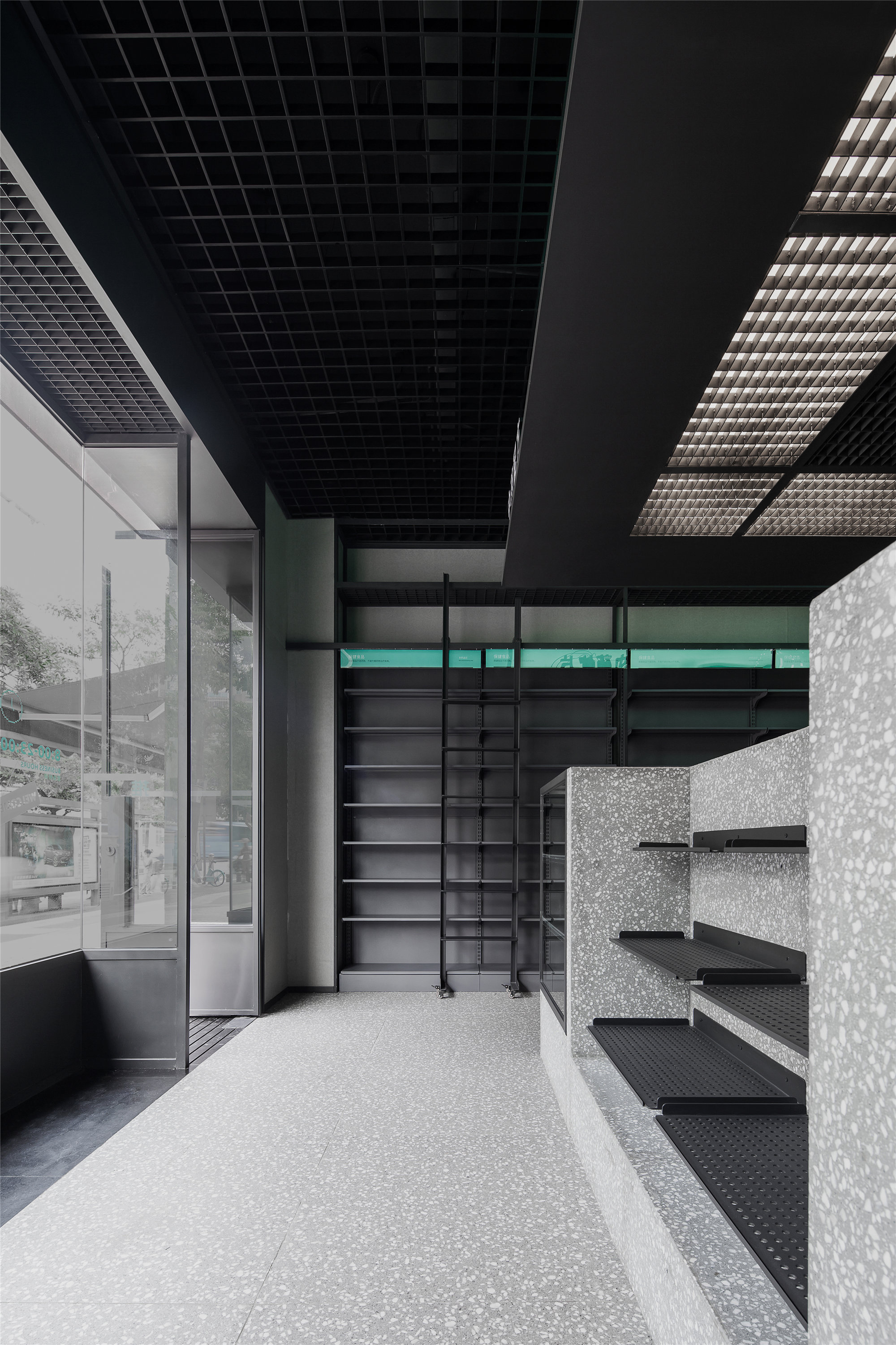
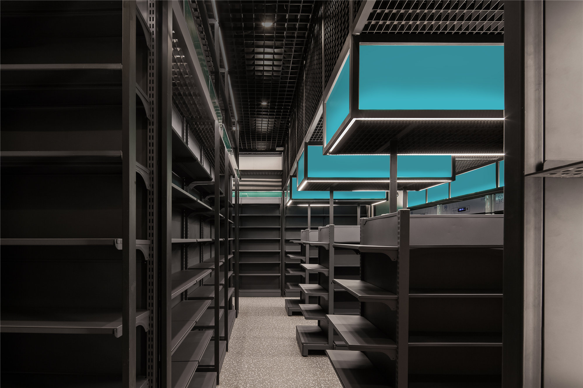
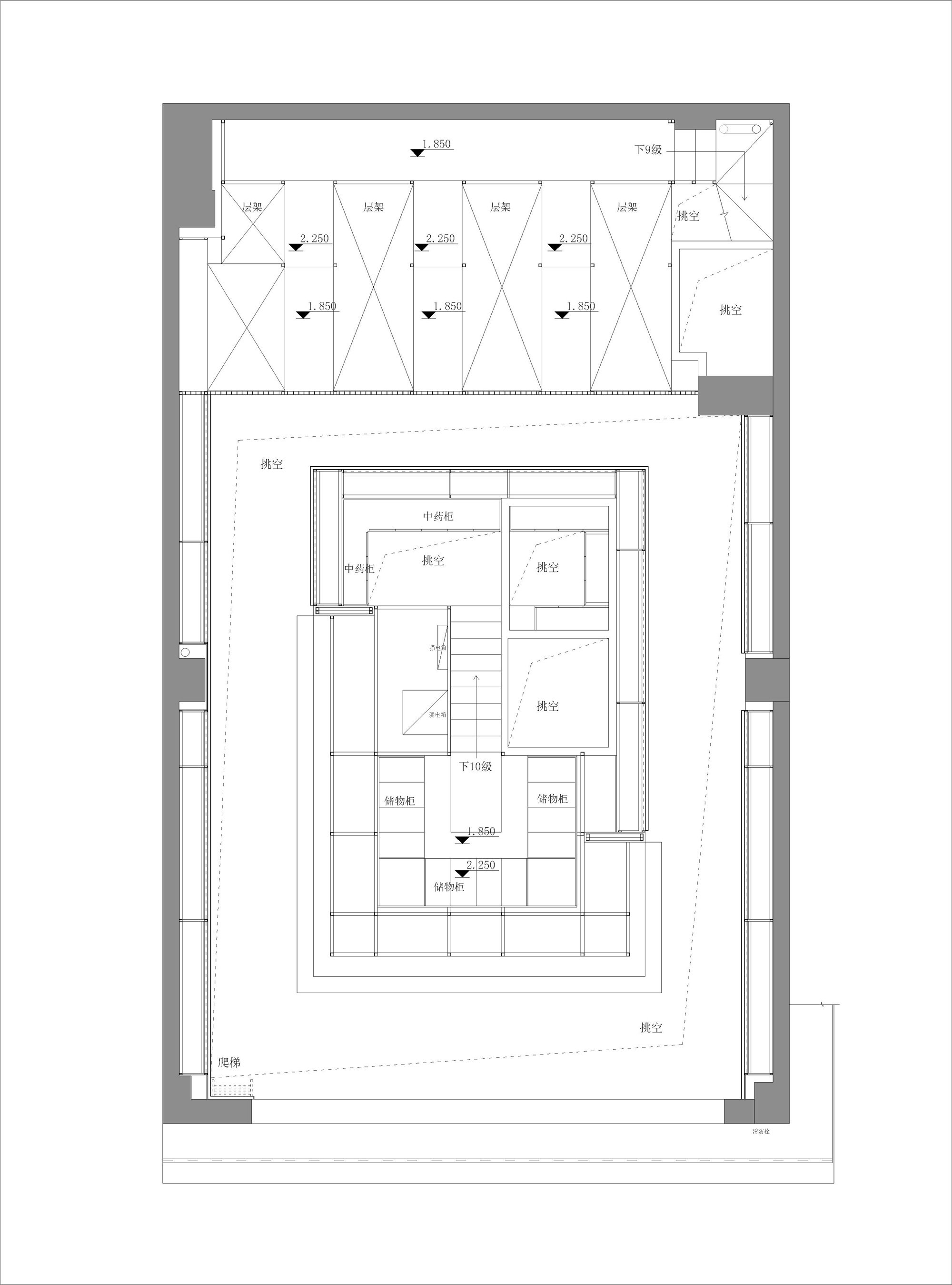
竖向空间的利用上,在底层和夹层将1.8高货架与2.1高人行通道错开设置,巧妙而有效地利用层高。靠墙货架下部为售卖展架,上部为仓储格架。滑动钢梯不仅满足取用高层货品的需要,也是空间中的视觉趣点。
In order to separate shelves with 1.8-meter-high and walkway with 2.1-meter-high at the bottom and interlayer, the design makes good use of floor height. The bottom of shelves, which against the wall, are used for sale, and the upper part are used for storage. The sliding steel ladder is not only satisfies the need of usage of upper shelves, but a visual highlight inside the space.
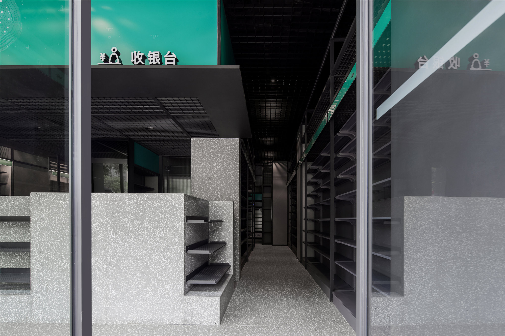
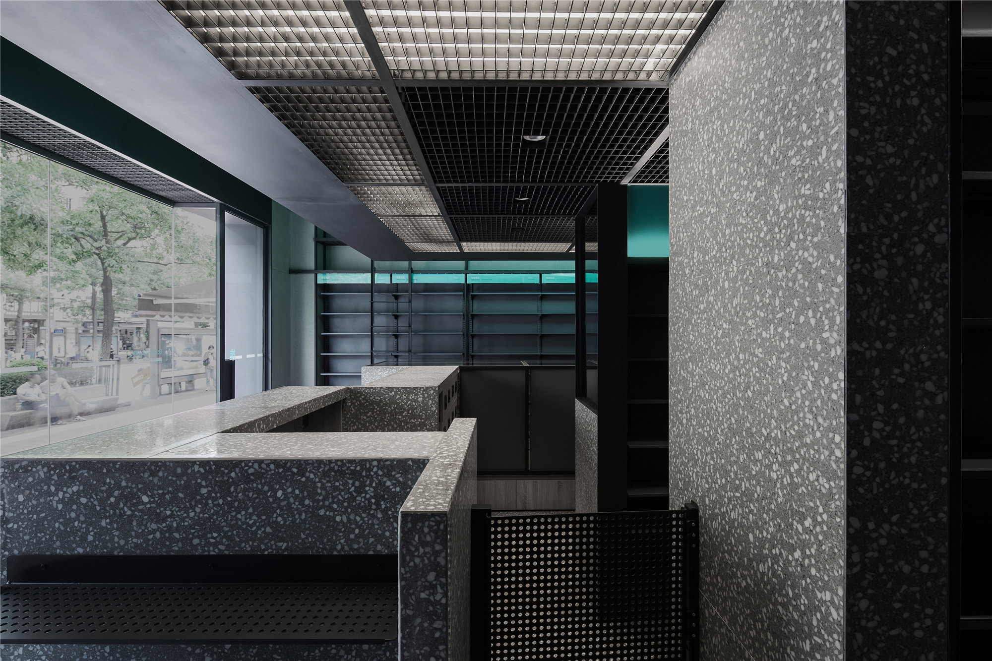
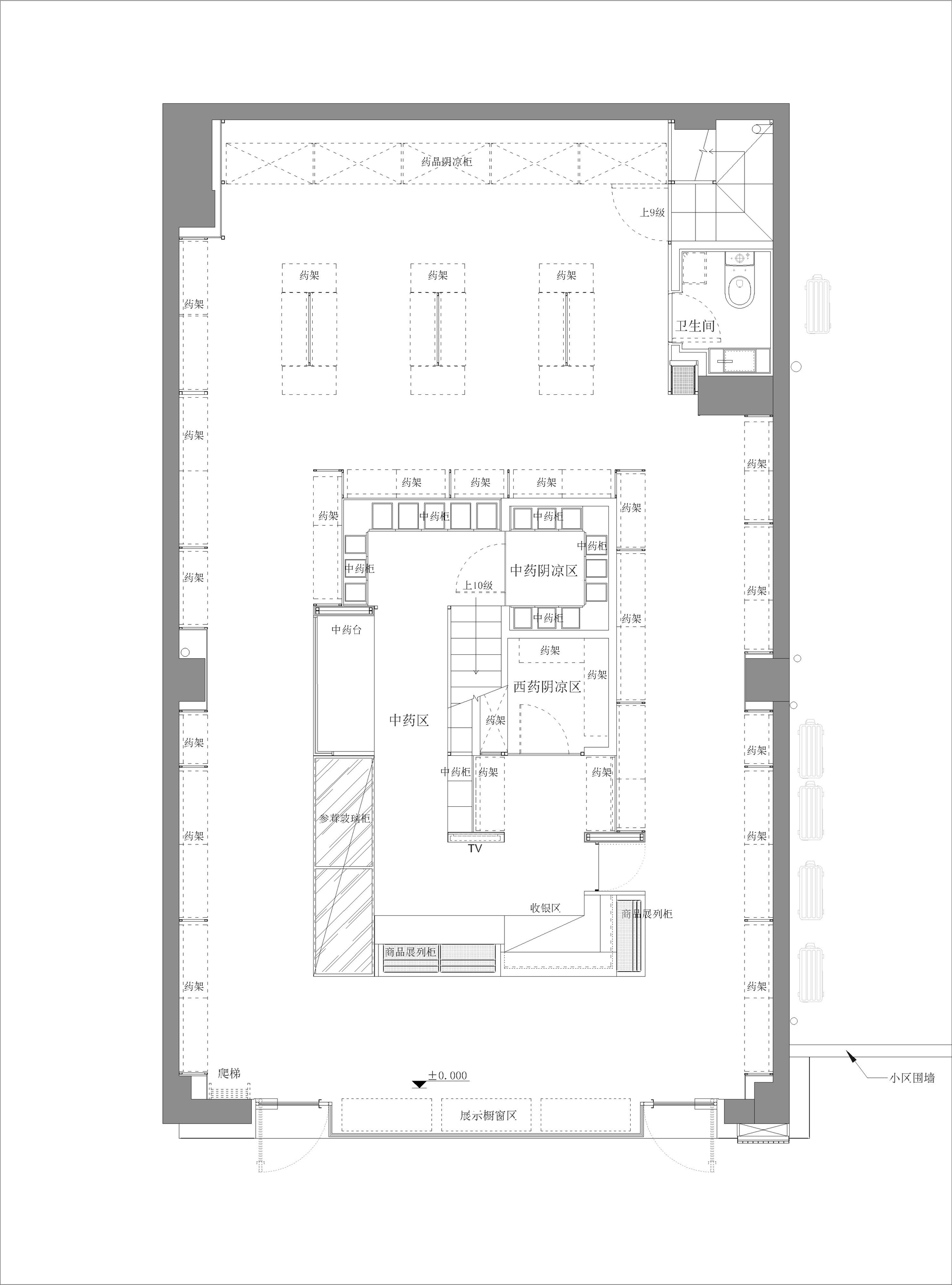
将前区西药处方、收银、中药配药、中药存柜、参茸售卖等多种功能分块组合,做岛式设置,最大限度缩短人员服务动线,而同时将这些功能区块在材质及比例上做有趣的蒙德里安式构图。
The island-style design combines multiple sections as blocks include western medicine prescription in front zone, cash register, traditional Chinese medicine zone, medicine storage, ginseng sales etc. It shortens the staff’s generatrix the most, also creates a composition of Mondrian-esque for these functional blocks in materials and proportion.
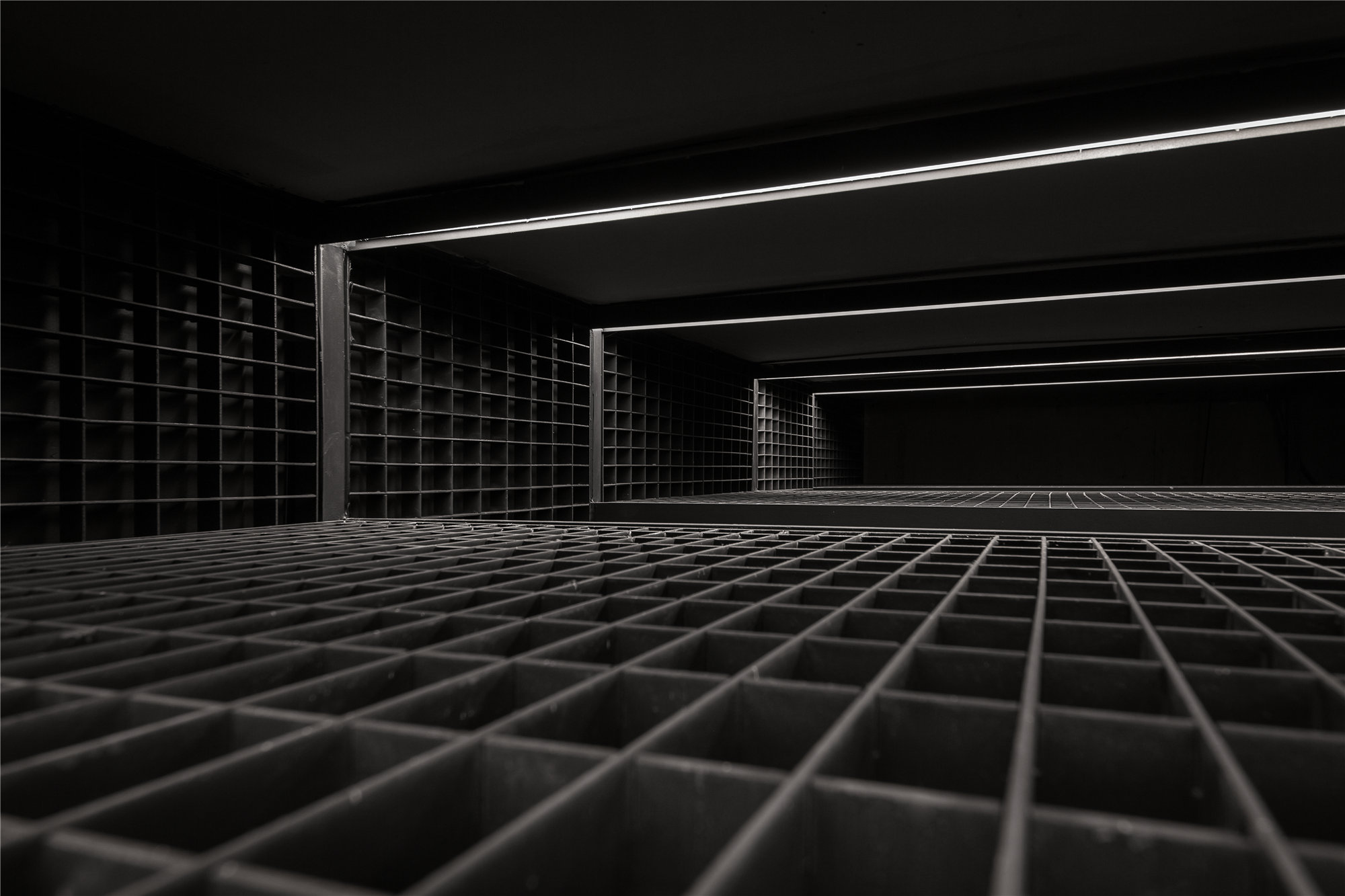
用钢格栅做为统一的基础元素,在不同界面上扮演着天花、货架、灯盘格栅、风口,楼板的功能角色。在夹层空间,由钢格栅单一材质纵横构架出纯粹而另类的空间维度。而灯光透过钢格栅投射在空间中也形成有趣的矩阵光影。
Using steel grating as unified basic element and it stands for various functional roles in different layers such as ceiling, shelves, grille lamp, air outlet, and floor slab. Inside the interlayer, steel grating, the single material, builds a pure and abstract space with crisscross type. The lights cast an amazing matrix of light and shadow in space through steel grating.
而方钢构架框不仅是结构支撑,也是照明灯管和设备线管。灰色的理性基调上,青蓝色企业色成了空间跳跃的元素,也是企业标牌和各种标识的背景。
The steel-made frames can support the structure; also it can be light tube and line pipe. Upon grey color, the rational style, cyan color of enterprise becomes positive elements inside the space, which is also the label and background of all kinds of signals.
设计最终呈现的冷峻理性、精准高效的特质,与药店所要传递给大众的企业理念是相符合的,并迎合当代特别是年轻族群的审美情趣,让传统行业展现新的生机活力。
The design finally displays characteristics of rational, accurate and effective, which fits the enterprise identity that DST Medicine Shop wants to convey to the public. Meanwhile, it meets the aesthetic needs of modern society, especially the younger generation, which shows vitality and energy inside traditional industry.
▲一层平面图
▲夹层平面图
项目信息——
项目名称:德善堂药店
项目面积:94 sqm
空间设计:喜玛拉雅设计
主创设计:胡若愚
参与设计:蔡婧、林巧燕
视觉设计:大羊设计
空间摄影:杨耿亮
主要材料:水磨石、黑砂钢、钢格栅
设计时间:2020年4月
完成时间:2020年9月
Projet Information——
Project:DST Medicine Shop
Location:Xiamen, Fujian
Area:94 sqm
Space Design:Himalaya Design
Chief Designer:Roy Hu
Design Team:Jon Tsai, Qiaoyan Lin
Visual Design:BIGSHEEP LAB
Photographer:Gengliang Yang
Material:Terrazzo, black sand steel, steel grating
Time:2020.4-2020.9


