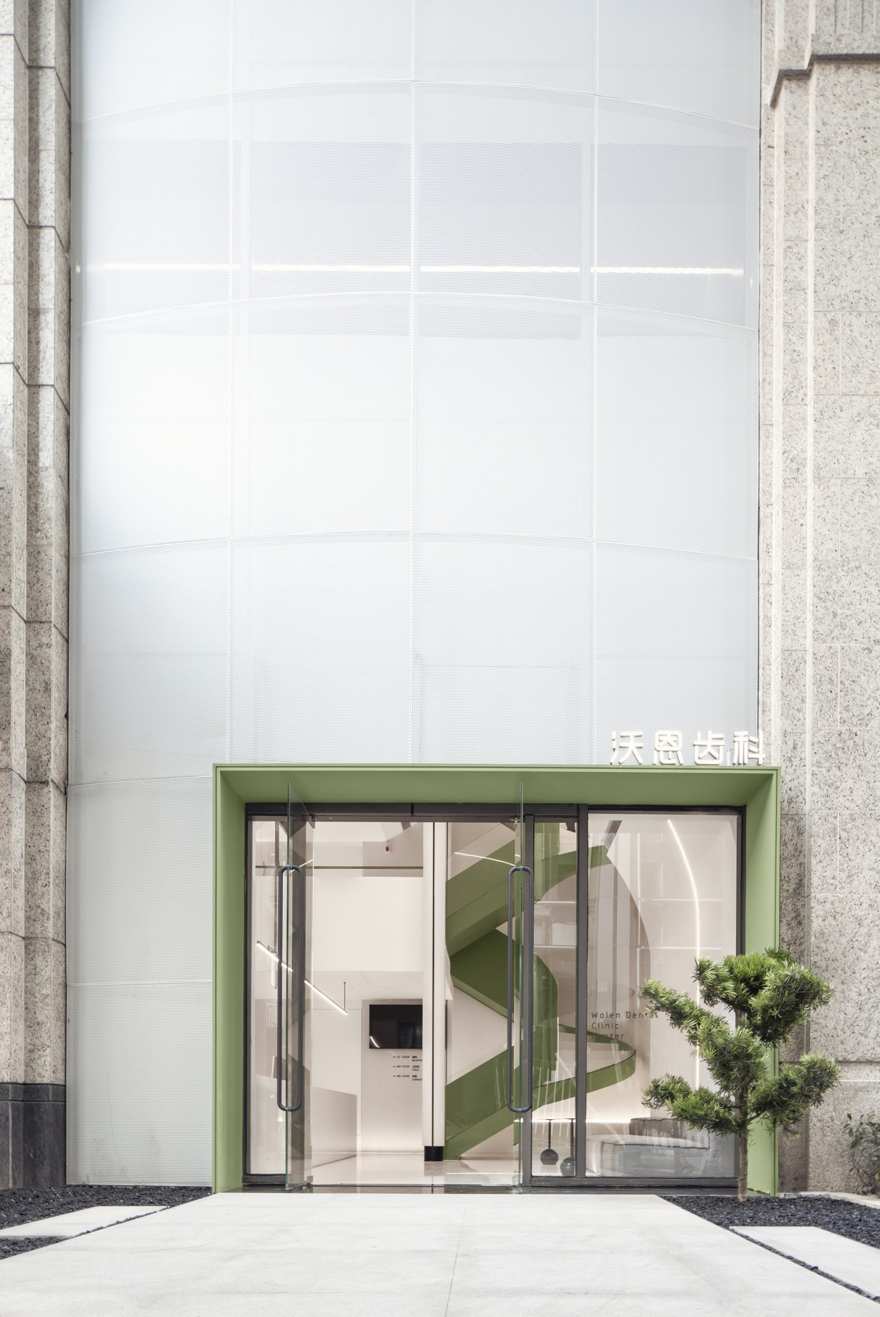
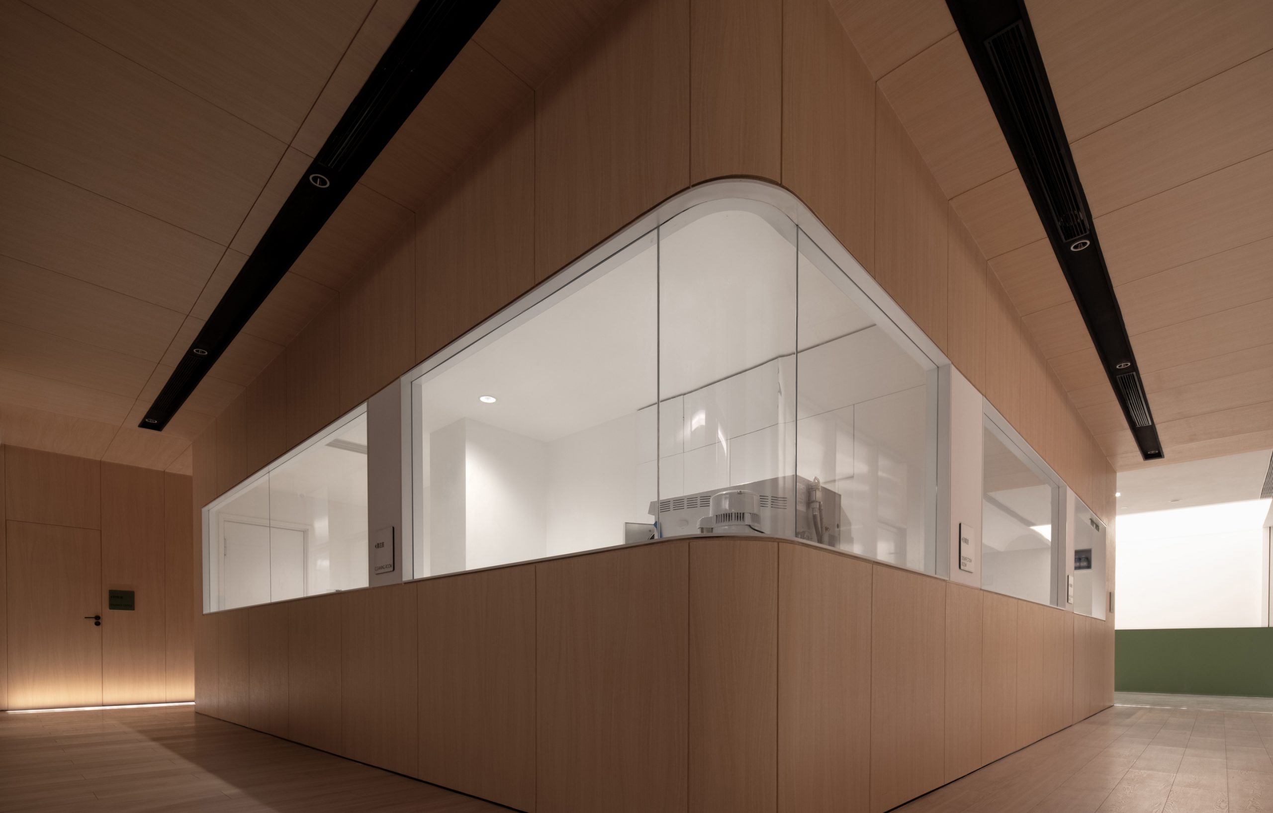
分割明确的布局、科学高效的流线、秩序统一的标识,这些专业性的需求,往往拉开了空间与人的距离。如何平衡专业性与距离感,是此次合作项目里与WOLEN沃恩齿科共同探讨的问题。
The professional needs of Health Care, such as clearly separated layout, efficient scientific working line, unitive logo, will widen the feeling of distance in the space.In that case, how to find the balance between professional needs and the sense of distance is the heart of the matter in this project, the design of WOLEN DENTISTRY.
呵护每一颗童心 Every child is the apple in our eyes.
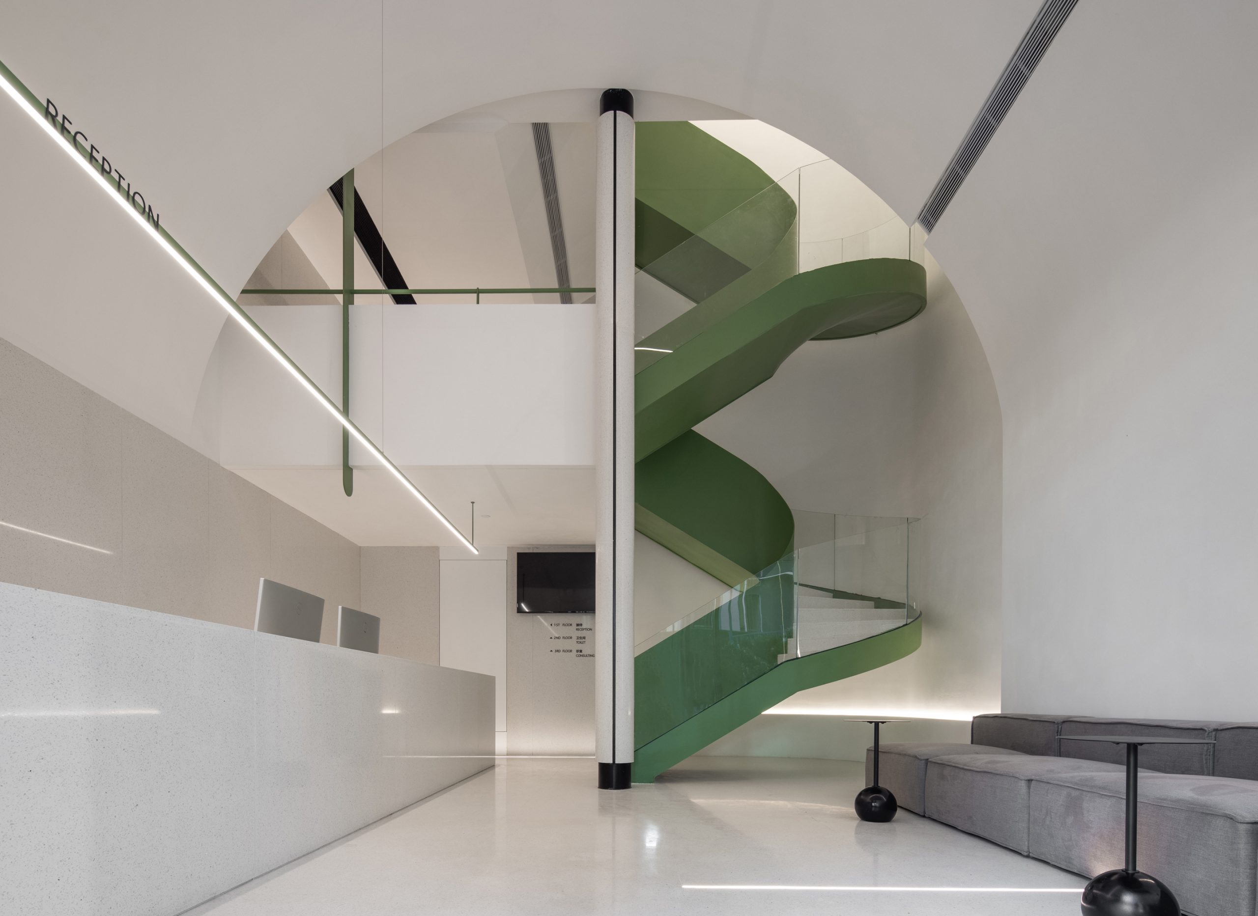
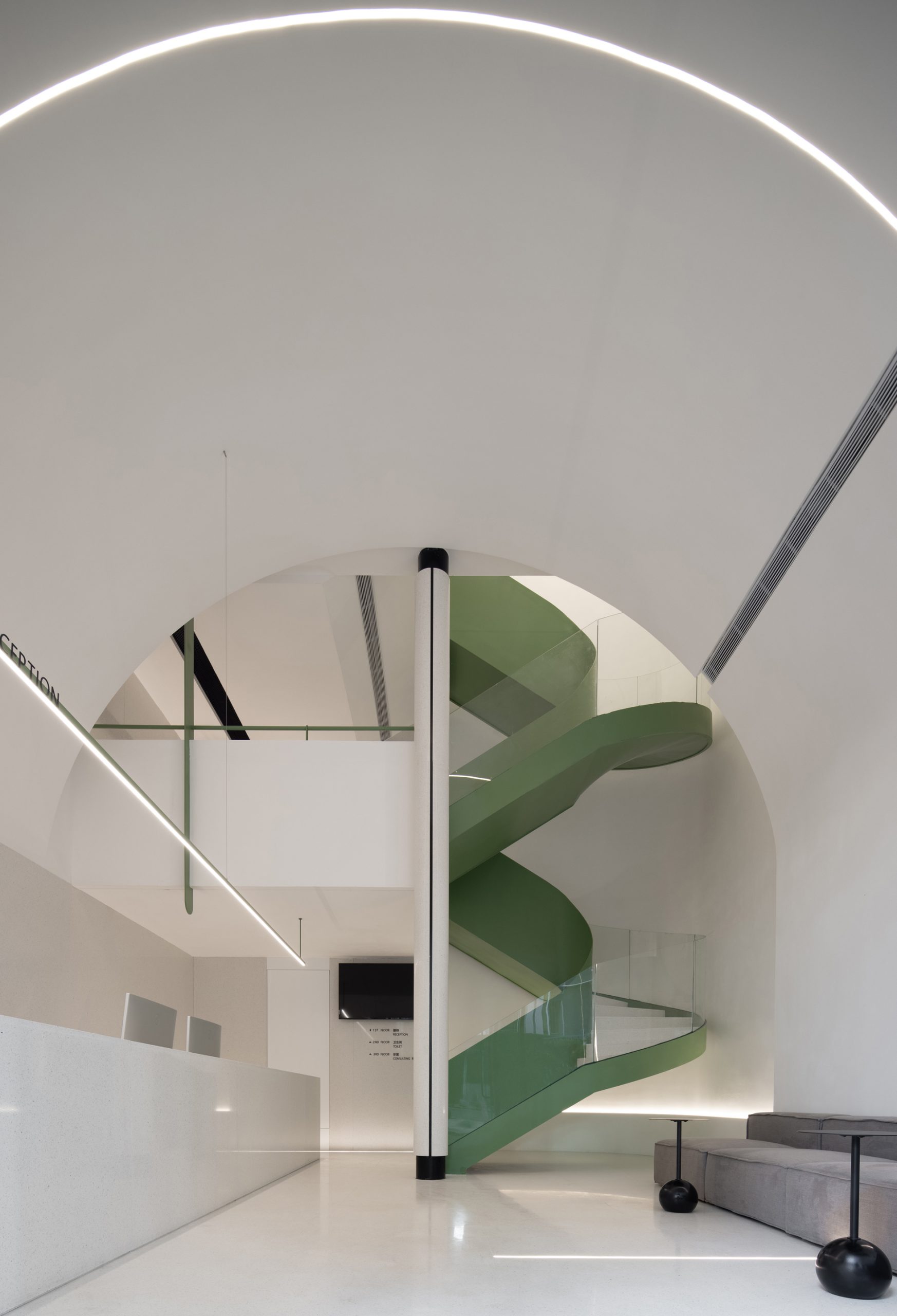
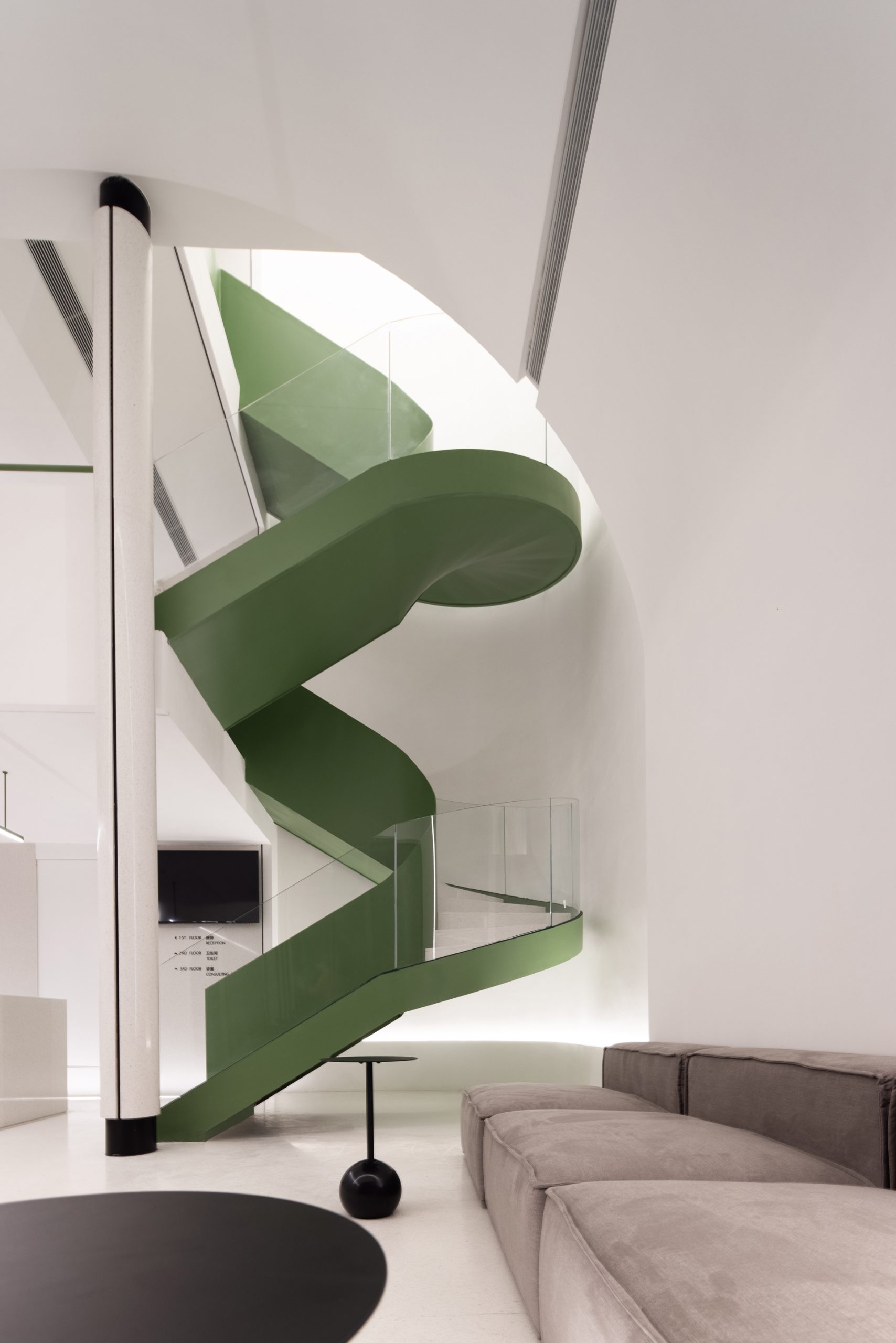
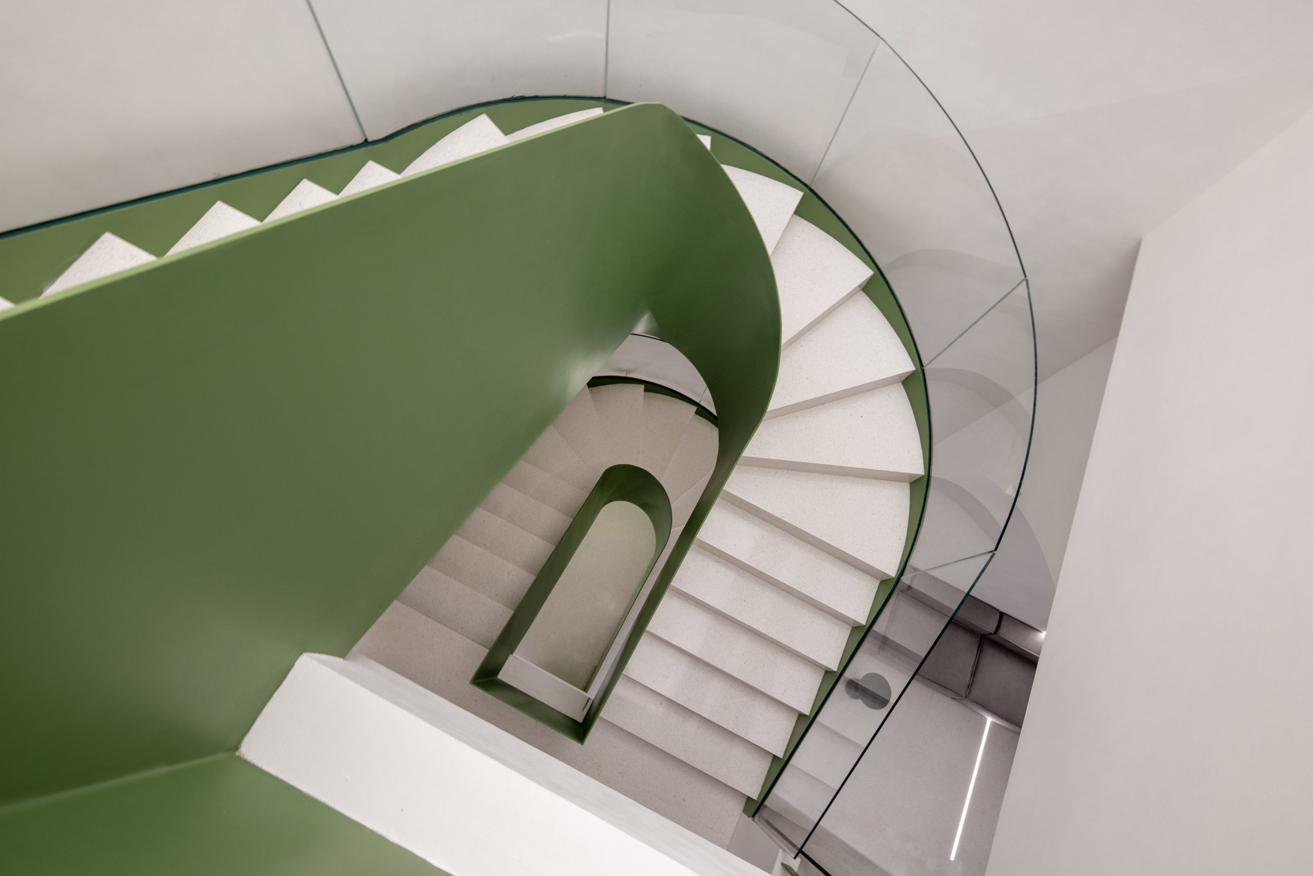
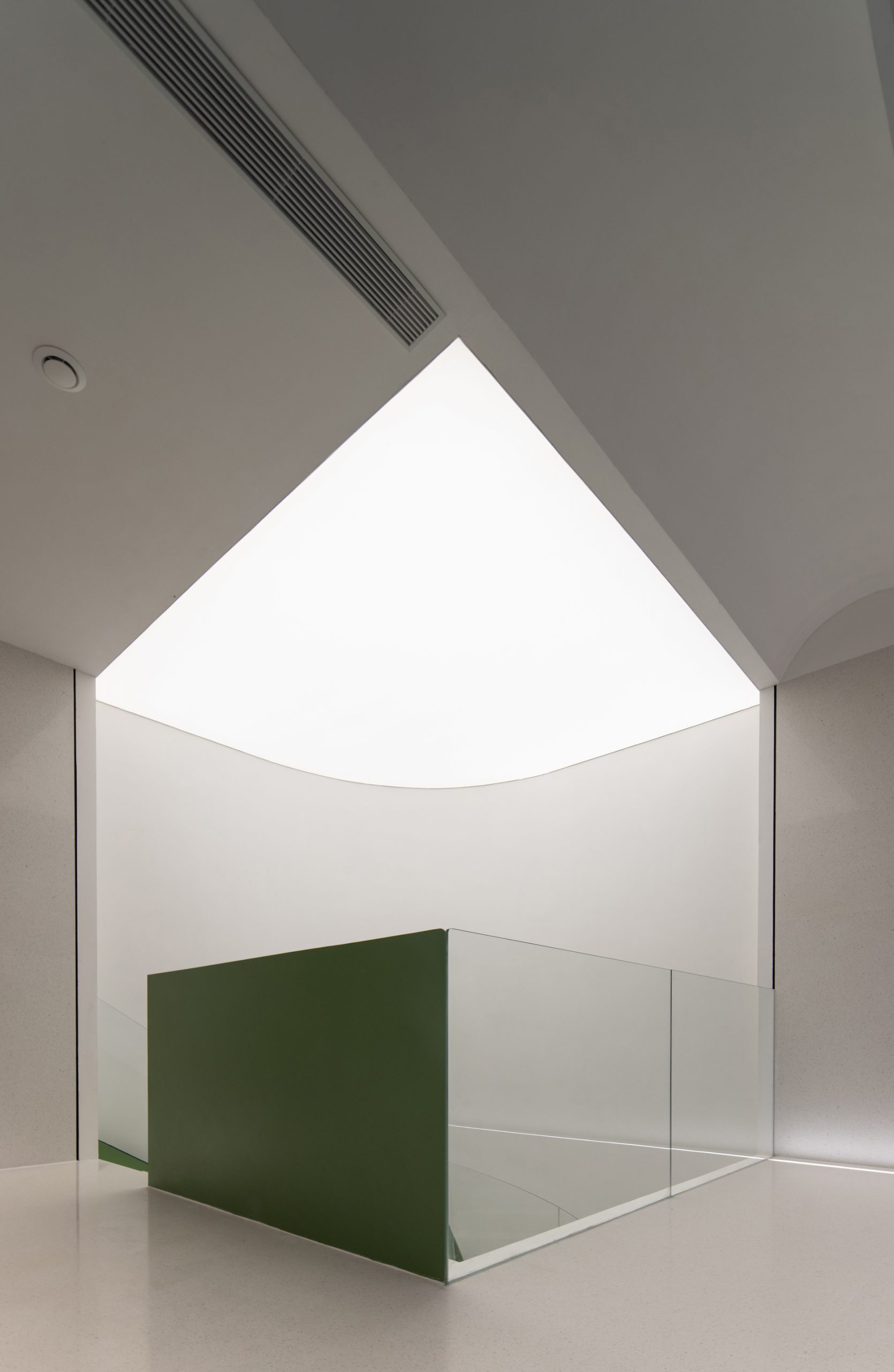
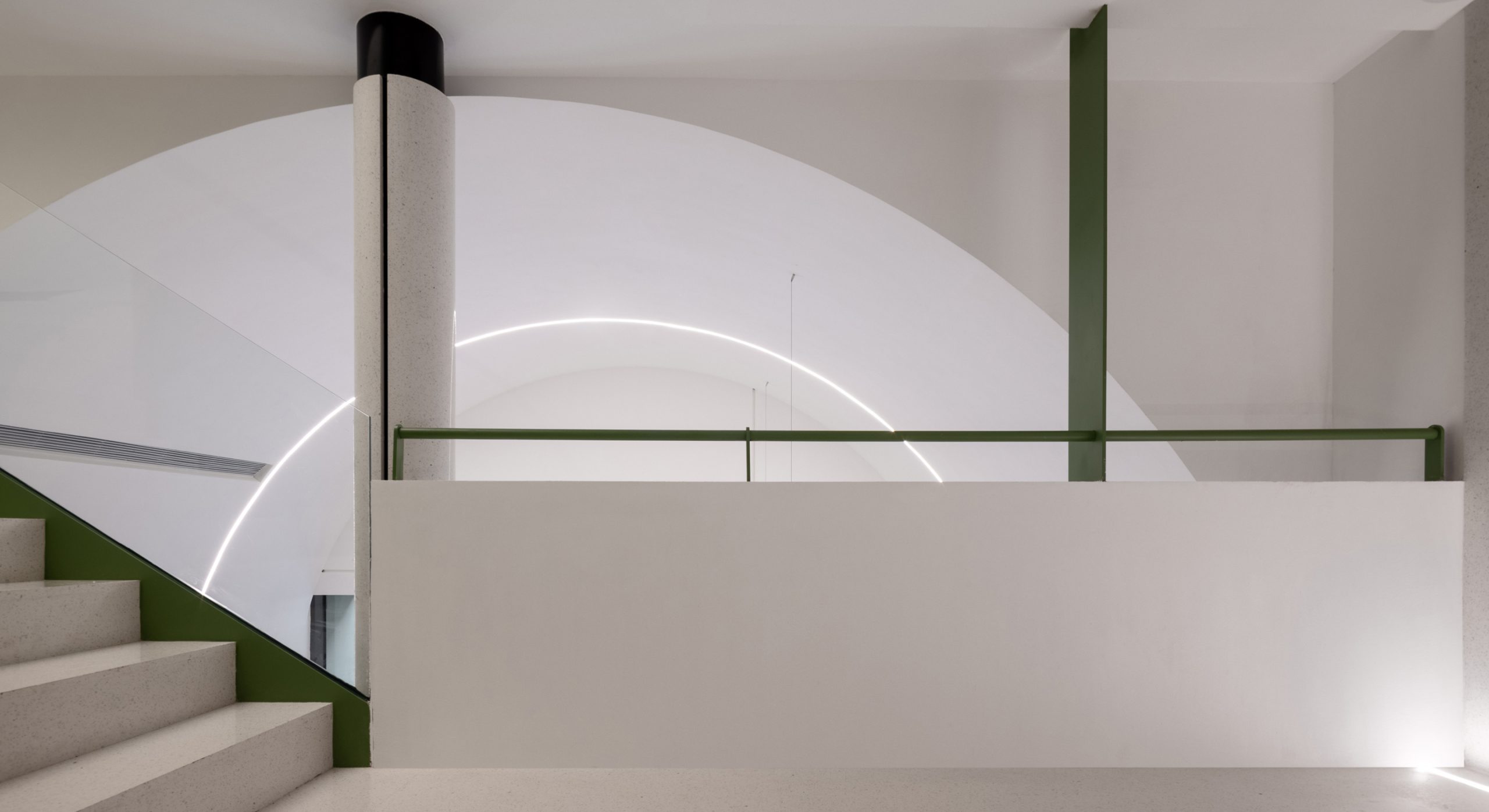
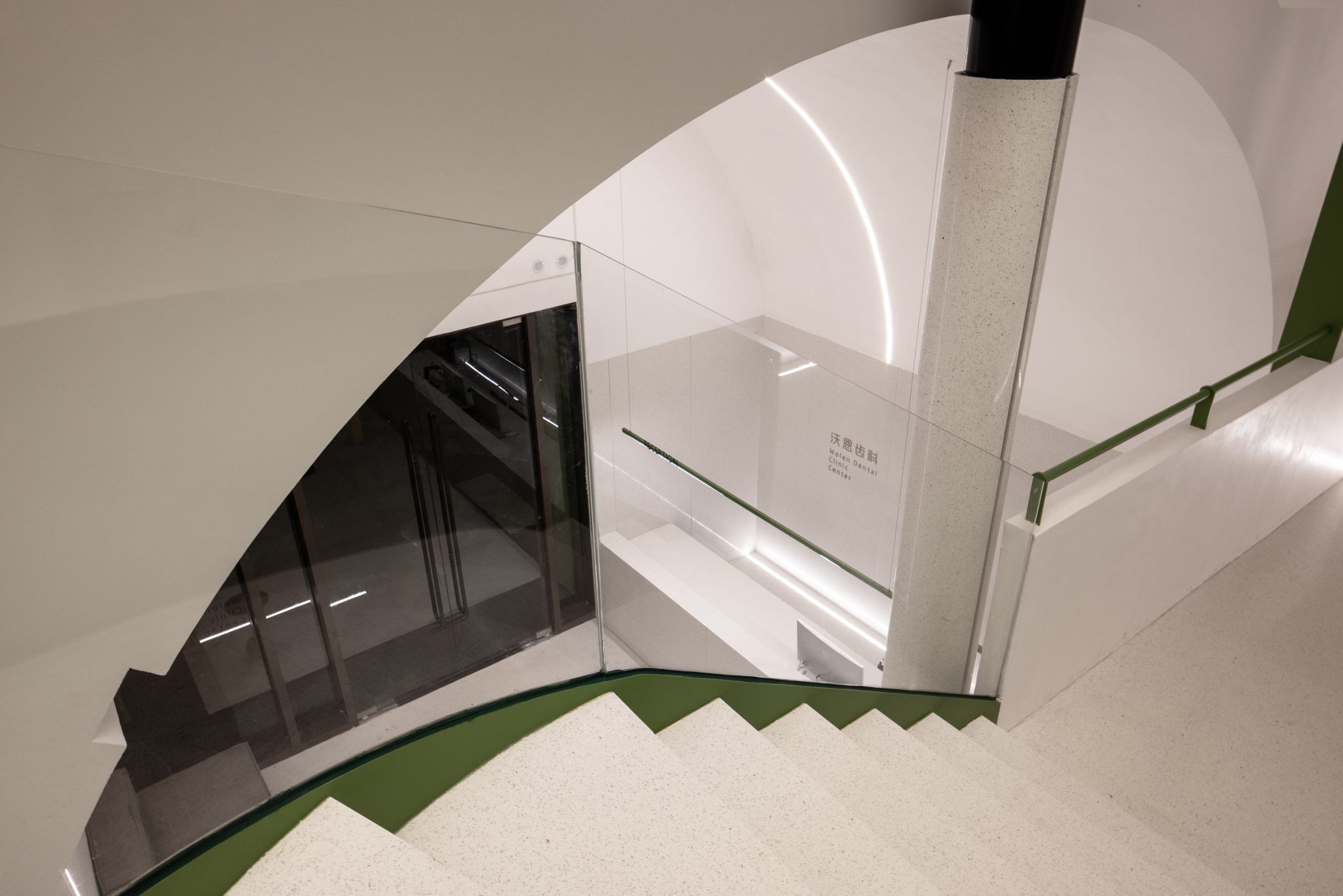
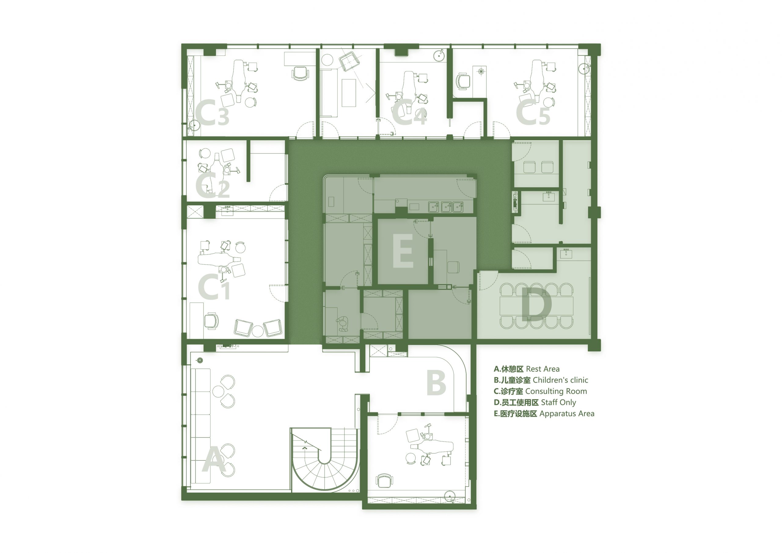
童话故事/杰克和魔豆/中,杰克沿着巨大豆茎爬到云端的巨人居所,展开他的冒险,我们将这个片段嫁接到了空间里:从一层围合的、包裹的小空间通过绿色旋梯,向着柔和的顶光,抵达单独设立在二层最外侧、开敞的儿童就诊区。
In the story Jack and the Beanstalk, Jack climbed up the beanstalk and went up to the sky through the clouds, where he came across the enormous giant and began his adventure. We rebuilt this story scene in our design. The kid’s outpatient area is on the second floor, with a light green beanstalk-like spiral stair connected to the first floor. kid’s area is open and brimmed with gentle light.
▲外立面夜景
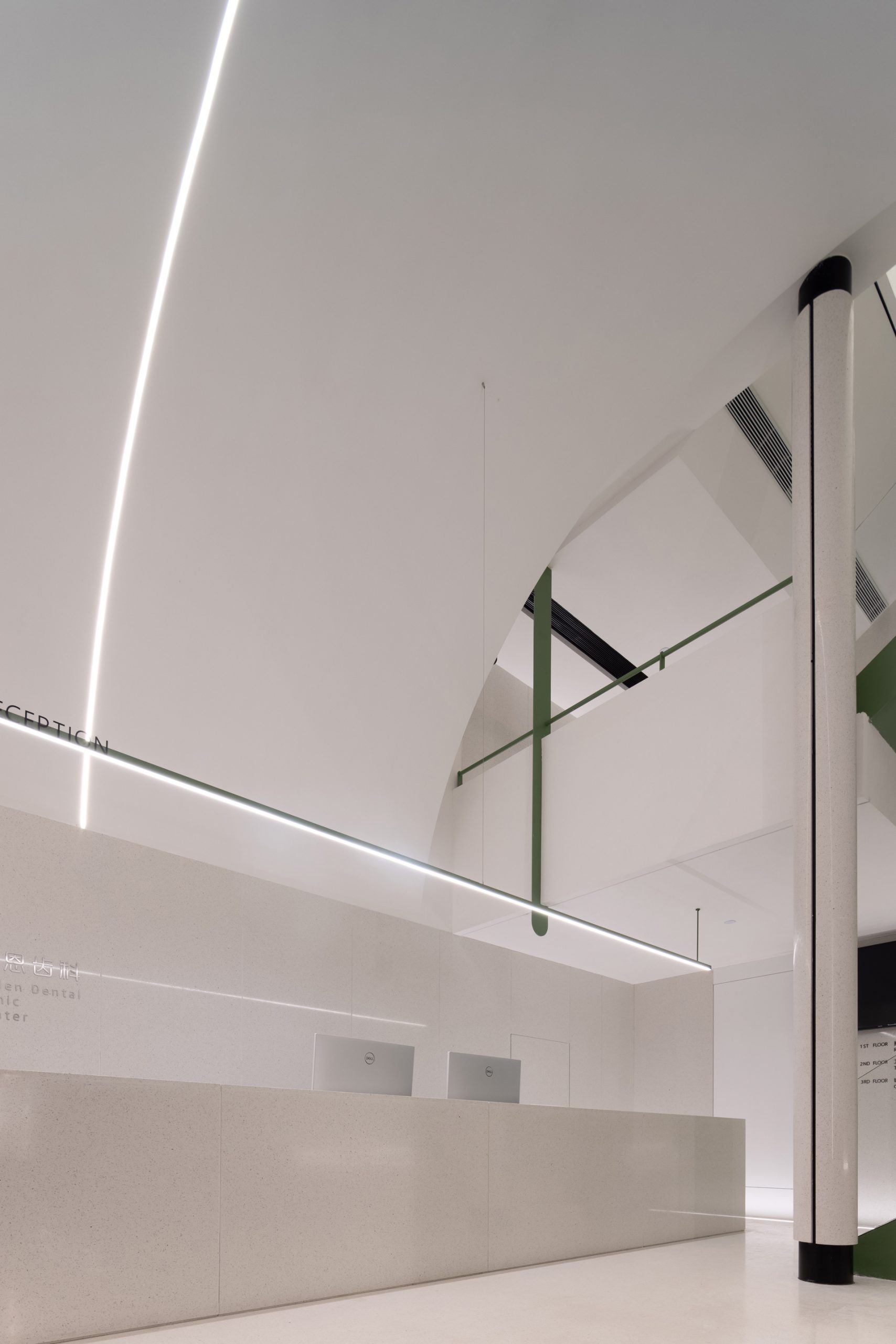
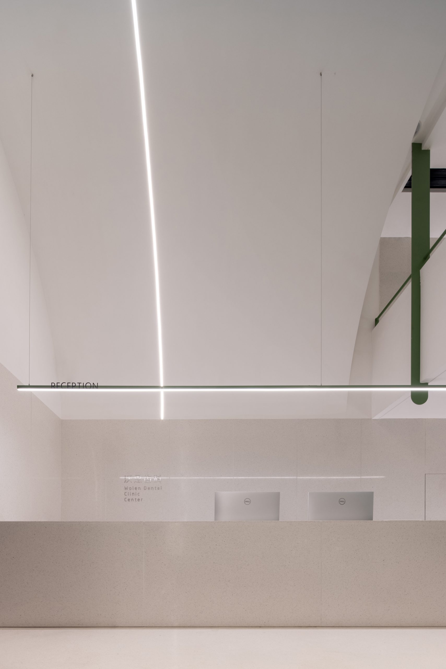
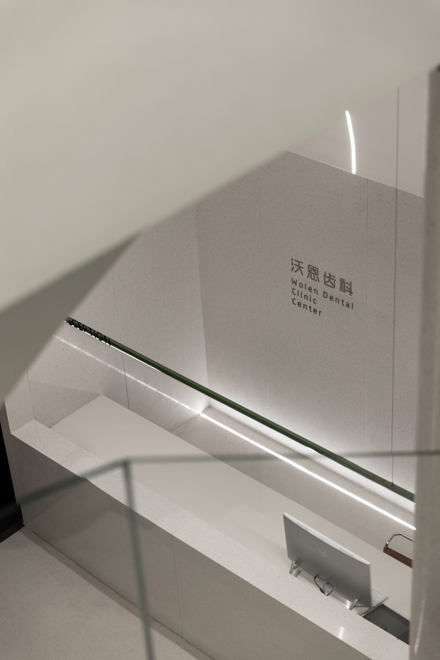
▲前台
▲一层接待区
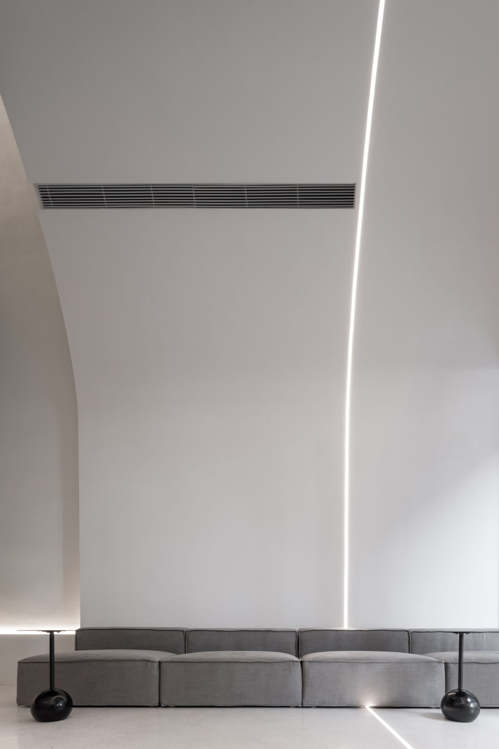
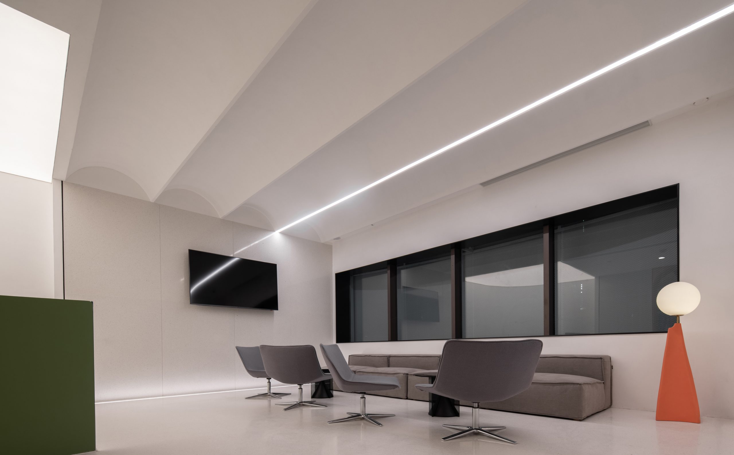
儿童是最抗拒但又最需要经常拜访医疗空间的群体,因此在空间中体现出对孩子的关怀尤其重要。我们精简logo的尺度,弱化空间的商业倾向;选用低矮、柔软的组合家具,营造温和的空间体验。
Kids need the most medical care while they are also refractory, thus the feeling of love and care in the space is of vital importance.In the kid’s area, the logo of the company is simplified, escaping being commercialized. Short and soft modular furniture is used to create the warm homely spatial experience.
▲楼梯
▲二层楼梯口
▲二层休息区
操控情绪的手 Manipulation of the mood
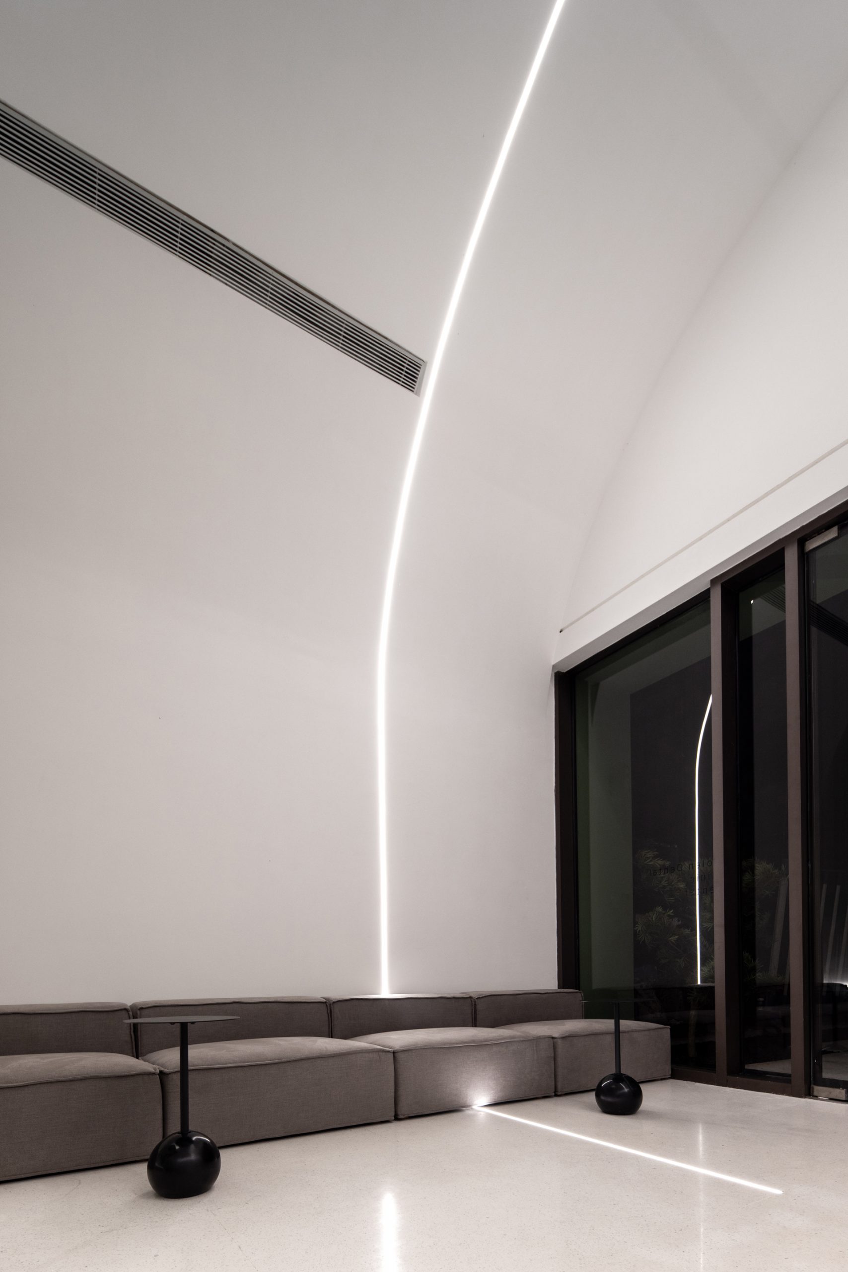
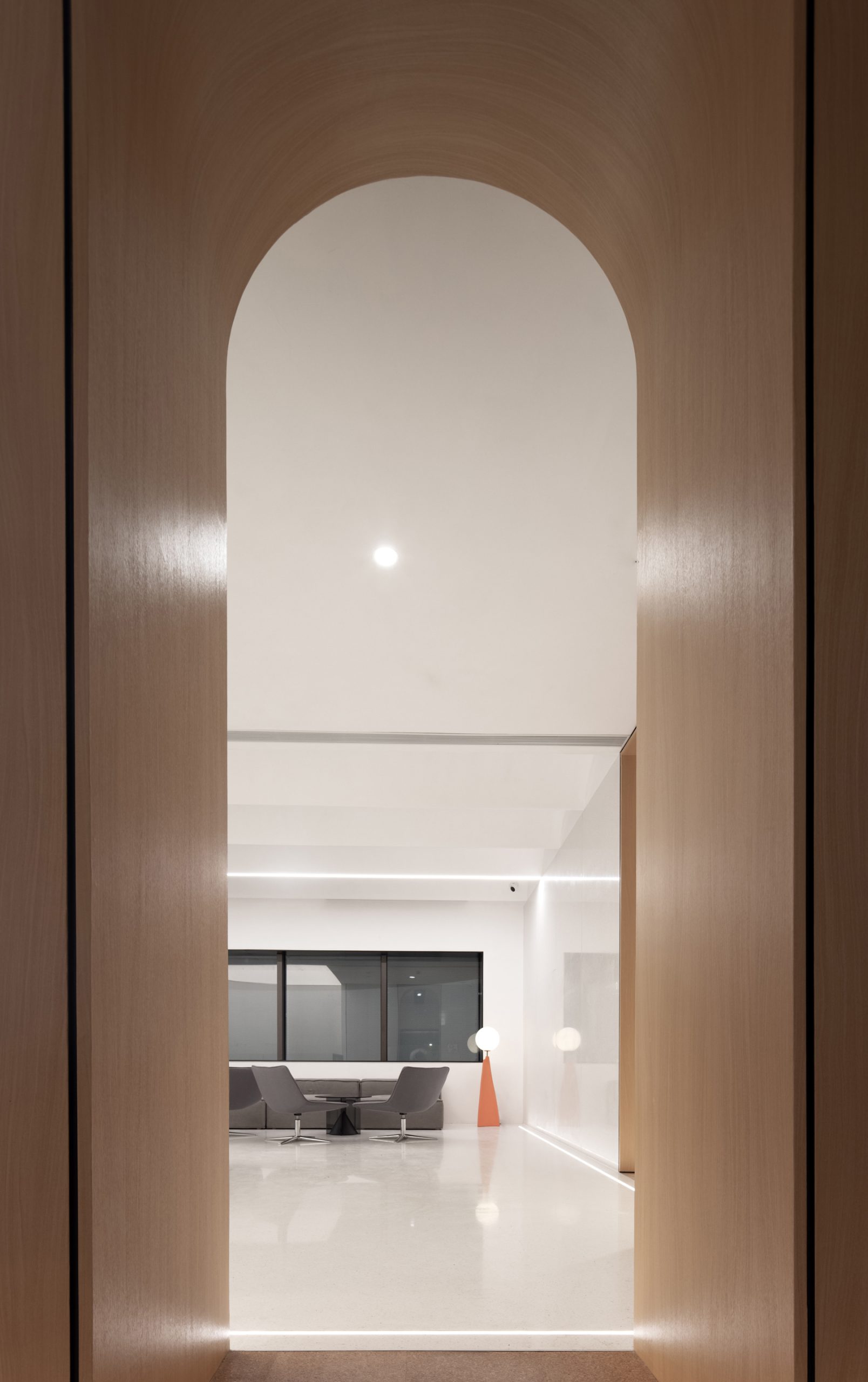
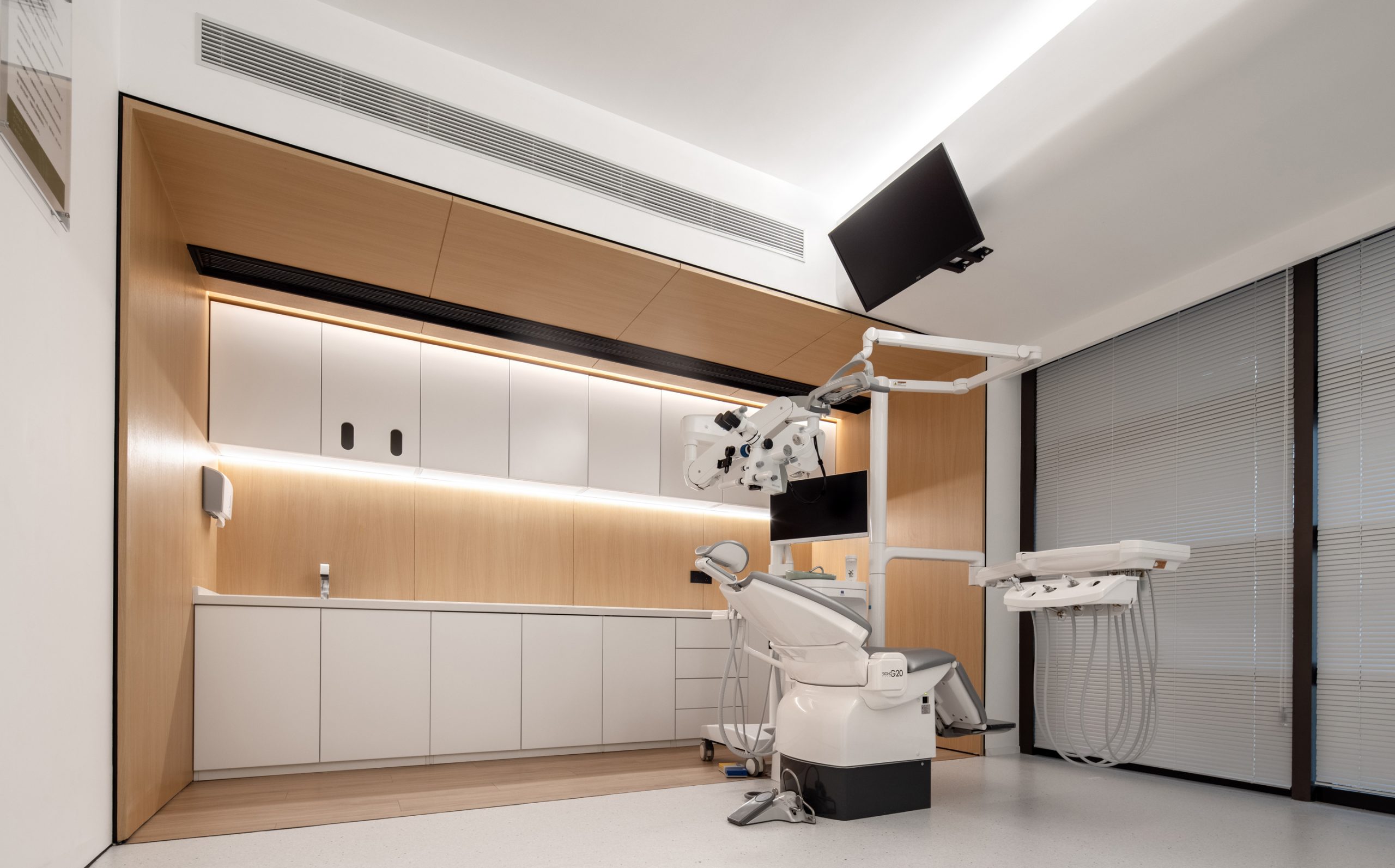
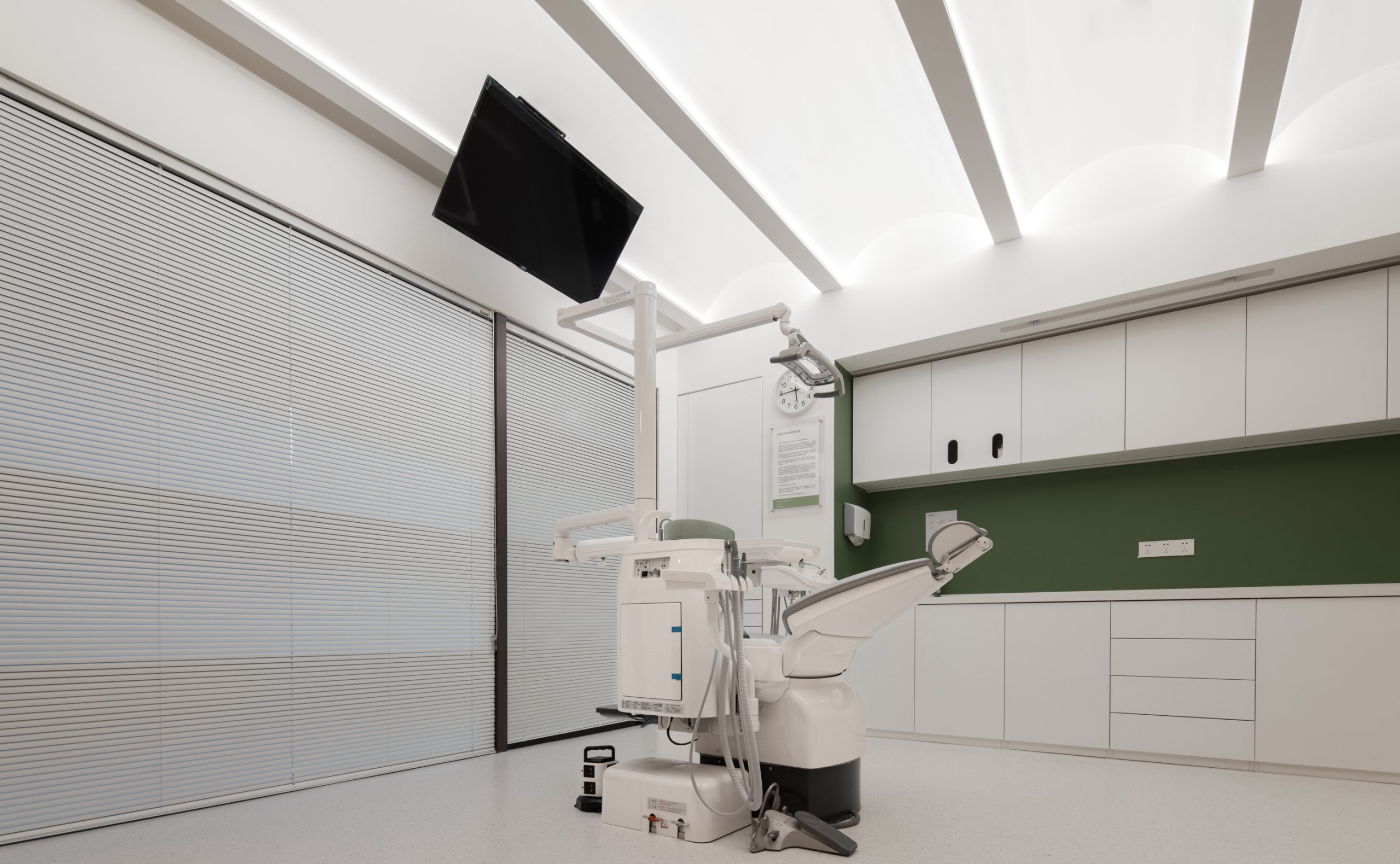
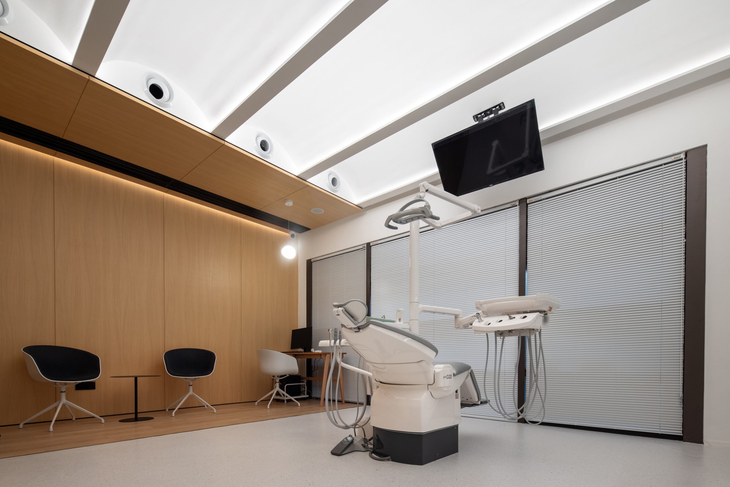
人们的感知绝大部分来自于视觉,或者说来自于光,光是空间里操控情绪的手。在这个项目中反复出现的有两种光,一种是凝聚视线、具有指向性的线性光,另一种是柔和晕染、温暖围合的漫射光。
What a person sees decides what the person feels. In other words, the light in the space will have a great influence on man’s mood. Two kinds of light appear in this project, one of which is the linear light and the other is diffused light. The former has the directive function while the latter makes customer feels the mildness.
▲二层服务台
▲医疗设施区
▲诊疗室
我们有意避免大面积使用均质的直接照明,用弧形造型充分反射人工光源,还用冲孔铝板过滤、柔化入室的自然光。希望通过光的变化,影响使用者的情绪,缓解焦虑与冰冷。
By design, we avoid using large-area uniform illumination. In order to soften the natural light, we adopted arch shapes and pierced aluminum planks. We hope that the changes of the light could have a positive influence on the patients, relieving their anxieties.
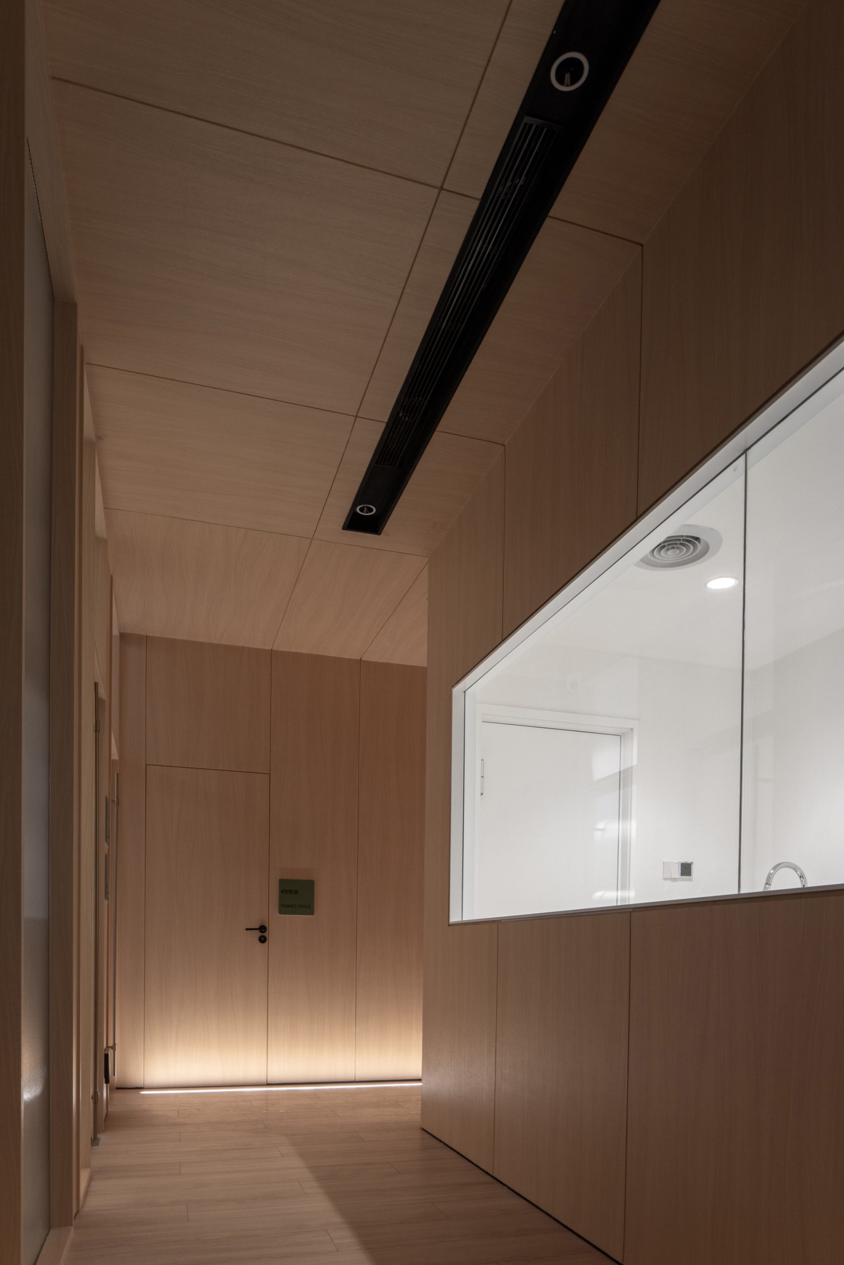
▲通道
▲空间细节
空间不是孤立的存在,它应与使用者紧密联系。当空间能影响情绪、引导行为时,认同与归属感才开始产生。
Space is never alone. By contrast, it should be connected to the people inside. Only when the design affects the mood and conducts the behavior will the acceptance and belongingness come into being.
项目信息——
全案设计:武汉朴开十向设计事务所
概念设计:熊天宇、张筱锴
设计执行:陆宏达、冯程程、李灿灿
项目地址:湖北省 武汉市
项目面积:400m²
完工时间:2020.10
摄影:张筱锴
材料:水磨石、木纹贴膜、冲孔铝板、瓦楞玻璃
Project information——
Project Design:Pure’s Design
Conceptual Design:Tianyu Xiong, Xiaokai Zhang
Design implemantation:Hongda Lu, Chengcheng Feng, Cancan Li
Construction drawing design:集向深化
Project area:400 m²
Time of completion:2020.10
Photographer:Xiaokai Zhang
Materials:Terrazzo, Wood Grain Film, Pierced Aluminum Plank, Corrugated Glass


