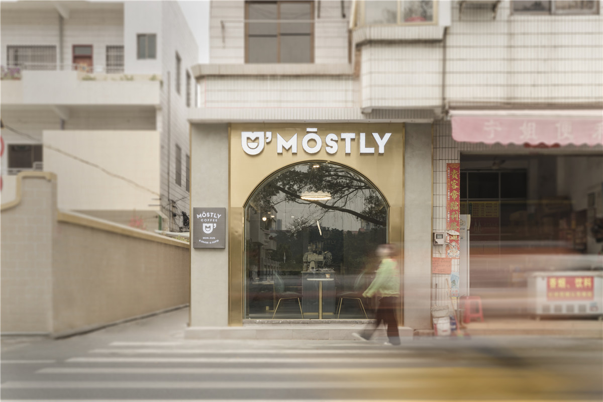
项目位置在禅城南庄的一个老式自建房楼下,Unkonwn将空置的街区边角改头换面成为Mostly Cafe,一个街角咖啡馆。由一个灰色的圆拱洞穴体块打破原本平凡的社区,创造出引人驻足的宁静空间。
The project is located downstairs from an old-fashioned self-built house in Nanzhuang, Chancheng. Unkonwn changed the corner of the vacant block into Mostly Cafe, a corner cafe. A gray circular arch cavern breaks the original mundane neighbourhood, creating a tranquil space to attract people.
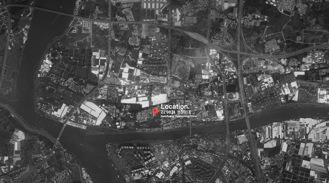
▲项目区位,Project location
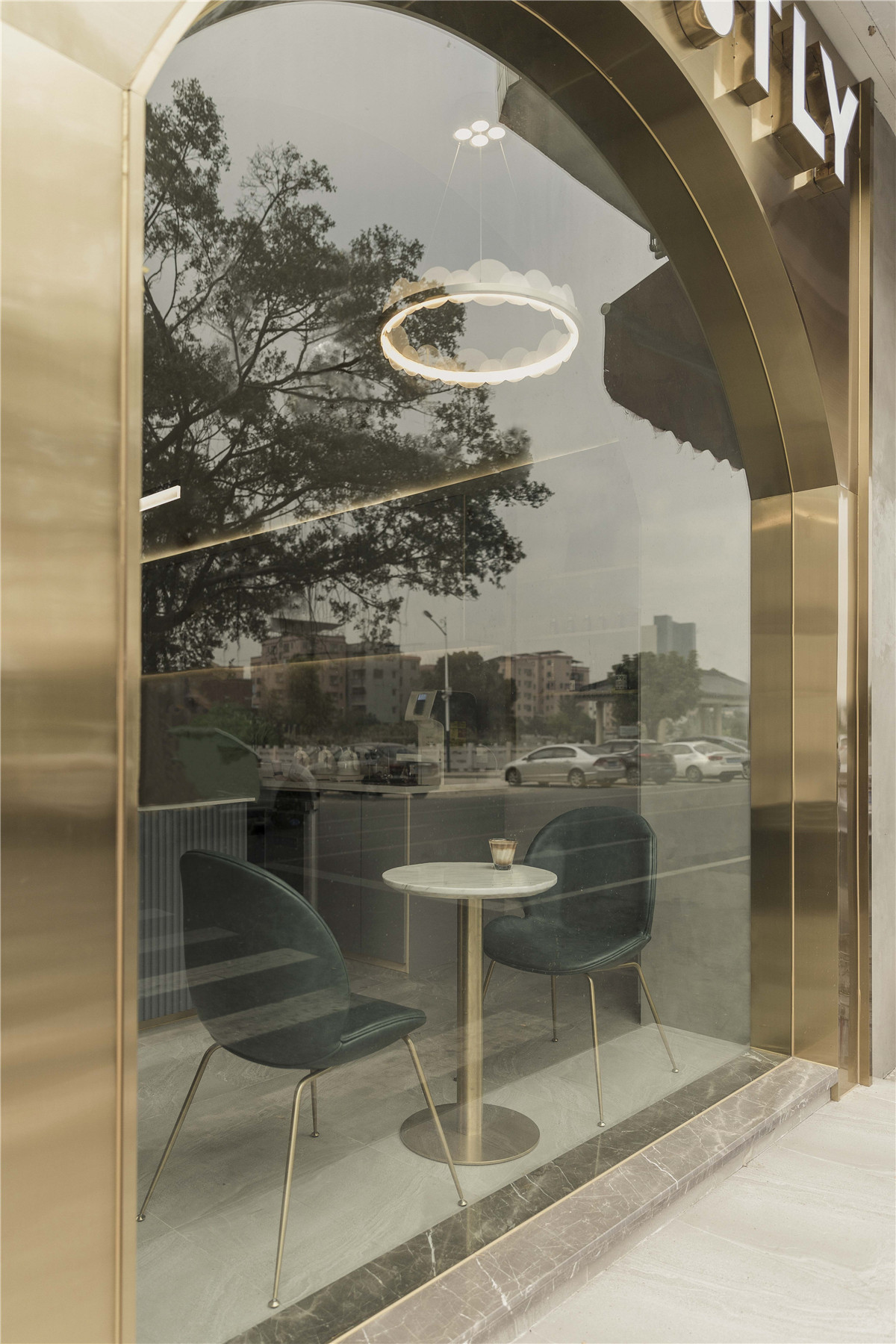
▲景观概览,Landscape Overview
建筑外部运用同一种灰色质感涂料制造出一个“灰盒子”,是一个打破自建房新旧的边界,构造一个统一而独立的外立面。外立面利用空间高度优势,制造一个巨大的圆拱,圆弧的拱顶柔化了层高廊窄的缺陷,结合落地玻璃形成一个独特的景观位。顶部保留原有的建筑面貌,与灰盒子形成对比。
The exterior of the building uses the same gray texture paint to create a “grey box”, which breaks the new and old boundaries of the self-built house and construct a unified and independent facade. The
façade makes use of the height advantage of space to create a huge circular arch. The arc‘s vault softens the narrow defects of the high-rise corridor, combined with the floor-to-ceiling glass to form a unique landscape position. The top of the building retains its original appearance, contrasting with the gray box.
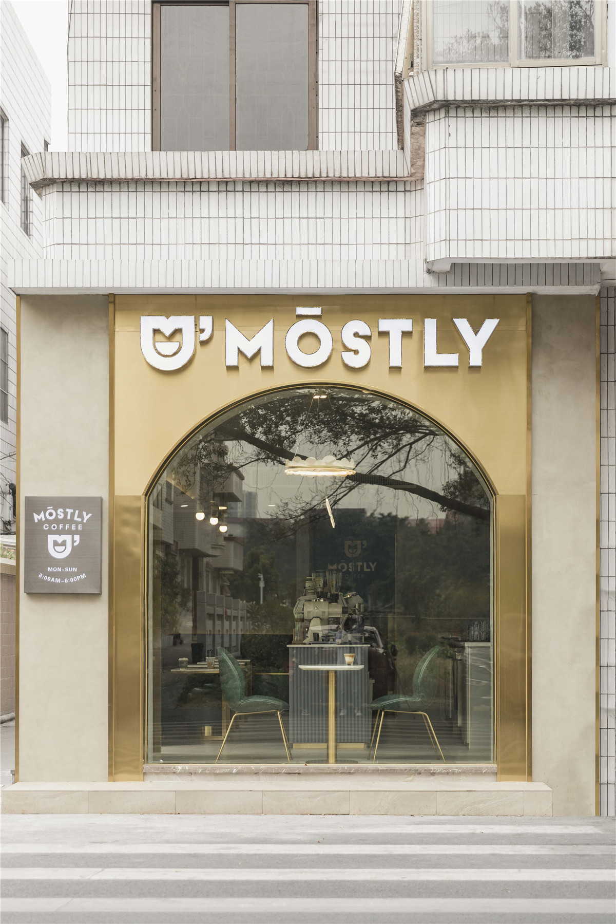
▲外观概览,overview
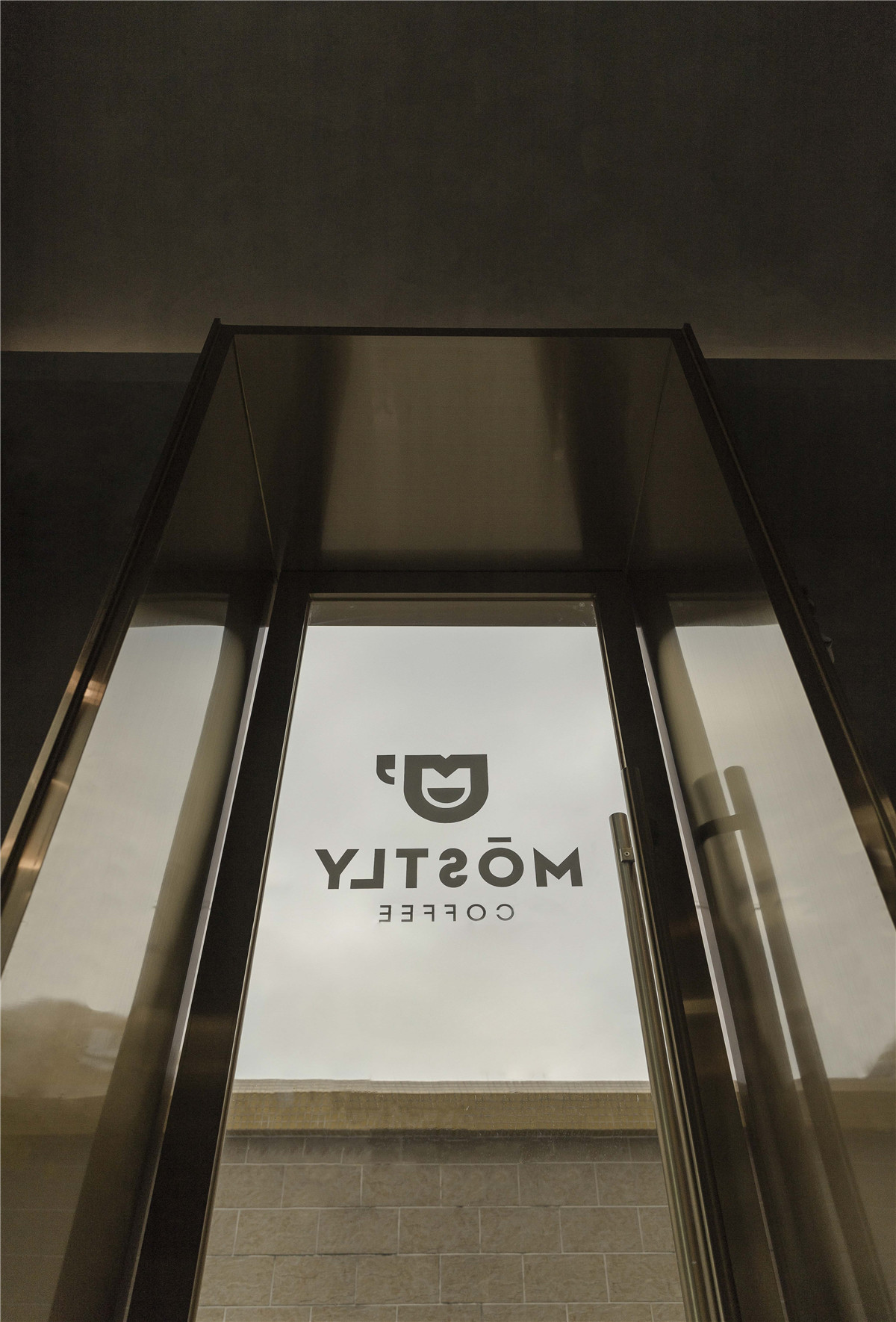
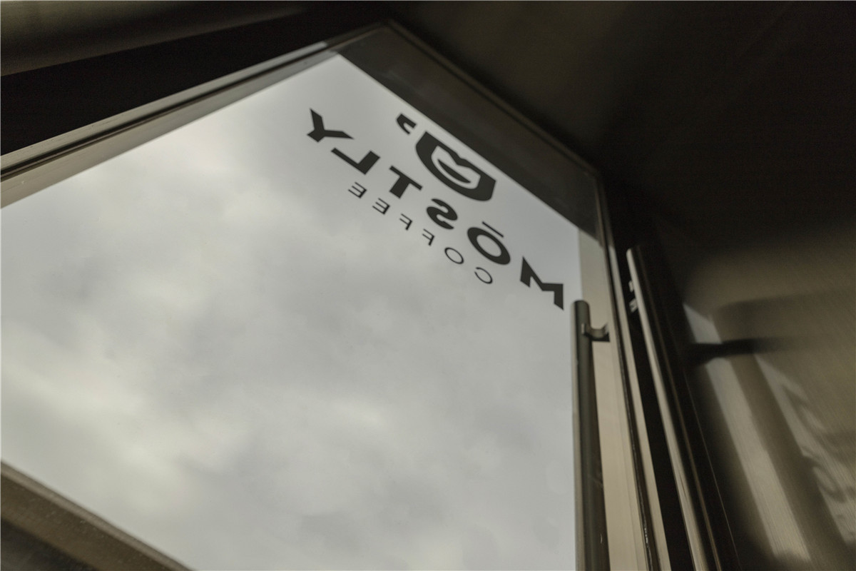
店面外立面的LOGO尽可能亮化处理,吸引客户人流视线。让外部人流的视线聚焦到室内,并且激发好奇心。入口改到右侧一方面的通过打开入口让光线进入,其次是起到“打开窄道”的作用。门洞造型也配合我们空间另一个concept– “hole”。往外做两级梯级,扩充店面的体量,同时作为休闲停留的区域增加顾客的停留时间。
The LOGO on the store’s facade is brightened as much as possible to attract customers‘ attention. Focus outsiders’ eyes on the interior and stimulate curiosity. The entrance is changed to the right. On one hand, the light enters by entrance, on the other hand, it is to “open the narrow lane”. The shape of the door also matches another concept of our space-“hole”. Make two steps outside to expand the store‘s mass, and at the same time increase the customer’s stay time as a leisure stay area.
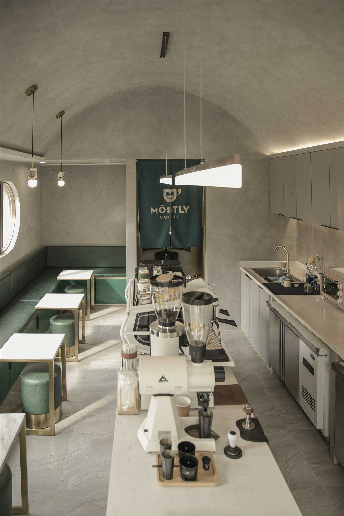


▲室内概览,Indoor overview
空间布局按照功能分区划分为吧台操作区、卡座区、观景卡座区以及卫生间。经过调整功能布局,优化顾客动线的流畅度,主要围绕操作区来布置散座的区域。突出向心性,拉近手冲咖啡这一活动与消费者之间的距离。
The space layout is divided into a bar operation area, a card seat area, a viewing card seat area, and a bathroom according to functional divisions. After adjusting the functional layout, to optimize the smoothness of the customer‘s line of movement, the scattered areas are mainly arranged around the operating area. Highlight the centripetality, and narrow the distance between hand-coffee and consumers.
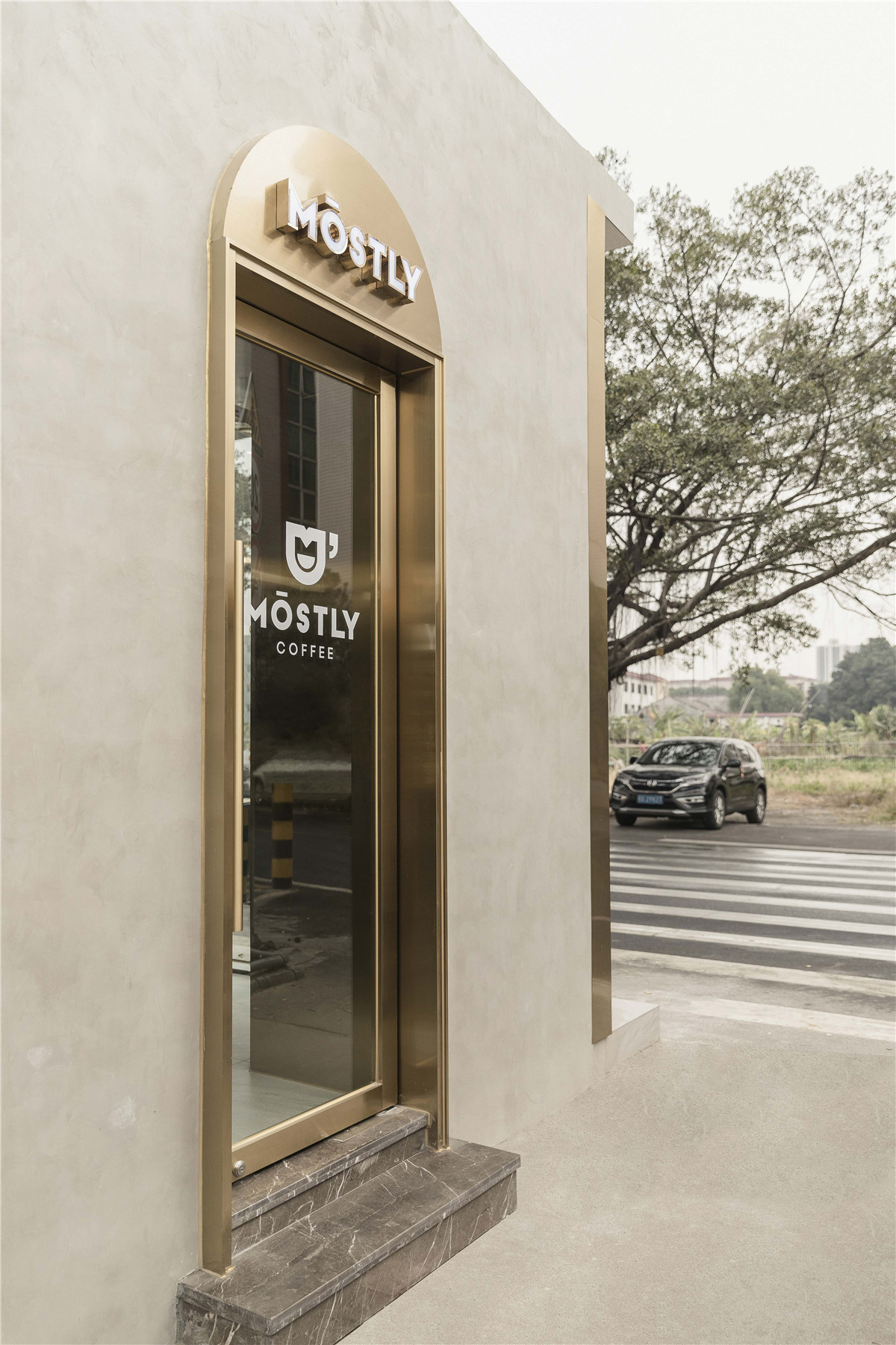
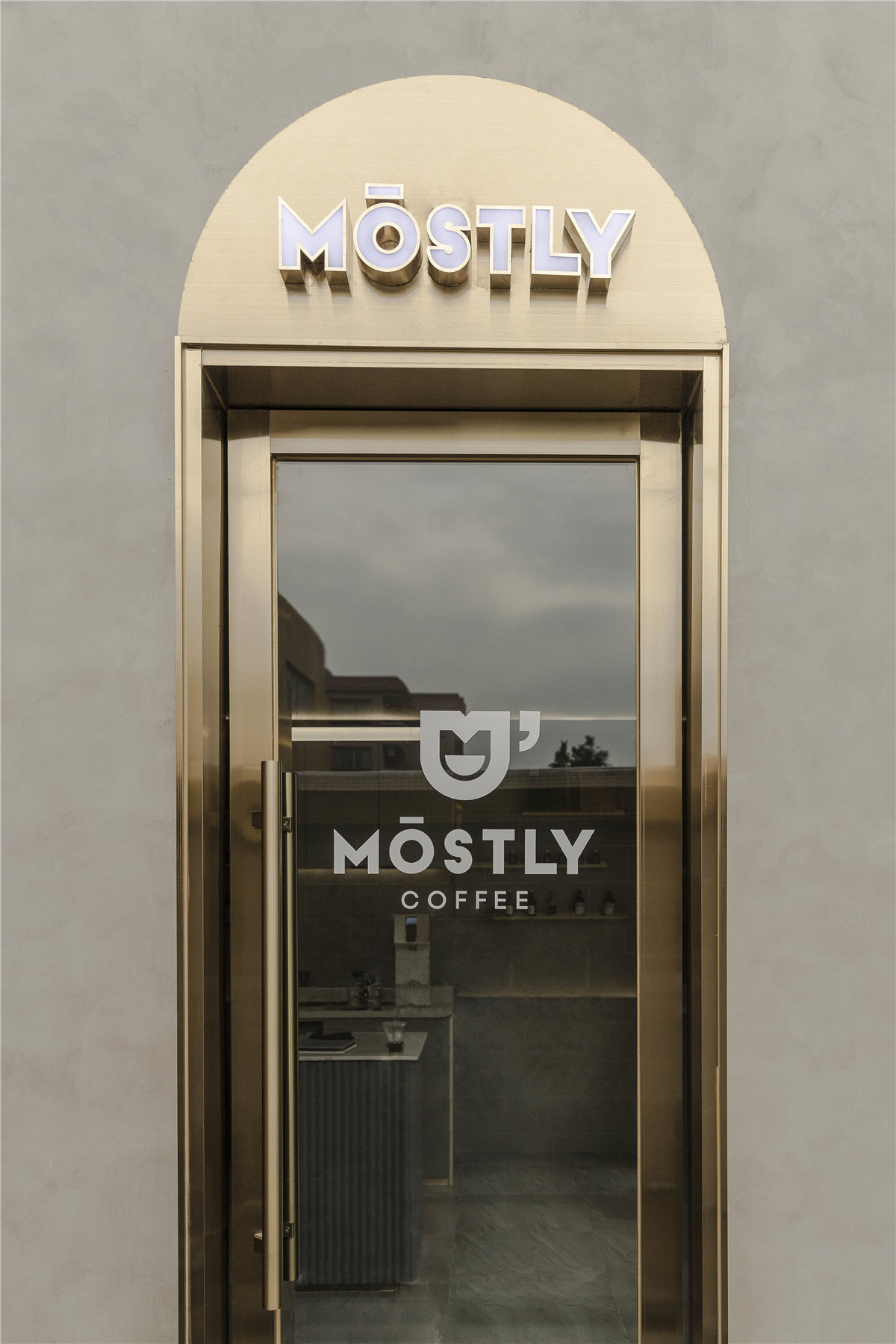
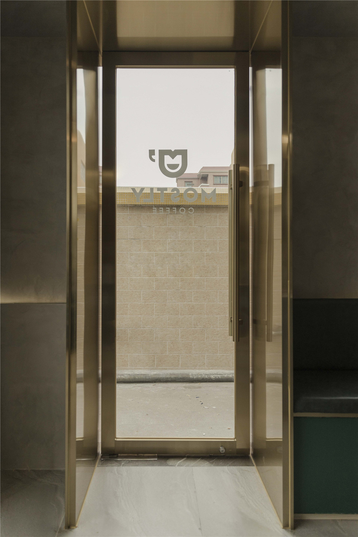
▲入口,Entrance
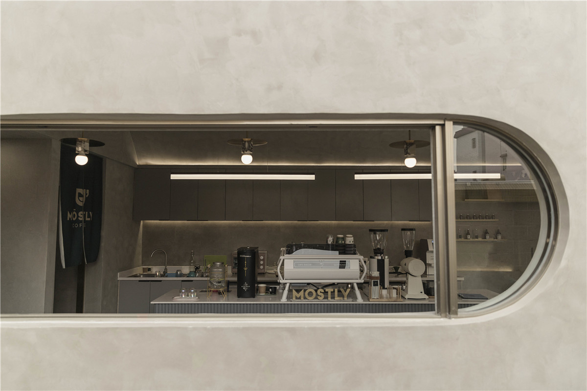
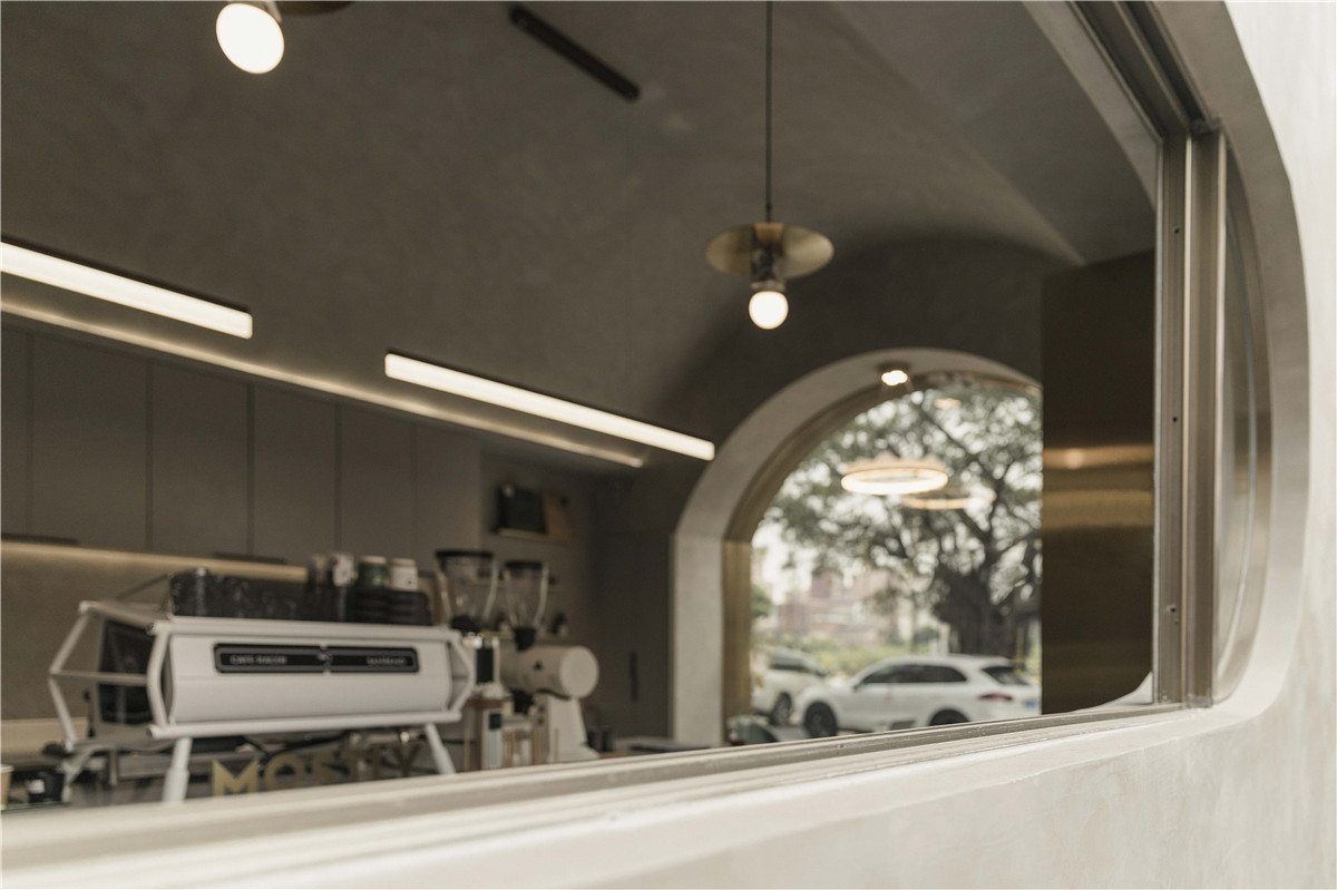
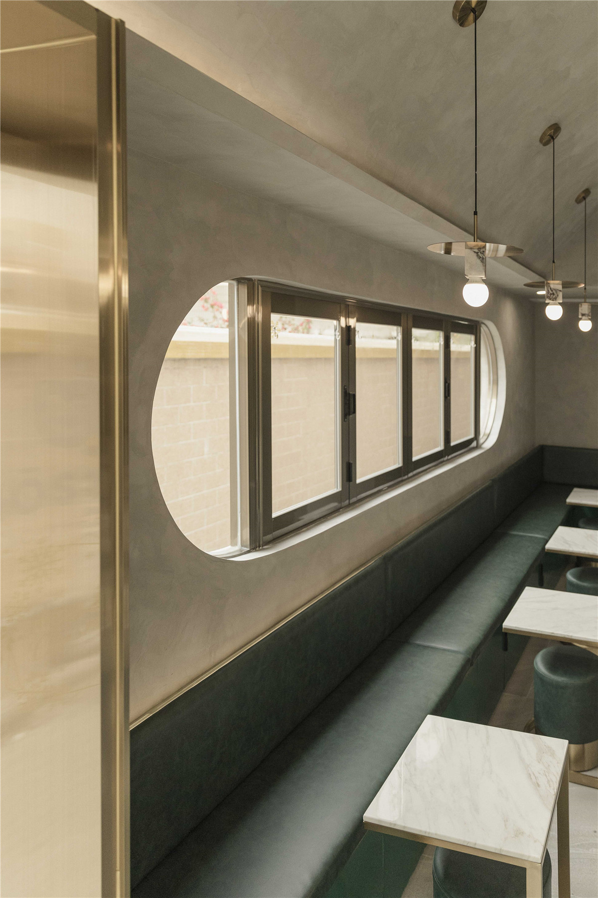
▲椭圆形窗口,Oval window
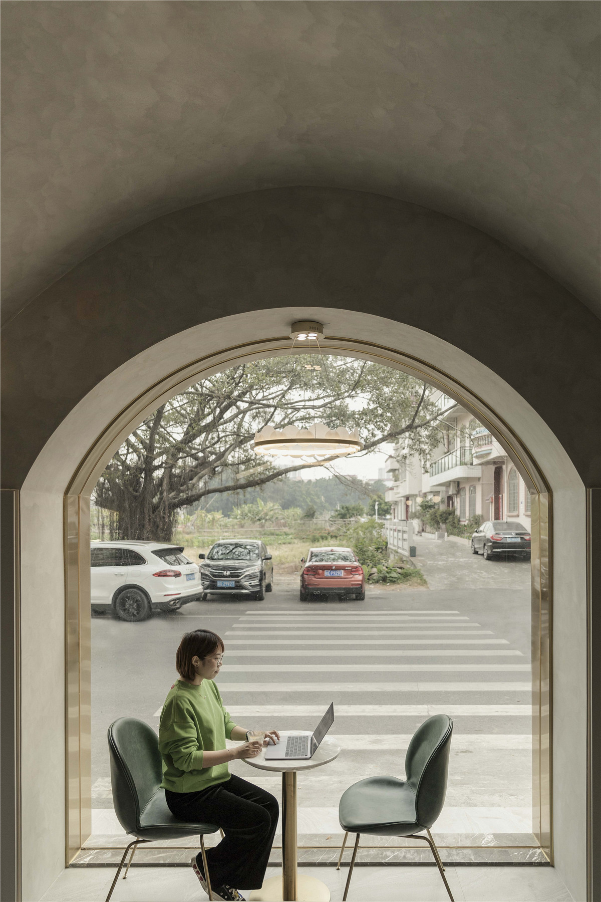
入户没有采用大入口,通过利用增大观景的窗口区域,放大光线进入的面积。采用折叠式窗口的设计增加室内活动空间的统一性。椭圆形窗口的设置,拉近室内外的距离感,不放过宅道上的行人分享店内的氛围,同时也是一幅“流动的画”,室 外的人也可驻足感受。
There is no large entrance to the home, and the area where the light enters is enlarged by using the enlarged window area for viewing. The design of the folding window increases the uniformity of the indoor activity space. The setting of the window brings closer the sense of distance between indoor and outdoor. It does not let the pedestrians share the atmosphere inside the shop, but it is also a “flowing picture”. People outside can also stop and feel.

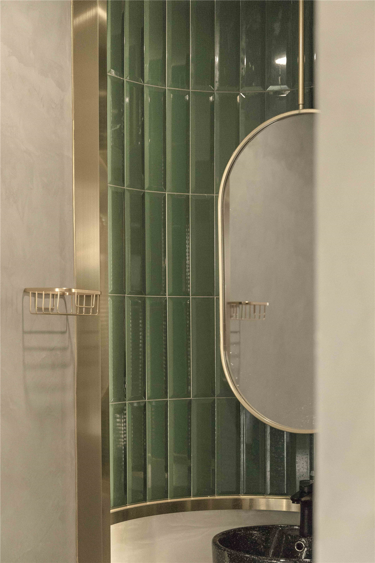
▲洗手盆区域,Washbasin area
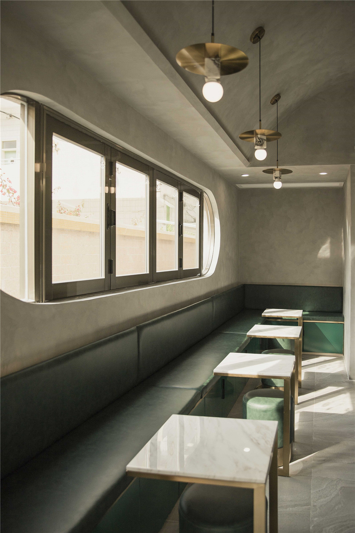
▲卡座区域,Deck area
为了营造更好舒适氛围,我们把洗手区域外置。通过定制的黄铜挂镜突出区域需求。打破卫生间与整体空间面积协调的障碍,让镜子也成为取景框。卡座融合了收纳的功能,配合解决因为空间面积局限而缺乏仓储的问题。
To create a more comfortable atmosphere, we placed the hand washing area outside. Highlight area requirements with custom brass mirrors. Break the obstacle of the coordination of the bathroom and the overall space area, so that the mirror also becomes a framing frame. The card holder integrates the function of storage and cooperates to solve the problem, which is lack of storage due to limited space .
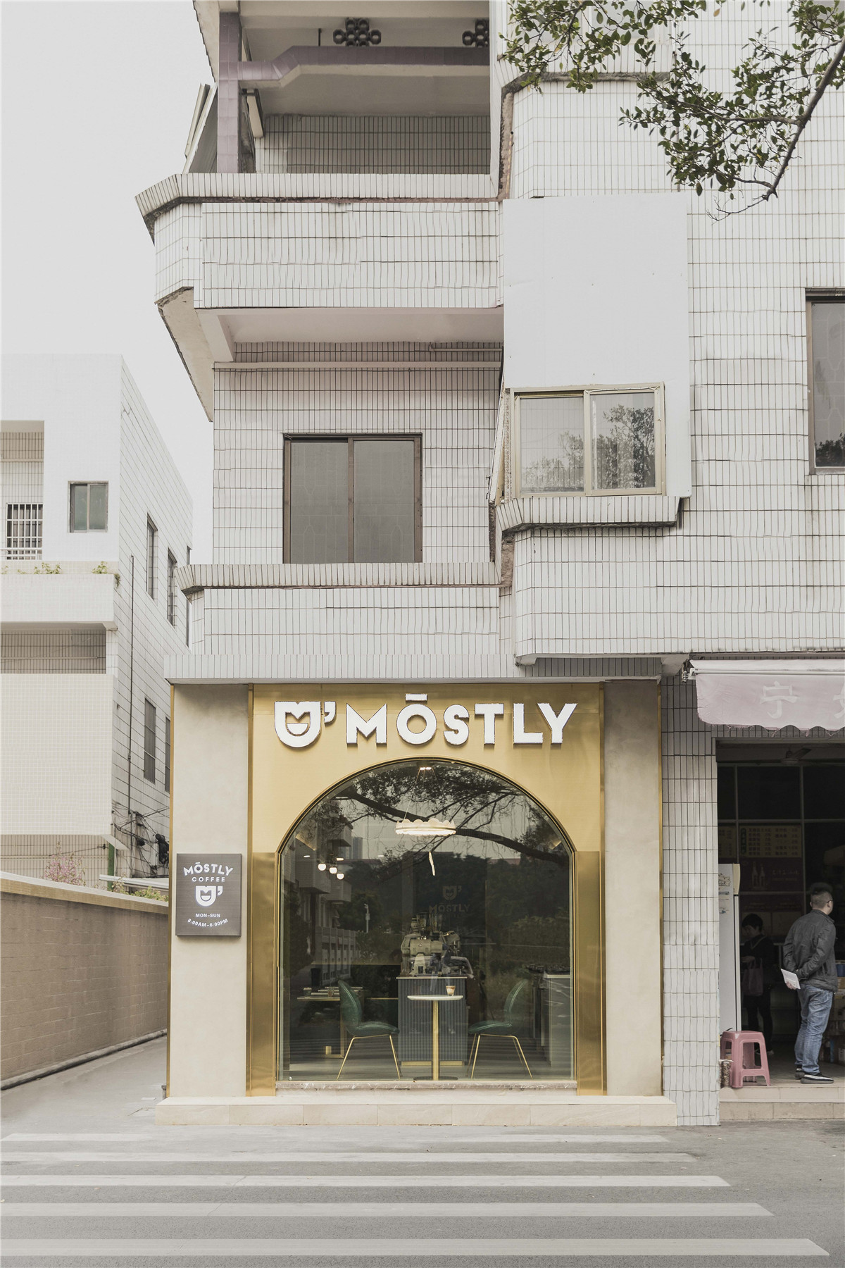
▲外立面总览,overview of facade
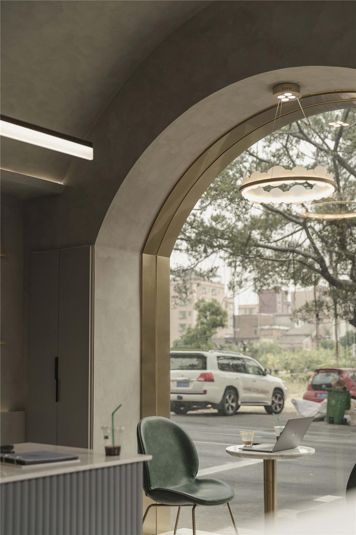


▲区域细部,Area detail
全店整体色调以浅灰为主,以简约柔化的圆拱线条贯穿空间。室内空间主要搭配灰墙灰砖作为背景材料,色调更趋于平稳统一。线条更加柔和,情感上更为理性。软装色调为饱和度较低的绿色,麻布软靠垫纹搭配黄铜感的餐椅。带点实验性的LED灯光搭配。
The whole store’s overall tone is mainly light gray, with simple and soft arch lines running through the space. The interior space is mainly matched with gray walls and gray bricks as the background material, and the color tone is more stable and uniform. The lines are softer and more emotionally rational. Soft color tone is green with low saturation, soft linen linen pattern and brass dining chair. With a bit of experimental LED lighting.
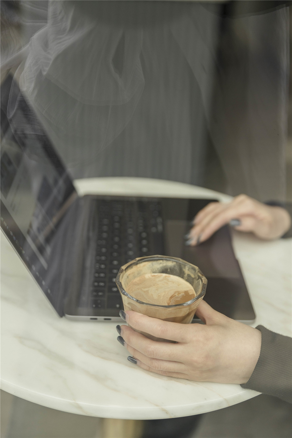

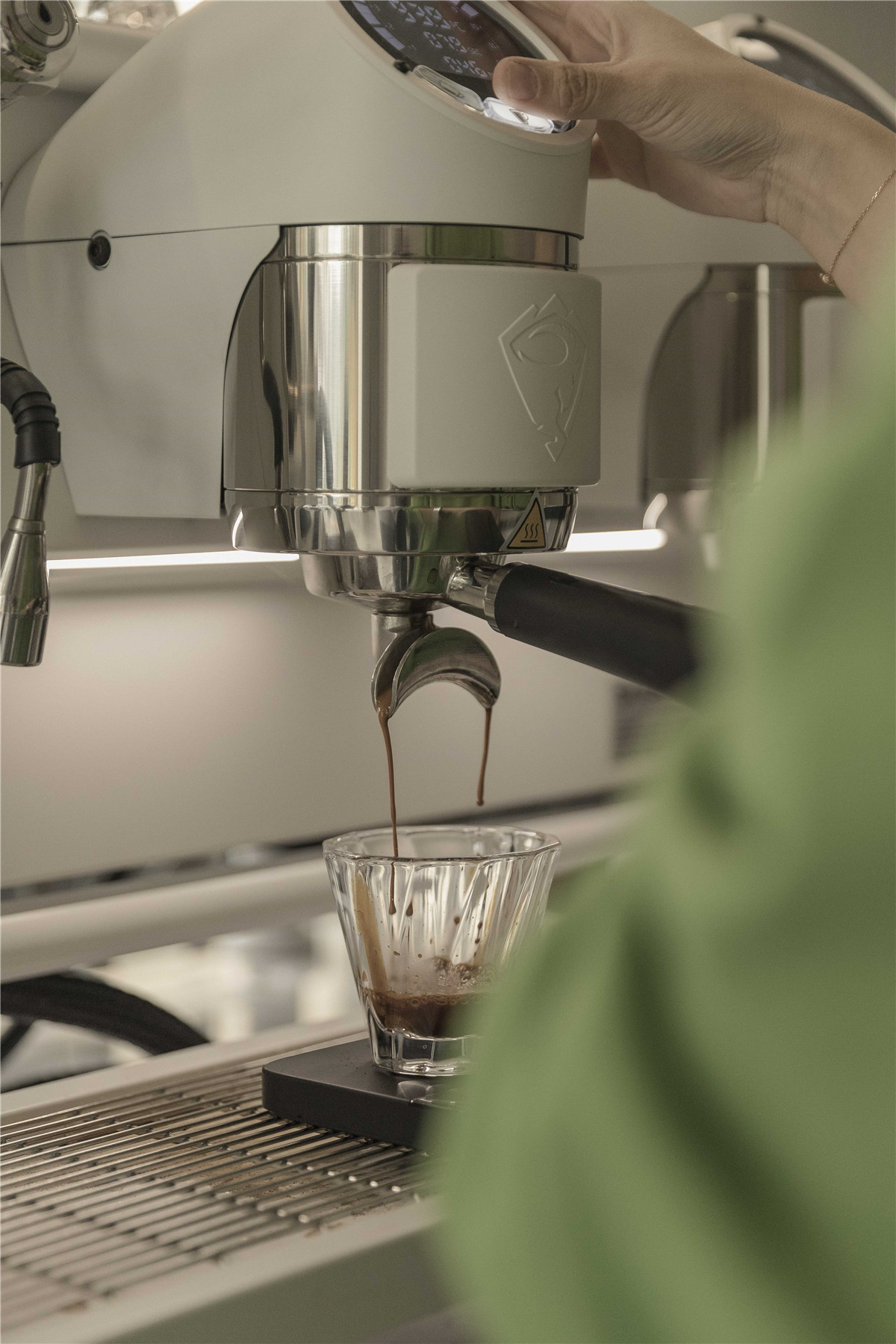
▲空间细部,Space details
我们希望通过咖啡文化的介入可以将旧社区的社交模式增添更多温度。一个普通的社区边角通过设计与咖啡成为新的社交场所,通过建筑新旧的改变为旧街角注入新活力,激活社区再发展。
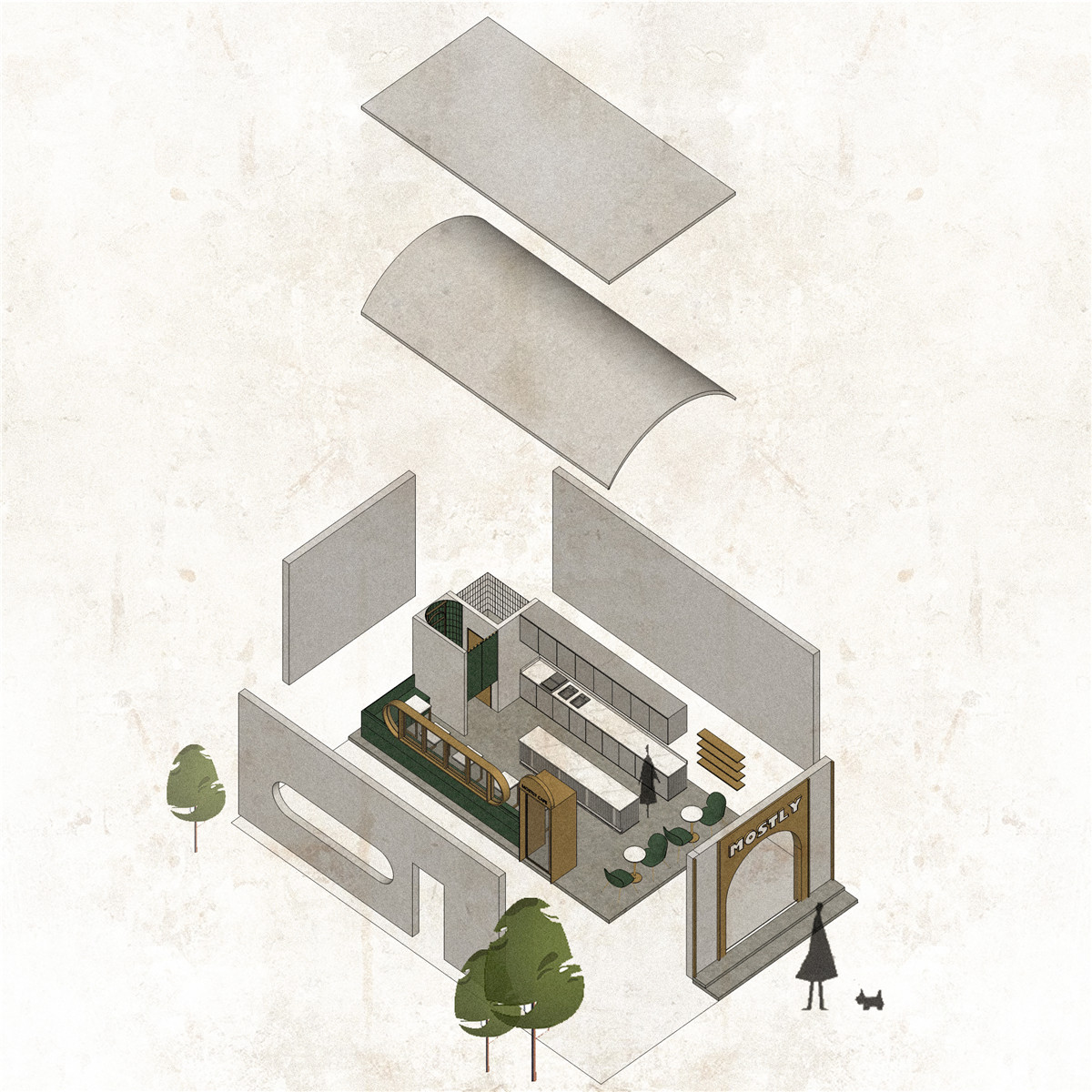
▲爆炸图 Explosion

▲平面图 Plan
项目信息——
项目名称:Mostly Cafe
项目地址:佛山南庄
项目甲方:mostly
设计单位:Unknown Design Studio未知设计事务所
设计时间:2019.06-2019.10
完工时间:2019.10
项目面积:30平米
项目摄影:Muji photographic
Project information——
Project Name:Mostly Cafe
Project Location:Nanzhuang,Foshan
Design company :Unknown Design Studio
Design area:30 sqm
Completion time:june 2019 – October 2019
Designed time:Oct.2019
Photographer:MUJI
Main material:Stainless steel、Cement paint、Marble


