1920年,美国宪法第18号修正案通过了极其严苛的禁酒令,这使得「地下酒吧SpeakEasy」迅速在城市里广泛出现。它们通常位于毫不起眼的街区,入口隐蔽,需要费尽周折才能找到,但推开门就会发现别有洞天。
In 1920,the 18th Amendment to the U.S. Constitution passed a draconian ban on alcohol,leading to the rapid spread of SpeakEasy in cities.They were usually located in nondescript neighborhoods with hidden entrances that take a lot of efforts to find,but push open the door and you‘ll find a surprise.
▲外立面
这在后人看来略显荒谬的禁酒令最终还是寿终正寝,但却真实地存在了14年,而Speakeasy所代表的饮酒文化却被后人承袭,此类风格的酒吧也在世界各地兴起。这也更提醒人们,珍惜杯中酒,莫负前人意。
The absurd ban on alcohol eventually died out,but also lasted for 14 years, and the drinking culture of Speakeasy was inherited,and the style of bars sprang up all over the world.This also reminds people to cherish the moment.
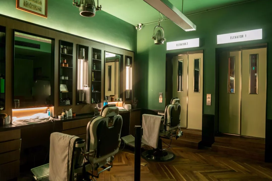
▲复古理发店
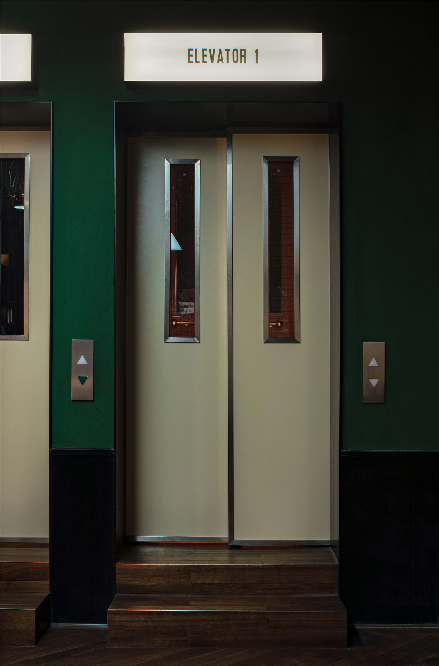
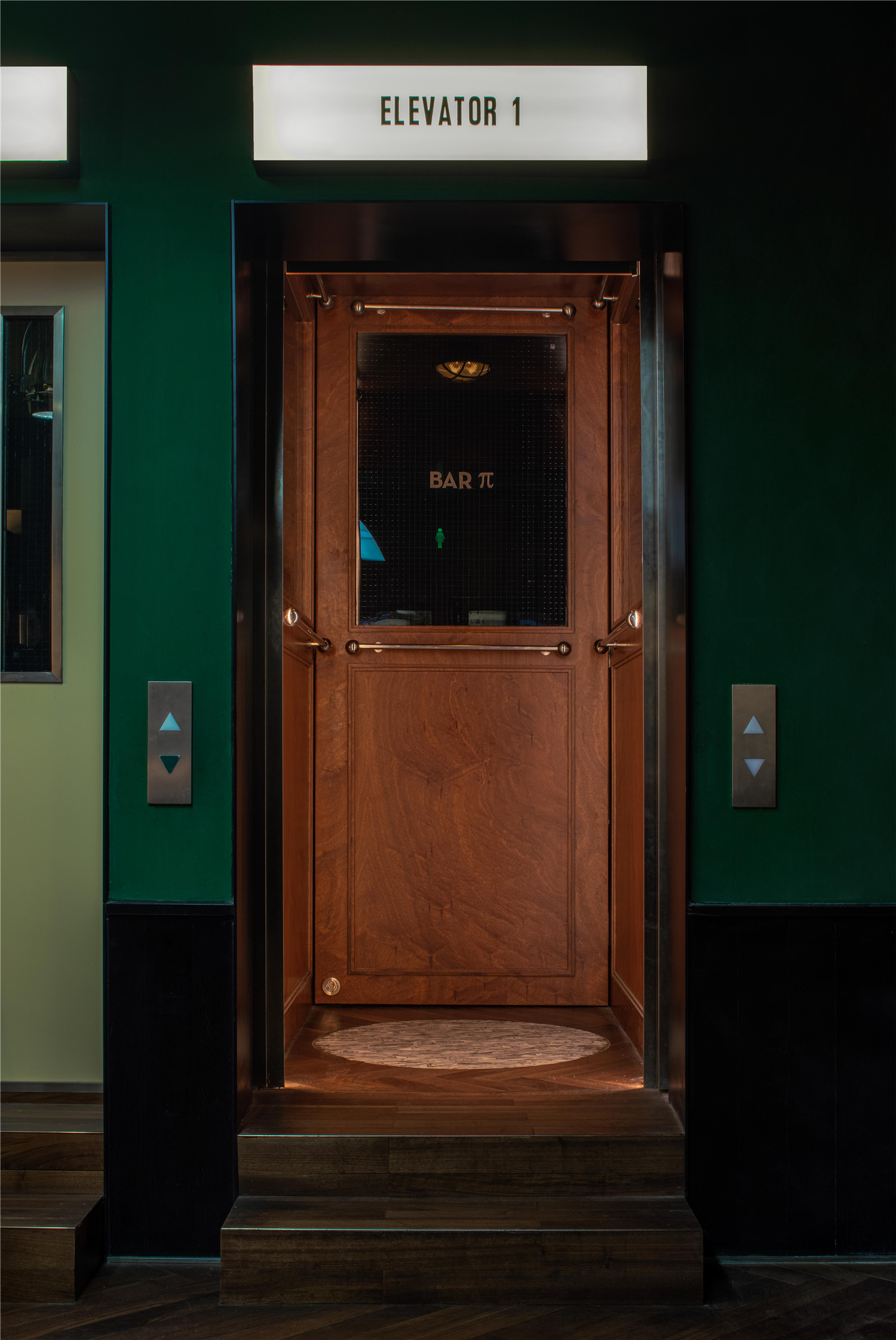
▲电梯入口
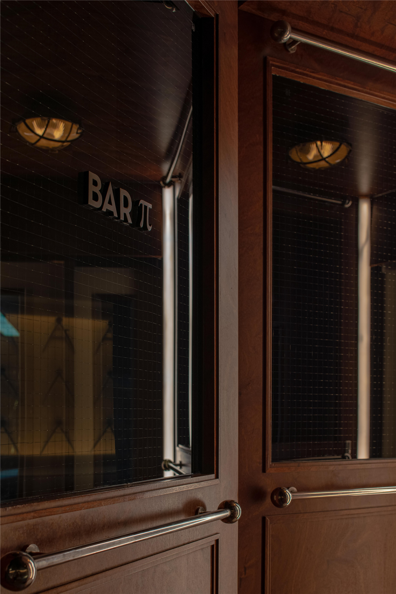
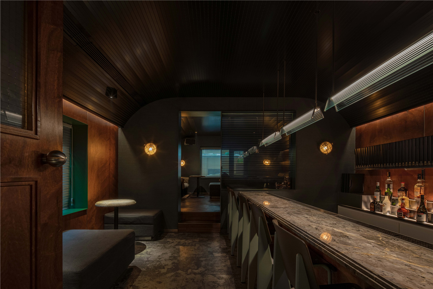
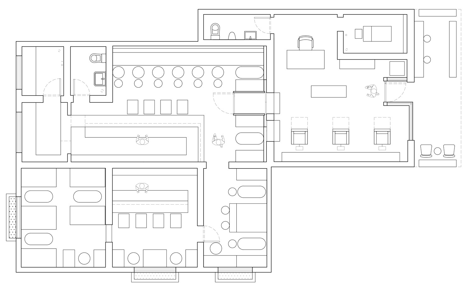
「Bar π」作为成都真正意义上的隐藏式酒吧之一,绝对“派头”十足。门头和空间前部完全作为复古男士BARBERSHOP「BUTCHER」的营业空间。与其他隐藏式酒吧双动线不同的是,你需要径直穿过BARBERSHOP主空间,直接来到酒吧的电梯轿厢式入口。按动“机关”进入狭窄的轿厢空间,再打开大门,终于豁然开朗。再从吧台到空间后部的VIPROOM,整体层层递进,行进动线充满探索的趣味。
「Bar π」as one of the real hidden bars in Chengdu,is definitely full of stye.The facade and front of the space are completely used by BARBERSHOP “BUTCHER”.Unlike other hidden bars,you will need to walk straight through the BARBERSHOP main space to the elevator door.Press the “mechanism” to enter into the narrow space,then open the door,finally enlightened.Then from the bar to the VIP ROOM at the back of the space,the whole progressive layer by layer,the marching line is full of exploring interest.
▲入口
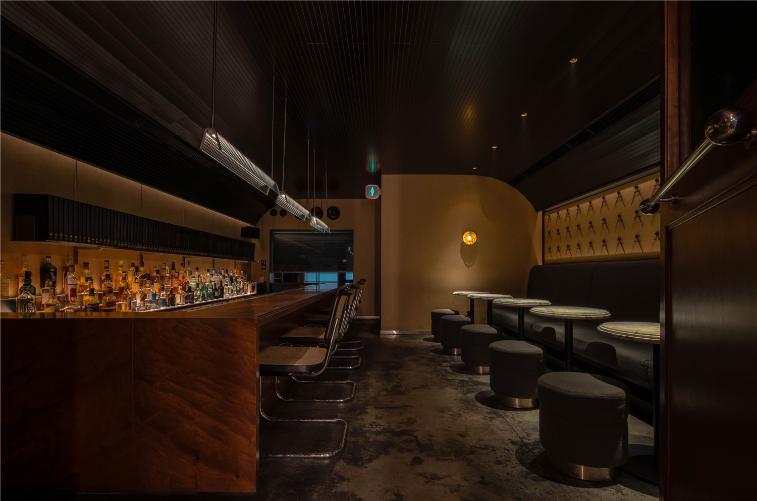
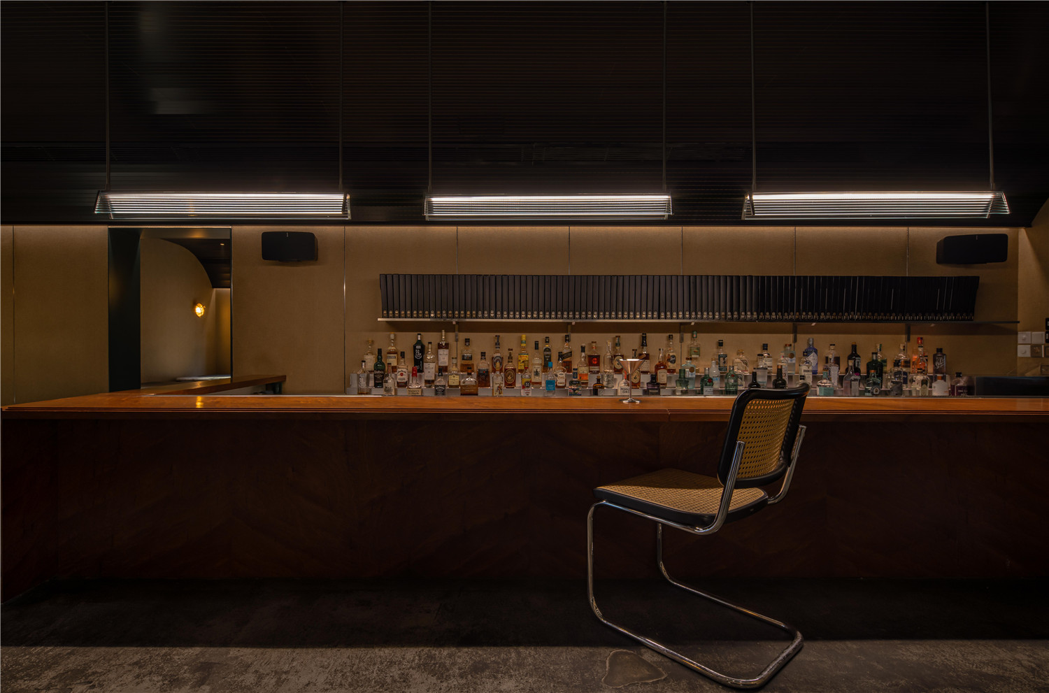
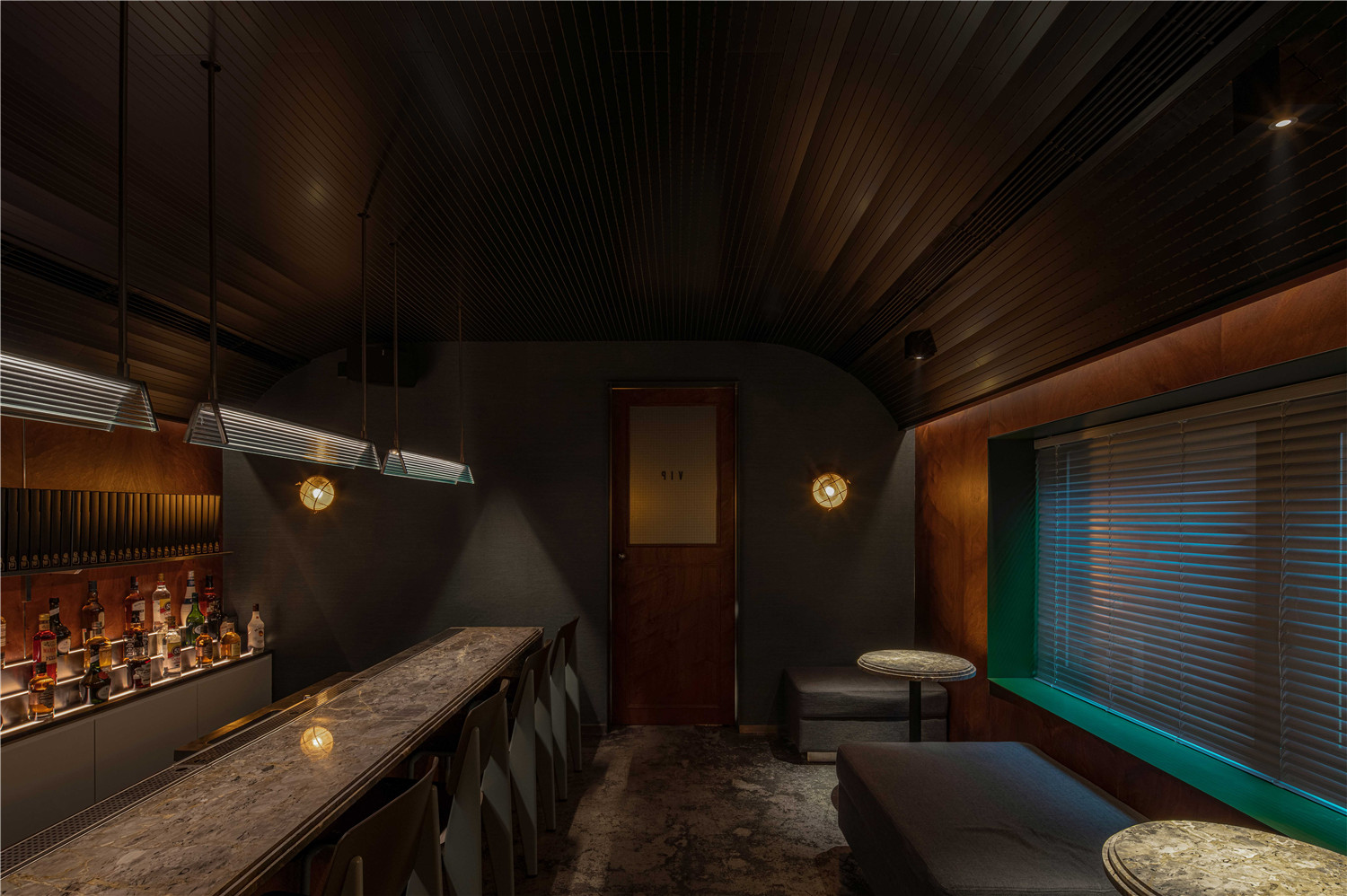
▲吧台
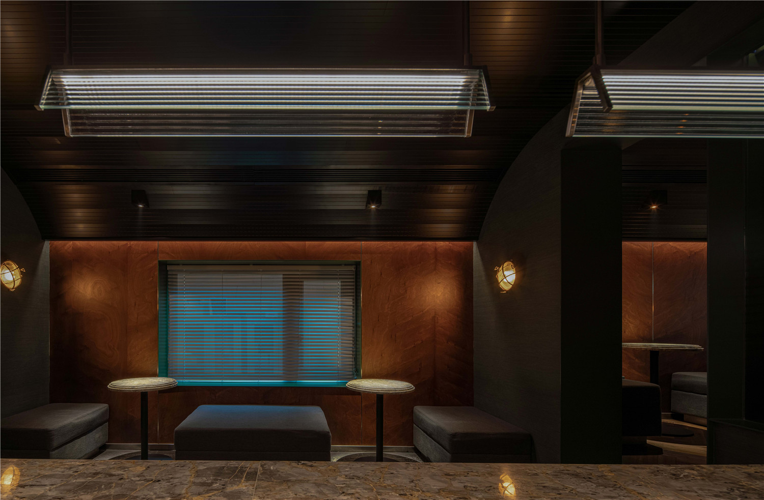
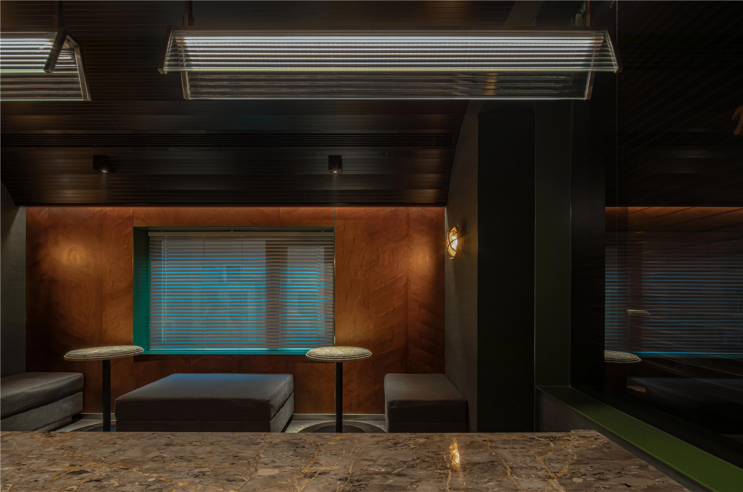
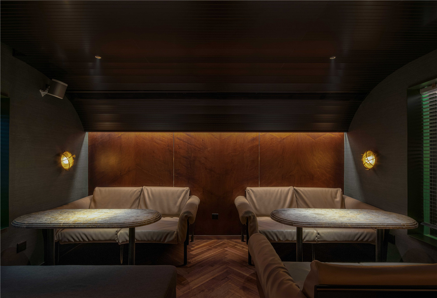
除了彻底将店面藏在后部,更是刻意将层高压缩到极致:地面抬高三十公分,天花板下降大约七八十公分。这样逆向思维的设计,其实是为了更大限度体现欧洲复古火车车厢的概念。并且希望通过这种设计细节的呈现,将场景的体验感做到极致。
In addition to hiding the bar completely in the back,the floor is deliberately compressed to the extreme:the floor is raised 30 centimeters,the ceiling drops about 70 or 80 centimeters.The design of such reverse thinking is actually to reflect the concept of European retro railway cars to a greater extent.And I hope that through the presentation of such design details,the experience of the scene will be the best.
▲美式风格的装饰
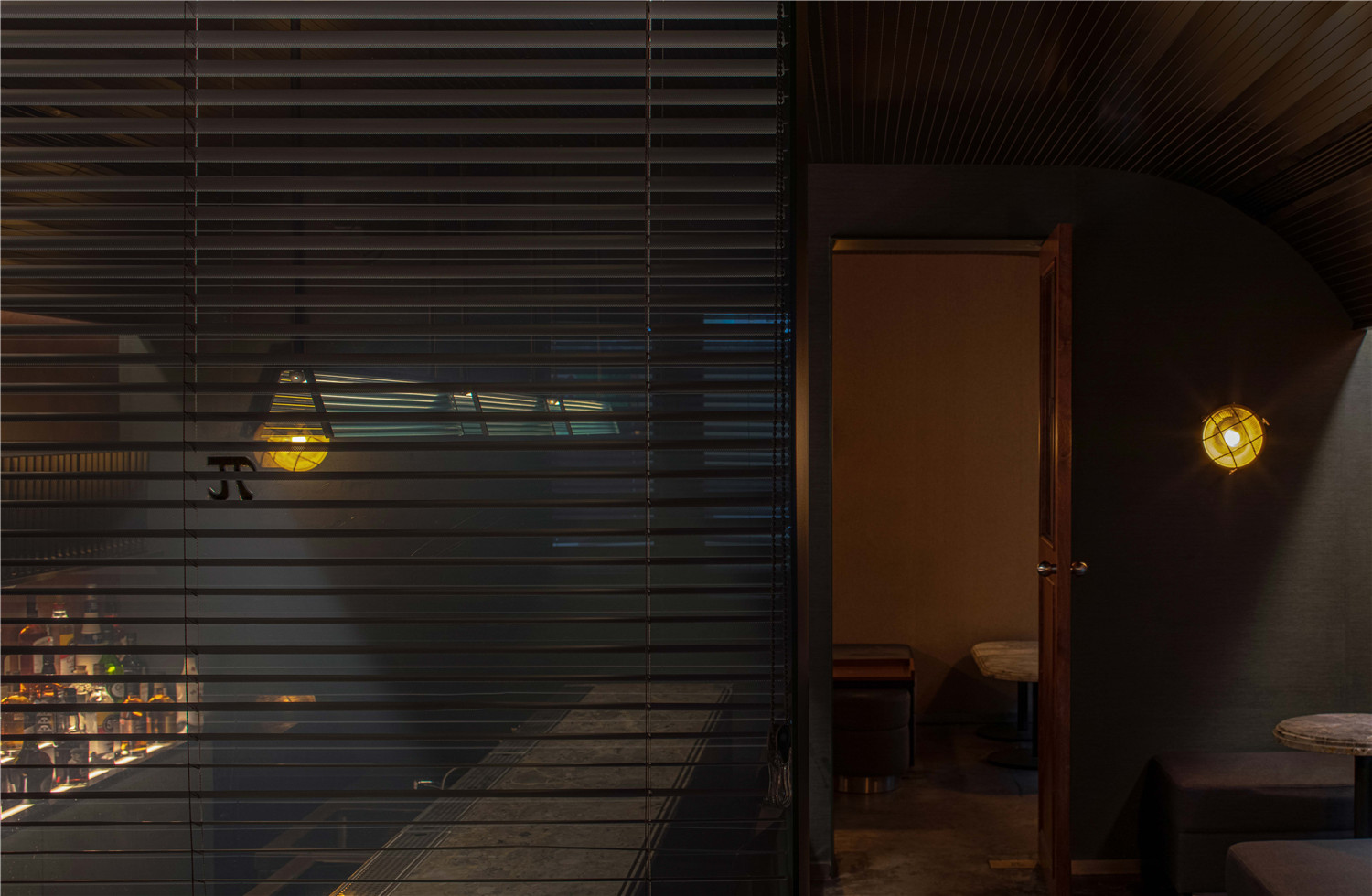
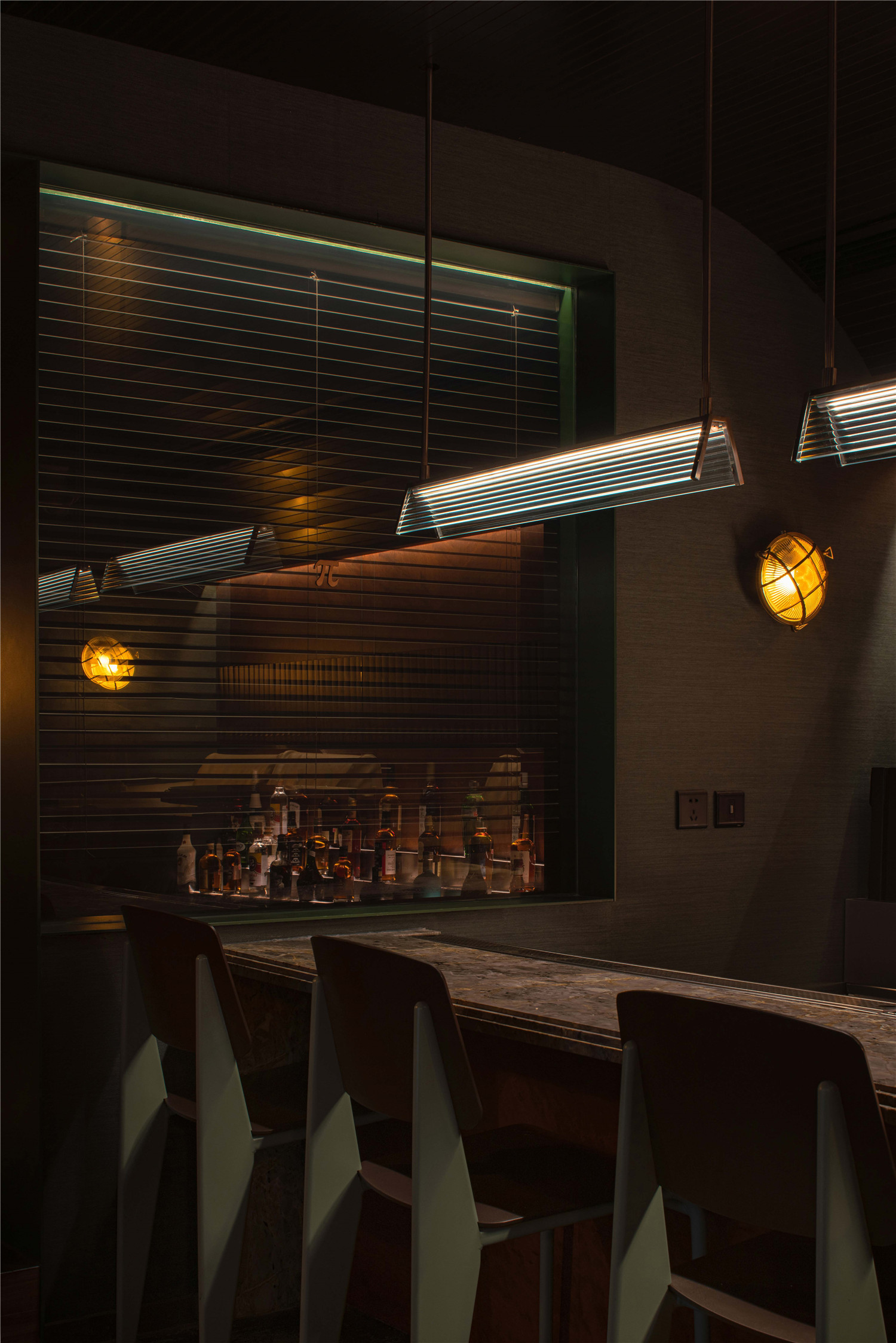
「Bar π」重要的设计灵感来自2016年的好莱坞电影《隐藏人物》。60年代美国办公空间里会出现的玻璃灯罩吊灯、复古百叶窗、方格磨砂玻璃、THONET经典椅的藤编质感,共同营造了区别于传统的“美式风格”。
The key design inspiration for「Bar π」came from the Hollywood film “Hidden Figures” in 2016.The chandelier with vitreous chimney,retro shutter,square ground glass and THONET classic chair that can appear in the US office space in 1960s,built together the American style that differs from tradition.
▲空间氛围
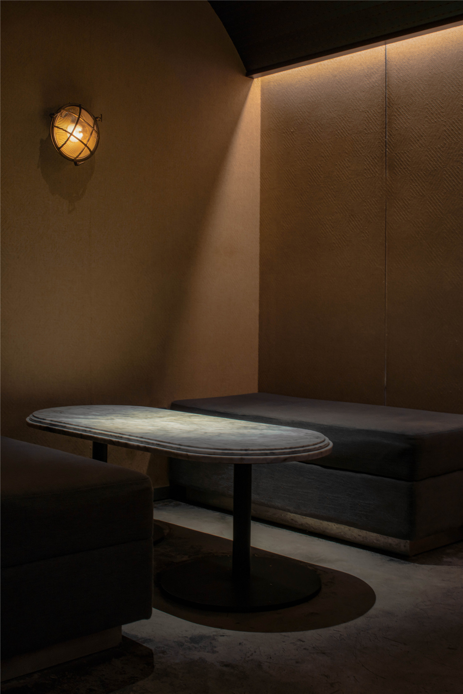
空间的整体呈现,每个细节都有它的作用,是无法割裂来看的。但一个个巧思般的细节,欧式车厢和美式办公室风格的结合,都在润物无声的烘托出设计师想要讲述的空间故事。
The overall presentation of the space,each detail has its role,and it cannot be separated.But the clever details,the union of European railway carriage and American office style,the story of the space that the foil that moisten thing soundless gives stylist to want to tell.
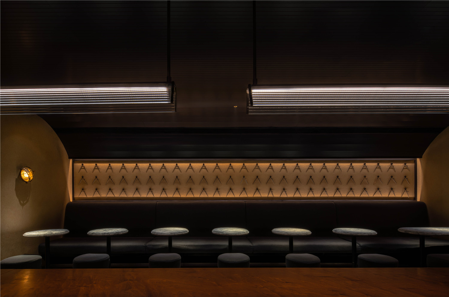
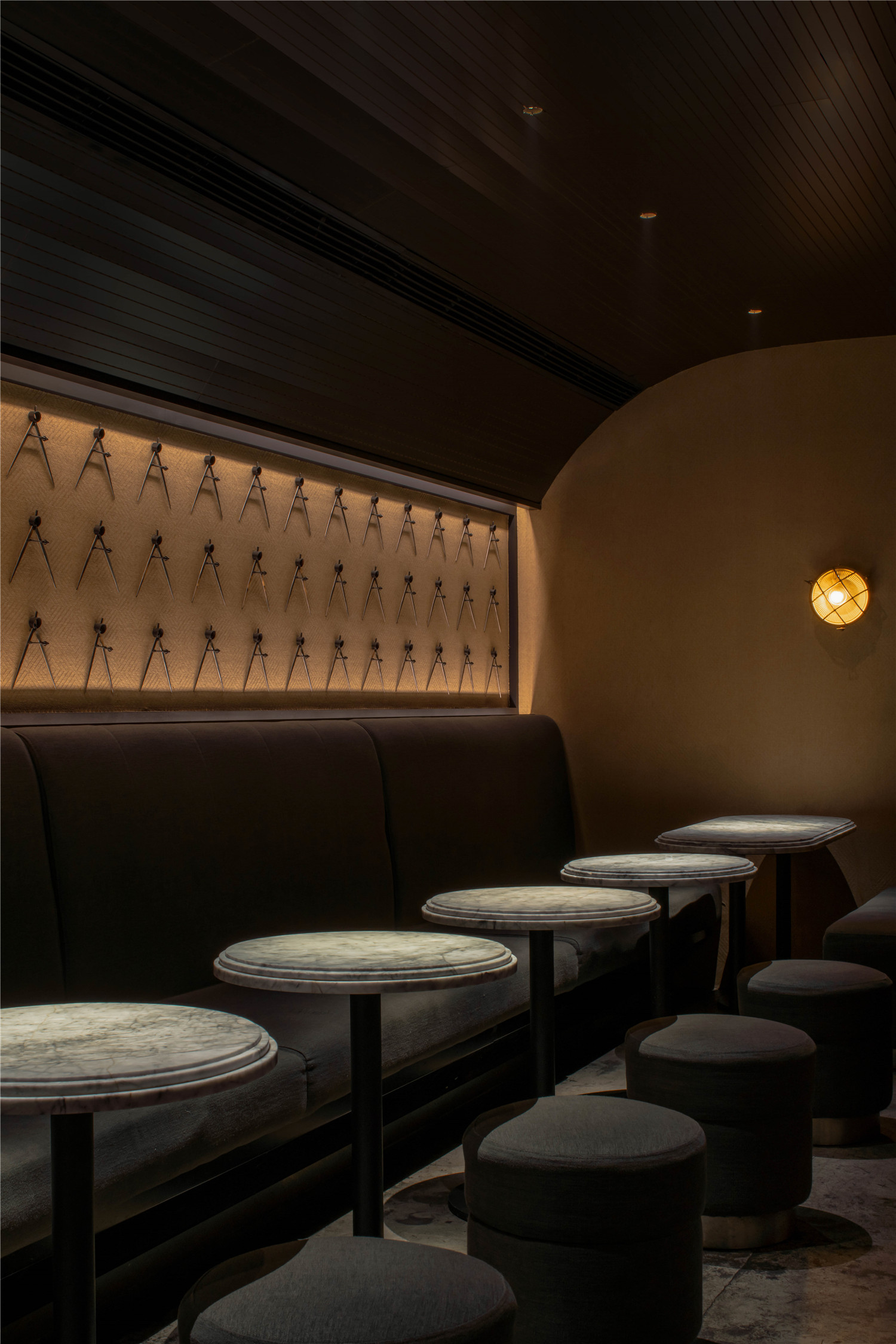
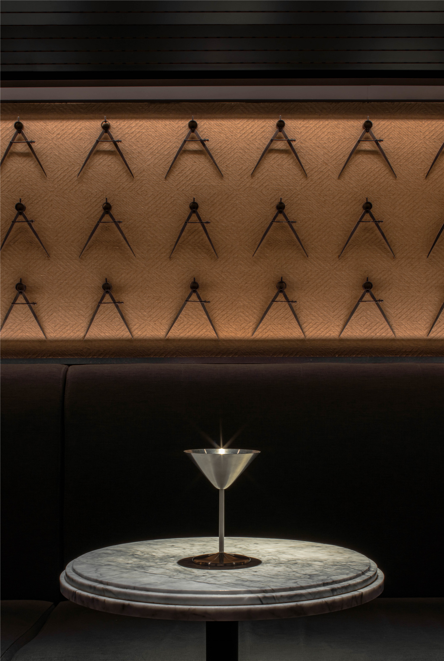
▲圆规墙
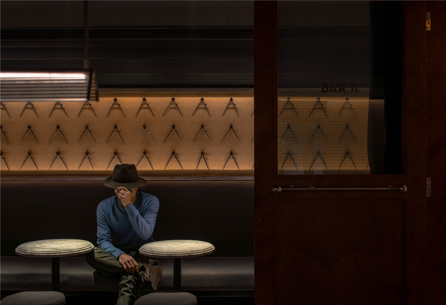
「Barπ」作为设计师从命名、设计到共同经营的设计型酒吧,完全从设计角度,将对于「空间体验」的理解作出极致的表达。圆规与π之间的联系不言而喻,用圆规作为「Bar π」品牌的视觉符号,阵列式的圆规墙在获得辨识度的同时,超越了语言和文字的局限。酒单的主视觉元素和调酒的命名都围绕着数学的主题,如圆周率,三角函数,欧姆定律等等;甚至是经营时间播放歌单的选择,都是「Bar π」想要达到的更为整体的空间消费体验。
「Bar π」 as a design type bar,from naming,design to the joint operation,the designer shows the ultimate expression understanding of “spatial experience” from the design.The connection between the compass and π is obvious.With the compass as the visual symbol of the「Bar π」 brand,the array of compass walls can achieve recognition while transcending the limits of language and text.The main visual elements of the wine list and the naming of the wine mix all revolve around mathematical topics such as PI,trigonometric functions,Ohm’s law,etc.Even the choice of open time playlists is the more holistic spatial consumption experience that「Bar π」seeks to achieve.
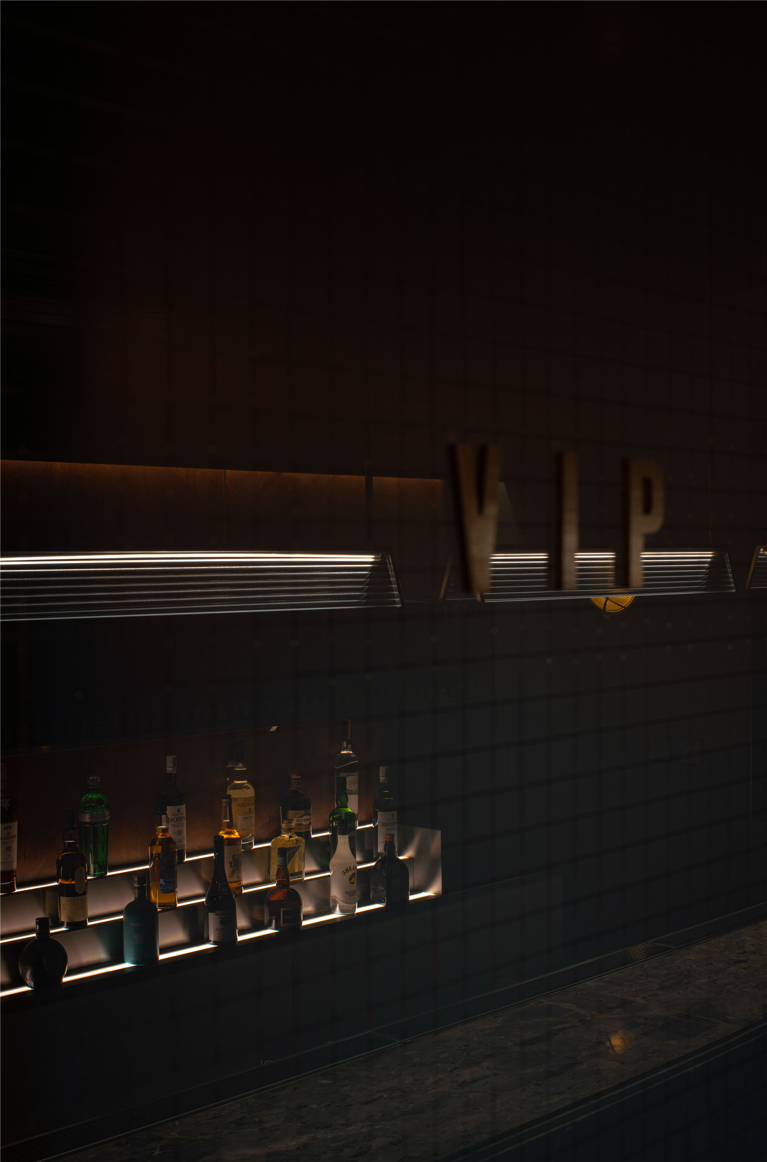
▲VIP区
“那些经历过时间考验,还能历久弥新的东西,才是我想做的。”by iZ.
“Have stood the test of time and are still going strong are the thing I want to express.” by iZ.
▲平面图
项目信息——
项目名称:Bar π
设计公司:iZ Design Studio
项目地址:成都
项目面积:135㎡
软装选型:Van Der Rohe 凡德罗家具
空间摄影:形在建筑空间摄影/贺川
Project Information——
Project name:Bar π
Space Designer:iZ.
Location:Cheng Du,CHINA
Design Area:135 ㎡
Furniture:Vitra | Thonet by Van Der Rohe Furniture
Photographer:HereSpacePhotography


