威隆拉第是19世纪80年代初,布尔诺地区老式住宅的统称。这里一栋汽车展厅作为周围商业建筑的一部分于1990年建成,紧邻四车道的Zarosicka大街的位置并没有另这块区域有所不同。这栋老建筑在技术上和外观上都十分老旧,无法再满足社会需求。所有者希望建筑以便宜和快速的方式进行改造,并继续维持其展厅的作用。因此,设计师面临的工作任务是:“以最低的成本做最酷的设计。”
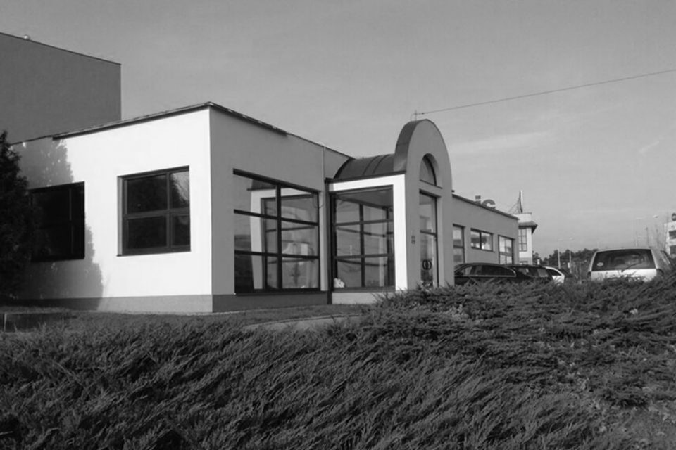
Vinohrady is the name of one of the oldest housing estates built in Brno in the first half of the 1980s. The car show room itself was set up in the 1990s and is a part of a line of nearby commercial buildings, bordering with the four-lane Zarosicka road, which, however, do not enhance the area anyhow. The former state of the building was technically and morally outdated and from the formal point of view, it did not correspond with the needs of the society. Given the fact that it was a temporary investment in the form of a rent and the firm had already been using those premises, the proposed solution had to be cheap and fast. The task was: “Do it cheap, ideally for free,” architects Ondrej Chybik and Michal Kristof are reminiscing.
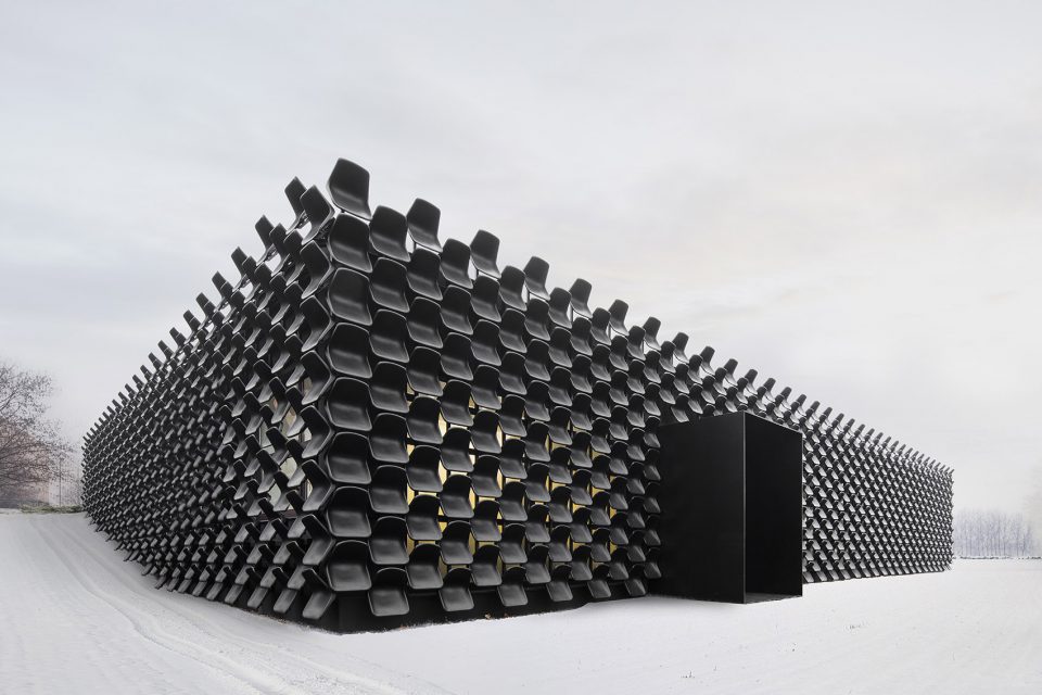
▼建筑全貌,full view
▼建筑原貌为老式住宅,the former architecture is an old housing estate
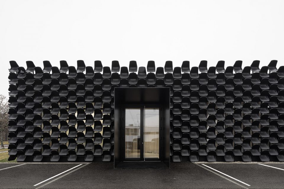
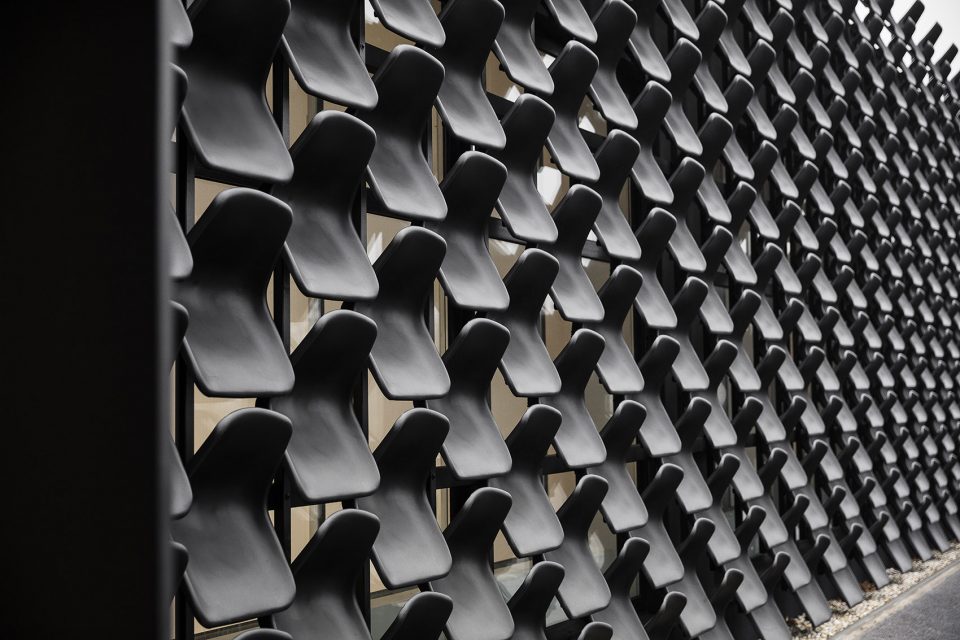
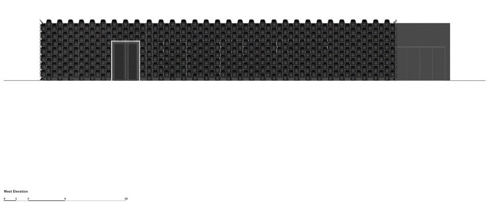
MY DVA group作为捷克国内,前沿的办公,教育和金属家具供应商,其公司还涉及商业及教育的概念和实践内部装饰,也包括一些附属产品设计。这栋建筑在材料上的选择既要考虑最低的建造成本,又要尽量提升建筑的形象。因此,设计师决定将建筑与公司产品相结合,由每把80捷克克朗的椅子作为建筑外立面的组成部分,除此之外不加设任何其他装饰。这种抽象的外部形象恰好反映了建筑内部功能,省去了建筑外部广告费用。“我们使用了供应商提供的,建筑内部展示的维琴察椅作为外立面的组成部件,这把椅子黑色的外观恰好可以适应不同的天气环境,尤其可以抵抗紫外线。”设计师如是说。椅子被固定在外立面钢结构上,为降低外立面损害风险,外挂的椅子每年都需要更换几次。
The MY DVA group belongs to the front domestic suppliers of office, school and metal furniture, focusing also on the concepts and realizations of commercial and educational interiors, including some atypical elements. The choice of material, which should have been based on the usage of a minimum amount of money, but with a maximum effect to enhance the former building, therefore, had to be connected with the firm′s production. Thus, the building is cladded by a homogenous product, a plastic black seat for about 80 CZK/1 piece, without any greater adjustments of the exterior. It creates an abstract texture which reflects what is going on inside without another banner advertising. “What we used is a basic form of an interior chair called Vicenza which the supplier delivers on a regular basis. In this case, however, we used black granulate for the outdoors because it is resistant to different weather conditions, especially UV light.” the architects are describing. The individual seats are fixed on a structure made from steel sections fixed on the facade. In case of a mechanical damage, it is possible to change each piece for a new one, even the facade cleaning can be done easily once or twice a year by a high-pressure cleaner.
▼外立面以企业产品作为装饰设计,the exterior connects to the firm’s production
▼外观上的椅子固定于钢结构框架上,the chairs are fixed on a steel structure
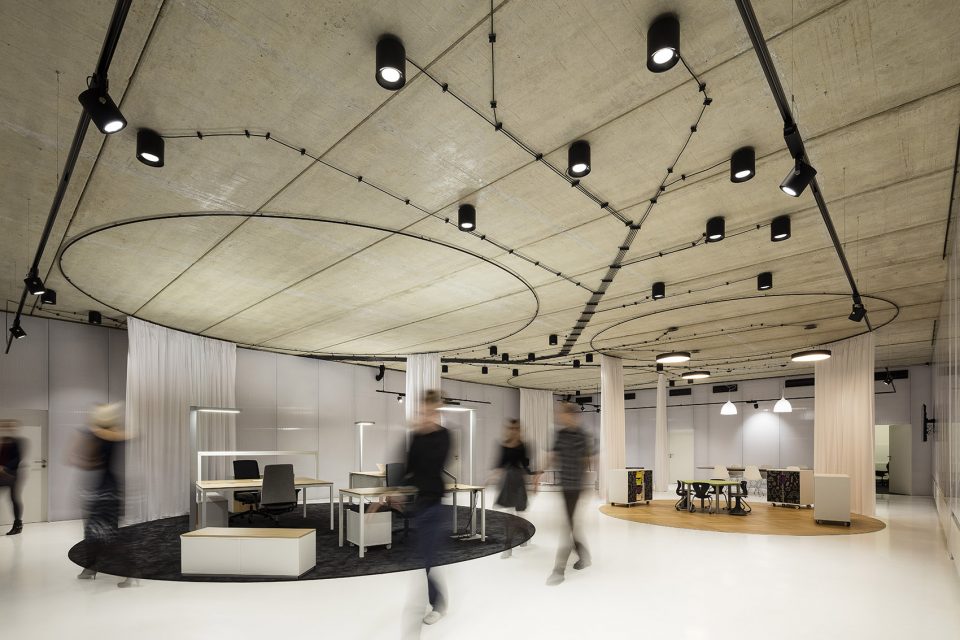
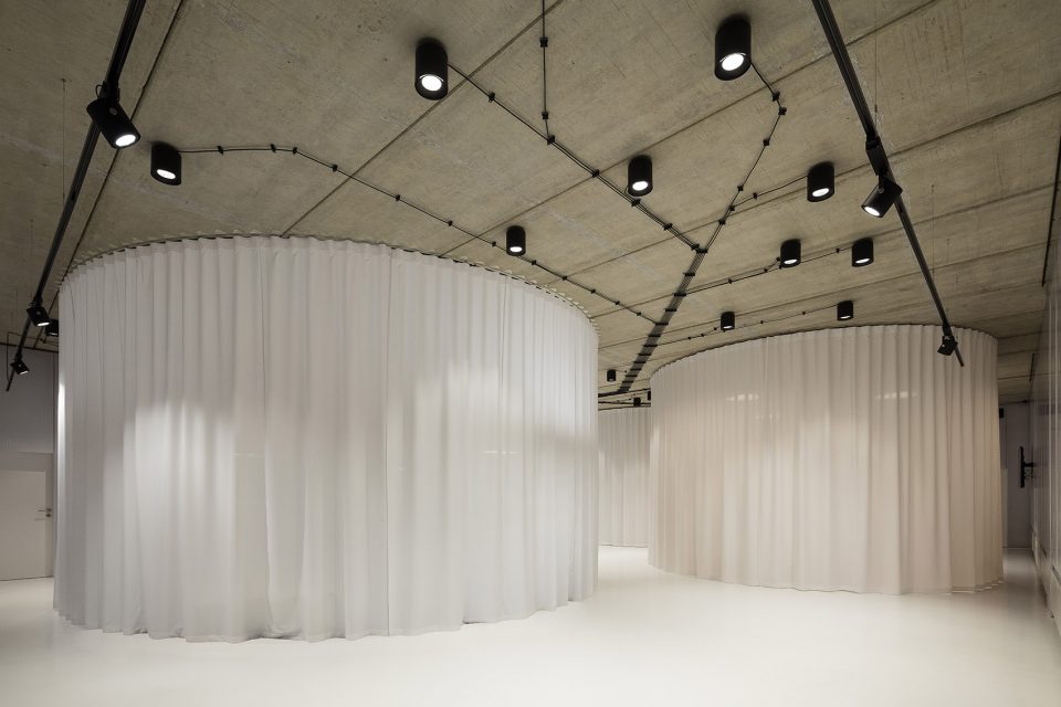
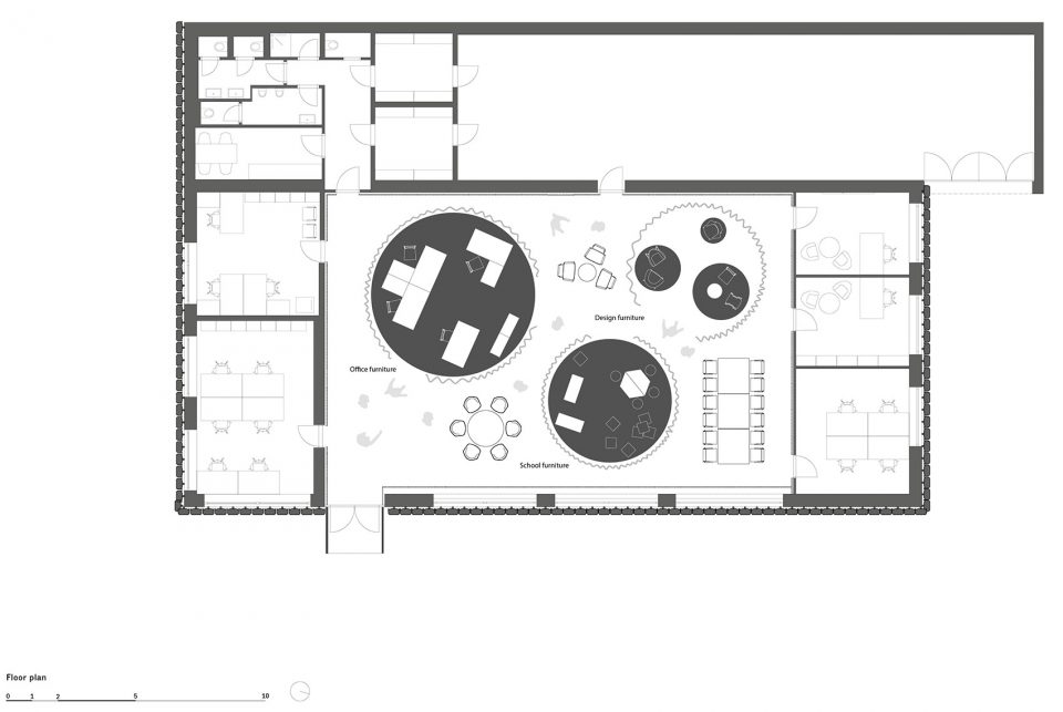
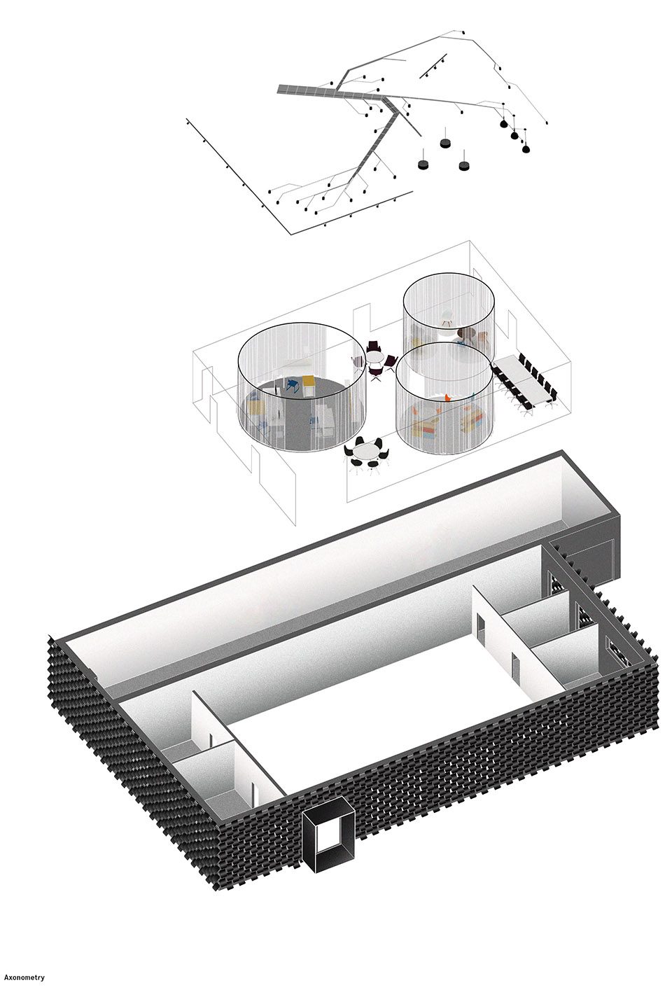
室内包括展厅和办公室两个部分,展现了另外的设计理念。建筑内部原有部分被移除。通过扩大原建筑中央的入口大厅创造出新的展示空间,并由聚碳酸酯板分区。通过地面白色砂浆和素雅的混凝土天花板将室内色调统一,新铺设的线缆暴露在结构外部。嵌入室内的三个圆形展厅,分别展出教育家具,办公家具和其他工业设计产品。圆形展示台由白色围帘遮蔽,围帘与建筑同高,可以拉开或闭合。圆形展示厅的内部地板材料,照明方式和光照颜色都与内部展示商品相一致。外部的展示空间同时展出其他商品和艺术品,或者移走作为办公区及客户聚集区。建筑整体内部空间以流畅的走廊形式展现,内部摆设按实时需求改变。员工办公室沿建筑外围设置,享受自然采光和通风,通过灰色地毯和白色漆面与室内风格统一。
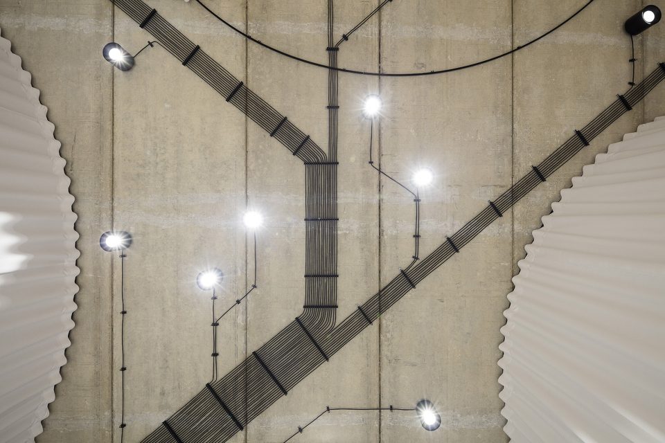
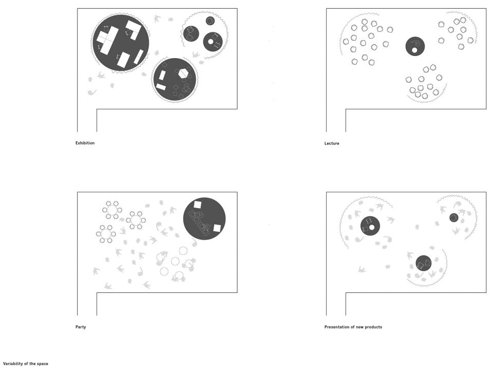
The concept of the interior represents the second level of the project and consists of two parts: a showroom and offices with a background for the employers. The inside of the building was demolished. A presentation space of the showroom was created by enlarging the former entrance hall at the centre of the layout and is demarcated by polycarbonate partitions. The floor is unified by means of white screed, on the ceiling remain former fair faced concrete panels and all the new wirings are exposed. Three circular galleries are embedded into this newly created space, representing three different segments of production – school furniture, office furniture and design pieces. The circular cutouts are demarcated by white textile curtains for the full height of the space, they can be closed or let open. Interiors of the cutouts represent three different settings where the flooring material, means of lighting and the colour of the light itself are aimed to correspond with a natural setting that the furniture is intended for. The interstices can be filled with various products or pieces of art, they can be used as a common room for the employees or for get-togethers with clients. The whole space works on the principle of a gallery which can be easily adjusted according to the actual needs.Offices for the employees are preserved along the perimeter of the structure, they are illuminated by daylight, have a ventilation and are unified by a grey carpet and white paint.
▼三个圆形展示厅展出不同商品,the three circular showrooms display different products
▼展厅内部照明配合展示商品而改变,the lightings in the showrooms are coordinated with the products
▼圆形展示台由白色围帘遮蔽,the circular cutouts are demarcated by white textile curtains for the full height of the space
▼新铺设的线缆暴露在天花板之外,all the new wirings are exposed
▼展厅内部依不同要求布置,the showroom can be easily adjusted according to the actual needs
▼平面图,plan
▼西立面图,west elevation
▼轴侧分析图,axonometry
项目信息——
Client: MY DVA group a.s.
Location: Brno-Vinohrady, Czech Republic
Year: 2015-2016
Program: showroom and offices for furniture company
Size: 550 m2
Status: completed
Team: Ondrej Chybik, Michal Kristof, Victor Cojocaru, Martin Holy, Vojtech Kouril, Sarka Kubinova, Ondrej Mundl, Matej Strba
Photographer: Lukas Pelech


