万物皆有序,而光赋予了自由生长,便有了四时之变,空间流转。
-逐光-
“The light exists within the bounds of the universe,
speaking seasons and the flow of time into existence.”
-Chasing Light-
如果说创意是空间表达,或空间内容的具体形态,那理性思考的那一部分,早在感性之先,便铺设出了逻辑的基石,后期的一切表达皆在这一基石之上。
If creativity is expressed through space, then it would follow that reason would come before sense. It lays the foundation of the logic behind expression.
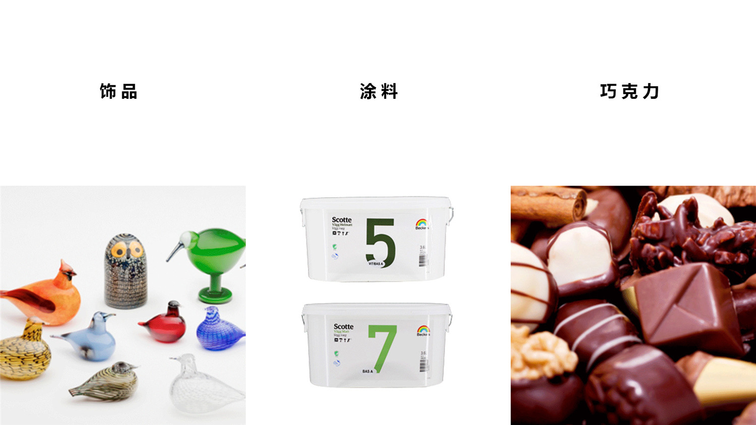
▲品牌产品系列
这个理性逻辑基于商业环境的迭代,基于我们对零售空间新的思考。更基于甲方的商业构想,与我们新零售空间概念不谋而合。所以,我们所要呈现的空间,应该是具备双重属性的。
This logic is one of the motivating factors behind our conception of the new retail space, and was in sync with our client’s business idea. That being said, the space we present should have dual attributes.
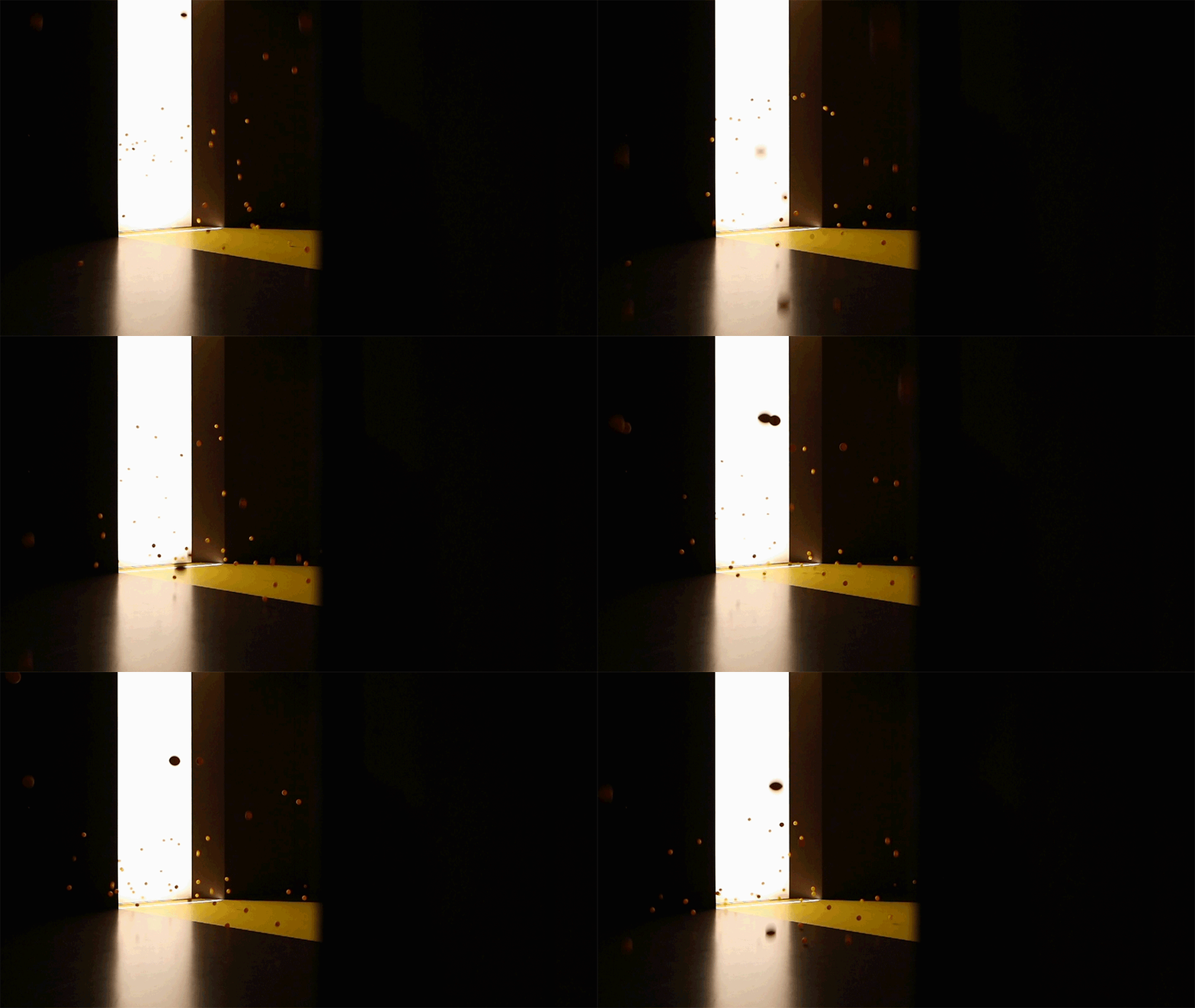
▲空间元素(巧克力+光)
其一,是始于营销的核心属性,那就是能够充分挖掘产品的特性,并使其在空间内全方位的展示出来。
First, marketing should be the core. We are to prioritize the full display of the product as much as possible throughout the space.
其二,空间社交功能的强化,与空间的展示功能之外,交流与分享成为空间另一平台效用。
Second, the enhancement of the social space is also essential, and it is accomplished by creating an open platform for communication and sharing.
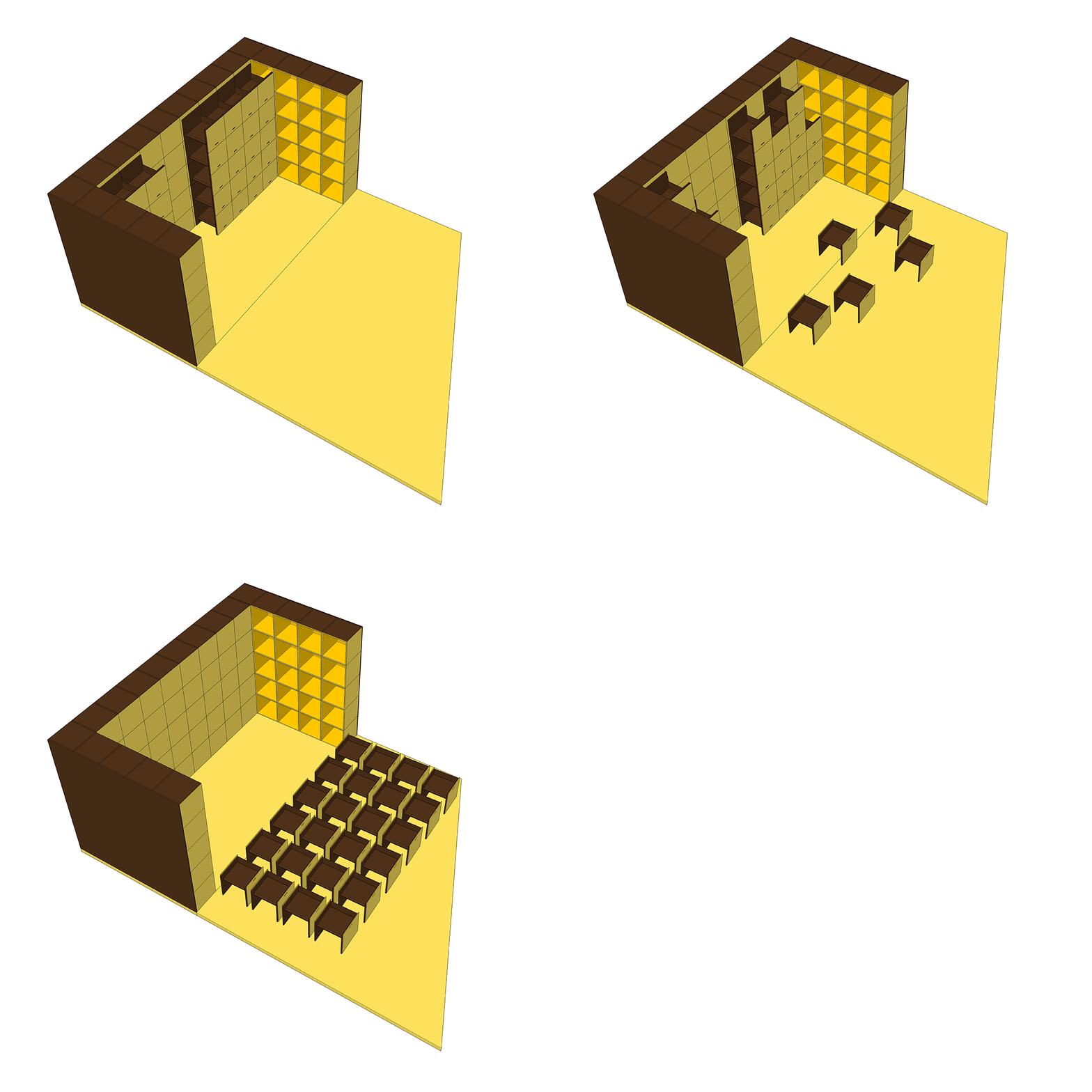
▲平面规划图
▲功能分析图
▲空间爆炸图
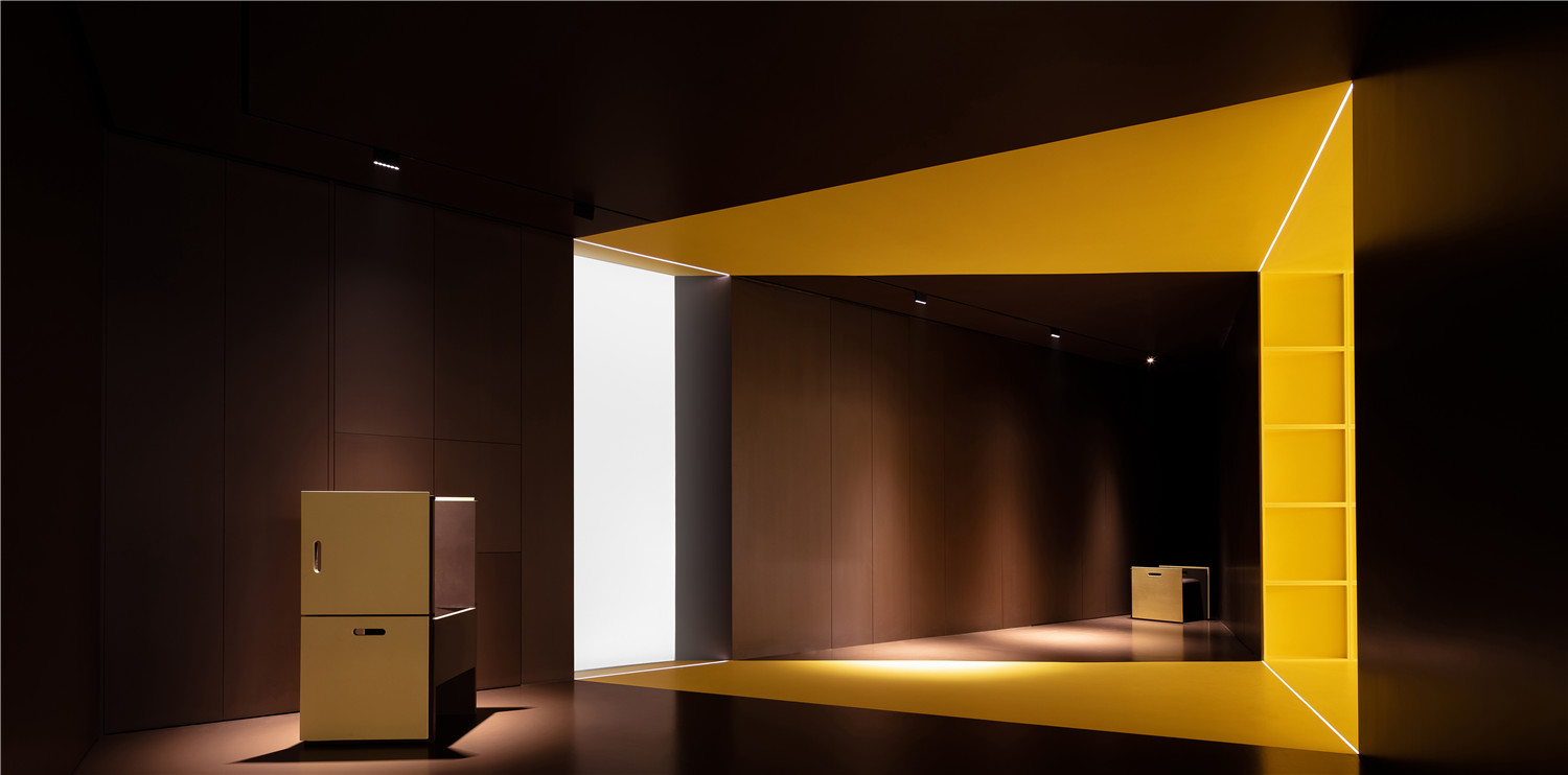
一束光穿过一扇窗的偶遇,触发了我们的感性:有光就有梦想,这是梦想开始的地方,这是生命力流动起来的力量。
A beam of light pierces through the window, and we are struck with the concept that where there is light, there are dreams. This is the place where dreams begin; this is the power of the movement of life.
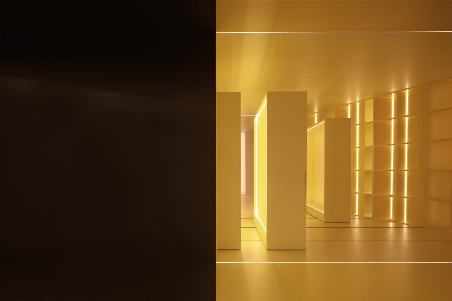
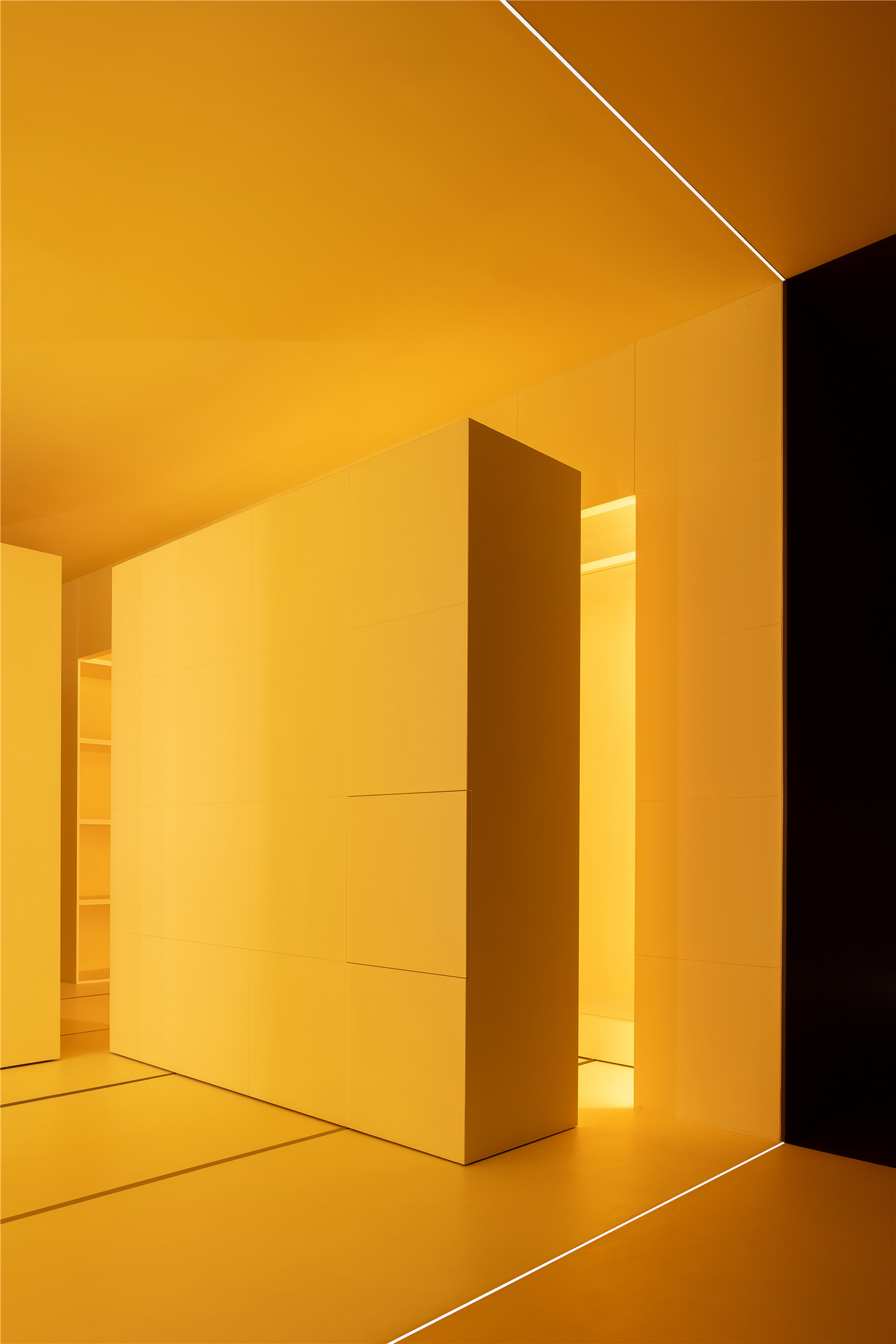
光是生长,光是艺术。几何式光形的延展,不仅仅是始于功能上的视觉聚焦,更营造出一种明暗对立的时间感,促成了天作之合的艺术体验。
Light means growth; light is art. The geometric shapes cast by the shadows are not only visually appealing, but also are a reflection of the passing of time, making for an aesthetic experience.
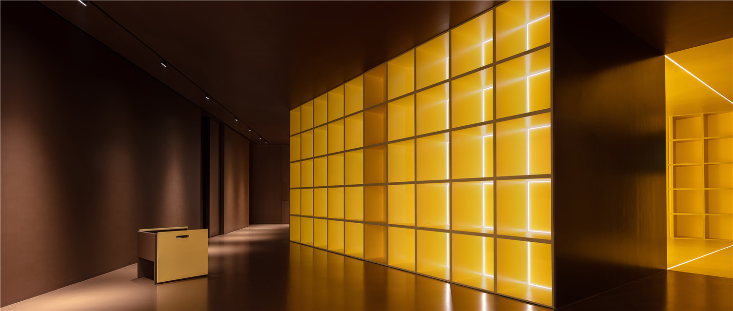
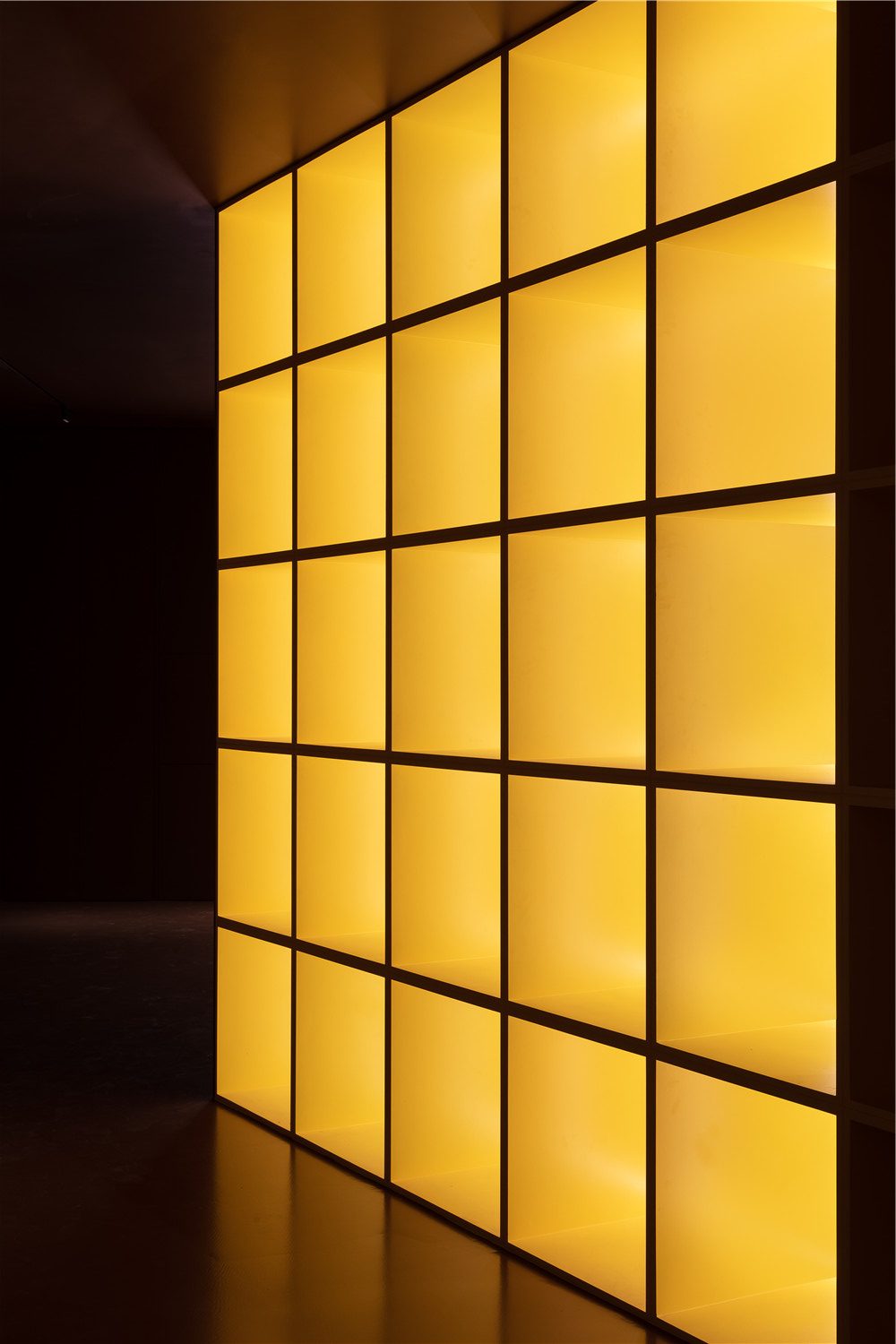
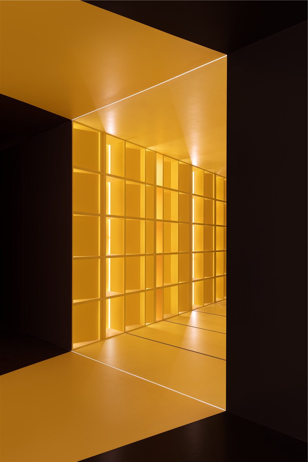
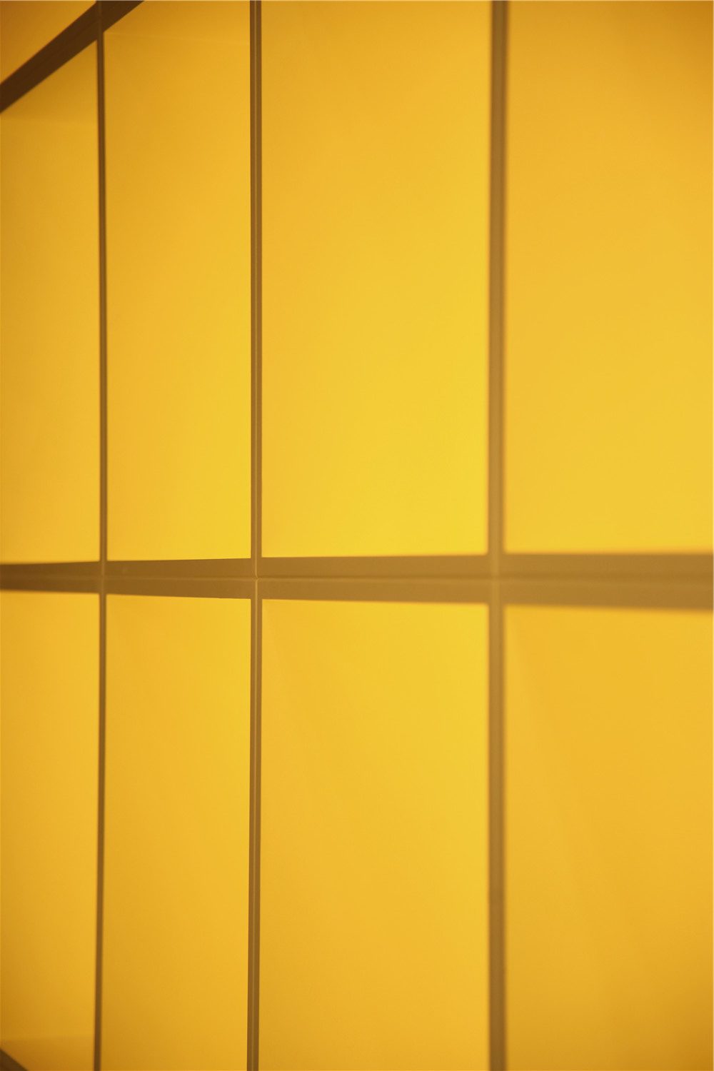
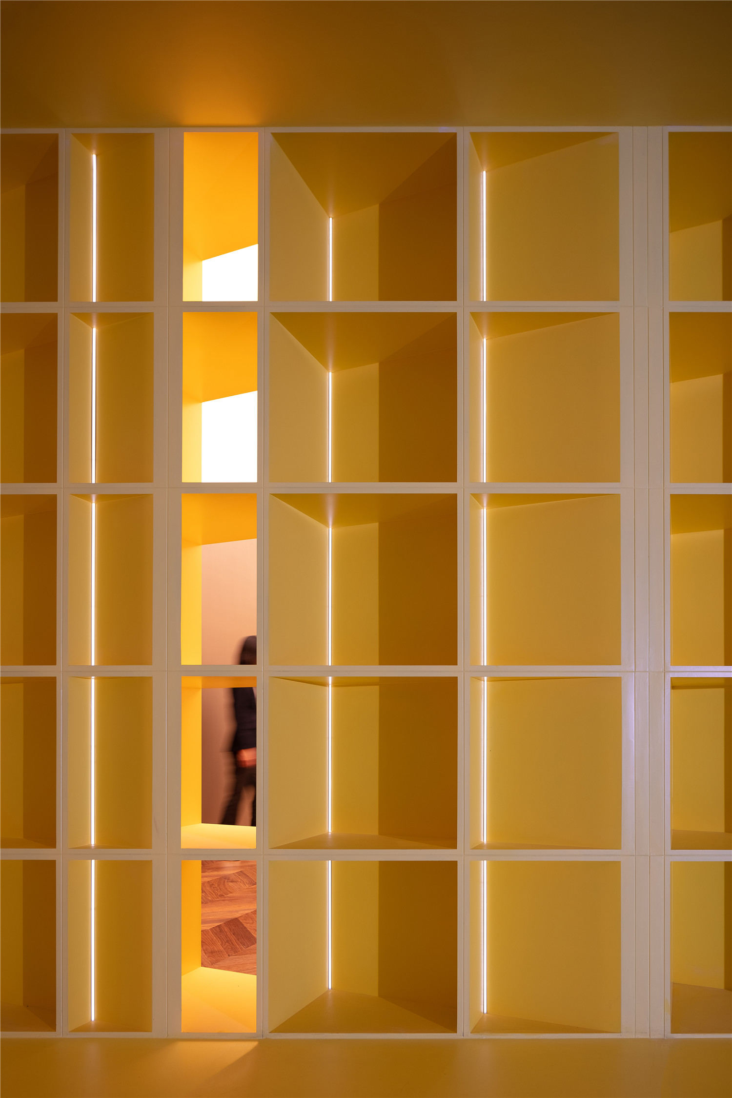
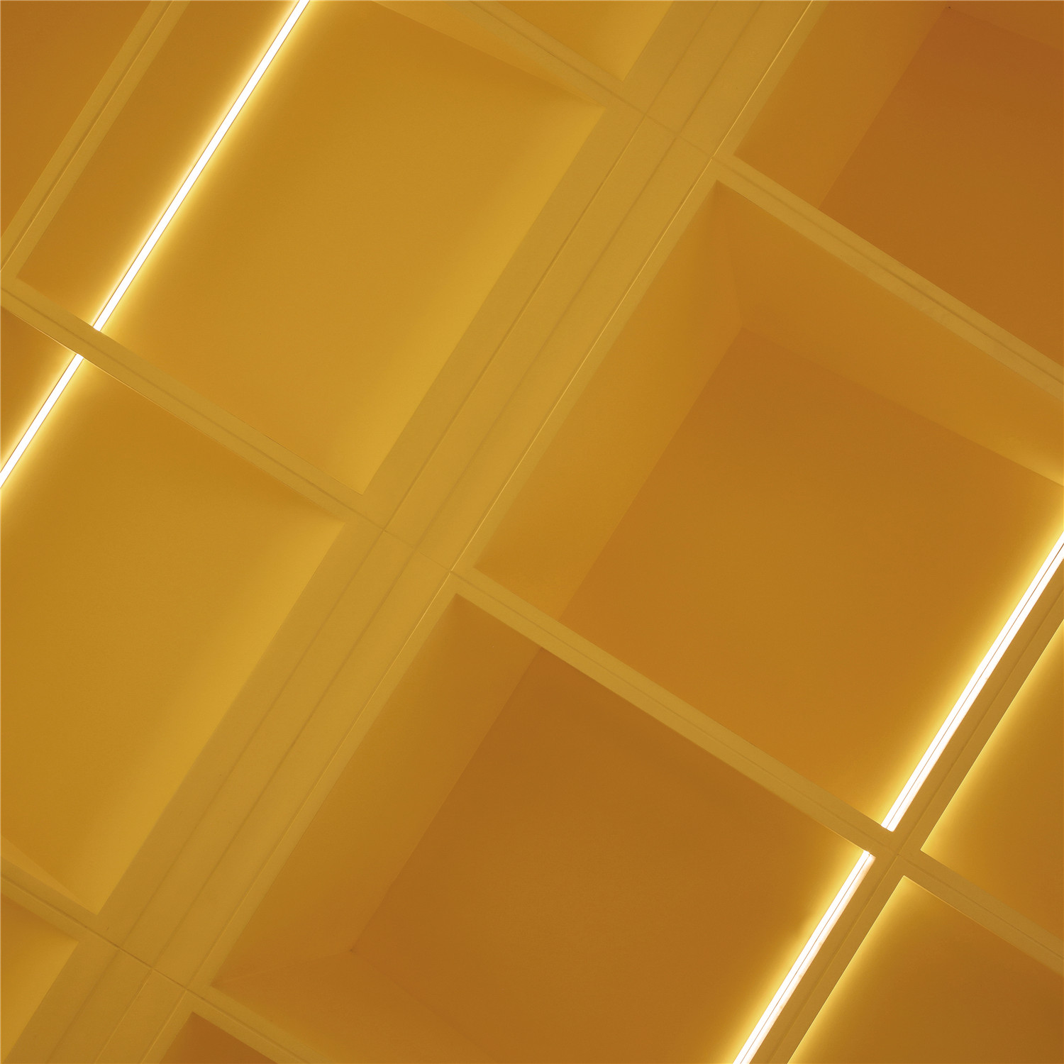
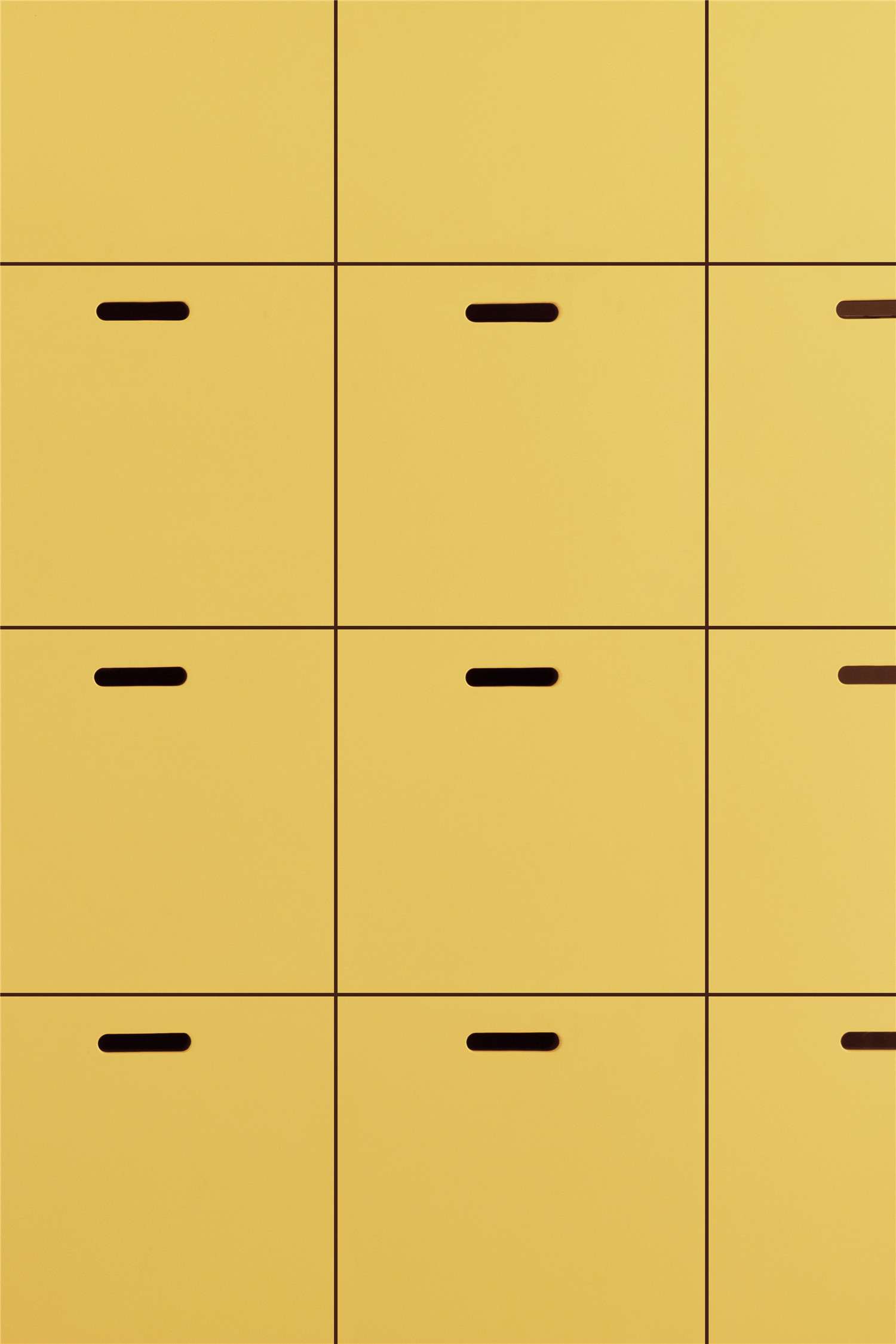
光是点燃空间的灵魂,光是灵动多变的魔法,一整面大方格盒,被光的照射角度切割成大小不一的小格。营造出明暗层次、虚实对比的视觉感,在丰富空间语境的同时,更清晰勾画和聚焦出主体的轮廓。
Light ignites space with magic. A wall with the outline of a large square is divided into grids of different sizes by the angle of light rays. It creates a visual sense of light and dark, virtual and real, while at the same time enriching the space and clarifying the theme.
空间的双重功能属性,在创意之初便埋下了伏笔。多功能活动区是日常展示的主力,也是临时起意的创意活动仪式感。营销与社交功能的并行,在这一空间和谐共处。
The dual functional attributes of the space are merely strokes from the paint brush of creativityn serving both marketing and social functions.
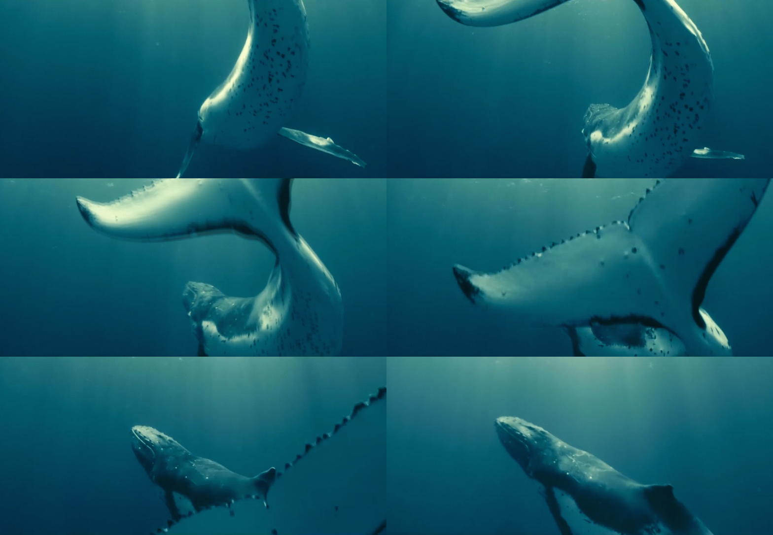
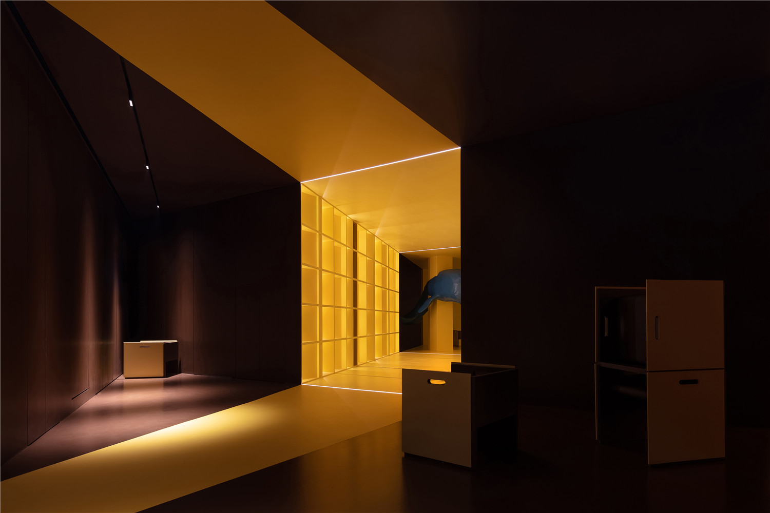
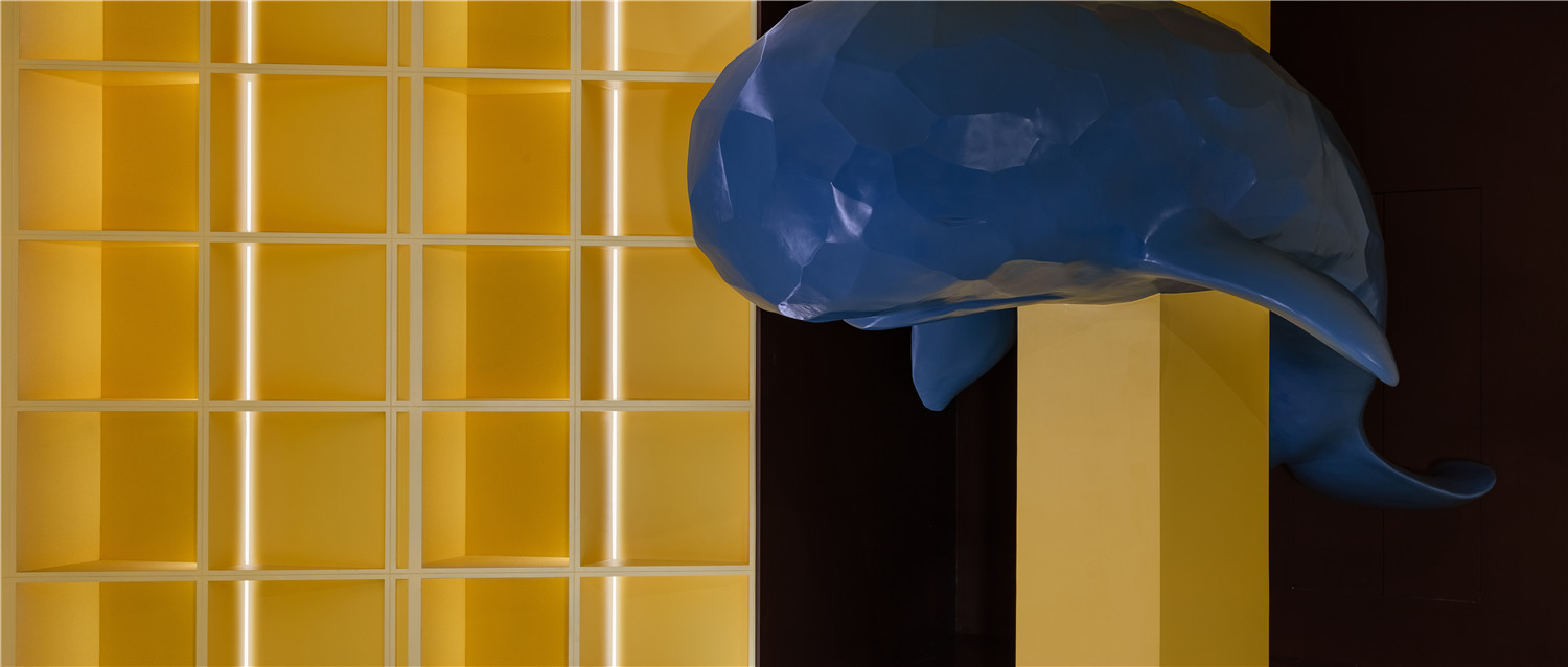
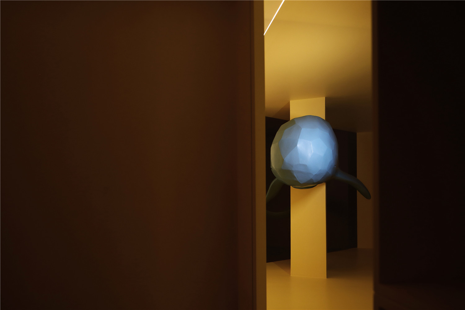
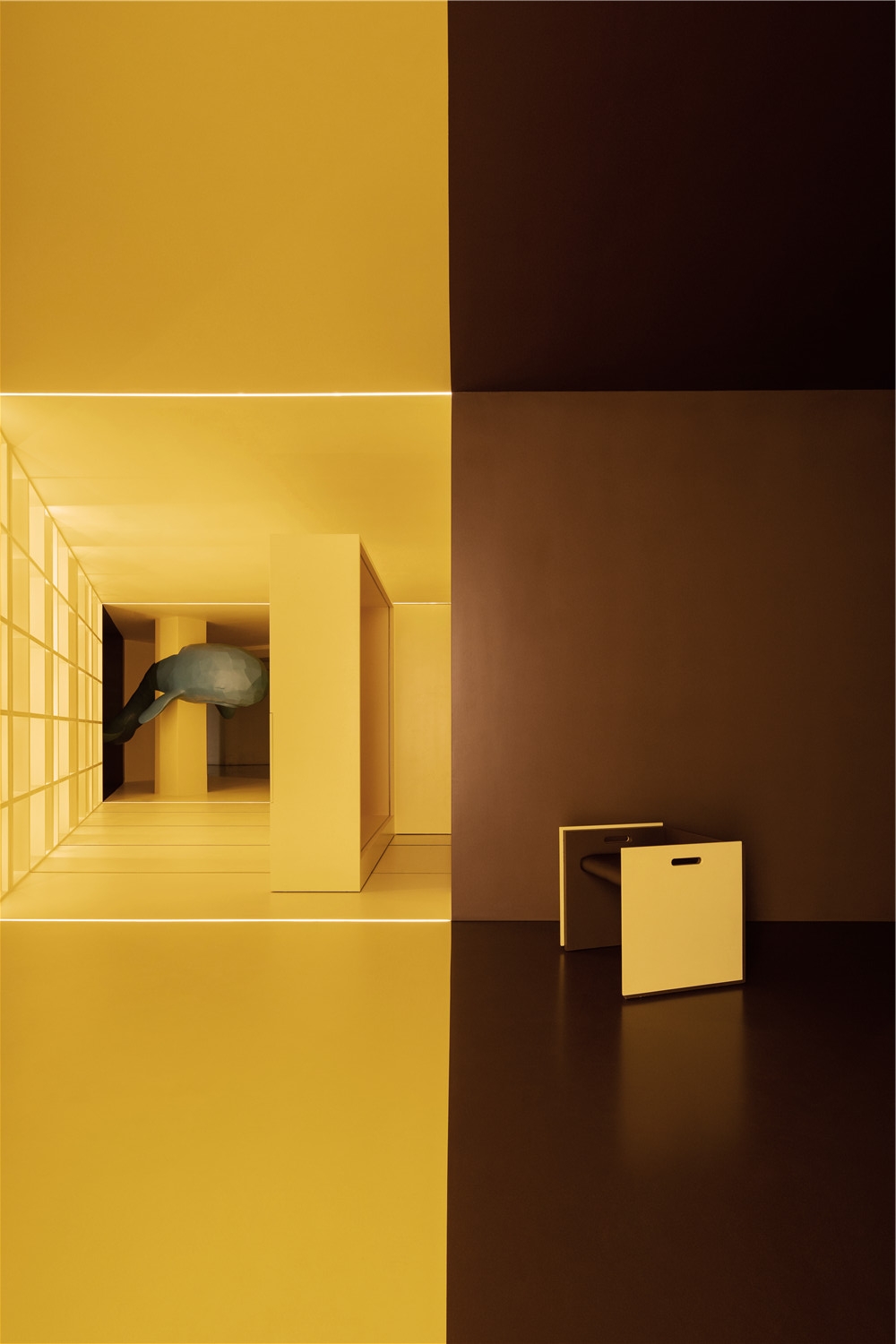
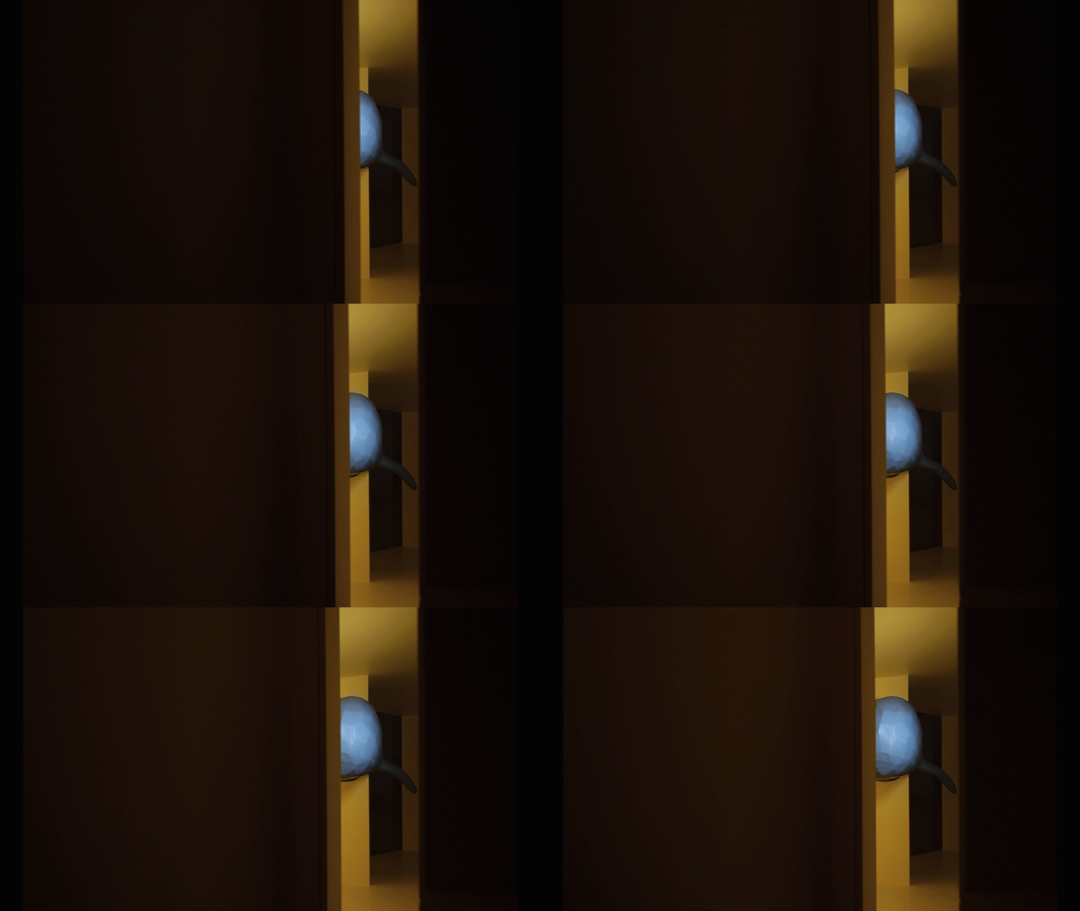
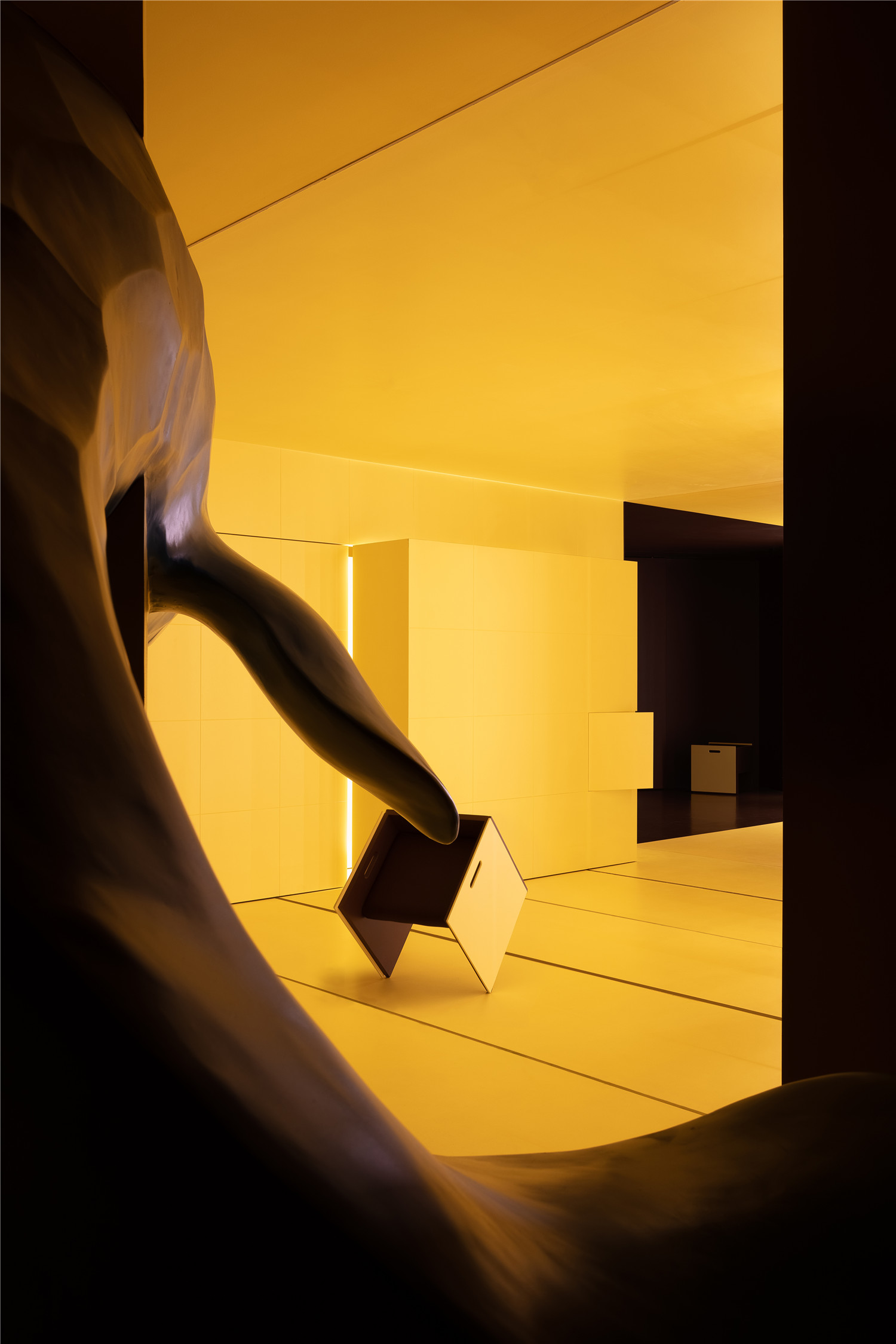
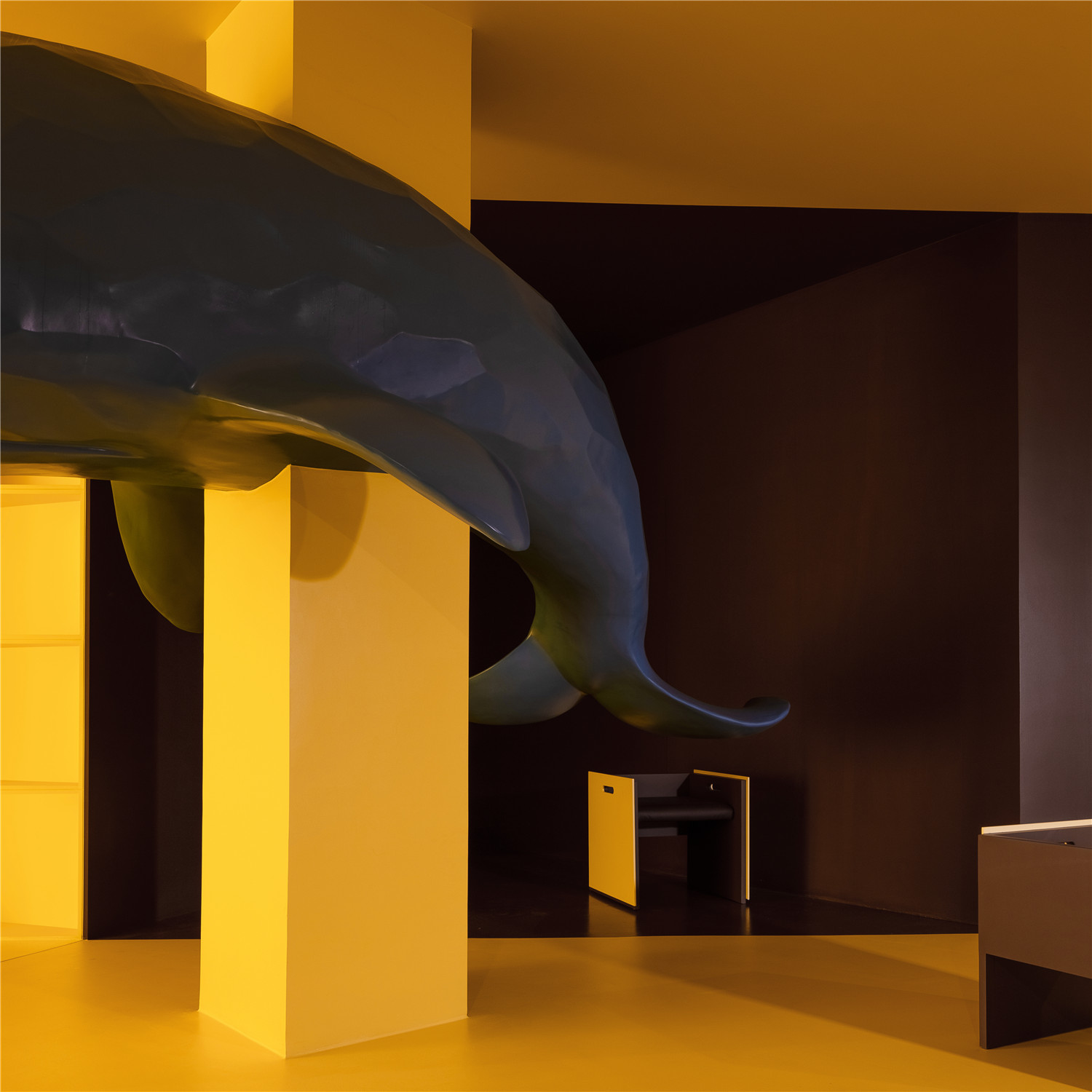
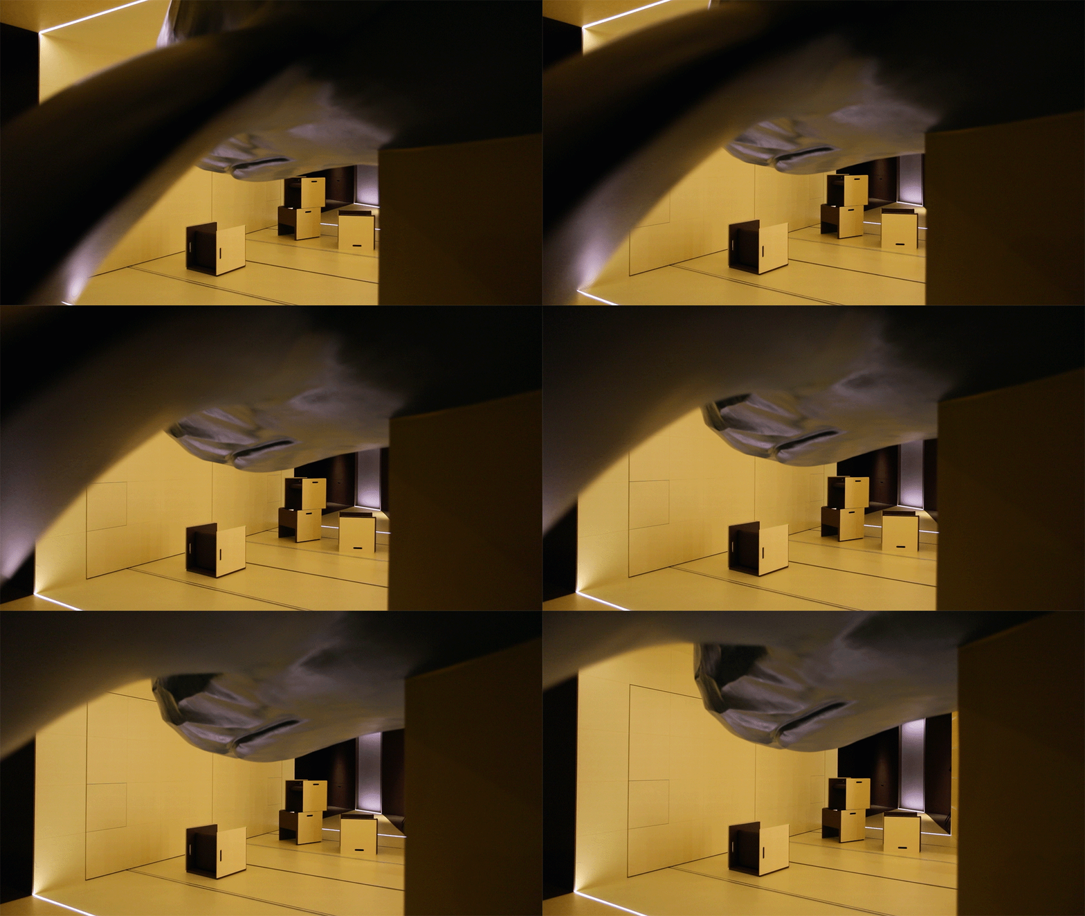
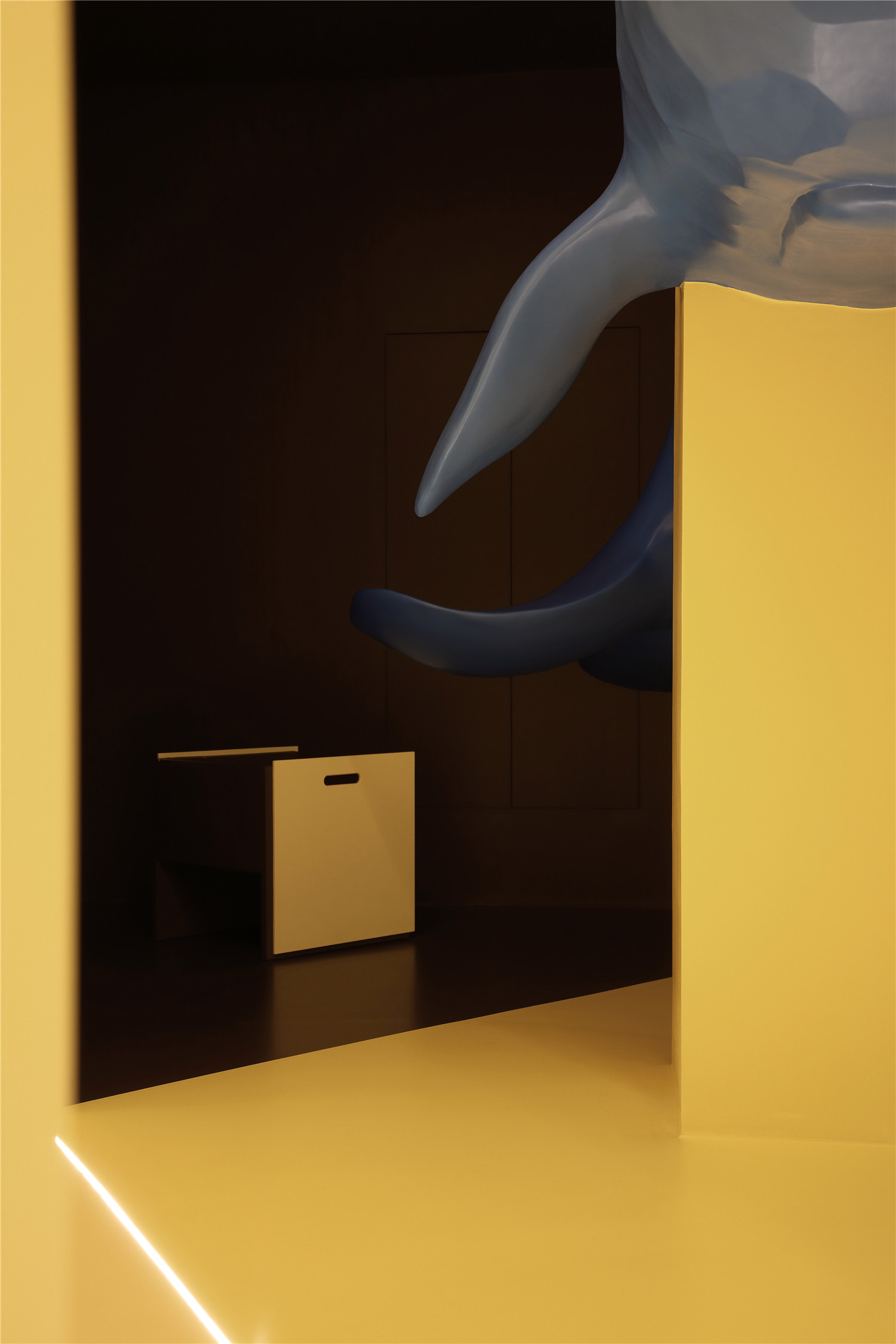
天光引入、扩散,切割着空间,幻化着视界。沿着黄色扩散的方向,一头蓝色鲸鱼迎面游来,与窗户的光产生了互动,也让空间的立体关系变得微妙。
The light fills the room, creating illuminous divisions, in which the blue whale suspended from the column swims through the light rays as if in the deep blue ocean.
海蓝时见鲸,蓝色光影是海的秘密,牵引出流动的漂浮,是天地呼应亮黄色中的一抹点睛。
Deep in the blue ocean, where the whale lives and swims amidst the secret of the sea—the light rays that guide the flow of the current and create a golden canopy of light.
整体的门面形象是一个有故事性的画面,蒙太奇的表达形式,光影的随型移动,栩栩如生的空间对话,犹如一部裸眼3D电影,讲述着这个关于光与梦想的故事。
The Doorway is like a scene from a movie, a montage. The shadows dance amidst the room as if they are communicating with the space, like a movie in 3D; the story is about the light and the pursuit of dreams.
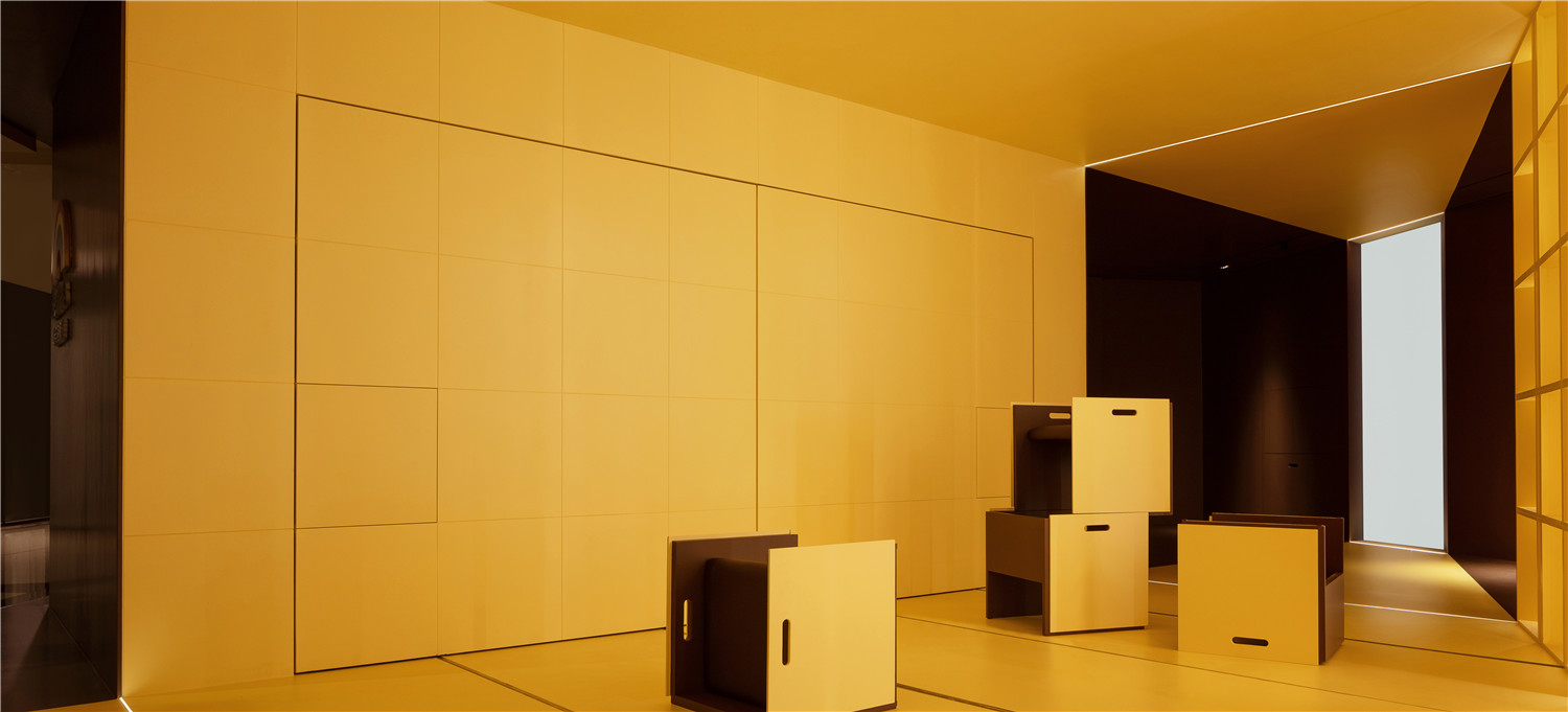
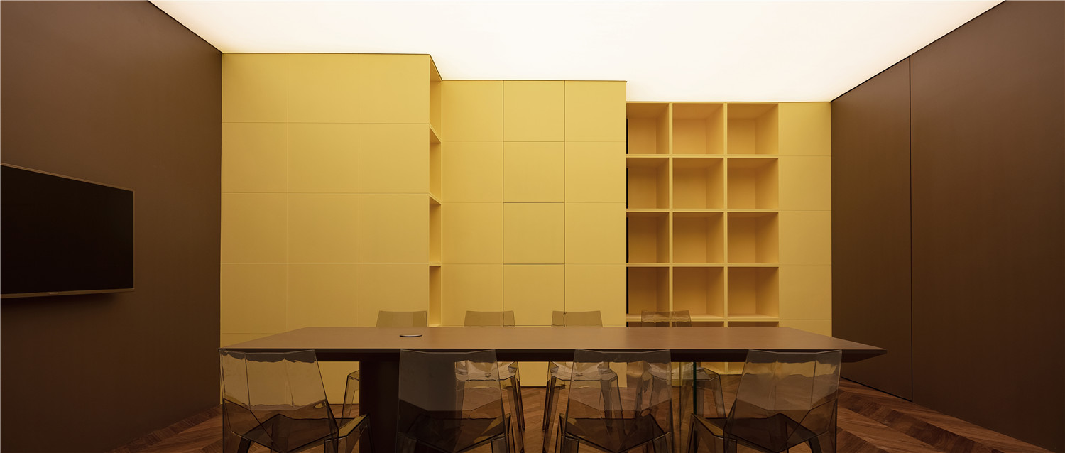
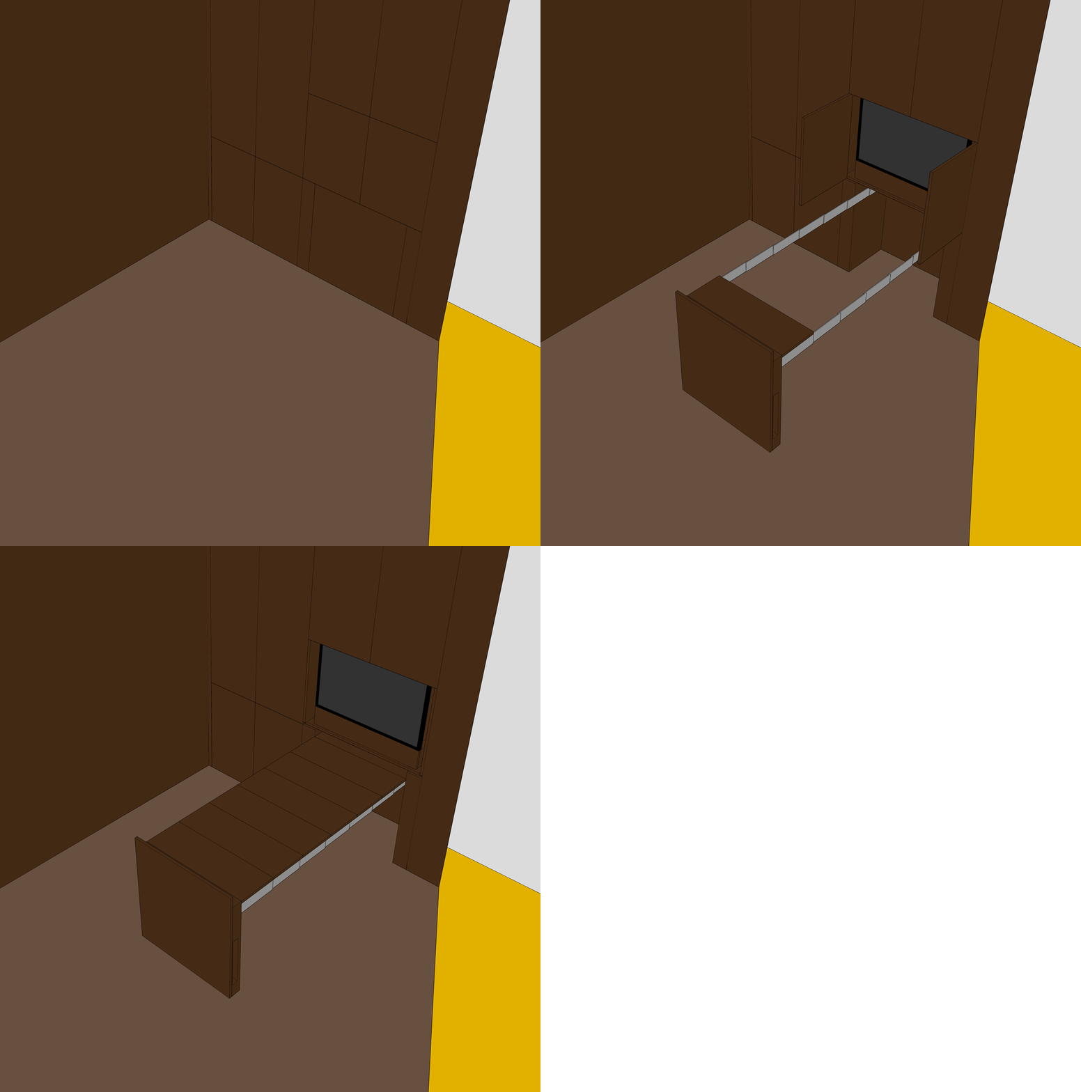
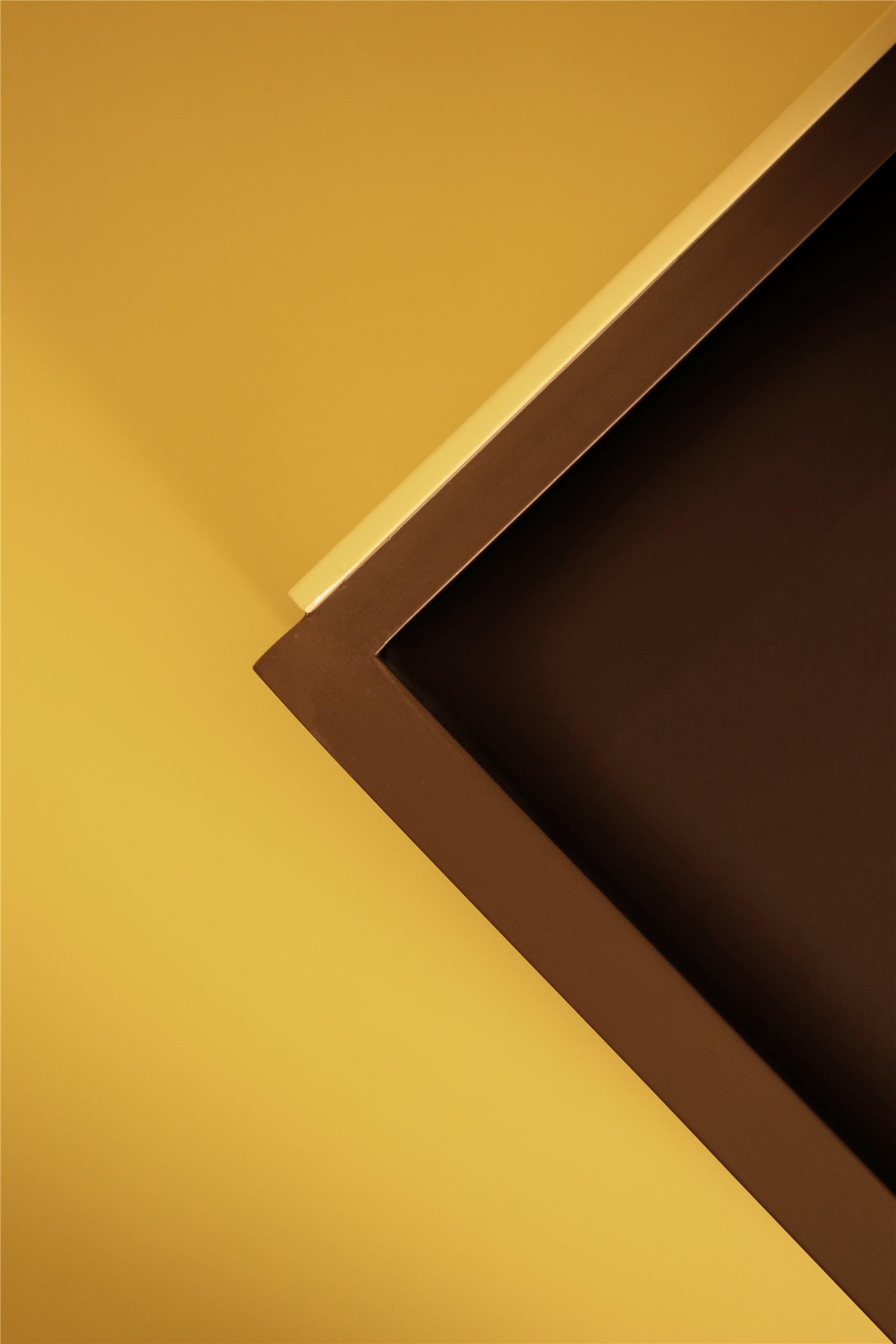
隐藏在深咖啡色墙面工法柜,用于展示产品的实际应用;直面入口的墙柜内则隐藏了一个洽谈区,电视、洽谈桌椅是结合产品功能应用的产物,既是用品,也是产品,让用户拥有更直接的体验感。
Directly behind the shelves is a discussion area, complete with a television, tables and chairs. The furniture has dual use as both a product and utility providing the user with a sense of connection.
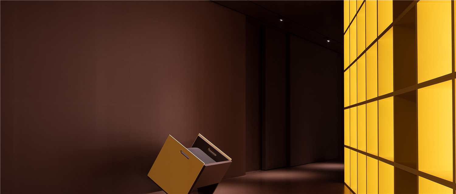
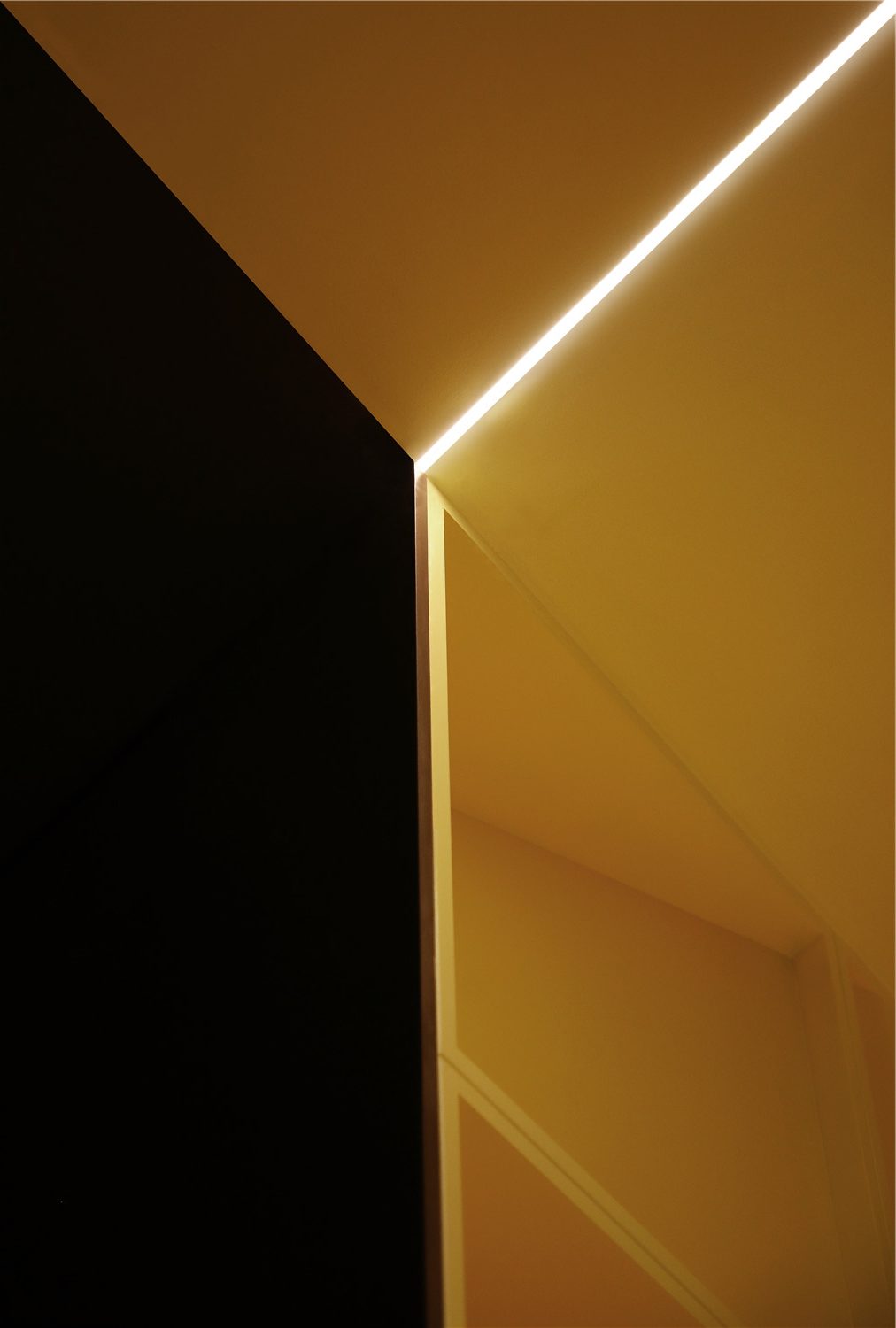
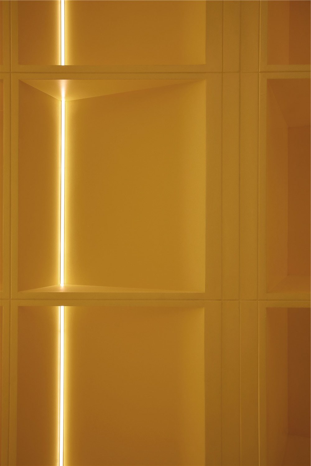
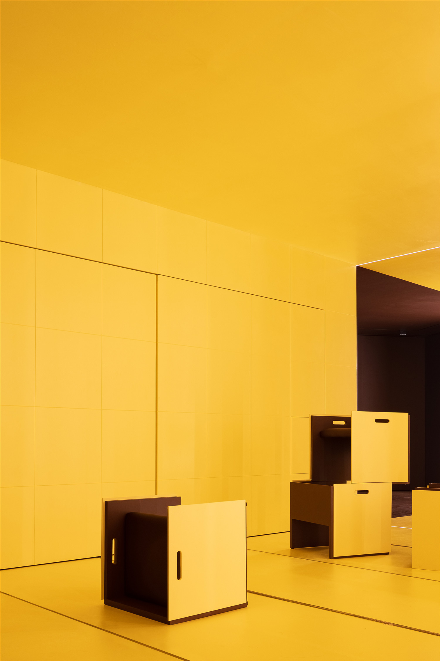
一切回归于简洁,让位于空间中最实质内容的凸显。源自巧克力的方格展示柜首夺眼球,四周运用了可调灯光,勾勒了展示柜的形状,迅速让产品成为焦点。
The protrusion of the shapes is a simple but pivotal design. The Chocolate shelf display catches the eyes, as the light outlines and emphasizes the products on display.
基于功能的体验,每一处都暗藏巧思。
Upon entering the room, it becomes obvious that each corner was thoughtfully designed.
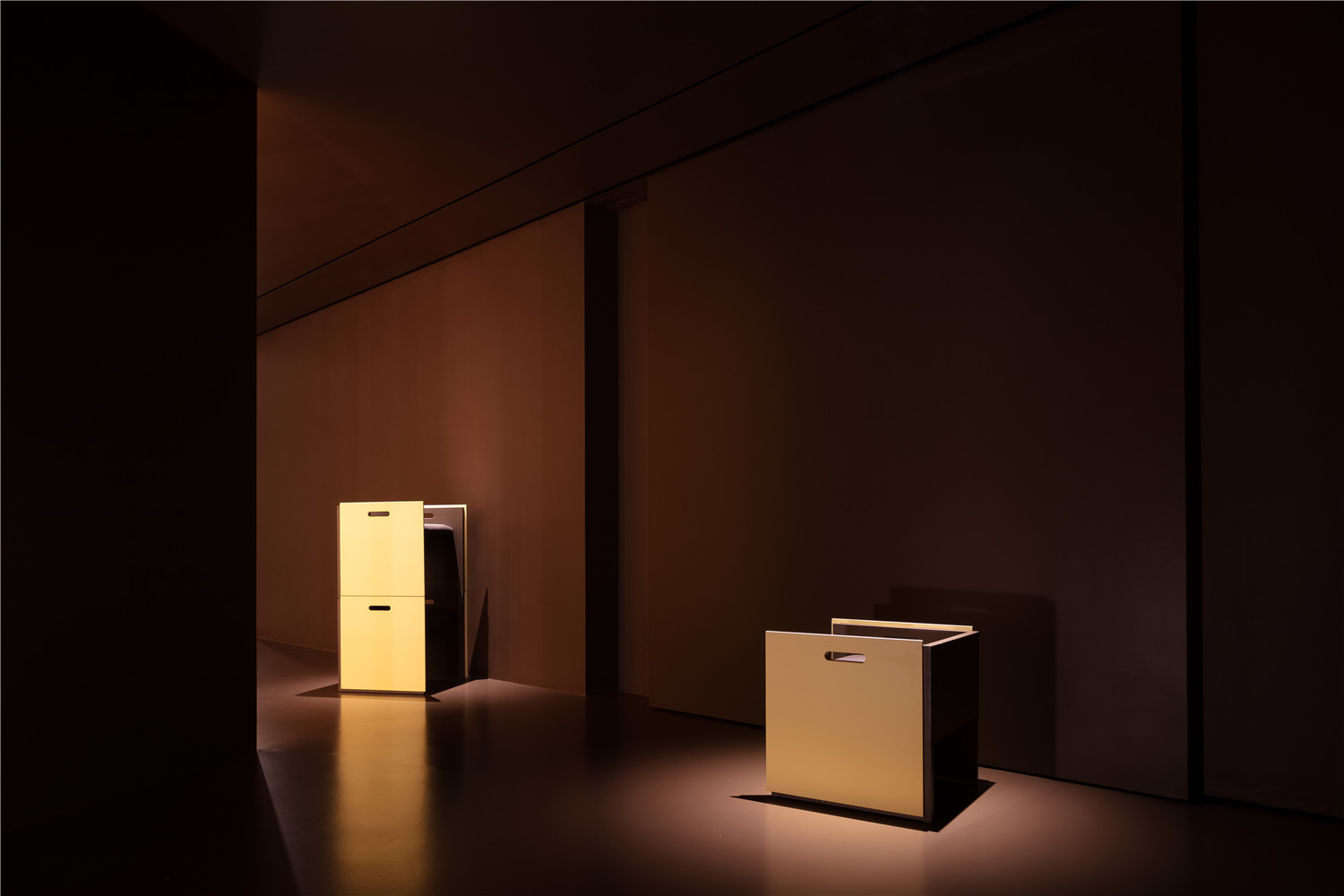
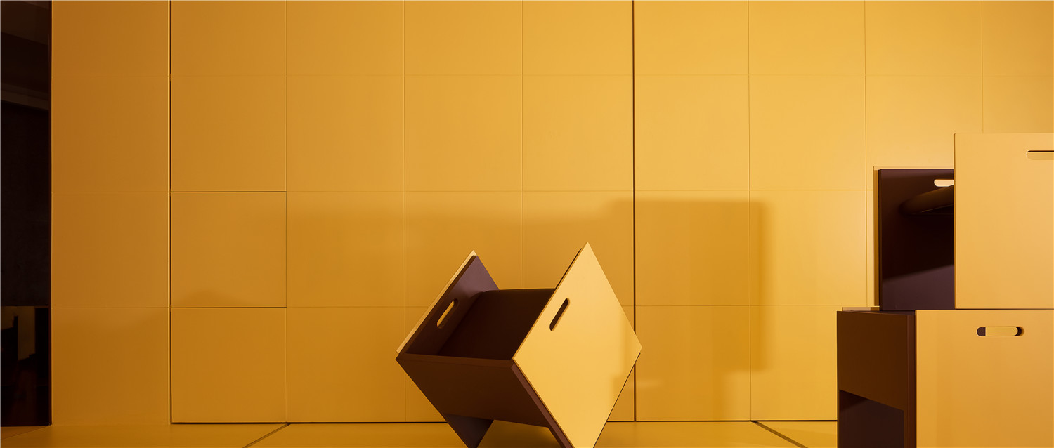
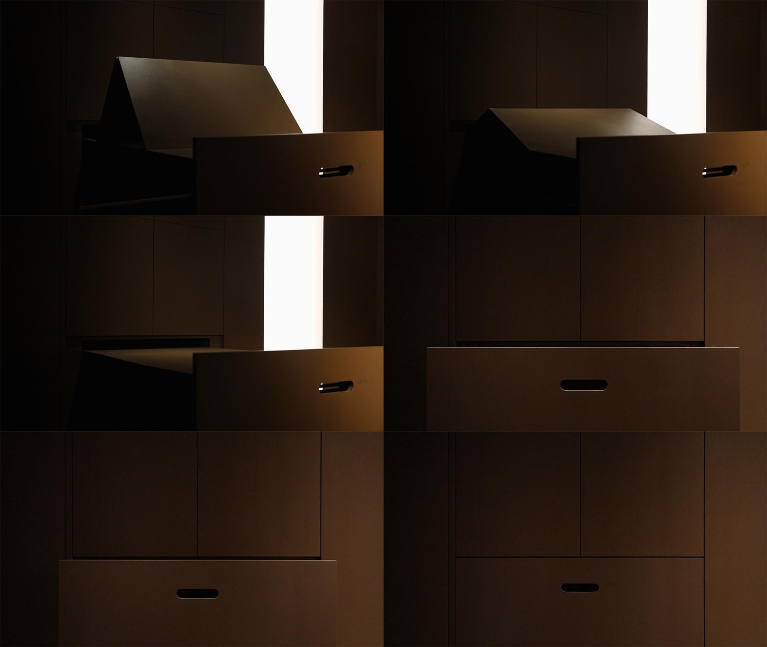
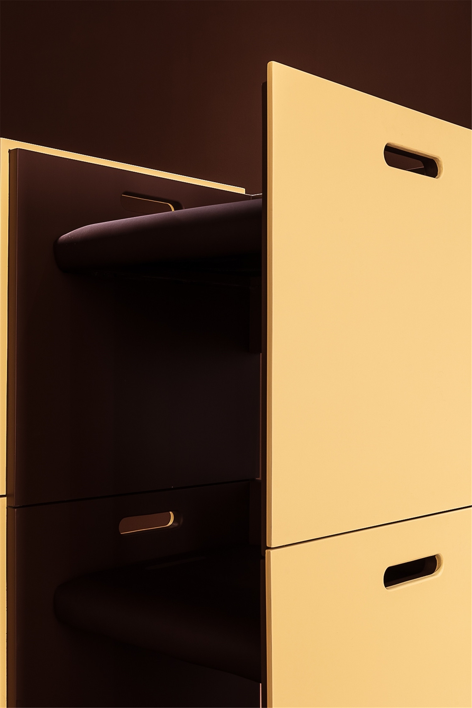
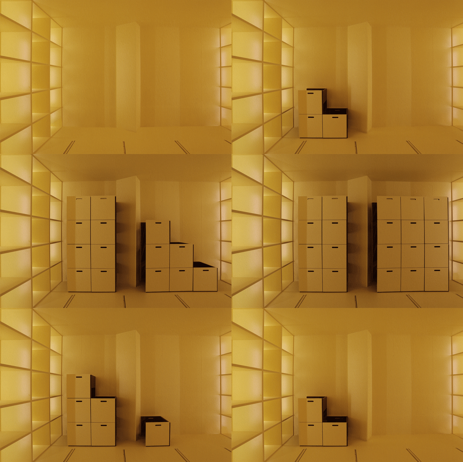
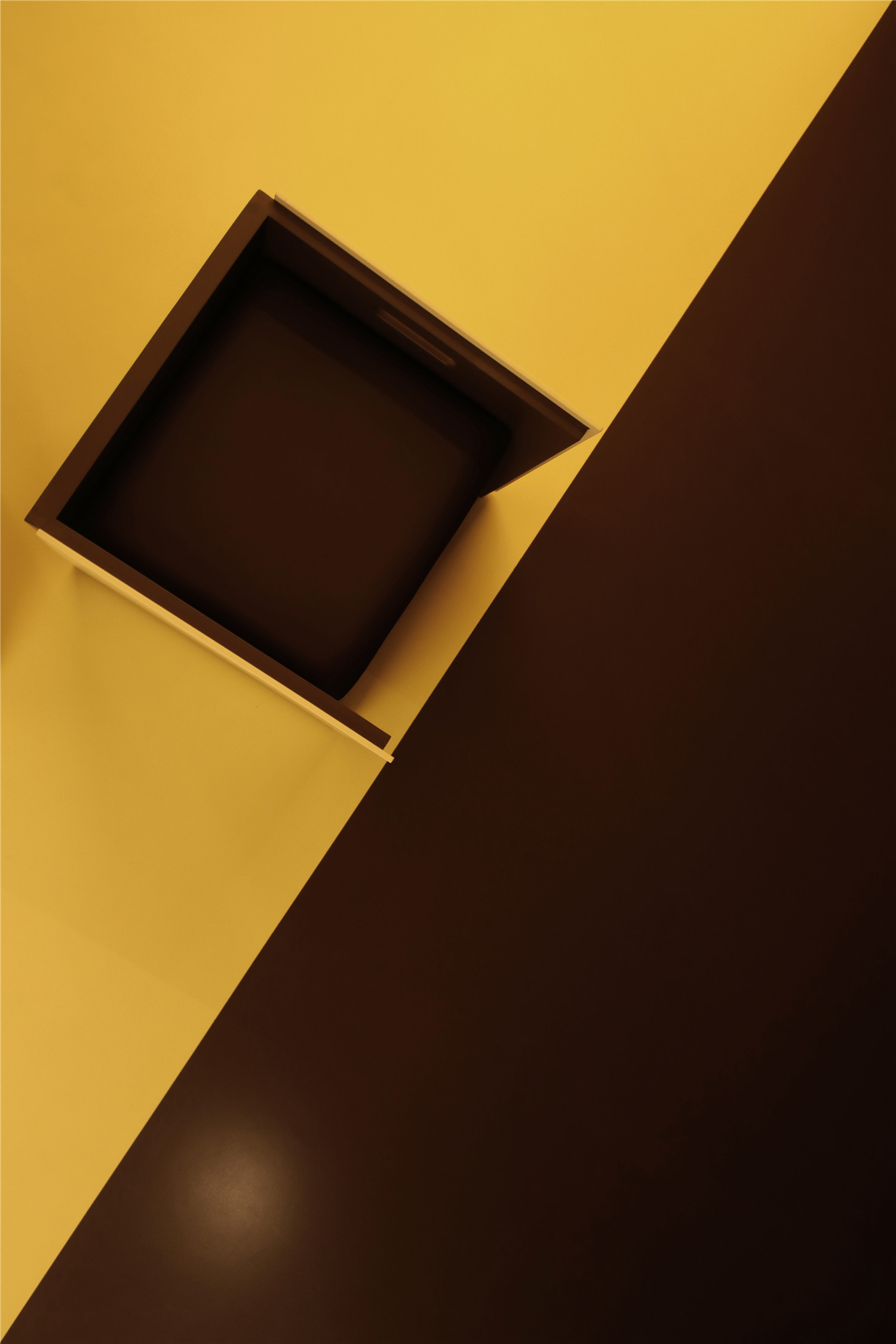
在平滑墙面的另一侧,隐藏着六个推拉展示柜和分享会使用的凳子,展现了强大的收纳和展示功能。凳子融合了产品、功能、美学艺术为一体的产物,看上去就像以直觉和想象力水到渠成的抽象派艺术,是这个空间不可或缺的移动元素。
The side of a smooth wall is made of six sliding shelves for storage(the shelves slide in and out like drawers) and has dozens of conference stools hidden within. The stools are a combination of product and art, a movable, yet essential part of the whole room, representing the duality of practicality and product genius.
从而,两墙之间根据使用场景灵活切换前一刻是产品展示厅,下一刻则变成小型的展示洽谈会。
Therefore, the space in between the sliding shelvess and the grid wall can readily be converted to an exhibition hall or a sharing meeting room.
与多功能厅相邻的柜子内,预留出一排像鲸鱼的透气孔,增加了空间的趣味性和对话性,也让空间更通透,空气更流动。
The shelves adjacent to the multifunction room have a row of openings that resemble a whale’s blow hole, making the space appear more fluid and allowing air flow through the room.
项目信息——
项目名称:比直涂装公司 /进口涂料艺术空间
项目地址:福建龙岩
设计主创:张建武
设计团队:物上空间
软装团队:物色软装
施工单位:福建比直建筑涂装有限公司
项目面积:245㎡
主要材料:多层实木地板、瑞典蓓柯漆、进口地坪漆
灯光设计:赖章灿
空间摄影:徐义稳 / 阿奇
Project information——
Project Name:Bizhi Paint Decoration Co., Ltd. / Imported Paint Art Space
Project Address:Longyan Fujian
Design Master:Jianwu Zhang
Design Team:WUSUN SPACE
Soft Loading team:WUSOO SOFT
Construction Unit :Fujian Bizhi?Architectural Paint Decoration Co., Ltd.
Project Area:245㎡
Main Materials:?Multi-layer solid woodfloor,?Beckers paint of?Sweden,?Imported floor paint
Lighting Designer:Sam Lai
Space Photography:Yiwen Xu / A Qi


