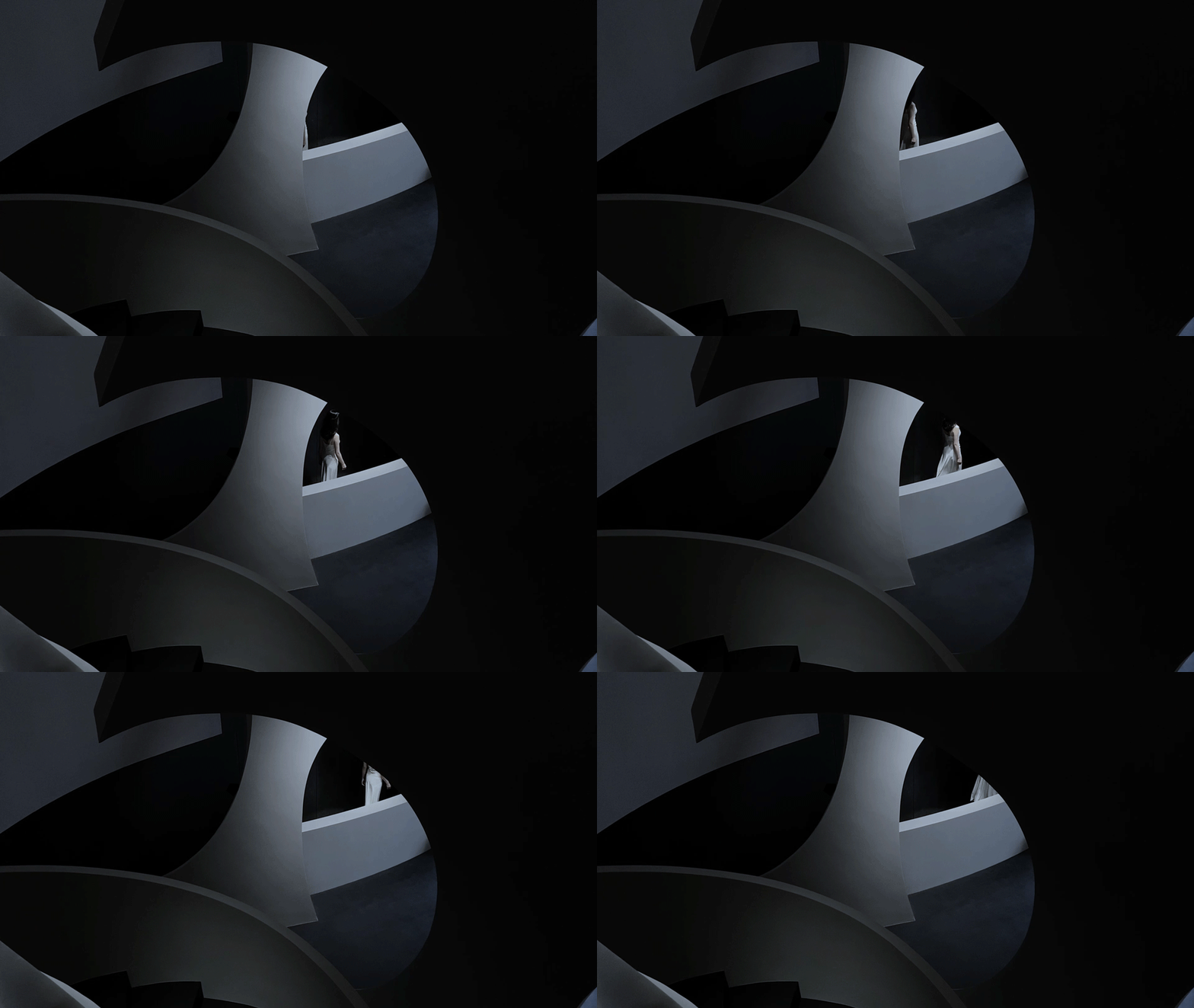
人体的架构犹如一座行走的建筑,而构成生物体的基本单位——细胞,则成为垒筑生命空间的一个个“组件”。
The structure of human body is a moving architecture, while cells – known as the basic units of all organisms, are its building blocks.
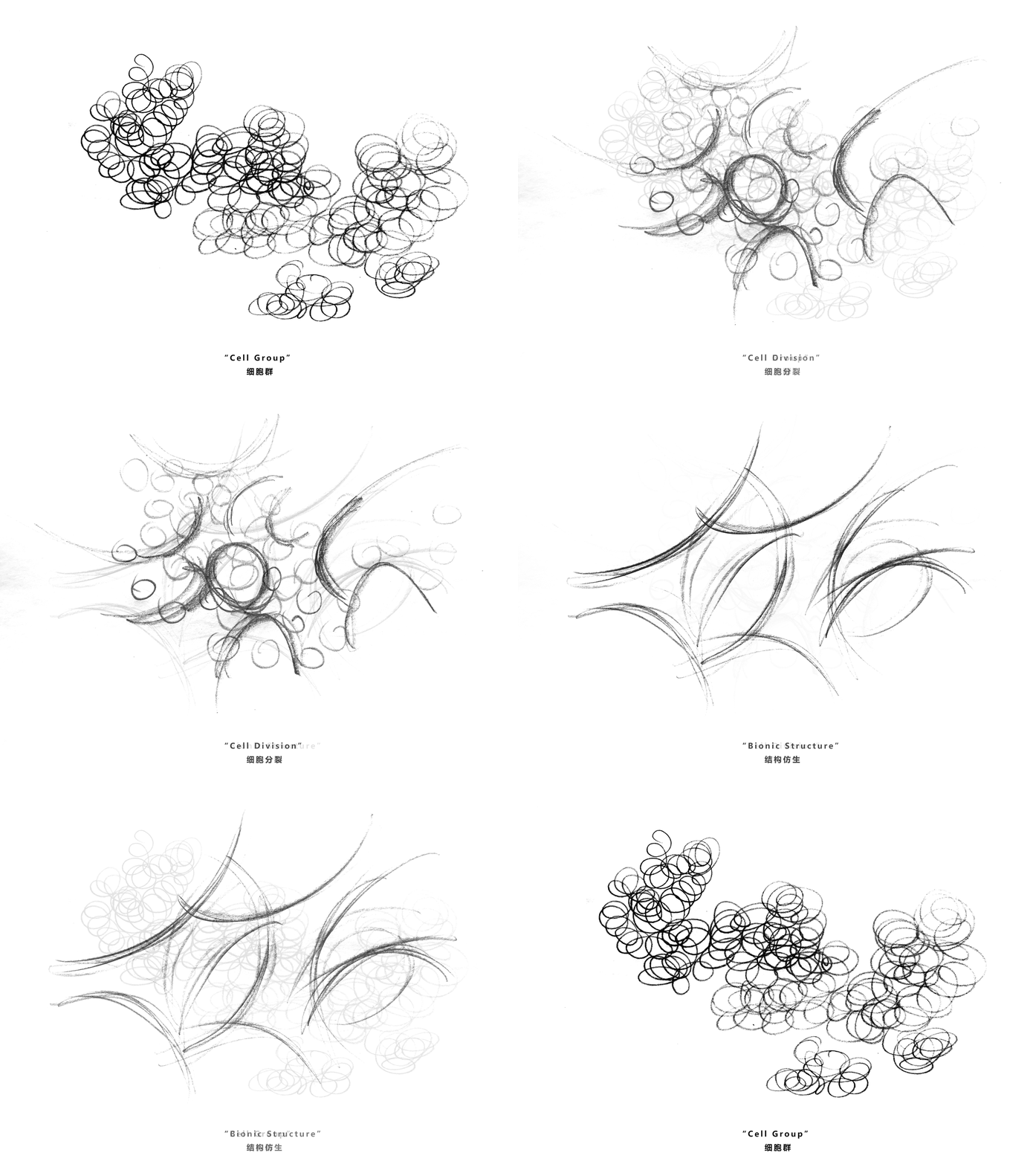
皮肤作为人体最大的器官,是机体与外界之间的天然“界面”,细胞处于不断的死亡中,新细胞则不断分裂为多个细胞,以维持机体健康。这是死亡与新生的必然较量。
As the largest organ of human body, skin is the interface between the physical body and the outside world. Cells are constantly?dying, and new ones are being made simultaneously, to maintain the healthy state of the body. It’s a battle between death and rebirth.
▲细胞分裂
▲构思草图
▲空间演化示意图
概况/记忆 Overview / Memory
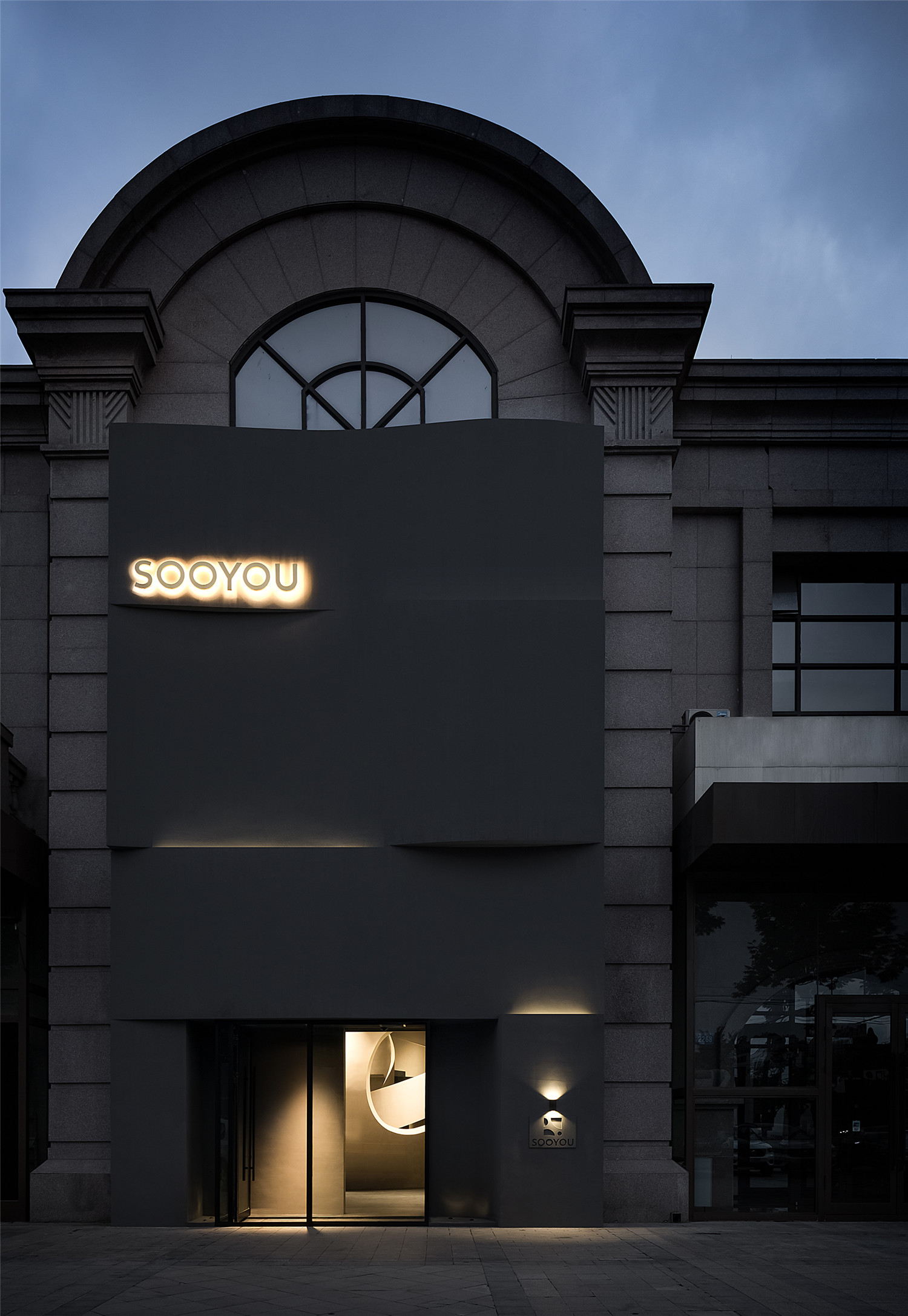
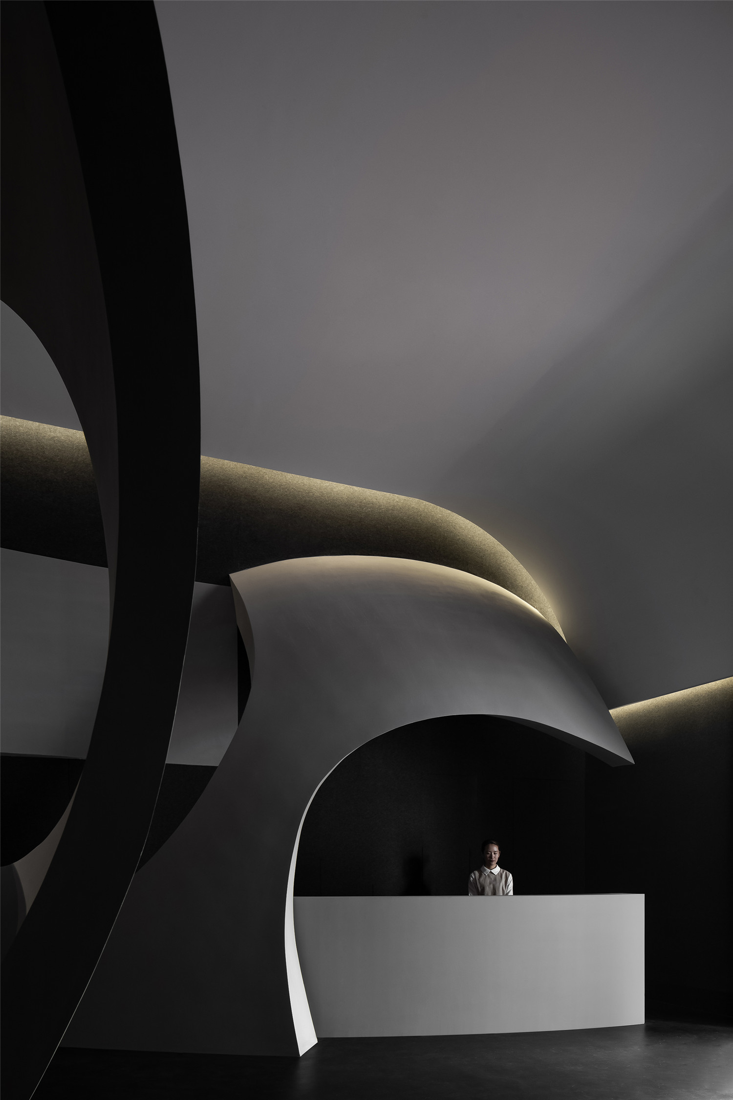
SOOYOU位于哈尔滨群力新区,是一家主要接待女性顾客的美容院。入口的墙体,其微妙的曲面和弧形的建筑本体形成呼应,创造出一种窥视的另类视角,暗示着空间的神秘存在。
Situated at Qunli New District, Harbin, China, the project is a beauty salon that mainly targets female consumers. The entrance wall echoes the arcs of the architecture with its curved shape, creates a unique perspective to look inside, and indicates a sense of mystery in the space.
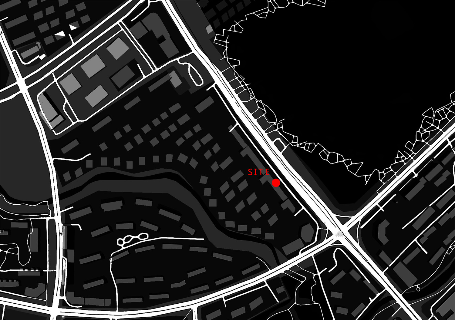
▲地理位置
▲项目外观
▲入口处墙体
AD艾克抽象提炼肌体细胞组织裂变的特性,以基础线条和形态的平面布局,承载细胞组织结构的空间化;以细胞裂变衍生为丰富的动线体验,解决空间的私密性诉求。设计意图唤起人潜层的某些身体记忆。
The design firm AD ARCHITECTURE drew inspiration from the constant fission of cells in human body, and translated it into spatial structures via geometric shapes and basic lines. The “fission” of structures creates rich experiences along the circulations while also providing privacy. The spatial design is aimed at evoking certain underlying body memories of people.
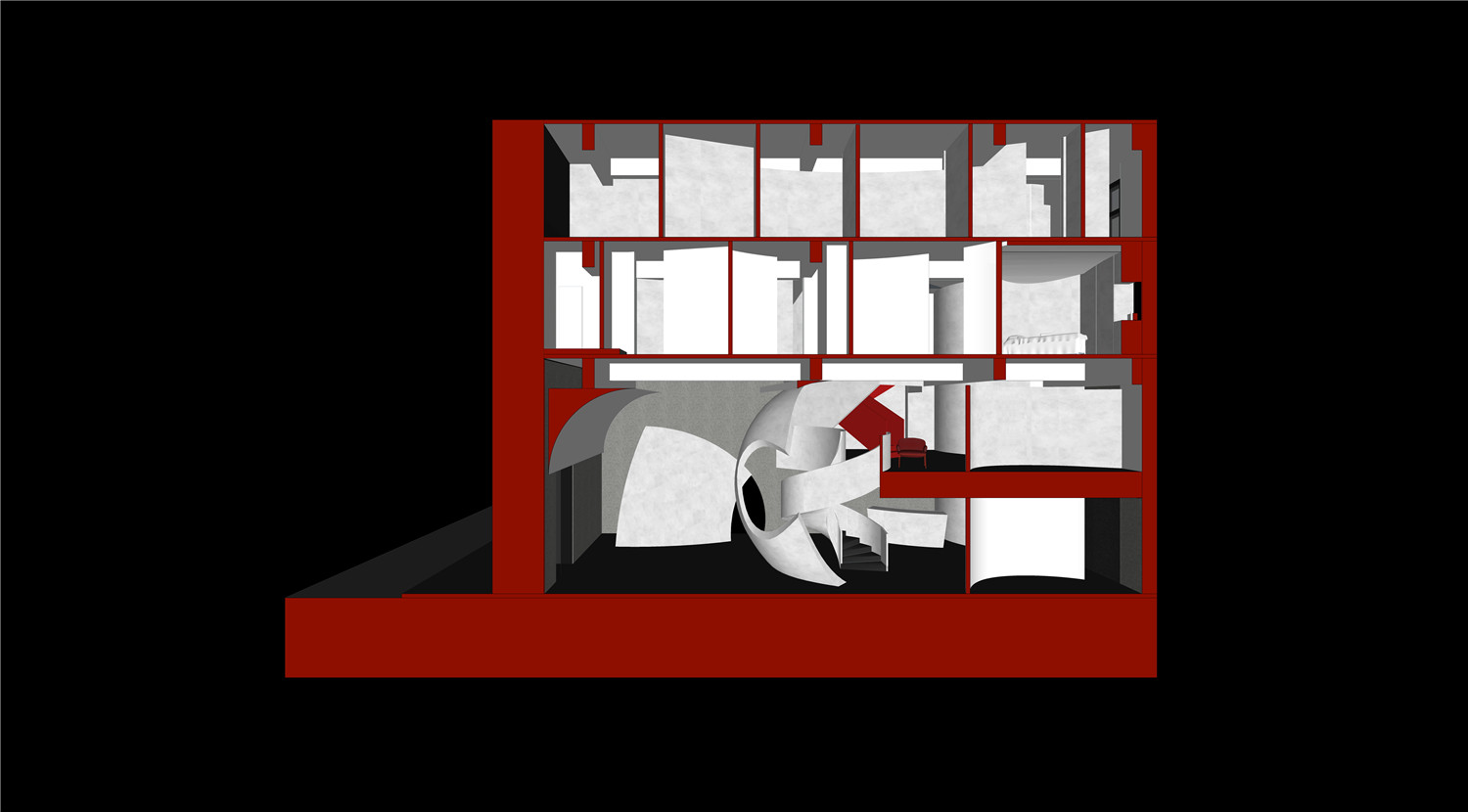
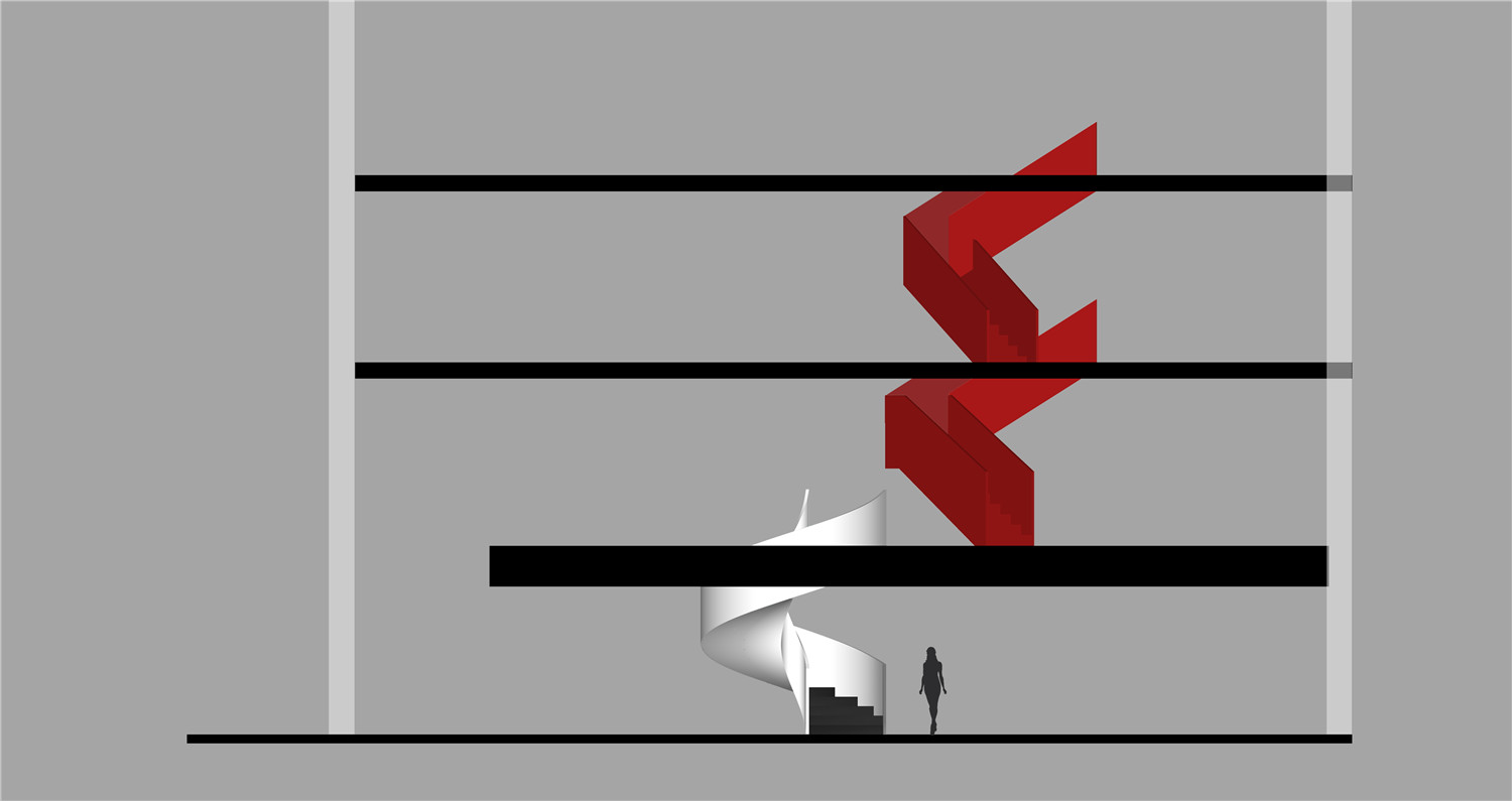
▲剖面图
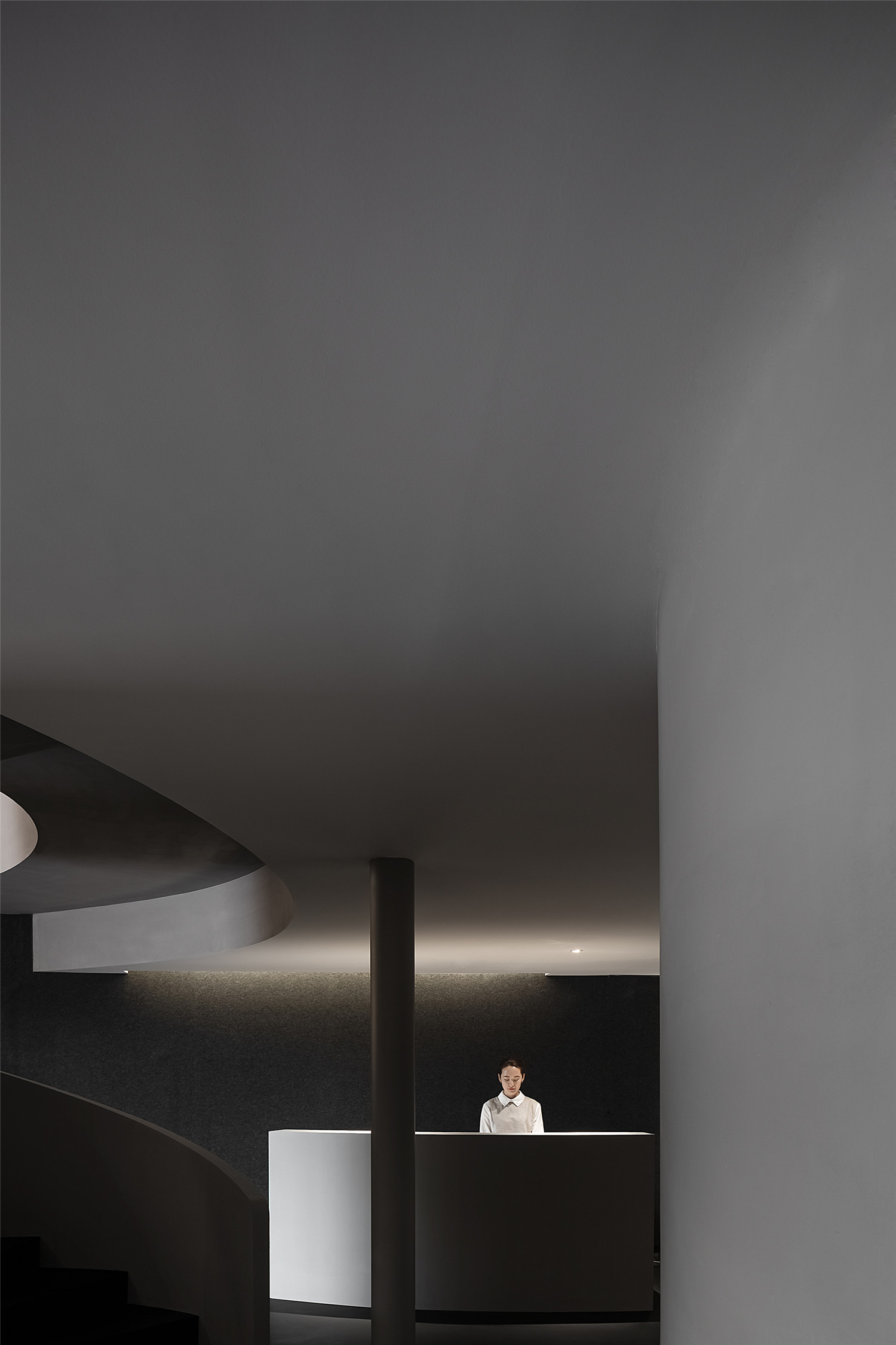
▲接待大厅和楼梯
形态/演变 Form / Evolution
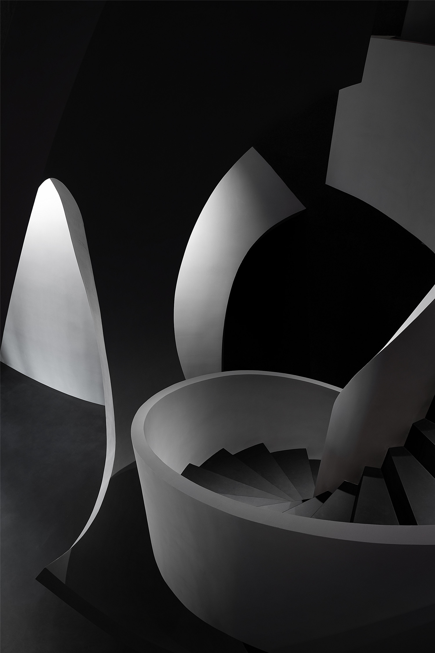
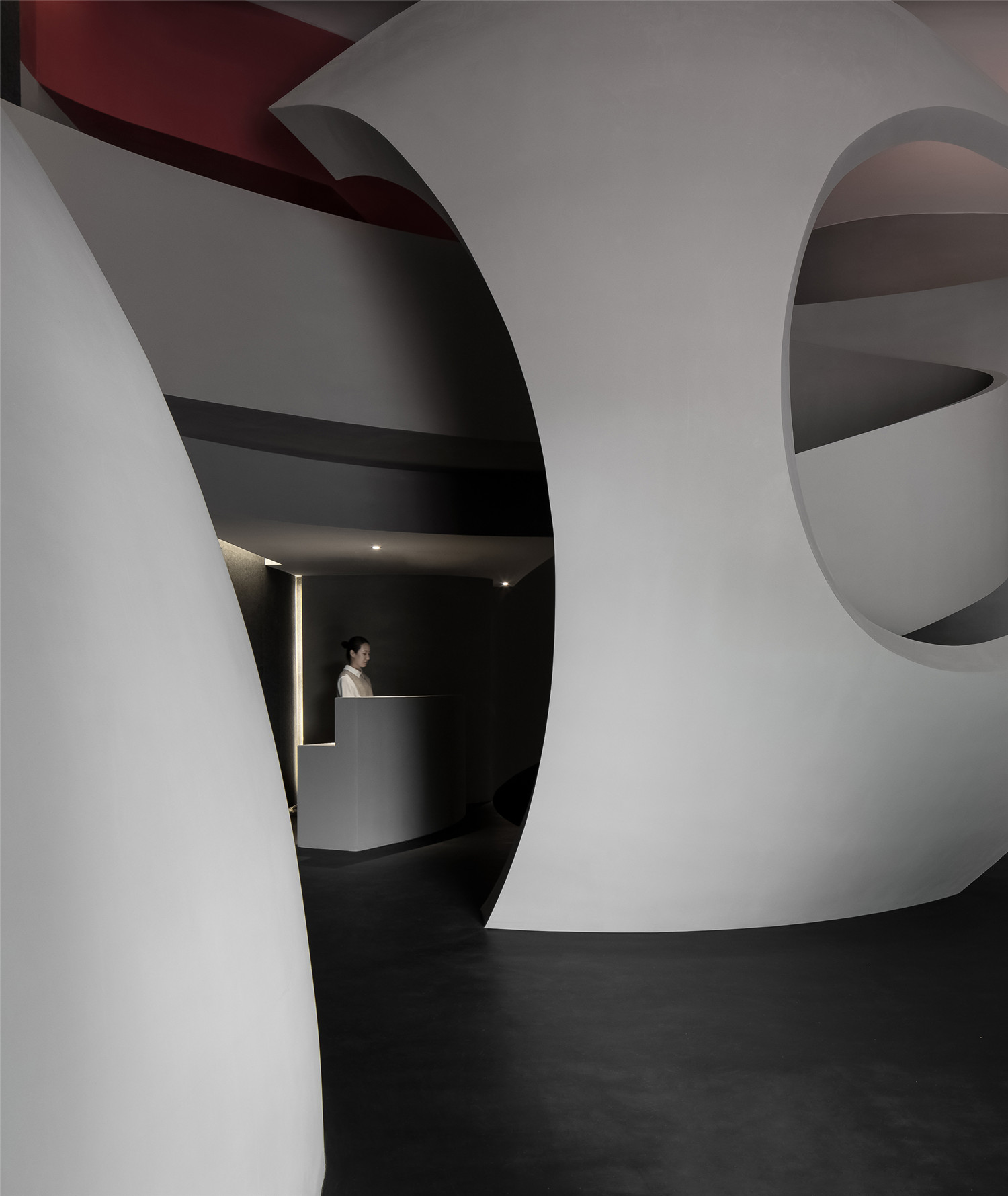
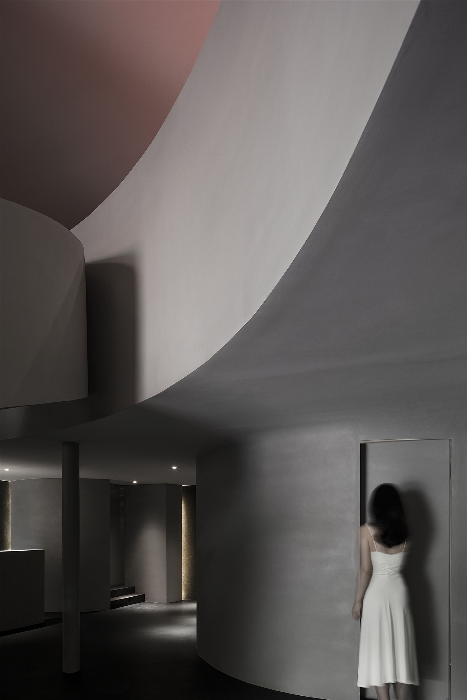
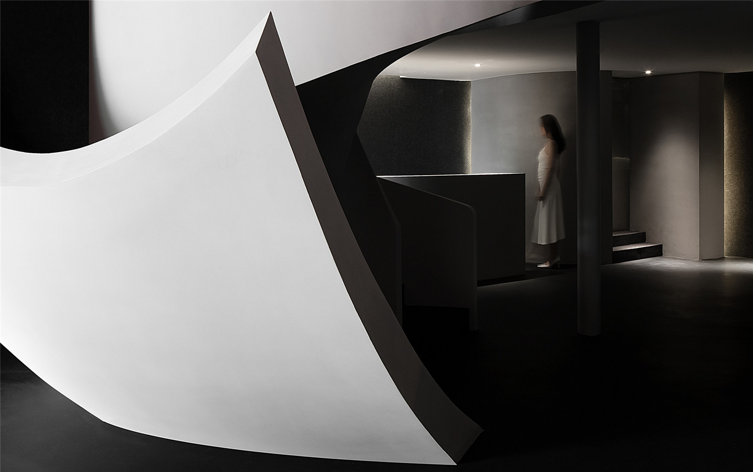
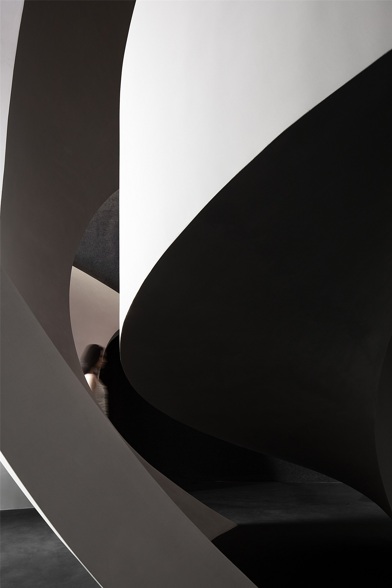
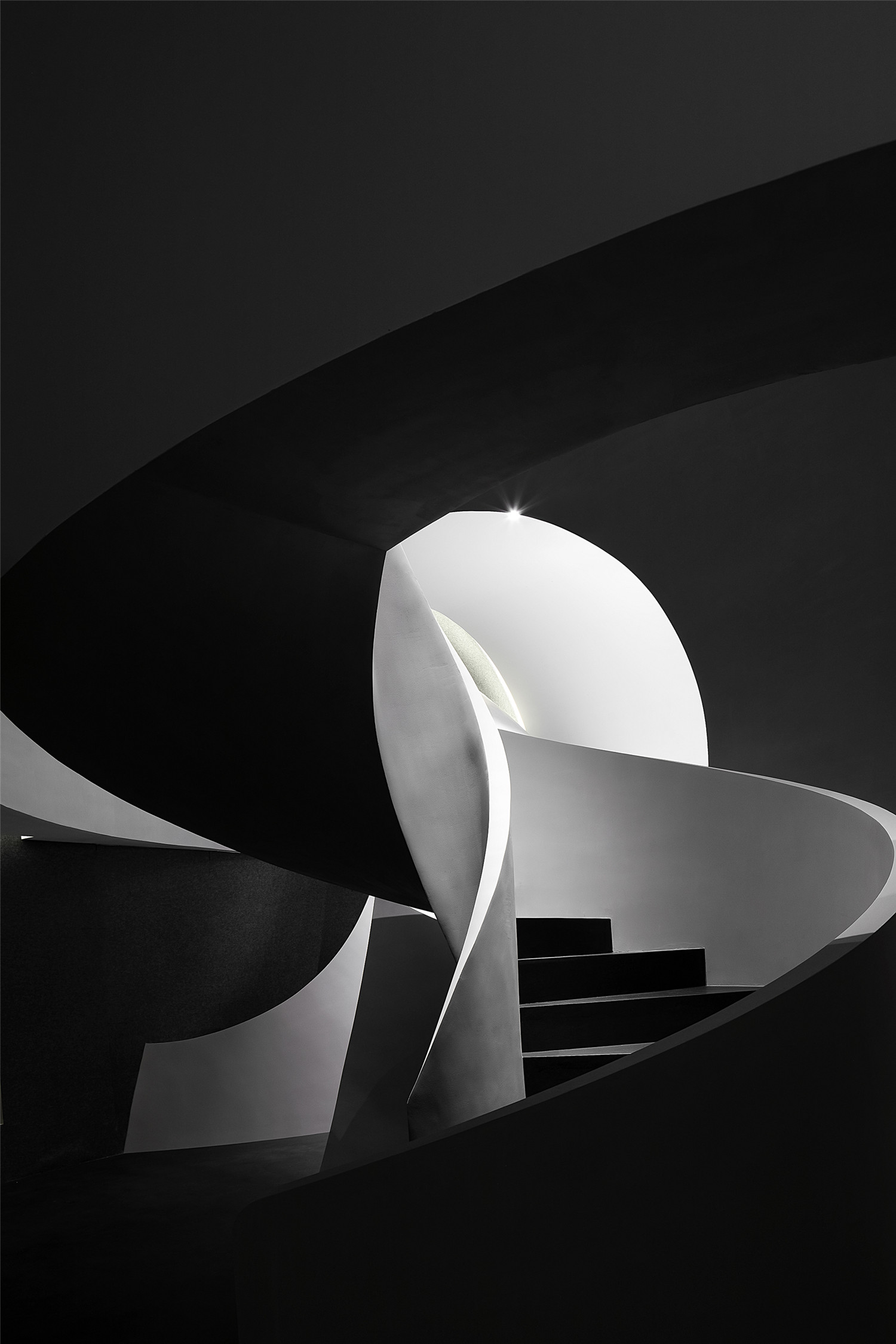
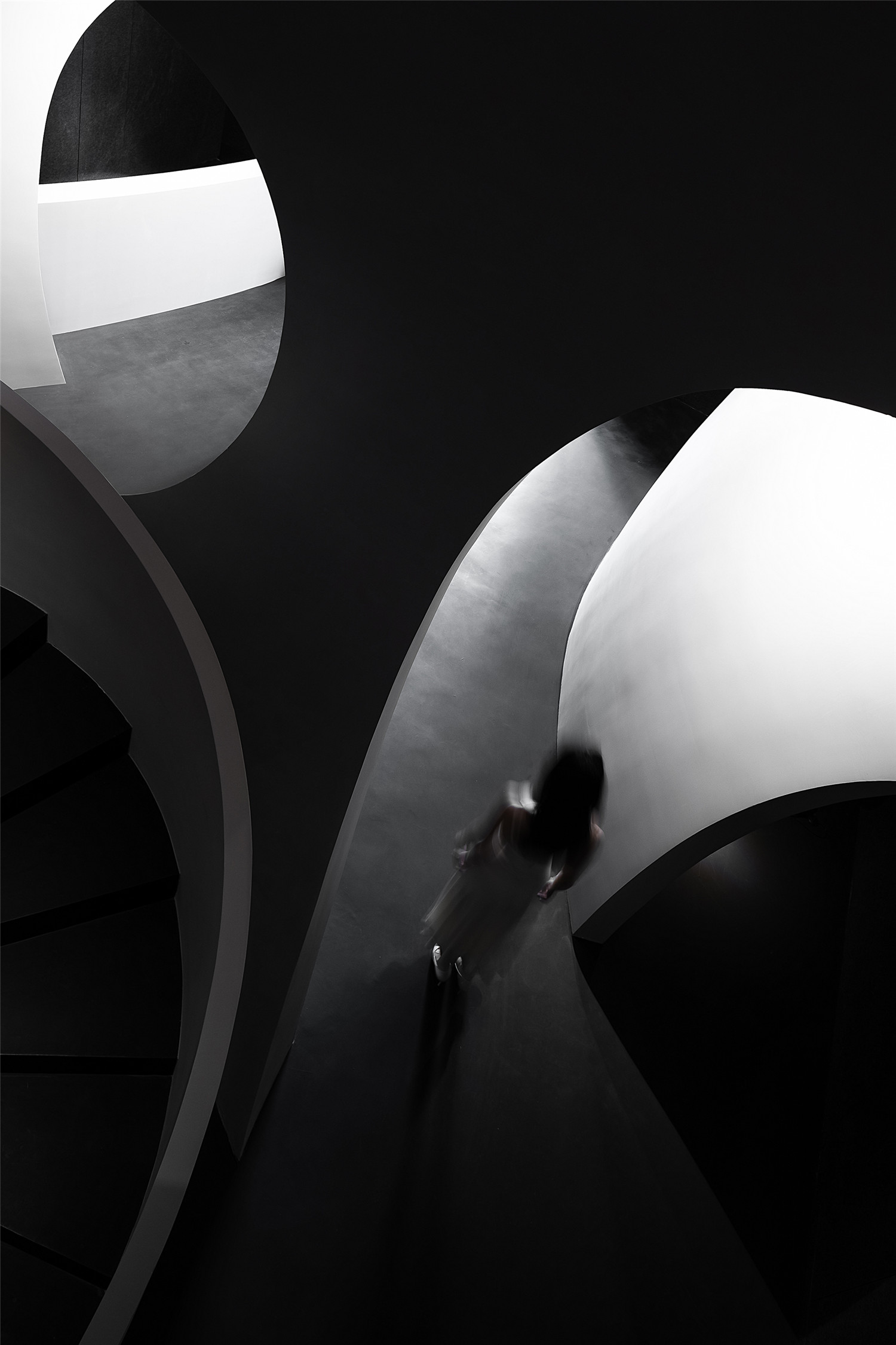
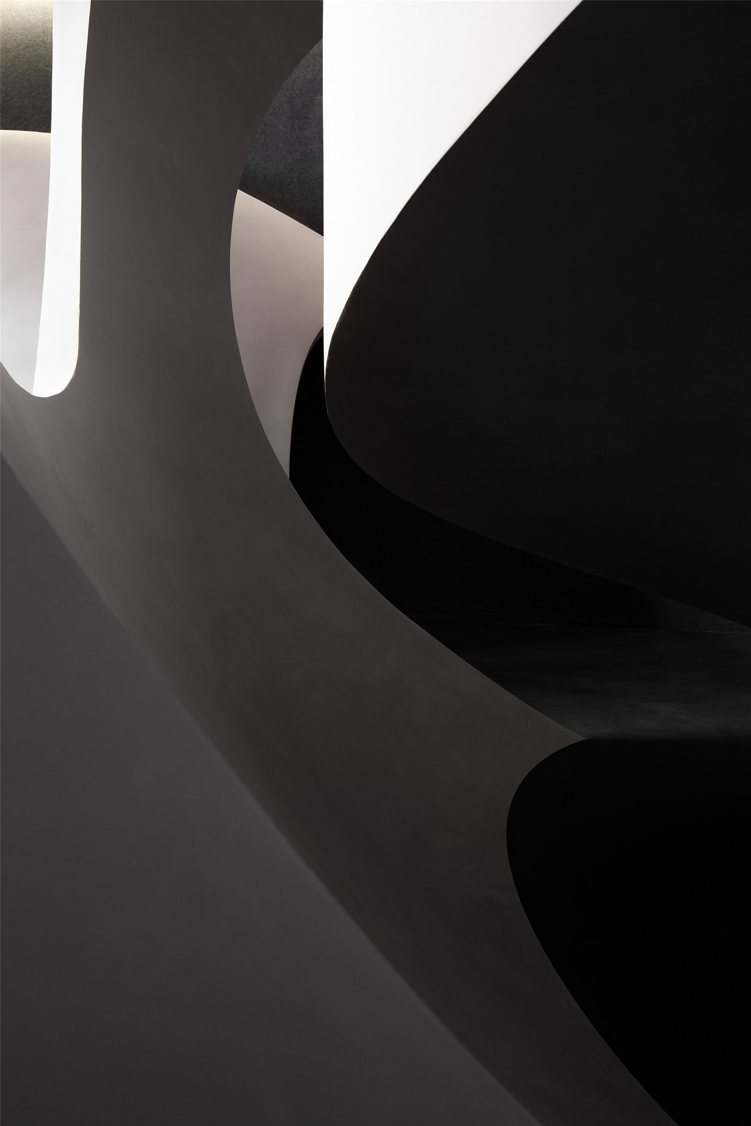
进入空间,曲线与直线的组合架构大型的几何体量,厉冷的混凝土协作塑造强烈的冲击感。视觉上线条的延伸交织,内含人体细胞流动的本质,当进入者缓缓而行,静与动的相对情境才开始发挥作用。
In the space, straight lines and curves are combined to outline large geometric blocks, and the cool concrete generates dramatic visual effects. Lines stretch and interweave, indicating the fluidity of human cells. As the customers slowly move within the space, the contrast of the static and dynamic will become more apparent.
▲曲线与直线的组合架构大型的几何体量
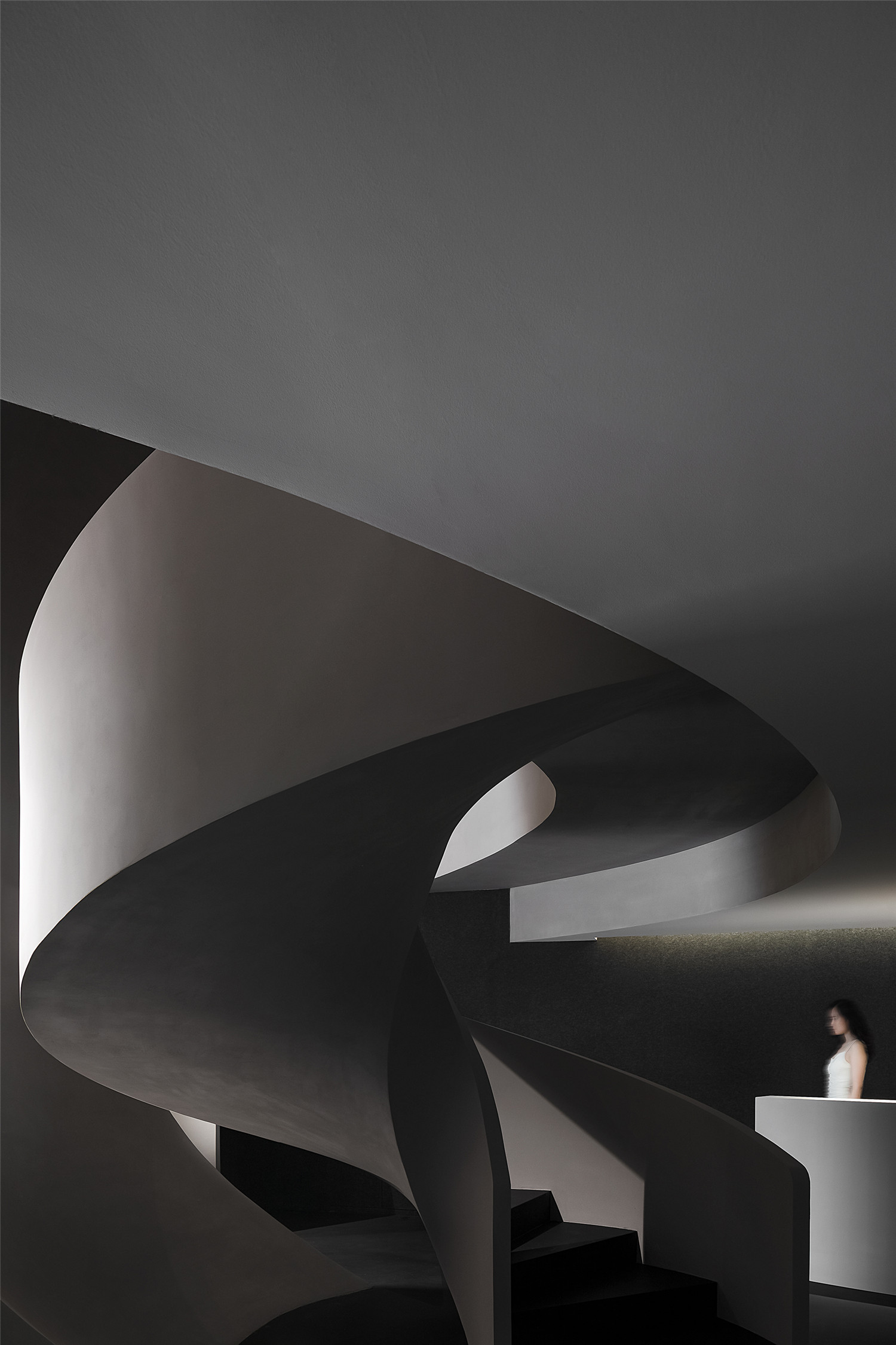
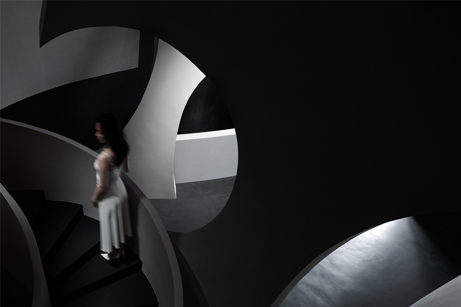
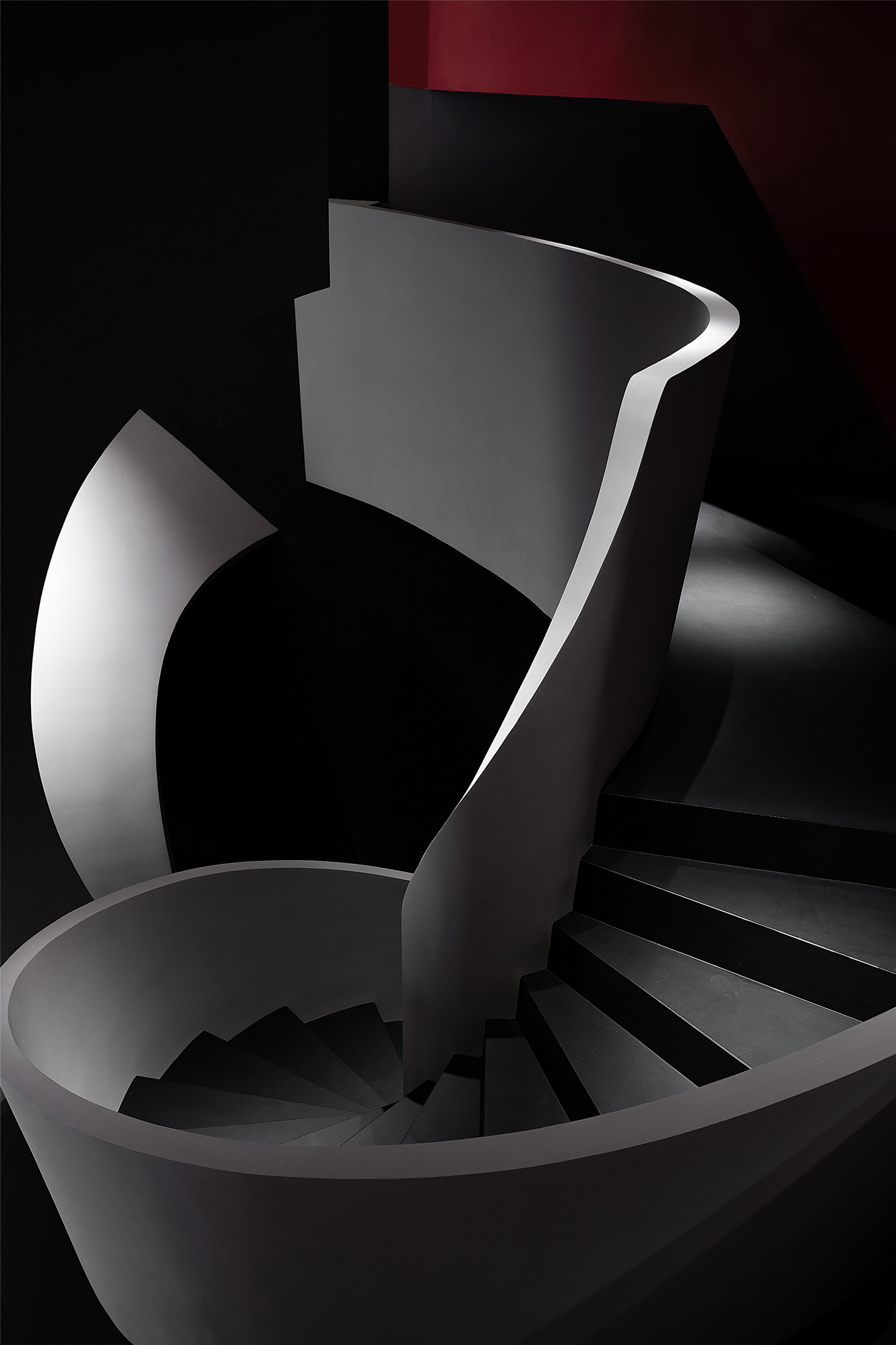
以预约服务的体系为依据,空间流程由一层空间接待到二楼的VIP房间,期间经过产品展示区。夹层的业务洽谈区被孤立出来,通过艺术化的楼梯进入,以保障洽谈期间的私密性,同时与预约的客人电梯错位,体现尊贵的服务系统。
The spatial layout takes into account SOOYOU’s reservation-based service system. The circulation links the product display area on 1F, the VIP rooms on 2F, with a product display area in between. The consulting area on the mezzanine is separated to ensure privacy for customers. It can be reached by an artistic staircase, which is separated from the elevator used for customers who have already made reservation, to embody the brand’s superior service system.
▲一层空间概览
▲艺术化的楼梯
光影/材质 Light & Shadows / Materials
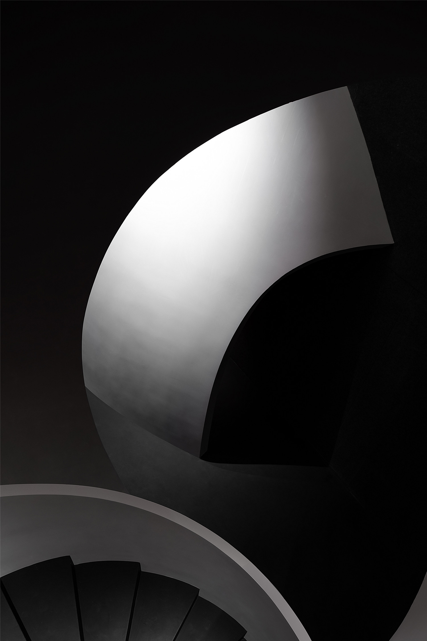
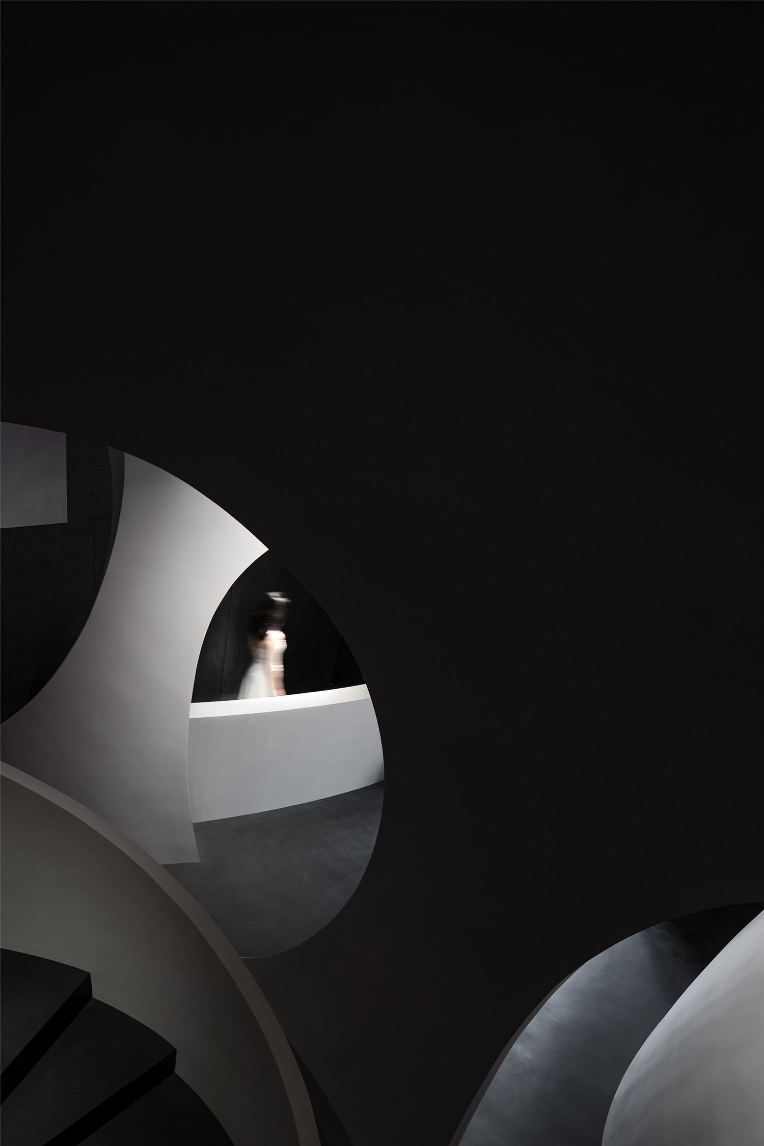
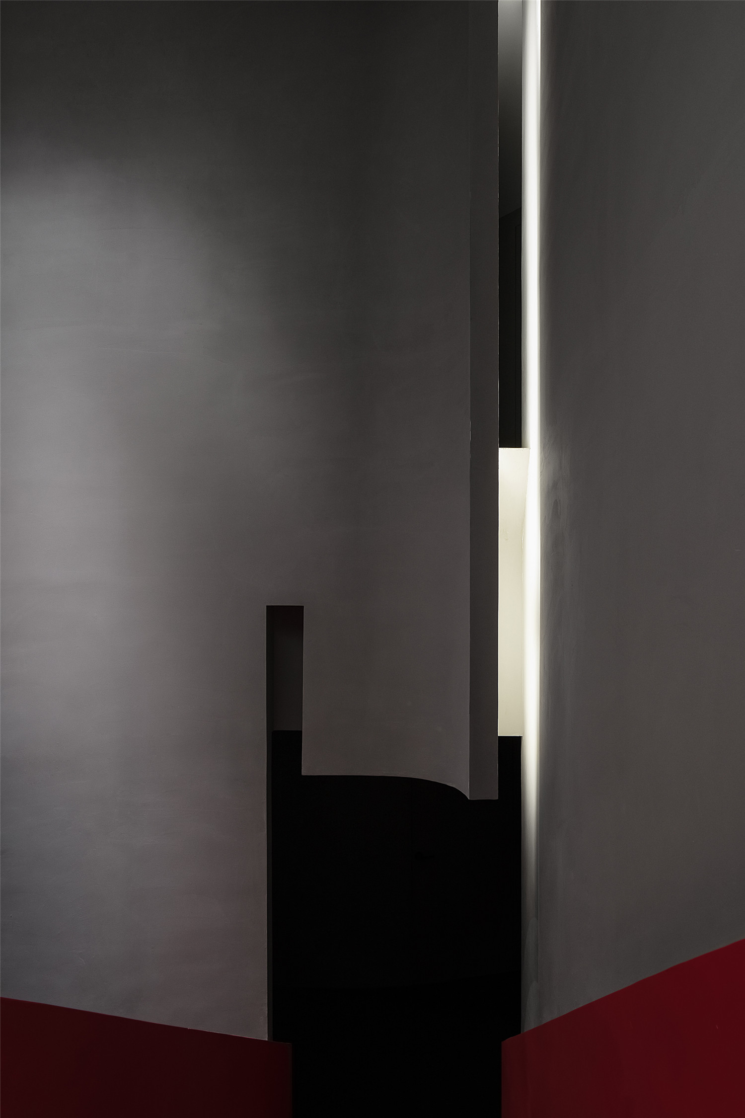
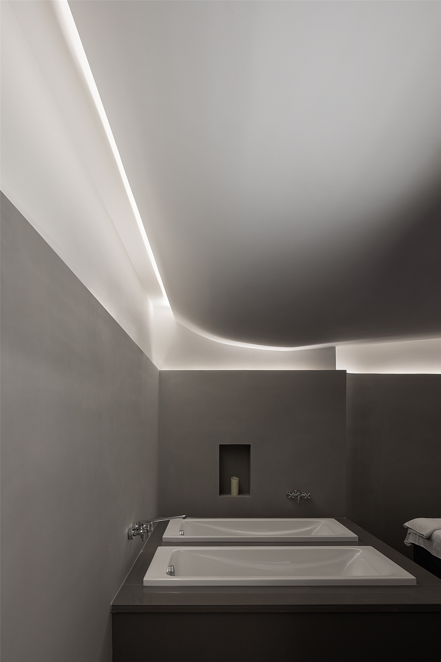
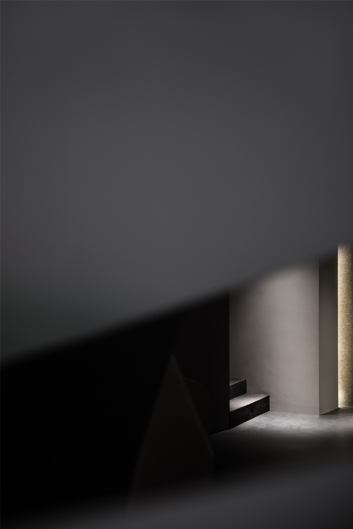
暗系场景氛围的营造,让光点亮的地方成为主角。阴影沿着光的边缘舒展,赋予进入者无限的想象空间。不同层次的明暗转换给予内心情绪的释放和强烈的自我属性,让舒缓自由的体验感贯穿始终。
The overall space is dominated by dark hues, with the areas illuminated as spatial highlights. Shadows extend along the edges of light, leaving infinite room for imagination. The shift of brightness and darkness at different layers stimulates emotional liberation, and offers calming and free experiences throughout the space.
▲营造暗系场景氛围
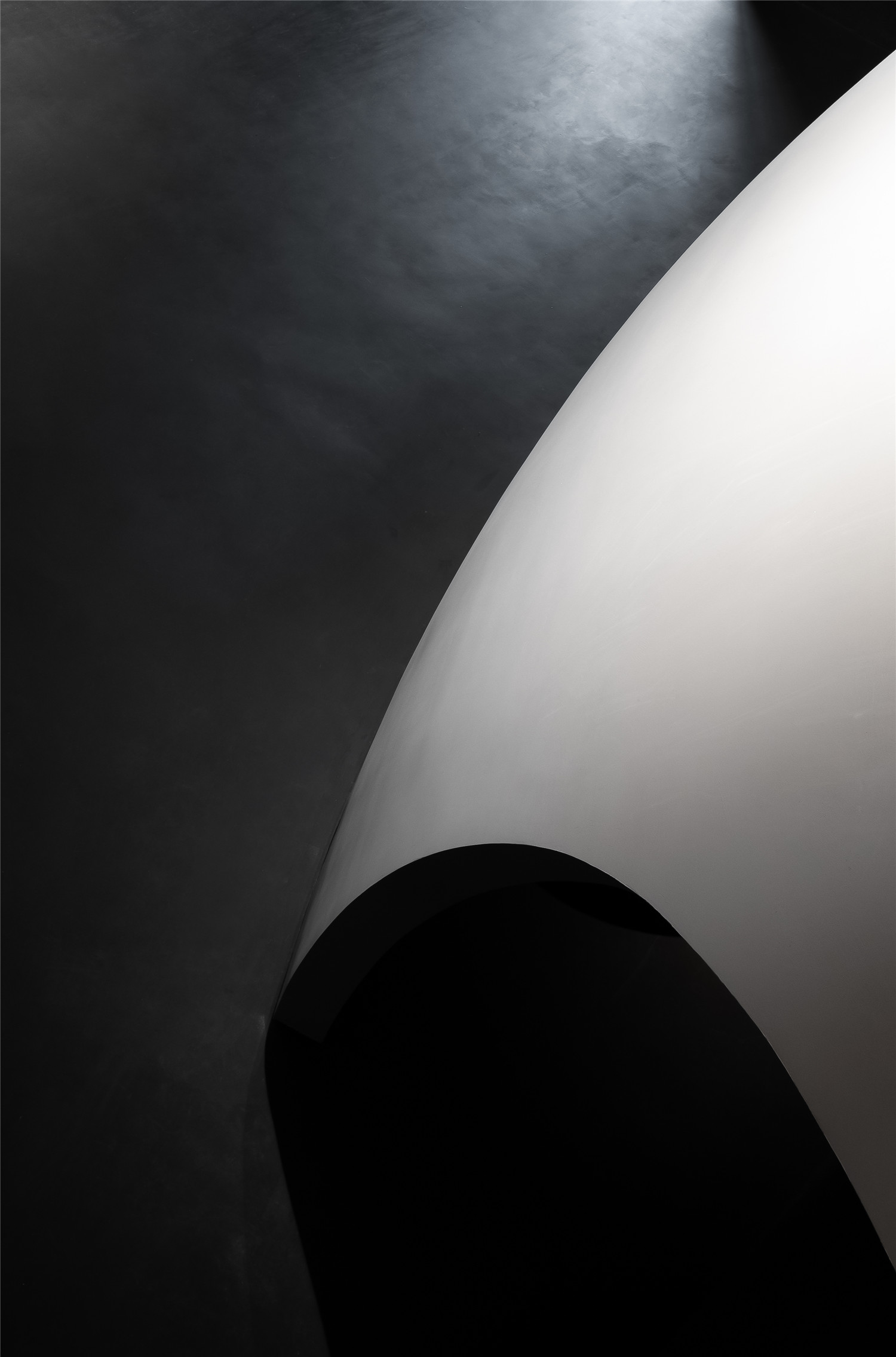
混凝土朴实的质感,体现品牌的健康与亲自然理念,有效地用低成本成就一个具有先锋性的美学空间。墙面黑色的毛毡,带给空间延伸的视觉,其吸音的效果也让空间的人处于更加安静舒适的状态中。
The austere texture of concrete embodies the brand’s concept that advocates health and closeness to nature, whilst contributing to produce an avant-garde aesthetic space with low cost. The black felt wall coverings visually stretch the space, and helps to generate a more tranquil and comfortable atmosphere with its sound-absorbing properties.
▲混凝土朴实的质感,体现品牌的健康与亲自然理念
色彩/张力 Colors / Dramatic Tension
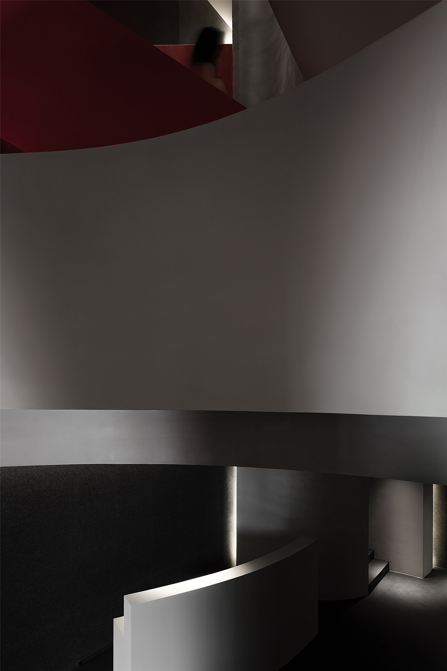
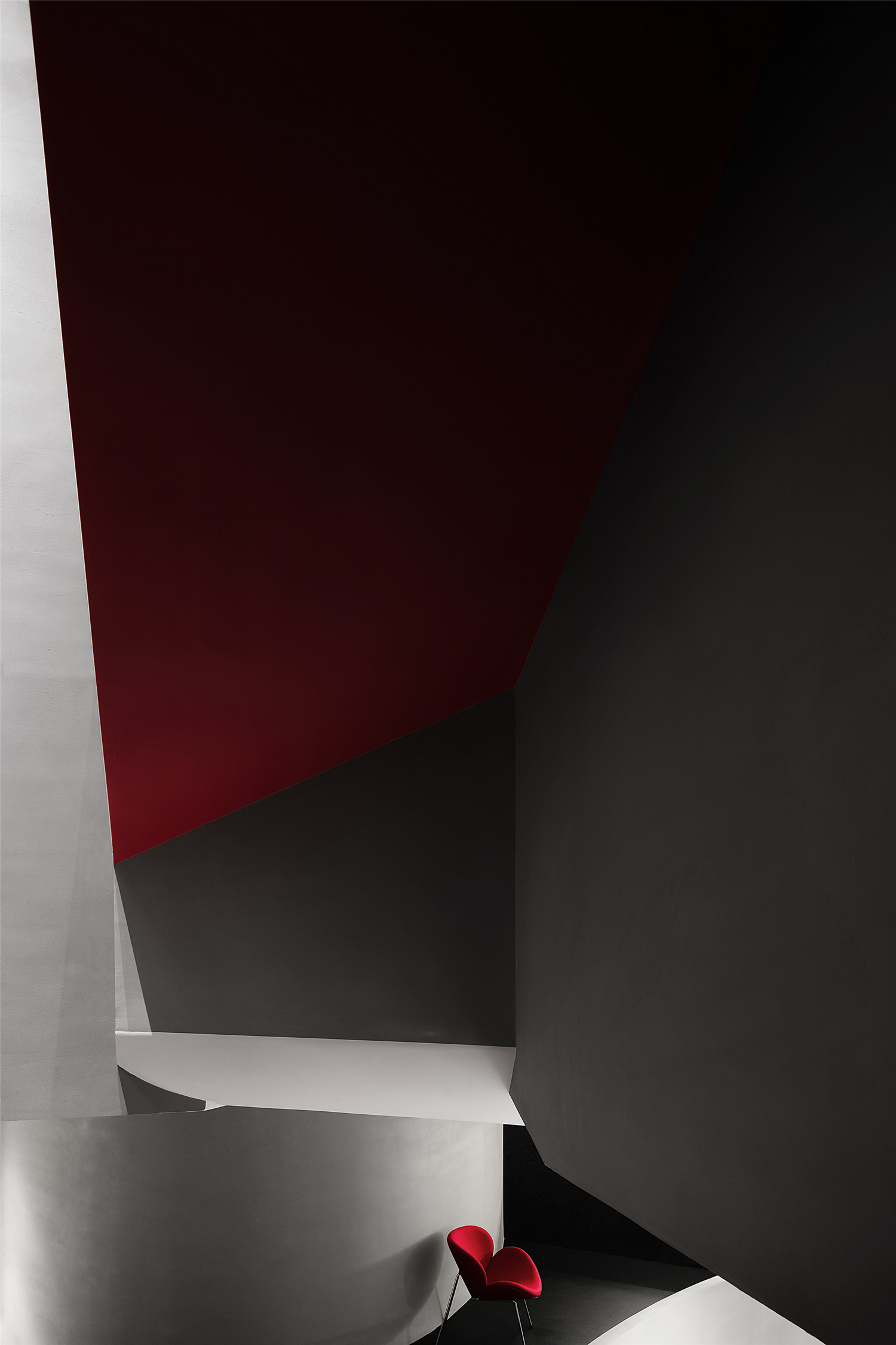
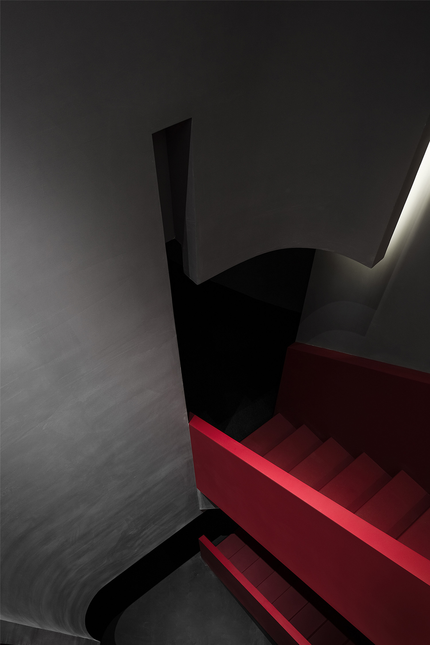
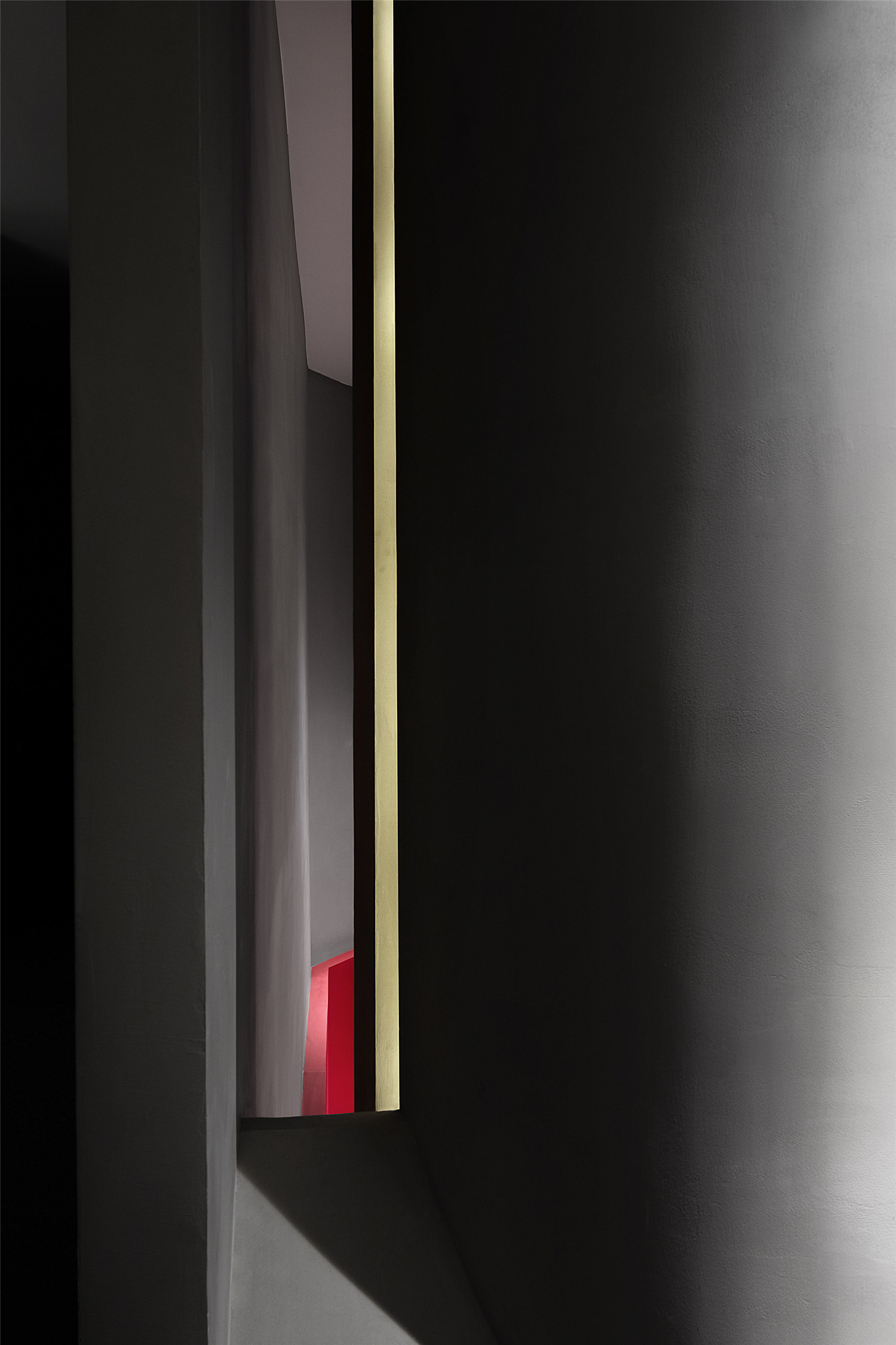
灰色与黑色铺构的空间基底中,暗藏一抹热烈的“红色”,色彩上的突变,成为空间造型之后引爆空间张力的第二个高潮。色彩应用的巨大反差极具引导性,同时为进入者留下深刻的印象。
Gray and black shades set the overall tone of the space, which is highlighted and enlivened by a red hue. The strong contrast of the colors generates dramatic tension in the space, leaves a deep impression on customers and guides them to explore the space.
▲空间转换
▲暗黑空间中隐藏着一抹热烈的“红色”
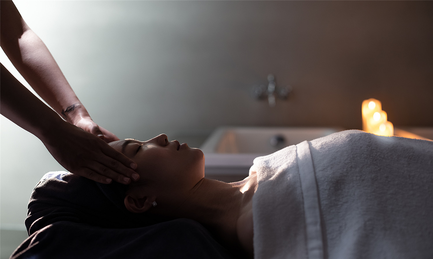
实际上,矛盾的一面对立存在于每一个场景画面里,另一面却又和谐地统一于这个空间中。好似美容的过程中细胞经历的死亡与重生,也好似每个人内心的自我挣扎及至蜕变、释怀。
The space is a harmonious unity of various opposite scenes. Beauty treatment is a process in which cells die and reborn, which echoes the struggle, transformation and liberation of our inner mind.
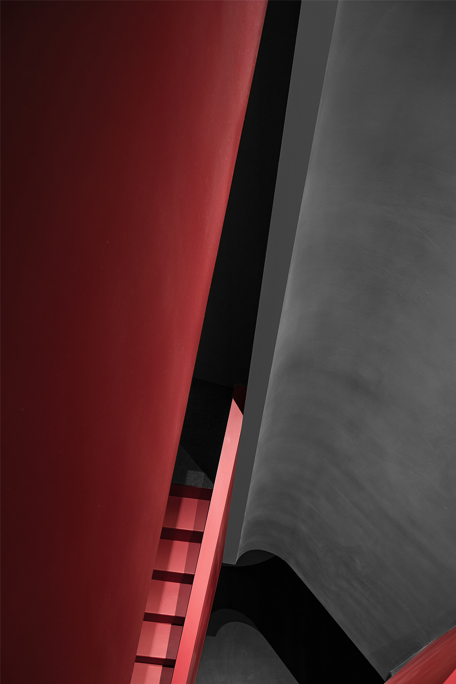
▲红色楼梯细节
物质与精神考量的交集,或分或合,似是而非,而人与情感的融入则促使新的画面和记忆不断生长,创造出一个具有矛盾体系而又极致平衡的艺术空间。
As people come in, their emotions will be evoked, and new spatial scenes as well as memories will be created. This is an artistic space, which features a contradictory system and balanced coordination.
▲空间局部
结语 Summary
这是我们在商业设计的一次先锋实验。打破章法的秩序,让神秘、有趣成为场所的精神。在这个差异化的空间,设计师扮演着手握主权的医生,以细胞的裂变与躁动为创作因子,最终生成抽象的仿生美学。
The project is a pioneering experiment that AD ARCHITECTURE carried out in commercial space design. It breaks conventional order, and injects mysterious and fun characters into the space. The designers drew on the fission and motion of cells to conceive this differentiated space, and finally produced abstract bionic aesthetic.
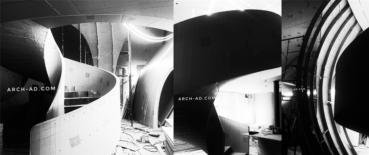
▲项目施工过程
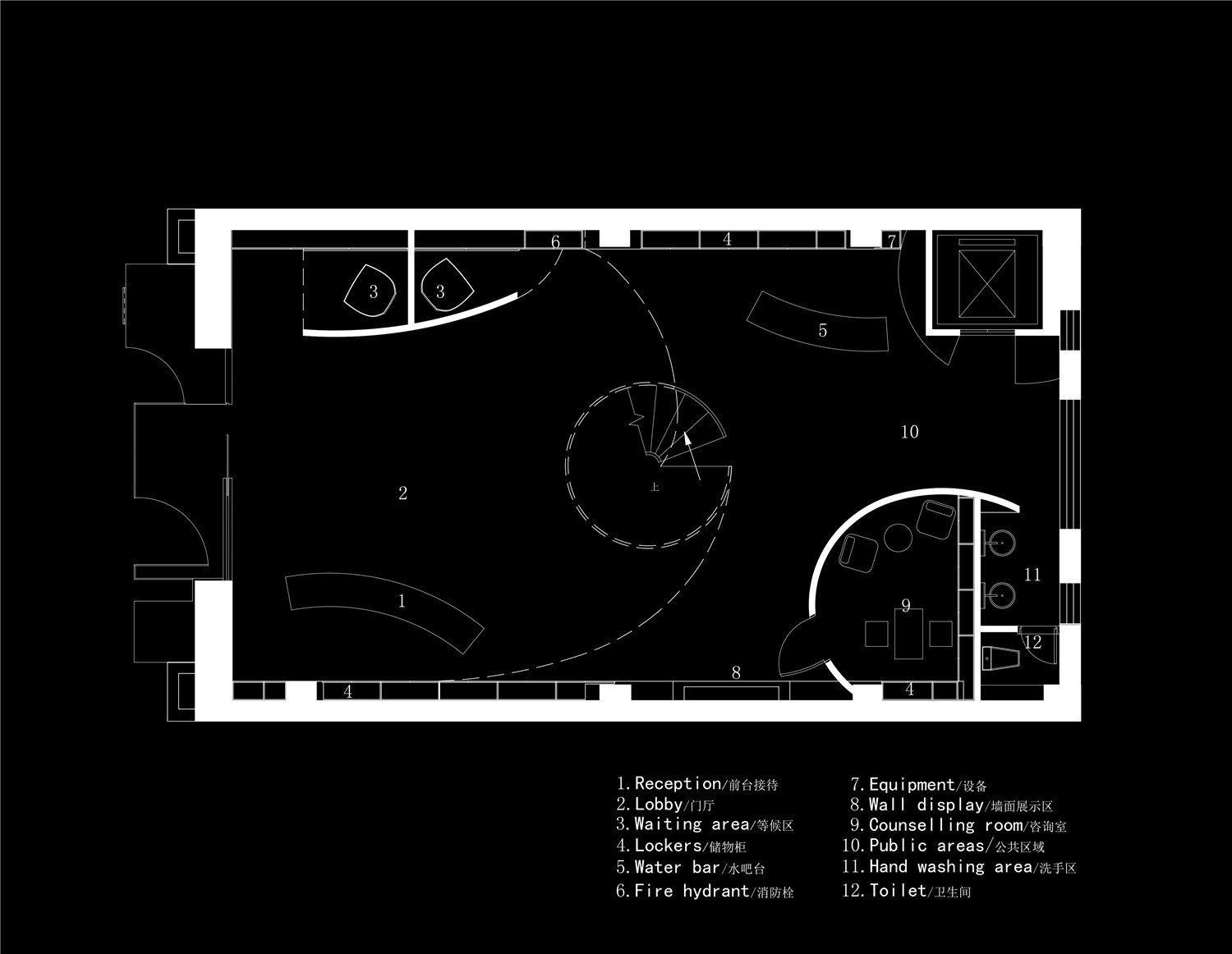
▲1F平面图
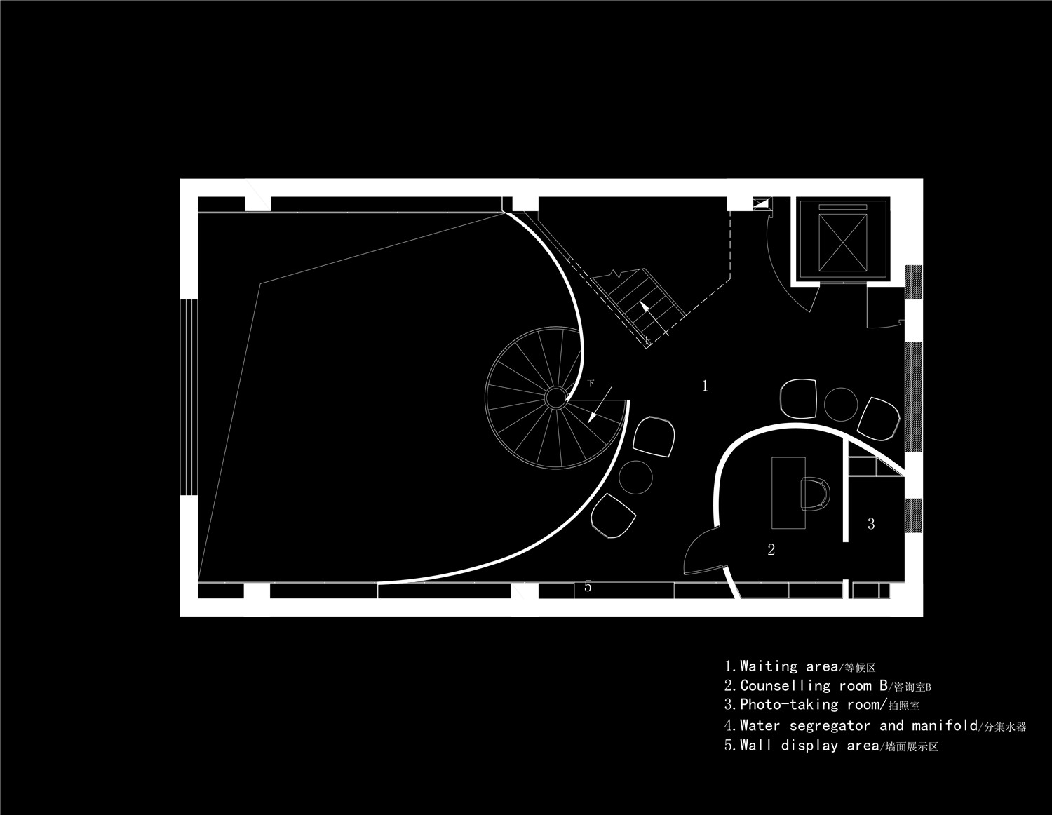
▲2F平面图
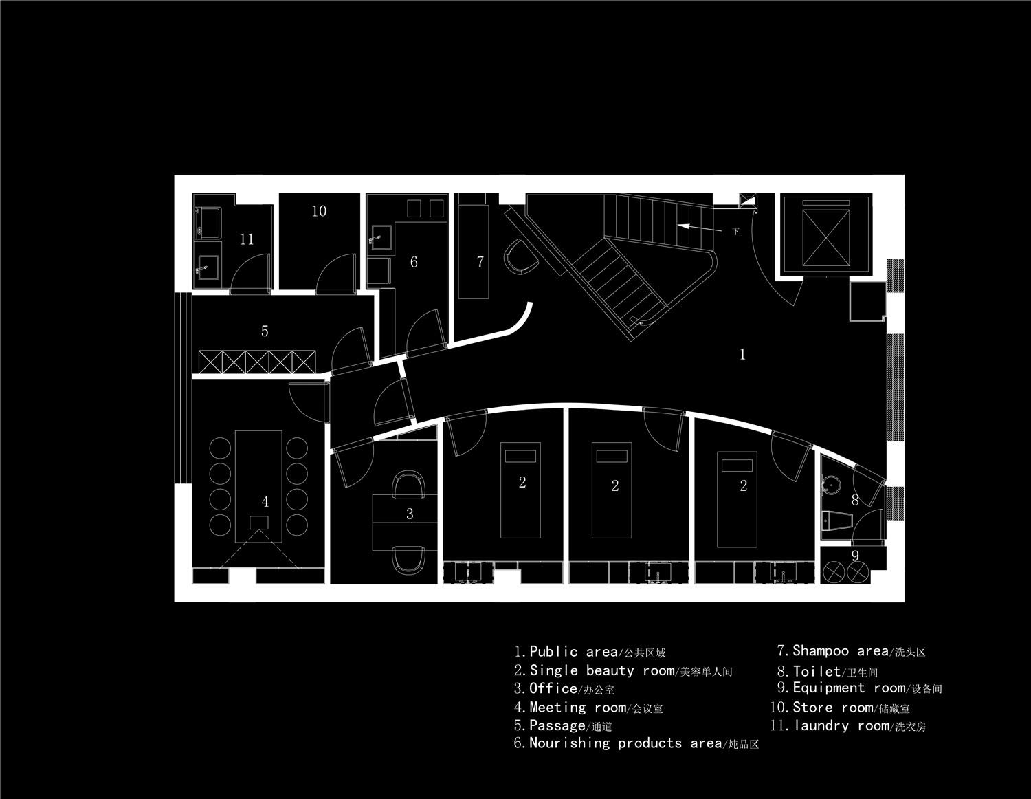
▲3F平面图
▲4F平面图
项目信息——
项目名称:哈尔滨SOOYOU美容院
总设计师:谢培河
设计团队:艾克建筑
项目地点:黑龙江哈尔滨
建筑面积:450平方米
主要材料:水泥漆、毛毡、外墙漆、石板
设计时间:2020年1月
竣工时间:2020年7月
摄影师:欧阳云
Project information——
Project name: SOOYOU BEAUTY SALON
Design firm: AD ARCHITECTURE
Chief designer: Xie Peihe
Design team: AD ARCHITECTURE
Location: Harbin, China
Area: 450 m2
Main materials: cement paint, felt, wall finishes, stone panels
Start time: January 2020
Completion time: July 2020
Photographer: Ouyang Yun


