神秘的月亮总是让我们在敬畏中萌生好奇。想象生活在失去重力的宇宙空间中,反重力和失去平衡的空间类型就会自然而然地浮现。
The enigmatic of the moon has always baffled us in awe.Imagine living in the cosmic space without weight and force,the spatial typology of anti-gravity and imbalance naturally surfaced.
新加坡SODA设计事务所由此得到灵感,产生了“多重倾斜角度”和“多面化”的设计概念。
This is the thinking process that inspired the spatial design for House On The Moon which is translated into diverse angular tilts and faceted forms.
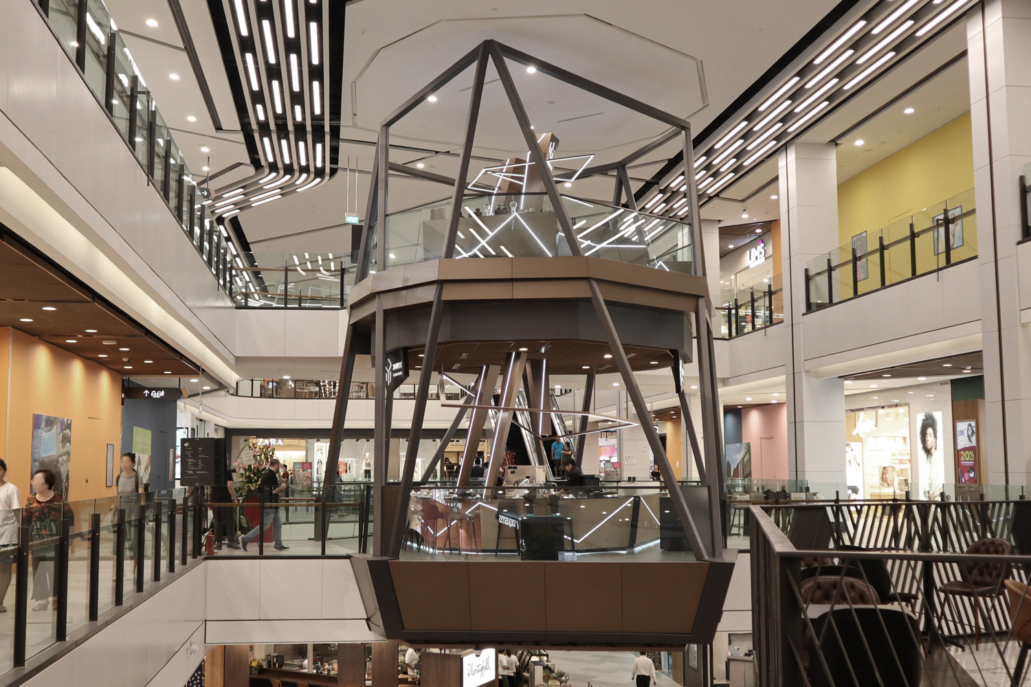
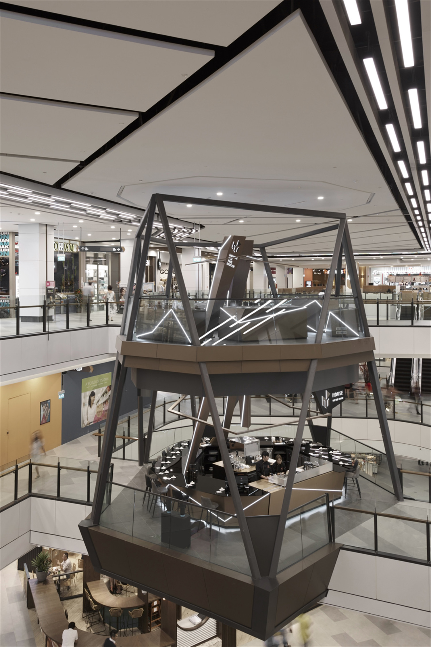
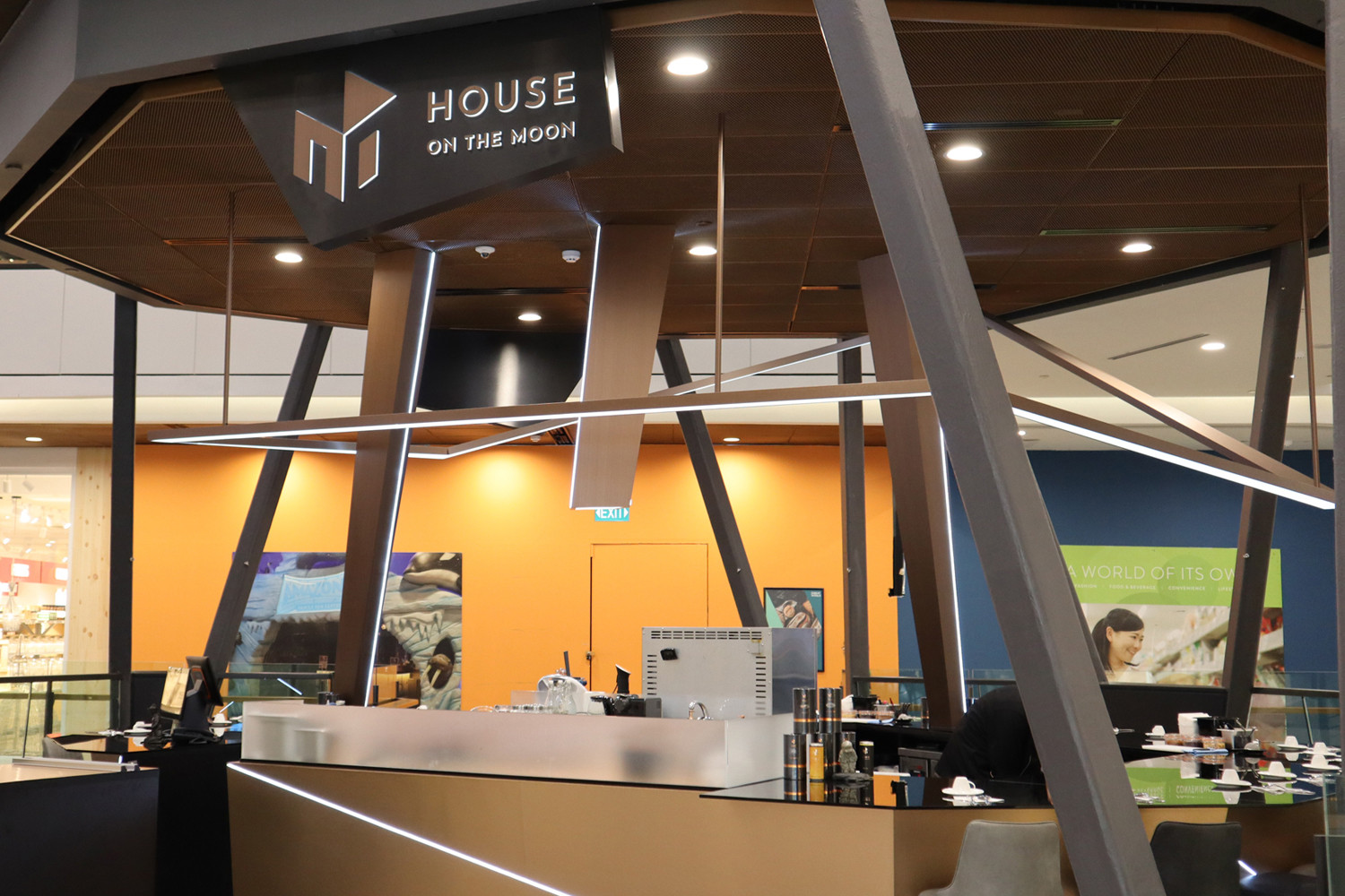
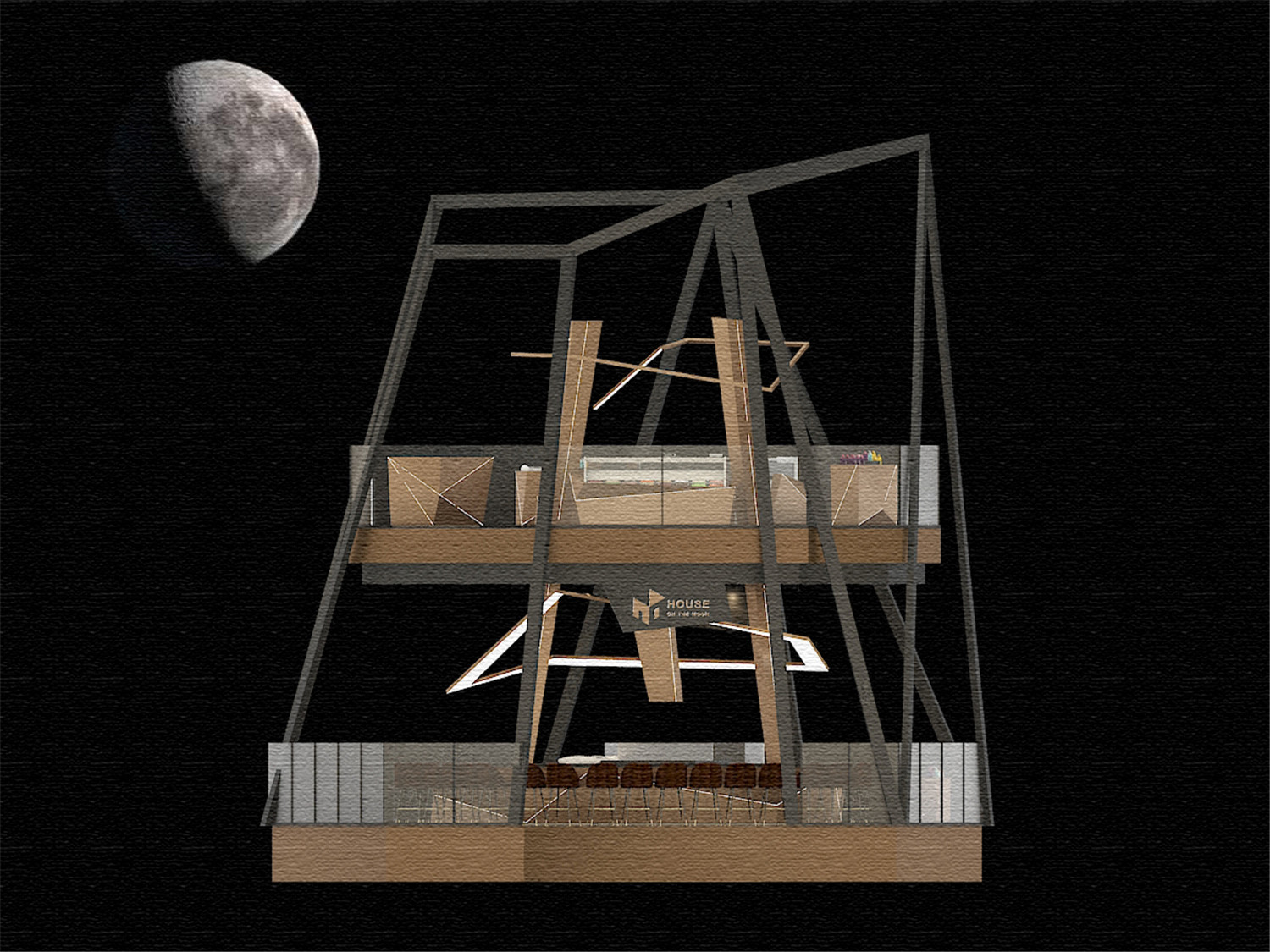
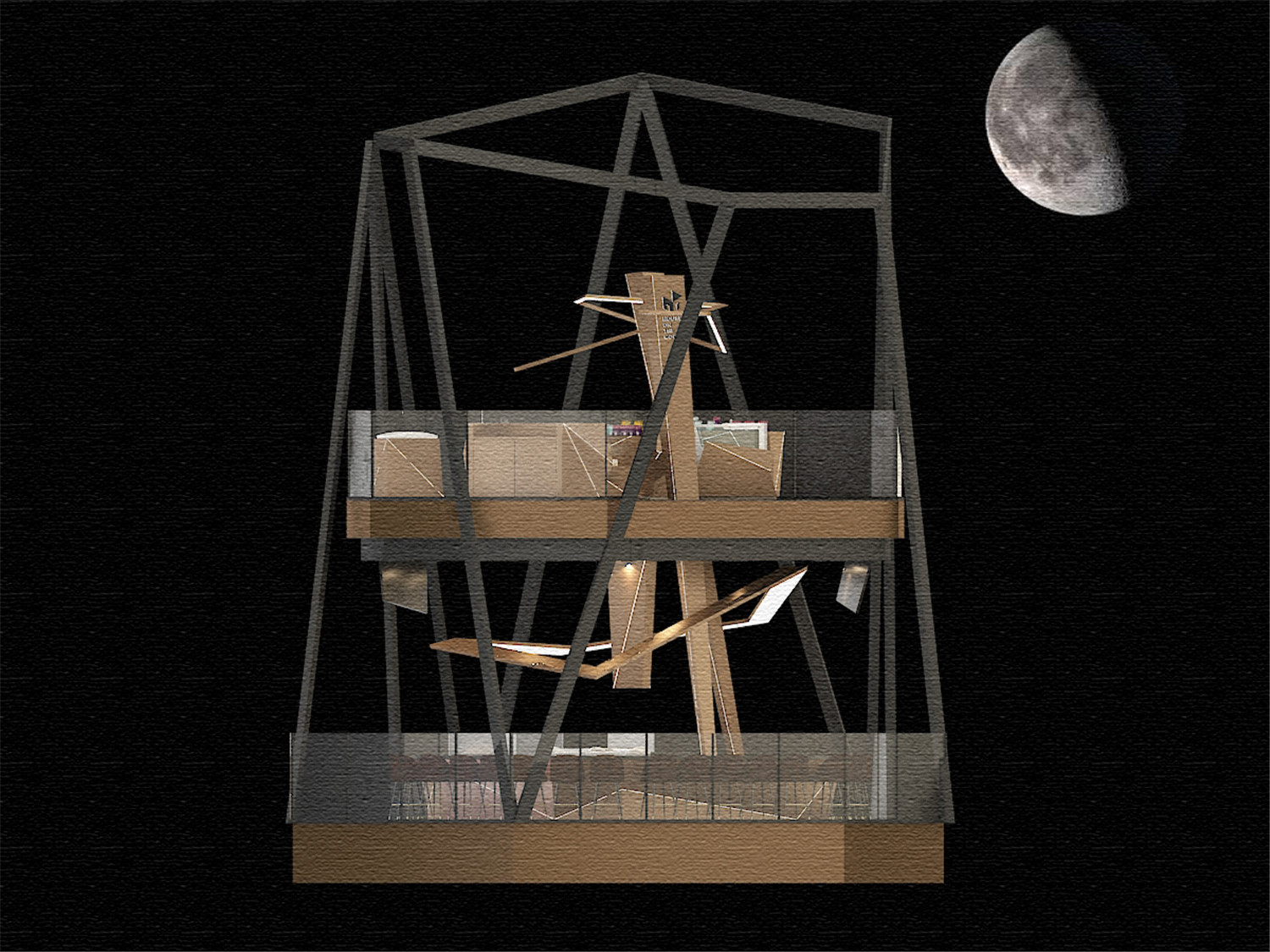
House On The Moon是一家由米其林厨师掌舵的高端甜品店,其位于新加坡中央区的Great World购物中心(旧称:Great World City)。该项目是一个 “悬浮” 在商场中部的双层室内建筑。一层为就餐区(人流繁忙区域),二层设计为商业零售空间,供商家销售和包装产品。而该店则被设想为由宇宙中的空间碎片物体组成的一个太空时代建筑。
House On The Moon is a dessert restaurant helmed by chefs who are recognised in the Michelin Guide.Located in the Central District of Singapore,in the newly revamped Great World (formerly known as Great World City),it is a mixed-used development consisting of a 6-storey shopping mall.The project site is a double-storey unit “suspended” in a triple volume space accessible only via two link ways across each level.The restaurant sits on Level One where traffic movements are more prominent and Level Two is planned as a retail space for takeaways and merchandise. It was devised as a space age architecture that is formed by fragmented objects from the cosmic world.
该空间中所有的物体都可以视为是宇宙中的空间碎片。而“多重倾斜角度”则是将空间中部分结构和装置等,设计为带有一定倾斜度的物体(例如柱子、环绕在柱子周围的装置结构)。
The built environment is perceived as fragments of objects floating in the cosmic world.The multi-faceted design intention naturally informs of the many tilted angles and planes surfaces that fractures into an asymmetrical structure.
正是倾斜的概念而衍生出了“多面化设计”。该店位于连接两侧商业空间的连桥平台上,有着优越的地理优势。而“多面化设计”创造了空间的多样性,即在不同的角度,顾客会有不一样的视觉体验。
Due to the nature of the site being on a link-bridge,one of the key design considerations is to manifest on various vantage points of audiences‘ approach to the site.
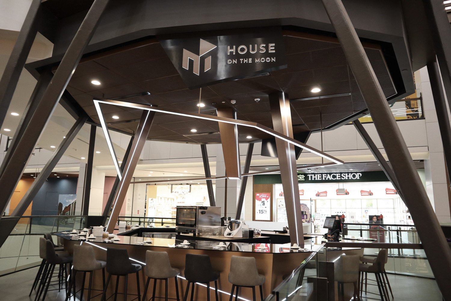
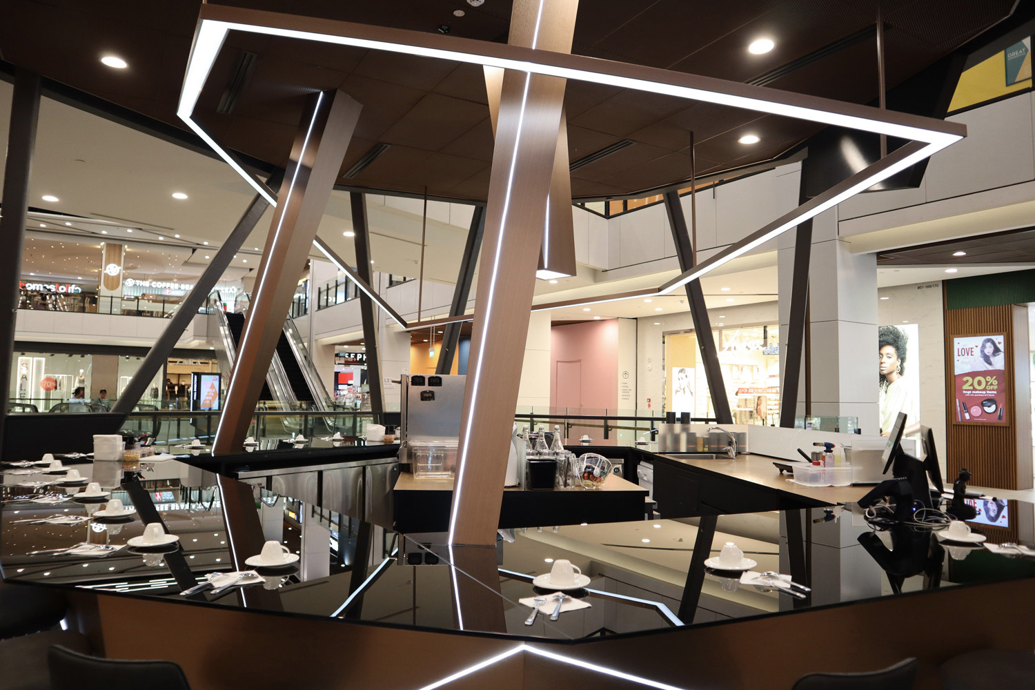
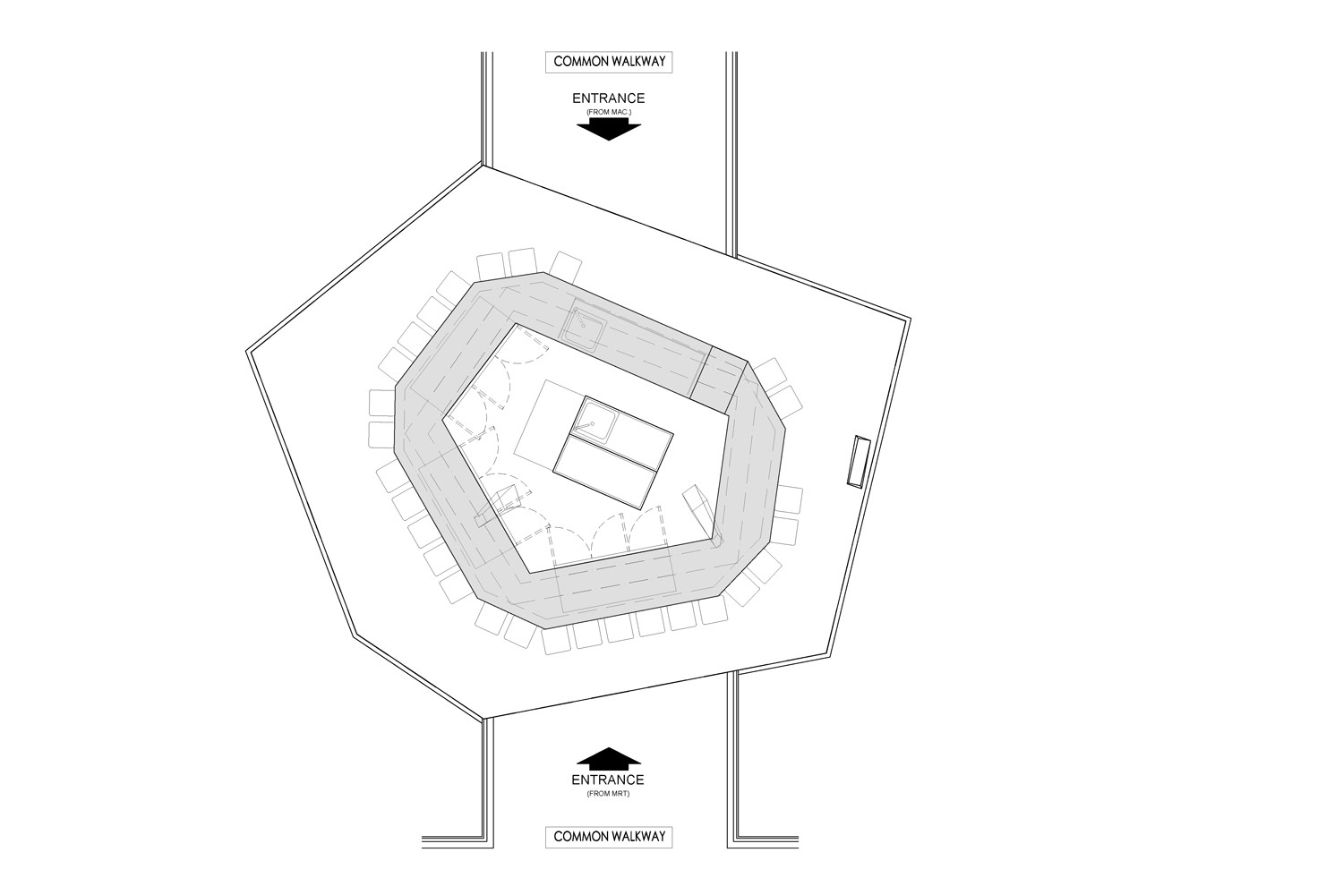
甜点吧的岛屿概念是为了响应场地内部的多面视角。顾客可以在吧台看到甜品的整个准备过程,享受沉浸式的体验 。
The island concept of a dessert bar is imminent so as to response to the many perspective views from within the interiority of the site.In such instance,the food preparation activity is naturally highlighted as a form of performance in the space.
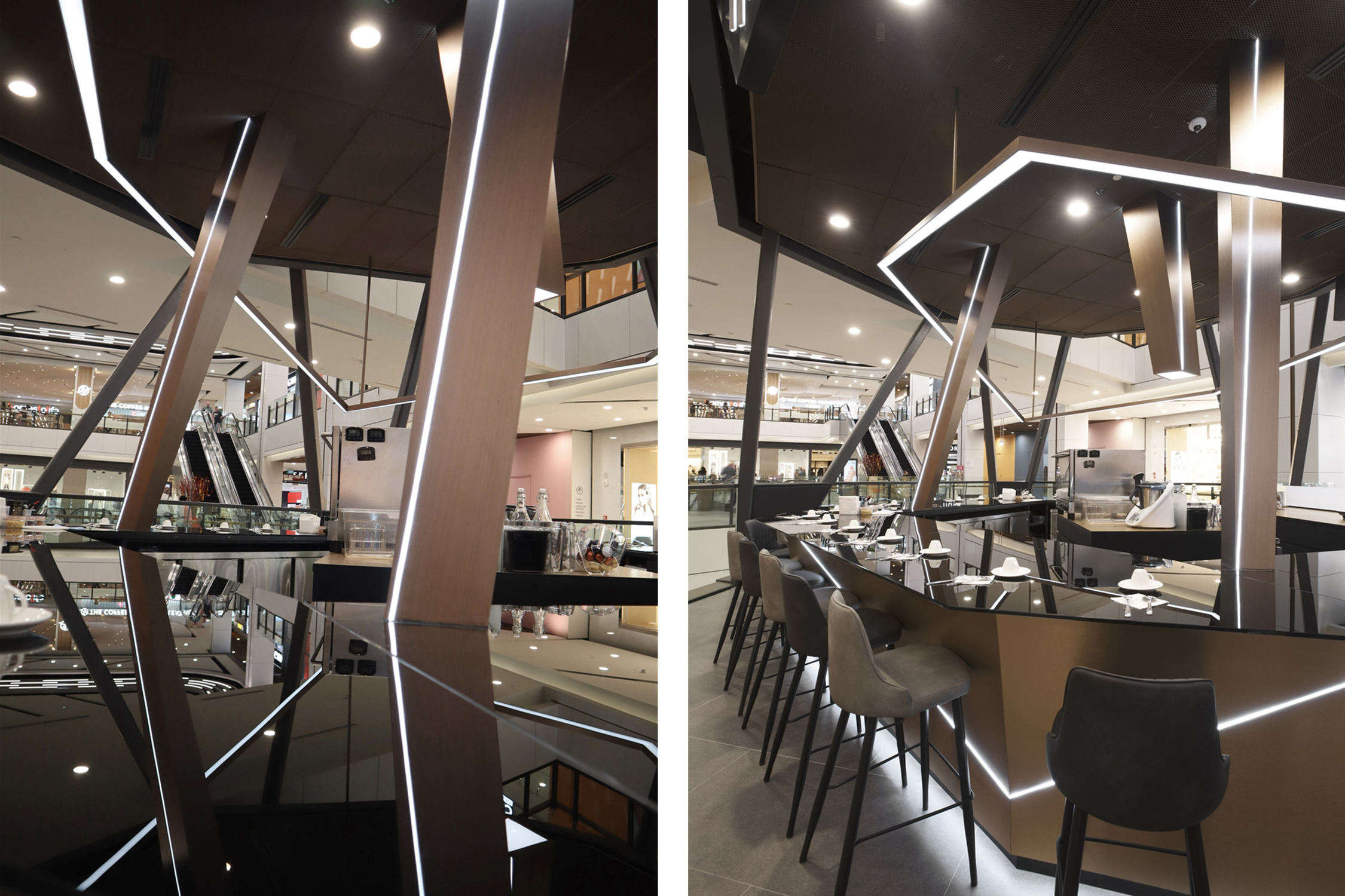
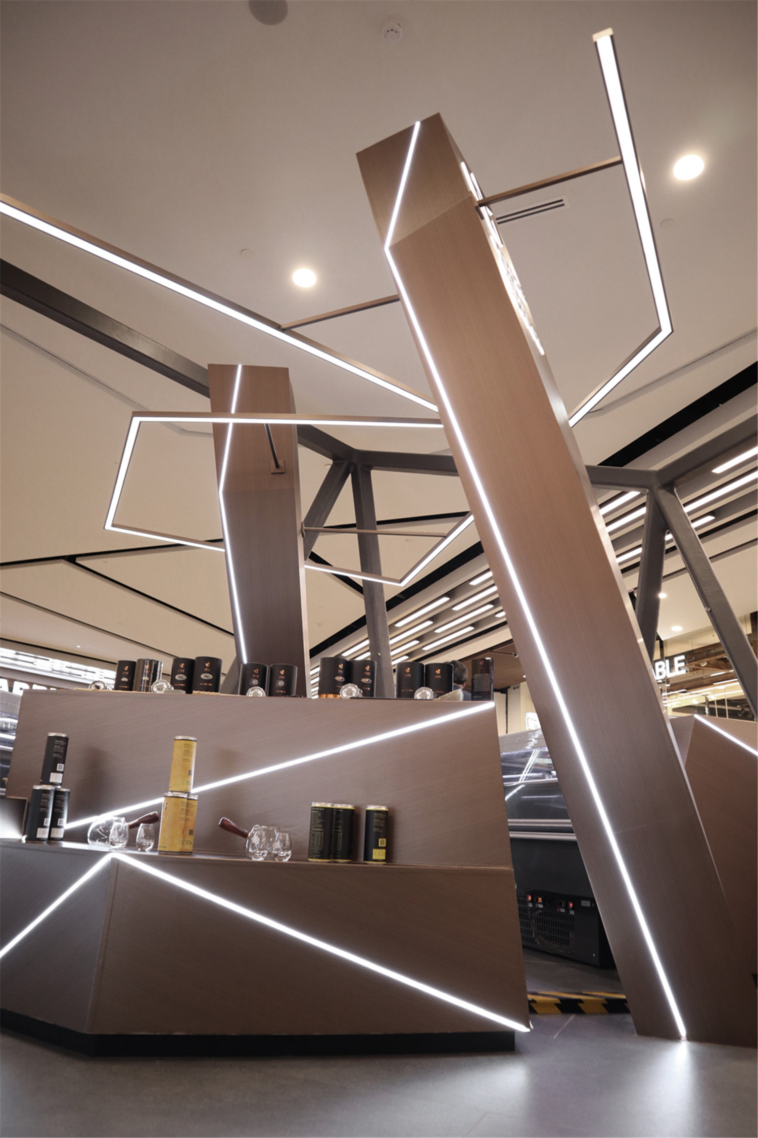
为使上下两层空间有一定的连接性,设计师将两个非垂直的倾斜柱状物体,由上至下插入此两层楼的室内建筑,贯穿上下层空间,并以此作为设计的核心据点。也由此,柱状结构能够自然的在下层空间中构成一个主要的用餐空间。
Two shards punctuated into the duplex site resulting in a continuous connection between the two floors and onto a base which is core foothold of the design,therefore it formulated the main dining space on the lower level.
环绕在柱体周围的条状装置是核心据点的延伸设计,它被设计为空间中的漂浮状物体。而位于上层用来展示物品的柜子,作为空间中的其他‘碎片’,经过设计考量,呈现出乱中有序的摆放。
Other random pieces behaved like floating objects around the dining space and upper floor which is designated as an extension of the core base.
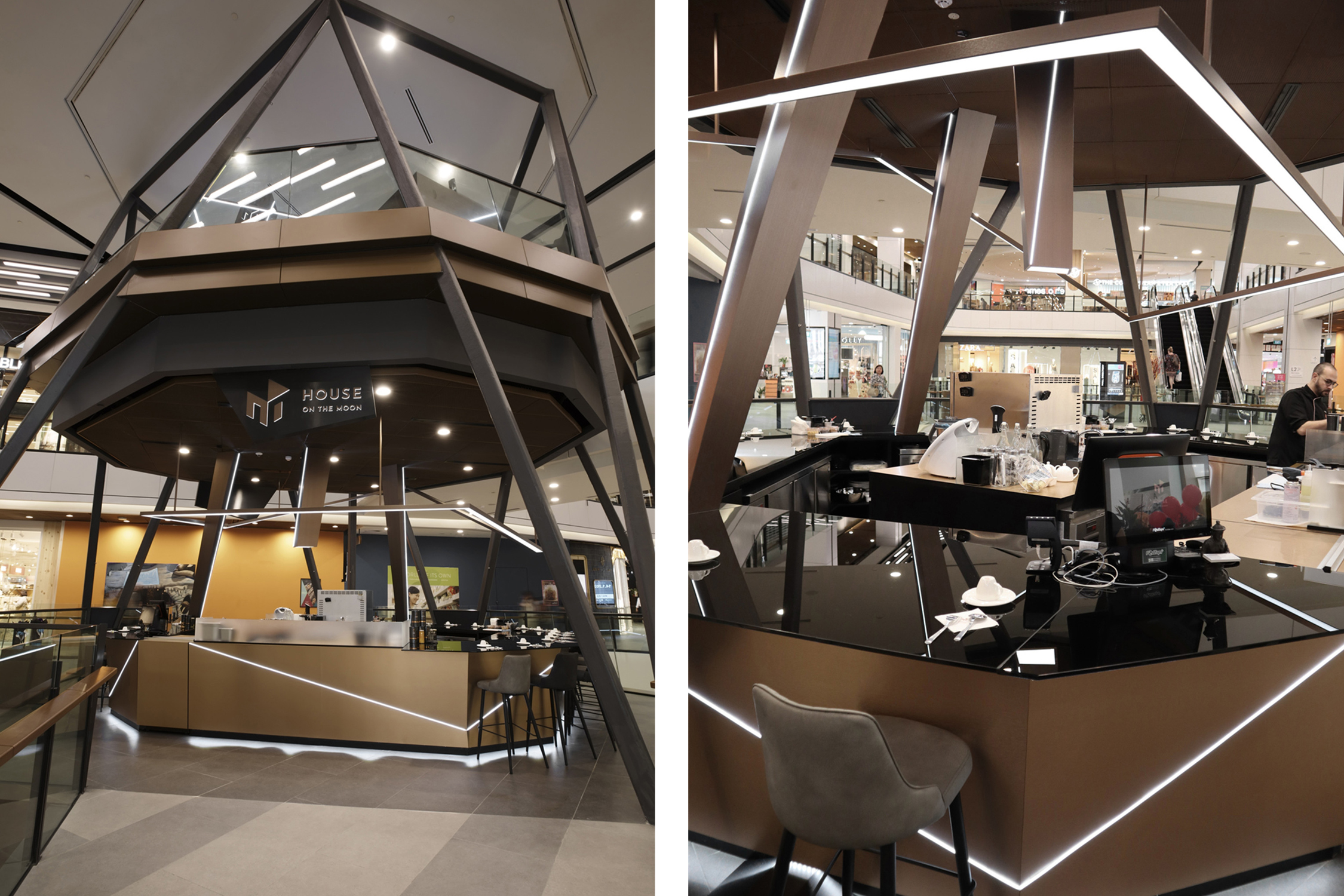
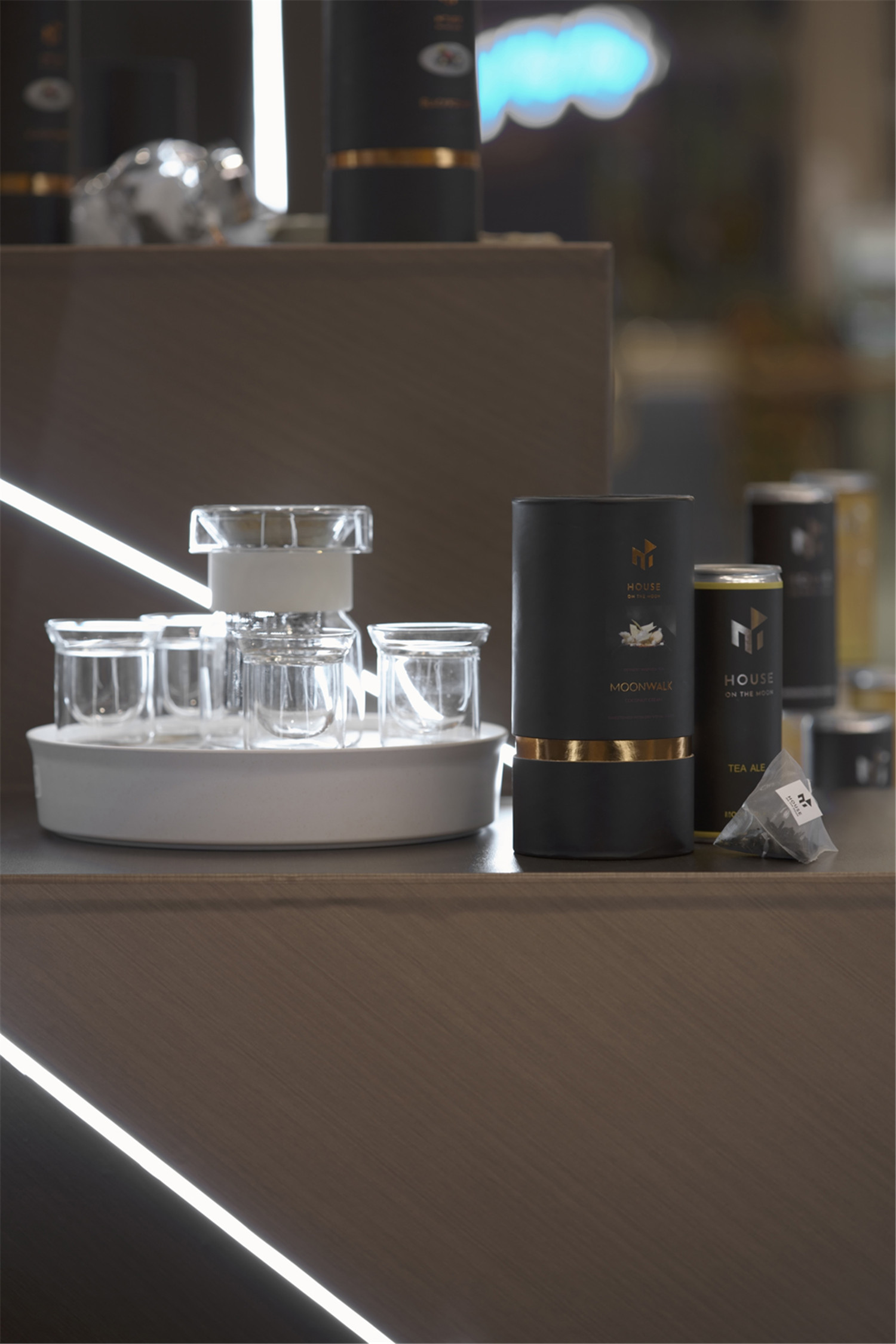
黑色玻璃用于吧台台面配合其结构及灯光以营造出一种深沉但柔和的反射效果。反射增添了与周围环境相关联的不规则性和奇异的视觉效果。
Black glass is used for the bar countertop to create a deep but muted reflection of the structures and its lighting effects.The reflection adds on to the irregularity and bizarre visual connections to the surroundings.
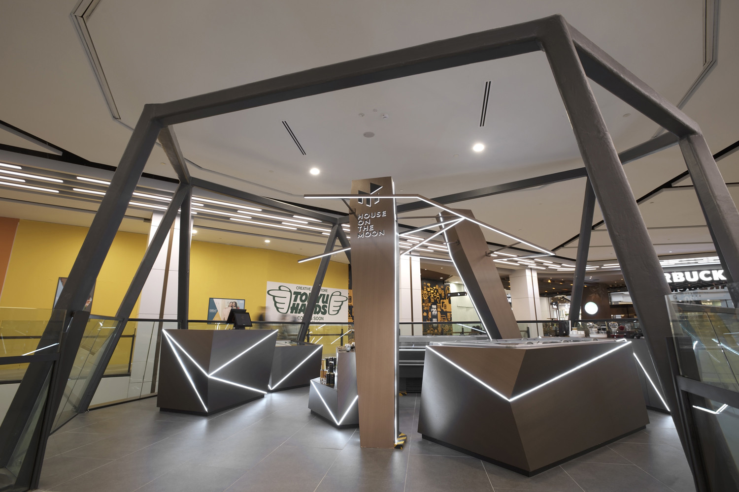
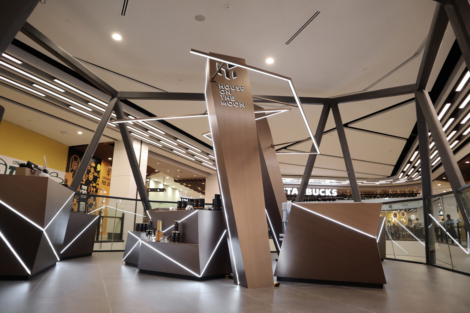
上层楼的结构和装置沿用了“多重倾斜角度”这一设计概念。为摆放物品的柜子和收银台设计了独特的“多面化”效果,而嵌在其表面的LED 灯带则会进一步突显其多面的特色视觉效果,营造出一种富有魅力的神秘气氛。这一效果在上层零售空间中得以放大,因为这里的空间可以给予人们更多的视觉体验。
The faceted form of the structures and fixtures depicts a bizarre nature of something foreign,further accentuated with lighting effects embedded into the surfaces which creates a mesmerizing spirit of mysterious-ness.It is amplified on the Level Two retail space as there are more visual penetration within the space.
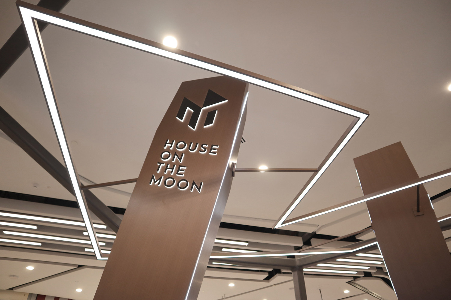
两个倾斜柱状物是该空间设计中的一大特色,这个特色贯穿了上下层空间,设计师将品牌LOGO置于该柱体上,是想以一种更激烈和有趣的方式来呈现该品牌,也以此来呼应反重力和不平衡的空间类型。
The two main shards while they appear to be puncturing the floor,bear the brand logo in a intense and perplexing manner to echo the design spatial typology of anti-gravity and imbalance.
位于上层的甜品冰柜阻碍了设计要表达的“多面化”和“多重倾斜角度”的想法(因为冰柜是四四方方的)。因此在冰柜外围设计了不规则的面板,且在面板上嵌入了LED灯带,把它和周围环境统一起来,以调节整个空间的多样化设计感。
The constraints of standardized refrigerator equipment to display foodstuffs adds on the challenges in fracturing the form. Therefore,the equipment are positioned to be hidden from audience‘s views and further concealed with carpentry works in the same design language as the faceted surfaces.The edges are highlighted with LED rope lights to accentuate its fractured form.
按照防火安全条例和商场管理层的要求,该室内建筑物体不可碰顶,因此无法调整位于天花部位的灯光,这意味着店内摆设的产品会没有足够的照明。考虑到这一点,设计师利用LED软灯带作为解决方案,增加空间的照明效果。而灯带的设计更强烈地呈现了“多面化”和“多重倾斜角度”的设计概念。
Due to fire safety and Mall‘s regulations,there is no ceiling work allowed on Level Two.This has created much hindrance for visual merchandising as the lightings provided are not sufficient and not focused on the displayed products.The fixtures are therefore designed with embedded LED rope lights to cast highlights and create visual attention to the products on display.The solution to provide adequate lightings to the products has turned out to be an opportunity to enhance the design language that further emphasized on the faceted surfaces.
在上层不可碰顶的情况下,结合了柱体高度设计了不规则形状的灯带来点亮空间,同时也有视觉引导作用。
A streak of lighting encompasses the boundaries of the retail displays which it also behaves as a visual guidance to encourage movements into and within the retail space.At the same time,it serves as a continuation of the faceted forms that connects both fixtures and vertical shards as an overhead feature.
此外位于上层的柜子,为配合其多面的设计概念,每一面的贴膜材料都是经过特制切割,也因此每一面贴膜的纹理都是不同的方向,也因此呈现出非常自然的效果。
The texture of the lamination finishing has painstakingly taken obligation to be installed along with the grain directions of the faceted panelling.Each panelling comes in different sizes and directions which none of them are repetitive.
▲平面图
项目信息——
项目名称:HOUSE ON THE MOON
设计公司:新加坡SODA设计事务所
主设计师:张进耀
项目面积:111㎡
Project information——
Project Name:HOUSE ON THE MOON
Design Firm:SODA (Spirit Of Design Analogy Pte Ltd)
Lead Designer: Tung Ching Yew
Area:111㎡


