钱汤,即公共浴池,在日本有着悠久的历史。过去人们家里没有淋浴房,钱汤因此成为了必不可少的公共场所。但随着社会的发展,现在95%的家庭都拥有了浴室,钱汤就渐渐地在城市中消失了。
“Traditionally, sento was a necessary public function for an area because people didn’t have bathrooms in their houses,” project architect Kotaro Shimada told us.”However today 95 per cent of them have it, so gradually sento has been disappearing from the city,” Shimada added.
Schemata建筑事务所的设计师们认为,钱汤代表了一种传统文化,他们希望这种文化可以被世代传承下去,因此他们在翻建东京的一家传统钱汤时,将啤酒吧这种现代元素加入到设计当中,增加了一些新功能,以期吸引当下的人们愿意经常光顾。
Schemata Architects has renovated a traditional sento, or public bathhouse, in Tokyo adding modern touches including a bar serving beer. “We think this culture is really important and want to keep also for the next generation, so we thought that a new sento has to have other functions that make people today want to go often.”
这家名为Koganeyu的公共浴池,始建于1985年。Schemata在对其进行翻建时,既保留了分隔男女浴室的半墙这种传统的设计,同时也引入了吸引年轻人的现代配色方案。
Named Koganeyu, the project involved refurbishing a public bathhouse that was originally built in 1985. Tokyo based Schemata Architects kept traditional elements, such as the half wall separating the men and women’s bathing areas, but introduced contemporary colour schemes and attractions for younger bathers.
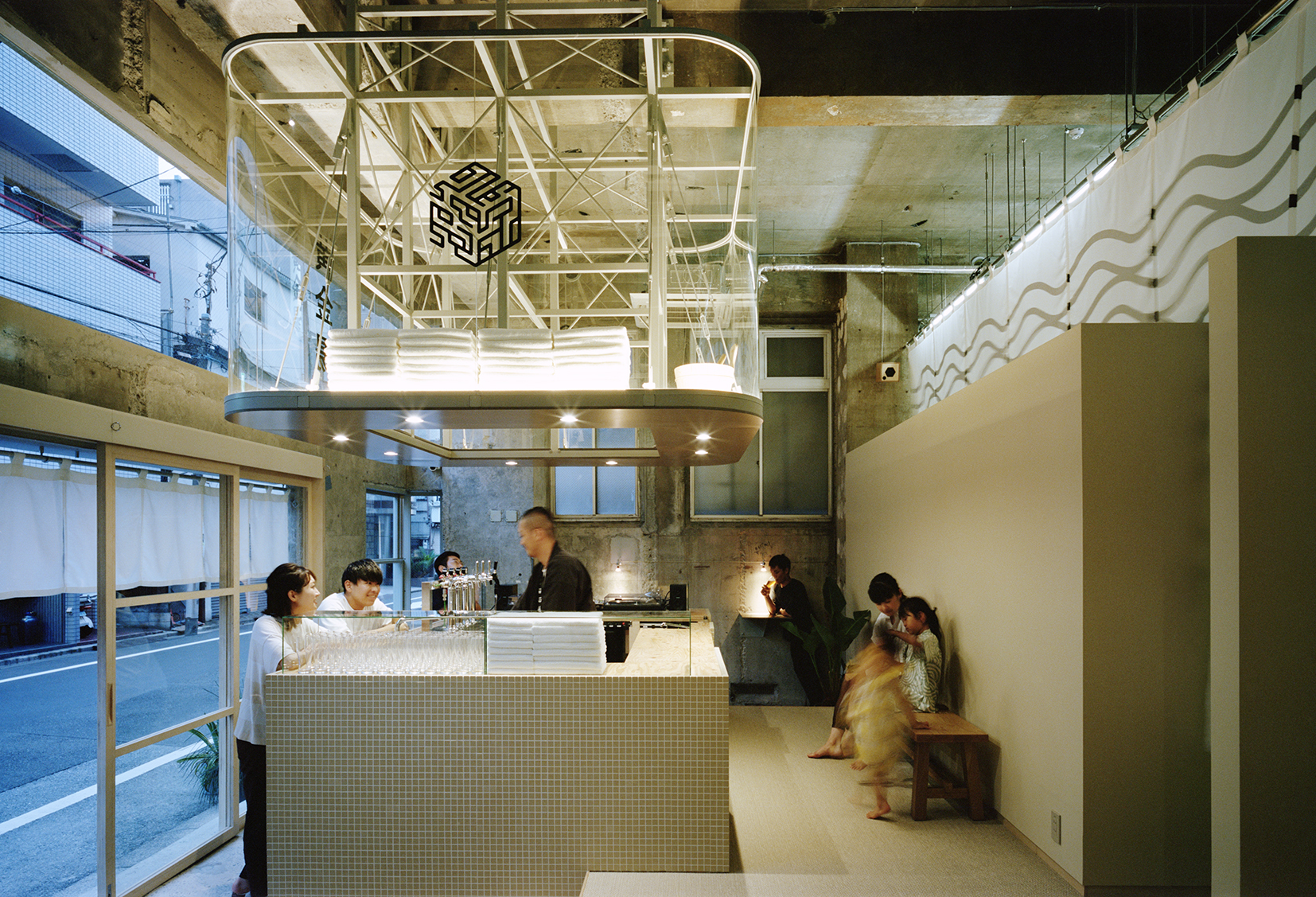
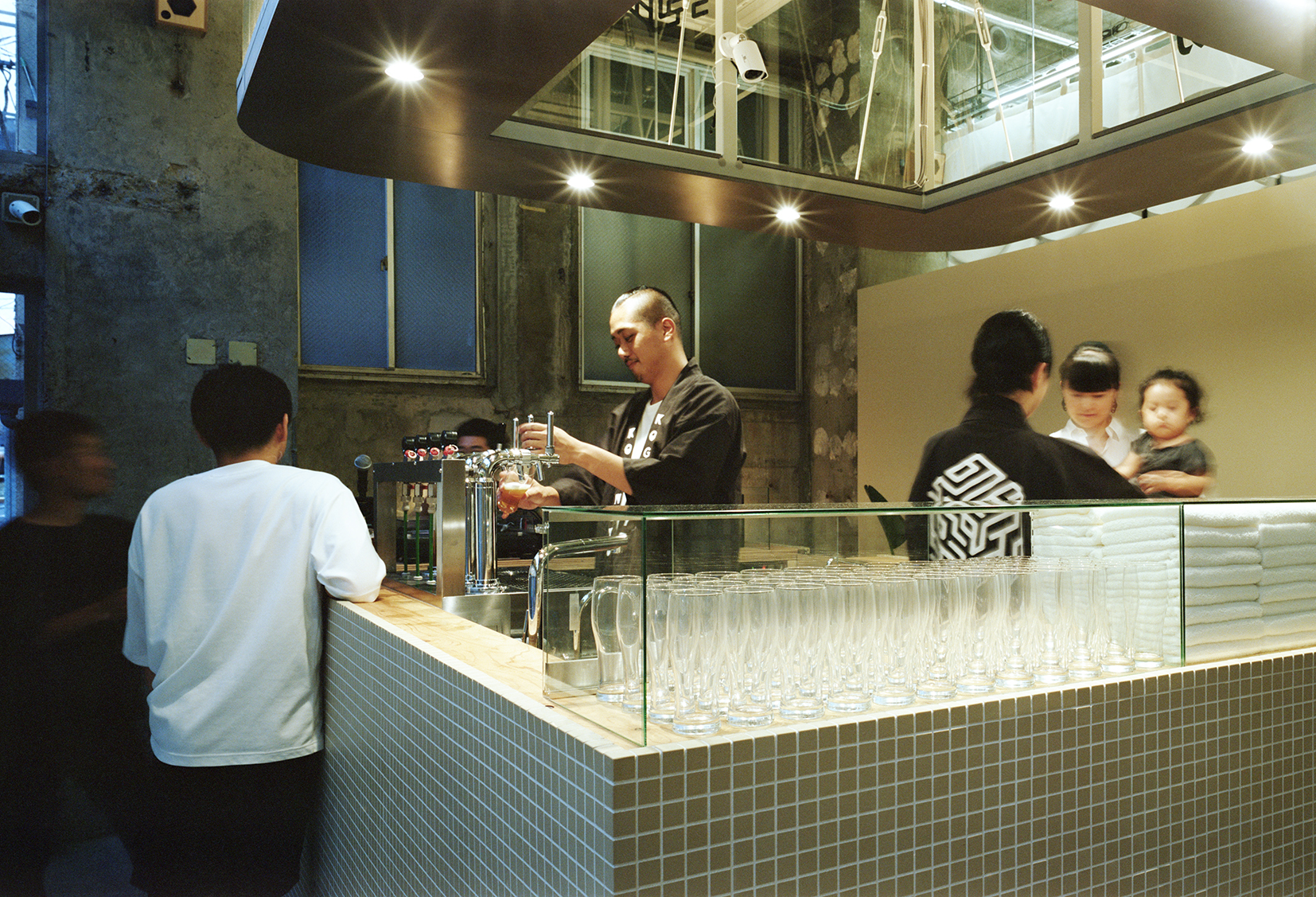
传统钱汤的前台,是一个叫作“万代”的接待处,面朝浴池方向,以便工作人员可以随时留意到客人的情况。现代浴室对传统布局进行了改造,越来越多的人喜欢将前台放到前面,而Schemata则更进一步,把前台区域打造成一个啤酒吧,同时兼具DJ台的功能。人们从外面首先看到的就是这个啤酒吧。
Schemata Architects designed a bar area that serves beer at the front of the sento that’s visible from the street. The bar is an adaption of the traditional sento layout, which originally had a reception desk called a bandai facing in towards the bath for staff to keep an eye on the bathers. More modern bathhouses put this booth out front, but Schemata Architects decided to take it one step further and have it as an island that can double as a DJ booth for events.
裸露着粗糙混凝土的工业风,与吧台上方整洁的米色瓷砖形成对比。柔和的灯光烘托了氛围,干净松软的毛巾叠放在金属拉丝的架子上。
Industrial-style concrete walls have been left bare to contrast with the neat square tiles in soft beige that cover the bar. Soft lighting adds to the atmosphere and clean fluffy towels are stacked above the brushed metal shelf.
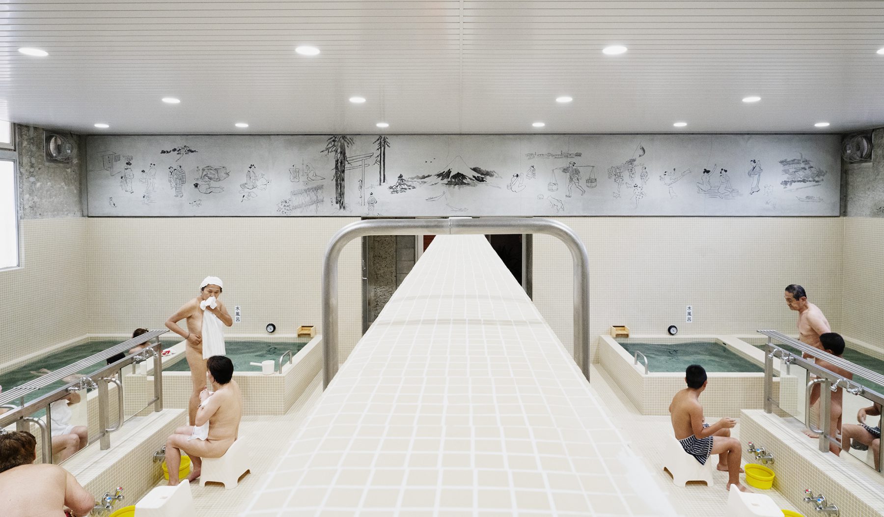
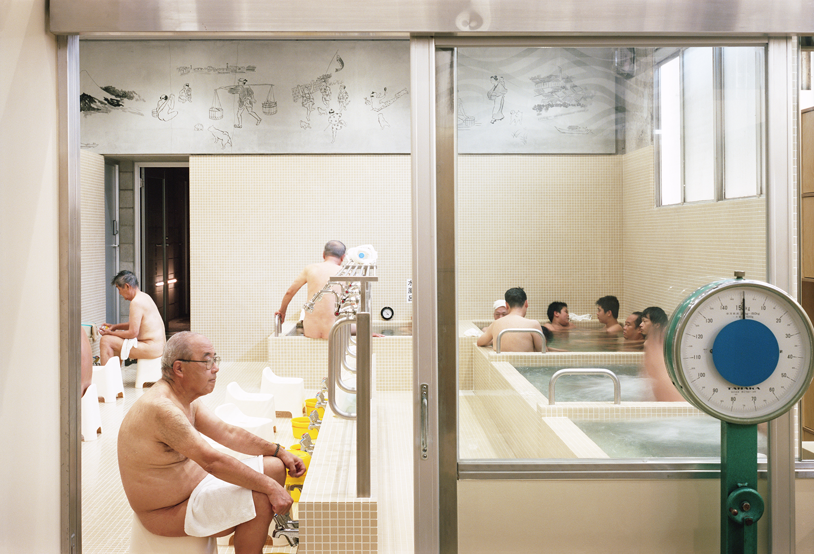
洗浴区分为男女两部,各在一边,中间以传统的半墙进行分隔。这样的设计,是为了方便家人或朋友,在看不到彼此的情况下进行语言交流,还可以共用肥皂。
The bathing area is divided according to sex, with men on one side and women on the other. A traditional half-wall separates the two to afford privacy to the nude bathers while allowing couples or families to communicate verbally and share soap over the wall.
建筑师在酒吧区域有意使用了相同的特色瓷砖设计,并加入了一根贯通两边浴室的金属杆。
Schemata Architects deliberately used the same tiles as the bar area for this feature and added a metal railing that runs from one side to the other.
在洗浴的时候,男女由一堵2.25米高的墙隔开,而洗完之后,他们就可以聚到只有1.15米高的吧台前畅饮一番了。设计师Shimada解释说,将吧台和浴场设计成一致的风格,是想营造出一种整体的浪漫感觉。
“During bathing time people are separated into men and women by the 2.25-metre- high boundary wall, but after they will be getting together in the end over this 1.15-metre-high counter with beer,” explained Shimada. “We hope using same materials could help people to feel the romanticism like that.”
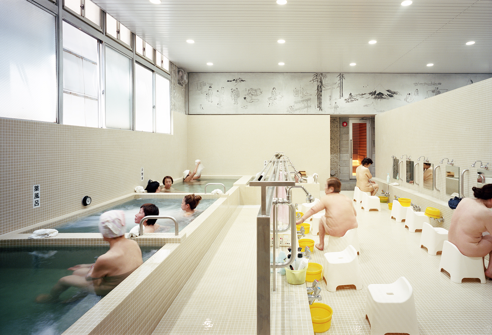
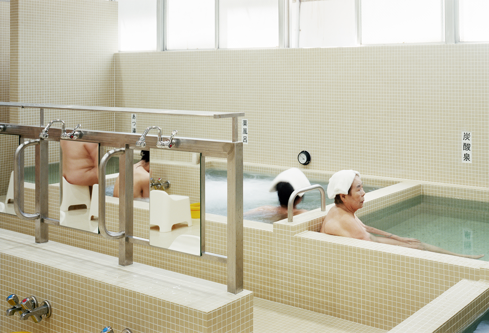
设计师选用小块的方形瓷砖,是看中了它们易于清洁的特性,且边缘的泥灰浆也更利于防滑。在颜色的选择上,他们采用了更温暖、明亮且普遍适用的米色系。
Small square porcelain tiles were selected because they’re easy to clean, and the mortar around the edges helps make them less slippy underfoot. Schemata Architects chose beige because it’s “warm, bright and universally good”.
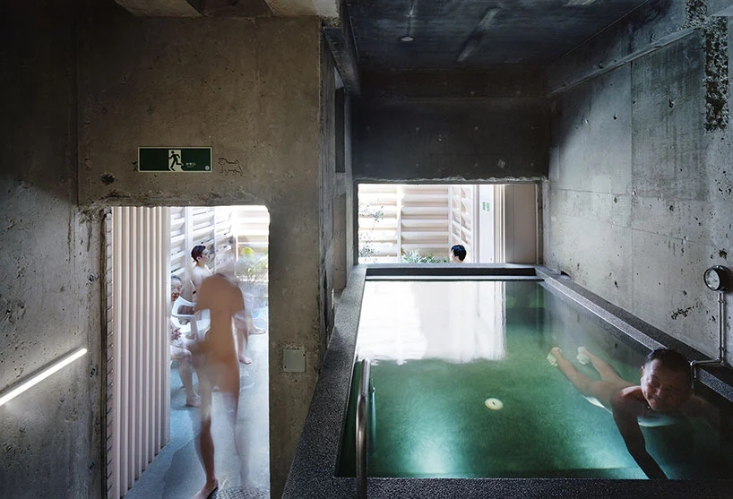
加热浴池是用十和田岩做的,这种石头在变湿的情况下会呈现蓝绿色,因此水的颜色也呈现出一种有点奢侈的清澈的蓝。十和田岩通常用于温泉,但在东京的浴池里还没有人使用过。
The insides of the heated baths are made from Towada stone, which looks blue-green when it’s wet.”It makes the water look blue and clean and its texture feels a bit luxurious,” said Shimada. “Towada stone is a popular material for onsen, but I’ve never seen it used in this kind of local bathhouse in Tokyo.”
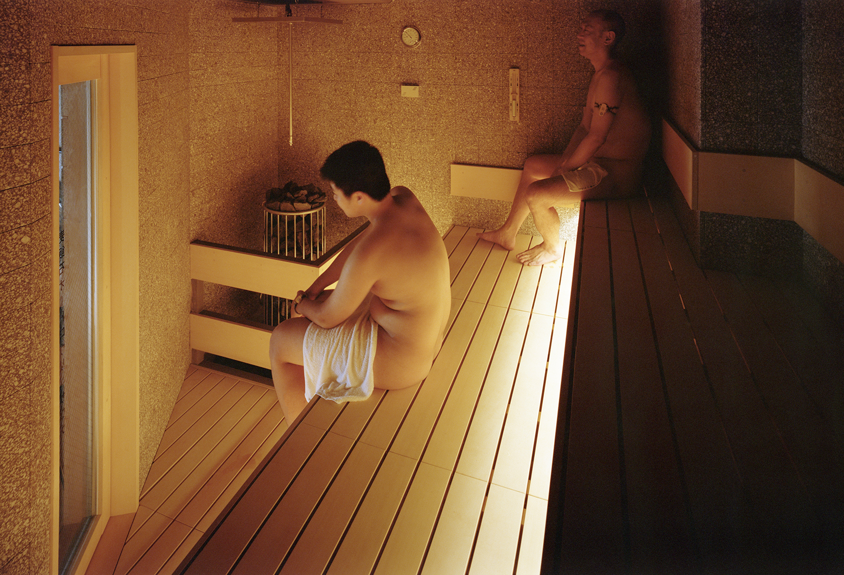
桑拿房和冷水池区域使用了深一些的色调。混凝土上面的深色聚合物,在防滑的同时,还可以对足部进行按摩。
Schemata Architects used a darker palette for the sauna and cold plunge pool area. The concrete has a dark aggragate that makes it more grippy and lightly massages the foot.
户外的座椅区可以让客们在洗浴中间清凉一下。
An outdoor area with seating lets customers cool down between baths.
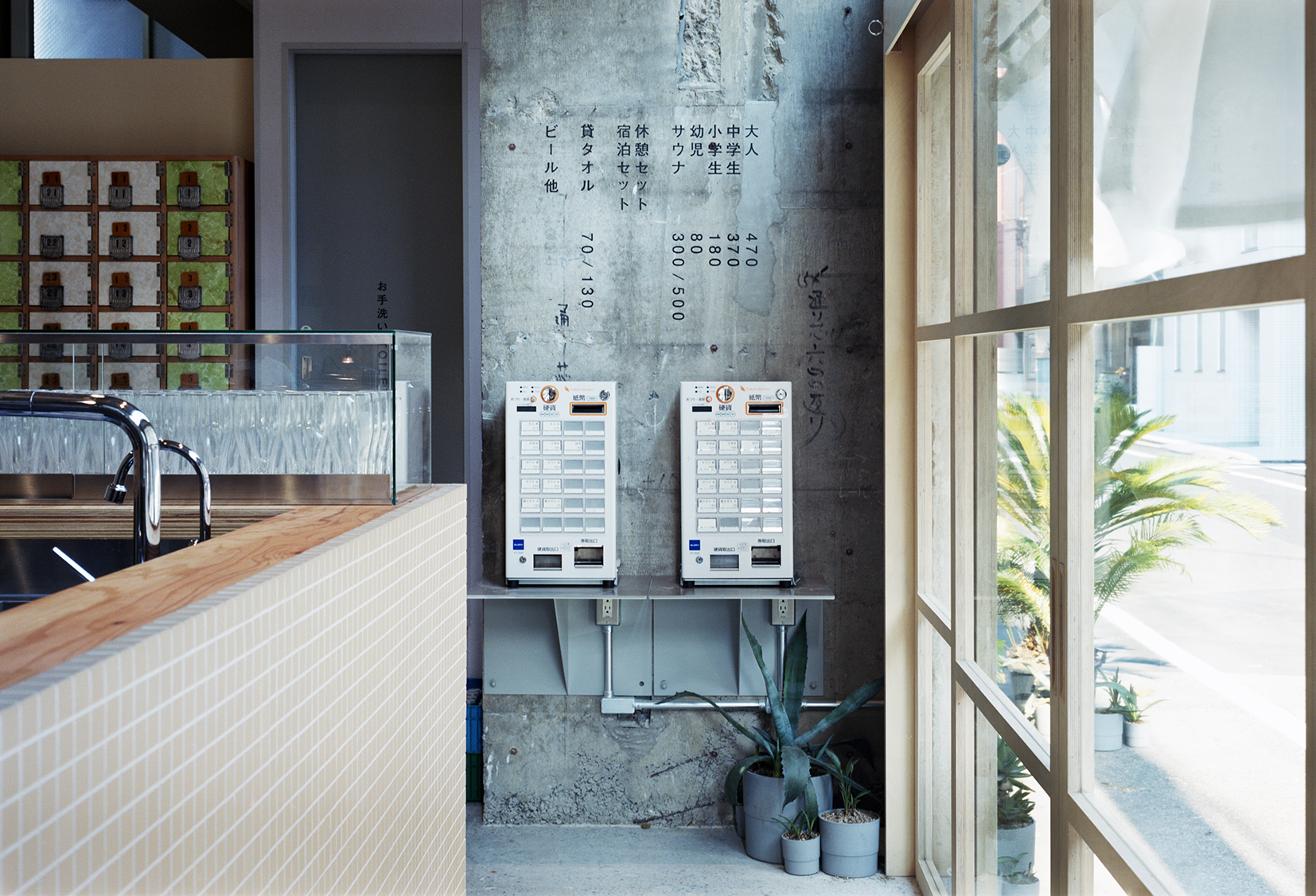
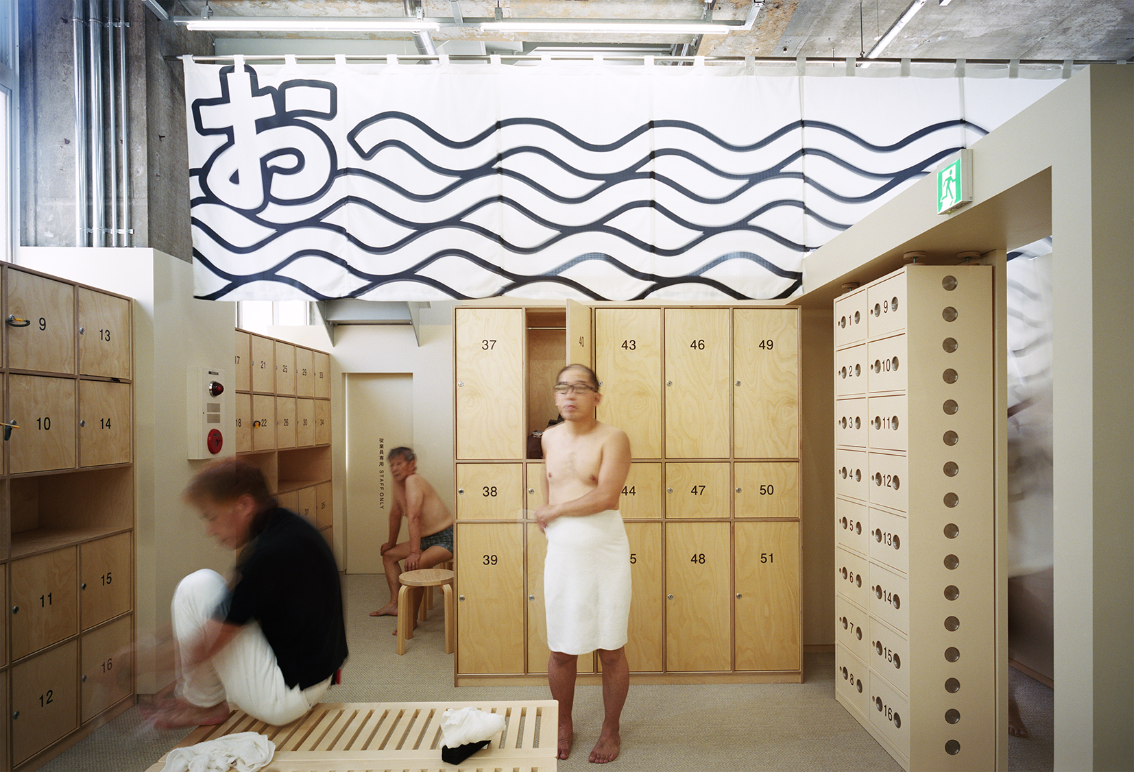
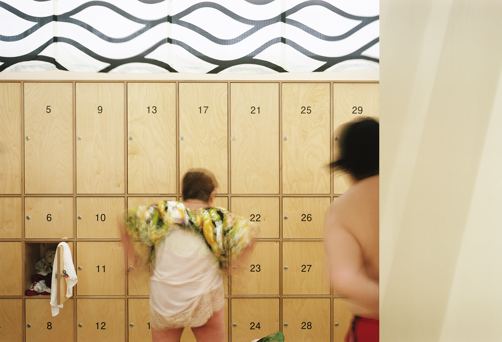
前台和更衣室的地面采用了沙色的编织乙烯,这种材料具有快干的特性,一双湿脚踩上去也会觉得很舒服。更衣室的门选用的是耐湿性良好的桦木胶合板,同时它的颜色也与整体的配色方案和谐一致。
The floors of the reception bar and locker room are made of sandy-coloured woven vinyl chosen by Schemata Architects because it drys quickly and is pleasant to stand on even with wet feet.Birch plywood was selected for the locker doors in the changing rooms because it’s resistant to moisture and complemented the pale colour scheme.
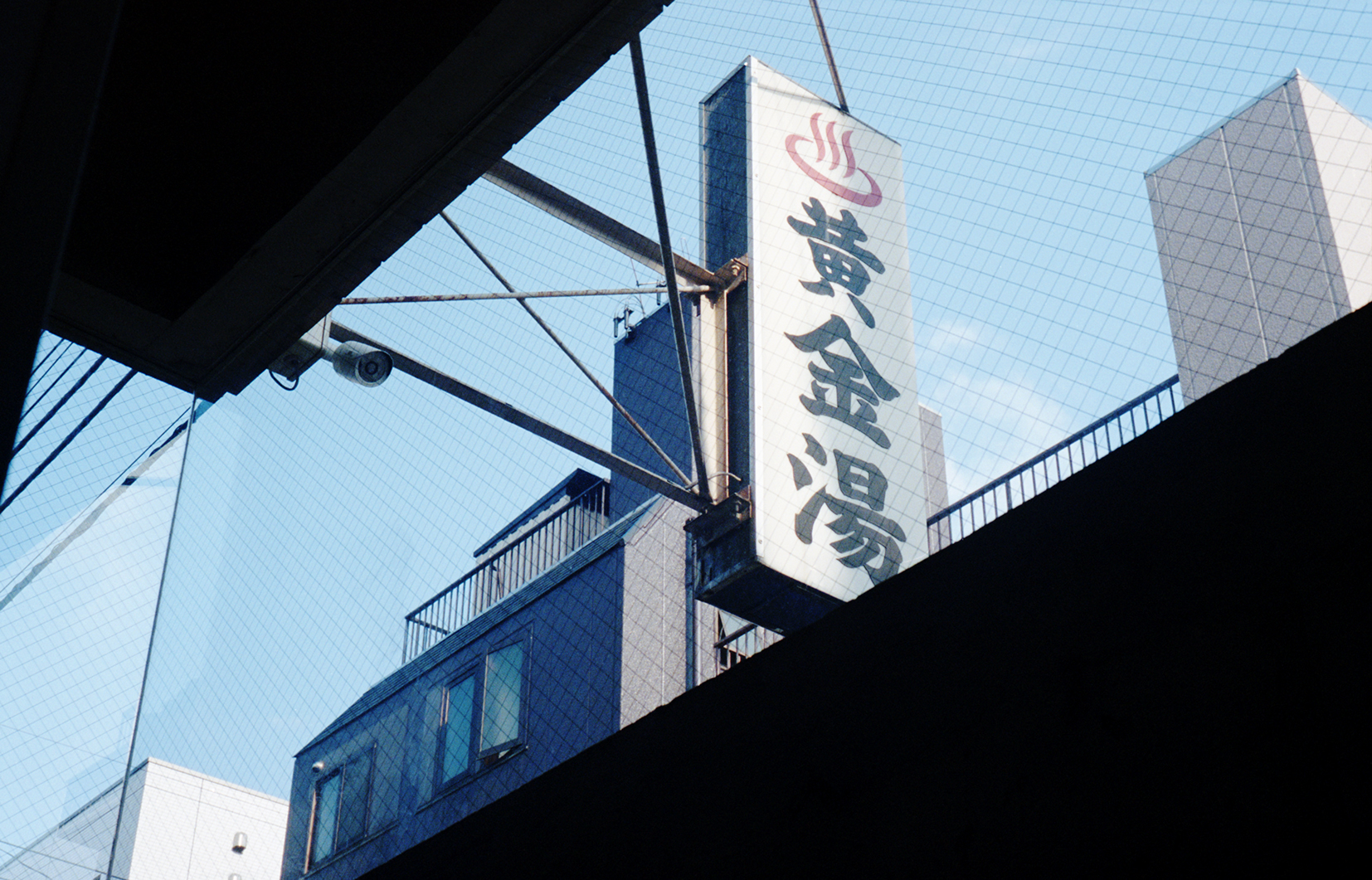
Schemata建筑事务所还委托艺术家们在浴室里做了一些传统装饰,比如Yoriko在浴场顶端画的人与富士山的长卷壁画;Tanaka设计的分隔男女更衣室的门帘,设计师在传统的棉麻对开帘上选用了打招呼用的Oi喂这个字,来传达分隔在两边的男人和女人之间的相互问候。品牌标识由Takahashi Hiroko操刀。这些都是对传统钱汤装饰的现代诠释。
Schemata Architects commissioned artists to reinterpret a couple of traditional sento decorations. Yoriko Hoshi painted a mural of people and Mount Fuji that scrolls around the top of the bathing area. Iichiro Tanaka designed the noren – traditional fabric split curtains – that divide the male and female changing rooms. Tanaka chose the exclamation Oi! in homage to the greetings exchanged by men and women over the wall. The branding and signage are by Takahashi Hiroko.


