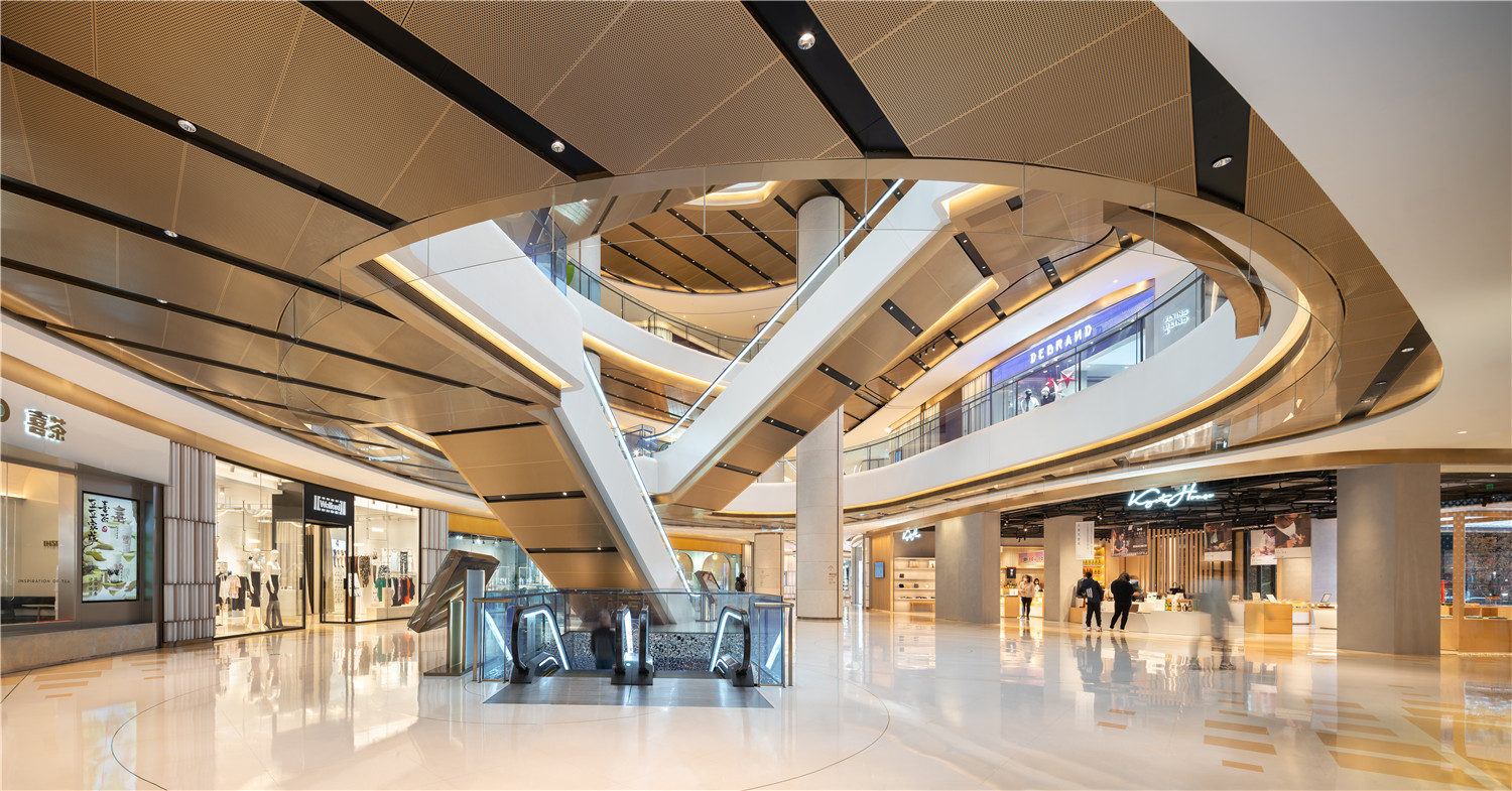
近期,Kokaistudios在国际竞赛中夺魁,受复星地产的委托,领衔负责外滩金融中心南区商场的室内设计。该项目见证了一个顶级商业空间的华丽转变,也见证了Kokaistudios强势回归外滩这一上海黄金滨水地带。这座由Heatherwick Studios与Foster + Partners联合设计的建筑群总面积 达91,982平方米,在丰富了城市天际线的同时也成为连接上海历史旧城区与现代商业中心的纽带。对Kokaistudios而言,该室内设计项目的挑战是在概念上打造轻松愉悦的滨海度假风情、模糊室内外的界限,并满足现代购物及生活方式的需求。
After winning the international design competition,Kokaistudios returned to Shanghai’s most exclusive waterfront district and completed a multifaceted interiors project for landmark architecture scheme,Bund Finance Center.Designed by Heatherwick Studios in partnership with Foster + Partners,the 91,982 sqm mixed-use development represents a significant addition to the city’s skyline,connecting Shanghai’s historic old town to its commercial heart.Occupying the development’s southern district,the BFC Mall represented an exciting challenge for Kokaistudios to create interiors that conceptually link to its riverside locale;blur boundaries between inside and out;and above all,support the shopping center’s lifestyle remit.
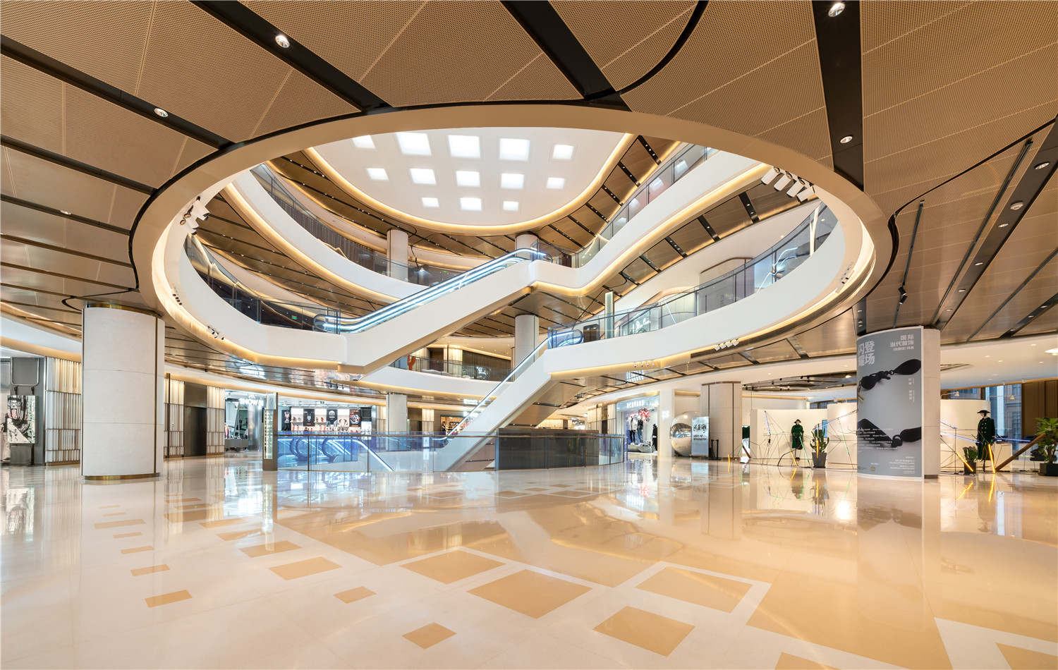
▲一层大中庭
作为一个大型综合开发项目,外滩金融中心将上海的商业中心与旧城区连结,建成后迅速成为城市的标志性建筑。Kokaistudios与外滩区域渊源颇深,早在2006年,由该事务所倾力改造的外滩18号就获得了联合国教科文组织颁发的遗产保护杰出大奖。
A major mixed-use development connecting Shanghai’s commercial heart to its old town,Bund Finance Center’s landmark architecture has fast become a Shanghai icon.Called upon to design interiors for the project’s mall,the project marks Kokaistudios a return to the city’s historic Bund,where in 2006 they led the renovation of UNESCO Heritage Award-winning Bund 18.
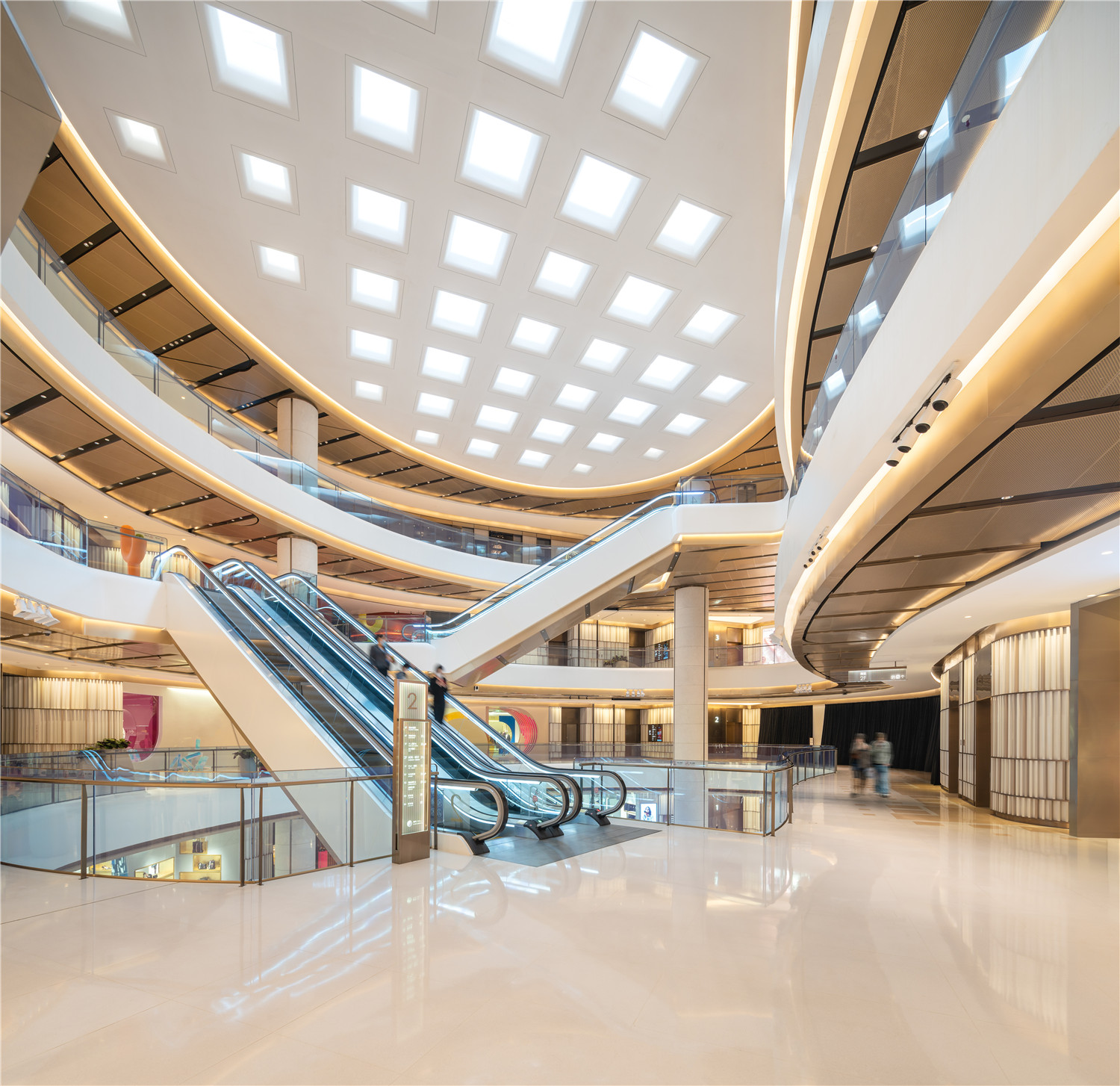
▲地上空间的大中庭区域
▲三层小中庭局部
BFC南区商场有六层,位于外滩金融中心两座180米高的塔楼中的南座,商场设有一个美食超市、健身馆和数个餐厅等功能空间,均分布在地下两层和地上四层,因此人流的动线设计是首要考量的因素。此外,为功能开发预留空间,在设计中更要注入灵活性。
BFC Mall occupies six storeys of one of the development’s two 180-meter tall towers to the south of the site.With facilities including a gourmet supermarket,gym,and multiple restaurants,all spread across two below-ground levels and four above,visitor circulation was a particular priority.Similarly, and in order to plan for a range of future lifestyle-oriented uses,injecting flexibility was important.
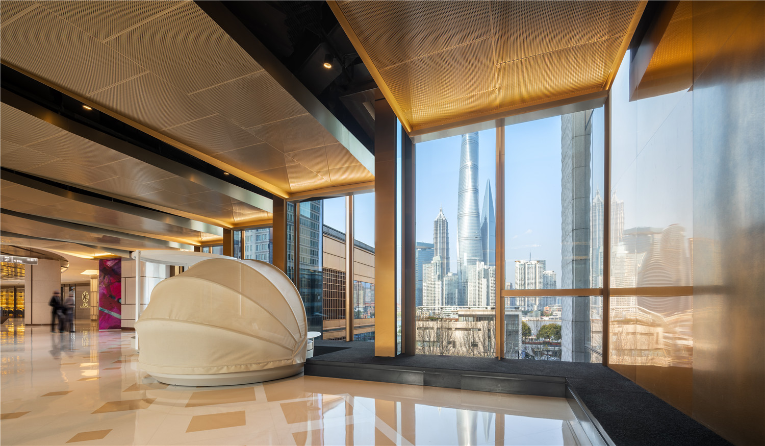
▲4层连廊区域绝佳的景观视野
上海的商业市场动向发展迅速且影响深远,而如今电子商务的迅速崛起更引发了实体商业空间角色和功能的重大变化。因此,Kokaistudios在参与该项目室内设计的新方向讨论时,更倾向将其规划为生活方式空间,而不仅仅是单一的零售场所。
In Shanghai,market trends develop fast,and with impact. Case in point:the rapid rise of e-commerce has triggered significant changes in the role and function of commercial spaces.To that end, and during its construction,BFC Mall’s programming was re-conceived for a lifestyle focus over exclusively retail,with Kokaistudios enlisted to steer the space’s interiors in this new direction.
▲从下沉庭院看室内外的和谐统一
Kokaistudios在Foster + Partners设计的建筑框架内进行室内设计,在接手项目时,商场内部已有两个重要租户:一间3000平方米的高端健身会所和一个大型儿童及宠物游乐中心。延续了这两家商户所强调的内在幸福、身心放松的内涵,并以基地靠近黄浦江岸线为灵感,团队以“水系”为线索,设定了“滨海度假”的主题。
Working within Foster + Partners’existing and unfolding physical framework,Kokaistudios’ concept was inspired both by the venue’s prime riverside location at the southern end of Shanghai’s Bund,as well as its two anchor tenants.They are a 3,000sqm fully equipped gym,and expansive children’s and pets’ play area.Expanding on both establishments’ inherent connotations of wellbeing,relaxation,and escape,as well as the site’s close proximity to the shoreline of the Huangpu River,the team devised overarching themes of beachside vacations,and above all,water.
▲天窗下端的散口喇叭式处理,引入更多自然光
Kokaistudios采用多种设计方式,成功将商场从单一购物转型为全面生活方式空间。设计首先通过与Foster+Partners的密切合作,打破建筑原本沉重的外立面,并将窗户朝向外置,让商场与浦东新区华丽的天际线相连,而对内则延伸至一个中央庭院。这样的做法赋予空间一个强有力的亮点:以绝佳的景观吸引过路行人的注意。而庭院中设计了一个下沉广场以加强与公共空间的关系,并为B1层的美食广场区引入充裕的自然光。
In moving away from the mall’s original objective and towards lifestyle,Kokaistudios opened up the space in multiple ways.First,and in close collaboration with Foster + Partners,outward-facing windows were installed to connect the mall to Pudong’s impressive skyline to the east of the development,as well as inwards to a central courtyard.The intervention lends the venue an additional attractive feature – dramatic views – and serves to draw the attention of passing foot traffic.A sunken plaza has been designed in the courtyard to strength the relation with the public space and to bring natural light to B1’s food court area.
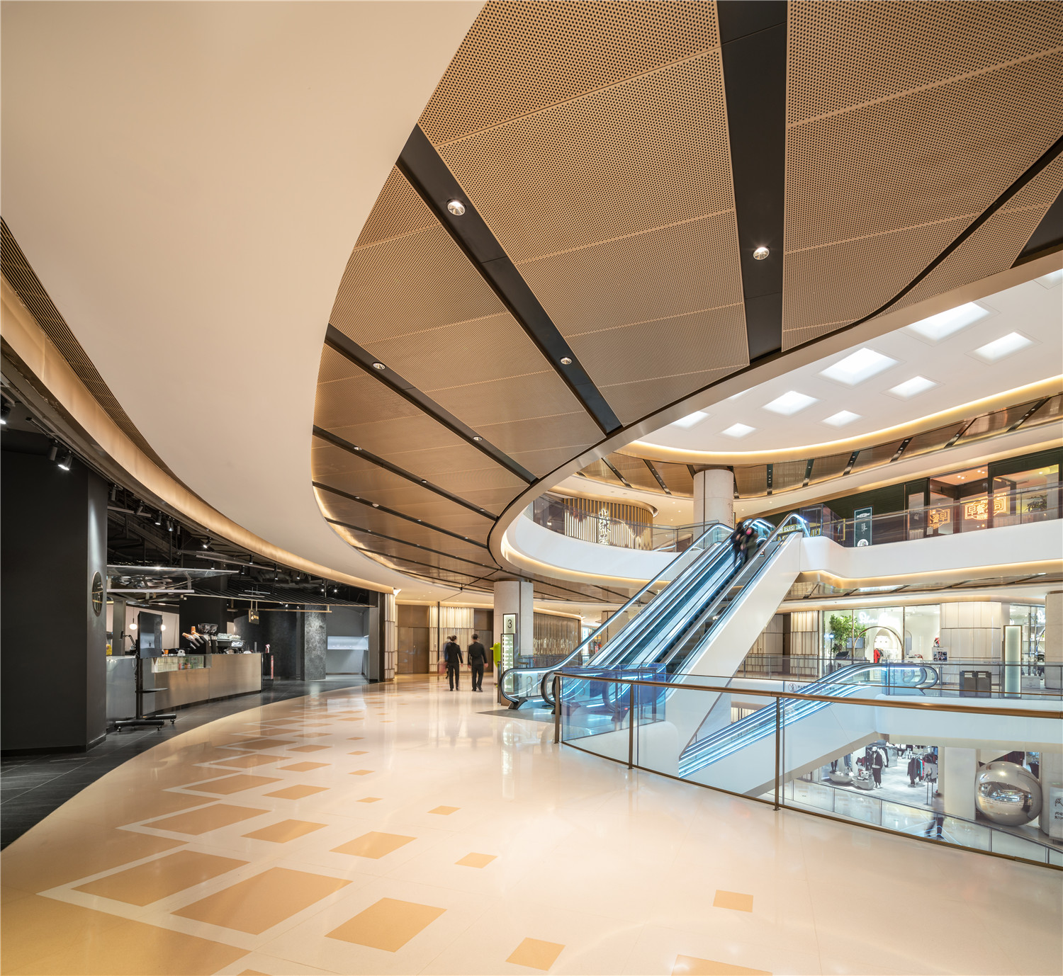
▲过道空间天花铝板的延伸
▲“水上”与“水下”空间的对比
▲地下二层的餐饮区
受到黄浦江自然形成的岸线启发,设计也进一步模糊了租户与公共空间的边界,打破传统商场空间的局限性,再没有哪一面是商户“正面”的感受,使之更加开放、灵动,也与“水系”的主题相契合。同时,设计增加了面向中央庭院的开放的商店区域,带来自然采光,以流动的方式打破传统商场中走道的固有印象。
Further blurring boundaries between outside and in,and inspired by the inherently inexact shoreline of the Huangpu River beyond,perimeters of tenant spaces are deliberately vague,and without a defined ‘shop front.’ The effect is one of openness,flexibility,and in keeping with a broader water motif that transcends the venue,fluidity.Also,adding open shop areas facing the central courtyard breaking the corridors in a dynamic way and bringing natural light.
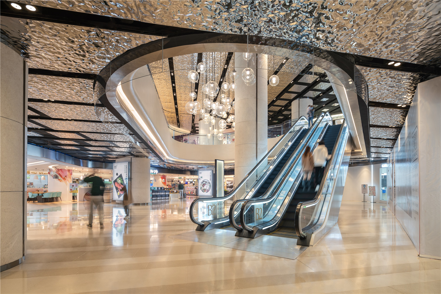
▲地下二层大中庭,更女性化的戏剧场景
▲地下一层大中庭
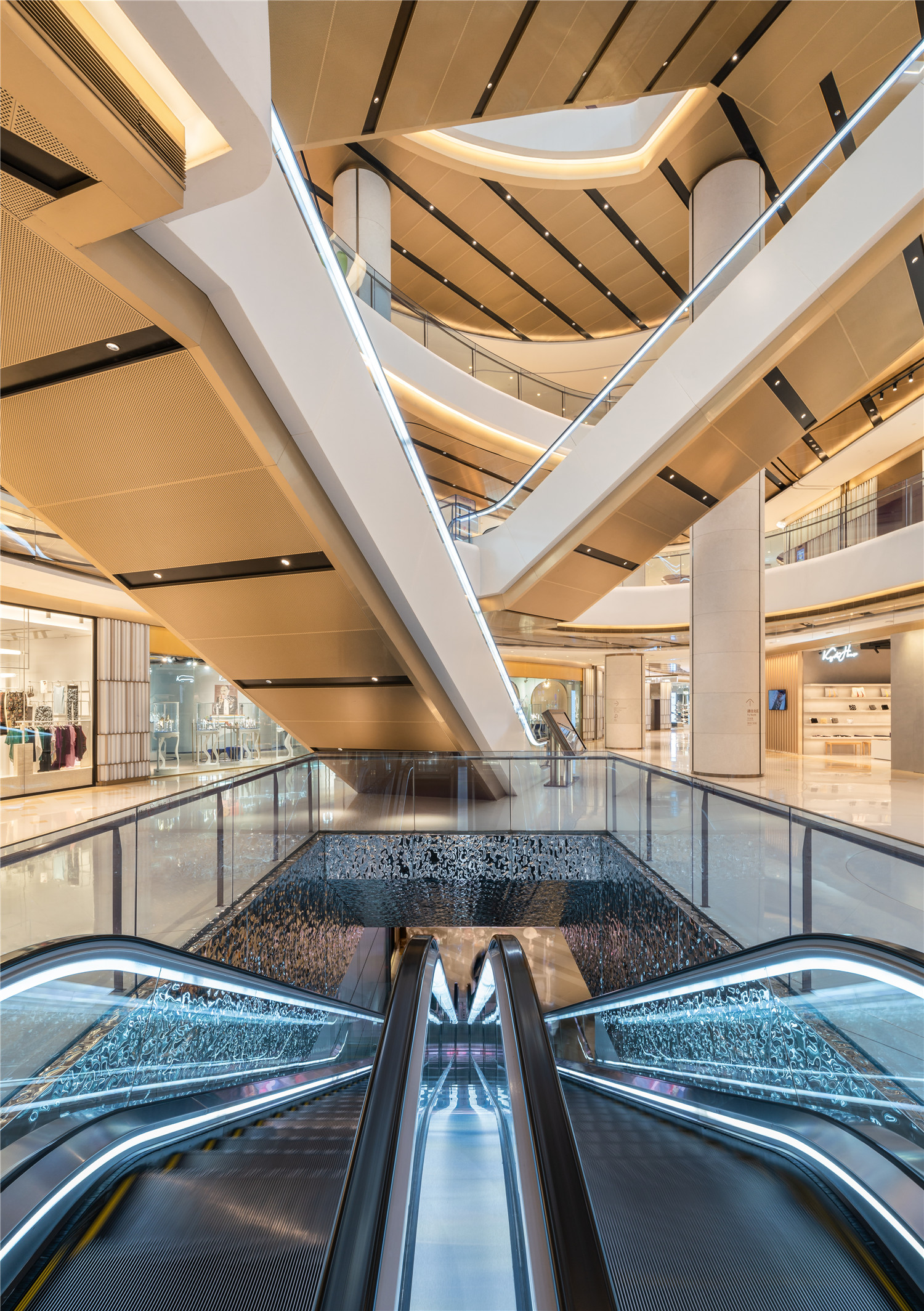
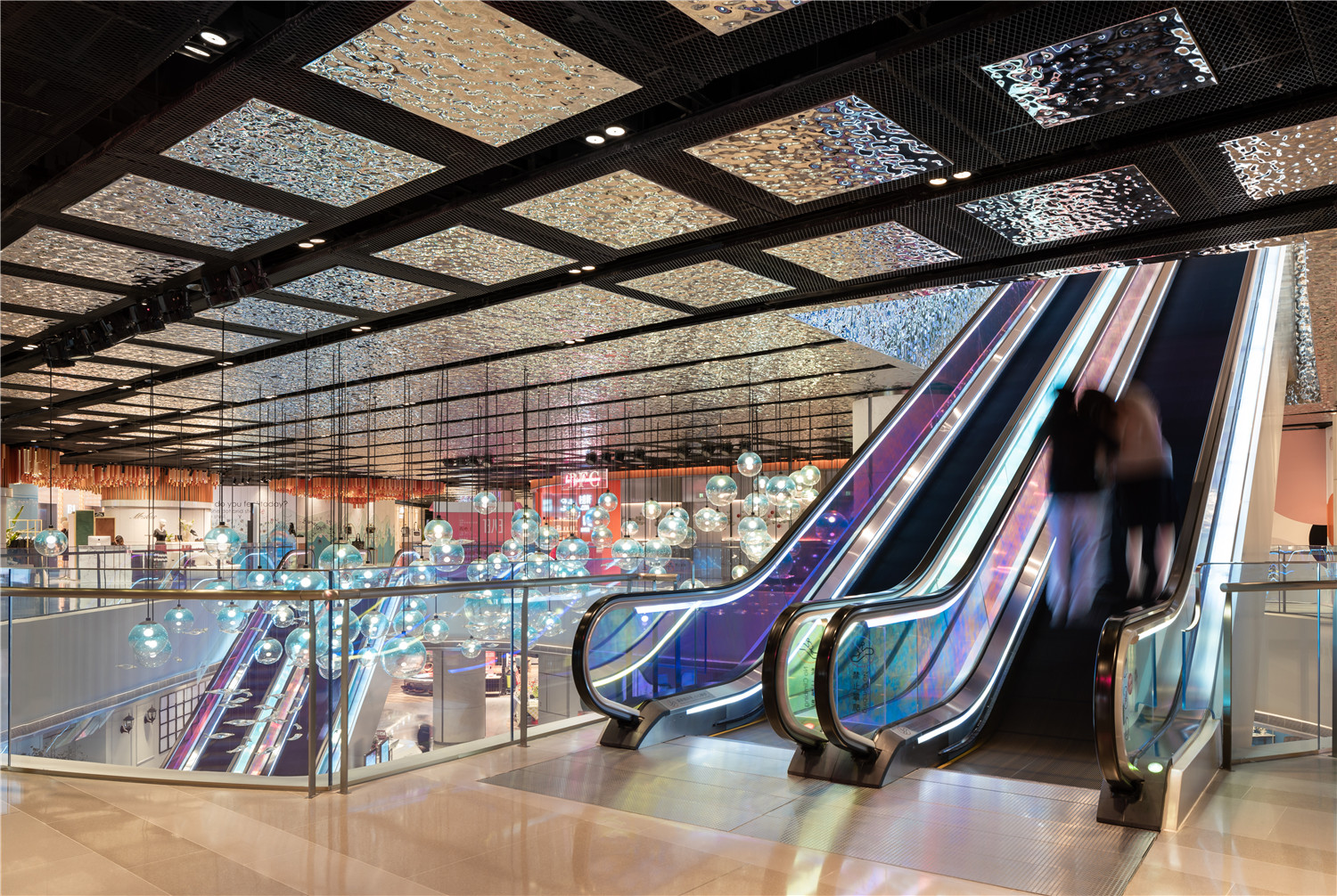
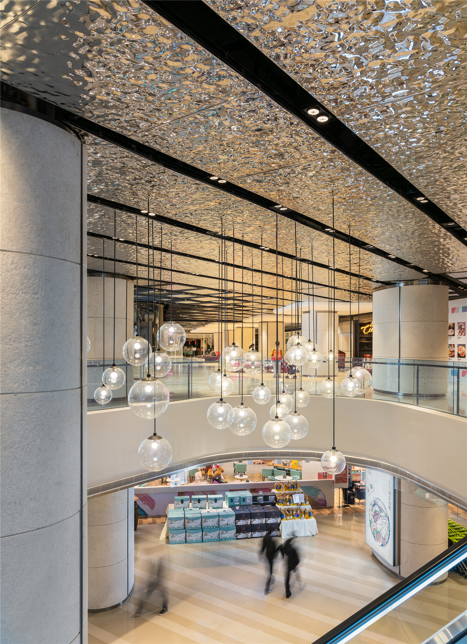
有关水系的联想贯穿整体空间,包括镶嵌在一层水磨石地面上的黄铜圆环,仿佛湖面上一圈圈荡漾开来的水波。设计通过材质的反转将地下两层打造成一个“海底世界”,从而与地上四层形成对比:在地上层中闪闪发光的水磨石瓷砖,到了地下空间则倒转成天花板的用材;此外还有反光不锈钢,以更柔和的色彩唤起神秘水下景观的气息。
Associations of water run throughout,including brass circles inlaid into the ground level’s terrazzo floor like rippled pools.The motif conceptually links the two below-ground floors with the four above,with basement levels imagined as an underwater world.Realized through a reversal of finishes and materials – below ground,the shimmering terrazzo tiles applied to the floors of levels one to four are used on the ceiling,for example – as well as reflective stainless steel,a more muted palette evokes a mysterious underwater landscape.
▲地面图案像阳光海滩的沙粒一样自然散开
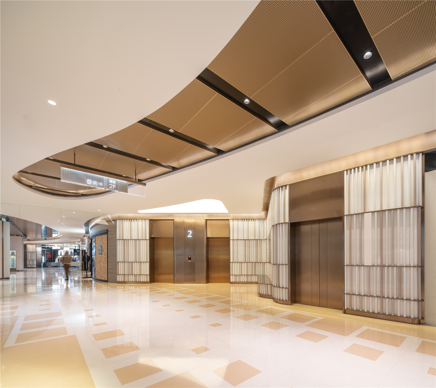
▲斜面开放式的电梯厅
活泼灵动的色彩点缀着调性柔和的地下空间。戏剧造型的吊灯从中庭倾泻而下,它由一串的球形泡泡状的灯饰组成,中间穿插着“鱼”造型的玻璃装饰。“珊瑚礁”区域的中心是一个充满活力的天花板装置,以桃色、粉红色和橙色为主基调。这是一处具有流动性的多用途空间,其模块化的座位可以容纳各种活动需求,与商场的生活方式和公共空间的焦点保持一致。
Punctuating the basement levels’softened tones are splashes of playfulness and vivid color.They include a dramatic chandelier,pouring down from the atrium and comprising spherical bubble-like pendant lighting,interspersed with glass fish.Elsewhere,the centerpiece of a’coral reef’area is a vibrant ceiling installation in inviting peach,pink,and orange tones.A multipurpose zone with fluidity at its core,its modular seating accommodates events of all kinds,in keeping with the mall’s lifestyle and public space focus.
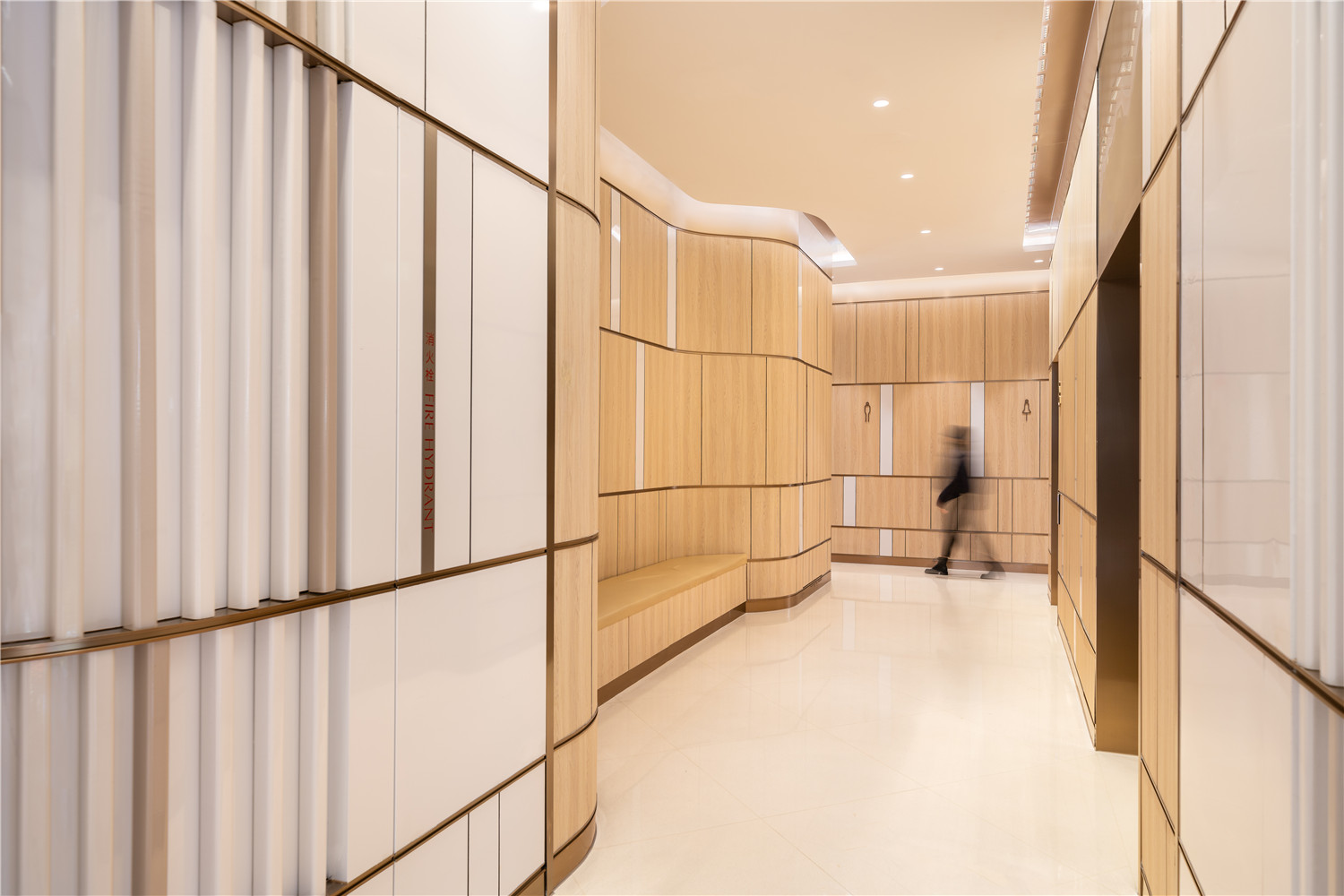
▲洗手间通道,从公共到私密空间的过渡
▲洗手间
材料和饰面的选择使空间整体充盈着度假的氛围。墙面的定制瓷砖和木材相搭配,唤起人们对海滨酒店和餐厅的回忆,奠定轻快的基调;以像素化的手法让水磨石和瓷砖格栅呈现杂色效果,如同海岸线一样模糊空间的边界。
Throughout,materials and finishes match the project’s overall holiday feel.For example,walls feature both custom-made ceramic tiles,as well as wood:more evocative of a beachside hotel or eatery,they strike a clear lifestyle tone.Throughout,terrazzo tiles checkered and variegated for a pixelated effect visually support interiors’overarching aim of blurring boundaries,much like a shoreline.
▲鱼群、泡沫与奇幻的色彩打造出欢乐的海底世界
▲地下小中庭
Kokaistudios提倡将BFC南区商场从“纯商业空间”转变为“可容纳更广泛生活方式的空间”,因此最终呈现的室内设计与原初规划相比有很大转变。这些转变工作甚为繁杂,宏观到对原本平面图的调整,细微到扩大卫生间的梳妆台和全身镜,使之更为舒适。目前,该商场餐饮租户的占比高达50%,更纳入了米其林星级餐厅以飨食客。
Initiators of BFC Mall’s directional shift from purely commercial to a broader lifestyle concept,Kokaistudios’interiors accommodate a significant change of programming from that which was originally planned.The switch in approach necessitated adjustments to the original floor plan to include larger,more accommodating bathrooms,complete with vanity areas and full-length mirrors.Currently comprising almost 50% food and beverage tenants,the venue boasts also Michelin stars across multiple eateries.
▲从室外庭院看室内的氛围
多样的设计元素结合在BFC南区商场中,创造了一种让人远离城市喧嚣而惬意放松的氛围。设计从所处的滨江环境中获得灵感,精心拣选材质与饰面以唤起人们对海滨度假生活的向往,也为国内外商业空间的室内设计树立了新标杆。BFC南区商场代表了在当今电子商务推动下不断进化的购物中心,它们将庞大的建筑体量积极融入城市公共空间,激发城市活力,并重新思考以市场为导向的新型商业空间该如何运作、发展、进一步向前。
At BFC Mall,these various components come together to create an atmosphere of escape from the bustle of city life,in which leisure and relaxation are paramount.Comprising materials and finishes to evoke a beach getaway,and taking direct inspiration from its riverside setting,the resulting interiors set a new standard for commercial spaces in China,and beyond. Representative of an ongoing evolution of shopping malls,prompted in part by e-commerce,as well as a drive to better integrate these often-vast architectural footprints into the city’s public space,BFC Mall marks an innovative,market-informed rethink of how commercial spaces might function,develop,and forward.
▲地下一层平面图
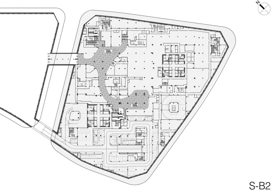
▲地下二层平面图
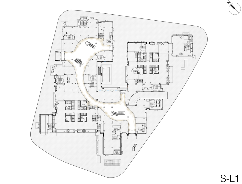
▲一层平面图
▲二层平面图
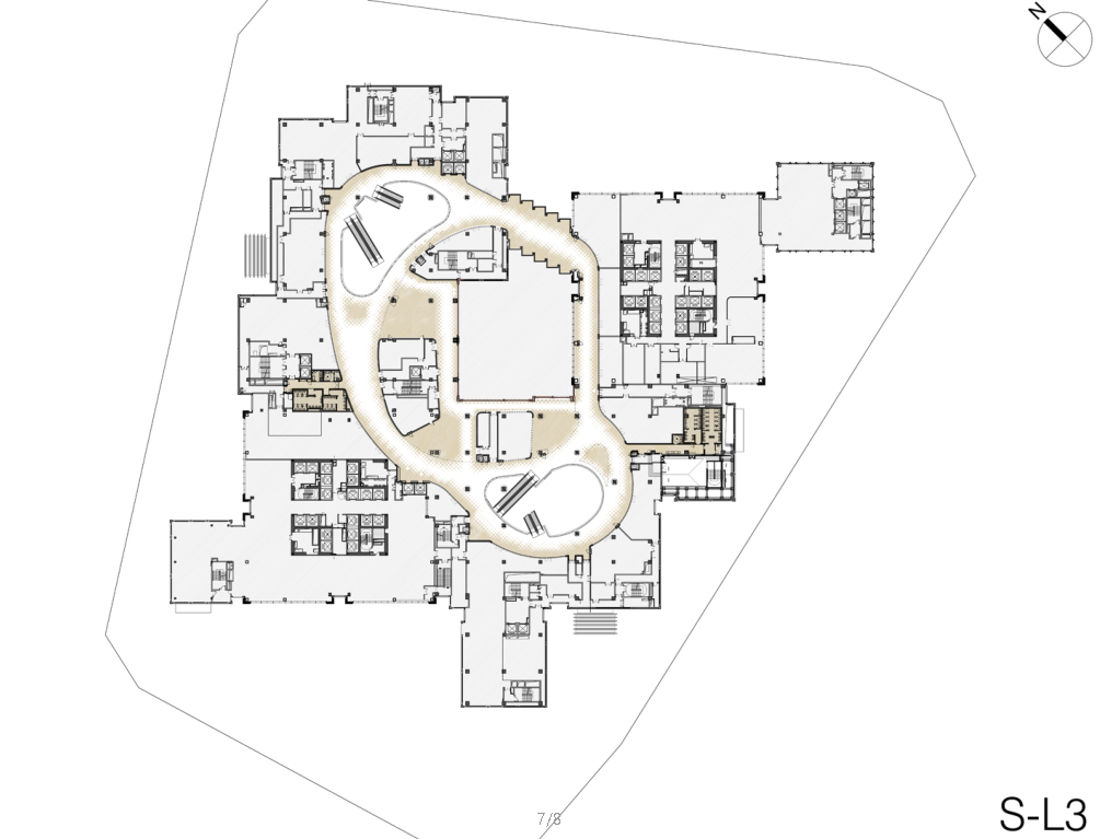
▲三层平面图
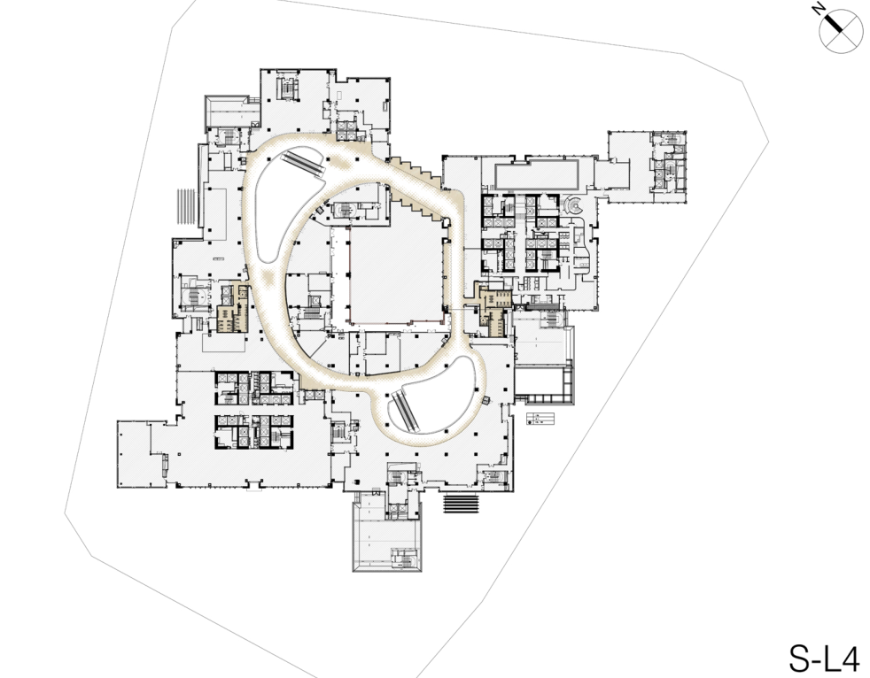
▲四层平面图
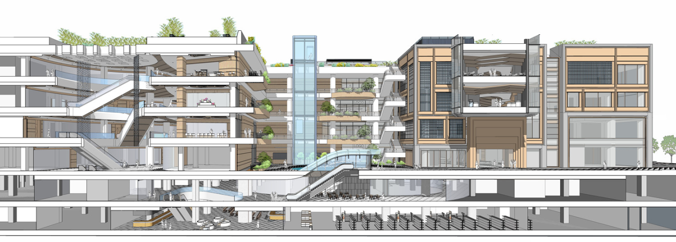
▲竞赛阶段剖切面概念图
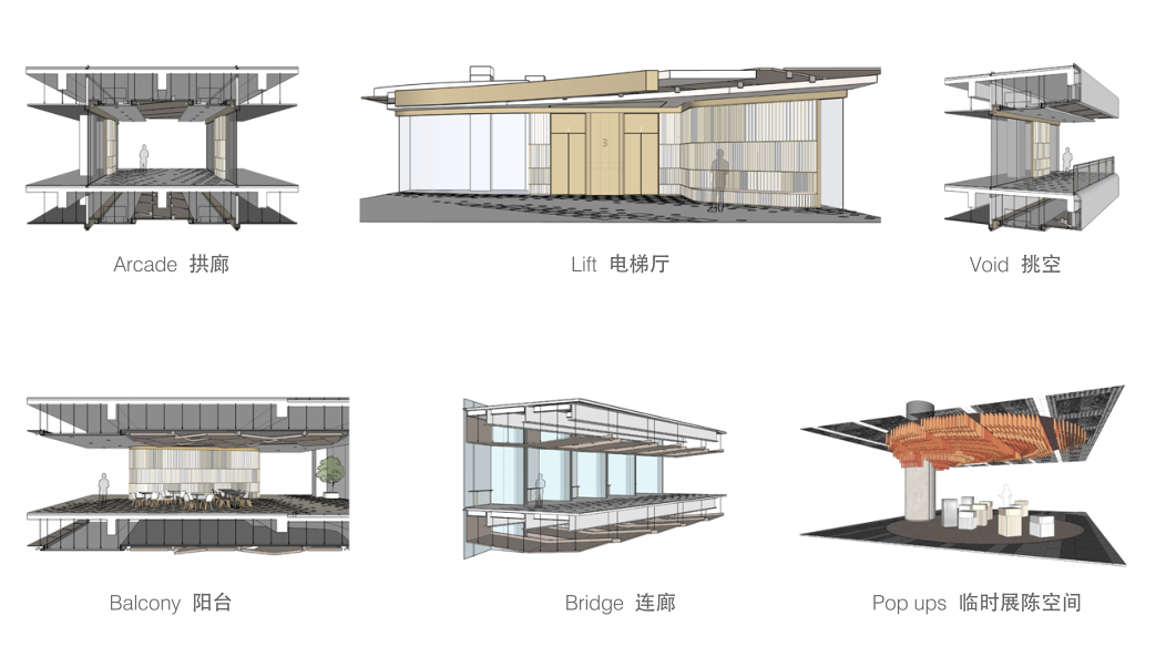
▲节点空间概念
▲流线分析
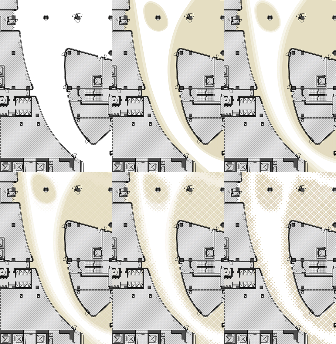
▲地面图案变化
项目信息——
项目名称:外滩金融中心南区商场
服务范围:室内设计
地点:中国,上海
建筑面积:91982平方米(地上:49060平方米;地下:42922平方米)
设计时间:2016年2月-2017年6月
开业时间:2019年12月12日
首席设计师:Andrea Destefanis, Filippo Gabbiani
室内建筑设计总监:Pietro Peyron
室内设计总监:王思昀
室内设计团队:赵牧云,Andrea Antonucci, 刘畅,陈芳汀,黄婉倩,许馨洁,陈芸苇,徐睿辰,Kasia Gorecka, Marta Pinheiro
摄影:张虔希
Project information——
Project Name: Bund Finance Center South Mall
Service Scope: Interior Design
Location: Shanghai, China
Floor Area: 91,982sqm (Above Ground: 49,060sqm; Underground: 42,922sqm)
Design Duration: Feb, 2016-Jun, 2017
Opening Date: December 12, 2019
Principal Designers: Andrea Destefanis, Filippo Gabbiani
Interior Architecture Director: Pietro Peyron
Interior Design Director: Rake Wang
Interior Design Team: Muyun Zhao, Andrea Antonucci, Chang Liu, Christine Chen, Rebecca Huang, Jessica Xu, Winnie Chen, Samo Xu, Kasia Gorecka, Marta Pinheiro
Photography: Terrence Zhang


