215平方米的餐厅坐落在店铺林立的商场中,设计师通过对几何造型的串联与叠加,用趣味的思维转化成外立面的组合方式。水磨石材质与镜面不锈钢的巧妙介入与运用,使室内外空间得到一个很好的划分。半开放式的门头设计在满足光线与视野自由流通的同时,也让整家店铺的外立面形成一个更加简单突出的表达。
This 215-square-meter restaurant project is located in a busy shopping mall with many shops.Through the connection and superposition of geometric shapes,designers use interesting thinking to transform it into a combination of facades.The ingenious intervention and application of terrazzo material and mirror stainless steel make a good division of indoor and outdoor space.The semi-open door head design not only satisfies the free circulation of light and view,but also makes the facade of the whole restaurant form a more simple and prominent expression.
▲入口处
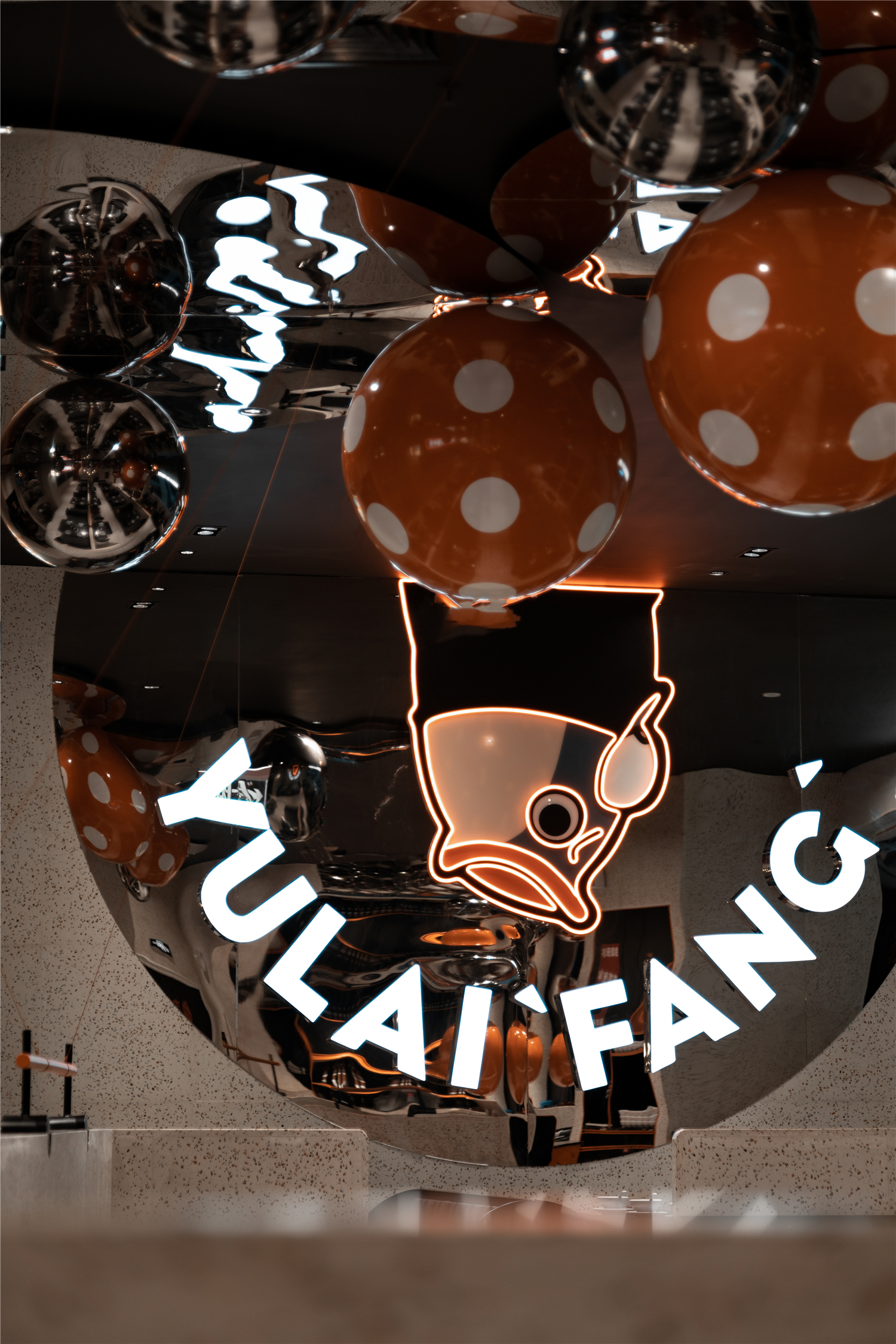
作为该品牌的旗舰店的形象展示,入口保留了主视觉的橙与黑的配色,为整个空间带来时尚、热情的调性。设计师倾力打造“鱼男友”的IP形象,强化品牌辨识度与渗透力的同时,提供完全沉浸式的、主题乐园般的餐饮体验,轻松俘获年轻女性客户群体的芳心。
As the image display of this brand‘s flagship store,the entrance retains the orange and black color matching of the main vision,bringing fashionable and enthusiastic tone to the whole space.The designer tries his best to create the IP image of “Fish Boyfriend”.While enhancing brand recognition and penetration,it provides a totally immersive theme park dining experience,which easily captures the hearts of young female customers.
▲鲜亮的色彩布置
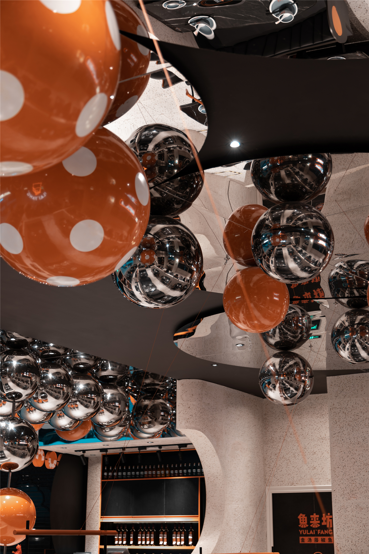
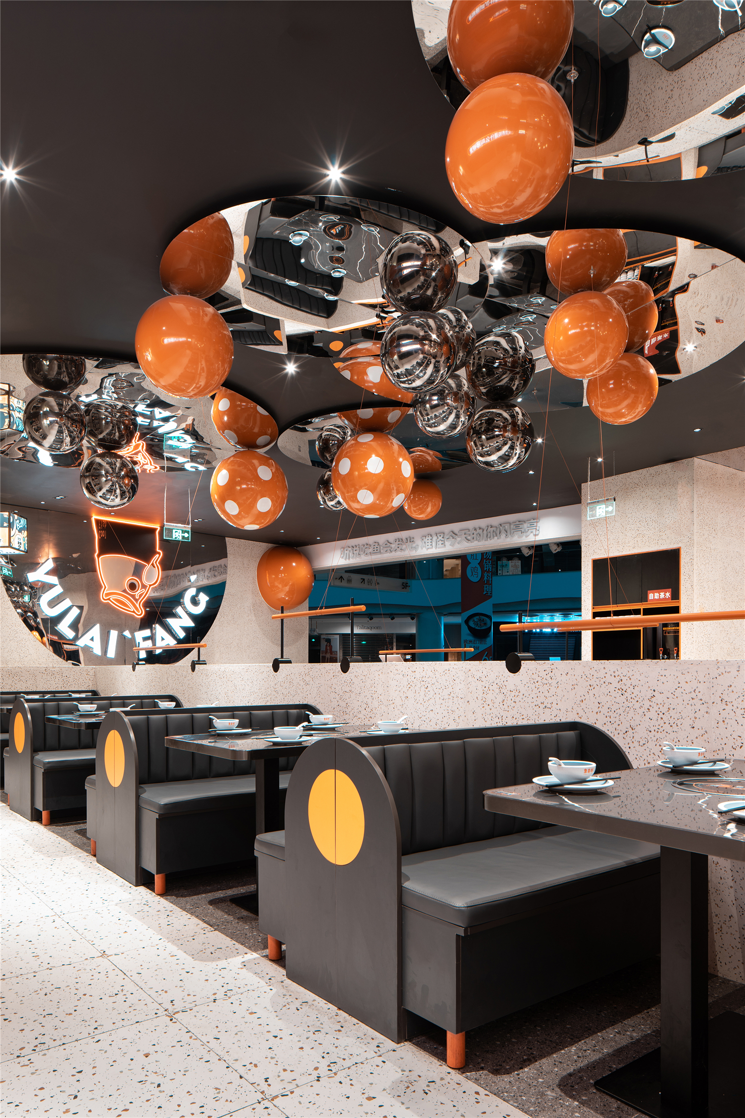
走进店内,鲜亮的色彩布置,以及刚柔并济的选材搭配,给人耳目一新的感官体验。曲线与直线的融合拉升着空间感,打造时尚简约的视觉感受。镜面天花的使用消减了低挑空区域逼仄的压抑感,其映像反射的作用也为顾客呈现出了缤纷多元且富含戏剧性的视觉效果。
Entering the store,the bright color layout,as well as the combination of rigid and soft materials,gives people a fresh sensory experience.The integration of curve and straight line enhances the sense of space and creates the visual sense of fashion and simplicity.The use of mirror smallpox reduces the sense of depression in the low overhead area,and its reflective effect also presents a colorful,diverse and dramatic visual effect for customers.
▲球形艺术装置
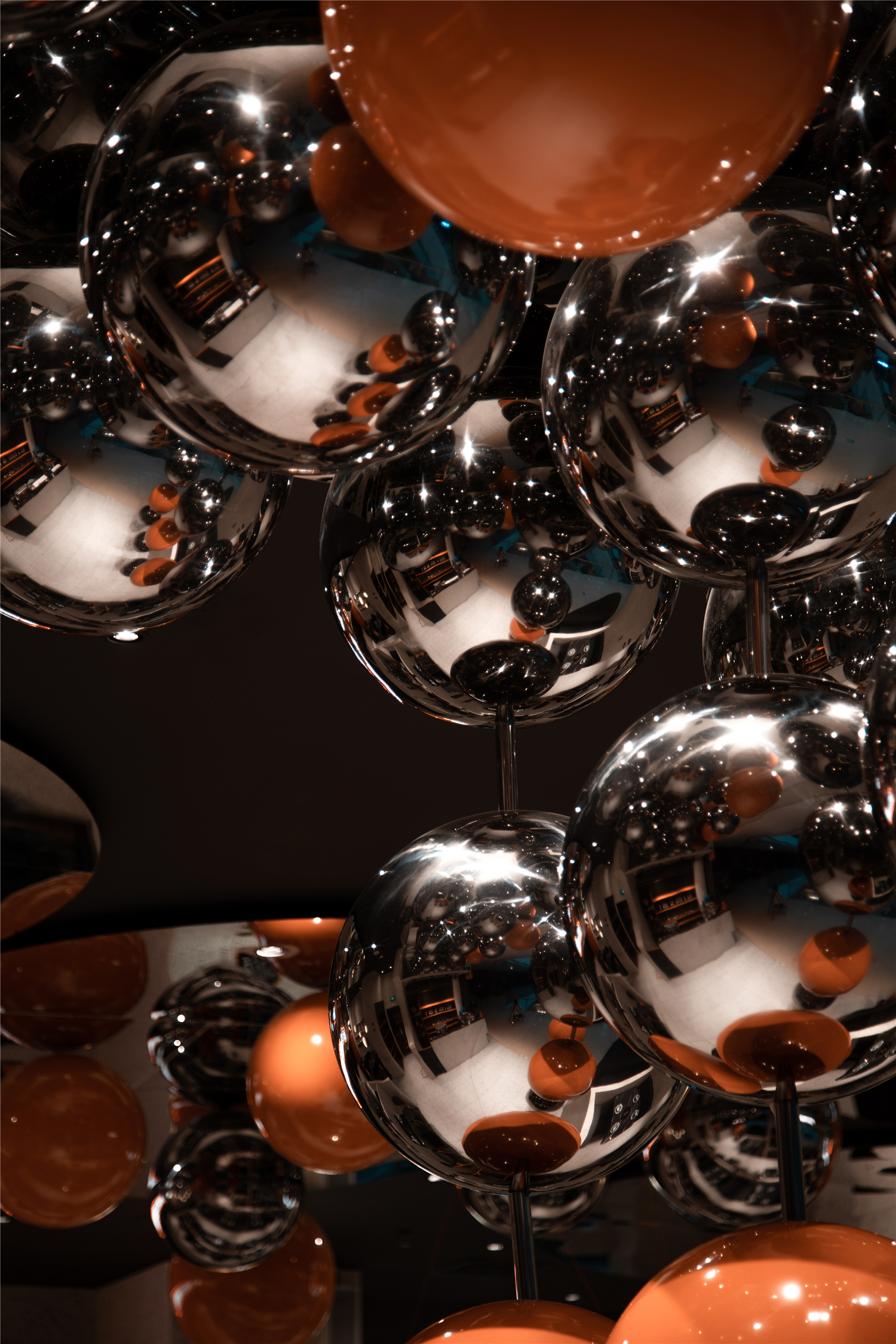
点状光源与球形艺术装置在虚实之间的交错,借由材质、光线、色泽进行分割,增加立体效果的同时,打破了大面积纯色所带来的单调和拥挤,令空间更加灵动有趣。奠定着活泼的空间基调,弱化背景的渲染,整个空间在时尚与艺术的交融中展现出自己的个性。
The intersection of point light source and spherical artistic device can be divided by material,light and color to increase the three-dimensional effect.At the same time,it breaks the monotony and crowding caused by large area of pure color and makes the space more flexible and interesting.It lays a lively space tone and weakens the rendering of the background.The whole space shows its own personality in the blending of fashion and art.
▲用餐区
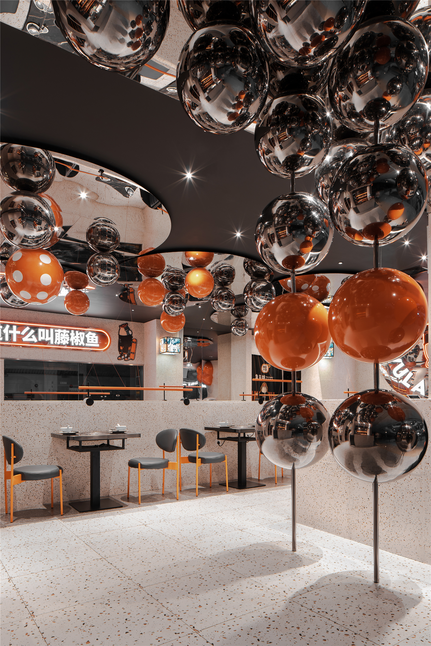
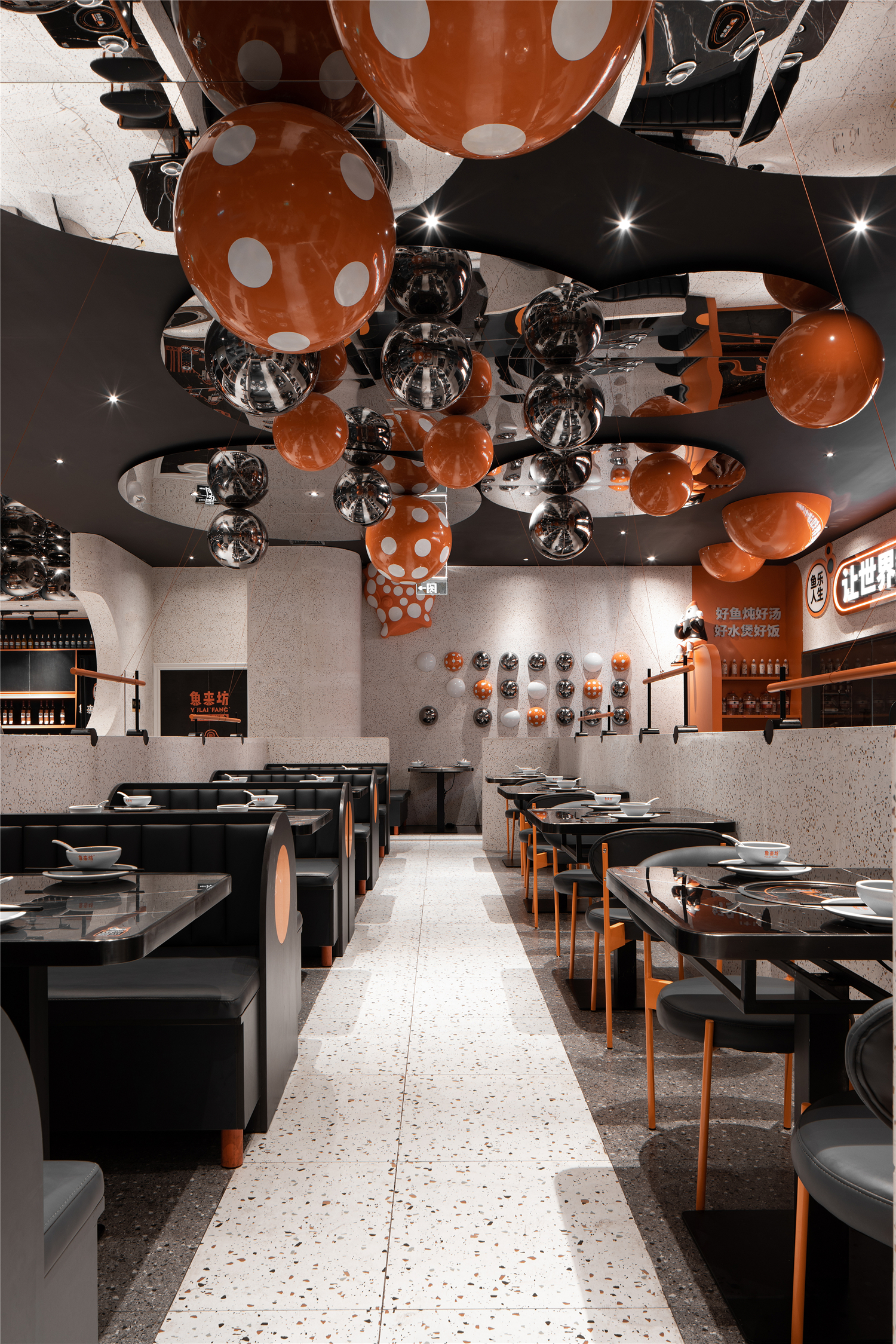
长桌与方桌区域相辅相成,既丰富了空间层次,又满足不同消费群体的使用需求。简单的色调搭配,细节上追求的细腻,体现出一种精致的生活方式,一种前卫的审美观念,以及一种活泼的空间氛围。
The long table area and the square table area complement each other,which not only enriches the spatial level,but also meets the needs of different consumer groups.Simple tone collocation and exquisite detail pursuit reflect a delicate lifestyle,a avant-garde aesthetic concept,and a lively space atmosphere.
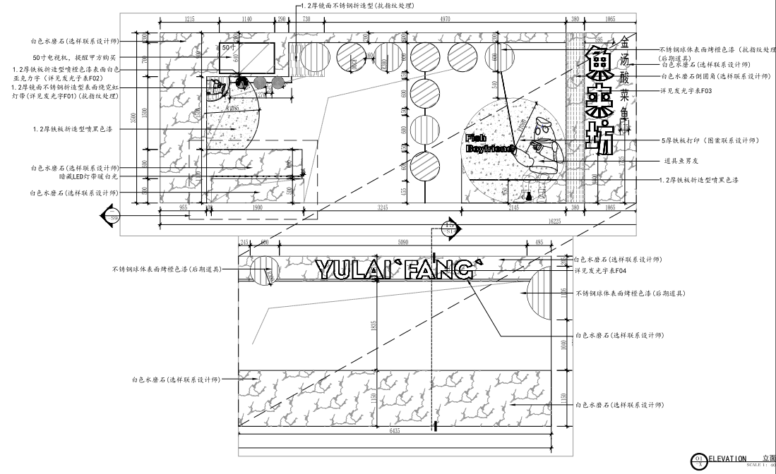
▲立面图
项目信息——
项目名称:鱼来坊
设计单位:无锡市麦设计建筑设计顾问有限公司
设计起止时间:2019年4月20日—2019年5月10日
主创设计师:董青、蒋越
辅助设计师:潘婷、李彦红
项目地址:重庆市南岸区江南大道28号星光时代广场
建筑面积:215㎡
摄影师:徐义稳
Project information——
Project Name:YULAI FANG
Design Company:MET Creative Brand
Design Cycle:April 20, 2019-May 10, 2019
Chief Designer:Qing Dong,Yue Jiang
Assistant Designer:Ting Pan, Yanhong Li
Location:Starlight Place, No. 28 Jiangnan Avenue, Nan’an District, Chongqing
Area:215㎡
Photographer:Yiwen Xu


