I设计格局 Design layout
建筑格局所带起的菜场更新
Food market renovation led by architectural layout thinking mode
什么是建筑格局?
What does architectural layout mean for the community?
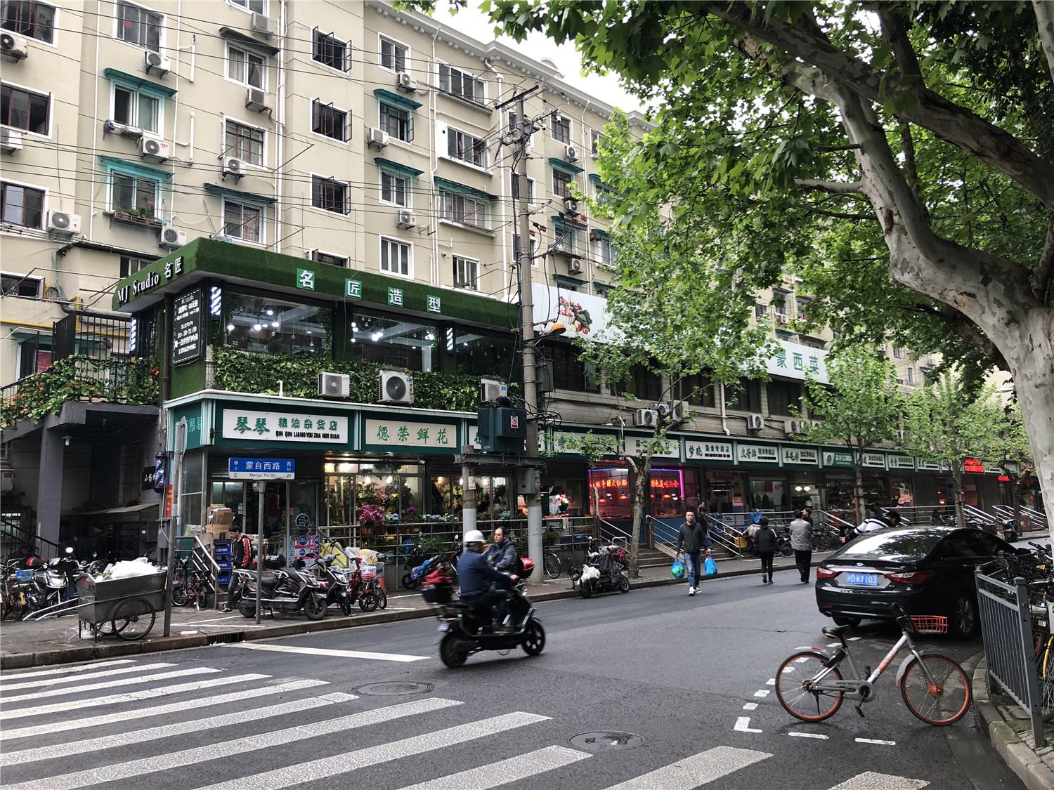
以考虑菜场及周边街道关系为核心出发点的思考路径。本次蒙西菜场的更新之路,我们希望是在“紧张及有限”的预算前提下,通过对蒙西菜场为核心改造对象,而将整体的街道,社区邻里的气质有一个提升。因此,我们在尊重原有建筑红线的基础上,将菜场外立面作为重点的改造载体。
It is a thinking mode centered on the relationship between the food market and its surrounding neighborhood.When we were tasked with the renovation project, we were under a “strained and limited” budget, but the target cannot be compromised, which is to significantly improve the block and community environment as a whole by focusing on the renovation of the market.With this big picture in mind, we decided to focus on the renovation of the market façade while respect the original design of the property.
▲改造前菜场外立面
未来的菜场不应该是商超,而是一个市民公共开放空间。
We should build food markets into public open spaces for citizens rather than supermarkets.
这是裸筑所坚持的建筑立场。也是对上一个永年菜场改造项目的持续补充。因此,定了这一建筑立场之后,所有的设计点,都围绕此核心立场所展开。
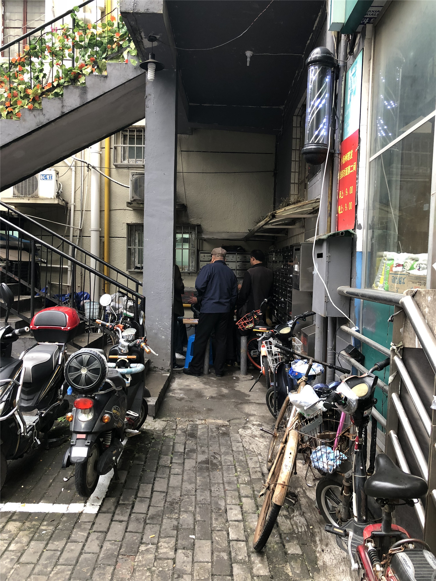
▲改造前入口处被自行车占道
▲改造前菜场入口
This is the belief of Roarc Renew and also a concept we explored after the renovation project of the Yongnian Food Market. As our position is clear, we started to create all the design elements with this principle in mind.
商超是公共空间吗?不是,商超更多的其实是营业场所,这类场所主张商业坪效,一切动线及布局都以“商业坪效”为出发点。
Should supermarkets be regarded as public spaces? We don‘t believe so. We think supermarkets are more of business premises which pursue turnover per square meter. For this kind of sites, all the designs of the architectural flows and layouts are driven by the sought-after “turnover per square meter”.
那什么是市民的公共空间?市民的公共空间,按我们的理解,应该是附属于社区一部分的活动空间。他是属于城市的“灰空间”。
Then how should we define public spaces for citizens? In our view, public spaces are the activity spaces attached to a community, and a “grey space” in a city.
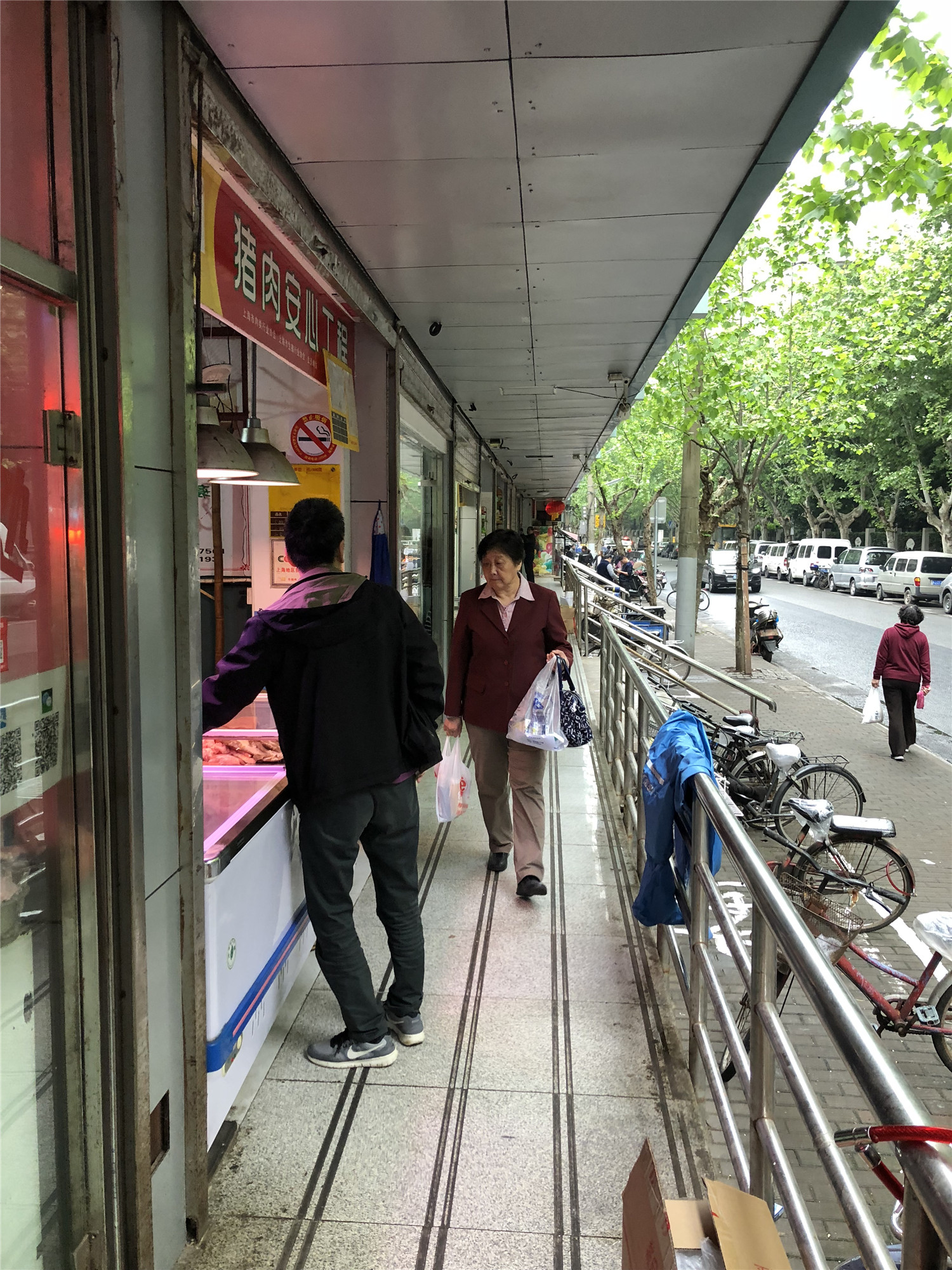
▲改造前外店铺过道
未来上海的城市格局:“人民城市人民建,人民城市为人民。” 这其实是要合理安排生产,生活,生态空间,努力扩大公共空间,让老百姓有健身娱乐的地方,让城市成为老百姓宜业宜居的乐园。因此,市民的公共空间,并不仅仅以“商业坪效”为出发点,而是在平衡商业的同时,为附近的居民提供一个“宜业宜居的乐园”。
Future urban pattern of Shanghai: “people’s city people build, people‘s city for people.” In fact, we should reasonably arrange production, life and ecological space, and strive to expand public space, so that people can have places for fitness and entertainment, and make the city a paradise suitable for people to work and live in. In other words, the design of public spaces for citizens should not be driven by the so-called “turnover per square meter”, but be aiming at building a “comfortable and pleasant place for both working and living” for neighboring residents, which means keeping a good balance between life and business.
▲外立面分析图
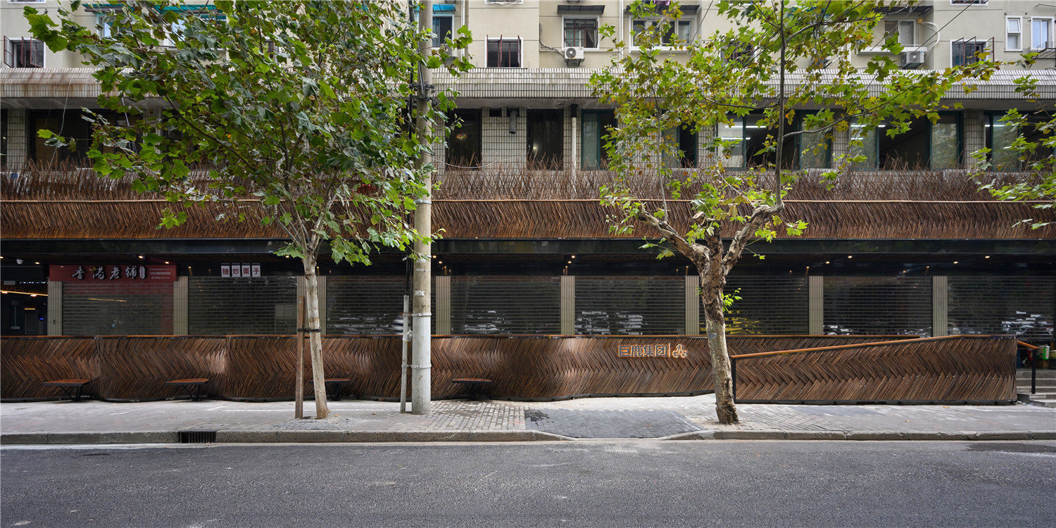
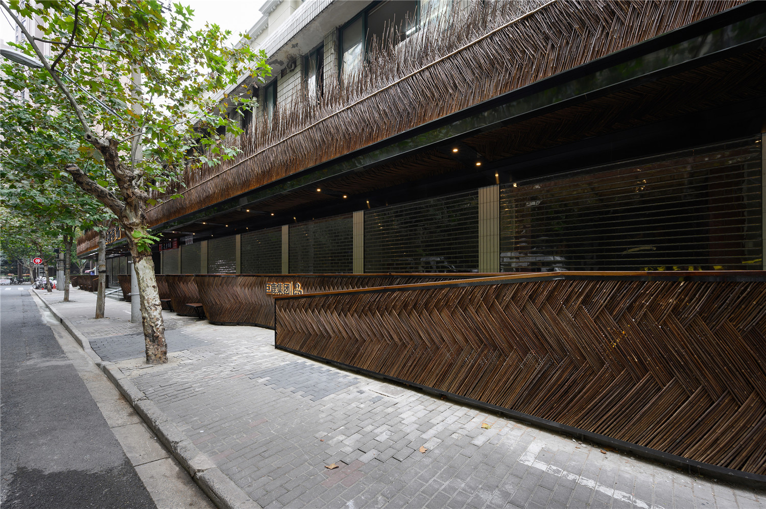
因此,菜场的商业属性,我们希望有更多的在“场”的内部体现。而沿街的外立面,是一个很好的与过往市民发生关系的场所。蒙西菜场自身的地缘条件也较为特殊,外立面近50m长,由台阶拾级而上进入菜场内部。
Therefore, we can keep the commercial attributes of the food market inside the market. But the façade facing the street is a space actively interacting with the passing citizens, which will act more like a public space.We noticed that the Mengxi Food Market has a façade stretching for almost 50m with an upward staircase leading into the market.
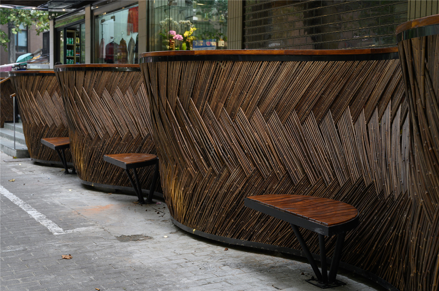
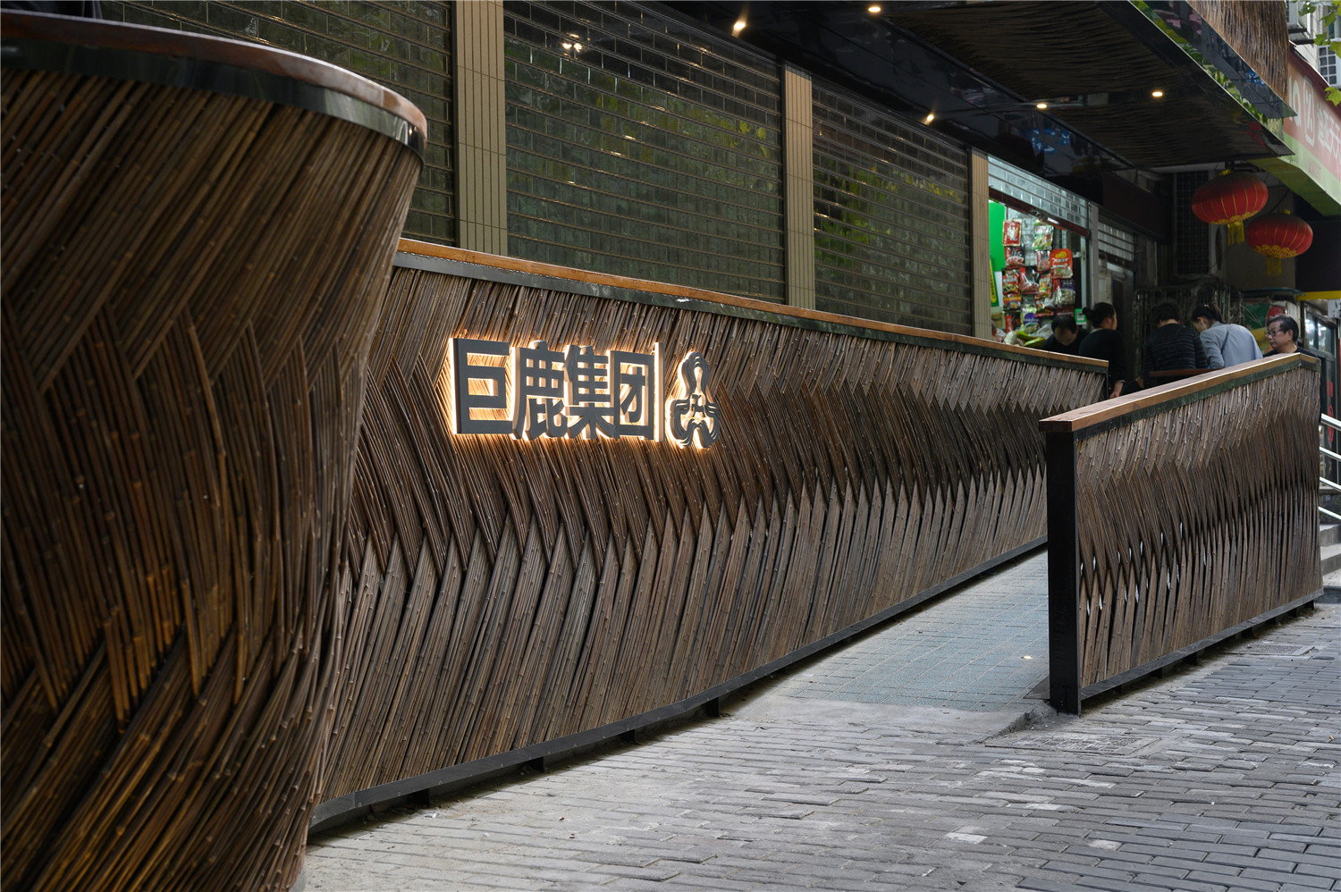
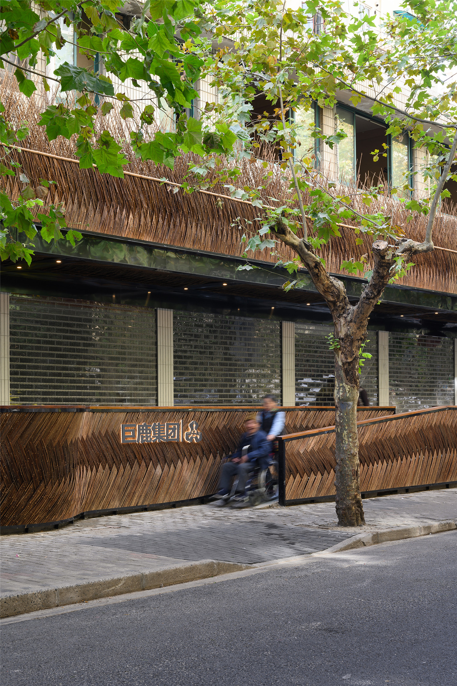
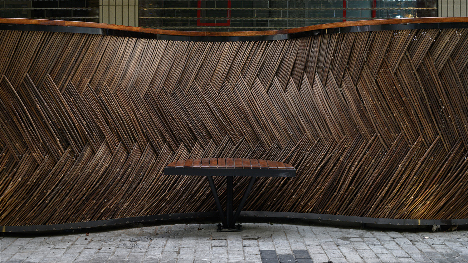
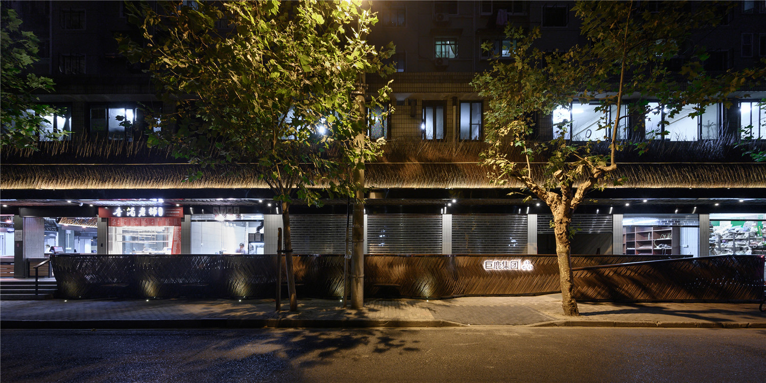
我们利用这一特殊构造,将原本“一”字状的栏杆扶手,变化成波浪曲线 –“凹凸凹凸”,来模糊菜场立面与街道之间的边界。而波浪线中的每一条内凹空间,都成为了这条人行道上为市民准备的休息站。
Based on these unique physical structures, we transformed the straight-line handrail into regular curving waves.In this way, the boundary between the market façade and the neighboring street was blurred. It also created many hollow areas functioning as the rest stops.
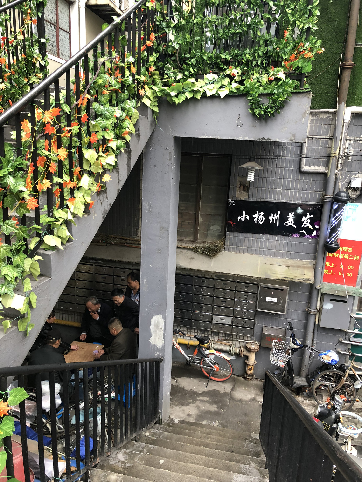
▲菜场门口大爷们围坐下棋
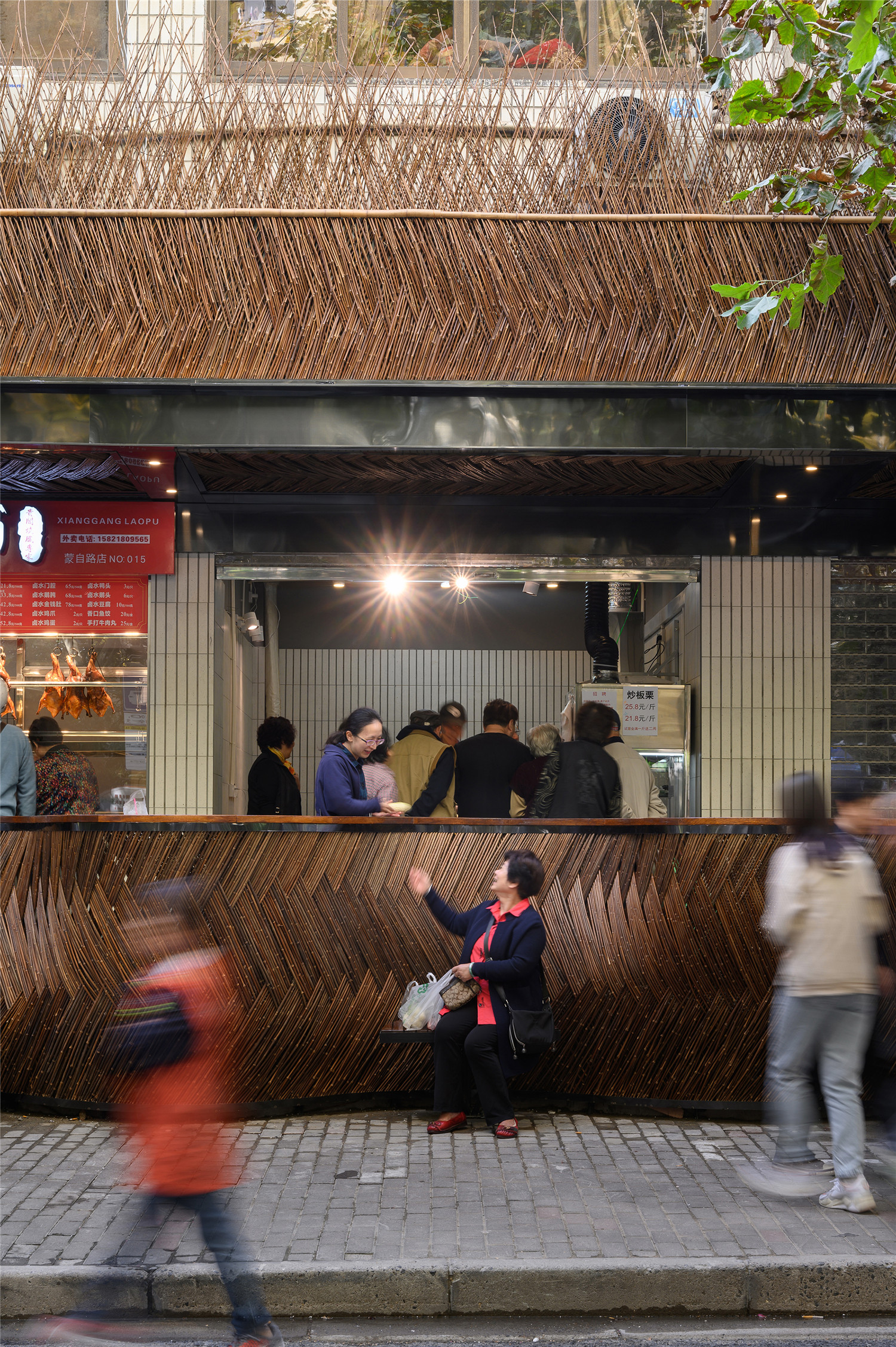
在模糊这条边界的设计时,我们花了大量的时间观察原菜场周边的使用人群的习惯。举个例子,我们发现,几乎每天中午都会有大爷坐在人行道两边下棋,当人行道上没有更多的空间的时候,大爷们就会群聚在马路上两侧,围观,下棋。因此,野竹篱曲线的凹凸所形成的一个个小空间,为市民,或在这里有使用习惯的一群人,就是大爷们所设立准备的。而相对应地,凸起的空间,则是菜场沿街的商家店铺给到菜场客人的小憩之地。
Apart from the efforts to blur the boundary, we also spent a large amount of time observing the habits of its customers. For example, we found that some senior citizens come to play chess almost every day at the pedestrian walkways. The small hollow spaces created by the wild bamboo fences are specially designed for them and the ones who need a rest here. Accordingly, the raised space created by the walkway functions as rest sites for market customers offered by the street-side shops.
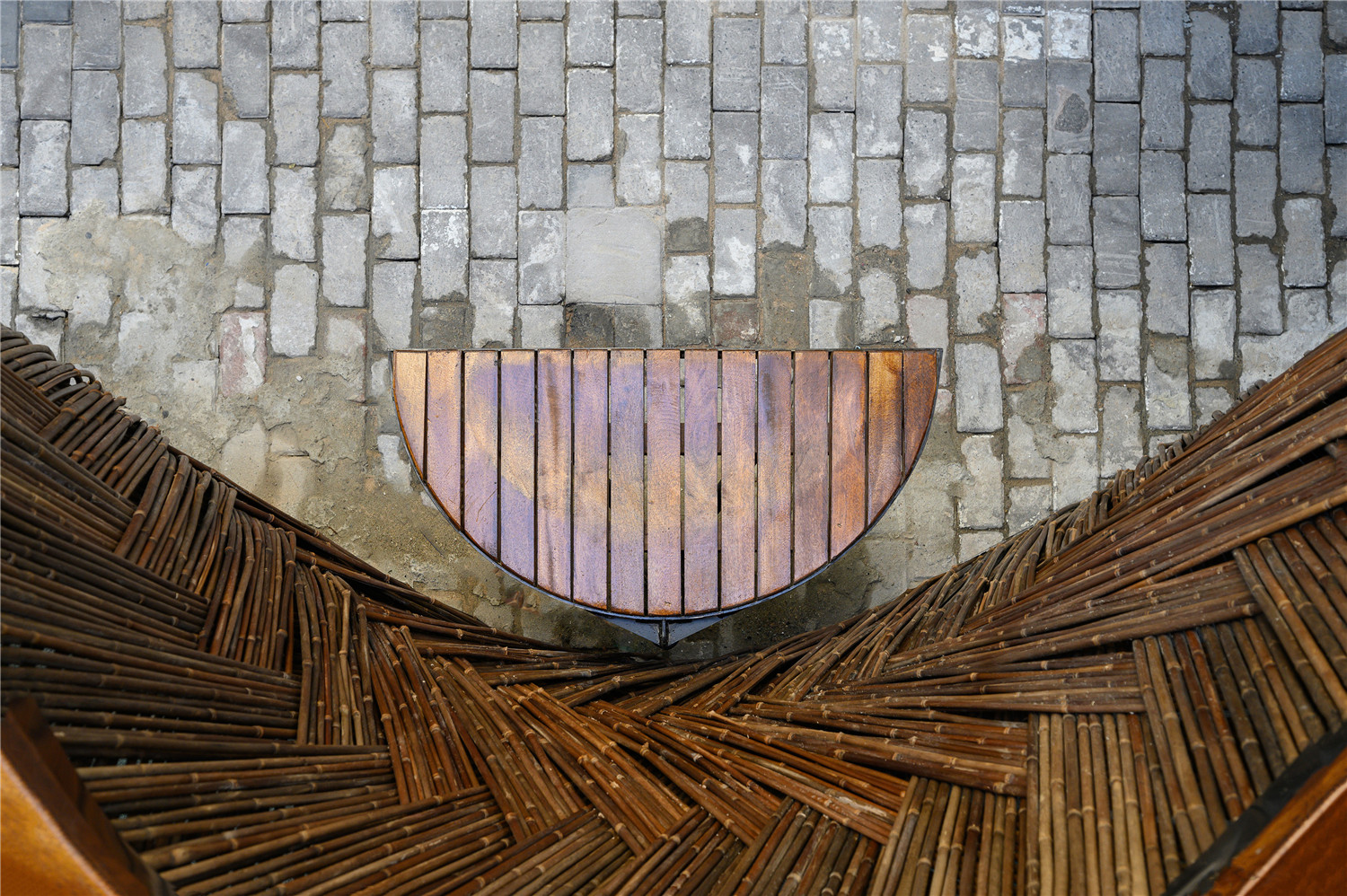
▲野竹篱坐凳供买菜的人或路过的人坐下休息闲聊
II表现形式 Form of Expression
上海的菜场,要有上海的“腔调”
Shanghai’s food markets should have typical Shanghai elements
▲改造后门头
蒙自西路这条幽静的马路,与武康路,永嘉路一样,都呈现着上海的一份宁静与韵味。而漫布法国梧桐的街道,两边Artdeco的别墅群落,XX里,XX弄的海派名称,以及那些经历了风雨的竹篱笆围挡,交织成了最最地道的老上海风情。
Similar to Wukang Road and Yongjia Road, the block on the Mengzi West Road presents a peaceful vibe and a unique styleof Shanghai. Plane trees are intersected with with Art Deco villas at the roadsides, forming the characteristic Shanghai lanes and the age-old bamboo fences form the authentic old Shanghai style.
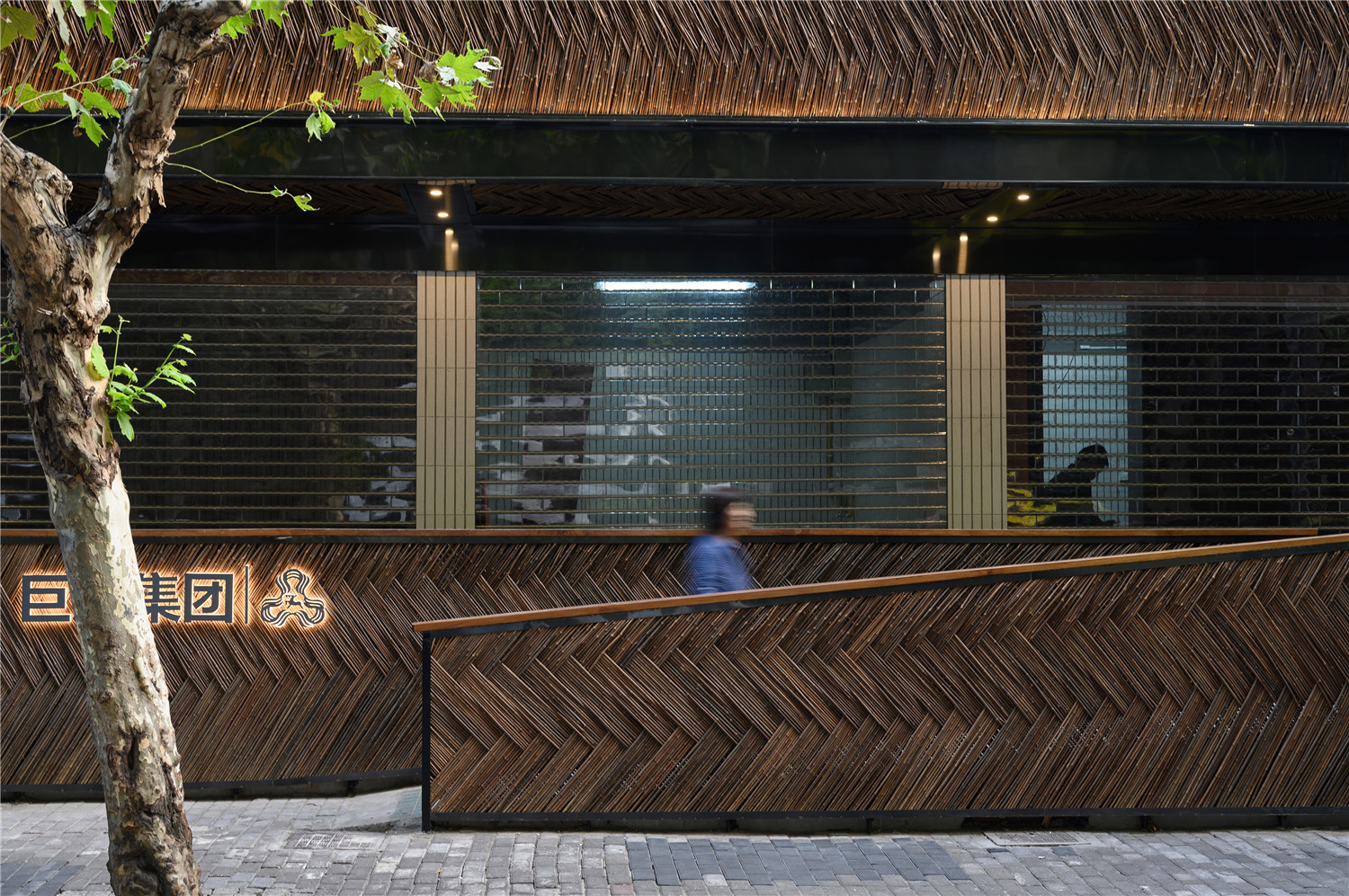
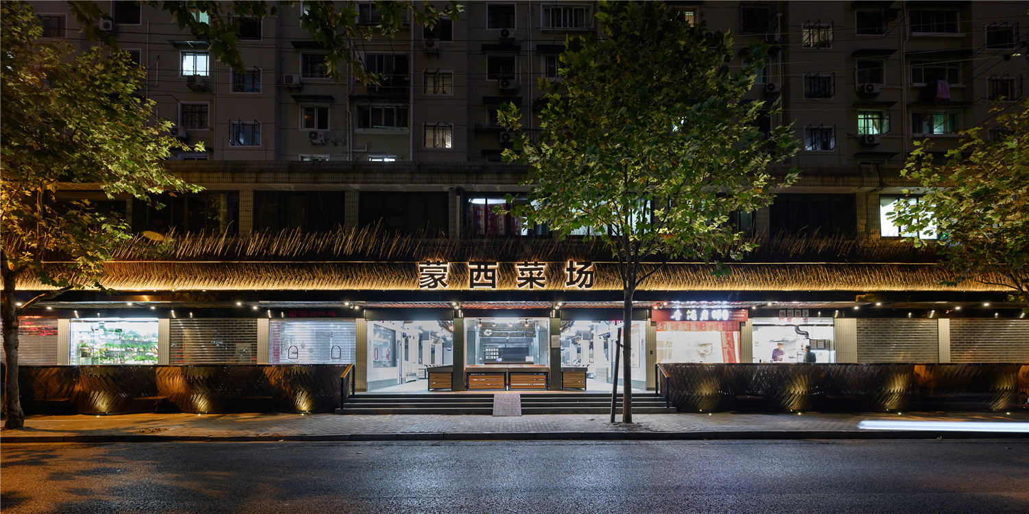
▲改造后外立面
野竹篱,这个特别的材质,成为了本次改造蒙西菜场的主材料,我们从建造性及其设计意义两方面做了考量。在设计意义方面,蒙西菜场延续了“永年”的“城市乡野”的旋律,从而更进一步地将“老上海”的法式浪漫淋漓尽致地通过“野竹篱”表达出来。野竹篱本身材质的自然肌理,又为“城市乡野”这一大主题提供了视觉逻辑。在设计意义上,两者是互为印证的关系。
The wild bamboo, a very special material, was selected as the main material for this Mengxi Food Market renovation project. From the point of design intention, the wild bamboo is a reminder of the “rural and wild theme” of the Yongnian project; while from the point of meaning, Mengxi Food Market have made one step further to give full play to the romantic “old Shanghai” style with use of wild bamboo materials.At the same time, the texture of wild bamboo possesses visual cues for the “rural and wild theme”. These two elements complement each other perfectly well.
▲改造后入口
▲无障碍通道
而在建造性上,野竹篱存在于上海滩数十年,成为了“海派”的文化符号,多被文人墨客用于别墅围挡,经久耐用,特别是经过防腐防霉处理蒸煮加工,室外使用寿命一般在5年以上。
In terms of of construction, wild bamboo has taken root in Shanghai for several decades. It has become a symbol of “Shanghai style” and was often used as fences for villas by men of letters. As a durable material, its life in natural environment can last over 5 years after corrosion and fungus-resistant treatment.
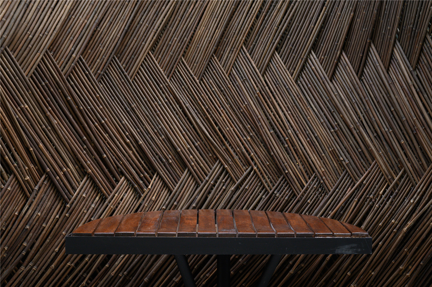
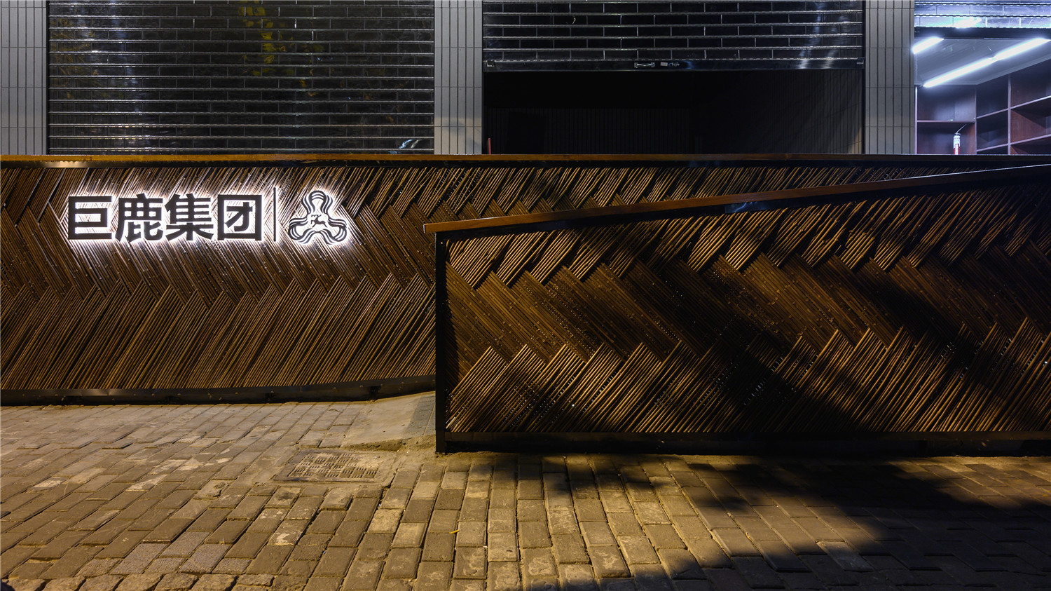
▲野竹篱细节
同时,这次试验的野竹篱的编织纹路以及固定方式,与普通的竖向铺法不同,在产生整体曲面的同时,又产生60度角的视觉交错细部,每根竹节的顿点被自然放大,产生了其妙的视觉感受与建造逻辑。
Unlike the ordinary wild bamboo weaving pattern, this time we have tried a new pattern. While creating a whole curving surface, the details were also made interwoven in a 60 degree angle to make each bamboo joint enlarged visibly, which produces an exquisite visual delight and construction logic.
▲改造前商家自制店招
▲店招分析图
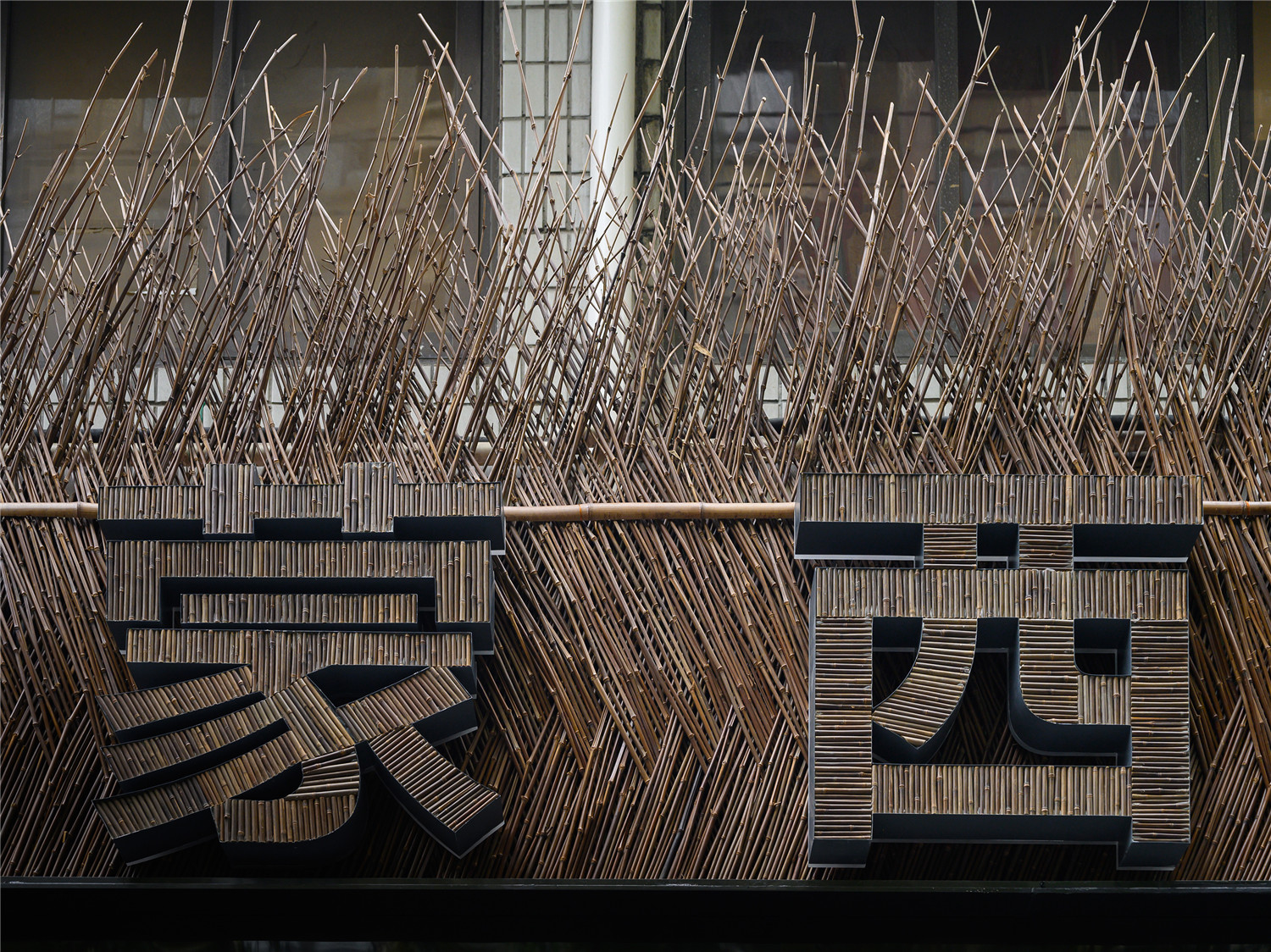
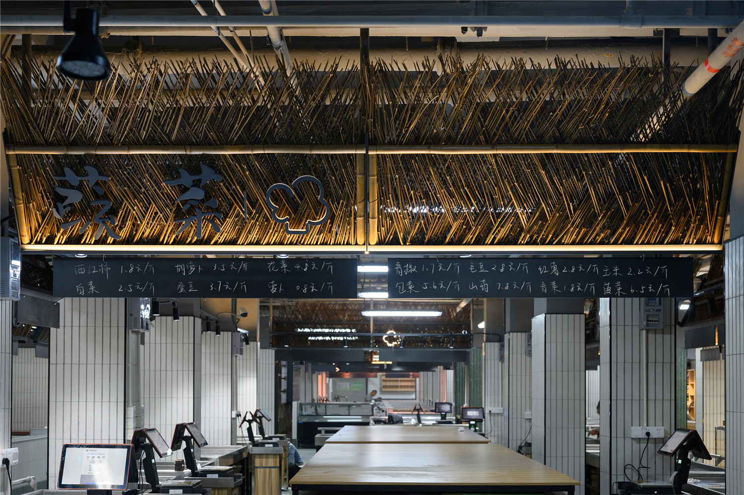
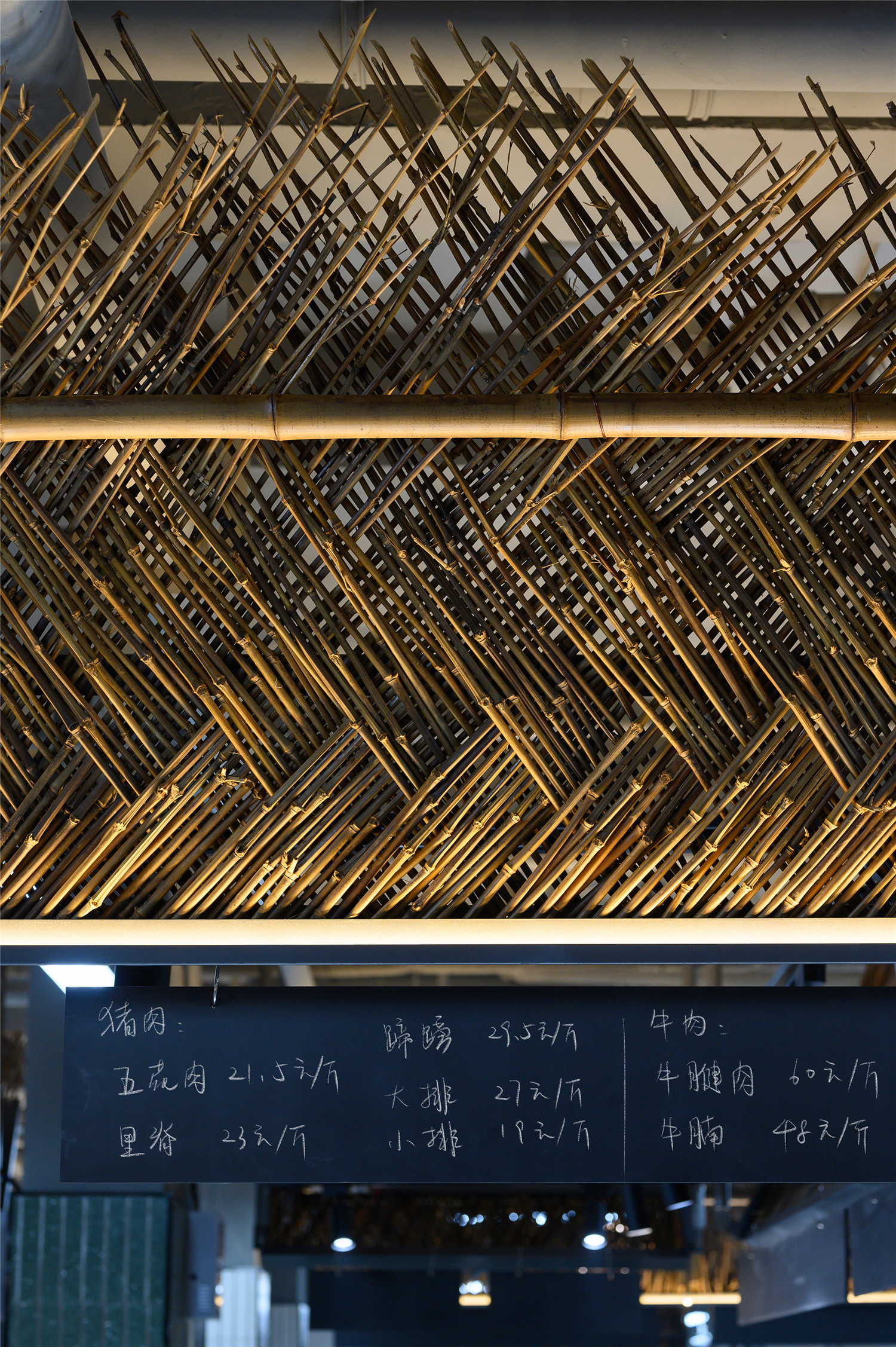
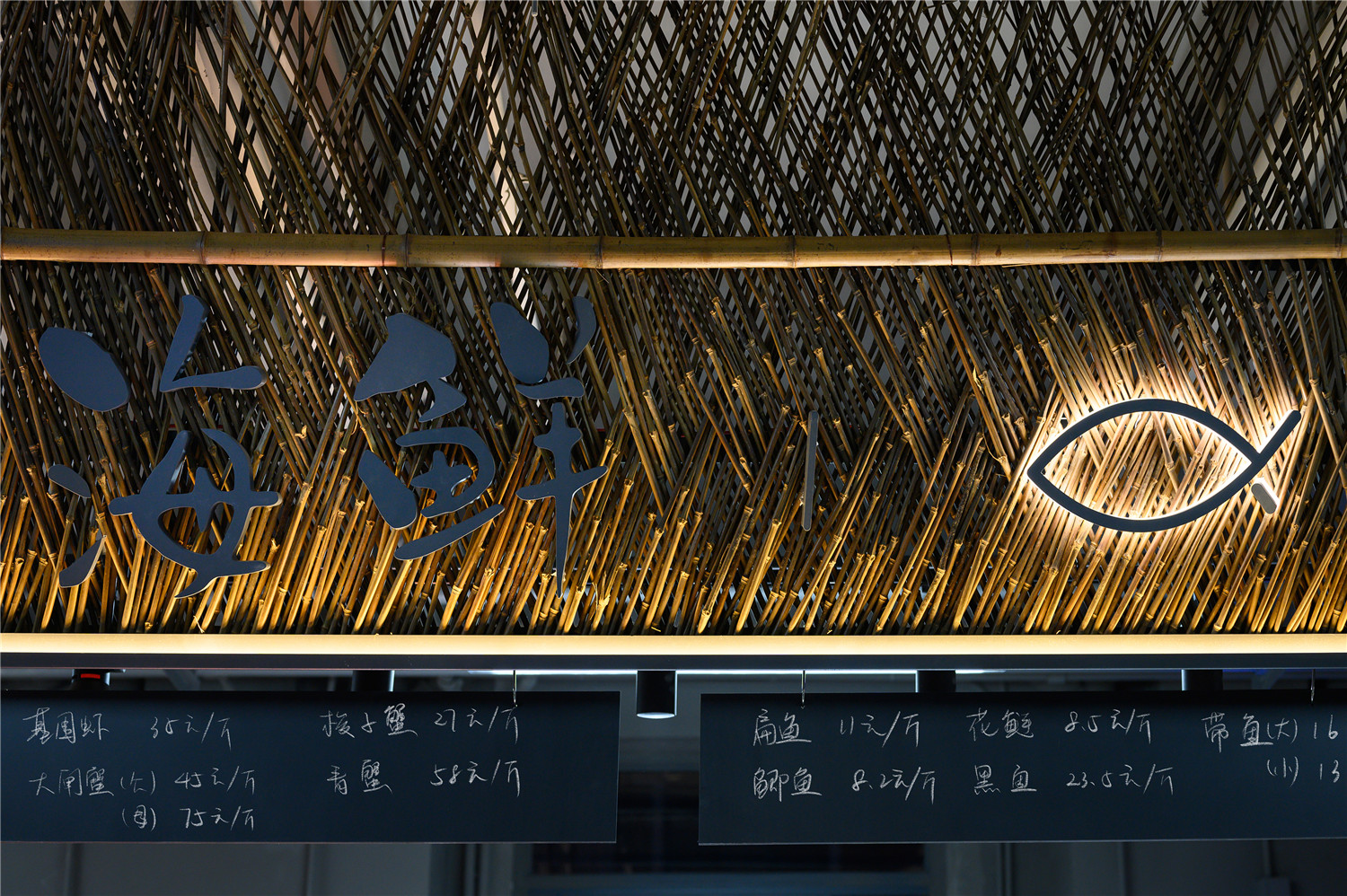
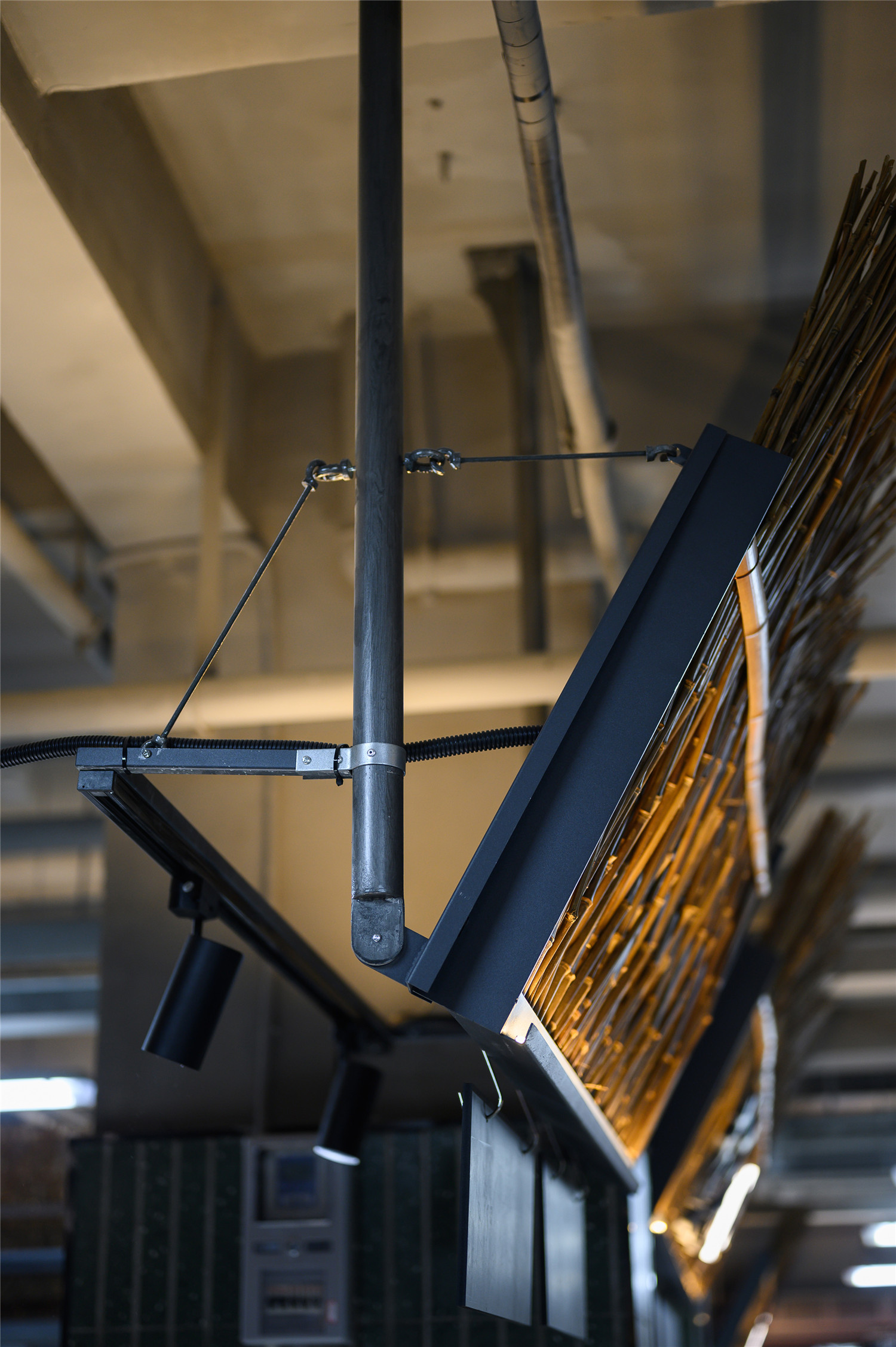
在室内的竹篱笆招牌,延续了永年的轻盈的钢丝节点,实现了从内至外的叙事延续。
The indoor shop signs also used bamboo material to inherite the use of light-weight steel wire joints from the Yongnian project, forming a unified visual style between the inside and the outside.
▲改造后店招
III 温暖乡野 – 蓦然回首,那人却在菜场栏栅处。
Rural and wild – A market with warmth
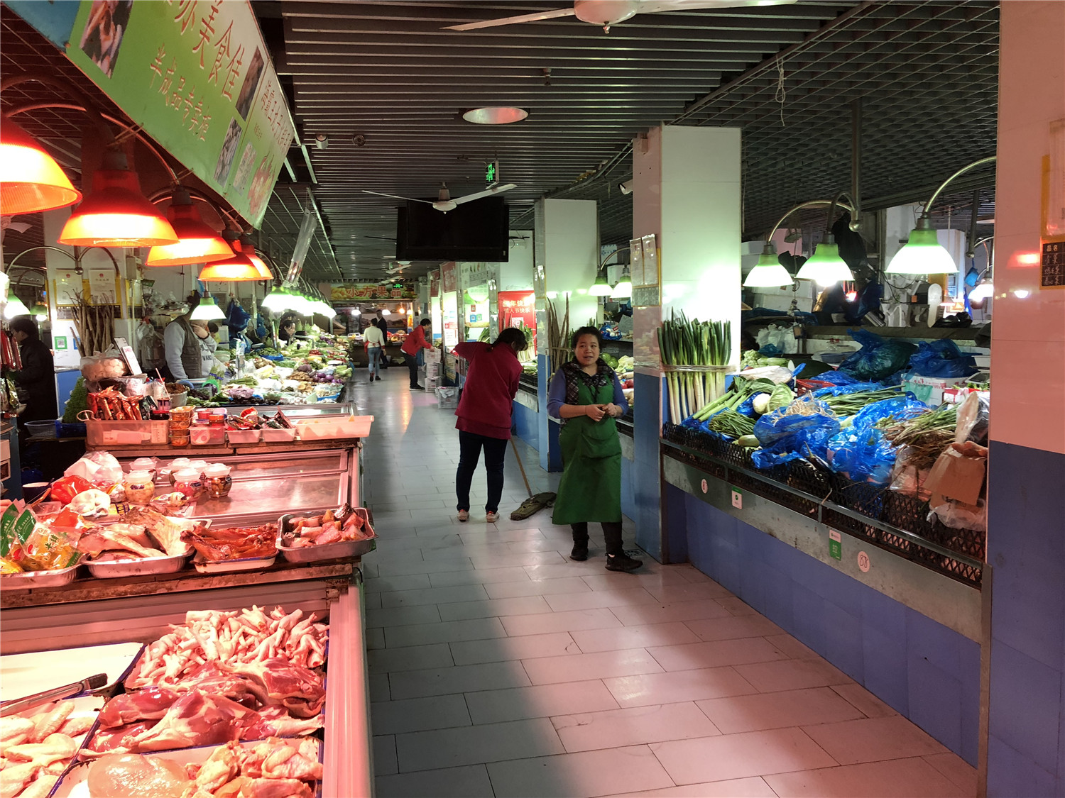
▲改造前菜市场内部
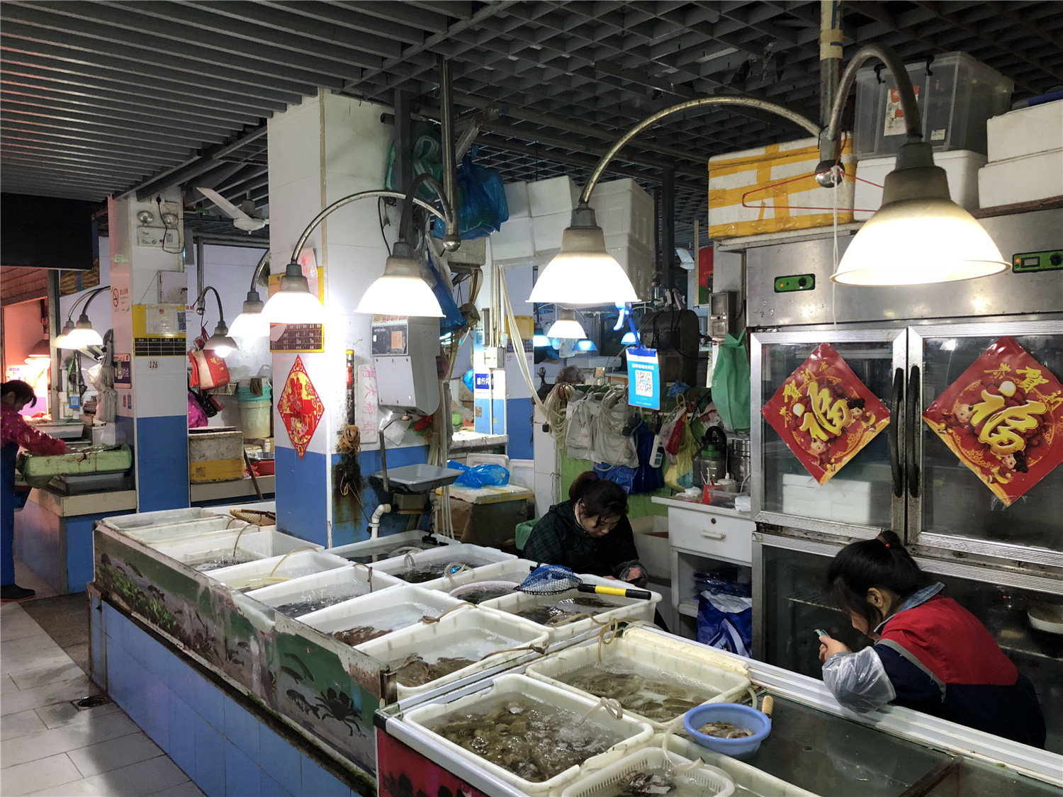
▲改造前水产区操作台简陋
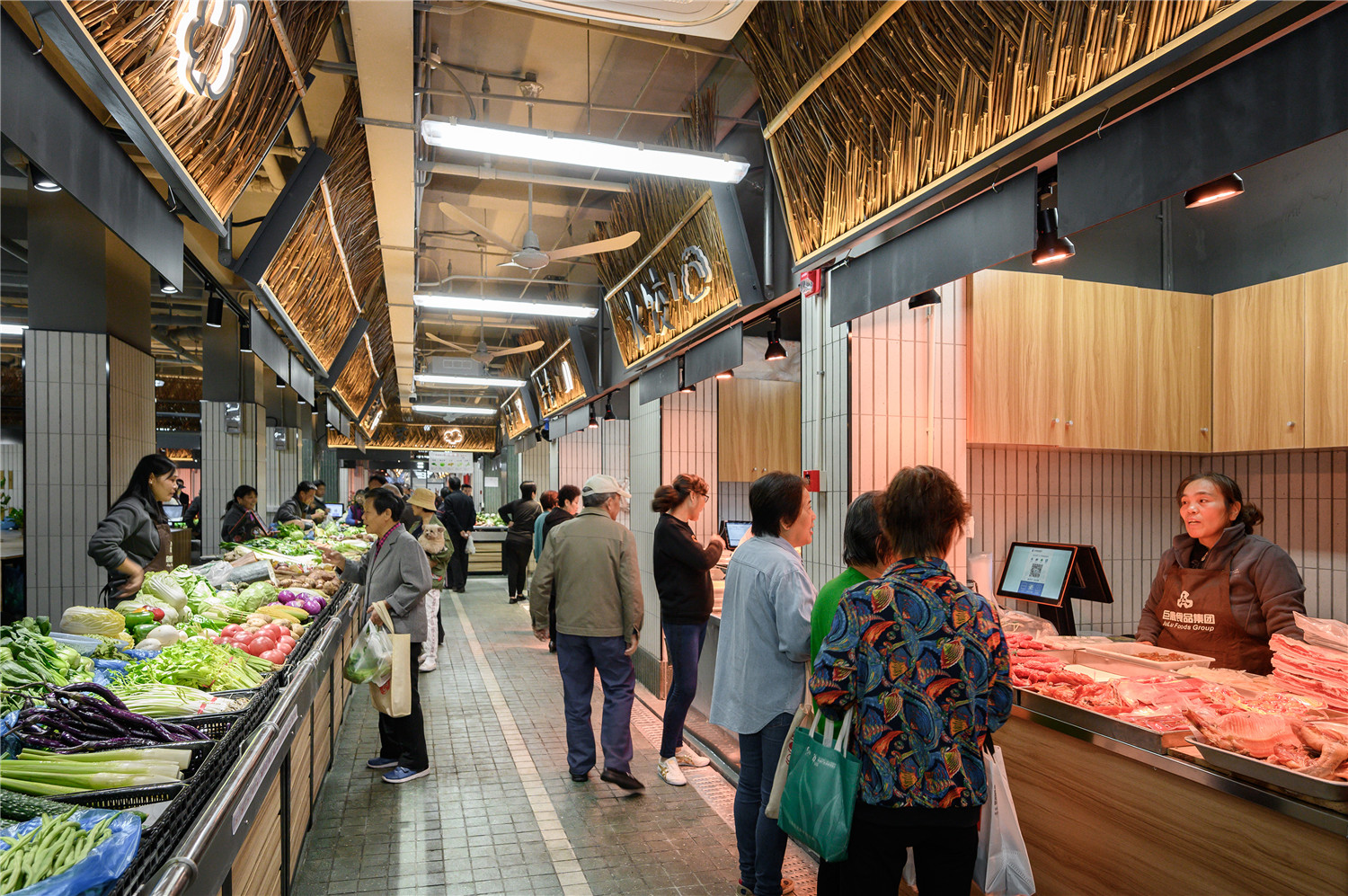
诚然,菜场的本质还是以商业出售为目的的营业场所,之所以我们希望上海未来的菜场走向的是“精致的烟火气”而非普通的商超,是因为对这座城市“人情味”的留恋。不仅仅是买完就走的顾客关系,还希望蒙西的这条长廊,是能够承载更多的“设计善意”,让原本停留在马路边上的“噶三胡”(上海话“闲聊”),安全地回归到蒙西的长廊上;让原本1分钟的寒暄,变成10分钟的家长里短;我们希望这条长廊成为老年人交朋友的地方,让他们晚年的孤独感减少一些;甚至我们希望,在这里能够产生许多浪漫的情感邂逅。
After all, we cannot deny that food markets are business premises in nature. But we still endeavored to build the food markets in Shanghai into places of exquisiteness, geniality and full of life. The reason behind is a deep longing for retaining the “humanistic” elements of the city.We hope the corridor of the Mengxi Food Market carries more “design goodwill” rather than being a pure commercial space. We hope the corridor will see more sidewalk small talk, where nodding greetings become ten minutes‘ warm talks. We hope the corridor becomes a place of social gathering for senior citizens to alleviate their loneliness. We even hope the corridors can witness many romantic encounters.
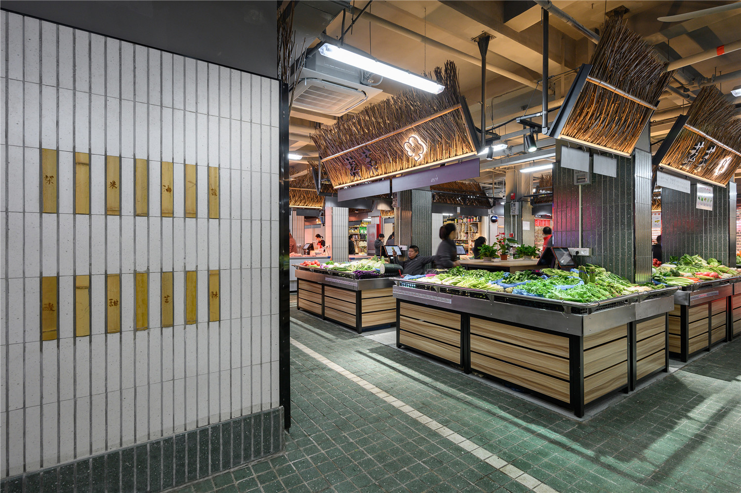
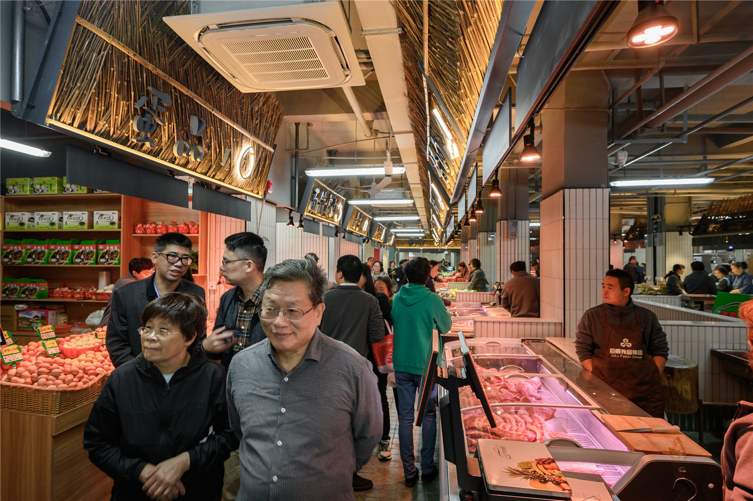
▲改造后菜市场内通道
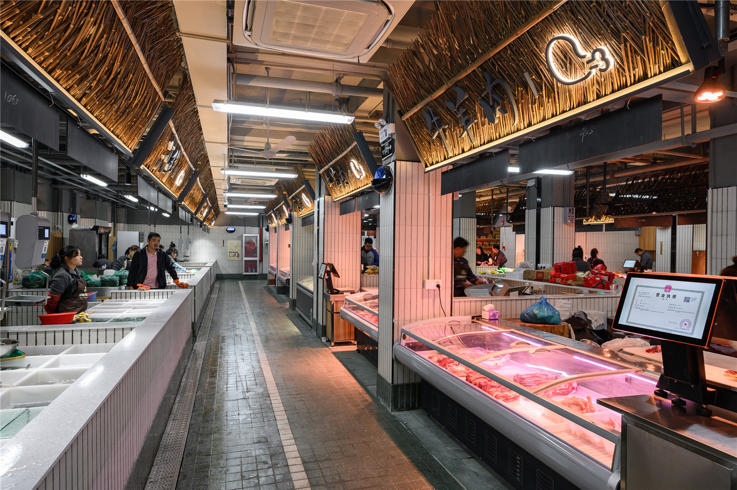
▲水产区与鲜肉区
▲水产区操作台,防止污水外溢
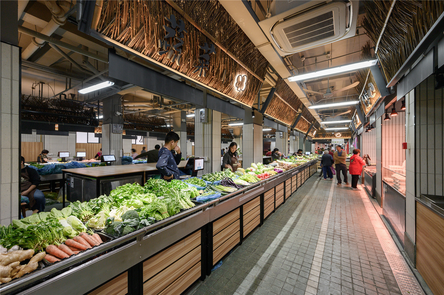
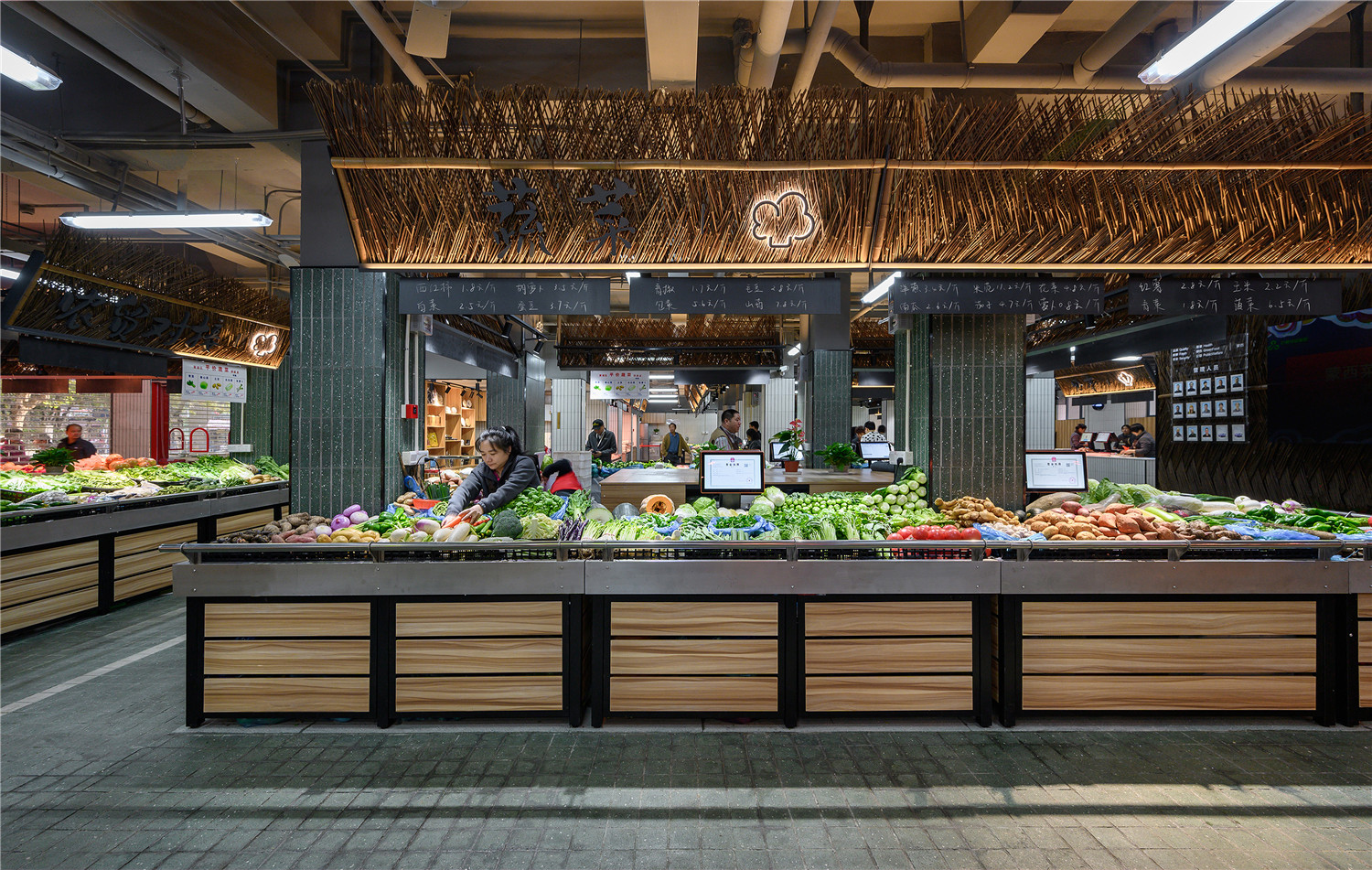
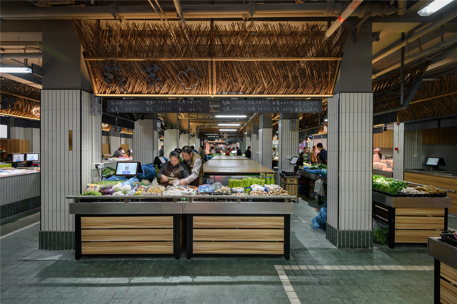
▲蔬菜区
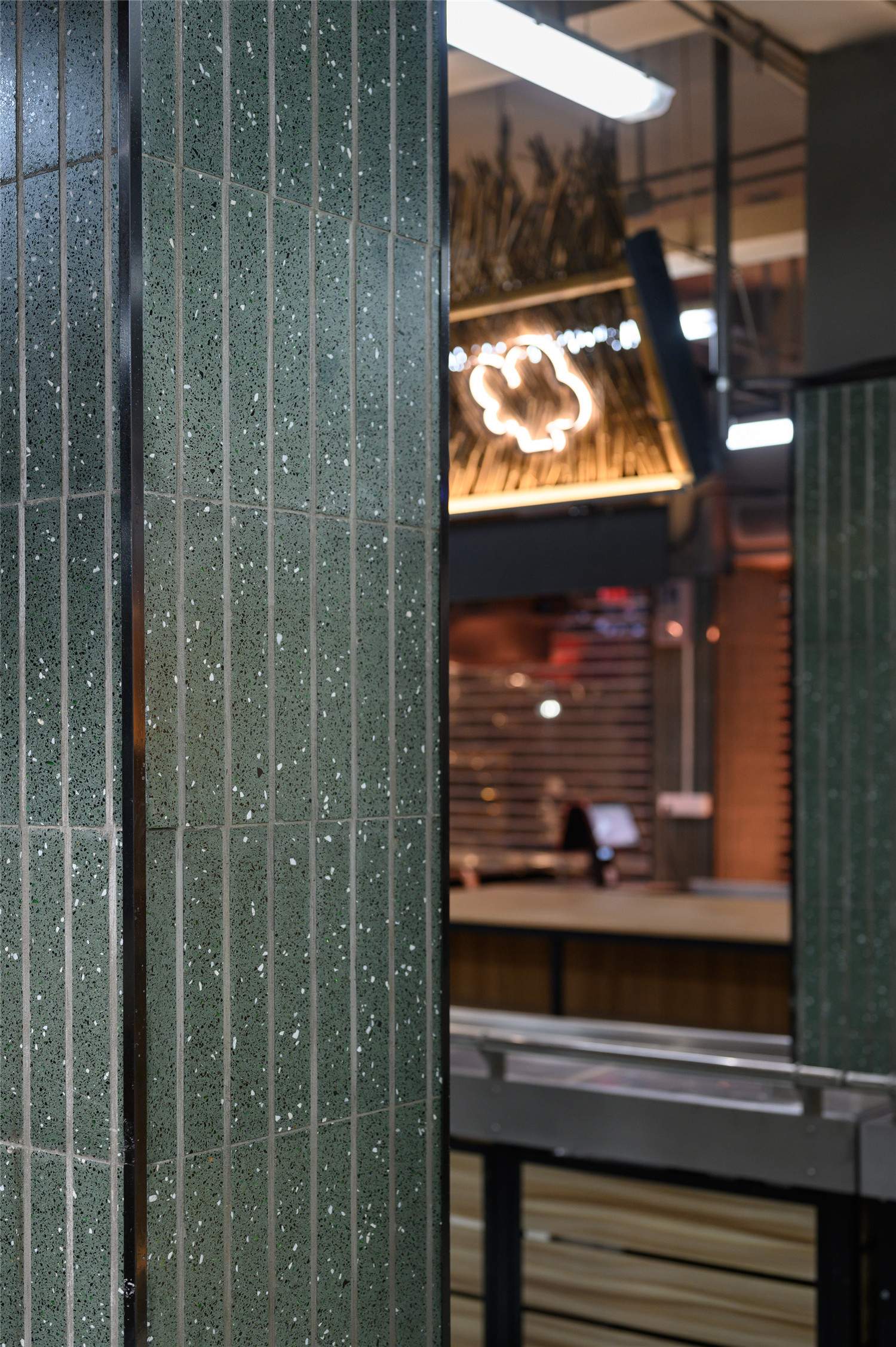
▲绿色水磨石墙面区分出果蔬区域
▲可开合的木饰柜台外立面
▲标识设计
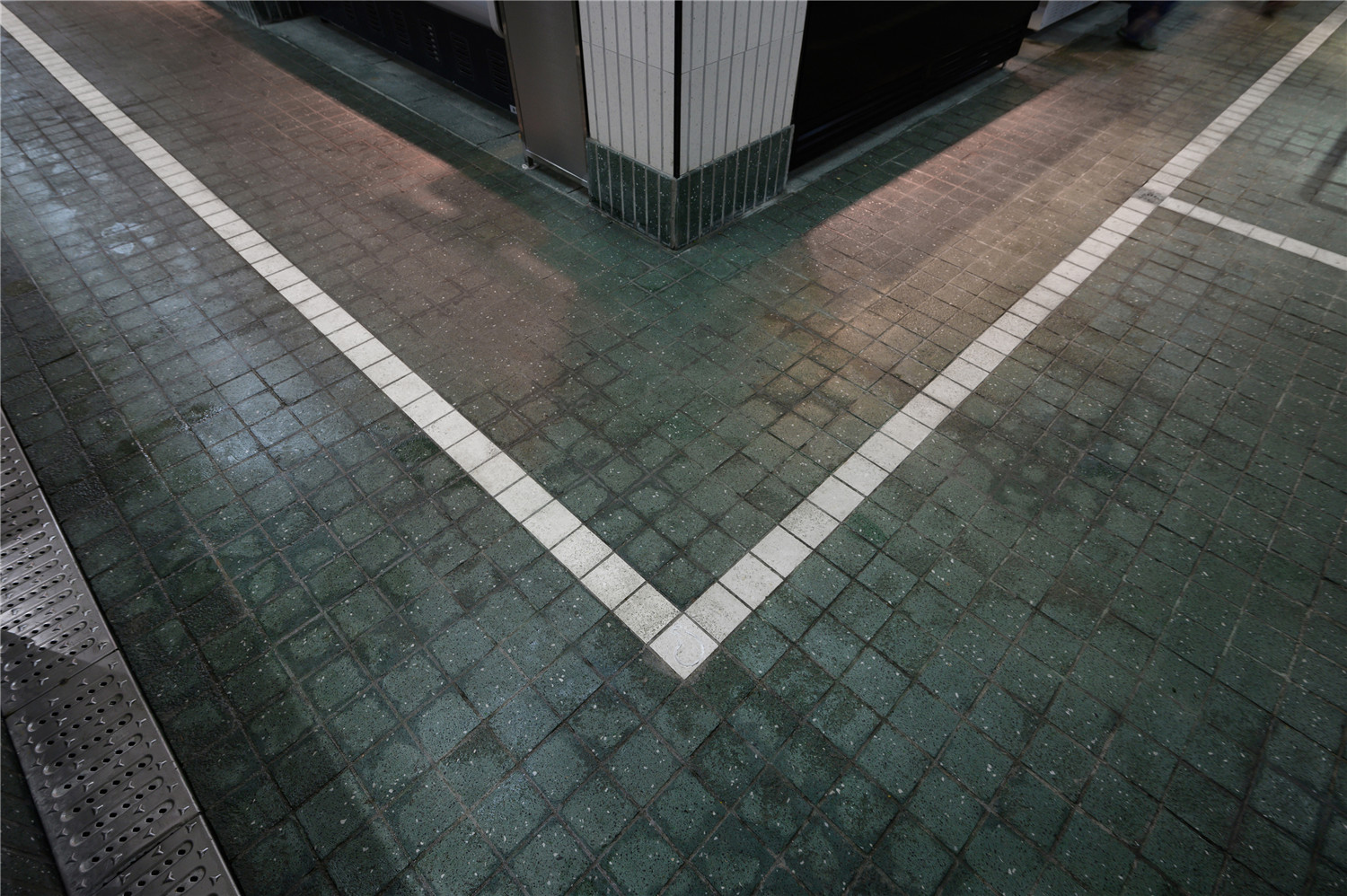
▲地面导示
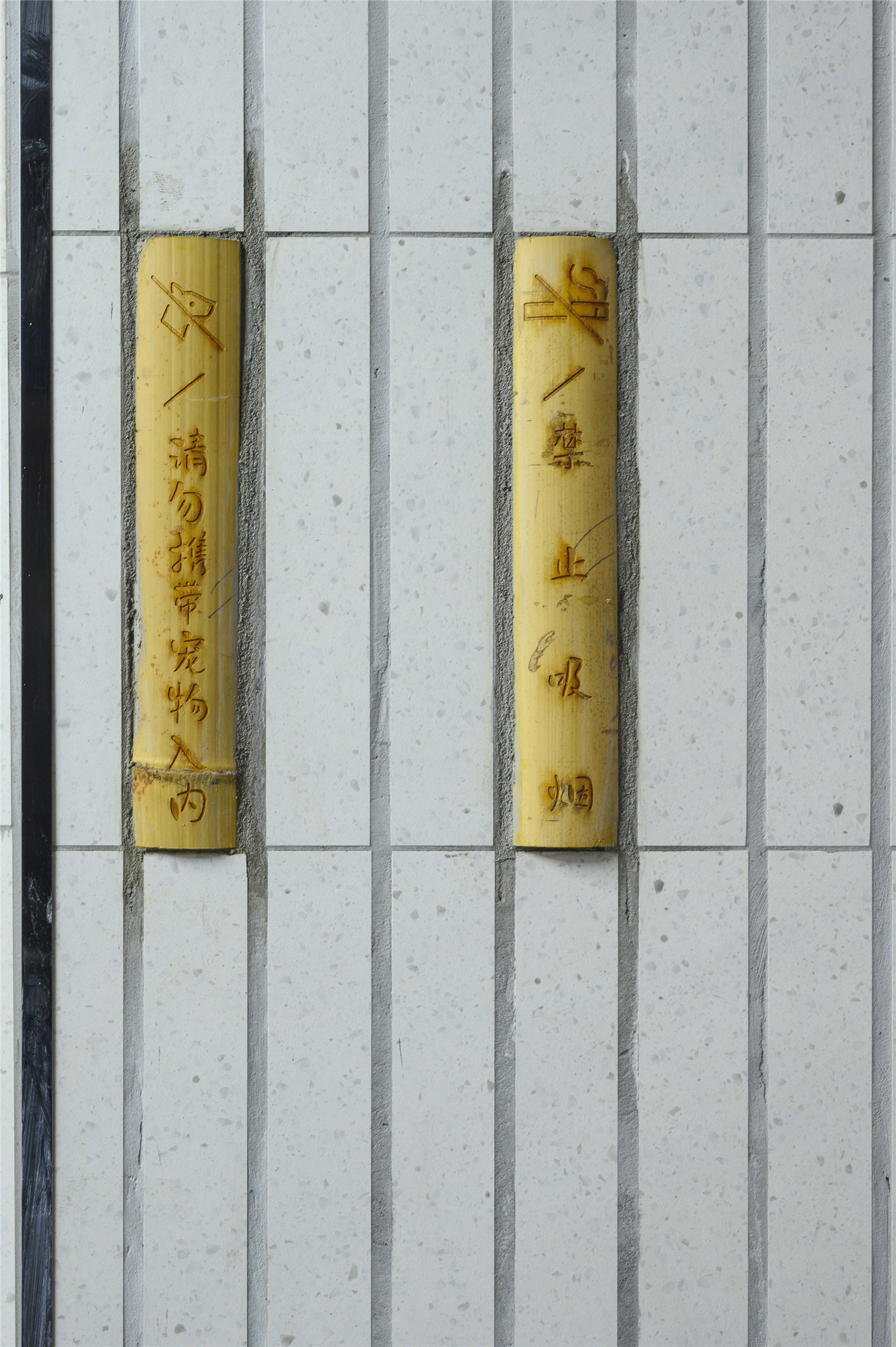
▲竹艺标示
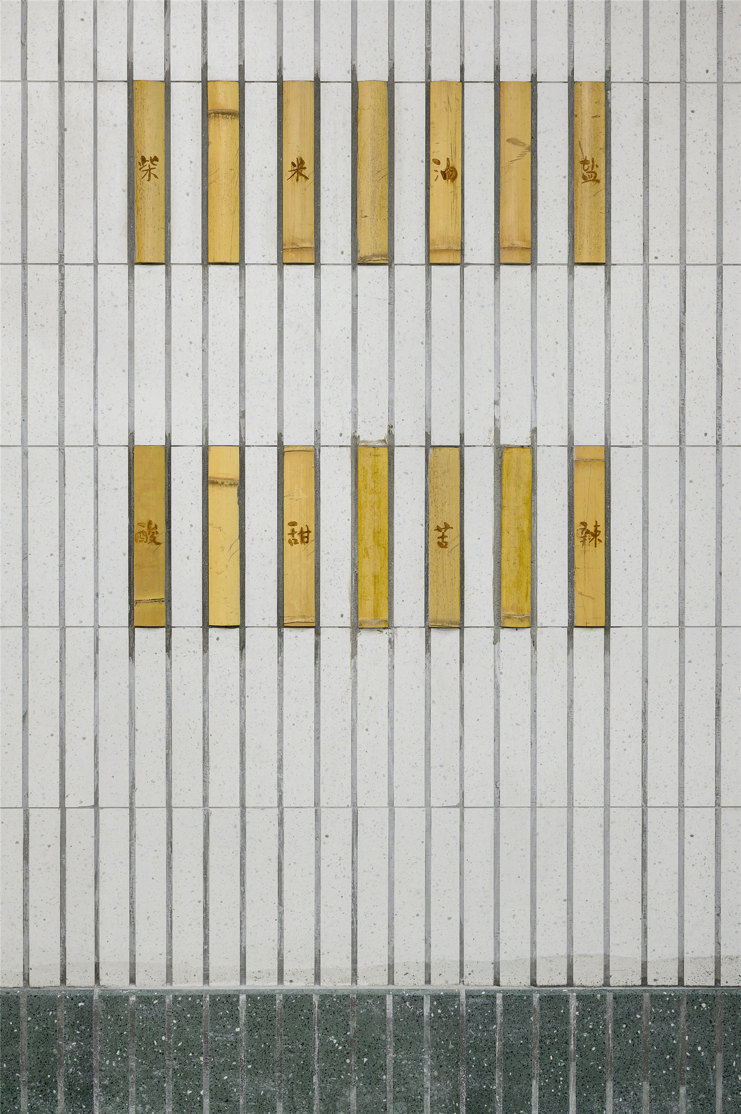
▲竹艺装饰
▲内店招、竹艺装饰和木柜台相呼应
对于事务所而言,每一次接受的命题,皆被视作一次挑战,亦或是对某种“可能性”的探索,这种可能性,可以是设计材料,营造方法,或是精神层面的探索。而蒙自西路这座“小菜场”是我对民生类项目在“材料”与“影射”意义上边界的探索。我们之所以热衷于民生项目的更新,也是因为我们希望通过设计的力量,去影响这座生我们养我们的城市,让他在金融属性之外,更添几分人文的温暖。
For Roarc Renew, each themed project is seen as a new challenge and an exploration for a new “possibility”. These possibilities may be realized through different materials, construction methods or spiritual quest.This time the small food market on Mengzi West Road is an exploration in “material” and “ connotation”. The reason why we are keen on projects related to people’s livelihood is because we hope to impact this lovely city where we grew up through the power of design, and add more humanistic care to its financial identity.
▲开市后场景
▲野竹篱坐凳供买菜的人或路过的人坐下休息闲聊
▲外立面夜景
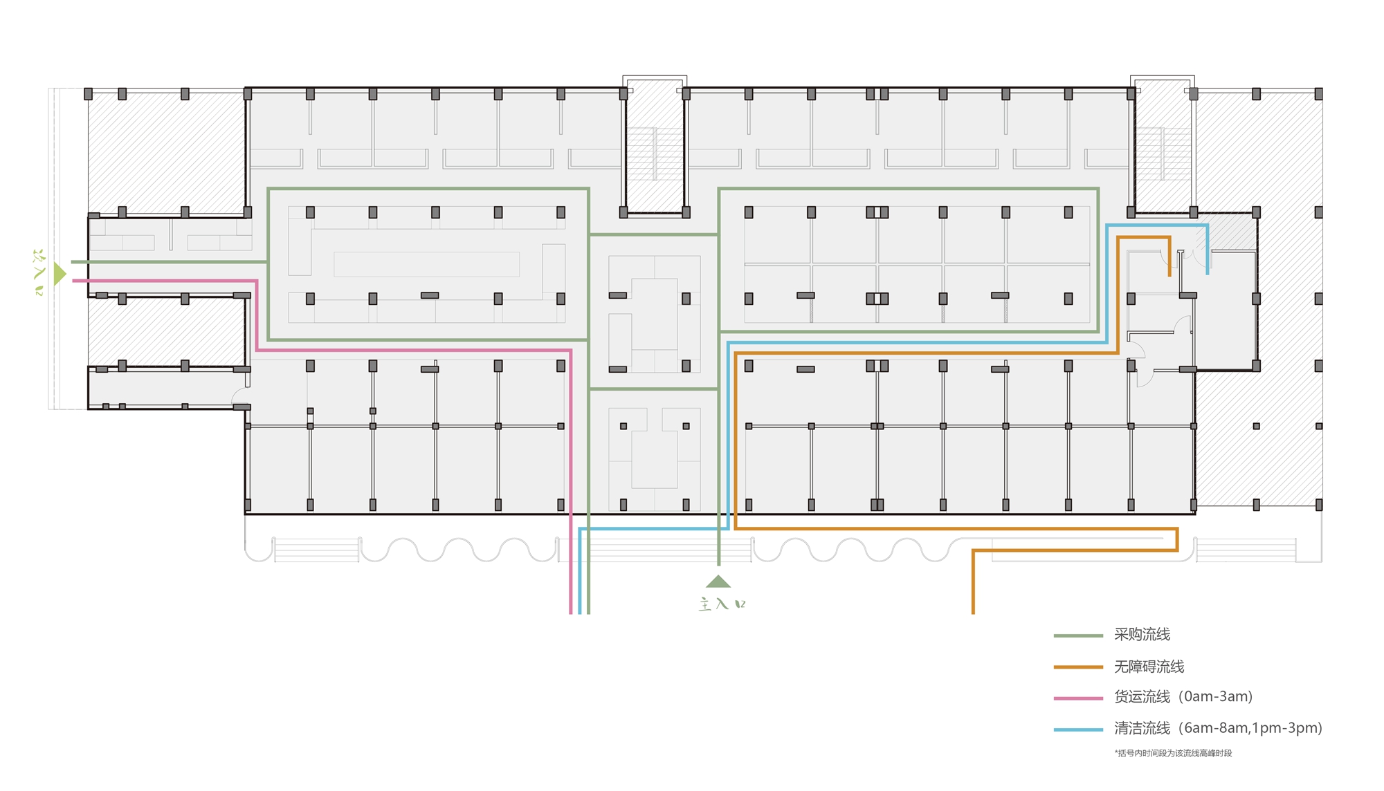
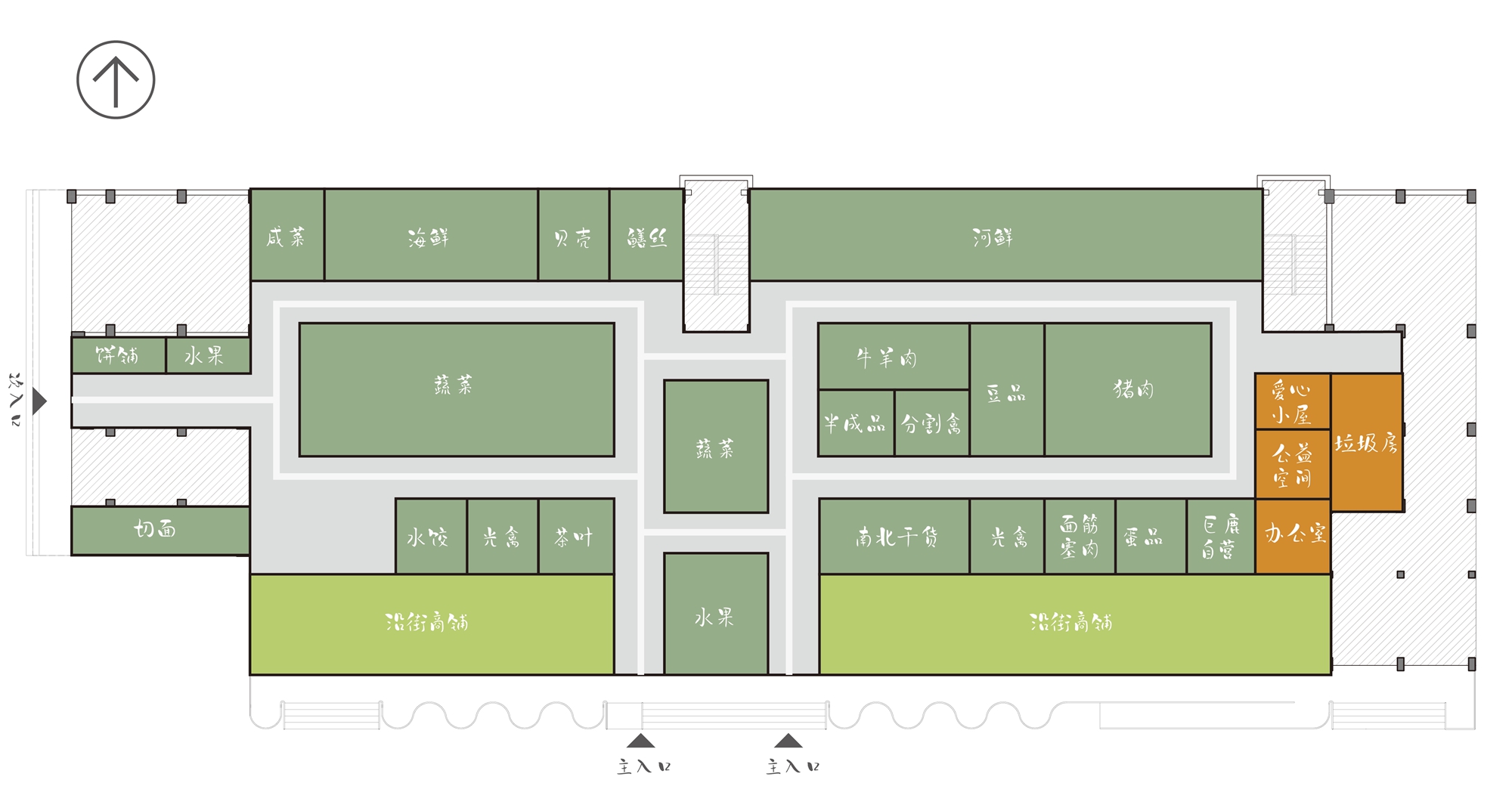
▲动线
▲总平面
项目信息——
Project information——
项目名称:巨鹿集团蒙西菜场
Project name: Mengxi Food Market of Julu Foods Group
项目地点:中国上海
Project location: Shanghai, China
项目完工日期:2019
Completed date: 2019
基地面积:1360平方米
Base area: 1360 square meters
建筑面积:1360平方米
Building area: 1360 square meters上海
建筑及室内设计:裸筑更新建筑设计事务所
Architecture and interior design: Roarc Renew
主持建筑师:柏振琦
Chief architect: Robben BAI
项目建筑师:陆慧沁
Project architect: Huiqin Lu
设计团队:薛乐骞,顾倩
Design group: Leqian Xue, Qian Gu
施工顾问:张成华 结庐装饰
Construction consultant: Chenghua Zhang, Jielu Decoration Company
竹艺材料及施工:境道原竹
Bamboo material and construction: Jingdao Yuanzhu
摄影师:Freeman
Photographer: Freeman
业主:淮海商业巨鹿集团
Property owner: Julu Group of Huaihai Commercial
主要建材:碳化竹子 钢管 黑钛不锈钢 水磨石砖 密度板 防腐木
Main building materials: carbonized bamboo, steel tube, black titanium stainless steel, terrazzo tile, density Fiberboard and antiseptic wood
设计时间(起迄年月):2019.05-2019.06
Date of design (start and completed date): 2019.05-2019.06
建设时间(起迄年月):2019.07-2019.10
Date of construction (start and completed date): 2019.07-2019.10


