亲子餐厅作为近年来新兴起的餐饮空间类型,更多地局限于儿童游乐场附带用餐这样的功能。旨在为儿童建造另一个与父母互动的场所。
In recent years, Parent-child restaurant has become a new type of dining in Beijing, with more restaurants serving the purpose of including children’s playgrounds, creating an environment for children to connect with their parents.
古鲁奇与维塔兰德合作的亲子餐厅,却将聚焦放在为了照顾孩子无暇顾及自己生活,更遑论与青春年少时的朋友安安静静约餐饭的“父母们”身上。
Golucci’s Parent-child restaurant , cooperated with the Beijing local brand Vitaland, focuses on parents who would like to have a quiet meal with their friends, but at the same time, take care of their children.
然而当约局变成约“孩子局”似乎一切问题就迎刃而解。
However, when your dates with friend become a “children’s date”, it seems like all the problems are easily solved.
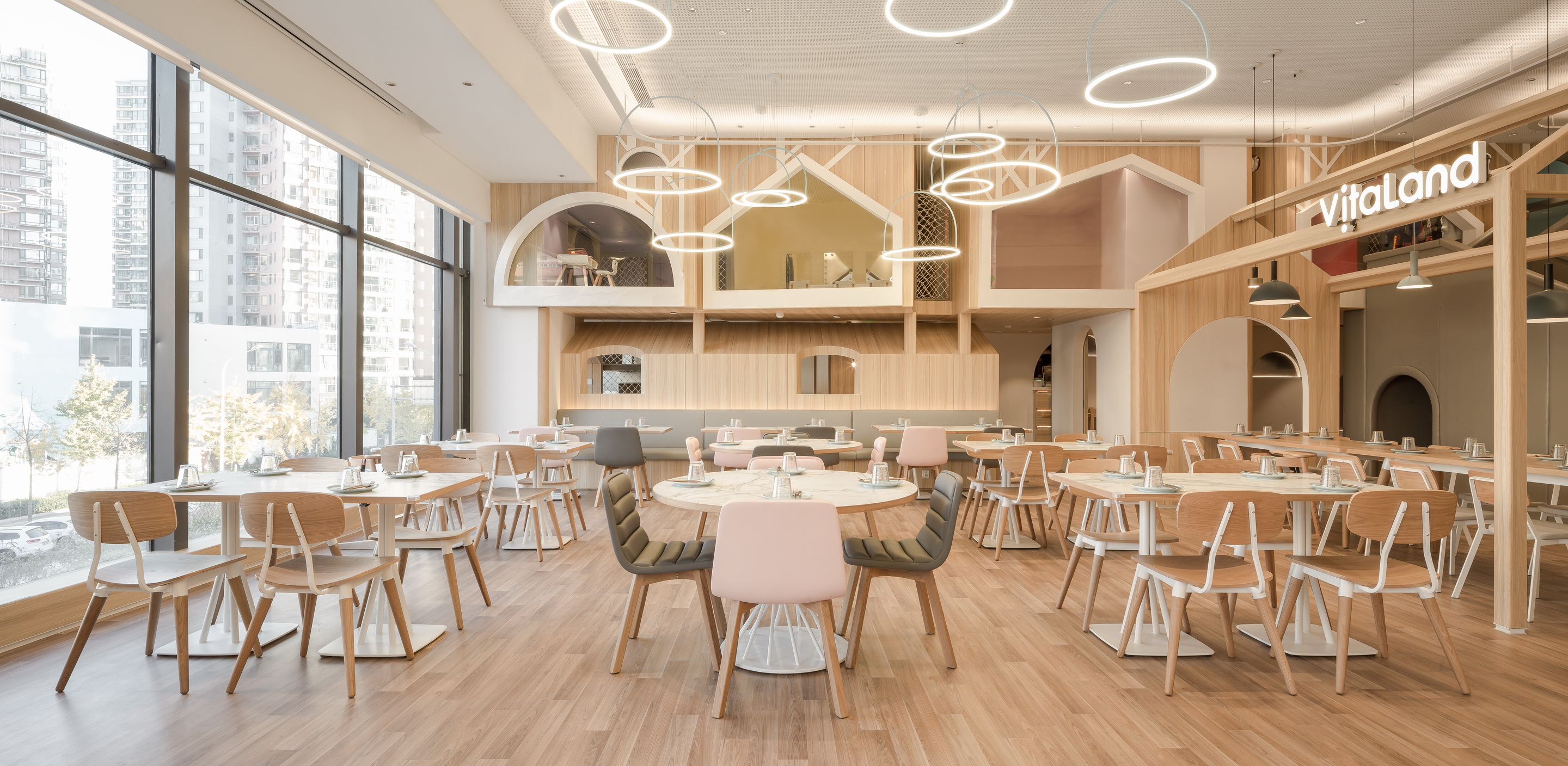
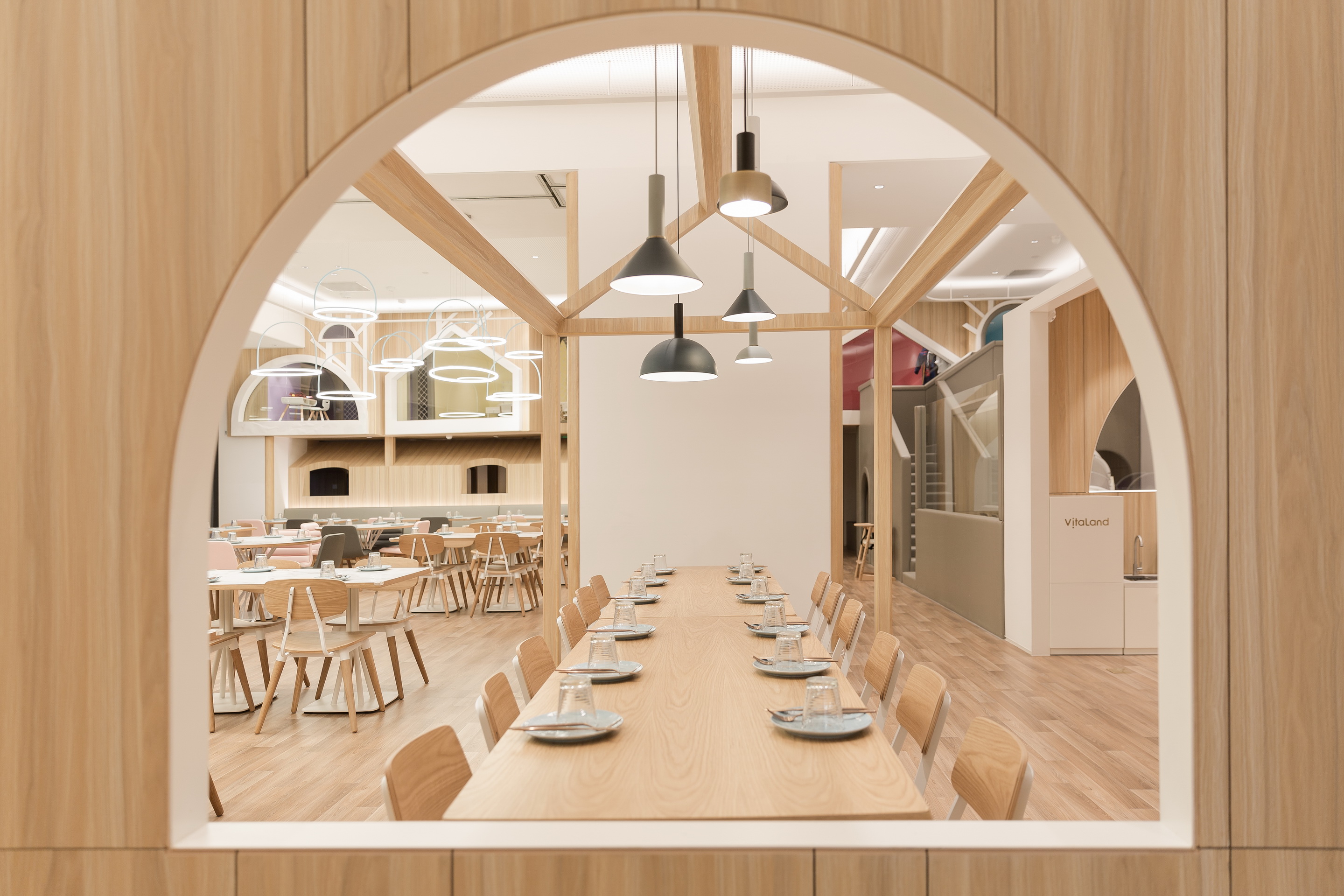
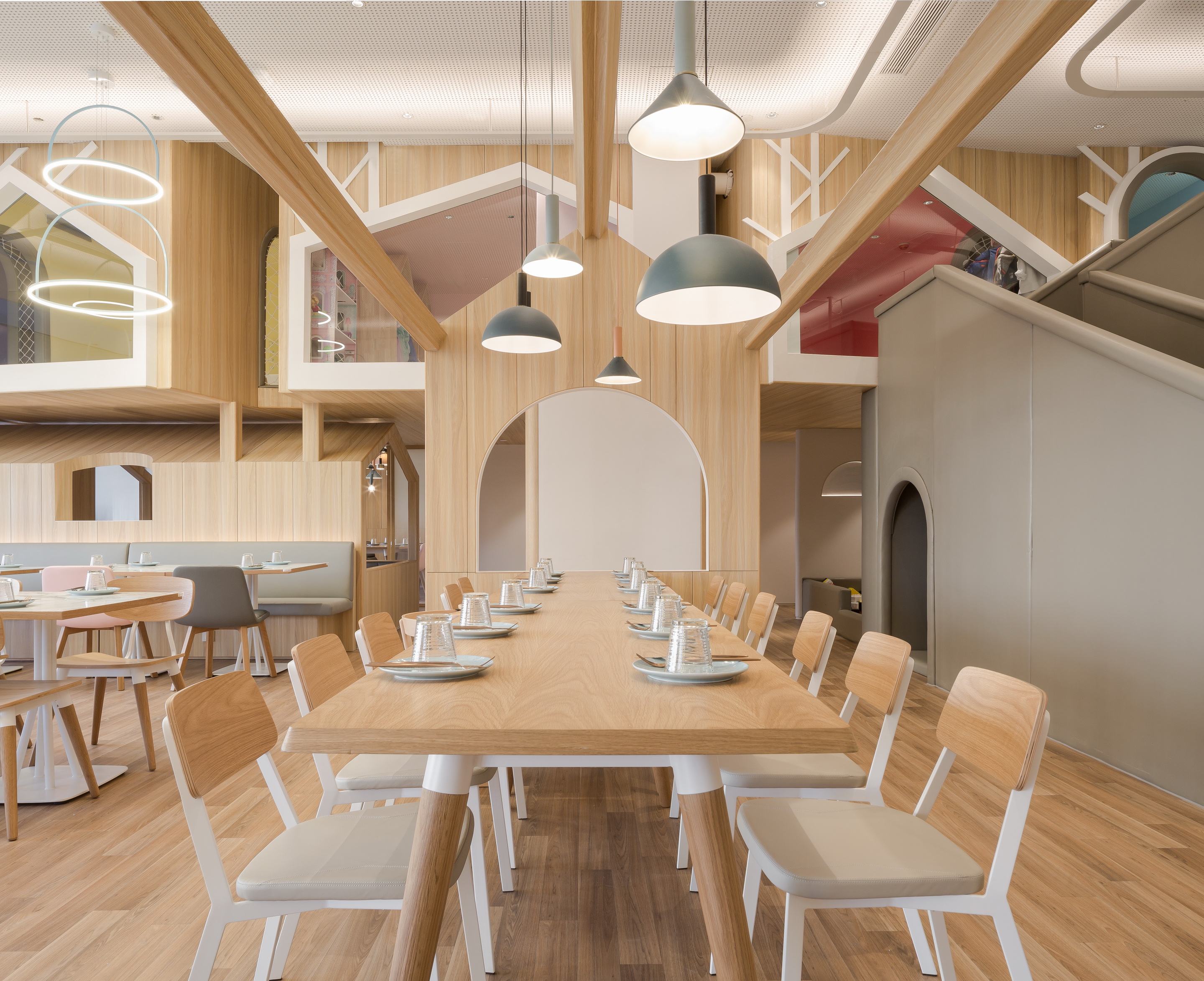
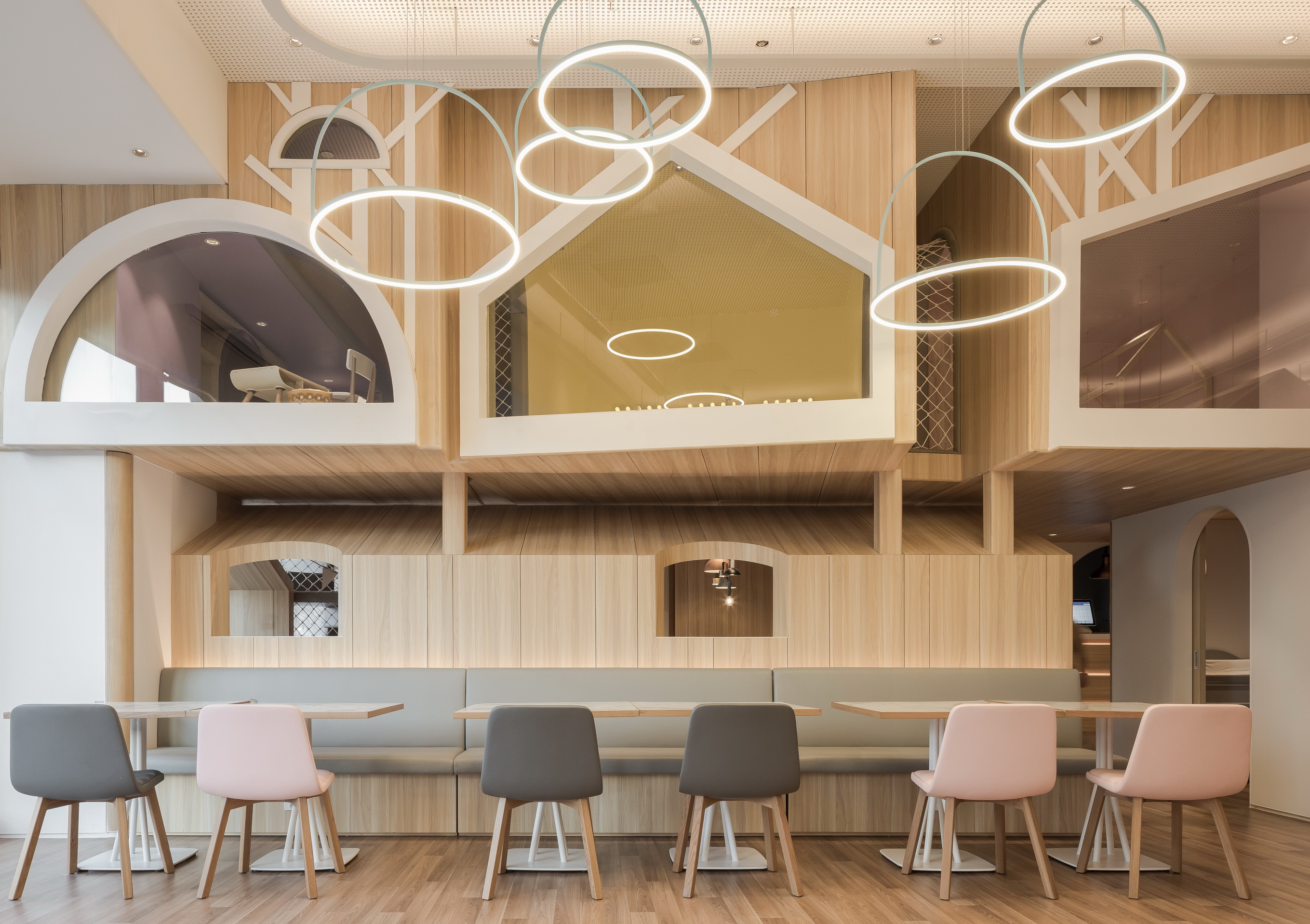
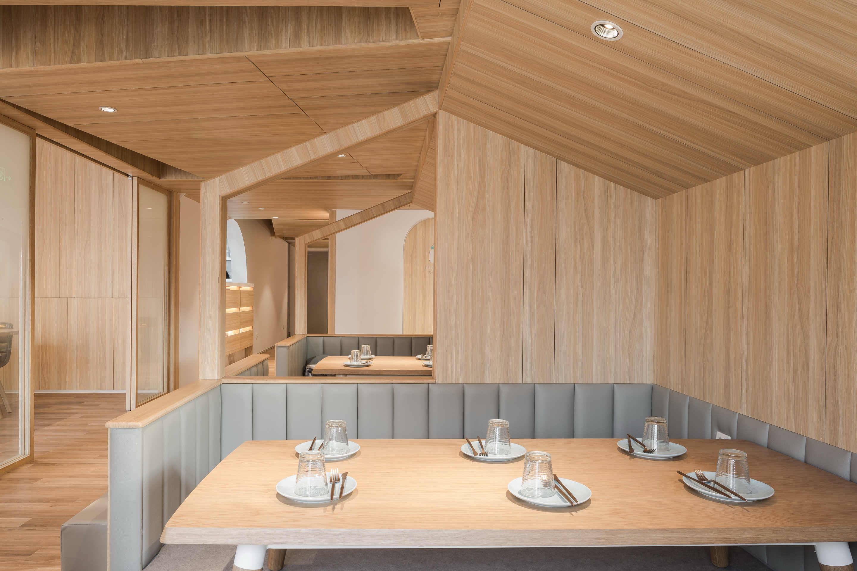
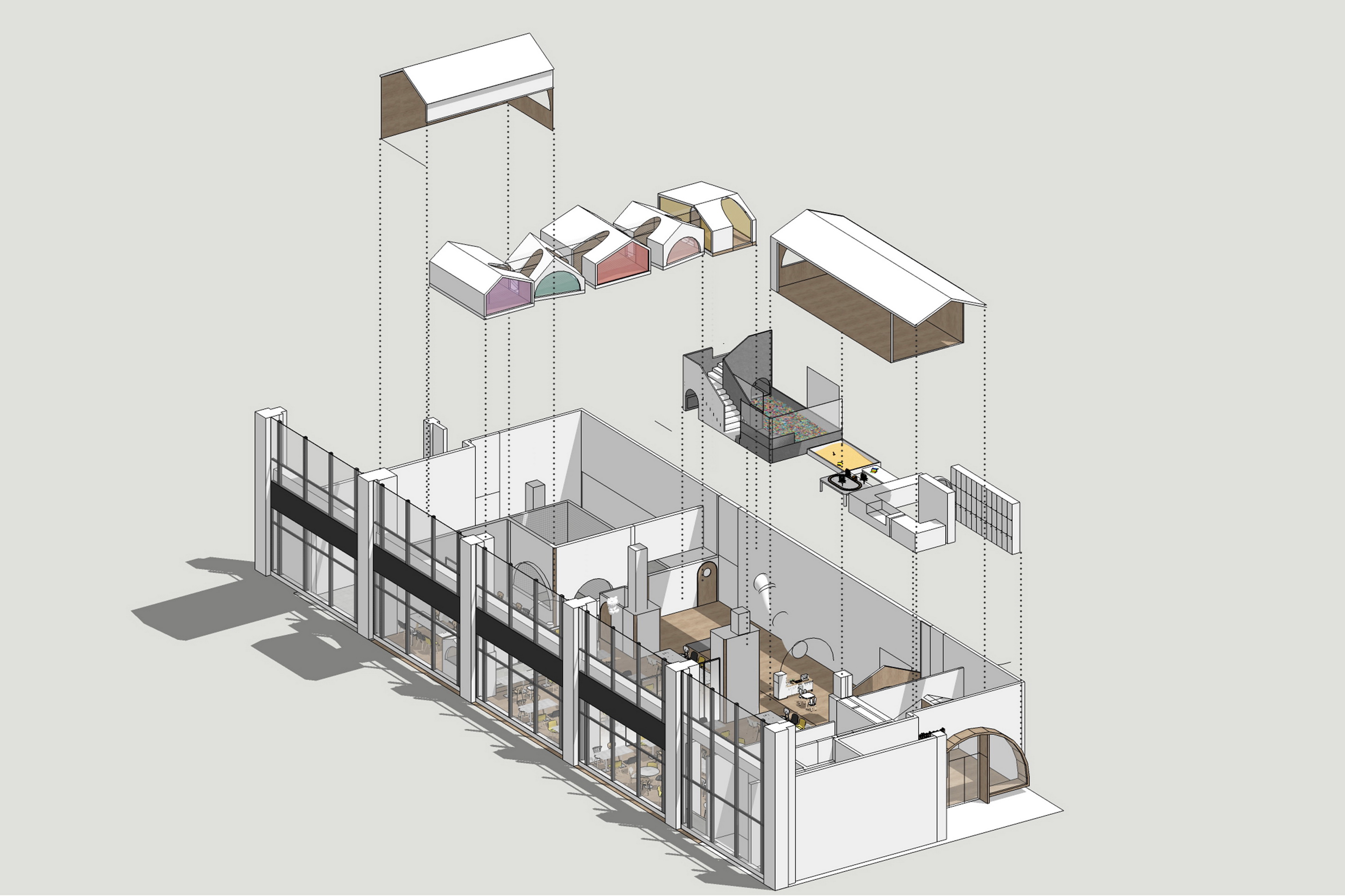
“树屋”的概念贯穿了整个餐厅的空间设计,一个个错落在空间里的小房子构成了不同的儿童体验空间,与就餐的大堂形成半围绕的结构,空间疏密相互呼应。
The “treehouse” concept runs through the entire space of the restaurant. The small houses that are scattered around the space compose different experience spaces for children, forming a semi-circular structure with the dining area, while the spaces are connected to each other.
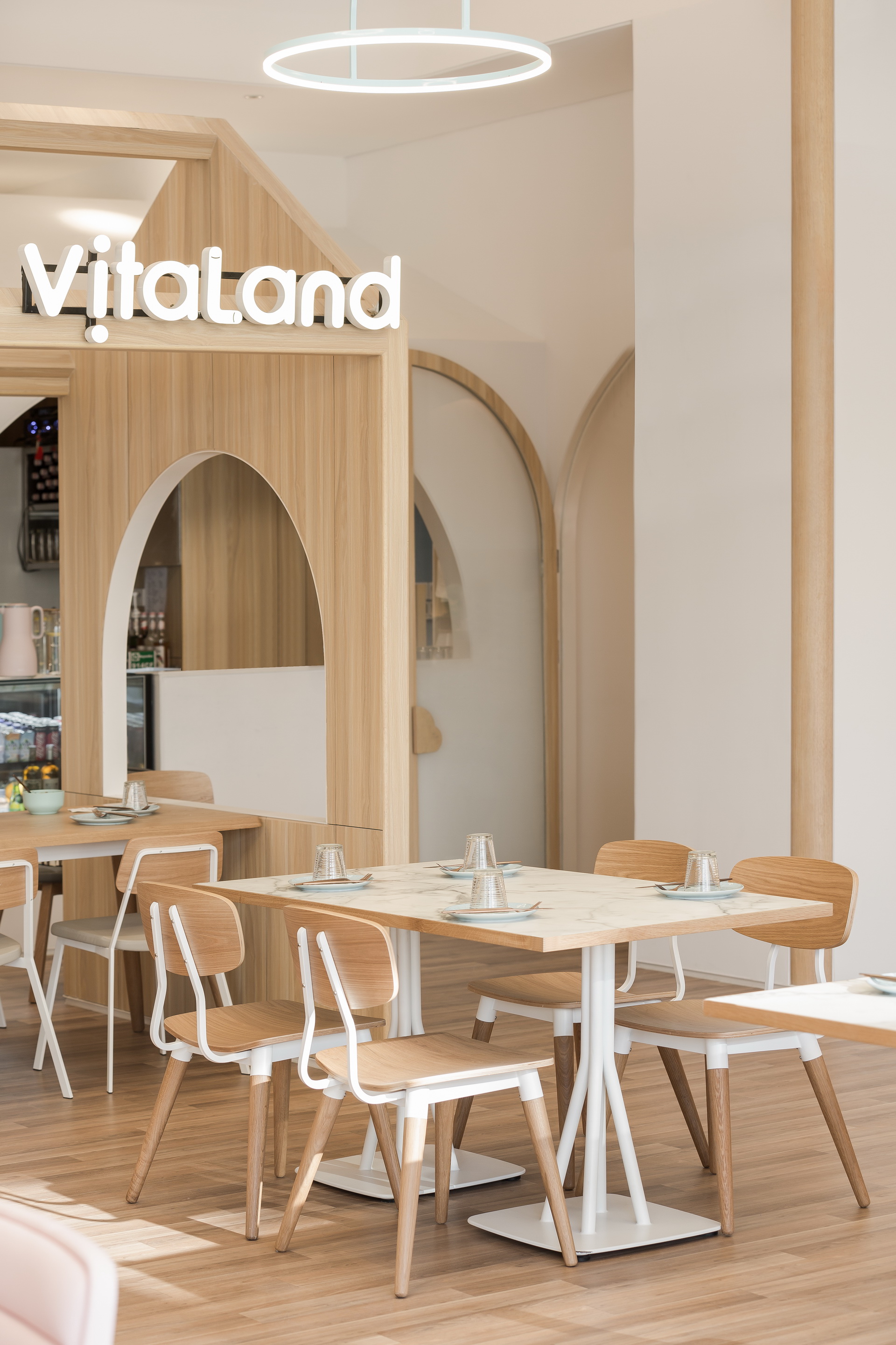
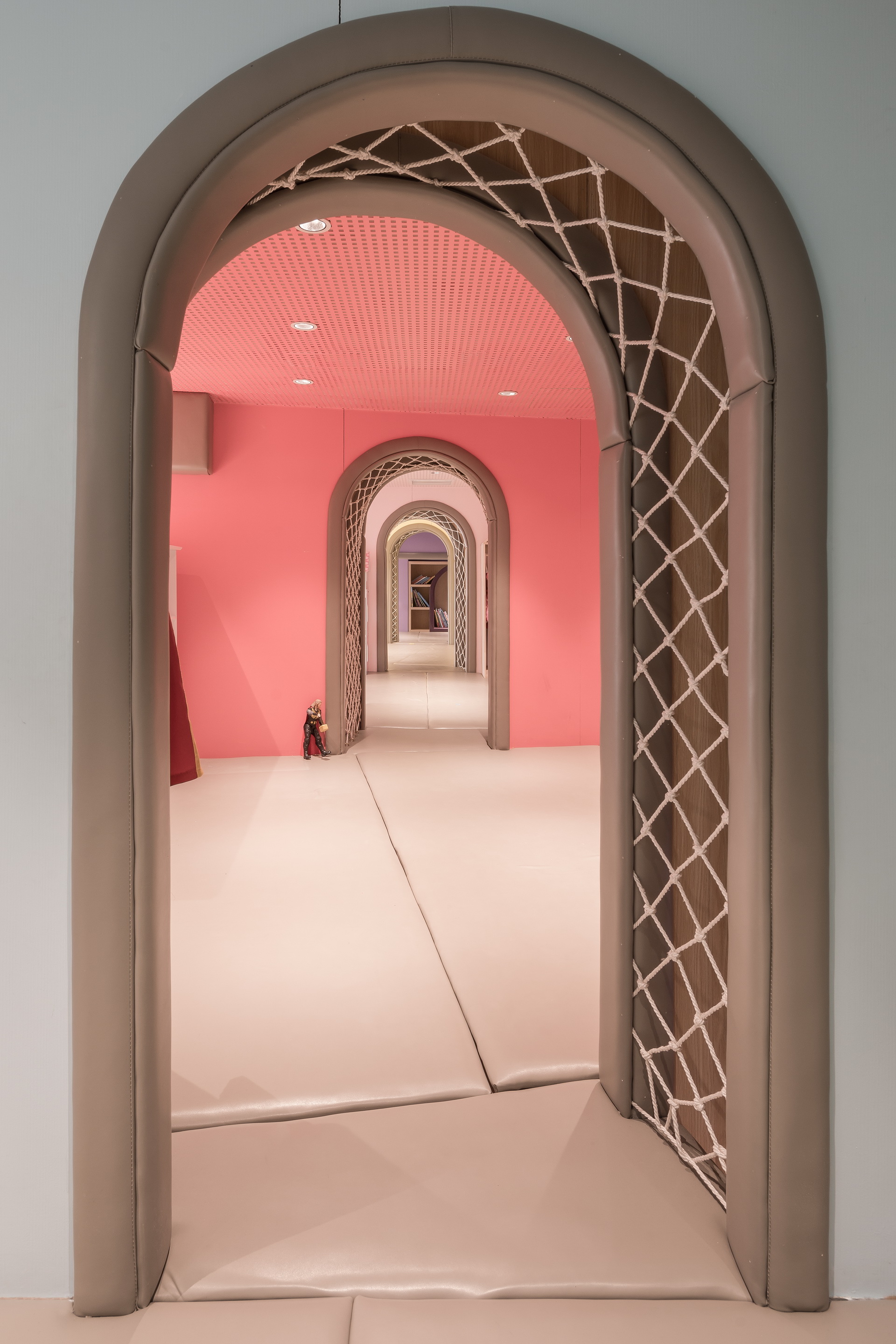
蔬菜与水果是餐厅的vi形象主体。一棵巨大的西兰花在入口处以欢迎的姿态迎接到访的客人,原本是大多数小朋友最“畏惧”的蔬菜,一下子活泼可爱起来。穿过白色的的鞋柜与展示架组成的玄关,跨过拱形的门洞就算是正式进入到这个“儿童与父母的乐园了”。
Vegetables and fruits are the main form of the restaurants VI image. A large broccoli greets the visiting guests at the entrance with a welcoming gesture. It was chosen as broccoli are often interpreted as the vegetable that “scares” children. Through the white shoe cabinet and display stand, the arched door greets you into this amusement park.
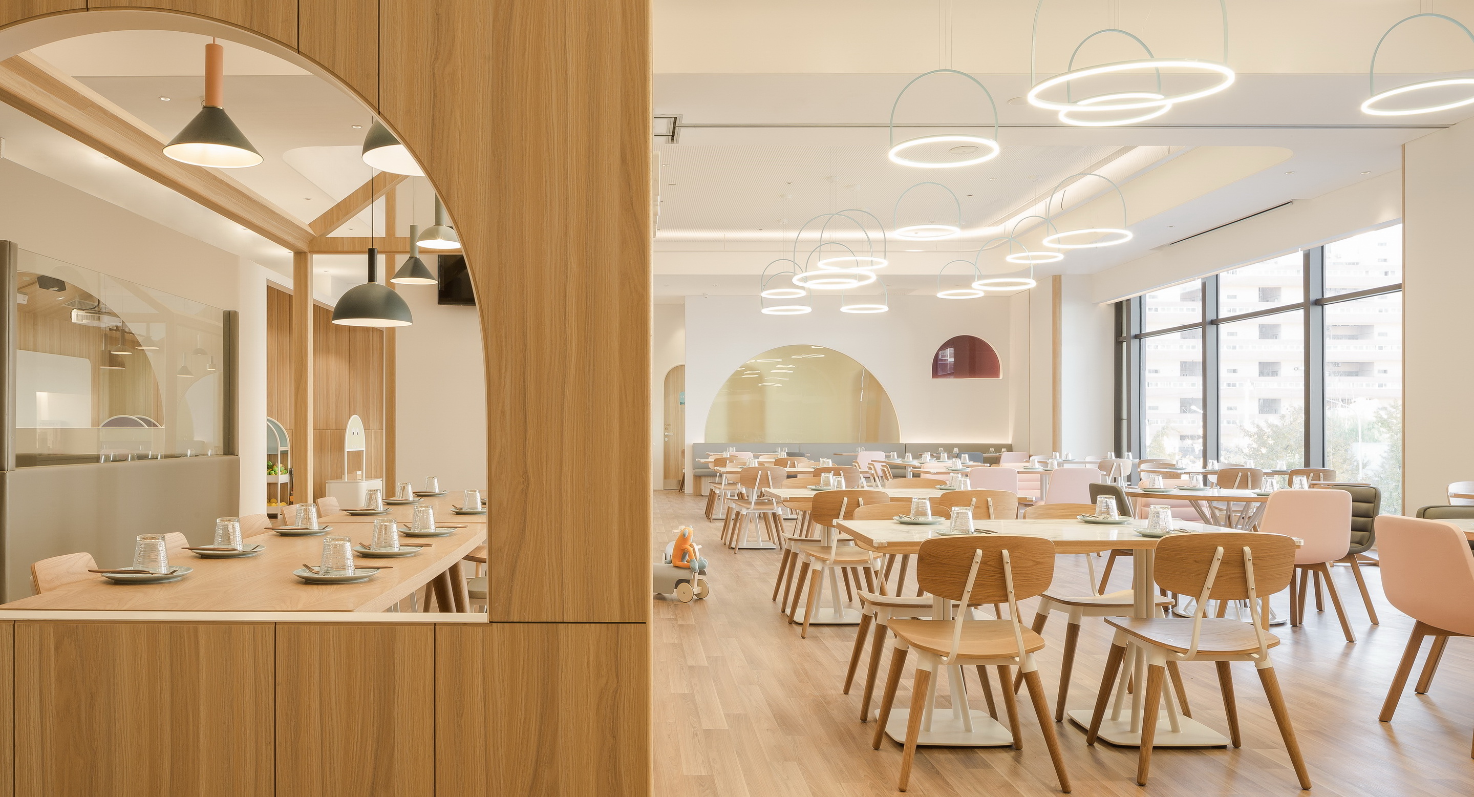
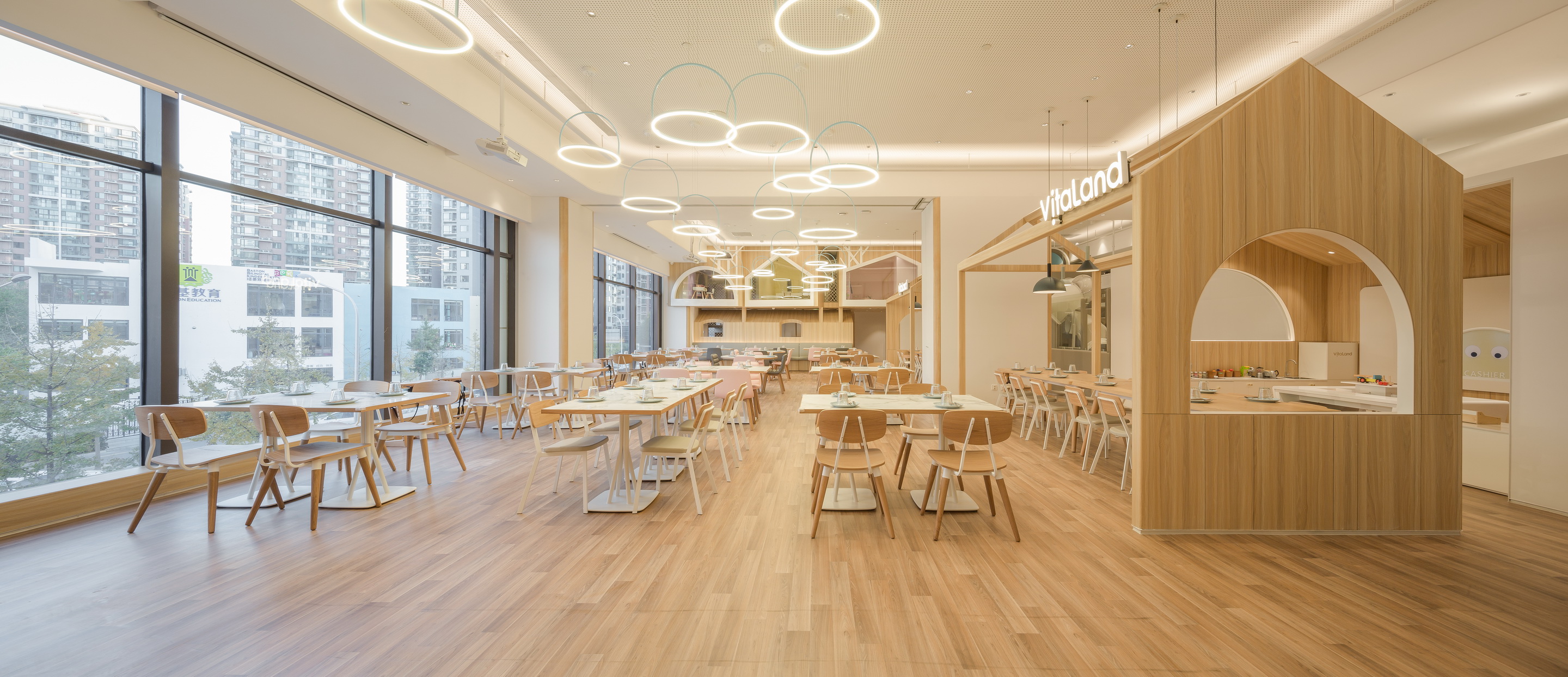
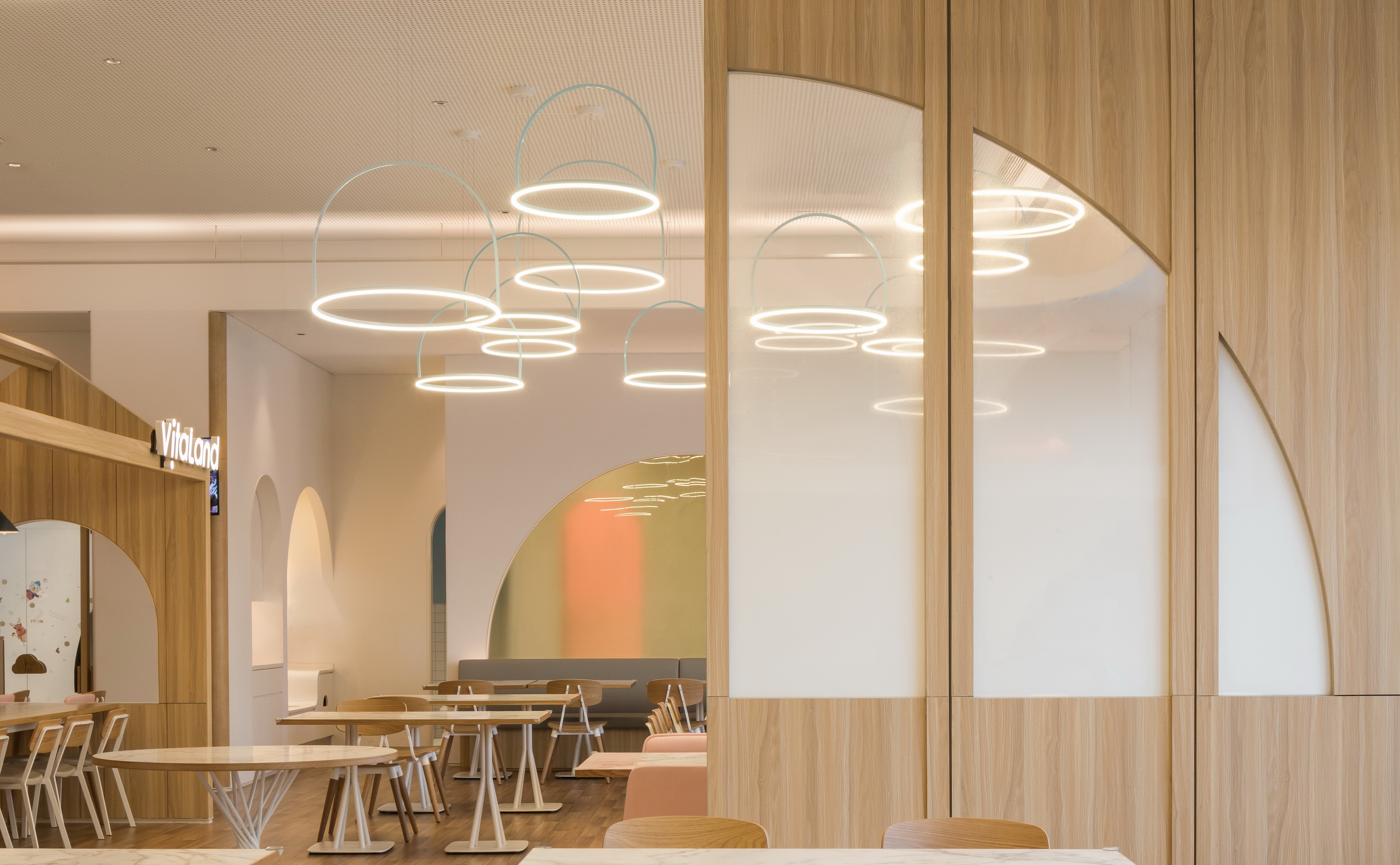
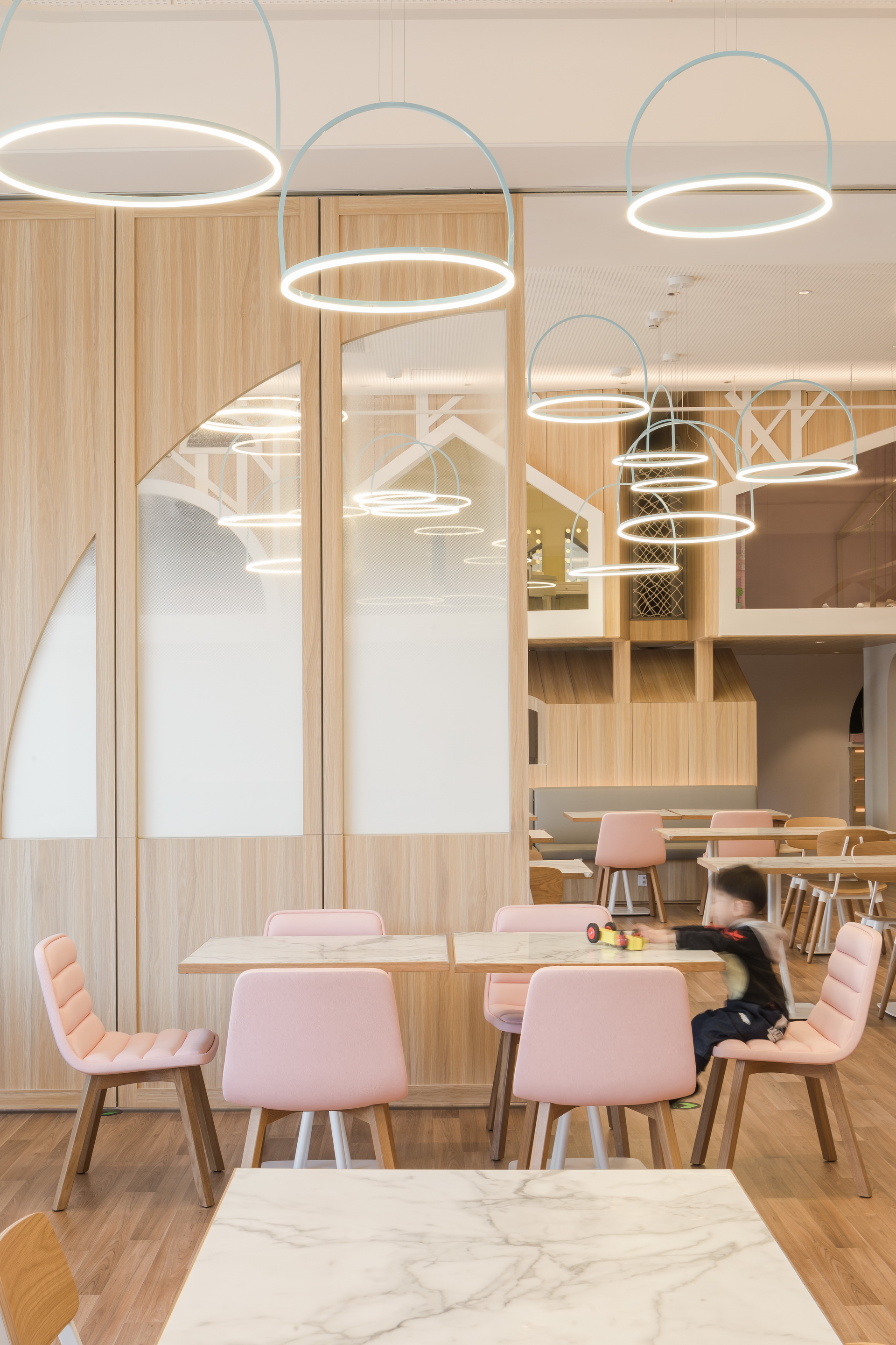
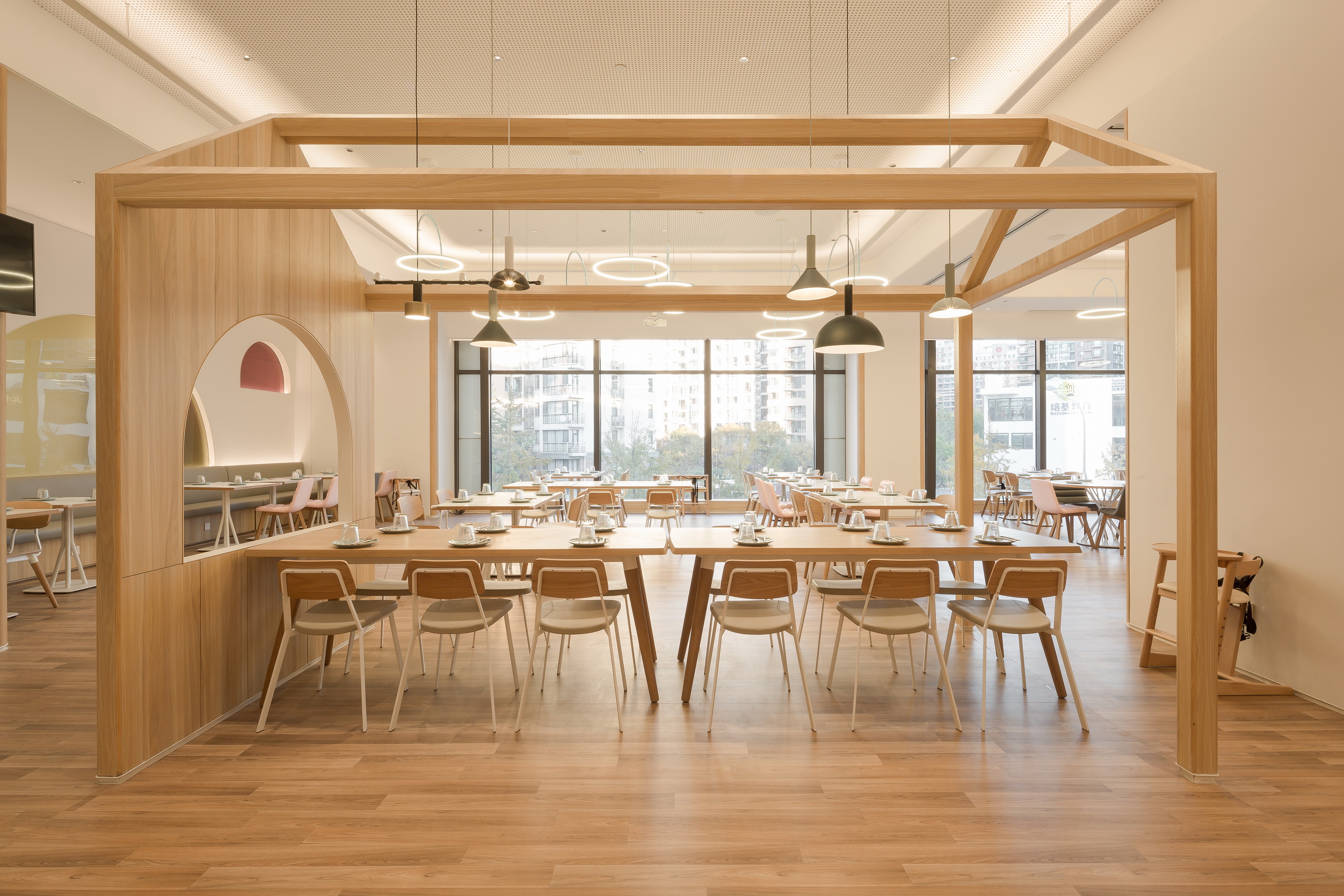
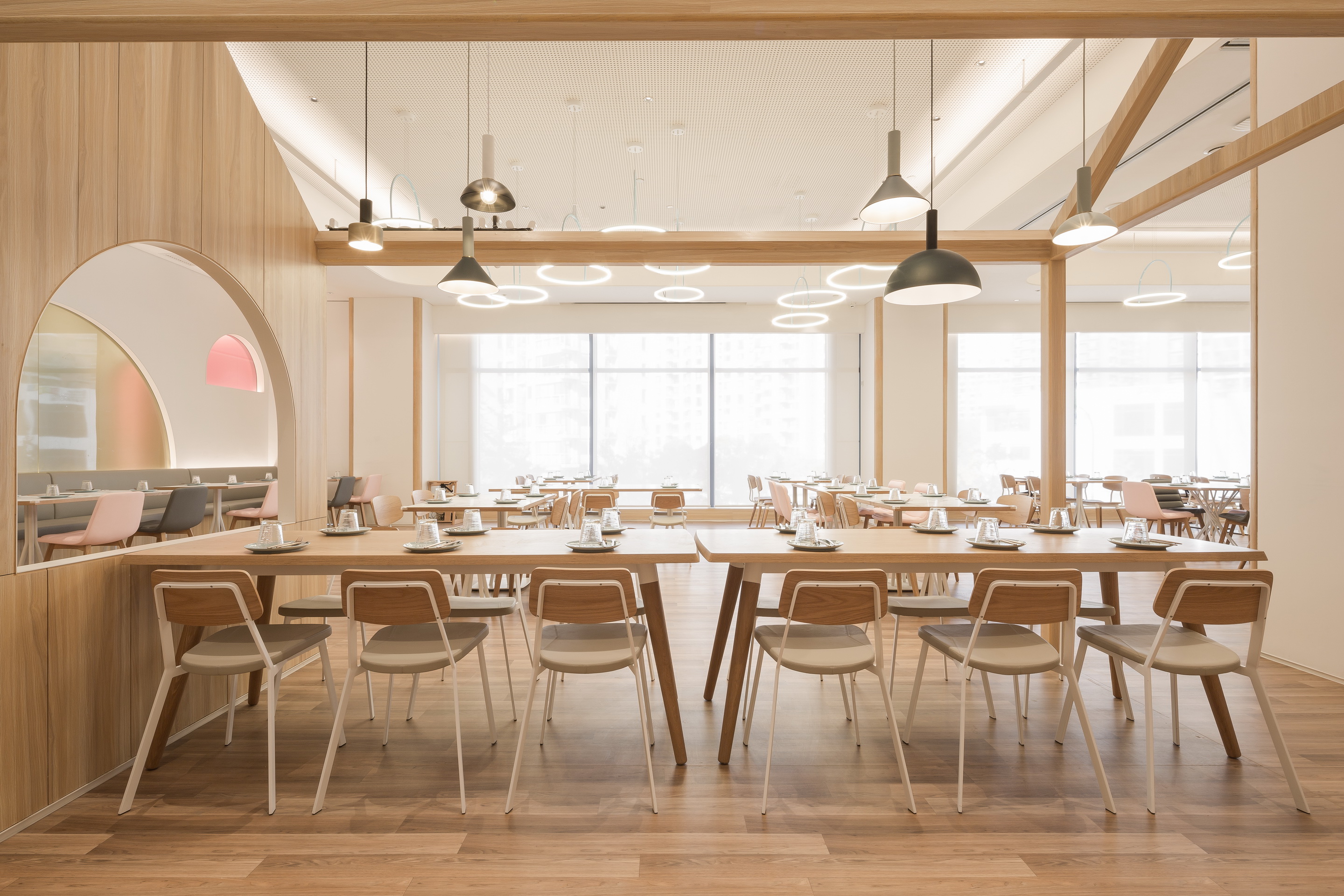
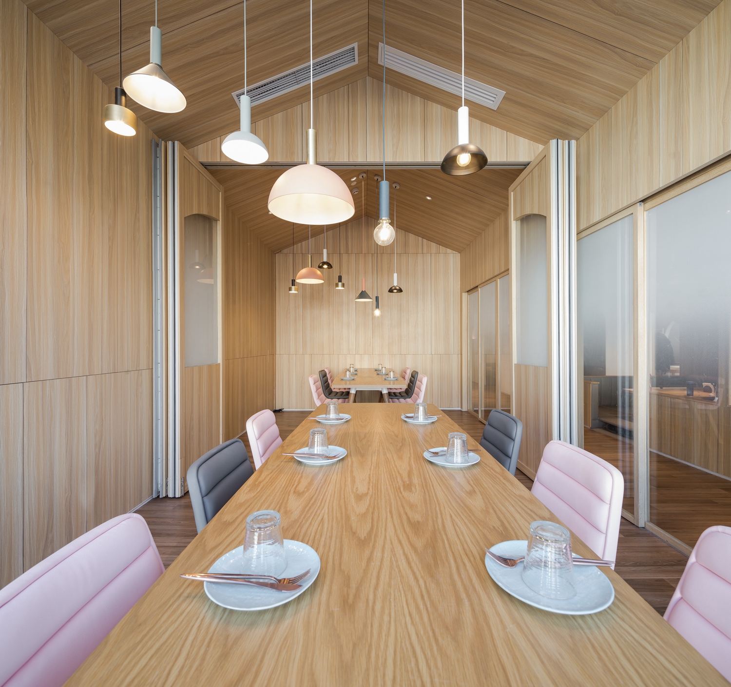
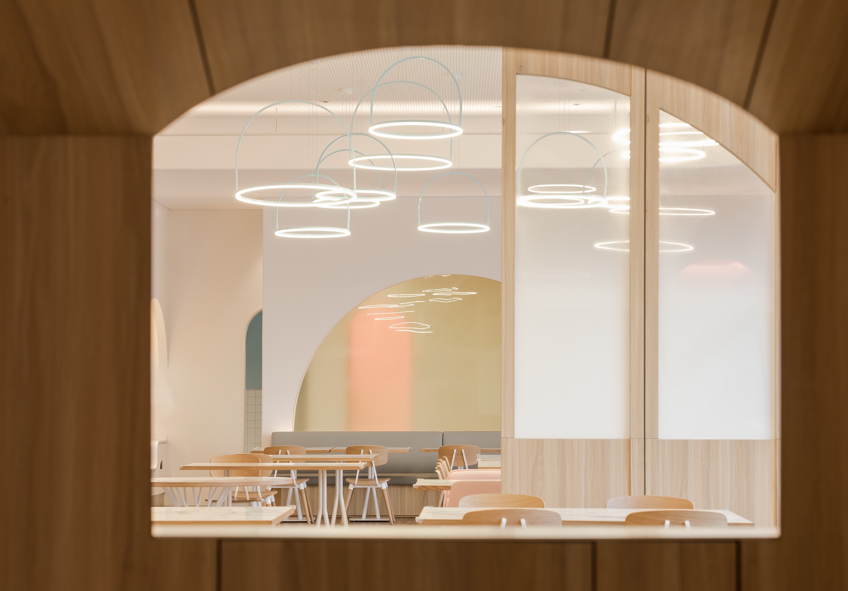
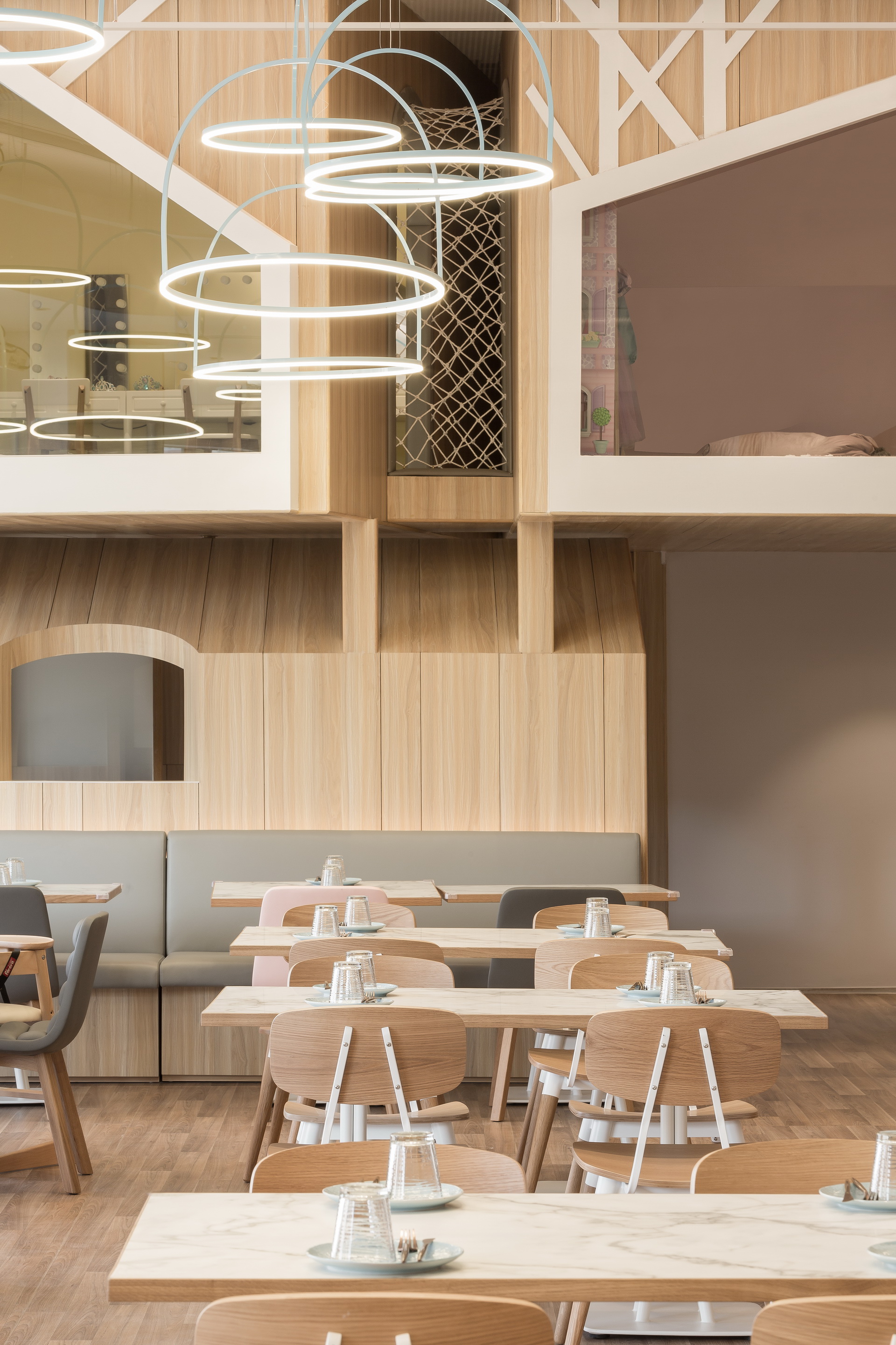
进入餐区,左手边便是主要的就餐大堂,白色的空间基调配上天花漂浮的圆形光圈灯具,有一种天空中的梦幻。大厅的中段设计了折叠门,需要办派对的时候还可以一分为二两个空间。
On the left hand side of the dining area, it is the main dining lobby. The white space is matched with the circular lights floating in the ceiling, giving an impression of a dream. The middle section of the hall is designed with folding doors, which could be used when you need to divide the large room into two.
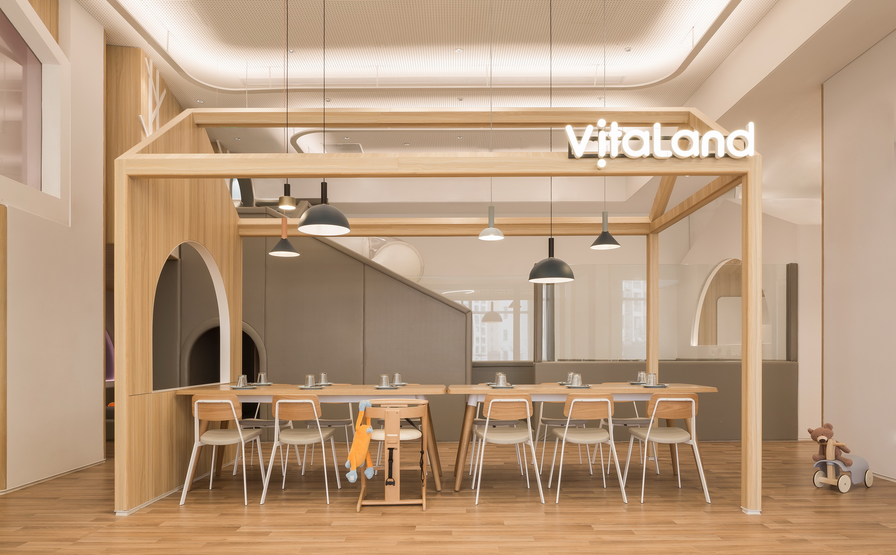
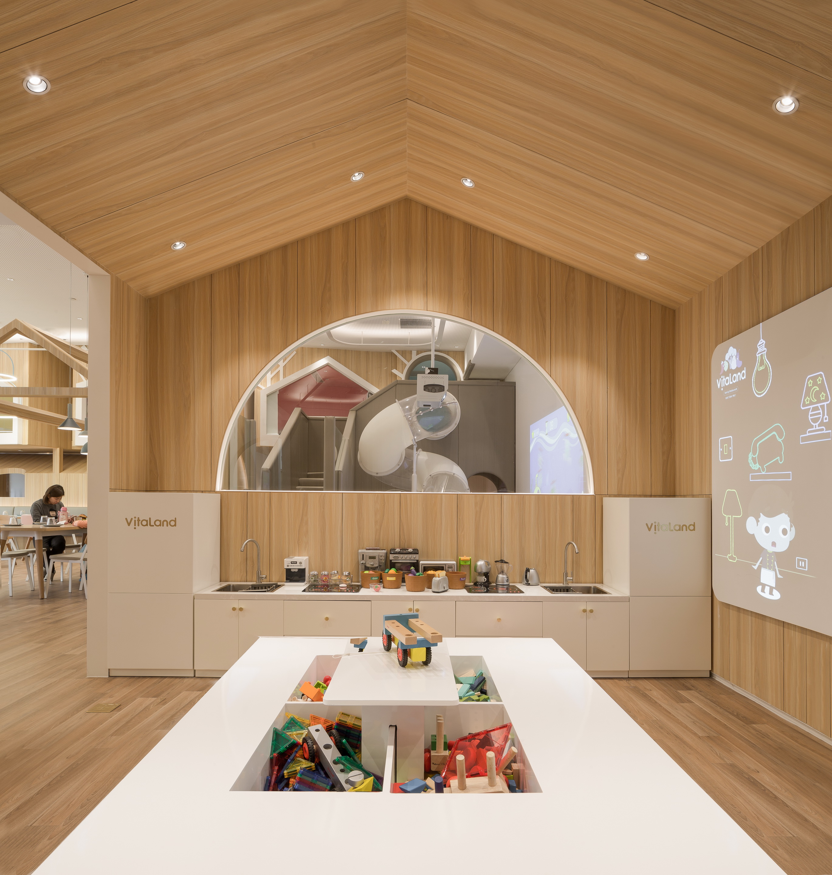
而餐区的右边,以框架构筑的小屋为界限,分隔了用餐区域儿童体验的区域,各种不同场景的体验活动,令成年人也羡慕不已。
On the right side of the dining area, there is a hut built with frames, which separates the children’s play area and the dining area. The various arenas of the play area, is also envied by adults.
也许是在某个周五的下午,已为人父母的你我约上一杯下午茶,阳光透过窗边梧桐树落在桌面。目光的尽头是玩闹的孩子,一切在现实与青春年少的回忆间穿梭,时间的轴线就这样被打乱。
Maybe on a Friday afternoon, You and I could have a cup of tea together, while the sun shines through the window and onto the phoenix tree. At the end of our gaze is a playful child, everything transporting back and forth between reality and youthful memories, while the axis of time gets disrupted.
大厅的尽头便是整个空间最最有趣的树屋聚落。层错的小屋彩色的玻璃窗,玻璃的颜色不仅来区分空间又与视觉系统相呼应。下层的小屋是包厢、儿童的休息室。而楼上层高不足1.5米的空间被设计成为又一不同主题的儿童体验空间,这个层高对于成年人而言需要弯腰才能进入,但是对于孩子而言却是恰恰合适而又充满安全感。
At the end of the hall is the most interesting part of the entire space. The huts are covered in stained glass windows. The color of the glass not only distinguishes the space but also reflects the Brand vision system. The lower level cabin is a pricate dining room for children. The space up to 1.5 meters is designed to give a different experiences for children. The height of this space requires adults to bend over in order to enter, which creates a sense of security for children.
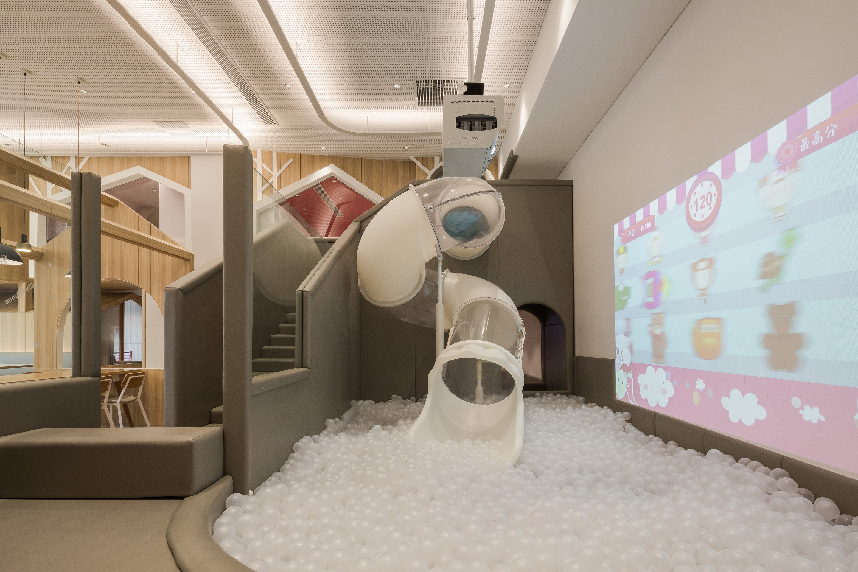
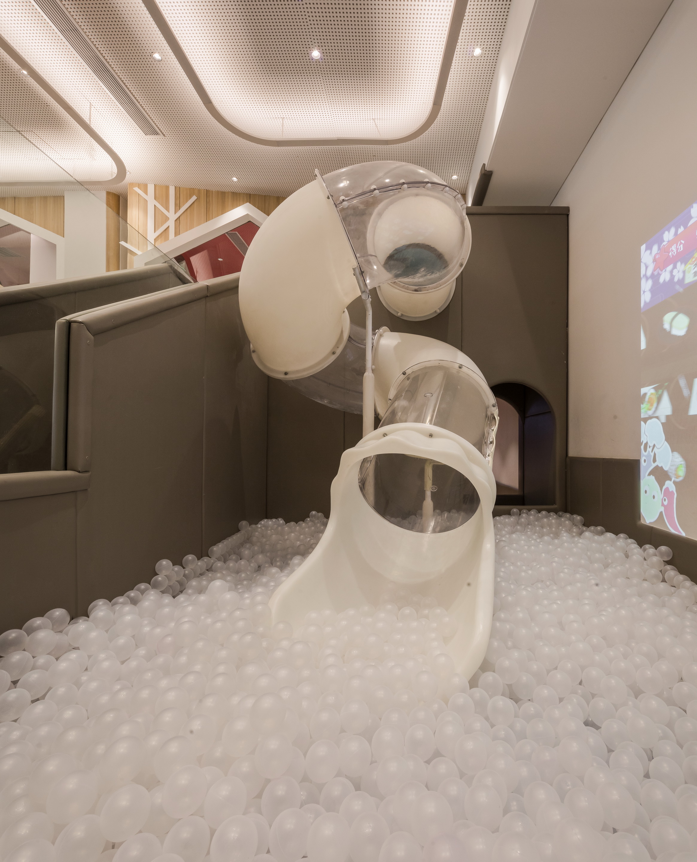
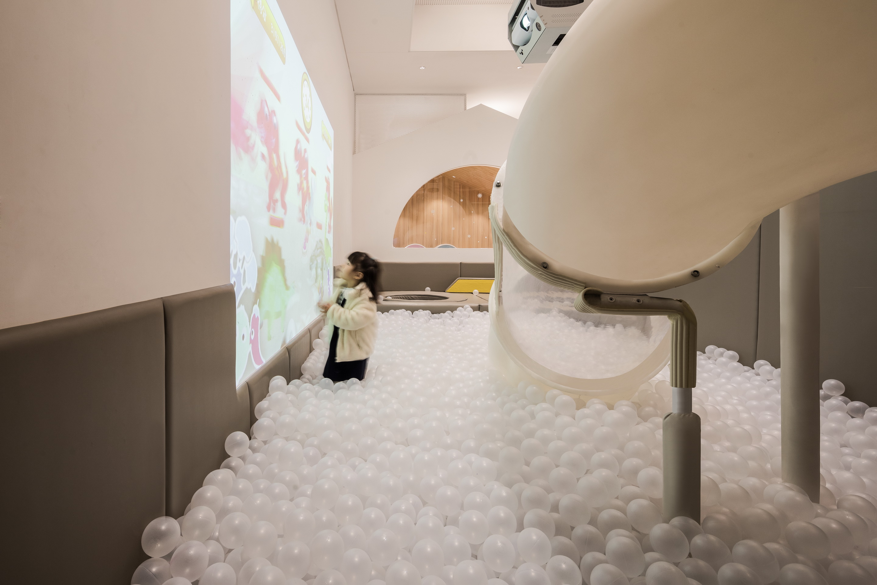
两层的树屋之间也充满着空间上的互动。从右手边的楼梯向上走,楼梯的内侧边是孩子们最喜欢球池。更多的小朋友会“半途而废”还没有爬上树屋便顺着设计在楼梯中断的滑梯入口滑进球池里。如此反复上上下下乐此不疲。
The two-story treehouse is filled with spacial interaction. As you go up the stairs, on the right hand side you can see a ball pit. Most children will not even climb up into the treehouse and instead go down the slide at the entrance. This constant up and down does not make them tired.
也有些孩子首先就被树屋吸引,一鼓作气爬上树屋,发现里面是一个充满惊奇的新世界,刚从公主主题小屋穿过有来到了全是超级英雄的空间,再往前跑去,竟然又有旋转的楼梯可以向下。
On the other hand, some children will first be attracted to the treehouse, and they would climb into the treehouse and find out that it is a new world full of surprises. It goes from a princess-themed hut, to a space full of superheroes, and when you run forward, there is even a spiral staircase that leads you down.
顺着旋转楼梯向下,刚刚落地,竟然看见才分开的爸爸妈妈正在热火朝天的聊天吃饭。
When you go down the spiral staircase, you can see your mom and dad eating and chatting.
恍然间,一场新的探险旅程就又要开始了。
Suddenly, a new adventure will begin again.
古鲁奇所设计的维塔兰德亲子餐厅,并不走当下流行的夸张设计的网红路线,清新如天堂的风格考虑更多的是小朋友的使用,而不是为了让父母拍照。在空间上设计师将目光投放在了孩子本身对高高低低的可以攀爬的空间比对五颜六色的地方更感兴趣的天性上,将空间生动有趣高低错落起来,试图营造出能让孩子们自娱自乐“野蛮生长”的空间,也好让父母们偷得浮生半日闲。
Golucci’s design of Vitaland kid restaurant does not follow the popular route of exaggerated fancy designs. The fresh style is more about the friendly children’s entertainment than to take pictures. In this space, the designer puts his perspective on the nature of the child’s own space that can be climbed more than the colorful place. It makes the space more interesting, and trying to create a way for children to use the space for entertainment is also good for parents to steal a half-day leisure.
项目信息——
项目名称:维塔兰德亲子餐厅
设计师(公司):古鲁奇公司
设计总监:利旭恒
专案设计:许娇娇
设计团队:利旭恒,许娇娇,张晓环
客户:维塔兰德亲子餐厅
项目位置:北京
项目面积:500平方米
完成时间:2019年06月
文字:朱圆欣
摄影:鲁鲁西
Project information——
Project Name: Vitaland kid restaurant
Design company: Golucci Interior Architects
Director: Lee Hsuheng
Design team: Lee Hsuheng, Xu Jiaojiao, Zhang Xiaohuan
Client: Vitaland kid restaurant
Location: Beijing, China
Built area: 500m2
Completion (date): 2019.6
Text: Zhu Yuanxin
Photographer: Lulu Xi


