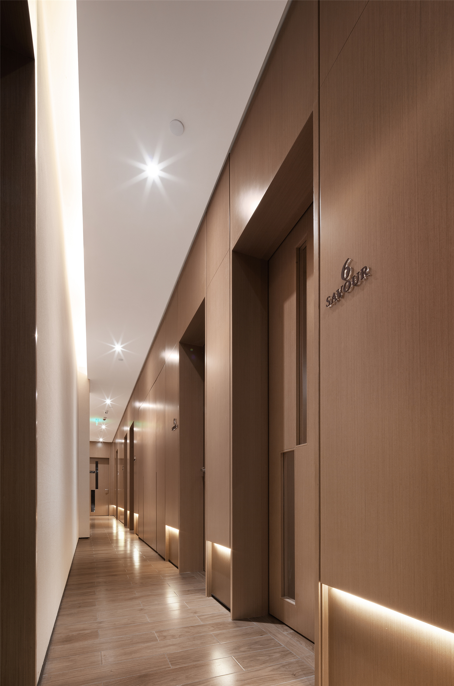
作为一个美发造型的专属空间,让人想到的第一个词语一定是“时尚”。今天我们对于时尚的定义有着诸多层面,在某种意义上,与其跟从,不如说从自己的个性出发才是时尚的精髓。与众不同,不跟风,让人印象深刻,这是对于时尚的最好诠释。苏梵造型大朗店的设计中就努力做到这一点,让顾客:记得住、回得来。
When it comes to an exclusive space of hair styling, the first word come to people’s mind is “fashion”. Today we define fashion from many different aspects. In some sense, the essence of fashion is not following the trend, but emphasizing your individuality. Do not follow the trends, being different and impressive is the best interpretation for fashion. In the design of Savour Dalang Store, what the designer strives to achieve is: to impress the customers and make them repeat customers.
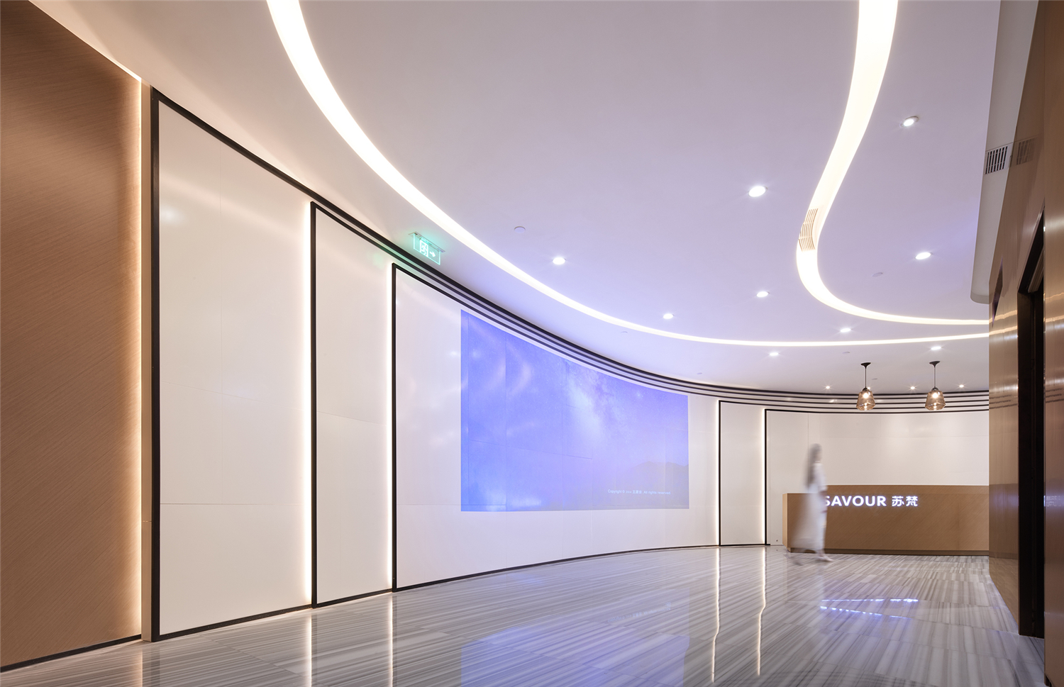
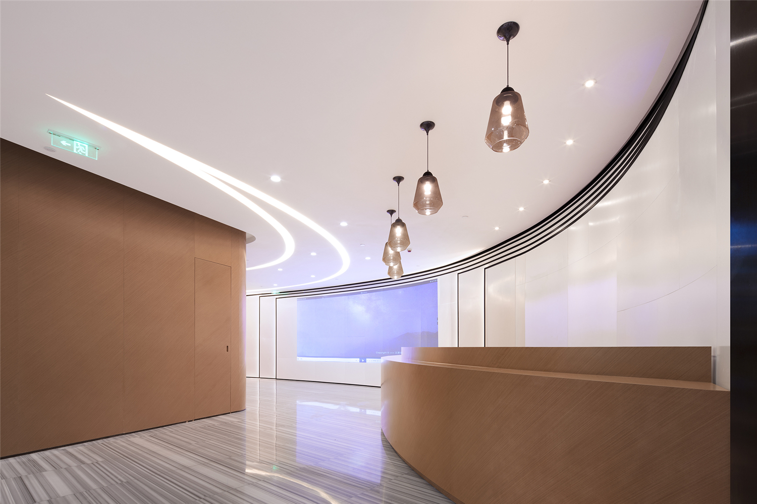
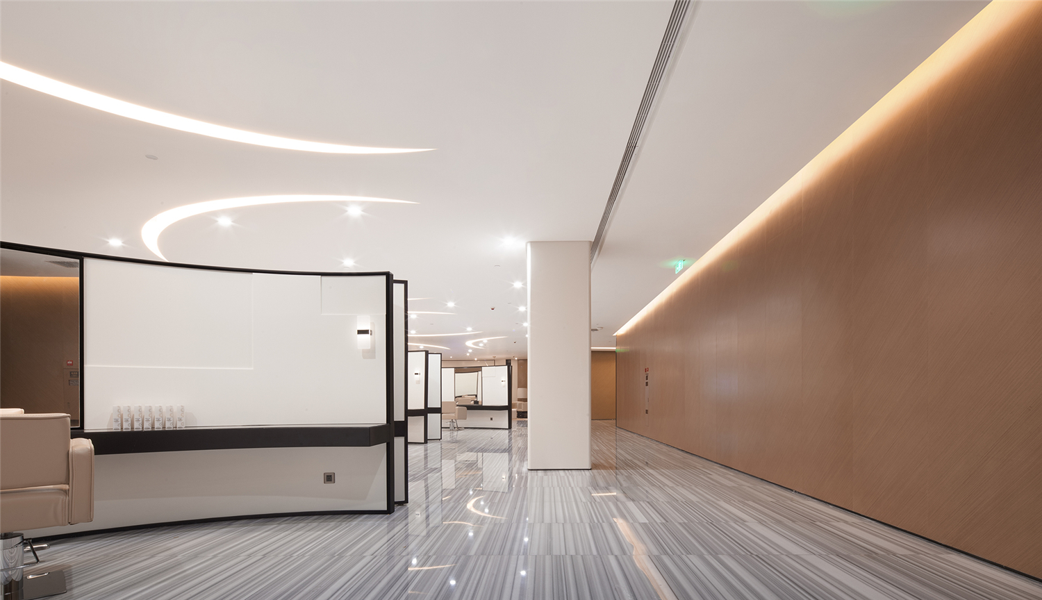
时尚行业,从沙宣的曲线,到三宅一生的剪裁,每一剪都涉及到精准、绝对、毫不犹豫,这可能是时尚行业注定的宿命。同样的,为完成苏梵造型大朗店的空间设计,强调曲线也是平面布局给人的第一冲击点。从电梯出来,一条弧线割开平静的平面图,喇叭口吸纳了各色顾客。
In fashion industry, from VS Sassoon’s curve to Issey Miyake’s cutting, every cutting is about accuracy, absoluteness and decisiveness; this might be the destined fate for fashion industry. Similarly, in the space design of Savour Dalang store, the highlight of curve is the first impact the plane layout gives to visitors. Getting out of the elevator, a quiet floor plan cut off by a curve is unfolded; the trumpet-shaped opening has attracted all kinds of customers.
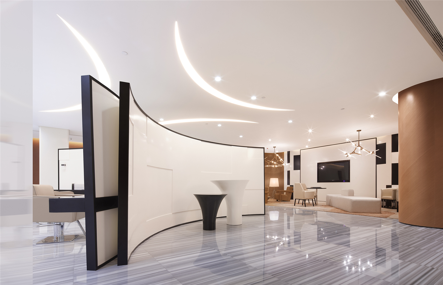
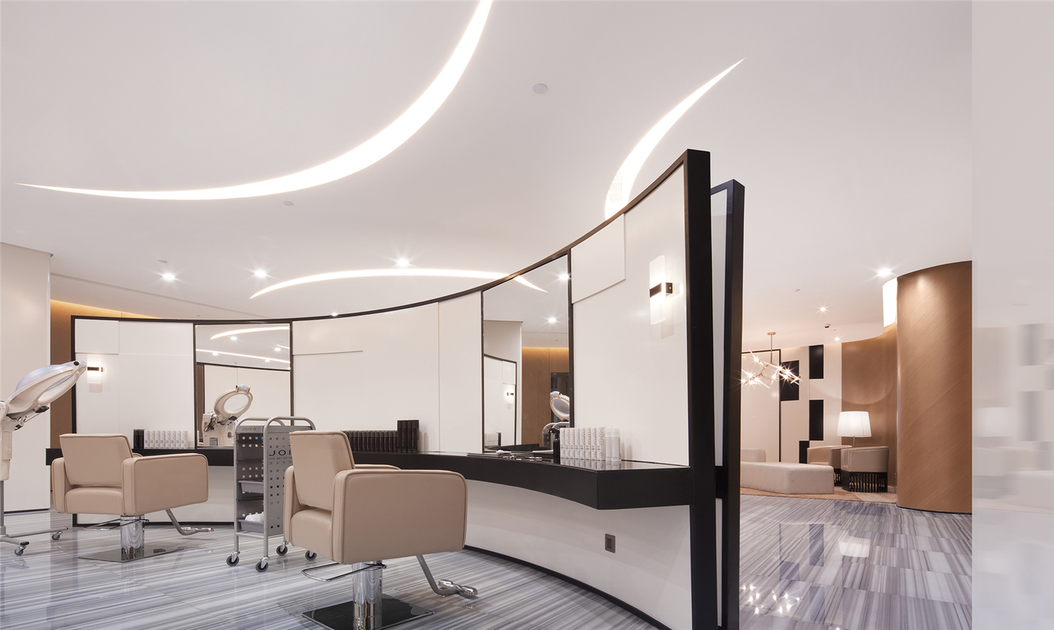
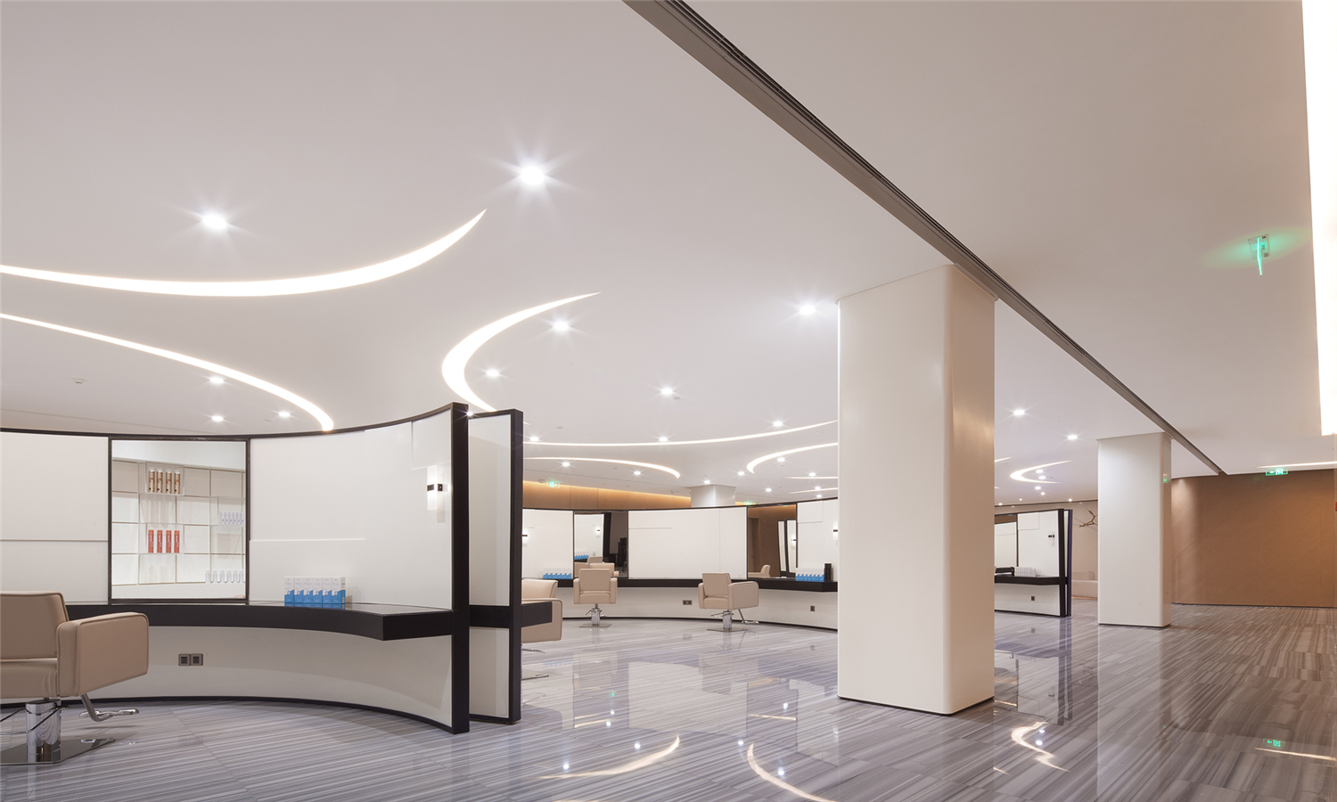
如果我们将艺术视为科学,那么设计就是技术。技术依托科学,又具有更多的功用。同样的,设计学的灵感经常来源艺术品,“功夫在诗外”的设计总能让人眼前一亮。操作区的设计的曲线就来自于极少主义雕塑家理查德•塞拉(Richard Serra)的作品。向大师致敬的操作区打破了方正空间的束缚,结合柱网,锚定了三个人字形的美发区域。三人成众,空间被三个人字节点摆布出活力空间,空间中的行走方式极其顺畅。与之对应的是顶棚的区域,三条弧光以软膜形式暗藏与顶棚,呼应了地面布局。
If we consider art a science, then design is a technology. Technology is based on science, yet it has more functions. Similarly, design inspiration always comes from works of art, “designs derive from practice” always make an impression. The curve used in the design of operating area is inspired by the work of minimalism sculptor – Richard Serra.The operating area which pays tribute to the master gets rid of constrain of square space. Together with the use of column grid, three Y-shaped hair dressing area are set. The placement of three Y-shaped nodes makes this space flowing. Three soft film arc lights hide in the ceiling and anchor with the floor layout.
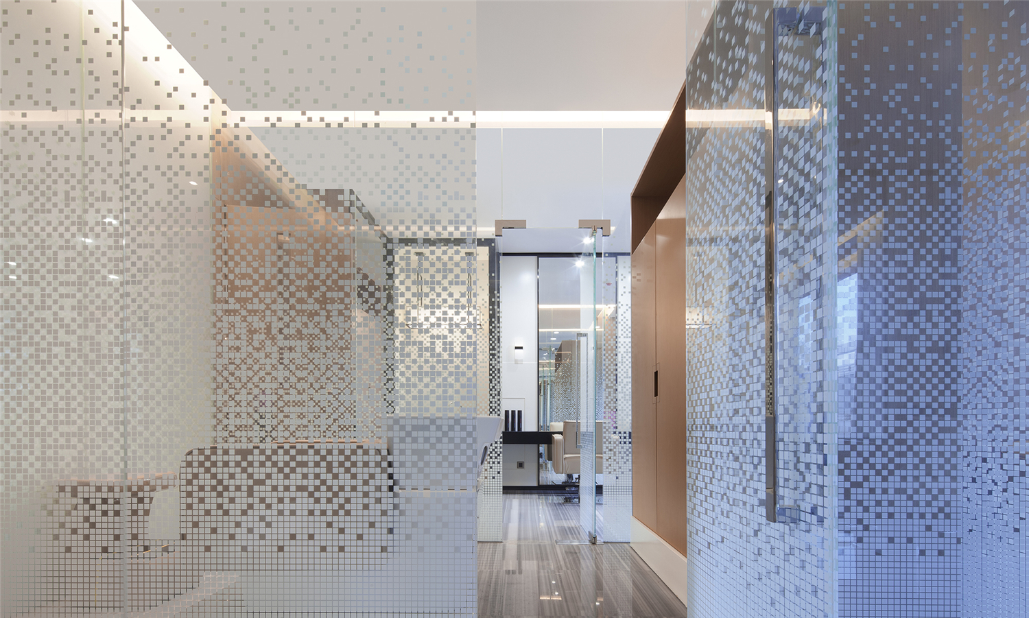
在现代设计中,很多时尚品牌都非常重视空间的通透性和透明感,例如妹岛和世的Dior旗舰店即通过透明玻璃传递了飘逸轻盈充满时尚的透明感和浪漫特性。如何让一个空间不死板,有弹性,有空气感,是时尚店面设计师应该重点考虑的问题。
In modern design, many fashion brands pay great attention to the permeability and transparency of the space, take Dior flagship store designed by Kazuyo Sejima for an example, the space conveys a flowing, lightsome and fashionable sense of transparency and characteristic of romance through the use of transparent glass. How to make a space vivid, flexible and have a feeling of spaciousness? It is the key issue for fashion store designers to focus on.
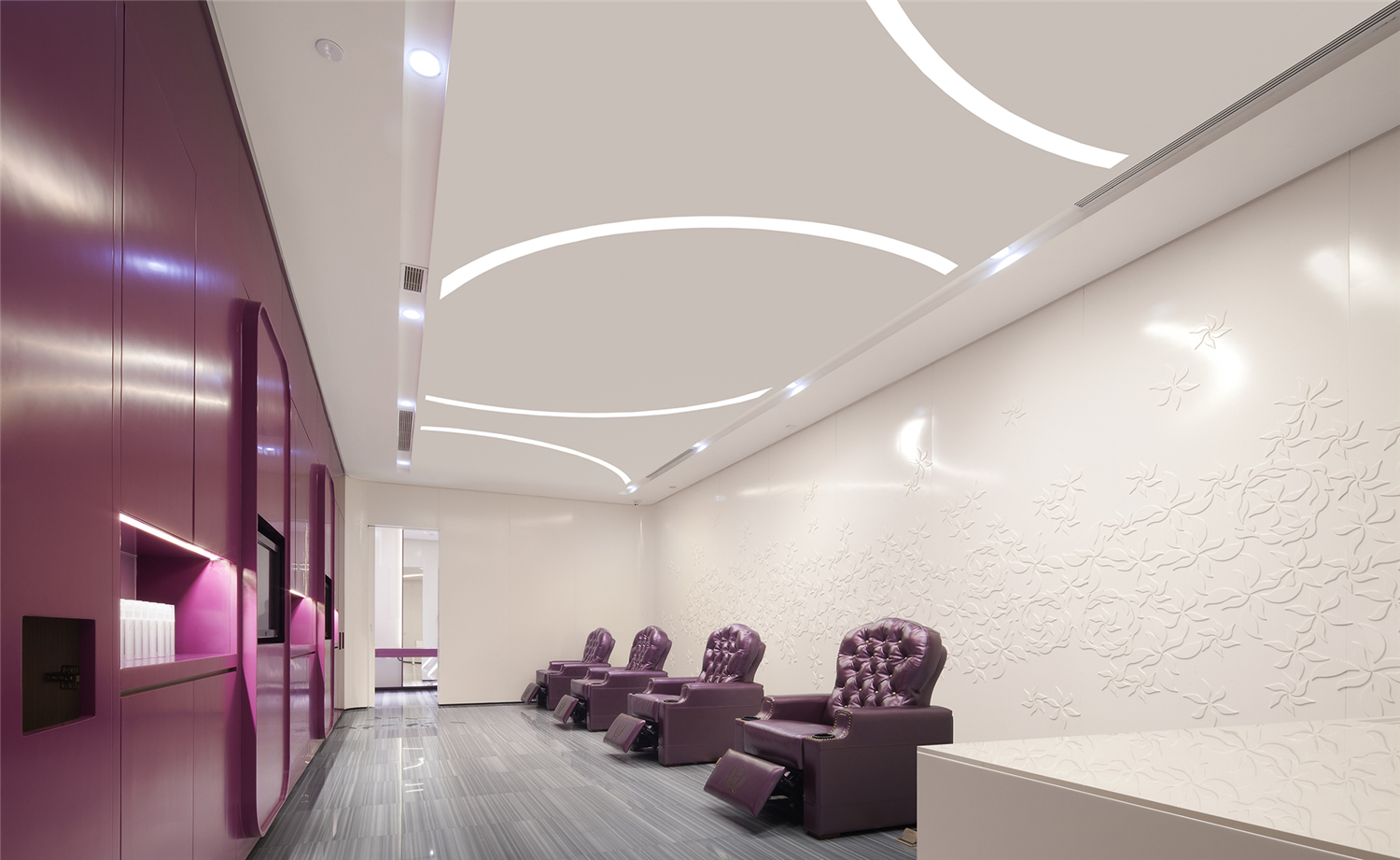
今天的工业设计中,圆角风靡一时,拥有亿万拥趸。这股有机现代主义风不断冲击着空间设计领域,工业级的室内设计将来会成为趋势,材料在工厂加工好,现场拼装无缝连接,看不见任何的连接点,要求设计师有高超的施工图能力,也考验了工厂制作环节的细腻。圆角设计有一种工业感,沙发后背的墙体雕刻烤漆,更具装饰性。
In today’s industrial design, round corner is all the rage and has gained millions of fans. This organic modernism trend will keep hitting space design industry, and in the future, industrial-grade interior design will become a trend. Materials will be processed in the factory, and being assembled at site, no connecting node or seam will be seen. This requires designer’s superb skill in dealing with construction drawings, and it is also a challenge for the factory’s crafts. Round corner design has an industrial sense, while the back wall of the sofa is decorative with baking finished and carvings.
现代的销售空间,注重的不是直接销售,而是借由空间设计的舒服、惬意,留住人,让客人通过好的体验成为回头客,因此,体验区和休闲空间,看似浪费经营面积,实则是设计中不可忽视的部分,做成亮点即可加分,促进销售顺理成章。
What modern sales space attaches great importance to is not direct sales, but offering customers nice experience through comfortable and cozy space design, so as to make them repeat customers. Therefore, it might seem a waste of operating area to build experience area and recreational area, yet, in fact, it is an essential part in the design. Make it a bright spot and it would be a plus to the design, which promotes sales naturally.
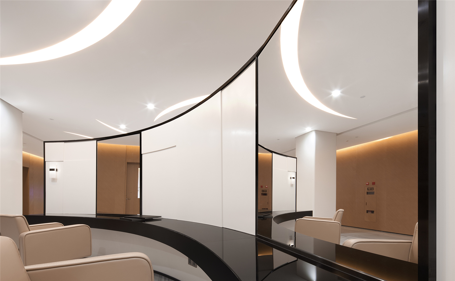
这个休闲区,用了集中不同的坐具,对坐小桌较为正式, Lounge区的长沙发则更为休闲。整体围绕的视听系统,增加了空间的交互性,搭配Roll&Hill的Agnes14枝形吊灯简洁干练。在大朗店设计中,设计师用了镜面和透明亚克力(玻璃)制造了各种“虚墙”。墙面或增加陈列功能,或增加镜面反射带来的互动性,都是很好的尝试。
A few kinds of seats are used in the recreational area; small tables with seats placed face to face are quite formal, while the couch in Lounge area is casual. The surrounding audio-visual system increases interactivity of the space, in combination with Agnes14 chandelier of Roll&Hill, the space becomes concise and efficient. In the design of Dalang store, designer creates all kinds of “illusive wall” by using mirror and transparent acrylic (glass). These walls might add function of display, or interactivity brought by the mirror reflection; which is a very nice try.
其实不仅是一个休息区,在整个大朗店的设计中,体验经济的意识也都潜在设计的表层之下,如何满足消费者,更好服务消费者并引领消费者,不仅仅是商家的重中之重,亦是一名商业设计师随时要反思的重中之重。
The consciousness of experience economy not only shows in the recreational area, but also hides under the surface of the whole design of Dalang store. To better meet customers’ demands, better serve the customers and guide them to consume are not only the top priorities for businesses, but also the most critical issues for commercial space designers to think about.
项目介绍——
主创设计师:姜晓林,闵耀
Chief designers: Jiang Xiao-Lin, Min Yao
设计公司:共向设计(www.cdd-china.com)
Design Company: Co-Direction Interior Design (www.cdd-china.com)
开发商:苏梵造型
Developer: Savour
类别:商业空间
Type: Commercial Space
项目地点:东莞
Location: Dongguan, Guangdong, China
Main materials: baking finish board, wood veneer, white lines jade, black steel, art glass
完成时间:2015年9月
Completion time: 2015.09
撰稿:侯熠
Author: Hou Yi
摄影师:井旭峰
photographers:Jing Xu-Feng
共向设计
姜晓林
Jiang Xiao-Lin
共向设计创始人兼设计总监
Founder and Design Director of Co-Direction Interior Design
拥有极强的艺术修养,擅长将艺术的审美经验,转化成设计动力。多年室内设计领域探索经验,一直致力于东方传统美学精神与当代设计手法碰撞,带领共向团队开拓多元化的设计实现。
“我想立足当下设计一些新的东西,我们把空间情境看作是有生命力的,并使其保持生命力,散发出文化艺术的气质,从而获得新的价值。”共向设计,强调研究、重视方法,形成了在高端地产、精品度假酒店、商业空间、顶级私人住宅等多个设计领域的综合实践。不断追求创新,始终用心于设计,潜心于产品的研发,是一支经验丰富国际化视野的设计团队,具有对前沿市场的敏锐洞察力,擅长整合各类资源,为业主提供完整并直接有效的室内设计顾问服务和软装解决方案。
Jiang Xiao-Lin has great artistic accomplishment, and is good at turning his art appreciation experience into design motivation. He has years of experience in exploring interior design, and has been committed to combining traditional eastern aesthetic spirit with contemporary design techniques. He has led Co-Direction Interior Design developed diversified designs.
“Based on current situation, I want to design something new. We think that space scenario is something viable, we keep its vitality and make it conveys a temperament of cultural art, thus gain it new values.” Co-Direction Interior Design emphasizes study, pays attention to design methods, thus accomplish practices in many design fields such as high-end property, boutique resort hotel, commercial space, top-level private house etc.. Co-Direction Interior Design insists in pursuing of innovation, doing designs with its heart and soul, and is immersed in R&D of products. It is an experienced design team with international vision and keen insight towards the frontier market. It is good at integrating all kinds of resources, and provides owners with complete and efficient interior design consulting service and FF&E solutions.
《Hi设计》已获授权,版权归原作者所有。


