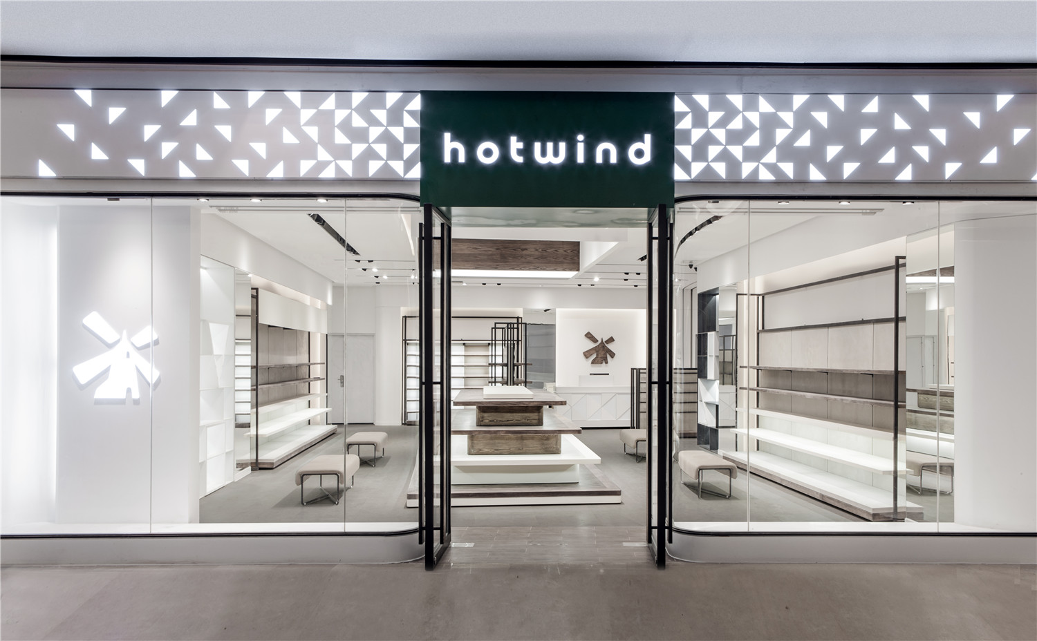
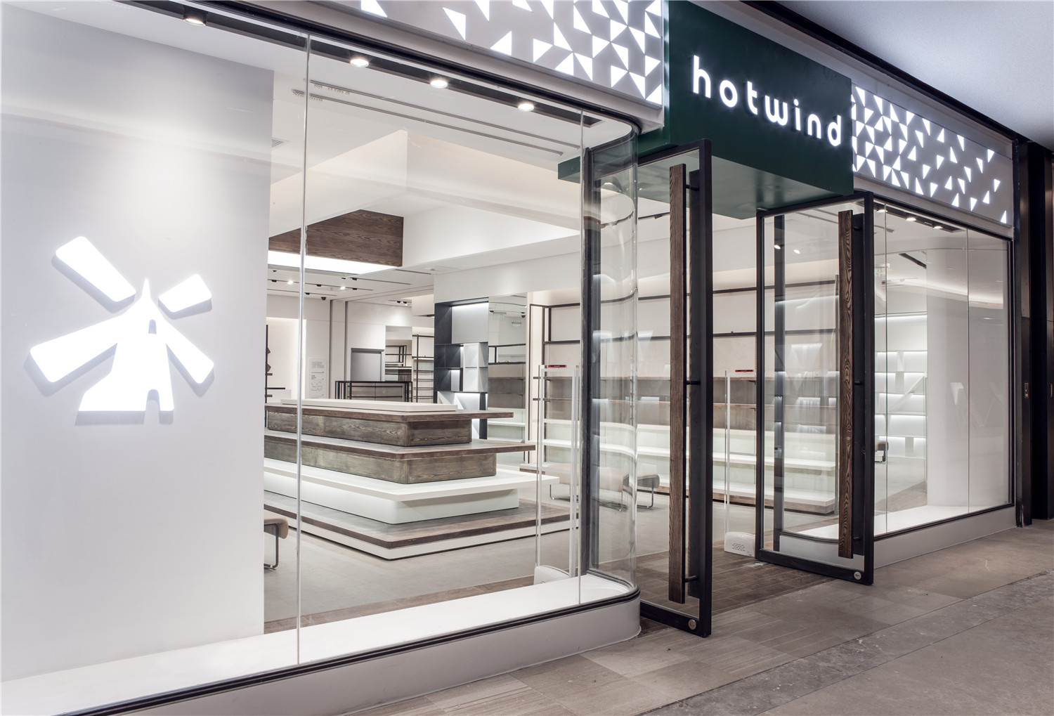
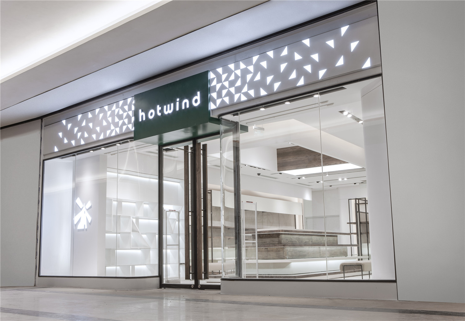
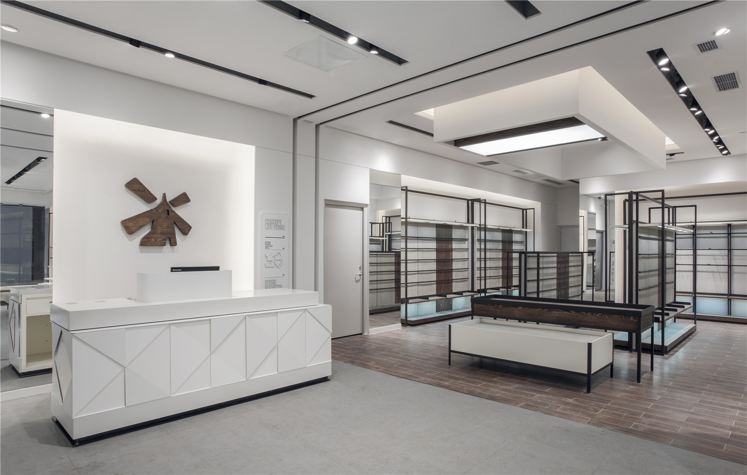
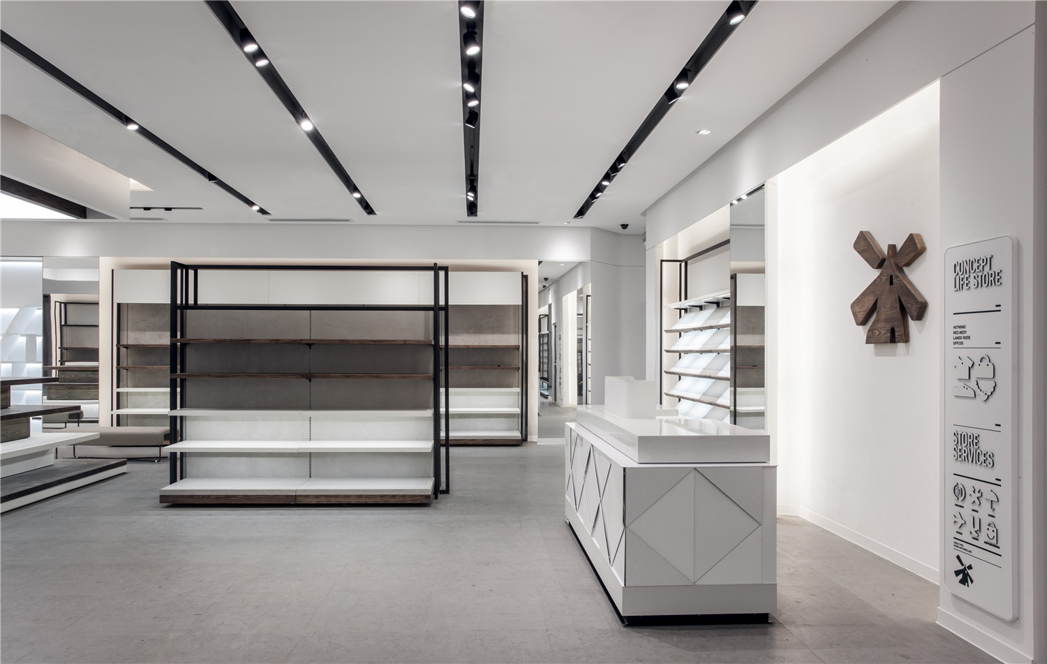
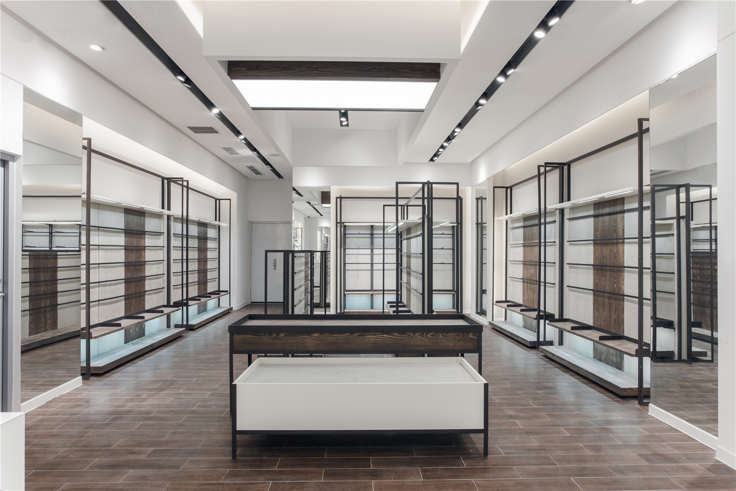
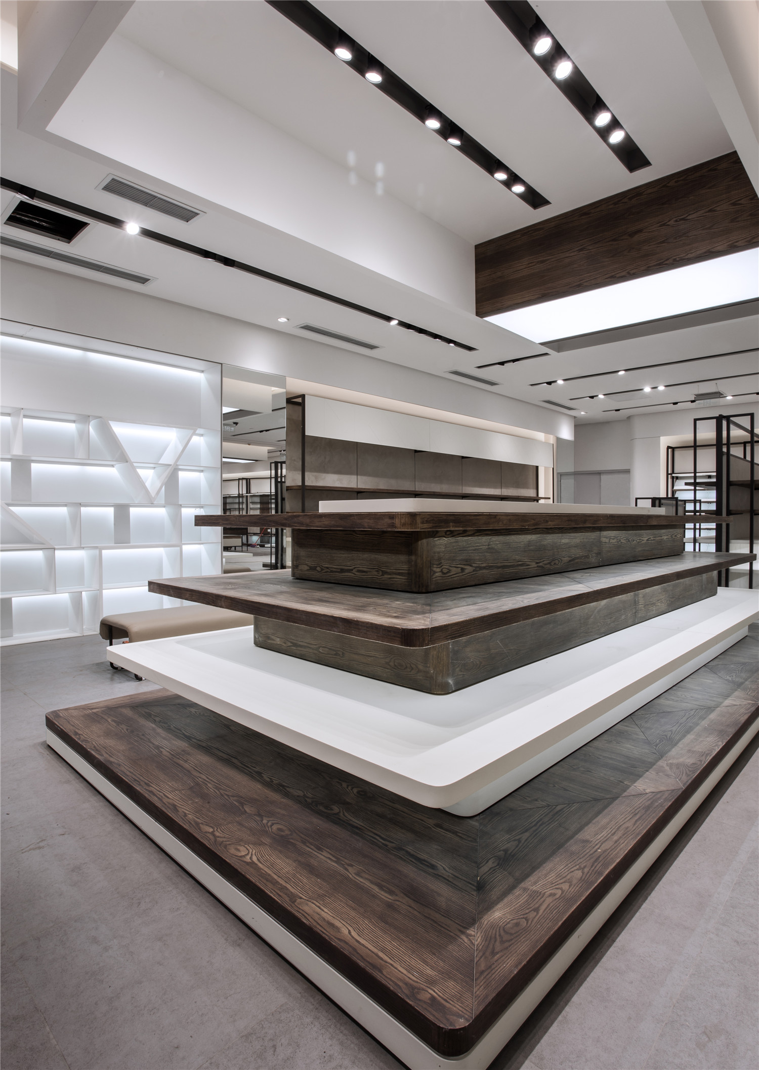
该项目位于成都市锦江区的一个开放式、低密度的街区形态购物中心,不同于传统的室内购物中心,其呈现出来的是一个由街道、里巷、广场交错组成的都会休闲中心。该项目是国内知名连锁快时尚品牌hotwind–热风的成都地区形象店,入驻此商场旨在为顾客提供创新及充满个性的购物及休闲体验,故委托RIGI睿集设计进行品牌终端设计。
The project is located in a shopping Centre featured by open and low-density blocks in Jinjiang Diststrict, Chengdu. Unlike the traditional in-house shopping Centre, it presents a city leisure centre consisted of streets, lanes and squares. This premise is the model image store of Hotwind, a nationally well-known quick fashion chain in Chengdu. The client opened an outlet in this shopping mall, aiming to provide with customers creative and custom shopping and leisure experience, thus thus consigning the design of the brand’s outlet to Rigidesign.
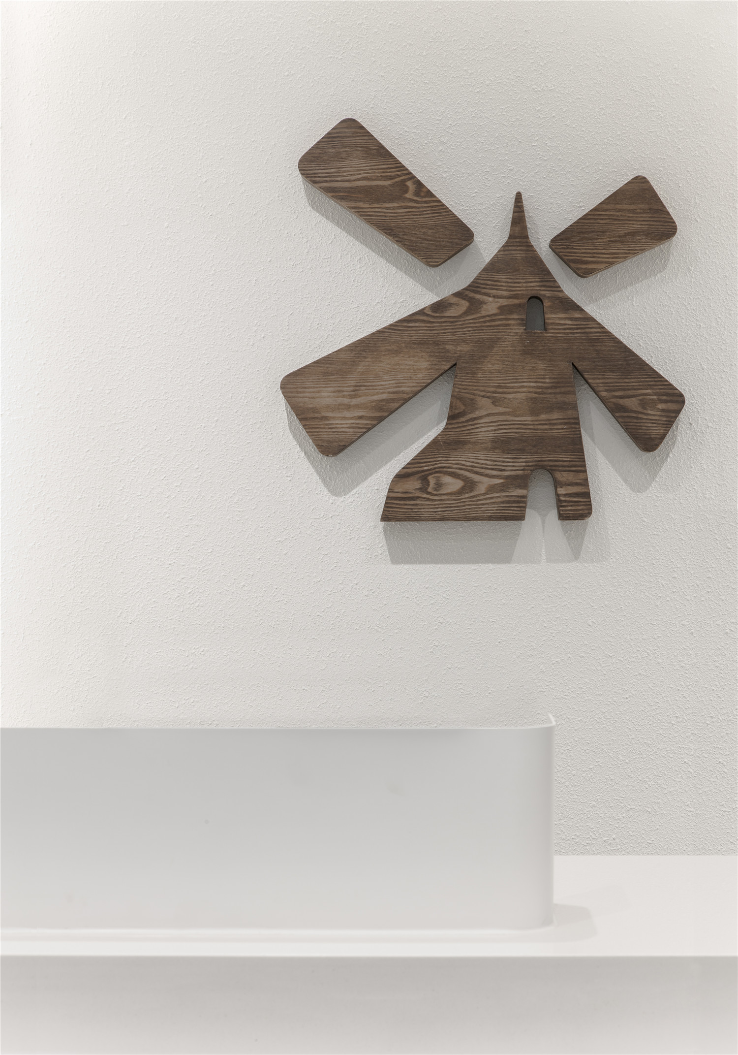
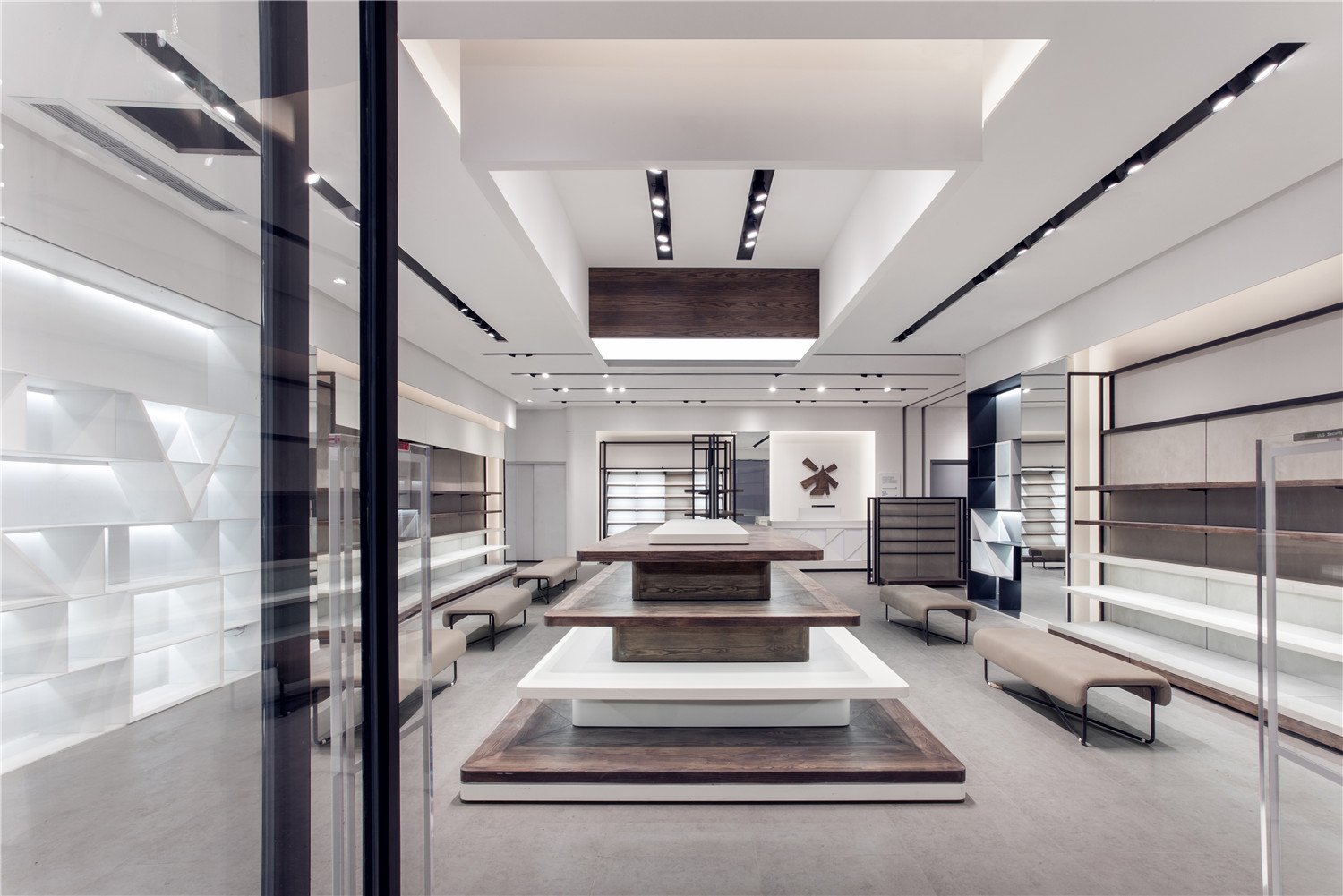
此店铺面宽较窄,店铺属于进深式空间,在门头部分设计师依然延续品牌固有的绿色logo字和发光三角元素,并在呈现方式上有所调整和再设计,加以橱窗上黑色金属线框的勾勒,将视觉集中,塑造品牌的品牌特性,给消费者全新的品牌形象上的视觉感受。
The store is narrow in layout, a depth space. Part of the design of the entrance follows the brand’s consistent green logo and shining triangle but with some changes and redesign in the presentation, enhanced by the black metal framing around the showcase which centralizes the sight, shapes the brand feature and leaves the customers a new impression on the new brand image.
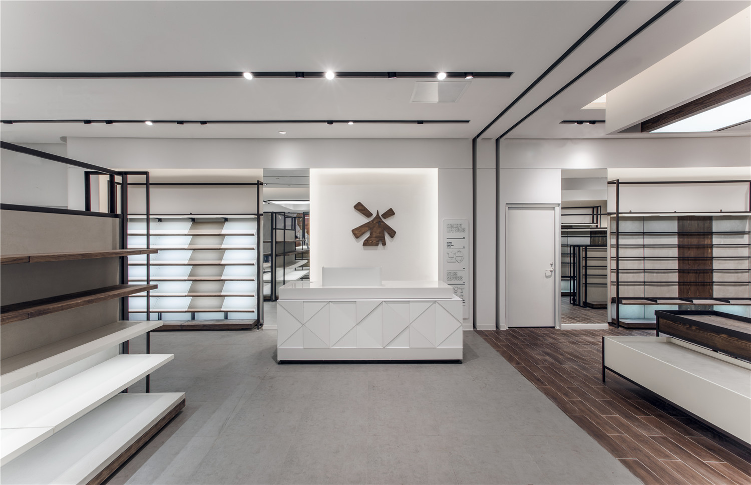
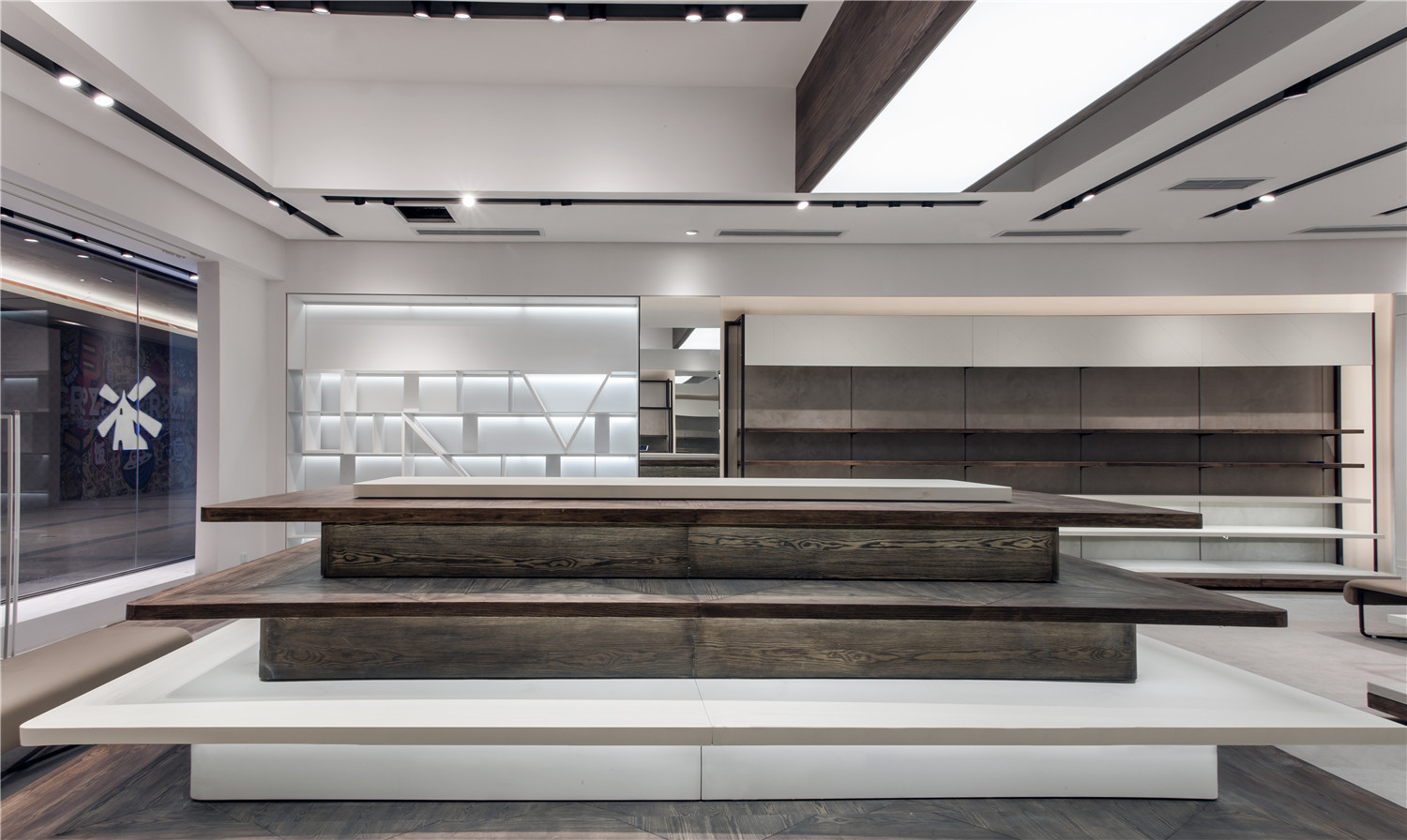
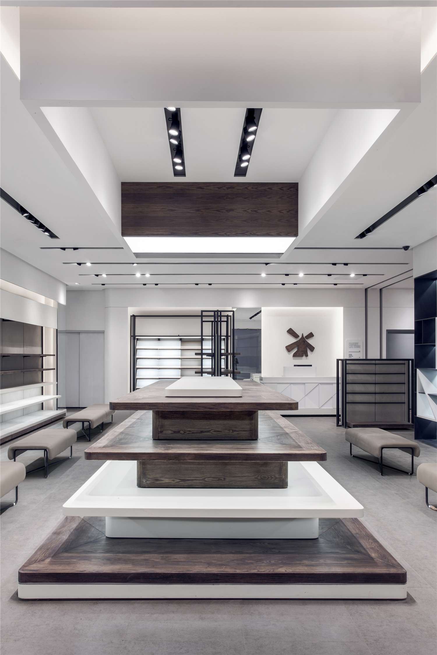
设计师将店堂天花大面积的白色和线条感灯槽的黑色进行对比,简洁明快,体现快时尚的品牌风格,局部的造型底天花和膜灯不仅可以提供更好的空间照明,同时也为店堂内部的区域划分起到一定的界定作用。重点陈列区域,设计师使用天花造型,地面材质与灯光效果等介质形成心理上的虚拟划分。
The designers made a contrast between the white ceiling and the black strip light slots, concisely demonstrating the quick fashion brand style. Part of the forming of the ceiling and the casing lights provides better lighting and serves as the threshold of in-house division. For key display area, the designers adopted the ceiling formation and other carriers such as ground texture and lighting effect to form the virtual division.
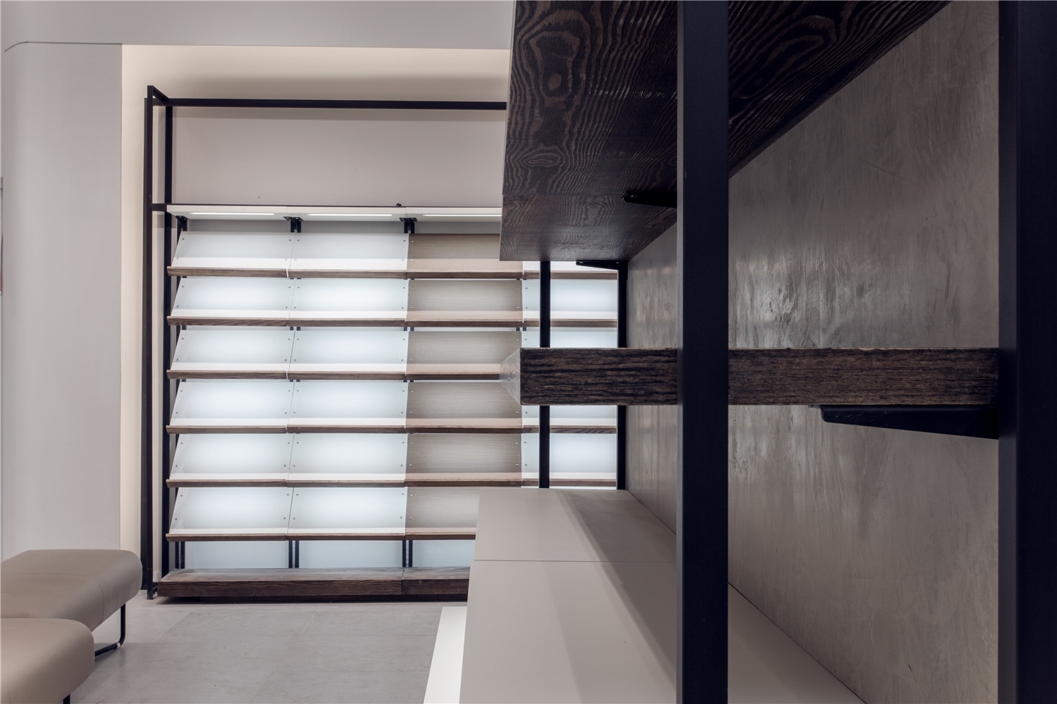
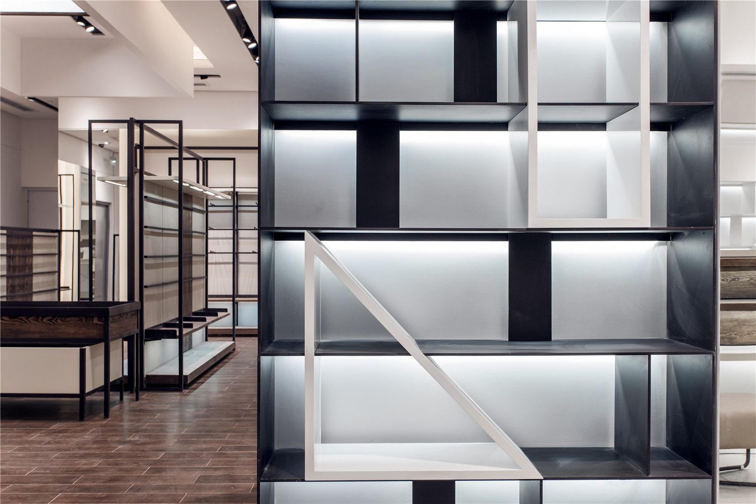
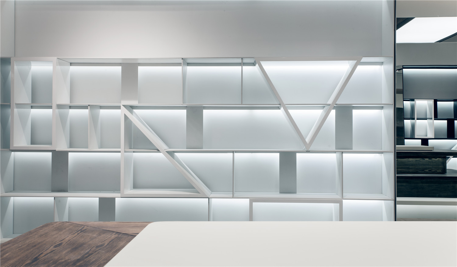
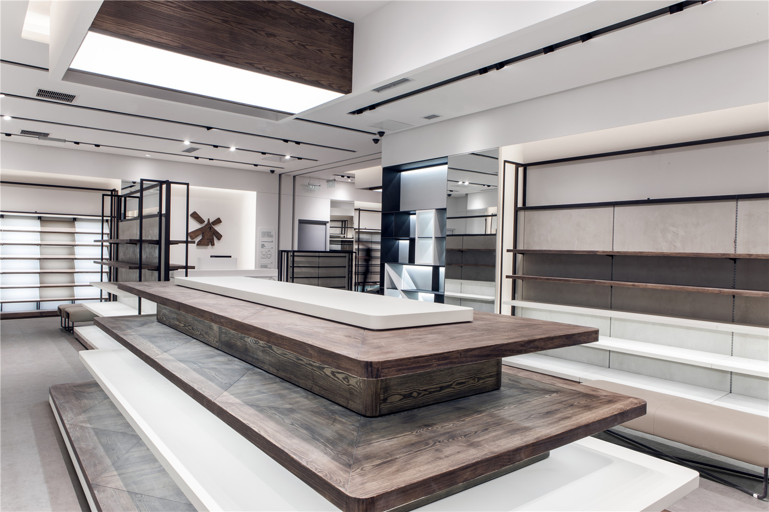
通过对品牌产品的调研与分析,设计师也将此项目店内道具进行了系统的整合与设计,从陈列功能效果,视觉宣传效果等方面入手,突破原有单体式的道具模式,将道具的设计方向朝通用化,模数化以及组合化推进,即呈现此项目的道具方案。设计师在道具上延续品牌以往简洁,自然的特点,运用深色木纹与金属的搭配,塑造出截然不同于品牌传统模式的时尚零售终端空间。
Through the research and analysis of the brand, the designers conducted systematic integration and designing in the materials in the store. Through the display function, visual effect, they did not follow the usual single item model, they promoted the items towards generalization, Mathematical Modeling and integration, which is to present the plan of item displaying for this store. The designers followed the consistently concise, natural style, adopted the combination between dark wood pattern and metal, thus shaping a unique fashion retail space that is different from the usual ones.
设计师在此项目中突破品牌固有清新感觉,尝试大量使用深色木纹质感材料和深色金属的组合搭配,白色天花和墙面,灰色地面以及深色道具,在店堂内形成流畅的,层次分明的购物体验空间。
The designers brought new ideas to the brand’s consistent freshness; they tried a lot of the combination between dark wood pattern and metal, white ceiling and wall, grey ground and dark items, forming a streamlined, clearly-layered shopping experience space.
该项目不仅是该品牌终端风格的新尝试,也是其品牌终端形象的一次大胆的探索和突破,种种体验变得直接而与众不同。
The project is not only the new trial of the brand’s outlet, but also a bold exploration and breakthrough of the outlet image, making the shopping experience direct and unique.
项目信息——
作品名称:hotwind热风成都太古里店
所属类别:鞋服综合
设计团队:刘恺 RIGI睿集设计团队
设计公司:RIGI睿集设计(www.rigi-design.com)
案例面积:250㎡
设计时间:2014年11月
建成时间:2014年12月
建成地点:成都,四川
摄影师:文仲锐
材料信息:白色乳胶漆、灰色乳胶漆面、蓝色哑光喷漆、金属白色磨砂面烤漆、浮雕水曲柳、木纹地砖、LED射灯
Name:Hotwind Taikoo Li Outlet Chengdu
Type:Shoes & Garments
Designers:Kai Liu,RIGI DESIGN team
Design Company:RIGI DESIGN (www.rigi-design.com)
Area:250㎡
DesignTime:2014/11
Completion Time:2014/12
Location:Chengdu, Sichuan Province, China
Photographer:Jack Wen
Materials:White and Gray Latex Paint, Blue Matte Paint, Wood, LED Spotlights
内容来自RIGI Hi设计已获授权 如需转载请注明出处


