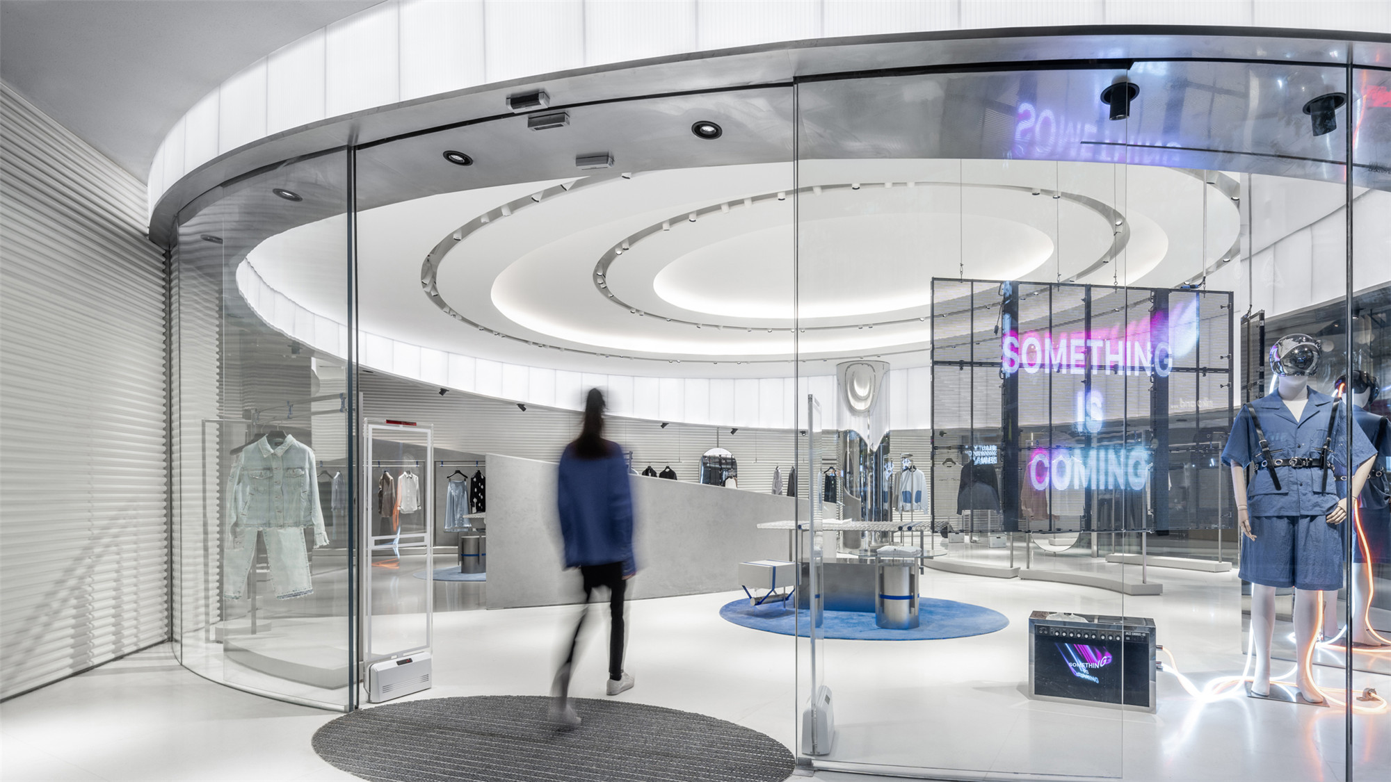
 IEW.H埃维纽上海旗舰店以一种对抗地心引力的姿态融合了极具未来感的设计主题,引入生动的体量与形态,使其一跃成为上海主要商街中令人瞩目的焦点。设计通过材料间的鲜明对比与充满现代感的冷色调形成强烈的视觉张力,在上海的中心商街创造了别具一格的购物体验。
Incorporating a futuristic theme with objects that seemingly defy gravity, as well as a playful approach to volume and shape, IEW.H‘s flagship store makes for an attention-grabbing addition to one of Shanghai’s primary shopping streets. Through contrasting materials and a cool, modern palette the shop delivers a unique shopping experience that has been designed for maximum impact.
▲与城市环境相融 merge with the city ambience
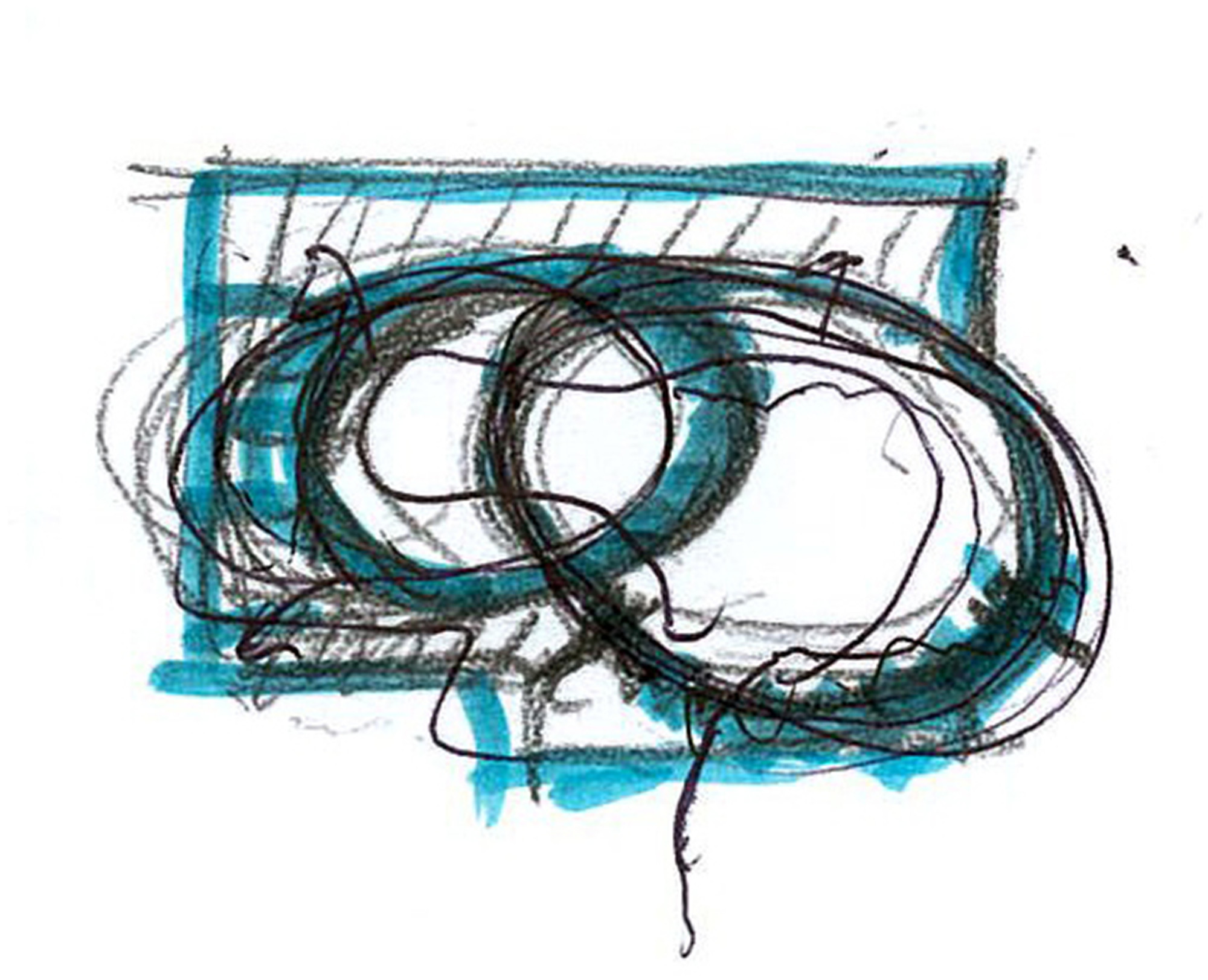
项目要求Kokaistudios在上海市中心设计一个超凡脱俗的零售空间,在259平米的场地内将时装品牌IEW.H埃维纽的未来主义概念转化为生动的设计语言。空间从行星轨道中获取灵感,临街立面选材独特,吸引来往行人踏足店内。空间不仅具有明显的建筑风格,其内置灵活性的设计更使店面易于根据日后的品牌合作、快闪店与其他活动进行调整。
Challenged with creating an out-of-this-world retail space in the heart of Shanghai, Kokaistudios transformed fashion label IEW.H‘s futuristic brand concept into playful design elements for its 259 sqm flagship store. A striking frontage incorporating unexpected materials draws shoppers into a space that takes inspiration from planetary rings. Despite striking an unmistakably architectural tone, the store has been designed for flexibility, and can be readily adapted for future brand partnerships, pop-ups and events.
▲沿街主立面 the street entrance elevation
IEW.H埃维纽是中国时装界的新兴品牌,其首字母缩写意为“Infinite Explorer with Hypersense”(多元无尽的探索者)。以此为出发点,Kokaistudios为这个多元化品牌标志性的室内空间确立了记忆、流线与反重力的主题。由于IEW.H埃维纽将以一年两季的频率推出与艺术家及设计师合作的新品,在装饰与色彩上保持空间的通用性与中立性尤为重要。
A newcomer to China’s vibrant apparel scene, the label‘s acronym stands for ’Infinite Explorer with Hypersense.‘ Taking this as a starting point, Kokaistudios established broad themes of antigravity, memory and fluidity for the multidimensional brand’s statement interiors. Because the fashion label will present twice-yearly collaborations with artists and designers, it was crucial that the space be kept versatile and neutral in terms of decor and color.
▲商场入口立面 mall entrance elevation
▲转角橱窗 corner window
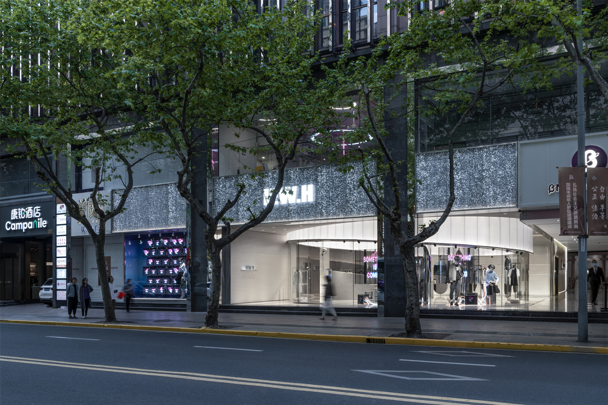
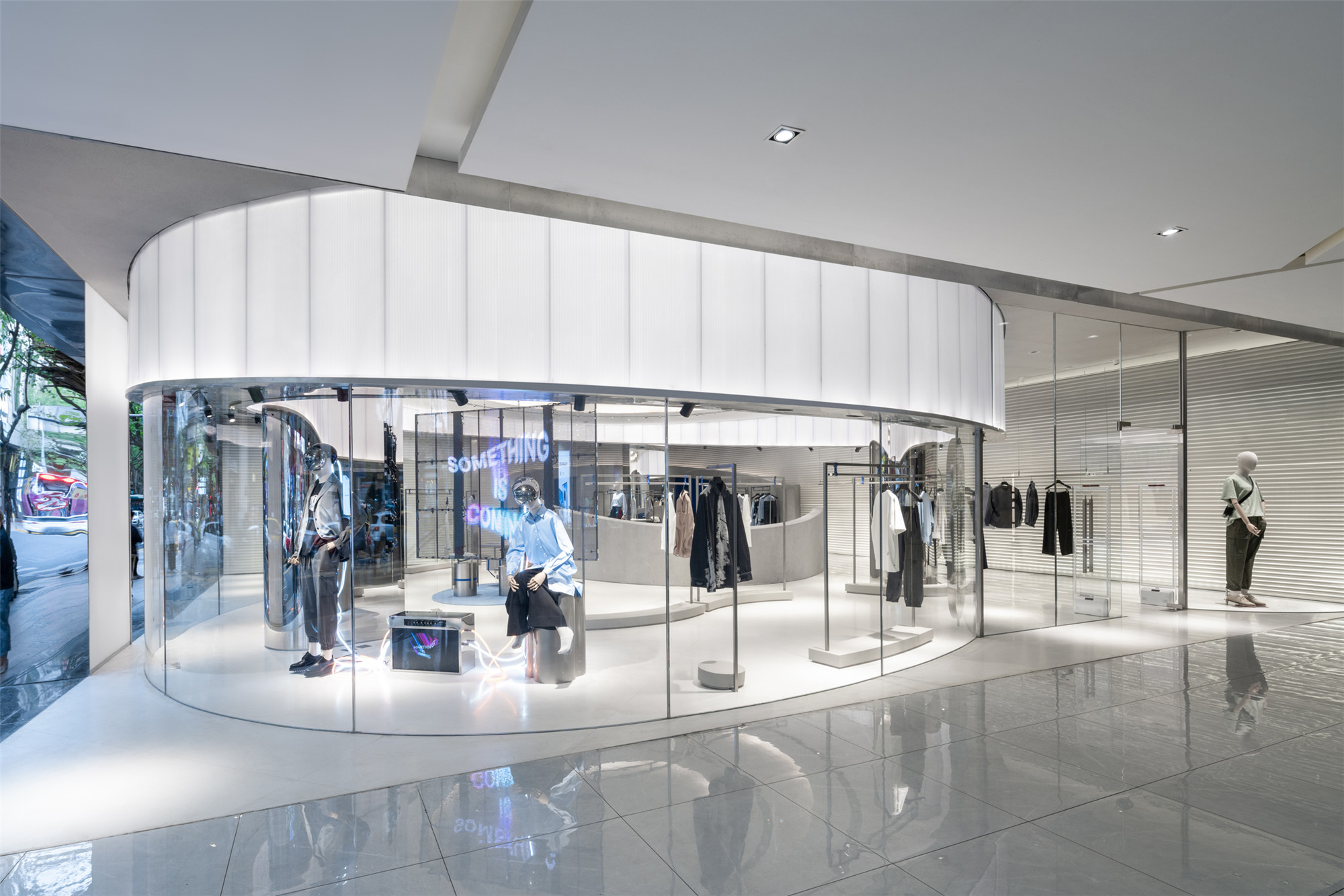
IEW.H埃维纽旗舰店位于上海繁华的淮海中路商街上,从内到外都彰显着极致的视觉冲击。由玻璃和铝制泡沫隔板筑成的立面完美契合其内部的未来主题,给人以超然的观感。这种金属材料由无数孔洞组成状似细胞的有机纹理,背面的灯光使其在夜晚熠熠生辉。店铺玻璃幕墙沿着街边曲线内退形成主入口,其圆柱形的店铺体量从淮海路标准化的齐平门头中脱颖而出,迅速吸引来往游人的注意,同时也提供了充足的橱窗陈列空间。
Located on one of Shanghai‘s principle shopping streets, Huaihai Lu, the IEW.H flagship creates impact both inside and out. A facade of glass and aluminum foam bulkhead creates an otherworldly effect from the outset, hinting at the store’s futuristic interior. Comprising organic-looking bubbles for an almost cellular appearance, the metallic material is backlit to create a glittering effect that is particularly striking at night. Below, a recessed glass entrance is positioned along the smooth convex curve of the store‘s exterior. Appearing as a cylindrical object set back from Huaihai Road’s otherwise standardized and flush storefront configuration, the shop immediately draws the attention of passers-by, providing ample space for window displays at the same time.
▲内部环形对位的元素 contrapuntal annular elements inside
▲沿街主入口内望视角 view from the street entrance
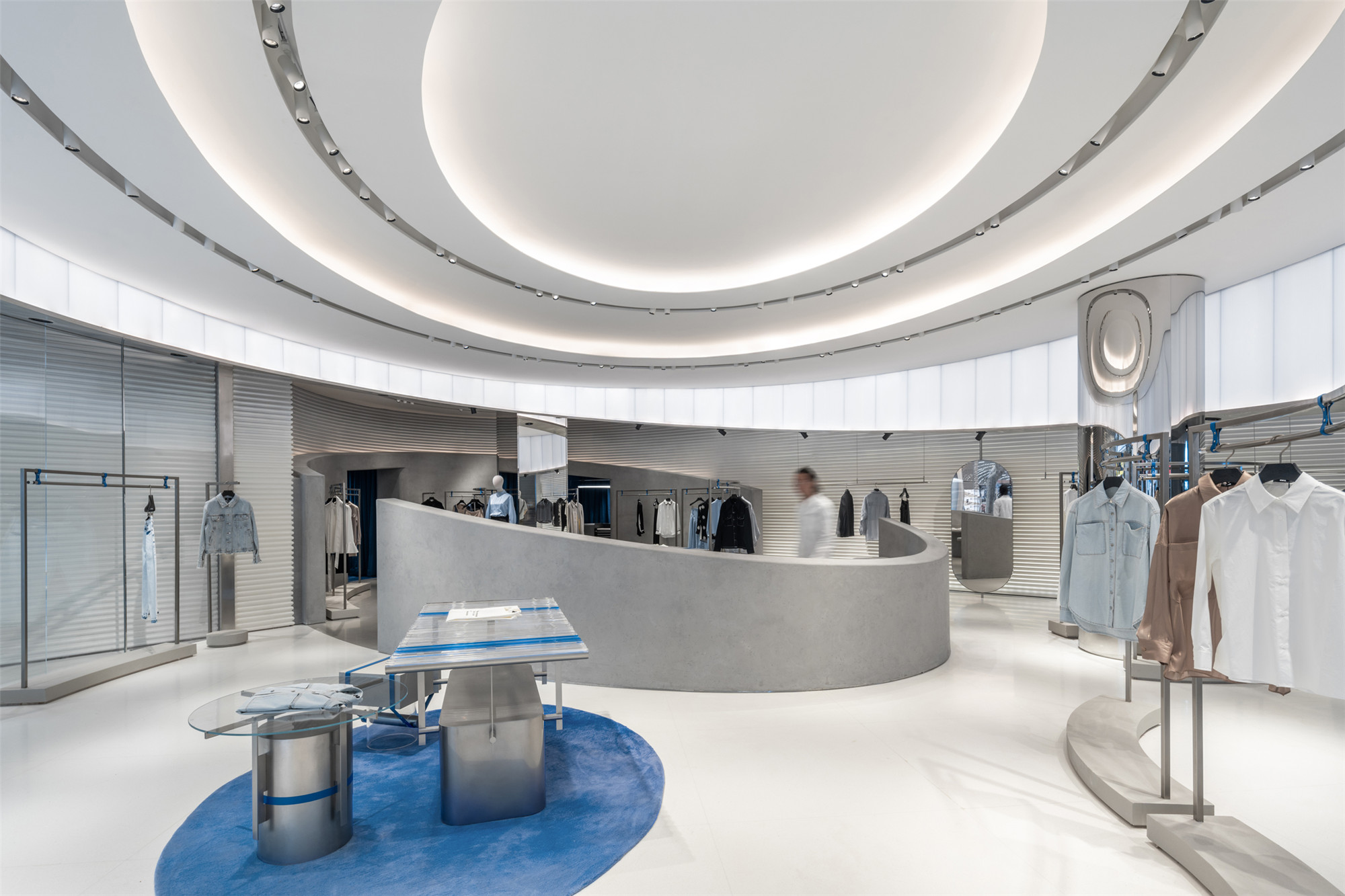
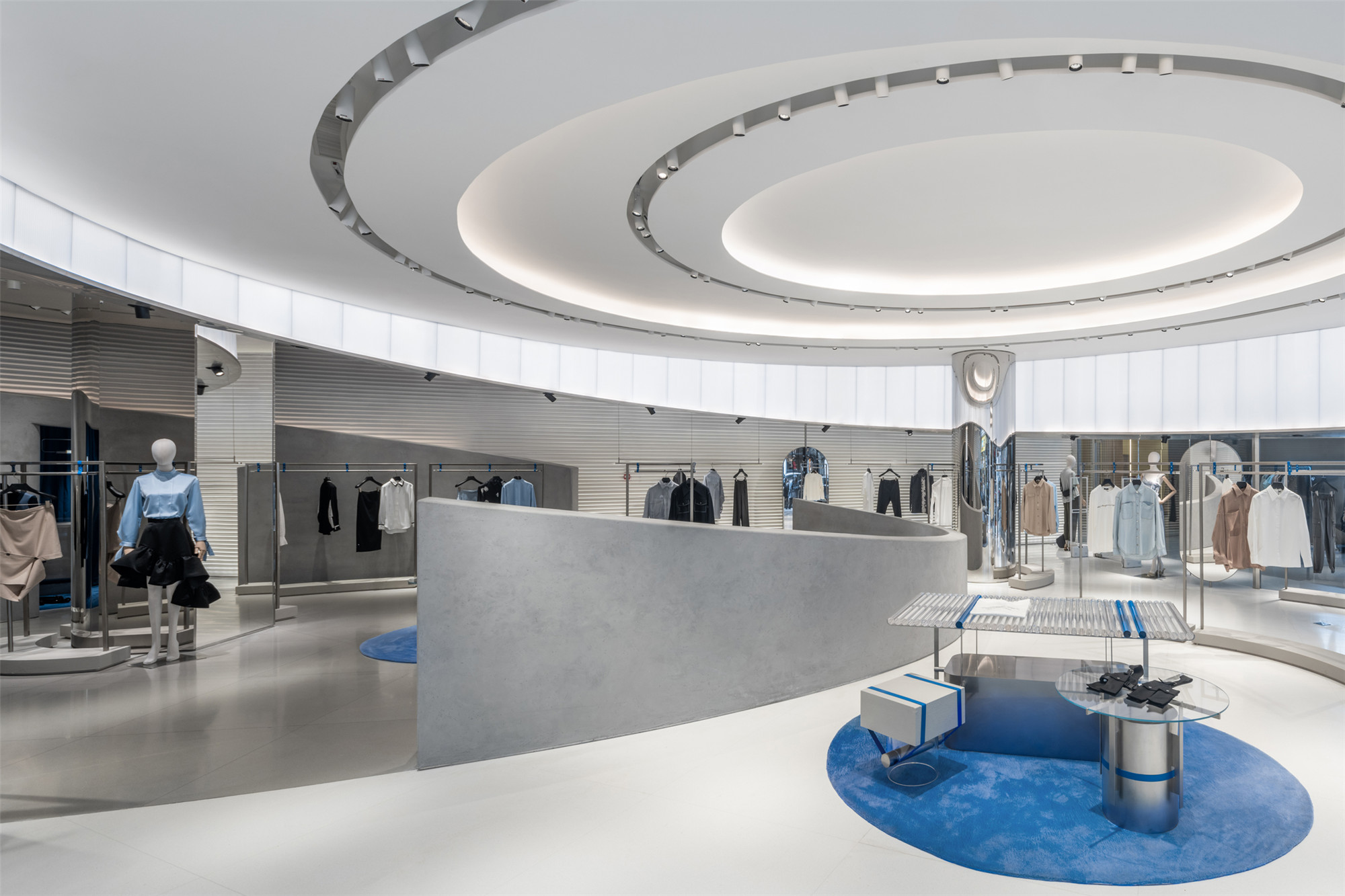
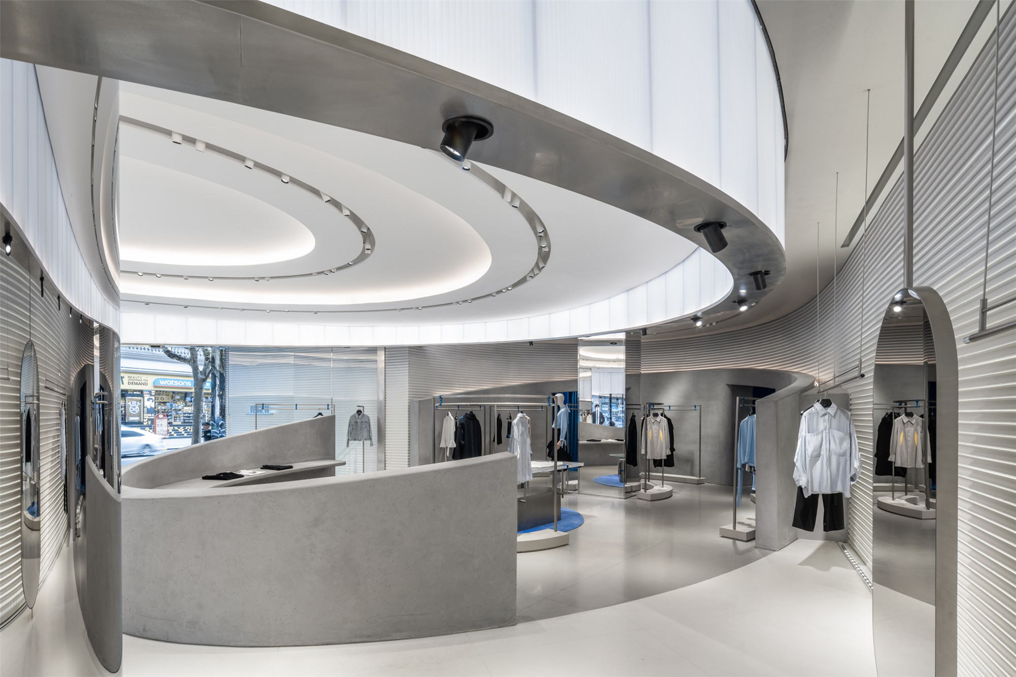
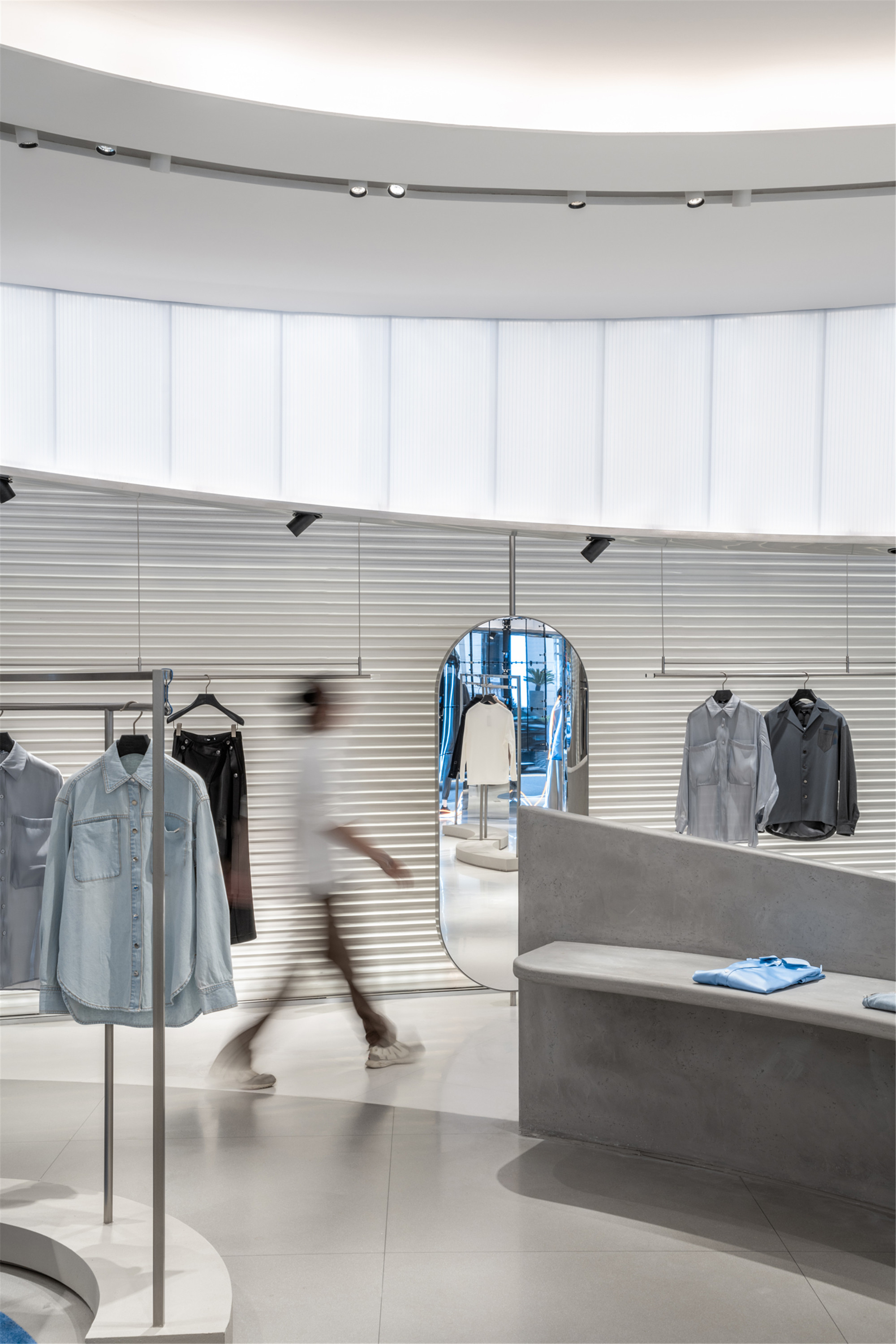
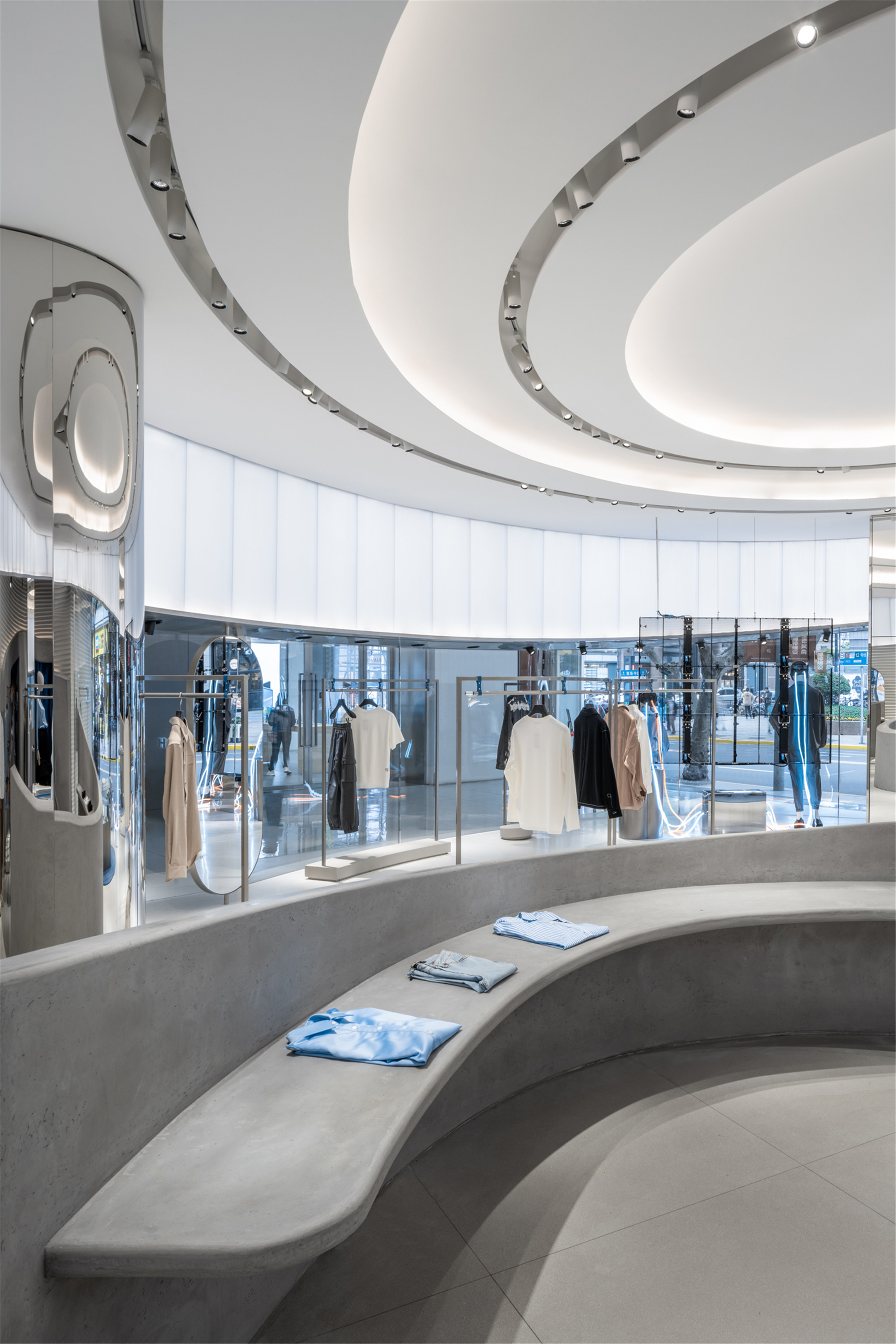
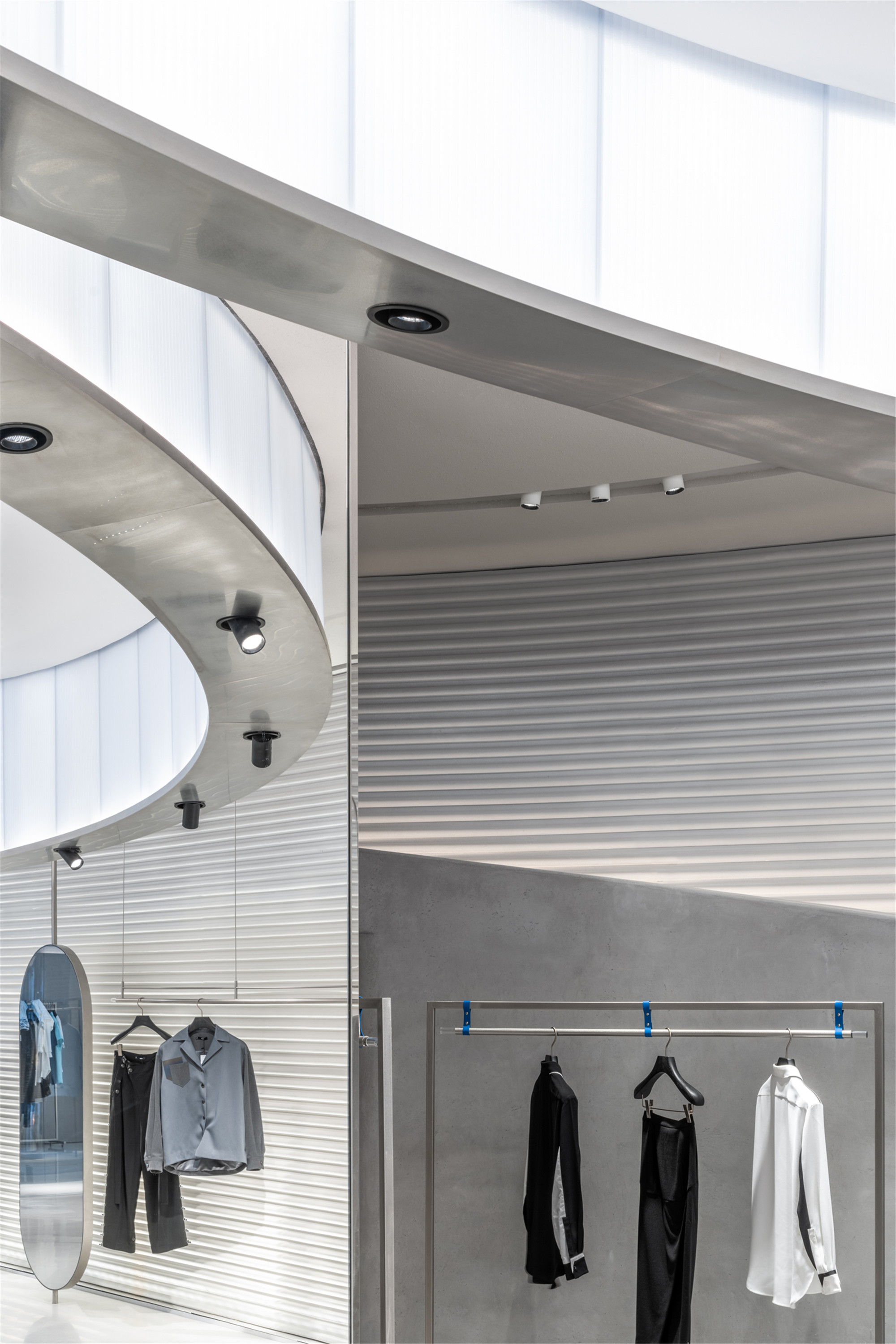
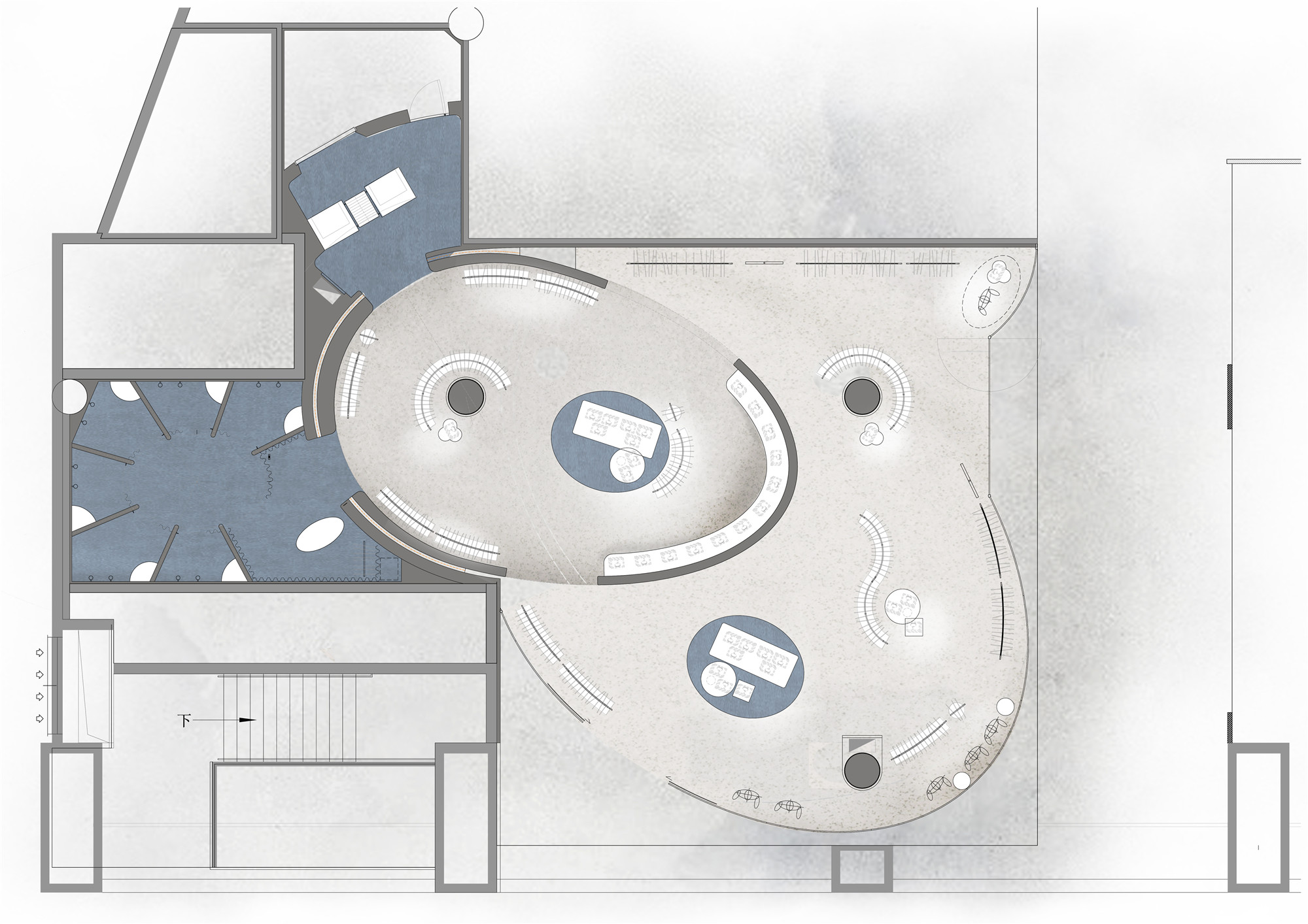
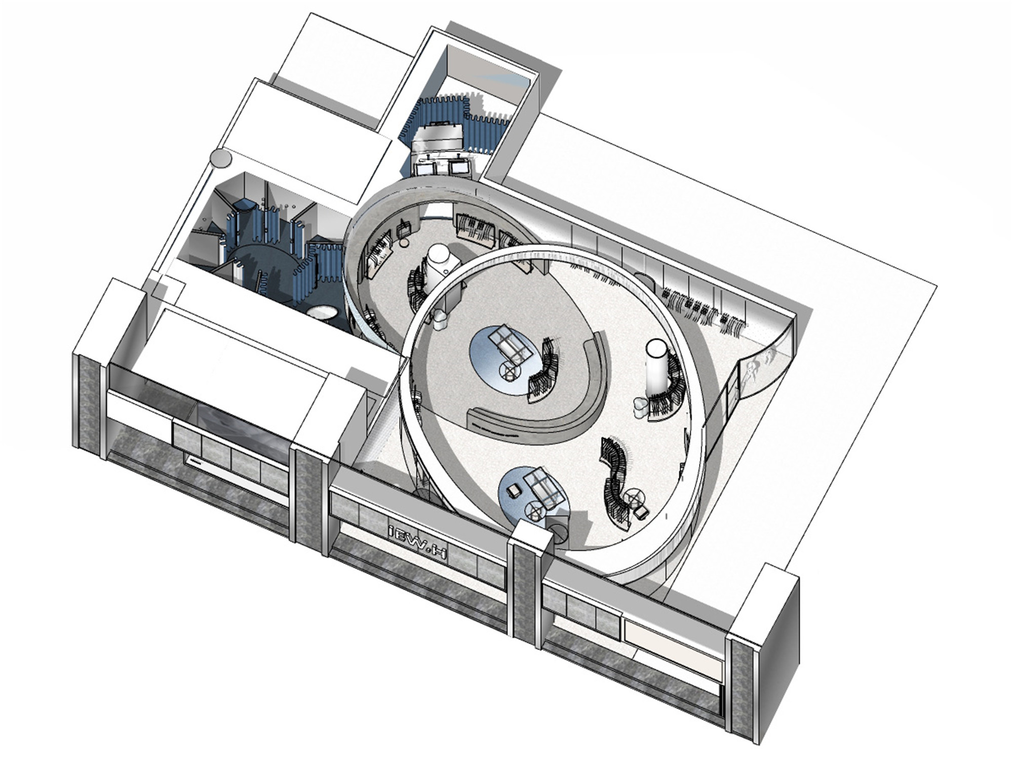
店铺的室内空间也延续了外立面的强烈视觉张力:展柜、长桌与陈列架等重点元素被置于两个相互交错的圆环内。较大的圆环悬浮于顾客的头顶,展现出贯穿项目始终的反重力概念。这个以聚碳酸酯为材料的环状结构配有内嵌式背光照明,极具建筑性。结构底部的不锈钢环带也随之微微倾斜,更强调了空间的紧凑感。
The strong visual impact continues inside, where elements of the store‘s core activities – its display counters, benches and racks – are positioned inside two interlocking rings. Illustrative of a broadly anti-gravity concept that runs throughout this retail design project, the larger of the two rings appears to float above shoppers’ heads. Highly architectural, the polycarbonate structure is fitted with inlaid backlighting. A surrounding tapered stainless-steel band accentuates the spatial compression created by the ring‘s deliberate tilt.
▲强烈的空间几何感 strong sense of space geometry
▲从中央向内看 1view to inside from the center
较小的圆环从地面倾斜升起,其线条向下延伸构成低矮的墙壁,分隔出一个独立的体量。与上层圆环的轻盈质感形成鲜明对比的是,下层圆环表面选用了质地更厚重的石膏,强化了反重力主题。设计通过地面两种色调的水磨石进一步引入了对比的手法;墙面由白色渐变为冷灰,更为室内空间注入了一丝动感。
The smaller of the two rings tilts up from the floor, its lines extending downwards to create low walls indicating a separate volume. In contrast to the upper ring’s seemingly weightless quality created by its polycarbonate material, the lower is finished in an altogether heavier textural plaster, reinforcing the design‘s antigravity theme. Contrast is further introduced by way of two tones of terrazzo tile flooring; as well as gradated wall color from white to cool grey, injecting a sense of movement into the interiors.
▲重点展示区 key display area
▲空间中的镜面反射 specular reflection in space
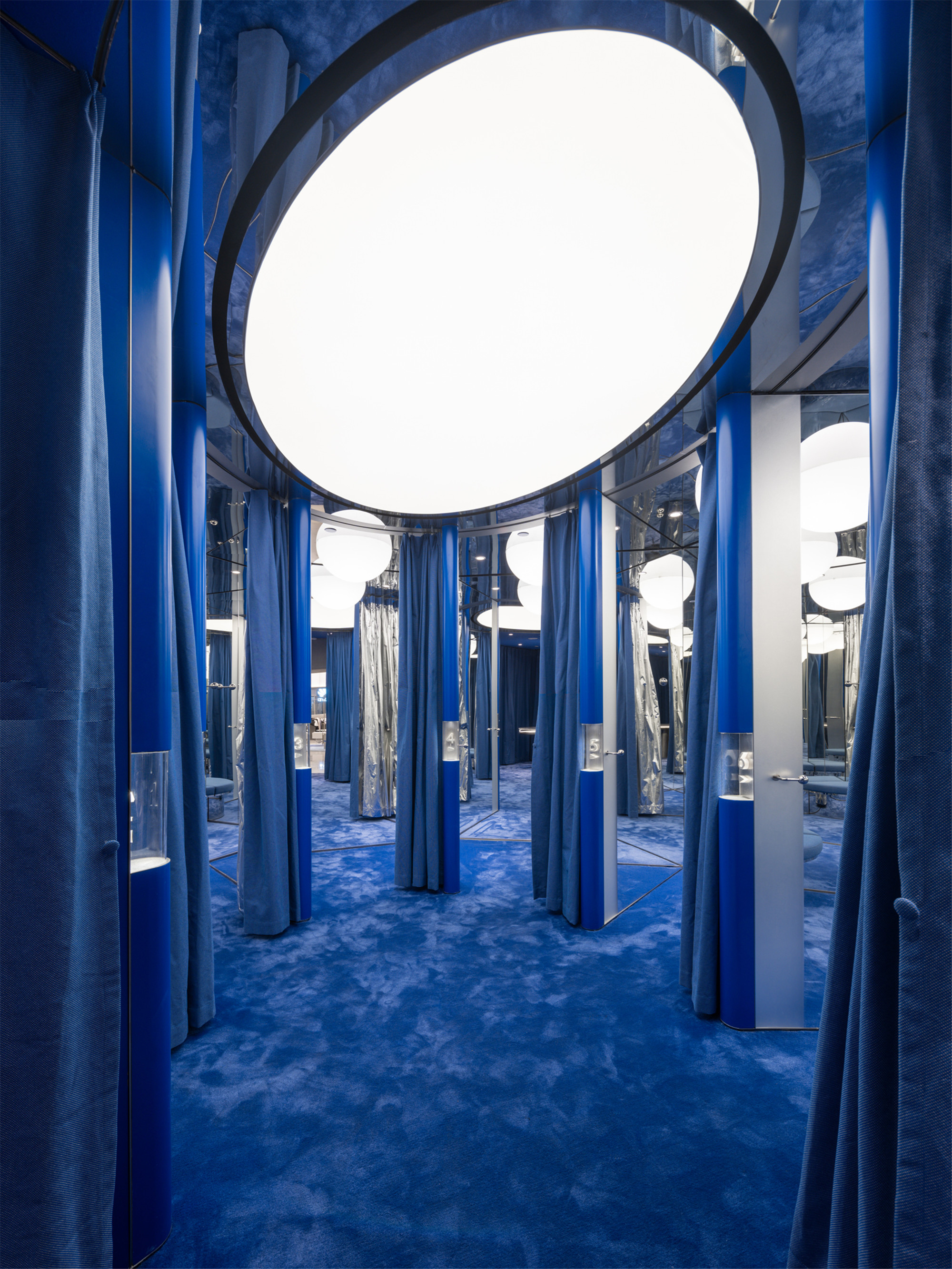
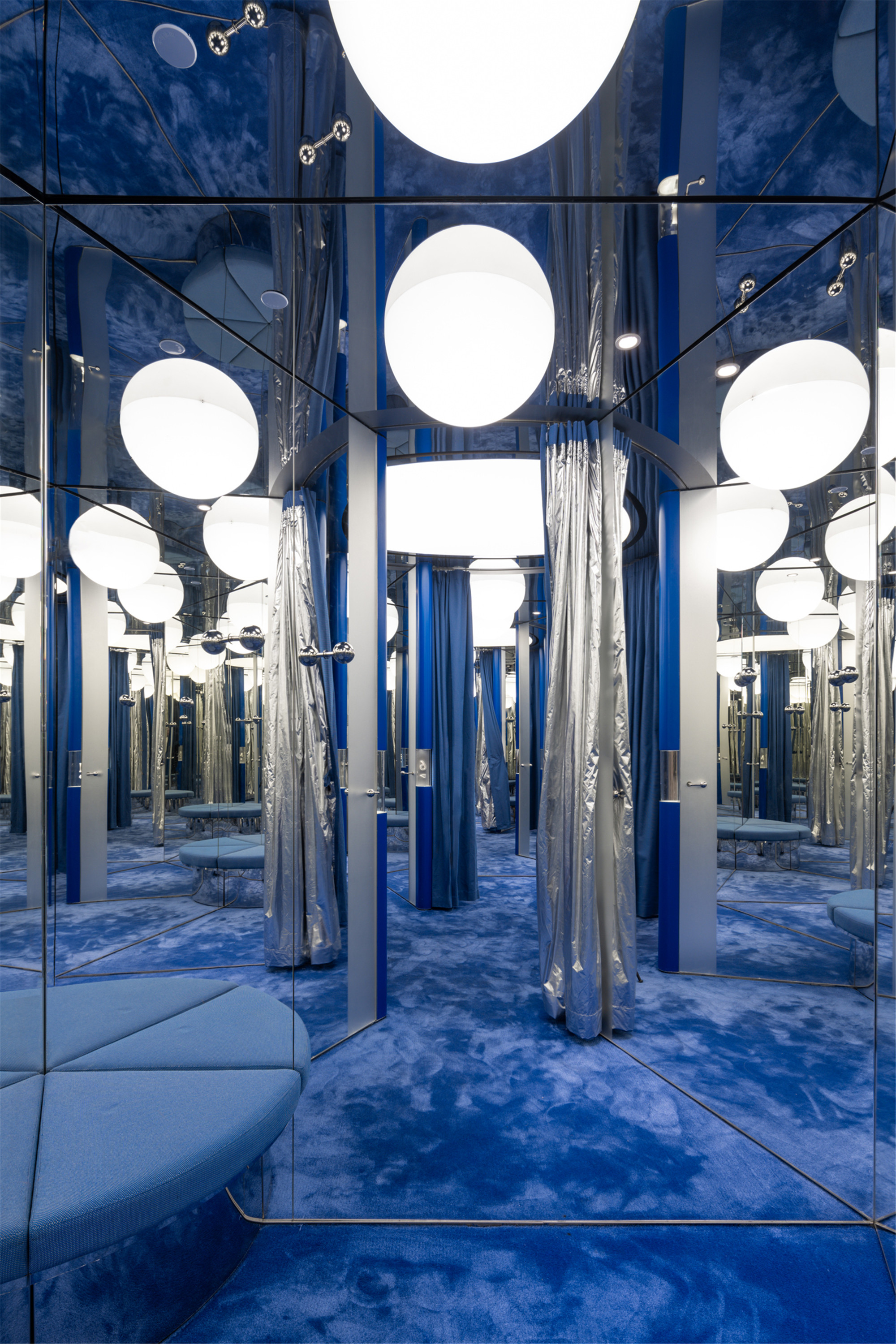
IEW.H埃维纽的试衣间可从小圆环进入,该区域以品牌色彩的天青蓝色与银灰为主基调,每间试衣间的镜面角度达270°,巧妙地打造出无限反射的万花筒效果。隔间的天花板也采用镜面设计,使得半球的灯体宛如漂浮在空中的星球。银色的收银台被置于相邻的侧室中,同样独立于两个交错环带外,两侧则是与主色调相同的深蓝色家具。
IEW.H’s fitting rooms are accessed from the smaller of the two rings. In brand colors of electric blue and silver, the area makes clever use of the 270-degree mirror surfaces in each fitting room to create a kaleidoscopic effect of infinite reflections. This extends to a half-globe light which, thanks to the facility‘s reflective ceiling, appears as a floating planet or orb. In an adjacent side room also positioned outside of the interlocking volumes is a silver cashier desk, flanked by soft furnishings in that same deep blue tone.
▲绑带式衣架细节 strapping hanger detail
▲看向收银区 1view to cashier
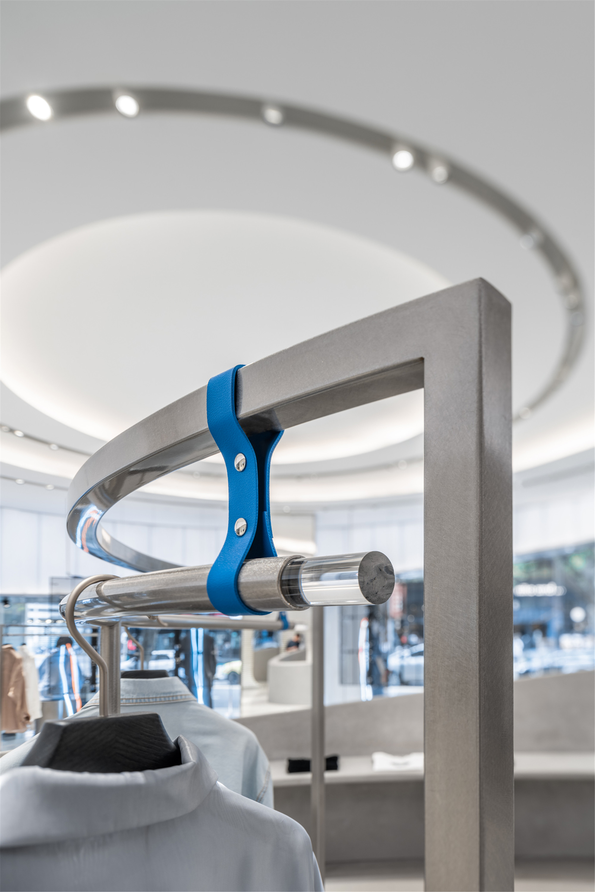
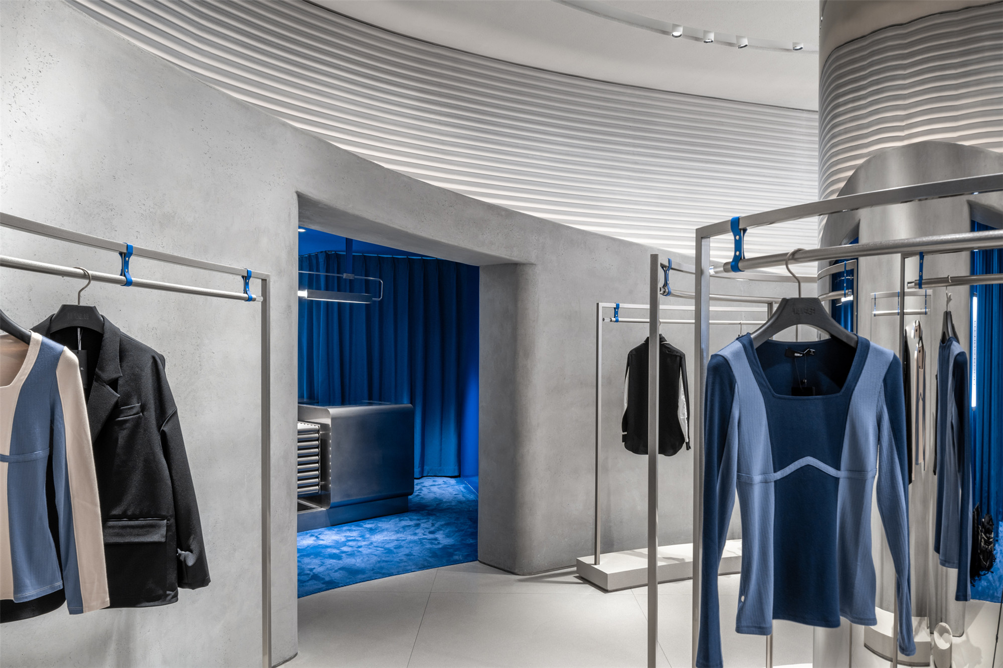
设计为交叠的环形空间保留了灵活性,为日后的活动预留了各种可能。除小圆环内侧的层板外,所有陈列元素都可独立移动。为了与店铺的设计主题保持一致,这些陈列元素都被打造成与两个圆环相契合的曲度。设计在微末处也呼应着反重力的主题,例如陈列架利用绑带制造出悬空感。
Opening up possibilities for future events, the space within the interlinked rings remains flexible. Except for a table-height display ledge along the inside edge of the smaller shape, all display elements are freestanding. In keeping with the design themes of the wider retail project, they are curved to match the store’s two main volumes, and in a playful touch, include tie-down straps in a nod to the outer space, anti-gravity theme.
▲更衣区整体视图 fitting rooms general view
▲更衣间 fitting room
IEW.H埃维纽上海旗舰店别具一格的室内设计,为人们呈现独特的IEW.H 埃维纽品牌世界观,传达大胆无畏的探索精神,同时致力于将时装与零售通过视觉化创新,使其从竞争日益激烈的高街时尚市场中脱颖而出,并不断地给顾客提供前所未有的沉浸式艺术购物体验,在这个前沿城市的中心展现了一个想象中的未来。
In Shanghai‘s already crowded market for high-street fashion, IEW.H sets itself apart through statement interiors. Designed to create a memorable shopping experience, and with inbuilt flexibility, the flagship store presents an imagined future in the heart of this most cutting-edge of cities.
▲平面图彩色 Plan Color
▲平面图黑白 Plan B&W
▲轴测图 Axon Diagram
▲概念手稿 concepy hand drawing
项目信息——
项目名称:IEW.H埃维纽上海旗舰店
地点:中国,上海
建筑面积:259平方米
设计时间:2020年10月 – 2020年12月
完工时间:2021年4月
客户:IEW.H埃维纽
室内设计:Kokaistudios
首席设计师:Filippo Gabbiani,Andrea Destefanis
设计总监:余书凡
项目经理:姚峣
设计团队(按姓氏首字母排序):陈俊宇,方玥,彭璐
摄影:CreatAR Images
撰文:Frances Arnold
媒体联络:Jacqueline Chiang
Email:Jacqueline@kokaistudios.com
Project information——
Project name:IEW.H Shanghai Flagship
Location:Shanghai, China
Floor area:259 Square meters
Design Time:Oct.2020 – Dec.2020
Date of completion:Apr. 2021
Client:IEW.H
Interior Design:Kokaistudios
Chief Designers:Filippo Gabbiani, Andrea Destefanis
Design Director:Ian Yu
Project Managers: Yao Yao
Design Team (alphabetical order by last name):Junyu Chen, Vivian Fang, Lu Peng
Photography:CreatAR Images
Text:Frances Arnold
Media Contact:Jacqueline Chiang
Email:Jacqueline@kokaistudios.com


