「意念造型」是一个20年来专注于为每一位客人定制独特形象提升的造型设计品牌。
“SENSE SALON” is a styling brand that has paid attention to customizing and improving the unique image of each guest for 20 years.
▲项目概览
作为第一家老店的改造项目,设计团队从品牌名“意念”的字面含义出发,通过空间的表现方式重新定义潜意识下的精神世界。将如何抓住并处理自然景观和未来主义之间的关系作为项目设计重点,放大“意念”调控自然的功能属性,以直白和具有穿透力的方式创造一个与意识和直觉对话的场所。
It is the first renovation project of the old store. Therefore, the design team redefines the subconscious spiritual world by the expression of the interior from the literal meaning of the brand name “SENSE”. Besides, the team focuses on how to grasp and deal with the relationship between natural landscape and futurism, magnify the functional attributes of “SENSE” to regulate nature. Finally, the team intends to create a place for dialogue with consciousness and intuition in a straightforward and penetrating way.
▲设计概念
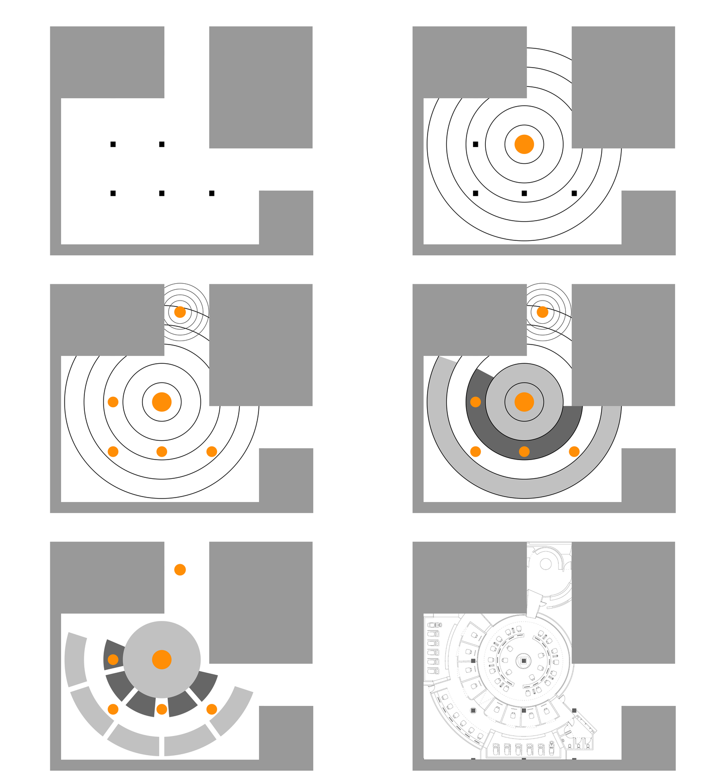
在发掘项目可视化符号的过程中,设计团队将视角锁定在“波(wave)”,波或波动是扰动或信息在空间上传播的一种物理现象,任何类型波的运动总是伴随着能量的传递。“波”既可以表现思维的发散性,也是广泛存在于自然界的运动轨迹。与时间轴单向性不同,以“当下”为原点向周围延伸,建立无止境和无限制的维度,将丰富的结构语言贯穿于场景体验中。
Besides, the design team locked the perspective on “wave” in the process of exploring the visual symbols of the project. In fact, the wave is a physical phenomenon in which disturbance or information propagates in space, and the motion of any type of wave is always accompanied by the transfer of energy. Moreover, “wave” can not only express the divergence of thinking but also widely exist in the natural world. What’s more, it extends around with the “present” as the origin, establishes endless and unlimited dimensions, and permeates the rich structural language in the scene experience, which is different from the unidirectional timeline.
▲“波”
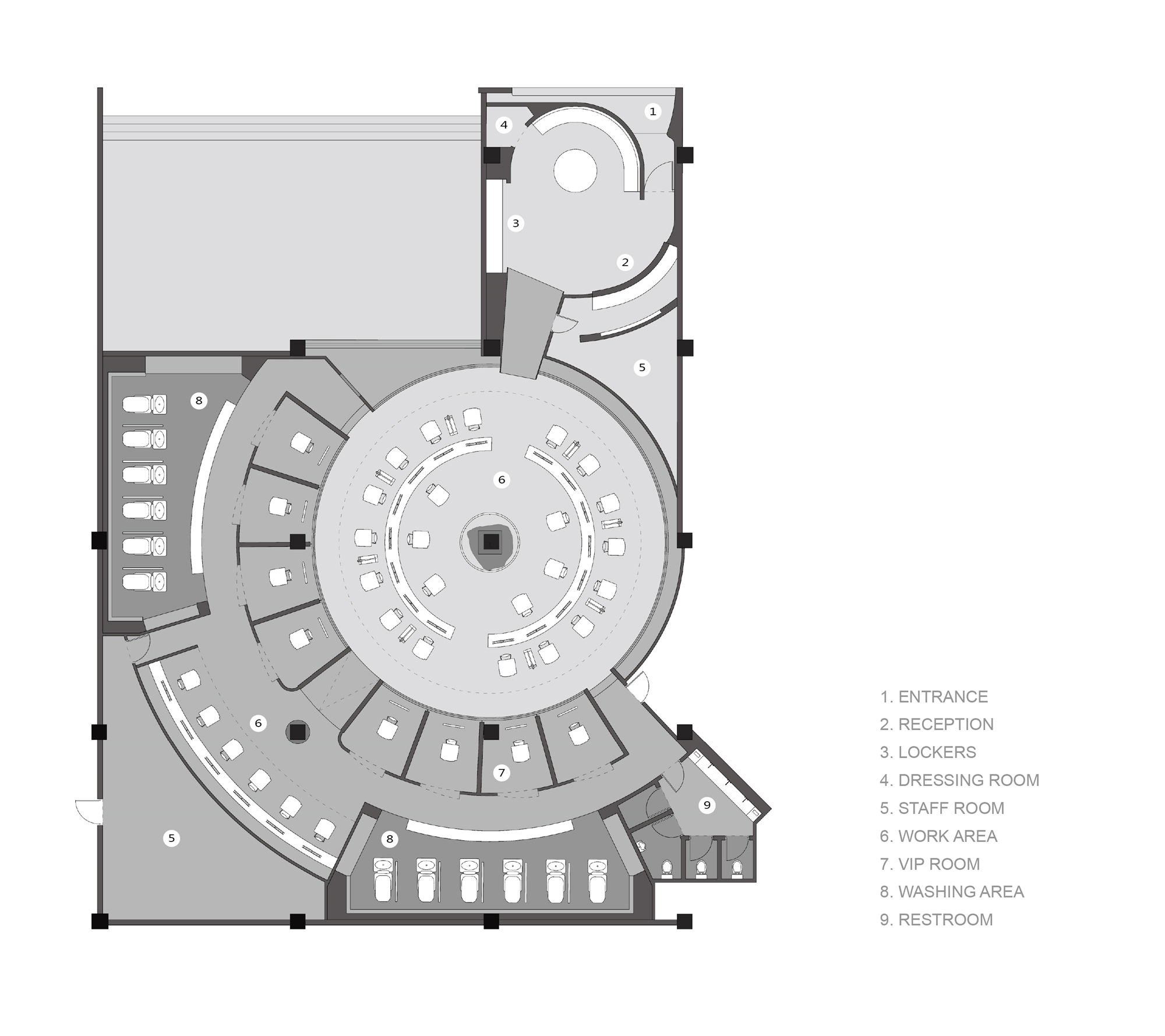
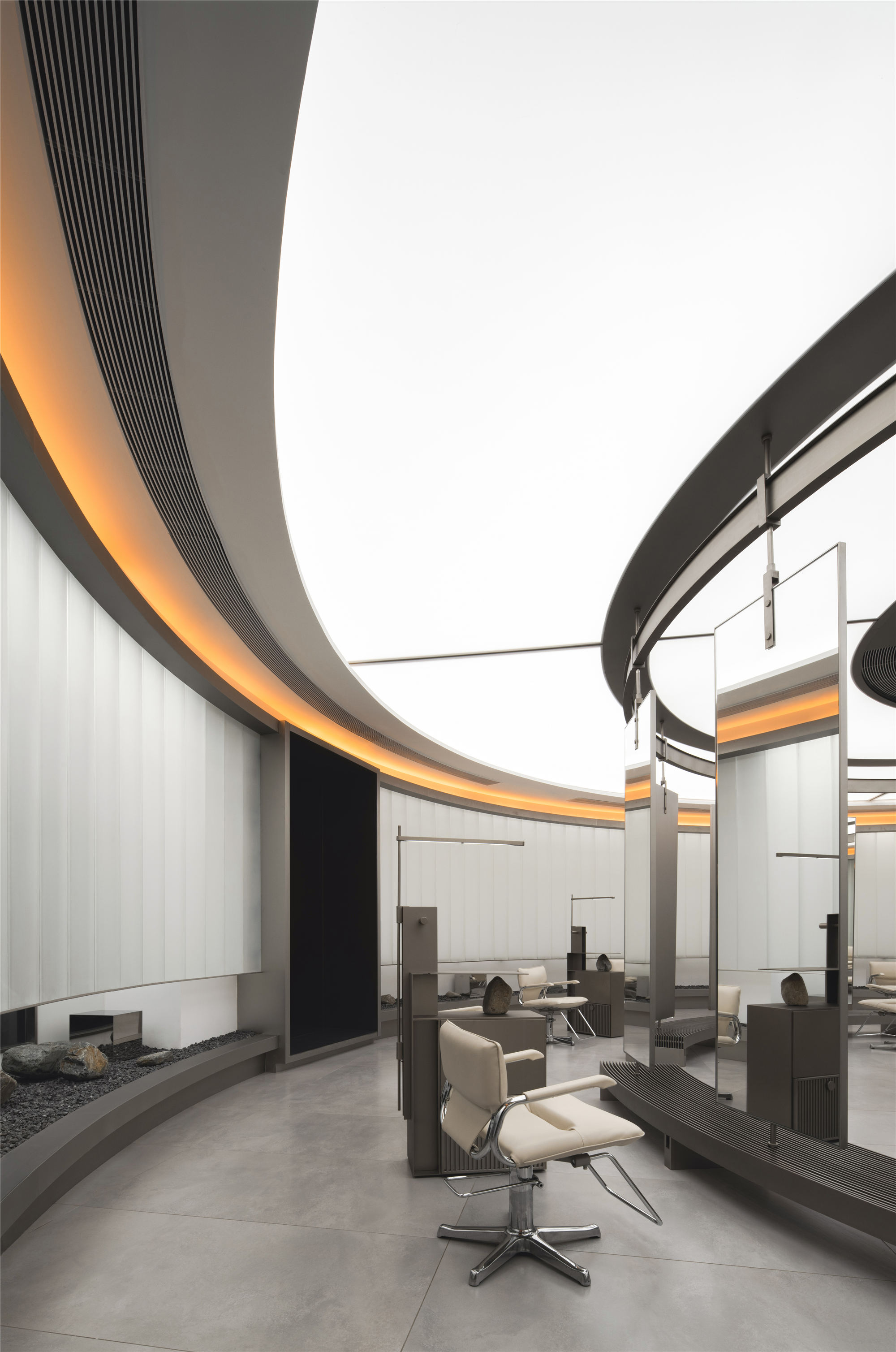
项目中大量运用圆、环、弧线等几何语汇表现“波”的控制性和仪式感,打破建筑原始结构规整平均的空间划分,以空间正中央的柱子为圆心依据不同功能属性及开放程度由中心向四周辐射展开平面布局和动线推进。
A large number of geometric terms such as circles, rings, and arcs are used to express the control and ritual sense of “waves” in the project, which breaks the regular and average interior division of the original structure of the building. Besides, the plane layout and moving line are radiated from the center to the surrounding area according to different functional attributes and opening degrees taking the column in the center of the interior as the center.
▲平面图
▲项目中大量运用圆、环、弧线等几何语汇
▲以空间正中央的柱子为圆心向四周辐射展开平面布局和动线推进
门头 ENTRANCE
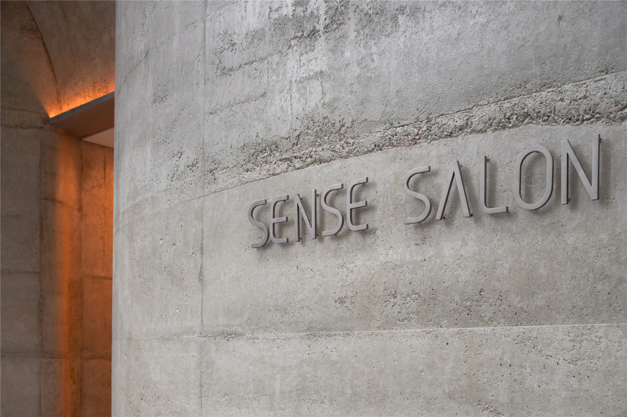
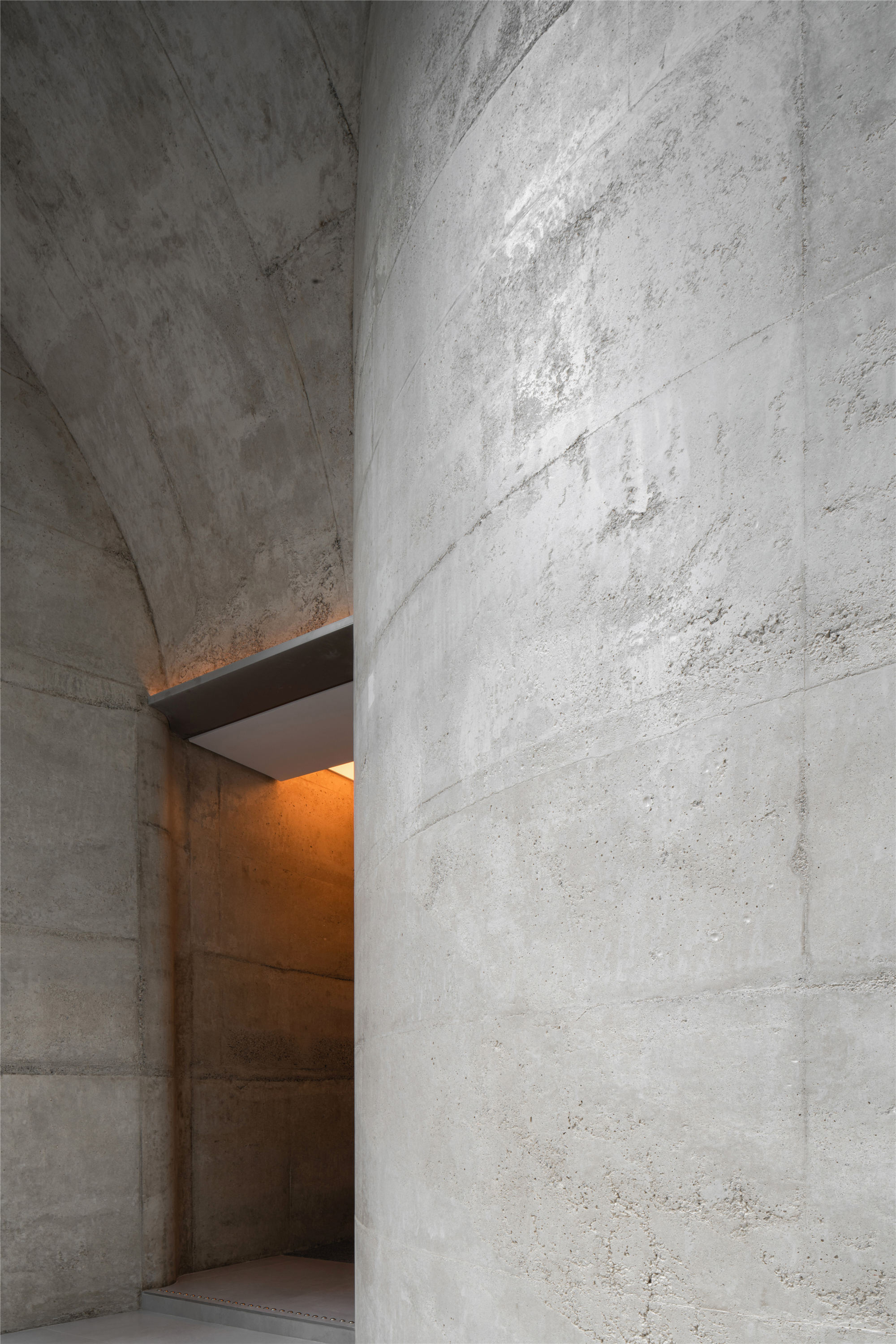
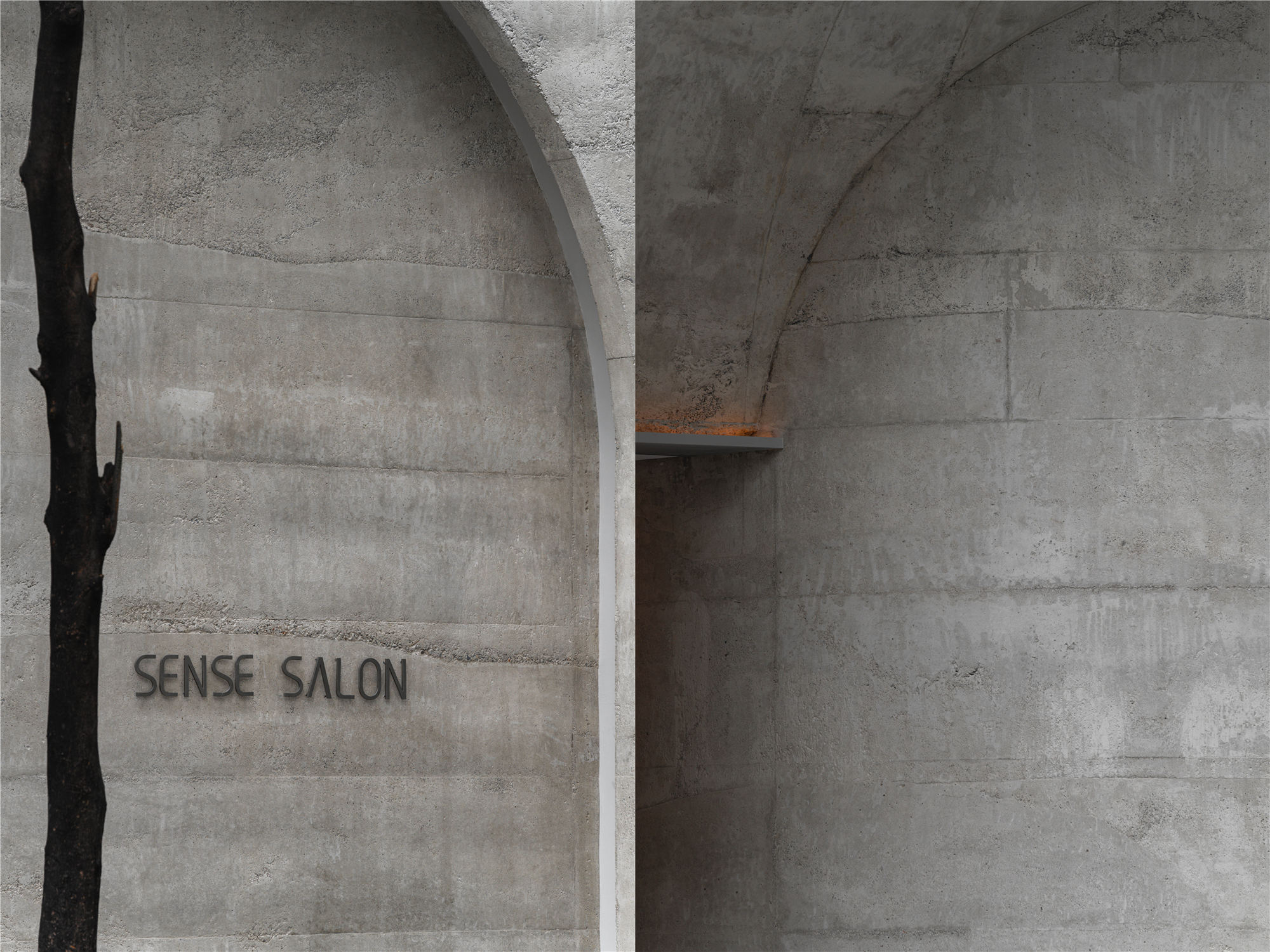
由于项目地处老成都比较嘈杂的街道,为了避免街道所带来的市井气,外立面规避了完全开敞的设计。弧面结构自然连接街道的同时增强了项目的独特性,封闭的造型让内部空间与外界完全隔绝。自然的材质肌理与几何结构碰撞,以微妙的方式营造神秘感和仪式感。
As the project is located in the old streets of Chengdu, the facade avoids the completely open design to avoid the market atmosphere brought by the streets. The curved surface structure naturally connects the street while enhancing the uniqueness of the project. Besides, the closed shape makes the internal area completely isolated from the outside world. What’s more, the natural texture collides with the geometric structure, creating a sense of mystery and ritual subtly.
▲弧面结构自然连接街道
▲入口外观
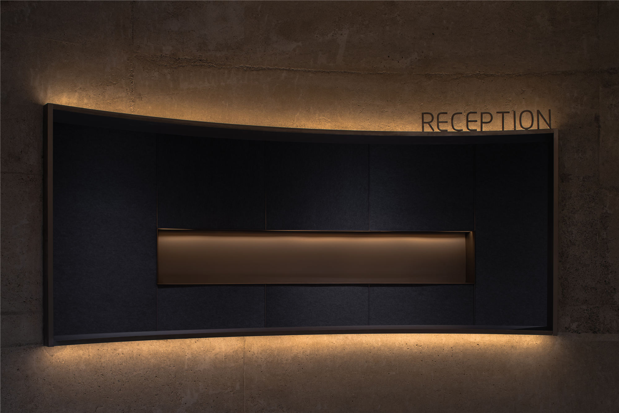
接待区域 RECEPTION
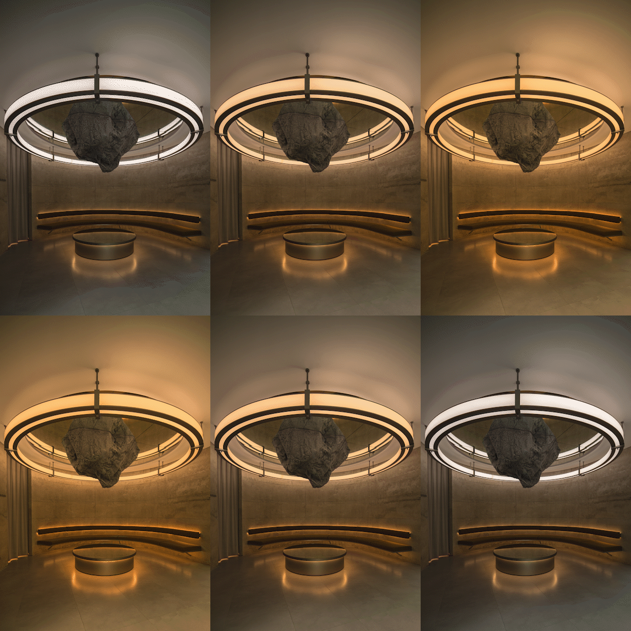
接待区作为进入内部主空间的前奏,故意在灯光及材料上与主空间拉开距离。为刚进入的顾客,在心理上起到一个缓冲作用。休息区的灯光以每三个小时为周期循环变化,模拟日出到日落的自然过程。
As a prelude to entering the internal main area, the reception area is deliberately separated from the main area in terms of lights and materials. Therefore, it acts as a psychological buffer for new customers. Besides, the lights in the rest area cycle every three hours, simulating the natural process from sunrise to sunset.
▲接待区
▲周期循环灯光模拟日出到日落
主区域 MAIN AREA
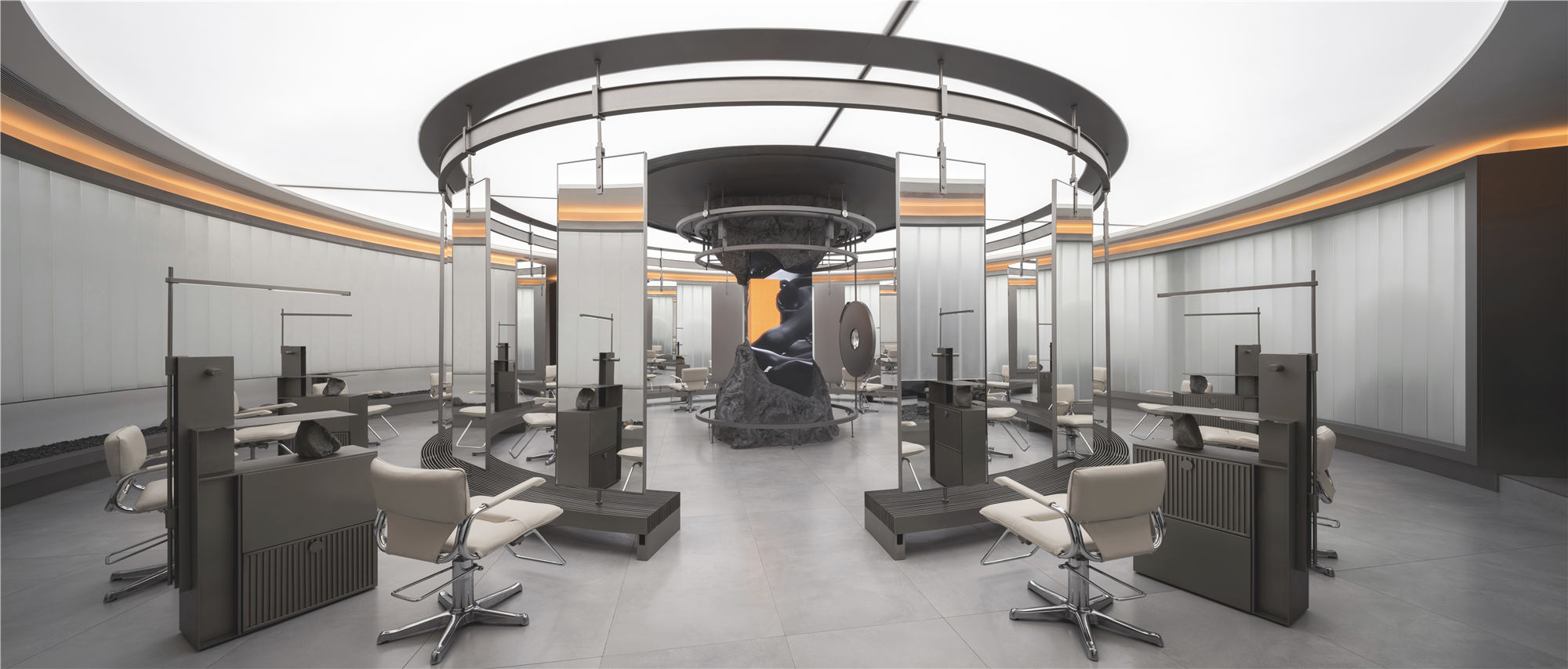
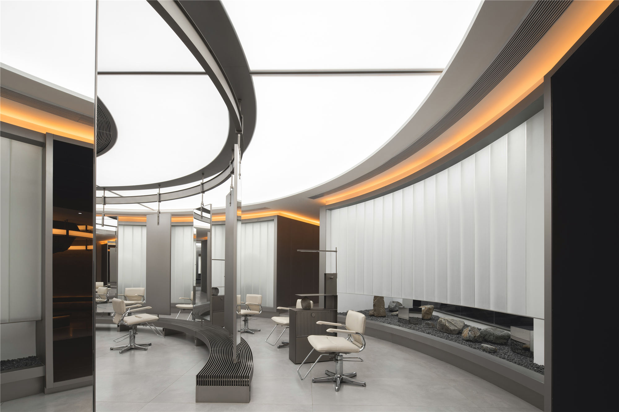
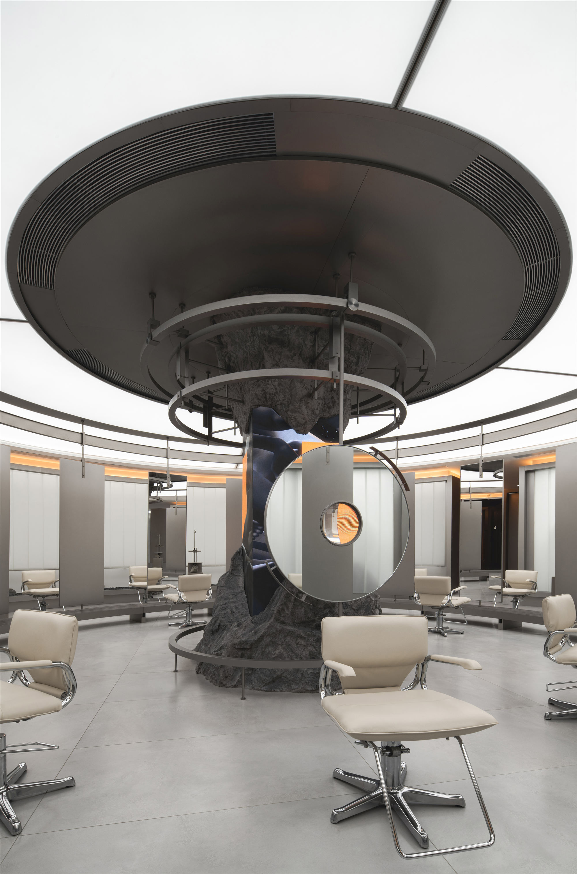
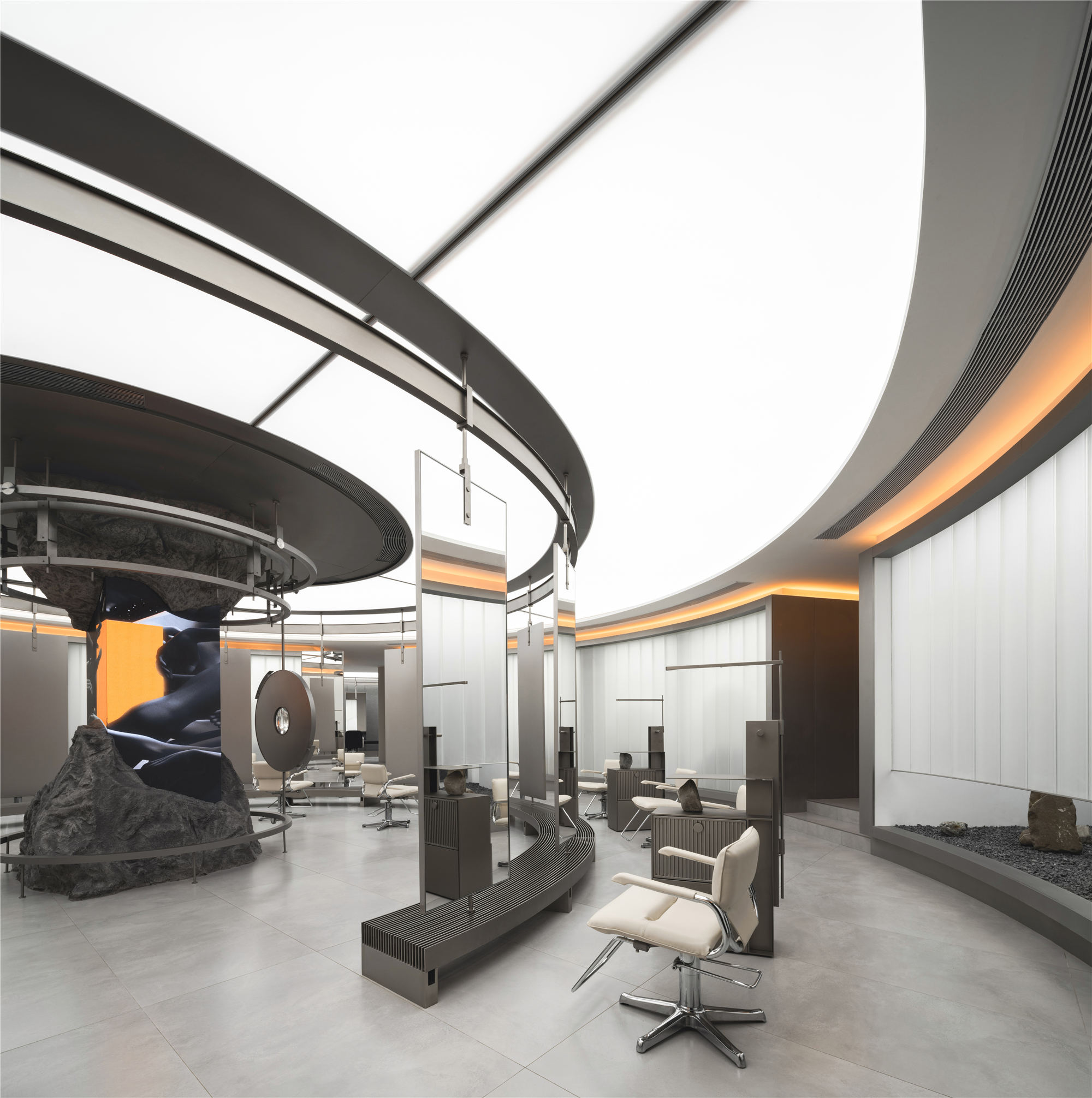
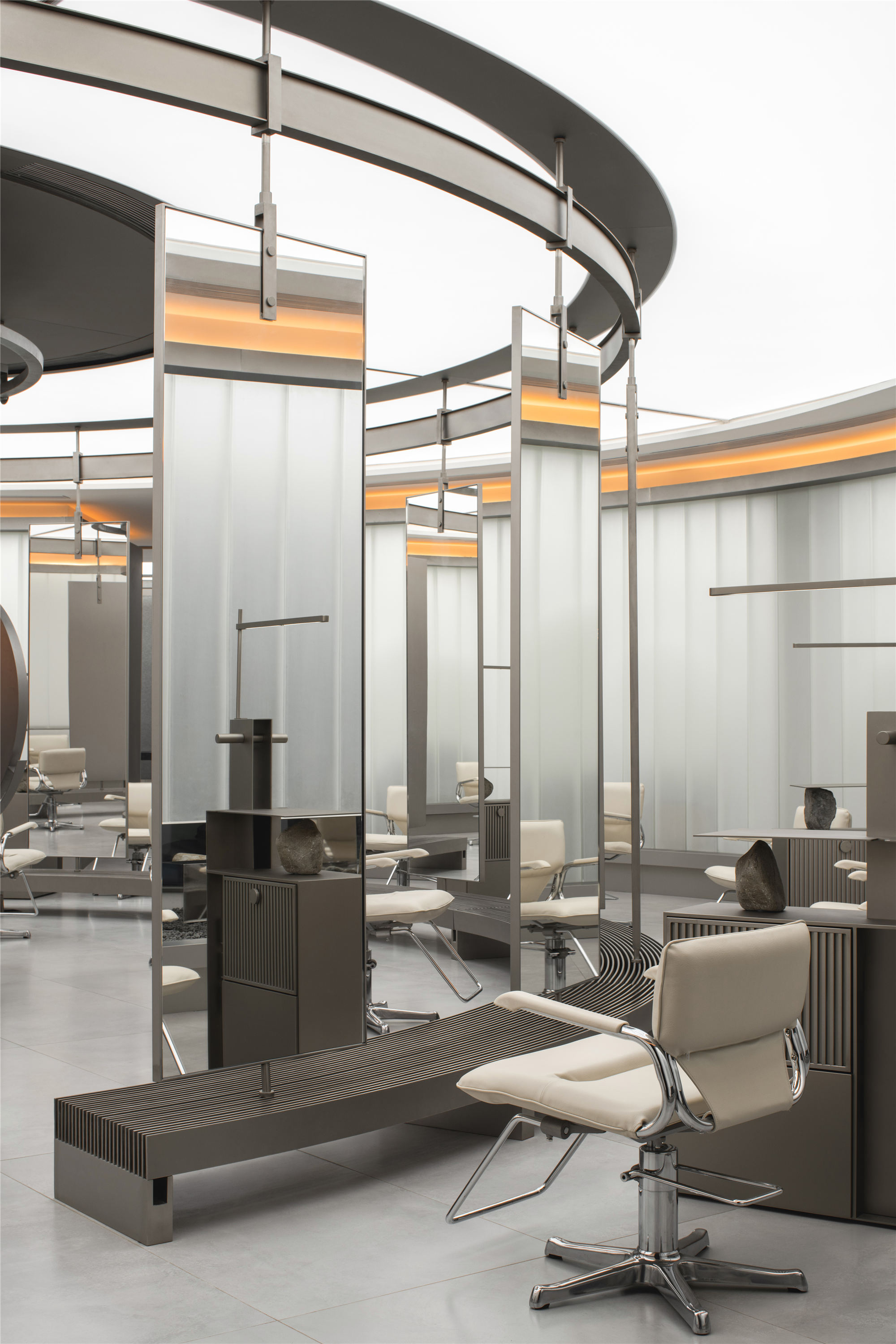
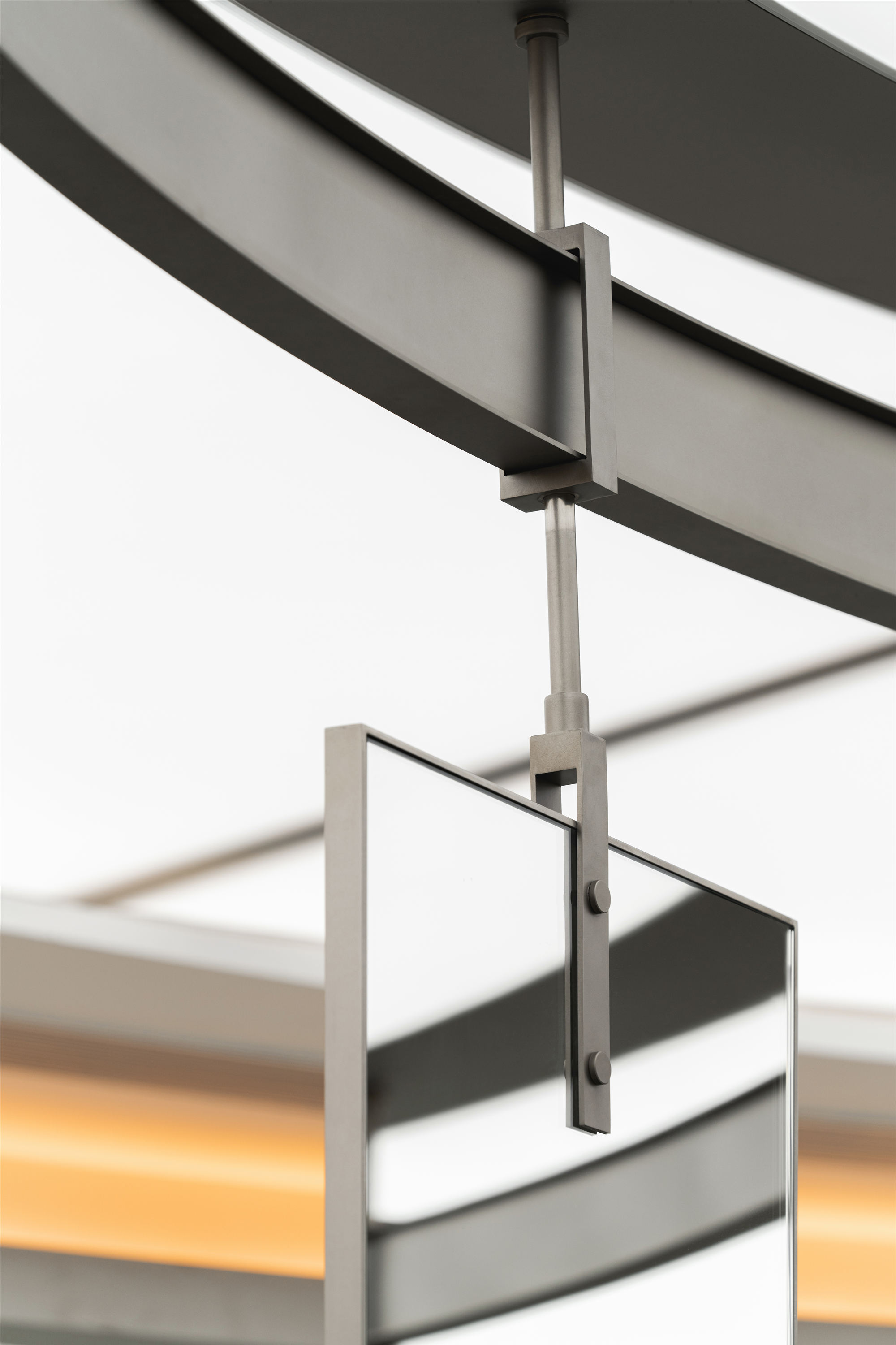
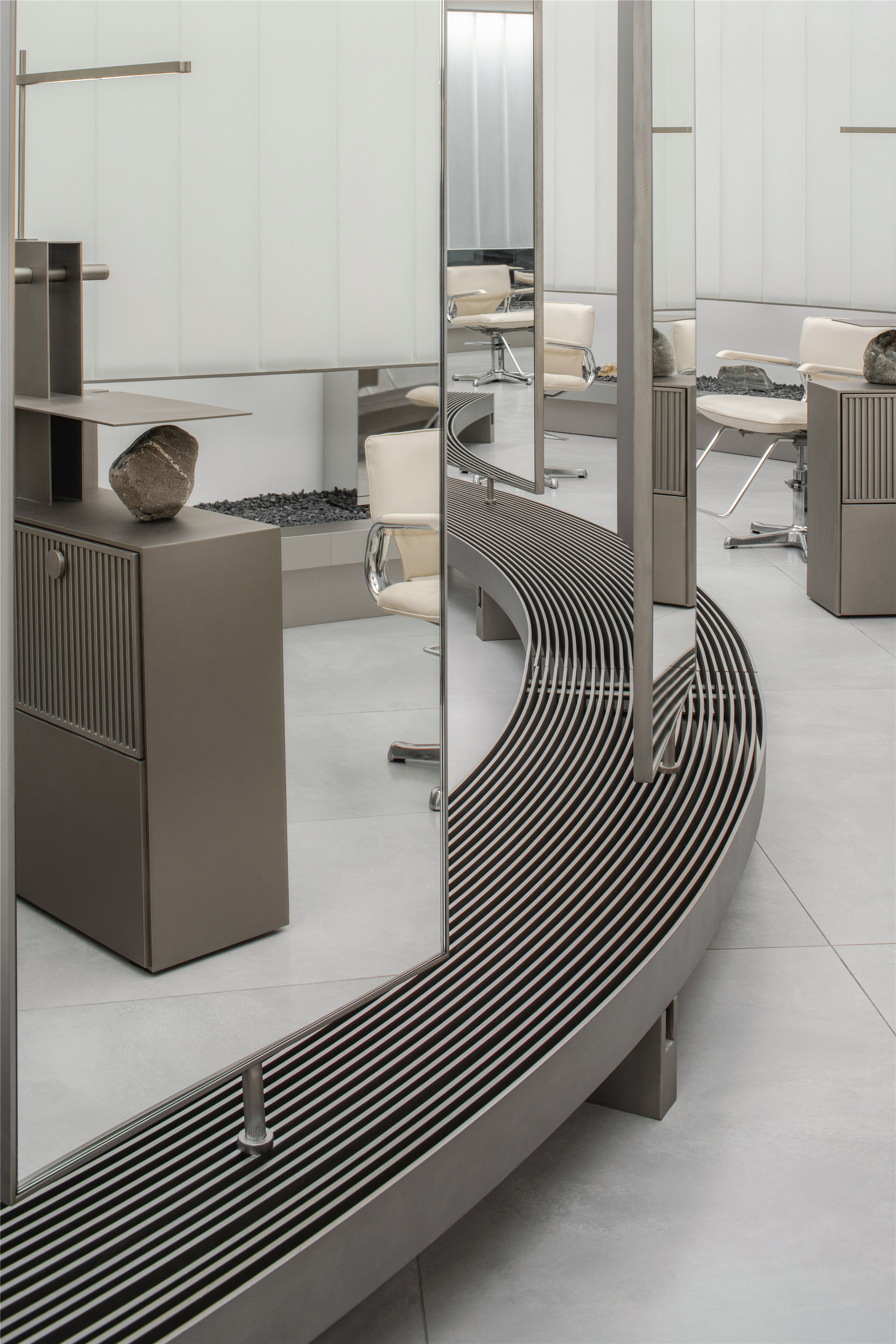
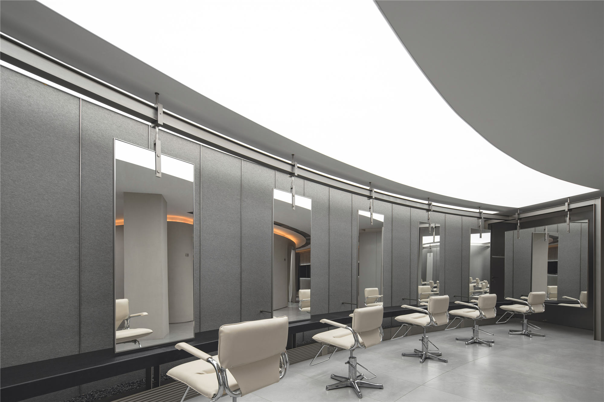
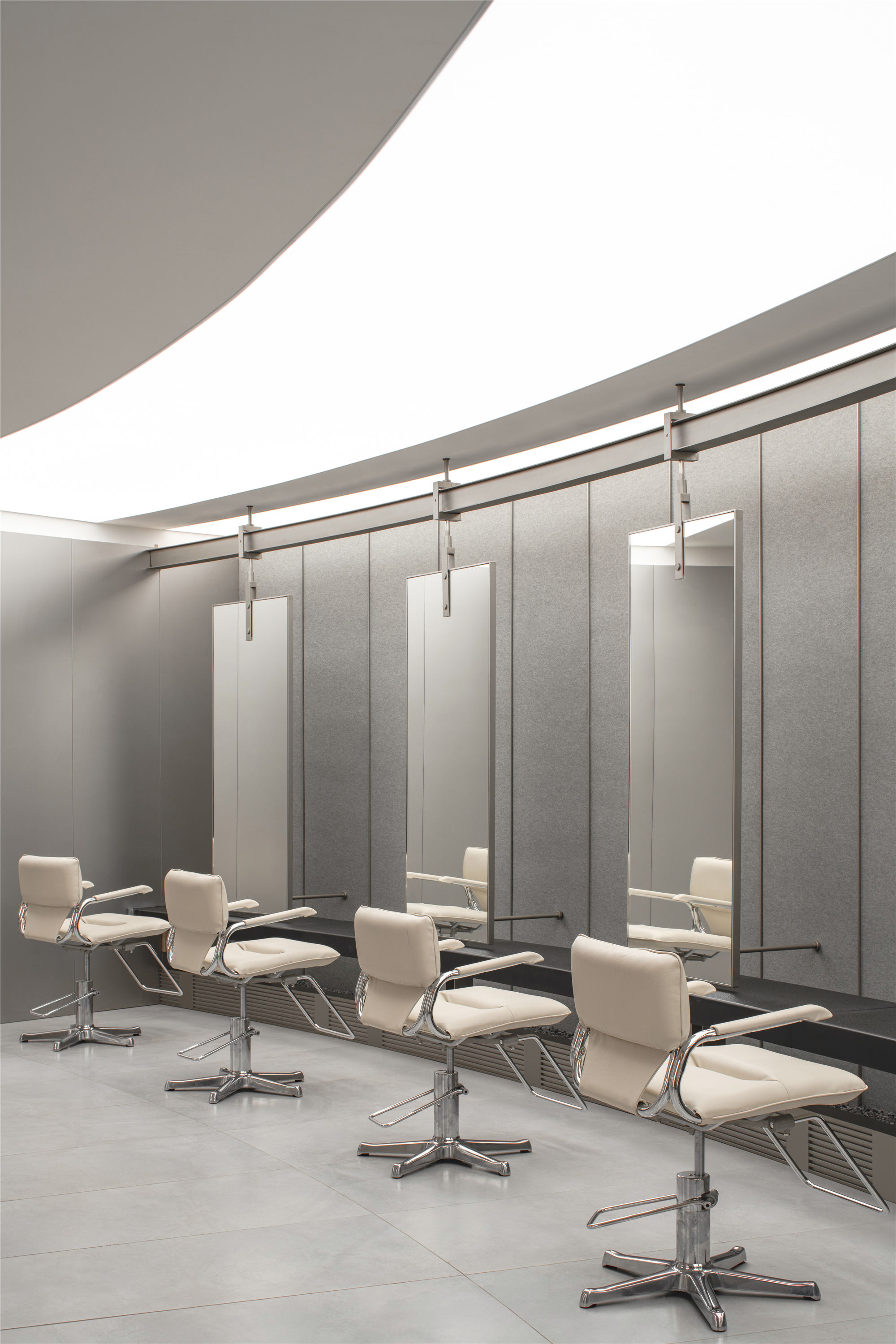
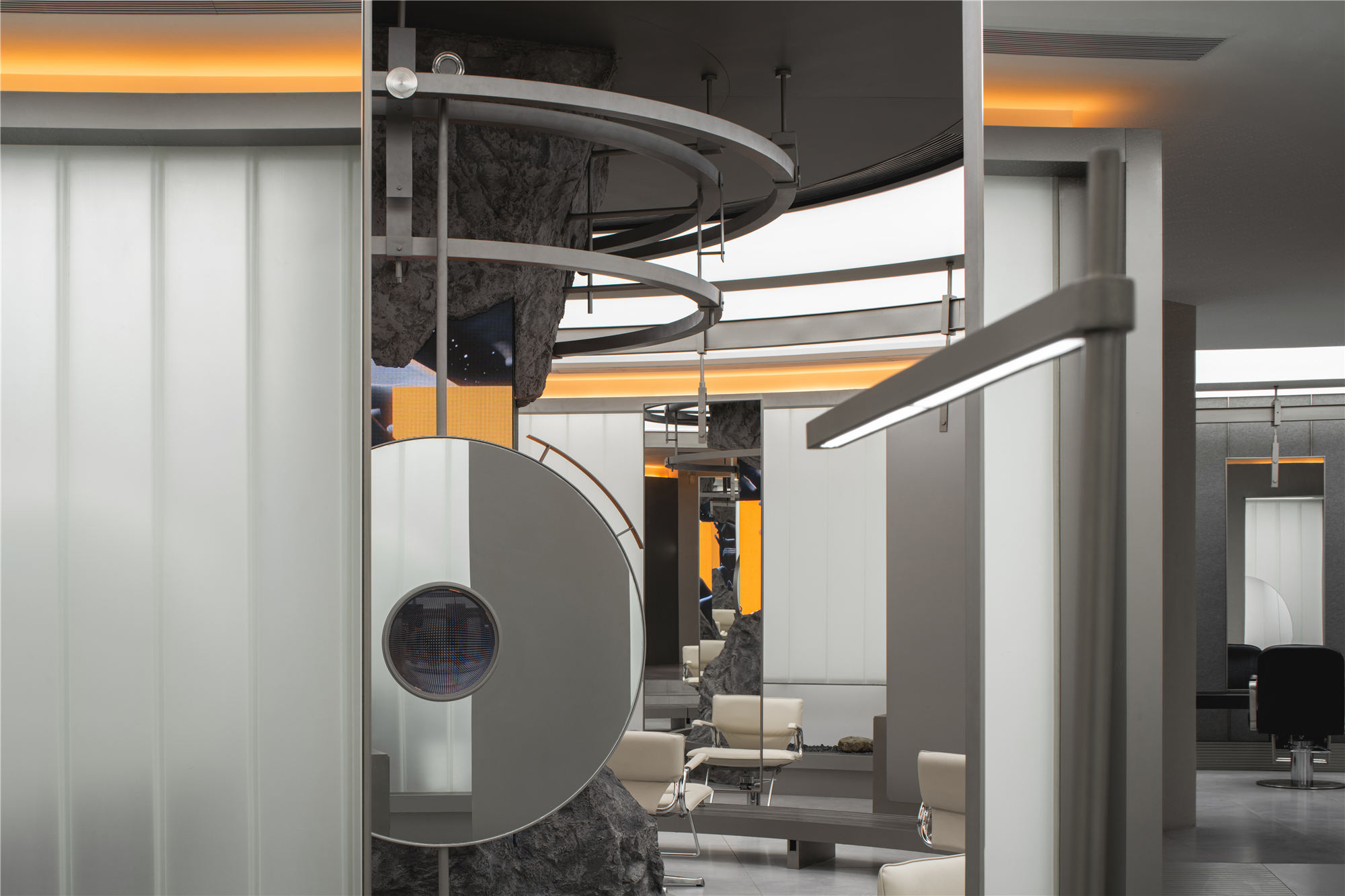
主要工作区域位于空间中心位置,是能量聚集发散的初始点。以此为圆心贯穿区域内的金属结构以环形布局为基础框架,等距划分镜面位置,内外双层座位递进扩散,在保证基本使用的同时重新探讨工位布局的可能性,也为空间动线提供了规范指引。
The main working area is located in the center of the interior, which is the initial point of energy accumulation and divergence. The metal structure in which the center of the circle runs through the area is based on the circular layout, the mirror position is divided equidistant, and the inner and outer double-layer seats are diffused step by step, which ensures the basic use and re-discusses the possibility of the layout of the workplace. it also provides a standard guide for the spatial moving line.
▲内外双层座位递进扩散
▲环形金属结构等距划分镜面位置
▲室内细节
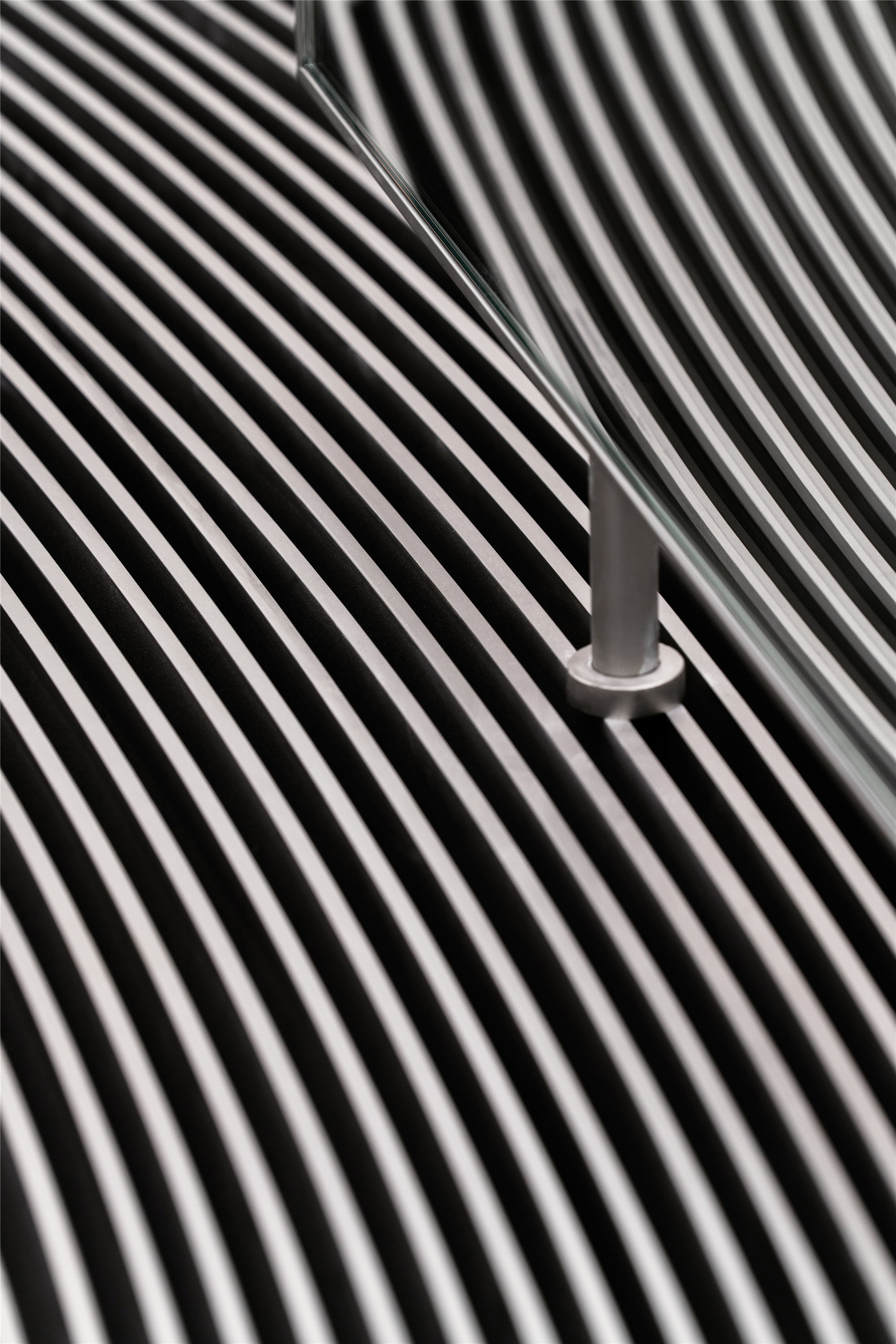
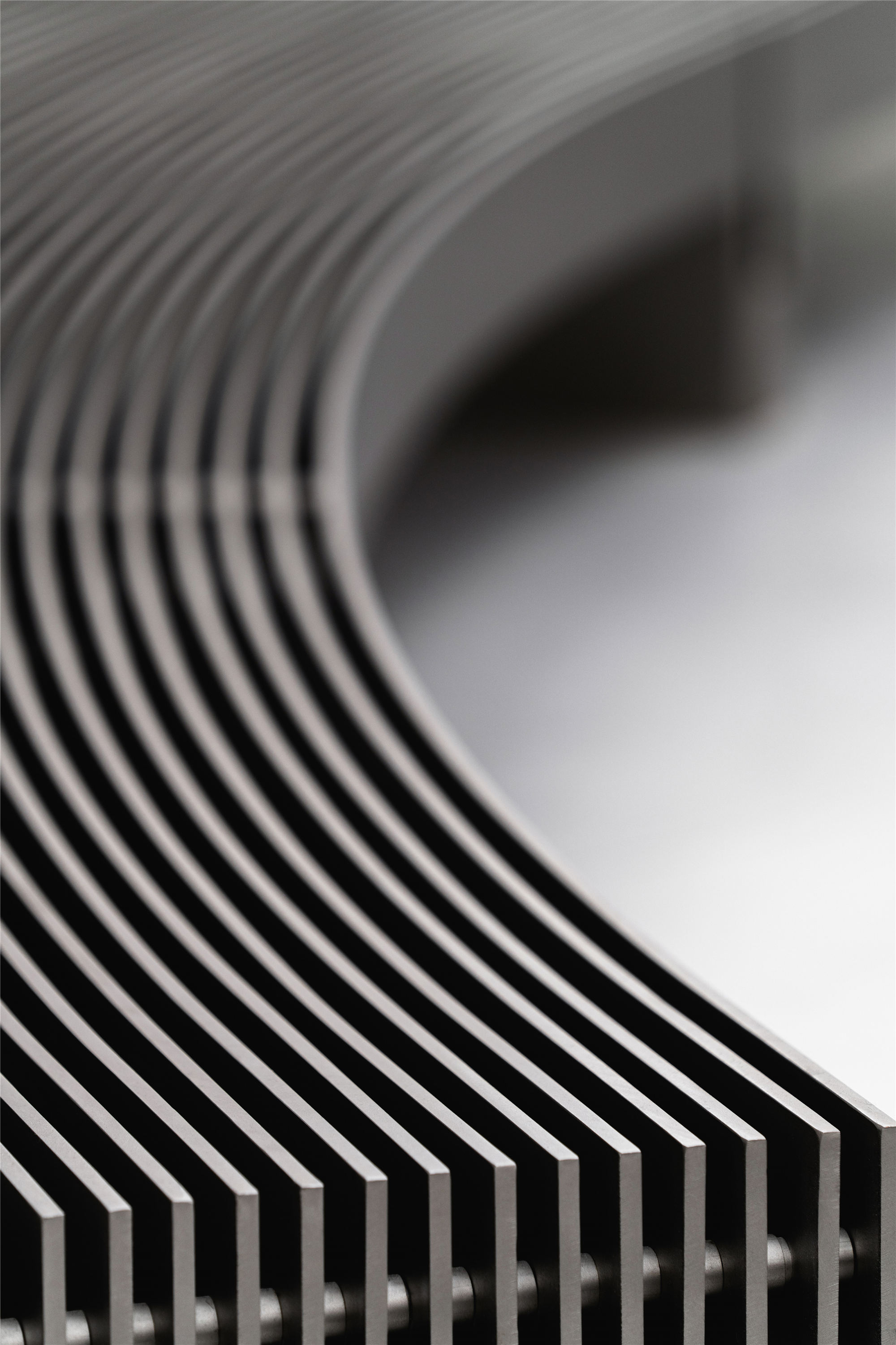
▲金属结构细节
连接廊道 CORRIDOR
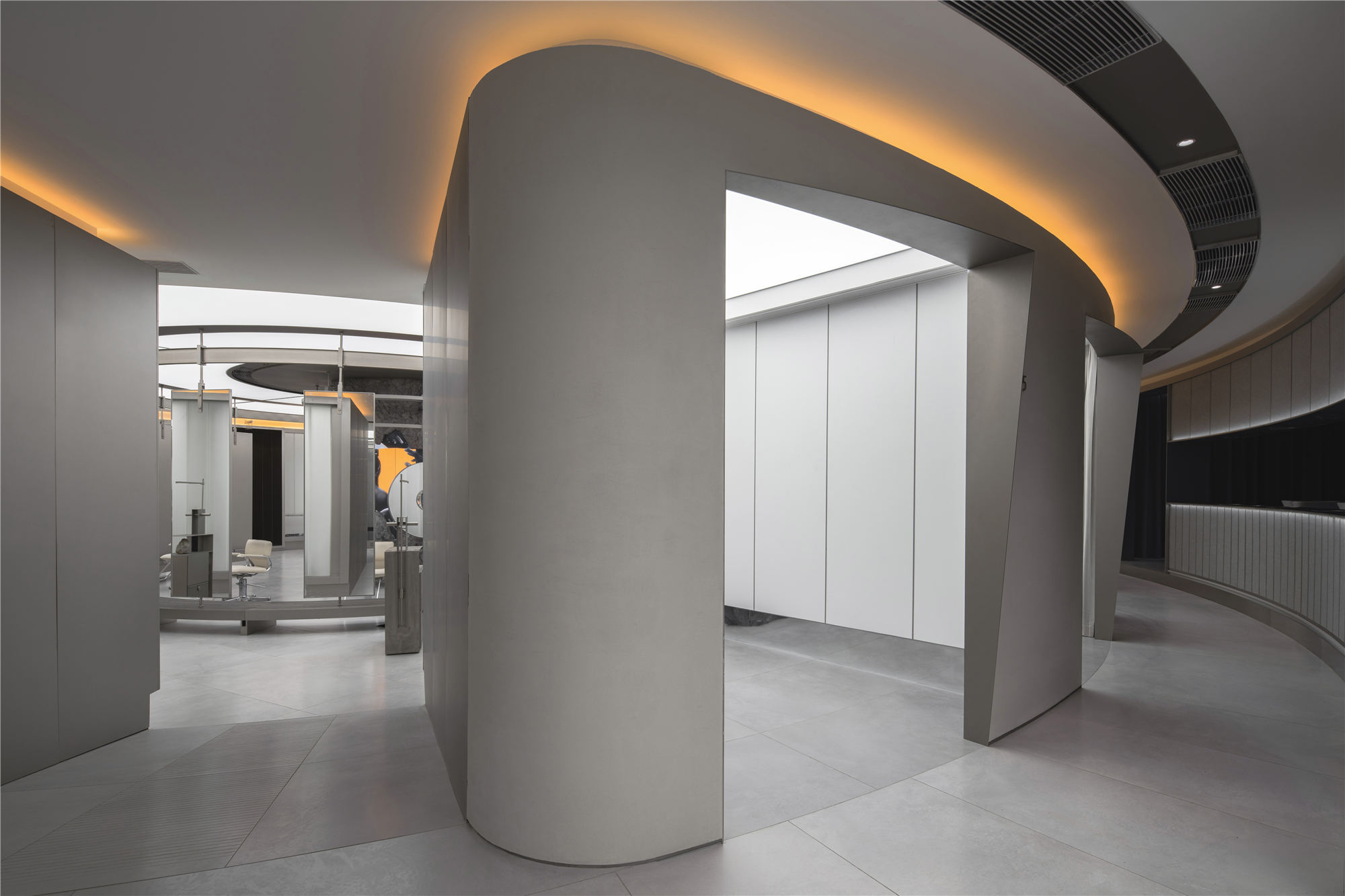
接待区域和主要工作区域以廊道串联,是两个频率的“波”相互影响产生干涉的位置。空间节奏在这里发生强弱中和的变化,故意压低的层高强调空间先抑后扬的对比。
The reception area and the main working area are connected in series with corridors, which is the position where the “waves” of the two frequencies interfere with each other. The spatial rhythm changes from strong to weak here. Besides, the deliberately low floor height emphasizes the contrast that the interior is suppressed first and then raised.
▲连接廊道
包间 VIP ROOM
八个封闭的房间环绕于主区域周围,U型玻璃削弱了二者之间的分界点,也赋予独立小空间足够的私密性。
Eight enclosed rooms surround the main area, and U-shaped glass weakens the demarcation point between the two, which provides sufficient privacy to separate small parts.
▲包间
其他区域 OTHER AREAS
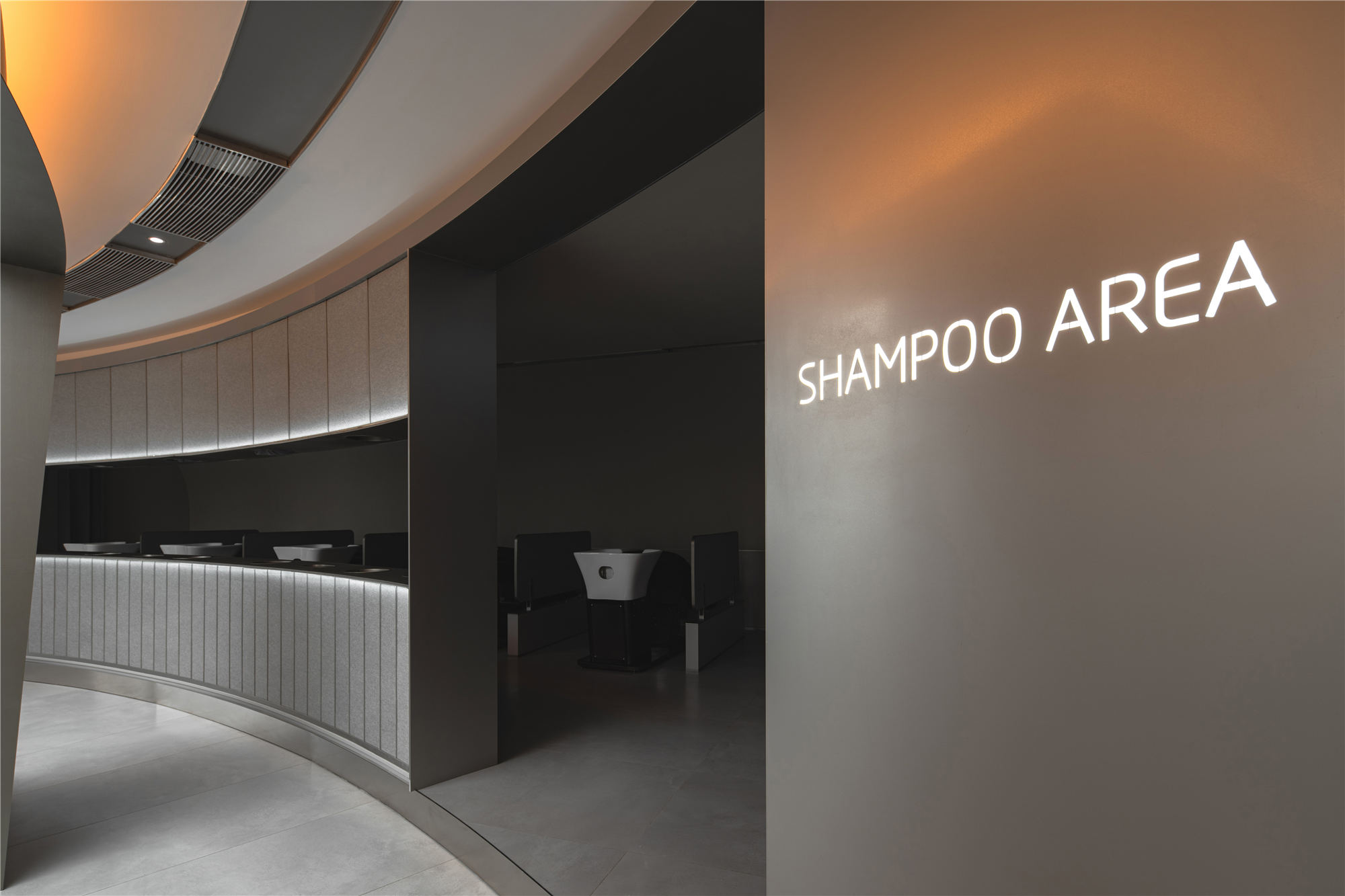
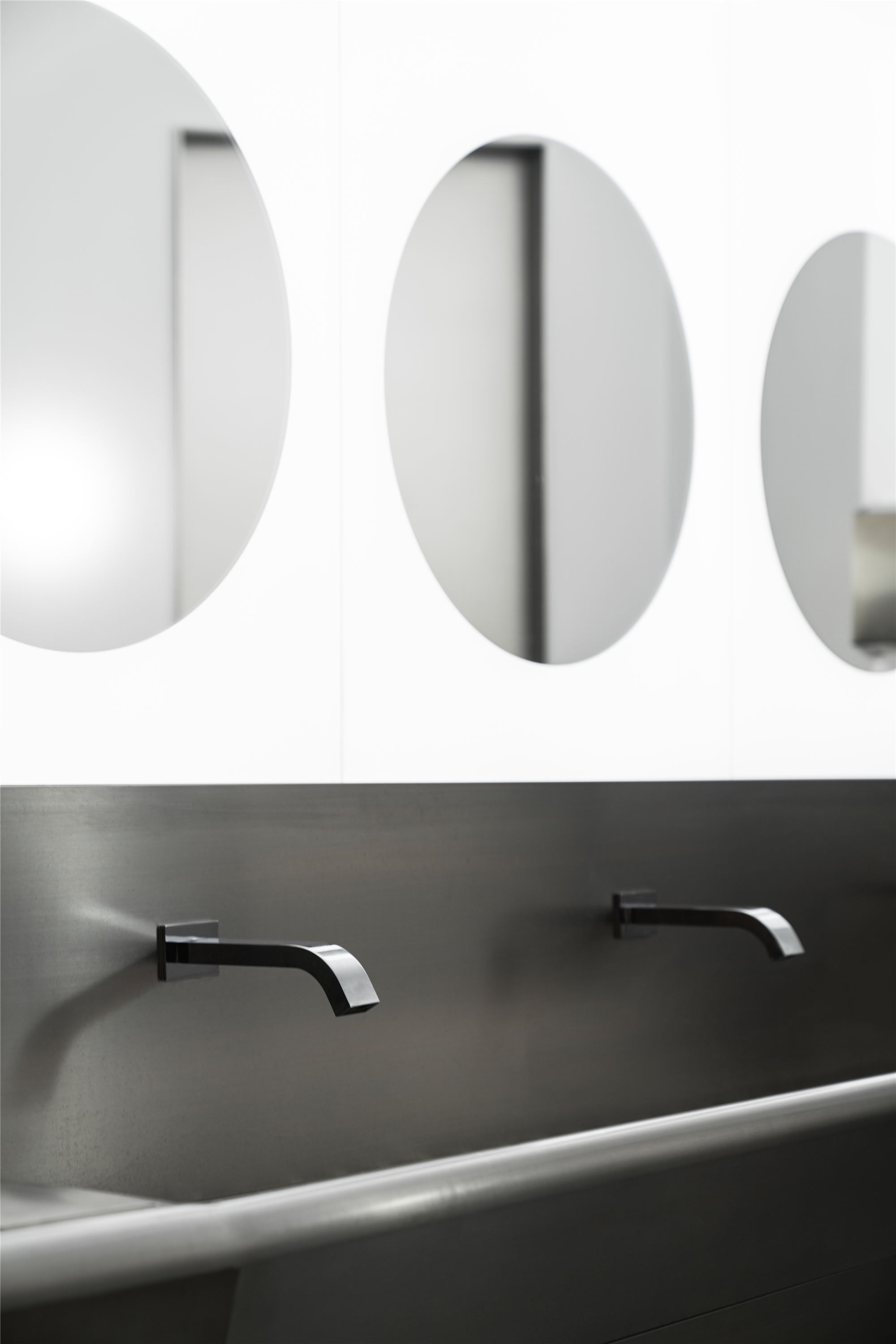
洗护区、烫染区、员工休息区按区域功能划分,联以回廊走道,有序的整合在“波”的边界。
Washing area, perm area, staff rest area are divided according to regional functions, and they are orderly integration in the “wave” boundary combined with corridors and walkways.
▲其他功能区域有序地整合在“波”的边界
▲洗护区
▲室内细节
装置 INSTALLATION
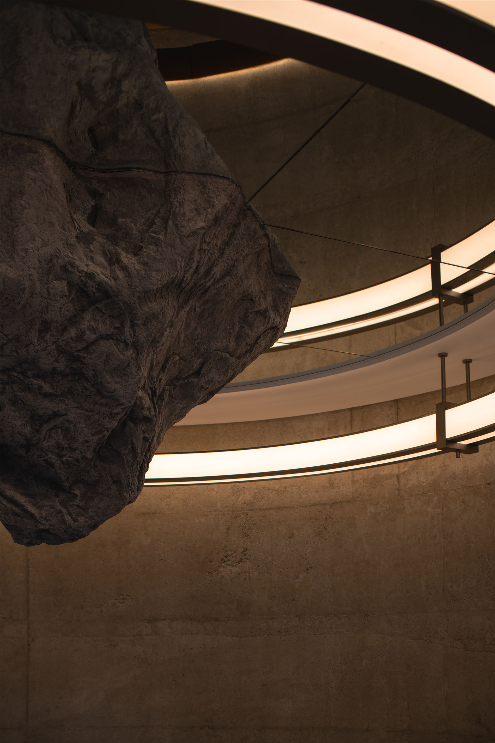
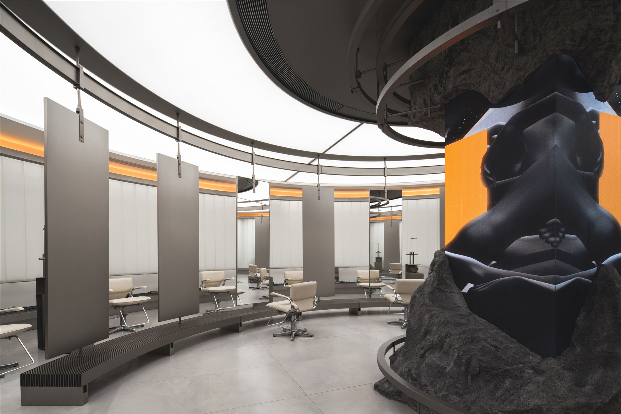
空间圆心处的整体装置由仿真巨石,LED屏幕,金属环形架,可移动镜面组成。不同材质的运用营造超现实的碰撞感,保留整体意识的同时丰富细节感受,映衬共生关系。
The whole installation at the center of the interior consists of a simulated boulder, a LED screen, a metal ring frame, and a movable mirror. The use of different materials creates a surreal sense of collision, retains the overall consciousness, and enriches the feeling of detail, reflecting the symbiotic relationship.
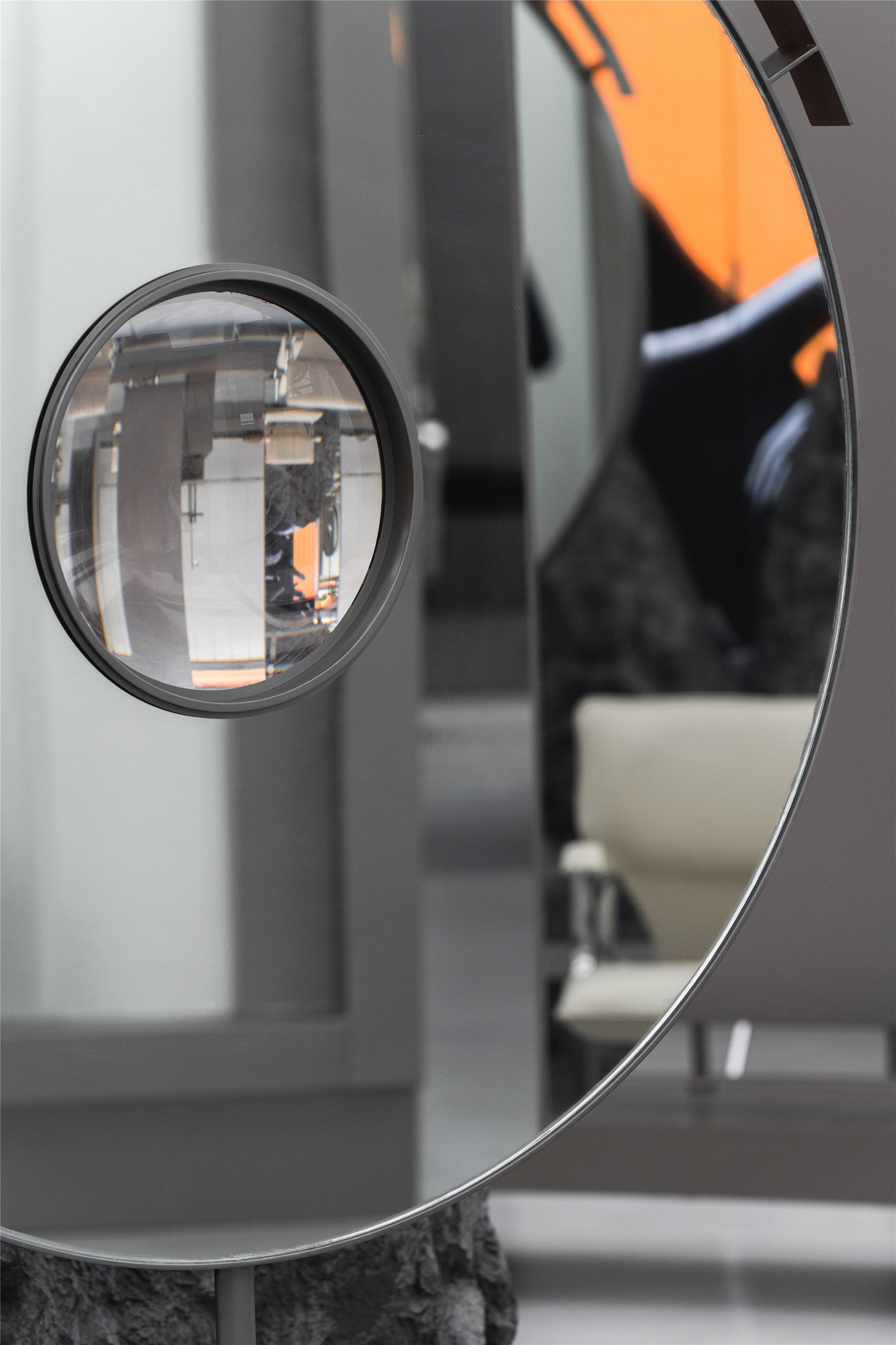
▲可移动圆镜
仿真巨石包裹从中生长的LED屏幕,利用不同媒介作为一个单元融合进空间中,同步现场氛围与光影的微妙变化,流动的数码景观为意想世界提供可视画面。金属环形结构围绕中心多媒体装置呈波形辐射展开,环形上的圆镜在移动过程中通过镜面反射使顾客可以从多角度观察自己。圆镜上的凸透镜可以放大LED屏幕上的影像,为置身于其中的顾客提供更为微观的视觉感受。
Besides, simulation boulder wrapped from the growth of the LED screen. And the use of different media as a unit in the interior synchronizes the subtle changes of the scene atmosphere and light and shadow. Moreover, the mobile digital landscape provides a visual picture of the intended world. Also, the metal ring structure spreads out in a waveform around the central multimedia installation, and the circular mirror on the ring makes customers can observe themselves from multiple angles through the specular reflection in the process of moving. What’s more, the convex lens on the round mirror can magnify the image on the LED screen, providing customers with a more microscopic visual experience.
▲装置细节
石头 STONE
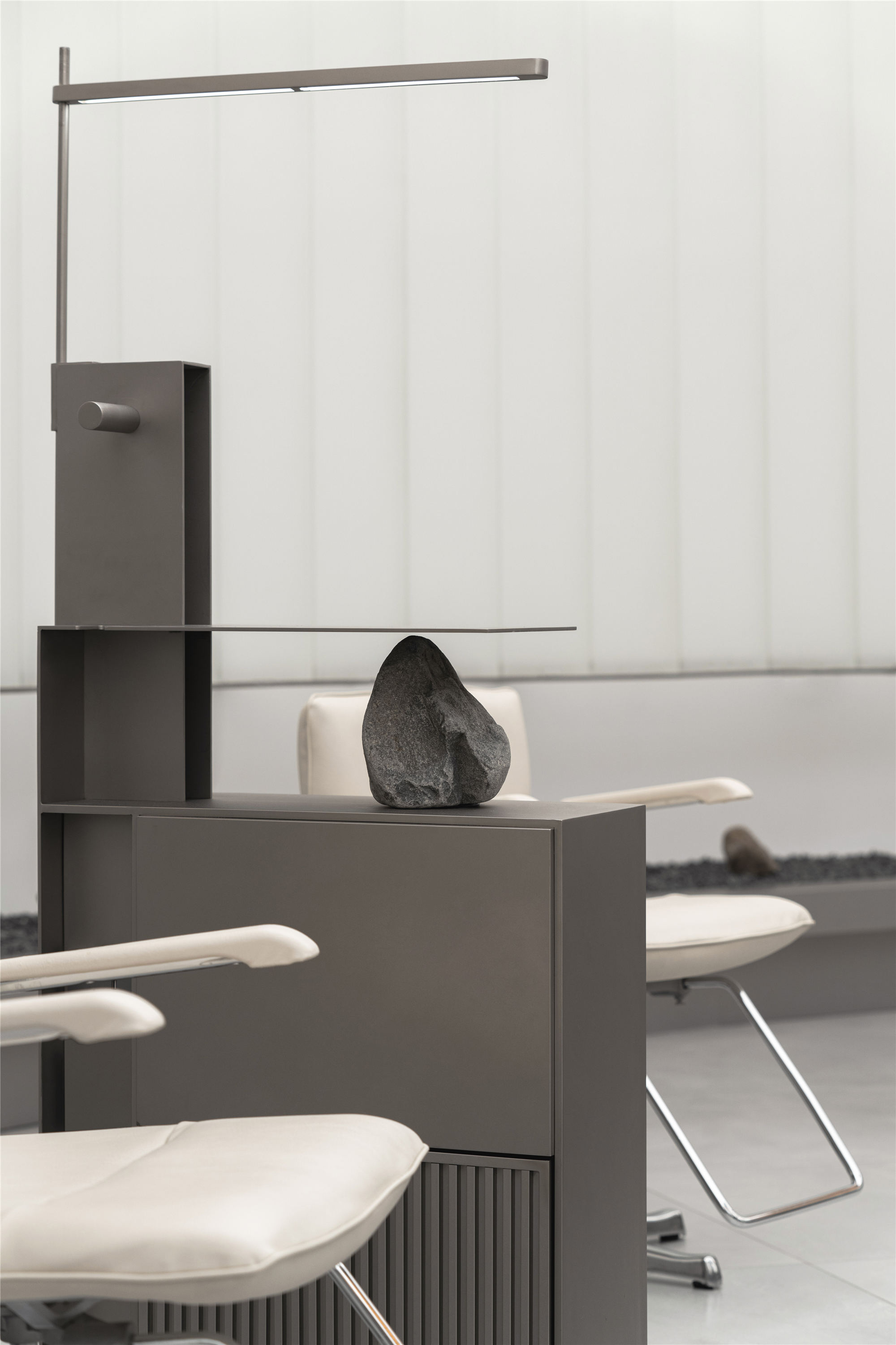
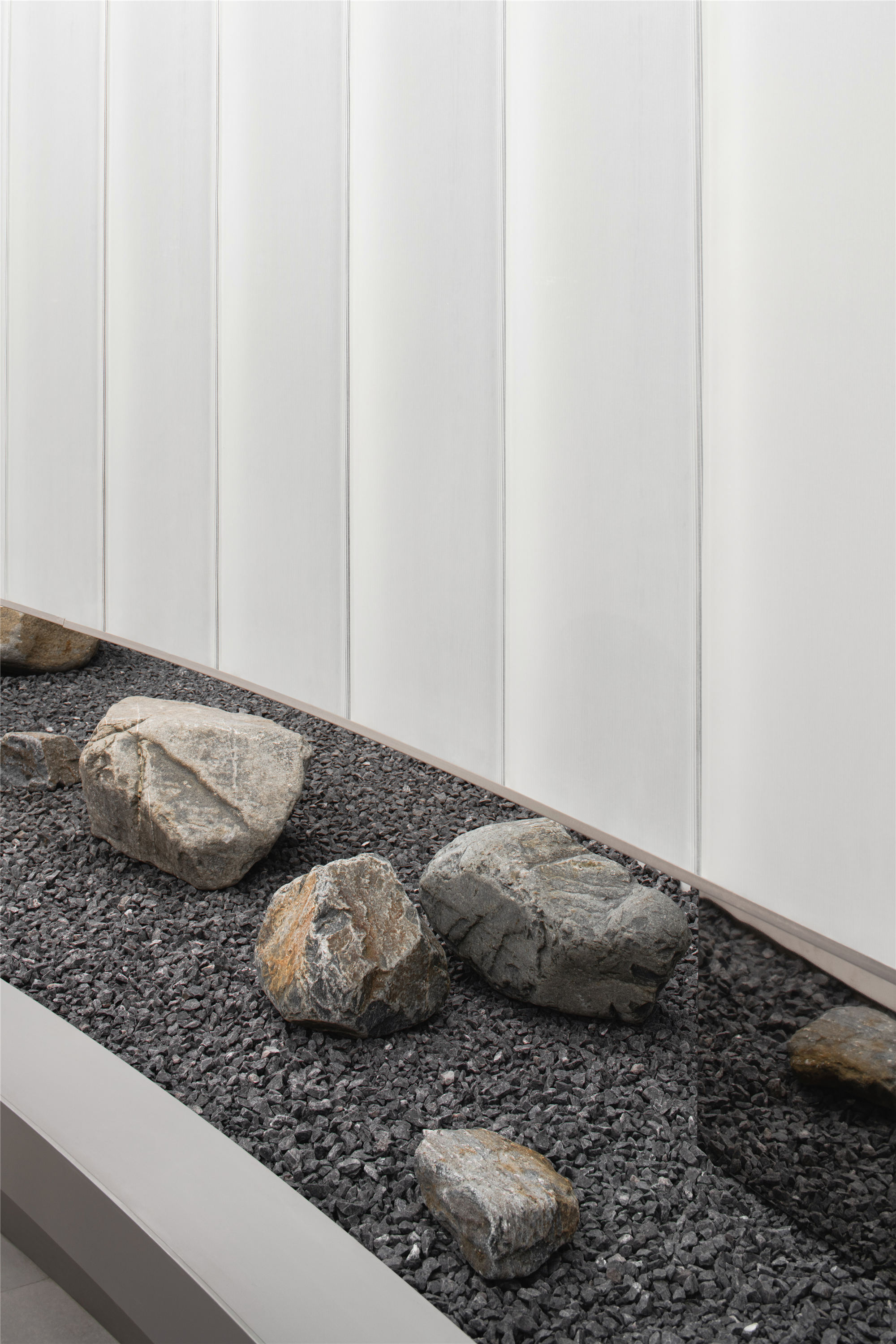
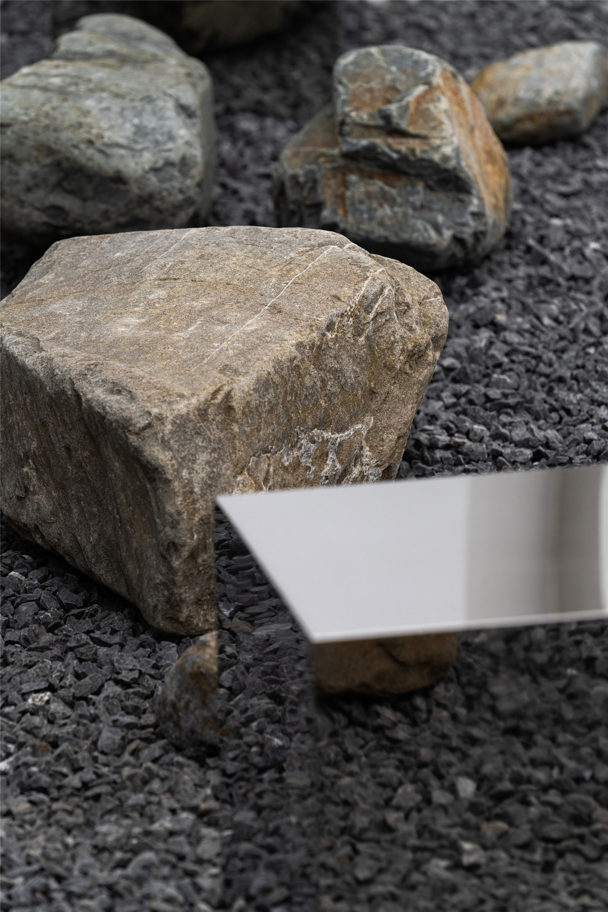
与以往采用软性材料来软化空间的坚硬感不同,石头作为自然界最原始的元素以最直接快捷,不具侵略性的方式存在于空间的各个角落。连接空间里的所有介质,模糊室内与室外,建筑与自然,现实与幻想的边界。
Stone, as the most primitive element in nature, exists in every corner of the project in the most direct, fast, and non-aggressive way, which is different from the hard sense of softening with soft materials in the past. Besides, it connects all the media in the project, blurring the boundaries between indoor and outdoor, architecture and nature, reality, and fantasy.
▲石头作为介质存在于空间的各个角落
项目信息——
项目名称:SENSE SALON 意念造型
设计方:MOJO STUDIO
联系邮箱:mojodesign@yeah.net
项目设计 & 完成年份:2020/2020
空间设计:Mojo Wang、邱天、Alba Beroiz
装置设计:Mojo Wang、邱天、鲍BAO、MAGI、大鱼
项目地址:四川省成都市锦江区福兴街58号
建筑面积:530㎡
摄影版权:形在空间摄影 Here Space | 贺川
客户:意念造型


