“四维空间会是什么形态?
无法观察、不可描绘,只能试着去推测。”
“What is the formation of a four-dimensional space?”
“Unobservable,indescribable but may only be predicated.”
我们希望用整体设计为SWAY BAR(四维酒吧)营造出更加浸入式的消费体验。多维的、抽象的、分离的、模糊的,种种无法被观察描绘但又性格分明的特征,才是“SWAY”的。
We hope to provide an immersive experience for the consumers in the design of SWAY BAR. The indescribable but distinctive traits such as multidimensional, abstract, ambiguous and separated are the characteristics of SWAY.
拆解、连接、再生
Break, Connect and Rebuild
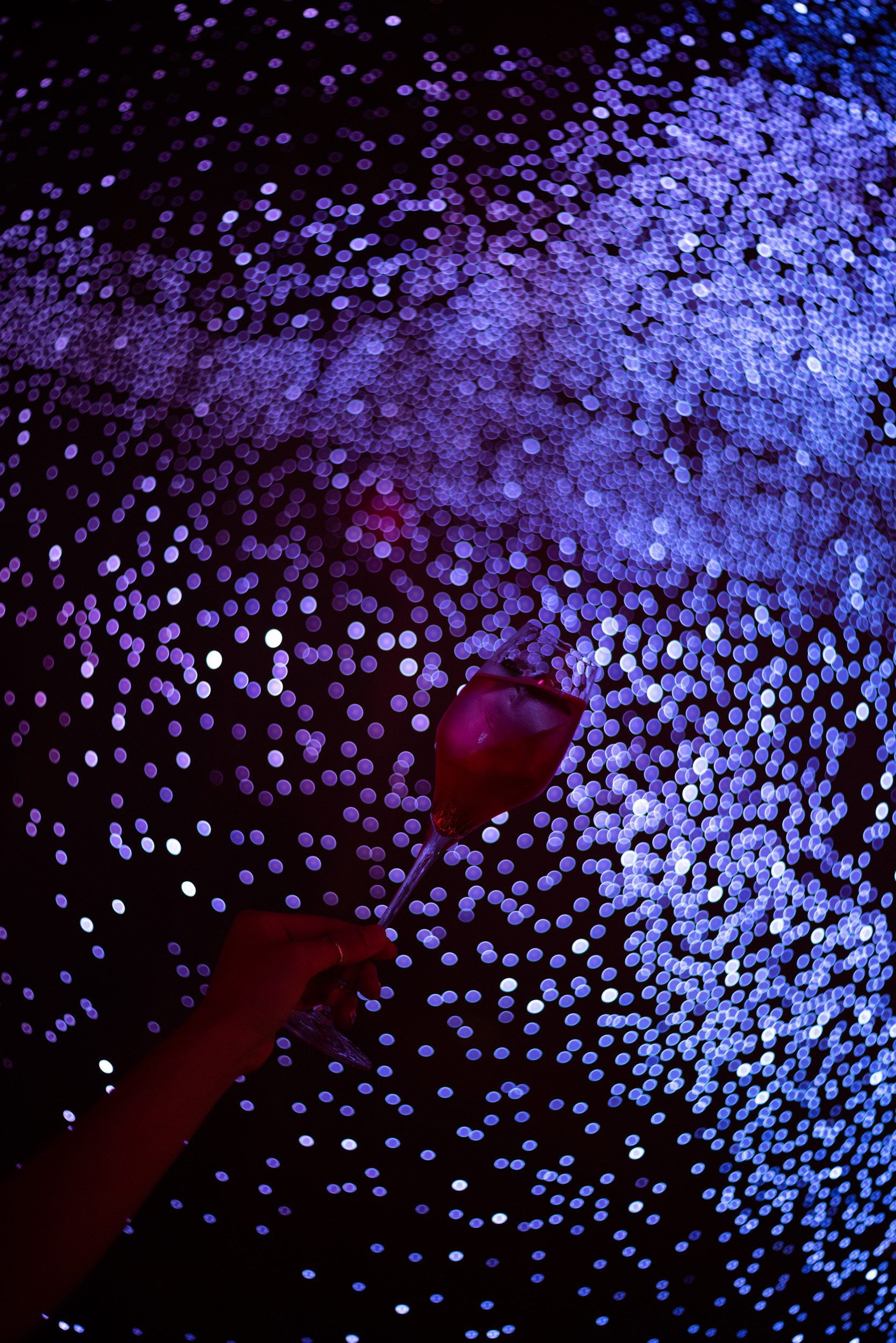
二维平面经过折叠,形成了视觉上的立体三维。在空间中享受舒适的饮酒氛围、环绕的音乐感受,微醺之态下,周围看似熟悉的空间在此变得模糊和不真实,时间亦不复存在,这便从三维跨越到了四维空间。
The two-dimensional plane is folded to create a visual three-dimensional. Customers will enjoy the comfortable atmosphere and pleasant music, leading them to the tipsy state of mind and feel the time ambiguous. That means crossing over from three dimensions to four.
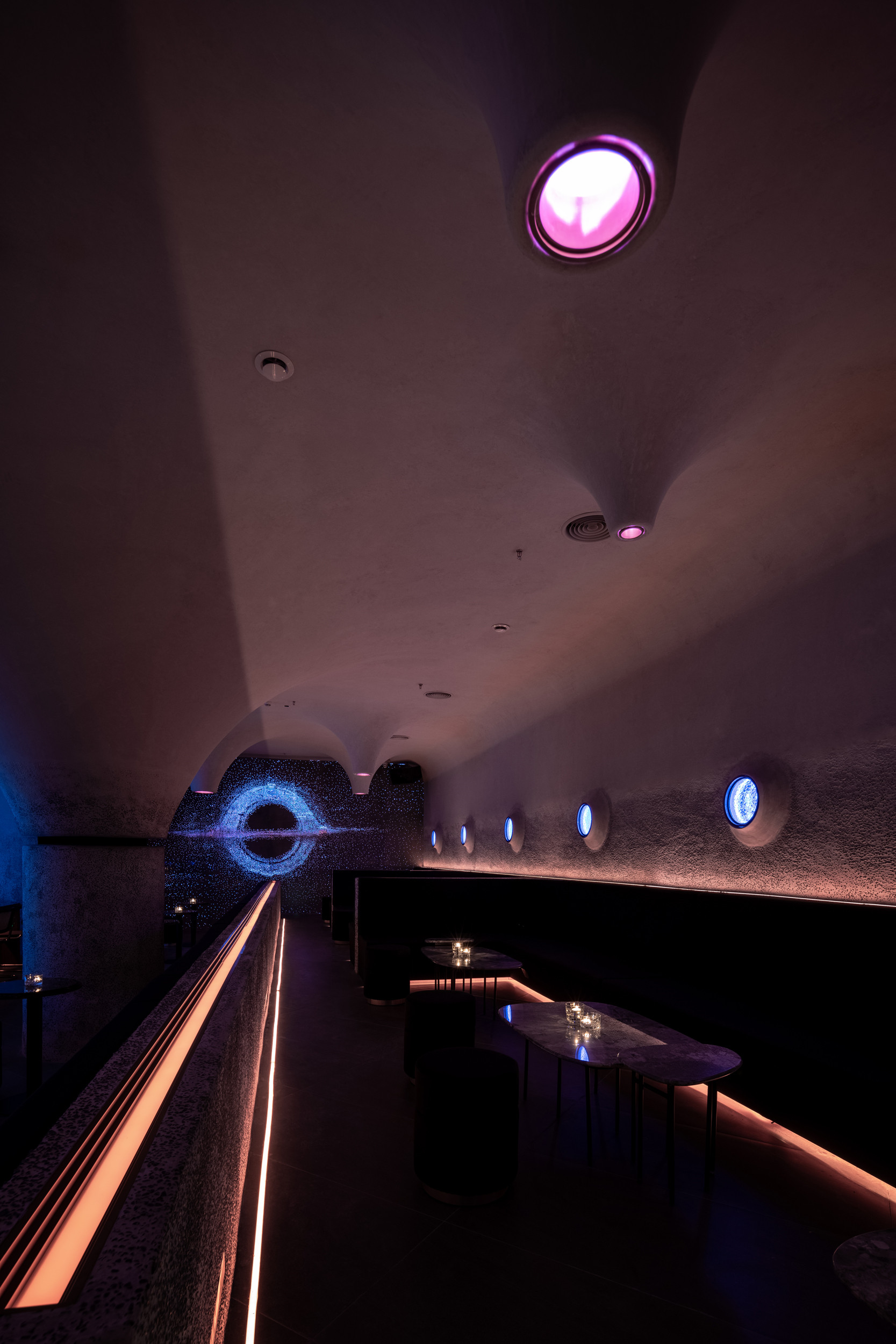
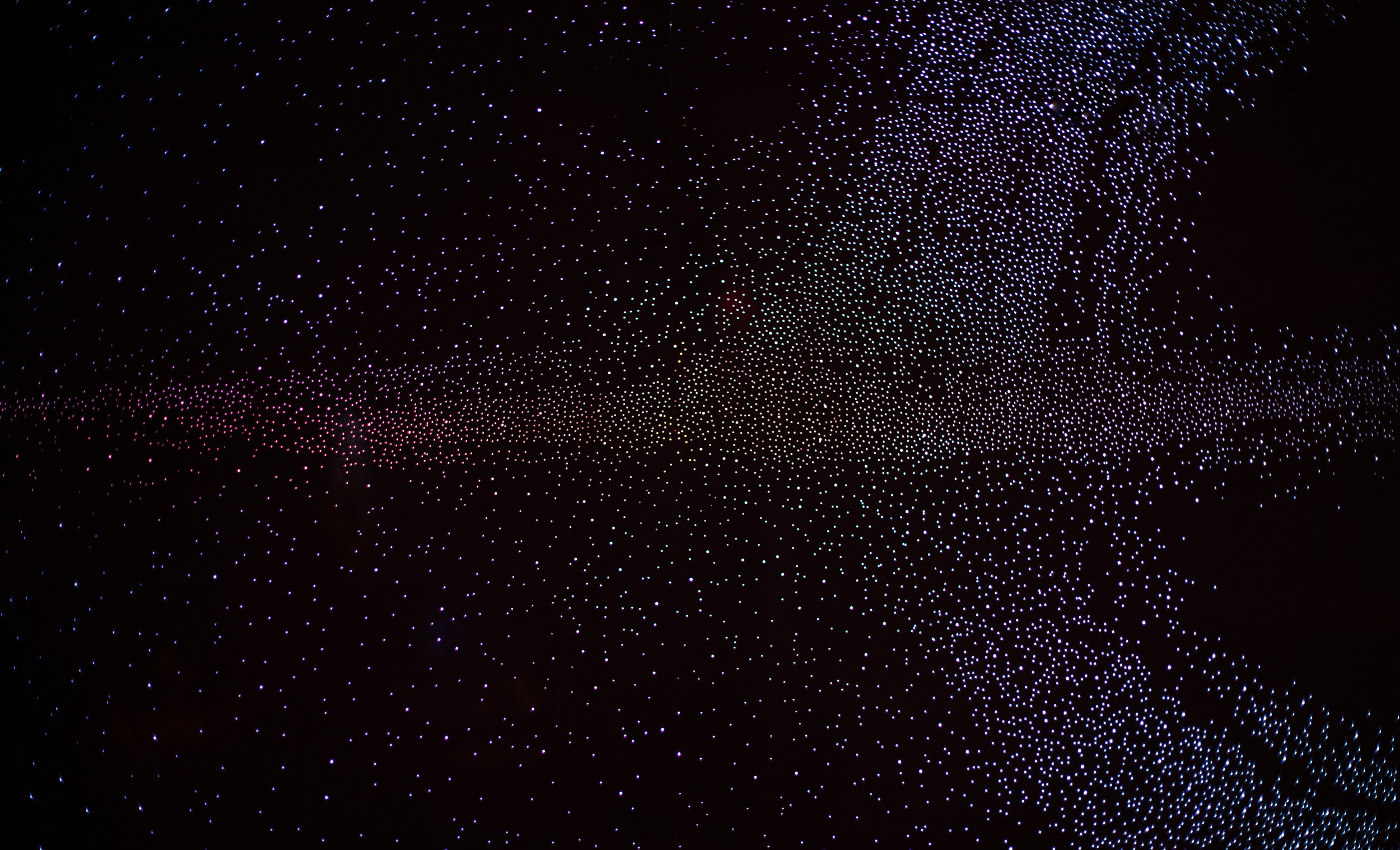
溶洞、星辰、舱室,为什么会把完全不相关的空间元素融在一起?让不该出现的事物,在不可能出现的时间点出现,这与“SWAY”行业属性“酒”有关,酒精是最容易超脱现实的饮料。脱离了现实状态后,就能拥有无限的想象空间。
The cave, stars and space capsule, these looked-irrelevant elements are combined together, the aim of which is to accord with the characteristics of Bars, bringing the experience of unrealistic to the customers.
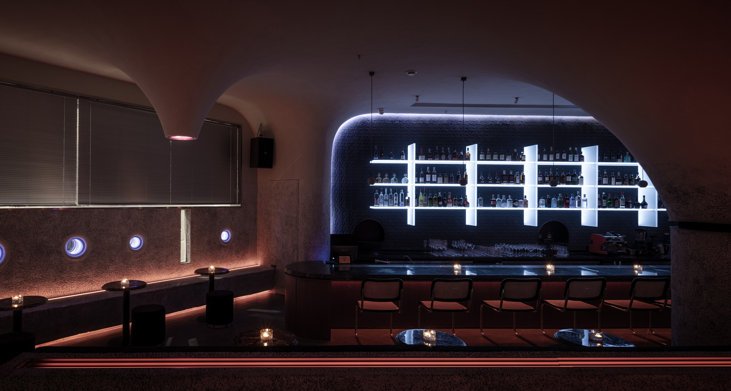
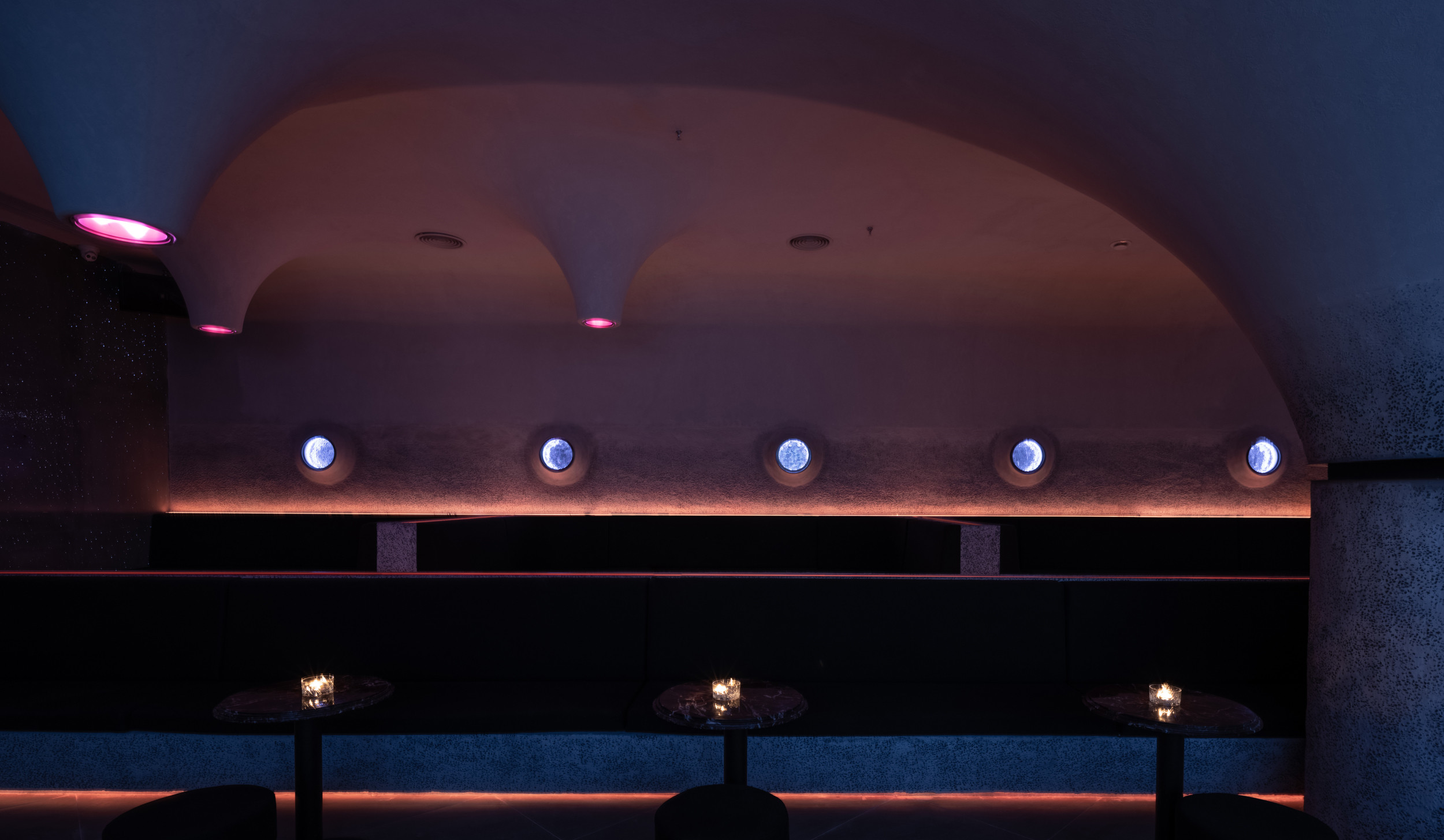
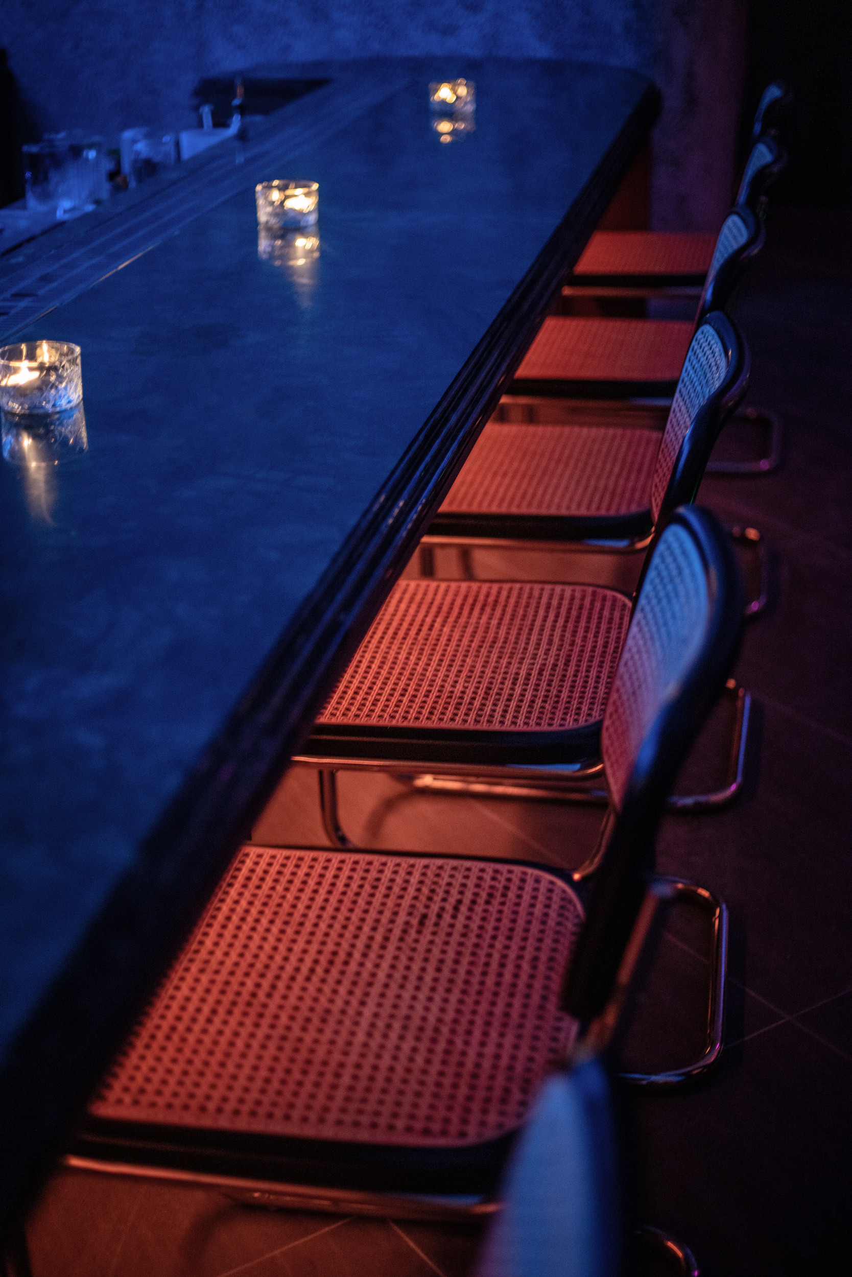
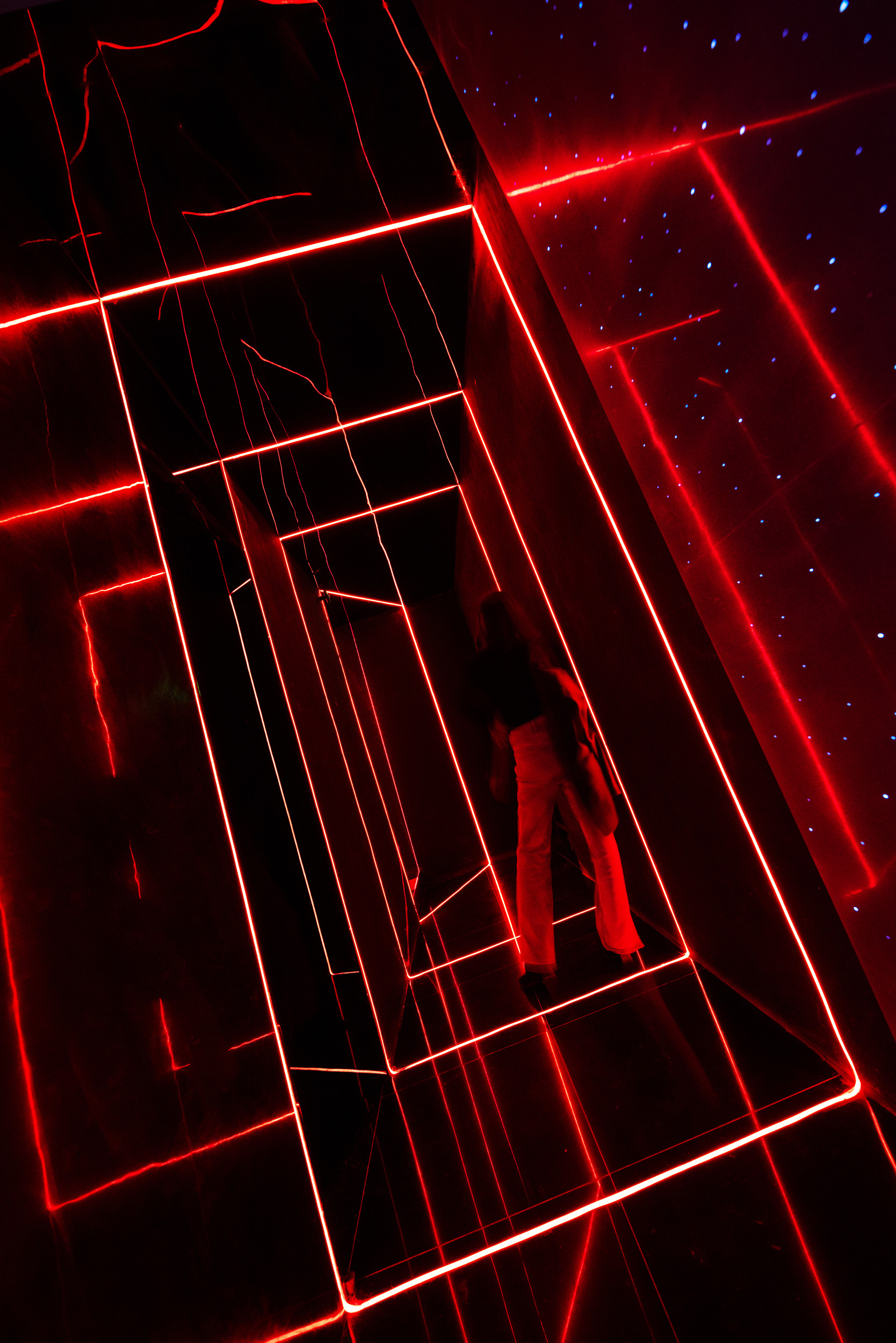
空间中除了清洁灯与应急照明,未设其它主灯,仅依靠可调控的RGB灯带排列组合,让灯光赋予空间氛围无限可能性。
None lights except for the emergency lamp is set in the space. The adjustable RGB light belts make the light arrangements in SWAY diversified.
常态里的反常规
Anti-Conventional
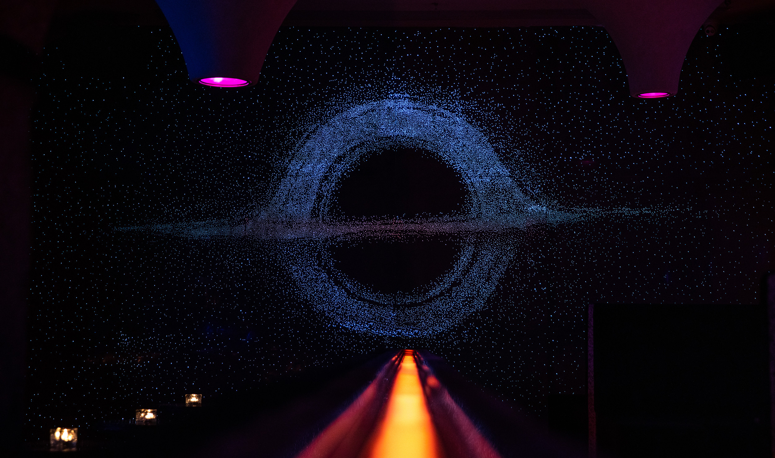
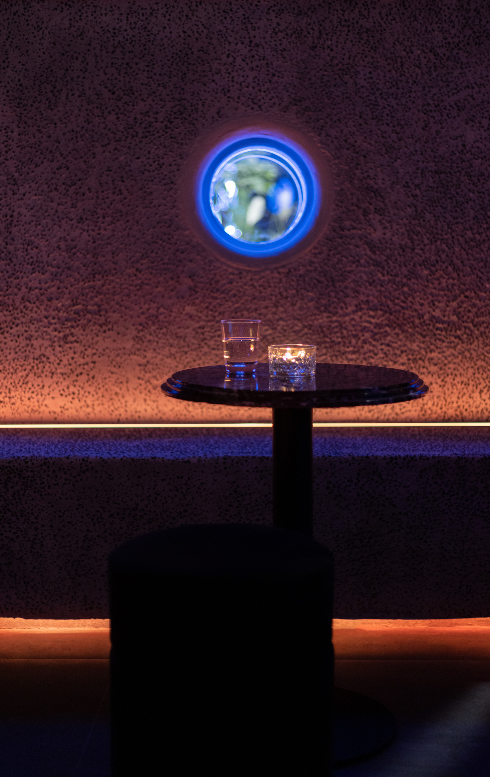
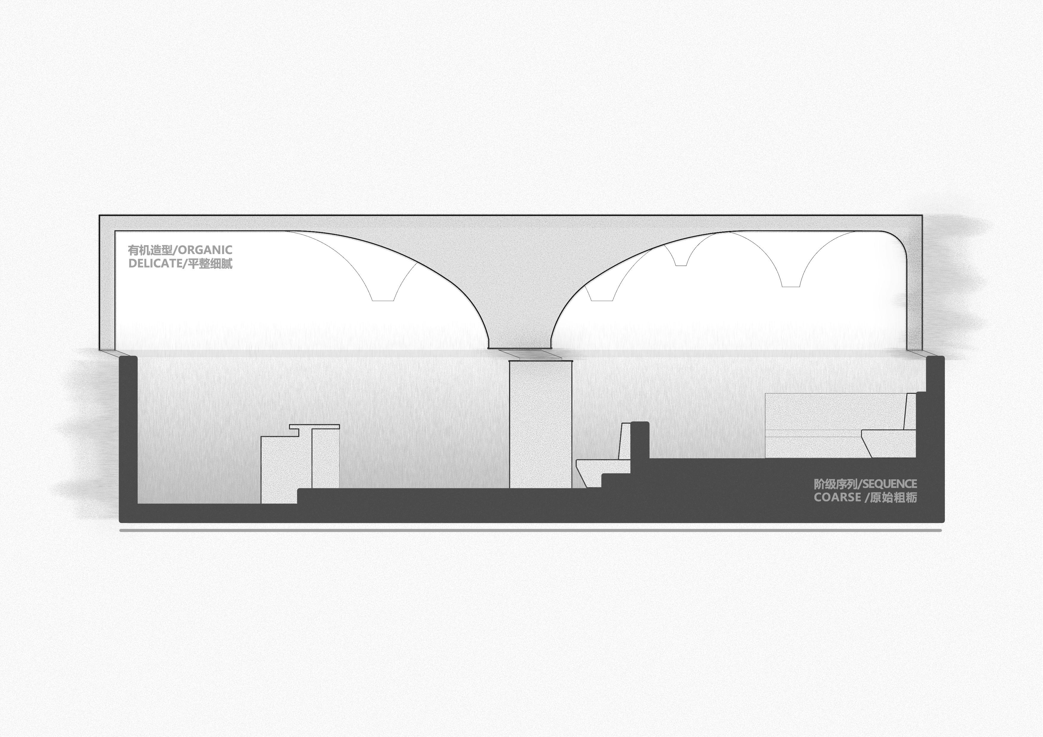
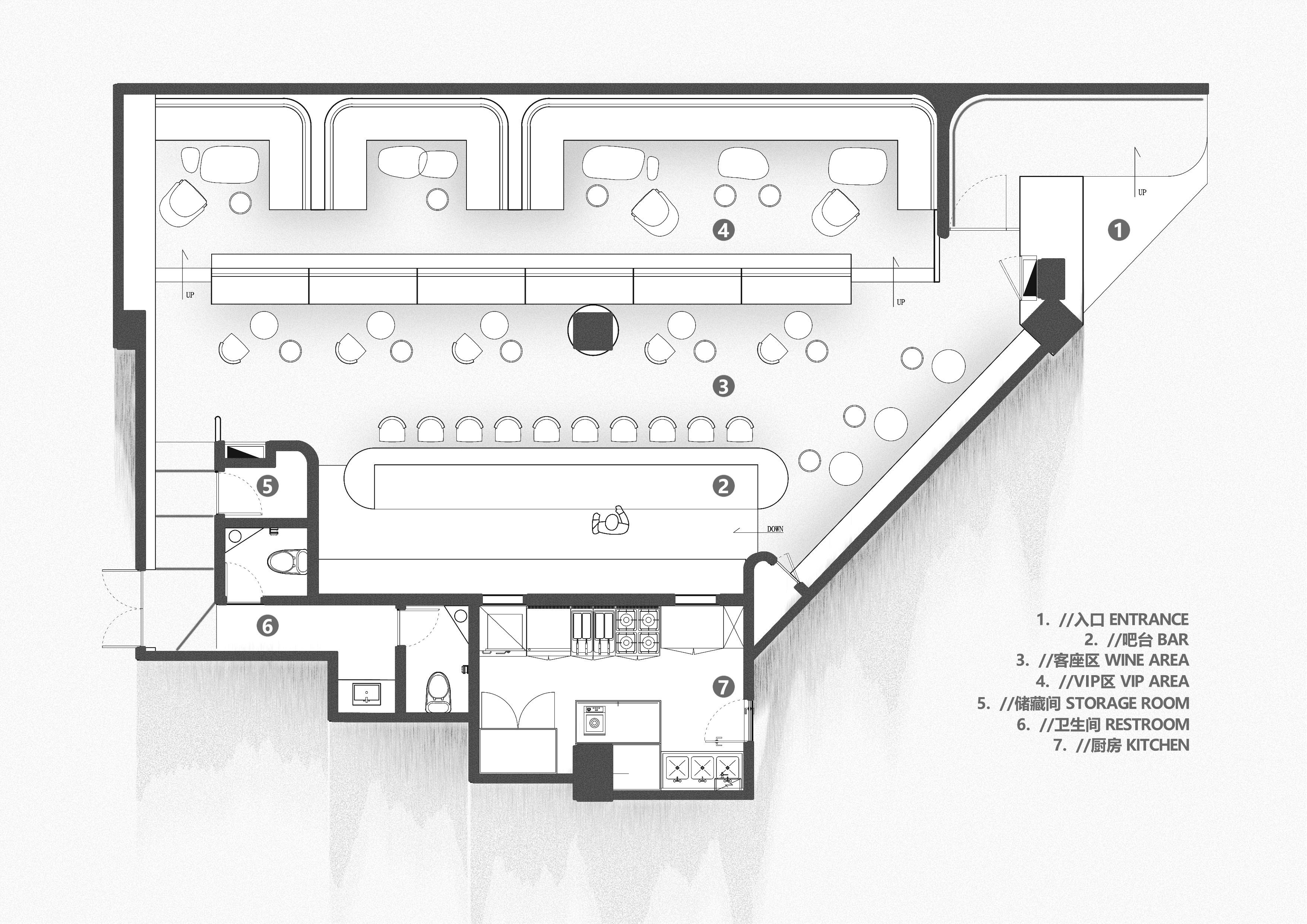
“店内座位按形式、氛围的不同,有序地分为三个层级;端景使用了透光混凝土,瞩目的黑洞图案引导顾客向内;酒架区作为空间核心,聚焦顾客视线…”比起这些设计上的常规手法,我们更在意一些反常规。
“The seats in SWAY are organized into three levels according to form and atmosphere; The black hole pattern on the light-transmitting concrete leads the customer to explore inside;The wine rack is set at the core of the space to attract attention.” These are the conventions, and we are more concerned with the anti-conventional.
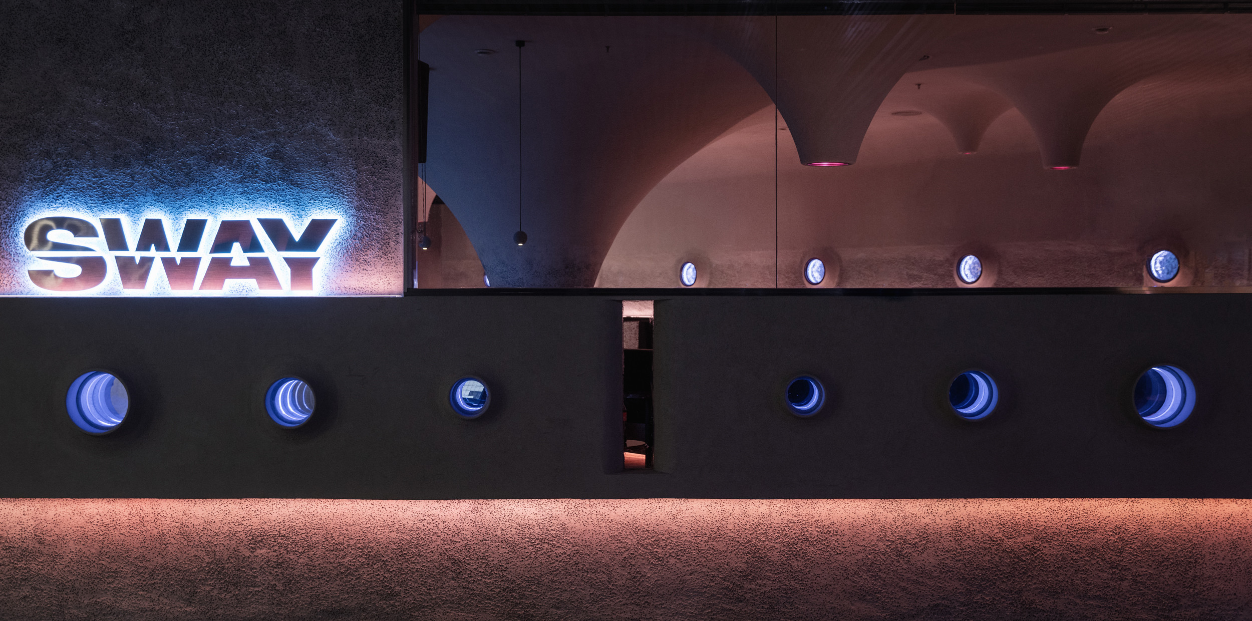
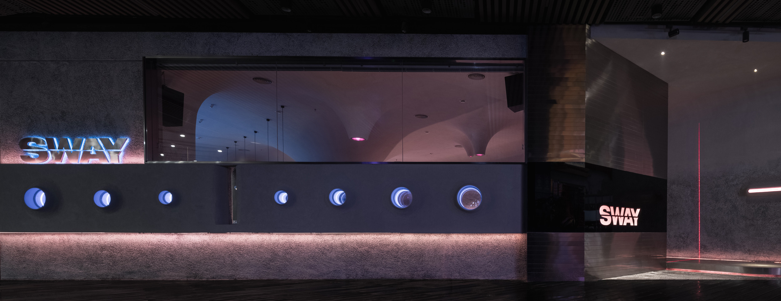
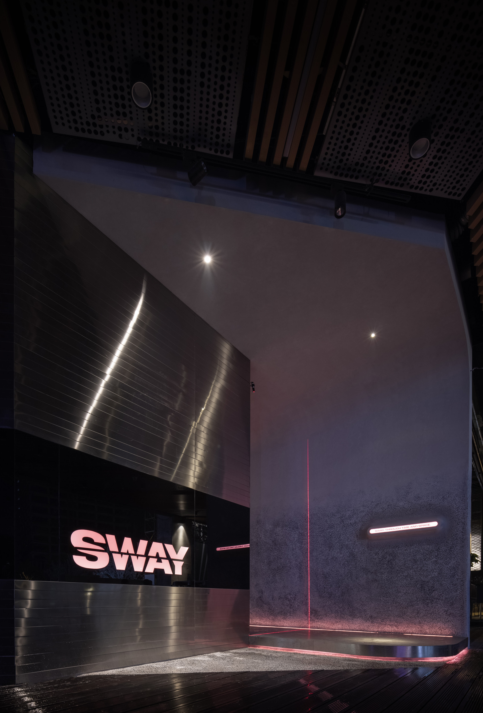
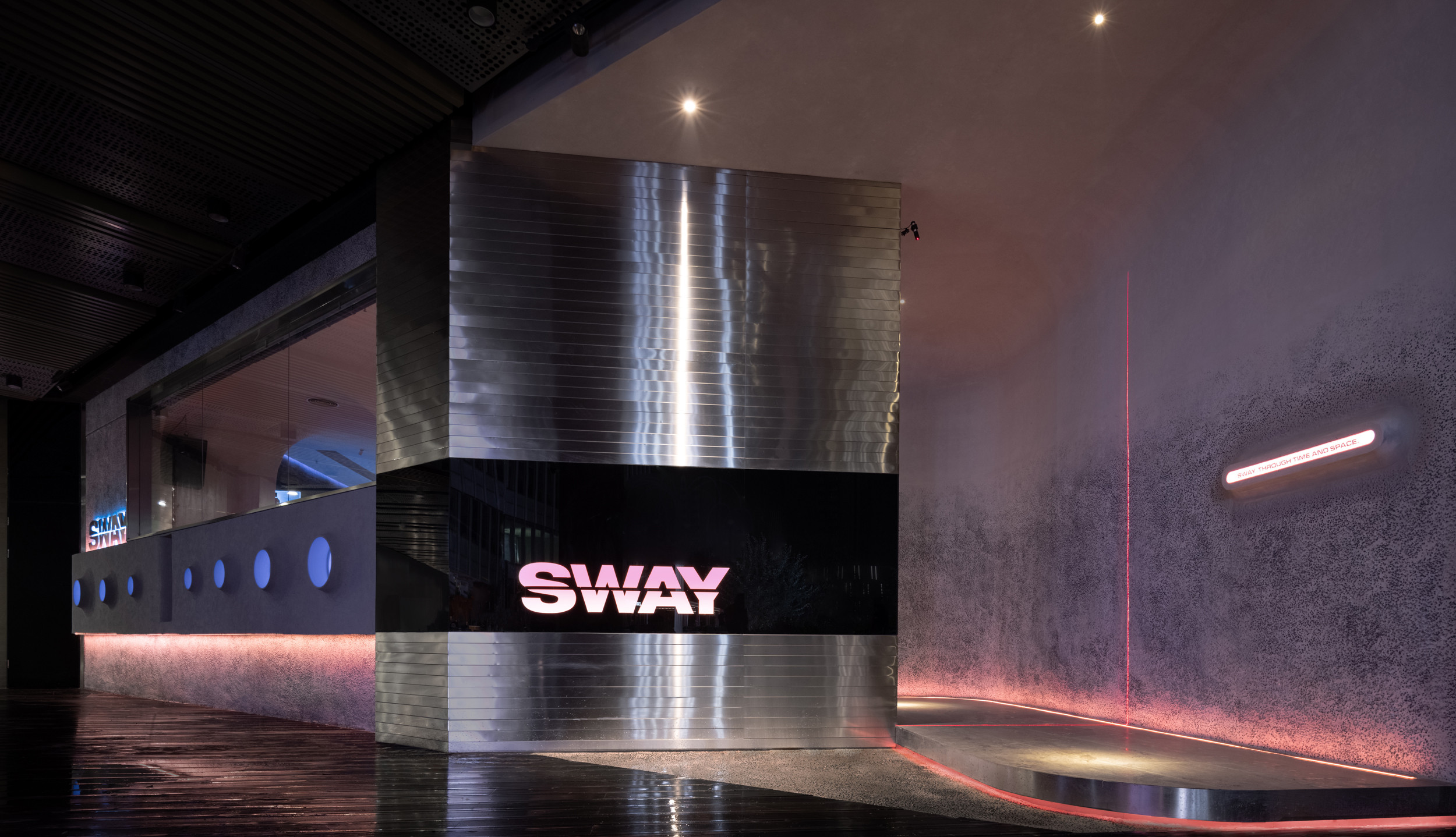
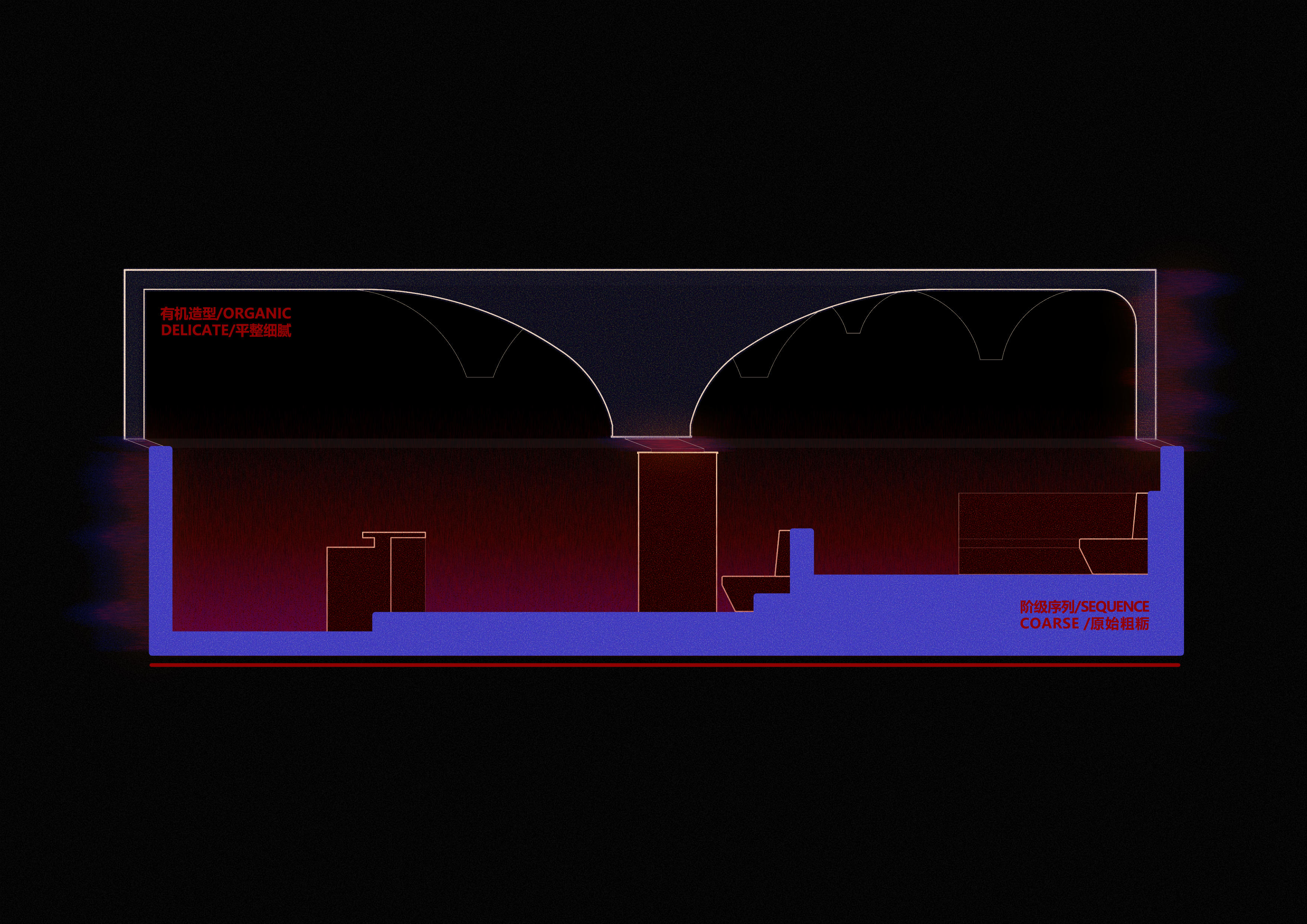
有机形态的天花,表面平整细腻,秩序规整的座位区墙面却斑驳粗粝;通亮的发光酒架,醒目的不是商品而是载体;本应光洁平整的不锈钢却被裁成条状错落拼接…我们始终认为,常规与反常规、秩序与失序,所构成的动态平衡,才是空间的乐趣所在。
The “Cave ceiling”is smooth but the wall behind the seats is rough and mottled;The shining luminous wine rack makes itself noticeable rather than the bottles;The polished stainless steel is cut into strips and irregularly connected… We have always believed that the joy of space is the dynamic balance of the conventional and anti-conventional, order and disorder.
连接过去与未来
From the past to the future
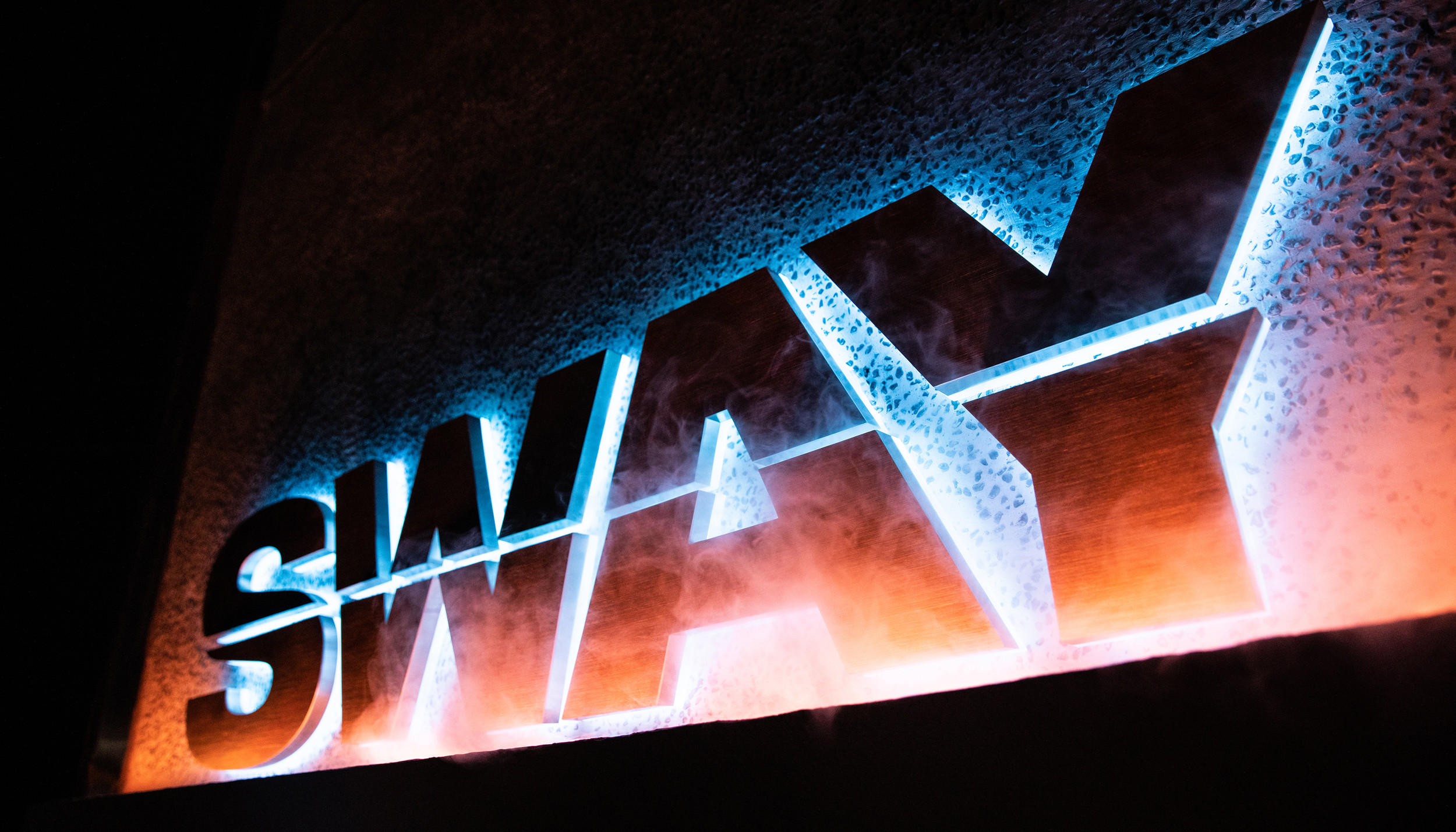
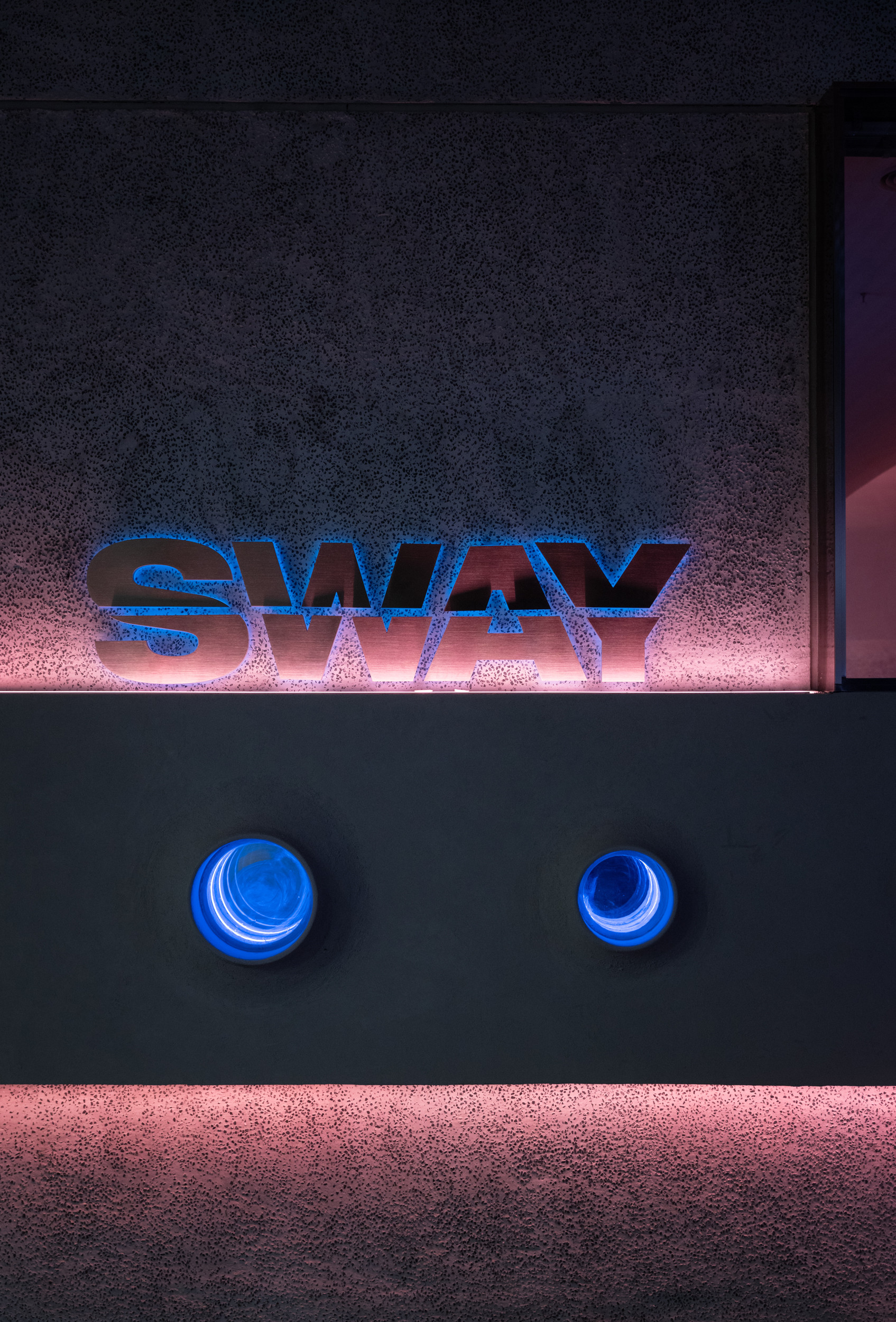
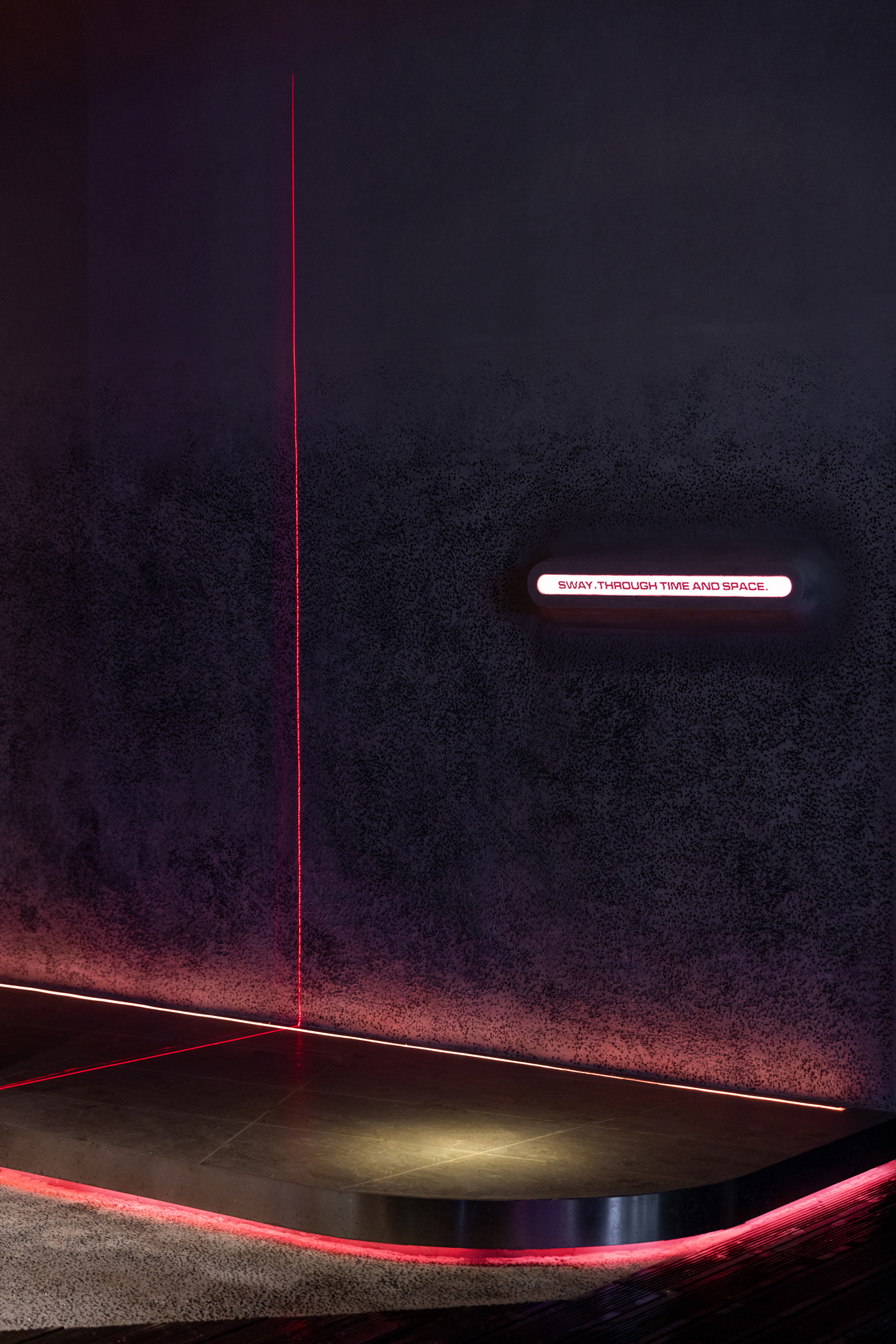
“SWAY”的标识也通过设计手法被切割、错位再重新连接,处理成可视化的折叠状态。通过品牌核心概念延伸出的辅助图形,是以星体圆形结构为基础,其微小的结构变化更是星体从诞生到虚无的生命过程。SWAY标识与空间融合后产生了奇妙的化学反应。
The “SWAY” logo has also been cut, dislocated and reconnected. The small structural changes in the circle-based auxiliary patterns are the life cycle of the star from birth to nothingness.The fusion of the SWAY logo with the space creates a surprising reaction
“当你凝望深渊,深渊也在凝望你”,创意永远基于用户的需求和体验,不断超脱,换位的同时创造更多层级的需求。即便是时间,也是能够被设计出来且量化的。
“When you look long into an abyss,the abyss looks into you.” Creativity is always based on the user‘s needs and experiences. Through the derivation of multiple levels of needs, even time is able to be made figurative.
项目信息——
全案设计:武汉朴开十向设计事务所
概念设计:熊天宇、张筱锴
设计执行:冯程程、田甜
项目地址:湖北省武汉市
项目面积:200m²
完工时间:2020.11
摄影:张筱锴
材料:透光混凝土-乐涂环保、水洗石&肌理涂料-ZEBRART斑马艺术涂装、亚克力-color panel
Project Information——
Project Design:Pure’s Design
Conceptual Design:Tianyu Xiong, Xiaokai Zhang
Design implementation:Chengcheng Feng, Tian Tian
Project address:Wuhan, Hubei Province
Project area:200m²
Time of completion:2020.11
Photographer:Xiaokai Zhang
Materials:litracon, exposed aggregate concrete, texture paint, color panel


