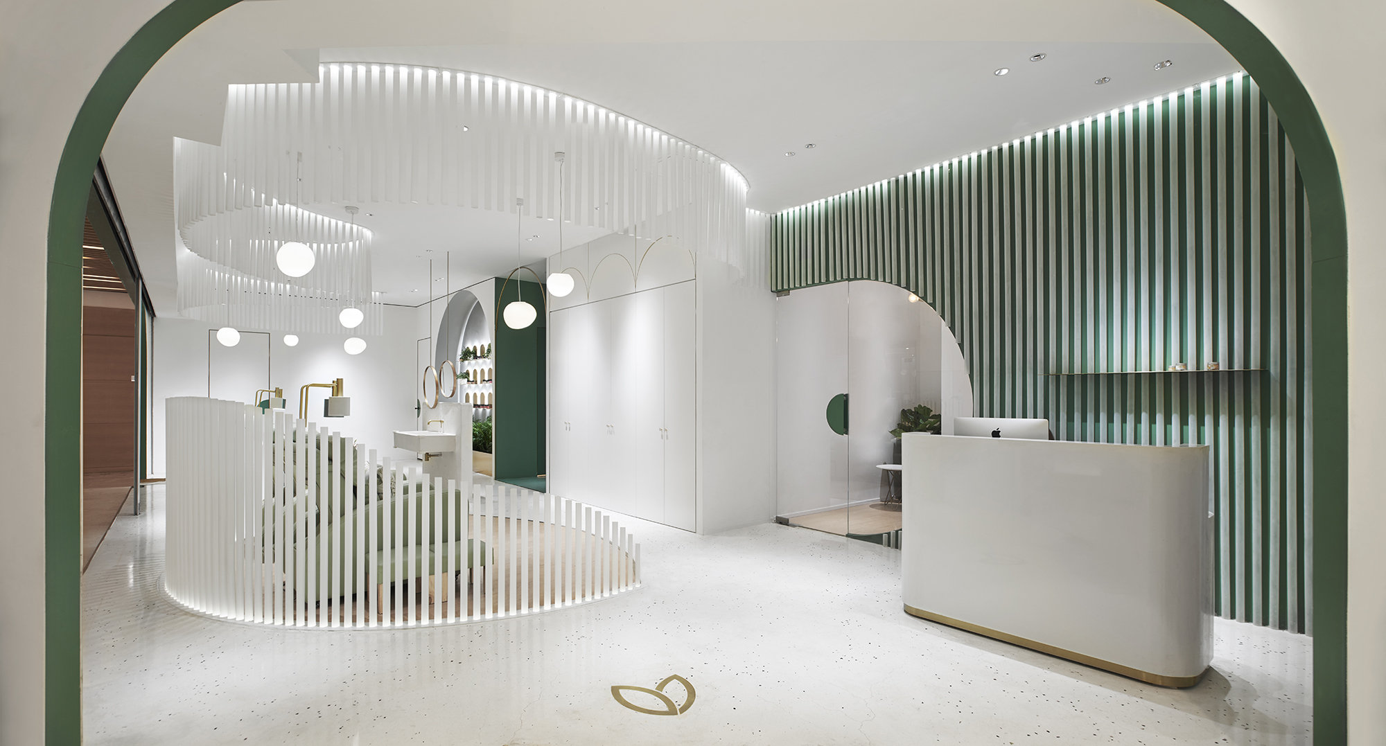
 谜舍设计受高端美甲品牌InNail委托,负责其空间店面形象的升级设计。InNail倡导自然健康的生活理念,谜舍设计以森林的形态作为设计灵感,旨在探索空间开放性与私密性的界限,创造出一个具有安全感的舒适空间.
NazoDesign is commissioned by InNail,a high-end brand of manicure, to design and upgrade its store image and space partition. Because InNail‘s advocating natural and healthy life ideas, NazoDesign takes the forest status as the design inspiration and aims to explore the boundary between openness and privacy of space,which creates a safe and comfortable space.
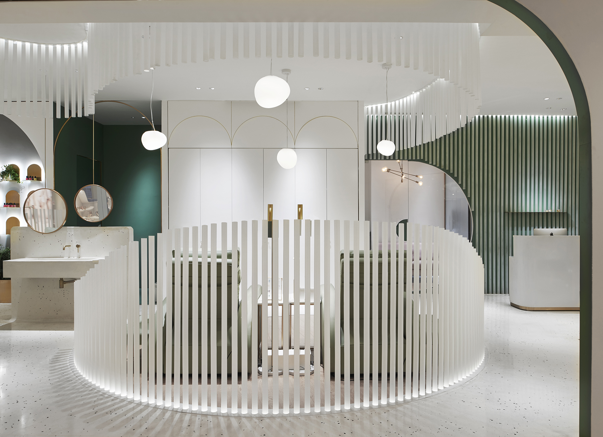
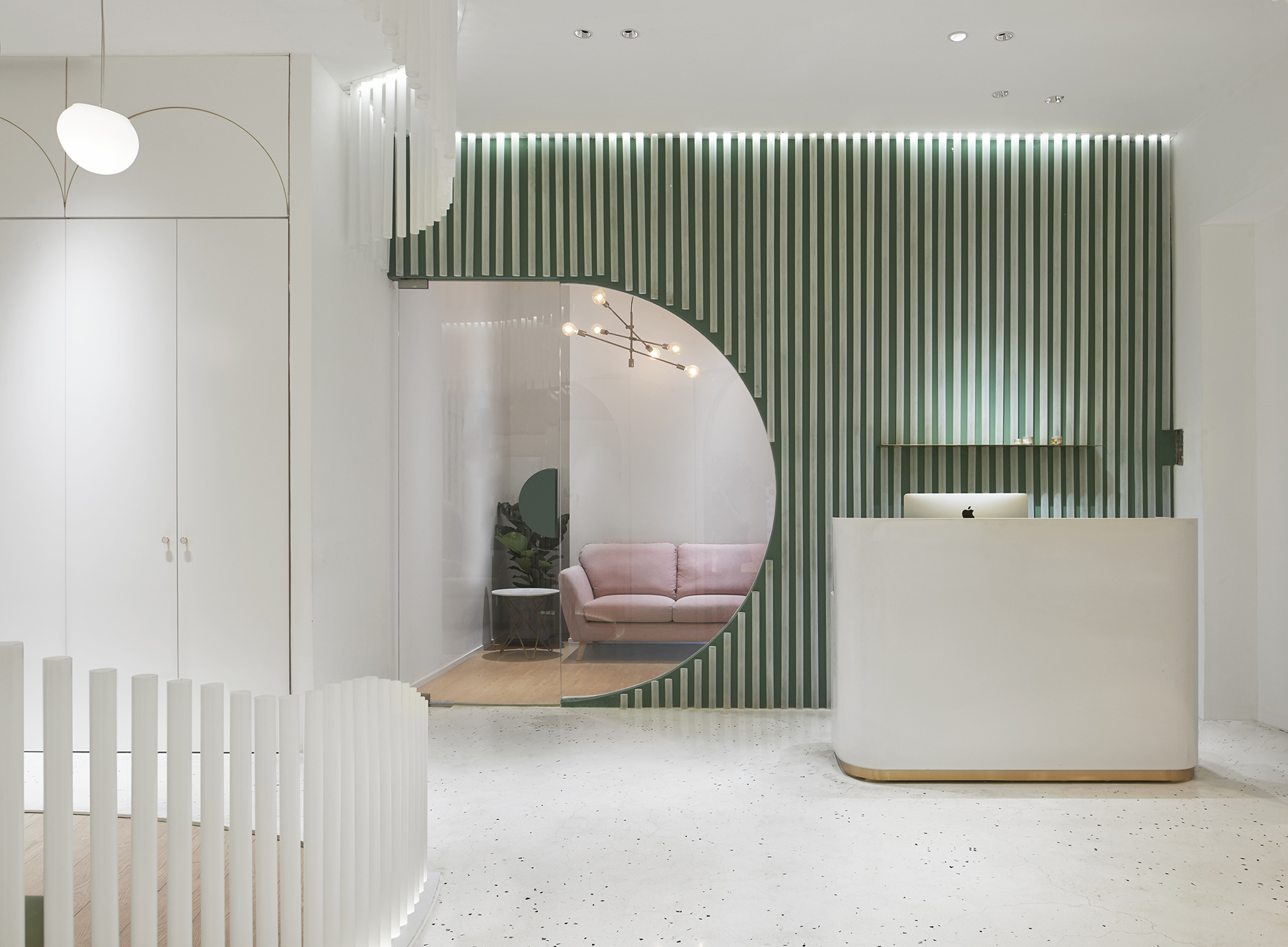
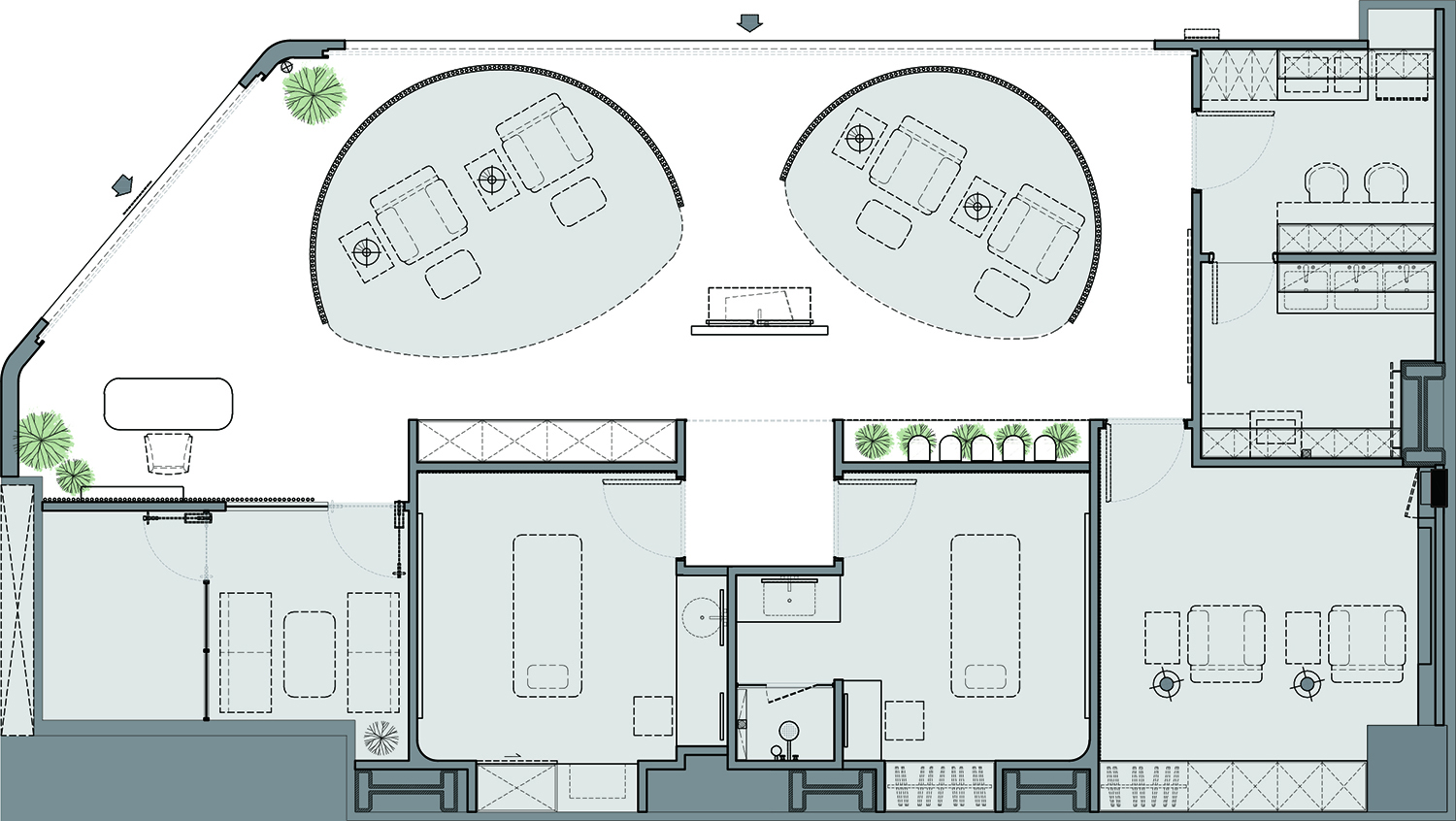
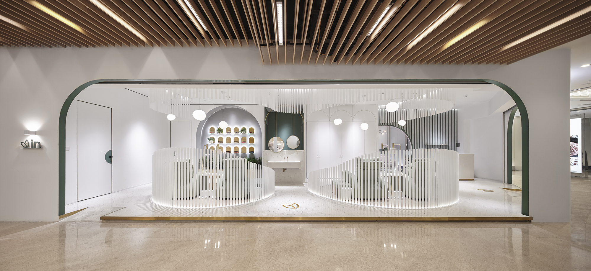
美甲空间分为开放美甲区和美甲包厢两个区域,开放美甲区设置了2组美甲沙发.谜舍设计对于“美甲”这一行为进行思考研究,相比美容,美甲不需要非常强的私密性,但较为高端的美甲服务又不适合完全开放,因此谜舍设计选用了磨砂亚克力管作为隔断材料,材料本身的半透明属性很好的满足了美甲的需求.通过控制亚克力管的长度,使其呈现出整体流线的造型,将开放美甲区域打造成私密性与通透性兼具的空间形态.
The manicure area is divided into two parts, as open manicure area and private manicure box. In the open manicure area, there are two sets of manicure furniture. NazoDesign have done some thinking and study on the manicure action. Comparing with cosmetology, manicure action does not need to be very private. But it is not suitable to totally be opened in the higher-end service of manicure. Therefore, NazoDesign chooses the frosted acrylic rods as partition materials. The translucent property of this material perfectly satisfies the needs of manicure. Using the acrylic rods, it appears a comprehensively streamlined modeling and makes the open manicure area into a spatial form, which is full of privacy and transparency.
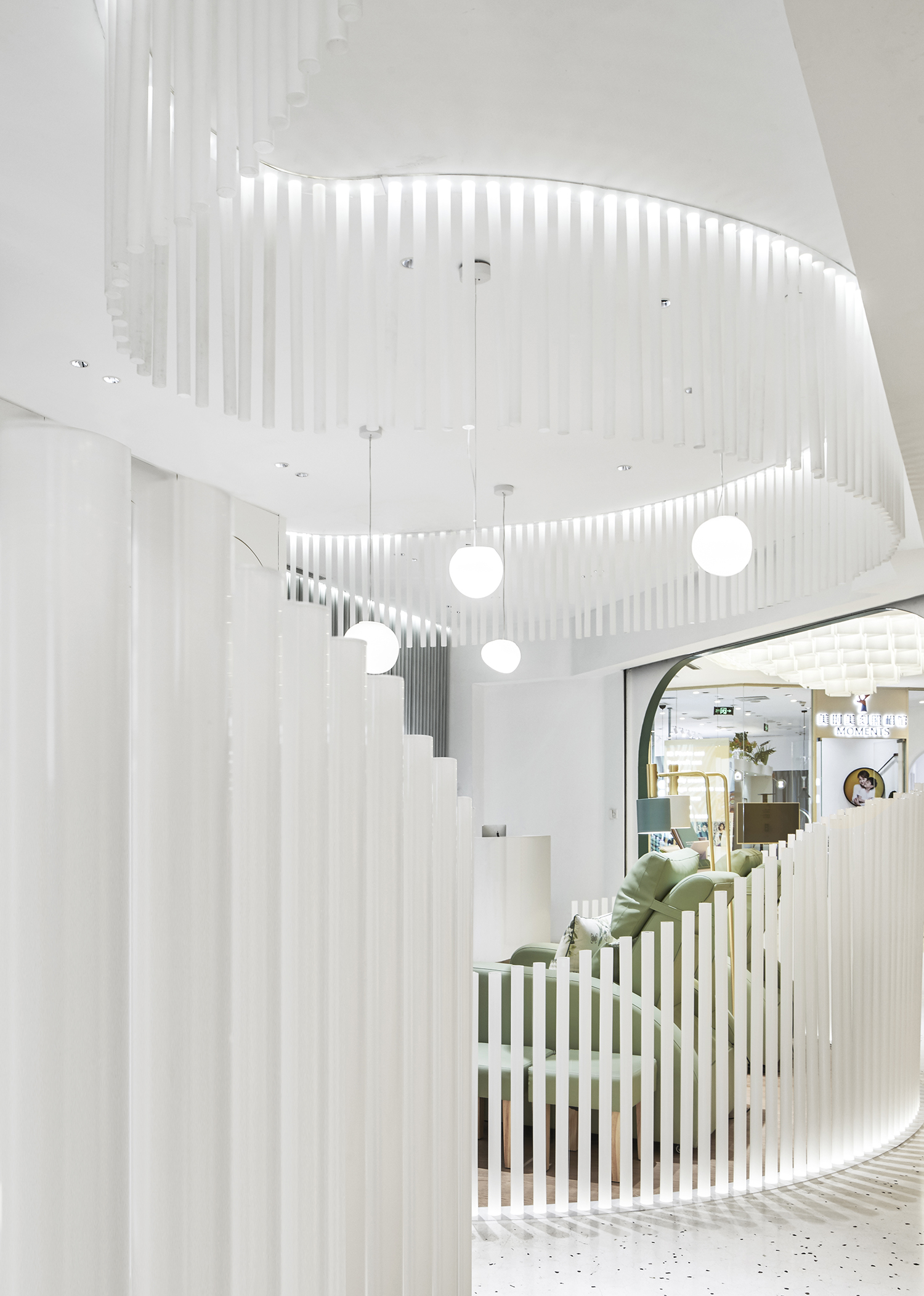
谜舍设计进一步将这样的材料语言延申到了整体空间,天花、墙壁、地面共同构成了一个具有节奏韵律感的“透明森林”.
NazoDesign further applies this material in the overall space, which makes the ceiling, walls and ground together constitute a “transparent forest” with a sense of rhythm.
因为消费者多为女性,故谜舍设计使用了大量的弧形元素以柔化空间的氛围,使空间对于女性客户更为友好亲切.
Because most of their consumers are female, NazoDesign uses a lot of arc elements to create a mild atmosphere, which makes the space more approachable to the female customers.
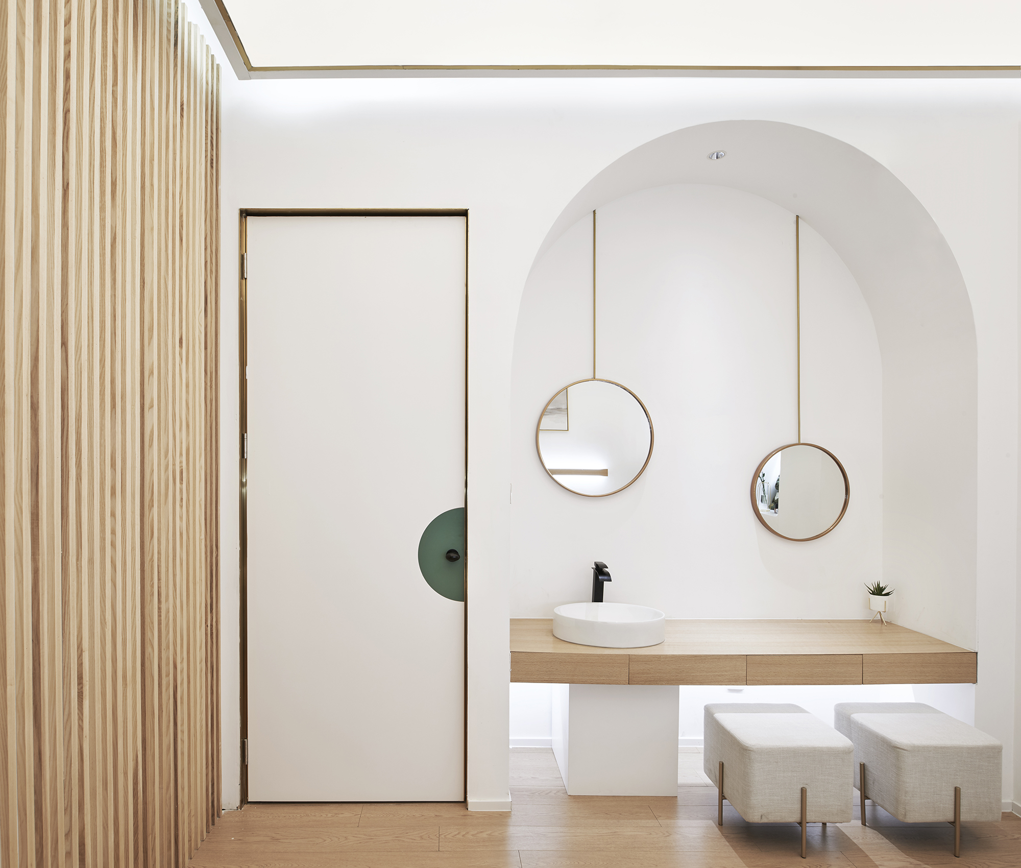
空间整体使用白色材质,以营造具有清洁感的空间氛围.
NazoDesign mainly uses white color materials on the main part of the whole space to create a clean space atmosphere.
空间局部使用品牌的绿色进行调节,丰富空间的视觉层次.
And to make some adjustments, it uses the brand green material on some parts of the space to enrich the visual level of the space.
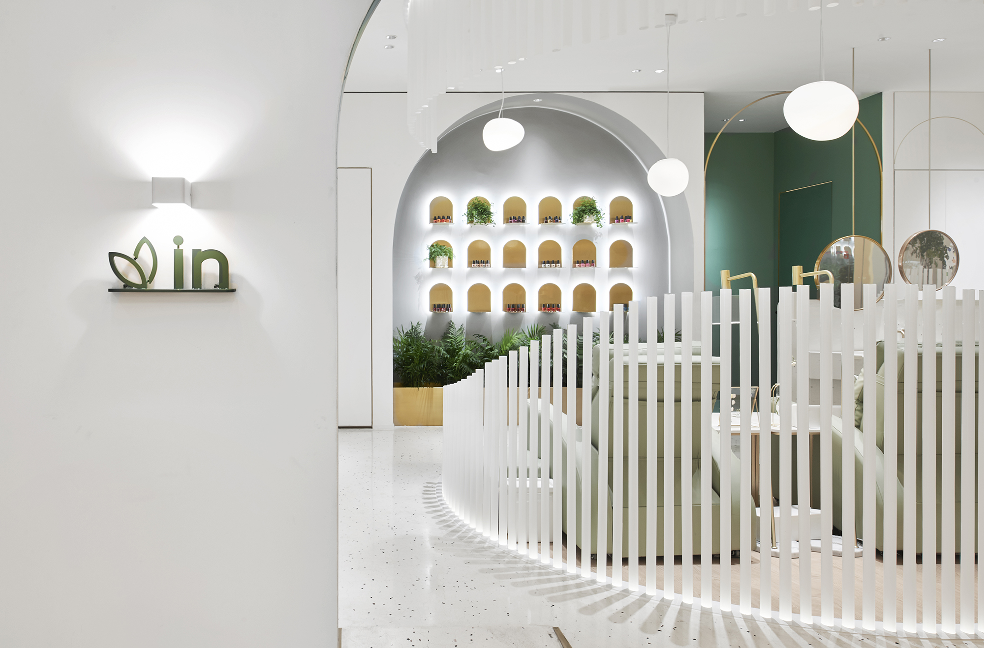
由指甲形状演变而来的产品陈列架与绿植共同构成了空间中的自然景观
The products on the display stand evolved from the nail shape and the green plants together constitute a natural landscape in the space.
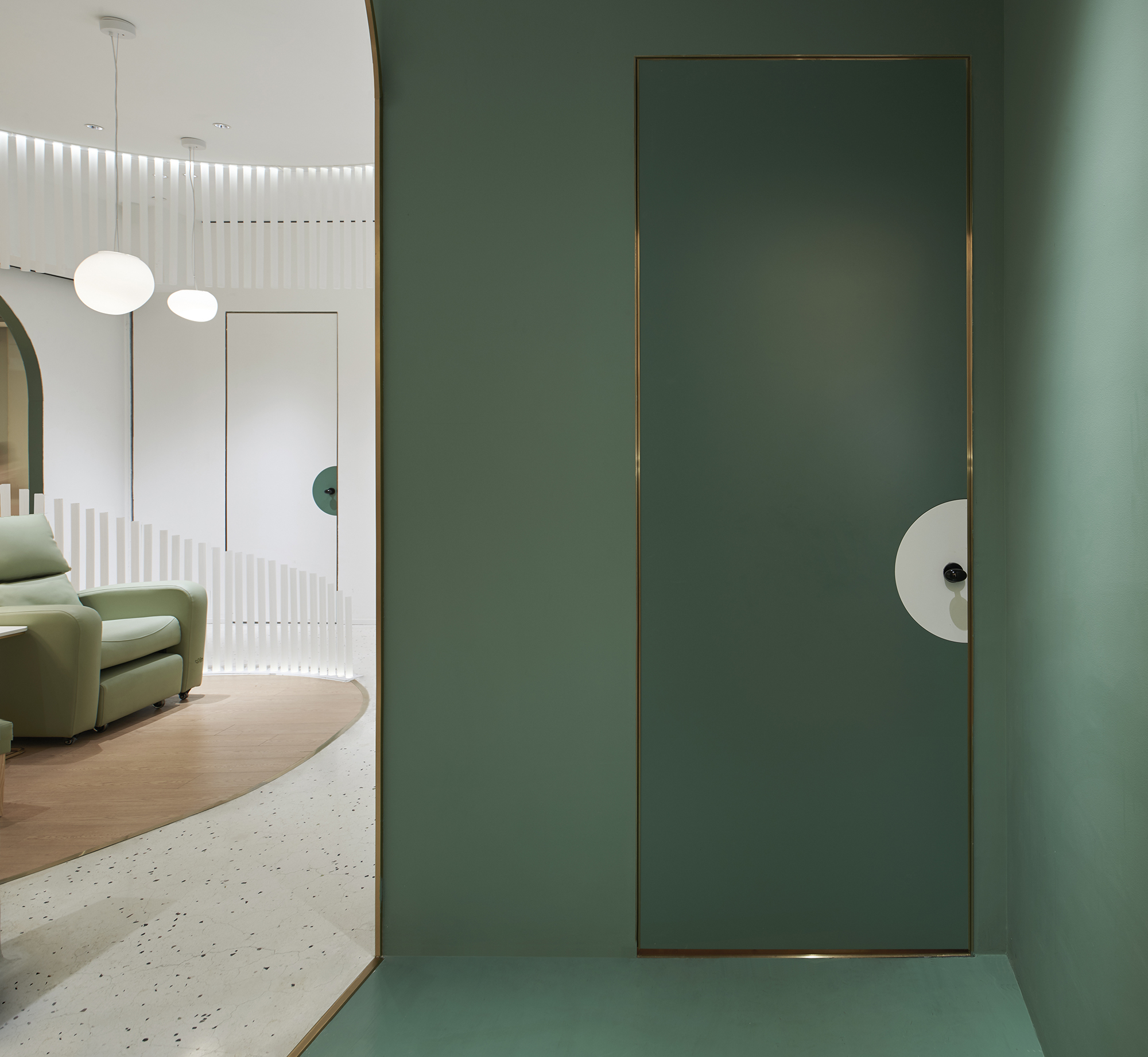
进入包厢前的玄关被打造成了一个绿色空间,谜舍设计通过颜色的使用方式去界定空间,对消费者即将进入不同私密等级空间进行心理暗示.
The hallway in front of the private manicure box is made into a totally green space. NazoDesign divides the space by using colors, which gives the consumers a psychological hint of entering different space with different privacy level.
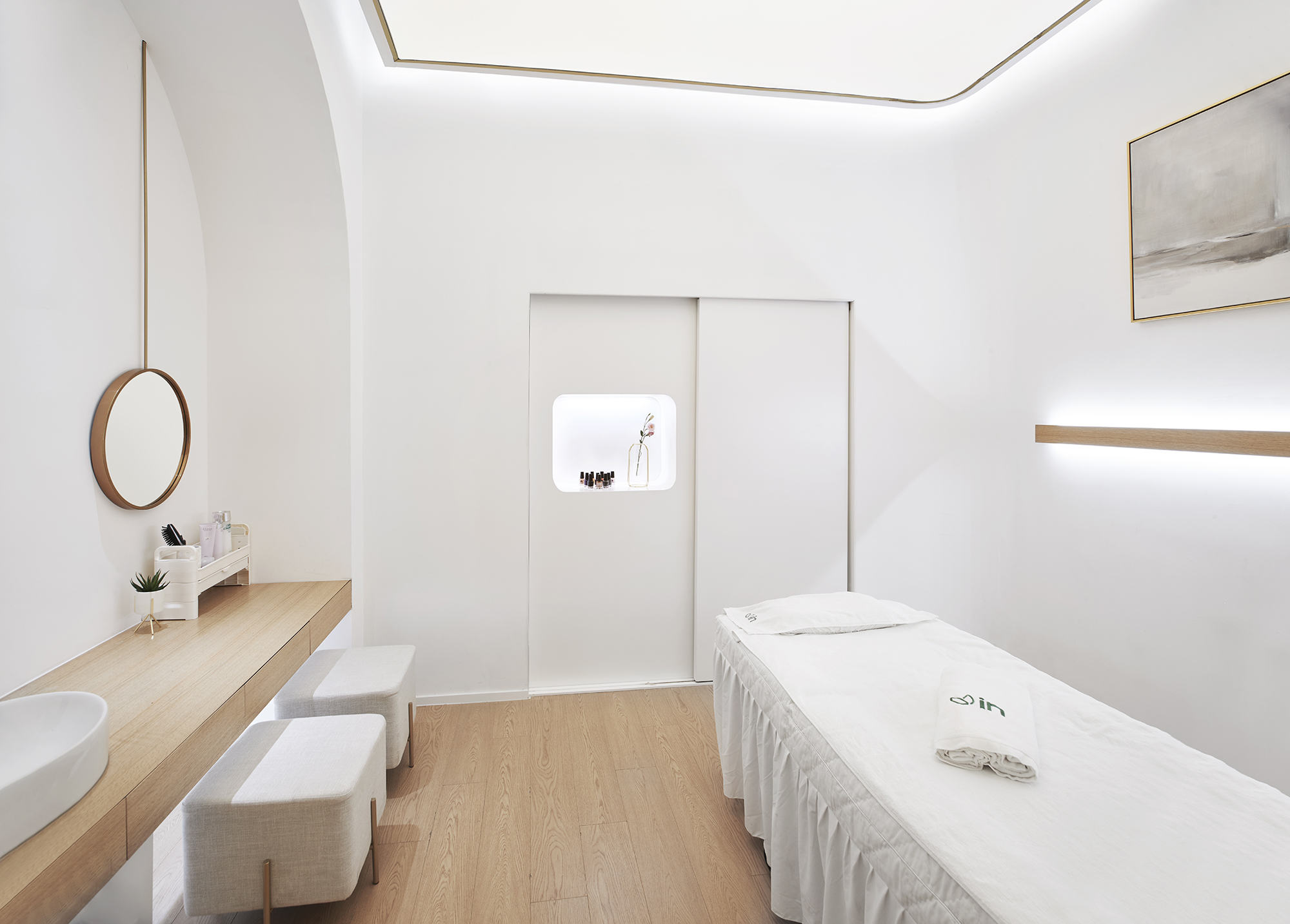
包厢内使用了整面软膜天花的照明方式,创造出不会产生直射眩目光的柔和空间氛围.
NazoDesign uses a whole soft film ceiling on the private manicure box to create a soft space atmosphere without direct blinding light.
▲ Display Windows
橱窗设计延续了空间的主色以及造型元素,并将自然的主题体现出来.
Also NazoDesign continues to use the same main colors and same modeling elements of the space on the shop windows, which shows the theme of nature.
▲ Plan
项目信息——
项目:InNail美甲店
面积:140平方米
位置 : 中国 北京
完工时间:2019年05月
设计公司:谜舍设计工作室
设计团队成员:田少寅,曾煜娴,泷泽洋一,简美玲,郭益克,张青.
品牌及导视:JAN Creation减艺设计
拍摄:广松美佐江,宋昱明(北京锐景摄影)
Project information——
Project: InNail Store
Area:140 sqm
Location:beijing,China
Completion date: May 2019
Design:Nazodesign Studio
Project team: Tian Shaoyin, Zeng Yuxian,Yoichi Takizawa,Guo YiKe , Zhang qing
Branding Design/Signage Design: JAN Creation
Photography:Misae Hiromatsu, Yuming Song (Beijing Ruijing Photo)


